
chapter two
building your first report
The SAS Visual Analytics Designer (the Designer) is the SAS Visual Analytics application that enables you to build reports and dashboards. The Designer can be accessed through the web application. Once the content is prepared in the Designer, it can then be viewed on the SAS Visual Analytics Viewer or through the SAS Mobile BI application. You can also import and access data directly from the Designer.
One of the benefits of the Designer is that you don’t have to create code when you build reports, which can be a huge help to analysts who might not be fluent with SAS code. Tables, graphs, and other objects are all controlled through a drag-and-drop functionality. All object properties can be set using screen options. Even creating new variables involves going through a guided interface!
In this chapter, we go through how to access and navigate the Designer. From there, you are guided through creating an initial report that includes using basic objects, creating new data items, and setting up interactions between objects.
Accessing the designer
You can access the Designer through either a direct link or by navigating SAS Home. The following figure shows you which spots on the Hub lead you to the Designer.
Figure 2.1 How to get to the Designer from the Hub

You can use the drop-down list ![]() to link to the applications on the system, including the Designer. The Create Report tile
to link to the applications on the system, including the Designer. The Create Report tile ![]() under Create Content also links you to the location.
under Create Content also links you to the location.
You can also directly link to the Designer if you know your server and port number. The link is structured as follows:
http://<server:port>/SASVisualAnalyticsDesigner
Introducing the designer layout
When you navigate to the Designer, you are brought to the main screen, which consists of three distinct areas that are used for development.
Figure 2.2 Areas of the Designer

The left pane is used as an inventory for data, objects, and reports. The middle area is the canvas where reports are designed and structured. The right pane contains multiple tabs, which enable control over the objects.
Using the canvas
The canvas is the user’s workspace for creating reports. It is broken up into multiple tiers that include prompts as well as sections.
Figure 2.3 Tiers of the canvas

The letters A, B, C, and D represent the tiers of the canvas. As you go up the canvas, each tier has a responsibility to what is below it. Here is how they are set up:
![]() Body - This is where the report objects can be placed and then get populated with data items.
Body - This is where the report objects can be placed and then get populated with data items.
![]() Section Prompt – This tier acts as a filter to the body. Control objects can be positioned here to regulate what data shows up in the objects in the body.
Section Prompt – This tier acts as a filter to the body. Control objects can be positioned here to regulate what data shows up in the objects in the body.
![]() Sections – Here is where the sections of the report are displayed as tabs. Each report can have multiple sections. Every section has its own independent section prompt and body.
Sections – Here is where the sections of the report are displayed as tabs. Each report can have multiple sections. Every section has its own independent section prompt and body.
![]() Report Prompt – Similar to the section prompt, this prompt controls data across sections in the report. Any control object placed here filters the entire report.
Report Prompt – Similar to the section prompt, this prompt controls data across sections in the report. Any control object placed here filters the entire report.
Using the left pane
The left pane of the designer is where you can access an inventory of objects, the data sets that you are working with, and even other reports. This area is where you begin when starting to build reports. In order to start developing a report, you need both data and objects. The object is the chart, table, or control that must be associated with data in order to display information.
The window pane is set up with four tabs for each of the actions. You can turn on or off which ones show up in the top bar by clicking the drop-down list in the top right corner of the panel as shown below.
Figure 2.4 Left pane of the Designer

The Objects tab is where you can drag the various objects to the body of a report. This tab is broken into the categories of objects that include tables, graphs, controls, containers, and others. All of the objects can go into the body of the canvas, but only control objects can go into the prompt areas. (See Sections ![]() and
and ![]() from Figure 2.3).
from Figure 2.3).
The Data tab is where you can import data and see all of the data items for each source. By clicking the Select a data source drop-down menu on the Data tab, you can access the Add Data Source window where you can import data or access any of the data sets in the LASR library. Once a data set is brought in, the data fields populate the body section of the tab. These data fields are also drag-and-drop enabled once objects are put onto the canvas. When any of the data items are selected, their properties populate at the bottom. You can manipulate how the data appears on the canvas by changing these values.
The last important part of the Data tab is the drop-down arrow ![]() at the top. This is where you can create new data items and perform other manipulations to your data that help make better reports. These options are covered later in this chapter as well as in later chapters of this book.
at the top. This is where you can create new data items and perform other manipulations to your data that help make better reports. These options are covered later in this chapter as well as in later chapters of this book.
The Import tab can be used to bring in other reports created in SAS Visual Analytics. If there was a particular object, section, or whole report that one user wanted to add to their current report, they can find that item and then drag it to their report.
The Shared Rules tab is where you can create display rules for gauges that can apply to multiple gauges in a report. This can be very helpful in dashboards where gauges are often used. A shared rule makes it easy to apply a display rule across the ones that you want. Display rules and gauges are covered further in Chapter 3.
Using the right pane
The right pane is where a user can control the attributes of the report, sections, and objects. Attributes include titles, look and feel, filtering, and other customizations. Each one of the tabs can be used on an object, but only some of them can be used on the whole section or report.
Figure 2.5 Tabs on the right pane of the Designer

The Properties tab is the only one that has options for an object, section, or report. Depending on which one you have selected, the options within the tab are different. At the report tier, you can change the title, set a description for the report, and control the section and report prompts of the report. From the report tier, you can change to the section tier of the tab by selecting any of the sections. The Properties tab on the section tier consists of the title, the layout, and control of the section prompts.
The layout gives you a choice of tiled or precision. Tiled is much more user friendly in that as you add each object, the canvas just continuously splits the rectangles in half. Then you can adjust the split afterward. Precision gives you complete control over each object on the canvas. You can change the height and width as well as stretch and shrink as you can with a picture in a document. This gives you a lot more control over the layout of the canvas but should only be used after you’re more familiar with the application.
At the object level, the Properties tab can vary depending on the object selected. There are always the settings of name, title, and description. Title is what shows up on the canvas, and name is how the object is referenced across the report. The rest of the options can include anything from selecting axis settings, determining if and where to put a legend, or how to handle grouping of data items.
Figure 2.6 Report and object level Styles tabs

The Styles tab is another tab that has options for both the report and object tiers. At the report tier, the Styles tab enables you to control the theme of the report. Default report themes are available from SAS, or you can override them with color selections of their own. On the object level, the Styles tab is similar to the Properties tab in that it can change depending on the object that is selected. This is where text, data, backgrounds, and frames can be styled to your preference.
Branding matters!
This is something to do after your reports are created, but also to think about while you are developing. In the preceding topic, we mentioned that you can create color selections of your own for the report theme. Having a set color scheme for all of your reports gives them a unified look and feel. If you are presenting them within an organization, you could even use the brand colors of the organization. Clicking Customize Theme in the section launches you into the Theme Designer, which lets you go even more in depth!
The rest of the tabs only have options for objects, and the choices available can also change depending on the object. The Display Rules tab enables you to add conditions to the object so that data or other elements change colors based on certain values. The Roles tab is where the data fields are controlled. Some objects can require multiple measures, and this is where they can be set (as opposed to dragging them to the object). The Filters tab works similarly to the control objects such that a user can limit data based on a certain value for a data field, except this is just on a singular object. Interactions are a way to have objects and sections relate to one another. This can be done as filtering or brushing and is covered later in this chapter. Finally, the Ranks tabs is a way that you can see categories in an object based on the ranking of a certain measure (for example, top 10 products based on revenue).
Building your first report
The right preparation can save you many hours of work, and with experience this is something that you start doing naturally over time. However, when you’re just getting started with this process, there are a couple things to consider before you start developing.
• What do you want to know?
Putting data fields into charts and looking at the counts can give you some insight into your data, but this is just scratching the surface of what the application can do. It is good to think ahead of time about what data fields you are really interested in exploring. Could there be actionable insight if you compared, say, store sales by product lines over time? Making a list of these thoughts is good to keep you on track to get the answers that you are looking for.
• Do you have the right data?
Whether you are importing data off your local machine or pulling from a database, it is important to have the fields that you want in the right format so that you can start to look at the questions that you are trying to answer. Sometimes sources might need to be joined or transposed before adding the data into the application so that everything is available to the user in the correct way. Also, some data calculations might need to be done in the application, so all of the elements of each calculation have to be in the source data. For example, if you wanted to look at profit by items sold, you would need both their sale price and what it costs to make them in the source data.
Now these aren’t necessary steps, but they can save you a lot of time and possible rework if thought about before diving in. For our first report, we are going to look at a toy store company. We are exploring their customer behavior. Some of the things to look for are how the purchases of the customers change weekly, monthly, and yearly. Not only that, but does this change according to product line or geographic area? Also, in which areas of the company are customers providing us with the most profit? This report is built using the VA_SAMPLE_SMALLINSIGHT data set that is shipped with SAS Visual Analytics.
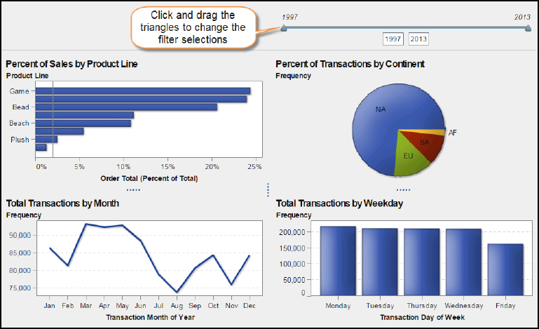
So what we’re going to do is set up four graphs and one control in a section to try to get answers to the questions above. We are going to look at the breakdown of sales by product line, where the transactions are coming from, and in what months or weekdays they are occurring. We also are setting up filtering of objects through interactions so that we can drill down into the data to get more insight. Here’s the report that you build by the end of this chapter:
Figure 2.7 Final result of our first report

Adding a data source
A data source can be anything that contains information in a structured form. This can be spreadsheets, text files, database tables, and so on, just as long as there is a way for the application to understand how the data is to be brought in. For example, if you wanted to bring in a spreadsheet, there is the option for which worksheet, start row, and columns to bring in. With a TXT file, there are similar options such as choosing which delimiter is used to separate the data.
There are also multiple areas to which you can bring in a data source to the application. There is an option to bring in data locally, which is from your personal computer. You can also pull in data from a server. This can be SAS data sets on a SAS server or database tables on a server that is not from SAS. To get data from a server that is not from SAS, software must be licensed for it and the administrator must grant access. There is also social media data such as Twitter, Facebook, or Google Analytics where you can pull information that is publicly available.
To add a data source to the report:
1. The left pane is where you can add data sources to the report. When you click on the square with a + sign in the Data tab, the Add Data Source window appears. Everything in the data sources table is what is currently on the SAS LASR Analytic Server and available to the user.

2. Find the VA_SAMPLE_SMALLINSIGHT data set. If you do not see it, then talk to your system administrator about getting the Visual Analytics sample data loaded onto the system.
3. Select the VA_SAMPLE_SMALLINSIGHT data set and click Add. The data source appears in the Data pane and is ready to use.
Working with data sources
After you click Add in the Add Data Source window, the data set populates into the Data tab. Each of the category data items has a number after it. This is the number of distinct values each data item contains. For example, there is an 8 after Product Line, which says that there are 8 different product lines across all of the data that was brought in.
Figure 2.8 Bringing in a data source to the Designer

The data items are divided into three sections when brought in which are Category, Measure, and Aggregated Measure. There are others such as hierarchies and geography items that can be created. Those are covered in later chapters.
| Category | Categories can be a combination of character, dates, geography, and numeric data items. This is also the default section if the application cannot recognize a number or date as it comes in. |
| Measure | Measures are values that can be used in computations. These are numeric data items that have a numeric format applied to them. Frequency is a default measure that shows up for every data set and represents 1 for every row of data. |
| Aggregated Measure | Aggregated measures are numeric values that are computed using predefined conditions. This includes averages, sums, percentages, and so on, of a certain field. Frequency percentage is a default aggregated measure for every incoming data set. |
Incoming columns from a data set are going to fall into the Categories or Measure areas. Aggregated measures other than frequency percentage must be created. You can create aggregated measures as well as other data items by clicking the drop-down menu at the top of the tab below the data set.
Figure 2.9 Adding new data items

In this menu, there are various options to create new items for the data set.
New Hierarchy is a way to relate data items to one another in a parent-child hierarchical manner so that you can drill down into specific areas. This works well for one to many relationships such as a product line to its individual products.
New Custom Category creates a new category field that is a grouping based on a previous field. For example, test scores could be grouped into their respective letter grade (A, B, C, D, or F).
New Calculated Item is a way to create new data items in the application by using a combination of data items in the data set as well as logical and arithmetic operators. This is covered later in this chapter.
New Parameter is a way to create a data item that can pass values based on selections within objects.
New Data Source Filter is a way to place a condition on the data set that keeps the rows that you require. For example, if you wanted only the sales for the United States, then you could use a Data Source Filter to keep all rows where Facility Country/Region equals US.
Data item properties
The last thing to cover in the Data tab is how you can change the properties of the data items.
Figure 2.10 Property options for data items

At the bottom of the Data tab is a two-column table that contains the metadata of each data item. Name is how the data item title is going to appear on the canvas, so this is where you can change the name to something that is easier to understand for the viewer.
Classification is the section of data types that each item can fall into. Depending on the value, this is where the user can switch categories from measures and vice versa.
Format is how the values of the data item appear on the canvas. This is important for measures since you can change whether the numbers show up as decimals, percentages, currency, and so on.
Aggregation is another property that applies to measures. You can specify a measure as a sum, average, count, among many other options.
Sort Options identifies whether there was a custom sort on the data item or not.
Creating new data items
For our report, we are going to create two new data items for our data set, a new date and a derived item.
Change the data item format
We want a new data item that is just the year so that we can easily look at the data by years.
Here are the steps:
1. Right-click Transaction Date and select Duplicate Data Item.
2. Click Transaction Date (1) to select it.
3. In the Properties area, change the name to Transaction Year.
4. Change the Format to Year.
What we did here was create an additional data field in the Designer so that we would have the data in two different formats. This did not add an extra field to our underlying data set. It just appears that way on the data tab.
Working with SAS dates
In the preceding example, we took a data item with a full date and created a new data item with just the part of the date (year) that we wanted just by changing the format of it. This can be done since SAS date types are so versatile. There is no need to use a function or follow any process. By changing the format, the underlying full date is still there, but only the part that you want will be shown. This can be done with many date formats including Day of Week, Month, and Month-Year.
Using a derived data item
Derived data items are common predefined aggregate measures built into the application to make it easier for you to create new actionable variables. Similar to the data item that we just added above, these are not new fields in the data set. They are just calculations defined so that when you use them in the report, the application already knows what calculation to perform on the original data field. In the following steps, we are going to create an aggregate measure through one of the derived item options.
1. Right-click Order Total in the Measures section. Select Create and then Percent of Total. All of the options in this menu are default aggregate calculations that can be used with measures.

2. On the Data tab, go down to the aggregated measures section, and you see Order Total (Percent of Total) at the bottom.
Working with the layout
Now that we have our variables set up, we can start to bring objects into the canvas and design the report. There are two ways that you get objects into the canvas. One is through the Insert menu on the top toolbar. The other way is to drag the object from the Objects tab in the left pane.
Starting the layout
The report uses four objects in the canvas area.
1. For our first object, we are going to drag a bar chart by dragging the Bar Chart text under Graphs on the Objects tab to the canvas.
2. The next object is going to be a pie chart. As you drag the object, notice how the application starts to guess how you would like your objects split on the canvas, either horizontally or vertically. Split this one vertically with the pie chart going on the right side.
3. Our third object is a line chart. This goes under the bar chart.
4. The final object is a bar chart that goes under the pie chart. Your canvas should look like the following figure afterward.

When an object is placed on the canvas, it always has the red circle located in the lower right corner of the canvas. This is simply a warning to indicate that there is no data specified for the object yet. Some objects require only one data item; but others can require multiple measures and categories. Until that minimum is met, the object does not populate with the data and the red circle remains.
Populating your objects
As with adding objects, adding data to the objects can be done in two ways. One is through the drag-and-drop function using the Data tab in the same way that you can drag objects with the Objects tab. The other way is through the Roles tab in the right pane. When clicked on the object, the Roles tab displays all of the possible locations for data items within the object.
Here’s what to do for our report:
1. On the Data tab, find Product Line.
2. Drag it to the first bar chart in the top left corner.
3. Notice how the Roles tab is updated with Product Line as the Category.

Once Product Line is dropped or selected, the chart automatically populates as you can see in the above picture. Some objects only need one data item. When that is the case, they default with Frequency as the measure. Frequency is just a count of every row. However, for our example we are going to use the aggregate measure, Order Total (Percent of Total), that we created earlier. You can do that by clicking the Measures drop-down list on the Roles tab, selecting Replace Frequency, and then finding the Order Profit (Percent of Total).
Improving the data object appearance
Now that our first chart is made, we can change the appearance of it by using the Properties and Styles tabs in the right pane. The Properties tab is where we can change the context of what appears on and around our bar chart. The reason to make changes to the appearance is so that the end viewer can get more context around what they are looking at and to make it more visually appealing when viewers first glance at the report and objects.
Limit chart junk!
There are ways that you can improve the appearance of objects in your report and also ways that you can actually make it harder to interpret. In The Visual Display of Quantitative Information, Edward Tufte writes about how to avoid using chart junk. He explains how chart junk is any decoration of graphics that does not give the viewer any additional information. This can be grid lines, tick marks, unnecessary labels, and so on. Using all those extra lines that do not say anything just makes it harder for the viewer to know what to look for.
Changing the properties
Here are a few things that you can change to improve the appearance for the end viewer.
• Under General, change Name and Title to Percent of Sales by Product Line.
• Change to bold and change the Title to 16 pt font.
• Under Bar, select Horizontal for the Direction.
• Under Reference Lines, click Create new reference line. Use a value of 0.02 and click Add.
• Under Grid Lines, uncheck the Show grid lines box.
Changing the appearance
The Styles tab is where we can change the look and feel of the chart. Here are some examples:
• Under Data Styling, change the Data skin to Matte.
• Under Data Colors, change the first box under Fill to the color of your choice.
Most of these changes were just for you to get used to using the various options available for the objects, but a few of them have more meaning.
Making your visualizations more appealing
In Information Visualization, Colin Ware describes through the perceptual process of how our eyes interpret an image. Pattern perception is a key component for visualizations since we want to find discrepancies and trends in the data. When we apply any of the data skins to an object, the data display of the object is given a certain texture and shading that makes the data portion more appealing to the eye. This can speed up pattern recognition because the viewers’ eyes will gravitate more to the data instead of other areas in the report.
Adding a reference line
The reference line is good to use to benchmark the data against some number.
Figure 2.11 Bar chart with a reference line added

So, for our example, corporate has come to us saying that they want to see if all of the product lines are pulling their weight of sales. We set the reference line as a benchmark at 2% to see if any product lines fall under that amount. Since we have added the reference line, the grid lines can get a little confusing, which is why we unselect them.
Adding data to other objects
Now that we have completed our first object, it is time to fill in the rest of our objects with data and get them to look the way we want.
Here’s the steps to create the additional objects:
Pie chart (top right corner)
1. Name and Title: Percent of Transactions by Continent (Bold and 16 pt font).
2. Under Data Labels, check Show Category Labels.
3. Uncheck Create Other slice for minimal values.
4. Uncheck Show Legend.
5. Data Skin: Matte.
6. Roles:
Category: Facility Continents
Measures: Frequency
Line chart (lower left corner)
1. Name and Title: Total Transactions by Month (Bold and 16pt font)
2. Data Skin: Matte
3. Roles:
Category: Transaction Month of Year
Measures: Frequency
Bar chart (lower right corner)
1. Name and Title: Total Transactions by Weekday (Bold and 16pt font)
2. Data Skin: Matte
3. Roles:
Category: Transaction Day of Week
Measures: Frequency
When you are all finished, your report should look something like this:
Figure 2.12 Report with all chart objects and data items added

Within this graph, we have created a report that displays an overall analysis of the purchases from our customers. We can see which products our customers are spending the most on, where in the world those transactions are coming from, and a breakdown of the months and days of when they occurred. This, however, is just a static view of the data. After looking at this report, you might want to know the geographic breakdown for just the beach product line or the months in which customers buy the most games. In the next section, we start to connect the objects together so that this report becomes dynamic and you can access the discovery part of their data analysis.
Working with data objects
For every report where you are doing analysis, you want to not only pack the most data you can onto the screen but also give the user multiple views of the data. Being able to filter data by certain conditions gives the user the ability to see the data from a different point that might interest them or bring about an idea. That could be within a certain date range, by a category, or some other condition that they see fit. Being able to break down the data in this way gives more power to you to see more visualizations about their data, which could lead to additional insight about what they are exploring.
Within the Designer there are multiple ways to filter data including using a Data Source Filter; adding a filter in the Filter tab for an object; applying a control in the prompts sections; and setting up interactions in the Interactions tab. The Data Source Filter can be found on the left pane Data tab. When you click on the drop-down menu there is an option to create a New Data Source Filter. This is a filter that you can place on the whole data set before even working with it. Once set, all of the data items that a user can drag to objects are pre-filtered with that set condition. We are going to use the other ways to filter data in our report; the steps are in the following sections.
Using the Filter tab
Another way is to use the Filter tab on the right pane when working with an object. Here, you can select certain data items and filter out values so that certain rows never get displayed by the object. When you get to the tab, you have the option of selecting any data item in the data set through the drop-down list or selecting advanced in the drop-down list and creating your own filter.
In our report, we know that we’re going to close our Oceanic and Asia facilities since they’re becoming unprofitable and even though it is a small amount, we want it out of the continent breakdown. Here’s what do to do for our report:
1. Go to the Filters tab in the right panel.
2. Make sure that Percent of Transactions by Continent is selected in the first drop-down list.
3. Click the second drop-down list and select Facility Continents.
4. Click Add Filter.
5. Uncheck AS and OC. You should be able to see the pie chart update without those continents in the canvas.

Filtering with report and section prompts
If we want to give the end viewer control over what is being filtered, there are two ways to do that. One way is through the report and section prompts that sit at the top of the canvas. You can put control objects in these areas of the canvas, which then control what data filters down into the sections and objects. The report prompt filters data for all of the sections. The section prompt filters data for all of the objects in the individual section. Each of the control objects that can be used in a prompt are listed below:
| Object | Description | Best used with … |
| Drop-down List | Lists all of the possible values in a drop-down menu. | Categories with many different values |
| Button Bar | In a ribbon form, lists all of the values of a particular category. | Categories with only a few different values |
| Text Input | Similar to a search field, this is a text box that enables you to enter text. | Descriptive categories where you might want to search for a keyword |
| Slider | Best used when you want to filter based on a chronological range. Works best with dates. | Dates |
*The Drop-down List control cannot be used in the section prompts.
Adding a slider object
For our report, we are going to add a slider to the report. This can be done through a drag-and-drop operation just like all of the other objects.
Here’s how you do it for this report:
1. Under Controls on the Objects tab, drag the Slider to the section prompt of the canvas.
2. Add Transaction Year as the Measure/Date in the Roles tab.
3. The object then populates with the minimum and maximum values from our data field as shown below:
You can then modify the triangles on the slider to get the range that you want to see. If the triangles are put on the same year, then the data is filtered for just that one year. After the triangles are set, you see the data within the objects change to how they have filtered the report. Remember that this filters all of the data in a section.
Adding object interactions
The other way to let the user do filtering in SAS Visual Analytics is to build interactions between objects. Earlier in the chapter, the Interactions tab was mentioned as a way to connect objects and sections together. For this section, we are just going to focus on connecting objects together. But you can also connect objects to other sections, reports, info windows, or even set-up external links. This can be done by going to the Interactions tab of an object in the section and clicking the New drop-down menu. Here is where you can find the ways to set up links to areas outside of the section.
Create an interaction
Here’s the steps to create an interaction in our report:
1. Make sure that our initial “Percent of Profit by Product Line” bar chart is selected. The Interactions tab can be used for every object, so we want to make sure that we are setting the one for the bar chart.
2. On the Interactions tab, select New and then Interaction in the drop-down list.
3. Stick with the first selection but change the drop-down list so that it reads Percent of Sales by Product Line filters Percent of Transactions by Continent.

4. Click OK.
When we click OK, the connection is set up between the two objects. You’ll notice the data change in the pie chart if you click any of the product lines in our first bar chart.
The Filter works just like any other way of filtering would. If the connection is established between the objects and a value is selected, then all other values are filtered out of the proceeding object. Brushing, on the other hand, highlights the values instead of hiding them. Since we are working with aggregations, the brush option would not really work and is better used with individual data points such as scatter plots.
Using the interactions view
One interaction is nice to use, but with many objects in a report, you might want to have multiple interactions set up so that the end viewer can really dig deeper into their data. Another, and more visual, way to add interactions is to use the Interactions View button. When you click this button in any object, you notice that it brings up all of the objects in your section. You can see the one that we have already set up by the filter icon and arrow between the two objects. We can easily create more filter interactions here by positioning the cursor over an object and then clicking and holding to draw a line to the other objects. Here are the additional interactions to set up for our report:
• Percent of Profit by Product Line filters Total Transactions by Month
• Percent of Profit by Product Line filters Total Transactions by Week
• Percent of Transactions by Continent filters Total Transactions by Month
• Percent of Transactions by Continent filters Total Transactions by Week
• Total Transactions by Month filters Total Transactions by Week
Your web of interactions should look something like this at the end:
Figure 2.13 Interactions view

The filter cannot go each way from object to object, so we have to be strategic with how we set up all of the interactions. For the sake of this report and as a good visualization practice, we keep all of the interactions set up in a simple manner, left to right and top to bottom. In this way, anything selected from the top left object filters the rest of the objects, the top right filters the bottom ones, and so on, from there. With this setup, everything eventually funnels to the final object in the bottom right. Now you can go back into your report and check for yourself how everything works.
Saving the report
Now that we are all done with the development of the report, we want to save it before doing anything else. Saving works like most other applications, and you can just select the File menu in the top toolbar and then click Save As. This brings you to the Save As window that gives you your SAS file locations to save.
Figure 2.14 Save As window

Under SAS Folders, you have a few options to choose from. My Folder is a location specific to your account for the application. Anything that you put in here cannot be seen by anyone else. All of the other folders are public, which means that other people on the system can access them. Until your reports are finalized, you might want to keep them in My Folder so that no one edits them by accident.
Reviewing the report
Our report is complete! We have thought about what we wanted to learn from this report, set up all the objects and data for it, and then customized it with connections and filters so that we can get multiple views of our data. After all that developing, now we can move into the data analysis part and see whether we can find out anything interesting in the data.
Users can go about finding their analysis in any way they want, but it’s also important to go back to the questions that we wanted to answer before we started developing the report. We had an interest in learning about our customers’ buying behavior and where we were getting the most profit from them. Here’s some intriguing findings that can be found in this report.
• Struggling Thrift Product Line
The Thrift product line only makes up 1.27% of sales and that decreases to 0.40% over the last five years (2009-2013). Being such a small part of the business, this product line needs more investigating to find out if it is even profitable enough to be worth keeping up.
• Customers do not go for Plush on Fridays
Most of the product lines either get a little higher (Bead, Gift, Beach) or lower (Game, Figure, Promo) with sales on Fridays compared to the rest of the week. This can be attributed to the purpose that each line serves. For example, people tend to go to the beach more on the weekends. So Friday would be a major shopping day for that line. However, the Plush product line sees an 80-85% drop on Friday sales, which is an extreme difference compared to all of the other lines. What could cause customers to only buy Plush toys Monday through Thursday?
• Beach items only sell in the summer
Of course, there would be some seasonality with the beach line, but it turns out to be very dramatic. From October to March, there is little to no sales for beach items; and in the Europe stores, they do not even attempt to sell anything in those months. This requires some further inventory analysis to make sure that we are selling all of our beach products off before those months come each season.
These actionable insights are just a sample of what can be found in that single data set. By setting up a report and using SAS Visual Analytics to dive into the data, we can analyze data much quicker compared to querying a table or scrolling through a spreadsheet. Not only that, but with the click of a button, you can have almost any view of the data that you want. With this chapter we have just scratched the surface. In the next chapter, we dive into dashboards and show some additional features that you can work with in the designer.
References
The following sources provide more information about the topics discussed in this chapter:
SAS Institute Inc. 2015. SAS Visual Analytics 7.3: User’s Guide. Cary, NC: SAS Institute Inc.
Tufte, Edward R. 2001. The Visual Display of Quantitative Information. Cheshire, CT: Graphics Press.
Ware, Colin. 2013. Information Visualization: Perception for Design. 3rd ed. Waltham, MA: Morgan Kaufmann.