“And so I fell in love with a color—in this case, the color blue—as if falling under a spell, a spell I fought to stay under and get out from under, in turns.”
–Maggie Nelson, Bluets
CHAPTER 7
ADDING COLOR TO SHADOWS
Shadows are everywhere. It actually takes a great deal of effort to create a shadowless image: you need several lights and some reflectors or fill cards. But shadows aren’t our enemy. They’re actually fantastic companions for color. Remember the scenario with orange-haired Elinor at the end of chapter 1? I referred to the shadows as a placeholder for the blue light I added. This chapter will cover the technique of intentionally creating shadows on your subject and background in order to fill them in with colored light.
SHADOW TYPES
Now that we’re thinking of shadows in terms of placeholders, let’s go over the different types of shadows.
HARD SHADOWS
Think of the quality of light of a cloudless sky on a sunny day, or of a flash with no modifier. That quality of light is referred to as “hard.” The shadows are crisp and dark. Smaller light sources make harder shadows, which means that a flash produces a harder shadow than a Profoto monolight fired from the same distance.
How defined the shadows are depends on the distance between the light and the subject, as well as the distance between the subject and the background. For shadows with the best definition, the light needs to be a good distance from the subject and the subject needs to be close to the background. Note how defined the model’s shadow is as she stands close to the background (Figure 7.1). The farther the subject moves off the background, the less defined the shadow will be. Also keep in mind the distance of the light to the subject. It needs to be far enough back that the light spread is even across the whole frame. If it gets too close, a hot spot will form in the middle.

Figure 7.1 Hard shadows are more defined than soft shadows. The closer the subject is to the background, the more defined their shadow will be.

Figure 7.2 Soft shadows have a less-defined, feathered edge.
SOFT SHADOWS
Diffused light, whether it’s sunlight diffused by clouds or a flash diffused by a scrim, softbox, or umbrella, is considered “soft.” The shadows you get from soft light source have rounded edges and a smooth transition from light to dark (Figure 7.2). You can soften or remove background shadows by moving your subject away from the background. Also, the larger the light source, the softer the light; moving the light closer to the subject reduces shadows as the light wraps around them.
DIRECTIONAL SHADOWS
The more extreme the angle of the light source in relation to the subject, the longer the shadow will be. For example, on the right in Figure 7.3 I have an ungelled hard light at an angle to the model. It creates a long, defined shadow, as seen in Figure 7.4. I also had a cyan-gelled softbox in a more frontal position, which bathed the scene in soft blue light and created a soft shadow to the right of the subject (Figure 7.5). When used together, the ungelled light fills in the majority of the cyan shadow on the right side of the subject, while the defined shadow on the left remains intact, filled with the cyan light (Figure 7.6).

Figure 7.3 In relation to the subject, I placed a cyan-gelled softbox in a frontal position to my model, and an ungelled, hard light at an angle to her right.

Figure 7.4 The side angle of the hard light and the close proximity of the model to the background created a long, defined shadow on the left.

Figure 7.5 The cyan-gelled softbox fill covered the scene in cyan light, leaving a soft shadow on the right.

Figure 7.6 The ungelled hard light filled in much of the soft cyan shadow on the right. The cyan fill is left intact within the hard-light shadow on the left.
WRAPPING SHADOWS
You’ll need a certain light modifier to create wrapping shadows—specifically a ring light. A ring light fits around your camera lens, and thus gives you light that is centered exactly to the lens. It’s designed to light your subject evenly from every direction. If you use the ring light in close proximity to your subject (as is common practice in beauty shots), you often don’t see much of the background. However, if you back off from the subject 5–7 feet, you’ll see the wrapping shadow that the modifier creates.
By positioning your subject 7–10 feet away from the background (Figure 7.7), the shadow is diminished (Figure 7.8). If you move the subject closer to the background (Figure 7.9), you will see a soft shadow that wraps around them (Figure 7.10). Now, let’s integrate some color. I gelled my ring light cyan, and positioned a red-gelled softbox in front of my subject, just out of the frame. You can see the result in Figure 7.11: a blue scene with a red subject and a red wrapping shadow.

Figure 7.7 The ring light is 5 feet from the subject, who is 5 feet from the backdrop.

Figure 7.8 The resulting shadow is soft and shapeless.

Figure 7.9 The ring light is 5 feet from the subject, who is right in front of the backdrop.

Figure 7.10 The resulting shadow is soft and wrapping, which is the goal.

Figure 7.11 The cyan-gelled ring light creates the wrapping shadow, which is filled in by a red-gelled softbox in front of the model.
SHADOW FILL
The shadows in your image don’t necessarily need to be created by your subject. In Figure 7.12, I positioned my light overhead and affixed the barn door snoot to it, closing the barn doors almost all the way shut. This created a sliver of light, which left the image bathed in shadow. I added a yellow gel to the light, as well as a cyan-gelled ring fill, and got a colorful duotone (Figure 7.13). I used a similar setup in Figure 7.14, except the main light was ungelled and frontal to the subject.

Figure 7.12 The barn door snoot creates a narrow light source with fast fall-off.

Figure 7.13 I gelled the snooted light yellow and added a cyan-gelled ring light fill to create a colorful dutone.

Figure 7.14 In this shot, the barn door is positioned in front of the subject, rather than above her.
In this next scenario, I created crisp shadows on my subject to fill in with color, all on a shadowless background. I placed the model right in front of the white background to achieve a vibrant red color from the red-gelled bare flash boomed overhead (Figure 7.15). I used a ring flash (gelled blue) to fill in the shadows. The high position of the hard light creates a low-angling shadow, which doesn’t appear in my frame (Figure 7.16). The blue fill light, while strong enough to fill in the shadows, is placed too low in relation to the red light to greatly change the red hue, resulting in a slightly magenta and blue duotone image (Figure 7.17).
As always, the output of your two lights will depend on the gel colors you select. In this scenario, my main light is powered 16 times lower than the fill light, in part because the main light is bare bulb and the fill light is passing through two layers of diffusion; also, the red gel is a less dense color than the blue gel, meaning more light gets through it (Figure 7.18).
I didn’t like how magenta Isabella’s shirt looked in the lower half of the image, so I made a gradient adjustment in Lightroom from the bottom of the frame up to the middle of the image, shifting the temperature warmer and lowering the highlights (Figure 7.19). I used the targeted action tool in the HSL panel to tweak the reds and blues until I had the exact hues I wanted. I wrapped up my color grading in the Camera Calibration panel. You can see in Figure 7.20 that her shirt is now seamlessly red and the blue shadow areas have been opened up to show more detail.

Figure 7.15 I position the model close to the white sweep to achieve a vibrant red background.

Figure 7.16 The high position of the light creates a low-angled shadow.

Figure 7.17 The blue fill, while strong enough to fill in the shadows, is too low in relation to the red light to greatly change its hue, resulting in a slightly magenta and blue duotone image.

Figure 7.18 The red-gelled bare bulb light is powered 16 times lower than the blue-gelled ring fill, due to the difference in gel density and light diffusion.

Figure 7.19 The Lightroom settings. In order to remove the blue cast on the model’s white shirt, I made a gradient adjust to the lower half of the image. This shifted the temperature and tint more yellow/magenta, and lowered the highlights.

Figure 7.20 The final shot. The magenta color cast is gone, resulting in a dramatic red and blue image.
UNDER LAYER
In the previous scenario, I mentioned how powerful color temperature is when working with both a cool color and a warm color. With a slight shift of temperature to my RAW file, I was able to turn the slight magenta color cast back to the intended red. This next example will show you how to stack a warm color with a cool color. This will allow you to choose which tones emerge in your image based on the color temperature settings you choose in post-processing.
To achieve an even, soft red light (Figure 7.21), I positioned two lights, one on either side of the model, and aimed them into nearby white walls (Figure 7.22). You could also bounce them into v-flats or use large, soft-light modifiers (such as an octabank or softboxes), as space allows. You essentially want to create the largest light source you can in order to have soft light with a good catchlight in the subject’s eyes.

Figure 7.21 The underlayer of the image is lit with soft, even red light.

Figure 7.22 To achieve the red light, complete with large catchlights in Emilija’s eyes, I bounced the two red-gelled lights into nearby white walls. The main light is gelled cyan, and fired through a softbox.
Next, I positioned my cyan-gelled softbox close to Emilija, and powered it high enough to ensure it would be the predominant color (Figure 7.23). Depending on how I shift the temperature in Lightroom, I can flesh out the warm tones or render them almost nonexistent (Figure 7.24).

Figure 7.23 The main light is powered high enough to overpower the red lights, making it the dominant color.

Figure 7.24 Shifting the temperature and tint in Lightroom makes the warm tones increase or disappear completely.
Another important thing to consider is how to retain drama in your image. I went to great lengths to make an eye-catching image, from my model selection to who I selected to do hair and makeup to how I lit and posed my model. All that is for naught if I’m unable to carry the image the rest of the way to the finish line by properly handling it in post-processing. Look at how dramatically different the same image looks in Figure 7.25, with just a few tweaks in the Basic panel and tone curve. The top image was my initial color grading. After walking away from my computer screen for a few hours and returning to the image, I could see that I was overexposing it in Lightroom, losing the drama that I had constructing with my lighting. By lowering the Exposure slider, cooling off the temperature, bumping up the highlights (to offset the lowered exposure), and raising the shadow portion of the red tone curve, I got Figure 7.26. Emilija is blue, with red highlights around her face and in her eyes.

Figure 7.25 The Lightroom settings. By lowering the exposure, cooling off the temperature, raising the highlights, and raising the shadows areas of the red tone curve, I was able to get a dramatic color grade.

Figure 7.26 The final shot. Emilija is blue, with red highlights around her face and in her eyes.
MULTIPLE SHADOWS
As we learned in chapter 1, per the additive color model, when red, green, and blue light (or cyan, magenta, and yellow) overlap, white light is created. Accordingly, if we were to take three lights and gel them in those colors, colorless light will be formed where they overlap. The magic happens when the overlapped light is interrupted by a subject, which creates an array of colored shadows (Figure 7.27).
I discussed this technique in my previous book, Studio Anywhere 2: A Photographer’s Guide to Shaping Hard Light (which bore that image on its cover). Two years have passed since I wrote that book and I’ve had a lot of time to explore the many variations this technique offers. I’ve learned that you can still achieve neutral light without using magenta, as is illustrated by Kevin Hart’s yellow and cyan shadows in Figure 7.28. I’ve also experimented with different methods of creating shadows, like the hair movement in Figure 7.29. Finally, I’ve minimized my gear rig needed to execute this technique.

Figure 7.27 When cyan, magenta, and yellow light overlaps, colorless light is created. Multicolored shadows result from one or more of the colored lights being blocked by an object or person.

Figure 7.28 Neutral light can still be achieved using just cyan and yellow gels, as illustrated here with actor Kevin Hart.

Figure 7.29 Windblown hair is a fantastic shadow generator, making it perfect for this technique.
When I first began using this technique, I lugged three light stands with me to shoot. This was a tiring task, especially when working alone, as I often do. I’ve since come up with a lightweight (and cheap) solution: cold shoe extension rails. In Figure 7.30, you can see that I have two 16-inch rails connected to a Nikon AS-19 speedlight stand (it’s better than the one that comes with the Cactus flashes). I also flattened out a small metal corner brace and used it to join the two rails. The joint bears the weight of the speedlights (rather than the flash stand) and levels out the two rails, which would otherwise sag under the weight of the flashes.
The greater the distance between the lights, the longer the colored shadows will be in the image. In Figure 7.31, the three lights are positioned next to each other, which results in short, colored shadows and a large, colorless shadow where the lights all overlap. When I added 1 foot of space between each light, the colored shadows grew while the colorless shadow decreased (Figure 7.32). Another benefit of having all three lights on one stand is it’s easy to quickly reposition them for longer shadows (Figure 7.33).

Figure 7.30 I use two 16-inch cold shoe extension rails with a metal corner brace in the middle to bear the weight of the rails and the speedlights. This allows broad spacing of the lights on a single light stand.

Figure 7.31 The three colored flashes are positioned next to each other, resulting in shorter colored shadows and a large, colorless shadow.

Figure 7.32 The three colored flashes are placed a foot apart, resulting in longer colored shadows and a minimal colorless shadow.

Figure 7.33 With all three flashes on one stand, I can easily reposition them to change the length of the shadows.
I recently did a beauty shoot with a model covered in jewels. She had gems glued all over her face and chest. I was already planning to use this tricolored technique, but I also added a Hoya star filter to my lens to transform the spectacular highlights from the jewels into starbursts (Figure 7.34).
To maximize the starbursts, I positioned my lights at an angle to the model, Maddie, so I could see the lights reflecting in the jewels (Figure 7.35). Since my flashes don’t have modeling lights, I always hit the “test” button on the transmitter so I can see where the light is falling in the scene (making sure to first tell the model to look away from the flashes).

Figure 7.34 The setup. My light(s) are positioned to my left at an elevated position in relation to the model in order to maximize the lens flare reflections in the jewels.

Figure 7.35 The lighting diagram. To achieve balance between the gelled lights, my green light is at 1/2, my red light is four times lower at 1/8, and my blue light is even lower, at 1/16.

Figure 7.36 I put each color on its own channel, dialing them in one at a time. I turn on all the channels and make sure I get a neutral color in the overlaps.
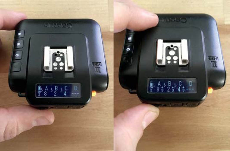
Figure 7.37 The invaluable feature of the Cactus V6II transmitter is that once I get a balanced ratio between the lights, I can power them all up or down while maintaining the integrity of the ratio.
The first thing to do when using this technique is balance the output between the three lights. Your light outputs will vary depending on the density of the shades of the colors you’re working with. I’ve found that my green light (set to 1/2) tends to be twice as bright as my red light (set to 1/4), which is twice as bright as my blue light (set to 1/8) (Figure 7.36). With the Cactus V6II transmitter, I can quickly adjust each output to create a perfect balance by lighting in layers, one at a time. I can adjust each light in 1/3-stop increments and once the perfect color ratio is achieved, I can dial the global power up or down, maintaining the integrity of the ratio (pretty cool, huh?) (Figure 7.37).
Once I had my settings figured out, I moved around Maddie, shooting from a number of angles, to ensure I got the best-possible starbursts (Figure 7.38). The best part of using this technique is the beautiful chaos that occurs whenever the model moves, creating more colorful shadows (Figure 7.39). As you can see in my setup shot, I used a stool on casters, which allowed me to move to my gear rack and my light stand, as well as back and forth to alter composition, without a lot of standing up, sitting down, and walking on my knees. It saves me a lot of time and energy.
In Lightroom (Figure 7.40), I decided to add a warm tone to the image by lowering the highlight points in the green and blue tones curves, thus adding magenta and yellow to the image. Though I could’ve simply adjusted the color temperature setting to achieve a warmer image, by lowering the highlight points of the cooler tone curves instead, I added warmth to the highlight portions of the image, which reduced the shininess in her skin (Figure 7.41).

Figure 7.38 The RAW file. Maddie is now both colorful and sparkly.

Figure 7.39 My favorite part of this technique is the unplanned, colorful shadows that result from the subject’s movements.

Figure 7.40 The Lightroom settings. To minimize the glossiness of the model’s skin, I lowered the right side of the blue tone curve, which added warmth to the highlights.

Figure 7.41 The final shot. Maddie shines bright, like a diamond.
MULTIPLE EXPOSURE
What’s more fun than playing with chaotic, colorful shadows? Why, adding an extra layer of chaos and color, obviously. Many cameras have a multiple exposure feature. In the Canon 5DIII, there are a few options to choose from before you get going. You need to select how many exposures are in one shot; if each exposure is saved or just the resulting image is saved; and how the images are blended together (Figure 7.42).
In Figure 7.43, you can see the colorful shadows on Curtis’ shirt, which were created using the CMY technique we just discussed. It’s a pleasant image, but I want to add extra punch to it, which I can do by making a multiple exposure with the same CMY technique. As usual, I have each of the three lights on their own channel.

Figure 7.42 When making an in-camera multiple exposure with a Canon 5DIII, you have several options to select, such as how many exposures are in one shot, how the exposures are blended, and if every shot is saved or just the final image.

Figure 7.43 Here I used cyan, magenta, and yellow lights to get colorful shadows on Curtis.
I begin by setting my camera to take three exposures with the blending mode set to “average.” For each 3-shot portrait, I start by toggling off channels B and C, leaving on just A, and take a shot. Then I toggle off A, and turn on B and take a shot. Then I do the same with C (Figure 7.44). In the second between each exposure, as I am toggling channels on and off, my composition shifts slightly, as does my subject. This means that each colored exposure is different (Figure 7.45), resulting in an even more vibrant, chaotic image (Figure 7.46).

Figure 7.44 I made a multiple exposure using three shots. One exposure was made using only the cyan light, one with only the magenta light, and one with only the yellow light.

Figure 7.45 Since I was shooting handheld, each of the exposures is slightly different. Both the subject and my hand moved slightly in between shots as I toggled the different light channels on and off.

Figure 7.46 The result is a much more colorful, chaotic image than the original, multicolored portrait.

Figure 7.47 I often direct my subject to make movements, or I move the camera dramatically between each exposure, resulting in a colorful, abstract image.
There are endless possibilities once you start experimenting with multiple exposures. When I am making a multiple exposure, I make sure to explain to my subject how many exposures there are in each sequence, giving them a better idea of what I’m doing and when we’ve moved on to a new shot. Sometimes I direct them to be still, or I change the camera angle or move closer or farther from my subject between each exposure (Figure 7.47).
You can also experiment with using a different number of exposures per shot and different blending modes. You can see how changing the blending mode alters how each image looks in Figure 7.48. In Figure 7.49, I used the same technique that I did with Curtis in Figure 7.46, except this time I used red, green, and blue gels, with the blending mode set to “bright.” Figure 7.49 is straight out of camera. Zero editing. The resulting images makes me think of what it might look like if each colored layer of a screen print came to life and started moving on its own.
Colored shadows can be created in a myriad of ways. Explore layering different color combinations, and combining these techniques with concepts from previous chapters. The exploration is my favorite part.
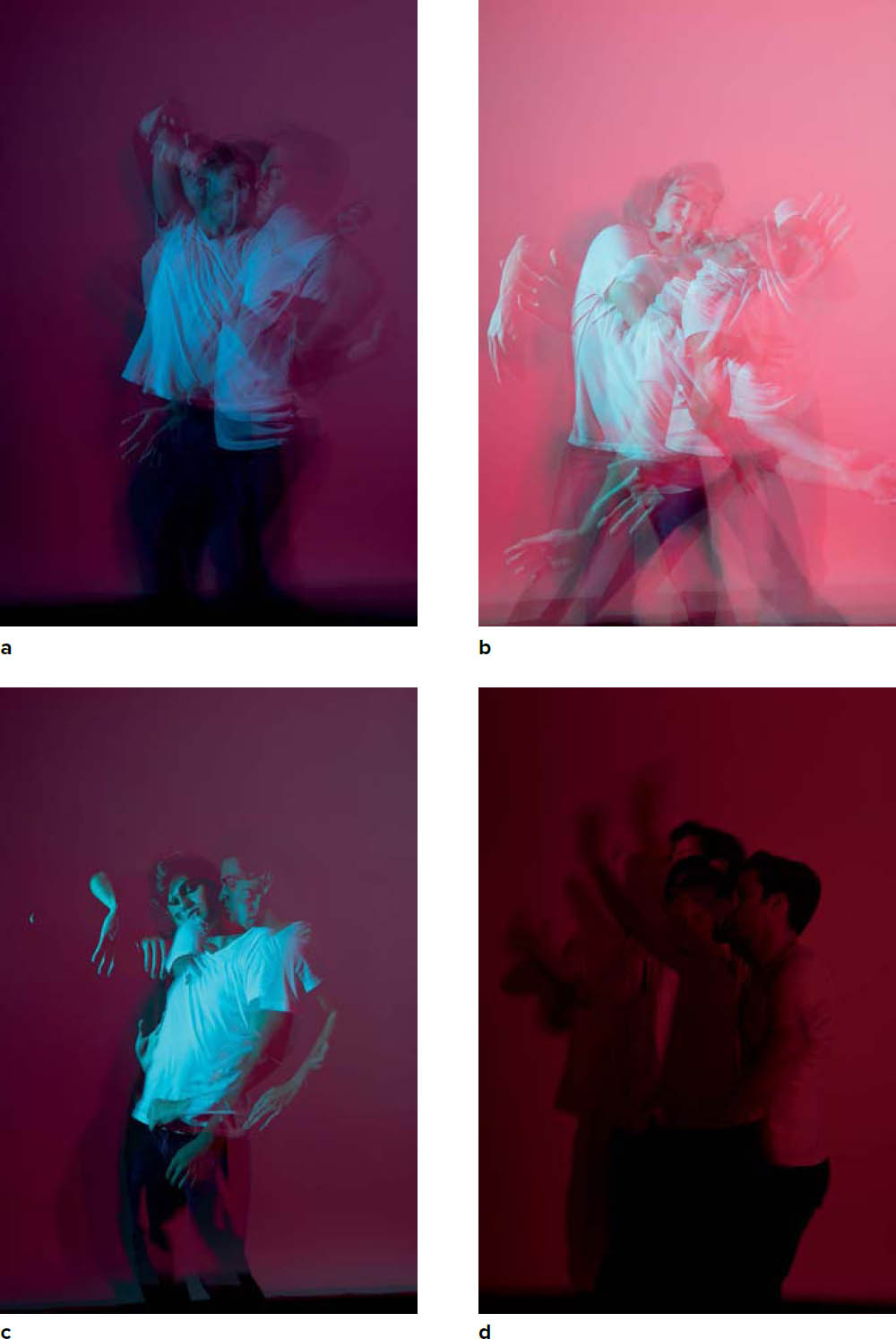
Figure 7.48 The image changes dramatically just by switching the blending mode. The blending modes used in these images are (a) additive balance, (b) average, (c) bright, and (d) dark.

Figure 7.49 To make this straight-out-of-camera image, I used the same technique I did with Curtis in Figure 7.46, except the blending mode was set to “bright.”