
A time-series analysis allows us to view the changes to the data over a specified time period. You see this being used all the time in presentations, on the news, and on application dashboards. It's a fantastic way to view trends.
For this recipe, we're going to use the Accidents data set.
- First, import the Python libraries that you need:
import pandas as pd import numpy as np import matplotlib as plt import matplotlib.pyplot as plt %matplotlib inline Next, define a variable for the accidents data file, import the data, and view the top five rows. accidents_data_file = '/Users/robertdempsey/Dropbox/private/Python Business Intelligence Cookbook/Data/Stats19-Data1979-2004/Accidents7904.csv' accidents = pd.read_csv(accidents_data_file, sep=',', header=0, index_col=False, parse_dates=True, tupleize_cols=False, error_bad_lines=False, warn_bad_lines=True, skip_blank_lines=True, low_memory=False ) accidents.head() - After that, get a full list of the columns and data types in the DataFrame:
accidents.dtypes
- Create a DataFrame containing the total number of casualties by date:
casualty_count = accidents.groupby('Date').agg({'Number_of_Casualties': np.sum}) - Next, convert the index to a
DateTimeIndex:casualty_count.index = pd.to_datetime(casualty_count.index)
- Sort the DataFrame by the
DateTimeIndexjust created:casualty_count.sort_index(inplace=True, ascending=True) - Finally, plot the data:
casualty_count.plot(figsize=(18, 4))
- Plot one year of the data:
casualty_count['2000'].plot(figsize=(18, 4))
- Plot the yearly total casualty count for each year in the 1980's:
the1980s = casualty_count['1980-01-01':'1989-12-31'].groupby(casualty_count['1980-01-01':'1989-12-31'].index.year).sum() the1980s.plot(kind='bar', figsize=(18, 4)) - Plot the 80's data as a line graph to better see the differences in years:
the1980s = casualty_count['1980-01-01':'1989-12-31'].groupby(casualty_count['1980-01-01':'1989-12-31'].index.year).sum() the1980s.plot(figsize=(18, 4))
The first thing we need to do is to import all the Python libraries we'll need. The last line of code—%matplotlib inline—is required only if you are running the code in IPython Notebook:
import pandas as pd import numpy as np import matplotlib as plt import matplotlib.pyplot as plt %matplotlib inline
Next we define a variable for the full path to our data file. It's recommended to do this so that if the location of your data file changes, you have to update only one line of code:
accidents_data_file = '/Users/robertdempsey/Dropbox/private/Python Business Intelligence Cookbook/Data/Stats19-Data1979-2004/Accidents7904.csv'
Once you have the data file variable, use the read_csv() function provided by Pandas to create a DataFrame from the CSV file:
accidents = pd.read_csv(accidents_data_file,
sep=',',
header=0,
index_col=False,
parse_dates=True,
tupleize_cols=False,
error_bad_lines=False,
warn_bad_lines=True,
skip_blank_lines=True,
low_memory=False
)If using IPython Notebook, use the head() function to view the top five rows of the DataFrame. This helps to ensure that the data is imported correctly:
accidents.head()
Next, we create a DataFrame containing the total number of casualties by date. We do this by using the groupby() function of the DataFrame and telling it to group by Date. We then aggregate the grouping using the sum of the Number_of_Casualties column:
casualty_count = accidents.groupby('Date').agg({'Number_of_Casualties': np.sum})In order to show the data over time, we need to convert the index to a DateTimeIndex. This converts each date from what's effectively a string into a DateTime:
casualty_count.index = pd.to_datetime(casualty_count.index)
Next, we sort the index from the earliest date to the latest date. This ensures that our plot will show the data accurately:
casualty_count.sort_index(inplace=True,
                                ascending=True)
Finally, we plot the casualty count data:
casualty_count.plot(figsize=(18, 4))
The result should look like the following image:

That's a lot of data in one chart, which makes it a bit difficult to understand. So next we plot the data for one year:
casualty_count['2000'].plot(figsize=(18, 4))
That plot should look like the one shown in the following image:

By plotting for a single year, we can see the trends much better. What about an entire decade? We next plot the yearly total casualty count for each year in the 1980s.
First we create the DataFrame by selecting all dates between January 1, 1980 and December 31, 1989. We then use the groupby() function to group by the year value of the index, and sum those values:
the1980s = casualty_count['1980-01-01':'1989-12-31'].groupby(casualty_count['1980-01-01':'1989-12-31'].index.year).sum()

Next we create the plot and display it as follows:
the1980s.plot(kind='bar',
              figsize=(18, 4))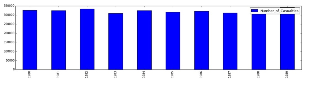
The last plot that we create is the 80s data as a line graph. This will help us to better see the differences in years, as the previous bar graph makes the values seem pretty close together.
Since we already have the DataFrame created, we can simply plot it. By default, Pandas will produce a line graph:
the1980s.plot(figsize=(18, 4))

It's now much easier to see the differences in the years.