
Usually, dashboard elements such as containers can be set by manipulating the border handles of each container and resizing them to a suitable size. Tableau Public also offers a Size feature, as shown in the following screenshot, that allows for more control in the positioning and sizing of these dashboard elements:
Note
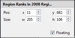
The dashboard element must be in the floating mode so that it can be sized and positioned. In case the container or element is not already in the floating mode, it can be set to floating by clicking on the dashboard element and checking off the Floating checkbox, as shown in the previous screenshot.
To change the positioning of the dashboard element, enter the x and y coordinates (this will take some trial and error) in the corresponding Pos: fields, or scroll up and down with the arrows for fine correction. To change Size, enter the width (w) and height (h) values in the corresponding fields using the up and down arrows for fine adjustment.
In the Size section of the Tableau Public controls on the left side of the dashboard, you can also choose to show the title of a particular chart by selecting or deselecting the Show Title checkbox. You must first select the dashboard element either in the dashboard, or in the Layout section of the Tableau Public controls. To show or hide the title of the dashboard, you can click on the Dashboard field in the Layout section and select or deselect Show Title. This may also be done, as described earlier in this chapter, by using the Dashboard | Show Title menu command.
Tableau Public presents many size options for the entire dashboard. This feature helps you select a size either for a blog or other website, or optimized for a tablet computer. To set the dashboard size, click on Dashboard in the Layout section of the Tableau Public controls.
There is also an option to resize the entire dashboard. For example, you may find that scrollbars appear to the right, or at the bottom of the dashboard, that you don't want to see. Alternatively, you may prefer matching the dashboard to a standard web page or computer desktop size. Again, in the Layout section, select Dashboard, or ensure that no worksheet or other elements are selected on the dashboard itself. The Size section presents a drop-down menu with a variety of dashboard size options.
Many sizing options are available for selection depending on your needs. Blog, iPad, Laptop, Desktop, Exactly, and Automatic are some of the typical settings. It will take some trial and error to properly size a dashboard for your needs.
It is important to consider the methods in which you will be publishing your dashboard. If you are publishing your dashboard to your blog, you need to make sure that it properly fits into the layout that you have selected.
In order to build a sample dashboard, which has a title, aggregate data, change over time, detailed data, and proper context, as shown at https://public.tableau.com/views/Chaper7-Dashboards/CO2EmissionsDashboard.
Perform the following steps to build the dashboard:
- Create a new dashboard by clicking on the dashboard creation icon in the filmstrip.
- Name it CO2 Emissions Dashboard; the name is important because it will be part of the URL for the workbook.
- Size the dashboard so that it fits a blog, as shown in the following screenshot. This size fits in a typical WordPress blog, and it is also narrower than most mobile devices and laptops. Therefore, the size will work well for users of multiple devices:

- We added containers knowing that we wanted to have a title, aggregate data, supporting details, and conclusions. We added a vertical layout container so that our visualizations and objects will stack on top of each other. The following steps will guide you to add data-map in the layout container:
- We dragged the aggregated data-map of CO2 Emissions per Capita into the vertical layout container.
- We then dragged the next worksheet, Emissions Over Time, into the very bottom of the vertical layout container so that the worksheet and the map would be automatically sized.
- We dragged the worksheet from the Dashboard pane to the bottom of the container and dropped it when we saw the wide gray border, as shown in the following screenshot:

- We assessed that the dashboard shown in the following screenshot isn't pretty. It still needs a title, and it should be rearranged:

- We added a title before rearranging it, by performing the following steps:
- Drag a
Textobject to the very top of the vertical layout container above the map. - Populate the title (Carbon Dioxide Emissions by Country in 2008) and then format it in 18 pt black Arial, which is wide enough to fit in the screen.
- Drag a
- The layout needs some work. Color legends need to move closer to their respective visualizations, and we need to change it so it can be fitted in some visualizations, as shown in the following screenshot:

- Move the Percentile color legend for the map by performing the following steps:
- Click on it to select it.
- Click on its context menu.
- Change it to floating.
- Move it below the center of the map (we will move it again later).
- We decided to remove the color legend for Region altogether.
- Remove the size legend for Avg. Once we have actually used a bar in the heat map; you can check it out by clicking on it.
- We removed the last color legend, which is for the heat map. The colors are used to indicate rank, and they follow the same color scheme as that of the map (brown is bad, and blue is good).
- Adjust the fit of the containers as:
- The heat map needs to be fit differently. Therefore, click on its context menu, select Fit, and choose Fit Width.
- Next, add titles by performing the following steps:
- Add a text object above the line graph; the title should be highly descriptive. It tells our users exactly what they are looking at, and it also tells them how to get more details. We used 14 pt black Arial font for the main title, and the call to action (that is, the text that tells the user what to do) is in 10 pt gray Arial, as shown in the following screenshot:

- Add more context with tooltips and labels; it's important for users to know exactly what they are looking at, how the data points relate to each other, and how it relates to them. You can modify the tooltip for the map by performing the following steps:
- Click on Map Visualization to select it.
- Click on the Worksheet menu.
- Select Tooltip.
- Modify the contents and font so that they add obvious context and do not require users to do a lot of work to figure out what they are viewing, as shown in the following screenshot:

- Repeat these steps for other visualizations. Make sure that you use the same font face and size in each tooltip. Consistency of design is critical.
- Modify the data labels, particularly for the line graph.
- Navigate to the worksheet, and place the appropriate fields on the Label shelf in case they were not there already.
- Format dashboard so that the right emphasis is created.
Change their location relative to each other on the dashboard so that they are all legible by clicking on individual labels and then dragging them elsewhere.
We felt comfortable making custom placements because we do not have a filter on the dashboard. (We will discuss filters in the next chapter.) We are confident that, with a specific size of the dashboard, the labels will always appear where we placed them.
If you want to undo custom placements, you can right-click on the label and select undo the custom location, as shown in the following screenshot:

- Adjust the size of the dashboard to 540 x 900 pixels because it appears compressed. Unfortunately, this means that we'll have a vertical scroll bar when not using a studio monitor, but we needed to make sure that the visualizations were legible. It's better to have a vertical scroll bar than a cramped dashboard. If no one can read it, it's a waste of time and effort.
Before publishing the dashboard, right-click on every worksheet in the filmstrip and select Hide.
This dashboard, as available at https://public.tableau.com/views/Chaper7-Dashboards/CO2EmissionsDashboard?:embed=y&:display_count=yes&:showTabs=y. It tells the story of not only how carbon dioxide emissions have changed geographically over time, but also what compounding factors may be contribute towards the future growth of Tableau Public.