
Chapter 5
Layouts with Android Studio
WHAT'S IN THIS CHAPTER?
- Layouts with Android Studio
- Layout previews
- Designing layouts with Android Studio
- Resource management
- Editing component properties
- Using other layout tools
- Asset management
So far in this book, we have covered Android Studio tools, mostly dealing with files and folders and assistants to the general application development process. This chapter explores details about another important part of the application development process: user interfaces.
User interfaces are defined with XML files in Android applications. User interface elements in Android are configured using XML tags and attributes. The Android operating system renders the user interface using the XML file and Java code to draw the user interface elements to Android devices.
Common terms used in Android UI development are layout, view, and widgets. We reference these many times in this chapter and in later chapters as well.
View is the base class of user interface elements. Widgets are derived from the View class and they become a ready-to-use user interface element such as images, texts, text inputs, drop-down boxes, and so on. Layouts are the containers for views and widgets; they are group of views.
You should now create a new project, as you did in Chapter 3. Name it ChapterFive and add a BlankActivity. You will use this new project in the following section.
LAYOUTS WITH ANDROID STUDIO
Layouts define the structure for a user interface in Android applications and app widgets. In Android applications, each Android activity handles the user interface operations so all activities have a layout design. App widgets are the small interaction interfaces placed in the home screen of Android for easy access to main functions of an application. Layouts are being used for the structured design of these interfaces.
XML is used to create a layout, which is stored in the res /layout folder. The build system automatically recognizes XML files in the layout folder as a user interface element to be displayed.
When you create a new application, you select an activity, for which layouts are auto-generated and placed in the layout folder. If you created the ChapterFive project with a BlankActivity, as suggested in the chapter introduction, you will see the layouts shown in Figure 5.1.

Figure 5.1 Layouts in the Project view
Figure 5.1 shows two layout files and one activity, which means that you can use layouts inside layouts to create reusable user interface structures in multiple activities and ease the refactoring of the user interface design.
Adding a New Layout File
Now that you know where layouts are stored, let's add a new layout to your recently created application. In Android Studio, it is pretty easy to identify a layout file and add it to your project. Go to File ⇨ New, select XML at the bottom of the menu, and then Layout XML, as shown in Figure 5.2.
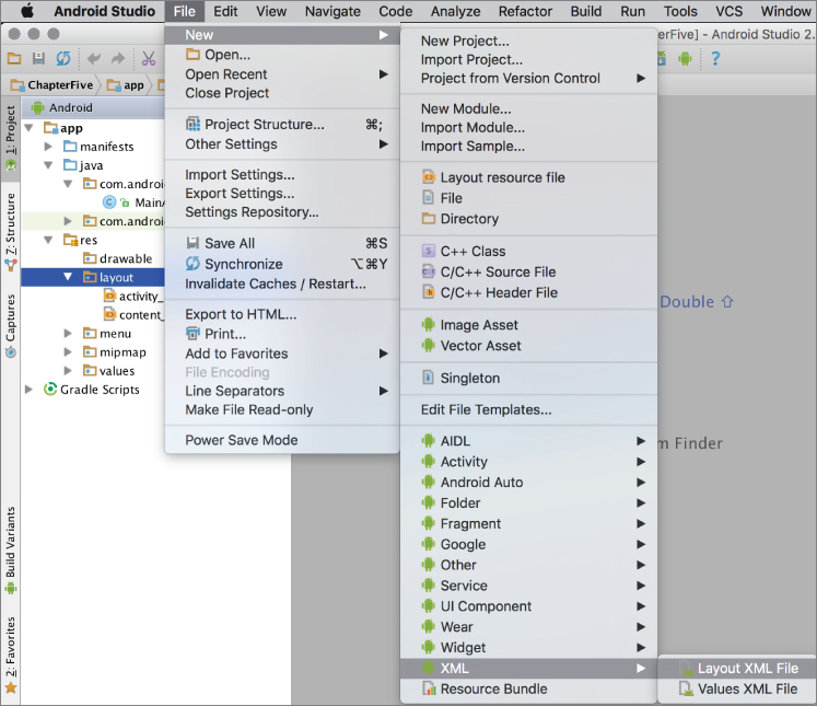
Figure 5.2 Adding a new layout in Android Studio
After you click Layout XML File, the window shown in Figure 5.3 opens. In this window, you can name the layout and select the Root Tag.
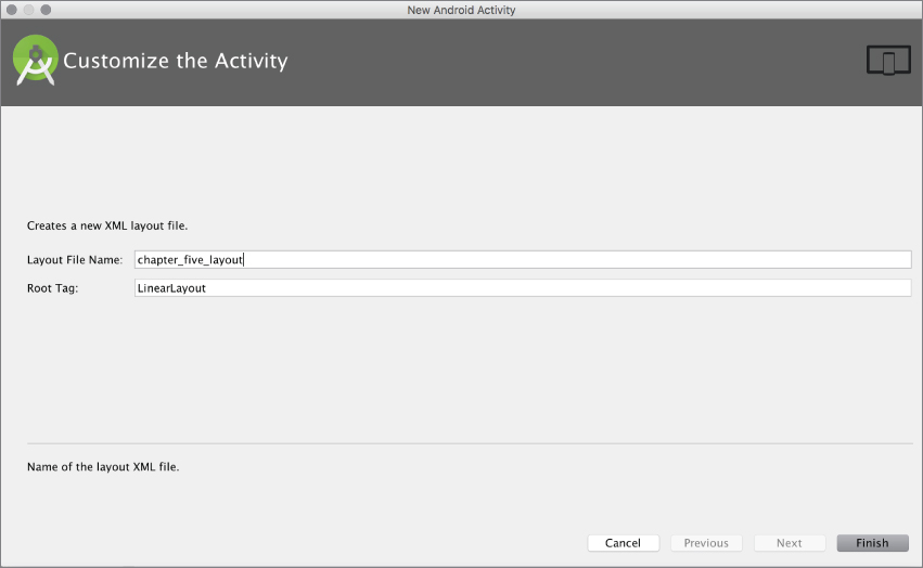
Figure 5.3 Configuring a new layout file
The Root Tag field shows the structure type for the layout. The following list describes layout tags you can use to arrange views.
- Linear Layout—Linear Layout is used to arrange views as a single row with multiple columns or a single column with multiple rows. Each element comes either after or beside the previous element. Designers can choose to arrange this type of layout as they prefer. This is an easy layout to use.
- Relative Layout—Relative Layout is used to arrange views relative to another view's position. This layout is a little harder to manage than the Linear Layout because it is the designer's task to position elements relative to one another.
- Frame Layout—Frame Layout is used as a placeholder layout for a single view. It makes it easier to arrange a view's position in another layout. Video playback is a good Frame Layout use case. Because video playback is done using a single video view, assigning a video view to a Frame Layout would make video seem better aligned with the application user interface.
- Table Layout—Table Layout creates table-like views with columns and rows. You can choose how many columns you want for each row.
- Grid Layout—Grid Layout offers the ability to create a user interface with elements arranged in multiple rows and columns. For example, if you need to list multiple photos in the same screen at once, you can create a grid to show their thumbnails easily. Although Grid Layout offers functionality that's similar to Table Layout, it is more like a mixture of Table Layout and Linear Layout.
Layout Design Structure in Android Studio
Now, let's discover Android Studio's basic layout design and development properties. We go into greater detail in later sections.
Right after you add a new XML layout, Android Studio opens it as an XML file or in Design mode. If a layout has been opened in Text mode, you will see the content of the XML file: either just the file, or the layout preview as well, as shown in Figure 5.4.

Figure 5.4 Layout in text mode
In case the preview is not opened by default, you can activate it with the Preview button on the edge of Android Studio or you can navigate to the Tool Windows option on the View menu and select Preview.
For a professional Android UI developer, using XML files is the best way to develop the user interfaces. However, if you want to drag and drop, Android Studio provides the Palette tool shown in Figure 5.5, with layouts and views to easily design the user interface. To switch between design perspectives, you can use the Text and Design buttons.

Figure 5.5 Visually designing in Android Studio
The Palette view shows a preview of the layout for the selected device. In Design view, you see a component tree that defines the child and parent relationships with additional views in the layout. You can also change the order of views in the component tree because some layouts require that.
There is also a Properties window where you can edit the properties of a layout, view, and all other user interface components. In Text mode, the editing is done within the XML tags. We revisit the design details with Android Studio in later chapters.
LAYOUT PREVIEWS
The Preview window helps designers see the changes applied to a layout instantly without launching the application.
Having an efficient preview tool is really important for GUI-based application development. This is especially true for mobile applications, which rely on a good user experience, especially for Android application development.
Android is growing faster than any mobile platform, not only on mobile phones but on wearables, TVs, cars, and Google Glass. There are probably hundreds of different screen sizes running Android, so developing a generic user interface or developing a user interface for the most used sizes and resolutions is really critical in Android application development to be sure all users have a good experience.
With the Preview tool, you can test your layout on any kind of screen for defined resolutions, the orientation of the device, and older Android SDKs. These functions are accessed by pressing the appropriate buttons, some of which are shown in Figure 5.6.

Figure 5.6 Preview window
For example, clicking the third button from the left in Figure 5.6 rotates the device image horizontally so you can see how your layout looks when the target device's orientation changes.
Layout Rendering Options
Android Studio provides practical preview options to easily render the layout for all devices and SDK versions simultaneously on the same screen. The options are shown in Figure 5.7.

Figure 5.7 Layout rendering options
Having rendering options that enable you to see preview-based Android versions and screen sizes eliminates the work of opening each rendering option one by one, which makes a UI designer's life easier.
Previewing Virtual Device Views
Because Android is an open source operating system, many companies, including large global brands and local OEMs, have customized and used it on their own hardware devices. As a result, you can see Android running on screens of almost any size.
Testing applications on the many common devices used by consumers is a necessary but painful and slow process. Launching applications on a wide variety of virtual devices during development is an option, but it is a very time-consuming process. Another option is to try layouts on real devices, but this is also a time-consuming and expensive process.
Android Studio improves this process by supplying predefined screen devices for previewing the layout during development. You can select devices by clicking the button with a device name to display the list of available previews, as shown in Figure 5.8.

Figure 5.8 Selecting a layout to preview in Android Studio
You can also select tablet and TV-sized devices, and wear devices. As Figure 5.8 shows, entries in the list match the name, screen size, and resolution of the target product. If you want to test with other, generic devices, navigate to the Generic Phones and Tablets option to see the list shown in Figure 5.9.
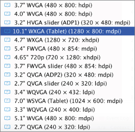
Figure 5.9 List of generic devices
Figure 5.9 shows the list of predefined generic screen resolutions and sizes for testing. If you want to define a new size or resolution you can select the Add Device Definition option, which leads you through the process of creating a new virtual device. Once created, you can use its settings in the preview view. As you saw in Figure 5.8, we use a virtual device for previews (the Nexus 4 option that is checked).
Previewing on Different Android SDK Versions
Previewing your layout according to size and resolution is not enough if your application's audience is large; you should also check that the layout is rendered the same in the current Android SDK. Many people use different Android devices with different release versions, so you can't be sure that everybody will use the same version at the same time and that your UI will work the same in all of them.
At each big release of Android, there can be minor or major changes to the API, which is directly related to UI layout. For example, FrameLayout is used a lot but was not a defined layout in earlier releases of Android and so may not be rendered in older versions. To avoid a situation like this, install the Android SDKs you want to test the UI on, and preview your layout with the major SDK versions, as shown Figure 5.10.

Figure 5.10 Picking the Android SDK version for previewing
Selecting Themes
A theme is a set of styles applied to all user interface elements to keep them looking similar in all application windows. There are many examples. A font style is a theme: When you define a font and apply it to all text views in the application, all text will be similar. A predefined color style also can be applied to all views to keep them in a similar color.
Predefined themes for Android applications come with Android SDK. You will noticed that a predefined theme has been assigned by Android Studio while previewing your layout. However, there are additional style options for layouts. Just click the Theme Selection button (to the right of the device orientation button shown in Figure 5.6) to open the window shown in Figure 5.11.

Figure 5.11 Theme selection window
Themes enable you to observe the appearance of the layout in any selected application style. Using themes makes styling recurring views with same look easier. Views such as dialogs and alerts can show different content but have the same appearance by applying same theme to those UI elements. Developers might want their application to be either full screen or only show the Android action bar while running; this can also be done using themes. (Notice the themes ending with NoActionBar in Figure 5.11.)
DESIGNING LAYOUTS WITH ANDROID STUDIO
In this section, you add user interface components and views to the layout you are designing.
There are two ways to add views to your layout. The first option is to use the Palette tool to add a predefined view or layout to your user layout. Figure 5.12 shows part of the Pallet.

Figure 5.12 Palette tool
The Palette tool includes the following views and layouts:
- Widgets—Widgets are single views that present a user element such as TextView, RadioButton, CheckBox, Button, and Switch.
- Text Fields—Contains predefined text fields for different types of text inputs such as password, date time, number, and e-mail. Selecting a text field with a predefined input type will make keyboard input easier. For example, when you select a number field, the keyboard opens with only numbers available.
- Containers—This group of views can contain any view type such as RadioGroup, ListView, GridView, SearchView, and VideoView.
- Date Time—This group includes date- and time-related views.
- Expert—This group includes view items with advanced uses such as the TextureView and SurfaceView, which are used to render OpenGL graphics. They are used primarily by game developers. Resources that use OpenGL will be presented using the SurfaceView.
- Custom—This group has four items to define customized views that are not included in the palette.
Let's play with a Plain TextView widget in our layout.
- First drag a Plain TextView widget (refer to Figure 5.12) from the pallet to the preview.
The Plain TextView widget will show up in the layout preview, and an XML entry is created in the Text mode view. According to your choice of layout, its location on the screen may change. Figure 5.13 shows that views are added vertically. If LinearLayout was chosen to be horizontal, views would be added side by side, horizontally.
- After adding the views, you may want to make changes to the view's ID, text, position, background color, and position. You can do this from the Properties pane at the right of the Designer window shown in Figure 5.13. Setting the
idproperty gives a unique ID for the view. If you set thetextproperty to Chapter Five, the text Medium Text will disappear and you will see Chapter Five in the preview window.
Figure 5.13 New components added to a layout
- In the Properties pane, you can change the text's width by setting the
layout:widthproperty tofill_parentto extend it and use all the available vertical space. - Finally, set the text's position to center by setting the
gravityproperty tocenter_horizontal. When you set the view's property to center, the text will be centered. You can also set it toleftorright, which will move the text in that direction.After you change the
widthandgravityproperties, you see that the view has been changed as well, as in Figure 5.14.
Figure 5.14 Editing properties
In the Properties window, some items have a list of values to set and some are set manually. You can also access the Help documentation by clicking the question mark (?) button on the top right. Clicking the rightmost button reveals the hidden properties for more advanced view settings.
To set properties in XML format, you have to know the names of the elements because you have to type them. However, Android Studio provides help by listing all the options right after you type < to start a new tag in the XML file, as shown in Figure 5.15.

Figure 5.15 Adding a new component in XML files
After adding the element tag in the XML file, you can edit the attributes. You will see the possible properties listed when you hit Control + spacebar. After you add a property, you set its value by first typing two double quote marks (""). Then place the cursor between them and press Control+spacebar to list the possible values you can assign to the property. Figure 5.16 shows an example of changing the properties of the CheckBox View shown in Figure 5.15.

Figure 5.16 Editing view properties in XML
MANAGING RESOURCES
To make a better Android UI, you need to know how to use static resources, strings, color definitions, style definitions, dimensional definitions, and drawables.
Resources are the main building blocks for layouts. They are reusable and easy to manage, and they enable developers to create consistency over all their user interfaces. Relying on the Android guidelines helps make your application easy for end users.
This section provides a brief overview of strings, styles, colors, dimens, and drawable resources and provides examples of how to use them in the layouts.
Using Strings
While developing user interfaces, you will need to use text on the screen. The Android guidelines suggest adding text to user elements using string resources instead of just writing the text to XML files or to a text property.
You create string resources in another XML file containing a list of elements. Initially there are only two items, but for this example we added new ones in a similar style—using the string tag in the XML file. Listing 5.1 shows the content of the string.xml file located in the res/values folder.
To use a string resource in the UI layout, you assign a property's text starting with @string in the XML file. For example:
"android:text="@string/chapter_name"You can also do this using the Properties window. With the mouse pointer on the property field, click the button that appears and a window will pop up that lists all the resources you can use, as shown in Figure 5.17. Select the string resource to assign to your view.

Figure 5.17 Resource selection window
Notice the New Resource button at the bottom of Figure 5.17. It is another alternative to add a new string resource to the string.xml file.
Using Styles
String resources are not the only resources you can reuse for your views. There are also style resources to assign to your view to change the appearance of text, including background color, size of text, font, shadowing, and so on.
Style resources are stored in the res/values/styles.xml file. Some predefined styles are already in the styles.xml file. Let's quickly make a new style to apply our layouts.
Listing 5.2 shows a simple style resource in the styles.xml file. It uses the style XML tag to create a new style to change the text color, size, padding, gravity (placement on the layout), and font.
To apply a style to a view, in the text mode of layout, add the style="@style/NewStyle" line or find the style property to select the NewStyle resource from the list. After you apply the style to the view, you will see that the view element changed in the preview. See Listing 5.4 in the following section for a sample style assignment in an XML layout file.
Styles are important. To make your user interface consistent, reusing and applying styles to all views will make them seem more professional and ordered.
Using Dimens
Dimen definitions are used to change the width, length, height, and margins of the assigned view in the layout for devices with different resolutions and screen sizes.
Using dimens gives you the flexibility to both design your layout for a specific device size and to assign a dimen resource to change to a different device size at runtime. You can create a better experience with all devices using the dimen resource.
Dimen tags are stored in the res/values/dimens.xml file. Dimension resources are created under the resources XML tag with dimen tags, as shown in Listing 5.3, which is the dimen.xml file generated right after the project was created.
To use the dimen resource right after definition, you need to find the resource that is related with the dimensions of the view. For example you can go to the layout:margin property and click the button to select from the available resources in the window that opens.
Assignment of the dimen resource in XML files is similar to assignment for strings and styles. For example if you want to assign fab_margin to your check box, added in previous section, you need to define the layout:margin attribute and assign the dimen with "@dimen/fab_margin", as in Listing 5.4.
All the defined resources are auto-referenced by Android Studio, so right after you start typing @dimen, @string, and @style recently defined resources will be listed.
Using Colors
Color definition resources can be used to assign layout and view color-related properties such as background, text color, border color, and so on. Color resources are defined in the res/values/colors.xml file. Right after you define the color, the editor in Android Studio provides a preview of the color on the left (a colored square), as shown in Figure 5.18.

Figure 5.18 Color resources definition
As you do for other resources, you assign a color by finding the property that can take a color (such as background) and assign the resource.
In an XML file, typing android:background="@color/colorBlack makes the background black.
Using Drawables
Drawables are resources which contain graphics that can be drawn on screen. They can be applied directly in the XML layout file with the android:drawable attribute. As in the previous example, you can add a color value as a drawable with android:drawable="@color/colorBlack".
Of course, drawables are not limited to color values and can be used for bitmaps and nine patch files; state, level, and layer lists; and transition, clip, scale, shape, and inset drawables.
Drawables can be defined in XML format. Listing 5.5 provides a simple example to draw a rectangle with rounded corners and has a gradient fill.
Other drawables that can be declared in XML are vector, transition, state, and animation drawables.
USING LAYOUT TOOLS
Android Studio provides developers translation capabiltiy to ease localization of Android UI text, and Activity Association to assign Android Activities to layouts and indicate the application themes on previews.
Translation
As a developer, you might be surprised that adding a translation will boost your downloads. There are several markets and languages that have a large Android ecosystem but low levels of English adaptation.
Translating your text resources can be simpler than you might imagine if you have externalized all the strings. As you saw in the “Using Strings” section, each string value should be externalized in the strings.xml file and never under any condition hard coded.
Right-click the strings.xml file and select Open Translations Editor. This editor not only serves as a key/value strings editor but also helps you to localize your resources. Figure 5.19 shows the Translation Editor.

Figure 5.19 Translation Editor
The green plus sign icon at the top left of the window creates a new key value pair, as shown in Figure 5.19. Because you don't have any other locale yet, the created values are the default locale for the app. The default locale acts as the fallback locale if no localization matches the user locale. Figure 5.20 shows the expanded list of locals.

Figure 5.20 Expanded list of locales
The second blue globe icon in Figure 5.10 adds a new locale to our app. You can choose to add several locales and they will all show up in the Translation Editor. To edit a value, select a cell from any locale and the key, default value, and the translated value you wish to enter will be displayed at the bottom of the editor, as shown in Figure 5.21.

Figure 5.21 Translated and default value
Ideally an application should have a full list of values for each key in each locale. If a value is missing, the default for that value will be used instead. To check for missing values, click the Show only keys needing translations check box and the editor will filter out the complete localized keys.
Supporting many locales looks pretty easy but in practice can be very troublesome. How would you support an East Asian language with a different alphabet if you do not have any knowledge of the target language? Fortunately, Google has a solution for that. You can buy a language for the desired locales and then you can ask for only the needed value using the filter tool, which helps you identify the required value. To order a language, click the Order a translation link at the top right of the editor (refer to Figure 5.19). Android Studio will open a web page in your default browser, as shown in Figure 5.22.

Figure 5.22 Android Studio language ordering web page
Next, you need to select your source language and upload the XML file. In the next step, you will be asked for the target languages you want to order. This is a paid service and you pay for the number of languages and items you need, but it's well worth the expense because with the right set of locales, your market accessibility will dramatically increase.
Activity Association
All layouts are associated with an activity during runtime. However, because this association comes during runtime, it can be difficult to see a preview of the layout during development because you might miss the theme selection for the activity, which is made in the AndroidManifest.xml file with a setting similar to the following:
android:theme="@style/AppTheme.NoActionBarThere are two ways to set the layout's context: either associate an activity visually in Design view or in the XML file. In the XML file, you need to associate an activity using the tools:context attribute in the layout tag itself, as shown in Listing 5.6.
In Design view, click the MainActivity button and select the Associate with other Activity option as shown in Figure 5.23.

Figure 5.23 Associate with other Activity
After association, the layout preview will change if your Activity theme is different than the currently selected theme.
ASSET MANAGEMENT
Asset management is one of the most undervalued topics in Android development. Not surprisingly, developers like to write code and may tend to skip best practices when it comes to assets such as images and bitmaps.
Since the early versions of Android, Google invested in tools to help developers deal with assets. The draw nine patch tool was one of the early tools provided for handling images that can be displayed properly on different screen sizes. Android Asset Studio and other tools integrated with ADT followed.
Android Studio is integrated with tools and offers different project views to group and organize assets. Each Android module has a res folder to host all assets as well as other resources except for source code. Because the Android ecosystem has a wide variety of devices with different screen sizes and densities, assets that can handle these different screen sizes are needed. Figure 5.24 shows asset folders to address resolution/density differences.
Figure 5.24 Asset resolution list
Early on, Android limited this list to ldpi, mdpi, and hdpi, but with the higher density pixels and larger screens available today, you have up to xxxhdpi density. Ideally, an image file should be resized for each screen resolution/density your app supports.
Android view (as opposed to Project view shown in Figure 5.24) offers an easier-to-follow visual structure for grouping the asset files (see Figure 5.25).
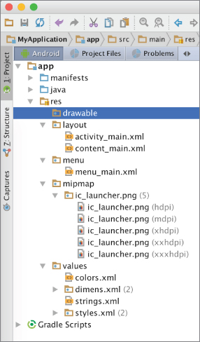
Figure 5.25 Visual structure for asset resources
This view groups different image sizes under the same resource name, in the mipmap folder, and also displays dpi info and the number of files in the folder. Android Studio handles all resizing processing when an image resource is created or imported via Android Studio. To import an existing image, right-click the project and select Image Asset from New, as shown in Figure 5.26.

Figure 5.26 Adding an image asset
Next, the Asset Studio window is displayed for importing your image, as shown in Figure 5.27.

Figure 5.27 Asset Studio window
Asset Studio creates different sizes of resources from your input and places them into the appropriate folders.
The wizard has several options, as follows:
- Asset Type—Allows you to choose icons between launcher, action bar/tab, or notification (see Figure 5.28).
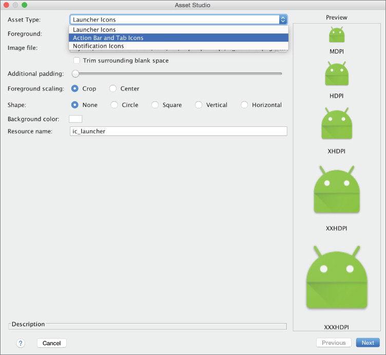
Figure 5.28 Asset type listing
- Foreground—Allows you to select an image, clip art, or text as an asset (see Figure 5.29).

Figure 5.29 Foreground options
- Image File—Allows you to choose an image.
- Additional Padding—Increases the space around the image.
- Foreground Scaling—Allows you to choose between cropping or centering the image during resizing.
- Shape—Allows you to choose the output image shape.
- Background Color—Allows you to choose a background color for the created images.
- Resource Name—Allows you to decide on the output file name. All the various sizes of the same image will be named the same but will be placed into appropriate folders based on the image size.
Another useful tool for creating image resources is the Vector Asset Studio. To create a vector asset, right-click on the project tree and select Vector Asset under New, as shown in Figure 5.30.

Figure 5.30 Adding a vector asset
Vector Asset Studio is very similar to Asset Studio. Vector Asset Studio can create vector assets from material icons or local SVG files. To create a vector asset based on a material icon, select the first option, as shown in Figure 5.31.

Figure 5.31 Creating a vector asset
Next, configure vector by selecting icon, setting size, and opacity from Vector Asset Studio window:
- Icon—An icon that the vector asset will be built from
- Size—The output size of the asset in terms of dp
- Opacity—The opacity of the created vector asset
The Local SVG file option offers the same configuration except that it asks for a file instead of an icon.
SUMMARY
This chapter covered the details of user interface design and development with a focus on layout. User experience is at the heart of Android application development to reach a wider audience. We covered the functions, including resource management, that we think are important and which you will need to use repeatedly during layout development with Android Studio.