
Chapter 6
DEVELOPING CSS IN PRACTICE: FROM DESIGN
TO DEPLOYMENT
In the previous two chapters, we talked a lot about the theory and concepts behind standards-based front-end web development. You learned why and how to create structured, semantically meaningful XHTML markup. You learned how Cascading Style Sheets work, how web browsers display XHTML content by default, and how to apply your own CSS rules to web pages. It's finally time to bring all your newfound knowledge to bear on a real project and turn your bland, unstyled web page into a beautiful, professionally implemented CSS design.
Since the easiest way to learn CSS-based design techniques is arguably to simply dive right into them, we invite you to think about this chapter as though you were looking over our shoulders while we show how to implement this design in code. We'll be carrying through the execution of the earlier examples in this book, the Papa Pepperoncini's Pizza website. Throughout this chapter, we'll be making references to topics covered in the previous two chapters, so we strongly urge you to read those chapters before beginning this one.
The visual source: understanding design documents
In any website design process, there always comes a point at which the developer (that's you) needs to turn a visually presented layout into a real web page. The designs for websites are typically created in programs such as Adobe Photoshop or GIMP. These programs are photo manipulation applications, so they produce raster graphics that can't be used on web pages. However, these files contain all the specific information about what a design looks like, including what fonts are used for each text element, the physical dimensions of all the items in the design, and the raw assets for each graphic.
As a front-end web developer, you are tasked with translating this design file into XHTML and CSS code to make your web page's look and feel match the look and feel of the design document as closely as possible. This is easier said than done because design files aren't constrained by the same limitations that web browsers are. Many times, design elements may need to be modified in some way so that they are suitable for the web pages for which they're destined. For this reason, it really pays off to be familiar with one of these image-editing applications. Such software is beyond the scope of this book, however, so you'll be focusing solely on implementing a design in CSS in this chapter.
Diving into code: advanced CSS concepts applied
To refresh your memory, Figure 6-1 shows you what the Papa Pepperoncini's Pizza website looks like without any styles applied to it.

Figure 6-1. Papa Pepperoncini's Pizza website before its design has been implemented
In this chapter, you'll turn that web page into one that looks like the Photoshop design document shown in Figure 6-2.

Figure 6-2. The original Photoshop PSD shows you the designer's vision for the look and feel of Papa Pepperoncini's website.
As you can see by comparing the design document to the current version of the web page, the designer's vision is radically different from the original, default styling. Using CSS, however, you'll make it happen.
The CSS development workflow
When developing any website design with CSS, you can follow some well-established best practices. Following these guidelines will make your life a lot easier, and they will ensure you end up with well-tested, standards-based code. One of the most important guidelines is to develop your style sheet in whatever browser most strictly adheres to the W3C's published standards. Since we're showing how to develop CSS now, we'll use the most popular browser that conforms to the W3C's CSS standards. As of this writing, that browser is Mozilla's Firefox web browser, currently at version 2.0.0.14 (though soon to be Firefox 3, because it is in the final stages of beta at this time), so whenever we refer to "our web browser" for the time being, that's the browser we mean. Although it's a good idea to occasionally check your progress in other browsers, for the sake of clarity in this text we'll refrain from mentioning other browsers and how to deal with their bugs until after the CSS design is completely implemented.
First things first: let's set up the source code file. In Chapter 4, you developed a basic XHTML template for the home page of Papa Pepperoncini's Pizza website. You saved this template as a plain-text file named index.html. The content of this file is as follows:
<!DOCTYPE html PUBLIC "-//W3C//DTD XHTML 1.0 Strict//EN"
"http://www.w3.org/TR/xhtml1/DTD/xhtml1-strict.dtd">
<html xmlns="http://www.w3.org/1999/xhtml" xml:lang="en" lang="en">
<head>
<meta http-equiv="Content-Type" content="text/html; 
charset=utf-8" />
<title>Welcome to Papa Pepperoncini’s Pizza!</title>
</head>
<body>
<div id="header">
<h3>
<a href="index.html">Papa Pepperoncini’s Pizza</a>
</h3>
<ul>
<li><a href="index.html">Home</a></li>
<li><a href="menu.html">Our Menu</a></li>
<li><a href="locations.html">Locations</a></li>
<li><a href="about.html">About Us</a></li>
</ul>
</div>
<div id="welcome">
<h1>Welcome to Papa Pepperoncini’s!</h1>
<p>
Please, sit down! Papa Pepperoncini’s Pizza
is the finest Italian Eatery this side of the
Atlantic, and we’re glad you’ve come to
visit. Feel free to look at the menu, browse through
our locations, or read about our history. And if
you need anything, just let us know. Grazzi!
</p>
</div>
<div id="specials">
<h2>Weekly Specials</h2>
<ul>
<li>Monday: Small Caesar Salad and Eggplant Rollatini</li>
<li>Tuesday: Pasta Gagioli and Gnocchi in a Pesto Cream
Sauce</li>
<li>Wednesday: Spiedini alla Romano with Marinara Sauce
</li>
<li>Thursday: New England Clam Chowder and
Grilled Shrimp Kabob over Rice</li>
<li>Friday: Tracciatella a la Romano and
7” Italian Combo Hero</li>
</ul>
</div>
<div id="footer">
<p>Copyright © 2008 <strong>Papa Pepperoncini’s
Pizza</strong> — All rights reserved.</p>
</div>
</body>
</html>
When you begin to add CSS rules to your page, you'll do so inside an embedded style sheet. The reasons you use an embedded style sheet over an external style sheet during development is twofold. First, it's far easier to keep a single file open in your favorite text editor than it is to switch between two files. Second, putting all your CSS rules in an embedded style sheet while you write them ensures that a single reload of the web page in your browser will apply the new rules, regardless of how your web browser may be configured. If you were to use an external style sheet, you may run into issues caused by the browser's attempts to cache your external CSS style sheet.
The first thing you need to do is create the style element in which you'll write your CSS styles. For the moment, you'll simply create an empty embedded style sheet with a single comment. Comments in CSS behave the same way comments in (X)HTML do; they let you write notes in plain English to yourself that the browser simply ignores. Unlike comments in (X)HTML, however, CSS comments begin with the two-character sequence /* and end with the two-character sequence */.
<!DOCTYPE html PUBLIC "-//W3C//DTD XHTML 1.0 Strict//EN"
"http://www.w3.org/TR/xhtml1/DTD/xhtml1-strict.dtd">
<html xmlns="http://www.w3.org/1999/xhtml" xml:lang="en" lang="en">
<head>
<meta http-equiv="Content-Type"
content="text/html; charset=utf-8" />
<title>Welcome to Papa Pepperoncini’s Pizza!</title>
<style type="text/css">
/* CSS rules for Papa Pepperoncini's Pizza will go here */
</style>
</head>
Now that you have a place to start defining CSS rules, you'll next define some global styles to make sure all web browsers will use your own defaults instead of their own:
<style type="text/css">

html, body {

    margin: 0;

    padding: 0;

    border: none;

    background: white;

}

</style>
These CSS rules "zero out" any margins, padding, and borders that browsers may give the page by default by setting all these attributes to explicit initial values. Doing this ensures that you have a common starting point for each browser.
Now that you've made a change to the CSS rules in your style sheet, you can view the change by reloading the index.html page in your web browser. Each time you save a new change, you'll typically check to see whether it got applied properly by reloading the web page in the browser. Then, you'll continue by saving another change, and you'll repeat the process all over again. You simply lather, rinse, and repeat until the entire design is complete.
This is a good start so far. Let's begin defining the CSS rules specific to this design.
Typography: text colors, fonts, and font sizes
With CSS, you get the most benefit by defining the most common design properties first. These will be encoded with CSS rules with very general selectors and will rely on CSS inheritance to cascade all the way down to your page elements. By defining the similar design elements in this general way first, you save time and ensure that the most basic parts of the design are applied consistently to the whole website in one fell swoop.
In this design, the colors are simplistic: a tomato red with orange and white highlights—the colors of Papa Pepperoncini's signature product, the classic Italian pizza. Almost all the text in the web page is this same tomato red color, so let's define that globally by applying it to the <body> element:
<style type="text/css">

html, body {

    margin: 0;

    padding: 0;

    border: none;

    background: white;

}

body {

    color: #993333;

}

</style>
The value for the color property used here merits some explanation. Up until now, you've used only keywords as values for the color property, such as white or black. However, the CSS specification defines only 16 standard color keywords (based on the Windows VGA color palette), which is obviously somewhat limiting. This is why CSS also lets you specify a color that is defined by numeric value, called a numeric RGB specification, which lets you define any combination of red, green, and blue colors individually in order to compose the exact color you want to use.
It might be interesting to note that the CSS3 specification defines 140 or so color keywords that you can use in your style sheets. Many of these are already supported in browsers, so you may find that you can safely use them today. However, if you do, your CSS code will not be able to validate as a CSS2 style sheet because the CSS2 specification does not include those keyword values. Instead, either validate your CSS code against the CSS3 specification or use a different method to define your colors, such as an RGB triplet.
Theoretically, using an RGB specification for your color increases your choice of possible color values into the millions. Modern displays that can support more than 256 colors can safely take advantage of these additional color values; however, websites that still need to support older display technologies most commonly use a subset of these colors called web-safe colors (or sometimes just web colors for short). This is a specific set of about 216 colors that are guaranteed to display in almost the same way across a number of computing platforms that have limited capabilities. The tomato red value used earlier is one of these web colors.
You can write the CSS color units in numeric RGB specification in one of two notations. The more common notation is the one used previously and is called hexadecimal notation (or more simply, hex) because it uses hexadecimal digits to define the values of each of the three colors. A hexadecimal color unit always begins with an octothorpe (#) and is then followed by hexadecimal digits, called a hex triplet (it's a triplet because of the set of the three RGB colors—red, green, and blue). The first two digits of the hex triplet are the value for red, the next two are the value for green, and the final two are the value for blue.
In the example CSS rule, this means 99 is the value for the red channel, 33 is the value for the green channel, and 33 is the value for the blue channel. There's also a noteworthy shortcut that you can use to specify hex values for web-safe colors, such as this one, where each of the color channels has the same hex digit. Instead of using a six-digit hex number, you can specify each color channel as a single hex digit, which the web browser will duplicate on its own. So, in this case, the following two CSS declarations are identical:
color: #993333;

color: #933;
There's nothing magic about this expansion. The browser simply sees that the hex value is specified with a mere three digits instead of six and duplicates the digit from each color channel to complete the set. Here's another set of CSS declarations that are identical:
color: white;

color: #FFFFFF;

color: #FFF;
Knowing this, you can shorten your CSS rules like so:
<style type="text/css">

html, body {

    margin: 0;

    padding: 0;

    border: none;

    background: #FFF;

}

body {

    color: #933;

}

</style>
Keeping CSS style sheets short is one way to make your website load faster, since the smaller the size of your files, the less time it takes a browser to download and parse them.
The other, less common notation for CSS color units lets you use a comma-separated list of either three decimal numbers (between 0, which is equivalent to #00, and 255, which is equivalent to #FF) or percentages (where 0.0% is equivalent to #00 and 100% is equivalent to #FF). As an example, these color declarations that set the property to green are also all identical:
color: green;

color: #0F0;

color: #00FF00;

color: rgb(0, 255, 0);

color: rgb(0%, 100%, 0%);
Moving on, you can next notice that the majority of the text on your web page is displayed using the Verdana font face. This is a common font for web pages because it's installed by default on almost every standard personal computer available today. Other common fonts include Arial, Helvetica, and Times, as well as most of the variations of these font families. Since you as a web developer cannot guarantee the existence of a particular installed font on a visitor's computer, it's safest to use the most common fonts, but the cost of this safety is that these fonts don't always look very nice on every design. With CSS, you can actually specify a list of fonts that you want the browser to try and apply, in order. This way, anyone with the nicer fonts installed will see them, and the visitors without them will get the generic fonts.
Since the design you have specifically calls for Verdana, let's list that font first:
<style type="text/css">

html, body {

    margin: 0;

    padding: 0;

    border: none;

    background: #FFF;

}

body {

    color: #933;

    font-family: Verdana;

}

</style>
Of course, there's still a chance (however slim) that the visitor viewing your page doesn't have Verdana installed on their computer. In that case, let's list another similar and common font choice, say Arial, followed in turn by the generic sans-serif font keyword:
body {

    color: #933;

    font-family: Verdana, Arial, sans-serif;

}
As you can see, fonts are listed in a comma-separated list, one after the other in the order you want the browser to try to apply them. In this case, you're telling the browser to "use the Verdana font if available, but if not, then try Arial. If that's not available either, just pick any font that doesn't have serifs in it." If a font name contains spaces, it needs to be quoted so the browser knows that the space is part of the font name. For instance, a common font that has spaces in its name is Times New Roman. To use that font in the list of font-family values, you'd need to write it like this:
font-family: "Times New Roman", Helvetica, serif;
In this example, you're telling the browser to "use the Times New Roman font if it is installed; otherwise try using Helvetica, and if that isn't available, just use any font with serifs." Note that Times New Roman is quoted and that the comma that delimits it from Helvetica is outside the quotation marks. In addition to the sans-serif and serif generic font families that CSS lets you specify, you can also declare cursive, fantasy, and (much more commonly used than the previous two) monospace.
You've now completed the very basic text coloring and font choices for your page, but there's more you need to do in regard to your text. You need to set a default size for the text on your page.
Sizes, as you'll recall from the previous chapter, can be specified in any of a number of CSS units. For a web page that will be viewed on a computer monitor, sizing fonts by specifying pixel lengths might seem like the most natural choice. However, since pixels are an absolute unit, they actually impose undesirable constraints on the visitor. Specifically, in Internet Explorer 5 and 6, text with a font-size property that uses a pixel value can't be resized at all!
To avoid this accessibility concern, you'll use a percentage value to specify the text's default size. Let's specify this value as 62.5%, since that gives you a default font size of 10 pixels, which seems like a nice round number. (Text that is 10 pixels in size is still a bit too small for your design, but you'll hold off specifying exact sizes until you get a little further along.) This way, the text in every browser remains resizable while still being declared as the same size.
body {

    color: #933;

    font-family: Verdana, Arial, sans-serif;

    font-size: 62.5%;

}
In addition to the font-family and font-size properties, another property that's worth mentioning as it relates to font sizes is the line-height property. You can use this property, which determines the height of each line inside an inline CSS box, to great effect. Most commonly, this property allows you to add a bit of spacing between the bottom of one line and the top of the one that follows it. For instance, here's how you could easily create double-spaced paragraphs in your page:
p { line-height: 200%; }
Of course, unless you're writing an academic paper, double-spaced lines are probably too far apart from one another. Most often, the most you need is a half line of whitespace between the lines of your text. In that case, a value of 150% will give you the result you want. That is, a value of 100% is the current height of the line, so 150% is the current height plus half its height, or one-and-a-half lines high, which results in a half line of whitespace between each line.
Now that you've defined both font-family and font-size, you can actually take advantage of another one of CSS's shorthand properties, the font property. This property allows you to set (almost) every property that applies to text in one declaration. At a minimum, it requires that you specify a font-size and font-family, though it also allows you to specify the font-style, font-variant, font-weight, and line-height properties in addition to these two required properties. Let's use it to quickly add in the default text's line height, too:
body {

    color: #933;

    font: 62.5%/1.3em Verdana, Arial, sans-serif;

}
The syntax of the font property can be a little tricky. As you can see here, you specify the font-size first. This value is then followed by a forward slash (/), and after that you specify the line-height value as another length unit. We used the em length unit here, but you could just as well have used a percentage. In fact, when it comes to font sizing, ems and percentages are interchangeable: 100% is equivalent to 1em, so 1.3em is equivalent to 130%.
Finally, the font property ends with the font-family property's list of your chosen fonts. What this says to the web browser is that you want to "set all the text inside the body to 62.5% of its default size, increase each line's height by an additional 0.3em (that is, by an additional 30%), and use the Verdana font to display text or Arial if Verdana isn't available or any other sans-serif font if Arial isn't available either."
Since the font property is so chock-full of options, let's take a look at some more examples:
font: italic 200% Zapfino, cursive;
This declaration sets the targeted text to a font-style of italic, a font-size of 200% (which means double whatever it was before), and a font-family list of Zapfino, cursive. Notice that you didn't specify a line-height property, since that is one of the optional properties. Here's another example:
font: small-caps bold 16pt "Helvetica", serif;
This time, you've set the font-variant property to small-caps (which turns text into uppercase lettering, with capital letters in the XHTML source code sized slightly larger than lowercase ones), the font-weight to bold, the font-size to 16pt (pt is short for points, a length unit traditionally used to size text for printing), and the font-family list to Helvetica, serif.
As a final example, these two CSS rules are identical:
h2 {

    font: inherit small-caps bold larger/150% Helvetica, serif;

}

h2 {

    font-style: inherit;

    font-variant: small-caps;

    font-weight: bold;

    font-size: larger;

    line-height: 150%;

    font-family: Helvetica, serif;

}
The interesting value in this example is inherit, which you've set on the font-style property. This special value just means "Use whatever the target element's parent's value for this CSS property is." Nearly all CSS properties can take an inherit value.
At this point, Papa Pepperoncini's website is looking a bit more stylish, but not by much. Figure 6-3 shows what you have so far. Next, since you've finished writing the CSS rules specifying the generalities, let's tackle that fancy header with the image of a big pizza pie in it.

Figure 6-3. The text of Papa Pepperoncini's Pizza website is beginning to show some color and styling.
Implementing the header: images and backgrounds
In this design, you have a large image of a pizza pie in the top-left corner that overlaps a red stripe. The red stripe has a gradient that goes from white under the pizza to red at its edge. Both the top-left and top-right corners are curved. In the original design file you got from your designer, the width of their canvas was 863 pixels. Furthermore, the designer's canvas couldn't accommodate any resizing that your web page must accommodate, so it doesn't make sense to try to replicate the design as though it were set in stone.
Instead, you'll use the design document as a guideline for the final look of the web page. Specifically, you can tell from looking at the design that the designer clearly intended the masthead to stretch from the one edge of the browser window to the other. If you implement this design with a fixed width, however, you'll end up with a design that can't accommodate a resized window. On the other hand, if you design the page in a way that allows the width of the header to be the same as the width of the browser window at any given point, you need to ensure that the gradient on the red stripe turns into a solid color before the point at which the design can stretch.
As you can imagine, in a much more complex design, there are many more complex issues such as this to consider. However, even with this simplistic example, you can clearly begin to see just how different designing for a web page is than designing for print. A lot of the design decisions that may seem great for print turn out to be really challenging when it comes time to implement the design in XHTML and CSS code.
Additionally, there is usually a point in any design where you simply have to allow for some distortion. Few layouts are resilient enough to accommodate everything from a 128-pixel-wide viewport, such as those commonly found on cheap mobile phones and PDAs, to a 2560-pixel-wide viewport, such as that provided by a 30-inch Apple Cinema Display, or even just text at the smallest or largest sizes possible. Thinking about how a design will stretch and how the text in a layout will flow is critical to creating good designs for web pages, but few print designers are used to this sort of thing.
In this case, you need to make a few changes to your design document in order to accommodate the variable-width layout you want. First, you need to move the end of the gradient past the point where the curve on the top-right corner of the design begins. It's at that point, 835 pixels to the right of the left edge of the browser window, where you'll be "stretching" the banner image. Second, you need to split the banner background into two separate images: one that includes the pizza and the curved text "Papa Pepperoncini's Pizza" on top of it for the left side of the banner and one that includes the curved corner for the right side of the banner.
When designing web pages, it's important to consider your target audience's likely screen resolution. At the time of this writing, most users have computer monitors that are at least 1024 pixels wide by default, but there are still some users (estimated at about 8 percent) with displays set to a resolution of 800 by 600 pixels. In those cases, a design that is wider than the width of their screen, such as this 835-pixel-wide design, will always cause a horizontal scroll bar to appear. To ensure you avoid this, you need to slim the design down to some width that is narrower than their browser window is likely to be. In the case of a monitor set to a resolution of 800 by 600, the safest bet is to keep your design less than 760 pixels wide.
Figure 6-4 shows the image of the pizza you'll use, which also includes the entire gradient on the reddish stripe, and Figure 6-5 shows the image of the curved corner on the right side of the page.
There are some interesting things to note about these images. Note that the image with the pizza, drop shadow, curved text, and gradient is saved as a JPG file. This is because the JPG image file format is a far superior image file format for encoding complex imagery that doesn't have clearly identifiable geometric shapes, such as straight lines. On the other hand, the other image that consists almost entirely of two solid colors (a reddish stripe and white stripe underneath it) is saved as a GIF file for the same reason. The GIF image file format compresses very nicely when the image's contents are primarily straight lines or other geometric shapes.

Figure 6-4. The banner image will be an 835-pixel-wide JPG image created by flattening several layers of the designer's original PSD document.

Figure 6-5. The right side of the banner image is modified so that it becomes a 1028-pixel-wide stripe of solid colors. This extra width is necessary to accommodate resizing the browser window.
Another thing to notice about these images is their file names. Though purely a stylistic choice, we called the one with the pizza logo.835×240.jpg because this is an image of Papa Pepperoncini's logo, and it is 835 pixels wide by 240 pixels high. Embedding the image's dimensions into the file name like this helps us remember what we're working with when all we're looking at is the text of a CSS style sheet. The multiple dots in the file name let us create a customized name space for each of our images. For instance, we named the other image file logo.cap-right.1028×240.gif. Among other things, this naming scheme makes sure that both images will show up next to each other in alphabetized file listings, such as those that FTP client programs produce, and that images with a similar purpose are grouped automatically. You'll see us use this convention throughout the rest of this chapter.
Finally, there are two more noteworthy things to pay attention to in the image of the curved top-right corner of the banner. First, it's extremely wide—1028 pixels wide to be precise. We made sure it was so wide because it's this extra width that will be visible when the visitor resizes their browser window. This extra width ensures that you can accommodate a browser viewport that is a total of 1863 pixels wide (835 pixels + 1028 pixels = 1863 pixels). It's very unlikely that most visitors will resize their browser window beyond this width, so this should be sufficient.
With the images sliced out of the design document and saved as files suitable for display on the Web inside a directory (let's call it images) in the same directory as your XHTML file, you can now write the CSS that attaches your images to your XHTML header. First, let's attach the header's background image, which will be the GIF image of the top-right corner of the banner:
<style type="text/css">

html, body {

    margin: 0;

    padding: 0;

    border: none;

    background: #FFF;

}

body {

    color: #933;

    font: 62.5%/1.3em Verdana, Arial, sans-serif;

}

#header {

    background-image: url(images/logo.cap-right.1028×240.gif);

}

</style>
This is another property and value you haven't seen before, so let's examine it a bit closer. The background-image property is pretty self-explanatory. It's used to apply an image to the background of an element. However, the value is a bit more complex. Since images are always separate files, they need to be referenced in CSS with a URL, just like they need to be referenced with a URL from the XHTML <img... /> element. There's nothing special about this URL either. It simply states that the image you're referencing can be found at the relative URL specified between the parentheses of the CSS property's value. Figure 6-6 shows the result of the CSS rules thus far.

Figure 6-6. Applying a background image tiles the background image by default.
This looks mostly OK, but as you can see, there's a problem at the top-right corner of the viewport, where the curve ends and the stripe seems to repeat itself. Indeed, it does, because by default any background image applied to an XHTML element is tiled, or repeated, both vertically and horizontally. To avoid this, you need to specify a value of no-repeat on the background-repeat property:
#header {

    background-image: url(images/logo.cap-right.1028×240.gif);

    background-repeat: no-repeat;

}
Figure 6-7 shows that the background image is now no longer tiling.

Figure 6-7. The header's background image no longer tiles but still needs to be placed in the right spot.
This is getting better, though you still need to ensure that this image is actually on the right side of the header, not the left. You'll need to use the background-position property to do this:
#header {

    background-image: url(images/logo.cap-right.1028×240.gif);

    background-repeat: no-repeat;

    background-position: right top;

}
The background-position property specifies exactly where inside the CSS box's padding and content areas the background image is first displayed. The property takes two values, the first of which specifies a horizontal offset from the padding area's left or right edge and the second of which specifies a vertical offset from either the padding area's top or bottom edge. Notice that this is not the same as the CSS box model properties such as padding or margin for which values are declared in a clockwise rotation. That is, first top, then right, then bottom, and finally left. This is often abbreviated to TRBL and memorized with the mnemonic "Don't get into TRouBLe."
For simplicity's sake, you used the keywords right and top previously, which simply means "Align the right edge of the background image with the right edge of the CSS box's padding area, and align the top edge of the background image with the top edge of the CSS box's padding area."
In addition to keywords (which can also be left, bottom, and center), you can also use any length unit or a percentage value for the background-position property. For example, another way to write the same declaration used earlier would be to use the values 100% 0% (that is, offset 100 percent horizontally and 0 percent vertically). This method of defining positions of properties as horizontal and vertical offsets from another specific point is common in CSS, and you'll be using it much more later in this chapter.
Similar to the way you used the font shorthand property before to shorten your CSS declaration block to a single declaration that dealt with fonts, let's use the background shorthand property to do the same thing with these three background properties:
#header {

    background: url(images/logo.cap-right.1028×240.gif)

                             no-repeat right top;

}
All the background shorthand property requires is either a background-color (which you have not specified) or a background-image (which you have). Since you haven't specified a value for background-color, the rule effectively looks like this:
#header {

    background-color: transparent;

    background-image: url(images/logo.cap-right.1028×240.gif)

    background-repeat: no-repeat

    background-attachment: scroll

    background-position: right top;

}
That is to say, without a color specified, the background shorthand property uses a value of transparent for the background-color property. Backgrounds that are transparent have no color, which is equivalent to saying that they have "no fill" in a graphics-editing application such as Adobe Photoshop or Adobe Illustrator. This lets whatever is behind the background "shine through." In this case, what's behind the header's background is just the page's background. Since you defined that background in an earlier CSS rule to be the color white, that color is what shines through.
The other property that the background shorthand property expands with is the background-attachment property. This property defines what happens to the background image when you scroll down on the page. You'll explore this property a little later, so for now you merely need to be aware that the possible values for this property are either scroll or fixed (or, naturally, inherit) and that, by default, this value is set to scroll, which just scrolls the background image along with the page as you would expect.
With the first image implemented, it's time to add the second, more prominent image. This time, however, you'll apply it to the <h3> element instead of the header <div>. You do this for three good reasons.
First, you can't give any element more than one background image, and you've already given the header <div> its background image. Second, the words "Papa Pepperoncini's Pizza" are actually in the <h3> element, so it makes sense that this element would be the one to house the graphical version of the headline, too. Finally, since the <h3> element is nested inside the <div> element, it will be displayed "on top of" (that is, closer to the viewer's eyes, or "on a higher layer than") the <div> element.
This may sound a bit confusing, so add the image to the header and see what this means in practice:
<style type="text/css">

html, body {

    margin: 0;

    padding: 0;

    border: none;

    background: #FFF;

}

body {

    color: #933;

    font: 62.5%/1.3em Verdana, Arial, sans-serif;

}

#header {

    background: url(images/logo.cap-right.1028×240.gif)

                             no-repeat right top;

}

#header h3 {

    background: url(images/logo.835×240.jpg) no-repeat;

}

</style>
Once again, you're using the background shorthand property to declare a bunch of properties related to the <h3> element's background in one declaration. This time, however, you can omit the values that relate to background-color, background-attachment, and background-position, since the defaults (transparent, scroll, and left top) are exactly what you want. As Figure 6-8 shows, the result of adding these last few CSS rules may not have been what was expected.
So, what's going on here? Recall from the discussions in the previous chapter that the CSS box model defines four distinct areas that a CSS box generates. The innermost of these areas is the content area, which is what contains the text and child elements of an element. The area that surrounds the content is the padding. Both the content and padding areas display a CSS box's background, such as the background images you've given the <h3> element.
You'll also recall that the type of CSS box an <h3> element generates by default is a block-level box. Block-level boxes grow as wide as they can, so in this case that means the <h3> element is as wide as the browser viewport. Their height, however, is determined by their content by default. In this case, since the <h3> element contains only a single line of text, it is exactly that high and no higher. The background image you've applied to this element is, in fact, taller than the height of the element, and as a result, it gets clipped at the bottom. What you may not have noticed before that you might realize now is that the background image for the <div> element was also getting clipped.
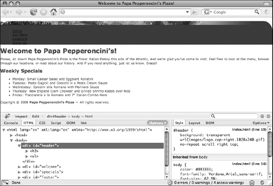
Figure 6-8. Adding the headline's background image on top of the header's background image begins to create the layered effect you want.
Clearly, you need to make these elements higher somehow. This is straightforward enough, of course. You'll simply add a declaration to the rule that targets the <h3> element in the header that sets its height property to be the height of the banner images, which are each 240 pixels tall:
#header h3 {

    background: url(images/logo.835x240.jpg) no-repeat;

    height: 240px;

}
In addition to increasing the height of the <h3> element, this declaration also increases the height of the header <div> element because the <h3> element is part of the <div>'s content area. Furthermore, because the <h3> element is a child of the <div>, the <h3> element's background image is overlaid on top of the <div>'s background image, as Figure 6-9 clearly shows.
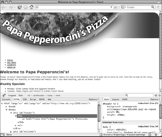
Figure 6-9. Background images get clipped if they are larger than the element's CSS box, so applying a height to the headline is necessary to display the full image of the pizza.
What this demonstrates is that each CSS box that is generated within the content area of another CSS box is actually being stacked on top of it, like a collage made with construction paper. As you continue nesting XHTML elements, you continue to stack CSS boxes one on top of another in an endless (and often invisible) tower. It's for this reason why any background applied to the <body> element always appears to be behind any other element on the web page and why the most deeply nested XHTML elements always appear to be in front of all their parent elements.
This stacking or layering behavior has a name. It's called the stack level or z-axis, which refers to the depth axis of a three-dimensional graph. Indeed, you can think of the web browser's viewport as one of these three-dimensional graphs. Depending on a web page's direction of flow (discussed in the previous chapter), the top-left corner of the browser viewport (or the top-right corner in right-to-left flows) can be said to be at position 0,0, meaning it is 0 pixels offset from the left edge of the viewport and 0 pixels offset from the top edge of the viewport. Each CSS box on a web page is positioned somewhere along the x-, y-, and z-axes on this imaginary graph. Figure 6-10 shows what this graph might look like from a web browser's point of view.
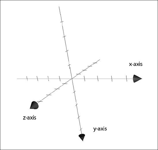
Figure 6-10. A three-dimensional graph has x-, y-, and z-axes. CSS boxes are positioned somewhere along each of these three axes, which is why they sometimes appear to be in front of one another, closer to the viewer's eyes facing the screen.
Moreover, exactly where a CSS box is placed along this z-axis by the browser can be controlled with CSS using the z-index property, which specifies a number that represents a point along this z-axis. For now, it's important to be aware only of the existence of this stacking behavior and its default behavior.
You need to make a few final modifications to the <h3> element in the header before you can call it complete. Obviously, since you're using the <h3> element's background to display the text "Papa Pepperoncini's Pizza," you no longer need to show the text in the <h3> element itself. However, you can't just get rid of that element. You can, however, move the inline box that its text content creates using the text-indent property. By setting a negative value on this property, you move the inline box toward the left edge of the viewport. By setting this value significantly high enough, you can actually move the text beyond the left edge of the viewport, effectively hiding it from view.
#header h3 {

    background: url(images/logo.835x240.jpg) no-repeat;

    height: 240px;

    text-indent: −999px;

}
This removes the text from the screen successfully, but since it doesn't do anything at all to the <h3> element's block-level box, there's still a gap between the top edge of the viewport and the image of the pizza logo. This gap is caused by the <h3> element's default top margin, so we'll zero it out (along with all its other margins).
#header h3 {

    background: url(images/logo.835x240.jpg) no-repeat;

    height: 240px;

    text-indent: −999px;

    margin: 0;

}
In the original unstyled page, the headline that read "Papa Pepperoncini's Pizza" was a link. However, when you moved the inline box with that text out of view, you also moved the link that text was contained within out of view. For the finishing touch on the masthead, you'll have to move the link back but keep the text hidden.
All you need to do to return the link is make the link's anchor element a block-level box. Doing this removes the effect of the text-indent declaration from the <a> element itself, but not for the anchor text. Since it's in fact the anchor elements that provide the clickable functionality of links and not the text they contain, this turns the one-line sliver of the top of the banner into the link you lost. To give the illusion that the logo image of the pizza itself is the link, you just need to set a specific width and height on the <a> element.
#header h3 {

    background: url(images/logo.835×240.jpg) no-repeat;

    height: 240px;

    text-indent: −999px;

    margin: 0;

}

#header h3 a {

    display: block;

    width: 835px;

    height: 100%;

}

</style>
The width is set to be equal to the width of the logo image of the pizza itself, and the height is set to 100%, which means "as tall as the containing block." In this case, the containing block of the <a> element is the <h3> element, so this ensures that the link is exactly as tall as the headline.
At this point, you have the masthead design fully implemented, without losing any of the semantic richness that the XHTML document contains. Even better, you've given it a lot of flexibility so that it can accommodate a browser window being resized to a significant degree, and you've also increased the usability of the header by greatly enhancing the clickable area of the link to the home page. Figure 6-11 shows the completed header implementation.

Figure 6-11. The completed header
The web page is now beginning to look like something you can be proud of, so without further ado, you'll continue working your way down the source code of your XHTML document. It's time to dive into styling the main navigation list.
The main navigation menu: absolute and relative CSS positioning
As you can see from looking at the design document, the main navigation menu is a vertical list of four text items in a larger font size, bold, and colored white; the list is positioned at the top right of the web page's masthead. Additionally, there is an orange icon that resembles a slice of pizza pointing at the currently selected menu item. This means that when the visitor is viewing the home page, the pizza slice icon needs to be visible next to the Home menu item, but when they are reading the online menu, the pizza slice icon needs to be visible next to the Our Menu menu item.
Let's begin by putting the navigation menu in the correct spot on the page. Right now, because the <ul> element that contains the navigation menu list items is generating a block-level CSS box in the normal flow of the web page, it is being rendered on its own line underneath the block-level CSS box generated by the 240-pixel-tall <h3> element. To move it to the top-right corner of the page, you first need to remove the <ul> element from the page's normal document flow so that you can control its positioning yourself. You do this by changing the element's position property:
#header ul {

    position: absolute;

}

</style>
When you save your changes and then reload the page to view the effect of this change, the result (shown in Figure 6-12) might be startling.
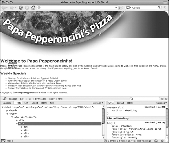
Figure 6-12. The navigation menu gets rendered overlapping other elements when it's taken out of the document flow and positioned absolutely.
As you can see, the headline and paragraph that used to be underneath the navigation menu appears to have slid upward on the page, and the navigation menu is now being displayed directly on top of those elements. What's happening here is actually simple: all you've done is remove the effect of the block-level CSS box generated by the <ul> element so that no other CSS boxes on the page are affected by its presence. This has the effect of making all the other CSS boxes completely ignore that it even exists, so as a result, the headline that reads "Welcome to Papa Pepperoncini's!" as well as the paragraph that follows it behave as though the navigation list isn't there.
Of course, the navigation menu certainly still exists; however, it exists in its own rendering context, which is akin to its own private document flow, completely unaffected by the flow or layout of other elements' CSS boxes. In a designer's terminology, you've effectively "created a new visual layer on top of the background layer" that contains only the navigation menu. In this state, you can move the navigation menu anywhere you want. Since you want to pin it to the top-right corner of the page, you'll use the top and right properties, which specify offsets from the top and right edges of (in this case) the viewport, each with a value of 0.
#header ul {

    position: absolute;

    top: 0;

    right: 0;

}

</style>
A reload of the web page now will show you that the navigation menu is indeed pinned to the top-right corner of the browser window and stays there while you resize the window. The position property is one of the most important properties to understand, so let's take a brief detour to discuss some of its other possible values.
The four values of the position property
When laying out designs with CSS2, CSS developers have a number of paths they can take. For the majority of them, the different possible values of the position property are used. The position property of an element can have one of four possible values. These are scroll, absolute, fixed, and relative. Each of them makes the element behave slightly differently, so let's examine each in turn.
The scroll value is the default value. If you never write a CSS style sheet with a position declaration in it, all of your elements will effectively be set to use the scroll value for this property. This value is easy to understand since you've been using it all along; it's the default behavior of document flow that we've become accustomed to whereby scrolling the page scrolls all of the elements on the page. Each CSS box is effectively cemented at whatever point it initially appeared.
The absolute value is probably the most frequently used value for this property. As shown, it completely removes the element from the normal document flow and allows you to use additional CSS properties (that is, the top, right, bottom, and left offset properties) to explicitly specify offset coordinates along the browser's x- and y-axes for the new position of the element on the page. This flexibility is incredibly powerful because it means you can specify a precise pixel location at which the element's CSS box appears. However, the offset coordinates are not always the edges of the browser viewport. To be precise, the absolute value sets the offset properties to values relative to the element's nearest positioned ancestor.
An element's nearest positioned ancestor is whatever ancestor element has already been given a position value other than scroll. In a typical left-to-right flow, that element's top-left corner then becomes the descendant element's 0,0 coordinate. To illustrate this, let's position the header <div> element absolutely as well and give the navigation menu's <ul> element a bright yellow background so you can clearly see its edges. Figure 6-13 shows the (rather odd-looking) result.
#header {

    background: url(images/logo.cap-right.1028×240.gif)

                             no-repeat right top;

    position: absolute;

}

/* other CSS rules... */

#header ul {

    position: absolute;

    top: 0;

    right: 0;

    background-color: yellow;

}

</style>

Figure 6-13. Moving the navigation menu list to the top-right corner of the viewport and giving it a background color for spotting it easily
There are probably a number of surprises shown here. First, it appears as though all the text has suddenly vanished. In fact, it hasn't vanished; it has just slid all the way to the top of the page and is being hidden by the tall banner images. Recall that the banner images actually contain white pixels in them, so what appears to be just the background of the white-colored web page underneath the banner images is actually part of the image and is thus obscuring the text that is now behind them. You can actually see this by noticing the slight outcropping of text at the top right of the viewport that reads, just barely, "browse through our."
Another apparent oddity is that the banner image's right side, the one with the rounded top-right corner, has also seemingly disappeared. This, too, has not actually disappeared but is instead also hidden underneath the <h3> element's background image of the large pizza pie and gradient stripe. On a related note, the entire banner's width has shrunk slightly and is no longer stretching across the entire viewport. This is because, despite that the header <div> is still a block-level element, it is no longer within the document's normal flow and so it has no containing block that it can reference to determine its total allowable width. As a result, its width is defined by its content, which in this case happens to be the 835-pixel-wide <a> element inside the <h3> element.
Finally, notice also that the navigation menu's absolutely positioned <ul> element is displaying the same width-shrinking behavior as the <div> element, which you now know to be because it is being rendered in its own visual context as well. However, instead of being pinned at the top-right corner of the browser's viewport as before, it is now pinned at the top-right corner of the header <div>. This is because the header <div> element is now the <ul> element's nearest positioned ancestor, so when you absolutely positioned it 0 pixels offset from the right edge and 0 pixels offset from the top edge of its containing block, that containing block now refers to the header <div>'s CSS box instead of the browser viewport.
On the other hand, the fixed value for the position property, which behaves the same way as the absolute value, will always use the browser's viewport as the offset reference. This has the important side effect of effectively pinning a CSS box at a certain point on the screen, regardless of whether a visitor scrolls the page. Unfortunately, neither Internet Explorer 5 nor 6 supports the fixed position, so this effect is not widely used.
The final possible value for the position property is relative. This value behaves similarly to the absolute value, but unlike the absolute value, setting an element's position property to relative does not remove it from the document's normal flow. Like the absolute value, however, it does create a positioned ancestor for any child elements. Let's switch the absolute value set on the header <div>'s position property to relative.
#header {

    background: url(images/logo.cap-right.1028×240.gif)

                              no-repeat right top;

    position: relative;

}
This restores the original layout you had before, with one important and very subtle distinction: the navigation menu is no longer pinned to the top-right corner of the browser viewport; instead, it is pinned to the top-right corner of the header <div>. Now, if you move the header <div> itself, the navigation menu will come along for the ride with it because you've effectively grouped all the elements inside of it into one self-contained layer.
Another way to think about the relative value for the position property is to say that it positions a CSS box at a certain offset relative to whatever its offsets would have been had the position value been scroll. For example, if you wanted to move the welcome <div> upward toward the banner image, you could give it a relative position with a negative top offset:
#welcome {

    position: relative;

    top: −70px;

}
Doing this will not cause the section of content that lists the weekly specials to "slide up on the page" as it would have done had you used an absolute value, because the relatively positioned CSS boxes retain the same layout effects as CSS boxes positioned with the scroll (default) value.
So as you can see, the relative value can serve two distinct purposes. First, with no associated offset properties declared, you can use it to create a positioned ancestor in order to position another element on the page. Second, you can use it to nudge CSS boxes around without affecting the position of their neighbors.
Positioning elements with the CSS position property and the related offset properties is among the most advanced CSS technique available to front-end web developers today, so it can take a lot of experimentation and practice to feel completely confident in using it. That said, spending a good deal of time experimenting with CSS-based positioning will undoubtedly pay huge dividends, so the investment is well worth it.
Now that you have a handle on how to position elements on the page using CSS-based positioning, we'll show how you can use the CSS box model in combination with this technique to skin your navigation menu.
Skinning the navigation menu: styling lists with CSS
At this point, the header is nearly complete. All that remains is to skin the navigation menu so that it has the look and feel the designer envisioned. To accomplish this, you'll need to learn about the various CSS properties you can use to manipulate the display of lists.
Because you're about to write a lot of CSS rules that target your navigation menu's <ul> element, it now makes sense for you to give that element an id attribute with a unique value so that you can select it more simply from your style sheet. Let's call it mainnav since it is the containing element of the main navigation elements.
<div id="header">
<h3><a href="index.html">Papa Pepperoncini’s Pizza</a></h3>
<ul id="mainnav">
<li><a href="index.html">Home</a></li>
<li><a href="menu.html">Our Menu</a></li>
<li><a href="locations.html">Locations</a></li>
<li><a href="about.html">About Us</a></li>
</ul>
</div>
You can now also change the CSS selectors from #header ul to #mainnav. Since list elements, such as the <ul> element that the navigation menu uses, typically have some amount of margins or padding applied to them by default via the browser's built-in style sheets that you don't need right now, ensure you remove any of these that may exist as well.
#mainnav {

    position: absolute;

    top: 0;

    right: 0;

    margin: 0;


    padding: 0;

}

</style>
There's nothing inherently special about a list element such as this. It simply generates a regular block-level CSS box. However, the same cannot be said of the <li> elements that lists generally contain.
By default, <li> elements generate a whole new kind of CSS box that is called a list-item box. List-item boxes behave similarly to the block-level boxes you're already accustomed to, with one important difference. In addition to generating a standard block-level CSS box, list-item boxes also generate a secondary marker box inside of which a special decorating marker is drawn. Typically, these markers are bullets (•) for li elements that are children of <ul> elements and are numbered (1., 2., 3., and so on) for <li> elements that are children of <ol> elements.
As with most things in CSS, certain properties give you more control over what kinds of markers are drawn, as well as where to draw these markers. For this design, you don't actually want to use these markers since you're not displaying the navigation menu in the traditional style of a list. This is actually quite typical of most designs for navigational menus on websites today. Despite that navigation menus are, in fact, logically and semantically represented as lists, their visual presentation is often quite different.
You have a number of options to choose from for making the list look less like a list. Most simply, you could set each list item's display property to block. Doing so will cause the <li> elements to generate normal block-level boxes instead of list-item boxes, effectively making the markers (the bullets) disappear. Another option is to leave the list-item boxes alone and just remove the marker boxes they generate. You'll do this by declaring the list-style-type property, which defines what kind of markers to display.
#mainnav {

    position: absolute;

    top: 0;

    right: 0;

    margin: 0;

    padding: 0;

    list-style-type: none;

}

</style>
Declaring a value of none indicates that no marker boxes should be generated. Instead of writing a new CSS rule, you've added this declaration to the declaration block of the CSS rule targeting the #mainnav element. This is because the list-style-type property is inherited, so by declaring this property on the <ul> element itself, all of its children <li> elements will inherit this value.
A value of disc, which is the default for <ul> elements, will cause the bullets to return. A value of decimal gives you ordered numbering, beginning with 1, and is the default for <ol> elements. In addition to bullets, list markers can also be rendered as squares by declaring the square value. Some of the other possible values for this property are other kinds of numbering systems, including decimal-leading-zero, upper-latin, lower-latin, upper-roman, lower-roman, hebrew, georgian, armenian, hiragana, and katakana, which each cause the marker to be displayed using that numbering system's native glyph. Unfortunately, once again, Internet Explorer does not support the majority of these options (although Internet Explorer 8 is slated to finally add support for them), so in practice you'll usually see only the defaults of decimal or disc used.
The next step in styling the list is to change the way the text appears:
#mainnav {

    position: absolute;

    top: 0;

    right: 0;

    margin: 0;

    padding: 0;

    list-style-type: none;

}

#mainnav a {

    color: #FFF;

    font: bold 2em "Myriad Pro", Verdana, Arial, sans-serif;

    text-decoration: none;

}

</style>
There's very little new here. The color property declares the text's color to be white, and the font property makes the text bold and sets the font to the same one the designer used in the design document, as well as providing a list of alternatives. It also sets font-size to 2em, which computes to 20 pixels in size.
How did we come up with 20 pixels, though? Well, recall that you originally declared the font size to be 62.5% on the <body> element. Assuming the visitor has set their browser's default text size preference to Medium (the factory default in most cases), this means regular text on the page is calculated to be exactly 10 pixels in size. This value is then inherited by all the elements on the page. The default font-size value for regular text on the page is 1em, which is the same as saying "the same size as the parent element's font-size." Therefore, all the regular text on the page is sized at 10 pixels. When you declare a font-size of 2em, what you're saying is effectively "double the size of the parent element's font-size." Since the parent element's font-size property is calculated to be 10 pixels, doubling that gives you 20 pixels (10 pixels times 2 equals 20 pixels). By the same logic, setting a value of 3em would make the navigation menu text 30 pixels in size, and setting a value of 2.5em would make it 25 pixels in size.
To avoid inconsistencies in the way that many browsers calculate the size of text and render it on the screen, it's important to ensure that all the text on your pages ends up being sized at a precise pixel value. Fractional pixel values can cause some browsers to display your text at a size you didn't intend. Figure 6-14 shows what the header looks like now.
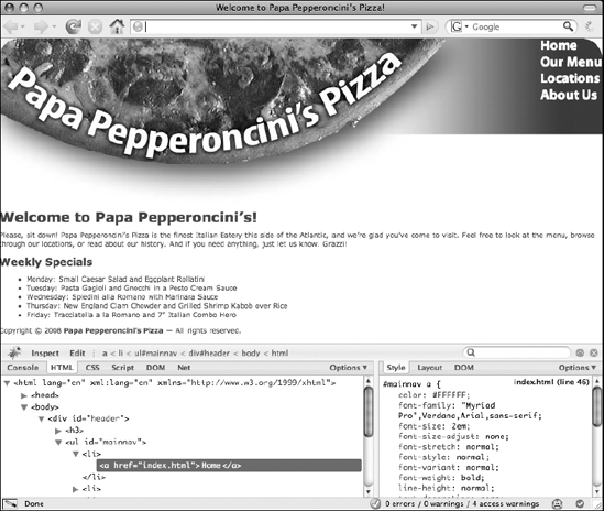
Figure 6-14. The header's fonts are now showing some font styles.
Next, let's get the exact spacing of the text right. In the design document, the navigation menu isn't pressed into the top-right corner like it is on the page. You need to push the text leftward a bit, and you also need to space the individual menu items vertically a bit more. You can use margins, padding, or a combination of both of these CSS box areas to accomplish this. For reasons that will become clear momentarily, let's use padding. Since you're going to need vertical padding as well as horizontal padding, you need to turn the inline boxes generated by the <a> elements into block-level boxes by declaring their display property, too.
#mainnav {

    position: absolute;

    top: 0;

    right: 0;

    margin: 0;

    padding: 0;

    list-style-type: none;

}

#mainnav a {

    color: #FFF;

    font: bold 2em "Myriad Pro", Verdana, Arial, sans-serif;

    text-decoration: none;

    display: block;

    padding: 1px 35px 1px 0;

}

</style>
That's almost perfect, but the navigation menu is still just a bit too high. To push it down a bit, let's increase the top margin on the list itself:
#mainnav {

    position: absolute;

    top: 0;

    right: 0;

    margin: 15px 0 0 0;

    padding: 0;

    list-style-type: none;

}

#mainnav a {

    color: #FFF;

    font: bold 2em "Myriad Pro", Verdana, Arial, sans-serif;

    text-decoration: none;

    display: block;

    padding: 2px 35px 2px 0;

}

</style>
Now the navigation menu is spaced just as it is in the design document. Figure 6-15 shows the results of the precise spacing. All that remains to complete it is adding the pizza slice icon that points to the currently selected page. Let's do that next.

Figure 6-15. By adding a little bit of padding, you're able to properly space the navigation menu items apart from each other and from the edges.
Adding interactivity: special styling for selected items and rollovers
The next sets of styles you need to write for the navigation menu are the ones that will add a certain amount of interactivity to the menu. First, you need to extract the pizza slice icons from the design document into a separate image. Since images must be rectangular and the pizza slice icon is decidedly not that shape, you need the image to have a transparent background, so you'll save it as a GIF file. We'll name the file icon.pizza-slice.normal.gif. Figure 6-16 shows the pizza icon image you'll use to highlight the current menu item selected, and Figure 6-17 shows a modified version of the pizza icon image you'll use for a rollover effect.

Figure 6-16. The background image icon
for the current menu item is an orange-
colored GIF with a transparent
background.
As you can see, we've named the rollover image icon.pizza-slice.hover.gif in keeping with the image file-naming conventions. More specifically, we didn't use "rollover" in the name of the file, because as you'll see in a few moments, CSS calls this rollover state the "hover" state instead.
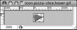
Figure 6-17. The background image
icon for the menu item's rollover
state is a blue-colored GIf with a
transparent background.
Now that you have the image assets you'll need saved to the images directory, you can begin by adding the normal pizza slice icon to the home page. To do this, you need a way to target just the one navigation menu item of the page that the visitor is currently viewing. The most reliable way to do this is to add an appropriately named class attribute to that particular list item. In this case, this is the home page, so you'll add a class value of selected to the first list item to signify this:
<div id="header">
<h3><a href="index.html">Papa Pepperoncini’s Pizza</a></h3>
<ul id="mainnav">
<li class="selected"><a href="index.html">Home</a></li>
<li><a href="menu.html">Our Menu</a></li>
<li><a href="locations.html">Locations</a></li>
<li><a href="about.html">About Us</a></li>
</ul>
</div>
Now, you can write a CSS rule that just targets whatever list item has the selected class applied to it. Let's add the normal pizza icon as a background image for the currently selected navigation menu item:
#mainnav a {

    color: #FFF;

    font: bold 2em "Myriad Pro", Verdana, Arial, sans-serif;

    text-decoration: none;

    display: block;

    padding: 2px 35px 2px 0;

}

#mainnav .selected a {

    background: url(images/icon.pizza-slice.normal.gif)

                             no-repeat left center;

}

</style>
This works, but it places the icon behind the text that reads "Home" instead of next to it. You need to give all the links in the navigation menu a bit of extra space on their left sides. This is no problem; you just need to tweak the padding value in the previous CSS rule. Since the pizza slice icons are exactly 35 pixels wide, you'll increase the left padding value to 45 pixels so you'll have 10 pixels of space between the edge of the icon and the beginning of the anchor text in the link.
#mainnav a {

    color: #FFF;

    font: bold 2em "Myriad Pro", Verdana, Arial, sans-serif;

    text-decoration: none;

    display: block;

    padding: 2px 35px 2px 45px;

}

#mainnav .selected a {

    background: url(images/icon.pizza-slice.normal.gif)

                             no-repeat left center;

}

</style>
Now let's do the same thing but for the rollover effect:
#mainnav a {

    color: #FFF;

    font: bold 2em "Myriad Pro", Verdana, Arial, sans-serif;

    text-decoration: none;

    display: block;

    padding: 2px 35px 2px 45px;

}

#mainnav .selected a {

    background: url(images/icon.pizza-slice.normal.gif)

                             no-repeat left center;

}

#mainnav a:hover {

    background: url(images/icon.pizza-slice.hover.gif)

                             no-repeat left center;

    color: #399;

}

</style>
This CSS rule introduces the :hover pseudo-class for the first time, so let's pause momentarily and examine what this means with a little more care.
The dynamic pseudo-classes: :hover, :active, and :focus
You'll recall from the previous chapter that a pseudo-class is a kind of CSS simple selector, which means you can use it to target certain elements on your page. Unlike most other kinds of CSS selectors, though, most pseudo-class selectors—such as the :hover pseudo-class selector—do not target elements that have any particular attribute value or other identifying characteristic. Instead, this pseudo-class selector targets elements that the visitor's cursor is currently hovering (or rolling) over. Since the visitor's cursor can be hovering over any element's CSS box at any given time, the :hover pseudo-class is the cornerstone of CSS-based rollover effects.
The :hover pseudo-class is called a dynamic pseudo-class because it describes a dynamic state, which is to say that elements can enter and leave the "hovered" state at the user's whim. In theory, any type of element (not just links) can be placed into this dynamic hovered state. Unfortunately, versions of Internet Explorer prior to 7 do not support the :hover pseudo-class on anything other than <a> elements, so in practice it's typically only links that get targeted with it.
The latest CSS selector, with its :hover pseudo-class selector, can be read as "when the cursor is hovering over an <a> element that is a child of the #mainnav element." Technically, what's happening is that the <a> element, just like any other element with the cursor hovering over it, enters a new and more specific state. Ordinarily, this fact isn't visually obvious because an element's :hover state inherits its initial values from the values of the element's static state, so there is no change in the visual appearance of the element. The moment you change these values by declaring different values for the element's :hover state, however, the change becomes immediately obvious, visible in the form of a rollover effect.
With the addition of the latest CSS rule, you now have a rollover effect for the navigation menu that shows and hides the teal-colored pizza slice icon, as well as turns the white links a similar color. In fact, it's a little bit too much because all the menu items are changing color on hover, even the currently selected item (Home). This is because you've declared :hover properties for both the selected and unselected items.
To stop the effect from happening on the selected items, you just need to specify the same values for the navigation links' hover states as those of their static state. You already specified a CSS rule for that state, so all you need to do now is add another CSS selector that uses the :hover pseudo-class to that rule and explicitly declare the text link's color.
#mainnav .selected a, #mainnav .selected a:hover {

    background: url(images/icon.pizza-slice.normal.gif)

                             no-repeat left center;

    color: #FFF;

}

#mainnav a:hover {

    background: url(images/icon.pizza-slice.hover.gif)

                             no-repeat left center;

    color: #399;

}

</style>
With this latest modification, the rollover effect is working just the way you want it to work. Still, there's a little bit more you can do to spruce up the navigation menu effects.
In addition to the :hover pseudo-class, CSS defines two other dynamic pseudo-classes. These are :active and :focus. Like the :hover pseudo-class, these two pseudo-classes apply to elements when they are in a particular state. In the case of the :active pseudo-class, this state is when the element is "being activated," such as between the time the user clicks a link and releases the mouse button. In the case of the :focus pseudo-class, this state is whenever the element has been given "focus," such as when a visitor tabs through the elements on a page. (Most web browsers will outline a focused element with some kind of highlight—Firefox actually uses a box's CSS border area for this, although for some odd reason you can't override this behavior with CSS.)
None of these pseudo-classes is mutually exclusive, which means that an element may be in any number of these states at any given time. For example, clicking a link first brings that element into the hover state (because the mouse cursor needs to be over that element in order to click it) and then gives that element focus and activates it at the same time. As you can see, a number of distinct events are happening here in quick succession.
We'll discuss more about the different kinds of events that a web browser can expose to you in the next chapter when we cover JavaScript's event-driven programming model. In the meantime, all you need to worry about is how to distinguish different dynamic states from one another using the dynamic pseudo-classes that CSS provides.
Right now, for this design, all you really need is to add another CSS rule to define the look and feel of the navigation links when a user clicks them. Even though the designer hasn't provided a design for this state in the original design document, it would be nice if the text turned red and the pizza-slice icon moved closer to the text itself. Changing the text color is a breeze, and moving the pizza slice icon right without moving the text of the link itself simply requires some careful manipulation of the <a> element's left margin and left padding properties. Since you also don't want this effect applied to the currently selected item, you'll add another selector into the CSS rule that styles the selected navigation item and override the declarations for the properties you add to the CSS rule below it.
#mainnav .selected a,

#mainnav .selected a:hover,

#mainnav .selected a:active {

    background: url(images/icon.pizza-slice.normal.gif)

                             no-repeat left center;

    color: #FFF;

    margin-left: 0;

    padding-left: 0;

}

#mainnav a:hover {

    background: url(images/icon.pizza-slice.hover.gif)

                             no-repeat left center;

    color: #399;

}

#mainnav a:active {

    color: red;

    margin-left: 7px;

    padding-left: 38px;

}

</style>
What you're doing with this new rule is changing the position of the left padding edge of the <a> element's CSS box relative to the rest of the element's CSS box. Since you know that background images, like the pizza slice icons, are drawn inside a CSS box's padding and content areas, reducing the width of the left padding area effectively moves the pizza slice icon closer to the text.
To be precise, you're moving it exactly 7 pixels closer, since you declared a left padding area width of 45 pixels in an earlier CSS rule and are now changing that width to 38 pixels (45 pixels minus 38 pixels equals 7 pixels). At the same time, you also increase the CSS box's left margin area from zero width to 7 pixels in order to "fill up" the space that you lost by decreasing the width of the padding area so that the CSS box as a whole remains in the same spot in the browser viewport.
As you can see in Figure 6-18, this ensures that the navigation links remain nicely aligned with one another while moving the pizza slice icon toward the text.

Figure 6-18. Applying the rollover backgrounds with the :hover pseudo-class gives a dynamic rollover effect.
Another way to accomplish the same effect would simply be to change the background-position property so that the background image is moved 7 pixels right from the left edge of the CSS box's padding area.
#mainnav .selected a,

#mainnav .selected a:hover,

#mainnav .selected a:active {

    background: url(images/icon.pizza-slice.normal.gif)

                             no-repeat left center;

    color: #FFF;

}

#mainnav a:hover {

    background: url(images/icon.pizza-slice.hover.gif)

                             no-repeat left center;

    color: #399;

}

#mainnav a:active {

    color: red;

    background-position: 7px center;

}

</style>
Using this approach, you can also remove the margin-left and padding-left declarations in the CSS rule before this one.
Both approaches are perfectly valid. This example shows that in many situations, you may find yourself with more than one way to accomplish the same thing. The method you choose to use will probably depend largely on your own experience and personal preferences. Sometimes, however, you'll be in a situation where designs dictate your choices a lot more than others. This occurs most often in more complex designs that require you to leverage every feature of CSS you can. In these cases, it's beneficial to be familiar with as many ways of doing things as possible so that you can have the most options available to you.
You'll use the background-position method since that shortens the CSS style sheet by a few lines (and we're lazy typists). Regardless of which method you end up using for the navigation menu, you now have the entire header and navigation menu's designs completed. For the final pièce de résistance, let's add one more declaration to the CSS rule that styles the currently selected navigation menu item:
#mainnav .selected a,

#mainnav .selected a:hover,

#mainnav .selected a:active {

    background: url(images/icon.pizza-slice.normal.gif)

                             no-repeat left center;

    color: #FFF;

    cursor: default;

}
This final declaration turns the visitor's cursor into whatever the browser's default is, typically an arrow, making it appear as though the currently selected navigation item isn't even a link at all! This often helps prevent the annoying situation where a visitor clicks a link that points to the same page as the one they're currently on and nothing appears to happen. Another way of doing this is by making the cursor appear as though it were a standard text-insertion cursor (often displayed as an I-bar) by using the value text, but this has the drawback that some users may try to select the text of the link and accidentally activate it.
Before you continue laying out the rest of your web page, let's explore what else you can do with links and pseudo-classes.
Styling links using the link pseudo-classes: :link and :visited
The most commonly used pseudo-classes are the :link and :visited pseudo-classes. These two pseudo-classes apply to links based on whether that link has been previously viewed. In other words, the :link pseudo-class is used to define the style of links that a user has yet to click, and the :visited pseudo-class is used to define the style of links that a user has previously clicked.
At first, it may seem a little strange that the name for this pseudo-class is :link since all throughout the rest of this book we've been referring to links as anchor (<a>) elements. However, this abstraction makes much more sense when you remember that you can use CSS to define the styling of any markup language, not just XHTML. So, although in XHTML the :link and :visited pseudo-classes simply apply to <a> elements that have been given a value in their href attribute, the :link and :visited pseudo-classes can apply to different elements based on whatever the definition of a "link" is in that other markup language. To put it more succinctly, when you use these pseudo-classes in (X)HTML, the following CSS selectors all target the same elements (albeit with different specificities):
a:link { ... }

:link { ... }

a:visited { ... }

:visited { ... }

a:link:visited { ... }
The first two CSS selectors shown in the previous code target all unvisited links, whereas the next three CSS selectors target all visited links. Of special note is the final CSS selector shown in the previous code, a:link:visited, because it demonstrates you can chain pseudo-class selectors just as you can for any other simple selector. Therefore, you can theoretically combine the dynamic pseudo-classes with the link pseudo-classes to create CSS selectors that target links in a particular state. For instance, the following CSS rule creates a rollover effect on visited links that makes them partially see-through:
a:visited:hover { opacity: .5; }
Sadly, Internet Explorer versions prior to 7 do not understand CSS selectors with multiple chained pseudo-classes such as this, so those browsers read this CSS selector as a:hover { ... }. (As an aside, no current version of Internet Explorer supports the opacity property either, although you can use a proprietary declaration such as filter: alpha(opacity=50); to get similar results as the previous declaration. Beware, however, that using this declaration in your style sheet will cause it not to validate.) The take-away point is that these pseudo-classes are specifically designed to let web designers distinguish between visited and unvisited links.
Since all the pseudo-classes have the same specificity, it's customary to define generic link styles for a design near the top of one's CSS style sheet in the following order:
a:link { /* style declarations for regular links */ }

a:visited { /* style declarations for regular visited links */ }

a:hover { /* style declarations for rollover, unvisited links */ }

a:active { /* style declarations for activated (clicked) links */ }
By defining these CSS rules in this order at the top of your style sheet, you use the natural CSS cascade to make sure that active link styles always override all the other link styles and that hovered link styles override static link styles. You also ensure that visited link styles override regular link styles. This replicates the default behavior web surfers are accustomed to. Since you've yet to define any link styles, or indeed any links at all, go ahead and add some to the welcome paragraph in this document:
<div id="welcome">
<h1>Welcome to Papa Pepperoncini’s!</h1>
<p>Please, sit down! Papa Pepperoncini’s Pizza
is the finest Italian Eatery this side of the Atlantic,
and you’re glad you’ve come to visit.
Feel free to look at <a href="menu.html">the menu</a>,
browse through our
<a href="locations.html">locations</a>,
or read <a href="about.html">about our history</a>.
And if you need anything, just let us know. Grazzi!</p>
</div>
Now, let's write some appropriately nice-looking CSS styles for these links. Let's color the regular links a deep blue color so that they stand out a little and the visited links a darker orange color so that they fade away. You'll make all links stand out even more by turning them green when they are hovered and a dark brown when they're clicked.
<style type="text/css">

html, body {

    margin: 0;

    padding: 0;

    border: none;

    background: #FFF;

}

body {

    color: #933;

    font: 62.5%/1.3em Verdana, Arial, sans-serif;

}

a:link {

    color: #06F;

}

a:visited {

    color: #906;

}

a:hover {

    color: #393;

}

a:active {

    color: #C60;

}

#header {

    background-image: url(images/logo.cap-right.1028x240.gif);

    position: relative;

}
Now, as you can see in Figure 6-19, the regular links in the page will be styled differently based on whether you've followed that particular link before.

Figure 6-19. Links can be styled differently based on whether the destination of the link is in the web browser's cache. If it is, then the link is visited, as the "locations" and "about our history" links in this figure are. Otherwise, the link is unvisited, like the "the menu" link.
While you're at it, you can improve these links even further by adding a title attribute to each of them. title attributes, as discussed briefly in Chapter 4, allow you to add supplementary information to most elements on a web page. The values of title attributes are usually rendered as tooltips, so they should contain short, helpful descriptions of what will happen when the user activates that element.
title attributes are especially helpful for links that point to the same pages as links in other parts of the page (which may or may not have the same anchor text), such as the links in the welcome paragraph and in the header. To clue the visitor in to the fact that these links actually go to the same destination page, you'll give each pair of links the same title value:
<div id="header">
<h3><a href="index.html" title="Return to home page.">Papa
Pepperoncini’s Pizza</a></h3>
<ul>
<li>
<a href="index.html" title="Return to home page.">Home</a>
</li>
<li><a href="menu.html" title="Read our menu online.">Our
Menu</a></li>
<li><a href="locations.html" title="Find our nearest
restaurant.">Locations</a></li>
<li><a href="about.html" title="Discover what makes us the
best.">About Us</a></li>
</ul>
</div>
<div id="welcome">
<h1>Welcome to Papa Pepperoncini’s!</h1>
<p>Please, sit down! Papa Pepperoncini’s Pizza
is the finest Italian Eatery this side of the Atlantic,
and you’re glad you’ve come to visit.
Feel free to look at
<a href="menu.html" title="Read our menu online.">the
menu</a>, browse through our <a href="locations.html"
title="Find our nearest restaurant.">locations</a>,
or read <a href="about.html"
title="Discover what makes us the best.">
about our history</a>. And if you need anything, just
let us know. Grazzi!</p>
</div>
Since the text of title attributes must be kept pretty short, we've tried to be as direct as possible when writing their values. As you can see, each title attribute uses imperative language to immediately inform the visitor what each link will do for them.
With all the link styling complete, you can next turn your attention to the final layout challenges you face in this design: splitting the welcome and weekly special sections into two vertical columns.
Making columns using floats and margins
In almost every medium, including the Web, designs often split content into multiple columns. There are a number of reasons for this trend. First, the human eye has difficulty scanning very wide lines of text, so splitting content into multiple narrower columns makes reading it easier. Another reason for this is that the human visual system is hardwired to recognize the proximity and alignment of groups of objects as being related to one another, so columns are a good way to distinguish one kind of content from another. Yet another reason is that the amount of physical space that web pages can use to display information to their visitors is limited, so columns also offer a good way to present more information in a smaller space.
The challenge, of course, is that while the human eye looks around a web page in a (mostly) randomized order, the source code of web pages is actually stored in a linear order. Once again, this is another area where properly structured, presentation-free markup used in conjunction with CSS can really shine. Even so, multicolumn layouts can often be very tricky to implement in a cross-browser compatible way.
You can use a couple of techniques to create columns in CSS. One of them is to just use absolutely positioned elements to define each column's location and dimensions. For instance, you might at first try to move the welcome <div> into a left column and the specials <div> into a right column using these CSS rules. Figure 6-20 shows the result of these positioning rules.
#welcome, #specials {

    position: absolute;

    top: 250px;

}

#welcome {

    left: 30px;

    width: 275px;

}

#specials {

    left: 375px;

}

Figure 6-20. Columns using absolutely positioned boxes can be positioned at will, regardless of their source order, but are then stiff and inflexible.
This seems to work rather nicely, and it has the benefit that you can position any piece of content anywhere on the page regardless of where that content appears in your XHTML source document. This method of creating columns does have one big drawback, however. Once the columns are positioned, they are stiff and inflexible because they will each ignore the other's existence.
For example, when you try to position the footer in an appropriately spaced point on the page, you run into the problem of not being able to determine ahead of time how far down the page it should be placed. If you put it too high, then the text in the columns will clobber it when the user increases their font size or when Papa Pepperoncini decides he'd like to add more text to his home page. On the other hand, if you put it too low, then you'll end up with a large amount of (ugly) blank space between the end of the columns and the start of the footer.
Of course, you could just keep tweaking the position of the footer whenever you'd like to make a change (and pray that the user doesn't touch their browser preferences!), but that's obviously not the best solution. Besides, you're a busy person and can't have Papa Pepperoncini calling you whenever he wants to change the text on his website. Clearly, you need to explore other options.
Another way you could separate this content into columns is by using a new property, called float, to move the element that appears first to the left or right content edge of its containing CSS box. In this case, this means you could use the float property with a value of left to move the welcome <div> to the left edge of the browser viewport. Of course, the welcome <div>'s left edge is already at the left edge of the browser viewport, so what good would this do you? Plenty!
Declare the float and width properties on the welcome <div> and see what happens:
#mainnav a:active {

    color: red;

    background-position: 7px center;

}

#welcome {

    float: left;

    width: 275px;

}

</style>
As you can see in Figure 6-21, this CSS rule has also given you two columns, but the columns are behaving a little bit strangely. The first oddity you're likely to notice is that the bullets in the list of weekly specials are overlapping a bit of the text in the welcome paragraph. For that matter, the entire list isn't even indented anymore, and all of the list items are now aligned with the headline that reads "Weekly Specials." There are actually a few things going on here, so let's take a breather and examine what's happening to each CSS box individually.
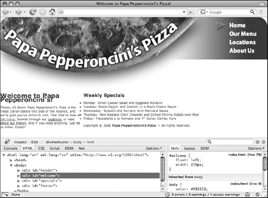
Figure 6-21. Creating columns by using floated layouts keeps the elements within the major document flow but has some limitations of its own.
The many layout effects of floated boxes
When you declare a float value on a CSS box, what you're doing is telling the browser to "take the CSS box this element generates and move, or float, it to the left (or right) as far as it can go without bumping into any other CSS box in the same document flow." Once a box is floated, it takes on a number of special behaviors that affect its neighboring CSS boxes in different ways besides simply moving toward the left or right edge of its containing block.
First, whenever you float a box, you implicitly transform the CSS box of the floated element into a block-level box, if the box was not already a block-level box before. Second, the floated box is moved partway out of the normal document flow so that content flows along its right side (for a box floated left) or its left side (for a box floated right). Since it is no longer in the document's normal flow, other block-level boxes appear to "slide upward" on the page in much the same way as you saw happen when you positioned elements absolutely. However, since the floated box is not entirely out of the document flow, all inline-level boxes actually wrap around the outer edges of the floated box (honoring the floated box's margins, padding, and border areas, if it has any). Third, if the floated element was previously contained within an inline-level box, the top edge of the floated box will be aligned with the top edge of that box. Otherwise, its top edge will be aligned with the bottom edge of the block-level box that came before it.
An example will help clarify this for you. Let's insert a new <div> directly after the welcome headline. We'll identify this <div> as floatbox to make things simple:
<div id="welcome">
<h1>Welcome to Papa Pepperoncini’s!</h1>
<div id="floatbox">I am a floated box.</div>
<p>Please, sit down! Papa Pepperoncini’s Pizza
is the finest Italian Eatery this side of the Atlantic,
and you’re glad you’ve come to visit.
Feel free to look at
<a href="menu.html" title="Read our menu online.">the
menu</a>, browse through our <a href="locations.html"
title="Find our nearest restaurant.">locations</a>,
or read <a href="about.html"
title="Discover what makes us the best.">
about our history</a>. And if you need anything, just
let us know. Grazzi!</p>
</div>
Now, let's turn this box into a 60-pixel by 60-pixel square, float it left, and give it a yellow background so you can easily identify its edges. Figure 6-22 shows the resulting display.
#floatbox {

    float: left;

    width: 50px;

    height: 50px;

    padding: 10px;

    background-color: yellow;

}

Figure 6-22. Floating a box causes the content to wrap around it at either the left or right sides.
As you can see, the floated box has been vertically aligned with the bottom of the preceding block-level box, which in this case is the <h1> element producing the headline "Welcome to Papa Pepperoncini's." Moreover, the inline boxes containing the text of the welcome paragraph as well as the inline boxes inside the specials <div> are all flowing around the right side of the box. Finally, notice that the floated box actually extends beyond the bottom edge of the welcome <div> in which it is nested in the XHTML source. Figure 6-23, which adds solid backgrounds to the welcome and special <div> elements, shows this more obviously.
#floatbox {

    float: left;

    width: 50px;

    height: 50px;

    padding: 10px;

    background-color: yellow;

}

#welcome { background-color: green; }

#specials { background-color: blue; }

Figure 6-23. Adding backgrounds to the nearby elements reveals that floated boxes protrude from the bottom of their containing blocks.
This is important: although floated boxes may not be placed higher than the point at which their top edge aligns with their containing inline-level box's top edge or the bottom edge of the preceding block-level box, their bottom edge will protrude beyond the bottom edge of their parent's CSS box. If you imagine that the yellow floated box were an image, you can see why floated boxes have to stick out of the bottom of their containers; if they couldn't, you wouldn't be able to wrap text around an image that was taller than its paragraph (as many images are).
If you were to float this box to the right instead of to the left, you'll see that the text will now flow around its left edge, as shown in Figure 6-24.

Figure 6-24. Floating a box
to the right makes the
content nearby it wrap
around its left edge.
Now that you understand what floated boxes actually do to your layout, let's reexamine what happened when you floated your welcome <div> to the left in order to turn it into a column.
Spacing your columns
As previously shown, when you floated the welcome <div> left, you created what looked like two columns. In fact, this isn't true. What you actually accomplished was making the content in the specials and footer <div> elements flow around the content in the floated welcome <div>. If you take a second look at the floated welcome <div> (shown in Figure 6-25), this time using background colors to make the specials and footer CSS boxes visible, you'll see that you really still have only one column.
#mainnav a:active {

    color: red;

    background-position: 7px center;

}

#welcome {

    float: left;

    width: 275px;

}

#specials { background-color: green; }

#footer { background-color: blue; }

</style>

Figure 6-25. Block-level boxes still grow to the width of their containing block, even when they contain floated boxes.
As you can see, both the specials and the footer <div> elements are still in a single wide column that stretches from one edge of the browser viewport to the other. It's merely that all the content, in its inline-level boxes, is wrapping around the floated welcome <div> that makes it appear as though you have two columns.
This also explains why your list of weekly specials no longer appears to be indented; since the block-level boxes that they are inside actually stretch across the entire width of the browser viewport, they are indented, but then they need to be moved even further toward the right to make room for the 275-pixel-wide floated box. As a result, they appear to lose their indentation since the browser itself has moved them automatically.
To fix this, all you need to do is define a significantly large left margin for the specials <div> so that the left edge of its content area is moved past the right outer edge of the welcome <div>. Since the welcome <div> is currently 275 pixels wide and it begins at the left edge of the browser viewport, any amount greater than 275 pixels will be enough for the left margin of the specials <div> to clear the right edge of the welcome <div>.
#mainnav a:active {

    color: red;

    background-position: 7px center;

}

#welcome {

    float: left;

    width: 275px;

}

#specials { margin-left: 375px }

</style>
Figure 6-26 shows the result of adding this margin-left declaration (and an additional declaration to color the background green for the sake of example).
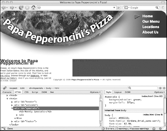
Figure 6-26. Using a combination of a floated box and a significantly high margin property can create the appearance of columns.
From here, all it takes is a few more CSS rules to quickly give the columns and their elements proper spacing and font sizing:
#welcome {

    float: left;

    width: 275px;

    margin: 0 0 0 30px;

}

#specials { margin: 0 35px 0 375px; }

#welcome h1, #specials h2 {

    font-size: 2.2em;

    line-height: 1.3em;

}

#welcome p, #specials li {

    font-size: 1.4em;

    line-height: 1.5em;

}

#specials h2 { margin-bottom: 0; }

#specials ul {

    list-style-type: none;

    margin: 0;

    padding: 0;

}

</style>
This might look like a lot, but it's nothing you haven't seen before. First, you simply set the margins of the welcome <div> to give you 30 pixels of whitespace along the left edge of the viewport. In the next rule, you set the margins of the specials <div> to give you 35 pixels of whitespace on its right side (to avoid having text run into the right edge of the viewport) and 375 pixels of space on its left (to clear the left column).
The rule after that sizes both column's headlines at 22 pixels (2.2em) and increases their line height so that the two lines of text that read "Welcome to Papa's Pepperoncini's!" don't overlap one another. The rule after that does the same for the welcome paragraph and list of weekly specials, only it sets their font size to 14 pixels (1.4em). The next rule removes the default bottom margin of the "Weekly Specials" headline so that, along with the final rule, the list of weekly specials appears to be right underneath the headline without any bullet markers.
Finally, in order to get the first sentence of the welcome paragraph—the one that reads, "Please, sit down!"—to display on its own line, you need to make one last tweak to the XHTML content of your page so that you can target this sentence with another rule. You could use the <span> element, but that doesn't add any additional semantic value to the page. Since the design clearly indicates that this first sentence should be emphasized in some way, you'll use an <em> element so that the semantics of the page more closely resemble the intention of the visual design:
<div id="welcome">
<h1>Welcome to Papa Pepperoncini’s!</h1>
<p><em>Please, sit down!</em> Papa Pepperoncini’s Pizza
is the finest Italian Eatery this side of the Atlantic,
and you’re glad you’ve come to visit.
Feel free to look at
<a href="menu.html" title="Read our menu online.">the
menu</a>, browse through our <a href="locations.html"
title="Find our nearest restaurant.">locations</a>,
or read <a href="about.html"
title="Discover what makes us the best.">
about our history</a>. And if you need anything, just
let us know. Grazzi!</p>
</div>
Now you can pull this sentence out of its paragraph and display it on its own line by making it generate a block-level box. Figure 6-27 shows the result of all these additions.
#welcome {

    float: left;

    width: 275px;

    margin: 0 0 0 30px;

}

#specials { margin: 0 35px 0 375px; }

#welcome h1, #specials h2 {

    font-size: 2.2em;

    line-height: 1.3em;

}

#welcome p, #specials li {

    font-size: 1.4em;

    line-height: 1.5em;

}

#welcome em {

    display: block;

    margin-bottom: 1em;

    font-weight: bold;

}

#specials h2 { margin-bottom: 0; }

#specials ul {

    list-style-type: none;

    margin: 0;

    padding: 0;

}

</style>
Figure 6-27. Styling the emphasized text as a new paragraph
As you can see, this last group of simple changes has completed the implementation of the main two columns. Better yet, since you didn't take your columns out of the normal document flow by using absolute positioning, both of the columns are now lining up with the end of the header by themselves. This means that if you later shrink the header, the columns will slide up the page along with it.
All you have left to do now is position and style the footer, and you can call your design complete.
Styling the footer: clearing floats and adding borders
The final block of content you need to style to complete Papa Pepperoncini's Pizza website is the footer. The original design didn't actually include a footer, so let's not spend too much time worrying about it. All you really need to do is make sure it always appears at the bottom of the website.
Currently, the footer is flowing around the floated left column right after the <div> listing Papa Pepperoncini's weekly specials in the right column. To ensure that the footer <div> is always beneath both columns, what you need to do is increase the footer's top margin by a significant amount to ensure that it clears the floated left column when the right column doesn't have enough content to push it down beneath the left column on its own. But how can you know how much to increase the top margin of the footer by ahead of time? Thankfully, you don't have to.
By declaring the clear property on the footer <div>, you can tell the browser to automatically adjust its top margin so that element always clears whatever floated boxes precede it in the document flow. In this case, since you want the footer to clear a CSS box that you've floated left, you can use the left value:
#specials ul {

    list-style-type: none;

    margin: 0;

    padding: 0;

}

#footer { clear: left; }

</style>
However, since you already know that you always want the footer to be at the bottom of the page, you may as well tell it to clear both left and right floated boxes by telling it to clear both.
#specials ul {

    list-style-type: none;

    margin: 0;

    padding: 0;

}

#footer { clear: both; }

</style>
Now, the footer will always be at the bottom of the page. If the floated left column is taller than the statically positioned right column, the browser will increase the footer's margin on its own so that it clears the floated column. If the right column is taller than the float, then the right column's content itself will ensure that the footer is pushed beneath both columns.
To give the footer a little extra breathing room and a bit of a nicer display, let's center the text, give the footer a top single top border, and push the left and right edges of the footer in from the edges of the browser viewport so that the border you give it will align nicely with the left edge of the left column:
#specials ul {

    list-style-type: none;

    margin: 0;

    padding: 0;

}

#footer {

    clear: both;

    text-align: center;

    border-top: 1px solid;

    margin: 0 30px 0;

}

</style>
In turn, these three declarations center all the inline-level boxes (the text) inside the footer, apply a 1 pixel solid top border, and finally increase the footer's horizontal margins by 30 pixels. Since you didn't specify a color for the top border, the color of the text will be used by default.
As a finishing touch, to give the design just a touch more whitespace between the ends of the columns and the start of the footer, let's increase the bottom margin on each column by another 30 pixels. You need to use the bottom margins of the columns to do this since you can't rely on the footer's top margin, because you're telling the browser to adjust that for you by itself in some cases. With these last changes, the style sheet—and the web design—is now complete.
#welcome {

    float: left;

    width: 275px;

    margin: 0 0 30px 30px;

}

#specials { margin: 0 35px 30px 375px; }

#welcome h1, #specials h2 {

    font-size: 2.2em;

    line-height: 1.3em;

}
Figure 6-28 shows the resulting design. Compare it with Figure 6-2 to see how closely you managed to mimic the original design.

Figure 6-28. The completed CSS-based design
At this point, you have the web page working perfectly in Firefox, but there are a few issues in other, less standards-compliant web browsers such as Internet Explorer. It's now time to return to these issues and mercilessly squash these rendering bugs one by one.
Dealing with nonstandard browsers
Try as it might, today's most popular web browser, Internet Explorer 6 for Windows, just can't cope with a lot of the (very basic) standard CSS-based layout schemes. In addition to its utter lack of support for parts of the CSS specifications, it and its differently versioned cousins sport a litany of rendering bugs that often have seemingly bizarre and completely unpredictable causes and solutions. It is especially notorious for dealing particularly poorly with complicated layouts that make heavy use of floated boxes.
The good news is that, thanks to the work of the web development community, most of these rendering bugs and their solutions have now been documented on websites such as "Big John" Gallant's and Holly Bergevin's Position Is Everything (http://positioniseverything.net/) and Peter-Paul Koch's Quirksmode (http://quirksmode.org/). These sites, among many others discoverable via a simple Google search, are absolutely indispensable resources for learning about the ins and outs of what's happening inside these nonstandard browsers when it seems like nothing is making sense at all.
Some of these bugs are so bad that even with a simple design such as the one you've developed for Papa Pepperoncini's Pizza website, there's bound to be some trouble. Indeed, unfortunately, if you take a look at the web page in Internet Explorer 6, you'll find that you have some (blessedly) minor problems. Figure 6-29 shows what Internet Explorer 6 makes of the code.

Figure 6-29. Bugs in Internet Explorer 6 cause it to render the page with incorrect spacing in the navigation menu and the right column's headline.
Each navigation menu link is spaced apart from the other ones way more than they should be and . . . yikes! Where'd the fourth navigation menu item go? Since the text of the list items is white, this last one seems to have vanished. In fact, it's actually still there, camouflaged into the white background of the header image. If you hover over it, you can see that it's still there.
However, hovering over the link reveals yet another problem with the navigation menu: only the anchor text of the link itself reveals the link's hover effect. In Firefox (and all other standards-compliant web browsers), the entire block-level box of the <a> element provides space to reveal the rollover.
Though slightly better, even the latest release of Internet Explorer—which is Internet Explorer version 7 as of this writing—has some spacing problems. Figure 6-30 shows the same code in Internet Explorer 7.

Figure 6-30. Though fewer seem to exist, some rendering bugs still remain even in Internet Explorer 7.
So, how can you wrestle these browsers into compliance? Even though Internet Explorer 8's promised improvements should be quite uplifting, it will still take time for the older versions of the web browser to become obsolete. You have a number of choices, each with their own pros and cons.
Browser-specific style sheets using conditional comments
Of course, one way to deal with browser bugs is to send entirely different style sheets to different web browsers. That's an awful lot of extra work, though, and the work required to maintain these different versions of the style sheets will only increase over time as you try to support more and more web browsers. Besides, even Internet Explorer did manage to get most of the rules in the style sheet correct.
Instead of making new style sheets for nonstandard browsers, you can use CSS's own cascading mechanism to write new CSS rules to override just the declarations that these web browsers have trouble with. This way, you won't be duplicating as much of the work you've previously accomplished. In addition, you can segregate the rules you write specifically for buggy browsers into one central place, which many developers find a lot easier to manage.
The most reliable way to apply a browser-specific style sheet to Internet Explorer is by using one of Internet Explorer's own proprietary features called conditional comments. (We go into quite a bit more detail on this in Chapter 8.) Briefly, a conditional comment looks exactly like a regular XHTML comment to every browser except Internet Explorer. When Internet Explorer encounters this specially crafted comment, however, it goes ahead and parses the content of the comment as though it were really part of the code. This feature lets web developers write code that only Internet Explorer can see.
If you go down this path, you could create a new embedded style sheet specifically for Internet Explorer that's filled with the CSS rules you want to use to override the problematic ones in the original, standards-based style sheet. Such XHTML code would look like this:
<!DOCTYPE html PUBLIC "-//W3C//DTD XHTML 1.0 Strict//EN"
"http://www.w3.org/TR/xhtml1/DTD/xhtml1-strict.dtd">
<html xmlns="http://www.w3.org/1999/xhtml" xml:lang="en" lang="en">
<head>
<meta http-equiv="Content-Type"
content="text/html; charset=utf-8" />
<title>Welcome to Papa Pepperoncini’s Pizza!</title>
<style type="text/css">
/* our original style sheet goes here */
</style>
<!--[if IE]><style type="text/css">
/* special Internet Explorer-only style sheet goes here */
</style><![endif]-->
</head>
As shown, a conditional comment starts and ends just like a typical XHTML comment, which is why other browsers can't see it. Internet Explorer, on the other hand, evaluates the expression placed within the square brackets (between the [ and ]> sequences). If the expression evaluates to true, then Internet Explorer will treat everything else up until the trailing <![endif]--> as though it were normal code.
The expression inside a conditional comment can even test to see which version of Internet Explorer is parsing the comment. For instance, here's a conditional comment that only Internet Explorer 6 will see:
<!--[if IE 6]> Code for all Internet Explorer 6

                         could go here. <![endif]-->
And here's one that all versions of Internet Explorer prior to (that is, less than) 8 will see:
<!--[if IE lt 8]> Code for all versions of Internet Explorer

                             prior to 8 could go here. <![endif]-->
Placing CSS style sheets behind conditional comments is arguably the safest method to use for redefining CSS rules specifically for Internet Explorer. Of course, conditional comments won't work for any browser other than Internet Explorer, so unless the problem with the rendering of your page is occurring only in that browser, conditional comments are only part of the potential solution. Additionally, conditional comments can't be placed inside a CSS style sheet, so you're forced to create entirely new style sheets when you want to use a conditional comment, even if that style sheet ends up being just a single CSS rule or two.
Filtering CSS rules with CSS selectors
Another method for tackling browser-specific CSS bugs is to rely on the browser's own failure to support CSS selectors properly. Since you already know that Internet Explorer (and many other, older web browsers) don't support certain CSS selectors, you can hide specific declaration blocks behind such CSS selectors. CSS rules written for this purpose and in this way are typically referred to as CSS filters, because they are used to filter CSS declarations away from different browsers.
A common idiom for this is to use the child combinator with the html and body type selectors:
html > body /* real selector goes here */ {

    /* CSS declarations for Internet Explorer 6 and below go here */

}
Since the <body> element is always a direct child of the html element, prepending this CSS selector to your real CSS selector will always match your real CSS selector. However, since Internet Explorer versions prior to 7 do not understand CSS selectors that use the child combinator, those browsers will completely ignore the CSS declarations inside the declaration block. So, for example, to color the text in an example <div> red in Internet Explorer 5 and 6 but green in Firefox, Safari, and other standards-compliant web browsers, you could use the following series of CSS rules:
div#example { color: red; }

html > body div#example { color: green; }
The drawback to using a series of CSS rules like this is that if the buggy browser gains support for the CSS selector you used (as Internet Explorer 7 did when it was first released), it will begin to behave like all the other browsers, and it will apply the green coloring to the element. In such a case, if the browser vendor doesn't also fix the original display bug, the original rendering error will resurface.
Of course, text coloring isn't used to fix display bugs. Most of the time, these browser-specific declarations will be used to change the dimensions of a CSS box for one browser or another. In this and the upcoming examples, however, I'll use colors simply because they are usually easier to see.
CSS hacks: exploiting one bug to resolve another
Another common idiom to accomplish the same thing as the child selector filter—but that is now considered far safer—exploits a bizarre bug present in Internet Explorer versions prior to 7. Rather than filtering CSS declarations away from the browser, however, this CSS selector actually targets that browser so that the declarations of the rule apply only to those browsers.
For some unexplained reason, Internet Explorer 5 and 6 incorrectly nest the html element inside another phantom element with no name. This unnamed element is what Internet Explorer 5 and 6 consider to be the root element of the page, whereas all other browsers consider the html element to be the root element. As a side effect of this strange behavior, you can actually use a CSS filter that targets browsers based on whether they perceive the html element to be descended from another (mystery) element.
To do this, you need to use the universal type selector. This selector, which is represented as an asterisk (*) simply means "any type of element." By combining this selector with a descendant combinator and the html type selector, you can write a CSS hack that is commonly referred to as the star-html hack.
div#example { color: red; }

* html div#example { color: green; }
According to the CSS2.1 specification, backslashes in CSS property names should be ignored. Internet Explorer 5, however, doesn't adhere to this and instead reads CSS property names with backslashes in them as nonexistent properties. You can thus exploit this fact to write a CSS declaration that only standards-compliant browsers and Internet Explorer versions 6 and newer will be able to understand. So, to color the text of the example <div> blue in Internet Explorer 5.5 and older, red in Internet Explorer 6, and green in all modern standards-compliant web browsers, you could use this series of rules:
div#example {

    color: blue;

    color: red;

}

html > body div#example { color: green; }
Internet Explorer 5 for Macintosh has a bug that relates to the way it parses CSS comments. Specifically, if you end a CSS comment with the sequence */ instead of simply */, then the browser will not recognize that the comment is ended and will blissfully ignore any remaining CSS rules until it sees another end-of-comment sequence without the backslash. This bug, which is known to affect only Internet Explorer 5 for Mac, is plainly named the commented backslash hack or the Mac hack. To exploit this fact and give the text in Internet Explorer 5 for Mac its own color (say, teal), you could write your CSS filters like this:
div#example { color: teal; }

/* Start Mac Hack to hide rules from IE5/Mac */

div#example {

    color: blue;

    color: red;

}

html > body div#example { color: green; }

/* End Mac Hack to stop hiding rules from IE5/Mac */
There's another CSS hack that uses comments, and it filters out Internet Explorer 7. Using it, you could give the example <div>'s text a yellow color only in Internet Explorer 7 without changing the colors for any of the other browsers:
div#example { color: teal; }

/* Start Mac Hack to hide rules from IE5/Mac */

div#example {

    color: blue;

    color: red;

}

html > body div#example { color: yellow; }

html > /**/ body div#example { color: green; }

/* End Mac Hack to stop hiding rules from IE5/Mac */
Quite a number of additional CSS hacks of this kind can filter out or specifically apply CSS rules to other browsers and browser versions, but many of them use CSS syntax that won't validate. Admittedly, CSS hacks can get quite messy quickly! Not only are they confusing, but they aren't always future-proof, so it's often simply best to avoid their use altogether if you can manage it.
In many of the most common cases, you'll find that rendering bugs can be squashed simply by explicitly specifying layout dimensions such as width or height or by changing the positioning scheme certain elements use, such as by using a position value of relative instead of the default of static. So, speaking of squashing CSS rendering bugs, let's get back to Papa Pepperoncini's Pizza and tackle those annoying Internet Explorer bugs.
Fixing your spacing bugs in Internet Explorer 6 and 7
Now that you have a few tools under your belt for dealing with CSS bugs in different browsers, you can use the simplest of these to fix the display problems your CSS code has caused in Internet Explorer 6 and 7. You'll first tackle the strange list item spacing that is pushing the fourth navigation menu item underneath the header. This bug has a name: the Internet Explorer whitespace bug.
Though there are quite a few ways you can deal with the Internet Explorer whitespace bug, the most straightforward for these purposes is to create a new CSS rule that overrides the display property and that applies only to Internet Explorer versions 6 and older. A foolproof way to do that is to use the star-html hack.
When you see the star-html hack in a style sheet, you know it's there to specifically fix a rendering bug in Internet Explorer versions older than 7. For this reason, we prefer to keep these hacks right next to the CSS rule they are overriding. If you were to move them into a separate style sheet, you wouldn't be able to easily see what CSS declarations you're overriding.
Use the star-html hack to close the gap between the items in your navigation list:
#mainnav a {

    color: #FFF;

    font: bold 2em "Myriad Pro", Verdana, Arial, sans-serif;

    text-decoration: none;

    display: block;

    padding: 2px 35px 2px 45px;

}

* html #mainnav a { display: inline; }

#mainnav .selected a,

#mainnav .selected a:hover,

#mainnav .selected a:active {

    background: url(images/icon.pizza-slice.normal.gif)

                             no-repeat left center;

    color: #FFF;

    cursor: default;

}
Simply overriding the display property and setting its value to inline is enough to fix this bug in Internet Explorer 6. With this bug out of the way, turn your attention to the position of the right column's headline.
To deal with this issue, you'll reverse the procedure. Instead of writing a new rule that applies only to the problem browsers, you'll write a new rule that filters them out. To filter out both Internet Explorer 6 and Internet Explorer 7, you can use the CSS filter we showed earlier, a filter we call the child comment filter. All you need do is declare a new initial top margin value and then re-declare it for conforming browsers:
#specials h2 {

    margin-top: 0; /* IE 6, 7 */

    margin-bottom: 0;

}

html > /**/ body #specials h2 {

    margin-top: .7em; /* conforming browsers */

}

#specials ul {

    list-style-type: none;

    margin: 0;

    padding: 0;

}
With these CSS filters in place, the design now renders identically in all the browsers on which you've tested it. Figure 6-31 shows the result in Internet Explorer 6, and Figure 6-32 shows the same code in Internet Explorer 7.

Figure 6-31. The completed design in Internet Explorer 6

Figure 6-32. The completed design in Internet Explorer 7
CSS media types and creating print style sheets
So far, you've seen how you can use CSS to create vivid designs on a computer screen. This is very handy, but CSS can do even more. Since its flexibility comes from the ability to use the same source document and display it in different ways, you can use everything you've just learned to create an entirely new look for the page when it's printed. You do this in two steps: first, you create a new style sheet (or an additional portion of your existing style sheet) and declare it as a print style sheet, and then you simply write new CSS rules that restyle your page in an appropriate way for paper.
To define styles specifically for printed media, you need to use CSS's predefined media types. Recall that the original style sheet is embedded in your XHTML document like this:
<style type="text/css">

    /* ...CSS rules for Papa Pepperoncini's Pizza are here... */

</style>
This style sheet is thus effectively a style sheet for all possible media types. One of these media types is screen. Another, as you may have guessed already, is print. So in other words, to the browser, the style sheet element actually looks like this:
<style type="text/css" media="all">

    /* ...CSS rules for Papa Pepperoncini's Pizza are here... */

</style>
If you wanted to restrict all the CSS rules you wrote to apply only to computer monitors, you could instead define your CSS style sheet like this:
<style type="text/css" media="screen">

    /* ...CSS rules for Papa Pepperoncini's Pizza are here... */

</style>
In fact, this is probably the simplest way to create a printed version of your page because it will cause the browser to ignore all your CSS rules when the user prints the page and your design will revert to the unstyled look you had before you started. Figure 6-33 shows a preview of how your page will look when printed from Safari.
Figure 6-33. The unstyled design as a preview of the printed page
Another way to accomplish this same effect is to nest all the CSS rules inside a special CSS rule whose declaration block can actually contain other CSS rules (including selectors). This CSS rule is called a media type at-rule because it "points at a media type." In code, it looks like this:
<style type="text/css">

    @media screen {

        /* ...CSS rules for Papa Pepperoncini's Pizza are here... */

    }

</style>
In both the media attribute for the style element and in an @media CSS rule, you can define more than one media type by listing them in a comma-separated list. For instance, many designs that work well for computer screens also often work well for projection displays, so to declare your styles for both of these types but no other types, you could write your style sheets in either of these two equivalent ways:
<style type="text/css" media="screen, projection">

    /* ...CSS rules for Papa Pepperoncini's Pizza are here... */

</style>

<style type="text/css">

    @media screen, projection {

        /* ...CSS rules for Papa Pepperoncini's Pizza are here... */

    }

</style>
The specificity of CSS rules declared within specific media type targets like this is no different than if the rules were not restricted to a media type. As a result, you can use all the cascading behavior you're now familiar with to define style sheets for different media types one after the other whose rules will override the previous style sheet's rules. In practice, it usually makes more sense to define entirely different style sheets for different media types instead of nesting your CSS rules inside an @media rule because this enables you to more easily "mix and match" simply by changing the order in which you embed (or externally link) your style sheets to your (X)HTML pages.
Let's take advantage of this behavior now to create a new very short print style sheet for Papa Pepperoncini's Pizza that builds on all the work you've already accomplished. While you're developing this style sheet, it will quickly become a nuisance to have to go to the print preview screen every time you want to check the progress of your work. As a workaround, let's temporarily simply define your new styles as screen styles and print styles, so they become visible in the browser.
With your new style sheet added to the mix, the XHTML header of your page now looks like this:
<!DOCTYPE html PUBLIC "-//W3C//DTD XHTML 1.0 Strict//EN"
"http://www.w3.org/TR/xhtml1/DTD/xhtml1-strict.dtd">
<html xmlns="http://www.w3.org/1999/xhtml" xml:lang="en" lang="en">
<head>
<meta http-equiv="Content-Type"
content="text/html; charset=utf-8" />
<title>Welcome to Papa Pepperoncini’s Pizza!</title>
<style type="text/css">
/* ...CSS rules for Papa Pepperoncini's Pizza are here... */
</style>
<style type="text/css" media="screen, print">
/* new CSS print styles will go here */
</style>
</head>
Now you can start writing new CSS rules to override the rules you already have. Just as you've done before, you'll simply go over design (and its style sheet) from top to bottom changing what you need to and leaving the rest the same. At the top, you have the global rules for the background of the page and the colors of the text and links.
Even though most browsers don't print backgrounds by default, let's turn off all the background colors and images explicitly. This will save some of your visitors some ink, and it's better for the environment, too. Also, since the notion of links is somewhat useless on printed pages, let's make all links look like normal text by turning them black and removing their underlines. After doing this, you can see yet another reason why descriptive anchor text (instead of anchor text such as "click here") is so important.
<style type="text/css" media="screen, print">

    html, body { background-color: transparent; }

    body { margin: .25in; }

    body, a:link, a:visited { color: #000; }

    a:link, a:visited { text-decoration: none; }

</style>
Notice that these CSS rules are overriding only what you have to from the previous rules, and they are ignoring the declarations that you want to keep. Notice also that there is no CSS rule for the a:hover or a:active styles, since these dynamic pseudo-classes obviously do not apply to printed media. Finally, note that because you are now working on physical media, it makes sense for you to use length values that are native to physical spaces (such as inches).
Next, let's give the nice graphical banner a simpler makeover. You need to explicitly remove the background image, move the negatively indented text back into the browser viewport, and make the text more prominent by increasing its size. Notice that, once again, you're now using a length unit that is native to printed media (points) to size the text.
<style type="text/css" media="screen, print">

    html, body { background-color: transparent; }

    body { margin: .25in; }

    body, a:link, a:visited { color: #000; }

    a:link, a:visited { text-decoration: none; }

    #header { background-image: none; }

    #header h3 {

        background-image: none;

        height: auto;

        text-indent: 0;

        text-align: center;

        font-size: 28pt;

}

</style>
Next, you need to completely remove the main navigation menu since, on a printed page, a navigation menu like this makes no sense at all. Doing so is very easy. You could just make the navigation menu invisible by declaring its visibility property with a value of hidden. This works, but doesn't really make sense: the navigation menu will still be there; it just will not be shown. You want to completely remove it from the document (without deleting it from your XHTML, of course), so instead, you declare its display property with a value set to none. This actually does more than simply make the main navigation menu invisible; it physically removes it from the layout of the page so that it is no longer in the document flow.
#header h3 {

        background-image: none;

        height: auto;

        text-indent: 0;

        text-align: center;

        font-size: 28pt;

}

#mainnav { display: none; }

</style>
These simple changes are all it took to create a completely restyled page that will be appropriate to be printed. You've retained your two-column layout, your footer, and all the textual elements of the page but removed the graphically intensive banner image and the interactive effects of the links and navigation elements. Figure 6-34 shows the results so far.
Figure 6-34. Only a few rules are necessary to override the screen styles in order to begin to design a print style sheet.
At this point, you're almost ready to call your print style sheet complete. For the final touches, let's space things out a bit more nicely, turn your page back into a single column, and soften the footer a bit. When that's done, you can remove the screen value from the media attribute of your style element. With these changes, you can declare your print design complete. Figure 6-35 shows the result.
<style type="text/css" media="print">

    html, body { background-color: transparent; }

    body { margin: .25in; }

    body, a:link, a:visited { color: #000; }

    a:link, a:visited { text-decoration: none; }

    #header { background-image: none; }

    #header h3 {

        background-image: none;

        height: auto;

        text-indent: 0;

        text-align: center;

        font-size: 28pt;

}

#mainnav { display: none; }

#welcome {

    float: none;

    width: auto;

    margin: 0;

}


#specials { margin: 0; }

#specials h2 { margin-bottom: .75em; }

#specials ul {

    list-style-type: disc;

    margin-left: .5in;

}

#footer {

    margin-top: .5in;

    border: none;

    color: #999;

    text-align: right;

}

</style>
Figure 6-35. A few more additions to the print style sheet give you a nice printer-friendly version of your page.
Now, with both your screen and print style sheets completed, you can easily extract them into external CSS style sheets and link those external style sheets to as many pages as you need to develop for Papa Pepperoncini's Pizza website with minimal fuss.
Designing for other media types and devices
As you can see, creating new style sheets for different media types is fairly painless. All it really requires is an understanding of the destination media and how it works. For printed pages, this should be easy because most if not all of us are intimately familiar with what printed pages can and can't do. It's the other media types, most notably the handheld media type, that become trickier.
The handheld media type is of particular importance because it's used for most handheld devices such as PDAs, smart phones, and other pocket-sized web browsers. Many of these web browsers look through the available style sheets used on a page and opt to use the one declared with the handheld media type, if one exists. If it doesn't, these browsers make a best-effort attempt to restyle the page content on the fly if they have to do so. Sometimes this automatic restyling works well, but other times it makes pages completely unusable. You can use a number of good tools to test your design for handheld browsers, some of which we discuss further in Chapter 8.
Of these devices with handheld browsers, two stand out as important exceptions: Apple's iPhone and iPod touch. These devices use the Mobile Safari browser, a variant of Mac OS X's native web browser, Safari. Mobile Safari actually uses the screen media type and ignores style sheets declared with the handheld media type. Thankfully, Apple has done a very good job of supporting the CSS standards in both of its Safari variations, so you needn't be too concerned with the iPhone and iPod touch's compatibility with their websites unless you need certain kinds of advanced interactions (such as drag and drop). Since this is an area of rapid development as of this writing, we suggest you check Apple's documentation to learn more about the iPhone and iPod touch's eccentricities when it comes to developing web pages for them.
Summary
As you've now seen, the implementation of a design in a CSS style sheet is relatively straightforward, but it can be complicated by numerous factors, such as browser bugs or natural differences in the display medium. With the simple design for Papa Pepperoncini's Pizza, you saw numerous examples of how designing for the web page is drastically different from designing for the printed page. You also saw some examples of common techniques used to leverage the flexibility and fluidity of web pages to maximize the usability of your web pages.
By using dynamic pseudo-classes, you added interactivity that would not have been possible on a printed page. By using two different layout techniques—absolute positioning and floated boxes—to lay out the elements of your web page in precise locations, you were able to mirror the designer's original vision for Papa Pepperoncini's Pizza website with a compatible, cross-browser implementation. Finally, you learned how to take the original style sheet and modify it to create a print-ready version of your page in mere minutes.
Clearly, there's plenty you can accomplish just by utilizing what XHTML and CSS have to offer. However, there's much more that the web browser has to offer in terms of creating dynamic effects that far exceed the modicum of interactivity that CSS's dynamic pseudo-classes provide. In the next chapters, you'll see how to harness the full power of JavaScript, a standards-based full-fledged programming language that's embedded directly inside web browsers, to take your web pages to a whole new level.