13
Styling Text
When it comes to styling text, you have a ton of freedom to make it look however you like. But understanding the effect it makes is important. How you style your text can have the biggest impact on the general design of your site.
Typography is a huge part of design, and getting it right can take your site to the next level. While this book doesn’t go into a full study of typography, you will get everything you need to customize the text on your site with CSS.
Choosing Fonts
When you’re thinking about which font (or typeface) to use on your website, first consider which fonts are actually available to you.
Today, the world is your oyster when it comes to fonts. But there used to be only a small number of cross-platform fonts that you could be confident the user would see correctly. They are still called web-safe fonts. The following are fonts that have traditionally been considered web-safe:
Arial
Courier New
Georgia
Verdana
Trebuchet MS
Times New Roman
That’s why we have the syntax for font handling that we do today—you list the main font you want to use, and then provide one or two fallback choices. This is also called a font stack.
In CSS, the property used to specify the font used for an element is font-family. The value of font-family is a comma-separated list of fonts you want to use, from highest to lowest priority. The font you want to use is listed first, followed by the fallbacks in the order in which you want to use them.
Here’s an example:
p {
    font-family: Cambria, "Times New
    →Roman", serif;
}
This says, “Use the font Cambria. If that’s not available, use Times New Roman. If that’s not available, use the system’s default serif font.”
Types of fonts
Always try to group a font with fallbacks that look similar. That’s because in the event that a fallback is used, you want your site to look as close as possible to what you originally intended.
Fonts used with CSS are broken down into a few categories, based on their style (FIGURE 13.1):

Figure 13.1 An example of each major font style
Serif, which is a font that has extra strokes on the ends of each letter.
Sans serif, which lacks the extra strokes.
Monospace, or fonts where every character has exactly the same width. These fonts are often reminiscent of classic typewriter text. They’re also commonly used to represent computer code.
Cursive, which are fonts designed to look like handwriting.
Fantasy, which are highly decorative fonts.
To set the default font for a whole website:
At the top of your
style.cssfile, typebody {.This targets the
<body>tag. All the elements within this tag will inherit the font styles that we assign to it.Type
font-family:.Type
Futura, Helvetica, Arial, sans-serif;.Futura is a great sans serif font but is installed by default only on macOS, so this font stack provides fallbacks that are more widely available.
Type
}, save the file, and open it in your browser.The text on the page is now displayed in a sans serif font (FIGURE 13.2).

Figure 13.2 Viewed in macOS, the page now uses Futura, with a fallback to more common fonts on other systems.
Google Fonts
While the main source for fonts is the user’s device, there are also many ways to use fonts from other sources. It’s now possible to use basically any font you like.
A common source of fonts is Google Fonts, a library of free open source fonts that anyone can include on their website (FIGURE 13.3). There are tons of fonts to choose from, as well as recommended pairings and more!

Figure 13.3 The Google Fonts (fonts.google.com) homepage
To add Google Fonts to your website:
Visit fonts.google.com.
Find a font you like and click it.
For this task, I’ll use Roboto (FIGURE 13.4).

Figure 13.4 The Roboto font option on fonts.google.com. Clicking this takes you to a list of all the styles you can select.
Click Select This Style for each style you want to include (
 ).
).I’ll select Regular 400, Regular 400 Italic, and Bold 700.
In the Selected Family box that appears, click Embed (FIGURE 13.5).

Figure 13.5 The Embed tab on Google Fonts. This is where you will find the CSS code to copy.
Click
@import.Copy the text between the <style> tags, without including the tags themselves.
Paste the copied text into your
style.cssfile, at the top.Below that, type
body {.Type
font-family: Roboto, sans-serif;.Type
}, save the file, and open it in your browser.Your webpages now use Roboto as the default font for body text (FIGURE 13.6).

Figure 13.6 An HTML page using the Roboto font
Including External Fonts with @font-face
If you don’t find a font you want in one of the online services, you can download and use an external font by linking to it using the @font-face at-rule.
An at-rule is a CSS statement that tells CSS how to perform or behave. All at-rules start with an at sign: @. You’ll see several at-rules throughout the rest of the book. The @font-face at-rule tells CSS to use the provided files as a font.
The statement begins with the at-rule, followed by an opening curly brace. That’s followed by the font-family property, which tells the browser how to reference the font by creating a new font family to use. Since it’s a declaration, it ends in a semicolon.
The font-family declaration is followed by another property, src. It behaves much like the <srcset> implementation of src. In this syntax, src is followed by a colon and two values: url, encapsulated by parentheses and single quotes, and format, also encapsulated by parentheses and single quotes. The URL can be relative or absolute. The format is the file format, which will most likely match the font file’s extension. More on font formats later in the chapter.
src can accept multiple sources separated by commas, and the last source ends in a semicolon. Here’s an example:
@font-face {
    font-family: 'Best Font';
    src: url('bestfont.woff')
format('woff'),
    url('bestfont.ttf')
format('ttf) ;
}
Reference the font like this in your CSS:
font-family: 'Best Font', sans-serif;
In this instance, you’ll likely pay for a font, and they can range from a few dollars to hundreds. However, you can download free fonts from websites like Font Squirrel (FIGURE 13.7).

Figure 13.7 The Font Squirrel (fontsquirrel.com) homepage
There are two caveats to using this method. The first is that different browsers support different font file formats.
Luckily, it can pretty much be boiled down to two: WOFF (Web Open Font Format) and WOFF2. Most modern websites use WOFF2 because it offers 30 percent compression gain over WOFF, making it faster for browsers to download. Optionally, you can use TTF (True Type Font).
In either case, you might have to convert your font into one of the above formats. To do so, you can use a webfont generator called Transfonter (FIGURE 13.8).

Figure 13.8 The Transfonter webfont generator (transfonter.org)
The other caveat is that you’ll need to include each style of the font as a separate @font-face directive in your style.css file. So regular, bold, and italic (as well as other variations) all have their own files that need to be included (FIGURE 13.9). This can make your style file lengthy, but it might be worth it to get that perfect font.

Figure 13.9 JetBrains Mono is a font with many styles.
To add a custom font to your CSS with @font-face:
At the top of the file
style.css, type@font-face {to begin the@font-facerule.It’s assumed all fonts for this task are in the same folder as
style.css.Type
font-family:.Type the name of the font family you want to include—for example,
'JetBrains Mono';.Use any font you like, and name the font family whatever you like.
Type
src: url('jetbrains-mono.woff2') format('woff2'),.Type
url('jetbrains-mono.woff') format('woff'),.Type
src: url('jetbrains-mono.woff') format('woff');.Type
}.Type
body {.Type
font-family: 'Jetbrains Mono', Courier, monospace;.Type
}.
Now you’re ready to use a custom font on your website (FIGURE 13.10)!

Figure 13.10 JetBrains Mono is now being used on this page.
Now that you know how to choose the font, it’s time to look at what else you do to style your text.
Sizing Text
You resize text using the font-size property, like this:
p {
    font-size: 18px;
}
Several different units of measurement can be used for font-size:
Pixels (
px): This is a fixed measurement, which means 18px will always be 18px. Designers like this because it gives them the most control over the font size.Percentage (
%): This is a percentage of the parent element’s font. In most browsers, the default size is 16px, so if we want headings to be 32px, we could specify a font size of200%.Em (
em): Traditionally in typography, this has meant “the size of a capital M.” Today, it’s a way of measuringfont-sizeas a multiplier relative to the parent. So using the example above, if we want a 32px heading, we could specify2em(or two times the parent’s font size).Root em (
rem): This behaves just like em, except it is always based on the root (or default) size. In this case, it is based on thefont-sizeapplied to thebodyselector. This makes the relative font sizes much easier to keep track of, because you don’t have to worry about multipliers on children or grandchildren.
One way to use font-size is to establish a harmonious relationship between the sizes of heading and body text (FIGURE 13.11).

Figure 13.11 Notice that the h1 is double the size of the body copy.
To set the size of headings relative to the size of body text:
In style.css, type
h1 {.Type
font-size: 2em;.Type
}.
Size isn’t the only thing you can change. In fact, there’s a whole set of text formatting properties available to you.
Formatting Text
There are lots of properties for formatting text, but here are the most common ones.
font-weight
The font-weight property allows you to apply a different boldness to text. There are two primary values:
normal, which is unbolded textbold, which creates bold, darker text
But as CSS has evolved, there are now some other values to consider:
lightermakes text thinner than the normal weight.boldermakes text thicker than the bold weight.Numbered values: You can define a weight at
100,200,300,400,500,600,700,800, or900.400is akin tonormal;700is akin tobold(FIGURE 13.12).

Figure 13.12 Font weight variations
For example, to make all your links bold, you would define the style for the anchor element this way:
a {
        font-weight: bold;
}
font-style
Next up is the font-style property, which italicizes text (FIGURE 13.13). There are three values:
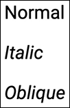
Figure 13.13 Font style variations
normal, which is normal, straight text.italic, which uses the italic style to show italic text.oblique, which uses the oblique style if it exists. If there is no such style, the browser tilts normal text slightly to make it look oblique.
Here’s an example:
h3 {
        font-style: italic;
}
text-decoration
The text-decoration property allows you to add emphasis lines to your text. There are several values (FIGURE 13.14):

Figure 13.14 Text decoration variations
none: There is no change to the text.underlineadds a line under the text. Use this to force links to be underlined (most modern browsers display link underlines when the user hovers over them).overlineadds a line over the text.line-throughadds a line through the text (like a strike).
If you have an article or story with a byline, you can use text-decoration to make the byline stand out a little bit.
As an example, here’s one way to style a byline class:
.byline {
        text-decoration: underline;
}
You can make text-decoration accept multiple values by listing them separated by spaces. So if you want to have an overline and an underline, for example, you can do the following:
.byline {
    text-decoration: underline
    →overline;
}
Finally, text-decoration is actually shorthand for three other properties. Include them in this order, separated by spaces:
text-decoration-line, which uses the values you’ve seen above.text-decoration-style, which changes what the line looks like. The default value issolid; the other options aredouble(two solid lines),dotted(a line made out of dots),dashed(a line made out of dashes), andwavy(a squiggly line) (FIGURE 13.15).
Figure 13.15 Text decoration style variations
text-decoration-color, which accepts any color.
This allows you to add more personality to the line (FIGURE 13.16):

Figure 13.16 The byline class with a wavy blue line instead of the standard solid black line
.byline {
        text-decoration: underline
         →wavy blue;
}
You can take this example a little further and apply some of the other properties you’ve learned as well.
To format a byline class:
In
style.css, type.bylineto target thebylineclass.Type
{to begin the style declaration.Type
font-style: italic;.Type
font-weight: bold;.Type
text-decoration: underline;.Type
}to close the style declaration.Now, text assigned the
bylineclass is styled bold, italic, and underlined (FIGURE 13.17).

Figure 13.17 The byline class applied to the author credit paragraph
Formatting for Readability
The styles in the previous section are mostly used to apply emphasis or draw attention to text. But there are also styles that improve text readability—things like line and text spacing, alignment, and more. Here are the common ones.
Alignment and justification
Using CSS, you can align text both horizontally and vertically.
With the text-align property, you can align the edge of the text to the left or right margin, center the text, or even justify it.
Justified text expands every line (except the last line) so that it takes up the full width of the container (FIGURE 13.18).

Figure 13.18 Justified text
With vertical-align, you can move elements vertically as they line up next to each other. So when you have two elements next to each other and one is taller than the other (for example, an image next to text), you can use vertical-align to line up their top edges. It’s also useful for vertically aligning text in tables.
vertical-align values include the following:
baselinealigns the element with the baseline of the parent (the baseline is the line on which most letters of a font sit).subaligns the element with the subscript baseline of the parent (about 50 percent below the baseline).superaligns the element with the superscript baseline of the parent (about 50 percent above the baseline).text-topaligns the top of the element with the top of its parent’s font.text-bottomaligns the bottom of the element with the top of its parent’s font.
Along with the above, you can use the following values for table cells:
topaligns the text in the cell with the top of the cell.middlealigns the text in the cell into the middle of the cell.bottomaligns the text in the cell with the bottom of the cell.You can see them in FIGURE 13.19.

Figure 13.19 vertical-align values demonstrated
Text spacing
Finally, there are several properties for spacing text, all using the same unit measurements as font-size (though em is popular for these properties):
line-height: The amount of space a line takes up, including font size and leading (the whitespace between lines). For most fonts, this is around 1.2em (or 1.2 times the font size).letter-spacing: The amount of space between each letter (also known as kerning).word-spacing: The amount of space between each word.text-indent: Indents the first line by some amount. Most often,pxis used here.
To set the internal spacing for paragraphs:
Type
p {.Type
line-height: 1.5em;.Type
letter-spacing: 0.1em;.Type
word-spacing: 0.2em;.Type
}.
You can see in FIGURE 13.20 that this gives the text a completely different feel.

Figure 13.20 Before and after adjusting line, letter, and word spacing
Wrapping Up
Using these properties, you can completely transform the look and feel of your site without doing much else. FIGURE 13.21 shows a great-looking page that is 99 percent powered by the techniques you learned in this chapter.

Figure 13.21 A beautiful website whose design is created by text styles
But still, typography is only a small part of the vast toolset you have in CSS. Another great way to customize your site is with color, the subject of the next chapter.