
C H A P T E R 13
Silverlight 5
Silverlight's release cycle is separate from the release cycle of Visual Studio, but it occupies an important place in Microsoft's line of products that depend on Visual Studio—so important that it warrants a chapter on its own. This chapter covers all the changes that have been added to Silverlight 5. We start by walking you through a brief history of Silverlight itself followed by each of the changes. These changes range from the addition of new controls (PivotViewer and RichTextBlockOverFlow controls) to changes made to databinding and improvements to graphics (3D and independent animations). We finish the chapter talking about how you can call native code from Silverlight.
A Brief History of Silverlight
Silverlight is currently up to version 5, and looking back, the first version was released sometime in 2007. So, in about five years, we've had about five releases, which speaks volumes about Microsoft's initial push into the Rich Internet Application (RIA) space—a space that was dominated by companies such as Adobe with its Adobe Flash product and now strongly challenged by the emergence of HTML5.
When Silverlight was first introduced, it was primarily used for playing media files. You could do a bit more than just play audios and videos, but that involved working with JavaScript, and it did not necessarily provide the best developer experience.
With Silverlight 2, you could develop with languages such as C# and VB.NET and the screens could be designed in XAML, which was what WPF used. In fact, Silverlight was based out of WPF and was initially even code named WPF/e (or WPF everywhere). Silverlight 2 provided a subset of the .NET Framework, a number of controls that you could use out of the box, and even nice features such as data access over WCF, ADO.NET Data Services.
Silverlight 3 added features such as Out-of-Browser (OOB) mode, more controls, better databinding, and so on.
Silverlight 4 went further with these changes and enabled better support for running the application in elevated trust mode, support for webcams and microphones, a RichTextBox control, printing support, ability to connect to COM components, drag-drop support, RIA services, and so forth.
The big changes in Silverlight 5 include improvements to databinding, changes to text controls, support for 3D API, and an ability to call low-level OS calls using P/Invoke.
In spite of all these nice features in Silverlight, specific versions of Silverlight are not packaged with Visual Studio. It usually has its own release cycle and like some other products (such as Windows Azure and MEF), it is released as a separate download. Once you've installed the tools, the integration in Visual Studio is quite seamless.
Improvements to Text
Silverlight 5 introduces a number of improvements to text and text-related controls. For starters, several new properties have been added to text controls, such as TextBox, that control character spacing, line spacing, and so on. Apart from new properties to existing controls, a new control (RichTextBoxOverflow) has also been added to Silverlight to allow displaying text in columns. Improvements to printing and support for OpenType fonts caps off text-related improvements in Silverlight 5.
Silverlight 5 introduces some new properties to control how text is displayed. These properties include the following:
CharacterSpacing: This property lets you set the spacing between two successive characters in a word. The XAML snippet below shows an example of how to set the character spacing, and Figure 13-1 shows how it gets displayed on screen:<StackPanel x:Name="LayoutRoot" Background="White">
<TextBlock FontSize="24">Hello, World!</TextBlock>
<TextBlock FontSize="24" CharacterSpacing="0">Hello, World!</TextBlock>
<TextBlock FontSize="24" CharacterSpacing="250">Hello, World!</TextBlock>
<TextBlock FontSize="24" CharacterSpacing="-125">Hello, World!</TextBlock>
</StackPanel>
Figure 13-1. Different character spacings in text
By looking at the sample XAML snippet and the resulting output, you would have realized that a value of 0 for the character spacing is the default value, it can take negative values, and that the unit for it is not in pixels. So, what is the unit on which
CharacterSpacingis based on? This is the distance between characters measured in one-thousandths of the font size. So, in our example, a character spacing of 250 for font size 24 results in 250/1000*24 = 6 pixels. This property is available in theControlclass, and any control that inherits from this class can also make use of this property.LineHeight: This sets the height between two successive lines in a text control (TextBoxand all its inherited controls). This value is set in pixels and an example of its use is shown in the following XAML snippet. Its output is shown in Figure 13-2, along with an output for normal line height.<TextBlock FontSize="20" LineHeight="50">
Lorem ipsum dolor sit amet, consectetur adipiscing elit.
<LineBreak />
Integer cursus tincidunt ligula, ut placerat sem mollis non.
<LineBreak />Fusce non placerat enim.
</TextBlock>
Figure 13-2. Normal line height and increased line height in text
LineStackingStrategy: This property is used to specify how each line in a TextBox is stacked. It is particularly useful if the font height in some of these lines varies. This property can take three values. Figure 13-3 shows how text is displayed when these values are used:MaxHeight: This is the default value and each line height is calculated based on the maximum height of the text present in it.BlockLineHeight: This adds theLineHeightproperty to set the height of each line. If this property is not specified, then it behaves like aMaxHeight.BaselineToBaseline: This behaves the same as aBlockLineHeight, but if theLineHeightproperty is not set, each line has the same height.

Figure 13-3. Figure showing different LineStackingStrategy values
OverflowContentTarget: This property is only available for aRichTextBoxand specifies where the overflow text from aRichTextBoxcan be placed. The overflow control is a new control that has been added to Silverlight 5 and is calledRichTextBoxOverflow. This XAML code snippet shows how this can be chained from oneRichTextBoxto another:<UserControl x:Class="SilverlightApplication5.MainPage"
xmlns="http://schemas.microsoft.com/winfx/2006/xaml/presentation"
xmlns:x="http://schemas.microsoft.com/winfx/2006/xaml"
xmlns:d="http://schemas.microsoft.com/expression/blend/2008"
xmlns:mc="http://schemas.openxmlformats.org/markup-compatibility/2006"
mc:Ignorable="d"
d:DesignHeight="1024" d:DesignWidth="800">
<StackPanel x:Name="LayoutRoot" Background="White" Margin="10, 10, 10, 10" Orientation="Horizontal" >
<RichTextBlock Width="200" Margin="10 10 10 10" OverflowContentTarget="{Binding ElementName=Overflow1}">
<Paragraph>
Lorem ipsum dolor sit amet, consectetur adipiscing elit. Curabitur justo lorem, rhoncus eget iaculis sit amet, rhoncus non turpis. Vivamus scelerisque est nec nisi sodales ac euismod tortor luctus. Mauris tellus ligula, porta vel laoreet at, venenatis sed orci. Etiam dapibus sem vitae felis mollis quis ornare metus dictum. Duis non tortor libero, et sagittis mauris. Vivamus commodo porta ullamcorper. Aliquam vel lectus ac leo ultrices hendrerit.
</Paragraph>
<Paragraph>
Curabitur euismod, eros sed condimentum ornare, lectus felis cursus sapien, vel luctus orci ligula sit amet lacus. Quisque ut lorem ac urna fringilla semper sit amet ac diam. Fusce accumsan accumsan arcu at gravida. In hac habitasse platea dictumst. Vestibulum pharetra, dui in sollicitudin rhoncus, metus arcu feugiat dolor, id sodales ante nisi a eros. Quisque vehicula risus sed eros commodo eget cursus lorem adipiscing. Etiam vel purus et est egestas consequat ut ac justo. Cras nunc diam, congue pretium laoreet tempus, sollicitudin ultricies velit.
</Paragraph>
<Paragraph>
Curabitur ac sapien et risus tincidunt pulvinar. Phasellus quis velit nibh. Cras est leo, sollicitudin sed scelerisque sed, tristique vel mauris. Etiam at lorem risus, vel mollis neque. Maecenas iaculis, nibh eu sodales facilisis, lectus ipsum ultricies tellus, aliquam lobortis purus ante tempor massa. Phasellus molestie scelerisque libero, id tempor est sollicitudin nec. Sed sit amet dui vitae arcu convallis ullamcorper. Nunc quis mi purus. Vivamus elementum, mauris non dignissim cursus, lorem massa tincidunt leo, dignissim convallis enim tellus quis dui. Aliquam elementum dapibus sollicitudin. Ut pulvinar, odio sed auctor facilisis, sapien erat bibendum ante, vitae placerat turpis urna a nisi. Duis tempus, eros nec semper pulvinar, eros diam fermentum velit, eu varius felis enim quis augue. Nulla malesuada bibendum erat, id semper nulla pulvinar eu. Suspendisse faucibus blandit magna non vehicula.
</Paragraph>
</RichTextBlock>
<RichTextBlockOverflow x:Name="Overflow1" Width="200" Margin="10 10 10 10" OverflowContentTarget="{Binding ElementName=Overflow2}" />
<RichTextBlockOverflow x:Name="Overflow2" Width="200" Margin="10 10 10 10" />
</StackPanel>
</UserControl>This feature is really useful to create a multicolumn layout for free-flowing text in your application. Figure 13-4 shows how the text overflows to the other
RichEditBlockcontrols.

Figure 13-4. Use of Overflow Text controls to display text in columns
OpenType Font Support
OpenType is a cross-platform font file format that was jointly developed by Adobe and Microsoft. It is already supported in WPF, and you can do some really fancy things with the font such as using ligatures, expressing fractions in a nice way, using property subscripting and superscripting, and applying different stylistic sets in the same font.
Silverlight now supports OpenType fonts, and you can set the FontFamily to one of the OpenText fonts available in Windows. Once you do that, you can set a number of Typography settings for it. In the following code snippet, the font family is set to Gabriola and the text Introducing .NET 4.5, which is the output of the XAML as shown in Figure 13-5.

Figure 13-5. OpenText font Gabriola in use
If you add the property Typography.StylisticSet1="True" to the TextBlock as shown in the following code snippet, you will notice the style of the font changes. (Notice the change to the character g in Figure 13-6.)
    <TextBlock FontSize="80" FontFamily="Gabriola" Typography.StylisticSet1="True">

        Introducing .NET 4.5

    </TextBlock>

Figure 13-6. OpenText font Gabriola with a different stylistic set
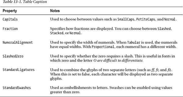
You will be able to see a lot more changes to the style if you set something such as Typography.StylisticSet6="True" in the XAML. In addition, there are other properties that you can set for typography that change the way the font looks. Some useful properties are found in the following table.
Printing Enhancements
With Silverlight 4, printing was a slow operation, particularly when it involved a lot of pages. This slow speed was mainly because the output to the printer was sent as a bitmap for each page to be printed, and these bitmaps weren't small. You can still do this in Silverlight 5, but in addition, you can also send vector-based graphics that your Postscript printer can pick up and print.
To enable this feature, rather than call the method void Print(string documentName) in the PrintDocument class, you call the overloaded method that takes a PrinterFallBackSettings object as a parameter. The PrinterFallBackSettings class contains two properties—ForceVector and OpacityThreshold. These properties can be used to force the PrintDocument class to send postscript vector data to the printer as shown in the following code snippet:
    void Print()

    {

        var doc = new PrintDocument();

        doc.PrintPage += (s, ea) =>

        {

            ea.PageVisual = LayoutRoot;

            ea.HasMorePages = false;

        };

        var settings = new PrinterFallbackSettings

        {

            ForceVector = true,

            OpacityThreshold = 0.5

        };

        doc.Print("Silverlight 5 doc", settings);

    }
Changes to Other Controls
Apart from changes to Text controls, Silverlight also introduces some useful changes to other existing controls. Type-ahead text searching in list boxes, where you can select an item by typing its value using a keyboard, is one such change. Multi-click support, which allows you do figure out double-clicks (or even multiple-clicks), is another useful change. In addition to these changes, a new control, PivotViewer, has also been introduced.
Type-Ahead Text Searching in List Box
One frustrating thing with list boxes and combo boxes is that it is very hard to select an item down the list using the keyboard. Silverlight 5 addresses this issue by providing a type-ahead, text-searching facility. This is available to the whole family of list box classes and includes combo boxes as well.
In Silverlight, each item in a list box can contain multiple properties. For example, if we bind our list box to a Book class, then what property within the Book class should we be using for our type-ahead text search? The answer is quite simple—you need to set the name of the property in the list box's DisplayMemberPath property.
 Note Type-ahead works well when you type fast. If you leave sufficient gaps between each character you type, the type-ahead feature resets, and you end up selecting the next item that starts with the letter you are typing.
Multiple-click Support
If you wanted to find out if a user double-clicked in previous versions of Silverlight, it involved juggling chainsaws blindfolded while riding a one-wheel cycle. Okay, I exaggerate, but it was not a trivial task. With Silverlight 5, there is now built-in support in the framework for detecting double-clicks, or triple-clicks (if there is such a thing), or even multiple-clicks.
The MouseButtonEventArgs object that gets passed over to mouse event handlers now has a property called ClickCount that can be used to determine double-clicks (and multiple-clicks). To check for a double-click, all you need to do is check if the event's ClickCount property equals 2, as shown in the following code snippet:
        private void TextBlock_MouseLeftButtonDown(object sender, MouseButtonEventArgs e)

        {


            if (e.ClickCount == 2)

            {

                //Double click

            }

        }
One of the things you need to remember is that a mouse-click event will be generated each time the mouse is clicked, and although you may only be interested in a double-click event, the event handler will be called twice—once during the first click and the second time during the double-click. To see how this works, set up a XAML using the following code snippet:
    <Grid x:Name="LayoutRoot" Background="White">

        <Grid.RowDefinitions>

            <RowDefinition Height="31*" />

            <RowDefinition Height="269*" />

        </Grid.RowDefinitions>

        <TextBlock Text="Click me!" MouseLeftButtonDown="TextBlock_MouseLeftButtonDown"

                   HorizontalAlignment="Center" VerticalAlignment="Center"  />

        <ScrollViewer Grid.Row="1" >

            <TextBlock x:Name="ClickCount"  />

        </ScrollViewer>

    </Grid>
Set the event handler for the text block to handle left button down events as shown below:
    private void TextBlock_MouseLeftButtonDown(object sender, MouseButtonEventArgs e)

    {

        if (e.ClickCount == 2)

        {

            //Double click

        }

    }
When you run the program, you will notice that when you click, double- click, or multiple-click Click me!, then the click count is shown below. You will notice that when you double-click, then a mouse-down event with ClickCount set to 1 is called first, followed by another event with the ClickCount set to 2.
Caution Although the MouseButtonEventArgs object is also sent on mouse-up events, the ClickCount property on these events is always 1. You should never use these events to determine multiple-clicks.
PivotViewer Control
The PivotViewer control allows users to interactively visualize large amounts of data in an intuitive fashion—such as applying filters on items, sorting -on properties, or viewing data in a chartlike fashion.
To see how the PivotViewer control works, let's first define the class we are going to use in our sample:
public class Book

{

    string Title { get; set; }

    string Isbn { get; set; }

    string Publisher { get; set; }

    string Authors { get; set; }

    int YearPublished { get; set; }

    string Genre { get; set; }

}
To get the control to work, follow these steps:
- Add the
System.Windows.Controls.Pivotassembly to your Silverlight project. This assembly contains the PivotViewer control. - Replace the XAML in your MainPage.xaml to markup:
<UserControl x:Class="PivotApp.MainPage"

    xmlns="http://schemas.microsoft.com/winfx/2006/xaml/presentation"

    xmlns:x="http://schemas.microsoft.com/winfx/2006/xaml"

    xmlns:d="http://schemas.microsoft.com/expression/blend/2008"

    xmlns:mc="http://schemas.openxmlformats.org/markup-compatibility/2006"

    xmlns:pivot="clr-namespace:System.Windows.Controls.Pivot;assembly=System.Windows.Controls.Pivot"

    mc:Ignorable="d"

    d:DesignHeight="300" d:DesignWidth="400">


    <Grid x:Name="LayoutRoot" Background="White" DataContext="{Binding Source={StaticResource SampleDataSource}}">

        <pivot:PivotViewer x:Name="Pivot" ItemsSource="{Binding Collection}" >


                <pivot:PivotViewer.PivotProperties>

                        <pivot:PivotViewerStringProperty Id="Title" Options="CanFilter" DisplayName="Title" Binding="{Binding Title}" />
<pivot:PivotViewerStringProperty Id="Genre" Options="CanFilter" DisplayName="Genre" Binding="{Binding Genre}" />
<pivot:PivotViewerStringProperty Id="Author" Options="CanFilter" DisplayName="Author" Binding="{Binding Authors}" />
<pivot:PivotViewerStringProperty Id="Publisher" Options="CanFilter" DisplayName="Publisher" Binding="{Binding Publisher}" />
<pivot:PivotViewerNumericProperty Id="YearPublished"
Options="CanFilter" DisplayName="YearPublished" Binding="{Binding Year}" />
</pivot:PivotViewer.PivotProperties>
<pivot:PivotViewer.ItemTemplates>
<pivot:PivotViewerItemTemplate>
<Border Width="300" Height="100" BorderBrush="#FF081134"
BorderThickness="2" CornerRadius="4" >
<Border.Background>
<LinearGradientBrush EndPoint="0.5,1"
StartPoint="0.5,0">
<GradientStop Color="#FF8284EA" Offset="0"/>
<GradientStop Color="White" Offset="1"/>
</LinearGradientBrush>
</Border.Background>
<StackPanel Margin="2" >
<TextBlock Text="{Binding Title}" FontSize="24"
FontFamily="Garamond" FontWeight="Bold"/>
<TextBlock Text="{Binding Authors}" FontStyle="Italic"
FontWeight="Bold"/>
<TextBlock Text="{Binding Genre}"/>
<TextBlock Text="{Binding Isbn}"/>
<StackPanel Orientation="Horizontal" >
<TextBlock Text="Publisher:" FontWeight="Bold"/>
<TextBlock Text="{Binding Publisher}"/>
<TextBlock Text=" Year Published:"
FontWeight="Bold"/>
<TextBlock Text="{Binding YearPublished}"/>
</StackPanel>
</StackPanel>
</Border>
</pivot:PivotViewerItemTemplate>
</pivot:PivotViewer.ItemTemplates>
</pivot:PivotViewer>
</Grid>
</UserControl>The XAML in the example binds to a
SampleDataSourcethat I've created, which you need to change to point to your own data. ThePivotViewerItemTemplatedefines how each item is displayed in thePivotcontrol, and thePivotPropertiesdefines which properties in the data are used for things such as filtering. - Press F5 to run the application, which will display as shown in Figure 13-7. Once the control is displayed, you will be able to change the sort order, filter data, and even the view (see Figure 13-8).
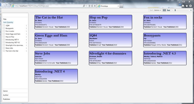
Figure 13-7. PivotViewer control
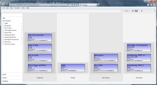
Figure 13-8. Different view of the PivotViewer control
Improvements to XAML
With each new version of Silverlight, there is always something new in the language. Silverlight 5 is no different, and there are a number of changes in the markup language. This version includes the addition of implicit data templates, changes to style bindings, introduction of relative source binding, and markup extensions in XAML. One of my favorite features is the ability to set breakpoints in XAML from within Visual Studio, and debug through it. These changes are covered in the following sections.
Implicit Data Templates
In Silverlight, you can specify data templates for controls such as ListBox. This allows you to specify how each item in the list box will be displayed on screen. To see how this works, let's take an example of a simple Book class defined as follows:
    public class Book

    {

        public string Isbn { get; set; }

        public string Title { get; set; }

        public string Authors { get; set; }

        public int Pages { get; set; }

    }
To display this in a nice way, you would do something like this in XAML, which would result in a nice display of each item as shown in Figure 13-9:
       <ListBox x:Name="BooksListbox" Height="400" Margin="10 10 10 10">

            <ListBox.ItemTemplate>

                <DataTemplate>

                    <StackPanel>

                        <TextBlock Text="{Binding Title}" FontSize="16" />

                        <TextBlock Text="{Binding Authors}" FontSize="12" />

                        <StackPanel Orientation="Horizontal">

                            <TextBlock Text="ISBN:" FontSize="9" FontStyle="Italic"/>

                            <TextBlock Text="{Binding Isbn}" FontSize="9" FontStyle="Italic"/>

                        </StackPanel>

                    </StackPanel>

                </DataTemplate>

            </ListBox.ItemTemplate>

        </ListBox>
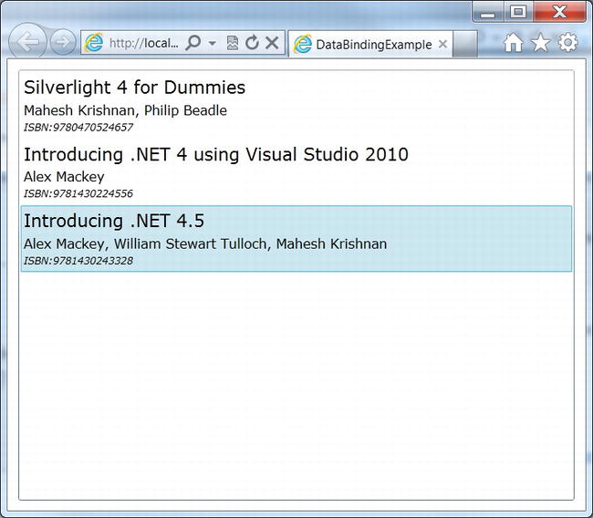
Figure 13-9. ListBox databound to Book objects
If the data template is to be used over and over again, it makes more sense to create a separate template and bind to the template using its name. For instance, if the name of the template is BookTemplate and it is defined in your Application resource file, then you can bind the template name as shown in the following XAML snippet:
        <ListBox x:Name="BooksListbox" Height="400" Margin="10 10 10 10"

                 ItemTemplate="{Binding Mode=OneWay, Source={StaticResource BookTemplate}}" >

        </ListBox>
But, wouldn't it be cool if we could just specify the list box to use a certain template depending on its type, rather than specifying a data template name? That is what the new implicit data template feature allows you to do. To enable implicit data template binding, you need to remove the key x:Key="BookTemplate" and add a property called DataType and set it to the name of the class you intend to use as shown in the following XAML snippet in your Application resources:
<Application xmlns="http://schemas.microsoft.com/winfx/2006/xaml/presentation"

             xmlns:x="http://schemas.microsoft.com/winfx/2006/xaml"

             x:Class="DataBindingExample.App"

             xmlns:my="clr-namespace:DataBindingExample"

             >

    <Application.Resources>

        <DataTemplate DataType="my:Book">

            <StackPanel>

                <TextBlock Text="{Binding Title}" FontSize="16" />

                <TextBlock Text="{Binding Authors}" FontSize="12" />

                <StackPanel Orientation="Horizontal">

                    <TextBlock Text="ISBN:" FontSize="9" FontStyle="Italic"/>

                    <TextBlock Text="{Binding Isbn}" FontSize="9" FontStyle="Italic"/>

                </StackPanel>

            </StackPanel>

        </DataTemplate>

    </Application.Resources>

</Application>
You can then remove the ItemTemplate binding property while using the list box and allow the list box to automatically use the data template depending on its type. One of the nice features about implicit data type binding is that it also supports polymorphism. In other words, if you use items that have classes derived from Book and they have a data template defined, Silverlight will automatically pick the right template depending on the derived type.
To see this in action, let's create another class called EBook that derives from Book, defined as the following:
    public class EBook : Book

    {

        public string Format { get; set; }

        public int Size { get; set; }

    }
You need to modify your App.xaml to specify a data template for the new EBook class as shown in the XAML snippet:
  <DataTemplate DataType="my:EBook">

            <StackPanel>

                <TextBlock Text="{Binding Title}" FontSize="16" />

                <TextBlock Text="{Binding Authors}" FontSize="12" />

                <StackPanel Orientation="Horizontal">

                    <TextBlock Text="ISBN:" FontSize="9" FontStyle="Italic"/>

                    <TextBlock Text="{Binding Isbn}" FontSize="9" FontStyle="Italic"/>

                </StackPanel>

                <StackPanel Orientation="Horizontal">

                    <TextBlock Text="Format:" FontSize="9" FontStyle="Italic"/>

                    <TextBlock Text="{Binding Format}" FontSize="9" FontStyle="Italic"/>
                </StackPanel>

                <StackPanel Orientation="Horizontal">

                    <TextBlock Text="Filesize:" FontSize="9" FontStyle="Italic"/>

                    <TextBlock Text="{Binding Size, StringFormat='{0:d} bytes'}" FontSize="9" FontStyle="Italic"/>

                </StackPanel>

            </StackPanel>

        </DataTemplate>
Now, depending on the data type of the item in your ItemSource, Silverlight will automatically choose the right template, as shown in Figure 13-10.
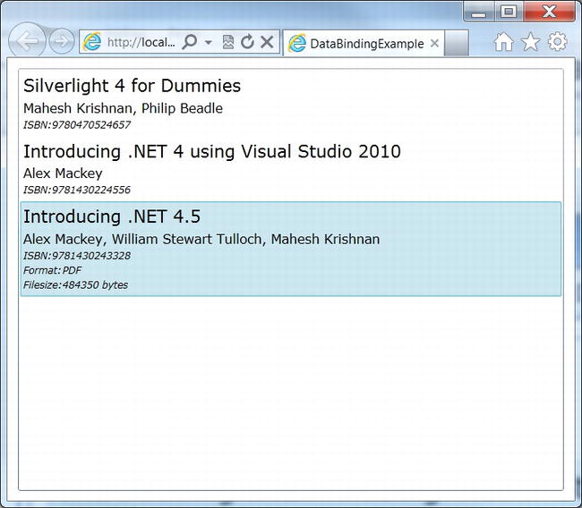
Figure 13-10. ListBox implicitly bound to Book (and EBook) objects
Style Binding
Prior to Silverlight 5, when creating a style for a control, you would have to set static values to properties as shown in the following code snippet:
    <Style TargetType="TextBlock">

        <Style.Setters>

            <Setter Property="FontSize" Value="40" />

            <Setter Property="FontFamily" Value="Gabriola" />

            <Setter Property="Foreground" Value="Blue" />

        </Style.Setters>

    </Style>
This would set the font size to 40, font family to Gabriola, and the foreground color of all text boxes to blue. Databinding support was very limited, and you could bind the setter property to a static resource. For instance, if you had declared a resource in App.xaml called FavouriteColor, you could access the static resource as shown in the following XAML snippet:
    <Application.Resources>

        <SolidColorBrush x:Key="FavouriteColor" Color="Blue" />

        …

        <Style TargetType="TextBlock">

            <Style.Setters>

                …

                <Setter Property="Foreground" Value="{StaticResource FavouriteColor}" />

            </Style.Setters>

        </Style>

        …
Silverlight 5 lets you do proper binding to setter values, and this can be demonstrated with an example. Consider you have a class called UserPreference that contains the user's favorite color and font as shown in the following code:
   public class UserPreference

    {

        public SolidColorBrush FavouriteColor { get; set; }

        public FontFamily FavouriteFont { get; set; }


        public UserPreference()

        {

            FavouriteColor = new SolidColorBrush(Colors.Blue);

            FavouriteFont = new FontFamily("Gabriola");

        }

    }
Now, you can bind to this object directly in your App.xaml:
<Application xmlns="http://schemas.microsoft.com/winfx/2006/xaml/presentation"

             xmlns:x="http://schemas.microsoft.com/winfx/2006/xaml"

             x:Class="StyleBindingExample.App"

             xmlns:my="clr-namespace:StyleBindingExample"

             >

    <Application.Resources>

        <my:UserPreference x:Key="preference" />


        <Style TargetType="TextBlock">

            <Style.Setters>

                <Setter Property="FontSize" Value="40" />

                <Setter Property="FontFamily" Value="{Binding FavouriteFont, Source={StaticResource preference}}" />

                <Setter Property="Foreground" Value="{Binding FavouriteColor, Source={StaticResource preference}}" />

            </Style.Setters>

        </Style>

    </Application.Resources>

</Application>
Relative Source Binding to Ancestors
Relative source binding allows you to create bindings to properties in its parent (or any one of its ancestors). This is particularly useful for something like a data template in a list box, for instance. But it can also be demonstrated with the following simple XAML snippet:
        <StackPanel Tag="Top Level">

            <StackPanel Tag="Next Level">

                <StackPanel Tag="Lowest Level">

                    <TextBlock Text="{Binding Path=Tag, RelativeSource={RelativeSource AncestorLevel=1, AncestorType=StackPanel}}"></TextBlock>

                    <TextBlock Text="{Binding Path=Tag, RelativeSource={RelativeSource AncestorLevel=2, AncestorType=StackPanel}}"></TextBlock>

                    <TextBlock Text="{Binding Path=Tag, RelativeSource={RelativeSource AncestorLevel=3, AncestorType=StackPanel}}"></TextBlock>

                </StackPanel>

            </StackPanel>

        </StackPanel>
In this example, I've set the Tag property on the StackPanel at the three different levels to different values. The TextBlock binds the Text property to a RelativeSource property specifying at what ancestor level it needs to find the control and also what type of control it needs to bind to. Silverlight will display a stack panel, with three TextBlock controls showing the values in the order Lowest Level, Next Level, and Top Level.
Markup Extensions in XAML
Custom markup extensions have been around in WPF and have now been introduced to Silverlight 5. In previous releases of Silverlight, you probably used markup extensions that were already built into Silverlight, but never realized you were using them. Some of the commonly used ones include {Binding} and {StaticResource}. As the name implies, it extends the standard XAML syntax.
Creating and using a custom markup extension is a lot more intuitive when reading the XAML as shown in the following example. The XAML uses a custom markup extension called TruncationExtension that truncates the length of string to just 12 characters as follows:
    <StackPanel x:Name="LayoutRoot" Background="White">

        <TextBlock Text="{my:TruncationExtension Text=Mahesh Krishnan, Length=12}"  />

        <TextBlock Text="{my:TruncationExtension Text=Alex Mackey, Length=12}" />

        <TextBlock Text="{my:TruncationExtension Text=William Tulloch, Length=12}" />

    </StackPanel>
To create your own markup extension, you either need to derive from the MarkupExtension class or implement IMarkupExtension<T>. The code for the class TruncationExtension, which we have used in this example, is shown below:
   public class TruncationExtension : IMarkupExtension<string>

    {

        public string Text { get; set; }

        public int Length { get; set; }


        public string ProvideValue(IServiceProvider serviceProvider)

        {

            return (Text.Length > Length) ?
                string.Format("{0}...", Text.Substring(0, Length-3)) :

                Text;

        }
The XAML Debugging Experience
One of the new features of Silverlight 5 is the ability to set breakpoints in XAML and inspect values. This is particularly helpful when you use databinding. As with setting a breakpoint in code, click the margin of the line at which you want to set a breakpoint. When the application is run, the debugger will break in the line as shown in Figure 13-11.
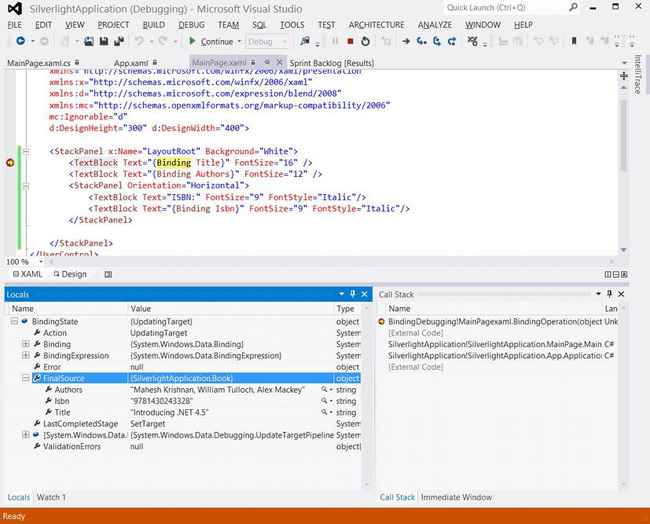
Figure 13-11. Breakpoints and Locals window in XAML
Notice that the Locals window is showing the BindingState, which in turn shows the kind of action being performed (UpdatingTarget, in this case), and FinalSource, which shows the value of fields that are being data bound.
Changes to Graphics
One of the big changes introduced in Silverlight 5 is the ability to add 3D graphics to your application. In addition, there are some changes made to improve the performance of animations. These two changes are covered in this section.
3D in Silverlight
Silverlight 5 now supports 3D graphics that will come in handy if you are creating games, graphs, and charts or modeling objects. To code 3D graphics in Silverlight, you need to learn XNA, which is out of the scope of this book. You also need to install DirectX SDK and XNA Game Studio on to your workstation. The Solar Wind 3D application found at http://code.msdn.microsoft.com/Solar-Wind-3D-Sample-4cb56170 is a good 3D graphics sample application shipped by Microsoft.
Note GPU Accelerator must be turned on in the plug-in in order to run 3D. You also need to get user confirmation to run the graphics or run the application in elevated trust mode.
Independent Animations
Typically, animations run on the UI thread. This is not necessarily bad, but when you have CPU-intensive work also running on the same thread, your animation can become jerky. One way to fix the problem is to move the CPU-intensive work to a background thread. Another way to solve this is to use independent animations. Independent animations, which have been introduced with Silverlight 5, allow you to run animations in a separate thread. This thread is called a composition thread. Silverlight will automatically promote your animation to use this thread if you enable hardware acceleration for the plug-in and set the BitmapCache property on the element you are animating.
Caution If you use certain types of unsupported drawing features, Silverlight will not use independent animations. Pixel shader is an example of an unsupported drawing feature.
Changes to Trusted Applications
With Silverlight 5, you can now create top-level windows for trusted applications running Out-of-Browser. In addition, you also have unrestricted access to the file system and can make calls to unmanaged code present in DLLs. These changes are covered in this section.
Multiple-Window Support
While running your application in Out-of-Browser, or OOB, mode, you can now create additional top-level windows. These windows are instances of the newly introduced Window class and need to be created in code.
Creating Multiple Windows
To see how this works, follow these steps:
- Choose File
 New Project… from the menu or press Ctrl+Shift+N. This will bring up the New Project dialog box. Choose Silverlight from the left-side options and select Silverlight Application from the list to create a new Silverlight project. In this sample, I have used
 WindowDemoas the project name. - The newly created solution will contain two projects—
WindowDemoandWindowDemo.Web. Select theWindowDemoproject from the Solution Explorer and press Alt + Enter to open up the Properties window. - Turn on the Enable running application out of the browser check box and then press the Out-of-Browser Settings… button to bring up the Out-of-Browser Settings dialog box. Turn on the Require elevated trust check box when running out of the browser check box and then press
OK. - Open
MainPage.xamlpage by double-clicking it from the Solution Explorer. - Add a button to the page from the toolbox and from the properties panel, add a button-click event handler by double-clicking the
Clickevent, and add code as shown in the following snippet:private void Button_Click_1(object sender, RoutedEventArgs e)
{
var window = new Window
{
Height = 300,
Width = 400,
Title = "Hello World Window"
};
window.Show();
} - Now press F5 to run the program and press the button in the screen to display the hello world window.
Adding Content to the Window
An empty window without any content is meaningless except in a demo. So, let's see how we can add content to this window:
- Right-click the Silverlight project from the Solution Explorer and select Add New Item. When the Add New Item dialog box opens up, select a Silverlight User Control from the list box and press OK.
- Update the content of the newly created control by dragging and dropping controls or editing its XAML directly.
- Update the code that creates the new window to specify the content as shown in the following code snippet:
        var window = new Window

        {

            Height = 300,

            Width = 400,

            Title = "Hello World Window",

            Content = new SilverlightControl1()

        };
Unrestricted File System Access
With Silverlight 4, there were restrictions on where you could read or write files. These restrictions have now been removed in Silverlight 5. The only caveat, of course, is that you run the application in Full Trust mode. Once in that mode, you can create directories, and read or write files anywhere in the file system. This simple code snippet is an example of creating a HelloWorld.txt file in the temp directory:
    private void WriteToFile()

    {

        var fileName = @"C:	empHelloWorld.txt";

        using (var fs = File.CreateText(fileName))

        {

            fs.WriteLine("Hello World!");

        }

    }
Calling Native Code from Silverlight
With Silverlight code, you can now call unmanaged native code from within a fully trusted Silverlight application. This has massive implications as you can do fairly low-level stuff such as interfacing with your bar code reader or call any function from a DLL that event talks to drivers installed on your machine.
Caution Calling native code only works on machines running on the Windows operating system. If you are running Silverlight on a Mac, for instance, this feature will not work.
Calling native code in Silverlight is done in a similar way as to how it is done in the rest of .NET—using P/Invoke or Platform Invoke. The following code snippet shows how it is used with a simple MessageBeep function that is found in User32.dll. As with regular .NET, the attribute DllImport is used in front of the extern function to declare it. Once it is declared, it can be used like any normal function:
        [DllImport("User32.dll")]

        private static extern bool MessageBeep(uint type);


        private void Button_Click (object sender, RoutedEventArgs e)

        {

            MessageBeep(0);

        }
Tip The site http://pinvoke.net contains all the DllImport definitions of all the native Windows DLLs. It is a great site to look for any specific methods you may want to use in your Silverlight application. Just copy and paste the definitions from the site onto your own class and use them.
Performance Improvements
Last but not least, Silverlight 5 has also made significant performance improvements in a number of areas. The main ones include the following:
- Improved XAML parse times
- Performance improvements around network latency
- Performance improvements around laying out text blocks.
- 64-bit browser support
- Hardware accelerated rendering when running in IE 9 Windowless mode
You do not need to make any changes to your code to make use of these improvements. They are just built into Silverlight 5.
Conclusion
The emergence of HTML5 in the last two years has seriously challenged platforms such as Silverlight, which probably does not have a long-term future; however, it is still being widely used due to the ease with which you can create Rich Internet Applications. It will be a number of years before it is eventually replaced with another technology. But until such time, new features and improvements continue to happen in Silverlight. In Silverlight 5, a number of improvements have been made to Text, to XAML, to graphics support, and in the area of writing trusted applications. These changes have been covered in depth in this chapter