
Chapter 2. Supervised Learning
As we mentioned earlier, supervised machine learning is one of the most commonly used and successful types of machine learning. In this chapter, we will describe supervised learning in more detail and explain several popular supervised learning algorithms. We already saw an application of supervised machine learning in Chapter 1: classifying iris flowers into several species using physical measurements of the flowers.
Remember that supervised learning is used whenever we want to predict a certain outcome from a given input, and we have examples of input/output pairs. We build a machine learning model from these input/output pairs, which comprise our training set. Our goal is to make accurate predictions for new, never-before-seen data. Supervised learning often requires human effort to build the training set, but afterward automates and often speeds up an otherwise laborious or infeasible task.
2.1 Classification and Regression
There are two major types of supervised machine learning problems, called classification and regression.
In classification, the goal is to predict a class label, which is a choice from a predefined list of possibilities. In Chapter 1 we used the example of classifying irises into one of three possible species. Classification is sometimes separated into binary classification, which is the special case of distinguishing between exactly two classes, and multiclass classification, which is classification between more than two classes. You can think of binary classification as trying to answer a yes/no question. Classifying emails as either spam or not spam is an example of a binary classification problem. In this binary classification task, the yes/no question being asked would be “Is this email spam?”
Note
In binary classification we often speak of one class being the positive class and the other class being the negative class. Here, positive doesn’t represent having benefit or value, but rather what the object of the study is. So, when looking for spam, “positive” could mean the spam class. Which of the two classes is called positive is often a subjective matter, and specific to the domain.
The iris example, on the other hand, is an example of a multiclass classification problem. Another example is predicting what language a website is in from the text on the website. The classes here would be a pre-defined list of possible languages.
For regression tasks, the goal is to predict a continuous number, or a floating-point number in programming terms (or real number in mathematical terms). Predicting a person’s annual income from their education, their age, and where they live is an example of a regression task. When predicting income, the predicted value is an amount, and can be any number in a given range. Another example of a regression task is predicting the yield of a corn farm given attributes such as previous yields, weather, and number of employees working on the farm. The yield again can be an arbitrary number.
An easy way to distinguish between classification and regression tasks is to ask whether there is some kind of continuity in the output. If there is continuity between possible outcomes, then the problem is a regression problem. Think about predicting annual income. There is a clear continuity in the output. Whether a person makes $40,000 or $40,001 a year does not make a tangible difference, even though these are different amounts of money; if our algorithm predicts $39,999 or $40,001 when it should have predicted $40,000, we don’t mind that much.
By contrast, for the task of recognizing the language of a website (which is a classification problem), there is no matter of degree. A website is in one language, or it is in another. There is no continuity between languages, and there is no language that is between English and French.1
2.2 Generalization, Overfitting, and Underfitting
In supervised learning, we want to build a model on the training data and then be able to make accurate predictions on new, unseen data that has the same characteristics as the training set that we used. If a model is able to make accurate predictions on unseen data, we say it is able to generalize from the training set to the test set. We want to build a model that is able to generalize as accurately as possible.
Usually we build a model in such a way that it can make accurate predictions on the training set. If the training and test sets have enough in common, we expect the model to also be accurate on the test set. However, there are some cases where this can go wrong. For example, if we allow ourselves to build very complex models, we can always be as accurate as we like on the training set.
Let’s take a look at a made-up example to illustrate this point. Say a novice data scientist wants to predict whether a customer will buy a boat, given records of previous boat buyers and customers who we know are not interested in buying a boat.2 The goal is to send out promotional emails to people who are likely to actually make a purchase, but not bother those customers who won’t be interested.
Suppose we have the customer records shown in Table 2-1.
| Age | Number of cars owned |
Owns house | Number of children | Marital status | Owns a dog | Bought a boat |
|---|---|---|---|---|---|---|
66 |
1 |
yes |
2 |
widowed |
no |
yes |
52 |
2 |
yes |
3 |
married |
no |
yes |
22 |
0 |
no |
0 |
married |
yes |
no |
25 |
1 |
no |
1 |
single |
no |
no |
44 |
0 |
no |
2 |
divorced |
yes |
no |
39 |
1 |
yes |
2 |
married |
yes |
no |
26 |
1 |
no |
2 |
single |
no |
no |
40 |
3 |
yes |
1 |
married |
yes |
no |
53 |
2 |
yes |
2 |
divorced |
no |
yes |
64 |
2 |
yes |
3 |
divorced |
no |
no |
58 |
2 |
yes |
2 |
married |
yes |
yes |
33 |
1 |
no |
1 |
single |
no |
no |
After looking at the data for a while, our novice data scientist comes up with the following rule: “If the customer is older than 45, and has less than 3 children or is not divorced, then they want to buy a boat.” When asked how well this rule of his does, our data scientist answers, “It’s 100 percent accurate!” And indeed, on the data that is in the table, the rule is perfectly accurate. There are many possible rules we could come up with that would explain perfectly if someone in this dataset wants to buy a boat. No age appears twice in the data, so we could say people who are 66, 52, 53, or 58 years old want to buy a boat, while all others don’t. While we can make up many rules that work well on this data, remember that we are not interested in making predictions for this dataset; we already know the answers for these customers. We want to know if new customers are likely to buy a boat. We therefore want to find a rule that will work well for new customers, and achieving 100 percent accuracy on the training set does not help us there. We might not expect that the rule our data scientist came up with will work very well on new customers. It seems too complex, and it is supported by very little data. For example, the “or is not divorced” part of the rule hinges on a single customer.
The only measure of whether an algorithm will perform well on new data is the evaluation on the test set. However, intuitively3 we expect simple models to generalize better to new data. If the rule was “People older than 50 want to buy a boat,” and this would explain the behavior of all the customers, we would trust it more than the rule involving children and marital status in addition to age. Therefore, we always want to find the simplest model. Building a model that is too complex for the amount of information we have, as our novice data scientist did, is called overfitting. Overfitting occurs when you fit a model too closely to the particularities of the training set and obtain a model that works well on the training set but is not able to generalize to new data. On the other hand, if your model is too simple—say, “Everybody who owns a house buys a boat”—then you might not be able to capture all the aspects of and variability in the data, and your model will do badly even on the training set. Choosing too simple a model is called underfitting.
The more complex we allow our model to be, the better we will be able to predict on the training data. However, if our model becomes too complex, we start focusing too much on each individual data point in our training set, and the model will not generalize well to new data.
There is a sweet spot in between that will yield the best generalization performance. This is the model we want to find.
The trade-off between overfitting and underfitting is illustrated in Figure 2-1.

Figure 2-1. Trade-off of model complexity against training and test accuracy
2.2.1 Relation of Model Complexity to Dataset Size
It’s important to note that model complexity is intimately tied to the variation of inputs contained in your training dataset: the larger variety of data points your dataset contains, the more complex a model you can use without overfitting. Usually, collecting more data points will yield more variety, so larger datasets allow building more complex models. However, simply duplicating the same data points or collecting very similar data will not help.
Going back to the boat selling example, if we saw 10,000 more rows of customer data, and all of them complied with the rule “If the customer is older than 45, and has less than 3 children or is not divorced, then they want to buy a boat,” we would be much more likely to believe this to be a good rule than when it was developed using only the 12 rows in Table 2-1.
Having more data and building appropriately more complex models can often work wonders for supervised learning tasks. In this book, we will focus on working with datasets of fixed sizes. In the real world, you often have the ability to decide how much data to collect, which might be more beneficial than tweaking and tuning your model. Never underestimate the power of more data.
2.3 Supervised Machine Learning Algorithms
We will now review the most popular machine learning algorithms and explain how they learn from data and how they make predictions. We will also discuss how the concept of model complexity plays out for each of these models, and provide an overview of how each algorithm builds a model. We will examine the strengths and weaknesses of each algorithm, and what kind of data they can best be applied to. We will also explain the meaning of the most important parameters and options.4 Many algorithms have a classification and a regression variant, and we will describe both.
It is not necessary to read through the descriptions of each algorithm in detail, but understanding the models will give you a better feeling for the different ways machine learning algorithms can work. This chapter can also be used as a reference guide, and you can come back to it when you are unsure about the workings of any of the algorithms.
2.3.1 Some Sample Datasets
We will use several datasets to illustrate the different algorithms. Some of the datasets will be small and synthetic (meaning made-up), designed to highlight particular aspects of the algorithms. Other datasets will be large, real-world examples.
An example of a synthetic two-class classification dataset is the
forge dataset, which has two features. The following code creates a
scatter plot (Figure 2-2) visualizing all of the data points in this dataset. The
plot has the first feature on the x-axis and the second feature on the
y-axis. As is always the case in scatter plots, each data point is
represented as one dot. The color and shape of the dot indicates its
class:
In[1]:
# generate datasetX,y=mglearn.datasets.make_forge()# plot datasetmglearn.discrete_scatter(X[:,0],X[:,1],y)plt.legend(["Class 0","Class 1"],loc=4)plt.xlabel("First feature")plt.ylabel("Second feature")("X.shape:",X.shape)
Out[1]:
X.shape: (26, 2)

Figure 2-2. Scatter plot of the forge dataset
As you can see from X.shape, this dataset consists of 26 data points,
with 2 features.
To illustrate regression algorithms, we will use the synthetic wave
dataset. The wave dataset has a single input feature and a continuous
target variable (or response) that we want to model. The plot created
here (Figure 2-3) shows the single
feature on the x-axis and the regression target (the output) on the
y-axis:
In[2]:
X,y=mglearn.datasets.make_wave(n_samples=40)plt.plot(X,y,'o')plt.ylim(-3,3)plt.xlabel("Feature")plt.ylabel("Target")

Figure 2-3. Plot of the wave dataset, with the x-axis showing the feature and the y-axis showing the regression target
We are using these very simple, low-dimensional datasets because we can easily visualize them—a printed page has two dimensions, so data with more than two features is hard to show. Any intuition derived from datasets with few features (also called low-dimensional datasets) might not hold in datasets with many features (high-dimensional datasets). As long as you keep that in mind, inspecting algorithms on low-dimensional datasets can be very instructive.
We will complement these small synthetic datasets with two real-world
datasets that are included in scikit-learn. One is the Wisconsin
Breast Cancer dataset (cancer, for short), which records clinical
measurements of breast cancer tumors. Each tumor is labeled as “benign”
(for harmless tumors) or “malignant” (for cancerous tumors), and the
task is to learn to predict whether a tumor is malignant based on the
measurements of the tissue.
The data can be loaded using the load_breast_cancer function from
scikit-learn:
In[3]:
fromsklearn.datasetsimportload_breast_cancercancer=load_breast_cancer()("cancer.keys():",cancer.keys())
Out[3]:
cancer.keys():
 dict_keys(['data', 'target', 'target_names', 'DESCR', 'feature_names', 'filename'])
Note
Datasets that are included in scikit-learn are usually stored
as Bunch objects, which contain some information about the dataset as
well as the actual data. All you need to know about Bunch objects is
that they behave like dictionaries, with the added benefit that you can
access values using a dot (as in bunch.key instead of bunch['key']).
The dataset consists of 569 data points, with 30 features each:
In[4]:
("Shape of cancer data:",cancer.data.shape)
Out[4]:
Shape of cancer data: (569, 30)
Of these 569 data points, 212 are labeled as malignant and 357 as benign:
In[5]:
("Sample counts per class:",{n:vforn,vinzip(cancer.target_names,np.bincount(cancer.target))})
Out[5]:
Sample counts per class:
 {'malignant': 212, 'benign': 357}
To get a description of the semantic meaning of each feature, we can
have a look at the feature_names attribute:
In[6]:
("Feature names:",cancer.feature_names)
Out[6]:
Feature names:
['mean radius' 'mean texture' 'mean perimeter' 'mean area'
 'mean smoothness' 'mean compactness' 'mean concavity'
 'mean concave points' 'mean symmetry' 'mean fractal dimension'
 'radius error' 'texture error' 'perimeter error' 'area error'
 'smoothness error' 'compactness error' 'concavity error'
 'concave points error' 'symmetry error' 'fractal dimension error'
 'worst radius' 'worst texture' 'worst perimeter' 'worst area'
 'worst smoothness' 'worst compactness' 'worst concavity'
 'worst concave points' 'worst symmetry' 'worst fractal dimension']
You can find out more about the data by reading cancer.DESCR if you
are interested.
We will also be using a real-world regression dataset, the Boston Housing dataset. The task associated with this dataset is to predict the median value of homes in several Boston neighborhoods in the 1970s, using information such as crime rate, proximity to the Charles River, highway accessibility, and so on. The dataset contains 506 data points, described by 13 features:
In[7]:
fromsklearn.datasetsimportload_bostonboston=load_boston()("Data shape:",boston.data.shape)
Out[7]:
Data shape: (506, 13)
Again, you can get more information about the dataset by reading the
DESCR attribute of boston. For our purposes here, we will actually
expand this dataset by not only considering these 13 measurements as
input features, but also looking at all products (also called
interactions) between features. In other words, we will not only
consider crime rate and highway accessibility as features, but also the
product of crime rate and highway accessibility. Including derived
feature like these is called feature engineering, which we will
discuss in more detail in
Chapter 4. This derived dataset can be loaded using the
load_extended_boston function:
In[8]:
X,y=mglearn.datasets.load_extended_boston()("X.shape:",X.shape)
Out[8]:
X.shape: (506, 104)
The resulting 104 features are the 13 original features together with the 91 possible combinations of two features within those 13 (with replacement).5
We will use these datasets to explain and illustrate the properties of the different machine learning algorithms. But for now, let’s get to the algorithms themselves. First, we will revisit the k-nearest neighbors (k-NN) algorithm that we saw in the previous chapter.
2.3.2 k-Nearest Neighbors
The k-NN algorithm is arguably the simplest machine learning algorithm. Building the model consists only of storing the training dataset. To make a prediction for a new data point, the algorithm finds the closest data points in the training dataset—its “nearest neighbors.”
k-Neighbors classification
In its simplest version, the k-NN algorithm only considers exactly one
nearest neighbor, which is the closest training data point to the point
we want to make a prediction for. The prediction is then simply the
known output for this training point. Figure 2-4 illustrates this for the case of classification on
the forge dataset:
In[9]:
mglearn.plots.plot_knn_classification(n_neighbors=1)

Figure 2-4. Predictions made by the one-nearest-neighbor model on the forge dataset
Here, we added three new data points, shown as stars. For each of them, we marked the closest point in the training set. The prediction of the one-nearest-neighbor algorithm is the label of that point (shown by the color of the cross).
Instead of considering only the closest neighbor, we can also consider an arbitrary number, k, of neighbors. This is where the name of the k-nearest neighbors algorithm comes from. When considering more than one neighbor, we use voting to assign a label. This means that for each test point, we count how many neighbors belong to class 0 and how many neighbors belong to class 1. We then assign the class that is more frequent: in other words, the majority class among the k-nearest neighbors. The following example (Figure 2-5) uses the three closest neighbors:
In[10]:
mglearn.plots.plot_knn_classification(n_neighbors=3)

Figure 2-5. Predictions made by the three-nearest-neighbors model on the forge dataset
Again, the prediction is shown as the color of the cross. You can see that the prediction for the new data point at the top left is not the same as the prediction when we used only one neighbor.
While this illustration is for a binary classification problem, this method can be applied to datasets with any number of classes. For more classes, we count how many neighbors belong to each class and again predict the most common class.
Now let’s look at how we can apply the k-nearest neighbors
algorithm using scikit-learn. First, we split our data into a training
and a test set so we can evaluate generalization performance, as
discussed in Chapter 1:
In[11]:
fromsklearn.model_selectionimporttrain_test_splitX,y=mglearn.datasets.make_forge()X_train,X_test,y_train,y_test=train_test_split(X,y,random_state=0)
Next, we import and instantiate the class. This is when we can set parameters, like the number of neighbors to use. Here, we set it to 3:
In[12]:
fromsklearn.neighborsimportKNeighborsClassifierclf=KNeighborsClassifier(n_neighbors=3)
Now, we fit the classifier using the training set. For
KNeighborsClassifier this means storing the dataset, so we can compute
neighbors during prediction:
In[13]:
clf.fit(X_train,y_train)
To make predictions on the test data, we call the predict method. For
each data point in the test set, this computes its nearest neighbors in
the training set and finds the most common class among these:
In[14]:
("Test set predictions:",clf.predict(X_test))
Out[14]:
Test set predictions: [1 0 1 0 1 0 0]
To evaluate how well our model generalizes, we can call the score
method with the test data together with the test labels:
In[15]:
("Test set accuracy: {:.2f}".format(clf.score(X_test,y_test)))
Out[15]:
Test set accuracy: 0.86
We see that our model is about 86% accurate, meaning the model predicted the class correctly for 86% of the samples in the test dataset.
Analyzing KNeighborsClassifier
For two-dimensional datasets, we can also illustrate the prediction for all possible test points in the xy-plane. We color the plane according to the class that would be assigned to a point in this region. This lets us view the decision boundary, which is the divide between where the algorithm assigns class 0 versus where it assigns class 1. The following code produces the visualizations of the decision boundaries for one, three, and nine neighbors shown in Figure 2-6:
In[16]:
fig,axes=plt.subplots(1,3,figsize=(10,3))forn_neighbors,axinzip([1,3,9],axes):# the fit method returns the object self, so we can instantiate# and fit in one lineclf=KNeighborsClassifier(n_neighbors=n_neighbors).fit(X,y)mglearn.plots.plot_2d_separator(clf,X,fill=True,eps=0.5,ax=ax,alpha=.4)mglearn.discrete_scatter(X[:,0],X[:,1],y,ax=ax)ax.set_title("{} neighbor(s)".format(n_neighbors))ax.set_xlabel("feature 0")ax.set_ylabel("feature 1")axes[0].legend(loc=3)

Figure 2-6. Decision boundaries created by the nearest neighbors model for different values of n_neighbors
As you can see on the left in the figure, using a single neighbor results in a decision boundary that follows the training data closely. Considering more and more neighbors leads to a smoother decision boundary. A smoother boundary corresponds to a simpler model. In other words, using few neighbors corresponds to high model complexity (as shown on the right side of Figure 2-1), and using many neighbors corresponds to low model complexity (as shown on the left side of Figure 2-1). If you consider the extreme case where the number of neighbors is the number of all data points in the training set, each test point would have exactly the same neighbors (all training points) and all predictions would be the same: the class that is most frequent in the training set.
Let’s investigate whether we can confirm the connection between model complexity and generalization that we discussed earlier. We will do this on the real-world Breast Cancer dataset. We begin by splitting the dataset into a training and a test set. Then we evaluate training and test set performance with different numbers of neighbors. The results are shown in Figure 2-7:
In[17]:
fromsklearn.datasetsimportload_breast_cancercancer=load_breast_cancer()X_train,X_test,y_train,y_test=train_test_split(cancer.data,cancer.target,stratify=cancer.target,random_state=66)training_accuracy=[]test_accuracy=[]# try n_neighbors from 1 to 10neighbors_settings=range(1,11)forn_neighborsinneighbors_settings:# build the modelclf=KNeighborsClassifier(n_neighbors=n_neighbors)clf.fit(X_train,y_train)# record training set accuracytraining_accuracy.append(clf.score(X_train,y_train))# record generalization accuracytest_accuracy.append(clf.score(X_test,y_test))plt.plot(neighbors_settings,training_accuracy,label="training accuracy")plt.plot(neighbors_settings,test_accuracy,label="test accuracy")plt.ylabel("Accuracy")plt.xlabel("n_neighbors")plt.legend()
The plot shows the training and test set accuracy on the y-axis against
the setting of n_neighbors on the x-axis. While real-world plots
are rarely very smooth, we can still recognize some of the
characteristics of overfitting and underfitting (note that because considering
fewer neighbors corresponds to a more complex model, the plot is
horizontally flipped relative to the illustration in
Figure 2-1). Considering a single nearest neighbor, the prediction
on the training set is perfect. But when more neighbors are considered, the model
becomes simpler and the training accuracy drops. The test set
accuracy for using a single neighbor is lower than when using more
neighbors, indicating that using the single nearest neighbor leads to a
model that is too complex. On the other hand, when considering 10
neighbors, the model is too simple and performance is even worse. The
best performance is somewhere in the middle, using around six neighbors.
Still, it is good to keep the scale of the plot in mind. The worst
performance is around 88% accuracy, which might still be acceptable.

Figure 2-7. Comparison of training and test accuracy as a function of n_neighbors
k-neighbors regression
There is also a regression variant of the k-nearest neighbors algorithm.
Again, let’s start by using the single nearest neighbor, this time using
the wave dataset. We’ve added three test data points as green stars on
the x-axis. The prediction using a single neighbor is just the target
value of the nearest neighbor. These are shown as blue stars in
Figure 2-8:
In[18]:
mglearn.plots.plot_knn_regression(n_neighbors=1)

Figure 2-8. Predictions made by one-nearest-neighbor regression on the wave dataset
Again, we can use more than the single closest neighbor for regression. When using multiple nearest neighbors, the prediction is the average, or mean, of the relevant neighbors (Figure 2-9):
In[19]:
mglearn.plots.plot_knn_regression(n_neighbors=3)

Figure 2-9. Predictions made by three-nearest-neighbors regression on the wave dataset
The k-nearest neighbors algorithm for regression is implemented in the
KNeighborsRegressor class in scikit-learn. It’s used similarly to
KNeighborsClassifier:
In[20]:
fromsklearn.neighborsimportKNeighborsRegressorX,y=mglearn.datasets.make_wave(n_samples=40)# split the wave dataset into a training and a test setX_train,X_test,y_train,y_test=train_test_split(X,y,random_state=0)# instantiate the model and set the number of neighbors to consider to 3reg=KNeighborsRegressor(n_neighbors=3)# fit the model using the training data and training targetsreg.fit(X_train,y_train)
Now we can make predictions on the test set:
In[21]:
("Test set predictions:",reg.predict(X_test))
Out[21]:
Test set predictions:
[-0.054  0.357  1.137 -1.894 -1.139 -1.631  0.357  0.912 -0.447 -1.139]
We can also evaluate the model using the score method, which for
regressors returns the R2 score. The R2
score, also known as the coefficient of determination, is a measure of
goodness of a prediction for a regression model, and yields a score
that’s usually between 0 and 1. A value of 1 corresponds to a perfect
prediction, and a value of 0 corresponds to a constant model that just
predicts the mean of the training set responses, y_train. The
formulation of R2 used here can even be negative, which
can indicate anticorrelated predictions.
In[22]:
("Test set R^2: {:.2f}".format(reg.score(X_test,y_test)))
Out[22]:
Test set R^2: 0.83
Here, the score is 0.83, which indicates a relatively good model fit.
Analyzing KNeighborsRegressor
For our one-dimensional dataset, we can see what the predictions look like for all possible feature values (Figure 2-10). To do this, we create a test dataset consisting of many points on the x-axis, which corresponds to the single feature:
In[23]:
fig,axes=plt.subplots(1,3,figsize=(15,4))# create 1,000 data points, evenly spaced between -3 and 3line=np.linspace(-3,3,1000).reshape(-1,1)forn_neighbors,axinzip([1,3,9],axes):# make predictions using 1, 3, or 9 neighborsreg=KNeighborsRegressor(n_neighbors=n_neighbors)reg.fit(X_train,y_train)ax.plot(line,reg.predict(line))ax.plot(X_train,y_train,'^',c=mglearn.cm2(0),markersize=8)ax.plot(X_test,y_test,'v',c=mglearn.cm2(1),markersize=8)ax.set_title("{} neighbor(s)train score: {:.2f} test score: {:.2f}".format(n_neighbors,reg.score(X_train,y_train),reg.score(X_test,y_test)))ax.set_xlabel("Feature")ax.set_ylabel("Target")axes[0].legend(["Model predictions","Training data/target","Test data/target"],loc="best")

Figure 2-10. Comparing predictions made by nearest neighbors regression for different values of n_neighbors
As we can see from the plot, using only a single neighbor, each point in the training set has an obvious influence on the predictions, and the predicted values go through all of the data points. This leads to a very unsteady prediction. Considering more neighbors leads to smoother predictions, but these do not fit the training data as well.
Strengths, weaknesses, and parameters
In principle, there are two important parameters to the KNeighbors
classifier: the number of neighbors and how you measure distance between
data points. In practice, using a small number of neighbors like three
or five often works well, but you should certainly adjust this
parameter. Choosing the right distance measure is somewhat beyond the
scope of this book. By default, Euclidean distance is used, which works
well in many settings.
One of the strengths of k-NN is that the model is very easy to understand, and often gives reasonable performance without a lot of adjustments. Using this algorithm is a good baseline method to try before considering more advanced techniques. Building the nearest neighbors model is usually very fast, but when your training set is very large (either in number of features or in number of samples) prediction can be slow. When using the k-NN algorithm, it’s important to preprocess your data (see Chapter 3). This approach often does not perform well on datasets with many features (hundreds or more), and it does particularly badly with datasets where most features are 0 most of the time (so-called sparse datasets).
So, while the k-nearest neighbors algorithm is easy to understand, it is not often used in practice, due to prediction being slow and its inability to handle many features. The method we discuss next has neither of these drawbacks.
2.3.3 Linear Models
Linear models are a class of models that are widely used in practice and have been studied extensively in the last few decades, with roots going back over a hundred years. Linear models make a prediction using a linear function of the input features, which we will explain shortly.
Linear models for regression
For regression, the general prediction formula for a linear model looks as follows:
- ŷ = w[0] * x[0] + w[1] * x[1] + ... + w[p] * x[p] + b
Here, x[0] to x[p] denotes the features (in this example, the number of features is p+1) of a single data point, w and b are parameters of the model that are learned, and ŷ is the prediction the model makes. For a dataset with a single feature, this is:
- ŷ = w[0] * x[0] + b
which you might remember from high school mathematics as the equation for a line. Here, w[0] is the slope and b is the y-axis offset. For more features, w contains the slopes along each feature axis. Alternatively, you can think of the predicted response as being a weighted sum of the input features, with weights (which can be negative) given by the entries of w.
Trying to learn the parameters w[0] and b on
our one-dimensional wave dataset might lead to the following line (see Figure 2-11):
In[24]:
mglearn.plots.plot_linear_regression_wave()
Out[24]:
w[0]: 0.393906 b: -0.031804

Figure 2-11. Predictions of a linear model on the wave dataset
We added a coordinate cross into the plot to make it easier to
understand the line. Looking at w[0] we see that the slope should be
around 0.4, which we can confirm visually in the plot. The intercept is
where the prediction line should cross the y-axis: this is slightly
below zero, which you can also confirm in the image.
Linear models for regression can be characterized as regression models for which the prediction is a line for a single feature, a plane when using two features, or a hyperplane in higher dimensions (that is, when using more features).
If you compare the predictions made by the straight line with those made
by the KNeighborsRegressor in Figure 2-10, using
a straight line to make predictions seems very restrictive. It looks
like all the fine details of the data are lost. In a sense, this is true.
It is a strong (and somewhat unrealistic) assumption that our target
y is a linear combination of the features. But looking at
one-dimensional data gives a somewhat skewed perspective. For datasets
with many features, linear models can be very powerful. In particular,
if you have more features than training data points, any target
y can be perfectly modeled (on the training set) as a
linear function.6
There are many different linear models for regression. The difference between these models lies in how the model parameters w and b are learned from the training data, and how model complexity can be controlled. We will now take a look at the most popular linear models for regression.
Linear regression (aka ordinary least squares)
Linear regression, or ordinary least squares (OLS), is the simplest and most classic linear method for regression. Linear regression finds the parameters w and b that minimize the mean squared error between predictions and the true regression targets, y, on the training set. The mean squared error is the sum of the squared differences between the predictions and the true values, divided by the number of samples. Linear regression has no parameters, which is a benefit, but it also has no way to control model complexity.
Here is the code that produces the model you can see in Figure 2-11:
In[25]:
fromsklearn.linear_modelimportLinearRegressionX,y=mglearn.datasets.make_wave(n_samples=60)X_train,X_test,y_train,y_test=train_test_split(X,y,random_state=42)lr=LinearRegression().fit(X_train,y_train)
The “slope” parameters (w), also called weights or coefficients, are
stored in the coef_ attribute, while the offset or intercept (b) is
stored in the intercept_ attribute:
In[26]:
("lr.coef_:",lr.coef_)("lr.intercept_:",lr.intercept_)
Out[26]:
lr.coef_: [0.394]
lr.intercept_: -0.031804343026759746
Note
You might notice the strange-looking trailing underscore at the
end of coef_ and intercept_. scikit-learn always stores anything
that is derived from the training data in attributes that end with a
trailing underscore. That is to separate them from parameters that are
set by the user.
The intercept_ attribute is always a single float number, while the
coef_ attribute is a NumPy array with one entry per input feature. As
we only have a single input feature in the wave dataset, lr.coef_
only has a single entry.
Let’s look at the training set and test set performance:
In[27]:
("Training set score: {:.2f}".format(lr.score(X_train,y_train)))("Test set score: {:.2f}".format(lr.score(X_test,y_test)))
Out[27]:
Training set score: 0.67
Test set score: 0.66
An R2 of around 0.66 is not very good, but we can see
that the scores on the training and test sets are very close together. This
means we are likely underfitting, not overfitting. For this
one-dimensional dataset, there is little danger of overfitting, as the
model is very simple (or restricted). However, with higher-dimensional
datasets (meaning datasets with a large number of features), linear
models become more powerful, and there is a higher chance of
overfitting. Let’s take a look at how LinearRegression performs on a
more complex dataset, like the Boston Housing dataset. Remember that
this dataset has 506 samples and 104 derived features. First, we load
the dataset and split it into a training and a test set. Then we build
the linear regression model as before:
In[28]:
X,y=mglearn.datasets.load_extended_boston()X_train,X_test,y_train,y_test=train_test_split(X,y,random_state=0)lr=LinearRegression().fit(X_train,y_train)
When comparing training set and test set scores, we find that we predict very accurately on the training set, but the R2 on the test set is much worse:
In[29]:
("Training set score: {:.2f}".format(lr.score(X_train,y_train)))("Test set score: {:.2f}".format(lr.score(X_test,y_test)))
Out[29]:
Training set score: 0.95
Test set score: 0.61
This discrepancy between performance on the training set and the test set is a clear sign of overfitting, and therefore we should try to find a model that allows us to control complexity. One of the most commonly used alternatives to standard linear regression is ridge regression, which we will look into next.
Ridge regression
Ridge regression is also a linear model for regression, so the formula it uses to make predictions is the same one used for ordinary least squares. In ridge regression, though, the coefficients (w) are chosen not only so that they predict well on the training data, but also to fit an additional constraint. We also want the magnitude of coefficients to be as small as possible; in other words, all entries of w should be close to zero. Intuitively, this means each feature should have as little effect on the outcome as possible (which translates to having a small slope), while still predicting well. This constraint is an example of what is called regularization. Regularization means explicitly restricting a model to avoid overfitting. The particular kind used by ridge regression is known as L2 regularization.7
Ridge regression is implemented in linear_model.Ridge. Let’s see how
well it does on the extended Boston Housing dataset:
In[30]:
fromsklearn.linear_modelimportRidgeridge=Ridge().fit(X_train,y_train)("Training set score: {:.2f}".format(ridge.score(X_train,y_train)))("Test set score: {:.2f}".format(ridge.score(X_test,y_test)))
Out[30]:
Training set score: 0.89
Test set score: 0.75
As you can see, the training set score of Ridge is lower than for
LinearRegression, while the test set score is higher. This is
consistent with our expectation. With linear regression, we were
overfitting our data. Ridge is a more restricted model, so we are less
likely to overfit. A less complex model means worse performance on the
training set, but better generalization. As we are only interested in
generalization performance, we should choose the Ridge model over the
LinearRegression model.
The Ridge model makes a trade-off between the simplicity of the model
(near-zero coefficients) and its performance on the training set. How
much importance the model places on simplicity versus training set
performance can be specified by the user, using the alpha parameter.
In the previous example, we used the default parameter alpha=1.0.
There is no reason why this will give us the best trade-off, though. The
optimum setting of alpha depends on the particular dataset we are
using. Increasing alpha forces coefficients to move more toward zero,
which decreases training set performance but might help generalization.
For example:
In[31]:
ridge10=Ridge(alpha=10).fit(X_train,y_train)("Training set score: {:.2f}".format(ridge10.score(X_train,y_train)))("Test set score: {:.2f}".format(ridge10.score(X_test,y_test)))
Out[31]:
Training set score: 0.79
Test set score: 0.64
Decreasing alpha allows the coefficients to be less restricted,
meaning we move right in Figure 2-1. For very small values of alpha, coefficients are barely
restricted at all, and we end up with a model that resembles
LinearRegression:
In[32]:
ridge01=Ridge(alpha=0.1).fit(X_train,y_train)("Training set score: {:.2f}".format(ridge01.score(X_train,y_train)))("Test set score: {:.2f}".format(ridge01.score(X_test,y_test)))
Out[32]:
Training set score: 0.93
Test set score: 0.77
Here, alpha=0.1 seems to be working well. We could try decreasing
alpha even more to improve generalization. For now, notice how the
parameter alpha corresponds to the model complexity as shown in
Figure 2-1. We will discuss methods
to properly select parameters in
Chapter 5.
We can also get a more qualitative insight into how the alpha
parameter changes the model by inspecting the coef_ attribute of
models with different values of alpha. A higher alpha means a more
restricted model, so we expect the entries of coef_ to have smaller
magnitude for a high value of alpha than for a low value of alpha.
This is confirmed in the plot in Figure 2-12:
In[33]:
plt.plot(ridge.coef_,'s',label="Ridge alpha=1")plt.plot(ridge10.coef_,'^',label="Ridge alpha=10")plt.plot(ridge01.coef_,'v',label="Ridge alpha=0.1")plt.plot(lr.coef_,'o',label="LinearRegression")plt.xlabel("Coefficient index")plt.ylabel("Coefficient magnitude")plt.hlines(0,0,len(lr.coef_))plt.ylim(-25,25)plt.legend()

Figure 2-12. Comparing coefficient magnitudes for ridge regression with different values of alpha and linear regression
Here, the x-axis enumerates the entries of coef_: x=0 shows the
coefficient associated with the first feature, x=1 the coefficient
associated with the second feature, and so on up to x=100. The y-axis
shows the numeric values of the corresponding values of the coefficients.
The main takeaway here is that for alpha=10, the coefficients are
mostly between around –3 and 3. The coefficients for the Ridge model
with alpha=1, are somewhat larger. The dots corresponding to
alpha=0.1 have larger magnitude still, and many of the dots
corresponding to linear regression without any regularization (which
would be alpha=0) are so large they are outside of the chart.
Another way to understand the influence of regularization is to fix a
value of alpha but vary the amount of training data available. For
Figure 2-13, we subsampled the Boston
Housing dataset and evaluated LinearRegression and Ridge(alpha=1) on
subsets of increasing size (plots that show model performance as a
function of dataset size are called learning curves):
In[34]:
mglearn.plots.plot_ridge_n_samples()

Figure 2-13. Learning curves for ridge regression and linear regression on the Boston Housing dataset
As one would expect, the training score is higher than the test score for all dataset sizes, for both ridge and linear regression. Because ridge is regularized, the training score of ridge is lower than the training score for linear regression across the board. However, the test score for ridge is better, particularly for small subsets of the data. For less than 400 data points, linear regression is not able to learn anything. As more and more data becomes available to the model, both models improve, and linear regression catches up with ridge in the end. The lesson here is that with enough training data, regularization becomes less important, and given enough data, ridge and linear regression will have the same performance (the fact that this happens here when using the full dataset is just by chance). Another interesting aspect of Figure 2-13 is the decrease in training performance for linear regression. If more data is added, it becomes harder for a model to overfit, or memorize the data.
Lasso
An alternative to Ridge for regularizing linear regression is Lasso.
As with ridge regression, the lasso also restricts coefficients to be
close to zero, but in a slightly different way, called L1
regularization.8 The consequence of L1 regularization is that when
using the lasso, some coefficients are exactly zero. This means some
features are entirely ignored by the model. This can be seen as a form
of automatic feature selection. Having some coefficients be exactly zero
often makes a model easier to interpret, and can reveal the most
important features of your model.
Let’s apply the lasso to the extended Boston Housing dataset:
In[35]:
fromsklearn.linear_modelimportLassolasso=Lasso().fit(X_train,y_train)("Training set score: {:.2f}".format(lasso.score(X_train,y_train)))("Test set score: {:.2f}".format(lasso.score(X_test,y_test)))("Number of features used:",np.sum(lasso.coef_!=0))
Out[35]:
Training set score: 0.29
Test set score: 0.21
Number of features used: 4
As you can see, Lasso does quite badly, both on the training and the
test set. This indicates that we are underfitting, and we find that it
used only 4 of the 104 features. Similarly to Ridge, the Lasso also has
a regularization parameter, alpha, that controls how strongly
coefficients are pushed toward zero. In the previous example, we used
the default of alpha=1.0. To reduce underfitting, let’s try decreasing
alpha. When we do this, we also need to increase the default setting
of max_iter (the maximum number of iterations to run):
In[36]:
# we increase the default setting of "max_iter",# otherwise the model would warn us that we should increase max_iter.lasso001=Lasso(alpha=0.01,max_iter=100000).fit(X_train,y_train)("Training set score: {:.2f}".format(lasso001.score(X_train,y_train)))("Test set score: {:.2f}".format(lasso001.score(X_test,y_test)))("Number of features used:",np.sum(lasso001.coef_!=0))
Out[36]:
Training set score: 0.90
Test set score: 0.77
Number of features used: 33
A lower alpha allowed us to fit a more complex model, which worked
better on the training and test data. The performance is slightly better
than using Ridge, and we are using only 33 of the 104 features. This
makes this model potentially easier to understand.
If we set alpha too low, however, we again remove the effect of
regularization and end up overfitting, with a result similar to
LinearRegression:
In[37]:
lasso00001=Lasso(alpha=0.0001,max_iter=100000).fit(X_train,y_train)("Training set score: {:.2f}".format(lasso00001.score(X_train,y_train)))("Test set score: {:.2f}".format(lasso00001.score(X_test,y_test)))("Number of features used:",np.sum(lasso00001.coef_!=0))
Out[37]:
Training set score: 0.95
Test set score: 0.64
Number of features used: 94
Again, we can plot the coefficients of the different models, similarly to Figure 2-12. The result is shown in Figure 2-14:
In[38]:
plt.plot(lasso.coef_,'s',label="Lasso alpha=1")plt.plot(lasso001.coef_,'^',label="Lasso alpha=0.01")plt.plot(lasso00001.coef_,'v',label="Lasso alpha=0.0001")plt.plot(ridge01.coef_,'o',label="Ridge alpha=0.1")plt.legend(ncol=2,loc=(0,1.05))plt.ylim(-25,25)plt.xlabel("Coefficient index")plt.ylabel("Coefficient magnitude")

Figure 2-14. Comparing coefficient magnitudes for lasso regression with different values of alpha and ridge regression
For alpha=1, we not only see that most of the coefficients are zero (which we already
knew), but that the remaining coefficients are also small in magnitude.
Decreasing alpha to 0.01, we obtain the solution shown as an upward pointing triangle,
which causes most features to be exactly zero. Using alpha=0.0001, we get
a model that is quite unregularized, with most coefficients nonzero and
of large magnitude. For comparison, the best Ridge solution is shown as circles. The Ridge model with alpha=0.1 has similar predictive performance
as the lasso model with alpha=0.01, but using Ridge, all coefficients
are nonzero.
In practice, ridge regression is usually the first choice between these
two models. However, if you have a large amount of features and expect
only a few of them to be important, Lasso might be a better choice.
Similarly, if you would like to have a model that is easy to interpret,
Lasso will provide a model that is easier to understand, as it will
select only a subset of the input features. scikit-learn also provides
the ElasticNet class, which combines the penalties of Lasso and
Ridge. In practice, this combination works best, though at the price
of having two parameters to adjust: one for the L1 regularization, and
one for the L2 regularization.
Linear models for classification
Linear models are also extensively used for classification. Let’s look at binary classification first. In this case, a prediction is made using the following formula:
- ŷ = w[0] * x[0] + w[1] * x[1] + ... + w[p] * x[p] + b > 0
The formula looks very similar to the one for linear regression, but instead of just returning the weighted sum of the features, we threshold the predicted value at zero. If the function is smaller than zero, we predict the class –1; if it is larger than zero, we predict the class +1. This prediction rule is common to all linear models for classification. Again, there are many different ways to find the coefficients (w) and the intercept (b).
For linear models for regression, the output, ŷ, is a linear function of the features: a line, plane, or hyperplane (in higher dimensions). For linear models for classification, the decision boundary is a linear function of the input. In other words, a (binary) linear classifier is a classifier that separates two classes using a line, a plane, or a hyperplane. We will see examples of that in this section.
There are many algorithms for learning linear models. These algorithms all differ in the following two ways:
-
The way in which they measure how well a particular combination of coefficients and intercept fits the training data
-
If and what kind of regularization they use
Different algorithms choose different ways to measure what “fitting the training set well” means. For technical mathematical reasons, it is not possible to adjust w and b to minimize the number of misclassifications the algorithms produce, as one might hope. For our purposes, and many applications, the different choices for item 1 in the preceding list (called loss functions) are of little significance.
The two most common linear classification algorithms are logistic
regression, implemented in linear_model.LogisticRegression, and
linear support vector machines (linear SVMs), implemented in
svm.LinearSVC (SVC stands for support vector classifier). Despite its
name, LogisticRegression is a classification algorithm and not a
regression algorithm, and it should not be confused with
LinearRegression.
We can apply the LogisticRegression and LinearSVC models to the
forge dataset, and visualize the decision boundary as found by the
linear models (Figure 2-15):
In[39]:
fromsklearn.linear_modelimportLogisticRegressionfromsklearn.svmimportLinearSVCX,y=mglearn.datasets.make_forge()fig,axes=plt.subplots(1,2,figsize=(10,3))formodel,axinzip([LinearSVC(),LogisticRegression()],axes):clf=model.fit(X,y)mglearn.plots.plot_2d_separator(clf,X,fill=False,eps=0.5,ax=ax,alpha=.7)mglearn.discrete_scatter(X[:,0],X[:,1],y,ax=ax)ax.set_title(clf.__class__.__name__)ax.set_xlabel("Feature 0")ax.set_ylabel("Feature 1")axes[0].legend()

Figure 2-15. Decision boundaries of a linear SVM and logistic regression on the forge dataset with the default parameters
In this figure, we have the first feature of the forge dataset on the
x-axis and the second feature on the y-axis, as before. We display the
decision boundaries found by LinearSVC and LogisticRegression
respectively as straight lines, separating the area classified as class
1 on the top from the area classified as class 0 on the bottom. In other
words, any new data point that lies above the black line will be
classified as class 1 by the respective classifier, while any point that
lies below the black line will be classified as class 0.
The two models come up with similar decision boundaries. Note that both
misclassify two of the points. By default, both models apply an L2
regularization, in the same way that Ridge does for regression.
For LogisticRegression and LinearSVC the trade-off parameter that
determines the strength of the regularization is called C, and higher
values of C correspond to less regularization. In other words, when
you use a high value for the parameter C, LogisticRegression and
LinearSVC try to fit the training set as best as possible, while with
low values of the parameter C, the models put more emphasis on finding
a coefficient vector (w) that is close to zero.
There is another interesting aspect of how the parameter C acts. Using
low values of C will cause the algorithms to try to adjust to the
“majority” of data points, while using a higher value of C stresses
the importance that each individual data point be classified correctly.
Here is an illustration using LinearSVC (Figure 2-16):
In[40]:
mglearn.plots.plot_linear_svc_regularization()

Figure 2-16. Decision boundaries of a linear SVM on the forge dataset for different values of C
On the lefthand side, we have a very small C corresponding to a lot of
regularization. Most of the points in class 0 are at the bottom, and
most of the points in class 1 are at the top. The strongly regularized
model chooses a relatively horizontal line, misclassifying two points.
In the center plot, C is slightly higher, and the model focuses more
on the two misclassified samples, tilting the decision boundary.
Finally, on the righthand side, the very high value of C in the model
tilts the decision boundary a lot, now correctly classifying all points
in class 0. One of the points in class 1 is still misclassified, as it
is not possible to correctly classify all points in this dataset using a
straight line. The model illustrated on the righthand side tries hard to
correctly classify all points, but might not capture the overall layout
of the classes well. In other words, this model is likely overfitting.
Similarly to the case of regression, linear models for classification might seem very restrictive in low-dimensional spaces, only allowing for decision boundaries that are straight lines or planes. Again, in high dimensions, linear models for classification become very powerful, and guarding against overfitting becomes increasingly important when considering more features.
Let’s analyze LogisticRegression in more detail on the Breast Cancer
dataset:
In[41]:
fromsklearn.datasetsimportload_breast_cancercancer=load_breast_cancer()X_train,X_test,y_train,y_test=train_test_split(cancer.data,cancer.target,stratify=cancer.target,random_state=42)logreg=LogisticRegression().fit(X_train,y_train)("Training set score: {:.3f}".format(logreg.score(X_train,y_train)))("Test set score: {:.3f}".format(logreg.score(X_test,y_test)))
Out[41]:
Training set score: 0.953
Test set score: 0.958
The default value of C=1 provides quite good performance, with 95%
accuracy on both the training and the test set. But as training and test
set performance are very close, it is likely that we are underfitting.
Let’s try to increase C to fit a more flexible model:
In[42]:
logreg100=LogisticRegression(C=100).fit(X_train,y_train)("Training set score: {:.3f}".format(logreg100.score(X_train,y_train)))("Test set score: {:.3f}".format(logreg100.score(X_test,y_test)))
Out[42]:
Training set score: 0.972
Test set score: 0.965
Using C=100 results in higher training set accuracy, and also a
slightly increased test set accuracy, confirming our intuition that a
more complex model should perform better.
We can also investigate what happens if we use an even more regularized
model than the default of C=1, by setting C=0.01:
In[43]:
logreg001=LogisticRegression(C=0.01).fit(X_train,y_train)("Training set score: {:.3f}".format(logreg001.score(X_train,y_train)))("Test set score: {:.3f}".format(logreg001.score(X_test,y_test)))
Out[43]:
Training set score: 0.934
Test set score: 0.930
As expected, when moving more to the left along the scale shown in Figure 2-1 from an already underfit model, both training and test set accuracy decrease relative to the default parameters.
Finally, let’s look at the coefficients learned by the models with the
three different settings of the regularization parameter C (Figure 2-17):
In[44]:
plt.plot(logreg.coef_.T,'o',label="C=1")plt.plot(logreg100.coef_.T,'^',label="C=100")plt.plot(logreg001.coef_.T,'v',label="C=0.001")plt.xticks(range(cancer.data.shape[1]),cancer.feature_names,rotation=90)plt.hlines(0,0,cancer.data.shape[1])plt.ylim(-5,5)plt.xlabel("Feature")plt.ylabel("Coefficient magnitude")plt.legend()
Warning
As LogisticRegression applies an L2 regularization by default, the
result looks similar to that produced by Ridge in Figure 2-12. Stronger
regularization pushes coefficients more and more toward zero, though
coefficients never become exactly zero. Inspecting the plot more
closely, we can also see an interesting effect in the third coefficient,
for “mean perimeter.” For C=100 and C=1, the coefficient is negative,
while for C=0.001, the coefficient is positive, with a magnitude that is
even larger than for C=1. Interpreting a model like this, one might
think the coefficient tells us which class a feature is associated with.
For example, one might think that a high “texture error” feature is
related to a sample being “malignant.” However, the change of sign in
the coefficient for “mean perimeter” means that depending on which model
we look at, a high “mean perimeter” could be taken as being either
indicative of “benign” or indicative of “malignant.” This illustrates
that interpretations of coefficients of linear models should always be
taken with a grain of salt.

Figure 2-17. Coefficients learned by logistic regression on the Breast Cancer dataset for different values of C
If we desire a more interpretable model, using L1 regularization might help, as it limits the model to using only a few features. Here is the coefficient plot and classification accuracies for L1 regularization (Figure 2-18):
In[45]:
forC,markerinzip([0.001,1,100],['o','^','v']):lr_l1=LogisticRegression(C=C,penalty="l1").fit(X_train,y_train)("Training accuracy of l1 logreg with C={:.3f}: {:.2f}".format(C,lr_l1.score(X_train,y_train)))("Test accuracy of l1 logreg with C={:.3f}: {:.2f}".format(C,lr_l1.score(X_test,y_test)))plt.plot(lr_l1.coef_.T,marker,label="C={:.3f}".format(C))plt.xticks(range(cancer.data.shape[1]),cancer.feature_names,rotation=90)plt.hlines(0,0,cancer.data.shape[1])plt.xlabel("Feature")plt.ylabel("Coefficient magnitude")plt.ylim(-5,5)plt.legend(loc=3)
Out[45]:
Training accuracy of l1 logreg with C=0.001: 0.91
Test accuracy of l1 logreg with C=0.001: 0.92
Training accuracy of l1 logreg with C=1.000: 0.96
Test accuracy of l1 logreg with C=1.000: 0.96
Training accuracy of l1 logreg with C=100.000: 0.99
Test accuracy of l1 logreg with C=100.000: 0.98
As you can see, there are many parallels between linear models for
binary classification and linear models for regression. As in
regression, the main difference between the models is the penalty parameter, which
influences the regularization and whether the model will use all
available features or select only a subset.

Figure 2-18. Coefficients learned by logistic regression with L1 penalty on the Breast Cancer dataset for different values of C
Linear models for multiclass classification
Many linear classification models are for binary classification only, and don’t extend naturally to the multiclass case (with the exception of logistic regression). A common technique to extend a binary classification algorithm to a multiclass classification algorithm is the one-vs.-rest approach. In the one-vs.-rest approach, a binary model is learned for each class that tries to separate that class from all of the other classes, resulting in as many binary models as there are classes. To make a prediction, all binary classifiers are run on a test point. The classifier that has the highest score on its single class “wins,” and this class label is returned as the prediction.
Having one binary classifier per class results in having one vector of coefficients (w) and one intercept (b) for each class. The class for which the result of the classification confidence formula given here is highest is the assigned class label:
- w[0] * x[0] + w[1] * x[1] + ... + w[p] * x[p] + b
The mathematics behind multiclass logistic regression differ somewhat from the one-vs.-rest approach, but they also result in one coefficient vector and intercept per class, and the same method of making a prediction is applied.
Let’s apply the one-vs.-rest method to a simple three-class classification dataset. We use a two-dimensional dataset, where each class is given by data sampled from a Gaussian distribution (see Figure 2-19):
In[46]:
fromsklearn.datasetsimportmake_blobsX,y=make_blobs(random_state=42)mglearn.discrete_scatter(X[:,0],X[:,1],y)plt.xlabel("Feature 0")plt.ylabel("Feature 1")plt.legend(["Class 0","Class 1","Class 2"])

Figure 2-19. Two-dimensional toy dataset containing three classes
Now, we train a LinearSVC classifier on the dataset:
In[47]:
linear_svm=LinearSVC().fit(X,y)("Coefficient shape: ",linear_svm.coef_.shape)("Intercept shape: ",linear_svm.intercept_.shape)
Out[47]:
Coefficient shape:  (3, 2)
Intercept shape:  (3,)
We see that the shape of the coef_ is (3, 2), meaning that each row
of coef_ contains the coefficient vector for one of the three classes
and each column holds the coefficient value for a specific feature
(there are two in this dataset). The intercept_ is now a
one-dimensional array, storing the intercepts for each class.
Let’s visualize the lines given by the three binary classifiers (Figure 2-20):
In[48]:
mglearn.discrete_scatter(X[:,0],X[:,1],y)line=np.linspace(-15,15)forcoef,intercept,colorinzip(linear_svm.coef_,linear_svm.intercept_,mglearn.cm3.colors):plt.plot(line,-(line*coef[0]+intercept)/coef[1],c=color)plt.ylim(-10,15)plt.xlim(-10,8)plt.xlabel("Feature 0")plt.ylabel("Feature 1")plt.legend(['Class 0','Class 1','Class 2','Line class 0','Line class 1','Line class 2'],loc=(1.01,0.3))
You can see that all the points belonging to class 0 in the training data are above the line corresponding to class 0, which means they are on the “class 0” side of this binary classifier. The points in class 0 are above the line corresponding to class 2, which means they are classified as “rest” by the binary classifier for class 2. The points belonging to class 0 are to the left of the line corresponding to class 1, which means the binary classifier for class 1 also classifies them as “rest.” Therefore, any point in this area will be classified as class 0 by the final classifier (the result of the classification confidence formula for classifier 0 is greater than zero, while it is smaller than zero for the other two classes).
But what about the triangle in the middle of the plot? All three binary classifiers classify points there as “rest.” Which class would a point there be assigned to? The answer is the one with the highest value for the classification formula: the class of the closest line.

Figure 2-20. Decision boundaries learned by the three one-vs.-rest classifiers
The following example (Figure 2-21) shows the predictions for all regions of the 2D space:
In[49]:
mglearn.plots.plot_2d_classification(linear_svm,X,fill=True,alpha=.7)mglearn.discrete_scatter(X[:,0],X[:,1],y)line=np.linspace(-15,15)forcoef,intercept,colorinzip(linear_svm.coef_,linear_svm.intercept_,mglearn.cm3.colors):plt.plot(line,-(line*coef[0]+intercept)/coef[1],c=color)plt.legend(['Class 0','Class 1','Class 2','Line class 0','Line class 1','Line class 2'],loc=(1.01,0.3))plt.xlabel("Feature 0")plt.ylabel("Feature 1")

Figure 2-21. Multiclass decision boundaries derived from the three one-vs.-rest classifiers
Strengths, weaknesses, and parameters
The main parameter of linear models is the regularization parameter,
called alpha in the regression models and C in LinearSVC and
LogisticRegression. Large values for alpha or small values for C mean simple models. In
particular for the regression models, tuning these parameters is quite
important. Usually C and alpha are searched for on a logarithmic
scale. The other decision you have to make is whether you want to use L1
regularization or L2 regularization. If you assume that only a few of your
features are actually important, you should use L1. Otherwise, you
should default to L2. L1 can also be useful if interpretability of the
model is important. As L1 will use only a few features, it is easier to
explain which features are important to the model, and what the effects
of these features are.
Linear models are very fast to train, and also fast to predict. They
scale to very large datasets and work well with sparse data. If your
data consists of hundreds of thousands or millions of samples, you might
want to investigate using the solver='sag' option in
LogisticRegression and Ridge, which can be faster than the default
on large datasets. Other options are the SGDClassifier class and the
SGDRegressor class, which implement even more scalable versions of the
linear models described here.
Another strength of linear models is that they make it relatively easy to understand how a prediction is made, using the formulas we saw earlier for regression and classification. Unfortunately, it is often not entirely clear why coefficients are the way they are. This is particularly true if your dataset has highly correlated features; in these cases, the coefficients might be hard to interpret.
Linear models often perform well when the number of features is large compared to the number of samples. They are also often used on very large datasets, simply because it’s not feasible to train other models. However, in lower-dimensional spaces, other models might yield better generalization performance. We will look at some examples in which linear models fail in Section 2.3.7.
2.3.4 Naive Bayes Classifiers
Naive Bayes classifiers are a family of classifiers that are quite
similar to the linear models discussed in the previous section. However, they tend to be
even faster in training. The price paid for this efficiency is that
naive Bayes models often provide generalization performance that is
slightly worse than that of linear classifiers like LogisticRegression and
LinearSVC.
The reason that naive Bayes models are so efficient is that they learn
parameters by looking at each feature individually and collect simple
per-class statistics from each feature. There are three kinds of naive
Bayes classifiers implemented in scikit-learn: GaussianNB,
BernoulliNB, and MultinomialNB. GaussianNB can be applied to any
continuous data, while BernoulliNB assumes binary data and
MultinomialNB assumes count data (that is, that each feature represents an
integer count of something, like how often a word appears in a
sentence). BernoulliNB and MultinomialNB are mostly used in text
data classification.
The BernoulliNB classifier counts how often every feature of each
class is not zero. This is most easily understood with an example:
In[53]:
X=np.array([[0,1,0,1],[1,0,1,1],[0,0,0,1],[1,0,1,0]])y=np.array([0,1,0,1])
Here, we have four data points, with four binary features each. There are two classes, 0 and 1. For class 0 (the first and third data points), the first feature is zero two times and nonzero zero times, the second feature is zero one time and nonzero one time, and so on. These same counts are then calculated for the data points in the second class. Counting the nonzero entries per class in essence looks like this:
In[54]:
counts={}forlabelinnp.unique(y):# iterate over each class# count (sum) entries of 1 per featurecounts[label]=X[y==label].sum(axis=0)("Feature counts:",counts)
Out[54]:
Feature counts:
{0: array([0, 1, 0, 2]), 1: array([2, 0, 2, 1])}
The other two naive Bayes models, MultinomialNB and GaussianNB, are
slightly different in what kinds of statistics they compute.
MultinomialNB takes into account the average value of each feature for
each class, while GaussianNB stores the average value as well as the
standard deviation of each feature for each class.
To make a prediction, a data point is compared to the statistics for
each of the classes, and the best matching class is predicted.
Interestingly, for both MultinomialNB and BernoulliNB, this leads to a
prediction formula that is of the same form as in the linear models
(see “Linear models for classification”). Unfortunately, coef_ for the naive Bayes models has a
somewhat different meaning than in the linear models, in that coef_ is
not the same as w.
Strengths, weaknesses, and parameters
MultinomialNB
and BernoulliNB have a single parameter, alpha,
which controls model complexity. The way alpha works is that the
algorithm adds to the data alpha many virtual data points that have
positive values for all the features. This results in a “smoothing” of
the statistics. A large alpha means more smoothing, resulting in less
complex models. The algorithm’s performance is relatively robust to the
setting of alpha, meaning that setting alpha is not critical for good
performance. However, tuning it usually improves accuracy somewhat.
GaussianNB is mostly used on very high-dimensional data, while the
other two variants of naive Bayes are widely used for sparse count data
such as text. MultinomialNB usually performs better than BernoulliNB, particularly on datasets with a relatively large number of nonzero
features (i.e., large documents).
The naive Bayes models share many of the strengths and weaknesses of the linear models. They are very fast to train and to predict, and the training procedure is easy to understand. The models work very well with high-dimensional sparse data and are relatively robust to the parameters. Naive Bayes models are great baseline models and are often used on very large datasets, where training even a linear model might take too long.
2.3.5 Decision Trees
Decision trees are widely used models for classification and regression tasks. Essentially, they learn a hierarchy of if/else questions, leading to a decision.
These questions are similar to the questions you might ask in a game of 20 Questions. Imagine you want to distinguish between the following four animals: bears, hawks, penguins, and dolphins. Your goal is to get to the right answer by asking as few if/else questions as possible. You might start off by asking whether the animal has feathers, a question that narrows down your possible animals to just two. If the answer is “yes,” you can ask another question that could help you distinguish between hawks and penguins. For example, you could ask whether the animal can fly. If the animal doesn’t have feathers, your possible animal choices are dolphins and bears, and you will need to ask a question to distinguish between these two animals—for example, asking whether the animal has fins.
This series of questions can be expressed as a decision tree, as shown in Figure 2-22.
In[55]:
mglearn.plots.plot_animal_tree()

Figure 2-22. A decision tree to distinguish among several animals
In this illustration, each node in the tree either represents a question or a terminal node (also called a leaf) that contains the answer. The edges connect the answers to a question with the next question you would ask.
In machine learning parlance, we built a model to distinguish between four classes of animals (hawks, penguins, dolphins, and bears) using the three features “has feathers,” “can fly,” and “has fins.” Instead of building these models by hand, we can learn them from data using supervised learning.
Building decision trees
Let’s go through the process of building a decision tree for the 2D
classification dataset shown in Figure 2-23. The
dataset consists of two half-moon shapes, with each class consisting of
75 data points. We will refer to this dataset as two_moons.
Learning a decision tree means learning the sequence of if/else questions that gets us to the true answer most quickly. In the machine learning setting, these questions are called tests (not to be confused with the test set, which is the data we use to test to see how generalizable our model is). Usually data does not come in the form of binary yes/no features as in the animal example, but is instead represented as continuous features such as in the 2D dataset shown in Figure 2-23. The tests that are used on continuous data are of the form “Is feature i larger than value a?”

Figure 2-23. Two-moons dataset on which the decision tree will be built
To build a tree, the algorithm searches over all possible tests and
finds the one that is most informative about the target variable. Figure 2-24 shows the first
test that is picked. Splitting the dataset horizontally at x[1]=0.0596
yields the most information; it best separates the points in class 0
from the points in class 1. The top node, also called the root,
represents the whole dataset, consisting of 50 points belonging to class
0 and 50 points belonging to class 1. The split is done by testing whether
x[1] <= 0.0596, indicated by a black line. If the test is true, a
point is assigned to the left node, which contains 2 points belonging to
class 0 and 32 points belonging to class 1. Otherwise the point is
assigned to the right node, which contains 48 points belonging to class
0 and 18 points belonging to class 1. These two nodes correspond to the
top and bottom regions shown in Figure 2-24. Even though the first
split did a good job of separating the two classes, the bottom region still
contains points belonging to class 0, and the top region still contains
points belonging to class 1.
We can build a more accurate model by repeating the process of looking
for the best test in both regions. Figure 2-25 shows that the most informative next split for the left
and the right region is based on x[0].

Figure 2-24. Decision boundary of tree with depth 1 (left) and corresponding tree (right)

Figure 2-25. Decision boundary of tree with depth 2 (left) and corresponding decision tree (right)
This recursive process yields a binary tree of decisions, with each node containing a test. Alternatively, you can think of each test as splitting the part of the data that is currently being considered along one axis. This yields a view of the algorithm as building a hierarchical partition. As each test concerns only a single feature, the regions in the resulting partition always have axis-parallel boundaries.
The recursive partitioning of the data is repeated until each region in the partition (each leaf in the decision tree) only contains a single target value (a single class or a single regression value). A leaf of the tree that contains data points that all share the same target value is called pure. The final partitioning for this dataset is shown in Figure 2-26.

Figure 2-26. Decision boundary of tree with depth 9 (left) and part of the corresponding tree (right); the full tree is quite large and hard to visualize
A prediction on a new data point is made by checking which region of the partition of the feature space the point lies in, and then predicting the majority target (or the single target in the case of pure leaves) in that region. The region can be found by traversing the tree from the root and going left or right, depending on whether the test is fulfilled or not.
It is also possible to use trees for regression tasks, using exactly the same technique. To make a prediction, we traverse the tree based on the tests in each node and find the leaf the new data point falls into. The output for this data point is the mean target of the training points in this leaf.
Controlling complexity of decision trees
Typically, building a tree as described here and continuing until all leaves are pure leads to models that are very complex and highly overfit to the training data. The presence of pure leaves mean that a tree is 100% accurate on the training set; each data point in the training set is in a leaf that has the correct majority class. The overfitting can be seen on the left of Figure 2-26. You can see the regions determined to belong to class 1 in the middle of all the points belonging to class 0. On the other hand, there is a small strip predicted as class 0 around the point belonging to class 0 to the very right. This is not how one would imagine the decision boundary to look, and the decision boundary focuses a lot on single outlier points that are far away from the other points in that class.
There are two common strategies to prevent overfitting: stopping the creation of the tree early (also called pre-pruning), or building the tree but then removing or collapsing nodes that contain little information (also called post-pruning or just pruning). Possible criteria for pre-pruning include limiting the maximum depth of the tree, limiting the maximum number of leaves, or requiring a minimum number of points in a node to keep splitting it.
Decision trees in scikit-learn are implemented in the
DecisionTreeRegressor and DecisionTreeClassifier classes.
scikit-learn only implements pre-pruning, not post-pruning.
Let’s look at the effect of pre-pruning in more detail on the Breast
Cancer dataset. As always, we import the dataset and split it into a
training and a test part. Then we build a model using the default setting
of fully developing the tree (growing the tree until all leaves are
pure). We fix the random_state in the tree, which is used for
tie-breaking internally:
In[56]:
fromsklearn.treeimportDecisionTreeClassifiercancer=load_breast_cancer()X_train,X_test,y_train,y_test=train_test_split(cancer.data,cancer.target,stratify=cancer.target,random_state=42)tree=DecisionTreeClassifier(random_state=0)tree.fit(X_train,y_train)("Accuracy on training set: {:.3f}".format(tree.score(X_train,y_train)))("Accuracy on test set: {:.3f}".format(tree.score(X_test,y_test)))
Out[56]:
Accuracy on training set: 1.000
Accuracy on test set: 0.937
As expected, the accuracy on the training set is 100%—because the leaves are pure, the tree was grown deep enough that it could perfectly memorize all the labels on the training data. The test set accuracy is slightly worse than for the linear models we looked at previously, which had around 95% accuracy.
If we don’t restrict the depth of a decision tree, the tree
can become arbitrarily deep and complex. Unpruned trees are therefore
prone to overfitting and not generalizing well to new data. Now let’s
apply pre-pruning to the tree, which will stop developing the tree
before we perfectly fit to the training data. One option is to
stop building the tree after a certain depth has been reached. Here we
set max_depth=4, meaning only four consecutive questions can be asked
(cf. Figures 2-24 and
2-26). Limiting the depth of the tree decreases overfitting. This leads to a
lower accuracy on the training set, but an improvement on the test set:
In[57]:
tree=DecisionTreeClassifier(max_depth=4,random_state=0)tree.fit(X_train,y_train)("Accuracy on training set: {:.3f}".format(tree.score(X_train,y_train)))("Accuracy on test set: {:.3f}".format(tree.score(X_test,y_test)))
Out[57]:
Accuracy on training set: 0.988
Accuracy on test set: 0.951
Analyzing decision trees
We can visualize the tree using the export_graphviz function from the
tree module. This writes a file in the .dot file format, which is a
text file format for storing graphs. We set an option to color the nodes
to reflect the majority class in each node and pass the class and
features names so the tree can be properly labeled:
In[58]:
fromsklearn.treeimportexport_graphvizexport_graphviz(tree,out_file="tree.dot",class_names=["malignant","benign"],feature_names=cancer.feature_names,impurity=False,filled=True)
We can read this file and visualize it, as seen in Figure 2-27, using the graphviz module (or you
can use any program that can read .dot files):
In[59]:
importgraphvizwithopen("tree.dot")asf:dot_graph=f.read()display(graphviz.Source(dot_graph))
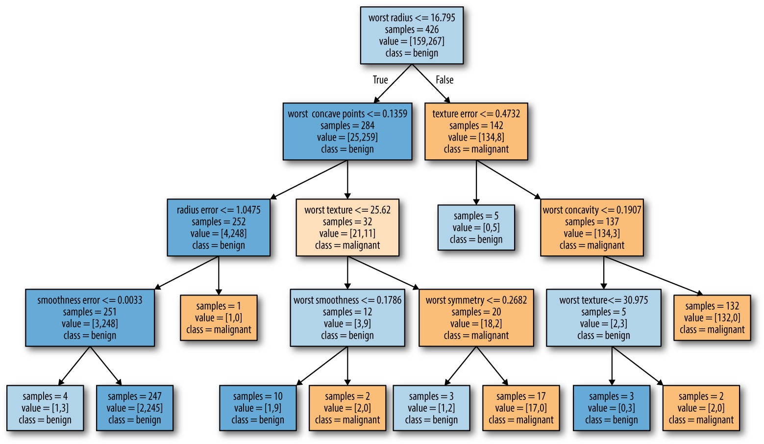
Figure 2-27. Visualization of the decision tree built on the Breast Cancer dataset
The visualization of the tree provides a great in-depth view of how the
algorithm makes predictions, and is a good example of a machine learning
algorithm that is easily explained to nonexperts. However, even with a
tree of depth four, as seen here, the tree can become a bit
overwhelming. Deeper trees (a depth of 10 is not uncommon) are even harder
to grasp. One method of inspecting the tree that may be helpful is to
find out which path most of the data actually takes. The samples
shown in each node in Figure 2-27 gives the number of samples in that
node, while value provides the number of samples per class. Following
the branches to the right, we see that worst radius > 16.795 creates
a node that contains only 8 benign but 134 malignant samples. The rest
of this side of the tree then uses some finer distinctions to split off
these 8 remaining benign samples. Of the 142 samples that went to the
right in the initial split, nearly all of them (132) end up in the leaf
to the very right.
Taking a left at the root, for worst radius <= 16.795 we end up with
25 malignant and 259 benign samples. Nearly all of the benign samples
end up in the second leaf from the left, with most of the other leaves containing very few samples.
Feature importance in trees
Instead of looking at the whole tree, which can be taxing, there are some useful properties that we can derive to summarize the workings of the tree. The most commonly used summary is feature importance, which rates how important each feature is for the decision a tree makes. It is a number between 0 and 1 for each feature, where 0 means “not used at all” and 1 means “perfectly predicts the target.” The feature importances always sum to 1:
In[60]:
("Feature importances:")(tree.feature_importances_)
Out[60]:
Feature importances:
[0.    0.    0.    0.    0.    0.    0.    0.    0.    0.    0.01  0.048
 0.    0.    0.002 0.    0.    0.    0.    0.    0.727 0.046 0.    0.
 0.014 0.    0.018 0.122 0.012 0.   ]
We can visualize the feature importances in a way that is similar to the way we visualize the coefficients in the linear model (Figure 2-28):
In[61]:
defplot_feature_importances_cancer(model):n_features=cancer.data.shape[1]plt.barh(np.arange(n_features),model.feature_importances_,align='center')plt.yticks(np.arange(n_features),cancer.feature_names)plt.xlabel("Feature importance")plt.ylabel("Feature")plt.ylim(-1,n_features)plot_feature_importances_cancer(tree)

Figure 2-28. Feature importances computed from a decision tree learned on the Breast Cancer dataset
Here we see that the feature used in the top split (“worst radius”) is by far the most important feature. This confirms our observation in analyzing the tree that the first level already separates the two classes fairly well.
However, if a feature has a low value in feature_importance_, it doesn’t mean
that this feature is uninformative. It only means that the feature was
not picked by the tree, likely because another feature encodes the same
information.
In contrast to the coefficients in linear models, feature importances are always positive, and don’t encode which class a feature is indicative of. The feature importances tell us that “worst radius” is important, but not whether a high radius is indicative of a sample being benign or malignant. In fact, there might not be such a simple relationship between features and class, as you can see in the following example (Figures 2-29 and 2-30):
In[62]:
tree=mglearn.plots.plot_tree_not_monotone()display(tree)
Out[62]:
Feature importances: [ 0. 1.]

Figure 2-29. A two-dimensional dataset in which the feature on the y-axis has a nonmonotonous relationship with the class label, and the decision boundaries found by a decision tree

Figure 2-30. Decision tree learned on the data shown in Figure 2-29
The plot shows a dataset with two features and two classes. Here, all
the information is contained in X[1], and X[0] is not used at all.
But the relation between X[1] and the output class is not monotonous,
meaning we cannot say “a high value of X[1] means class 0, and a low
value means class 1” (or vice versa).
While we focused our discussion here on decision trees for
classification, all that was said is similarly true for decision trees
for regression, as implemented in DecisionTreeRegressor. The usage and analysis of regression trees is very similar to that of classification
trees. There is one particular property of using tree-based models for
regression that we want to point out, though. The
DecisionTreeRegressor (and all other tree-based regression models) is
not able to extrapolate, or make predictions outside of the
range of the training data.
Let’s look into this in more detail, using a dataset of historical computer memory (RAM) prices. Figure 2-31 shows the dataset, with the date on the x-axis and the price of one megabyte of RAM in that year on the y-axis:
In[63]:
importosram_prices=pd.read_csv(os.path.join(mglearn.datasets.DATA_PATH,"ram_price.csv"))plt.semilogy(ram_prices.date,ram_prices.price)plt.xlabel("Year")plt.ylabel("Price in $/Mbyte")

Figure 2-31. Historical development of the price of RAM, plotted on a log scale
Note the logarithmic scale of the y-axis. When plotting logarithmically, the relation seems to be quite linear and so should be relatively easy to predict, apart from some bumps.
We will make a forecast for the years after 2000 using the historical
data up to that point, with the date as our only feature. We will
compare two simple models: a DecisionTreeRegressor and
LinearRegression. We rescale the prices using a logarithm, so that the
relationship is relatively linear. This doesn’t make a difference for
the DecisionTreeRegressor, but it makes a big difference for
LinearRegression (we will discuss this in more depth in Chapter 4).
After training the models and making predictions, we apply the
exponential map to undo the logarithm transform. We make predictions on
the whole dataset for visualization purposes here, but for a quantitative
evaluation we would only consider the test dataset:
In[64]:
fromsklearn.treeimportDecisionTreeRegressor# use historical data to forecast prices after the year 2000data_train=ram_prices[ram_prices.date<2000]data_test=ram_prices[ram_prices.date>=2000]# predict prices based on dateX_train=data_train.date[:,np.newaxis]# we use a log-transform to get a simpler relationship of data to targety_train=np.log(data_train.price)tree=DecisionTreeRegressor(max_depth=3).fit(X_train,y_train)linear_reg=LinearRegression().fit(X_train,y_train)# predict on all dataX_all=ram_prices.date[:,np.newaxis]pred_tree=tree.predict(X_all)pred_lr=linear_reg.predict(X_all)# undo log-transformprice_tree=np.exp(pred_tree)price_lr=np.exp(pred_lr)
Figure 2-32, created here, compares the predictions of the decision tree and the linear regression model with the ground truth:
In[65]:
plt.semilogy(data_train.date,data_train.price,label="Training data")plt.semilogy(data_test.date,data_test.price,label="Test data")plt.semilogy(ram_prices.date,price_tree,label="Tree prediction")plt.semilogy(ram_prices.date,price_lr,label="Linear prediction")plt.legend()

Figure 2-32. Comparison of predictions made by a linear model and predictions made by a regression tree on the RAM price data
The difference between the models is quite striking. The linear model approximates the data with a line, as we knew it would. This line provides quite a good forecast for the test data (the years after 2000), while glossing over some of the finer variations in both the training and the test data. The tree model, on the other hand, makes perfect predictions on the training data; we did not restrict the complexity of the tree, so it learned the whole dataset by heart. However, once we leave the data range for which the model has data, the model simply keeps predicting the last known point. The tree has no ability to generate “new” responses, outside of what was seen in the training data. This shortcoming applies to all models based on trees.9
Strengths, weaknesses, and parameters
As discussed earlier, the parameters that control model complexity in
decision trees are the pre-pruning parameters that stop the building of
the tree before it is fully developed. Usually, picking one of the
pre-pruning strategies—setting either max_depth, max_leaf_nodes, or
min_samples_leaf—is sufficient to prevent overfitting.
Decision trees have two advantages over many of the algorithms we’ve discussed so far: the resulting model can easily be visualized and understood by nonexperts (at least for smaller trees), and the algorithms are completely invariant to scaling of the data. As each feature is processed separately, and the possible splits of the data don’t depend on scaling, no preprocessing like normalization or standardization of features is needed for decision tree algorithms. In particular, decision trees work well when you have features that are on completely different scales, or a mix of binary and continuous features.
The main downside of decision trees is that even with the use of pre-pruning, they tend to overfit and provide poor generalization performance. Therefore, in most applications, the ensemble methods we discuss next are usually used in place of a single decision tree.
2.3.6 Ensembles of Decision Trees
Ensembles are methods that combine multiple machine learning models to create more powerful models. There are many models in the machine learning literature that belong to this category, but there are two ensemble models that have proven to be effective on a wide range of datasets for classification and regression, both of which use decision trees as their building blocks: random forests and gradient boosted decision trees.
Random forests
As we just observed, a main drawback of decision trees is that they tend to overfit the training data. Random forests are one way to address this problem. A random forest is essentially a collection of decision trees, where each tree is slightly different from the others. The idea behind random forests is that each tree might do a relatively good job of predicting, but will likely overfit on part of the data. If we build many trees, all of which work well and overfit in different ways, we can reduce the amount of overfitting by averaging their results. This reduction in overfitting, while retaining the predictive power of the trees, can be shown using rigorous mathematics.
To implement this strategy, we need to build many decision trees. Each tree should do an acceptable job of predicting the target, and should also be different from the other trees. Random forests get their name from injecting randomness into the tree building to ensure each tree is different. There are two ways in which the trees in a random forest are randomized: by selecting the data points used to build a tree and by selecting the features in each split test. Let’s go into this process in more detail.
Building random forests
To build a random forest model, you need to decide on the number of
trees to build (the n_estimators parameter of RandomForestRegressor
or RandomForestClassifier). Let’s say we want to build 10 trees. These
trees will be built completely independently from each other, and the
algorithm will make different random choices for each tree to make sure
the trees are distinct. To build a tree, we first take what is called a
bootstrap sample of our data. That is, from our
n_samples data points, we repeatedly draw an example randomly with
replacement (meaning the same sample can be picked multiple times),
n_samples times. This will create a dataset that is as big as the
original dataset, but some data points will be missing from it
(approximately one third), and some will be repeated.
To illustrate, let’s say we want to create a bootstrap sample of the list
['a', 'b', 'c', 'd']. A possible bootstrap sample would be
['b', 'd', 'd', 'c']. Another possible sample would be
['d', 'a', 'd', 'a'].
Next, a decision tree is built based on this newly created dataset.
However, the algorithm we described for the decision tree is slightly
modified. Instead of looking for the best test for each node, in each
node the algorithm randomly selects a subset of the features, and it looks
for the best possible test involving one of these features. The number
of features that are selected is controlled by the max_features
parameter. This selection of a subset of features is repeated separately
in each node, so that each node in a tree can make a decision using a
different subset of the features.
The bootstrap sampling leads to each decision tree in the random forest being built on a slightly different dataset. Because of the selection of features in each node, each split in each tree operates on a different subset of features. Together, these two mechanisms ensure that all the trees in the random forest are different.
A critical parameter in this process is max_features. If we set
max_features to n_features, that means that each split can look at
all features in the dataset, and no randomness will be injected in the
feature selection (the randomness due to the bootstrapping remains,
though). If we set max_features to 1, that means that the splits
have no choice at all on which feature to test, and can only search over
different thresholds for the feature that was selected randomly.
Therefore, a high max_features means that the trees in the random
forest will be quite similar, and they will be able to fit the data
easily, using the most distinctive features. A low max_features means
that the trees in the random forest will be quite different, and that
each tree might need to be very deep in order to fit the data well.
To make a prediction using the random forest, the algorithm first makes a prediction for every tree in the forest. For regression, we can average these results to get our final prediction. For classification, a “soft voting” strategy is used. This means each algorithm makes a “soft” prediction, providing a probability for each possible output label. The probabilities predicted by all the trees are averaged, and the class with the highest probability is predicted.
Analyzing random forests
Let’s apply a random forest consisting of five trees to the two_moons
dataset we studied earlier:
In[66]:
fromsklearn.ensembleimportRandomForestClassifierfromsklearn.datasetsimportmake_moonsX,y=make_moons(n_samples=100,noise=0.25,random_state=3)X_train,X_test,y_train,y_test=train_test_split(X,y,stratify=y,random_state=42)forest=RandomForestClassifier(n_estimators=5,random_state=2)forest.fit(X_train,y_train)
The trees that are built as part of the random forest are stored in the
estimator_ attribute. Let’s visualize the decision boundaries learned
by each tree, together with their aggregate prediction as made by the
forest (Figure 2-33):
In[67]:
fig,axes=plt.subplots(2,3,figsize=(20,10))fori,(ax,tree)inenumerate(zip(axes.ravel(),forest.estimators_)):ax.set_title("Tree {}".format(i))mglearn.plots.plot_tree_partition(X_train,y_train,tree,ax=ax)mglearn.plots.plot_2d_separator(forest,X_train,fill=True,ax=axes[-1,-1],alpha=.4)axes[-1,-1].set_title("Random Forest")mglearn.discrete_scatter(X_train[:,0],X_train[:,1],y_train)
You can clearly see that the decision boundaries learned by the five trees are quite different. Each of them makes some mistakes, as some of the training points that are plotted here were not actually included in the training sets of the trees, due to the bootstrap sampling.
The random forest overfits less than any of the trees individually, and provides a much more intuitive decision boundary. In any real application, we would use many more trees (often hundreds or thousands), leading to even smoother boundaries.

Figure 2-33. Decision boundaries found by five randomized decision trees and the decision boundary obtained by averaging their predicted probabilities
As another example, let’s apply a random forest consisting of 100 trees on the Breast Cancer dataset:
In[68]:
X_train,X_test,y_train,y_test=train_test_split(cancer.data,cancer.target,random_state=0)forest=RandomForestClassifier(n_estimators=100,random_state=0)forest.fit(X_train,y_train)("Accuracy on training set: {:.3f}".format(forest.score(X_train,y_train)))("Accuracy on test set: {:.3f}".format(forest.score(X_test,y_test)))
Out[68]:
Accuracy on training set: 1.000
Accuracy on test set: 0.972
The random forest gives us an accuracy of 97%, better than the linear
models or a single decision tree, without tuning any parameters. We
could adjust the max_features setting, or apply pre-pruning as we did
for the single decision tree. However, often the default parameters of
the random forest already work quite well.
Similarly to the decision tree, the random forest provides feature importances, which are computed by aggregating the feature importances over the trees in the forest. Typically, the feature importances provided by the random forest are more reliable than the ones provided by a single tree. Take a look at Figure 2-34.
In[69]:
plot_feature_importances_cancer(forest)

Figure 2-34. Feature importances computed from a random forest that was fit to the Breast Cancer dataset
As you can see, the random forest gives nonzero importance to many more features than the single tree. Similarly to the single decision tree, the random forest also gives a lot of importance to the “worst radius” feature, but it actually chooses “worst perimeter” to be the most informative feature overall. The randomness in building the random forest forces the algorithm to consider many possible explanations, the result being that the random forest captures a much broader picture of the data than a single tree.
Strengths, weaknesses, and parameters
Random forests for regression and classification are currently among the most widely used machine learning methods. They are very powerful, often work well without heavy tuning of the parameters, and don’t require scaling of the data.
Essentially, random forests share all of the benefits of decision trees,
while making up for some of their deficiencies. One reason to still use
decision trees is if you need a compact representation of the decision-making process. It is basically impossible to interpret tens or hundreds
of trees in detail, and trees in random forests tend to be deeper than
decision trees (because of the use of feature subsets). Therefore, if
you need to summarize the prediction making in a visual way to
nonexperts, a single decision tree might be a better choice. While
building random forests on large datasets might be somewhat
time consuming, it can be parallelized across multiple CPU cores within a
computer easily. If you are using a multi-core processor (as nearly all
modern computers do), you can use the n_jobs parameter to adjust the
number of cores to use. Using more CPU cores will result in linear
speed-ups (using two cores, the training of the random forest will be
twice as fast), but specifying n_jobs larger than the number of cores
will not help. You can set n_jobs=-1 to use all the cores in your
computer.
You should keep in mind that random forests, by their nature, are
random, and setting different random states (or not setting the
random_state at all) can drastically change the model that is built.
The more trees there are in the forest, the more robust it will be
against the choice of random state. If you want to have reproducible
results, it is important to fix the random_state.
Random forests don’t tend to perform well on very high dimensional, sparse data, such as text data. For this kind of data, linear models might be more appropriate. Random forests usually work well even on very large datasets, and training can easily be parallelized over many CPU cores within a powerful computer. However, random forests require more memory and are slower to train and to predict than linear models. If time and memory are important in an application, it might make sense to use a linear model instead.
The important parameters to adjust are n_estimators, max_features,
and possibly pre-pruning options like max_depth. For n_estimators,
larger is always better. Averaging more trees will yield a more robust
ensemble by reducing overfitting. However, there are diminishing
returns, and more trees need more memory and more time to train. A
common rule of thumb is to build “as many as you have time/memory
for.”
As described earlier, max_features determines how random each tree is,
and a smaller max_features reduces overfitting. In general, it’s a good rule of thumb to use the default values: max_features=sqrt(n_features) for classification and max_features=n_features for regression. Adding max_features or max_leaf_nodes might sometimes improve performance. It can also drastically reduce space and time requirements for training and prediction.
Gradient boosted regression trees (gradient boosting machines)
The gradient boosted regression tree is another ensemble method that combines multiple decision trees to create a more powerful model. Despite the “regression” in the name, these models can be used for regression and classification. In contrast to the random forest approach, gradient boosting works by building trees in a serial manner, where each tree tries to correct the mistakes of the previous one. By default, there is no randomization in gradient boosted regression trees; instead, strong pre-pruning is used. Gradient boosted trees often use very shallow trees, of depth one to five, which makes the model smaller in terms of memory and makes predictions faster. The main idea behind gradient boosting is to combine many simple models (in this context known as weak learners), like shallow trees. Each tree can only provide good predictions on part of the data, and so more and more trees are added to iteratively improve performance.
Gradient boosted trees are frequently the winning entries in machine learning competitions, and are widely used in industry. They are generally a bit more sensitive to parameter settings than random forests, but can provide better accuracy if the parameters are set correctly.
Apart from the pre-pruning and the number of trees in the ensemble,
another important parameter of gradient boosting is the learning_rate,
which controls how strongly each tree tries to correct the mistakes of
the previous trees. A higher learning rate means each tree can make
stronger corrections, allowing for more complex models. Adding more trees to the ensemble, which can be accomplished by increasing
n_estimators, also increases the model complexity, as the model has
more chances to correct mistakes on the training set.
Here is an example of using GradientBoostingClassifier on the Breast
Cancer dataset. By default, 100 trees of maximum depth 3 and a learning rate of 0.1 are used:
In[70]:
fromsklearn.ensembleimportGradientBoostingClassifierX_train,X_test,y_train,y_test=train_test_split(cancer.data,cancer.target,random_state=0)gbrt=GradientBoostingClassifier(random_state=0)gbrt.fit(X_train,y_train)("Accuracy on training set: {:.3f}".format(gbrt.score(X_train,y_train)))("Accuracy on test set: {:.3f}".format(gbrt.score(X_test,y_test)))
Out[70]:
Accuracy on training set: 1.000
Accuracy on test set: 0.958
As the training set accuracy is 100%, we are likely to be overfitting. To reduce overfitting, we could either apply stronger pre-pruning by limiting the maximum depth or lower the learning rate:
In[71]:
gbrt=GradientBoostingClassifier(random_state=0,max_depth=1)gbrt.fit(X_train,y_train)("Accuracy on training set: {:.3f}".format(gbrt.score(X_train,y_train)))("Accuracy on test set: {:.3f}".format(gbrt.score(X_test,y_test)))
Out[71]:
Accuracy on training set: 0.991
Accuracy on test set: 0.972
In[72]:
gbrt=GradientBoostingClassifier(random_state=0,learning_rate=0.01)gbrt.fit(X_train,y_train)("Accuracy on training set: {:.3f}".format(gbrt.score(X_train,y_train)))("Accuracy on test set: {:.3f}".format(gbrt.score(X_test,y_test)))
Out[72]:
Accuracy on training set: 0.988
Accuracy on test set: 0.965
Both methods of decreasing the model complexity reduced the training set accuracy, as expected. In this case, lowering the maximum depth of the trees provided a significant improvement of the model, while lowering the learning rate only increased the generalization performance slightly.
As for the other decision tree–based models, we can again visualize the feature importances to get more insight into our model (Figure 2-35). As we used 100 trees, it is impractical to inspect them all, even if they are all of depth 1:
In[73]:
gbrt=GradientBoostingClassifier(random_state=0,max_depth=1)gbrt.fit(X_train,y_train)plot_feature_importances_cancer(gbrt)

Figure 2-35. Feature importances computed from a gradient boosting classifier that was fit to the Breast Cancer dataset
We can see that the feature importances of the gradient boosted trees are somewhat similar to the feature importances of the random forests, though the gradient boosting completely ignored some of the features.
As both gradient boosting and random forests perform well on similar kinds of data, a common approach is to first try random forests, which work quite robustly. If random forests work well but prediction time is at a premium, or it is important to squeeze out the last percentage of accuracy from the machine learning model, moving to gradient boosting often helps.
If you want to apply gradient boosting to a large-scale problem, it
might be worth looking into the xgboost package and its Python
interface, which at the time of writing is faster (and sometimes easier
to tune) than the scikit-learn implementation of gradient boosting on
many datasets.
Strengths, weaknesses, and parameters
Gradient boosted decision trees are among the most powerful and widely used models for supervised learning. Their main drawback is that they require careful tuning of the parameters and may take a long time to train. Similarly to other tree-based models, the algorithm works well without scaling and on a mixture of binary and continuous features. As with other tree-based models, it also often does not work well on high-dimensional sparse data.
The main parameters of gradient boosted tree models are the number
of trees, n_estimators, and the learning_rate, which controls the degree to which each tree is allowed to correct the mistakes of the previous trees.
These two parameters are highly interconnected, as a lower
learning_rate means that more trees are needed to build a model of
similar complexity. In contrast to random forests, where a higher
n_estimators value is always better, increasing n_estimators in gradient
boosting leads to a more complex model, which may lead to overfitting. A
common practice is to fit n_estimators depending on the time and
memory budget, and then search over different learning_rates.
Another important parameter is max_depth (or alternatively
max_leaf_nodes), to reduce the complexity of each tree. Usually
max_depth is set very low for gradient boosted models, often not
deeper than five splits.
2.3.7 Kernelized Support Vector Machines
The next type of supervised model we will discuss is kernelized support
vector machines. We explored the use of linear support vector machines
for classification in “Linear models for classification”. Kernelized support
vector machines (often just referred to as SVMs) are an extension that
allows for more complex models that are not defined simply by
hyperplanes in the input space. While there are support vector machines
for classification and regression, we will restrict ourselves to the
classification case, as implemented in SVC. Similar concepts apply to
support vector regression, as implemented in SVR.
The math behind kernelized support vector machines is a bit involved, and is beyond the scope of this book. You can find the details in Chapter 12 of Hastie, Tibshirani, and Friedman’s The Elements of Statistical Learning. However, we will try to give you some sense of the idea behind the method.
Linear models and nonlinear features
As you saw in Figure 2-15, linear models can be quite limiting in low-dimensional spaces, as lines and hyperplanes have limited flexibility. One way to make a linear model more flexible is by adding more features—for example, by adding interactions or polynomials of the input features.
Let’s look at the synthetic dataset we used in “Feature importance in trees” (see Figure 2-29):
In[74]:
X,y=make_blobs(centers=4,random_state=8)y=y%2mglearn.discrete_scatter(X[:,0],X[:,1],y)plt.xlabel("Feature 0")plt.ylabel("Feature 1")

Figure 2-36. Two-class classification dataset in which classes are not linearly separable
A linear model for classification can only separate points using a line, and will not be able to do a very good job on this dataset (see Figure 2-37):
In[75]:
fromsklearn.svmimportLinearSVClinear_svm=LinearSVC().fit(X,y)mglearn.plots.plot_2d_separator(linear_svm,X)mglearn.discrete_scatter(X[:,0],X[:,1],y)plt.xlabel("Feature 0")plt.ylabel("Feature 1")
Now let’s expand the set of input features, say by also adding
feature1 ** 2, the square of the second feature, as a new feature.
Instead of representing each data point as a two-dimensional point,
(feature0, feature1), we now represent it as a three-dimensional point, (feature0, feature1, feature1 ** 2).10 This new representation is illustrated in Figure 2-38 in
a three-dimensional scatter plot:
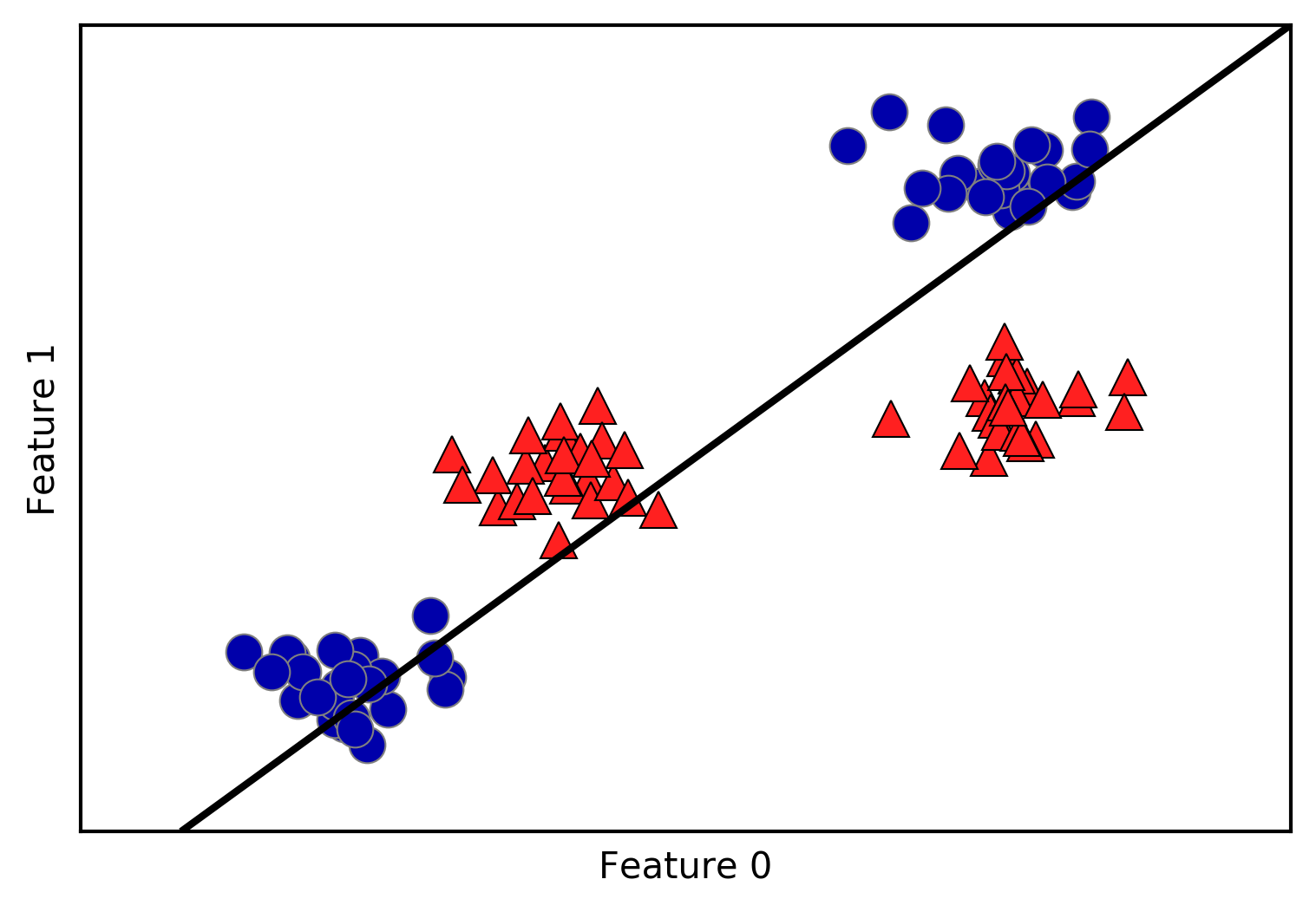
Figure 2-37. Decision boundary found by a linear SVM
In[76]:
# add the squared second featureX_new=np.hstack([X,X[:,1:]**2])frommpl_toolkits.mplot3dimportAxes3D,axes3dfigure=plt.figure()# visualize in 3Dax=Axes3D(figure,elev=-152,azim=-26)# plot first all the points with y == 0, then all with y == 1mask=y==0ax.scatter(X_new[mask,0],X_new[mask,1],X_new[mask,2],c='b',cmap=mglearn.cm2,s=60,edgecolor='k')ax.scatter(X_new[~mask,0],X_new[~mask,1],X_new[~mask,2],c='r',marker='^',cmap=mglearn.cm2,s=60,edgecolor='k')ax.set_xlabel("feature0")ax.set_ylabel("feature1")ax.set_zlabel("feature1 ** 2")

Figure 2-38. Expansion of the dataset shown in Figure 2-37, created by adding a third feature derived from feature1
In the new representation of the data, it is now indeed possible to separate the two classes using a linear model, a plane in three dimensions. We can confirm this by fitting a linear model to the augmented data (see Figure 2-39):
In[77]:
linear_svm_3d=LinearSVC().fit(X_new,y)coef,intercept=linear_svm_3d.coef_.ravel(),linear_svm_3d.intercept_# show linear decision boundaryfigure=plt.figure()ax=Axes3D(figure,elev=-152,azim=-26)xx=np.linspace(X_new[:,0].min()-2,X_new[:,0].max()+2,50)yy=np.linspace(X_new[:,1].min()-2,X_new[:,1].max()+2,50)XX,YY=np.meshgrid(xx,yy)ZZ=(coef[0]*XX+coef[1]*YY+intercept)/-coef[2]ax.plot_surface(XX,YY,ZZ,rstride=8,cstride=8,alpha=0.3)ax.scatter(X_new[mask,0],X_new[mask,1],X_new[mask,2],c='b',cmap=mglearn.cm2,s=60,edgecolor='k')ax.scatter(X_new[~mask,0],X_new[~mask,1],X_new[~mask,2],c='r',marker='^',cmap=mglearn.cm2,s=60,edgecolor='k')ax.set_xlabel("feature0")ax.set_ylabel("feature1")ax.set_zlabel("feature1 ** 2")

Figure 2-39. Decision boundary found by a linear SVM on the expanded three-dimensional dataset
As a function of the original features, the linear SVM model is not actually linear anymore. It is not a line, but more of an ellipse, as you can see from the plot created here (Figure 2-40):
In[78]:
ZZ=YY**2dec=linear_svm_3d.decision_function(np.c_[XX.ravel(),YY.ravel(),ZZ.ravel()])plt.contourf(XX,YY,dec.reshape(XX.shape),levels=[dec.min(),0,dec.max()],cmap=mglearn.cm2,alpha=0.5)mglearn.discrete_scatter(X[:,0],X[:,1],y)plt.xlabel("Feature 0")plt.ylabel("Feature 1")

Figure 2-40. The decision boundary from Figure 2-39 as a function of the original two features
The kernel trick
The lesson here is that adding nonlinear features to the representation of our data can make linear models much more powerful. However, often we don’t know which features to add, and adding many features (like all possible interactions in a 100-dimensional feature space) might make computation very expensive. Luckily, there is a clever mathematical trick that allows us to learn a classifier in a higher-dimensional space without actually computing the new, possibly very large representation. This is known as the kernel trick, and it works by directly computing the distance (more precisely, the scalar products) of the data points for the expanded feature representation, without ever actually computing the expansion.
There are two ways to map your data into a higher-dimensional space that
are commonly used with support vector machines: the polynomial kernel,
which computes all possible polynomials up to a certain degree of the
original features (like feature1 ** 2 * feature2 ** 5); and the radial
basis function (RBF) kernel, also known as the Gaussian kernel. The Gaussian
kernel is a bit harder to explain, as it corresponds to an infinite-dimensional feature space. One way to explain the Gaussian kernel is
that it considers all possible polynomials of all degrees, but the
importance of the features decreases for higher degrees.11
In practice, the mathematical details behind the kernel SVM are not that important, though, and how an SVM with an RBF kernel makes a decision can be summarized quite easily—we’ll do so in the next section.
Understanding SVMs
During training, the SVM learns how important each of the training data points is to represent the decision boundary between the two classes. Typically only a subset of the training points matter for defining the decision boundary: the ones that lie on the border between the classes. These are called support vectors and give the support vector machine its name.
To make a prediction for a new point, the distance to each of the support
vectors is measured. A classification decision is made based on the
distances to the support vector, and the importance of the support
vectors that was learned during training (stored in the dual_coef_
attribute of SVC).
The distance between data points is measured by the Gaussian kernel:
- krbf(x1, x2) = exp (–ɣǁx1 - x2ǁ2)
Here, x1 and x2 are data points, ǁ x1 - x2 ǁ denotes Euclidean distance, and ɣ (gamma) is a parameter that controls the width of the Gaussian kernel.
Figure 2-41 shows the result of training a support vector machine on a
two-dimensional two-class dataset. The decision boundary is shown in
black, and the support vectors are larger points with the wide outline. The following code creates this plot by training an SVM on the forge dataset:
In[79]:
fromsklearn.svmimportSVCX,y=mglearn.tools.make_handcrafted_dataset()svm=SVC(kernel='rbf',C=10,gamma=0.1).fit(X,y)mglearn.plots.plot_2d_separator(svm,X,eps=.5)mglearn.discrete_scatter(X[:,0],X[:,1],y)# plot support vectorssv=svm.support_vectors_# class labels of support vectors are given by the sign of the dual coefficientssv_labels=svm.dual_coef_.ravel()>0mglearn.discrete_scatter(sv[:,0],sv[:,1],sv_labels,s=15,markeredgewidth=3)plt.xlabel("Feature 0")plt.ylabel("Feature 1")

Figure 2-41. Decision boundary and support vectors found by an SVM with RBF kernel
In this case, the SVM yields a very smooth and nonlinear (not a
straight line) boundary. We adjusted two parameters here: the
C parameter and the gamma parameter, which we will now discuss in
detail.
Tuning SVM parameters
The gamma parameter is the one shown in the formula given
in the previous section, which corresponds to the inverse of the width of
the Gaussian kernel.
Intuitively, the gamma parameter determines how far the influence of a single
training example reaches, with low values meaning corresponding to a far reach,
and high values to a limited reach. In other words, the wider the radius of the
Gaussian kernel, the further the influence of each training example.
The C parameter is a regularization parameter, similar to that used in the
linear models. It limits the importance of each point (or more precisely, their
dual_coef_).
Let’s have a look at what happens when we vary these parameters (Figure 2-42):
In[80]:
fig,axes=plt.subplots(3,3,figsize=(15,10))forax,Cinzip(axes,[-1,0,3]):fora,gammainzip(ax,range(-1,2)):mglearn.plots.plot_svm(log_C=C,log_gamma=gamma,ax=a)axes[0,0].legend(["class 0","class 1","sv class 0","sv class 1"],ncol=4,loc=(.9,1.2))

Figure 2-42. Decision boundaries and support vectors for different settings of the parameters C and gamma
Going from left to right, we increase the value of the parameter gamma from 0.1 to
10. A small gamma means a large radius for the Gaussian kernel, which
means that many points are considered close by. This is reflected in
very smooth decision boundaries on the left, and boundaries that focus
more on single points further to the right. A low value of gamma means
that the decision boundary will vary slowly, which yields a model of low
complexity, while a high value of gamma yields a more complex model.
Going from top to bottom, we increase the C parameter from 0.1 to
1000. As with the linear models, a small C means a very restricted
model, where each data point can only have very limited influence. You
can see that at the top left the decision boundary looks nearly linear,
with the misclassified points barely having any influence on the line. Increasing C, as shown on the bottom left, allows these
points to have a stronger influence on the model and makes the decision
boundary bend to correctly classify them.
Let’s apply the RBF kernel SVM to the Breast Cancer dataset. By default,
C=1 and gamma=1/n_features:
In[81]:
X_train,X_test,y_train,y_test=train_test_split(cancer.data,cancer.target,random_state=0)svc=SVC()svc.fit(X_train,y_train)("Accuracy on training set: {:.2f}".format(svc.score(X_train,y_train)))("Accuracy on test set: {:.2f}".format(svc.score(X_test,y_test)))
Out[81]:
Accuracy on training set: 1.00
Accuracy on test set: 0.63
The model overfits quite substantially, with a perfect score on the training set and only 63% accuracy on the test set. While SVMs often perform quite well, they are very sensitive to the settings of the parameters and to the scaling of the data. In particular, they require all the features to vary on a similar scale. Let’s look at the minimum and maximum values for each feature, plotted in log-space (Figure 2-43):
In[82]:
plt.boxplot(X_train,manage_xticks=False)plt.yscale("symlog")plt.xlabel("Feature index")plt.ylabel("Feature magnitude")
From this plot we can determine that features in the Breast Cancer dataset are of completely different orders of magnitude. This can be somewhat of a problem for other models (like linear models), but it has devastating effects for the kernel SVM. Let’s examine some ways to deal with this issue.

Figure 2-43. Feature ranges for the Breast Cancer dataset (note that the y axis has a logarithmic scale)
Preprocessing data for SVMs
One way to resolve this problem is by rescaling each feature so that
they are all approximately on the same scale. A common rescaling method for
kernel SVMs is to scale the data such that all features have 0 mean
and unit variance, or that all features are between 0 and 1. We
will see how to do this using the StandardScaler or MinMaxScaler
preprocessing method in Chapter 3, where we’ll
give more details. The best choice of preprocessing method depends on
the properties of the dataset. For now, let’s do this “by hand”:
In[83]:
# compute the minimum value per feature on the training setmin_on_training=X_train.min(axis=0)# compute the range of each feature (max - min) on the training setrange_on_training=(X_train-min_on_training).max(axis=0)# subtract the min, and divide by range# afterward, min=0 and max=1 for each featureX_train_scaled=(X_train-min_on_training)/range_on_training("Minimum for each feature",X_train_scaled.min(axis=0))("Maximum for each feature",X_train_scaled.max(axis=0))
Out[83]:
Minimum for each feature
[0. 0. 0. 0. 0. 0. 0. 0. 0. 0. 0. 0. 0. 0. 0. 0. 0. 0. 0. 0. 0. 0. 0. 0.
 0. 0. 0. 0. 0. 0.]
Maximum for each feature
 [1. 1. 1. 1. 1. 1. 1. 1. 1. 1. 1. 1. 1. 1. 1. 1. 1. 1. 1. 1. 1. 1. 1. 1.
 1. 1. 1. 1. 1. 1.]
In[84]:
# use THE SAME transformation on the test set,# using min and range of the training set (see Chapter 3 for details)X_test_scaled=(X_test-min_on_training)/range_on_training
In[85]:
svc=SVC()svc.fit(X_train_scaled,y_train)("Accuracy on training set: {:.3f}".format(svc.score(X_train_scaled,y_train)))("Accuracy on test set: {:.3f}".format(svc.score(X_test_scaled,y_test)))
Out[85]:
Accuracy on training set: 0.948
Accuracy on test set: 0.951
Scaling the data made a huge difference! Now we are actually in an
underfitting regime, where training and test set performance are quite
similar but less close to 100% accuracy. From here, we can try
increasing either C or gamma to fit a more complex model. For example:
In[86]:
svc=SVC(C=1000)svc.fit(X_train_scaled,y_train)("Accuracy on training set: {:.3f}".format(svc.score(X_train_scaled,y_train)))("Accuracy on test set: {:.3f}".format(svc.score(X_test_scaled,y_test)))
Out[86]:
Accuracy on training set: 0.988
Accuracy on test set: 0.972
Here, increasing C allows us to improve the model significantly,
resulting in 97.2% accuracy.
Strengths, weaknesses, and parameters
Kernelized support vector machines are powerful models and perform well on a variety of datasets. SVMs allow for complex decision boundaries, even if the data has only a few features. They work well on low-dimensional and high-dimensional data (i.e., few and many features), but don’t scale very well with the number of samples. Running an SVM on data with up to 10,000 samples might work well, but working with datasets of size 100,000 or more can become challenging in terms of runtime and memory usage.
Another downside of SVMs is that they require careful preprocessing of the data and tuning of the parameters. This is why, these days, most people instead use tree-based models such as random forests or gradient boosting (which require little or no preprocessing) in many applications. Furthermore, SVM models are hard to inspect; it can be difficult to understand why a particular prediction was made, and it might be tricky to explain the model to a nonexpert.
Still, it might be worth trying SVMs, particularly if all of your features represent measurements in similar units (e.g., all are pixel intensities) and they are on similar scales.
The important parameters in kernel SVMs are the regularization parameter
C, the choice of the kernel, and the kernel-specific parameters. Although we primarily focused on the RBF kernel, other choices are
available in scikit-learn. The RBF kernel has only one parameter,
gamma, which is the inverse of the width of the Gaussian kernel.
gamma and C both control the complexity of the model, with large
values in either resulting in a more complex model. Therefore, good
settings for the two parameters are usually strongly correlated, and C
and gamma should be adjusted together.
2.3.8 Neural Networks (Deep Learning)
A family of algorithms known as neural networks has recently seen a revival under the name “deep learning.” While deep learning shows great promise in many machine learning applications, deep learning algorithms are often tailored very carefully to a specific use case. Here, we will only discuss some relatively simple methods, namely multilayer perceptrons for classification and regression, that can serve as a starting point for more involved deep learning methods. Multilayer perceptrons (MLPs) are also known as (vanilla) feed-forward neural networks, or sometimes just neural networks.
The neural network model
MLPs can be viewed as generalizations of linear models that perform multiple stages of processing to come to a decision.
Remember that the prediction by a linear regressor is given as:
- ŷ = w[0] * x[0] + w[1] * x[1] + ... + w[p] * x[p] + b
In plain English, ŷ is a weighted sum of the input features x[0] to x[p], weighted by the learned coefficients w[0] to w[p]. We could visualize this graphically as shown in Figure 2-44:
In[87]:
display(mglearn.plots.plot_logistic_regression_graph())

Figure 2-44. Visualization of logistic regression, where input features and predictions are shown as nodes, and the coefficients are connections between the nodes
Here, each node on the left represents an input feature, the connecting lines represent the learned coefficients, and the node on the right represents the output, which is a weighted sum of the inputs.
In an MLP this process of computing weighted sums is repeated multiple times, first computing hidden units that represent an intermediate processing step, which are again combined using weighted sums to yield the final result (Figure 2-45):
In[88]:
display(mglearn.plots.plot_single_hidden_layer_graph())

This model has a lot more coefficients (also called weights) to learn: there is one between every input and every hidden unit (which make up the hidden layer), and one between every unit in the hidden layer and the output.
Computing a series of weighted sums is mathematically the same as computing just one weighted sum, so to make this model truly more powerful than a linear model, we need one extra trick. After computing a weighted sum for each hidden unit, a nonlinear function is applied to the result—usually the rectifying nonlinearity (also known as rectified linear unit or relu) or the tangens hyperbolicus (tanh). The result of this function is then used in the weighted sum that computes the output, ŷ. The two functions are visualized in Figure 2-46. The relu cuts off values below zero, while tanh saturates to –1 for low input values and +1 for high input values. Either nonlinear function allows the neural network to learn much more complicated functions than a linear model could:
In[89]:
line=np.linspace(-3,3,100)plt.plot(line,np.tanh(line),label="tanh")plt.plot(line,np.maximum(line,0),label="relu")plt.legend(loc="best")plt.xlabel("x")plt.ylabel("relu(x), tanh(x)")

For the small neural network pictured in Figure 2-45, the full formula for computing ŷ in the case of regression would be (when using a tanh nonlinearity):
- h[0] = tanh(w[0, 0] * x[0] + w[1, 0] * x[1] + w[2, 0] * x[2] + w[3, 0] * x[3] + b[0])
- h[1] = tanh(w[0, 1] * x[0] + w[1, 1] * x[1] + w[2, 1] * x[2] + w[3, 1] * x[3] + b[1])
- h[2] = tanh(w[0, 2] * x[0] + w[1, 2] * x[1] + w[2, 2] * x[2] + w[3, 2] * x[3] + b[2])
- ŷ = v[0] * h[0] + v[1] * h[1] + v[2] * h[2] + b
Here, w are the weights between the input x and the hidden layer h, and v are the weights between the hidden layer h and the output ŷ. The weights v and w are learned from data, x are the input features, ŷ is the computed output, and h are intermediate computations. An important parameter that needs to be set by the user is the number of nodes in the hidden layer. This can be as small as 10 for very small or simple datasets and as big as 10,000 for very complex data. It is also possible to add additional hidden layers, as shown in Figure 2-47:
In[90]:
mglearn.plots.plot_two_hidden_layer_graph()

Having large neural networks made up of many of these layers of computation is what inspired the term “deep learning.”
Tuning neural networks
Let’s look into the workings of the MLP by applying the MLPClassifier
to the two_moons dataset we used earlier in this chapter. The results are shown in Figure 2-48:
In[91]:
fromsklearn.neural_networkimportMLPClassifierfromsklearn.datasetsimportmake_moonsX,y=make_moons(n_samples=100,noise=0.25,random_state=3)X_train,X_test,y_train,y_test=train_test_split(X,y,stratify=y,random_state=42)mlp=MLPClassifier(solver='lbfgs',random_state=0).fit(X_train,y_train)mglearn.plots.plot_2d_separator(mlp,X_train,fill=True,alpha=.3)mglearn.discrete_scatter(X_train[:,0],X_train[:,1],y_train)plt.xlabel("Feature 0")plt.ylabel("Feature 1")

Figure 2-48. Decision boundary learned by a neural network with 100 hidden units on the two_moons dataset
As you can see, the neural network learned a very nonlinear but
relatively smooth decision boundary. We used solver='lbfgs', which
we will discuss later.
By default, the MLP uses 100 hidden nodes, which is quite a lot for this small dataset. We can reduce the number (which reduces the complexity of the model) and still get a good result (Figure 2-49):
In[92]:
mlp=MLPClassifier(solver='lbfgs',random_state=0,hidden_layer_sizes=[10])mlp.fit(X_train,y_train)mglearn.plots.plot_2d_separator(mlp,X_train,fill=True,alpha=.3)mglearn.discrete_scatter(X_train[:,0],X_train[:,1],y_train)plt.xlabel("Feature 0")plt.ylabel("Feature 1")
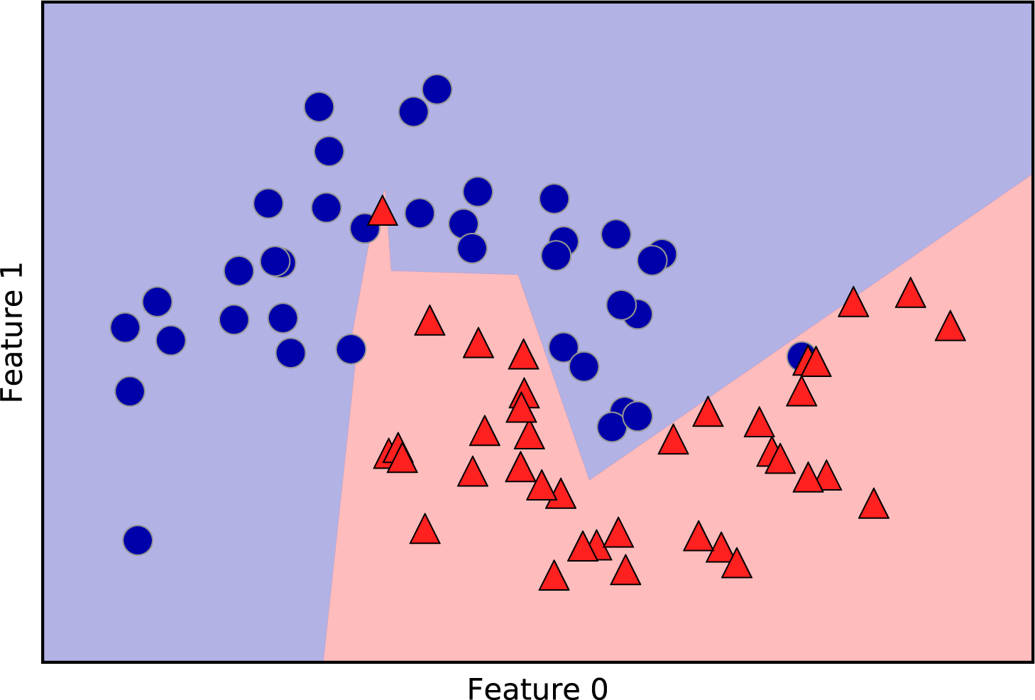
With only 10 hidden units, the decision boundary looks somewhat more ragged. The default nonlinearity is relu, shown in Figure 2-46. With a single hidden layer, this means the decision function will be made up of 10 straight line segments. If we want a smoother decision boundary, we could add more hidden units (as in Figure 2-48), add a second hidden layer (Figure 2-50), or use the tanh nonlinearity (Figure 2-51):
In[93]:
# using two hidden layers, with 10 units eachmlp=MLPClassifier(solver='lbfgs',random_state=0,hidden_layer_sizes=[10,10])mlp.fit(X_train,y_train)mglearn.plots.plot_2d_separator(mlp,X_train,fill=True,alpha=.3)mglearn.discrete_scatter(X_train[:,0],X_train[:,1],y_train)plt.xlabel("Feature 0")plt.ylabel("Feature 1")
In[94]:
# using two hidden layers, with 10 units each, now with tanh nonlinearitymlp=MLPClassifier(solver='lbfgs',activation='tanh',random_state=0,hidden_layer_sizes=[10,10])mlp.fit(X_train,y_train)mglearn.plots.plot_2d_separator(mlp,X_train,fill=True,alpha=.3)mglearn.discrete_scatter(X_train[:,0],X_train[:,1],y_train)plt.xlabel("Feature 0")plt.ylabel("Feature 1")

Figure 2-50. Decision boundary learned using 2 hidden layers with 10 hidden units each, with rect activation function

Figure 2-51. Decision boundary learned using 2 hidden layers with 10 hidden units each, with tanh activation function
Finally, we can also control the complexity of a neural network by using
an l2 penalty to shrink the weights toward zero, as we did in ridge
regression and the linear classifiers. The parameter for this in the
MLPClassifier is alpha (as in the linear regression models), and it’s
set to a very low value (little regularization) by default. Figure 2-52 shows the
effect of different values of alpha on the two_moons dataset, using
two hidden layers of 10 or 100 units each:
In[95]:
fig,axes=plt.subplots(2,4,figsize=(20,8))foraxx,n_hidden_nodesinzip(axes,[10,100]):forax,alphainzip(axx,[0.0001,0.01,0.1,1]):mlp=MLPClassifier(solver='lbfgs',random_state=0,hidden_layer_sizes=[n_hidden_nodes,n_hidden_nodes],alpha=alpha)mlp.fit(X_train,y_train)mglearn.plots.plot_2d_separator(mlp,X_train,fill=True,alpha=.3,ax=ax)mglearn.discrete_scatter(X_train[:,0],X_train[:,1],y_train,ax=ax)ax.set_title("n_hidden=[{}, {}]alpha={:.4f}".format(n_hidden_nodes,n_hidden_nodes,alpha))

Figure 2-52. Decision functions for different numbers of hidden units and different settings of the alpha parameter
As you probably have realized by now, there are many ways to control the
complexity of a neural network: the number of hidden layers, the number
of units in each hidden layer, and the regularization (alpha). There are
actually even more, which we won’t go into here.
An important property of neural networks is that their weights are set randomly before learning is started, and this random initialization affects the model that is learned. That means that even when using exactly the same parameters, we can obtain very different models when using different random seeds. If the networks are large, and their complexity is chosen properly, this should not affect accuracy too much, but it is worth keeping in mind (particularly for smaller networks). Figure 2-53 shows plots of several models, all learned with the same settings of the parameters:
In[96]:
fig,axes=plt.subplots(2,4,figsize=(20,8))fori,axinenumerate(axes.ravel()):mlp=MLPClassifier(solver='lbfgs',random_state=i,hidden_layer_sizes=[100,100])mlp.fit(X_train,y_train)mglearn.plots.plot_2d_separator(mlp,X_train,fill=True,alpha=.3,ax=ax)mglearn.discrete_scatter(X_train[:,0],X_train[:,1],y_train,ax=ax)

Figure 2-53. Decision functions learned with the same parameters but different random initializations
To get a better understanding of neural networks on real-world data,
let’s apply the MLPClassifier to the Breast Cancer dataset. We start
with the default parameters:
In[97]:
("Cancer data per-feature maxima:{}".format(cancer.data.max(axis=0)))
Out[97]:
Cancer data per-feature maxima:
[  28.11    39.28   188.5   2501.       0.163    0.345    0.427    0.201
    0.304    0.097    2.873    4.885   21.98   542.2      0.031    0.135
    0.396    0.053    0.079    0.03    36.04    49.54   251.2   4254.
    0.223    1.058    1.252    0.291    0.664    0.207]
In[98]:
X_train,X_test,y_train,y_test=train_test_split(cancer.data,cancer.target,random_state=0)mlp=MLPClassifier(random_state=42)mlp.fit(X_train,y_train)("Accuracy on training set: {:.2f}".format(mlp.score(X_train,y_train)))("Accuracy on test set: {:.2f}".format(mlp.score(X_test,y_test)))
Out[98]:
Accuracy on training set: 0.92
Accuracy on test set: 0.90
The accuracy of the MLP is quite good, but not as good as the other
models. As in the earlier SVC example, this is likely due to scaling of
the data. Neural networks also expect all input features to vary in a
similar way, and ideally to have a mean of 0, and a variance of
1. We must rescale our data so that it fulfills these requirements.
Again, we will do this by hand here, but we’ll introduce the
StandardScaler to do this automatically in Chapter 3:
In[99]:
# compute the mean value per feature on the training setmean_on_train=X_train.mean(axis=0)# compute the standard deviation of each feature on the training setstd_on_train=X_train.std(axis=0)# subtract the mean, and scale by inverse standard deviation# afterward, mean=0 and std=1X_train_scaled=(X_train-mean_on_train)/std_on_train# use THE SAME transformation (using training mean and std) on the test setX_test_scaled=(X_test-mean_on_train)/std_on_trainmlp=MLPClassifier(random_state=0)mlp.fit(X_train_scaled,y_train)("Accuracy on training set: {:.3f}".format(mlp.score(X_train_scaled,y_train)))("Accuracy on test set: {:.3f}".format(mlp.score(X_test_scaled,y_test)))
Out[99]:
Accuracy on training set: 0.991
Accuracy on test set: 0.965

ConvergenceWarning:
    Stochastic Optimizer: Maximum iterations reached and the optimization
    hasn't converged yet.
The results are much better after scaling, and already quite
competitive. We got a warning from the model, though, that tells us that
the maximum number of iterations has been reached. This is part of the
adam algorithm for learning the model, and tells us that we should
increase the number of iterations:
In[100]:
mlp=MLPClassifier(max_iter=1000,random_state=0)mlp.fit(X_train_scaled,y_train)("Accuracy on training set: {:.3f}".format(mlp.score(X_train_scaled,y_train)))("Accuracy on test set: {:.3f}".format(mlp.score(X_test_scaled,y_test)))
Out[100]:
Accuracy on training set: 0.995
Accuracy on test set: 0.965
Increasing the number of iterations only increased the training set
performance, not the generalization performance. Still, the model is
performing quite well. As there is some gap between the training and the
test performance, we might try to decrease the model’s complexity to get
better generalization performance. Here, we choose to increase the alpha
parameter (quite aggressively, from 0.0001 to 1) to add stronger
regularization of the weights:
In[101]:
mlp=MLPClassifier(max_iter=1000,alpha=1,random_state=0)mlp.fit(X_train_scaled,y_train)("Accuracy on training set: {:.3f}".format(mlp.score(X_train_scaled,y_train)))("Accuracy on test set: {:.3f}".format(mlp.score(X_test_scaled,y_test)))
Out[101]:
Accuracy on training set: 0.988
Accuracy on test set: 0.972
This leads to a performance on par with the best models so far.12
While it is possible to analyze what a neural network has learned, this is
usually much trickier than analyzing a linear model or a tree-based
model. One way to inspect what was learned is to look at the weights
in the model. You can see an example of this in the scikit-learn example gallery. For the Breast Cancer dataset, this might be a
bit hard to understand. The following plot (Figure 2-54) shows the weights that were
learned connecting the input to the first hidden layer. The rows in this
plot correspond to the 30 input features, while the columns correspond
to the 100 hidden units. Light colors represent large positive values,
while dark colors represent negative values:
In[102]:
plt.figure(figsize=(20,5))plt.imshow(mlp.coefs_[0],interpolation='none',cmap='viridis')plt.yticks(range(30),cancer.feature_names)plt.xlabel("Columns in weight matrix")plt.ylabel("Input feature")plt.colorbar()

One possible inference we can make is that features that have very small weights for all of the hidden units are “less important” to the model. We can see that “mean smoothness” and “mean compactness,” in addition to the features found between “smoothness error” and “fractal dimension error,” have relatively low weights compared to other features. This could mean that these are less important features or possibly that we didn’t represent them in a way that the neural network could use.
We could also visualize the weights connecting the hidden layer to the output layer, but those are even harder to interpret.
While the MLPClassifier and MLPRegressor provide easy-to-use
interfaces for the most common neural network architectures, they only
capture a small subset of what is possible with neural networks. If you
are interested in working with more flexible or larger models, we
encourage you to look beyond scikit-learn into the fantastic deep
learning libraries that are out there. For Python users, the most
well-established are keras, lasagna, and tensor-flow. lasagna builds on
the theano library, while keras can use either tensor-flow or theano.
These libraries provide a much more flexible interface to build neural
networks and track the rapid progress in deep learning research. All of
the popular deep learning libraries also allow the use of
high-performance graphics processing units (GPUs), which scikit-learn
does not support. Using GPUs allows us to accelerate computations by
factors of 10x to 100x, and they are essential for applying deep learning
methods to large-scale datasets.
Strengths, weaknesses, and parameters
Neural networks have reemerged as state-of-the-art models in many applications of machine learning. One of their main advantages is that they are able to capture information contained in large amounts of data and build incredibly complex models. Given enough computation time, data, and careful tuning of the parameters, neural networks often beat other machine learning algorithms (for classification and regression tasks).
This brings us to the downsides. Neural networks—particularly the large and powerful ones—often take a long time to train. They also require careful preprocessing of the data, as we saw here. Similarly to SVMs, they work best with “homogeneous” data, where all the features have similar meanings. For data that has very different kinds of features, tree-based models might work better. Tuning neural network parameters is also an art unto itself. In our experiments, we barely scratched the surface of possible ways to adjust neural network models and how to train them.
Estimating complexity in neural networks
The most important parameters are the number of layers and the number of hidden units per layer. You should start with one or two hidden layers, and possibly expand from there. The number of nodes per hidden layer is often similar to the number of input features, but rarely higher than in the low to mid-thousands.
A helpful measure when thinking about the model complexity of a neural network is the number of weights or coefficients that are learned. If you have a binary classification dataset with 100 features, and you have 100 hidden units, then there are 100 * 100 = 10,000 weights between the input and the first hidden layer. There are also 100 * 1 = 100 weights between the hidden layer and the output layer, for a total of around 10,100 weights. If you add a second hidden layer with 100 hidden units, there will be another 100 * 100 = 10,000 weights from the first hidden layer to the second hidden layer, resulting in a total of 20,100 weights. If instead you use one layer with 1,000 hidden units, you are learning 100 * 1,000 = 100,000 weights from the input to the hidden layer and 1,000 * 1 weights from the hidden layer to the output layer, for a total of 101,000. If you add a second hidden layer you add 1,000 * 1,000 = 1,000,000 weights, for a whopping total of 1,101,000—50 times larger than the model with two hidden layers of size 100.
A
common way to adjust parameters in a neural network is to first create a
network that is large enough to overfit, making sure that the task can
actually be learned by the network. Then, once you know the training data can
be learned, either shrink the network or increase alpha to add
regularization, which will improve generalization performance.
In our experiments, we focused mostly on the definition of the
model: the number of layers and nodes per layer, the regularization, and
the nonlinearity. These define the model we want to learn. There is also
the question of how to learn the model, or the algorithm that is used
for learning the parameters, which is set using the algorithm
parameter. There are two easy-to-use choices for algorithm. The
default is 'adam', which works well in most situations but is quite
sensitive to the scaling of the data (so it is important to always scale
your data to 0 mean and unit variance). The other one is 'lbfgs',
which is quite robust but might take a long time on larger models or
larger datasets. There is also the more advanced 'sgd' option, which
is what many deep learning researchers use. The 'sgd' option comes
with many additional parameters that need to be tuned for best results.
You can find all of these parameters and their definitions in the
user guide. When starting to work with MLPs, we recommend sticking to
'adam' and 'lbfgs'.
fit Resets a Model
An important property of scikit-learn models
is that calling fit will always reset everything a model previously
learned. So if you build a model on one dataset, and then call fit
again on a different dataset, the model will “forget” everything it
learned from the first dataset. You can call fit as often as you like on
a model, and the outcome will be the same as calling fit on a “new”
model.
2.4 Uncertainty Estimates from Classifiers
Another useful part of the scikit-learn interface that we haven’t talked
about yet is the ability of classifiers to provide uncertainty estimates
of predictions. Often, you are not only interested in which class a
classifier predicts for a certain test point, but also how certain it is
that this is the right class. In practice, different kinds of mistakes
lead to very different outcomes in real-world applications. Imagine a
medical application testing for cancer. Making a false positive
prediction might lead to a patient undergoing additional tests, while a
false negative prediction might lead to a serious disease not being
treated. We will go into this topic in more detail in Chapter 6.
There are two different functions in scikit-learn that can be used to
obtain uncertainty estimates from classifiers: decision_function and
predict_proba. Most (but not all) classifiers have at least one of
them, and many classifiers have both. Let’s look at what these two
functions do on a synthetic two-dimensional dataset, when building a
GradientBoostingClassifier classifier, which has both a decision_function and a predict_proba method:
In[103]:
fromsklearn.ensembleimportGradientBoostingClassifierfromsklearn.datasetsimportmake_circlesX,y=make_circles(noise=0.25,factor=0.5,random_state=1)# we rename the classes "blue" and "red" for illustration purposesy_named=np.array(["blue","red"])[y]# we can call train_test_split with arbitrarily many arrays;# all will be split in a consistent mannerX_train,X_test,y_train_named,y_test_named,y_train,y_test=train_test_split(X,y_named,y,random_state=0)# build the gradient boosting modelgbrt=GradientBoostingClassifier(random_state=0)gbrt.fit(X_train,y_train_named)
2.4.1 The Decision Function
In the binary classification case, the return value of
decision_function is of shape (n_samples,), and it returns one
floating-point number for each sample:
In[104]:
("X_test.shape: {}".format(X_test.shape))("Decision function shape: {}".format(gbrt.decision_function(X_test).shape))
Out[104]:
X_test.shape: (25, 2)
Decision function shape: (25,)
This value encodes how strongly the model believes a data point to belong to the “positive” class, in this case class 1. Positive values indicate a preference for the positive class, and negative values indicate a preference for the “negative” (other) class:
In[105]:
# show the first few entries of decision_function("Decision function:",gbrt.decision_function(X_test)[:6])
Out[105]:
Decision function:
[ 4.136 -1.683 -3.951 -3.626  4.29   3.662]
We can recover the prediction by looking only at the sign of the decision function:
In[106]:
("Thresholded decision function:",gbrt.decision_function(X_test)>0)("Predictions:",gbrt.predict(X_test))
Out[106]:
Thresholded decision function:
[ True False False False  True  True False  True  True  True False  True
  True False  True False False False  True  True  True  True  True False
  False]
Predictions:
['red' 'blue' 'blue' 'blue' 'red' 'red' 'blue' 'red' 'red' 'red' 'blue'
 'red' 'red' 'blue' 'red' 'blue' 'blue' 'blue' 'red' 'red' 'red' 'red'
 'red' 'blue' 'blue']
For binary classification, the “negative” class is always the first
entry of the classes_ attribute, and the “positive” class is the
second entry of classes_. So if you want to fully recover the output
of predict, you need to make use of the classes_ attribute:
In[107]:
# make the boolean True/False into 0 and 1greater_zero=(gbrt.decision_function(X_test)>0).astype(int)# use 0 and 1 as indices into classes_pred=gbrt.classes_[greater_zero]# pred is the same as the output of gbrt.predict("pred is equal to predictions:",np.all(pred==gbrt.predict(X_test)))
Out[107]:
pred is equal to predictions: True
The range of decision_function can be arbitrary, and depends on the
data and the model parameters:
In[108]:
decision_function=gbrt.decision_function(X_test)("Decision function minimum: {:.2f} maximum: {:.2f}".format(np.min(decision_function),np.max(decision_function)))
Out[108]:
Decision function minimum: -7.69 maximum: 4.29
This arbitrary scaling makes the output of decision_function often
hard to interpret.
In the following example we plot the decision_function for all points in the 2D plane
using a color coding, next to a visualization of the decision boundary,
as we saw earlier. We show training points as circles and test data as
triangles (Figure 2-55):
In[109]:
fig,axes=plt.subplots(1,2,figsize=(13,5))mglearn.tools.plot_2d_separator(gbrt,X,ax=axes[0],alpha=.4,fill=True,cm=mglearn.cm2)scores_image=mglearn.tools.plot_2d_scores(gbrt,X,ax=axes[1],alpha=.4,cm=mglearn.ReBl)foraxinaxes:# plot training and test pointsmglearn.discrete_scatter(X_test[:,0],X_test[:,1],y_test,markers='^',ax=ax)mglearn.discrete_scatter(X_train[:,0],X_train[:,1],y_train,markers='o',ax=ax)ax.set_xlabel("Feature 0")ax.set_ylabel("Feature 1")cbar=plt.colorbar(scores_image,ax=axes.tolist())axes[0].legend(["Test class 0","Test class 1","Train class 0","Train class 1"],ncol=4,loc=(.1,1.1))

Figure 2-55. Decision boundary (left) and decision function (right) for a gradient boosting model on a two-dimensional toy dataset
Encoding not only the predicted outcome but also how certain the classifier is provides additional information. However, in this visualization, it is hard to make out the boundary between the two classes.
2.4.2 Predicting Probabilities
The output of predict_proba is a probability for each class, and is
often more easily understood than the output of decision_function. It is always of
shape (n_samples, 2) for binary classification:
In[110]:
("Shape of probabilities:",gbrt.predict_proba(X_test).shape)
Out[110]:
Shape of probabilities: (25, 2)
The first entry in each row is the estimated probability of the first
class, and the second entry is the estimated probability of the second
class. Because it is a probability, the output of predict_proba is
always between 0 and 1, and the sum of the entries for both classes
is always 1:
In[111]:
# show the first few entries of predict_proba("Predicted probabilities:")(gbrt.predict_proba(X_test[:6]))
Out[111]:
Predicted probabilities:
[[0.016 0.984]
 [0.846 0.154]
 [0.981 0.019]
 [0.974 0.026]
 [0.014 0.986]
 [0.025 0.975]]
Because the probabilities for the two classes sum to 1, exactly one of the classes will be above 50% certainty. That class is the one that is predicted.13
You can see in the previous output that the classifier is relatively certain for most points. How well the uncertainty actually reflects uncertainty in the data depends on the model and the parameters. A model that is more overfitted tends to make more certain predictions, even if they might be wrong. A model with less complexity usually has more uncertainty in its predictions. A model is called calibrated if the reported uncertainty actually matches how correct it is—in a calibrated model, a prediction made with 70% certainty would be correct 70% of the time.
In the following example (Figure 2-56) we again show the decision boundary on the dataset, next to the class probabilities for the class 1:
In[112]:
fig,axes=plt.subplots(1,2,figsize=(13,5))mglearn.tools.plot_2d_separator(gbrt,X,ax=axes[0],alpha=.4,fill=True,cm=mglearn.cm2)scores_image=mglearn.tools.plot_2d_scores(gbrt,X,ax=axes[1],alpha=.5,cm=mglearn.ReBl,function='predict_proba')foraxinaxes:# plot training and test pointsmglearn.discrete_scatter(X_test[:,0],X_test[:,1],y_test,markers='^',ax=ax)mglearn.discrete_scatter(X_train[:,0],X_train[:,1],y_train,markers='o',ax=ax)ax.set_xlabel("Feature 0")ax.set_ylabel("Feature 1")cbar=plt.colorbar(scores_image,ax=axes.tolist())axes[0].legend(["Test class 0","Test class 1","Train class 0","Train class 1"],ncol=4,loc=(.1,1.1))

Figure 2-56. Decision boundary (left) and predicted probabilities for the gradient boosting model shown in Figure 2-55
The boundaries in this plot are much more well-defined, and the small areas of uncertainty are clearly visible.
The scikit-learn website
has a great comparison of many models and what their uncertainty
estimates look like. We’ve reproduced this in Figure 2-57, and we encourage you
to go through the example there.

Figure 2-57. Comparison of several classifiers in scikit-learn on synthetic datasets (image courtesy http://scikit-learn.org)
2.4.3 Uncertainty in Multiclass Classification
So far, we’ve only talked about uncertainty estimates in binary
classification. But the decision_function and predict_proba methods
also work in the multiclass setting. Let’s apply them on the Iris dataset, which is a three-class classification dataset:
In[113]:
fromsklearn.datasetsimportload_irisiris=load_iris()X_train,X_test,y_train,y_test=train_test_split(iris.data,iris.target,random_state=42)gbrt=GradientBoostingClassifier(learning_rate=0.01,random_state=0)gbrt.fit(X_train,y_train)
In[114]:
("Decision function shape:",gbrt.decision_function(X_test).shape)# plot the first few entries of the decision function("Decision function:")(gbrt.decision_function(X_test)[:6,:])
Out[114]:
Decision function shape: (38, 3)
Decision function:
[[-0.529  1.466 -0.504]
 [ 1.512 -0.496 -0.503]
 [-0.524 -0.468  1.52 ]
 [-0.529  1.466 -0.504]
 [-0.531  1.282  0.215]
 [ 1.512 -0.496 -0.503]]
In the multiclass case, the decision_function has the shape
(n_samples, n_classes) and each column provides a “certainty score”
for each class, where a large score means that a class is more likely
and a small score means the class is less likely. You can recover the
predictions from these scores by finding the maximum entry for each data
point:
In[115]:
("Argmax of decision function:")(np.argmax(gbrt.decision_function(X_test),axis=1))("Predictions:")(gbrt.predict(X_test))
Out[115]:
Argmax of decision function:
[1 0 2 1 1 0 1 2 1 1 2 0 0 0 0 1 2 1 1 2 0 2 0 2 2 2 2 2 0 0 0 0 1 0 0 2 1 0]
Predictions:
[1 0 2 1 1 0 1 2 1 1 2 0 0 0 0 1 2 1 1 2 0 2 0 2 2 2 2 2 0 0 0 0 1 0 0 2 1 0]
The output of predict_proba has the same shape,
(n_samples, n_classes). Again, the probabilities for the possible
classes for each data point sum to 1:
In[116]:
# show the first few entries of predict_proba("Predicted probabilities:")(gbrt.predict_proba(X_test)[:6])# show that sums across rows are one("Sums:",gbrt.predict_proba(X_test)[:6].sum(axis=1))
Out[116]:
Predicted probabilities:
[[0.107 0.784 0.109]
 [0.789 0.106 0.105]
 [0.102 0.108 0.789]
 [0.107 0.784 0.109]
 [0.108 0.663 0.228]
 [0.789 0.106 0.105]]
Sums: [1. 1. 1. 1. 1. 1.]
We can again recover the predictions by computing the argmax of
predict_proba:
In[117]:
("Argmax of predicted probabilities:")(np.argmax(gbrt.predict_proba(X_test),axis=1))("Predictions:")(gbrt.predict(X_test))
Out[117]:
Argmax of predicted probabilities:
[1 0 2 1 1 0 1 2 1 1 2 0 0 0 0 1 2 1 1 2 0 2 0 2 2 2 2 2 0 0 0 0 1 0 0 2 1 0]
Predictions:
[1 0 2 1 1 0 1 2 1 1 2 0 0 0 0 1 2 1 1 2 0 2 0 2 2 2 2 2 0 0 0 0 1 0 0 2 1 0]
To summarize, predict_proba and decision_function always have shape
(n_samples, n_classes)—apart from decision_function in the special binary case. In the binary case,
decision_function only has one column, corresponding to the “positive”
class classes_[1]. This is mostly for historical reasons.
You can recover the prediction when there are n_classes many columns
by computing the argmax across columns. Be careful, though, if your
classes are strings, or you use integers but they are not consecutive
and starting from 0. If you want to compare results obtained with
predict to results obtained via decision_function or predict_proba,
make sure to use the classes_ attribute of the classifier to get the
actual class names:
In[118]:
logreg=LogisticRegression()# represent each target by its class name in the iris datasetnamed_target=iris.target_names[y_train]logreg.fit(X_train,named_target)("unique classes in training data:",logreg.classes_)("predictions:",logreg.predict(X_test)[:10])argmax_dec_func=np.argmax(logreg.decision_function(X_test),axis=1)("argmax of decision function:",argmax_dec_func[:10])("argmax combined with classes_:",logreg.classes_[argmax_dec_func][:10])
Out[118]:
unique classes in training data: ['setosa' 'versicolor' 'virginica']
predictions: ['versicolor' 'setosa' 'virginica' 'versicolor' 'versicolor'
 'setosa' 'versicolor' 'virginica' 'versicolor' 'versicolor']
argmax of decision function: [1 0 2 1 1 0 1 2 1 1]
argmax combined with classes_: ['versicolor' 'setosa' 'virginica' 'versicolor'
 'versicolor' 'setosa' 'versicolor' 'virginica' 'versicolor' 'versicolor']
2.5 Summary and Outlook
We started this chapter with a discussion of model complexity, then discussed generalization, or learning a model that is able to perform well on new, previously unseen data. This led us to the concepts of underfitting, which describes a model that cannot capture the variations present in the training data, and overfitting, which describes a model that focuses too much on the training data and is not able to generalize to new data very well.
We then discussed a wide array of machine learning models for classification and regression, what their advantages and disadvantages are, and how to control model complexity for each of them. We saw that for many of the algorithms, setting the right parameters is important for good performance. Some of the algorithms are also sensitive to how we represent the input data, and in particular to how the features are scaled. Therefore, blindly applying an algorithm to a dataset without understanding the assumptions the model makes and the meanings of the parameter settings will rarely lead to an accurate model.
This chapter contains a lot of information about the algorithms, and it is not necessary for you to remember all of these details for the following chapters. However, some knowledge of the models described here—and which to use in a specific situation—is important for successfully applying machine learning in practice. Here is a quick summary of when to use each model:
- Nearest neighbors
-
For small datasets, good as a baseline, easy to explain.
- Linear models
-
Go-to as a first algorithm to try, good for very large datasets, good for very high-dimensional data.
- Naive Bayes
-
Only for classification. Even faster than linear models, good for very large datasets and high-dimensional data. Often less accurate than linear models.
- Decision trees
-
Very fast, don’t need scaling of the data, can be visualized and easily explained.
- Random forests
-
Nearly always perform better than a single decision tree, very robust and powerful. Don’t need scaling of data. Not good for very high-dimensional sparse data.
- Gradient boosted decision trees
-
Often slightly more accurate than random forests. Slower to train but faster to predict than random forests, and smaller in memory. Need more parameter tuning than random forests.
- Support vector machines
-
Powerful for medium-sized datasets of features with similar meaning. Require scaling of data, sensitive to parameters.
- Neural networks
-
Can build very complex models, particularly for large datasets. Sensitive to scaling of the data and to the choice of parameters. Large models need a long time to train.
When working with a new dataset, it is in general a good idea to start with a simple model, such as a linear model or a naive Bayes or nearest neighbors classifier, and see how far you can get. After understanding more about the data, you can consider moving to an algorithm that can build more complex models, such as random forests, gradient boosted decision trees, SVMs, or neural networks.
You should now be in a position where you have some idea of how to apply,
tune, and analyze the models we discussed here. In this chapter, we
focused on the binary classification case, as this is usually easiest to
understand. Most of the algorithms presented have classification
and regression variants, however, and all of the classification
algorithms support both binary and multiclass classification. Try
applying any of these algorithms to the built-in datasets in
scikit-learn, like the boston_housing or diabetes datasets for
regression, or the digits dataset for multiclass classification.
Playing around with the algorithms on different datasets will give you a
better feel for how long they need to train, how easy it is to analyze
the models, and how sensitive they are to the representation of the data.
While we analyzed the consequences of different parameter settings for the algorithms we investigated, building a model that actually generalizes well to new data in production is a bit trickier than that. We will see how to properly adjust parameters and how to find good parameters automatically in Chapter 6.
First, though, we will dive in more detail into unsupervised learning and preprocessing in the next chapter.
1 We ask linguists to excuse the simplified presentation of languages as distinct and fixed entities.
2 In the real world, this is actually a tricky problem. While we know that the other customers haven’t bought a boat from us yet, they might have bought one from someone else, or they may still be saving and plan to buy one in the future.
3 And also provably, with the right math.
4 Discussing all of them is beyond the scope of the book, and we refer you to the scikit-learn documentation for more details.
5 This is 13 interactions for the first feature, plus 12 for the second not involving the first, plus 11 for the third and so on (13 + 12 + 11 + … + 1 = 91).
6 This is easy to see if you know some linear algebra.
7 Mathematically, Ridge penalizes the squared L2 norm of the coefficients, or the Euclidean length of w.
8 The lasso penalizes the L1 norm of the coefficient vector—or in other words, the sum of the absolute values of the coefficients.
9 It is actually possible to make very good forecasts with tree-based models (for example, when trying to predict whether a price will go up or down). The point of this example was not to show that trees are a bad model for time series, but to illustrate a particular property of how trees make predictions.
10 We picked this particular feature to add for illustration purposes. The choice is not particularly important.
11 This follows from the Taylor expansion of the exponential map.
12 You might have noticed at this point that many of the well-performing models achieved exactly the same accuracy of 0.972. This means that all of the models make exactly the same number of mistakes, which is four. If you compare the actual predictions, you can even see that they make exactly the same mistakes! This might be a consequence of the dataset being very small, or it may be because these points are really different from the rest.
13 Because the probabilities are floating-point numbers, it is unlikely that they will both be exactly 0.500. However, if that happens, the prediction is made at random.