
Once you’ve imported your data and cleaned and transformed it into a suitable state, you get to start asking questions like “what does it all mean?” The two main tools at your disposal are summary statistics and plots. (Modeling comes later, because you need to understand your data before you can model it properly.) R is well served by a comprehensive set of functions for calculating statistics, and a choice of three different graphics systems.
After reading this chapter, you should:
- Be able to calculate a range of summary statistics on numeric data
- Be able to draw standard plots in R’s three plotting systems
- Be able to manipulate those plots in simple ways
We’ve already come across many of the functions for calculating summary statistics, so this section is partly a recap. Most are fairly obvious in their naming and their usage; for example, mean and median calculate their respective measures of location. There isn’t a function for the mode, but it can be calculated from the results of the table function, which gives counts of each element. (If you haven’t already, have a go at Exercise 13-3 now.)
In the following examples, the obama_vs_mccain dataset contains the fractions of people voting for Obama and McCain in the 2008 US presidential elections, along with some contextual background information on demographics:
data(obama_vs_mccain,package="learningr")obama<-obama_vs_mccain$Obama mean(obama)
## [1] 51.29
median(obama)
## [1] 51.38
The table function doesn’t make a great deal of sense for the obama variable (or many numeric variables) since each value is unique. By combining it with cut, we can see how many values fall into different bins:
table(cut(obama,seq.int(0,100,10)))
##
##   (0,10]  (10,20]  (20,30]  (30,40]  (40,50]  (50,60]  (60,70]  (70,80]
##        0        0        0        8       16       16        9        1
##  (80,90] (90,100]
##        0        1
var and sd calculate the variance and standard deviation, respectively. Slightly less common is the mad function for calculating the mean absolute deviation:
var(obama)
## [1] 123.1
sd(obama)
## [1] 11.09
mad(obama)
## [1] 11.49
There are several functions for getting the extremes of numeric data. min and max are the most obvious, giving the smallest and largest values of all their inputs, respectively. pmin and pmax (the “parallel” equivalents) calculate the smallest and largest values at each point across several vectors of the same length. Meanwhile, the range function gives the minimum and maximum in a single function call:
min(obama)
## [1] 32.54
with(obama_vs_mccain,pmin(Obama,McCain))
##  [1] 38.74 37.89 44.91 38.86 36.91 44.71 38.22  6.53 36.93 48.10 46.90
## [12] 26.58 35.91 36.74 48.82 44.39 41.55 41.15 39.93 40.38 36.47 35.99
## [23] 40.89 43.82 43.00 49.23 47.11 41.60 42.65 44.52 41.61 41.78 36.03
## [34] 49.38 44.50 46.80 34.35 40.40 44.15 35.06 44.90 44.75 41.79 43.63
## [45] 34.22 30.45 46.33 40.26 42.51 42.31 32.54
range(obama)
## [1] 32.54 92.46
cummin and cummax provide the smallest and largest values so far in a vector. Similarly, cumsum and cumprod provide sums and products of the values to date. These functions make most sense when the input has been ordered in a useful way:
cummin(obama)
##  [1] 38.74 37.89 37.89 37.89 37.89 37.89 37.89 37.89 37.89 37.89 37.89
## [12] 37.89 35.91 35.91 35.91 35.91 35.91 35.91 35.91 35.91 35.91 35.91
## [23] 35.91 35.91 35.91 35.91 35.91 35.91 35.91 35.91 35.91 35.91 35.91
## [34] 35.91 35.91 35.91 34.35 34.35 34.35 34.35 34.35 34.35 34.35 34.35
## [45] 34.22 34.22 34.22 34.22 34.22 34.22 32.54
cumsum(obama)
##  [1]   38.74   76.63  121.54  160.40  221.34  275.00  335.59  428.05
##  [9]  489.96  540.87  587.77  659.62  695.53  757.38  807.23  861.16
## [17]  902.71  943.86  983.79 1041.50 1103.42 1165.22 1222.55 1276.61
## [25] 1319.61 1368.84 1415.95 1457.55 1512.70 1566.83 1623.97 1680.88
## [33] 1743.76 1793.46 1837.96 1889.34 1923.69 1980.44 2034.91 2097.77
## [41] 2142.67 2187.42 2229.21 2272.84 2307.06 2374.52 2427.15 2484.49
## [49] 2527.00 2583.22 2615.76
cumprod(obama)
##  [1] 3.874e+01 1.468e+03 6.592e+04 2.562e+06 1.561e+08 8.377e+09 5.076e+11
##  [8] 4.693e+13 2.905e+15 1.479e+17 6.937e+18 4.984e+20 1.790e+22 1.107e+24
## [15] 5.519e+25 2.976e+27 1.237e+29 5.089e+30 2.032e+32 1.173e+34 7.261e+35
## [22] 4.487e+37 2.572e+39 1.391e+41 5.980e+42 2.944e+44 1.387e+46 5.769e+47
## [29] 3.182e+49 1.722e+51 9.841e+52 5.601e+54 3.522e+56 1.750e+58 7.789e+59
## [36] 4.002e+61 1.375e+63 7.801e+64 4.249e+66 2.671e+68 1.199e+70 5.367e+71
## [43] 2.243e+73 9.785e+74 3.349e+76 2.259e+78 1.189e+80 6.817e+81 2.898e+83
## [50] 1.629e+85 5.302e+86
The quantile function provides, as you might expect, quantiles (median, min, and max are special cases). It defaults to the median, minimum, maximum, and lower and upper quartiles, and in an impressive feat of overengineering, it gives a choice of nine different calculation algorithms:
quantile(obama)
##    0%   25%   50%   75%  100%
## 32.54 42.75 51.38 57.34 92.46
quantile(obama,type=5)#to reproduce SAS results
##    0%   25%   50%   75%  100%
## 32.54 42.63 51.38 57.34 92.46
quantile(obama,c(0.9,0.95,0.99))
##   90%   95%   99%
## 61.92 65.17 82.16
IQR wraps quantile to give the interquartile range (the 75th percentile minus the 25th percentile):
IQR(obama)
## [1] 14.58
fivenum provides a faster, greatly simplified alternative to quantile. You only get one algorithm, and only the default quantiles can be calculated. It has a niche use where speed matters:
fivenum(obama)
## [1] 32.54 42.75 51.38 57.34 92.46
There are some shortcuts for calculating multiple statistics at once. You’ve already met the summary function, which accepts vectors or data frames:
summary(obama_vs_mccain)
##         State        Region       Obama          McCain
##  Alabama   : 1   IV     : 8   Min.   :32.5   Min.   : 6.53
##  Alaska    : 1   I      : 6   1st Qu.:42.8   1st Qu.:40.39
##  Arizona   : 1   III    : 6   Median :51.4   Median :46.80
##  Arkansas  : 1   V      : 6   Mean   :51.3   Mean   :47.00
##  California: 1   VIII   : 6   3rd Qu.:57.3   3rd Qu.:55.88
##  Colorado  : 1   VI     : 5   Max.   :92.5   Max.   :65.65
##  (Other)   :45   (Other):14
##     Turnout      Unemployment      Income        Population
##  Min.   :50.8   Min.   :3.40   Min.   :19534   Min.   :  563626
##  1st Qu.:61.0   1st Qu.:5.05   1st Qu.:23501   1st Qu.: 1702662
##  Median :64.9   Median :5.90   Median :25203   Median : 4350606
##  Mean   :64.1   Mean   :6.01   Mean   :26580   Mean   : 6074128
##  3rd Qu.:68.0   3rd Qu.:7.25   3rd Qu.:28978   3rd Qu.: 6656506
##  Max.   :78.0   Max.   :9.40   Max.   :40846   Max.   :37341989
##  NA's   :4
##     Catholic      Protestant       Other      Non.religious     Black
##  Min.   : 6.0   Min.   :26.0   Min.   :0.00   Min.   : 5    Min.   : 0.4
##  1st Qu.:12.0   1st Qu.:46.0   1st Qu.:2.00   1st Qu.:12    1st Qu.: 3.1
##  Median :21.0   Median :54.0   Median :3.00   Median :15    Median : 7.4
##  Mean   :21.7   Mean   :53.8   Mean   :3.29   Mean   :16    Mean   :11.1
##  3rd Qu.:29.0   3rd Qu.:62.0   3rd Qu.:4.00   3rd Qu.:19    3rd Qu.:15.2
##  Max.   :46.0   Max.   :80.0   Max.   :8.00   Max.   :34    Max.   :50.7
##  NA's   :2      NA's   :2      NA's   :2      NA's   :2
##      Latino      Urbanization
##  Min.   : 1.2   Min.   :   1
##  1st Qu.: 4.3   1st Qu.:  46
##  Median : 8.2   Median : 101
##  Mean   :10.3   Mean   : 386
##  3rd Qu.:12.1   3rd Qu.: 221
##  Max.   :46.3   Max.   :9856
##
The cor function calculates correlations between numeric vectors. As you would expect, there was an almost perfect negative correlation between the fraction of people voting for Obama and the fraction of people voting for McCain. (The slight imperfection is caused by voters for independent candidates.) The cancor function (short for “canonical correlation”) provides extra details, and the cov function calculates covariances:
with(obama_vs_mccain,cor(Obama,McCain))
## [1] -0.9981
with(obama_vs_mccain,cancor(Obama,McCain))
## $cor
## [1] 0.9981
##
## $xcoef
##         [,1]
## [1,] 0.01275
##
## $ycoef
##          [,1]
## [1,] -0.01287
##
## $xcenter
## [1] 51.29
##
## $ycenter
## [1] 47
with(obama_vs_mccain,cov(Obama,McCain))
## [1] -121.7
Over its lifetime, R has accumulated three different plotting systems. base graphics are the oldest system, having been around as long as R itself. base graphs are easy to get started with, but they require a lot of fiddling and magic incantations to polish, and are very hard to extend to new graph types.
To remedy some of the limitations of base, the grid graphics system was developed to allow more flexible plotting. grid lets you draw things at a very low level, specifying where to draw each point, line, or rectangle. While this is wonderful, none of us have time to write a couple of hundred lines of code each time we want to draw a scatterplot.
The second plotting system, lattice, is built on top of the grid system, providing high-level functions for all the common plot types. It has two standout features that aren’t available in base graphics. First, the results of each plot are saved into a variable, rather than just being drawn on the screen. This means that you can draw something, edit it, and draw it again; groups of related plots are easier to draw, and plots can be saved between sessions. The second great feature is that plots can contain multiple panels in a lattice,[49] so you can split up your data into categories and compare the differences between groups. This solves the plotting equivalent of the split-apply-combine problem that we discussed in Chapter 9.
The ggplot2 system, also built on top of grid, is the most modern of the three plotting systems. The “gg” stands for “grammar of graphics,''[50] which aims to break down graphs into component chunks. The result is that code for a ggplot looks a bit like the English way of articulating what you want in the graph.
The three systems are, sadly, mostly incompatible (there are ways to combine base and grid graphics, but they should be considered a last resort). The good news is that you can do almost everything you want in ggplot2, so learning all three systems is mostly overkill. There are a couple of rare use cases where ggplot2 isn’t appropriate: it does more calculation than other graphics systems, so for quick and dirty plots of very large datasets it can be more convenient to use another system. Also, many plotting packages are based on one of the other two systems, so using those packages requires a little knowledge of base or lattice.
The following examples demonstrate all three systems; if you are pushed for time, then just take note of the ggplot2 parts. Due to space constraints, this chapter can only give a taste of some of the possibilities on offer. Fortunately, there are three excellent and easy to read books on graph drawing in R, namely R Graphics, ggplot2, and Lattice, by the authors of the grid, ggplot2, and lattice systems, respectively.[51]
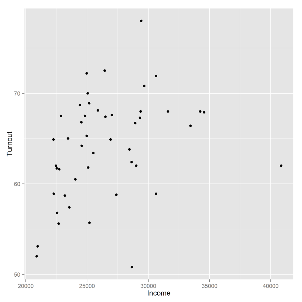
Perhaps the most common of all plots is the scatterplot, used for exploring the relationships between two continuous variables. The obama_vs_mccain dataset has lots of numeric variables that we can compare, but we’ll start by asking, “Does voter income affect turnout at the polls?”
The base graphic function to draw a scatterplot is simply plot. The best-practice code style these days is to keep all the variables you want for a plot together inside a data frame (or possibly several), rather than having them scattered in individual vectors. Unfortunately, plot predates[52] this idea, so we have to wrap it in a call to with to access the columns.
Although plot will simply ignore missing values, for tidiness let’s remove the rows with missing Turnout values:
obama_vs_mccain<-obama_vs_mccain[!is.na(obama_vs_mccain$Turnout),]
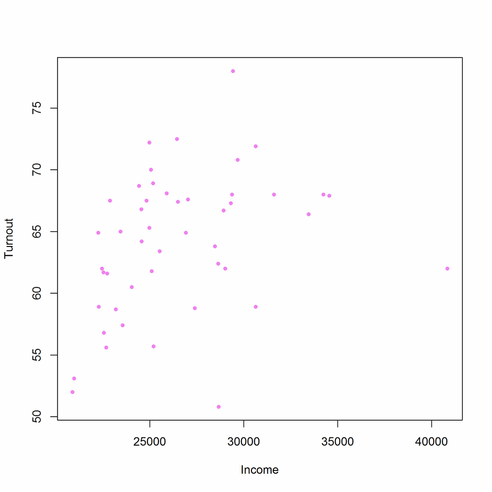
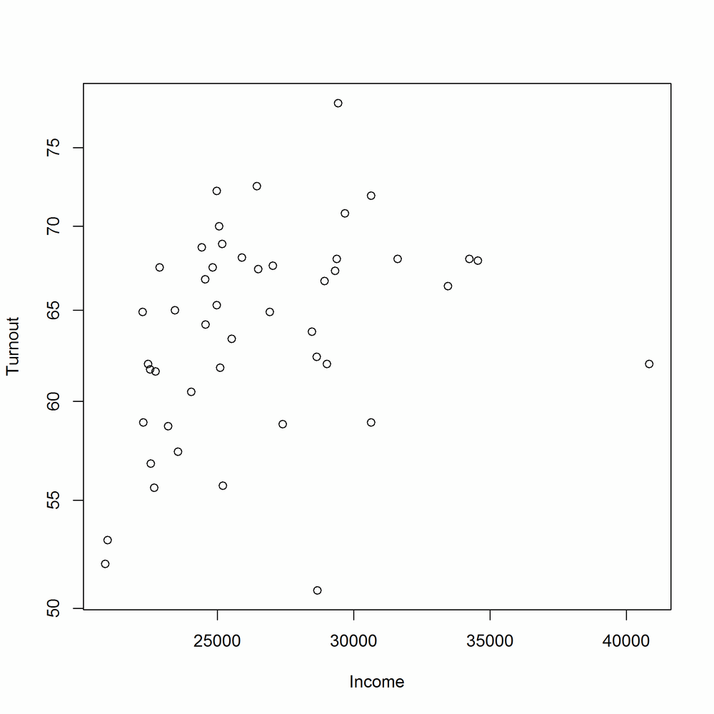
We can then create a simple scatterplot, shown in Figure 14-1:
with(obama_vs_mccain,plot(Income,Turnout))

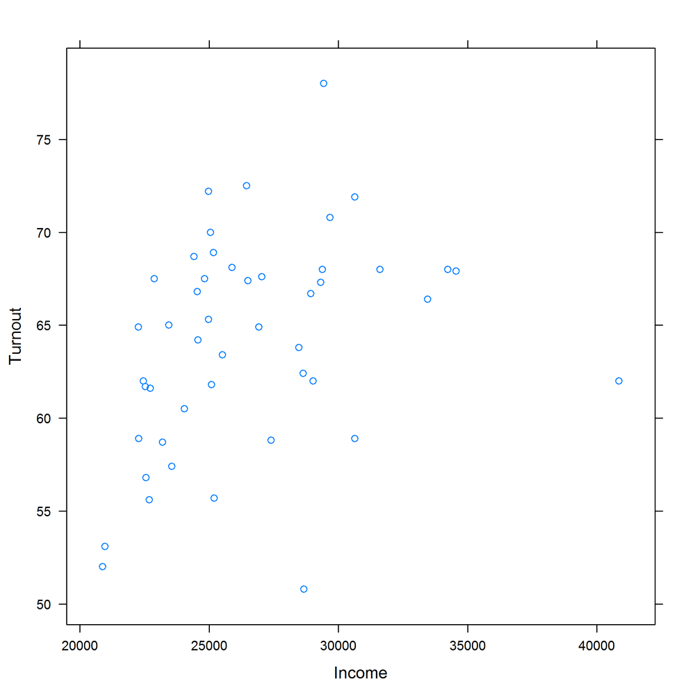
plot has many arguments for customizing the output, some of which are more intuitive than others. col changes the color of the points. It accepts any of the named colors returned by colors, or an HTML-style hex value like "#123456". You can change the shape of the points with the pch argument (short for “plot character”).[53] Figure 14-2 shows an updated scatterplot, changing the point color to violet and the point shape to filled-in circles:
with(obama_vs_mccain,plot(Income,Turnout,col="violet",pch=20))
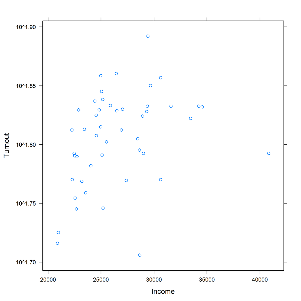
Log scales are possible by setting the log argument. log = "x" means use a logarithmic x-scale, log = "y" means use a logarithmic y-scale, and log = "xy" makes both scales logarithmic. Figures 14-3 and 14-4 display some options for log-scaled axes:
with(obama_vs_mccain,plot(Income,Turnout,log="y"))#Fig. 14-3
with(obama_vs_mccain,plot(Income,Turnout,log="xy"))#Fig. 14-4

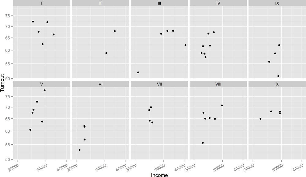
We can see that there is a definite positive correlation between income and turnout, and it’s stronger on the log-log scale. A further question is, “Does the relationship hold across all of the USA?” To answer this, we can split the data up into the 10 Standard Federal Regions given in the Region column, and plot each of the subsets in a “matrix” in one figure. The layout function is used to control the layout of the multiple plots in the matrix. Don’t feel obliged to spend a long time trying to figure out the meaning of the next code chunk; it only serves to show that drawing multiple related plots together in base graphics is possible. Sadly, the code invariably looks like it fell out of the proverbial ugly tree, so this technique should only be used as a last resort. Figure 14-5 shows the result:
par(mar=c(3,3,0.5,0.5),oma=rep.int(0,4),mgp=c(2,1,0))regions<-levels(obama_vs_mccain$Region)plot_numbers<-seq_along(regions)layout(matrix(plot_numbers,ncol=5,byrow=TRUE))for(region in regions){regional_data<-subset(obama_vs_mccain,Region==region)with(regional_data,plot(Income,Turnout))}

The lattice equivalent of plot is xyplot. It uses a formula interface to specify the variables for the x and y coordinates. Formulae will be discussed in more depth in Formulae, but for now just note that you need to type yvar ~ xvar. Conveniently, xyplot (and other lattice functions) takes a data argument that tells it which data frame to look for variables in. Figure 14-6 shows the lattice equivalent of Figure 14-1:
library(lattice)xyplot(Turnout ~ Income,obama_vs_mccain)
Many of the options for changing plot features are the same as those in base graphics. Figure 14-7 changes the color and point shape, mimicking Figure 14-2:
xyplot(Turnout ~ Income,obama_vs_mccain,col="violet",pch=20)

Axis scales, however, are specified in a different way. lattice plots take a scales argument, which must be a list. The contents of this list must be name = value pairs; for example, log = TRUE sets a log scale for both axes. The scales list can also take further (sub)list arguments named x and y that specify settings for only those axes. Don’t panic, it isn’t as complicated as it sounds. Figures 14-8 and 14-9 show examples of scaled axes:
xyplot(Turnout ~ Income,obama_vs_mccain,scales=list(log=TRUE)#both axes log scaled (Fig. 14-8))
xyplot(Turnout ~ Income,obama_vs_mccain,scales=list(y=list(log=TRUE))#y-axis log scaled (Fig. 14-9))

The formula interface makes splitting the data by region vastly easier. All we have to do is to append a | (that’s a “pipe” character; the same one that is used for logical “or”) and the variable that we want to split by, in this case Region. Using the argument relation = "same" means that each panel shares the same axes. Axis ticks for each panel are drawn on alternating sides of the plot when the alternating argument is TRUE (the default), or just the left and bottom otherwise. The output is shown in Figure 14-10; notice the improvement over Figure 14-5:
xyplot(Turnout ~ Income|Region,obama_vs_mccain,scales=list(log=TRUE,relation="same",alternating=FALSE),layout=c(5,2))

Another benefit is that lattice plots are stored in variables, (as opposed to base plots, which are just drawn in a window) so we can sequentially update them. Figure 14-11 shows a lattice plot that is updated in Figure 14-12:
(lat1<-xyplot(Turnout ~ Income|Region,obama_vs_mccain))#Fig. 14-11
(lat2<-update(lat1,col="violet",pch=20))#Fig. 14-12


ggplot2 (the “2” is because it took a couple of attempts to get it right) takes many of the good ideas in lattice and builds on them. So, splitting plots up into panels is easy, and sequentially building plots is also possible. Beyond that, ggplot2 has a few special tricks of its own. Most importantly, its “grammatical” nature means that it consists of small building blocks, so it’s easier to create brand new plot types, if you feel so inclined.
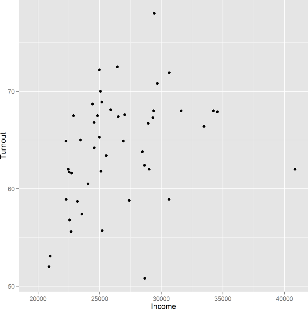
The syntax is a very different to other plotting code, so mentally prepare yourself to look at something new. Each plot is constructed with a call to the ggplot function, which takes a data frame as its first argument and an aesthetic as its second. In practice, that means passing the columns for the x and y variables to the aes function. We then add a geom to tell the plot to display some points. Figure 14-13 shows the result:
library(ggplot2)ggplot(obama_vs_mccain,aes(Income,Turnout))+geom_point()
ggplot2 recognizes the commands from base for changing the color and shape of the points, but also has its own set of more human-readable names. In Figure 14-14, “shape” replaces “pch,” and color can be specified using either “color” or “colour”:
ggplot(obama_vs_mccain,aes(Income,Turnout))+geom_point(color="violet",shape=20)

To set a log scale, we add a scale for each axis, as seen in Figure 14-15. The breaks argument specifies the locations of the axis ticks. It is optional, but used here to replicate the behavior of the base and +lattice examples:
ggplot(obama_vs_mccain,aes(Income,Turnout))+geom_point()+scale_x_log10(breaks=seq(2e4,4e4,1e4))+scale_y_log10(breaks=seq(50,75,5))

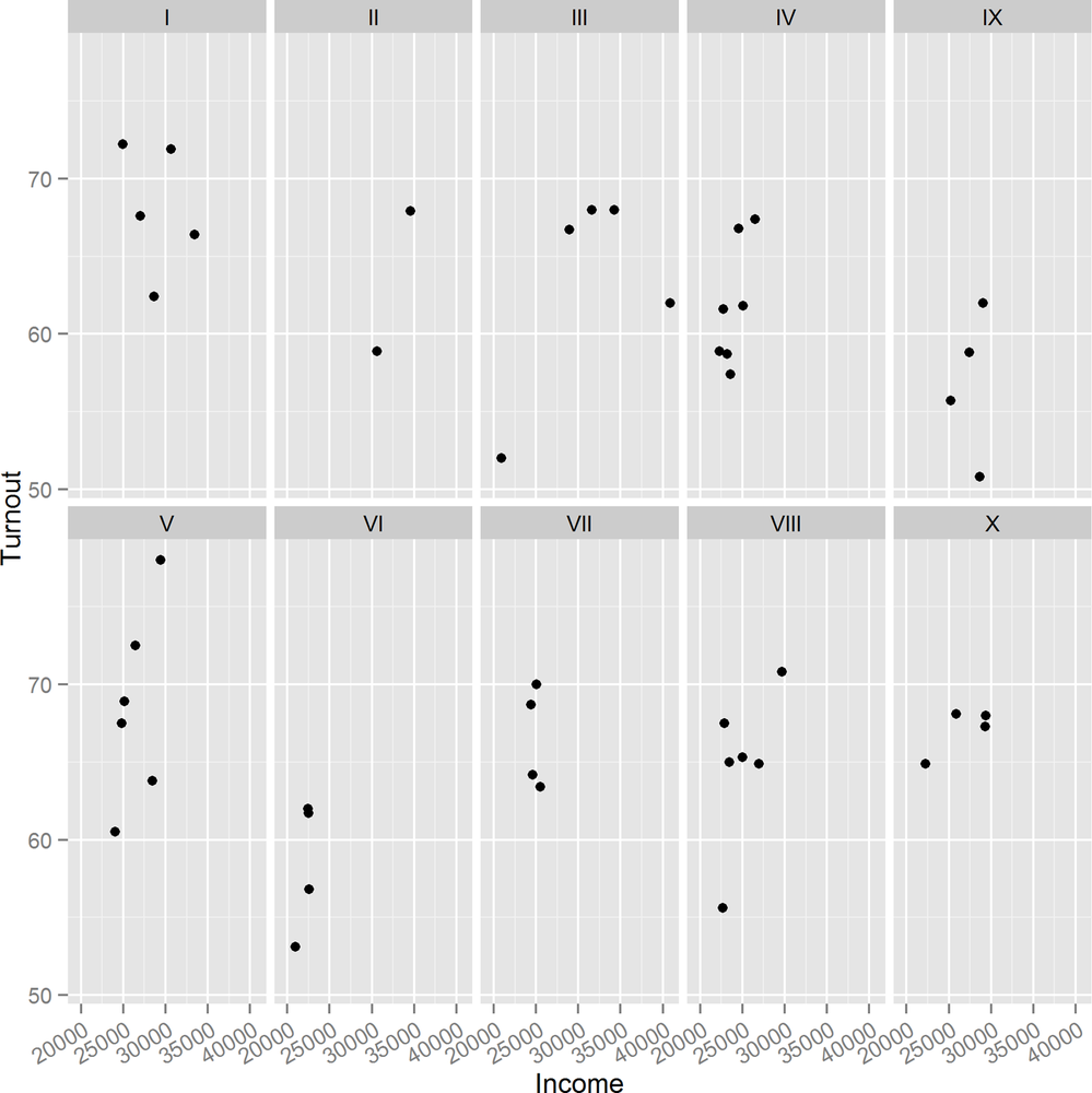
To split the plot into individual panels, we add a facet. Like the lattice plots, facets take a formula argument. Figure 14-16 demonstrates the facet_wrap function. For easy reading, the x-axis ticks have been rotated by 30 degrees and right-justified using the theme function:
ggplot(obama_vs_mccain,aes(Income,Turnout))+geom_point()+scale_x_log10(breaks=seq(2e4,4e4,1e4))+scale_y_log10(breaks=seq(50,75,5))+facet_wrap(~ Region,ncol=4)
To split by multiple variables, we would specify a formula like ~ var1 + var2 + var3. For the special case of splitting by exactly two variables, facet_grid provides an alternative that puts one variable in rows and one in columns.
As with lattice, ggplots can be stored in variables and added to sequentially. The next example redraws Figure 14-13 and stores it as a variable. As usual, wrapping the expression in parentheses makes it auto-print:
(gg1 <- ggplot(obama_vs_mccain, aes(Income, Turnout)) +
  geom_point()
)
Figure 14-17 shows the output. We can then update it as follows, with the result shown in Figure 14-18:
(gg2<-gg1+facet_wrap(~ Region,ncol=5)+theme(axis.text.x=element_text(angle=30,hjust=1)))
For exploring how a continuous variable changes over time, a line plot often provides more insight than a scatterplot, since it displays the connections between sequential values. These next examples examine a year in the life of the crab in the crab_tag dataset, and how deep in the North Sea it went.
In base, line plots are created in the same way as scatterplots, except that they take the argument type = "l". To avoid any dimensional confusion[54] we plot the depth as a negative number rather than using the absolute values given in the dataset.
Ranges in the plot default to the ranges of the data (plus a little bit more; see the xaxs section of the ?par help page for the exact details). To get a better sense of perspective, we’ll manually set the y-axis limit to run from the deepest point that the crab went in the sea up to sea level, by passing a ylim argument. Figure 14-19 displays the resulting line plot:
with(crab_tag$daylog,plot(Date,-Max.Depth,type="l",ylim=c(-max(Max.Depth),0)))
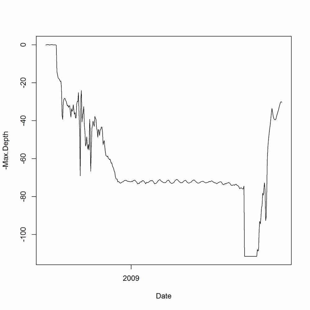
At the moment, this only shows half the story. The Max.Depth argument is the deepest point in the sea that the crab reached on a given day. We also need to add a line for the Min.Depth to see the shallowest point on each day. Additional lines can be drawn on an existing plot using the lines function. The equivalent for scatterplots is points. Figure 14-20 shows the additional line:
with(crab_tag$daylog,lines(Date,-Min.Depth,col="blue"))

Line plots in lattice follow a similar pattern to base. They use xyplot, as with scatterplots, and require the same type = "l" argument. Specifying multiple lines is blissfully easy using the formula interface. Notice the + in the formula used to create the plot in Figure 14-21:
xyplot(-Min.Depth+-Max.Depth ~ Date,crab_tag$daylog,type="l")

In ggplot2, swapping a scatterplot for a line plot is as simple as swapping geom_plot for geom_line (Figure 14-22 shows the result):
ggplot(crab_tag$daylog,aes(Date,-Min.Depth))+geom_line()

There’s a little complication with drawing multiple lines, however. When you specify aesthetics in the call to ggplot, you specify them for every geom. That is, they are “global” aesthetics for the plot. In this case, we want to specify the maximum depth in one line and the minimum depth in another, as shown in Figure 14-23. One solution to this is to specify the y-aesthetic inside each call to geom_line:
ggplot(crab_tag$daylog,aes(Date))+geom_line(aes(y=-Max.Depth))+geom_line(aes(y=-Min.Depth))

This is a bit clunky, though, as we have to call geom_line twice, and actually it isn’t a very idiomatic solution. The “proper” ggplot2 way of doing things, shown in Figure 14-24, is to melt the data to long form and then group the lines:
library(reshape2)crab_long<-melt(crab_tag$daylog,id.vars="Date",measure.vars=c("Min.Depth","Max.Depth"))ggplot(crab_long,aes(Date,-value,group=variable))+geom_line()

In this case, where there are only two lines, there is an even better solution that doesn’t require any data manipulation. geom_ribbon plots two lines, and the contents in between. For prettiness, we pass the color and fill argument to the geom, specifying the color of the lines and the bit in between. Figure 14-25 shows the result:
ggplot(crab_tag$daylog,aes(Date,ymin=-Min.Depth,ymax=-Max.Depth))+geom_ribbon(color="black",fill="white")

Whichever system you use to draw the plot, the behavior of the crab is clear. In September it lives in shallow waters for the mating season, then it spends a few months migrating into deeper territory. Through winter, spring, and summer it happily sits on the North Sea seabed (except for an odd, brief trip to the surface at the start of June—dodgy data, or a narrow escape from a fishing boat?), then it apparently falls off a cliff in mid-July, before making its way back to shallow climes for another round of rumpy-pumpy, at which point it is caught.
If you want to explore the distribution of a continuous variable, histograms are the obvious choice.[55]
For the next examples we’ll return to the obama_vs_mccain dataset, this time looking at the distribution of the percentage of votes for Obama. In base, the hist function draws a histogram, as shown in Figure 14-26. Like plot, it doesn’t have a data argument, so we have to wrap it inside a call to with:
with(obama_vs_mccain,hist(Obama))

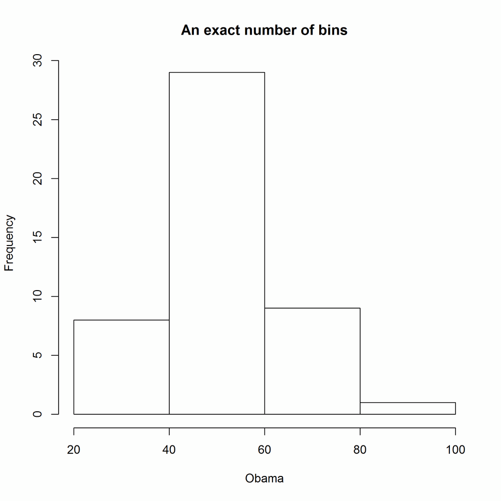
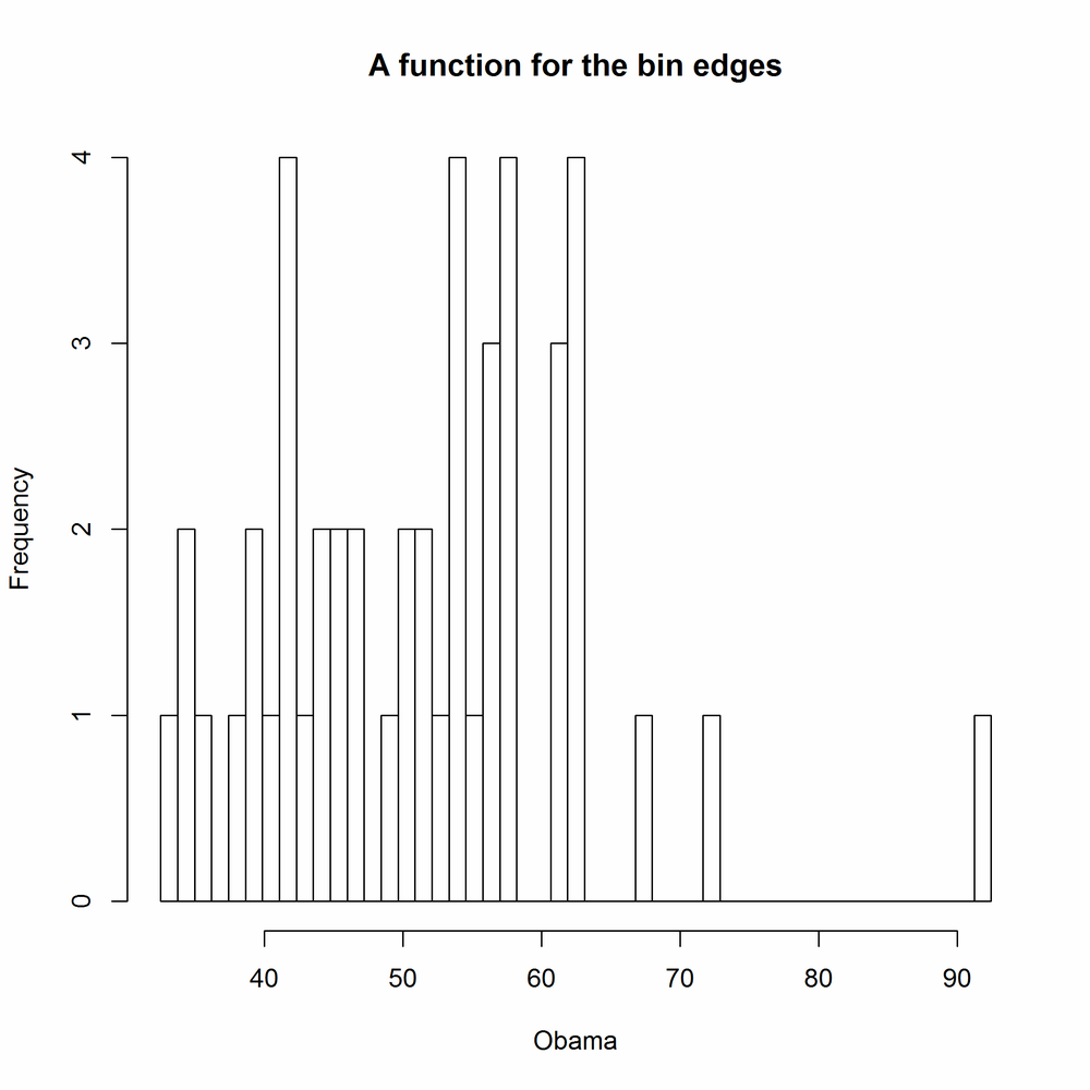
The number of breaks is calculated by default by Sturges’s algorithm. It is good practice to experiment with the width of bins in order to get a more complete understanding of the distribution. This can be done in a variety of ways: you can pass hist a single number to specify the number of bins, or a vector of bin edges, or the name of a different algorithm for calculating the number of bins ("scott" and "fd" are currently supported on top of the default of "sturges"), or a function that calculates one of the first two options. It’s really flexible. In the following examples, the results of which are shown in Figures 14-27 to 14-31, the main argument creates a main title above the plot. It works for the plot function too:
with(obama_vs_mccain,hist(Obama,4,main="An exact number of bins"))#Fig. 14-27
with(obama_vs_mccain,hist(Obama,seq.int(0,100,5),main="A vector of bin edges"))#Fig. 14-28

with(obama_vs_mccain,hist(Obama,"FD",main="The name of a method"))#Fig. 14-29

with(obama_vs_mccain,hist(Obama,nclass.scott,main="A function for the number of bins"))#Fig. 14-30

Figure 14-30. Specifying histogram breaks using a function for the number of bins with base graphics
binner<-function(x){seq(min(x,na.rm=TRUE),max(x,na.rm=TRUE),length.out=50)}with(obama_vs_mccain,hist(Obama,binner,main="A function for the bin edges"))#Fig. 14-31
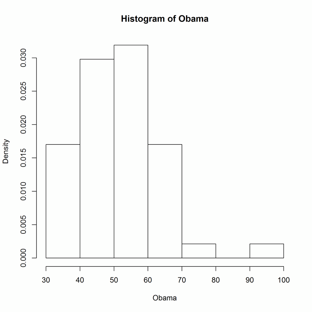
The freq argument controls whether or not the histogram shows counts or probability densities in each bin. It defaults to TRUE if and only if the bins are equally spaced. Figure 14-32 shows the output:
with(obama_vs_mccain,hist(Obama,freq=FALSE))
lattice histograms behave in a similar manner to base ones, except for the usual benefits of taking a data argument, allowing easy splitting into panels, and saving plots as a variable. The breaks argument behaves in the same way as with hist. Figures 14-33 and 14-34 show lattice histograms and the specification of breaks:
histogram(~ Obama,obama_vs_mccain)#Fig. 14-33
histogram(~ Obama,obama_vs_mccain,breaks=10)#Fig. 14-34


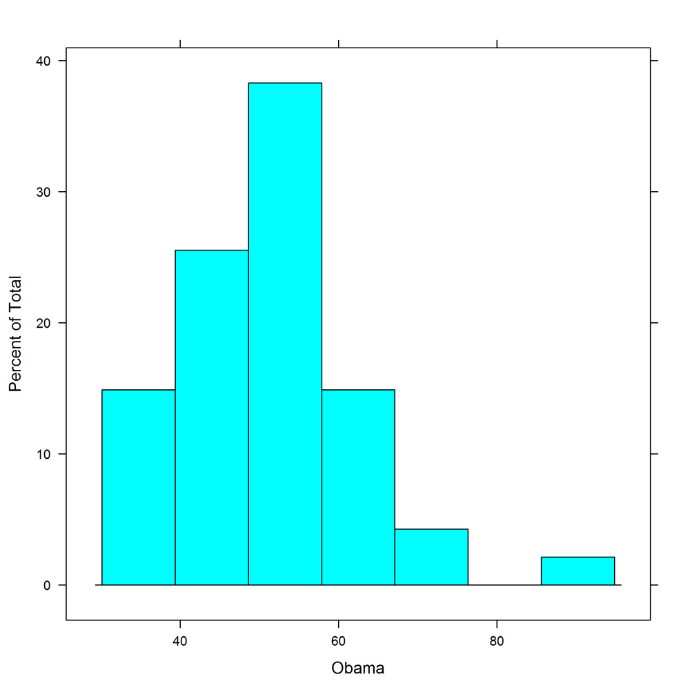
lattice histograms support counts, probability densities, and percentage y-axes via the type argument, which takes the string "count", "density", or "percent". Figure 14-35 shows the "percent" style:
histogram(~ Obama,obama_vs_mccain,type="percent")
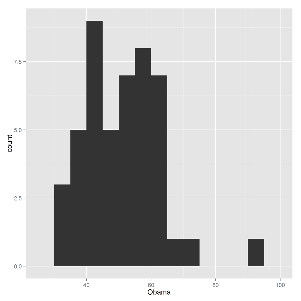
ggplot2 histograms are created by adding a histogram geom. Bin specification is simple: just pass a numeric bin width to geom_histogram. The rationale is to force you to manually experiment with different numbers of bins, rather than settling for the default. Figure 14-36 shows the usage:
ggplot(obama_vs_mccain,aes(Obama))+geom_histogram(binwidth=5)
You can choose between counts and densities by passing the special names ..count.. or ..density.. to the y-aesthetic. Figure 14-37 demonstrates the use of ..density..:
ggplot(obama_vs_mccain,aes(Obama,..density..))+geom_histogram(binwidth=5)

If you want to explore the distribution of lots of related variables, you could draw lots of histograms. For example, if you wanted to see the distribution of Obama votes by US region, you could use latticing/faceting to draw 10 histograms. This is just about feasible, but it doesn’t scale much further. If you need a hundred histograms, the space requirements can easily overwhelm the largest monitor. Box plots (sometimes called box and whisker plots) are a more space-efficient alternative that make it easy to compare many distributions at once. You don’t get as much detail as with a histogram or kernel density plot, but simple higher-or-lower and narrower-or-wider comparisons can easily be made.
The base function for drawing box plots is called boxplot; it is heavily inspired by lattice, insofar as it uses a formula interface and has a data argument. Figure 14-38 shows the usage:
boxplot(Obama ~ Region,data=obama_vs_mccain)

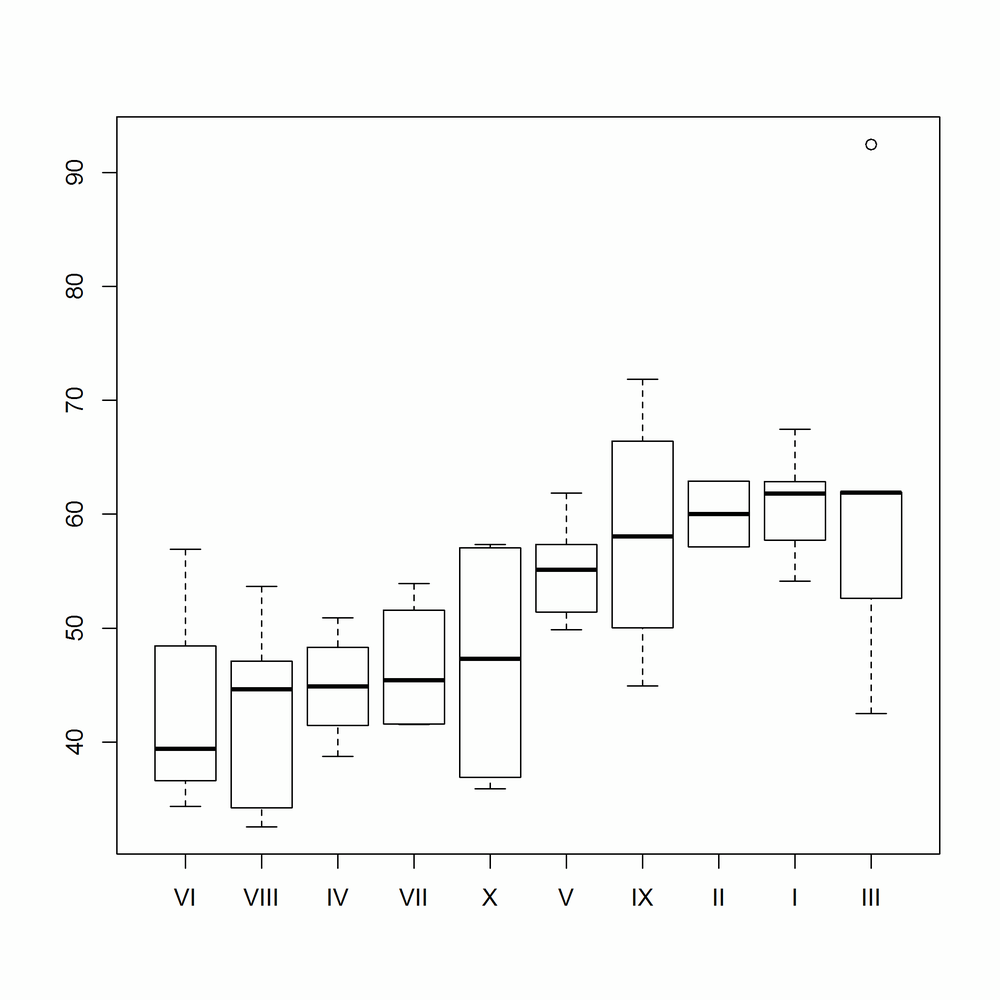
This type of plot is often clearer if we reorder the box plots from smallest to largest, in some sense. The reorder function changes the order of a factor’s levels, based upon some numeric score. In Figure 14-39 we score the Region levels by the median Obama value for each region:
ovm<-within(obama_vs_mccain,Region<-reorder(Region,Obama,median))boxplot(Obama ~ Region,data=ovm)
The switch from base to lattice is very straightforward. In this simplest case, we can make a straight swap of boxplot for bwplot (“bw” is short for “b (box) and w (whisker),” in case you hadn’t figured it out). Notice the similarity of Figure 14-40 to Figure 14-38:
bwplot(Obama ~ Region,data=ovm)

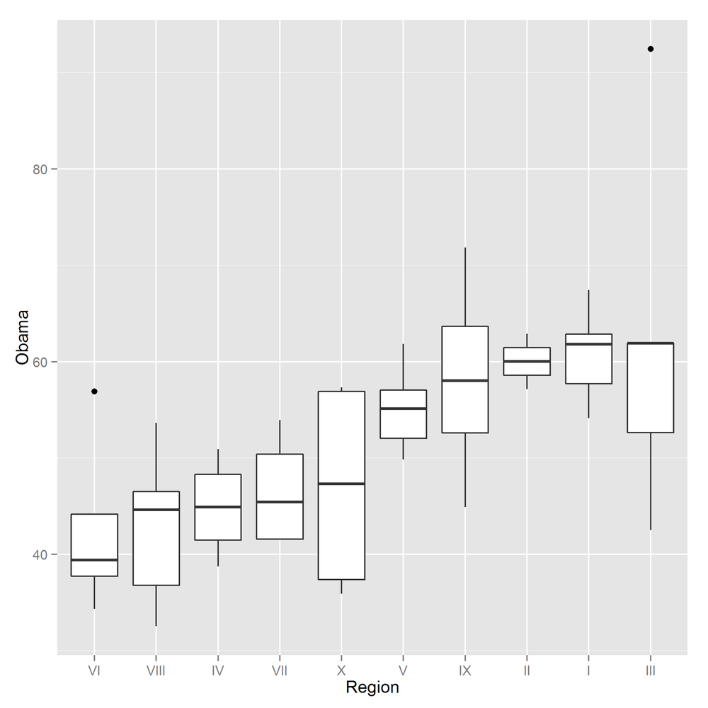
The ggplot2 equivalent box plot, shown in Figure 14-41, just requires that we add a geom_boxplot:
ggplot(ovm,aes(Region,Obama))+geom_boxplot()
Bar charts (a.k.a. bar plots) are the natural way of displaying numeric variables[56] split by a categorical variable. In the next examples, we look at the distribution of religious identification across the US states. Data for Alaska and Hawaii are not included in the dataset, so we can remove those records:
ovm<-ovm[!(ovm$State%in%c("Alaska","Hawaii")),]
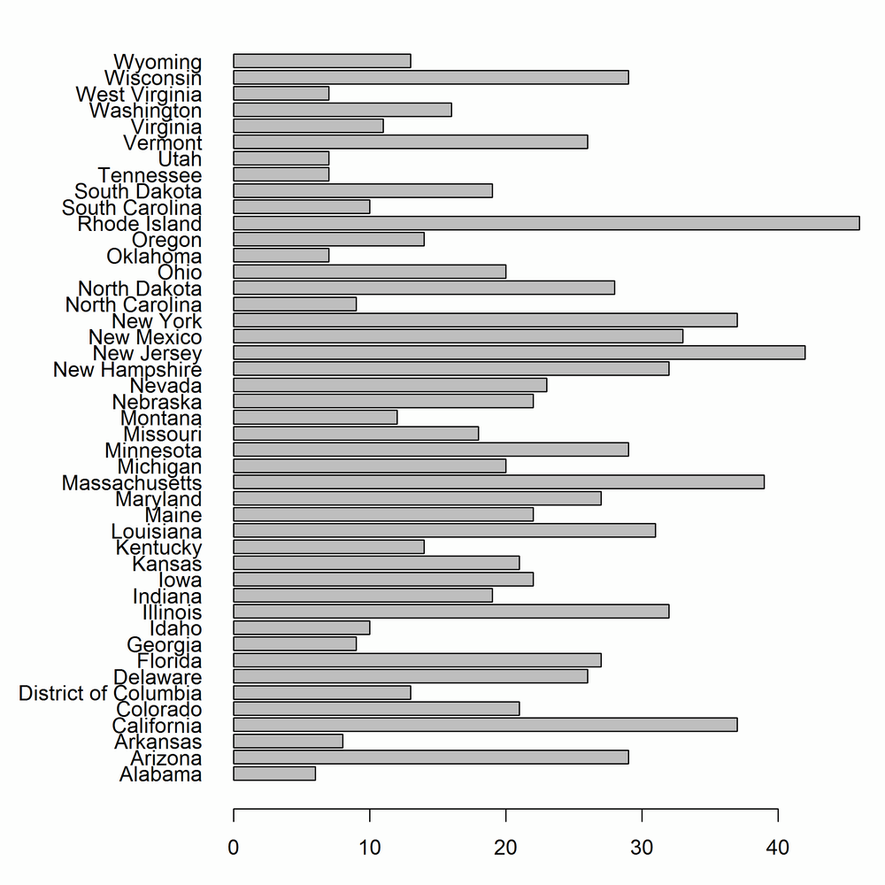
In base, bar charts are created with the barplot function. As with the plot function, there is no argument to specify a data frame, so we need to wrap it in a call to with. The first argument to barplot contains the lengths of the bars. If that is a named vector (which it won’t be if you are doing things properly and accessing data from inside a data frame), then those names are used for the bar labels. Otherwise, as we do here, you need to pass an argument called names.arg to specify the labels. By default the bars are vertical, but in order to make the state names readable we want horizontal bars, which can be generated with horiz = TRUE.
To display the state names in full, we also need to do some fiddling with the plot parameters, via the par function. For historical reasons, most of the parameter names are abbreviations rather than human-readable values, so the code can look quite terse. It’s a good idea to read the ?par help page before you modify a base plot.
The las parameter (short for “label axis style”) controls whether labels are horizontal, vertical, parallel, or perpendicular to the axes. Plots are usually more readable if you set las = 1, for horizontal. The mar parameter is a numeric vector of length 4, giving the width of the plot margins at the bottom/left/top/right of the plot. We want a really wide lefthand side to fit the state names. Figure 14-42 shows the output of the following code:
par(las=1,mar=c(3,9,1,1))with(ovm,barplot(Catholic,names.arg=State,horiz=TRUE))
Simple bar charts like this are fine, but more interesting are bar charts of several variables at once. We can visualize the split of religions by state by plotting the Catholic, Protestant, Non.religious, and Other columns. For plotting multiple variables, we must place them into a matrix, one in each row (rbind is useful for this).
The column names of this matrix are used for the names of the bars; if there are no column names we must pass a names.arg like we did in the last example. By default, the bars for each variable are drawn next to each other, but since we are examining the split between the variables, a stacked bar chart is more appropriate. Passing beside = FALSE achieves this, as illustrated in Figure 14-43:
religions<-with(ovm,rbind(Catholic,Protestant,Non.religious,Other))colnames(religions)<-ovm$State par(las=1,mar=c(3,9,1,1))barplot(religions,horiz=TRUE,beside=FALSE)

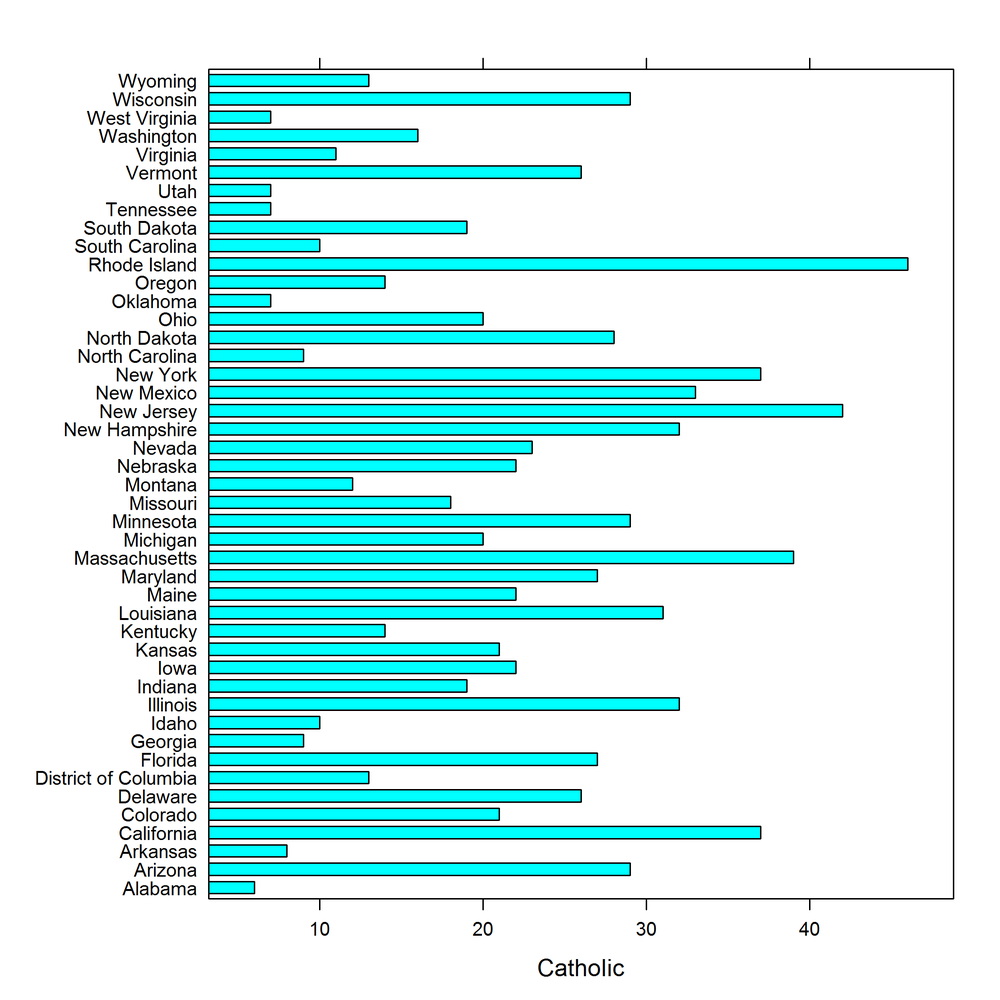
The lattice equivalent of barplot, shown in Figure 14-44, is barchart. The formula interface is the same as those we saw with scatterplots, yvar ~ xvar:
barchart(State ~ Catholic,ovm)
Extending this to multiple variables just requires a tweak to the formula, and passing stack = TRUE to make a stacked plot (see Figure 14-45):
barchart(State ~ Catholic+Protestant+Non.religious+Other,ovm,stack=TRUE)

ggplot2 requires a tiny bit of work be done to the data to replicate this plot. We need the data in long form, so we must first melt the columns that we need:
religions_long<-melt(ovm,id.vars="State",measure.vars=c("Catholic","Protestant","Non.religious","Other"))
Like base, gplot2 defaults to vertical bars; adding coord_flip swaps this. Finally, since we already have the lengths of each bar in the dataset (without further calculation) we must pass stat = "identity" to the geom. Bars are stacked by default, as shown in Figure 14-46:
ggplot(religions_long,aes(State,value,fill=variable))+geom_bar(stat="identity")+coord_flip()

To avoid the bars being stacked, we would have to pass the argument position = "dodge" to geom_bar. Figure 14-47 shows this:
ggplot(religions_long,aes(State,value,fill=variable))+geom_bar(stat="identity",position="dodge")+coord_flip()

The other possibility for that argument is position = "fill", which creates stacked bars that are all the same height, ranging from 0 to 100%. Try it!
There are many packages that contain plotting capabilities based on one or more of the three systems. For example, the vcd package has lots of plots for visualizing categorical data, such as mosaic plots and association plots. plotrix has loads of extra plot types, and there are specialist plots scattered in many other packages.
latticeExtra and GGally extend the lattice and ggplot2 packages, and grid provides access to the underlying framework that supports both these systems.
You may have noticed that all the plots covered so far are static. There have in fact been a number of attempts to provide dynamic and interactive plots.[57] There is no perfect solution yet, but there are many interesting and worthy packages that attempt this.
gridSVG lets you write grid-based plots (lattice or ggplot2) to SVG files. These can be made interactive, but it requires some knowledge of JavaScript. playwith allows pointing and clicking to interact with base or lattice plots. iplots provides a whole extra system of plots with even more interactivity. It isn’t easily extensible, but the common plots types are there, and you can explore the data very quickly via mouse interaction. googleVis provides an R wrapper around Google Chart Tools, creating plots that can be displayed in a browser. rggobi provides an interface to GGobi (for visualizing high-dimensional data), and rgl provides an interface to OpenGL for interactive 3D plots. The animation package lets you make animated GIFs or SWF animations.
The rCharts package provides wrappers to half a dozen JavaScript plotting libraries using a lattice syntax. It isn’t yet available via CRAN, so you’ll need to install it from GitHub:
library(devtools)install_github("rCharts","ramnathv")
- Question 14-1
-
What is the difference between the
minandpminfunctions? - Question 14-2
-
How would you change the shape of the points in a
baseplot? - Question 14-3
-
How do you specify the x and y variables in a
latticeplot? - Question 14-4
-
What is a
ggplot2aesthetic? - Question 14-5
- Name as many plot types as you can think of for exploring the distribution of a continuous variable.
- Exercise 14-1
-
In the
obama_vs_mccaindataset, find the (Pearson) correlation between the percentage of unemployed people within the state and the percentage of people that voted for Obama. [5] - Draw a scatterplot of the two variables, using a graphics system of your choice. (For bonus points, use all three systems.) [10] for one plot, [30] for all three
-
In the
- Exercise 14-2
-
In the
alpe_d_huez2dataset, plot the distributions of fastest times, split by whether or not the rider (allegedly) used drugs. Display this using a) histograms and b) box plots. [10] - Exercise 14-3
-
The
gonorrhoeadataset contains gonorrhoea infection rates in the US by year, age, ethnicity, and gender. Explore how infection rates change with age. Is there a time trend? Do ethnicity and gender affect the infection rates? [30]
[49] There are several terms for this. Edward Tufte called the idea “small multiples” in Envisioning Information; Bill Cleveland and Rick Becker of Bell Labs coined the term “trellising”; Deepayan Sarkar renamed it “latticing” in the lattice package to avoid a Bell Labs trademark; and Leland Wilkinson named it “faceting,” a term that is used in ggplot2.
[50] The concept was devised by Leland Wilkinson in the book of the same name. The book is brilliant, but not suitable for bedtime reading, being densely packed with equations.
[51] Books on plotting have the advantage that even if you can’t be bothered to read them, they are pretty to flick through.
[52] Predates as in “comes before,” not “hunts and eats.”
[53] Read the ?points help page and try plot(1:25, pch = 1:25, bg = "blue") to see the different shapes.
[54] Insert your own Australia/upside-down joke here.
[55] Dataviz purists often note that kernel density plots generally give a “better” representation of the underlying distribution. The downside is that every time you show them to a non-statistician, you have to spend 15 minutes explaining what a kernel density plot is.
[56] More specifically, they have to be counts or lengths or other numbers that can be compared to zero. For log-scaled things where the bar would extend to minus infinity, you want a dot plot instead.
[57] Dynamic means animation; interactive means point and click to change them.