By now, the reader should know what a Shiny web application is, how it is structured, and what its main underlying concepts are, reactivity being the most important one.
This chapter will be divided into the following two big topics:
- UI.R and its different possibilities: In
UI.R, an intensive walkthrough of the different input and output types will be done. Some tips will be discussed in relation to the use of some of them. - A list of good practices for server.R and global.R: As these applications run live, it becomes crucial to take execution times into account. In this regard, it is always important (especially when coding
server.Randglobal.R) to find a way to produce the desired result to minimize execution times and coding, as this can give the application much better response times. This is the reason why there is a section dedicated to advice on how to structure and plan the application's development.
Additionally, a small section on Shiny's options configuration is also included.
This section will cover the different parts of the interface with its corresponding functions. In short, we will look at the following:
Shiny provides some templates for web applications. They are general structures to organize the different elements within the interface, such as the position of the inputs, the position of the outputs, and so on.
Many of the elements related to structure are divided into fluid and fixed. The main difference is that fluid containers adjust the width of their elements to the browser's width while fixed is used with a user specified width.
Generally, elements in Shiny order themselves row-wise inside a structure, that is, one below the other. For example, the structure1(elementA,elementB) pseudocode will display elementB below elementA inside structure1. Although not recommended at all, the number of elements that can be placed one below the other is unlimited.
There are some builders, however, that order their elements column-wise, that is, one next to the other (for example, sidebarLayout(), which is explained in the following section). It is important to keep in mind that all structure-related functions have a width argument. Based on a 12 scale, this argument defines the width of the object in question with respect to the total width of the main structure that contains it.
So, for instance, if the container is 600 pixels wide, each width unit represents 50 (also 600/12) pixels. If the sum of the width of elements in the same row exceeds 12 pixels, the application will reorganize its elements and will not be able to display them in the same row. Finally, when the width argument is not specified, it is defaulted according to criteria that depend on the functions being used. It is important to keep in mind that decimal numbers are not accepted, i.e., you should use round numbers from 1 to 12.
You will find the most important builders related to structure divided by type in the following:
- Page: Page builders define the type of page that the application will be built on. In this sense, they are the first structure builders to be included, as they work as containers for the rest of the structures and the widgets. From a technical point of view, they create the structure of the HTML document that the application will be built on. The following is a list of page builders:
fluidPage(): This is the simplest main structure; a high-level function that creates a display adjusted to the browser's width. Along withsidebarLayout(), it is the simplest way to create a Shiny UI. In fact, the combination offluidPage()andsidebarLayout()replacespageWithSidebar(), which although deprecated, is still present in many examples on the Web.fixedPage(): UnlikefluidPage(),fixedPage()creates a fixed-size application, independent of the browser's width. Unless it is explicitly required that the elements in HTML have a specific size, it is always advisable to usefluidPage()instead.bootstrapPage(): This is the most basic type of page where only the JavaScript bootstrap library is loaded. It is worth remembering that this library is also called in the other page builders. For more information about bootstrap, visit http://www.getbootstrap.com.navbarPage(): This creates a page with a navigation bar on top. It is used along withtabPanel(), which is explained in the following section of this chapter. An example of this can be found at http://shiny.rstudio.com/gallery/navbar-example.html.
- Layout: Layout builders generate empty structures with certain characteristics, where elements will be placed afterwards.
sidebarLayout():This creates a page with two main elements, a sidebar panel and a main panel. By default, their width is 4 and 8 pixels respectively. Both elements have their special builders, which are covered in the next section,sidebarPanel()andmainPanel(). Normally, the inputs will be placed in the Panel sidebar and the outputs in the main panel. Although this layout is suggested, it is a mere visual convention, so there is absolutely no restriction on placing inputs or outputs in any of them.
- Rows and columns: They are structures to include elements row or column-wise respectively.
fluidRow()andfixedRow(): Row functions are wrappers that display elements at the same height. In fact, the UI structure of a Shiny application is mainly thought of as consisting of rows with columns inside, at least for the simplest built-in functionalities. Lastly, it is advisable to use the function that corresponds to the main chosen structure.
While the fluid layout updates the width values whenever the browser's window changes, fixed layouts don't.
For fluid layouts, if the size of the window is changed (for instance, if it is maximized), then the width of the different tags update to fit the window's width.
In a fluid page, the width in pixels of the plot (inside the
imgtag) in a maximized window on a 1157 pixel-wide window is 1157.On fixed layouts, on the contrary, this width update does not take place. As it appears in the manual, the total width default for
fixedPage()is 940 pixels on a typical display, and 724 pixels or 1170 pixels on smaller and larger displays respectively.As it can be seen in the preceding example, the input panel is enclosed in a
divtag of thespan4class(that is, a panel of width 4, which means 4/12 from the total width) while the main panel is inside aspan8div. Naturally, these widths can be changed, with the only constrains that the sum of the widths within each row cannot exceed12. - Panels: Panels are delimited areas that serve a particular purpose. Normally, panels have either input or output elements:
inputPanel(): This is a panel to include inputs in one block. The function will place the different inputs from left to right and from top to bottom.tabsetPanel(): This displays elements in tabs. It is particularly useful to display different outputs and group them in tabs by topic. A small demonstration based on the second example in the previous chapter is shown in the following section. Theglobal.Rscript will not be included in this case because it remains exactly as it was.absolutePanel(): This is a panel with a specified size and position. The position parameters will be taken as it is taken in CSS's absolute position.fixedPanel()is equivalent to this with the sole difference that it uses CSS's fixed position.conditionalPanel(): This is a panel that is visible only if a certain condition is met. It can be used either to contain input or output elements. Two examples of different possible useful situations where this could be used and how it is done are shown in a later section.tabPanel(): This is a tab structure that can be used insidenavbarPage(),tabsetPanel(), ornavlistPanel()to create tabs within the structure that contains it. By default, when a tab is not active, the outputs that are contained in it are not updated in the backend, even if the input changes.sidebarPanel(): This is the sidebar's container forsidebarLayout(), that is, thesidebarPanelargument. By default, its width is 4 (out of 12, from Shiny's scale) and is aligned left.mainPanel():This is the main container forsidebarLayout(), that is, themainPanelargument. By default, its width is 4 (out of 12, from Shiny's scale) and is aligned left.navlistPanel(): This is a very similar structure tonavbarPage(), with the sole difference that instead of having the different tabs displayed on the top, they are displayed as links on the left-hand side within a box.wellPanel(): This creates a basic Bootstrap's CSS well, that is, a colored (grey by default) container.
In the first example of the previous chapter, the application was used to send an error message when the input number was left blank:

This error message is displayed because, as there is no input argument, the 1:input$number series in server.R returns NA, which, of course, results in an error while plotting. To avoid showing the user an error message, a conditionalPanel() builder can be included. In this case, the UI.R script would look as follows:
library(shiny)

# Starting line
shinyUI(fluidPage(

# Application title
titlePanel("Conditional Panel - Example 1"),

# Sidebar with a numeric input
# Sidebar
sidebarLayout(
  sidebarPanel(
    numericInput("number",
        "Insert a number:",
          value = 30,
          min = 1,
          max = 50)),


  #The plot created in server.R is displayed
    mainPanel(
      conditionalPanel(condition= "input.number > 0",
      plotOutput("plot"))
    )
  )
))
conditionalPanel() is included inside mainPanel(), and plotOutput() is passed inside conditionalPanel() after the condition. Every argument passed after condition= must be an element to be displayed if the condition is met. It is particularly important to take into account while using conditionalPanel() that the condition must be a string object representing a JavaScript statement.
In the case of inputs, they are called as input.(variable) in JavaScript. In this case, as the condition to be met is input.number > 0, whenever the condition is not met, (for example, when the input box is left empty) the output is not shown. In this case, the error message is not displayed:

conditionalPanel() can also be used to selectively show inputs. Back to Example 1, if an optional parameter of color change is added, it would be coded as follows. In UI.R, a conditionalPanel() input is passed with the color change feature where the widget is inside conditionalPanel(), so it will consequently appear only if the condition passed to it is true (in this case, if the checkbox is ticked):
library(shiny)

# Starting line
shinyUI(fluidPage(

  # Application title
  titlePanel("Conditional Panel - Example 2"),

  # Sidebar with a numeric input
    # Sidebar
  sidebarLayout(
  sidebarPanel(
      numericInput("number",
                  "Insert a number:",
                  value = 30,
                  min = 1,
                  max = 50),
      #Checkbox to select color

      checkboxInput("selectcolor",label = "Change color"),

      #Conditional Panel. When the checkbox is ticked, it displays
      #the radio button options

      conditionalPanel("input.selectcolor == true",
        radioButtons("color", "Pick up the color:",
                     c("red", "blue", "green")))),


  #The plot created in server.R is displayed
    mainPanel(
      conditionalPanel(condition= "input.number > 0",
      plotOutput("plot"))
    )
  )
))
server.R would be as follows:
library(shiny)

#initialization of server.R
shinyServer(function(input, output) {

  #Plot generation
  output$plot <- renderPlot({
    if(input$selectcolor){
      plot(1/1:input$number, col=input$color)
    } else {
      plot(1/1:input$number)
    }
  })

})
In this case, whenever the checkbox is ticked, the radio buttons are displayed. As conditionalPanel() only makes parts of the application visible or invisible but does not have any influence on the input or output values that are contained in it, the color input variable (the one that receives the value from the radio buttons) will have a value, whatever status the checkbox has.
For this reason, the plot creation in server.R has to be slightly changed. Instead of directly plotting, it looks for the checkbox's input value (which is directly TRUE or FALSE as explained in the inputs section under checkboxInput()) and, if TRUE, it plots with the passed color. Otherwise, it is plotted with the default color (black).
Lastly, as the condition in condtionalPanel() is passed in a string of JavaScript code, true and false are written in lower case.
In the case of the iris dataset, a Tabset panel with two tabs is displayed in the output section where one panel is for the table and the other one is for the graphics.
In UI.R, tabsetPanel() only receives the tabPanel() objects. Inside these, the outputs are passed. The following is the UI.R code:
library(shiny)

# Starting line
shinyUI(fluidPage(

# Application title
  titlePanel("Tabset Example"),

  # Sidebar
  sidebarLayout(
    sidebarPanel(
      #Species selection
      selectInput("species","Select a species:",
      c("setosa", "versicolor", "virginica"))),

      #The plot created in server.R is displayed
      mainPanel(
        tabsetPanel(
          tabPanel("Summaries",tableOutput("table")),
          tabPanel("Graphics",plotOutput("plot"))
      ))

    )
))
In server.R, apart from creating the outputs, a reactive object was included, which is then used by both renderTable() and renderPlot(). As it was explained in the previous chapter, this is a very good practice when working with datasets, especially if the same dataset is used both times. Following is the code:
library(shiny)
data(iris)

#initialization of server.R
shinyServer(function(input, output) {

  sset <- reactive({subset(iris, Species == input$species)[,-5]})

  #Table generation where the summary is displayed
  output$table <- renderTable({
    summary(sset())
  })

  output$plot <- renderPlot({
    plot(sset())
  })

})
The following is the final outcome:

The Shiny package provides a wide variety of input widgets to include in an application. It is also possible to create custom widgets. That is, however, out of the scope of this book, as an intermediate level in JavaScript is required.
The built-in Shiny widgets can be divided as follows:
Let's look at the most important functions in each of the sections.
Free inputs can mainly be divided in two big groups: numeric inputs and character inputs. They are as follows:
numericInput(): This is a free field where the user can enter a number. Although Shiny provides the possibility of setting maximum and minimum values to this controller, it is important to keep in mind that, by default, the widget will only turn red, but the application will anyway execute with the entered number, unless the application itself performs a validation of the values entered on the server side, as it is explained in Chapter 7, Advanced Functions in Shiny.textInput(): This is a free field text where the user can write. Unfortunately, there is still no built-in option/feature to perform validations on free text inputs in the same way as innumericInput()for example, to validate whether the entered free text is an e-mail when an email is required.sliderInput(): A slider input is also a numeric input with the sole difference that instead of inserting a number in a free field, the input has to be determined by a slider.sliderInput()also has the advantage that it is limited to the range specified and that the interface itself does not allow the insertion of out of range values.
Although lists can be used for any other purpose, in most cases, lists are used to filter options. Conceptually, they can be subdivided into two big groups: unique and multiple selectors. Although for some of the list widgets to change from one type to another is as easy as setting multiple arguments to TRUE or FALSE, it is important to keep in mind that the object returned changes from a character to a character vector:
selectInput(): This is the selection from a drop-down menu. Under the argument choices, the list of options can be passed as a character vector where the values displayed and the values stored in the corresponding input objects will be the same or as a character vector with names associated. In this case, the names will be displayed in the application but the value will be stored in the variable. Back toExample 2, if the name of the species should appear in capital letters, it would be as follows:#Species selection selectInput("species","Select a species:", c(SETOSA= "setosa", VERSICOLOR="versicolor", VIRGINICA="virginica"))Tip
Vectors can have names assigned either by creating a vector and then assigning names with the
names()function or directly during vector creation withc()and the=object structure name. It is not necessary that all elements contain names. In the second method, names can be passed quoted or unquoted. This applies forlist()as well.By default,
selectInput()is a unique selection widget. In order to make it multiple, themultipleargument must be set toT.checkboxGroupInput(): This displays a list of checkboxes, with one checkbox per passed option. The object generated in the input list is exactly equivalent toselectInput()withmultiple = T.checkboxInput(): This displays one single checkbox. Its outcome isTRUEorFALSE.radioButtons(): This displays options with radio buttons on its side. Functionally, it is exactly equivalent toselectInput()withmultiple = F.
Shiny provides two built-in functions to select dates. Both of them have a very intuitive date-picker interface. The objects returned are date objects. However, in more advanced implementations, it is possible that in some cases, dates objects do not behave as expected:
dateInput(): This is for date selection. The minimum and maximum values can be either a string in the yyyy-mm-dd format or a date object.dateRangeInput(): This is also for date selection. The minimum and maximum value can be either a string or a date object. Technically, it is equivalent to twice ofdateInput(), with the sole difference that the function does not allow end values smaller than start values. The object returned in this case is an array of length two where the first element is the start and the second is the end.
An interface for user file-upload can be included via fileInput(). It is highly recommended to add an action button (see the following) and an observation/isolation clause on the server side (Chapter 7, Advanced Functions in Shiny).
fileInput() creates a traditional file selection interface (that is, a button that, when hit, opens a window browser). The handling of this object will depend on the purpose of the application (whether it has to be turned into a data frame, to a list of lines, and so on).
The following functions are the most important ones for buttons:
actionButton(): This is a button that triggers an action. It is mostly used to prevent instant re-execution of code whenever an input changes. This functionality is most used in an isolation context. This topic is covered thoroughly in Chapter 7, Advanced Functions in Shiny.submitButton(): This delays the execution of any change in every input value until the button is hit. Although it might seem very similar toactionButton(), (in fact, there are many cases where both could be equivalent if properly used) they have a crucial difference:submitButton()changes all the input values at the same time, whileactionButton()gives the possibility to trigger actions differently upon button hit. The difference can be seen very clearly when using aconditionalPanel()within an input area. You will find an example that illustrates the limitations ofsubmitButton()in this situation in the following section.
Back to the second example shown in the conditionalPanel() section (with the optional color selection), a slight change is made so that the execution of the changes in the input is carried out upon button hit.
In UI.R, only submitButton() is added as follows:
library(shiny)

# Starting line
shinyUI(fluidPage(

  # Application title
  titlePanel("Submit Button Example"),

  # Sidebar with a numeric input
    # Sidebar
  sidebarLayout(
  sidebarPanel(
      numericInput("number",
                  "Insert a number:",
                  value = 30,
                  min = 1,
                  max = 50),
      #Checkbox to select color
      checkboxInput("selectcolor",label = "Change color"),
      #Conditional Panel. When the checkbox is ticked, it displays
      #the radio button options
      conditionalPanel("input.selectcolor == true",
        radioButtons("color", "Pick up the color:",
                     c("red", "blue", "green"))),
    submitButton("Apply changes")),

  #The plot created in server.R is displayed
    mainPanel(
      conditionalPanel(condition= "input.number > 0",
      plotOutput("plot"))
    )
  )
))
server.R remains the same.
Although the only change with respect to the original example is the inclusion of the submitButton() widget, the application does not work as expected. Firstly, when the checkbox is checked, the radio buttons are not displayed. They will only display after the submit button is hit:

No change after the box is checked.
After this, the window will appear. At this moment, the user can click on any of the options, but the window will only change color once the button is hit again. However, when unchecking the box, the same problem appears; the radio buttons are still visible when they should be hidden.
This behavior is explained by the fact that submitButton() changes all the inputs at the same time upon button hit. So, not only will the color change depend on the button hit but also the checkbox value, which decides the visibility and invisibility of the radio buttons.
The solution to this would be the use of actionButton() instead. However, as this also requires the use of isolate(), which is a topic that will be covered in Chapter 7, Advanced Functions in Shiny, this same example will be taken up at that stage where its use will be much clearer to the user.
- downloadButton(): The name of this widget is clearly self-explanatory. This functionality is always used along with downloadHandler() in server.R. downloadHandler() is a function that serves exclusively to download data.
The following is a small applied example with the iris dataset.
Here's what UI.R should look like:
library(shiny)

# Starting line
shinyUI(fluidPage(

  # Application title
  titlePanel("Example 2"),

  # Sidebar
  sidebarLayout(
  sidebarPanel(
    #Species selection
    selectInput("species","Select a species:",
      c("setosa", "versicolor", "virginica")),
      downloadButton("download", "Download Data")),

    #The plot created in server.R is displayed
    mainPanel(
      textOutput("report")
    )

  )
))
Here's what server.R should look like:
library(shiny)

data(iris)

#initialization of server.R
shinyServer(function(input, output) {

  sset <- reactive(subset(iris, Species == input$species))

  #Text to output
  output$report <- renderText(
    paste0("The filtered dataset contains ",nrow(sset()), " rows")
  )

  #Download Handler
  output$download <- downloadHandler(
    filename=paste0("Data_",input$species,"_",Sys.Date(),".csv"),
    content= function(file){
      write.csv(sset(),file, row.names=F)}
    )

})
The downloaded object has the name of the button that calls it. This means that in the flow of input/outputs, downloadButton() takes the object created by downloadHandler() and triggers the download.
downloadHandler() is a very special function that has a fixed structure that is unusual to traditional R coding under the argument content. Unlike normal CSV writing, Shiny writes the output to a temporary file and then constructs the file that will be downloaded. How this function works internally is very complex. However, respecting the structure as shown previously (content = function(file){...}), the application performs the data download with no problem.
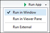
While running these examples, it is important to keep in mind that the data download button does not work properly when running it on window (Run in Window option from the Run App button menu in RStudio). To do so, select Run External instead, and the application will be opened in a new tab on the active browser's session on newer versions of RStudio. In older ones, hit the Run App button and, once the window pops up, select Open in Browser: