
Machine learning has undoubtedly been applied to problems across every discipline. Although the basic techniques are similar across all domains, some are so specialized that communities have formed to develop solutions to the challenges unique to the field. This leads to the discovery of new techniques and new terminology that is relevant only to domain-specific problems.
This section covers a pair of domains that use machine learning techniques extensively, but require specialized knowledge to unlock their full potential. Since entire books have been written on these topics, this will serve as only the briefest of introductions. For more detail, seek out the help provided by the resources cited in each section.
The field of bioinformatics is concerned with the application of computers and data analysis to the biological domain, particularly with regard to better understanding the genome. As genetic data is unique compared to many other types, data analysis in the field of bioinformatics offers a number of unique challenges. For example, because living creatures have a tremendous number of genes and genetic sequencing is still relatively expensive, typical datasets are much wider than they are long; that is, they have more features (genes) than examples (creatures that have been sequenced). This creates problems when attempting to apply conventional visualizations, statistical tests, and machine learning methods to such data. Additionally, the use of proprietary microarray "lab-on-a-chip" techniques requires highly specialized knowledge simply to load the genetic data.
Note
A CRAN task view listing some of R's specialized packages for statistical genetics and bioinformatics is available at http://cran.r-project.org/web/views/Genetics.html.
The Bioconductor project of the Fred Hutchinson Cancer Research Center in Seattle, Washington, aims to solve some of these problems by providing a standardized set of methods of analyzing genomic data. Using R as its foundation, Bioconductor adds bioinformatics-specific packages and documentation specific to base R software.
Bioconductor provides workflows for analyzing DNA and protein microarray data from common microarray platforms such as Affymetrix, Illumina, NimbleGen, and Agilent. Additional functionality includes sequence annotation, multiple testing procedures, specialized visualizations, tutorials, documentation, and much more.
Note
For more information about the Bioconductor project, visit the project website at http://www.bioconductor.org.
Social network data and graph datasets consist of structures that describe connections, or links (sometimes also called edges), between people or objects known as nodes. With N nodes, an N × N = N2 matrix of potential links can be created. This creates tremendous computational complexity as the number of nodes grows.
The field of network analysis is concerned with statistical measures and visualizations that identify meaningful patterns of connections. For example, the following figure shows three clusters of circular nodes all connected via a square node at the center. A network analysis may reveal the importance of the square node, among other key metrics.
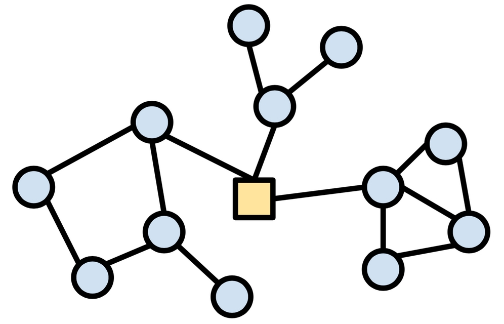
Figure 12.3: A social network showing nodes in three clusters around the central square node
The network package by Carter T. Butts, David Hunter, and Mark S. Handcock offers a specialized data structure for working with networks. This data structure is necessary due to the fact that the matrix needed to store N2 potential links would quickly run out of memory; the network data structure uses a sparse representation to store only the existent links, saving a great deal of memory if most relationships are non-existent. A closely related package, sna (social network analysis), allows analysis and visualization of the network objects.
Note
For more information on network and sna, including very detailed tutorials and documentation, refer to the project website hosted by the University of Washington: http://www.statnet.org/. The social network analysis lab at Stanford University also hosts very nice tutorials at https://sna.stanford.edu/rlabs.php.
The igraph package by Gábor Csárdi provides another set of tools for visualizing and analyzing network data. It is capable of handling very large networks and calculating metrics. An additional benefit of igraph is the fact that it has analogous packages for the Python and C programming languages, allowing it to be used virtually anywhere analyses are being performed. As will be demonstrated shortly, it is very easy to use.
Note
For more information on the igraph package, including demos and tutorials, visit the homepage at http://igraph.org/r/.
Using network data in R requires use of specialized formats, as network data are not typically stored in typical tabular data structures like CSV files and data frames. As mentioned previously, because there are N2 potential connections between N network nodes, a tabular structure would quickly grow to be unwieldy for all but the smallest N values. Instead, graph data are stored in a form that lists only the connections that are truly present; the absent connections are inferred from the absence of data.
Perhaps the simplest such format is the edgelist, which is a text file with one line per network connection. Each node must be assigned a unique identifier, and links between nodes are defined by placing the connected nodes' identifiers together on a single line, separated by a space. For instance, the following edgelist defines three connections between node 0 and nodes 1, 2, and 3.
0 1
0 2
0 3
To load network data into R, the igraph package provides a read.graph() function that can read edgelist files as well as other, more sophisticated formats like Graph Modeling Language (GML). To illustrate this functionality, we'll use a dataset describing friendships among members of a small karate club. To follow along, download the karate.txt file from the Packt Publishing website and save it to your R working directory. Then, after you've installed the igraph package, the karate network can be read into R as follows:
> library(igraph)
> karate <- read.graph("karate.txt", "edgelist", directed = FALSE)
This will create a sparse matrix object that can be used for graphing and network analysis. Note that the directed = FALSE parameter forces the network to use undirected, bi-directional links between nodes.
Since the karate dataset describes friendships, this means that if Person 1 is friends with Person 2, then Person 2 must be friends with Person 1. On the other hand, if the dataset described fight outcomes, the fact that Person 1 defeated Person 2 would certainly not imply that Person 2 defeated Person 1. In this case, the parameter directed = TRUE should be set.
To examine the graph, use the plot() function:
> plot(karate)
This produces the following figure:
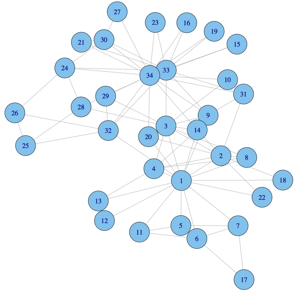
Figure 12.4: A network visualization of the karate dataset. Connections indicate fights between competitors.
Examining the network visualization, it is apparent that there are a few highly connected members of the karate club. Nodes 1, 33, and 34 seem to be more central than the others, which remain at the club periphery.
Using igraph to calculate graph metrics, it is possible to demonstrate our hunch analytically. The degree of a node measures how many nodes it is linked to.
The degree() function confirms our hunch that nodes 1, 33, and 34 are more connected than the others with 16, 12, and 17 connections respectively:
> degree(karate)
 [1] 16  9 10  6  3  4  4  4  5  2  3  1  2  5  2  2  2  2
[19]  2  3  2  2  2  5  3  3  2  4  3  4  4  6 12 17
Because some connections are more important than others, a variety of network measures have been developed to measure node connectivity with this consideration. A network metric called betweenness centrality is intended to capture the number of shortest paths between nodes that pass through each node. Nodes that are truly more central to the entire graph will have a higher betweenness centrality value, because they act as a bridge between other nodes. We obtain a vector of the centrality measures using the betweenness() function as follows:
> betweenness(karate)
 [1] 231.0714286  28.4785714  75.8507937   6.2880952
 [5]   0.3333333  15.8333333  15.8333333   0.0000000
 [9]  29.5293651   0.4476190   0.3333333   0.0000000
[13]   0.0000000  24.2158730   0.0000000   0.0000000
[17]   0.0000000   0.0000000   0.0000000  17.1468254
[21]   0.0000000   0.0000000   0.0000000   9.3000000
[25]   1.1666667   2.0277778   0.0000000  11.7920635
[29]   0.9476190   1.5428571   7.6095238  73.0095238
[33]  76.6904762 160.5515873
As nodes 1 and 34 have much greater betweenness values than the others, they are more central to the karate club's friendship network. These two individuals, with extensive personal friendship networks, may be the "glue" that holds the network together.
The sna and igraph packages are capable of computing many such graph metrics, which may then be used as inputs to machine learning functions. For example, suppose we were attempting to build a model predicting who would win an election for club president. The fact that nodes 1 and 34 are well connected suggests that they may have the social capital they would need for such a leadership role. These might be highly valuable predictors of election results.
Tip
By combining network analysis with machine learning, services like Facebook, Twitter, and LinkedIn provide vast stores of network data for making predictions about users' future behavior. A high-profile example is the 2012 US Presidential campaign in which Chief Data Scientist Rayid Ghani utilized Facebook data to identify people who might be persuaded to vote for Barack Obama.