
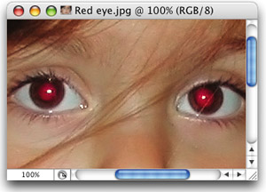
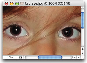
Not very. That's right, when you're using the Red Eye tool (Shift-J until you have it), you can click directly on the red that appears in the pupil, but if you're afraid that you won't be able to click directly on the red area (which can happen due to squinting, eye lashes, etc.), don't sweat it. Just click somewhere near where the red eye appears, and it will still remove the red eye. The tool is sensitive enough to search out any red that's even near where you clicked, so that's why the answer to the question “how accurate do you need to be when clicking?” is “not very.”
Before
After
©KLEBER STEPHENSON
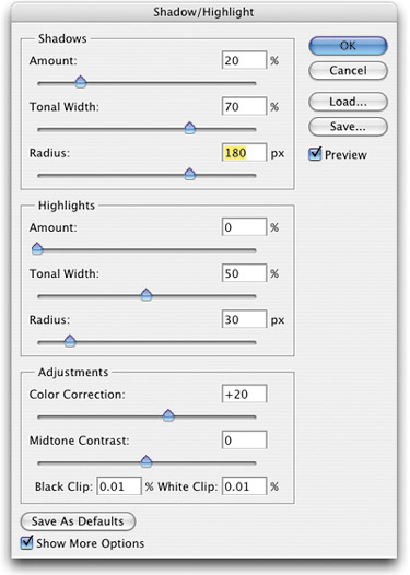
The Shadow/Highlight feature in Photoshop is pretty amazing, but as amazing as it is, sometimes opening up the shadows can give your photo a “milky” look to it, making it obvious that you made adjustments using Shadow/Highlight. Well, here's a tip for getting around that. First open Shadow/Highlight by going under the Image menu, under Adjustments, then choosing Shadow/Highlight. When the dialog opens, click on the Show More Options checkbox. Then, in the Shadows area up top, lower the Amount from the default setting of 50% to something more like 20%. Then increase the Tonal Width a bit and the Radius setting quite a bit, until the shadows are opened, but it doesn't look “milky” or over-processed. Once you've done this, you can slowly increase the Amount slider, but stop if it starts to look milky.
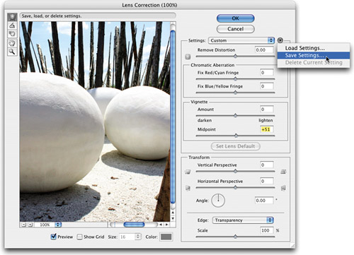
I love the Lens Correction filter in CS2, but I dearly hate the grid that appears over every image every time I open one, and it's on by default, so you have to manually turn it off. However, if you're like me (and you know you are), and you want that grid off fast, there is a workaround—you can save your own custom setting with the grid turned off. But to do that, you have to change something (or the Save Settings will be grayed out). I found a workaround that has virtually no effect on your image. Open the Lens Correction filter (found under the Filter menu, under Distort), and then increase the Vignette Midpoint to 51% (a 1% increase). Then, at the bottom of the dialog, turn off the checkbox for Show Grid. Now, in the Settings flyout menu, you'll be able to choose Save Settings.
©ISTOCKPHOTO/DIRK HOUBEN
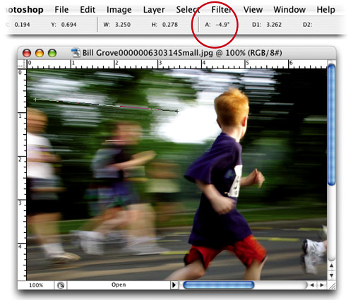
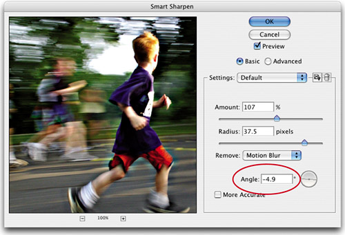
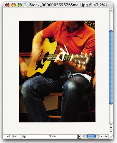
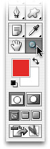
Here's a tip I picked up from our buddy and NAPP Help Desk Director Peter Bauer. In Smart Sharpen (under Filter, choose Sharpen), there's a special form of sharpening that removes visible motion blur. This sharpening is called (are you ready for this?) Motion Blur sharpening, and you choose it from the Remove pop-up menu in the Smart Sharpen dialog. But here's the catch—you have to be able to determine the angle of the blur for Smart Sharpen to remove it. So, that's where Pete's tip comes in. You grab the Measure tool (nested under the Eyedropper tool in the Toolbox), and drag it along the angle of the blur. Then, look in the Options Bar and you'll see the angle degree listed after the letter A. That's the number you enter in the Motion Blur Angle field within Smart Sharpen. Very clever, Mr. Bauer.
©ISTOCKPHOTO/BILL GROVE
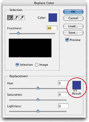
If you're using Replace Color (under the Image menu, under Adjustments) to select an area within your photo and replace it with a different color, the new color is pretty much an approximation, because you're dragging sliders, rather than inputting the exact RGB or CMYK build you're looking for. In Photoshop CS2, there's a way around this. Once you've selected the area of color you want to replace, click on the color swatch to the right of the sliders in the Replacement section (it wasn't there in previous versions). This brings up the Color Picker, where you can enter the exact RGB or CMYK values for your new color.
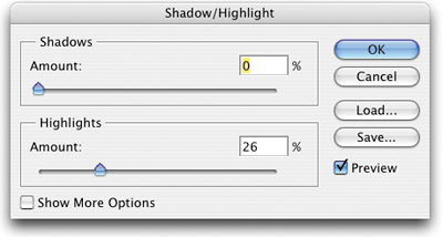
If you open the Shadow/Highlight command (found in the Image menu, under Adjustments) to open up the shadows in your photo, you're in good shape from the get-go because it automatically increases the shadow area by 50%. That's great, if that's what you're after. But what if you're trying to pull back the highlights in a photo? Shadow/Highlight doesn't know that and by default still opens up your shadows by 50%. The way to combat this is to immediately drag the Shadows slider all the way to the left when the dialog appears, so now you can adjust (pull back) the highlights by dragging the Highlights slider to the right, which affects just the highlights and not the shadows.
One of the cornerstones of professional retouching is to always perform your retouches on their own separate layer. That way you never “bruise” (damage) the pixels of the original image. However, when using the Healing Brush in Photoshop 7.0, you really had no choice—you had to use it on the same layer. In Photoshop CS2, you can heal to another layer. But first, there's a little setting you have to change. Get the Healing Brush from the Toolbox, then up in the Options Bar, turn on the checkbox for Sample All Layers. Next, click on the Create a New Layer icon at the bottom of the Layers palette to create a new blank layer above your Background layer and do your “healing” there.
I have to give credit for this incredible tip to NAPP member Stephanie Cole, who showed it to me after the Midnight Madness session at the Photoshop World Conference & Expo in LA. She pointed out how you can get a real mottled-looking result sometimes when using the Healing Brush. However, she found that when you change the brush shape (by clicking on the Brush thumbnail in the Options Bar) to a tall thin brush, it heals using a star-shaped stroke. This greatly reduces the mottling often associated with the Healing Brush, creating a smoother-looking, more natural retouch. My thanks to Stephanie for allowing me to share her very slick trick.
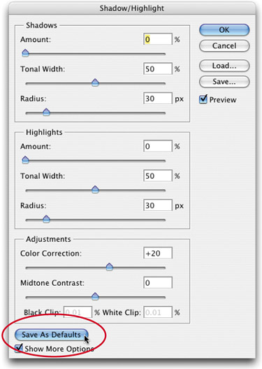
By default, the Shadow/Highlight adjustment command decreases the shadows by 50%, but if you'd prefer to have Shadow/Highlight open flat (with no automatic shadow adjustment), you can set your own defaults. That way, you decide how much, and when, the shadows get opened. You do this by going under the Image menu, under Adjustments, choosing Shadow/Highlight, and then dragging the Shadows Amount slider to 0%. Click on the Show More Options checkbox, and at the bottom of the expanded dialog click on the Save As Defaults button. That's it: Now you get to decide if the shadows get opened up, and how much, because everything's set flat.
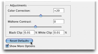
Don't ever be concerned about experimenting in Photoshop CS2's amazing Shadow/Highlight feature—mess with the sliders all you want, because you can always get back to the factory-default settings, even if you've overridden them by saving your own defaults. You do this within the Shadow/Highlight dialog (under Image, under Adjustments) by clicking on the Show More Options checkbox. Then, hold the Shift button, and you'll see the Save As Defaults button at the bottom of the expanded dialog change to the Reset Defaults button. Click it, and the factory defaults are back, baby!
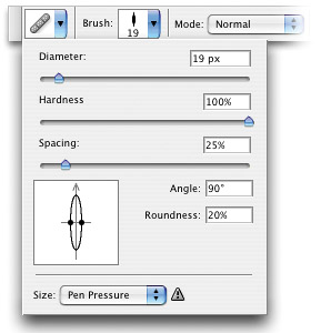
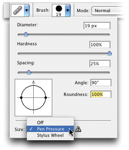
If you're using a Wacom tablet and wireless pen with Photoshop, you've probably already uncovered the secret hiding place where Adobe tucked the pressure sensitivity controls. (Hint: They're in the Brushes palette.) But if you want to use pressure sensitivity with the Healing Brush, it's in a totally different spot. To turn it on, press Shift-J until you have the Healing Brush tool, then in the Options Bar, click directly on the Brush thumbnail, and a menu will pop up (it's not the standard Brush Picker). At the bottom of the menu, you'll see a Size pop-up menu, where you can choose Pen Pressure.
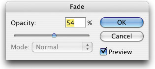
I don't know if you've noticed, but Photoshop's Healing Brush (Shift-J) doesn't have an option for controlling its opacity (the way the Clone Stamp, Brush, Eraser, and other tools have). But there is a workaround if you want to use the brush and have some control over its opacity. Just go ahead and use the brush first; then to lower the opacity of your stroke, go under the Edit menu and choose Fade Healing Brush. When the Fade dialog appears, lower the Opacity slider to the desired amount. It's a bit clunky, but it works.
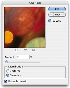
If you've printed an image with a gradient in it, you're probably familiar with banding (a visible line where one color ends and the next starts, like bands of color, instead of a smooth transition from one color to the next). There's a very popular tip for getting rid of banding that's very effective for high-resolution imaging. Open the image in Photoshop and go under the Filter menu, under Noise, and choose Add Noise. When the Add Noise dialog appears, for Amount enter 2, for Distribution choose Gaussian, turn on the Monochromatic checkbox, and then click OK. You'll see a little bit of this noise when viewing the image onscreen, but when printed at high resolution, the noise disappears and hides the banding. We add noise to every gradient we create for just that reason.
©ISTOCKPHOTO/ANDY LIM
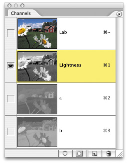
Just about every image that is brought into Photoshop, whether from a scanner, digital camera, CD-ROM, etc., needs to be sharpened. The undisputed tool for this task is Photoshop's Unsharp Mask filter. The only downside of using this filter is that getting the level of sharpening you'd like can sometimes cause color shifts and halos, and it can also accentuate dust or specs within the image. There are two ways around this, and what's great about these methods is they let you apply a higher level of sharpening without causing color shifts or other problems: (1) Convert your file from RGB mode to Lab Color. Then go to the Channels palette and click on the Lightness channel. Now apply the Unsharp Mask filter (twice if you need it), then switch back to RGB mode (don't worry, there's no harm in this RGB-to-Lab-to-RGB mode conversion). (2) If you're working on a CMYK image, apply the Unsharp Mask filter, then go under the Edit menu and choose Fade Unsharp Mask. When the Fade dialog appears, change the Mode pop-up menu to Luminosity and click OK (which pretty much does the same thing as method 1; it applies the sharpening to the luminance of the image, not the color).
©ISTOCKPHOTO/SPENCER DOANE
If you scanned an image that already has been printed in one form or another, you're bound to get a moiré pattern over your image (moiré patterns are a series of dots or spots that appear on your image). These spots are your scanner picking up the halftone screen that was applied when the image was printed.
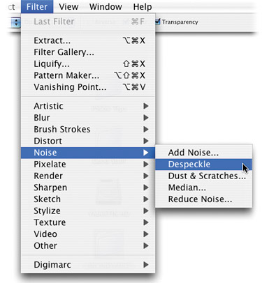
Here are five quick tips for removing moiré patterns:
Go under the Filter menu, under Noise, and choose Despeckle. There are no numbers to input or sliders to adjust—it either works or it doesn't, but luckily, it works about 75% of the time. However, if you run Despeckle and it doesn't work, undo it. That's because Despeckle adds a slight blur to your entire image, and if it doesn't work, there's no sense in leaving that blur applied, eh?
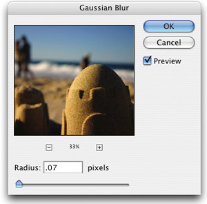
Apply a 1-pixel or less Gaussian Blur. This will usually work if method 1 doesn't. Again, if this technique doesn't remove the moiré pattern, undo it to reduce unnecessary blurring.
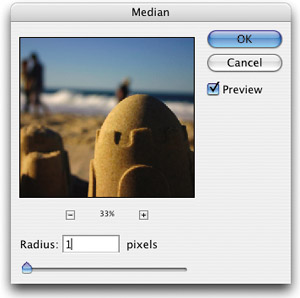
Go under the Filter menu, under Noise, and choose Median. Enter 1 pixel and click OK. I know I'm sounding like a broken record, but if it doesn't work, undo it. You know why.
Reduce the resolution of your scan to twice the line screen it will be printed at. For example, if you scanned it at 300 dpi and you're going to print it at 100-line screen, lower the resolution of the file to 200 ppi and that'll probably do the trick. If this image is going to be used on the Web, when you lower the resolution to 72 ppi, that'll probably do it.
Lastly, try rescanning the image with the image rotated slightly on the scanner bed. This is a last resort, but if all else fails, this will probably do the trick. Once the image is in Photoshop, you'll have to straighten the scan, but at least the moiré pattern will be gone.
©ISTOCKPHOTO/RON HOHENHAUS
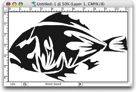
If you're scanning black-and-white line art for reproduction in print, here are two quick tips that'll help you get better results:
Scan the line art image at the dpi you'll be printing it. This is the one time we break our long-standing “don't-scan-at-too-high-a-resolution” rule—but only when it comes to line art. If you're going to output your line art on a 600-dpi laser printer, scan it at 600 dpi. If you're going to output it to high-resolution film negs, scan it at 1,200 dpi (that's about as high as you'll need to go).
Scan your line art images in Grayscale mode. If you do, then you can apply filters such as the Unsharp Mask to help clean and define the lines, and you can use Levels to brighten the white areas.
Note: If you scan in Bitmap mode, you won't be able to use these two important line art cleanup tips, because they're not supported in Bitmap mode.
©ISTOCKPHOTO/REBECCA LOWE
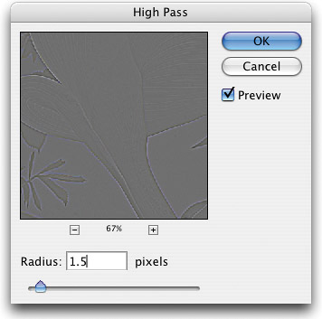
There's a sharpening technique that's really gaining popularity that works especially well on images with lots of well-defined edges (such as buildings, cars, furniture, etc.). It's actually a layer technique combined with a filter, but it's very easy (and often very effective) to apply. Start by duplicating the Background layer of the image you want to sharpen by pressing Command-J (PC: Control-J). Then, go under the Filter menu, under Other, and choose High Pass. When the High Pass dialog appears, enter a Radius of 1.5 pixels (a good starting point) and click OK to apply the filter. It will change your image into a gray mess, but don't sweat it (yet). To bring the sharpening into your image, change the blend mode of this layer to Soft Light. The gray will disappear, and the edges of your image will appear sharper. You can also try the Hard Light mode to increase the sharpening effect. Still not enough? Make a copy of the layer for a multiplying effect. Is one copy not enough sharpening, but two are too much? You can control the sharpening amount in two ways: (1) Switch between Soft Light and Hard Light, or (2) lower the Opacity setting of the layer to dial in just the right amount of sharpening.
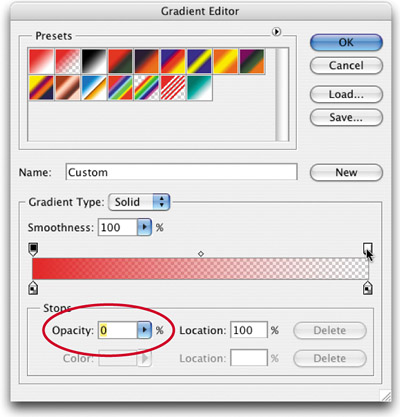
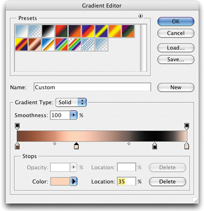
If you're creating a gradient using a spot color that fades to white, to make sure your gradient appears just on the spot separation plate, create the gradient to go from the spot color to a 0% tint of the same spot color (for example, go from 100% red to 0% red). Just click on the color's opacity stop (that appears above the stop in the color ramp) and then lower the Opacity in the bottom-left corner of the Gradient Editor. That way, when you do your seps, the entire gradient will appear on the red separation.
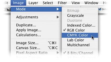
We've been asked the question of whether to correct in CMYK or RGB a hundred times. As a general rule, we try to do as much color correction as possible in RGB mode, and if we're going to use the image on press, we only convert to CMYK at the end of the correction process. The main reason is that CMYK mode throws away data—a lot of data—and why would you want to correct an image with significantly less data than your scanner can capture? We want as much data as possible while correcting images, and when we're done, then we'll convert to CMYK (under Image, choose Mode) and toss the data that won't be used on press.
If you've scanned an image and it's crooked when you bring it into Photoshop, you can fix it in about 10 seconds flat. Just switch to the Measure tool (it lives behind the Eyedropper tool in the Toolbox) and drag it along the top edge of the image you want to straighten. That's the hard part (and that should give you an idea of how easy this technique is). Next, go under the Image menu, under Rotate Canvas, and choose Arbitrary. Photoshop automatically enters the amount of rotation (courtesy of your earlier measurement), so all you have to do is click OK and bam!—the image is perfectly straightened.
©ISTOCKPHOTO/NATHAN WATKINS
Even though your flatbed scanner is normally used for scanning (you guessed it) flat images, it doesn't mean you can't scan images that have more dimension (such as a watch, a ring, a yo-yo, you name it). The only problem is, scanning an image that lifts the lid adds lots of ambient light into your scan, introducing so many outside colors and reflections that it makes the scan all but unusable. The tip for getting around this is deceivingly simple: Just put a black sweater (or black felt cloth) around the object you're going to scan, and you'll get great-looking scans, even with the lid open. The black sweater soaks up that ambient light and you'll be amazed at how natural and balanced your scanned objects will look.
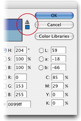
If you're working on an image that will be printed on a printing press and you select a color that's outside the range of what a CMYK press can reproduce, you'll get what's called a Gamut Warning right within Photoshop's Color Picker. This is just to let you know that the color you've chosen is outside the CMYK gamut. Just below the warning is a tiny color swatch showing you what the color you picked will really look like when printed in CMYK mode. To find out where that color resides within the Color Picker, click once directly on that tiny swatch and Photoshop will pick that color for you.
When cleaning up line art images with the Pencil tool, you can spend a lot of time going back and forth to the Toolbox to switch your Foreground color to black (to fill in missing pixels) and then to white (to erase pixels that shouldn't be there in the first place). It does help if you use the keyboard shortcut D to set your Foreground to black, and then X to make white your Foreground color, but there's actually a faster way. Once you select the Pencil tool, go in the Options Bar and turn on Auto Erase. What the Auto Erase option does is pretty neat—when you click the Pencil in a black area of pixels, it paints white; when you click it on a white pixel, it automatically paints black. It happens automatically—so you never have to switch colors again—saving you a ton of time, travel, and keystrokes.
You don't need a calculator to determine how much resolution you need for printing to a particular line screen—Photoshop will do all the math for you, right inside the Image Size dialog. Here's how: Open the image you want to print. Go under the Image menu and choose Image Size. When the dialog appears, click on the Auto button (it's right under the Cancel button). When the Auto Resolution dialog appears, all you have to do is type in the line screen of the device you're printing to and then choose a Quality setting. Here's how Photoshop does its resolution math:
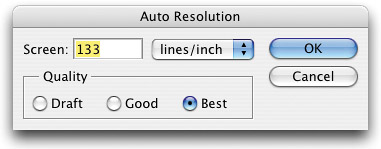
Draft: This just lowers your resolution to 72 ppi (ideal for onscreen use, the Web, etc.).
Good: This takes the line screen and multiplies it by 1.5.
Best: This doubles the line screen (multiplies it by 2).
When you click OK, Photoshop enters the math it just did into the Resolution field of the Image Size dialog.
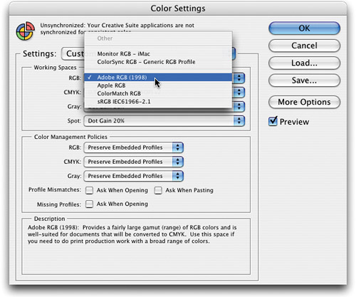
By default, the RGB space for your monitor is set to sRGB, which is an okay mode for designing Web graphics. However, if you're producing graphics for print, the sRGB mode is just about the worst RGB space your monitor could possibly be set at. It clips off lots of colors that are actually printable in CMYK mode, and therefore is pretty unsuitable for prepress work. We recommend changing your RGB workspace to an RGB space that's more appropriate for doing print work. We like Adobe RGB (1998), which is a very popular RGB space for prepress work. You choose this RGB space under the Photoshop menu, under Color Settings (in Windows, Color Settings can be found under the Edit menu). When the Color Settings dialog appears, under the Working Spaces area, choose Adobe RGB (1998) from the RGB pop-up menu.
If you're designing a job that will ultimately go to a printing press in CMYK mode and it's going to contain one or more gradients, you'll get better printed results (less color shifts) if you create those gradients after you convert to CMYK mode.
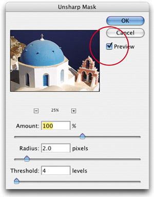
If you're applying a correction filter, such as the Unsharp Mask filter, you can get a before and after view of your image even before you click the OK button (and then press Command-Z [PC: Control-Z] to undo/redo the filter). Instead, click-and-hold on the preview box inside the Unsharp Mask filter. When you click-and-hold, you get the before preview in the window; when you release the mouse button, it shows you how the image will look with the filter applied. Pretty handy. If you need to see the full preview onscreen, you can toggle the Preview checkbox on or off. Another tip is to hold the Command or Option (PC: Control or Alt) button while in a filter dialog, and then your cursor changes into the Zoom tool. You can then zoom in or out in your preview window by clicking within it.
©ISTOCKPHOTO/ANGELIKA STERN
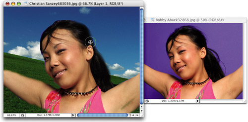
If you're retouching an image using the Clone Stamp tool (S), not only can you clone from the image you're in but you can also clone from any other image that you have open. All you have to do is make sure both images are open at the same time. Go to the other image, Option-click (PC: Alt-click) on the area you want to clone from, switch back to the image you're working on, and then start painting. When you do, you'll be cloning image data from the other image.
©ISTOCKPHOTO/BOBBY ABACK & CHRISTIAN SANZEY
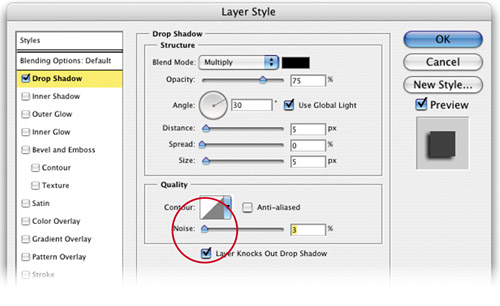
Here's a quick tip for getting more realistic drop shadows in print: Add some noise. When you choose Drop Shadow from the Add a Layer Style pop-up menu in the Layers palette, there's a slider for adding noise to your shadows in the Layer Style dialog. When you add just a small percentage, it makes your shadows appear more realistic when they show up in print.
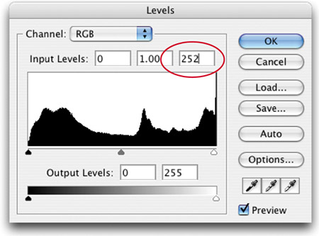
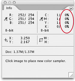
If you have an image that appears to have solid white areas (maybe the background surrounding a logo), but when you put the Eyedropper on that area, it gives you a 1% or 2% reading in one of the CMYK values in your Info palette, you can use Levels to gets those areas back down to 0% so they don't print with a dot. Here's how: Go under the Image menu, under Adjustments, and choose Levels. The third field from the left (at the top of the dialog) shows your current highlight value (your white point setting). The default value will be 255. Enter 252 or 250, then move your cursor over the white area in question and look in the Info palette to see if the readings are now all 0% (that change should be enough to remove the stray colors). When it's right, click OK, and you'll have solid white in your white areas.
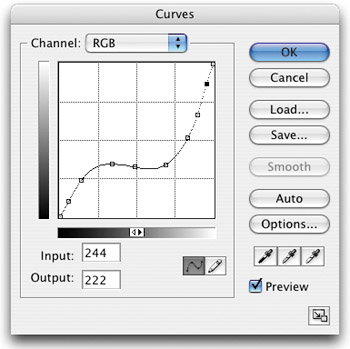
When correcting images in Curves, Levels, etc., it's best to try to do all your corrections at one time rather than changing each setting individually (by that I mean, don't set a highlight in Curves, then close and reopen it to set a shadow). The reason is, each time you apply a tonal correction, it puts some strain on the quality of the image. So to keep your image from having unnecessary data loss, when you open Curves or Levels, make your shadow, highlight, and midtone adjustments, and then click OK to apply all three adjustments at once.
©ISTOCKPHOTO/SUE MCDONALD
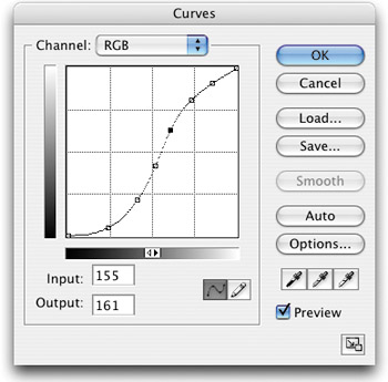
When you're working in Curves (Command-M [PC: Control-M]), once you've plotted a curve point, you can rotate over to the next point in your curve by pressing Control-Tab (PC: Right-click-Tab). To rotate back to the previous point, add the Shift key to make it Shift-Control-Tab (PC: Shift-Right-click-Tab). If you've got one or more points selected and want to deselect all your points, just press Command-D (PC: Control-D) to release all your points.
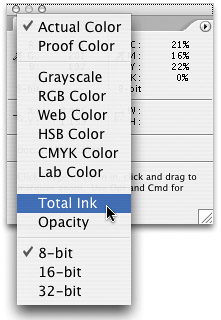
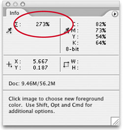
Not sure where the highlight or shadow points in your image are located? Let Photo-shop help. Go under the Window menu and choose Info. In the RGB readout, click on the tiny Eyedropper icon to the left of the readout. A pop-up menu will appear with a list of values you can measure. Choose Total Ink from this pop-up menu. Next, press I to switch to the Eyedropper tool and move it over your image in the areas you think might be the darkest. Now, in the Info palette, look for the highest number. When you find the area in your image with the highest number (the highest amount of total ink), you've found the shadow point. Do the same to find the highlight—just look for the lowest number. When you locate that number, you've found the highlight.
Here's a lingo tip about resolution. Although images can have a resolution from 1 to more than 2,000 ppi, when it comes to talking resolution, there are three basic resolutions that are pretty common. Low-res (short for resolution) is normally 72 ppi, and low-res images are primarily used for onscreen viewing (such as the Web, slide presentations, digital video, etc.). Medium-res is generally 150 ppi and is commonly used for printing to inkjet and laser printers. When people use the term high-res, it's almost always referring to 300 ppi, which is more than sufficient resolution for printing to a printing press. Anything above 300 ppi is still considered high-res, but you'd say it like this: “I made a 600-ppi high-res scan.” Which resolution is right for you? Nice try. That's a whole book unto itself.
When you apply sharpening to your image using the Unsharp Mask or Smart Sharpen filter (under Filter, choose Sharpen), make certain that when you apply it, you're viewing the image at 100% size. Most other views won't give you an accurate view of how the sharpening is really affecting the image. To make sure you're viewing at 100%, just double-click the Zoom tool in the Toolbox.
Once you've plotted a point on a curve in the Curves dialog (Command-M [PC: Control-M]), you can adjust these points by clicking-and-dragging them, but many people find it easier to plot the point by using the Up/Down Arrow keys on their keyboard. This adjusts the Output of the point in increments of 2. To adjust the Input, use the Left/Right Arrow keys. To make larger moves, hold the Shift key while using the Arrow keys and your points will move in increments of 15.
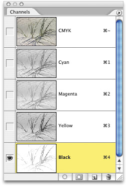
If you've already converted your image to CMYK mode and you want to quickly sharpen your image without introducing color shifts or halos, go to the Channels palette (under the Window menu), click on the Black channel, and apply your Unsharp Mask there. Applying the filter just to the Black channel will enable you to apply a higher level of sharpening without damaging the image.
©ISTOCKPHOTO/ALAN GOULE
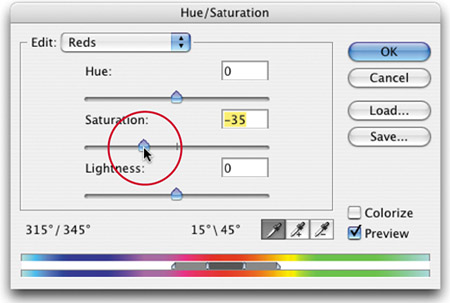
If you're working on an RGB image and you've done your basic color correction but the flesh tone in your image still seems too red (a common problem), here's a tip to fix it fast. First, select the flesh tone areas in your image (using the Lasso tool, etc.). Add a slight feather by going under the Select menu and choosing Feather. Enter a 1-pixel feather for low-res images; 3–5 pixels for high-res images. Go under the Image menu, under Adjustments, and choose Hue/Saturation. From the Edit pop-up menu, choose Reds. Now lower the Saturation slider until your skin tones look more natural and click OK.
You've read some techniques in this chapter that require you to be in either RGB mode or Lab Color mode; however, if for any reason your image is already in CMYK mode, do not (I repeat, do not) convert to RGB or Lab mode for any reason. Once you've converted to CMYK mode, the data loss from the conversion has already occurred, and switching back to RGB mode won't bring back those lost colors. What's worse is, if you switch from CMYK to RGB (or Lab), when you convert back to CMYK mode, you'll go through another CMYK conversion and damage your image even more. The moral of this story is—once you're in CMYK mode, stay there.
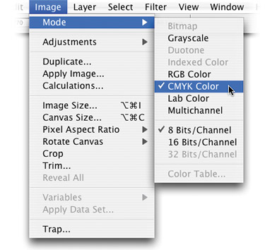
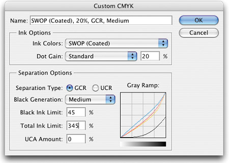
Converting from RGB mode to CMYK mode for printing is easy, just choose CMYK from the Mode menu under the Image menu. However, getting great-looking separations on press takes more than just choosing the CMYK menu command. Before you convert to CMYK mode, call the print shop that's printing your job and ask them for their Photoshop CMYK separation setup. They'll provide you with custom settings to input in the Custom CMYK dialog that will give you a separation that's tuned to their particular printing press. Once they provide you with those settings, you input them by going under the Edit menu and choosing Color Settings. When the Color Settings dialog appears, click on the CMYK pop-up menu, and at the top of the menu choose Custom CMYK. The Custom CMYK setup dialog will appear, where you can enter the settings given to you by the print shop. Once entered, then you can make your CMYK conversion, and you'll get a better separation that's specially tuned to the press your job will be printed on.
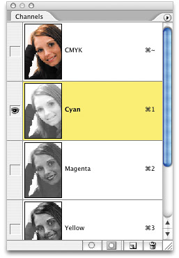
When you're sharpening CMYK images, the toughest areas to sharpen are often the flesh tones. Usually, because of the soft nature of skin, you'll need a lot of sharpening, which can introduce noise and color shifts, particularly in flesh tone areas. One tip that's often used to combat this is to apply your sharpening to just the Cyan channel in the Channels palette in images where flesh tone is the focal point (such as in portraits).
©ISTOCKPHOTO/JOEY NELSON
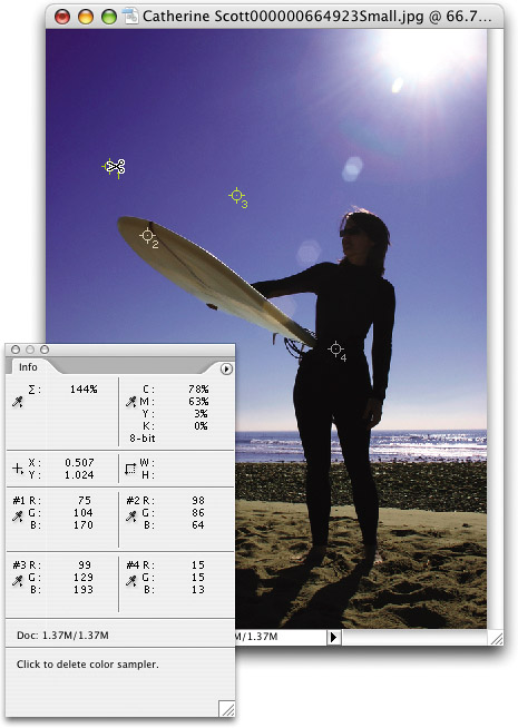
Photoshop's Color Sampler tool lets you sample up to four different color readings from within your image at the same time. The cool thing is, anytime you have one of Photoshop's paint tools (Brush, Pencil, etc.), you can instantly access the Color Sampler by holding Option-Shift (PC: Alt-Shift). Click to add a color sampler and the Info palette immediately pops up to show you the reading. Each time you add a sampler, the Info palette expands to show that reading (leaving your earlier readings still visible). To delete any sampler, press Option-Shift (PC: Alt-Shift) again and just move the cursor back over the sampler and it will change into a pair of scissors. Click right on the sampler in your image to delete it. (Hint: You have to click directly on the sampler or it won't work, and this doesn't work for all painting tools.)
©ISTOCKPHOTO/CATHERINE SCOTT