Chapter 3. Exploring data
This chapter covers
- Using summary statistics to explore data
- Exploring data using visualization
- Finding problems and issues during data exploration
In the last two chapters, you learned how to set the scope and goal of a data science project, and how to load your data into R. In this chapter, we’ll start to get our hands into the data.
Suppose your goal is to build a model to predict which of your customers don’t have health insurance; perhaps you want to market inexpensive health insurance packages to them. You’ve collected a dataset of customers whose health insurance status you know. You’ve also identified some customer properties that you believe help predict the probability of insurance coverage: age, employment status, income, information about residence and vehicles, and so on. You’ve put all your data into a single data frame called custdata that you’ve input into R.[1] Now you’re ready to start building the model to identify the customers you’re interested in.
1 We have a copy of this synthetic dataset available for download from https://github.com/WinVector/zmPDSwR/tree/master/Custdata, and once saved, you can load it into R with the command custdata <- read.table('custdata.tsv',header=T,sep=' ').
It’s tempting to dive right into the modeling step without looking very hard at the dataset first, especially when you have a lot of data. Resist the temptation. No dataset is perfect: you’ll be missing information about some of your customers, and you’ll have incorrect data about others. Some data fields will be dirty and inconsistent. If you don’t take the time to examine the data before you start to model, you may find yourself redoing your work repeatedly as you discover bad data fields or variables that need to be transformed before modeling. In the worst case, you’ll build a model that returns incorrect predictions—and you won’t be sure why. By addressing data issues early, you can save yourself some unnecessary work, and a lot of headaches!
You’d also like to get a sense of who your customers are: Are they young, middle-aged, or seniors? How affluent are they? Where do they live? Knowing the answers to these questions can help you build a better model, because you’ll have a more specific idea of what information predicts the probability of insurance coverage more accurately.
In this chapter, we’ll demonstrate some ways to get to know your data, and discuss some of the potential issues that you’re looking for as you explore. Data exploration uses a combination of summary statistics—means and medians, variances, and counts—and visualization, or graphs of the data. You can spot some problems just by using summary statistics; other problems are easier to find visually.
For most of this book, we’ll assume that the data you’re analyzing is in a single data frame. This is not how that data is usually stored. In a database, for example, data is usually stored in normalized form to reduce redundancy: information about a single customer is spread across many small tables. In log data, data about a single customer can be spread across many log entries, or sessions. These formats make it easy to add (or in the case of a database, modify) data, but are not optimal for analysis. You can often join all the data you need into a single table in the database using SQL, but in appendix A we’ll discuss commands like join that you can use within R to further consolidate data.
3.1. Using summary statistics to spot problems
In R, you’ll typically use the summary command to take your first look at the data.
Listing 3.1. The summary() command

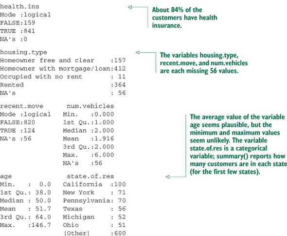
The summary command on a data frame reports a variety of summary statistics on the numerical columns of the data frame, and count statistics on any categorical columns (if the categorical columns have already been read in as factors[2]). You can also ask for summary statistics on specific numerical columns by using the commands mean, variance, median, min, max, and quantile (which will return the quartiles of the data by default).
2 Categorical variables are of class factor in R. They can be represented as strings (class character), and some analytical functions will automatically convert string variables to factor variables. To get a summary of a variable, it needs to be a factor.
As you see from listing 3.1, the summary of the data helps you quickly spot potential problems, like missing data or unlikely values. You also get a rough idea of how categorical data is distributed. Let’s go into more detail about the typical problems that you can spot using the summary.
3.1.1. Typical problems revealed by data summaries
At this stage, you’re looking for several common issues: missing values, invalid values and outliers, and data ranges that are too wide or too narrow. Let’s address each of these issues in detail.
Missing values
A few missing values may not really be a problem, but if a particular data field is largely unpopulated, it shouldn’t be used as an input without some repair (as we’ll discuss in chapter 4, section 4.1.1). In R, for example, many modeling algorithms will, by default, quietly drop rows with missing values. As you see in listing 3.2, all the missing values in the is.employed variable could cause R to quietly ignore nearly a third of the data.
Listing 3.2. Will the variable is.employed be useful for modeling?
If a particular data field is largely unpopulated, it’s worth trying to determine why; sometimes the fact that a value is missing is informative in and of itself. For example, why is the is.employed variable missing so many values? There are many possible reasons, as we noted in listing 3.2.
Whatever the reason for missing data, you must decide on the most appropriate action. Do you include a variable with missing values in your model, or not? If you decide to include it, do you drop all the rows where this field is missing, or do you convert the missing values to 0 or to an additional category? We’ll discuss ways to treat missing data in chapter 4. In this example, you might decide to drop the data rows where you’re missing data about housing or vehicles, since there aren’t many of them. You probably don’t want to throw out the data where you’re missing employment information, but instead treat the NAs as a third employment category. You will likely encounter missing values when model scoring, so you should deal with them during model training.
Invalid values and outliers
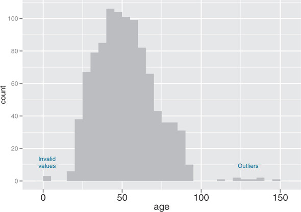
Even when a column or variable isn’t missing any values, you still want to check that the values that you do have make sense. Do you have any invalid values or outliers? Examples of invalid values include negative values in what should be a non-negative numeric data field (like age or income), or text where you expect numbers. Outliers are data points that fall well out of the range of where you expect the data to be. Can you spot the outliers and invalid values in listing 3.3?
Listing 3.3. Examples of invalid values and outliers

Often, invalid values are simply bad data input. Negative numbers in a field like age, however, could be a sentinel value to designate “unknown.” Outliers might also be data errors or sentinel values. Or they might be valid but unusual data points—people do occasionally live past 100.
As with missing values, you must decide the most appropriate action: drop the data field, drop the data points where this field is bad, or convert the bad data to a useful value. Even if you feel certain outliers are valid data, you might still want to omit them from model construction (and also collar allowed prediction range), since the usual achievable goal of modeling is to predict the typical case correctly.
Data range
You also want to pay attention to how much the values in the data vary. If you believe that age or income helps to predict the probability of health insurance coverage, then you should make sure there is enough variation in the age and income of your customers for you to see the relationships. Let’s look at income again, in listing 3.4. Is the data range wide? Is it narrow?
Listing 3.4. Looking at the data range of a variable

Even ignoring negative income, the income variable in listing 3.4 ranges from zero to over half a million dollars. That’s pretty wide (though typical for income). Data that ranges over several orders of magnitude like this can be a problem for some modeling methods. We’ll talk about mitigating data range issues when we talk about logarithmic transformations in chapter 4.
Data can be too narrow, too. Suppose all your customers are between the ages of 50 and 55. It’s a good bet that age range wouldn’t be a very good predictor of the probability of health insurance coverage for that population, since it doesn’t vary much at all.
Of course, the term narrow is relative. If we were predicting the ability to read for children between the ages of 5 and 10, then age probably is a useful variable as-is. For data including adult ages, you may want to transform or bin ages in some way, as you don’t expect a significant change in reading ability between ages 40 and 50. You should rely on information about the problem domain to judge if the data range is narrow, but a rough rule of thumb is the ratio of the standard deviation to the mean. If that ratio is very small, then the data isn’t varying much.
We’ll revisit data range in section 3.2, when we talk about examining data graphically.
One factor that determines apparent data range is the unit of measurement. To take a nontechnical example, we measure the ages of babies and toddlers in weeks or in months, because developmental changes happen at that time scale for very young children. Suppose we measured babies’ ages in years. It might appear numerically that there isn’t much difference between a one-year-old and a two-year-old. In reality, there’s a dramatic difference, as any parent can tell you! Units can present potential issues in a dataset for another reason, as well.
Units
Does the income data in listing 3.5 represent hourly wages, or yearly wages in units of $1000? As a matter of fact, it’s the latter, but what if you thought it was the former? You might not notice the error during the modeling stage, but down the line someone will start inputting hourly wage data into the model and get back bad predictions in return.
Listing 3.5. Checking units can prevent inaccurate results later

Are time intervals measured in days, hours, minutes, or milliseconds? Are speeds in kilometers per second, miles per hour, or knots? Are monetary amounts in dollars, thousands of dollars, or 1/100 of a penny (a customary practice in finance, where calculations are often done in fixed-point arithmetic)? This is actually something that you’ll catch by checking data definitions in data dictionaries or documentation, rather than in the summary statistics; the difference between hourly wage data and annual salary in units of $1000 may not look that obvious at a casual glance. But it’s still something to keep in mind while looking over the value ranges of your variables, because often you can spot when measurements are in unexpected units. Automobile speeds in knots look a lot different than they do in miles per hour.
3.2. Spotting problems using graphics and visualization
As you’ve seen, you can spot plenty of problems just by looking over the data summaries. For other properties of the data, pictures are better than text.
We cannot expect a small number of numerical values [summary statistics] to consistently convey the wealth of information that exists in data. Numerical reduction methods do not retain the information in the data.
William Cleveland The Elements of Graphing Data
Figure 3.1 shows a plot of how customer ages are distributed. We’ll talk about what the y-axis of the graph means later; for right now, just know that the height of the graph corresponds to how many customers in the population are of that age. As you can see, information like the peak age of the distribution, the existence of subpopulations, and the presence of outliers is easier to absorb visually than it is to determine textually.
Figure 3.1. Some information is easier to read from a graph, and some from a summary.

The use of graphics to examine data is called visualization. We try to follow William Cleveland’s principles for scientific visualization. Details of specific plots aside, the key points of Cleveland’s philosophy are these:
- A graphic should display as much information as it can, with the lowest possible cognitive strain to the viewer.
- Strive for clarity. Make the data stand out. Specific tips for increasing clarity include
- Visualization is an iterative process. Its purpose is to answer questions about the data.
During the visualization stage, you graph the data, learn what you can, and then regraph the data to answer the questions that arise from your previous graphic. Different graphics are best suited for answering different questions. We’ll look at some of them in this section.
In this book, we use ggplot2 to demonstrate the visualizations and graphics; of course, other R visualization packages can produce similar graphics.
The theme of this section is how to use visualization to explore your data, not how to use ggplot2. We chose ggplot2 because it excels at combining multiple graphical elements together, but its syntax can take some getting used to. The key points to understand when looking at our code snippets are these:
- Graphs in ggplot2 can only be defined on data frames. The variables in a graph—the x variable, the y variable, the variables that define the color or the size of the points—are called aesthetics, and are declared by using the aes function.
- The ggplot() function declares the graph object. The arguments to ggplot() can include the data frame of interest and the aesthetics. The ggplot() function doesn’t of itself produce a visualization; visualizations are produced by layers.
- Layers produce the plots and plot transformations and are added to a given graph object using the + operator. Each layer can also take a data frame and aesthetics as arguments, in addition to plot-specific parameters. Examples of layers are geom_point (for a scatter plot) or geom_line (for a line plot).
This syntax will become clearer in the examples that follow. For more information, we recommend Hadley Wickham’s reference site http://ggplot2.org, which has pointers to online documentation, as well as to Dr. Wickham’s ggplot2: Elegant Graphics for Data Analysis (Use R!) (Springer, 2009).
In the next two sections, we’ll show how to use pictures and graphs to identify data characteristics and issues. In section 3.2.2, we’ll look at visualizations for two variables. But let’s start by looking at visualizations for single variables.
3.2.1. Visually checking distributions for a single variable
The visualizations in this section help you answer questions like these:
- What is the peak value of the distribution?
- How many peaks are there in the distribution (unimodality versus bimodality)?
- How normal (or lognormal) is the data? We’ll discuss normal and lognormal distributions in appendix B.
- How much does the data vary? Is it concentrated in a certain interval or in a certain category?
One of the things that’s easier to grasp visually is the shape of the data distribution. Except for the blip to the right, the graph in figure 3.1 (which we’ve reproduced as the gray curve in figure 3.2) is almost shaped like the normal distribution (see appendix B). As that appendix explains, many summary statistics assume that the data is approximately normal in distribution (at least for continuous variables), so you want to verify whether this is the case.
Figure 3.2. A unimodal distribution (gray) can usually be modeled as coming from a single population of users. With a bimodal distribution (black), your data often comes from two populations of users.

You can also see that the gray curve in figure 3.2 has only one peak, or that it’s unimodal. This is another property that you want to check in your data.
Why? Because (roughly speaking), a unimodal distribution corresponds to one population of subjects. For the gray curve in figure 3.2, the mean customer age is about 52, and 50% of the customers are between 38 and 64 (the first and third quartiles). So you can say that a “typical” customer is middle-aged and probably possesses many of the demographic qualities of a middle-aged person—though of course you have to verify that with your actual customer information.
The black curve in figure 3.2 shows what can happen when you have two peaks, or a bimodal distribution. (A distribution with more than two peaks is multimodal.) This set of customers has about the same mean age as the customers represented by the gray curve—but a 50-year-old is hardly a “typical” customer! This (admittedly exaggerated) example corresponds to two populations of customers: a fairly young population mostly in their 20s and 30s, and an older population mostly in their 70s. These two populations probably have very different behavior patterns, and if you want to model whether a customer probably has health insurance or not, it wouldn’t be a bad idea to model the two populations separately—especially if you’re using linear or logistic regression.
The histogram and the density plot are two visualizations that help you quickly examine the distribution of a numerical variable. Figures 3.1 and 3.2 are density plots. Whether you use histograms or density plots is largely a matter of taste. We tend to prefer density plots, but histograms are easier to explain to less quantitatively-minded audiences.
Histograms
A basic histogram bins a variable into fixed-width buckets and returns the number of data points that falls into each bucket. For example, you could group your customers by age range, in intervals of five years: 20–25, 25–30, 30–35, and so on. Customers at a boundary age would go into the higher bucket: 25-year-olds go into the 25–30 bucket. For each bucket, you then count how many customers are in that bucket. The resulting histogram is shown in figure 3.3.
Figure 3.3. A histogram tells you where your data is concentrated. It also visually highlights outliers and anomalies.
You create the histogram in figure 3.3 in ggplot2 with the geom_histogram layer.
Listing 3.6. Plotting a histogram

The primary disadvantage of histograms is that you must decide ahead of time how wide the buckets are. If the buckets are too wide, you can lose information about the shape of the distribution. If the buckets are too narrow, the histogram can look too noisy to read easily. An alternative visualization is the density plot.
Density plots
You can think of a density plot as a “continuous histogram” of a variable, except the area under the density plot is equal to 1. A point on a density plot corresponds to the fraction of data (or the percentage of data, divided by 100) that takes on a particular value. This fraction is usually very small. When you look at a density plot, you’re more interested in the overall shape of the curve than in the actual values on the y-axis. You’ve seen the density plot of age; figure 3.4 shows the density plot of income. You produce figure 3.4 with the geom_density layer, as shown in the following listing.
Figure 3.4. Density plots show where data is concentrated. This plot also highlights a population of higher-income customers.

Listing 3.7. Producing a density plot

When the data range is very wide and the mass of the distribution is heavily concentrated to one side, like the distribution in figure 3.4, it’s difficult to see the details of its shape. For instance, it’s hard to tell the exact value where the income distribution has its peak. If the data is non-negative, then one way to bring out more detail is to plot the distribution on a logarithmic scale, as shown in figure 3.5. This is equivalent to plotting the density plot of log10(income).
Figure 3.5. The density plot of income on a log10 scale highlights details of the income distribution that are harder to see in a regular density plot.

In ggplot2, you can plot figure 3.5 with the geom_density and scale_x_log10 layers, such as in the next listing.
Listing 3.8. Creating a log-scaled density plot

When you issued the preceding command, you also got back a warning message:
Warning messages:
1: In scale$trans$trans(x) : NaNs produced
2: Removed 79 rows containing non-finite values (stat_density).
This tells you that ggplot2 ignored the zero- and negative-valued rows (since log(0) = Infinity), and that there were 79 such rows. Keep that in mind when evaluating the graph.
In log space, income is distributed as something that looks like a “normalish” distribution, as will be discussed in appendix B. It’s not exactly a normal distribution (in fact, it appears to be at least two normal distributions mixed together).
You should use a logarithmic scale when percent change, or change in orders of magnitude, is more important than changes in absolute units. You should also use a log scale to better visualize data that is heavily skewed.
For example, in income data, a difference in income of five thousand dollars means something very different in a population where the incomes tend to fall in the tens of thousands of dollars than it does in populations where income falls in the hundreds of thousands or millions of dollars. In other words, what constitutes a “significant difference” depends on the order of magnitude of the incomes you’re looking at. Similarly, in a population like that in figure 3.5, a few people with very high income will cause the majority of the data to be compressed into a relatively small area of the graph. For both those reasons, plotting the income distribution on a logarithmic scale is a good idea.
Bar charts
A bar chart is a histogram for discrete data: it records the frequency of every value of a categorical variable. Figure 3.6 shows the distribution of marital status in your customer dataset. If you believe that marital status helps predict the probability of health insurance coverage, then you want to check that you have enough customers with different marital statuses to help you discover the relationship between being married (or not) and having health insurance.
Figure 3.6. Bar charts show the distribution of categorical variables.
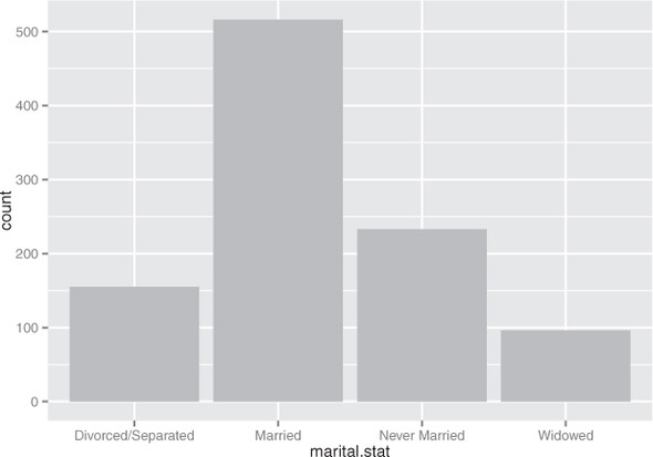
The ggplot2 command to produce figure 3.6 uses geom_bar:
ggplot(custdata) + geom_bar(aes(x=marital.stat), fill="gray")
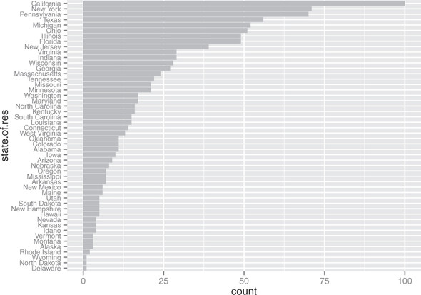
This graph doesn’t really show any more information than summary(custdata$marital .stat) would show, although some people find the graph easier to absorb than the text. Bar charts are most useful when the number of possible values is fairly large, like state of residence. In this situation, we often find that a horizontal graph is more legible than a vertical graph.
The ggplot2 command to produce figure 3.7 is shown in the next listing.
Figure 3.7. A horizontal bar chart can be easier to read when there are several categories with long names.

Listing 3.9. Producing a horizontal bar chart

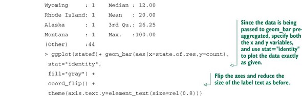
Cleveland[3] recommends that the data in a bar chart (or in a dot plot, Cleveland’s preferred visualization in this instance) be sorted, to more efficiently extract insight from the data. This is shown in figure 3.8.
3 See William S. Cleveland, The Elements of Graphing Data, Hobart Press, 1994.
Figure 3.8. Sorting the bar chart by count makes it even easier to read.
This visualization requires a bit more manipulation, at least in ggplot2, because by default, ggplot2 will plot the categories of a factor variable in alphabetical order. To change this, we have to manually specify the order of the categories—in the factor variable, not in ggplot2.
Listing 3.10. Producing a bar chart with sorted categories

Before we move on to visualizations for two variables, in table 3.1 we’ll summarize the visualizations that we’ve discussed in this section.
Table 3.1. Visualizations for one variable
|
Graph type |
Uses |
|---|---|
| Histogram or density plot | Examines data range Checks number of modes Checks if distribution is normal/lognormal Checks for anomalies and outliers |
| Bar chart | Compares relative or absolute frequencies of the values of a categorical variable |
3.2.2. Visually checking relationships between two variables
In addition to examining variables in isolation, you’ll often want to look at the relationship between two variables. For example, you might want to answer questions like these:
- Is there a relationship between the two inputs age and income in my data?
- What kind of relationship, and how strong?
- Is there a relationship between the input marital status and the output health insurance? How strong?
You’ll precisely quantify these relationships during the modeling phase, but exploring them now gives you a feel for the data and helps you determine which variables are the best candidates to include in a model.
First, let’s consider the relationship between two continuous variables. The most obvious way (though not always the best) is the line plot.
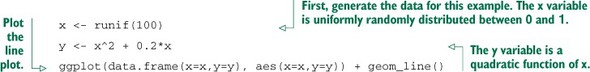
Line plots
Line plots work best when the relationship between two variables is relatively clean: each x value has a unique (or nearly unique) y value, as in figure 3.9. You plot figure 3.9 with geom_line.
Figure 3.9. Example of a line plot

Listing 3.11. Producing a line plot
When the data is not so cleanly related, line plots aren’t as useful; you’ll want to use the scatter plot instead, as you’ll see in the next section.
Scatter plots and smoothing curves
You’d expect there to be a relationship between age and health insurance, and also a relationship between income and health insurance. But what is the relationship between age and income? If they track each other perfectly, then you might not want to use both variables in a model for health insurance. The appropriate summary statistic is the correlation, which we compute on a safe subset of our data.
Listing 3.12. Examining the correlation between age and income
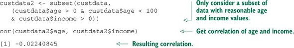
The negative correlation is surprising, since you’d expect that income should increase as people get older. A visualization gives you more insight into what’s going on than a single number can. Let’s try a scatter plot first; you plot figure 3.10 with geom_point:
Figure 3.10. A scatter plot of income versus age

ggplot(custdata2, aes(x=age, y=income)) +
   geom_point() + ylim(0, 200000)
The relationship between age and income isn’t easy to see. You can try to make the relationship clearer by also plotting a linear fit through the data, as shown in figure 3.11.
Figure 3.11. A scatter plot of income versus age, with a linear fit

You plot figure 3.11 using the stat_smooth layer:[4]
4 The stat layers in ggplot2 are the layers that perform transformations on the data. They’re usually called under the covers by the geom layers. Sometimes you have to call them directly, to access parameters that aren’t accessible from the geom layers. In this case, the default smoothing curve used geom_smooth, which is a loess curve, as you’ll see shortly. To plot a linear fit we must call stat_smooth directly.
ggplot(custdata2, aes(x=age, y=income)) + geom_point() +
  stat_smooth(method="lm") +
  ylim(0, 200000)
In this case, the linear fit doesn’t really capture the shape of the data. You can better capture the shape by instead plotting a smoothing curve through the data, as shown in figure 3.12.
Figure 3.12. A scatter plot of income versus age, with a smoothing curve

In R, smoothing curves are fit using the loess (or lowess) functions, which calculate smoothed local linear fits of the data. In ggplot2, you can plot a smoothing curve to the data by using geom_smooth:
ggplot(custdata2, aes(x=age, y=income)) +
   geom_point() + geom_smooth() +
   ylim(0, 200000)
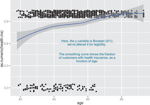
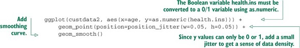
A scatter plot with a smoothing curve also makes a good visualization of the relationship between a continuous variable and a Boolean. Suppose you’re considering using age as an input to your health insurance model. You might want to plot health insurance coverage as a function of age, as shown in figure 3.13. This will show you that the probability of having health insurance increases as customer age increases.
Figure 3.13. Distribution of customers with health insurance, as a function of age
You plot figure 3.13 with the command shown in the next listing.
Listing 3.13. Plotting the distribution of health.ins as a function of age
In our health insurance examples, the dataset is small enough that the scatter plots that you’ve created are still legible. If the dataset were a hundred times bigger, there would be so many points that they would begin to plot on top of each other; the scatter plot would turn into an illegible smear. In high-volume situations like this, try an aggregated plot, like a hexbin plot.
Hexbin plots
A hexbin plot is like a two-dimensional histogram. The data is divided into bins, and the number of data points in each bin is represented by color or shading. Let’s go back to the income versus age example. Figure 3.14 shows a hexbin plot of the data. Note how the smoothing curve traces out the shape formed by the densest region of data.
Figure 3.14. Hexbin plot of income versus age, with a smoothing curve superimposed in white

To make a hexbin plot in R, you must have the hexbin package installed. We’ll discuss how to install R packages in appendix A. Once hexbin is installed and the library loaded, you create the plots using the geom_hex layer.
Listing 3.14. Producing a hexbin plot

In this section and the previous section, we’ve looked at plots where at least one of the variables is numerical. But in our health insurance example, the output is categorical, and so are many of the input variables. Next we’ll look at ways to visualize the relationship between two categorical variables.
Bar charts for two categorical variables
Let’s examine the relationship between marital status and the probability of health insurance coverage. The most straightforward way to visualize this is with a stacked bar chart, as shown in figure 3.15.
Figure 3.15. Health insurance versus marital status: stacked bar chart

Some people prefer the side-by-side bar chart, shown in figure 3.16, which makes it easier to compare the number of both insured and uninsured across categories.
Figure 3.16. Health insurance versus marital status: side-by-side bar chart

The main shortcoming of both the stacked and side-by-side bar charts is that you can’t easily compare the ratios of insured to uninsured across categories, especially for rare categories like Widowed. You can use what ggplot2 calls a filled bar chart to plot a visualization of the ratios directly, as in figure 3.17.
Figure 3.17. Health insurance versus marital status: filled bar chart

The filled bar chart makes it obvious that divorced customers are slightly more likely to be uninsured than married ones. But you’ve lost the information that being widowed, though highly predictive of insurance coverage, is a rare category.
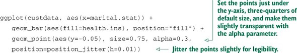
Which bar chart you use depends on what information is most important for you to convey. The ggplot2 commands for each of these plots are given next. Note the use of the fill aesthetic; this tells ggplot2 to color (fill) the bars according to the value of the variable health.ins. The position argument to geom_bar specifies the bar chart style.
Listing 3.15. Specifying different styles of bar chart

To get a simultaneous sense of both the population in each category and the ratio of insured to uninsured, you can add what’s called a rug to the filled bar chart. A rug is a series of ticks or points on the x-axis, one tick per datum. The rug is dense where you have a lot of data, and sparse where you have little data. This is shown in figure 3.18. You generate this graph by adding a geom_point layer to the graph.
Figure 3.18. Health insurance versus marital status: filled bar chart with rug

Listing 3.16. Plotting data with a rug
In the preceding examples, one of the variables was binary; the same plots can be applied to two variables that each have several categories, but the results are harder to read. Suppose you’re interested in the distribution of marriage status across housing types. Some find the side-by-side bar chart easiest to read in this situation, but it’s not perfect, as you see in figure 3.19.
Figure 3.19. Distribution of marital status by housing type: side-by-side bar chart
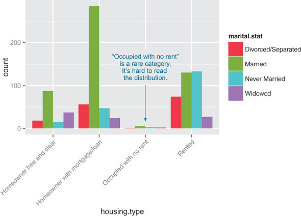
A graph like figure 3.19 gets cluttered if either of the variables has a large number of categories. A better alternative is to break the distributions into different graphs, one for each housing type. In ggplot2 this is called faceting the graph, and you use the facet_wrap layer. The result is in figure 3.20.
Figure 3.20. Distribution of marital status by housing type: faceted side-by-side bar chart

The code for figures 3.19 and 3.20 looks like the next listing.
Listing 3.17. Plotting a bar chart with and without facets
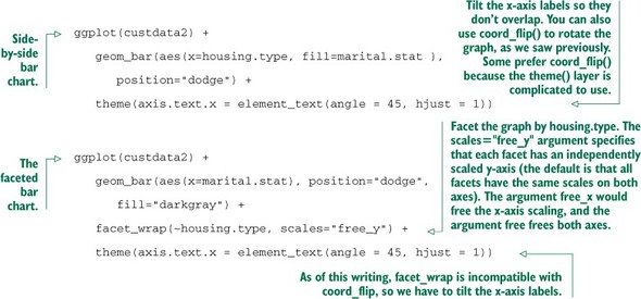
Table 3.2 summarizes the visualizations for two variables that we’ve covered.
Table 3.2. Visualizations for two variables
|
Graph type |
Uses |
|---|---|
| Line plot | Shows the relationship between two continuous variables. Best when that relationship is functional, or nearly so. |
| Scatter plot | Shows the relationship between two continuous variables. Best when the relationship is too loose or cloud-like to be easily seen on a line plot. |
| Smoothing curve | Shows underlying “average” relationship, or trend, between two continuous variables. Can also be used to show the relationship between a continuous and a binary or Boolean variable: the fraction of true values of the discrete variable as a function of the continuous variable. |
| Hexbin plot | Shows the relationship between two continuous variables when the data is very dense. |
| Stacked bar chart | Shows the relationship between two categorical variables (var1 and var2). Highlights the frequencies of each value of var1. |
| Side-by-side bar chart | Shows the relationship between two categorical variables (var1 and var2). Good for comparing the frequencies of each value of var2 across the values of var1. Works best when var2 is binary. |
| Filled bar chart | Shows the relationship between two categorical variables (var1 and var2). Good for comparing the relative frequencies of each value of var2 within each value of var1. Works best when var2 is binary. |
| Bar chart with faceting | Shows the relationship between two categorical variables (var1 and var2). Best for comparing the relative frequencies of each value of var2 within each value of var1 when var2 takes on more than two values. |
There are many other variations and visualizations you could use to explore the data; the preceding set covers some of the most useful and basic graphs. You should try different kinds of graphs to get different insights from the data. It’s an interactive process. One graph will raise questions that you can try to answer by replotting the data again, with a different visualization.
Eventually, you’ll explore your data enough to get a sense of it and to spot most major problems and issues. In the next chapter, we’ll discuss some ways to address common problems that you may discover in the data.
3.3. Summary
At this point, you’ve gotten a feel for your data. You’ve explored it through summaries and visualizations; you now have a sense of the quality of your data, and of the relationships among your variables. You’ve caught and are ready to correct several kinds of data issues—although you’ll likely run into more issues as you progress.
Maybe some of the things you’ve discovered have led you to reevaluate the question you’re trying to answer, or to modify your goals. Maybe you’ve decided that you need more or different types of data to achieve your goals. This is all good. As we mentioned in the previous chapter, the data science process is made of loops within loops. The data exploration and data cleaning stages (we’ll discuss cleaning in the next chapter) are two of the more time-consuming—and also the most important—stages of the process. Without good data, you can’t build good models. Time you spend here is time you don’t waste elsewhere.
In the next chapter, we’ll talk about fixing the issues that you’ve discovered in the data.
- Take the time to examine your data before diving into the modeling.
- The summary command helps you spot issues with data range, units, data type, and missing or invalid values.
- Visualization additionally gives you a sense of data distribution and relationships among variables.
- Visualization is an iterative process and helps answer questions about the data. Time spent here is time not wasted during the modeling process.