
Appendix B. Important statistical concepts
Statistics is such a broad topic that we’ve only been able to pull pieces of it into our data science narrative. But it’s an important field that has a lot to say about what happens when you attempt to infer from data. We’ve assumed in this book that you already know some statistical tools (in particular, summary statistics like the mean, mode, median, and variance). In this appendix, we’ll demonstrate a few more important statistical concepts.
B.1. Distributions
In this section, we’ll outline a few important distributions: the normal distribution, the lognormal distribution, and the binomial distribution. As you work further, you’ll also want to learn many other key distributions (such as Poisson, beta, negative binomial, and many more), but the ideas we present here should be enough to get you started.
B.1.1. Normal distribution
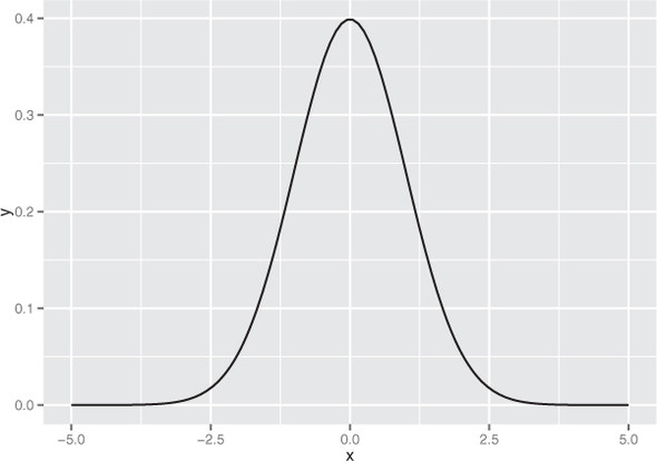
The normal or Gaussian distribution is the classic symmetric bell-shaped curve, as shown in figure B.1. Many measured quantities such as test scores from a group of students, or the age or height of a particular population, can often be approximated by the normal. Repeated measurements will tend to fall into a normal distribution. For example, if a doctor weighs a patient multiple times, using a properly calibrated scale, the measurements (if enough of them are taken) will fall into a normal distribution around the patient’s true weight. The variation will be due to measurement error (the variability of the scale). The normal distribution is defined over all real numbers.
Figure B.1. The normal distribution with mean 0 and standard deviation 1
In addition, the central limit theorem says that when you’re observing the sum (or mean) of many independent, bounded variance random variables, the distribution of your observations will approach the normal as you collect more data. For example, suppose you want to measure how many people visit your website every day between 9 a.m. and 10 a.m. The proper distribution for modeling the number of visitors is the Poisson distribution; but if you have a high enough volume of traffic, and you observe long enough, the distribution of observed visitors will approach the normal distribution, and you can make acceptable estimates about your traffic by treating the number of visitors as if it were normally distributed.
This is important; one reason that the normal is so popular is because it’s relatively easy to calculate with. The normal is described by two parameters: the mean m and the standard deviation s (or alternatively, the variance, which is the square of s). The mean represents the distribution’s center (and also its peak); the standard deviation represents the distribution’s “natural unit of length”—you can estimate how rare an observation is by how many standard deviations it is from the mean. As we mention in chapter 4, for a normally distributed variable
- About 68% of the observations will fall in the interval (m-s,m+s).
- About 95% of the observations will fall in the interval (m-2*s,m+2*s).
- About 99.7% of the observations will fall in the interval (m-3*s,m+3*s).
So an observation more than three standard deviations away from the mean can be considered quite rare, in most applications.
Many machine learning algorithms and statistical methods (for example, linear regression) assume that the unmodeled errors are distributed normally. Linear regression is fairly robust to violations of this assumption; still, for continuous variables, you should at least check if the variable distribution is unimodal and somewhat symmetric. When this isn’t the case, consider some of the variable transformations that we discuss in chapter 4.
Using the normal distribution in R
In R, the function dnorm(x, mean=m, sd=s) is the normal distribution function: it will return the probability of observing x when it’s drawn from a normal distribution with mean m and standard deviation s. By default, dnorm assumes that mean=0 and sd=1 (as do all the functions related to the normal distribution that we discuss here). Let’s use dnorm() to draw figure B.1.
Listing B.1. Plotting the theoretical normal density
library(ggplot2)

x <- seq(from=-5, to=5, length.out=100) # the interval [-5 5]
f <- dnorm(x)                           # normal with mean 0 and sd 1
ggplot(data.frame(x=x,y=f), aes(x=x,y=y)) + geom_line()
The function rnorm(n, mean=m, sd=s) will generate n points drawn from a normal distribution with mean m and standard deviation s.
Listing B.2. Plotting an empirical normal density
library(ggplot2)

# draw 1000 points from a normal with mean 0, sd 1
u <- rnorm(1000)

# plot the distribution of points,
# compared to normal curve as computed by dnorm() (dashed line)
ggplot(data.frame(x=u), aes(x=x)) + geom_density() +
   geom_line(data=data.frame(x=x,y=f), aes(x=x,y=y), linetype=2)
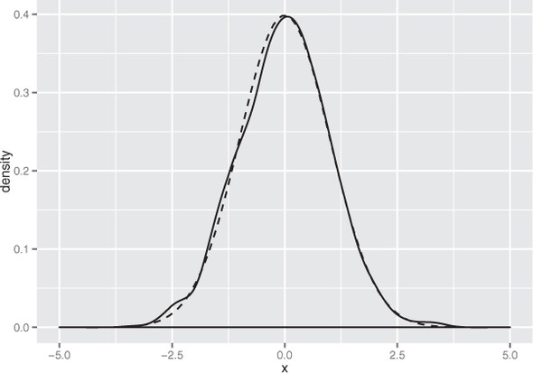
As you can see in figure B.2, the empirical distribution of the points produced by rnorm(1000) is quite close to the theoretical normal. Distributions observed from finite datasets can never exactly match theoretical continuous distributions like the normal; and, as with all things statistical, there is a well-defined distribution for how far off you expect to be for a given sample size.
Figure B.2. The empirical distribution of points drawn from a normal with mean 0 and standard deviation 1. The dotted line represents the theoretical normal distribution.
The function pnorm(x, mean=m, sd=s) is what R calls the normal probability function, otherwise called the normal cumulative distribution function: it returns the probability of observing a data point of value less than x from a normal with mean m and standard deviation s. In other words, it’s the area under the distribution curve that falls to the left of x (recall that a distribution has unit area under the curve). This is shown in the following listing.
Listing B.3. Working with the normal CDF
# --- estimate probabilities (areas) under the curve ---

# 50% of the observations will be less than the mean
pnorm(0)
# [1] 0.5


# about 2.3% of all observations are more than 2 standard
# deviations below the mean
pnorm(-2)
# [1] 0.02275013

# about 95.4% of all observations are within 2 standard deviations
# from the mean
pnorm(2) - pnorm(-2)
# [1] 0.9544997
The function qnorm(p, mean=m, sd=s) is the quantile function for the normal distribution with mean m and standard deviation s. It’s the inverse of pnorm(), in that qnorm(p, mean=m, sd=s) returns the value x such that pnorm(x, mean=m, sd=s) == p.
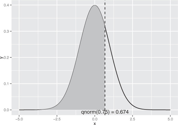
Figure B.3 illustrates the use of qnorm(): the vertical line intercepts the x axis at x = qnorm(0.75); the shaded area to the left of the vertical line represents the area 0.75, or 75% of the area under the normal curve.
Figure B.3. Illustrating x < qnorm(0.75)
The code to create figure B.3 (along with a few other examples of using qnorm()) is shown in the following listing.
Listing B.4. Plotting x < qnorm(0.75)
# --- return the quantiles corresponding to specific probabilities ---

# the median (50th percentile) of a normal is also the mean
qnorm(0.5)
# [1] 0

# calculate the 75th percentile
qnorm(0.75)
# [1] 0.6744898
pnorm(0.6744898)
# [1] 0.75

# --- Illustrate the 75th percentile ---

# create a graph of the normal distribution with mean 0, sd 1
x <- seq(from=-5, to=5, length.out=100)
f <- dnorm(x)
nframe <- data.frame(x=x,y=f)

# calculate the 75th percentile
line <- qnorm(0.75)
xstr <- sprintf("qnorm(0.75) = %1.3f", line)

# the part of the normal distribution to the left
# of the 75th percentile
nframe75 <- subset(nframe, nframe$x < line)

# Plot it.
# The shaded area is 75% of the area under the normal curve
ggplot(nframe, aes(x=x,y=y)) + geom_line() +
  geom_area(data=nframe75, aes(x=x,y=y), fill="gray") +
  geom_vline(aes(xintercept=line), linetype=2) +
  geom_text(x=line, y=0, label=xstr, vjust=1)
B.1.2. Summarizing R’s distribution naming conventions
Now that we’ve shown some concrete examples, we can summarize how R names the different functions associated with a given probability distribution. Suppose the probability distribution is called DIST. Then the following are true:
- dDIST(x, ...) is the distribution function (PDF) that returns the probability of observing the value x.
- pDIST(x, ...) is the cumulative distribution function (CDF) that returns the probability of observing a value less than x. The flag lower.tail=F will cause pDIST(x, ...) to return the probability of observing a value greater than x (the area under the right tail, rather than the left).
- rDIST(n, ...) is the random number generation function that returns n values drawn from the distribution DIST.
- qDIST(p, ...) is the quantile function that returns the x corresponding to the pth percentile of DIST. The flag lower.tail=F will cause qDIST(p, ...) to return the x that corresponds to the 1 - pth percentile of DIST.
R’s backward naming convention
For some reason, R refers to the cumulative distribution function (or CDF) as the probability distribution function (hence the convention pDIST). This drives us crazy, because most people use the term probability distribution function (or PDF) to refer to what R calls dDIST. Be aware of this.
B.1.3. Lognormal distribution
The lognormal distribution is the distribution of a random variable X whose natural log log(X) is normally distributed. The distribution of highly skewed positive data, like the value of profitable customers, incomes, sales, or stock prices, can often be modeled as a lognormal distribution. A lognormal distribution is defined over all non-negative real numbers; as shown in figure B.4 (top), it’s asymmetric, with a long tail out toward positive infinity. The distribution of log(X) (figure B.4, bottom) is a normal distribution centered at mean(log(X)). For lognormal populations, the mean is generally much higher than the median, and the bulk of the contribution toward the mean value is due to a small population of highest-valued data points.
Figure B.4. Top: The lognormal distribution X such that mean(log(X))=0 and sd(log(X)=1. The dashed line is the theoretical distribution, and the solid line is the distribution of a random lognormal sample. Bottom: The solid line is the distribution of log(X).

Don’t use the mean as a “typical” value for a lognormal population
For a population that’s approximately normally distributed, you can use the mean value of the population as a rough stand-in value for a typical member of the population. If you use the mean as a stand-in value for a lognormal population, you’ll overstate the value of the majority of your data.
Intuitively, if variations in the data are expressed naturally as percentages or relative differences, rather than as absolute differences, then the data is a candidate to be modeled lognormally. For example, a typical sack of potatoes in your grocery store might weigh about five pounds, plus or minus half a pound. The length that a specific type of bullet will fly when fired from a specific type of handgun might be about 2,100 meters, plus or minus 100 meters. The variations in these observations are naturally represented in absolute units, and the distributions can be modeled as normals. On the other hand, differences in monetary quantities are often best expressed as percentages: a population of workers might all get a 5% increase in salary (not an increase of $5,000/year across the board); you might want to project next quarter’s revenue to within 10% (not to within plus or minus $1,000). Hence, these quantities are often best modeled as having lognormal distributions.
Using the lognormal distribution in R
Let’s look at the functions for working with the lognormal distribution in R (see also section B.1.2). We’ll start with dlnorm() and rlnorm():
- dlnorm(x, meanlog=m, sdlog=s) is the distribution function (PDF) that returns the probability of observing the value x when it’s drawn from a lognormal distribution X such that mean(log(X)) = m and sd(log(X)) = s. By default, meanlog=0 and sdlog=1 for all the functions discussed in this section.
- rlnorm(n, meanlog=m, sdlog=s) is the random number generation function that returns n values drawn from a lognormal distribution with mean(log(X)) = m and sd(log(X)) = s.
We can use dlnorm() and rlnorm() to produce figure B.4 at the beginning of this section. The following listing also demonstrates some properties of the lognormal distribution.
Listing B.5. Demonstrating some properties of the lognormal distribution
# draw 1001 samples from a lognormal with meanlog 0, sdlog 1
u <- rlnorm(1001)

# the mean of u is higher than the median
mean(u)
# [1] 1.638628
median(u)
# [1] 1.001051

# the mean of log(u) is approx meanlog=0
mean(log(u))
# [1] -0.002942916

# the sd of log(u) is approx sdlog=1
sd(log(u))
# [1] 0.9820357

# generate the lognormal with meanlog=0, sdlog=1
x <- seq(from=0, to=25, length.out=500)
f <- dlnorm(x)

# generate a normal with mean=0, sd=1
x2 <- seq(from=-5,to=5, length.out=500)
f2 <- dnorm(x2)

# make data frames
lnormframe <- data.frame(x=x,y=f)
normframe <- data.frame(x=x2, y=f2)
dframe <- data.frame(u=u)

# plot densityplots with theoretical curves superimposed
p1 <- ggplot(dframe, aes(x=u)) + geom_density() +
  geom_line(data=lnormframe, aes(x=x,y=y), linetype=2)


p2 <- ggplot(dframe, aes(x=log(u))) + geom_density() +
  geom_line(data=normframe, aes(x=x,y=y), linetype=2)

# functions to plot multiple plots on one page
library(grid)
nplot <- function(plist) {
  n <- length(plist)
  grid.newpage()
  pushViewport(viewport(layout=grid.layout(n,1)))
  vplayout<-function(x,y) {viewport(layout.pos.row=x, layout.pos.col=y)}
  for(i in 1:n) {
    print(plist[[i]], vp=vplayout(i,1))
  }
}

# this is the plot that leads this section.
nplot(list(p1, p2))
The remaining two functions are the CDF plnorm() and the quantile function qlnorm():
- plnorm(x, meanlog=m, sdlog=s) is the cumulative distribution function (CDF) that returns the probability of observing a value less than x from a lognormal distribution with mean(log(X)) = m and sd(log(X)) = s.
- qlnorm(p, meanlog=m, sdlog=s) is the quantile function that returns the x corresponding to the pth percentile of a lognormal distribution with mean(log(X)) = m and sd(log(X)) = s. It’s the inverse of plnorm().
The following listing demonstrates plnorm() and qlnorm(). It uses the data frame lnormframe from the previous listing.
Listing B.6. Plotting the lognormal distribution
# the 50th percentile (or median) of the lognormal with
# meanlog=0 and sdlog=10
qlnorm(0.5)
# [1] 1
# the probability of seeing a value x less than 1
plnorm(1)
# [1] 0.5

# the probability of observing a value x less than 10:
plnorm(10)
# [1] 0.9893489

# -- show the 75th percentile of the lognormal

# use lnormframe from previous example: the
# theoretical lognormal curve

line <- qlnorm(0.75)
xstr <- sprintf("qlnorm(0.75) = %1.3f", line)


lnormframe75 <- subset(lnormframe, lnormframe$x < line)

# Plot it
# The shaded area is 75% of the area under the lognormal curve
ggplot(lnormframe, aes(x=x,y=y)) + geom_line() +
  geom_area(data=lnormframe75, aes(x=x,y=y), fill="gray") +
  geom_vline(aes(xintercept=line), linetype=2) +
  geom_text(x=line, y=0, label=xstr, hjust= 0, vjust=1)
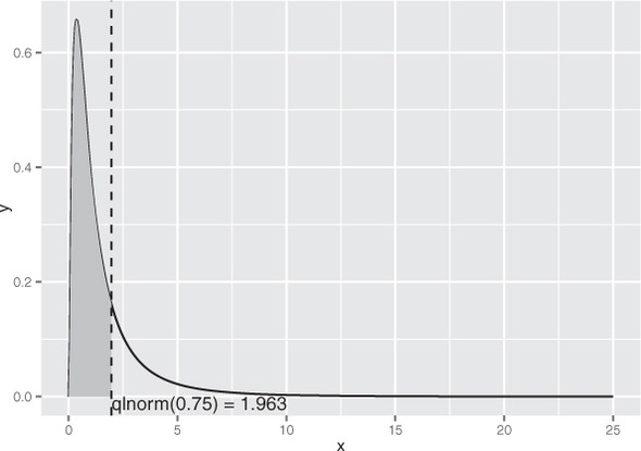
As you can see in figure B.5, the majority of the data is concentrated on the left side of the distribution, with the remaining quarter of the data spread out over a very long tail.
Figure B.5. The 75th percentile of the lognormal distribution with meanlog=1, sdlog=0
B.1.4. Binomial distribution
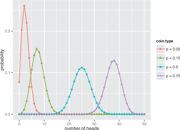
Suppose that you have a coin that has a probability p of landing on heads when you flip it (so for a fair coin, p = 0.5). In this case, the binomial distribution models the probability of observing k heads when you flip that coin N times. It’s used to model binary classification problems (as we discuss in relation to logistic regression in chapter 7), where the positive examples can be considered “heads.”
Figure B.6 shows the shape of the binomial distribution for coins of different fairnesses, when flipped 50 times. Note that the binomial distribution is discrete; it’s only defined for (non-negative) integer values of k.
Figure B.6. The binomial distributions for 50 coin tosses, with coins of various fairnesses (probability of landing on heads)
Using the binomial distribution in R
Let’s look at the functions for working with the binomial distribution in R (see also section B.1.2). We’ll start with the PDF dbinom() and the random number generator rbinom():
- dbinom(k, nflips, p) is the distribution function (PDF) that returns the probability of observing exactly k heads from nflips of a coin with heads probability p.
- rbinom(N, nflips,p) is the random number generation function that returns N values drawn from the binomial distribution corresponding to nflips of a coin with heads probability p.
You can use dbinom() (as in the following listing) to produce figure B.6.
Listing B.7. Plotting the binomial distribution
library(ggplot2)
#
# use dbinom to produce the theoretical curves
#

numflips <- 50

# x is the number of heads that we see
x <- 0:numflips

# probability of heads for several different coins
p <- c(0.05, 0.15, 0.5, 0.75)
plabels <- paste("p =", p)

# calculate the probability of seeing x heads in numflips flips
# for all the coins. This probably isn't the most elegant
# way to do this, but at least it's easy to read

flips <- NULL
for(i in 1:length(p)) {
  coin <- p[i]
  label <- plabels[i]
  tmp <- data.frame(number.of.heads=x,
                   probability = dbinom(x, numflips, coin),
                   coin.type = label)
  flips <- rbind(flips, tmp)
}


# plot it
# this is the plot that leads this section
ggplot(flips, aes(x=number.of.heads, y=probability)) +
  geom_point(aes(color=coin.type, shape=coin.type)) +
  geom_line(aes(color=coin.type))
You can use rbinom() to simulate a coin-flipping-style experiment. For example, suppose you have a large population of students that’s 50% female. If students are assigned to classrooms at random, and you visit 100 classrooms with 20 students each, then how many girls might you expect to see in each classroom? A plausible outcome is shown in figure B.7, with the theoretical distribution superimposed.
Figure B.7. The observed distribution of the count of girls in 100 classrooms of size 20, when the population is 50% female. The theoretical distribution is shown with the dashed line.

Let’s write the code to produce figure B.7.
Listing B.8. Working with the theoretical binomial distribution

As you can see, even classrooms with as few as 4 or as many as 16 girls aren’t completely unheard of when students from this population are randomly assigned to classrooms. But if you observe too many such classrooms—or if you observe classes with fewer than 4 or more than 16 girls—you’d want to investigate whether student selection for those classes is biased in some way.
You can also use rbinom() to simulate flipping a single coin.
Listing B.9. Simulating a binomial distribution
# use rbinom to simulate flipping a coin of probability p N times

p75 <- 0.75 # a very unfair coin (mostly heads)
N <- 1000  # flip it several times
flips_v1 <- rbinom(N, 1, p75)

# Another way to generat unfair flips is to use runif:
# the probability that a uniform random number from [0 1)
# is less than p is exactly p. So "less than p" is "heads".
flips_v2 <- as.numeric(runif(N) < p75)

prettyprint_flips <- function(flips) {
  outcome <- ifelse(flips==1, "heads", "tails")
  table(outcome)
}

prettyprint_flips(flips_v1)
# outcome
# heads tails
# 756   244
prettyprint_flips(flips_v2)
# outcome
# heads tails
# 743   257
The final two functions are the CDF pbinom() and the quantile function qbinom():
- pbinom(k, nflips, p) is the cumulative distribution function (CDF) that returns the probability of observing k heads or fewer from nflips of a coin with heads probability p. pbinom(k, nflips, p, lower.tail=F) returns the probability of observing more than k heads from nflips of a coin with heads probability p. Note that the left tail probability is calculated over the inclusive interval numheads <= k, while the right tail probability is calculated over the exclusive interval numheads > k.
- qbinom(q, nflips, p) is the quantile function that returns the number of heads k that corresponds to the qth percentile of the binomial distribution corresponding to nflips of a coin with heads probability p.
The next listing shows some examples of using pbinom() and qbinom().
Listing B.10. Working with the binomial distribution
# pbinom example

nflips <- 100
nheads <- c(25, 45, 50, 60)  # number of heads

# what are the probabilities of observing at most that
# number of heads on a fair coin?
left.tail <- pbinom(nheads, nflips, 0.5)
sprintf("%2.2f", left.tail)
# [1] "0.00" "0.18" "0.54" "0.98"

# the probabilities of observing more than that
# number of heads on a fair coin?
right.tail <- pbinom(nheads, nflips, 0.5, lower.tail=F)
sprintf("%2.2f", right.tail)

# [1] "1.00" "0.82" "0.46" "0.02"

# as expected:
left.tail+right.tail
#  [1] 1 1 1 1

# so if you flip a fair coin 100 times,
# you are guaranteed to see more than 10 heads,
# almost guaranteed to see fewer than 60, and
# probably more than 45.

# qbinom example

nflips <- 100

# what's the 95% "central" interval of heads that you
# would expect to observe on 100 flips of a fair coin?

left.edge <- qbinom(0.025, nflips, 0.5)
right.edge <- qbinom(0.025, nflips, 0.5, lower.tail=F)
c(left.edge, right.edge)
# [1] 40 60

# so with 95% probability you should see between 40 and 60 heads
One thing to keep in mind is that because the binomial distribution is discrete, pbinom() and qbinom() won’t be perfect inverses of each other, as is the case with continuous distributions like the normal.
Listing B.11. Working with the binomial CDF
# because this is a discrete probability distribution,
# pbinom and qbinom are not exact inverses of each other

# this direction works
pbinom(45, nflips, 0.5)
# [1] 0.1841008
qbinom(0.1841008, nflips, 0.5)
# [1] 45

# this direction won't be exact
qbinom(0.75, nflips, 0.5)
# [1] 53
pbinom(53, nflips, 0.5)
# [1] 0.7579408
B.1.5. More R tools for distributions
R has many more tools for working with distributions beyond the PDF, CDF, and generation tools we’ve demonstrated. In particular, for fitting distributions, you may want to try the fitdistr method from the MASS package.
B.2. Statistical theory
In this book, we necessarily concentrate on (correctly) processing data, without stopping to explain a lot of the theory. The steps we use will be more obvious after we review a bit of statistical theory in this section.
B.2.1. Statistical philosophy
The predictive tools and machine learning methods we demonstrate in this book get their predictive power not from uncovering cause and effect (which would be a great thing to do), but by tracking and trying to eliminate differences in data and by reducing different sources of error. In this section, we’ll outline a few of the key concepts that describe what’s going on and why these techniques work.
Exchangeability
Since basic statistical modeling isn’t enough to reliably attribute predictions to true causes, we’ve been quietly relying on a concept called exchangeability to ensure we can build useful predictive models.
The formal definition of exchangeability is this: if all the data in the world is x[i,],y[i] (i=1,...m), we call the data exchangeable if for any permutation j_1,...j_m of 1,...m, the joint probability of seeing x[i,],y[i] is equal to the joint probability of seeing x[j_i,],y[j_i]. The idea is that if all permutations of the data are equally likely, then when we draw subsets from the data using only indices (not snooping the x[i,],y[i]), the data in each subset, though different, can be considered as independent and identically distributed. We rely on this when we make train/test splits (or even train/calibrate/test splits), and we hope (and should take steps to ensure) this is true between our training data and future data we’ll encounter in production.
Our hope in building a model is that the unknown future data the model will be applied to is exchangeable with our training data. If this is the case, then we’d expect good performance on training data to translate into good model performance in production. It’s important to defend exchangeability from problems such as overfit and concept drift.
Once we start examining training data, we (unfortunately) break its exchangeability with future data. Subsets that contain a lot of training data are no longer indistinguishable from subsets that don’t have training data (through the simple process of memorizing all of our training data). We attempt to measure the degree of damage by measuring performance on held-out test data. This is why generalization error is so important. Any data not looked at during model construction should be as exchangeable with future data as it ever was, so measuring performance on held-out data helps anticipate future performance. This is also why you don’t use test data for calibration (instead, you should further split your training data to do this); once you look at your test data, it’s less exchangeable with what will be seen in production in the future.
Another potential huge loss of exchangeability in prediction is summarized is what’s called Goodhart’s law: “When a measure becomes a target, it ceases to be a good measure.” The point is this: factors that merely correlate with a prediction are good predictors ... until you go too far in optimizing for them or when others react to your use of them. For example, email spammers can try to defeat a spam detection system by using more of the features and phrases that correlate highly with legitimate email, and changing phrases that the spam filter believes correlate highly with spam. This is an essential difference between actual causes (which do have an effect on outcome when altered) and mere correlations (which may be co-occurring with an outcome and are good predictors only through exchangeability of examples).
Bias variance decomposition
Many of the modeling tasks in this book are what are called regressions where, for data of the form y[i],x[i,], we try to find a model or function f() such that f(x[i,])~E[y[j]|x[j,]~x[i,]] (the expectation E[] being taken over all examples, where x[j,] is considered very close to x[i,]). Often this is done by picking f() to minimize E[(y[i]-f(x[i,]))^2].[1] Notable methods that fit closely to this formulation include regression, KNN, and neural nets.
1 The fact that minimizing the squared error gets expected values right is an important fact that gets used in method design again and again.
Obviously, minimizing square error is not always your direct modeling goal. But when you work in terms of square error, you have an explicit decomposition of error into meaningful components called the bias/variance decomposition (see The Elements of Statistical Learning, Second Edition, by T. Hastie, R. Tibshirani, and J. Friedman, Springer, 2009). The bias/variance decomposition says this:
E[(y[i]-f(x[i,]))^2] = bias^2 + variance + irreducibleError
Model bias is the portion of the error that your chosen modeling technique will never get right, often because some aspect of the true process isn’t expressible within the assumptions of the chosen model. For example, if the relationship between the outcome and the input variables is curved or nonlinear, you can’t fully model it with linear regression, which only considers linear relationships. You can often reduce bias by moving to more complicated modeling ideas: kernelizing, GAMs, adding interactions, and so on. Many modeling methods can increase model complexity (to try to reduce bias) on their own, for example, decision trees, KNN, support vector machines, and neural nets. But until you have a lot of data, increasing model complexity has a good chance of increasing model variance.
Model variance is the portion of the error that your modeling technique gets wrong due to incidental relations in the data. The idea is this: a retraining of the model on new data might make different errors (this is how variance differs from bias). An example would be running KNN with k=1. When you do this, each test example is scored by matching to a single nearest training example. If that example happened to be positive, your classification will be positive. This is one reason we tend to run KNN with a larger k: it gives us the chance to get more reliable estimates of the nature of neighborhood (by including more examples) at the expense of making neighborhoods a bit less local or specific. More data and averaging ideas (like bagging) greatly reduce model variance.
Irreducible error is the truly unmodelable portion of the problem (given the current variables). If we have i,j such that x[i,]=x[j,], then (y[i]-y[j])^2 contributes to the irreducible error. What we’ve been calling a Bayes rate or error rate of a saturated model is an ideal model with no bias or variance term: its only source of error is the irreducible error. Again, we emphasize that irreducible error is measured with respect to a given set of variables; add more variables, and you have a new situation that may have its own lower irreducible error.
The point is that you can always think of modeling error as coming from three sources: bias, variance, and irreducible error. When you’re trying to increase model performance, you can choose what to try based on which of these you are trying to reduce.
Under fairly mild assumptions, averaging reduces variance. For example, for data with identically distributed independent values, the variance of averages of groups of size n has a variance of 1/n of the variance of individual values. This is one of the reasons why you can build models that accurately forecast population or group rates even when predicting individual events is difficult. So although it may be easy to forecast the number of murders per year in San Francisco, you can’t predict who will be killed. In addition to shrinking variances, averaging also reshapes distributions to look more and more like the normal distribution (this is the central limit theorem and related to the law of large numbers).
Statistical efficiency
The efficiency of an unbiased statistical procedure is defined as how much variance is in the procedure for a given dataset size. More efficient procedures require less data to get below a given amount of variance. This differs from computational efficiency, which is about how much work is needed to produce an estimate.
When you have a lot of data, statistical efficiency becomes less critical (which is why we haven’t emphasized it in this book). But when it’s expensive to produce more data (such as in drug trials), statistical efficiency is your primary concern. In this book, we take the approach that we usually have a lot of data, so we can prefer general methods that are somewhat statistically inefficient (such as using a test holdout set, using cross-validation for calibration, and so on) to more specialized statistically efficient methods (such as specific ready-made parametric tests like the Wald test and others).
Remember: it’s a luxury, not a right, to ignore statistical efficiency. If your project has such a need, you’ll want to consult with expert statisticians to get the advantages of best practices.
B.2.2. A/B tests
Hard statistical problems usually arise from poor experimental design. This section describes a simple, good statistical design philosophy called A/B testing that has very simple theory. The ideal experiment is one where you have two groups—control (A) and treatment (B)—and the following holds:
- Each group is big enough that you get a reliable measurement (this drives significance).
- Each group is (up to a single factor) distributed exactly like populations you expect in the future (this drives relevance). In particular, both samples are run in parallel at the same time.
- The two groups differ only with respect to the single factor you’re trying to test.
A common way to set up such an ideal test situation is called an A/B test. In an A/B test, a new idea, treatment, or improvement is proposed and then tested for effect. A common example is a proposed change to a retail website that it is hoped will improve the rate of conversion from browsers to purchasers. Usually the treatment group is called B and an untreated or control group is called A. As a reference, we recommend “Practical Guide to Controlled Experiments on the Web” (R. Kohavi, R. Henne, and D. Sommerfield, KDD, 2007).
Setting up A/B tests
Some care must be taken in running an A/B test. It’s important that the A and B groups be run at the same time. This helps defend the test from any potential confounding effects that might be driving their own changes in conversion rate (hourly effects, source-of-traffic effects, day-of-week effects, and so on). Also, you need to know that differences you’re measuring are in fact due to the change you’re proposing and not due to differences in the control and test infrastructures. To control for infrastructure, you should run a few A/A tests (tests where you run the same experiment in both A and B).
Randomization is the key tool in designing A/B tests. But the split into A and B needs to be made in a sensible manner. For example, for user testing, you don’t want to split raw clicks from the same user session into A/B because then A/B would both have clicks from users that may have seen either treatment site. Instead, you’d maintain per-user records and assign users permanently to either the A or the B group when they arrive. One trick to avoid a lot of record-keeping between different servers is to compute a hash of the user information and assign a user to A or B depending on whether the hash comes out even or odd (thus all servers make the same decision without having to communicate).
Evaluating A/B tests
The key measurements in an A/B test are the size of effect measured and the significance of the measurement. The natural alternative (or null hypothesis) to B being a good treatment is that B makes no difference, or B even makes things worse. Unfortunately, a typical failed A/B test often doesn’t look like certain defeat. It usually looks like the positive effect you’re looking for is there and you just need a slightly larger follow-up sample size to achieve significance. Because of issues like this, it’s critical to reason through acceptance/rejection conditions before running tests.
Let’s work an example A/B test. Suppose we’ve run an A/B test about conversion rate and collected the following data.
Listing B.12. Building simulated A/B test data

Once we have the data, we summarize it into the essential counts using a data structure called a contingency table.[2]
2 The confusion matrices we used in section 5.2.1 are also examples of contingency tables.
Listing B.13. Summarizing the A/B test into a contingency table
tab <- table(d)
print(tab)
     converted
group     0     1
    A 94979  5021
    B  9398   602
The contingency table is what statisticians call a sufficient statistic: it contains all we need to know about the experiment. We can print the observed conversion rates of the A and B groups.
Listing B.14. Calculating the observed A and B rates
aConversionRate <- tab['A','1']/sum(tab['A',])
print(aConversionRate)
## [1] 0.05021
bConversionRate <- tab['B','1']/sum(tab['B',])
print(bConversionRate)
## [1] 0.0602
commonRate <- sum(tab[,'1'])/sum(tab)
print(commonRate)
## [1] 0.05111818
We see that the A group was measured at near 5% and the B group was measured near 6%. What we want to know is this: can we trust this difference? Could such a difference be likely for this sample size due to mere chance and measurement noise? We need to calculate a significance to see if we ran a large enough experiment (obviously, we’d want to design an experiment that was large enough, what we call test power, which we’ll discuss in section B.2.3). What follows are a few good tests that are quick to run.
Fisher’s test for independence
The first test we can run is Fisher’s contingency table test. In the Fisher test, the null hypothesis that we’re hoping to reject is that conversion is independent of group, or that the A and B groups are exactly identical. The Fisher test gives a probability of seeing an independent dataset (A=B) show a departure from independence as large as what we observed. We run the test as shown in the next listing.
Listing B.15. Calculating the significance of the observed difference in rates
fisher.test(tab)

    Fisher's Exact Test for Count Data

data:  tab
p-value = 2.469e-05
alternative hypothesis: true odds ratio is not equal to 1
95 percent confidence interval:
 1.108716 1.322464
sample estimates:
odds ratio
  1.211706
This is a great result. The p-value (which in this case is the probability of observing a difference this large if we in fact had A=B) is 2.469e-05, which is very small. This is considered a significant result. The other thing to look for is the odds ratio: the practical importance of the claimed effect (sometimes also called clinical significance, which is not a statistical significance). An odds ratio of 1.2 says that we’re measuring a 20% relative improvement in conversion rate between the A and B groups. Whether you consider this large or small (typically, 20% is considered large) is an important business question.
Frequentist significance test
Another way to estimate significance is to again temporarily assume that A and B come from an identical distribution with a common conversion rate, and see how likely it would be that the B group scores as high as it did by mere chance. If we consider a binomial distribution centered at the common conversion rate, we’d like to see that there’s not a lot of probability mass for conversion rates at or above B’s level. This would mean the observed difference is unlikely if A=B. We’ll work through the calculation in the following listing.
Listing B.16. Computing frequentist significance

This is again a great result. The calculated probability is small, meaning such a difference is hard to achieve by chance if A=B.
Bayesian posterior estimate
We can also find a Bayesian posterior estimate of what the B conversion rate is. To do this, we need to supply priors (in this case, centered around the common rate) and plot the posterior distribution for the B conversion rate. In a Bayesian analysis, the priors are supposed to be our guess at the distribution of the B conversion rate before looking at any data, so we pick something uninformative like the A conversion rate or some diffuse distribution. The posterior estimate is our estimate of the complete distribution of the B conversion rate after we’ve looked at the data. In a Bayesian analysis, uncertainty is measured as distributions of what we’re trying to predict (as opposed to the more common frequentist analysis where uncertainty is modeled as noise or variations in alternate samples and measurements). For all this complexity, there’s code that makes either analysis a one-line operation and it’s clear what we’re looking for in a good result. In a good result, we’d hope to see a posterior distribution centered around a high B rate that has little mass below the A rate.
The most common Bayesian analysis for binomial/Bernoulli experiments is to encode our priors and posteriors as a beta distribution and measure how much mass is in the left tail of the distribution, as shown in the next listing.
Listing B.17. Bayesian estimate of the posterior tail mass

And again we have an excellent result. The number 4.731817e-06 is called the posterior estimate of the probability of seeing a conversion rate no higher than the A rate given the observed B data. This number being small means we estimate the unknown true B rate to likely be larger than the A rate. We can plot the entire posterior distribution (shown in figure B.8) as shown in the following listing.
Figure B.8. Posterior distribution of the B conversion rate. The dashed line is the A conversion rate.
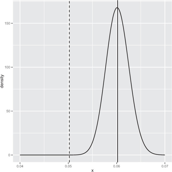
Listing B.18. Plotting the posterior distribution of the B group
library('ggplot2')
plt <- data.frame(x=seq(from=0.04,to=0.07,length.out=301))

plt$density <- dbeta(plt$x,
   shape1=commonRate+tab['B','1'],
   shape2=(1-commonRate)+tab['B','0'])
ggplot(dat=plt) +
   geom_line(aes(x=x,y=density)) +
   geom_vline(aes(xintercept=bConversionRate)) +
   geom_vline(aes(xintercept=aConversionRate),linetype=2)
B.2.3. Power of tests
To have significant A/B test results, you must first design and run good A/B tests. For our experiment design example, suppose you’re running a travel site that has 6,000 unique visitors per day and a 4% conversion rate from page views to purchase enquiries (your measurable goal).[3] You’d like to test a new design for the site to see if it increases your conversion rate. This is exactly the kind of problem A/B tests are made for! But we have one more question: how many users do we have to route to the new design to get a reliable measurement? How long will it take us to collect enough data?
3 We’re taking the 4% rate from http://mng.bz/7pT3.
When trying to determine sample size or experiment duration, the important concept is statistical test power. Statistical test power is the probability of rejecting the null hypothesis when the null hypothesis is false.[4] Think of statistical test power as 1 minus a p-value. The idea is this: you can’t pick out useful treatments if you can’t even identify which treatments are useless. So you want to design your tests to have test power near 1, which means p-values near 0.
4 See B. S. Everitt, The Cambridge Dictionary of Statistics, Second Edition, Cambridge University Press, 2010.
To design a test, you must specify the parameters in table B.1.
Table B.1. Test design parameters
|
Parameter |
Meaning |
Value for our example |
|---|---|---|
| confidence (or power) | This is how likely you want it to be that the test result is correct. We’ll write confidence = 1 - errorProb. | 0.95 (or 95% confident), or errorProb=0.05. |
| targetRate | This is the conversion rate you hope the B treatment achieves: the further away from the A rate, the better. | We hope the B treatment is at least 0.045 or a 4.5% conversion rate. |
| difference | This is how big an error in conversion rate estimate we can tolerate. | We’ll try to estimate the conversion rate to within plus/minus 0.4%, or 0.004, which is greater than the distance from our targetRate and our historical A conversion rate. |
So the B part of our experimental design is to find out how many customers we’d have to route to the B treatment to have a very good chance of seeing a B conversion rate in the range of 4.1–4.9% if the true B conversion rate were in fact 4.5%. This would be a useful experiment to run if we were trying to establish that the B conversion rate is in fact larger than the historic A conversion rate of 4%. In a complete experiment, we’d also work out how much traffic to send to the A group to get a reliable confirmation that the overall rate hasn’t drifted (that the new B effect is due to being in group B, not just due to things changing over time).
The formula in listing B.19 gives a rule of thumb yielding an estimate of needed experiment sizes. Such a rule of thumb is important to know because it’s simple enough that you can see how changes in requirements (rate we are assuming, difference in rates we are trying to detect, and confidence we require in the experiment) affect test size.
Listing B.19. Sample size estimate
estimate <- function(targetRate,difference,errorProb) {
    ceiling(-log(errorProb)*targetRate/(difference^2))
}

est <- estimate(0.045,0.004,0.05)
print(est)
## [1] 8426
We need about 8,426 visitors to have a 95% chance of observing a B conversion rate of at least 0.041 if the true unknown B conversion rate is at least 0.045. We’d also want to route a larger number of visitors to the A treatment to get a tight bound on the control conversion rate over the same period. The estimate is derived from what’s called a distribution tail bound and is specialized for small probabilities (which is usually the case with conversion rates; see http://mng.bz/Mj62).
More important than how the estimate is derived is what’s said by its form. Reducing the probability of error (or increasing experimental power) is cheap, as error probability enters the formula through a logarithm. Measuring small differences in performance is expensive; the reciprocal of difference enters the formula as a square. So it’s easy to design experiments that measure large performance differences with high confidence, but hard to design experiments that measure small performance differences with even moderate confidence. You should definitely not run A/B tests where the proposed improvements are very small and thus hard to measure (and also of low value).
R can easily calculate exact test power and propose test sizes without having to memorize any canned tables or test guides. All you have to do is model a precise question in terms of R’s distribution functions, as in the next listing.
Listing B.20. Exact binomial sample size calculation

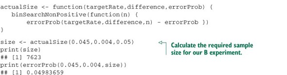
So it’s enough to route 7,623 visitors to the B treatment to expect a successful measurement. In running the experiment, it’s important to use the precise population size estimate given by R’s pbinom() distribution function. But for thinking and planning, it helps to have a simple expression in mind (such as the formula found in listing B.19).
We’ve discussed test power and significance under the assumption you’re running one large test. In practice, you may run multiple tests trying many treatments to see if any treatment delivers an improvement. This reduces your test power. If you run 20 treatments, each with a p-value goal of 0.05, you would expect one test to appear to show significant improvement, even if all 20 treatments are useless. Testing multiple treatments or even reinspecting the same treatment many times is a form of “venue shopping” (you keep asking at different venues until you get a ruling in your favor). Calculating the loss of test power is formally called “applying the Bonferroni correction” and is as simple as multiplying your significance estimates by your number of tests (remember, large values are bad for significances or p-values). To compensate for this loss of test power, you can run each of the underlying tests at a tighter p cutoff: p divided by the number of tests you intend to run.
B.2.4. Specialized statistical tests
Throughout this book, we concentrate on building predictive models and evaluating significance, either through the modeling tool’s built-in diagnostics or through empirical resampling (such as bootstrap tests or permutation tests). In statistics, there’s an efficient correct test for the significance of just about anything you commonly calculate. Choosing the right standard test gives you a good implementation of the test and access to literature that explains the context and implications of the test. Let’s work on calculating a simple correlation and finding the matching correct test.
We’ll work with a simple synthetic example that should remind you a bit of our PUMS Census work in chapter 7. Suppose we’ve measured both earned income (money earned in the form of salary) and capital gains (money received from investments) for 100 individuals. Further suppose that there’s no relation between the two for our individuals (in the real world, there’s a correlation, but we need to make sure our tools don’t report one even when there’s none). We’ll set up a simple dataset representing this situation with some lognormally distributed data.
Listing B.21. Building a synthetic uncorrelated income example

We claim the observed correlation of -0.01 is statistically indistinguishable from 0 (or no effect). This is something we should quantify. A little research tells us the common correlation is called the Pearson coefficient, and the significance test for a Pearson coefficient for normally distributed data is a Student t-test (with the number of degrees of freedom equal to the number of items minus 2). We know our data is not normally distributed (it is, in fact, lognormally distributed), so we’d research further and find the preferred solution is to compare the data by rank (instead of by value) and use a test like Spearman’s rho or Kendall’s tau. We’ll use Spearman’s rho, as it can track both positive and negative correlations (whereas Kendall’s tau tracks degree of agreement).
A fair question is, how do we know which is the exact right test to use? The answer is, by studying statistics. Be aware that there are a lot of tests, giving rise to books like 100 Statistical Tests: in R by N. D. Lewis (Heather Hills Press, 2013). We also suggest that if you know the name of a test, consult Everitt’s The Cambridge Dictionary of Statistics.
Another way to find the right test is using R’s help system. help(cor) tells us that cor() implements three different calculations (Pearson, Spearman, and Kendall) and that there’s a matching function called cor.test() that performs the appropriate significance test. Since we weren’t too far off the beaten path, we only need to read up on these three tests and settle on the one we’re interested in (in this case, Spearman). So let’s redo our correlation with the correct test and check the significance.
Listing B.22. Calculating the (non)significance of the observed correlation
with(d,cor(EarnedIncome,CapitalGains,method='spearman'))
# [1] 0.03083108
with(d,cor.test(EarnedIncome,CapitalGains,method='spearman'))
#
#       Spearman's rank correlation rho
#
#data:  EarnedIncome and CapitalGains
#S = 161512, p-value = 0.7604
#alternative hypothesis: true rho is not equal to 0
#sample estimates:
#       rho
#0.03083108
We see the Spearman correlation is 0.03 with a p-value of 0.7604, which means truly uncorrelated data would show a coefficient this large about 76% of the time. So there’s no significant effect (which is exactly how we designed our synthetic example).
B.3. Examples of the statistical view of data
Compared to statistics, machine learning and data science have an optimistic view of working with data. In data science, you quickly pounce on noncausal relations in the hope that they’ll hold up and help with future prediction. Much of statistics is about how data can lie to you and how such relations can mislead you. We only have space for a couple of examples, so we’ll concentrate on two of the most common issues: sampling bias and missing variable bias.
B.3.1. Sampling bias
Sampling bias is any process that systematically alters the distribution of observed data.[5] The data scientist must be aware of the possibility of sampling bias and be prepared to detect it and fix it. The most effective fix is to fix your data collection methodology.
5 We would have liked to use the common term “censored” for this issue, but in statistics the phrase censored observations is reserved for variables that have only been recorded up to a limit or bound. So it would be potentially confusing to try to use the term to describe missing observations.
For our sampling bias example, we’ll continue with the income example we started in section B.2.4. Suppose through some happenstance we were studying only a high-earning subset of our original population (perhaps we polled them at some exclusive event). The following listing shows how, when we restrict to a high-earning set, it appears that earned income and capital gains are strongly anticorrelated. We get a correlation of -0.86 (so think of the anticorrelation as explaining about (-0.86)^2 = 0.74 = 74% of the variance; see http://mng.bz/ndYf) and a p-value very near 0 (so it’s unlikely the unknown true correlation of more data produced in this manner is in fact 0). The following listing demonstrates the calculation.
Listing B.23. Misleading significance result from biased observations
veryHighIncome <- subset(d, EarnedIncome+CapitalGains>=500000)
print(with(veryHighIncome,cor.test(EarnedIncome,CapitalGains,
    method='spearman')))
#
#       Spearman's rank correlation rho
#
#data:  EarnedIncome and CapitalGains
#S = 1046, p-value < 2.2e-16
#alternative hypothesis: true rho is not equal to 0
#sample estimates:
#       rho
#-0.8678571
Some plots help show what’s going on. Figure B.9 shows the original dataset with the best linear relation line run through. Note that the line is nearly flat (indicating change in x doesn’t predict change in y).
Figure B.9. Earned income versus capital gains

Figure B.10 shows the best trend line run through the high income dataset. It also shows how cutting out the points below the line x+y=500000 leaves a smattering of rare high-value events arranged in a direction that crudely approximates the slope of our cut line (-0.8678571 being a crude approximation for -1). It’s also interesting to note that the bits we suppressed aren’t correlated among themselves, so the effect wasn’t a matter of suppressing a correlated group out of an uncorrelated cloud to get a negative correlation.
Figure B.10. Biased earned income versus capital gains

The code to produce figures B.9 and B.10 and calculate the correlation between suppressed points is shown in the following listing.
Listing B.24. Plotting biased view of income and capital gains

B.3.2. Omitted variable bias
Many data science clients expect data science to be a quick process, where every convenient variable is thrown in at once and a best possible result is quickly obtained. Statisticians are rightfully wary of such an approach due to various negative effects such as omitted variable bias, collinear variables, confounding variables, and nuisance variables. In this section, we’ll discuss one of the more general issues: omitted variable bias.
What is omitted variable bias?
In its simplest form, omitted variable bias occurs when a variable that isn’t included in the model is both correlated with what we’re trying to predict and correlated with a variable that’s included in our model. When this effect is strong, it causes problems, as the model-fitting procedure attempts to use the variables in the model to both directly predict the desired outcome and to stand in for the effects of the missing variable. This can introduce biases, create models that don’t quite make sense, and result in poor generalization performance.
The effect of omitted variable bias is easiest to see in a regression example, but it can affect any type of model.
An example of omitted variable bias
We’ve prepared a synthetic dataset called synth.RData (download from https://github.com/WinVector/zmPDSwR/tree/master/bioavailability) that has an omitted variable problem typical for a data science project. To start, please download synth.RData and load it into R, as the next listing shows.
Listing B.25. Summarizing our synthetic biological data

This loads synthetic data that’s supposed to represent a simplified view of the kind of data that might be collected over the history of a pharmaceutical ADME[6] or bioavailability project. RStudio’s View() spreadsheet is shown in figure B.11.
6 ADME stands for absorption, distribution, metabolism, excretion; it helps determine which molecules make it into the human body through ingestion and thus could even be viable candidates for orally delivered drugs.
Figure B.11. View of rows from the bioavailability dataset

The columns of this dataset are described in table B.2.
Table B.2. Bioavailability columns
|
Column |
Description |
|---|---|
| week | In this project, we suppose that a research group submits a new drug candidate molecule for assay each week. To keep things simple, we use the week number (in terms of weeks since the start of the project) as the identifier for the molecule and the data row. This is an optimization project, which means each proposed molecule is made using lessons learned from all of the previous molecules. This is typical of many projects, but it means the data rows aren’t mutually exchangeable (an important assumption that we often use to justify statistical and machine learning techniques). |
| Caco2A2BPapp | This is the first assay run (and the “cheap” one). The Caco2 test measures how fast the candidate molecule passes through a membrane of cells derived from a specific large intestine carcinoma (cancers are often used for tests, as noncancerous human cells usually can’t be cultured indefinitely). The Caco2 test is a stand-in or analogy test. The test is thought to simulate one layer of the small intestine that it’s morphologically similar to (though it lacks a number of forms and mechanisms found in the actual small intestine). Think of Caco2 as a cheap test to evaluate a factor that correlates with bioavailability (the actual goal of the project). |
| FractionHuman-Absorption | This is the second assay run and is what fraction of the drug candidate is absorbed by human test subjects. Obviously, these tests would be expensive to run and subject to a lot of safety protocols. For this example, optimizing absorption is the actual end goal of the project. |
We’ve constructed this synthetic data to represent a project that’s trying to optimize human absorption by working through small variations of a candidate drug molecule. At the start of the project, they have a molecule that’s highly optimized for the stand-in criteria Caco2 (which does correlate with human absorption), and through the history of the project, actual human absorption is greatly increased by altering factors that we’re not tracking in this simplistic model. During drug optimization, it’s common to have formerly dominant stand-in criteria revert to ostensibly less desirable values as other inputs start to dominate the outcome. So for our example project, the human absorption rate is rising (as the scientists successfully optimize for it) and the Caco2 rate is falling (as it started high and we’re no longer optimizing for it, even though it is a useful feature).
One of the advantages of using synthetic data for these problem examples is that we can design the data to have a given structure, and then we know the model is correct if it picks this up and incorrect if it misses it. In particular, this dataset was designed such that Caco2 is always a positive contribution to fraction of absorption throughout the entire dataset. This data was generated using a random non-increasing sequence of plausible Caco2 measurements and then generating fictional absorption numbers, as shown next (the data frame d is the published graph we base our synthetic example on). We produce our synthetic data that’s known to improve over time in the next listing.
Listing B.26. Building data that improves over time
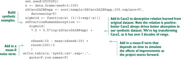
The design of this data is this: Caco2 always has a positive effect (identical to the source data we started with), but this gets hidden by the week factor (and Caco2 is negatively correlated with week, because week is increasing and Caco2 is sorted in decreasing order). Time is not a variable we at first wish to model (it isn’t something we usefully control), but analyses that omit time suffer from omitted variable bias. For the complete details, consult our GitHub example documentation (https://github.com/WinVector/zmPDSwR/tree/master/bioavailability).
A spoiled analysis
In some situations, the true relationship between Caco2 and FractionHuman-Absorption is hidden because the variable week is positively correlated with Fraction-HumanAbsorption (as the absorption is being improved over time) and negatively correlated with Caco2 (as Caco2 is falling over time). week is a stand-in variable for all the other molecular factors driving human absorption that we’re not recording or modeling. Listing B.27 shows what happens when we try to model the relation between Caco2 and FractionHumanAbsorption without using the week variable or any other factors.
Listing B.27. A bad model (due to omitted variable bias)
print(summary(glm(data=s,
   FractionHumanAbsorption~log(Caco2A2BPapp),
   family=binomial(link='logit'))))
## Warning: non-integer #successes in a binomial glm!
##
## Call:
## glm(formula = FractionHumanAbsorption ~ log(Caco2A2BPapp),
##    family = binomial(link = "logit"),
##     data = s)
##
## Deviance Residuals:
##    Min      1Q  Median      3Q     Max
## -0.609  -0.246  -0.118   0.202   0.557
##
## Coefficients:
##                   Estimate Std. Error z value Pr(>|z|)
## (Intercept)        -10.003      2.752   -3.64  0.00028 ***
## log(Caco2A2BPapp)   -0.969      0.257   -3.77  0.00016 ***
## ---
## Signif. codes:  0 '***' 0.001 '**' 0.01 '*' 0.05 '.' 0.1 ' ' 1
##
## (Dispersion parameter for binomial family taken to be 1)
##
##     Null deviance: 43.7821  on 99  degrees of freedom
## Residual deviance:  9.4621  on 98  degrees of freedom

## AIC: 64.7
##
## Number of Fisher Scoring iterations: 6
For details on how to read the glm() summary, please see section 7.2. Note that the sign of the Caco2 coefficient is negative, not what’s plausible or what we expected going in. This is because the Caco2 coefficient isn’t just recording the relation of Caco2 to FractionHumanAbsorption, but also having to record any relations that come through omitted correlated variables.
Working around omitted variable bias
There are a number of ways to deal with omitted variable bias, the best ways being better experimental design and more variables. Other methods include use of fixed-effects models and hierarchical models. We’ll demonstrate one of the simplest methods: adding in possibly important omitted variables. In the following listing, we redo the analysis with week included.
Listing B.28. A better model
print(summary(glm(data=s,
   FractionHumanAbsorption~week+log(Caco2A2BPapp),
   family=binomial(link='logit'))))
## Warning: non-integer #successes in a binomial glm!
##
## Call:
## glm(formula = FractionHumanAbsorption ~ week + log(Caco2A2BPapp),
##     family = binomial(link = "logit"), data = s)
##
## Deviance Residuals:
##     Min       1Q   Median       3Q      Max
## -0.3474  -0.0568  -0.0010   0.0709   0.3038
##
## Coefficients:
##                   Estimate Std. Error z value Pr(>|z|)
## (Intercept)         3.1413     4.6837    0.67   0.5024
## week                0.1033     0.0386    2.68   0.0074 **
## log(Caco2A2BPapp)   0.5689     0.5419    1.05   0.2938
## ---
## Signif. codes:  0 '***' 0.001 '**' 0.01 '*' 0.05 '.' 0.1 ' ' 1
##
## (Dispersion parameter for binomial family taken to be 1)
##
##     Null deviance: 43.7821  on 99  degrees of freedom
## Residual deviance:  1.2595  on 97  degrees of freedom
## AIC: 47.82
##
## Number of Fisher Scoring iterations: 6
We recovered decent estimates of both the Caco2 and week coefficients, but we didn’t achieve statistical significance on the effect of Caco2. Note that fixing omitted variable bias requires (even in our synthetic example) some domain knowledge to propose important omitted variables and the ability to measure the additional variables (and try to remove their impact through the use of an offset; see help('offset')).
At this point, you should have a more detailed intentional view of variables. There are, at the least, variables you can control (explanatory variables), important variables you can’t control (nuisance variables), and important variables you don’t know (omitted variables). Your knowledge of all of these variable types should affect your experimental design and your analysis.