Over the past six years, Dreamweaver has become the standard for building, maintaining, and working with websites. Known for its intuitive toolset, cross-platform–feature parity, and wide range of supported server technologies, Dreamweaver is to web publishing as InDesign is to print. Adobe’s acquisition of Dreamweaver strengthens the platform by combining it with the best graphics tools available.
Dreamweaver makes it simple to construct anything from a single web page to a site consisting of thousands of pages across hundreds of folders. It frees web developers from the drudgery of site management and allows them to concentrate on the creative aspects of site design and information presentation. For the “hardcore” developer that requires hands-on access to HTML, Dreamweaver provides code-level editing and validation that are second to none.
This chapter will cover everything you need to know to create websites in Dreamweaver. We’ll start by defining a new project, then work our way through adding design elements, media, and more!
Let’s get started. Opening Dreamweaver brings up the typical Quick Start welcome screen. Here you can create a new document, open a recently edited page or site, or create a new site from one of Adobe’s built-in templates. If you prefer to use this interface for getting to your files, feel free, but our focus will be on using the standard menu items to access functionality. In fact, if you never want to see the welcome screen again, just click the Don’t Show Again check box.
The New command is conveniently found in the File menu. Don’t let the simplicity of the single word new fool you, though, because Dreamweaver can create a host of document types—everything from XHTML pages with a variety of prebuilt layouts to plain old text (TXT) files. XML, CSS, SMIL, JavaScript, QuickTime, Perl, PHP, MMS, and other Web-related file formats are documents Dreamweaver can handle with ease. This chapter covers only the basic file types, but be aware that Dreamweaver has a depth and breadth beyond what is discussed here.
Also located in the File menu are the Open and Open Recent commands. The Open Recent submenu is especially helpful because it lists not only recently opened sites, but also individual HTML pages and other types of documents you might have opened recently. At the very bottom of the Open Recent submenu is the option Reopen on Startup, which reopens all of your recent files each time Dreamweaver starts up.
When you need to quickly work on a file or two, Dreamweaver can be used in a pinch just by opening the existing file using File, Open, or by creating a new file using methods we’ve just described. Working in this mode too much, however, can lead to problems.
The Web works by linking different pieces of content together. Imagine that you start by creating one page, add in a few images, and then add another page, linking them together. Do this a few more times and you’ve just created a website. Unfortunately, you’re stuck without being able to organize the content. If you move pages into a folder, the links will be lost and you’ll have a bunch of manual cleanup to do just to get things working again.
To get around this problem, Dreamweaver defines the notion of a site. A site is any collection of content that you want to use together on one or more web pages. When pages are created and managed within a site, Dreamweaver takes care of keeping your links intact for you. Move your files to a new folder? No problem—Dreamweaver makes sure your links change appropriately.
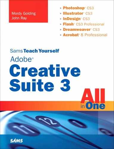
From your computer’s perspective, a site is simply a directory where all of the web files will be created. From the Site menu, choose Manage Sites. Figure 10.1 shows the Manage Sites dialog box.
By choosing Manage Sites rather than New Site, you open a simple manager for all of the sites that you set up on your system. Here you can create a new site, edit/duplicate existing site definitions, import or export sites, and, of course, remove sites. Click the New button and choose Site to start a new site definition.
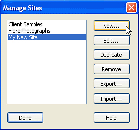
The process of defining a site walks you through a wizard that collects some information about your website. If you aren’t positive of something, you can always go back and edit it later, so don’t worry about it too much. Figure 10.2 shows step one of the Site Definition wizard.
First, decide what you want to name your site, and type it into the Site Name field. This is an arbitrary name that is only used to identify the site to you; it won’t show up on any of the web pages. You are also prompted for the URL of the site. If you don’t yet know, just leave it blank. Click Next to move on.
Dreamweaver now prompts you to see if you want to work with a server technology (to build dynamic database-driven pages). Because this is beyond the scope of this book, choose No, I Do Not Want to Use a Server Technology, and then click Next.
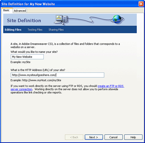
On the third screen of the Site Definition wizard, things get a bit complicated. Here you need to decide whether you’re going to be editing files directly on a connected server volume (a mapped network drive—never a good idea), or locally and then uploading them to a remote server. The local option is what you want, even if you aren’t ready to connect to a server. Click the Edit Copies Locally button, and then click the folder icon to choose where your site files will be saved. After making your choice, click Next, as shown in Figure 10.3.
Finally, Dreamweaver wants to know how it is going to connect to a remote server. Choose None, and then click Next.
Your site is now defined. Dreamweaver displays a summary of your settings. Just click Done and you’re ready to start building. Any new pages you create will be added to and managed within this site definition.
After you’ve saved one or more site definitions, you can view the contents of the site from the Files panel within the Files panel group, as seen in Figure 10.4. This presents a Windows Explorer–like view of the files that are currently available within your site. If you have multiple sites defined, switch between them quickly using the pop-up menu in the upper-left corner of the panel.

After your site is selected, you can double-click files to open them, drag them to move them, and so on. New files and folders can be created directly within the panel using the Files panel groups flyout menu (the upper right corner of the group panel) or by right-clicking in the file listing. It’s a convenient way to organize things without having to leave Dreamweaver.
The best thing about the Site Files view is that it is an “intelligent” means of managing your files. Unlike the file system on your computer, when you drag a file from one folder to another in your site, the Dreamweaver CS3 file manager understands that this move might have consequences. It automatically scans through your documents and makes sure that any links to or from the document being moved will still work. With these conveniences (and others you’ll learn about later), you’re likely to find that this panel quickly becomes one of your most frequently visited screens.
Unlike GoLive, Dreamweaver does not have an official site import feature, but it is still very easy to do. To import an existing site that is located on a remote server, you configure your site definition as you did earlier, but you specify the full details of the connection to your remote server in the Sharing Files area of the Site Definition dialog box.
When a site definition has a remote server attached, you can copy the files from the remote server into your local site definition using, you guessed it, the Files panel. We’ll look more closely at this in the “Transferring Files to and from Remote Sites” section later.
As you work with your CS3 suite, you’ll appreciate the similarity between the different applications. Dreamweaver, as you’ve seen, has a main window (where you’ll do your web page composition) as well as a number of different panel groups, each containing panels that provide additional features. Chances are, you aren’t going to use all of these all the time, but it’s good to get a sense for what there is, and where it is. Let’s explore the Dreamweaver CS3 workspace now.
To begin, let’s create a new blank document by clicking “Create New... HTML” from the Welcome window, or by choosing File, New, HTML from the menubar.
When you start Dreamweaver CS3, the largest area on your screen is the Document window. This is where you compose your web pages in the What You See Is What You Get (WYSIWYG) interface. As you build your page, you’ll immediately see the results of each change, just as it would appear in a web browser.
Three parts make up the Document window. The top of the window contains the toolbar, which holds shortcuts to many common commands and functions (you’ll learn about these as needed). If you open multiple documents in Dreamweaver, they’ll open in separate tabs also located along the top of the window (just like most popular web browsers). The middle is the content area, and the status bar is at the bottom.
The Document window is where you will do most of your web page editing. To add to your page layout, you can type directly into the Document window or use the Insert panel or Insert menu to add text, graphics, or links to the page. The flashing cursor in the Document window shows where the current insert point is located. You can move this point by clicking with your mouse or using the arrow keypad to move it around. Wherever the cursor is, that’s where your text or object will be inserted.
Anything that has been added to the Document window can easily be removed, cut, copied, or pasted—much like your standard word processing software. You can select text by clicking and dragging your cursor over the letters. To select an object such as an image, click it once. You can choose multiple items by moving the insertion point to the beginning of the group of objects you want to select, and then holding Shift and clicking where you want the selection to end. Single selected objects are designated by a darkened outline, whereas multiple objects are darkened completely.
After an object is selected, you can use the Copy, Cut, Paste, and Clear commands under the Edit menu to move, duplicate, or delete the selection. The Backspace key also works in a pinch to delete a selection. Two additional copy-and-paste methods are located in the Edit menu—Copy HTML and Paste HTML. These are rather counterintuitive operations that might not perform exactly how you’d expect. As you might know, HTML is the underlying language that forms web pages. Simple tags define the way a page looks when it is presented in a browser. Each tag usually has a start tag and an end tag to define what a particular style applies to.
For example, the bold tag is used to make text appear bold in your web browser. In the following sentence, the word bold is defined using HTML tags to appear in a bold typeface onscreen:
I like to emphasize words with <b>bold</b>.
The Copy HTML selection will copy the underlying HTML behind what you see onscreen. You can then paste the HTML into other applications. If you simply used the Copy command, you’d end up just pasting the text version of what you see onscreen.
Paste HTML works similarly with the Paste operation. If you’ve copied HTML code from another program, you can use the Paste HTML function to paste it into Dreamweaver with all the styles intact. The standard Paste operation would end up pasting the HTML code itself. A good rule of thumb is to use these special forms of Copy and Paste only when working with external programs; otherwise you might find the results confusing. The tags themselves will be pasted as part of the onscreen text, rather than being recognized as HTML.
Dreamweaver has provided several shortcuts that make selecting objects even easier. To select a line of text or an object, click in front of the object near the left window border. The cursor changes to an alternate arrow style to show that it is in the line-select mode. You can extend this technique to select multiple objects by clicking and dragging down the left border of the screen.
At the bottom of the Document window is the status bar. This provides a few simple controls for interacting with the document view.
The left side of the status bar contains a listing of the HTML tags surrounding the current cursor position. As you work with more complex web page designs, you’ll appreciate how quickly this can help you determine exactly where you are in the document.
Another component in the status bar is the current size of the Document window in pixels (width × height). As you’re almost certainly aware, websites often are designed without any attention paid to the size of the screen on which they will display. You can quickly set several preview sizes by clicking and holding on the display of the current window size in the status bar. A pop-up menu appears with a list of common preset sizes that you can choose, including the maximum window size for WebTV viewers.
On the far right of the status bar is an estimation of the page size and the time it will take to download. Most site developers target a particular class of user—dial-in/DSL/LAN browsers, and so on. Creating beautiful pages that take 10 minutes to download is not a good idea. The default speed that is used to estimate the download time is a 56kbps modem. You can adjust the speed in the Dreamweaver status bar preferences, accessed by pressing Command-U (Mac) or Control-U (Windows).
The final portion of your document area is the toolbar. Located directly above the Document window itself, the toolbar contains quick-click shortcuts for switching between HTML, split HTML/Design, Design, and several preview modes, as well as a very convenient way to set the title of the current document and validate that the document is made with correct HTML. You’ll learn more about these features later in the chapter.
Arguably, the most important of the myriad of Dreamweaver panel groups on your screen is the Insert group. This is a floating window that appears above your Document window. As you design pages, you’ll frequently refer to this panel, shown in Figure 10.5, and its toolbox of web elements.
Looking at the Insert panel, you’ll see several categories of elements that you can work with, represented by tabs. In its vertical orientation, the tabs are replaced by a single pop-up menu at the top of the panel. Using either the tabs or the pop-up menu, you can access these types of tools:
Common—. This is the most common of the design elements. This includes images, tables, embedded objects, and composite constructs such as navigation bars and image rollovers. This is the default palette shown.
Layout—. Tables, layers, and other elements for creating complex page layouts.
Forms—. Text fields, radio buttons, and everything you need to put together input forms.
Data—. When creating dynamic websites, this panel contains several tools for tying into databases and accessing other server-side features.
Spry—. Elements that use Adobe’s Ajax (JavaScript) features to create dynamic onscreen effects, such as collapsible lists, sorting tables, and so forth.
Text—. Common text formatting features, such as headings, paragraphs, and lists.
Favorites—. Right-clicking when Favorites is selected allows you to customize this panel with any of hundreds of available shortcuts, including those from any of the other Insert panels.
Each element that you add to a web page, be it image, text, or any other object, has properties that can change how it looks in a web browser. Text can be set to certain colors; images can be altered to different widths or heights. Rather than create a different configuration dialog box for each object that you can edit, a single panel, called the Properties panel, handles everything. Located under the document area, this panel is context sensitive. Whatever item is currently selected in your design can be configured through the Properties panel. As you switch from one element to another, the contents of the Properties panel update automatically. Try, for example, selecting some text that you’ve typed into your document design window. Figure 10.6 shows the properties for basic page text.
The Properties panel itself has a few different modes that can be activated depending on the level of detail with which you want to work. If you’re a beginner, you might want to view the Properties panel in the simple mode. To do this, collapse the window to its smallest size by clicking the up arrow in the lower-right corner of the window. If the arrow is pointing down, the window is already collapsed, and clicking the arrow toggles the window into expert mode, providing several additional options.
If you don’t have a perfect encyclopedic memory of HTML tags, you can access an extensive help system in the Properties panel—just click the Help icon located in the upper-right corner of the Properties panel. This launches the help system and displays information about the attributes you are editing. You’ll find this is an excellent way to get context-sensitive information about an object without resorting to a reference manual.
Another useful feature of the Properties panel is the Quick Tag Editor. Clicking the button directly below the Help button launches the Quick Tag Editor. The Quick Tag Editor simply brings up a pop-up window that contains the HTML for the tag being edited. You can change any of the HTML in the tag directly. Although this might not seem like a very big feature, sometimes you know exactly what you want to change on a tag, but you don’t want to search through the source code or deal with going through an interface to find it. The Quick Tag Editor gives you exactly what you want and doesn’t force you to use the point and click tools to make your changes.
The other panels used in the Dreamweaver CS3 environment are important, but will not be as heavily used as what we’ve seen to this point. To get a sense for what other tools are available, let’s review the panel groups and the panels they contain. Keep in mind that you can rearrange panels and panel groups. So if your system doesn’t match exactly, someone has probably been customizing things a bit. You can revert back to the default layout by choosing Window, Workspace Layout, Default from the menu.
Not all panel groups are visible initially. If you don’t see one of the groups listed here, look under the Window menu.
The Application panel group contains these tools:
Databases—. Databases provide the information used inside a dynamic site. The Databases panel is used to define and view databases connected to the current site.
Bindings—. Defines and edits connections to live data sources (for instance, databases).
Server Behaviors—. Also necessary for dynamic sites, Server Behaviors control how information is processed by the remote web server.
Components—. Used to add JavaBeans or web services to the application. This panel is mainly of use to advanced developers.
The Frames panel group contains this tool:
Frames—. If you’re creating a website that uses frames, you’ll probably want an easy way to control them. The Frames panel lets you select and modify individual frame attributes.
The Files panel group contains these tools:
Files—. The Files panel contains the tools you need to keep track of your website’s files and synchronize them with remote servers.
Map—. Although part of the Files panel, the Map is an entirely separate tool, accessed from the flyout menu. One of the hardest parts about maintaining a site is keeping track of how the pages connect and the paths that the users can take to reach different pieces of information. Dreamweaver can generate a map of your website for easy reference.
Assets—. Site assets are all the images, colors, and other objects in use on your site. You do not need to manually create the Assets panel—Dreamweaver will update it for you. The Assets panel is an excellent way to keep track of everything on your site.
Snippets—. The Snippets panel holds small code fragments that you can use with your site.
The Tag panel group contains these tools:
Attributes—. A hierarchical list of all the attributes that can be set for your HTML tags and styles.
Behaviors—. The Behaviors panel is used to add JavaScript actions to objects on a web page. The behaviors are generated automatically, without any need for knowledge of the JavaScript language.
The Timelines panel group contains this tool:
Timelines—. Through the use of JavaScript and layers, portions of a web page can be animated over time. The Timeline panel enables you to visually set the position of layers against time.
The CSS panel group contains these tools:
CSS Styles—. Cascading Style Sheets (CSS) are the World Wide Web Consortium (W3C) standard for controlling the look and feel of your website down to the pixel size of the font being used and the margins around your elements. This panel contains all the defined styles and allows you to edit and apply them.
AP Elements—. Lists and allows selection of any absolutely positioned (AP) elements. AP elements can exist on top of one another or even be entirely invisible. As such, it’s often difficult to find what you want to edit. The AP Elements panel shows you a list of all these items in one place.
The History panel group contains this tool:
History—. If you’ve used History to fix some boo-boos in Photoshop, you’ll recognize the History panel immediately. The History contains a list of all the changes you’ve made to the web document. You can immediately back up to any state that the document has been in since it was last saved. The history can hold between 2 and 99,999 steps, with the default being 50. You can reset this value in the General section of the Dreamweaver preferences (Command-U or Control-U).
The Results panel group contains these tools:
Search—. Conducts a search on the entire site, identifying the matched files in the panel.
Reference—. The Reference panel is an extremely detailed reference for CSS, HTML, and JavaScript. If you’re interested in the technology behind the code you create, everything you need to know is right here.
Validation—. Want to see how close your documents are to true HTML standards? Using the Validation panel, you can check for how well your document validates against popular web standards. Not many web pages are fully standards compliant, but it’s a good goal to have.
Browser Compatibility Check—. No matter how well your document follows web standards, it may still have problems in certain browsers. The browser compatibility check identifies potential problems before your site is launched.
Link Checker—. The link checker automatically scans your entire site for broken links. Any identified errors are found and presented for correction.
Site Reports—. Site Reports runs a series of tests on your website looking for problems, as well as identifying what editors are currently working on files.
FTP Log—. Need to check on FTP file transfers to and from your site? This panel might help your diagnose connection errors.
Don’t think the panel layout is ideal for your particular needs? No problem—you can rearrange everything in Dreamweaver CS3.
You can collapse panel groups into a single line or expand them to show the entire panel by using the disclosure arrow in front of the panel name. These groups are then listed as part of the complete panel collection, usually located down the right side of your screen. You can break the collection into smaller groups by clicking on the dotted drag handle in front of the group name and dragging the group out of the main collection. Dragging the group back to the main collection will add it back to the list.
If you want to take things even further, you can drag individual panels from one group to another to create new hybrid groups. Clicking the pop-up panel menu button at the top-right corner of each panel provides additional features for renaming groups, maximizing panels, closing group panels, and special functions for the frontmost panel.
To clean up your view quickly, you can deselect individual panels under the Window menu or use the View, Hide Panels (F4) command to hide all of them at once. If you’re more interested in arranging things neatly rather than hiding them, choose the Tile or Cascade options. Dreamweaver will attempt to arrange the floating windows as best it can.
You’re now ready to start creating and editing basic pages. To begin, make sure that you have a site created and selected.
To create a new page, choose New from the File menu. The Category selection allows you to choose between blank documents, templates, and stationary. You want to start with a Blank Page, so be sure that it is highlighted. Next, in the page type list, pick HTML. If you want to use a predefined page layout, select an option from the Layout column. Finally, click the Create button.
Your new document will open in the workspace. (You could also create a new file in the Files panel using the Files panel menu or contextual menu, as mentioned earlier.)
You should now have a blank HTML document open in your editor, waiting anxiously for content.
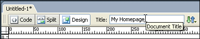
When you make a new page, Dreamweaver CS3 automatically puts the words Untitled Document in the Title field. This will appear at the top of the browser window when the page is viewed and will also be used as the default bookmark name should your visitors want to come back later.
Before adding anything to the body of your page, you’ll want to change these words to something that better indicates the content you expect to be in the page. Click the Title field at the top of the page to select the default title, and then simply type in the new title (see Figure 10.7).
With your title in place, you’re ready to begin building your page. You’ll have your choice of several editing views. Let’s take a look at the editing views and how they are used.
Not everyone approaches building a web page the same way. Some people have visual minds and like to work as they would in a page-layout application. Other folks prefer to hand-code their HTML. Fortunately, Dreamweaver has a set of tools to satisfy everyone.
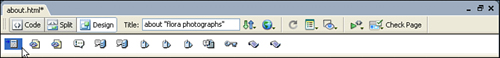
When editing HTML, you’ll notice three buttons in the upper-left corner of the editing area (Code, Split, and Design). Those buttons represent the various page-editing views (see Figure 10.8). Each mode has unique features, so you will probably find yourself using a combination of editing views as you become more experienced with the application.

There are several controls along the top of the editing window that you can make use of at any time regardless of the editing view that you are in. You’ve already seen the Title Editor; each of the other buttons hides a pop-up menu with several features. Let’s review these buttons now, from left to right:
File Management—. After you’ve configured your site definition with a server for deployment, you’ll be able to use these buttons to send the file you are working on to the remote server, fetch files from the server, and more. You can do all of this from the Files panel as well, but this button is a convenient shortcut.
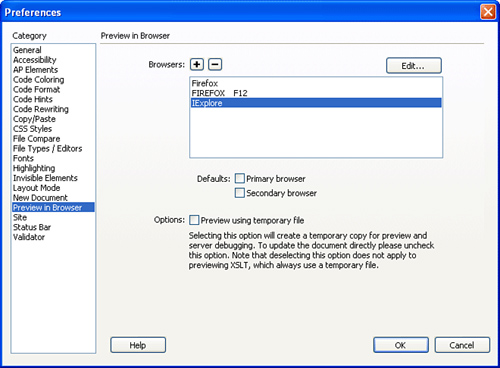
Preview/Debug in Browser—. Dreamweaver uses a real embedded web browser engine to display your documents in real-time as you create them, but obviously this is only one potential view and there are half a dozen browsers that you might want to check your creation in. The Preview button will allow you to view the current page in any browser on your system. If a browser is now already in the list, just click the button and choose Edit Browser List to easily edit the available browsers, as shown in Figure 10.9.
Refresh Design View (Design/Split)—. If you’ve made a change to the code that isn’t being reflected yet in the Design or Split views, click this button to force Dreamweaver to update the screen.
View Options—. The View Options button opens a menu that displays several settings that are specific to the view in which you are working. In Code view, for instance, this button can turn on and off line numbers and word wrap. In the Design view, it shows and hides tools such as rulers and grids.
Visual Aids (Design/Split)—. When working in one of the visual modes, these settings are used to activate the display of elements such as table borders and visual displays of width and height values—pieces of information that are helpful, but might be distracting when trying to view your designs onscreen.
Validate Markup—. Checks to see if the code in the document is valid according to the type of document you are creating (HTML, XHTML, ColdFusion, and so forth). If you’re only using the design tools, your documents should always validate because Dreamweaver will obey the appropriate standards. If you’re coding by hand, however, there might be errors introduced into the code. This is the tool that can help you find them.
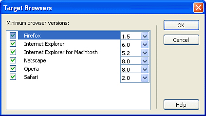
Check Page—. One of the most useful features of Dreamweaver CS3 is its capability to check your page against a variety of browsers to find common problems. Using the Settings command, which displays the Target Browsers dialog shown in Figure 10.10, you can configure the versions of the various browsers that will be tested.
Now that you know what the common controls are for, let’s review the different views available and the features specific to them.
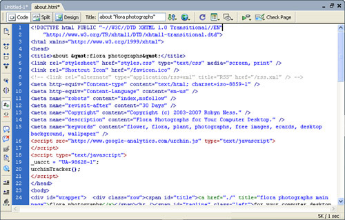
Code view is where the HTML code that makes up a page is visible. The code is fully editable, and changes made here are reflected in the other modes. Dreamweaver’s Source Code Editor is very powerful, with features such as code formatting, element collapsing, and code completion. If you’re in raw HTML, as seen in Figure 10.11, this is the place to be.
Down the left side of the window, you’ll find several tools specific to this mode:
Open Documents—. Choose which source code file you’re working on if you currently have several open.
Collapse Full Tag—. If you’ve spent time working with HTML, you’ll know that tags generally come in pairs. For example, a document’s title and page description can be found with the
<head>and</head>tags. Sometimes you don’t necessarily need everything in between the tags to be visible onscreen. By clicking inside a tag, such as<head>, and then activating this tool, it will collapse the tags into a single space-saving line.Collapse Selection—. Just like the Collapse Full Tag tool, this feature collapses multiple lines of text into a single line. This variation, however, collapses any group of lines you select, not just a pair of tags.
Expand All—. Expands all of the currently collapsed tags and selections so that all code is visible.
Select Parent Tag—. Selects the text between the parent tag of a given tag. The
<title></title>tags, for example, are children tags of the<head></head>tags. If you use this tool while your cursor is in the<title>tag, it automatically selects everything in the<head>tag set.Balance Braces—. Often, when programming or using CSS, you’ll need to use braces
{}to start and stop blocks of code. If you’re in the middle of a block of code and want to see everything enclosed within the pair of braces that you’re in, you can click the Balance Braces button to select all text within your current set of braces.Line Numbers—. Toggles line numbers on and off within the editor.
Highlight Invalid Code—. Toggles highlighting of bad code on and off. While useful, invalid code highlighting can be troublesome when you’re making edits and temporarily have code that registers as invalid.
Apply Comment—. Adds comment tags to a selected block of HTML code. Choose from HTML comments or comments specific to a programming language, such as ColdFusion Markup Language.
Remove Comment—. Removes the comment tags from the currently selected block of text.
Wrap Tag—. Wraps the currently selected block of text within a tag of your choosing.
Recent Snippets—. Access recently used snippets of code from your Snippets library.
Move or Convert CSS—. Moves a selected CSS block to an external stylesheet, or converts inline CSS into a block-style CSS rule.
Indent Code—. Indent a selected group of lines.
Outdent Code—. Outdent (the opposite of indenting) a selected group of lines.
Apply Source Formatting—. As much as we might like to think we write pretty code, few of us really do. The Apply Source Formatting feature automatically formats your code according to the hierarchy of HTML tags and rules of the programming language you’re using (if any).
One of the most useful features of the Code Editor is code completion. Code completion is one of those things that you won’t think you’ll need until you actually use it. The process is simple—just start typing a valid tag or function from a programming language, and a list of matching tags appears, as seen in Figure 10.12.

Use your cursor keys (or your mouse) to select the tag you want to enter, and then press Return. The tag is automatically completed for you.
A tool that works hand-in-hand with the Code Editor is the Attributes panel, found in the Tag panel group. This panel is context sensitive. Wherever your cursor is located, the panel will display all of the available attributes for the tags that affect your current position.
For example, if you place your cursor in the <body> tag (or within content directly located within the <body></body> tags), the Attributes panel will look similar to what is shown in Figure 10.13.
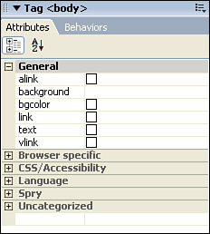
Here, the general attributes for the <body> tag are shown and can be edited by clicking in the column to the right of their name. For example, to set the bgcolor (background color) for the body tag, you’d click the box to the right of bgcolor. This will open a small color chooser window where you can pick the color you want.
Besides just showing general attributes, the panel can also be used to control attributes that are specific to certain browsers, set attributes that control CSS styles and accessibility features, and so on. Just click the + button to the right of each attribute group to show the potential options for the tag you are editing.
The second editing mode, Split view, gives you the ability to work directly with the code or with a visual representation of the page simultaneously. In this view, shown in Figure 10.14, the editing area is split into two parts. The upper half provides the same features as the Code Editor and can be used to directly enter and edit HTML or other programming information.
The lower portion of the view shows the live design layout. You can use Dreamweaver’s visual tools to create and edit content in this area. As you make changes in one area, they are immediately reflected in the other. This gives you an easy way to test out different styles and tags and see their effects without having to preview the page in your browser, or jump directly into a design-only view.
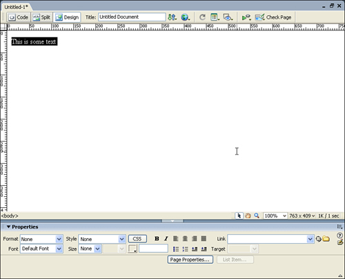
WYSIWYG web editors provide a visual process for designing pages rather than requiring the developer to write HTML syntax. The Design view is the purely visual mode that works like a page-layout program. You can drag images onto the page, type text, and use layout grids, tables, and layers to position elements just the way you like them, all without writing a line of HTML code. Figure 10.15 shows the Design view with rulers visible.
By default, the Design view has two view options active—rulers and guides. If you’ve used the other CS3 programs, you’re probably already familiar with what these are. The rulers provide a measurement in pixels, inches, or centimeters across and down the editor. The guides are horizontal or vertical markers that you can set up to help place content precisely within the design area.
To add a guide, just click and drag from within a ruler. For example, to add a guide at 250 pixels from the left side of the page, you’d place your cursor in the ruler at the left side of the editor (anywhere in the ruler area will do), and then click and drag into the design area. As you drag, a vertical line is drawn that extends through the editor. Simply continue dragging until it reaches the 250 pixel point, and then let go. The guide is invisible in the actual HTML page, but can be used to precisely align elements that you’re adding to the design.
Another helpful alignment tool that you might want to activate is the grid. To do this, use the View Options button at the top of the Design area. This button can be used to toggle any of the view elements on or off, should you find them distracting.
Another feature of the Design mode that can help you turn your web visions into reality is the tracing image. A tracing image is just what it sounds like—an image of what you want to create that can be placed in the design view for the purpose of tracing the layout into a working design.
To add a tracing image to the Design view, choose Modify, Page Properties. When the Page Properties dialog box appears, click Tracing Image. Your screen should now resemble Figure 10.16.
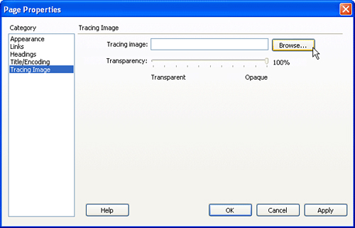
Click the Browse button to find and choose a graphics file to use as a tracing image, and then use the transparency slide to choose how opaque the image will appear in the design view. If you find the image too distracting or too faded, you can always re-open these settings and change the transparency at any time.
After the tracing image has been added, you can quickly turn it on and off using the View Options button, just as with the rulers, grid, and guides.
Although you can see the content, or body area, of your page design visually, there is a portion of your page that is important, yet hidden from view—the head.
The difference between these two areas is that the body portion is what loads into the browser window, whereas the head portion is used to give directions to the browser. The head section is where you put metatags, such as the keywords or description metatags that search engines use to index your site, links to external CSS and JavaScript pages, and more. A whole set of objects in the Common panel of the Insert group is devoted to the head portion of the page. You can select any head object to add it to the page, and then configure it using the Properties panel. But, if this is a purely visual design view, how do you see the head elements?
Once again, we turn to the View Options—this time, choosing Head Content. This makes a small bar visible across the top of the design area. Within the bar are icons representing different pieces of head content, such as the page title and content type. When one of these elements is selected, its properties are visible and editable within the Properties panel. Figure 10.17 shows the head content area visible with the Page Title icon selected.
This gives you complete access to the hidden portion of your web design without needing to access the source code!
Now that the page is created and you’ve seen your view options, let’s take a look at adding and editing some actual page content. We’re going to be working in the Design view, because the ability to work visually makes web design a much more fluid process.
The first thing to try is just adding some text into the design area. Click inside the editor and start typing. As you’d expect, the text you enter appears onscreen—this is exactly what your visitors are going to see in your browser. Because you’re presumably already familiar with using a text editor, we’ll skip the details on how to move the cursor around and copy and paste—this should all work just as you’d expect.
What you probably want to do, however, is start styling the text content that you enter. To do this, look no further than the Properties panel, shown in Figure 10.18.
The controls visible when entering text should seem familiar—fonts, text sizes, alignment, ordered and unordered list formats, indenting, outdenting, and colors. Almost all the tools you’d expect in a common word processor are available for your use.
To set the style for a specific piece of text, just select the text in the Design view, and then click to apply the styles. If no selection is made when you apply a style, whatever styles you choose will be used when you enter more content.
Let’s take a closer look at two of the Properties panel tools that might require a bit more explanation: Colors and Links.
If you’ve opened the color chooser in Dreamweaver (usually represented by a small square with a triangle in the lower-right corner), you’ll notice that it is very different from choosing a color in an application like Photoshop.
Initially, a web-safe color palette is displayed that enables you to pick a color from the 212 web-safe colors available. For more variety, however, you can choose alternative color options by clicking the pop-up menu arrow in the upper-right corner of the color palette when it is being displayed.
Two other options can also make life easier if you find yourself feeling too constrained by the web color palette: the eyedropper and the system color pickers.
To use the eyedropper, just click the color square—your cursor changes to an eyedropper. Wherever you move and click the eyedropper, that color will be selected. This enables you to choose a color from anywhere on the screen, including your desktop background. If, at any time, you want to return to the default color setting, click the default color icon (a square with a line through it) in the upper-right corner of the Color panel.
A more precise way of choosing colors is by using the system’s Color Pickers. Once again, open the web-safe palette and click the right-most icon in upper-right corner. This will bring up the Color Picker that is native to your system.
A link is a hot spot—usually a few underlined words—that, when clicked, takes viewers to a new page, or to a specific location on a long scrolling page.
Because there are a number of ways to create these links, let’s review a few that you might find useful.
The first method of adding a link is to position your cursor where it should appear, and then click the Hyperlink object in the Insert panel. You should see a dialog box similar to that shown in Figure 10.19.
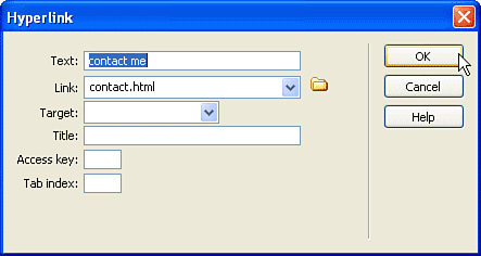
Use the Text field to set the text of the link that is displayed onscreen in the browser. Next, in the Link field, type the filename that should be displayed when the link is clicked. Alternatively, click the folder icon at the end of the field and choose a file directly from your site directory.
Leave the Target field empty, unless you want to open the link in a new window or a frame (which we’ll look at later in “Advanced Layout with Frames”). The remaining settings, as follows, are useful and can be defined however you’d like:
Title—. Link titles do not show up in the page itself, but appear as tooltips in many browsers.
Access Key—. This is a keyboard shortcut that can be used to access the link directly.
Tab Index—. Setting a tab index chooses the order in which the link will be highlighted when users press Tab to navigate the page.
When you’ve finished filling in the dialog box, click OK to create the link and add it to the web page.
Perhaps it’s just me, but this seems like an incredible hassle, just to add a link or two to a page. Luckily, as we hinted at earlier, Dreamweaver provides a myriad of other ways to link documents together...some of which are much faster.
The second way to create a link is by entering your link text directly into the Design view. After you’ve typed out what you want to be clickable, select the text with your cursor.
Next, using the Link field in the Properties panel, enter in the filename to link to and press Enter. Congratulations, you’ve just created another link!
For the third linking method, we’ll try something a bit more exciting. Again, enter and select a few words in the Design view. This time, however, instead of manually entering the file to link to, open and position your Files panel so that you can see the file you want to use with the link. Now look at the Properties panel. Just to the right of the Link field you should see a little crosshairs icon.
This is the Point-to-File icon, used to target a particular file. Click and hold on the crosshairs icon and drag to the file you want to link. As you drag, an arrow will be drawn from the crosshairs to the file in the Site window, as demonstrated in Figure 10.20. That’s it; you’ve just created a link by pointing to a file! Pretty nifty, huh?

There are actually even more ways to make links with Dreamweaver CS3. Using the Insert menu, or selecting the link-to-be-text and using the contextual menus, will also suffice. You can go back at any time and edit existing links through the Modify menu’s Change Link option, or, of course, by editing the Link field in the Properties window.
Now that you understand the basics of working with text content and the Properties panel, let’s take a look at another type of content you’ll want to add—images. Most websites, for better or worse, are graphics intensive, making use of images to convey information visually and to create compelling user interfaces.
To insert an image, make sure your cursor is located where you want the image to appear, and then click the Image button in the Common panel of the Insert panel group, or choose Image from the Insert menu. Next, select the image from your site directory, as shown in Figure 10.21.
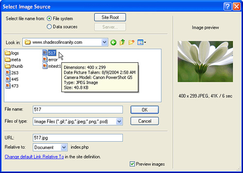
You’ll see a few options related to dynamic data when selecting the image from your drive. You can ignore these as they pertain to dynamic programming, which we won’t be getting into. One option you will want to take a look at is the Relative To: setting. This pop-up menu determines how Dreamweaver writes the links to the image. Usually you want to use the Relative to Document setting. This means that the links are created relative to one another. If an image is located two directories above the current document, the link in the document is set to look for an image two directories above it, no matter where you happen to store the file. Linking that is relative to the site root references the files based on the top of the website—moving the linked files anywhere else within the site breaks the link.
If you choose an image outside of your folder, Dreamweaver gives you the option of copying it into your site. You can also specify a URL to an image that is located remotely. Unfortunately, Dreamweaver only displays local images, so the design view might become a bit confusing if you link all your images into the site via remote URLs.
If you want to insert an image, but you don’t have one ready yet (waiting on the graphic designers again, huh?), you can insert a placeholder using the Image Placeholder object rather than an image. You can drag the handles (black squares) around the placeholder to size it in your document view. Later, you can assign an image file to the placeholder by selecting it and providing an image filename or URL in the Properties panel.
As with any HTML object that is inserted into a page, you can set certain attributes for an image. This is done by selecting the image in the Design view and then turning to our trusted friend, the Properties panel. As with the text content, there are a number of attributes that can be controlled for images. Figure 10.22 shows the image properties available in Dreamweaver CS3.
From left to right, these are the properties that can be set for images on your page:
Name—. Directly below the image size is a name that can be used to refer to it programmatically. This is typically used in JavaScript.
Width/Height—. The W and H fields set the width and height of the image as it will appear on the page.
Src—. The URL to the image that will be displayed.
Link—. If an image is to be used as a link, you can quickly add all the appropriate <a href> tags around it by just typing in the destination URL in this field.
Alt—. Alternative text to be displayed in case the image can’t be displayed or to be read aloud by browsers for the visually impaired. You should try to use alt attributes whenever possible.
Class—. The name of a style sheet class that should be applied, if any style sheets are defined.
V Space/H Space—. Set vertical and horizontal padding around the image.
Target—. The target window or frame to be set as the target if the image is being used as a link. This should usually be left blank.
Low Src—. Rarely used, this sets a URL to a low resolution (usually black and white) version of the image. This allows a version of the image to be displayed quickly, while the high-resolution version loads.
Border—. Sets a border around the image.
Justification—. The three justification alignment buttons in the lower-right of the Properties panel control where the image is placed in relation to the HTML text around it.
Align—. Determines where an image will lie in relation to objects that are next to it.
Using the Alignment properties to position text and graphics is beneficial when creating web pages that must be accessible to a variety of computers and browsers. If you are positioning text exactly (with tables or layers—something you’ll learn about later in “Advanced Layout with Tables”), you inevitably create pages that display poorly on low resolution screens or on displays that have different font settings. Using Alignment properties allows the images and text themselves to drive the display of the page. If text is too long, it will wrap around the image and fill the screen (or the parent object) as much as necessary.
If you don’t have complex image alignment requirements, allow the text to wrap around images on your pages. Any time you can design a page to take advantage of the cross-platform and cross-browser nature of HTML, it’s a good thing.
Linked images are common on the Web. When the user clicks a linked image, the browser loads the linked web page. With an image selected, you can add a hyperlink in a couple ways:
Type a URL into the Link box in the Properties panel.
Browse for the linked page by selecting the Browse icon beside the Link box.
Use the Point-to-File icon to link to a file. The Point-to-File icon enables you to simply drag the file over to the Files panel to create a link.
To enter a known URL as an image link, select an image on your web page and make sure the Properties panel is open. Enter a URL in the Link box underneath the Src box.
Notice that when you enter a URL in the Link box, the Border property automatically changes to 0. This is so that you do not have the hyperlink highlight as a border around the image. If you prefer to have a highlighted border, set the border to a value greater than 0. You can also set a border for an image that isn’t linked to anything. The border will then appear as a black box around the image.
After you save the web page, preview it in a browser. When you click the image that has the hyperlink, your browser should go to the hyperlinked page.
The Align pop-up menu in the Properties panel controls how objects that are located beside an image align with it. Align is very different from the text alignment settings you used previously. You use the text alignment settings to align an image in the center, to the left, or to the right of the screen. You use the Align pop-up menu to affect how other objects align with an image. In Figure 10.23, for instance, the image is aligned to the right of the text because Right is selected in the Align pop-up menu.

Change the Align setting of the image so that all the text appears to the left, beside the image. To do this, select Right from the Align pop-up menu in the Properties Panel. Why select Right? The image will be on the right. Remember that the Align options apply to the image but affect other elements within its vicinity. The alignment choices are described in Table 10.1.
Table 10.1. Image Alignment Options in the Properties Panel
Description | |
|---|---|
Default | Baseline-aligns the image, but this depends on the browser. |
Baseline | Aligns the bottom of the image with the bottom of the element. |
Top | Aligns the image with the highest element. Additional lines of text wrap beneath the image. |
Middle | Aligns the baseline of the text with the middle of the image. Additional lines of text wrap beneath the image. |
Bottom | Aligns the baseline of the text at the bottom of the image. |
TextTop | Aligns the image with the highest text (not the highest element, as with the Top option). Additional lines of text wrap beneath the image. |
Absolute Middle | Aligns the middle of the image with the middle of the text beside it. |
Absolute Bottom | Aligns the bottom of the highest element with the bottom of the image. |
Left | Aligns the image to the left of other elements. |
Right | Aligns the image to the right of other elements. |
To increase the distance between the image and other page elements, set the V Space and H Space. V stands for vertical and H stands for horizontal. To add space to the right and left of an image, put a value in the H Space text box. Horizontal space is added to both the right and the left of the image. Vertical space is added to both the top and the bottom of the image.
With Dreamweaver CS3, you can easily edit images that you’ve placed in your documents. Within the Edit section of the Properties panel, you’ll see six buttons that can be used to edit your images directly (sort of) in Dreamweaver. Changes you make with these tools are permanent, so be careful what you do!
These controls are
Edit—. Opens the selected image in Photoshop for editing (or in another application set in the File Types/Editors section of the Dreamweaver CS3 preferences).
Optimize—. Opens the selected image in the Dreamweaver optimization window.
Crop—. Lets you trim off unwanted portions of the image and saves the smaller file. This command works within Dreamweaver, enabling you to save the cropped image.
Resample—. This command becomes active after you’ve resized an image in Dreamweaver. It optimizes an image by adding or removing pixels in the image. This command works within Dreamweaver.
Brightness and Contrast—. Changes the brightness and contrast of an image to correct an image that is too bright or too dark. This command works within Dreamweaver.
Sharpen—. Sharpens a blurry image. This command works within Dreamweaver.
You can access all these image-editing commands from the Properties panel when you have an image selected. Make sure you have a backup copy of any images you modify because Dreamweaver changes the actual image file.
Although they aren’t as full featured as Illustrator or Photoshop, these controls enable you to perform common image-editing tasks without leaving the comfort of the web design app.
Dreamweaver CS3 makes it easy to implement rollover images by using the Rollover Image object. A rollover is an image that swaps to another image when the viewer’s cursor is over it. You need two image files with exactly the same dimensions to create a rollover.
To create a rollover image, follow these steps:
Place the insertion point where you want the rollover image to appear.
Select the Rollover Image object from the Common panel of the Insert panel group or select Insert, Image Objects, Rollover Image. The Insert Rollover Image dialog box appears.
Type a name for the image in the Image Name text field.
Select both the original image file and the rollover image file by clicking the Browse buttons next to those options and selecting the image files.
Check the Preload Rollover Image check box if you’d like the rollover image downloaded into the viewer’s browser cache when the page first loads. With a preloaded image, there is less chance that the viewer will have to wait for the rollover image to download when she moves the cursor over the image.
Add Alternate text that describes the image. This helps the visually-impaired to browse and understand your site.
Add a link to the rollover image by clicking the Browse button next to When Clicked, Go to URL or type in the external URL or named anchor.
The Insert Rollover Image dialog box should look as shown in Figure 10.24. Click the OK button.

What if you wanted to create a bunch of rollover images as a navigation bar? And what if you wanted each of them to have a down button state, too? You could create all these buttons individually, or you could use the Dreamweaver Insert Navigation Bar dialog box to create all the buttons at once.
You simulate a button by swapping images that are the same size but look slightly different. Each image represents a button state. The default button state is up. The down state appears when the user clicks the mouse on the button; the down state image usually modifies the up state image so that it looks pressed down. The over state appears when the user passes his mouse over the button. The navigation bar can also add an over when down state, which appears when the user rolls the mouse over the button when it is already in the down state. You must add an up state image to a navigation bar, but all the other button states are optional.
To create a navigation bar, follow these steps:
Select the Navigation Bar object from the Common panel or select Insert, Image Objects, Navigation Bar. The Insert Navigation Bar dialog box appears.
An initial, unnamed button element is visible. Change the element name to the name of your first button. (If you simply go to the next step, Dreamweaver will automatically give your button the same name as the name of the image file.)
Browse to load a button up image, a button over image, and a button down image. You can also enter an over while down image. All these images must be the same size.
Enter a hyperlink in the When Clicked, Go to URL box. Type in a URL or browse to a web page. The Target pop-up menu next to the URL box enables you to target a specific frame. You’ll explore frames later in “Advanced Layout with Frames.”
Check the Preload Images check box if you want the images to be automatically preloaded when the page first loads. Check the Show Down Image Initially check box if you want the button to appear pressed in at first.
Add additional buttons by clicking the plus button at the top of the dialog box and repeating steps 2–5. Rearrange the order of the buttons by using the arrow buttons at the top of the Insert Navigation Bar dialog box. To delete a button, click the minus button.
At the bottom of the Insert Navigation Bar dialog box, choose to insert the navigation bar either horizontally or vertically into the web page. Select the Use Tables check box if you’d like the navigation bar to be created in a table. (The section “Advanced Page Layout by Using Tables” explains how to use tables for layout.) The table layout occurs here for you automatically.
When you are finished adding buttons, click OK.
To test the buttons, save your file and preview it in a browser. If you’ve made a mistake, don’t fret! You can edit the navigation bar by selecting the Navigation Bar object again.
An image map is an image that has regions, called hotspots, defined as hyperlinks. When a viewer clicks a hotspot, it acts just like any other hyperlink. Instead of adding one hyperlink to an entire image, you can define a number of hotspots on different portions of an image. You can even create hotspots in different shapes.
Image maps are useful for presenting graphical menus that the viewer can click to select regions of a single image. For instance, you could create an image out of a picture of North America. You could draw hotspots around the different countries in North America. When the viewer clicked a country’s hotspot, she could jump to a web page with information on that country.
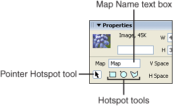
When an image is selected, you see four image map tools in the lower corner of the expanded Properties panel. These four tools are used to define image map hotspots. The arrow is the Pointer Hotspot tool, which is used to select or move the hotspots. There are three image map hotspot tools: One tool draws rectangles, one draws ovals, and one draws polygons.
To create an image map, follow these steps:
Insert an image into a web page. The image must be selected for the image map tools to appear in the Properties panel.
Give the map a name in the Map Name text box, as shown in Figure 10.25. The name needs to be unique from other map names in the page.
Select one of the hotspot tools. You’ll spend the next minutes exploring each of the hotspot tools in depth.
With a newly drawn hotspot selected, type a URL in the Link box, or click the Browse icon to browse to a local web page. You can also link a hotspot to a named anchor by entering a pound sign followed by the anchor name.
Enter alternative text for the hotspot in the Alt text box; some browsers display this text as a tooltip.
Optionally, select a window target from the Target pop-up menu in the Properties panel. Setting a target window will open a new browser window when the link is clicked. Most of the time, you probably won’t select a target.
You set all the image properties for an image map just as you would an ordinary image. You can set the vertical space, horizontal space, alt text, border, and alignment. If you copy and paste the image map into another web page, all the image map properties come along, too.
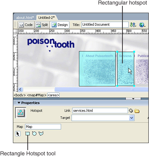
To add a rectangular hotspot to your image map, first select the Rectangle Hotspot tool. Click and drag the crosshair cursor to make a rectangle the dimensions of the hotspot you want to create. When you release the mouse, a highlighted box appears over the image, as in Figure 10.26. With the hotspot selected, enter a URL into the Link box in the Properties panel.
To move or adjust the size of the hotspot, you need to first select the Pointer Hotspot tool. You can’t use the other hotspot tools to adjust the hotspot, or you will end up creating another hotspot. Click the hotspot with the Pointer Hotspot tool and either move the hotspot to another location or resize the hotspot by using the resizing handles.
In the web page HTML, the rectangular hotspot is defined by two sets of x and y coordinates. The upper-left corner of the rectangle is recorded as the first two coordinates in the code and the lower-right corner of the rectangle is recorded as the last two coordinates. The coordinates are in pixels, and they are relative to the image, not to the web page.
A circular area might better define some areas in your image map than a rectangular one. You create a circular hotspot just as you create a rectangular one. Select the Oval Hotspot tool and then click and drag to create the hotspot—press Shift as you draw to make the hotspot a perfect circle. Reposition or resize the hotspot by using the Pointer Hotspot tool.
You can understand why you can have only a circle and not an ellipse when you see how the circular hotspot coordinates are defined. A circle is defined by three values: The circle’s radius and the x and y values that define the circle’s center.
Sometimes the area you’d like to turn into a hotspot just isn’t circular or rectangular. The Polygon Hotspot tool enables you to create any shape you want to define as an irregular hotspot.
You use the Polygon Hotspot tool a little differently than you use the Oval or Rectangle Hotspot tools. First, select the Polygon Hotspot tool from the Properties panel. Instead of clicking and dragging to create a shape, click once for every point in the polygon, as shown in Figure 10.27. You should move around the area you want to define as a hotspot in either a clockwise or counterclockwise manner; clicking randomly may create an odd polygon. When you are finished creating the points of the polygon, select the Pointer Hotspot tool to complete the polygon. You select the Pointer Hotspot tool to deselect the Polygon Hotspot tool so you don’t accidentally add stray points on the screen. Or you can double-click when you are finished drawing the polygon.
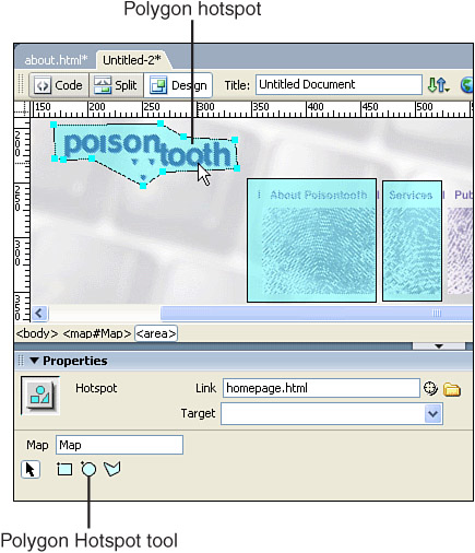
A polygon is defined by as many x and y coordinates, each representing one of the corner points, as you need to define the hotspot shape.
Dreamweaver has built-in alignment tools that you can use to align the hotspots in an image map. First, you need to select the hotspots you want to align. To select all the hotspots in an image map, use the keyboard shortcut Ctrl+A in Windows or Command+A on the Macintosh. Or you can hold down Shift as you click hotspots to add them to the selection. You can tell when hotspots are selected because you can see the resizing handles.
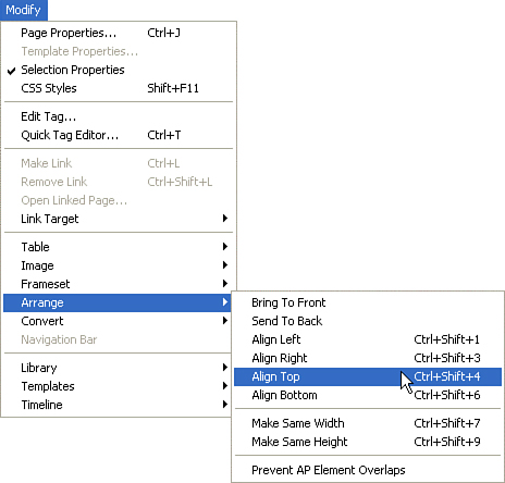
Sometimes it is difficult to finely align hotspots with your mouse. You can use the arrow keys to move a hotspot or multiple hotspots one pixel at a time. The Arrange submenu under the Modify menu contains commands to align hotspots, as shown in Figure 10.28. You can align multiple hotspots on the left, right, top, or bottom. You can make multiple hotspots the same height by using the Make Same Height command or the same width by using the Make Same Width command.
Hotspots can overlap each other. Whichever hotspot is on top (usually the one created first) will be the link triggered by clicking on the overlapping area. You can change the stacking order of hotspots by using the commands located in the Arrange submenu of the Modify menu. You might want to create overlapping hotspots on purpose as part of the design of an image map. For instance, you might use a circular hotspot over part of a rectangular hotspot. Alternatively, the overlapping might simply be a consequence of the limited shapes you have available to define the hotspots.
It’s difficult to tell which hotspot is on top of another hotspot. If you’ve recently created the image map, you know which hotspot was created first and is therefore on top. You can manipulate the stacking order of the hotspots by selecting Modify, Arrange, Bring to Front or Send to Back. If a hotspot overlaps another and needs to be on top, select the Bring to Front command.
Using the tools you’ve seen to this point, you can create web pages with styled text and images. Although these pieces make up most of the sites you’ll create (or visit!) you don’t have the tools you’ll need to create compelling layouts. There are three approaches we’ll look at for laying out information on the screen—tables, frames, and CSS layers.
Tables give web developers the ability to make page elements appear in a specific place onscreen. Dreamweaver enables you to work in Layout view so you can draw table elements directly onto the Document window. This makes it easy to create tables for page layout. Let’s start, however, with just adding a table and using it as you would in something like Microsoft Word.
To insert a table into your web page, follow these steps:
Place the insertion point in your web page where you want the table to be inserted.
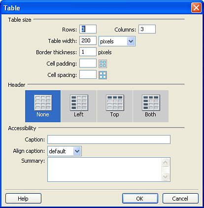
Select the Table button in the Common panel (Insert panel group) or choose Insert, Table. The Table dialog box appears, as shown in Figure 10.29.
Accept the default values or enter your own values into the Rows and Columns text boxes. By default, Dreamweaver creates a 3 by 3 table.
If you’d like a border to be drawn around the table, choose the number of pixels wide the border should be. For no border, enter 0.
Set the amount of space between the content contained in a cell and the border of the cell—the cell padding.
Use Cell Spacing to set the amount of space, horizontal and vertical, between two cells.
If you’d like to have headings for the columns or rows in your table, make the appropriate choice in the Header section of the Table dialog. The contents of header cells appear bold and centered by default.
Finally, configure your accessibility options. You can add a caption for a table that appears in the browser and is visible to everyone. You can set the alignment for the caption so that it appears above, below, to the left, or to the right of the table. You should always add a summary for your table. The summary is read by screen readers and helps the visually impaired user evaluate whether to progress through the table data or skip the information.
When you’re done setting values in this dialog box, click OK.
A table with the attributes you’ve specified is inserted into the document.
When you have your table structure determined, you can start adding text or images to the table. You can also fine-tune the structure as you work in Dreamweaver by using the Properties panel and selecting table cells or entire tables.
To enter content, click in a table cell, type, and then tab to the next cell. You can press Shift+Tab to move backward through the table cells. When you reach the rightmost cell in the bottom row, pressing Tab creates a new row.
To remove a row or column from a table, use the context menu that pops up when you right-click (Control+click on the Mac) a table cell. Right-click (Control+click on the Mac) a table cell and select Table; a submenu appears, with a number of commands to add and remove rows, columns, or both. Select one of these commands to make a change to the table.
Use the icons in the Layout panel of the Insert panel group to add rows either above or below the current row or to add columns to the left or the right of the current column. You can also add or remove rows and columns by editing the table properties in the Properties panel. Adjust the number of rows and columns in the Properties panel with an entire table selected to add or remove groups of cells.
You can change column width and row height by dragging the cell borders or by entering values in the Properties panel. If you prefer to “eyeball” the size, position the cursor over a cell border until the cursor turns into the double-line cursor. Drag the double-line cursor to change the column width or row height.
Use the W (width) and H (height) boxes in the Properties panel to give exact values to widths and heights. Values are expressed in either pixel or percentage values. A percentage value changes your table size as the size of the browser window changes, whereas a pixel value always displays the table at a constant size.
Just as you can change the size of cells, rows, and columns, you can change the size of an entire table. With the entire table selected, drag the resizing handles to make the table a different size. If you have not given width and height values to cells, rows, and columns, the cells distribute themselves proportionally when the entire table size is changed. Or use the W and H boxes in the Properties panel, with the entire table selected, to give the table either pixel or percentage size values.
When your table is selected, you’ll notice a gray bar appear below it. Within this bar are pop-up menus below each column, and a central pop-up menu in the middle. You can use these menus to quickly clear the width of a column, or of the entire table.
You can also clear the cell heights and clear the cell and convert all the values between pixels and percentages in the Properties panel, as seen in Figure 10.30.

You might want some rows or columns in your table to have fewer cells than other rows. For example, you might want the top row of a table to have a title that is centered over all the columns. How do you accomplish that?
You can increase or decrease the column span and row span by either splitting or merging cells. To merge an entire row so it appears as one cell, select the row and click the Merge button in the Properties panel or right-click anywhere on the row and select the Merge Cells command from the Table submenu of the context menu. Now the content of the entire row can be positioned over all the columns.
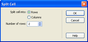
Use the Split Cell command to add additional rows or columns to a cell. The Split button is beside the Merge button in the Properties panel. Select the Split button or right-click (or Control+click) in the cell and select the Split Cell command from the Table submenu of the context menu, and the Split Cell dialog box appears, as shown in Figure 10.31. Enter the number of rows or columns you would like the cell to be split into and click OK. Now a single cell is split into multiple cells.
You can align the contents of a cell or a group of cells vertically—from top to bottom. The Vert pop-up menu in the Properties panel sets the vertical alignment for the contents of an individual cell or a group of cells.
Align the contents of a cell or a group of cells horizontally—from left to right—with the Horz pop-up menu.
There are several places you can add color to a table:
A background color for a table cell or group of cells
A background color for the entire table
A border color for a table cell or group of cells
A border color for the entire table
Figure 10.32 shows the different table colors in the Properties panel. Cell properties always have priority over the same properties in the table. For instance, if you applied blue as the table background color and then applied red to an individual cell, the one cell would be red and all the other cells would be blue. Set the table background and table border in the Properties panel. The Brdr Color setting determines the border color of the entire table.
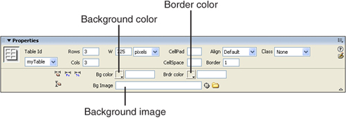
You can add a background image to a table cell or an entire table. Enter the URL for a background image in the box labeled Bg Image in the Properties panel. You can enter a pixel value in the Border text box to see a border; however, you don’t usually add borders to a layout table. If you add a border color and don’t see the border, you might have the border size set to zero. Set the cell background and cell border colors in the Properties panel with a cell or group of cells selected.
Traditionally, designing tables for page layout has been a complicated task. Making changes or creating the perfect number of cells has required web developers to combine various rows and columns to get pages to look the way they want them to. Dreamweaver includes Layout view, which enables you to easily draw, move, and edit table cells.
To turn on Layout view, select View, Table Mode, Layout Mode. When you turn on Layout view, two layout buttons on the Layout panel (Insert panel group) become active. One of these buttons, Draw Layout Table, draws a layout table; the other, Draw Layout Cell, draws an individual layout cell (a table cell). A layout table looks just like a regular HTML table in the web browser, but it looks slightly different in Dreamweaver. In Dreamweaver, you can manipulate layout tables and layout table cells by clicking and dragging them into position on the page.
Dreamweaver’s Layout view enables you to draw onto the Document window a design that will appear in table cells. You create areas for content, menus, and other elements of a web page by selecting the Draw Layout Cell command and drawing cells for each page element.
To create a layout, follow these steps:
Select the Layout Mode from the Table Mode options in the View menu.
Select the Draw Layout Cell button in the Layout panel of the Insert panel group.
Draw cells in the Document window for page elements, as shown in Figure 10.33. A layout table is automatically created to hold the layout cells.
Alternatively, you can draw the layout table first, and then draw cells within it.
After your design is onscreen, you can click the borders of the layout cells and use the handles to resize the layout.

To quickly select a cell to edit its properties, hold down Ctrl and click (Command+click on the Mac) within the cell. As shown in Figure 10.34, the Properties panel presents the Width, Height, Bg (background color), Horz (horizontal alignment), Vert (vertical alignment), and No Wrap properties. These properties are exactly the same table cell properties that you learned about earlier. There’s one additional property, Autostretch, which is unique to layout tables.

Autostretch enables a column to stretch to fill all the available space in the browser window. No matter what size the browser window is, the table will span the entire window. When you turn on Autostretch for a specific cell, all the cells in that column will be stretched. This setting is particularly useful for cells that contain the main content of the page. The menus can stay the same width, but the content can stretch to take up all the available space. Or you can place a stretched cell on the right side of a table and stretch the background colors over the width of the screen, no matter what the user’s resolution.
Dreamweaver automatically adds spacer images to table cells to make sure they remain the size that you intend in all browsers. The spacer image trick is an old trick used by web developers to ensure that table cells don’t collapse when viewed in certain browsers. A transparent one-pixel GIF is stretched to a specific width. This image is not visible in the browser. The GIF maintains the width of all the cells that are not in the autostretched column. If you do not add a spacer image, any columns without an image to hold their size might collapse.
To turn on Autostretch, follow these steps:
Select a cell by holding Ctrl while clicking the cell.
Select the Autostretch radio button in the Properties Panel. The Choose Spacer Image dialog box appears.
In the Choose Spacer Image dialog box, you have three choices:
Create a Spacer Image File—When you select this option, Dreamweaver creates an invisible one-pixel GIF image, adds it to the top cell of each column, and stretches it to the column width. Dreamweaver asks you where you’d like to store the
spacer.gifimage that Dreamweaver creates.Use an Existing Spacer Image File—If you’ve already created a spacer image, select this option. Dreamweaver asks you to navigate to where the image is stored.
Don’t Use Spacer Images for Autostretch Tables—If you select this option, Dreamweaver warns you that your cells may collapse and not maintain the widths you have set.
Love ‘em or hate ‘em, many people seem to have strong opinions about frames. Creating a web page with frames enables you to contain multiple web pages in a single browser window. The user can select a link in one frame that loads content into another existing frame, enabling the user to stay in the same browser window.
Frames consist of individual web pages—one for each frame—held together by a web page that contains the frameset. The frameset defines the size and position of the individual frames. You can either load an existing web page into a frame or create a new web page. The frameset is like the glue that holds all the frames together. The frameset web page isn’t visible to the user; the user sees only the content held in the frames defined by the frameset.
The quickest way to create frames in Dreamweaver is to use the prebuilt frames objects that are available in the Frames menu in the Layout panel of the Insert panel group. The Layout panel has several common frame configurations that can quickly get you going with a set of frames.
If one of these prebuilt configurations fits the way you want your frames to look, you’ll have a head start by using the frames objects. You can fine-tune the frame settings by using the methods we’ll look at shortly.
With a new web page open, add a frameset object by either clicking an icon from the Frames menu in the Layout panel of the Insert panel group or selecting Insert, HTML, Frames. The framesets in these frames templates all have the borders turned off and have default names set—we’ll look at how to change the frame names, borders, and default content in a second.
To create frames from scratch, use the Visual Aids menu in the Document window’s toolbar to turn on Frame Borders, or select View, Visual Aids, Frame Borders. Dreamweaver CS3 adds a set of borders surrounding the page. These borders don’t represent how the finished page will look in the browser.
To create frames, drag from the frame borders into your design—just like adding guidelines. After they are added, you can move these borders to resize your frames. When you are ready to turn them off, simply select View, Visual Aids, Frame Borders again to toggle the setting off.
Now you can immediately start entering content into the individual frame areas by clicking in them and using the design tools. What’s different from using a table, however, is that in the case of frames, the content for each frame comes from a separate HTML file. If you add a new set of frames and then start adding content, each frame saves as an individual HTML file.
Simply drag the frame borders in Dreamweaver to resize a frame. If you want finer control over the size of a frame, you can set frame sizes in the Properties panel while the frameset is selected, as shown in Figure 10.35. You can select the rows or columns in the frameset by clicking the small visual representation in the Properties panel. Often, the first frame has an absolute value (either pixel or percentage), whereas the second frame is defined as relative. When a frame is defined as relative, it takes up the remaining space either horizontally or vertically.

When you Alt+click (or Option+click on the Mac) within a frame, the properties for that frame are available in the Properties panel, as shown in Figure 10.36.

Here, you can choose the HTML file that will initially be displayed in the frame using the Src field.
This is also where you give each frame a unique name. It’s important that each frame have a name. This is not a filename; this is an actual name for a frame. The frame name is used to target the frame, making a web page load into the frame when a link is clicked in another frame. Click on each frame in the Frames panel and type a name in the Frame Name box in the Properties panel. You can name the top frame banner, the left frame toc (for table of contents), and the right frame main.
Each frame has its own scrolling attributes displayed in the Properties panel when a frame is selected in the Frames panel. There are four settings in the Scroll pop-up menu of the Properties panel.
Yes—. This setting turns scrollbars on, whether the content requires them. Both vertical and horizontal scrollbars might appear, depending on the browser.
No—. This setting turns scrollbars off, whether the content requires them. If viewers cannot see all the content in the frame, they have no way to scroll to see it.
Auto—. This setting turns the scrollbars on if the content of the frame is larger than what is visible in the browser window. If all the content is visible, the scrollbars are off. This setting turns on only the necessary scrollbars, horizontal or vertical, and is usually a better choice than the Yes setting.
Default—. For most browsers, this setting is the same as Auto.
Select the No Resize check box in the Properties panel if you do not want the user to be able to resize your frames. Checking this check box keeps the user from resizing the frame size in the browser window. Allowing users to resize the frames can sometimes help them maintain the readability of your web page, but it also might ruin your page design. If a frame-based web page is well designed, taking into account how the page will look at various monitor resolutions, users shouldn’t have to resize the frames.
The default look for frame borders is a gray shaded border between the frames. You might not want your frame-based web page to be so obviously “framed.” While you’re surfing the Web, it’s sometimes difficult to identify websites that use frames because they have turned off the frame borders or colored them to blend with the site design.
Using the Properties panel, you can turn borders on and off, set the border color, and change the border width. Border attributes are a little tricky because some of them are set in the frame, some are set in the frameset, and some can be set in both places. Setting properties in an individual frame overrides the same properties set in the frameset. If you set attributes for frames but they don’t seem to work, check to make sure you have set the attributes in all the framesets; you might be working with a nested frame that is affected by two sets of frameset attributes.
Set the border width in the frameset. The easiest way to select the frameset and display the frameset attributes in the Properties panel is to select a frame and then use the tag selector in the lower-left corner of the design window to choose the frameset tag. You can also click the frame borders to select the frameset.
The most useful feature of frames is their capability to load content in one frame after a user clicks a link in another frame. The frameset is the parent, and the frames or framesets it contains are its children. Understanding these concepts helps you understand targeting. You can load a web page into a frame or window by targeting it. You add the target attribute to a hyperlink to send the linked content into a specific window or frame.
There are four reserved target names:
_top—. This opens a linked web page in the entire browser window._self—. This opens a linked web page in the same window or frame that contains the link. This is the default setting._parent—. This opens a linked web page in the parent frameset. If the parent frameset is not nested, the linked page will fill the entire browser window._blank—. This opens a linked web page in a new browser window.
The Target pop-up menu in the Properties panel lists all the reserved target names, plus the names of any of the frames you created that are currently open in the Document window. Creating a hyperlink and selecting a frame name from the Target pop-up menu causes the linked page to load in that window. If no target is entered, the linked page loads in the frame that contains the link.
Earlier you saw how easy it was to lay out content using the Dreamweaver CS3 layout tables. Layout tables simulate the next feature we’ll been looking at—layout with layers, or, to be more precise, layout with absolute positioned DIVs through CSS. An HTML <div> tag (or DIV) behaves just like a layer in a graphics program. It can hold content and sit behind or in front of other layers. It is used to divide content into logical sections within a web page.
An AP DIV is an “absolute position” DIV that uses special CSS styles to size and place it anywhere on a page with pixel-perfect precision. For our purposes, we’ll call these layers, but the appropriate technical term is DIV.
To create a layer (or an AP DIV), select the Draw AP Div tool in the Layout panel (Insert panel group), and then just click and drag in the design area. Alternatively, choose Insert, Layout Objects, AP Div to insert a layer, as seen in Figure 10.37.
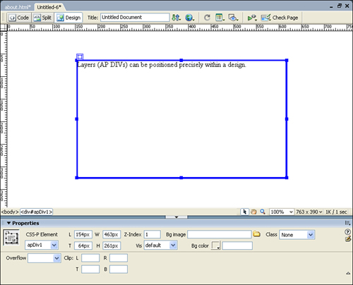
You’ll notice the resizing handles on each border of your layer. You can drag these handles to make a layer bigger or smaller. You can also set the width and height of the layer in the Properties panel. The W and H properties in the Properties panel are the width and height of the layer. The default measurement unit is pixels.
A layer has a selection handle in the upper-left corner. You can reposition a layer by picking it up and moving it with this handle. To select multiple layers, hold down the Shift key while clicking layers to add them to the selection. You can also use the arrow keys on your keyboard to move a selected layer.
You can use the drag handle to drag a layer anywhere on the screen, or you can use the Properties panel to set the exact positioning of a layer. The L and T properties stand for the left, the offset from the left edge of the page, and top, the offset from the top edge of the page. These positions are relative to the entire browser window. You can move a layer either by dragging it (with its selection handle) or by positioning it exactly by entering values in the L (left) and T (top) boxes.
A layer is treated just like a mini web page. Almost anything that you can add to a web page can be added to the content of a DIV. Just click inside the DIV area and use the same Dreamweaver tools that you’ve been using up to this point. You can even add other layers into an existing layer.
When a layer is selected, you’ll be able to set background colors and images for the layer using the Properties panel—this should be getting quite familiar by now, so we won’t get into the details on this process.
Another useful tool for working with layers is the AP Elements panel. To set a layer name, for example, double-click the name in the AP Elements panel’s Name column. It becomes editable and you can type in a new name, as shown in Figure 10.38.

Notice that when you select a layer in the AP Elements panel, the layer is selected in the Document window also, making it simple to manage large numbers of layers.
Notice that you can select a check box at the top of the Layers panel to prevent layers from overlapping. If you find that you cannot place your layers on top of one another, this check box is probably selected.
The main reason you would want to prevent overlaps is if you were going to eventually convert the layers into a table; a table cannot have overlapping elements. You can export a table as a series of layers by using the Tables to Layers command (by selecting Modify, Convert, Convert Tables to Layers). You can also use the Layers to Table command (by selecting Modify, Convert, Convert Layers to Table) to turn the layers in your page into a layout table.
Not only can you position layers in exact places on the page, you can also allow layers to overlap one another. So, which layer is on top? The stacking order decides which layer is on top of other layers. The z-index value, in turn, determines the stacking order. The z-index can be either a negative or a positive number.
The layer with the highest z-index is the one on the top. The term z-index comes from the coordinate system that you used back in geometry class—remember x and y coordinates? Well, the z-index is the third coordinate that is necessary to describe three-dimensional space. Imagine an arrow coming out of the paper or screen toward you and another going back into the screen or paper. That is the z-index.
To change the z-index, double-click the Z column in the AP Elements panel and type a new value.
Layers have a visibility attribute that can be set to Visible, Hidden, Inherit, or Default. The AP Elements panel represents visibility with a picture of an eye. The eye beside a layer is open when the layer is set to Visible. It’s closed when the layer is set to Hidden. The Inherit setting does not have an eye representation. The eye is a toggle that moves through the Default, Visible, and Hidden settings and then goes back to Default.
To access all the visibility attributes, use the Vis pop-up menu in the middle of the Properties panel when a layer is selected. These are the visibility settings:
Visible—. A layer set to Visible appears on the web page upon loading.
Hidden—. A layer set to Hidden does not appear on the web page. You can later make the layer visible by using the Show-Hide Layer behavior.
Inherit—. A layer set to Inherit has the same visibility as its parent. Imagine you have one layer inside another (a child layer inside a parent layer). If the parent is set to Hidden and the child is to Inherit, it will also be hidden.
Default—. The Default setting is actually the same as Inherit in most browsers.
Initially, web pages were designed using tags that not only defined types of content (headers, paragraphs, tables, and so forth), but the appearance of those elements as well. This, unfortunately, was counter to one of the goals of the Web—to separate content from design and let the output device render the output to the best of its capability. Enter CSS.
Those of you familiar with paragraph and character styles in page-layout applications will probably grasp the basics of CSS readily, but the scope of CSS falls well beyond altering font faces, sizes, and colors. CSS can be used to position elements, not merely text, on a page. In fact, if you have played with layers, you were working with CSS because a layer actually writes a <DIV> tag, which defines an area, and that area is positioned (and can be styled) with CSS.
Ever wonder why they’re called Cascading Style Sheets instead of simply style sheets? It’s because you can define styles in several ways, which at times could result in conflicting styles. The method of resolving this conflict is called precedence. For example, you can define a style internally, meaning that it’s written into a page, or externally, meaning that the style is defined in a separate document and linked to the page. In such a case, any conflicting styles in the internally defined styles take precedence over those defined in the external styles. Likewise, a style can be written inline, which means that it is applied to only one element on a page rather than the whole page, like an internal style. In this case, the inline style takes precedence over the internal style.
So if you have an external style sheet that defines a piece of text as red, and there is no internal or inline style on that text, the text appears red. If you also have an internal style declaring that text to be blue, the internal style would win and the text would be blue. But if you also had an inline style defining the text as green, the inline style would triumph over the others and the text would appear green.
Let’s start by creating an internal CSS. Open a blank page, and then open the CSS Styles panel in the CSS panel group. The editor employs two buttons at the top, All and Current. The All button displays all the styles currently defined while Current shows only the styles applied to the current object.
To define a style, click the + page icon at the bottom right of the panel. A New CSS Rule dialog box appears, as shown in Figure 10.39.
Now, choose whether you are adding a tag style, a class style, or an ID style. Let’s concentrate on tag styles first. Tag, in this case, refers to an HTML tag, which is a markup element. Say, for example, that you want to create a style that would make all your hyperlinks appear with no underline, but you want the underline to show up when the visitor puts his mouse over the link. You would need to define a style for the <a> tag, which is the tag used to make a link, and define two variations of the tag, one for each mouse state, off the link and over the link.
First, click the Tag radio button. Next, use the Tag pop-up menu to choose the tag you want to modify—in this case, a. Finally, click the In This Document Only radio button (this saves the style as an internal style), and then click OK.
Dreamweaver now takes you into the CSS Editor. The left half of the editor displays categories for all of the different style attributes, as seen in Figure 10.40.
To choose a color for your link, click the Type category and use the Color selector to pick a link color. To make sure that no link is displayed, ensure that Underline is not chosen in the text decoration settings. Click OK and your style is defined!
Next, let’s see how you can define the color of a link when the mouse is hovering over it. In this case, follow the same procedure you just did, but choose Advanced as the selector type and a:hover as the style to define, and click OK.
Within the category, choose Type. Pick a color for the mouseover state of your link, and then click the Decoration Underline button. Click OK to save your style. Your page links will now change color and underline when you mouse over them. It’s that simple!
To test out the styles you defined, preview the page, and put your mouse over the link. Remember, when you create a tag style, that style attaches to every instance of that tag in the page, or in all pages referenced by an external style sheet. In some instances, you might want to define a style that you can apply only where needed. In that case, you need a class style.
Defining a class style is not much different from defining a tag style, but unlike a tag style, which automatically adheres to every occurrence of a specific HTML tag in a page, a class style needs to be manually applied wherever it is desired. Class style names begin with a period (.) and won’t work properly without it. Let’s try one. Click the New Class button at the bottom of the CSS Styles panel. In the New CSS Rule dialog, choose a selector type of Class and change the name of the selector to .bodyclass. Click OK.
Make sure that the Type category is selected. Choose white for the color and set the type size as 16 pixels. Click the Font button and choose Trebuchet. Next, click the Background category, and choose navy for the background color.
Now click the Box category, and in the Padding section, type 5 into the Top field, making sure the Same for All box is checked. When you click out of the input field, the attribute automatically fills in for all four sides, as shown in Figure 10.41.

Click the Border category, and make sure that Border is active. Type 2 into the width field, type “lime” in the color field (or choose a nice color from the pop-up color swatches!) and Solid from the Style pop-up menu. Save your changes and go over to your HTML page. Type the words try it! and select them. In the Properties panel, use the Style pop-up menu to choose the style you’ve defined. It should immediately be visible in your design and in previews of your page.
Although internal style sheets are useful, the external version has the real power. When you reference an external style sheet from multiple pages in a site, all it takes is an edit to that one CSS document to make a quick site-wide change.
You can create a new external style sheet by going through the same steps you’ve already seen to define a new style, but by clicking the radio button next to New Style Sheet File in the New CSS Rule dialog, as seen in Figure 10.42.
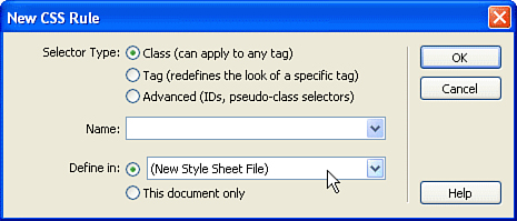
You’ll be prompted for a name and a location to save the file. Choose any appropriate location within your site structure. After it is created, the style definition continues as you’ve already seen. After an external style sheet has been defined, it is selectable from the Define In pop-up menu.
To link your HTML pages to your new style sheet, simply open up the HTML file you want to link to the CSS file, and then click the Attach Style Sheet button (it looks like a chain) in the CSS Styles panel. Choose Add As Link, browse for the CSS file, and click OK to apply.
Entire books are devoted to CSS, but hopefully this section will get you started. CSS is somewhat addictive. When you realize its incredible power, you’ll never want to go back to the old way of styling your pages again!
Finished websites reside on a web server where many people access the web pages. While you are working on your websites, you will want to move them onto the server for testing. At the end of the project, you’ll need to move your web pages to a public server so other people can look at them. There are different ways to move the files onto a server and different methods for ensuring that the version of the files is correct and not accidentally overwritten.
When working in Dreamweaver, you don’t need FTP transfer software or any other software to move your files onto the remote server. This capability is built right into Dreamweaver! It’s more convenient to set up your remote site and transfer files while working in Dreamweaver than to jump out to another application.
You define a remote site by editing the website definition (which you get to by selecting Site, Manage Sites). Select a site and click the Edit button to launch the Site Definition dialog box for the selected website. In the Basic tab, click the Next button until you reach the Sharing Files section of the Site Definition Wizard, as shown in Figure 10.43.
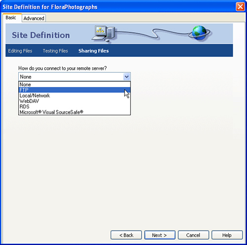
You can choose five transfer methods from the pop-up menu:
FTP
Local/Network
WebDAV
RDS
Microsoft Visual SourceSafe
The transfer method you select depends on where your remote site is located. The site may be on your company’s intranet, and if so, you can transfer the local site up to the remote site by using a LAN, or Local/Network, connection. The site may be at your ISP, the folks who provide you with an Internet or a web hosting service. In this case, you will probably connect to its servers by using FTP. SourceSafe, RDS, and WebDAV connections are less common than the others but are sometimes used in professional web development environments.
You should select FTP access, as shown in Figure 10.44, if you need to transfer files over the Web to a remote server. The server could be physically located in your building, or it could be on the other side of the world. You need to enter the name of the FTP server into the text field What Is the Hostname or FTP Address of Your Web Server? Often this is in the following format: ftp.domain.com.
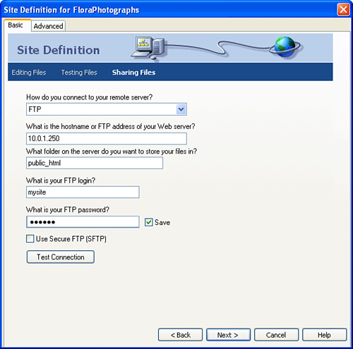
Enter the correct directory in the text field What Folder on the Server Do You Want to Store Your Files In? You might need to get the path for this directory from your web or network administrator. If you are unsure what the root directory is on the remote site, try leaving the What Folder? field blank. The FTP server might put you in the correct directory because your account may be configured that way.
You need a login and a password to access the FTP server—enter these in the appropriate fields. Dreamweaver saves your password by default. If other people have access to Dreamweaver on your computer and you don’t want them to access your FTP account, deselect the Save check box.
If you’re using secure FTP (SFTP), which encrypts all traffic between your computer and the remote hosting computer, click Use Secure FTP.
Click the Test Connection button to make sure that you’ve entered everything correctly and are successfully connecting to the FTP server.
You can troubleshoot FTP connection problems by first closing the Site Definition dialog box and then selecting Window, Results and clicking the FTP Log tab. The FTP log lists the reason you didn’t connect successfully. For instance, if the log states that the password was incorrect or the directory you are targeting doesn’t exist, you can change these in the Site Definition Wizard and try again.
If you are behind a firewall or using a proxy server, you might have difficulties with FTP. Consult the network administrator about which settings you need to choose when setting up FTP. If you go through a firewall to access the Internet, you might need to edit the advanced FTP settings, located by clicking the Advanced tab in the Site Definition dialog.
You should select Local/Network in the Site Definition Wizard if the server is on a computer that you can connect to directly by using a network. If you can access files on the server the same way you access your hard drive, moving files to and from it with ease, you have LAN access. You need to know the correct web-accessible directory; your web administrator should be able to give you that information.
Set up LAN access to the remote server by entering the path to the remote directory. Use the Browse icon to browse to the directory or type in the path. Checking the Refresh Remote File List Automatically box (in the Advanced tab) might slow down Dreamweaver’s performance a bit, but you will always have an up-to-date reflection of the remote site.
Using the RDS and Visual SourceSafe options require specific information from your network administrator. Depending on how these services are configured, your setup may change. Consult your administrator before attempting setup of these features.
Another standard is WebDAV (sometimes just called DAV); the version-control information for WebDAV is set up similarly to a SourceSafe database. WebDAV stands for World Wide Web Distributed Authoring and Versioning, and it is a group of standards governing Web collaboration that is an extension to HTTP. Again, you’ll need to consult with your network administrator to identify if this feature is available and how to configure it on your system.
After you define the remote site and click Next, Dreamweaver asks if you’d like to enable Check In/Check Out. Because you overwrite files when you transfer them from the local site to the remote site, you need to be careful if multiple people are working on the same site. You can use Check In/Check Out functionality so you do not overwrite files that others have recently edited and uploaded to the remote site.
Click the Advanced tab of the Site Definition dialog box to see a different view of your remote site’s settings. The Remote Info category, shown in Figure 10.45, displays the login information, along with firewall and other settings. You can click back and forth between the Basic and Advanced tabs if you like.
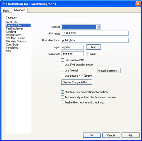
You can close the Site Definition dialog box by clicking OK to save your settings. Next you’ll try connecting to the remote server and transferring your files.
The Files panel enables you to transfer files to and from the remote site you’ve defined. You can transfer files to your local site by clicking the Get File(s) button, and you can transfer files to the remote site by clicking the Put File(s) button. Unfortunately, the full view of your files is hidden until you click the Expand button in the upper-right corner of the file panel. After it is expanded, the panel shows a view of both your local and remote sites, as seen in Figure 10.46. When you want to collapse the expanded Files panel, click the Expand/Collapse button again.
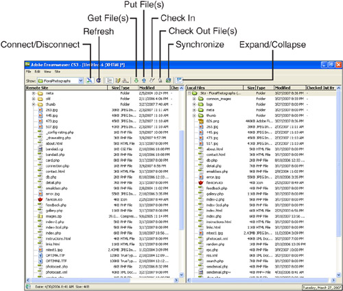
You’ll want to pay close attention to these buttons at the top of the Files panel:
Connect/Disconnect—. This button establishes a connection to an FTP server. The button has a little green light that is lit when you are connected to the FTP server. This button is always lit when you have LAN access to your remote site.
Refresh—. This button manually refreshes the list of files in the Files panel.
Get File(s)—. This button retrieves files from the remote site and moves them to your local site.
Put File(s)—. This button places files from your local site onto the remote site.
Check out File(s)—. This button retrieves files from the remote site, moves them to your local site, and marks them as Checked Out.
Check in File(s)—. This button places files from your local site onto the remote site and marks them as Checked In.
Synchronize—. Find changes on the local or remote sites and synchronize the corresponding site copy.
Expand/Collapse—. Changes the panel display from a fullscreen view of your files to a mini listing of just the local or remote files.
Use the Check In/Check Out tools in Dreamweaver to ensure that only one person is working on a file at a time. When you have a file checked out, no one else can check out that file until you check it back in, just like when you have a DVD or video checked out from the video store. Dreamweaver marks the file as checked out by you so that your collaborators know who to bug if they also need to make changes to the file!
When you check out a file from the remote site, Dreamweaver retrieves a copy of that file from the remote server to ensure that you have the most up-to-date version of the file in your local site. When Dreamweaver gets the file, it overwrites the file that exists on your local drive. The checked-out file appears to Dreamweaver users with your name beside it on the remote server, signaling to your collaborators that you have checked it out. The file has a green check mark beside it in your local site, showing that you currently have that file checked out.
To get or put files, first make sure the correct site is selected in the Site pop-up menu of the Files panel. If you access your site via FTP, click the Connect button. If you are already connected or are accessing the files on a LAN, skip this step.
To get or check out files, follow these steps:
Select the files you want to transfer to your local site. You can also select an entire folder to transfer all of its contents.
Click the Get File(s) button, or click the Check Out button if you have Check In/Check Out enabled for this site.
Dreamweaver might display a dialog box, asking if you would also like to download dependent files. Dependent files are images and other assets that are linked to the files you are transferring. You can disable this dialog box by checking the Don’t Ask Me Again box. I prefer to transfer the asset files manually instead of having Dreamweaver do it automatically.
To put or check in files, follow these steps:
Select the files you want to transfer to the remote site.
Click the Put File(s) button, or click the Check In button if you have Check In/Check Out enabled for this site. If you transfer a file that is currently open, Dreamweaver prompts you to save the file before you put it on the remote site.
Dreamweaver might display a dialog box, asking if you would also like to upload dependent files. You can disable this dialog box by checking the Don’t Ask Me Again box.
When a website already exists at a remote site, you need to define the website in Dreamweaver, connect to the remote site, and download all the files in the site to work on it. Remember, you can edit only files that are located on your own machine. You can download and edit an existing site even if it wasn’t created with Dreamweaver.
Downloading a site for the first time might take some time, depending on how you are accessing the site and what your network connection speed is. After you initially download all the files, however, you should need only to download any files that change.
To import an existing website, all you need to do is mirror the existing site on your local drive. There is no conversion process, and the files will remain unchanged in Dreamweaver. To import an existing website, follow these steps:
Set up both your local and remote info in the Site Definition dialog box.
Get all the files on the remote site by selecting the top entry in the remote site of the Files panel. Selecting the top entry, the root folder, selects the entire site. If you select a file, you get only that file instead of the entire site.
Click the Get File(s) button to transfer all the files on the remote site to your local site.
After the files have transferred you can access and edit the files locally, and then use the file controls to upload changes back to the server as needed.
When designing web pages, you can create library items from objects that you use often. If you update a library item, it updates everywhere throughout your site. This is very handy!
Library items help you maintain consistency in a website. They also allow you to share design elements with other web developers. When you are in the design phase of a website, you should be thinking about common elements that would be appropriate to create as Dreamweaver library items.
You can turn all sorts of objects into library items. For instance, a navigation bar that is present in many of the pages in your website would be an excellent candidate for a library item. When you need to add a new button to the navigation bar, it is simple to add the button to the original library item and then update your entire site automatically with the change.
You can create a library item, save it to the Library category of the Assets panel, and then apply it to any web page within your website. Anyone working on the same website can use the library item, and you can use library items created by others. You can include a library item in a web page multiple times. Library items can be created from any object contained in the body of the web page, such as forms, tables, text, Java applets, layers, and images.
You need to define a website before Dreamweaver can insert a library item. Dreamweaver creates a directory called Library in the root of your website where it stores all the library items. When you insert a library item into your web page, Dreamweaver inserts into the page a copy of everything contained in the library item.
When you are creating and applying library items, you open the Library category of the Assets panel, shown in Figure 10.47. The Library category of the Assets panel shows all the library items that exist in the current website. Each website that you create can have a different set of library items.

The Library category of the Assets panel is divided into two halves. The bottom half lists the names of the library items in the website. The top half displays the contents of a library item that you have selected in the bottom half. The buttons at the bottom of the panel include the following:
Insert—. You click this button to insert the currently selected library item at the location of the insertion point in the web page.
Refresh List—. You click this button to refresh the list in the Assets panel. This is useful for refreshing the list after you’ve added a new item.
New Library Item—. You click this button to create a new, blank library item.
Edit—. You click this button to open the library item in its own Dreamweaver Document window for editing.
Delete Library Item—. You click this button to remove the original library item from the library. This doesn’t affect any instances of the library item (although the item can no longer be updated throughout the site).
There are two ways to create library items:
From an existing object or group of objects—. After you decide to create a library item out of a group of objects on a web page, you select the objects and save them into the library.
From scratch, as a new, empty library item—. You can create a new library item, open it up, and add objects to it just as if it were a regular web page.
You create a library item from an existing object or group of objects on your web page as follows:
Select an object or a group of objects. Select multiple objects either by dragging your cursor over them or by holding down the Shift key and clicking objects to add to the selection.
To add the selection to the library, drag and drop it onto the bottom half of the Library category of the Assets panel. Alternatively, select Modify, Library, Add Object to Library.
Give the library object a meaningful name. The Name field is selected immediately after you create the library item; at any time, you can reselect the name with a long single-click on the name field.
When you select a library item name, you see the contents of the library item in the top half of the Library category of the Assets panel, as shown in Figure 10.48. The contents might look different from how they will look in the web page because the Library category of the Assets panel is small, and the objects wrap. Also, because the library item is only a portion of a web page, it appears with no page background color.
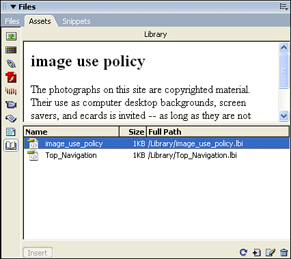
To create a library item from scratch, follow these steps:
Click the New Library Item button at the bottom of the Library category of the Assets panel. Dreamweaver creates a new, blank library item. A message telling you how to add content to the blank library item appears in the top half of the Library category of the Assets panel.
Give the library item a name. For example, create a copyright statement that will go at the bottom of each of your web pages. The name
Copyrightwould be a good choice.Double-click the library item in the Library category of the Assets panel. Dreamweaver opens the library item in a separate Document window. You can tell that you have a library item open because Dreamweaver displays
<<Library Item>>along with the name of the library item in the title bar as well as using the extension .lbi, as shown in Figure 10.49.Insert objects into the library item’s Document window just as you would in any web page. Insert the copyright symbol (from the Text category in the Insert bar or by selecting Insert, HTML, Special Characters), a year, and a name.
Close the Document window and save the library item. Your changes are reflected in the Library category of the Assets panel.
After you have created a library item, you simply drag it from the list in the Library category of the Assets panel and drop it onto your web page. You can pick up the library item and move it to a different location in the Document window. You will not be able to select individual objects contained in the inserted library item. When you click any of the objects, you select the entire library item; the group of objects in a library item is essentially one object in your web page.
When you insert a library item into a web page, a copy of its contents is inserted. You no longer need to have the original library item present. When you upload your web page onto a remote website, you do not need to upload the Library directory. It is a good idea to keep the directory, though, in case you want to make changes to library items throughout the website.
The Properties panel, as shown in Figure 10.50, displays the library item attributes when a library item is selected in the Document window. The Src box displays the name of the library item (which you cannot change here). Three buttons in the Properties panel help you manage the library item:
Open—. This button opens the library item you want to edit.
Detach from Original—. This button breaks the link between this instance of a library item and the original item. If the original library item is changed, a detached item will not be updated. If you detach a library item from its original, the individual objects contained in the item will be editable.
Re-create—. This button overwrites the original library item with the currently selected instance of the library item. This is useful if the original library item has been inadvertently edited or lost.

You can apply a highlight to library items so that they are easy to see in the Document window. The highlight appears only in Dreamweaver and not in the browser. In addition, the highlight appears only if Invisible Elements is checked in the View menu. You set the highlight color in the Highlighting category in the Dreamweaver Preferences dialog box.
You edit a library item by opening that item to add or change objects in the Document window. Don’t worry about the page background color when editing library items; the item appears on the background color of the page in which it is inserted. After you’ve inserted your previously created library item into a page, open the library item to edit it. Apply different formatting to some of the objects in the item.
After you are finished editing, save the library item. Dreamweaver asks you whether you want to update all the documents in the website that contain the library item, as shown in Figure 10.51. Click Update to automatically update all linked library items.
After updating, a dialog box displays statistics on how many files were examined, how many were updated, and how many could not be updated. Check the Show Log check box if you want to see these statistics. Click Close to close the Update Pages dialog box.
You can manually update linked library items at any time. Right-click on the library item in the Library category of the Assets panel and select either the Update Current Page command to update the current web page or the Update Site command to update the entire website. The Update Current Page command acts immediately, and no dialog box appears. When you issue the Update Site command, the Update Pages dialog box appears. Click the Start button to begin updating all the linked library items in the website.
Dreamweaver CS3 provides all the features you need (and more!) to be a successful web designer. The inclusion of Dreamweaver in Adobe’s software lineup makes it the most complete solution for implementing a website from start to finish. Dreamweaver CS3 adopts the look and feel of the rest of CS3 while keeping the features that have made Dreamweaver a popular product in its own right.
In this chapter you learned how to create and manage sites, add and style most common types of content, and create cascading style sheets, rollover images, and even complex layouts using tables and absolutely positioned layers.