

Shading
Isuspect that thus far in this book you have probably been more impressed with the shading in the finished works than the fact that they were drawn correctly. Shading is the icing on the cake; it’s what brings your drawing to life. However, all the wonderful shading in the world won’t help if the image is drawn inaccurately, assuming that your goal is realism. That’s why shading comes after site and shape: It’s the finished step that catapults your art from a single-dimension line drawing to a three-dimensional image. This chapter addresses and demonstrates how this is accomplished.
The process of getting the site and shapes right tends to be a bit mechanical, but may be accomplished fairly quickly with a few easy-to-grasp tools and techniques. Shading, however, is what typically separates the soon-to-be artist from the skilled pro. Why? Because shading takes practice. It takes an even pressure on the pencil, a smooth touch and an experienced eye. In chapter three we learned various pencilling, smudging and erasing techniques, all of which are used to shade. In this chapter we’ll put those skills to practice.
Define With Values, Not Lines
In chapter two we learned how the mind places everything into patterns of perception, memorizes those patterns, then uses what’s recorded in the mind rather than the reality of what’s in front of us. Perceptions are more powerful than facts. And truth be told, most of the lines you draw are a perception, not a fact.
Say you are looking at a room painted white. How do you know there are walls and a ceiling? After all, they’re all white. You might respond by pointing out that they have angles you can see. Look again. Why do you know there are angles? Are there lines drawn on the walls and ceiling to tell you there are angles? What do you actually see?
To answer this question, first we need to understand what a line is. The most common definition of a line is “the shortest distance between two points.” But that’s not an artist’s definition. A line, when used in a drawing, is a mark made on the paper to represent an edge of something—where one thing ends and something else begins. If I’m drawing my hand on a piece of paper, the lines I originally make represent the edges of my hand and are used to separate my hand from the rest of the paper. The reality of my hand is that it is not outlined: There isn’t a black mark that goes around the outside of my hand.
What our eyes see in reality are not distinct, sharp lines, but changes in value. The term value means the relative lightness or darkness of an area. It’s the different shades of gray that range from the white of your paper to the darkest dark your pencil can make.
So, it is the changes in value, however subtle, that allow you to see where the walls end and the ceiling begins in the white room. One of your goals in shading is to make sure that you end up with value changes rather than lines defining your subject. There are very few real lines in this world, but there are countless value changes. Realistic drawings show value changes, not outlines.

Reference Photo
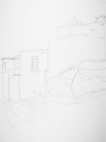
Line Drawing
We initially draw the edges of the subject, placing them in the correct site and with the correct shapes.
Bad Shading
Now it comes time to shade. Those same lines, useful at first to indicate the edges of things, are not truly lines at all. But the emerging artist leaves them in place, and the drawing looks amateurish as a result.
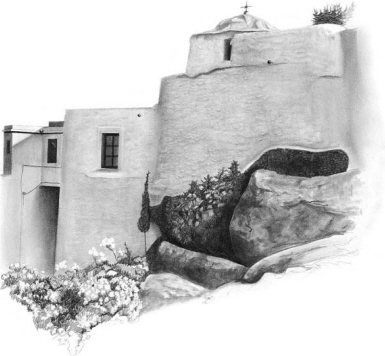
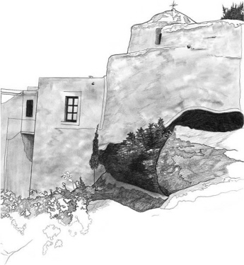
Good Shading
Although both drawings are correctly drawn, this one is clearly drawn better. What’s the difference? The lines left in the first drawing, where there are no lines in reality, change the work from professional to struggling artist. A much more realistic drawing is created when you use value changes rather than lines to define your subject. Don’t leave lines!
 Psssssst!
The closer in value two things are to each other, the less you can separate them with a line. In classic art training, you would practice your shading on a bunch of stuff painted white. This exercise forces you to practice subtle shading to define edges. It also simplifies things because you’re not dealing with color.
How to Get Rid of Lines
Okay, so now you know that most of the lines in your drawing have to go in order for it to look realistic. How do you go about doing this? There are several ways to get rid of lines that were originally used to mark the edges in your drawing.

Absorb Lines
The background may be darkened so the line will be absorbed.
Erase Lines
The line may be erased so only the value change remains.

Blend Lines
The line may be blended into the image where there’s a gradual value change.
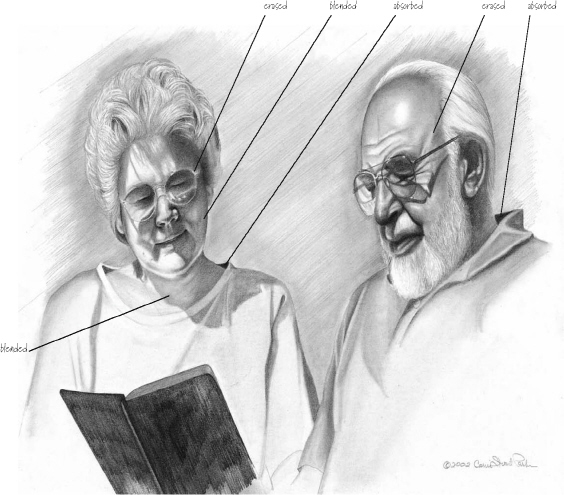
Combining Line Removal Techniques
Most drawings will require you to use a variety of techniques to eliminate lines: absorbing some, erasing others and blending some into the shadows.
PASTOR AND EDNA DAY
Graphite on bristol board
14" x 17" (36cm x 43cm)
Psssssst!
In your drawings, examine areas that were originally drawn as lines. When deciding which lines will stay and which will go, look at each line and ask yourself if it really appears as a line in the reference photo or live reference, or if it is a value change.
Isolate and Squint to See Values
The answer to the age-old question “How do you eat an elephant?” is this: One bite at a time. How do you shade a complicated subject? One little part at a time. Isolate the individual parts of your drawing and see them as shapes with different values.
In spite of the parental admonition that squinting may cause your face to remain in that pose, squinting in art is a rather useful tool. When you squint, edges blur and you are left with lights and darks. Artists know this and often squint at the subjects they are drawing to more clearly see value changes.
Although I’m encouraging you to isolate specific areas and concentrate on the value changes, you’ll need to be sure you look at the entire drawing and adjust accordingly. Make it a habit to shade a single area, walk away, then return and check that the value is correct to the overall image.

Break Down the Complex
It turns out that there wasn’t just one lesson in that jar back. That image has a very complicated series of shadows and lights, so the drawing was broken up into smaller sections. The different parts, such as the section shown here, were isolated and viewed as shapes: square light shapes, rectangular midtones and rounded darks. The shades (values) are nothing more than shapes. Don’t try to analyze why something is round or square, dark or light. Just duplicate what you see.

Squint to See Values Easier
Squinting at these shells encourages our eyes to focus on seeing values, not details.
Psssssst!
Although not technically the same as the classic “squint,” another tool for seeing value changes is a piece of red acetate. Colors have a way of interfering with our ability to distinguish values. Hold the acetate in front of your face or place it over the reference photo and it renders your subject into only values, removing the distraction of color.
Compare Values and Avoid the Guessing Game
It is always easier to make relative judgments rather than absolute judgments when it comes to art. Something is “too big” or “too small,” “too light” or “too dark,” in reference to something else.
A value scale is an invaluable aid for comparing values as you shade. You can buy a value scale or easily make one yourself with a piece of bristol board and a pencil. A value scale contains ten blocks of values ranging from black to white, with tones of gray in between. A hole is usually punched in each block. Place the scale over the different areas of the reference photo you are using to determine the correct amount of shading needed to duplicate what you are drawing.
Don’t Guess at What You Can’t See
One very important question to ask yourself when drawing is: Why do I see that? Force yourself to answer. You actually see something because there is a value change. Something is either lighter or darker than something else. When you ask this question, you are forcing yourself to analyze rather than guess at the values.
This question becomes especially important when you can’t see everything in the reference photo, such as when details are lost in the dark areas. Many artists think they need to fill in the missing details. Guesswork like this can lead to drawing disaster. If you don’t see it, don’t guess. Don’t try to figure out what’s happening in that mysterious dark area, because you’ll be running it through your perceptions of reality instead of seeing it for what it is.
Value Scale
This is a handy tool for working out the value problems in a drawing.

Guessing at Reality
This is what commonly happens when an artist tries to fill in the blanks of what they can’t see in a reference photo. Scary!

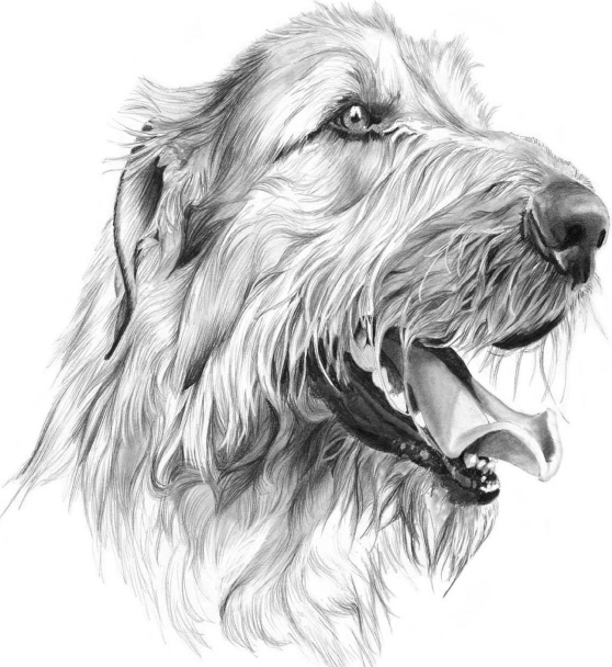
Leave a Little Mystery
So what if we can’t see every single detail of the dog’s face? The drawing is better for it.
Punch Up the Contrast
I have come across many competent art students who are able to render beautifully drawn art, but their drawings aren’t particularly interesting. It’s because they lack contrast. Usually the drawings are very light in appearance with no true darks. An interesting drawing ranges through the full value scale, from white to black, with tones in between.
Let’s take the following washed-out drawing from so-so to spectacular by heightening the contrast and adjusting its values.
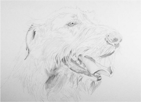
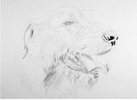
A Drawing With No Draw
This is a nice but boring drawing. The values were created with a very timid hand. The shapes are dead-on and everything’s well proportioned, but will the viewer even notice?
![]() Revisit Your Reference
Revisit Your Reference
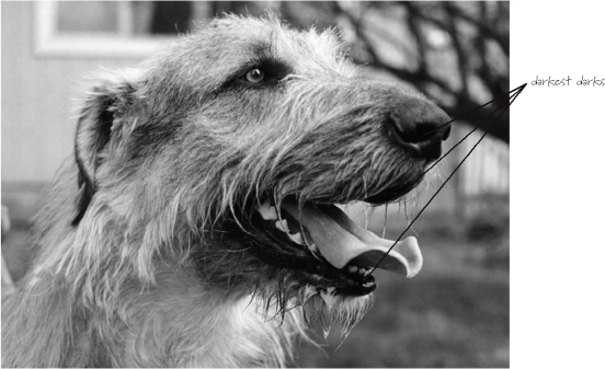
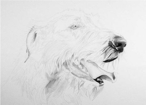
The drawing needs more contrast, but where do we begin? Go back to the photo and find a place on the subject that’s dark—really dark. The dog’s nostrils and lips look like the best bet.
![]() Get Dark
Get Dark
Now take a 6B pencil and begin darkening those spots on your drawing. Push hard. Harder. There, now you can take a deep breath. That was the hardest part.
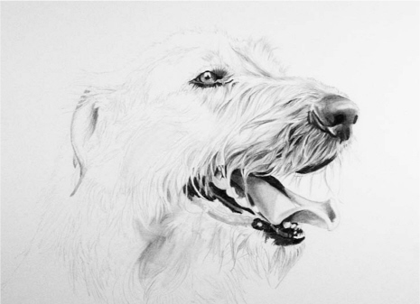
![]() Adjust the Other Values
Adjust the Other Values
In order to fix this drawing, you now have to adjust the remaining values so the darkest value you just created no longer awkwardly jumps out of your drawing. Start small with the hair at the tip of the nose and the tongue.
Psssssst!
If your drawing looks pale, place a single black mark on the paper. This forces you to adjust the values, making the rest of the drawing darker and therefore more interesting.
![]() Keep Going
Keep Going
Progress to the dog’s eye and the corner of his mouth, adjusting values as you go. Notice the variety of techniques used: close pencil strokes for darker areas on the fur and spaced-out strokes for the lighter areas; smudging for midtones; and erasing (or lifting graphite) for highlights on the nose, eye and tongue. Using an eraser to lift very small groupings of hair strands not only adds depth to the values of the drawing but also creates the realistic texture of fur.
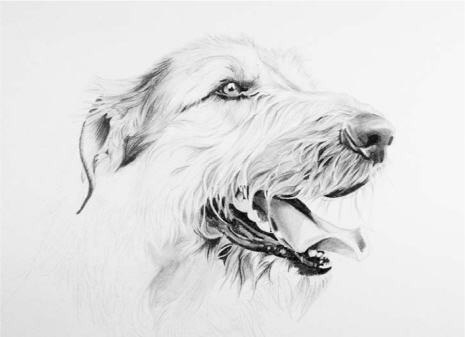
![]() And Going …
And Going …
Work your way back to the dog’s ear. Just remember not to darken everything—the dark values will only be effective if they appear next to lighter ones.
![]() … There! Much Better
… There! Much Better
The reworked drawing has much more depth, realism and interest than the original. Well-executed values and enough contrast can make all the difference between a ho-hum drawing and an eye-catching work of art.
IRISH WOLFHOUND
Graphite on bristol board
14" x 17" (36cm x 43cm)
Seek to Understand the Effects of Light
Regardless of your choice of shading technique, you need to learn how to spot the different characteristics of light and shadow on your subject and recognize the potential challenges of recreating them on your paper. The effects of the light source are different depending on whether your subject is round or angular.
Working in the Round
I received a call a number of years ago from a friend in Long Island about an upcoming portrait drawing class. In a thick New York accent, he informed me that he was going to start the class by having everyone “drarl a bull.”
This was a new one for me, so I asked why he would want to teach a class to “drarl a bull.” He replied, “Because the face is based on a bull.” Now, I was raised on a ranch, and I know a bit about bulls and cows in general. I had never observed the similarity between a human face and a bull. I thought that maybe the breed of bull made a difference—I mean, an Angus looks different from a Scottish Highlander bull—so I politely asked about the breed. There was an astonished silence; then in a quiet voice, he said, “A bull, a round bull. What was I supposed to call it, a sphere?”
So, let’s talk about bulls—I mean balls. Round stuff. Most drawing classes require you to shade a ball and often other round things like cylinders and cones. Why this obsession with round? Because there’s a pattern of darks and lights that occurs on something round and because it is affected by a light source. If you can shade using this pattern, you will create the appearance of something round and capture the three-dimensional feel of the subject.

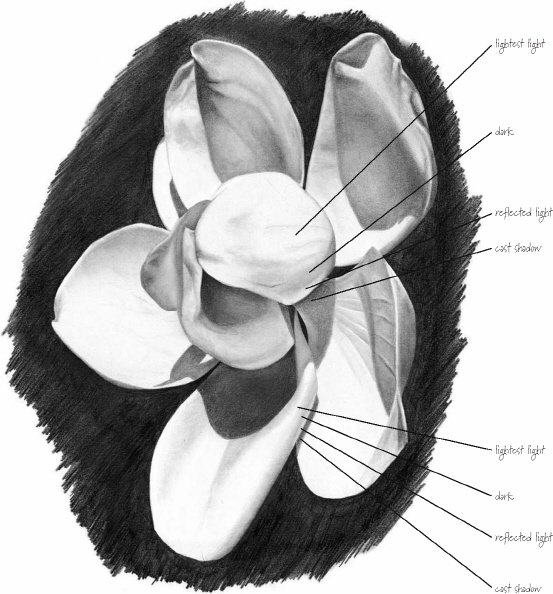
Round objects have a predictable pattern of lightest light, dark, reflected light and cast shadow that helps to define their shape.
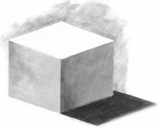
Angular subjects like this cube will show more abrupt value changes than what you see on rounded objects.
Psssssst!
Objects lit by natural light will have a predictable shadow because light rays travel in parallel lines, whereas artificial light may come from more than one source and cause more than one shadow.
The pattern of lightest light, dark, reflected light and cast shadow may be placed on any subject and it will create the appearance of roundness. Now, I realize I just said, “If you don’t see it, don’t draw it.” This is the exception that proves the rule … or something like that.
Angular Subjects
Unlike round objects that shade gradually from the highlighted area through midtone grays into the dark shadows, angular subjects have abrupt edges and relatively little value changes within the flat surface. There may be reflected light on an angular surface—for example, a flowerpot sitting on a porch may cast a glow onto the wall behind it—so we want to be on the lookout for interesting plays of lights and darks. The technique of squinting will serve you well when observing more angular surfaces.
Developing the patterns of light and shadow on any subject will help realistically define its form.
Check for Accuracy
You’ve spent quality time with your pencils, established a working relationship with your eraser and finally (FINALLY) completed your drawing. Congratulations! Now, there is still a chance, albeit remote, that your art might not look quite right. Let’s talk about checking for accuracy.
In the beginning of the book, I introduced the concept of patterns of perception. The mind organizes the items we want to draw into patterns, memorizes those patterns and trots them out when we draw. It is these often limited perceptions that keep us from drawing well.
We need to learn a few techniques to break up these patterns and refresh our minds. This will make it easier to determine what is incorrect in our drawings. Most of these techniques have been around for awhile, and many artists use them without thinking about it too much. To make your drawings better, routinely add some of the following techniques to your drawing process.
Invert for a New Perspective
Inversion, as we learned earlier, means to turn something upside down. At some point in the drawing process, turn your artwork upside down to gain a new perspective on it. If you are working from a reference photo, invert it as well and place it beside your drawing. You may spot errors or problems more clearly.
Get Some Distance
Chances are you’ve hovered over your drawing from a fixed distance as you’ve worked on it. Now you need to change the distance. Get up and view your drawing from further away. Post it on a wall. Changing the distance will make the value problems more pronounced and will give you better insight into any potential problems.
Take a Break
Shortly after you began your drawing, your mind processed it and committed it to memory. You need a break from your art and the image you are drawing. Go get a cup of tea, check the weather or call your mom. Physically get away from your work, then return and study it. You will have a small window of time to see the errors before your mind reprocesses the work. Have a pad of paper with you and immediately record the errors. Otherwise, you’ll forget.
Use Your New Tools
In this book I’ve described a variety of tools to help you draw well. These tools can help you see your artwork better. Take a ruler to your drawing and make sure things are where they should be. Look at your drawing through a piece of red acetate to check your values (or just squint). Put your tools to good use, and they will serve you well.
Shift Into Reverse
Hold your drawing up to a mirror and look at the image in reverse. Like inversion, this time-tested technique changes the look of the art and may help you spot (and fix) previously unseen problems.
Ask Friends and Family
Assuming you have members of your family or friends that will be helpful without reducing you to shark chum, you might want to ask them what they think of your drawing. They may not be artists themselves, but they are your viewers, and they can give you a different perspective you might want to consider. They may wonder what the black blob at the bottom of the sketch represents—the blob that you thought was an artsy touch.
Once I asked my mom about a portrait I had completed. I thought it was really creative. She wanted to know why I made the nose blue. That’s all she saw: that blue nose. As my purpose was not to create an artistic statement on blue noses, I decided to change the piece.
Approach Other Artists
Fellow artists can help critique your drawings, too. Some artists and budding artists are members of art groups, but not every art group critiques each other’s work. If you’re not a member of a group that reviews each other’s art, try visiting a teacher at the local art center or asking a friendly artist-type neighbor for an informal critique.
Try a Combination
The best way to check your art for accuracy is with a combination of several of these techniques. I walk away from my work, wait a bit, come back, make notes, ask my husband and look at it upside down. Find a set of techniques comfortable for you and try it.
Make Accuracy Checks a Part of Your Routine
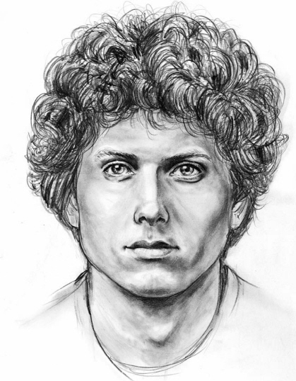
This composite sketch was completed by a student from one of my drawing courses. Even though a facial composite drawing is an image made from putting together the features of different faces, each element must be checked for accuracy against the features in the individual reference photos selected by the witness. Sheila is an outstanding artist, partly because she is always on the lookout for possible errors occurring within the drawing. For artists like Sheila, accuracy-checking tools such as reassessing a drawing after taking a break from it, or viewing it from a distance, are a matter of course.
PRETTY BOY
Sergeant Sheila Tajima-Shadle, Fremont
Police Department, California
Graphite on bristol board
10" x 8" (25cm x 20cm)
Cheat Sheet
• The lines in a line drawing are meant to represent the edges of things. Leaving these outlines in your finished drawing will make it look amateurish and unrealistic.
• Use changes in value—that is, the lights and darks—to ultimately define your subject, not lines.
• You can get rid of lines by absorbing them into a darker background, erasing them and leaving only a value change, or blending them into a value change.
• Simplify complex subjects by isolating parts of the drawing and seeing them as shapes with different values.
• Squint at your subject to see the value changes more clearly.
• Use a value scale to help you build a range of values in your drawing.
• Draw what you see; don’t guess. Leave an area undetailed if that’s how a part of your reference photo looks.
• If your drawing looks boring, add more darks and adjust the values accordingly for more contrast.
• Pay attention to how the light source affects round and angular subjects.
• Your drawings will be better if you use a number of accuracy-checking techniques.
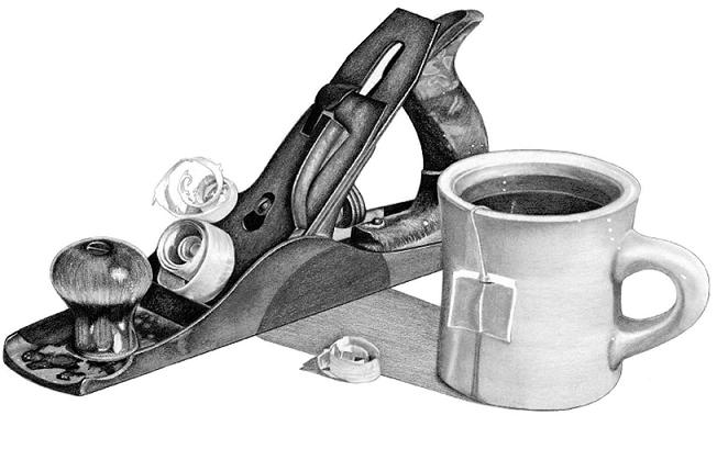
Drawing White on White
One of the biggest challenges of this piece was drawing and shading a white mug on a white background. Some of the original lines were left to define the shape and texture of the subject.
STILL LIFE WITH ANTIQUE WOOD PLANER
Graphite on bristol board
14" x 17" (36cm X 43cm)