Chapter 20
A Career in Modeling
IN THIS CHAPTER
Discovering models
Modeling and fitting
Working with the Monte Carlo method
“Model” is a term that gets thrown around a lot these days. Simply put, a model is something you know and can work with that helps you understand something you know little about. A model is supposed to mimic, in some way, the thing it’s modeling. A globe, for example, is a model of the earth. A street map is a model of a neighborhood. A blueprint is a model of a building.
Researchers use models to help them understand natural processes and phenomena. Business analysts use models to help them understand business processes. The models these people use might include concepts from mathematics and statistics — concepts that are so well known they can shed light on the unknown. The idea is to create a model that consists of concepts you understand, put the model through its paces, and see if the results look like real-world results.
In this chapter, I discuss modeling. My goal is to show how you can harness Excel’s statistical capabilities to help you understand processes in your world.
Modeling a Distribution
In one approach to modeling, you gather data and group them into a distribution. Next, you try to figure out a process that results in that kind of a distribution. Restate that process in statistical terms so that it can generate a distribution, and then see how well the generated distribution matches up to the real one. This “process you figure out and restate in statistical terms” is the model.
If the distribution you generate matches up well with the real data, does this mean your model is “right”? Does it mean the process you guessed is the process that produces the data?
Unfortunately, no. The logic doesn’t work that way. You can show that a model is wrong, but you can’t prove that it’s right.
Plunging into the Poisson distribution
In this section, I walk you through an example of modeling with the Poisson distribution. I introduce this distribution in Chapter 19, where I tell you it seems to characterize an array of processes in the real world. By “characterize a process,” I mean that a distribution of real-world data looks a lot like a Poisson distribution. When this happens, it’s possible that the kind of process that produces a Poisson distribution is also responsible for producing the data.
What is that process? Start with a random variable x that tracks the number of occurrences of a specific event in an interval. In Chapter 19, the “interval” is a sample of 1,000 universal joints, and the specific event is “defective joint.” Poisson distributions are also appropriate for events occurring in intervals of time, and the event can be something like “arrival at a toll booth.” Next, I outline the conditions for a Poisson process, and use both defective joints and toll booth arrivals to illustrate:
-
The number of occurrences of the event in two non-overlapping intervals are independent.
The number of defective joints in one sample is independent of the number of defective joints in another. The number of arrivals at a toll booth during one hour is independent of the number of arrivals during another.
-
The probability of an occurrence of the event is proportional to the size of the interval.
The chance that you’ll find a defective joint is larger in a sample of 10,000 than it is in a sample of 1,000. The chance of an arrival at a toll booth is greater for one hour than it is for a half-hour.
-
The probability of more than one occurrence of the event in a small interval is 0 or close to 0.
In a sample of 1,000 universal joints, you have an extremely low probability of finding two defective ones right next to one another. At any time, two vehicles don’t arrive at a toll booth simultaneously.
As I show you in Chapter 19, the formula for the Poisson distribution is
In this equation, μ represents the average number of occurrences of the event in the interval you’re looking at, and e is the constant 2.781828 (followed by infinitely many more decimal places).
Visualizing the Poisson distribution
To gain a deeper understanding of the Poisson distribution, here’s a way to visualize and experiment with it. Figure 20-1 shows a spreadsheet with a chart of the Poisson and the values I based it on.

FIGURE 20-1: Visualizing the Poisson distribution.
Cell A2 holds the value for the mean of the Poisson. I calculate the values for f(x) in column D by typing
=POISSON.DIST(C2,$A$2,FALSE)
into cell D2 and then autofilling. Using FALSE as the third argument causes the function to return the probability associated with the first argument. (TRUE returns the cumulative probability. For more on POISSON.DIST, see Chapter 19.)
Then I inserted a column chart and modified it somewhat. You’ll learn this distribution when you try different values in A2 and note the effect on the chart.
Working with the Poisson distribution
Time to use the Poisson in a model. At the FarBlonJet Corporation, web designers track the number of hits per hour on the intranet home page. They monitor the page for 200 consecutive hours and group the data, as shown in Table 20-1.
TABLE 20-1 Hits Per Hour on the FarBlonJet Intranet Home Page
Hits/Hour |
Observed Hours |
Hits/Hour X Observed Hours |
|
0 |
10 |
0 |
|
1 |
30 |
30 |
|
2 |
44 |
88 |
|
3 |
44 |
132 |
|
4 |
36 |
144 |
|
5 |
18 |
90 |
|
6 |
10 |
60 |
|
7 |
8 |
56 |
|
Total |
200 |
600 |
The first column shows the variable Hits/Hour. The second column, Observed Hours, shows the number of hours in which each value of Hits/Hour occurred. In the 200 hours observed, 10 of those hours went by with no hits, 30 hours had one hit, 44 had two hits, and so on. These data lead the web designers to use a Poisson distribution to model Hits/Hour. Another way to say this: They believe a Poisson process produces the number of hits per hour on the web page.
Multiplying the first column by the second column results in the third column. Summing the third column shows that in the 200 observed hours, the intranet page received 600 hits. So the average number of hits/hour is 3.00.
Applying the Poisson distribution to this example,
From here on, I pick it up in Excel.
Using POISSON.DIST again
Figure 20-2 shows each value of x (hits/hour), the probability of each x if the average number of hits per hour is three, the predicted number of hours, and the observed number of hours (taken from the second column in Table 20-1). I selected cell B3 so that the Formula bar shows how I used the POISSON.DIST worksheet function. I autofilled column B down to cell B10. (For the details on using POISSON.DIST, see Chapter 19.)

FIGURE 20-2: Web page hits/hour — Poisson-predicted (μ=3) and observed.
To get the predicted number of hours, I multiplied each probability in column B by 200 (the total number of observed hours). I used Excel’s graphics capabilities (see Chapter 3) to show you how close the predicted hours are to the observed hours. They look pretty close, don’t they?
Testing the model’s fit
Well, “looking pretty close” isn’t enough for a statistician. A statistical test is a necessity. As is the case with all statistical tests, this one starts with a null hypothesis and an alternative hypothesis. Here they are:
H0: The distribution of observed hits/hour follows a Poisson distribution.
H1: Not H0
The appropriate statistical test involves an extension of the binomial distribution. It’s called the multinomial distribution — multi because it encompasses more categories than just “success” and “failure.” It’s difficult to work with, and Excel has no worksheet function to handle the computations.
Fortunately, pioneering statistician Karl Pearson (inventor of the correlation coefficient) noticed that χ2 (“chi-square”), a distribution I show you in Chapter 10, approximates the multinomial. Originally intended for one-sample hypothesis tests about variances, χ2 has become much better known for applications like the one I’m about to show you.
Pearson’s big idea was this: If you want to know how well a hypothesized distribution (like the Poisson) fits a sample (like the observed hours), use the distribution to generate a hypothesized sample (your predicted hours, for instance), and work with this formula:
Usually, this is written with Expected rather than Predicted, and both Observed and Expected are abbreviated. The usual form of this formula is
For this example,
What is that total? Excel figures it out for you. Figure 20-3 shows the same columns as earlier, with column F holding the values for (O – E)2/E. I could have used this formula
=((D3-C3)^2)/C3

FIGURE 20-3: Web page hits/hour — Poisson-predicted (μ=3) and observed, along with the calculations needed to compute χ2.
to calculate the value in F3 and then to autofill up to F10.
I chose a different route. First, I assigned the name Predicted_Hrs to C3:C10 and the name Observed_Hrs to D3:D10. Then I used an array formula (see Chapter 2). I selected F3:F10 and created this formula:
=(Observed_Hrs-Predicted_Hrs)^2/Predicted_Hrs
Pressing Ctrl+Shift+Enter puts the values into F3:F10. That key combination also puts the curly brackets into the formula in the Formula bar.
The sum of the values in column F is in cell F11, and that’s χ2. If you’re trying to show that the Poisson distribution is a good fit to the data, you’re looking for a low value of χ2.
Okay. Now what? Is 3.5661 high or is it low?
To find out, you evaluate the calculated value of χ2 against the χ2 distribution. The goal is to find the probability of getting a value at least as high as the calculated value, 3.5661. The trick is to know how many degrees of freedom (df) you have. For a goodness-of-fit application like this one
where k = the number of categories and m = the number of parameters estimated from the data. The number of categories is 8 (0 hits/hour through 7 hits/hour). The number of parameters? I used the observed hours to estimate the parameter μ, so m in this example is 1. That means df = 8 – 1 – 1 = 6.
Use the worksheet function CHISQ.DIST.RT on the value in F11, with 6 df. CHISQ.DIST.RT returns .73515, the probability of getting a χ2 of at least 3.5661 if H0 is true. (Refer to Chapter 10 for more on CHISQ.DIST.RT.) Figure 20-4 shows the χ2 distribution with 6 df and the darkened area to the right of 3.5661.

FIGURE 20-4: The χ2 distribution, df = 6. The shaded area is the probability of getting a χ2 of at least 3.5661 if H0 is true.
If α = .05, the decision is to not reject H0 — meaning you can’t reject the hypothesis that the observed data come from a Poisson distribution.
This is one of those infrequent times when it’s beneficial to not reject H0 — if you want to make the case that a Poisson process is producing the data. If the probability had been just a little greater than .05, not rejecting H0 would look suspicious. The large probability, however, makes nonrejection of H0 — and an underlying Poisson process — seem more reasonable. (For more on this, see the sidebar “A point to ponder,” in Chapter 10.)
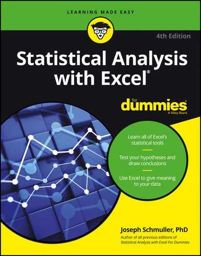
A word about CHISQ.TEST
Excel provides CHISQ.TEST, a worksheet function that on first look appears to carry out the test I show you with about one-tenth the work I did on the worksheet. Its Function Arguments dialog box provides one box for the observed values and another for the expected values.
One problem is that CHISQ.TEST does not return a value for χ2. It skips that step and returns the probability that you’ll get a χ2 at least as high as the one you calculate from the observed values and the predicted values.
Another problem is that CHISQ.TEST's degrees of freedom are wrong for this case. CHISQ.TEST goes ahead and assumes that df = k-1 (7) rather than k-m-1 (6). You lose a degree of freedom because you estimate μ from the data. In other kinds of modeling, you lose more than one degree of freedom. Suppose, for example, you believe that a normal distribution characterizes the underlying process. In that case, you estimate μ and σ from the data, and you lose two degrees of freedom.
By basing its answer on less than the correct df, CHISQ.TEST gives you an inappropriately large (and misleading) value for the probability.
CHISQ.TEST would be perfect if it had an option for entering df, or if it returned a value for χ2 (which you could then evaluate via CHI.DIST and the correct df).
When you don’t lose any degrees of freedom, CHISQ.TEST works as advertised. Does that ever happen? In the next section, it does.
Playing ball with a model
Baseball is a game that generates huge amounts of statistics — and many study these statistics closely. SABR, the Society for American Baseball Research, has sprung from the efforts of a band of dedicated fan-statisticians (fantasticians?) who delve into the statistical nooks and crannies of the Great American Pastime. They call their work sabermetrics. (I made up fantasticians. They call themselves sabermetricians.)
The reason I mention this is that sabermetrics supplies a nice example of modeling. It’s based on the obvious idea that during a game, a baseball team’s objective is to score runs and to keep its opponent from scoring runs. The better a team does at both, the more games it wins. Bill James, who gave sabermetrics its name and is its leading exponent, discovered a neat relationship between the amount of runs a team scores, the amount of runs the team allows, and its winning percentage. He calls it the Pythagorean percentage:

Think of it as a model for predicting games won. (This is James’ original formula, and I use it throughout. Over the years, sabermetricians have found that 1.83 is a more accurate exponent than 2.) Calculate this percentage and multiply it by the number of games a team plays. Then compare the answer to the team’s wins. How well does the model predict the number of games each team won during the 2011 season?
To find out, I found all the relevant data for every Major League Baeball team for 2011. (Thank you, www.baseball-reference.com.) I put the data into the worksheet in Figure 20-5.

FIGURE 20-5: Runs scored, runs allowed, predicted wins, and wins for each Major League baseball team in 2011.
As Figure 20-5 shows, I used an array formula to calculate the Pythagorean percentage in column D. First, I assigned the name Runs_Scored to the data in column B, and the name Runs_Allowed to the data in column C. Then I selected D2:D31 and created the formula
=Runs_Scored^2/(Runs_Scored^2 + Runs_Allowed^2)
Next, I pressed Ctrl+Shift+Enter to put the values into D2:D31 and the curly brackets into the formula in the Formula bar.
Had I wanted to do it another way, I’d have put this formula in cell D2:
=B2^2/((B2^2)+(C2^2))
Then I would have autofilled the remaining cells in column D.
Finally, I multiplied each Pythagorean percentage in column D by the number of games each team played (28 teams played 162 games, 2 played 161) to get the predicted wins in column F. Because the number of wins can only be a whole number, I used the ROUND function to round off the predicted wins. For example, the formula that supplies the value in E3 is
=ROUND(D3*162,0)
The zero in the parentheses indicates that I wanted no decimal places.
Before proceeding, I assigned the name Predicted_Wins to the data in column F, and the name Wins to the data in column G.
How well does the model fit with reality? This time, CHISQ.TEST can supply the answer. I don’t lose any degrees of freedom here: I didn’t use the Wins data in column G to estimate any parameters, like a mean or a variance, and then apply those parameters to calculate Predicted Wins. Instead, the predictions came from other data — the runs scored and the runs allowed. For this reason, df = k – m – 1 = 30 – 0 – 1 = 29.
Here’s how to use CHISQ.TEST (when it’s appropriate!):
- With the data entered, select a cell for
CHISQ.TEST’s answer. - From the Statistical Functions menu, select CHISQ.TEST and click OK to open the Function Arguments dialog box for
CHISQ.TEST. (See Figure 20-6.) -
In the Function Arguments dialog box, type the appropriate values for the arguments.
In the Actual_range box, type the cell range that holds the scores for the observed values. For this example, that’s Wins (the name for F2:F32).
In the Expected_range box, type the cell range that holds the predicted values. For this example, it’s Predicted_Wins (the name for E2:E32).
With the cursor in the Expected_range box, the dialog box mentions a product of row totals and column totals. Don’t let that confuse you. It has to do with a slightly different application of this function (which I cover in Chapter 22).
With values entered for Actual_range and for Expected_range, the answer appears in the dialog box. The answer here is .999951, which means that with 29 degrees of freedom, you have a huge chance of finding a value of χ2 at least as high as the one you’d calculate from these observed values and these predicted values. Another way to say this: The calculated value of χ2 is very low, meaning that the predicted wins are very close to the actual wins. Bottom line: The model fits the data extremely well.
- Click OK to put the answer into the selected cell.
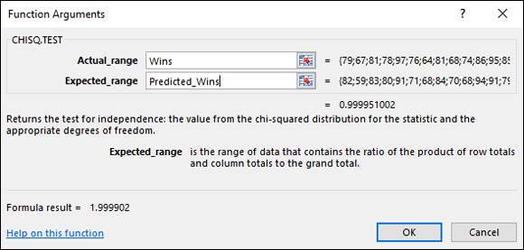
FIGURE 20-6: The CHISQ.TEST Function Arguments dialog box.
A Simulating Discussion
Another approach to modeling is to simulate a process. The idea is to define, as much as you can, what a process does and then somehow use numbers to represent that process and carry it out. It’s a great way to find out what a process does in case other methods of analysis are very complex.
Taking a chance: The Monte Carlo method
Many processes contain an element of randomness. You just can’t predict the outcome with certainty. To simulate this type of process, you have to have some way to simulate the randomness. Simulation methods that incorporate randomness are called Monte Carlo simulations. The name comes from the city in Monaco whose main attraction is gambling casinos.
In the next few sections, I show you a couple of examples. These examples aren’t so complex that you can’t analyze them. I use them for just that reason: You can check the results against analysis.
Loading the dice
In Chapter 18, I talk about a die (one member of a pair of dice) that’s biased to come up according to the numbers on its faces: A 6 is six times as likely as a 1, a 5 is five times as likely, and so on. On any toss, the probability of getting a number n is n/21.
Suppose you have a pair of dice loaded this way. What would the outcomes of 200 tosses of these dice look like? What would be the average of those 200 tosses? What would be the variance and the standard deviation? You can use Excel to set up Monte Carlo simulations and answer these questions.
To start, I use Excel to calculate the probability of each outcome. Figure 20-7 shows how I did it. Column A holds all the possible outcomes of tossing a pair of dice (2–12). Columns C through N hold the possible ways of getting each outcome. Columns C, E, G, I, K, and M show the possible outcomes on the first die. Columns D, F, H, J, L, and N show the possible outcomes on the second die. Column B gives the probability of each outcome, based on the numbers in columns C–M. I highlighted B7, so the Formula bar shows I used this formula to have Excel calculate the probability of a 7:
=((C7*D7)+(E7*F7)+(G7*H7)+(I7*J7)+(K7*L7)+(M7*N7))/21^2

FIGURE 20-7: Outcomes and probabilities for a pair of loaded dice.
I autofilled the remaining cells in column B.
The sum in B14 confirms that I considered every possibility.
Next, it’s time to simulate the process of tossing the dice. Each toss, in effect, generates a value of the random variable x according to the probability distribution defined by column A and column B. How do you simulate these tosses?
Data analysis tool: Random Number Generation
Excel’s Random Number Generation tool is tailor-made for this kind of simulation. Tell it how many values you want to generate, give it a probability distribution to work with, and it randomly generates numbers according to the parameters of the distribution. Each randomly generated number corresponds to a toss of the dice.
Here’s how to use the Random Number Generation tool:
- Select Data | Data Analysis to open the Data Analysis dialog box.
- In the Data Analysis dialog box, scroll down the Analysis Tools list and select Random Number Generation.
-
Click OK to open the Random Number Generation dialog box.
Figure 20-8 shows the Random Number Generation dialog box.
-
In the Number of Variables box, type the number of variables you want to create random numbers for.
I know, I know … don’t end a sentence with a preposition. As Winston Churchill said: “That’s the kind of nonsense up with which I will not put.” Hey, but seriously, I entered 1 for this example. I’m only interested in the outcomes of tossing a pair of dice.
-
In the Number of Random Numbers box, type the number of numbers to generate.
I entered 200 to simulate 200 tosses of the loaded dice.
-
In the Distribution box, click the down arrow to select the type of distribution.
You have seven options here. The choice you make determines what appears in the Parameters area of the dialog box, because different types of distributions have different types (and numbers) of parameters. You’re dealing with a discrete random variable here, so the appropriate choice is Discrete.
-
Choosing Discrete causes the Value and Probability Input Range box to appear under Parameters. Enter the array of cells that holds the values of the variable and the associated probabilities.
The possible outcomes of the tosses of the die are in A2:A12, and the probabilities are in B2:B12, so the range is A2:B12. Excel fills in the dollar signs ($) for absolute referencing.
-
In the Output Options, select a radio button to indicate where you want the results.
I selected New Worksheet Ply to put the results on a new page in the worksheet.
- Click OK.
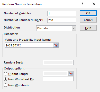
FIGURE 20-8: The Random Number Generation dialog box.
Because I selected New Worksheet Ply, a newly created page opens with the results. Figure 20-9 shows the new page. The randomly generated numbers are in column A. The 200 rows of random numbers are too long to show you. I could have cut and pasted them into ten columns of 20 cells, but then you’d just be looking at 200 random numbers.
FIGURE 20-9: The results of simulating 200 tosses of a pair of loaded dice.
Instead, I used FREQUENCY to group the numbers into frequencies in columns C and D and then used Excel’s graphics capabilities to create a graph of the results. I selected D2, so the formula box shows how I used FREQUENCY for that cell. As you can see, I defined Tosses as the name for A2:A201 and x as the name for C2:C12.
What about the statistics for these simulated tosses?
=AVERAGE(Tosses)
tells you the mean is 8.640.
=VAR.S(Tosses)
returns 4.191 as the estimate of the variance, and SQRT applied to the variance returns 2.047 as the estimate of the standard deviation.
How do these values match up with the parameters of the random variable? This is what I mean earlier by “checking against analysis.” In Chapter 18, I show how to calculate the expected value (the mean), the variance, and the standard deviation for a discrete random variable.
The expected value is
In the worksheet in Figure 20-7, shown earlier, I used the SUMPRODUCT worksheet function to calculate E(x). The formula is
=SUMPRODUCT(A2:A12,B2:B12)
The expected value is 8.667.
The variance is
With E(x) stored in B16, I used this formula:
=SUMPRODUCT(A2:A12,A2:A12,B2:B12)-B16^2
 Note the use of A2:A12 twice in
 SUMPRODUCT. That gives you the sum of x2.
The formula returns 4.444 as the variance. SQRT applied to that number gives 2.108 as the standard deviation.
Table 20-2 shows how closely the results from the simulation match up with the parameters of the random variable.
TABLE 20-2 Statistics from the Loaded Dice-Tossing Simulation and the Parameters of the Discrete Distribution
Simulation Statistic |
Distribution Parameter | |
|
Mean |
8.640 |
8.667 |
|
Variance |
4.191 |
4.444 |
|
Standard Deviation |
2.047 |
2.108 |
Simulating the Central Limit Theorem
This might surprise you, but statisticians often use simulations to make determinations about some of their statistics. They do this when mathematical analysis becomes very difficult.
For example, some statistical tests depend on normally distributed populations. If the populations aren’t normal, what happens to those tests? Do they still do what they’re supposed to? To answer that question, statisticians might create non-normally distributed populations of numbers, simulate experiments with them, and apply the statistical tests to the simulated results.
In this section, I use simulation to examine an important statistical item — the Central Limit Theorem. In Chapter 9, I introduce the Central Limit Theorem in connection with the sampling distribution of the mean. In fact, I simulate sampling from a population with only three possible values to show you that even with a small sample size, the sampling distribution starts to look normally distributed.
Here, I use the Random Number Generation tool to set up a normally distributed population and draw 40 samples of 16 scores each. I calculate the mean of each sample and then set up a distribution of those means. The idea is to see how that distribution matches up with the Central Limit Theorem.
The distribution for this example has the parameters of the population of scores on the IQ test, a distribution I use for examples in several chapters. It’s a normal distribution with μ = 100 and σ = 16. According to the Central Limit Theorem, the mean of the distribution of means should be 100, and the standard deviation (the standard error of the mean) should be 4.
For a normal distribution, the Random Number Generation dialog box looks like Figure 20-10. The first two entries cause Excel to generate 16 random numbers for a single variable. Choosing Normal in the Distribution box causes the Mean box and the Standard Deviation box to appear under Parameters. As the figure shows, I entered 100 for the Mean and 16 for the Standard Deviation. Under Output Options, I selected Output Range and entered a column of 16 cells. This puts the randomly generated numbers into the indicated column on the current page, and (because I specified 40 samples) into 39 adjoining columns. Then I used AVERAGE to calculate the mean for each column (each sample, in other words), and then ROUND to round off each mean.

FIGURE 20-10: The Random Number Generation dialog box for a normal distribution.
Next, I copied the 40 rounded sample means to another worksheet so I could show you how they’re distributed.
I calculated their mean and the standard deviation. I used FREQUENCY to group the means into a frequency distribution, and used Excel’s graphics capabilities to graph the distribution. Does the Central Limit Theorem accurately predict the results? Figure 20-11 shows what I found.

FIGURE 20-11: The results of the Central Limit Theorem simulation.
The mean of the means, 100.621, is close to the Central Limit Theorem’s predicted value of 100. The standard deviation of the means, 3.915, is close to the Central Limit’s predicted value of 4 for the standard error of the mean. The graph shows the makings of a normal distribution, although it’s slightly skewed. In general, the simulation matches up well with the Central Limit Theorem. If you try this, you’ll get different numbers than mine, but your overall results should be in the same ballpark.
A couple of paragraphs ago, I said, “I copied the 40 rounded sample means to another worksheet.” That’s not quite a slam-dunk. When you try to paste a cell into another worksheet and that cell holds a formula, Excel usually balks and gives you an ugly-looking error message when you paste. This happens when the formula refers to cell locations that don’t hold any values in the new worksheet.
To work around that, you have to do a little trick on the cell you want to copy. You have to convert its contents from a formula into the value that the formula calculates. The steps are:
- Select the cell or cell array you want to copy.
- Right-click and select Copy from the contextual menu that appears (or just press Ctrl+C without right-clicking).
-
Right-click the cell where you want the copy to go.
This opens the contextual menu shown in Figure 20-12.
-
From the contextual menu, under Paste Options, select Paste Values.
It’s the second icon from the left — a clipboard labeled 123.

FIGURE 20-12: When you copy a cell array and then right-click another cell, this menu pops up.
The contextual menu offers another helpful capability. Every so often in statistical work, you have to take a row of values and relocate them into a column, or vice versa. (I did that in this example.) Excel calls this transposition. To transpose, follow the same four steps, but in Step 4, select Transpose. This one is the fourth icon from the left — a clipboard with a two-headed arrow.