Chapter 22
Ten Things (Twelve, Actually) That Just Didn’t Fit in Any Other Chapter
IN THIS CHAPTER
Visualizing variability
Going over the odds and ends of probability
Looking for independence
Working with logs
Sorting
I wrote this book to show you all of Excel’s statistical capabilities. My intent was to tell you about them in the context of the world of statistics, and I had a definite path in mind.
Some of the capabilities don’t neatly fit along that path. I still want you to be aware of them, however, so here they are.
Graphing the Standard Error of the Mean
When you create a graph and your data are means, it’s a good idea to include the standard error of each mean in your graph. This gives the viewer an idea of the spread of scores around each mean.
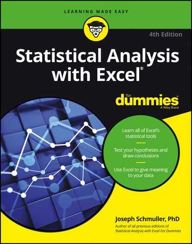
Figure 22-1 gives an example of a situation where this arises. The data are (fictional) test scores for four groups of people. Each column header indicates the amount of preparation time for the eight people within the group. I used Excel’s graphics capabilities (refer to Chapter 3) to draw the graph. Because the independent variable is quantitative, a line graph is appropriate. (refer to Chapter 21 for a rant on my biggest peeve.)
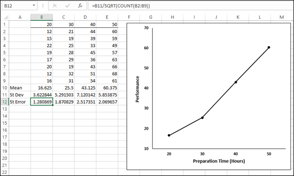
FIGURE 22-1: Four groups, their means, standard deviations, and standard errors. The graph shows the group means.
For each group, I used AVERAGE to calculate the mean and STDEV.S to calculate the standard deviation. I also calculated the standard error of each mean. I selected cell B12, so the formula box shows you that I calculated the standard error for Column B via this formula:
=B11/SQRT(COUNT(B2:B9))
The trick is to get each standard error into the graph. In Excel 2013 this is easy to do, and it’s different from earlier versions of Excel. Begin by selecting the graph. This causes the Design and Format tabs to appear. Select
Design | Add Chart Element | Error Bars | More Error Bars Options
Figure 22-2 shows what I mean.

FIGURE 22-2: The menu path for inserting error bars.
 In the Error Bars menu, you have to be careful. One selection is Standard Error. Avoid it. If you think this selection tells Excel to put the standard error of each mean on the graph, rest assured that Excel has absolutely no idea of what you’re talking about. For this selection, Excel calculates the standard error of the set of four means — not the standard error within each group.
More Error Bar Options is the appropriate choice. This opens the Format Error Bars panel. (See Figure 22-3.)

FIGURE 22-3: The Format Error Bars panel.
In the Direction area of the panel, select the radio button next to Both, and in the End Style area, select the radio button next to Cap. (You can’t see the Direction area in the figure, because I scrolled down to set up the screen shot.)
Remember the cautionary note I gave you a moment ago? I have a similar one here. One selection in the Error Amount area is Standard Error. Avoid this one, too. It does not tell Excel to put the standard error of each mean on the graph.
Scroll down to the Error Amount area and select the radio button next to Custom. This activates the Specify Value button. Click that button to open the Custom Error Bars dialog box, shown in Figure 22-4. With the cursor in the Positive Error Value box, select the cell range that holds the standard errors ($B$12:$E$12). Tab to the Negative Error Value box and do the same.

FIGURE 22-4: The Custom Error Bars dialog box.
 That Negative Error Value box might give you a little trouble. Make sure that it’s cleared of any default values before you enter the cell range.
Click OK in the Custom Error Bars dialog box and close the Format Error Bars dialog box, and the graph looks like Figure 22-5.

FIGURE 22-5: The graph of the group means, including the standard error of each mean.
Probabilities and Distributions
Here are some probability-related worksheet functions. Although they’re a little on the esoteric side, you might find some use for them.
PROB
If you have a probability distribution of a discrete random variable and you want to find the probability that the variable takes on a particular value, PROB is for you. Figure 22-6 shows the PROB Argument Functions dialog box along with a distribution.

FIGURE 22-6: The PROB Function Arguments dialog box and a probability distribution.
You supply the random variable (X_range), the probabilities (Prob_range), a lower limit, and an upper limit. PROB returns the probability that the random variable takes on a value between those limits (inclusive).
If you leave Upper Limit blank, PROB returns the probability of the value you gave for the lower limit. If you leave Lower Limit blank, PROB returns the probability of obtaining, at most, the upper limit (for example, the cumulative probability).
WEIBULL.DIST
This is a probability density function that’s mostly applicable to engineering. It serves as a model for the time until a physical system fails. As engineers know, in some systems, the number of failures stays the same over time because shocks to the system cause failure. In others, like some microelectronic components, the number of failures decreases with time. In still others, wear-and-tear increases failures with time.
The Weibull distribution’s two parameters allow it to reflect all these possibilities. One parameter, Alpha, determines how wide or narrow the distribution is. The other, Beta, determines where it’s centered on the x-axis.
The Weibull probability density function is a rather complicated equation. Thanks to Excel, you don’t have to worry about it. Figure 22-7 shows WEIBULL.DIST’s Function Arguments dialog box.

FIGURE 22-7: The WEIBULL.DIST Function Arguments dialog box.
The dialog box in the figure answers the kind of question a product engineer would ask: Assume the time to failure of a bulb in an LCD projector follows a Weibull distribution with Alpha = .75 and Beta = 2,000 hours. What’s the probability the bulb lasts at most 4,000 hours? The dialog box shows that the answer is .814.
Drawing Samples
Excel’s Sampling data analysis tool is helpful for creating samples. You can tailor it in a couple of ways. If you’re trying to put a focus group together and you have to select the participants from a pool of people, you could assign each one a number and have the Sampling tool select your group.
One way to select is periodically. You supply n, and Excel samples every nth number. The other way to select is randomly. You supply the number of individuals you want randomly selected and Excel does the rest.
Figure 22-8 presents the Sampling dialog box, three groups I had it sample from, and two columns of output.

FIGURE 22-8: The Sampling data-analysis tool dialog box, sampled groups, and results.
The first output column, Column A, shows the results of periodic sampling with a period of 6. Sampling begins with the sixth score in Group 1. Excel then counts out scores and delivers the sixth, and goes through that process again until it finishes in the last group. The periodic sampling process, as you can see, doesn’t recycle. I supplied an output range up to cell A11, but Excel stopped after four numbers.
The second output column, Column B, shows the results of random sampling. I asked for 20 and that’s what I got. If you closely examine the numbers in Column B, you’ll see that the random sampling process can select a number more than once.
Beware of a little quirk: The Labels check box seems to have no effect. When I specified an input range that includes C1, D1, and E1 and selected the Labels check box, I received this error message: Sampling - Input range contains non-numeric data. Not a showstopper, but a little annoying.
Testing Independence: The True Use of CHISQ.TEST
In Chapter 20, I show you how to use CHISQ.TEST to test the goodness of fit of a model to a set of data. In that chapter, I also warn you about the pitfalls of using this function in that context, and I mention that it’s really intended for something else.
Here’s the something else. Imagine you’ve surveyed a total of 200 people. Each person lives in a rural area, an urban area, or a suburb. Your survey asked them their favorite type of movie: drama, comedy, or animation. You want to know if their movie preference is independent of the environment in which they live.
Table 22-1 shows the results.
TABLE 22-1 Living Environment and Movie Preference
Drama |
Comedy |
Animation |
Total | |
|
Rural |
40 |
30 |
10 |
80 |
|
Urban |
20 |
30 |
20 |
70 |
|
Suburban |
10 |
20 |
20 |
50 |
|
Total |
70 |
80 |
50 |
200 |
The number in each cell represents the number of people in the environment, indicated in the row, who prefer the type of movie indicated in the column.
Do the data show that preference is independent of environment? This calls for a hypothesis test:
H0: Movie preference is independent of environment
H1: Not H0
α = .05
To get this done, you have to know what to expect if the two are independent. Then you can compare the data with the expected numbers and see whether they match. If they do, you can’t reject H0. If they don’t, you reject H0.
Concepts from probability help determine the expected data. In Chapter 18, I tell you that if two events are independent, you multiply their probabilities to find the probability that they occur together. Here, you can treat the tabled numbers as proportions, and the proportions as probabilities.
For example, in your sample, the probability is 80/200 that a person is from a rural environment. The probability is 70/200 that a person prefers drama. What’s the probability that a person is in the category “rural and likes drama”? If the environment and preference are independent, that’s (80/200) × (70/200). To turn that probability into an expected number of people, you multiply it by the total number of people in the sample: 200. So the expected number of people is (80 × 70)/200, which is 28.In general,
After you have the expected numbers, you compare them to the observed numbers (the data) via this formula:

You test the result against a χ2 (chi-square) distribution with df = (Number of Rows – 1) × (Number of Columns – 1), which in this case comes out to 4.
The CHISQ.TEST worksheet function performs the test. You supply the observed numbers and the expected numbers, and CHISQ.TEST returns the probability that a χ2 at least as high as the result from the preceding formula could have resulted if the two types of categories are independent. If the probability is small (less than .05), reject H0. If not, don’t reject. CHISQ.TEST doesn’t return a value of χ2; it just returns the probability (under a χ2 distribution with the correct df).
Figure 22-9 shows a worksheet with both the observed data and the expected numbers, along with CHISQ.TEST’s Function Arguments dialog box. Before I ran CHISQ.TEST, I attached the name Observed to C3:E5, and the name Expected to C10:E12. (If you don’t know how to do this, read Chapter 2.)

FIGURE 22-9: The CHISQ.TEST Function Arguments dialog box, with observed data and expected numbers.
The figure shows that I’ve entered Observed into the Actual_range box, and Expected into the Expected_range box. The dialog box shows a very small probability, .00068, so the decision is to reject H0. The data are consistent with the idea that movie preference is not independent of environment.
Logarithmica Esoterica
 The functions in this section are really out there. Unless you’re a tech-head, you’ll probably never use them. I present them for completeness. You might run into them while you’re wandering through Excel’s statistical functions, and wonder what they are.
They’re based on what mathematicians call natural logarithms, which in turn are based on e, that constant I use at various points throughout this book. I begin with a brief discussion of logarithms, and then I turn to e.
What is a logarithm?
Plain and simple, a logarithm is an exponent — a power to which you raise a number. In the equation
2 is an exponent. Does that mean that 2 is also a logarithm? Well … yes. In terms of logarithms,
That’s really just another way of saying 102 = 100. Mathematicians read it as “the logarithm of 100 to the base 10 equals 2.” It means that if you want to raise 10 to some power to get 100, that power is 2.
How about 1,000? As you know
so
How about 453? Uh … Hmmm … That’s like trying to solve
What could that answer possibly be? 102 means 10 × 10, and that gives you 100. 103 means 10 × 10 × 10 and that’s 1,000. But 453?
Here’s where you have to think outside the dialog box. You have to imagine exponents that aren’t whole numbers. I know, I know … How can you multiply a number by itself a fraction at a time? If you could, somehow, the number in that 453 equation would have to be between 2 (which gets you to 100) and 3 (which gets you to 1,000).
In the 16th century, mathematician John Napier showed how to do it, and logarithms were born. Why did Napier bother with this? One reason is that it was a great help to astronomers. Astronomers have to deal with numbers that are, well, astronomical. Logarithms ease computational strain in a couple of ways. One way is to substitute small numbers for large ones: The logarithm of 1,000,000 is 6 and the logarithm of 100,000,000 is 8. Also, working with logarithms opens up a helpful set of computational shortcuts. Before calculators and computers appeared on the scene, this was a very big deal.
Incidentally,
meaning that
You can use Excel to check that out if you don’t believe me. Select a cell and type
=LOG(453,10)
Press Enter and watch what happens. Then just to close the loop, reverse the process. If your selected cell is — let’s say — D3, select another cell and type
=POWER(10,D3)
or
=10^D3
Either way, the result is 453.
Ten, the number that’s raised to the exponent, is called the base. Because it’s also the base of our number system and we’re all familiar with it, logarithms of base 10 are called common logarithms.
Does that mean you can have other bases? Absolutely. Any number (except 0 or 1 or a negative number) can be a base. For example,
So
If you ever see log without a base, base 10 is understood, so
In terms of bases, one number is special… .
What is e?
Which brings me to e, a constant that’s all about growth. Before I get back to logarithms, I’ll tell you about e.
Imagine the princely sum of $1 deposited in a bank account. Suppose the interest rate is 2 percent a year. (Good luck with that.) If it’s simple interest, the bank adds $.02 every year, and in 50 years you have $2.
If it’s compound interest, at the end of 50 years you have (1 + .02)50 — which is just a bit more than $2.68, assuming the bank compounds the interest once a year.
Of course, if the bank compounds it twice a year, each payment is $.01, and after 50 years the bank has compounded it 100 times. That gives you (1 + .01)100, or just over $2.70. What about compounding it four times a year? After 50 years — 200 compoundings — you have (1 + .005)200, which results in the don’t-spend-it-all-in-one-place amount of $2.71 and a tiny bit more.
Focusing on “just a bit more” and a “tiny bit more,” and taking it to extremes, after one hundred thousand compoundings you have $2.718268. After one hundred million, you have $2.718282.
If you could get the bank to compound many more times in those 50 years, your sum of money approaches a limit — an amount it gets ever so close to, but never quite reaches. That limit is e.
The way I set up the example, the rule for calculating the amount is
where n represents the number of payments. Two cents is 1/50th of a dollar and I specified 50 years — 50 payments. Then I specified two payments a year (and each year’s payments have to add up to 2 percent) so that in 50 years you have 100 payments of 1/100th of a dollar, and so on.
To see this in action, enter numbers into a column of a spreadsheet as I have in Figure 22-10. In cells C2 through C20, I have the numbers 1 through 10 and then selected steps through one hundred million. In D2, I put this formula
=(1+(1/C2))^C2

FIGURE 22-10: Getting to e.
and then autofilled to D20. The entry in D20 is very close to e.
Mathematicians can tell you another way to get to e:
Those exclamation points signify factorial. 1! = 1, 2! = 2 X 1, 3! = 3 X 2 X 1. (For more on factorials, refer to Chapter 16.)
Excel helps visualize this one, too. Figure 22-11 lays out a spreadsheet with selected numbers up to 170 in Column C. In D2, I put this formula:
=1+ 1/FACT(C2)

FIGURE 22-11: Another path to e.
and, as the Formula bar in the figure shows, in D3 I put this one:
=D2 +1/ FACT(C3)
Then I autofilled up to D17. The entry in D17 is very close to e. In fact, from D11 on, you see no change, even if you increase the number of decimal places.
Why did I stop at 170? Because that takes Excel to the max. At 171, you get an error message.
So e is associated with growth. Its value is 2.781828 … The three dots mean you never quite get to the exact value (like π, the constant that enables you to find the area of a circle).
This number pops up in all kinds of places. It’s in the formula for the normal distribution (see Chapter 8), and it’s in distributions I discuss in Chapter 17. Many natural phenomena are related to e.
It’s so important that scientists, mathematicians, and business analysts use it as the base for logarithms. Logarithms to the base e are called natural logarithms. A natural logarithm is abbreviated as ln.
Table 22-2 presents some comparisons (rounded to three decimal places) between common logarithms and natural logarithms:
TABLE 22-2 Some Common Logarithms (Log) and Natural Logarithms (Ln)
Number |
Log |
Ln |
|
e |
0.434 |
1.000 |
|
10 |
1.000 |
2.303 |
|
50 |
1.699 |
3.912 |
|
100 |
2.000 |
4.605 |
|
453 |
2.656 |
6.116 |
|
1000 |
3.000 |
6.908 |
One more thing. In many formulas and equations, it’s often necessary to raise e to a power. Sometimes the power is a fairly complicated mathematical expression. Because superscripts are usually printed in small font, it can be a strain to have to constantly read them. To ease the eyestrain, mathematicians have invented a special notation: exp. Whenever you see exp followed by something in parentheses, it means to raise e to the power of whatever’s in the parentheses. For example,
Excel’s EXP function does that calculation for you.
Speaking of raising e, when Google, Inc., filed its IPO, it said it wanted to raise $2,718,281,828, which is e times a billion dollars rounded to the nearest dollar.
On to the Excel functions.
LOGNORM.DIST
A random variable is said to be lognormally distributed if its natural logarithm is normally distributed. Maybe the name is a little misleading, because I just said log means “common logarithm” and ln means “natural logarithm.”
Unlike the normal distribution, the lognormal can’t have a negative number as a possible value for the variable. Also unlike the normal, the lognormal is not symmetric — it’s skewed to the right.
Like the Weibull distribution I describe earlier, engineers use it to model the breakdown of physical systems — particularly of the wear-and-tear variety. Here’s where the large-numbers-to-small numbers property of logarithms comes into play. When huge numbers of hours figure into a system’s life cycle, it’s easier to think about the distribution of logarithms than the distribution of the hours.
Excel’s LOGNORM.DIST works with the lognormal distribution. You specify a value, a mean, and a standard deviation for the lognormal. LOGNORM.DIST returns the probability that the variable is, at most, that value.
For example, FarKlempt Robotics, Inc., has gathered extensive hours-to-failure data on a universal joint component that goes into its robots. The company finds that hours-to-failure is lognormally distributed with a mean of 10 and a standard deviation of 2.5. What is the probability that this component fails in, at most, 10,000 hours?
Figure 22-12 shows the LOGNORM.DIST Function Arguments dialog box for this example. In the X box, I entered ln(10000). I entered 10 into the Mean box, 2.5 into the Standard_dev box, and TRUE into the Cumulative box. The dialog box shows the answer, .000929 (and some more decimals). If I enter FALSE into the Cumulative box, the function returns the probability density (the height of the function) at the value in the X box.

FIGURE 22-12: The LOGNORM.DIST Function Arguments dialog box.
LOGNORM.INV
LOGNORM.INV turns LOGNORM.DIST around. You supply a probability, a mean, and a standard deviation for a lognormal distribution. LOGNORM.INV gives you the value of the random variable that cuts off that probability.
To find the value that cuts off .001 in the preceding example’s distribution, I used the LOGNORM.INV Function Arguments dialog box shown in Figure 22-13. With the indicated entries, the dialog box shows that the value is 9.722 (and more decimals).

FIGURE 22-13: The LOGNORM.INV Function Arguments dialog box.
By the way, in terms of hours, that’s 16,685 — just for .001.
Array Function: LOGEST
In Chapter 14, I tell you all about linear regression. It’s also possible to have a relationship between two variables that’s curvilinear rather than linear.
The equation for a line that fits a scatterplot is
One way to fit a curve through a scatterplot is with this equation:
LOGEST estimates a and b for this curvilinear equation. Figure 22-14 shows the LOGEST Function Arguments dialog box and the data for this example. It also shows an array for the results. Before using this function, I attached the name x to B2:B12 and y to C2:C12.

FIGURE 22-14: The Function Arguments dialog box for LOGEST, along with the data and the selected array for the results.
Here are the steps for this function:
-
With the data entered, select a five-row-by-two-column array of cells for LOGEST’s results.
I selected F4:G8.
- From the Statistical Functions menu, select
LOGESTto open the Function Arguments dialog box for LOGEST. -
In the Function Arguments dialog box, type the appropriate values for the arguments.
In the Known_y’s box, type the cell range that holds the scores for the y-variable. For this example, that’s y (the name I gave to C2:C12).
In the Known_x’s box, type the cell range that holds the scores for the x-variable. For this example, it’s x (the name I gave to B2:B12).
In the Const box, the choices are TRUE (or leave it blank) to calculate the value of a in the curvilinear equation I showed you or FALSE to set a to 1. I typed TRUE.
The dialog box uses b where I use a. No set of symbols is standard.
In the Stats box, the choices are TRUE to return the regression statistics in addition to a and b, FALSE (or leave it blank) to return just a and b. I typed TRUE.
Again, the dialog box uses b where I use a and m-coefficient where I use b.
- Important: Do not click OK. Because this is an array function, press Ctrl+Shift+Enter to put LOGEST’s answers into the selected array.
Figure 22-15 shows LOGEST’s results. They’re not labeled in any way, so I added the labels for you in the worksheet. The left column gives you the exp(b) (more on that in a moment), standard error of b, R Square, F, and the SSregression. The right column provides a, standard error of a, standard error of estimate, degrees of freedom, and SSresidual. For more on these statistics, refer to Chapters 14 and 15.

FIGURE 22-15: LOGEST's results in the selected array.
About exp(b). LOGEST, unfortunately, doesn’t return the value of b — the exponent for the curvilinear equation. To find the exponent, you have to calculate the natural logarithm of what it does return. Applying Excel’s LN worksheet function here gives 0.0256 as the value of the exponent.
So the curvilinear regression equation for the sample data is
or in that exp notation I told you about:
A good way to help yourself understand all of this is to use Excel’s graphics capabilities to create a scatterplot. (See Chapter 3.) Then right-click on a data point in the plot and select Add Trendline from the pop-up menu. This adds a linear trendline to the scatterplot and, more importantly, opens the Format Trendline panel (see Figure 22-16). Select the radio button next to Exponential, as I’ve done in the figure. Also, as I’ve done in the figure, toward the bottom of the panel, select the check box next to Display Equation on Chart.

FIGURE 22-16: The Format Trendline panel.
Click Close, and you have a scatterplot complete with curve and equation. I reformatted mine in several ways to make it look clearer on the printed page. Figure 22-17 shows the result.

FIGURE 22-17: The scatterplot with curve and equation.
Array Function: GROWTH
GROWTH is curvilinear regression’s answer to TREND. (See Chapter 14.) You can use this function in two ways: to predict a set of y-values for the x-values in your sample or to predict a set of y-values for a new set of x-values.
Predicting y’s for the x’s in your sample
Figure 22-18 shows GROWTH set up to calculate y's for the x’s I already have. I included the Formula bar in this screen shot so that you can see what the formula looks like for this use of GROWTH.

FIGURE 22-18: The Function Arguments dialog box for GROWTH, along with the sample data. GROWTH is set up to predict x’s for the sample y’s.
Here are the steps:
-
With the data entered, select a cell range for
GROWTH’s answers.I selected D2:D12 to put the predicted y’s right next to the sample y’s.
- From the Statistical Functions menu, select GROWTH to open the Function Arguments dialog box for
GROWTH. -
In the Function Arguments dialog box, type the appropriate values for the arguments.
In the Known_y’s box, type the cell range that holds the scores for the y-variable. For this example, that’s y (the name I gave to C2:C12).
In the Known_x’s box, type the cell range that holds the scores for the x-variable. For this example, it’s x (the name I gave to B2:B12).
I’m not calculating values for new x’s here, so I leave the New_x’s box blank.
In the Const box, the choices are TRUE (or leave it blank) to calculate a, or FALSE to set a to 1. I entered TRUE. (I really don’t know why you’d enter FALSE.) Once again, the dialog box uses b where I use a.
-
Important: Do not click OK. Because this is an array function, press Ctrl+Shift+Enter to put GROWTH’s answers into the selected column.
Figure 22-19 shows the answers in D2:D12.

FIGURE 22-19: The results of GROWTH: Predicted y’s for the sample x’s.
Predicting a new set of y’s for a new set of x’s
Here, I use GROWTH to predict y’s for a new set of x’s. Figure 22-20 shows GROWTH set up for this. In addition to the array named x and the array named y, I defined New_x as the name for B15:B22, the cell range that holds the new set of x’s.
Figure 22-20 also shows the selected array of cells for the results. Once again, I included the Formula bar to show you the formula for this use of the function.
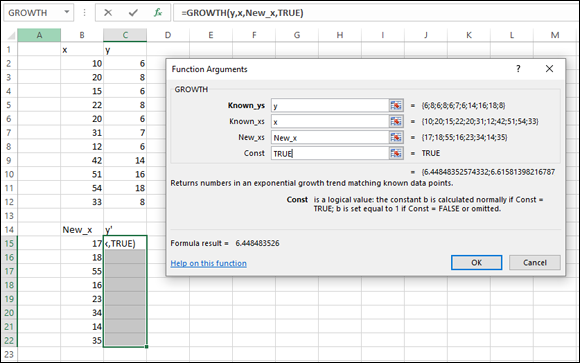
FIGURE 22-20: The Function Arguments dialog box for GROWTH, along with data. GROWTH is set up to predict y’s for a new set of x’s.
To do this, follow these steps:
-
With the data entered, select a cell range for
GROWTH’s answers.I selected C15:C22.
- From the Statistical Functions menu, select GROWTH to open the Function Arguments dialog box for
GROWTH. -
In the Function Arguments dialog box, type the appropriate values for the arguments.
In the Known_y’s box, enter the cell range that holds the scores for the y-variable. For this example, that’s y (the name I gave to C2:C12).
In the Known_x’s box, enter the cell range that holds the scores for the x-variable. For this example, it’s x (the name I gave to B2:B12).
In the New_x’s box, enter the cell range that holds the new scores for the x-variable. That’s New_x (the name I gave to B15:B22).
In the Const box, the choices are TRUE (or leave it blank) to calculate a, or FALSE to set a to 1. I typed TRUE. (Again, I really don’t know why you’d enter FALSE.)
-
Important: Do not click OK. Because this is an array function, press Ctrl+Shift+ Enter to put GROWTH’s answers into the selected column.
Figure 22-21 shows the answers in C15:C22.

FIGURE 22-21: The results of GROWTH: Predicted y’s for a new set of x’s.
The logs of Gamma
Sounds like a science fiction thriller, doesn’t it?
The GAMMA function I discuss in Chapter 19 extends factorials to the realm of non-whole numbers. Because factorials are involved, the numbers can get very large, very quickly. Logarithms are an antidote.
In an earlier version, Excel provided GAMMALN for finding the natural log of the gamma function value of the argument x. (Even before it provided GAMMA.)
In Excel 2013, GAMMALN receives a facelift and (presumably) greater precision. The new worksheet function is GAMMALN.PRECISE.
So the new function looks like this:
=GAMMALN.PRECISE(5.3)
It’s equivalent to
=LN(GAMMA(5.3))
The answer, by the way, is 3.64.
Just so you know, I expanded to 14 decimal places and found no difference between GAMMALN and GAMMALN.PRECISE for this example.
Sorting Data
In behavioral science experiments, researchers typically present a variety of tasks for participants to complete. The conditions of the tasks are the independent variables. Measures of performance on these tasks are the dependent variables.
For methodological reasons, the conditions and order of the tasks are randomized so that different people complete the tasks in different orders. The data reflect these orders. To analyze the data, it becomes necessary to sort everyone’s data into the same order.
The worksheet in Figure 22-22 shows data for one participant in one experiment. Width and Distance are independent variables; Moves and Errors are dependent variables. The objective is to sort the rows in increasing order of width and then in increasing order of distance.

FIGURE 22-22: Unsorted data.
Here’s how to do it:
-
Select the cell range that holds the data.
For this example, that’s B2:E9.
-
Select Data | Sort.
This opens the Sort dialog box, shown in Figure 22-23. When the dialog box opens, it shows just one row under Column. The row is labeled Sort By. Because I have headers in my data, I checked the box next to My Data Has Headers.
-
From the drop-down menu in the box next to Sort By, select the first variable to sort by. Adjust Sort On and Order.
I selected Width and kept the default conditions for Sort On (Values) and Order (Smallest to Largest).
-
Click the Add Level button.
This opens another row labeled Then By.
-
In the drop-down menu in the box next to Then By, select the next variable to sort by, then adjust Sort On and Order.
I selected Distance and kept the default conditions.
-
After the last variable, click OK.
The sorted data appear in Figure 22-24.
FIGURE 22-23: The Sort dialog box.

FIGURE 22-24: The data sorted by width and distance.