
6. Leverage Visuals
As we explain in Chapter 5, “Write Simply and Clearly,” there’s no doubt that clear writing is a key component of effective communication. But another element is just as important, yet it’s one that’s often overlooked. This element is—you guessed it—visuals.
The more we understand about the workings of the human mind, the more we see the importance of visuals. For example, half the brain is devoted (directly or indirectly) to vision. We process images 60,000 times faster than text. Even letters and words are experienced visually: We learn the alphabet by associating A with apple, B with ball, and so on. When we read the letters “b-a-l-l,” we don’t process them individually. Rather, we “see” an image of the entire word—and we instantly associate the word with a mental picture of a bouncing sphere.
Marketers and the media leverage visuals to sell their products and convey ideas to an increasingly diverse world. Plus, because our world is overloaded with information, these persuaders know that visuals quickly cut through the clutter to capture people’s attention and influence their thinking.
Visuals Persuade
Presenters who use visuals are 43% more effective in persuading audience members to take a desired course of action than presenters who don’t use visuals, according to a study by the University of Michigan School of Management.
Perhaps as a result, visuals are growing in importance in our society. From advertising to entertainment, from highway signs to retail store displays, visuals dominate. Writes Paul Martin Lester, Ph.D., professor at California State University at Fullerton, “Images . . . fill our newspapers, magazines, books, clothing, billboards, computer monitors, and television screens as never before in the history of mass communications.” As a result, “We are becoming a visually mediated society. For many, understanding of the world is being accomplished, not through reading words, but by reading images.”1
Leverage Visuals to Help Employees Understand
What does this mean to you? Quite simply, visuals need to be one of your key communication strategies. And even if you can’t draw, don’t think of yourself as a visual person, and don’t have the budget to hire a graphic designer, you can make communication more appealing through the simple use of visual techniques.
Visuals Explain
Dan Roam, author of The Back of the Napkin, is a strong advocate of the impact of even the simplest visuals. As he puts it, “Visual thinking means taking advantage of our innate ability to see—both with our eyes and with our mind’s eye—in order to discover ideas that are otherwise invisible, develop those ideas quickly and intuitively, and then share those ideas with other people in a way that they simply ‘get.’”2
Climb the Visual Tree
The first step in using visuals to enhance your communication is to understand the Visual Tree, a concept created by Alison’s colleague David Pitre to illustrate the array of visual approaches available to us (see Figure 6-1).

We start at the bottom of the tree, before visuals, when all we have are words. But as we work our way up, we see the increasingly sophisticated visual options, leading all the way to the top, to moving images such as video and animation.
We show you how to use five branches of the Visual Tree—text treatment, simple graphics, photography, icons, and infographics—to make your communication more compelling. We give you tips on how to achieve many of these methods with available tools such as Microsoft Word and your digital camera. And we provide examples of applying visuals to a common HR communication challenge: providing information to employees during open enrollment.
• Observe. As Yogi Berra once said, “You can observe a lot just by watching.” Visit your favorite shopping website to see how designers use colors, images, and even white space to make merchandise appealing. Browse through a consumer magazine and notice the use of type treatments. Next time you’re at the supermarket, pay attention to how the packaging is designed to draw you in.
• Explore. Much information about visuals is available for free on the Internet, including an About.com learning section on design basics, a website about color (www.colormatters.com), and even videos on YouTube that give the history of graphic design.
Take Text to the Next Level
We love words as much as the next person; in fact, our ideal vacation includes a beach and a book. But even people like us don’t want to have to search through a sea of gray text to find information we need when we need it.
So the first step in making your content more visual is by giving it a “text treatment”—breaking up the wall of words:
• Use bullets, numbers, and other chunking techniques, as demonstrated in Chapter 5.
• Give your text some oomph by using boldface or italics, making headlines or subheads larger.
• Break the boundaries of black and white by using color to highlight text.
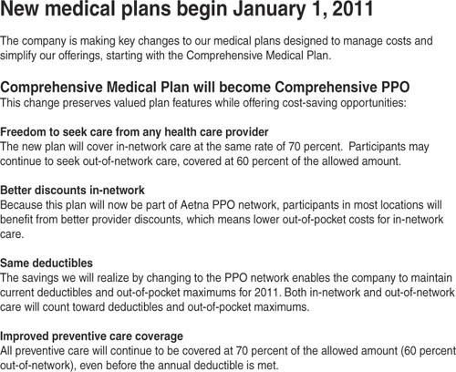
In Figure 6-2, a communication about a change in a medical plan is made easier to read by using the framing techniques we show you in Chapter 4, “Frame Your Message,” and the writing approaches described in Chapter 5. Then a text treatment—subheads in boldface type—is employed to enhance the look of the piece and make it easy to scan.
Beware the Typography Trap
One common mistake that many nondesigners make is to overdo the use of typography fonts. (A font is a set or family of typefaces, such as Arial or Times New Roman.) After all, it’s so easy to replace one font with another—and even to use a different font for every word in a sentence. But there are two very good reasons not to indulge in font madness. First, although occasional use of a different font creates interest, too many competing fonts are just distracting. And second, most organizations have guidelines that specify which fonts support your brand; you want your communication to be consistent with your company’s look and feel.
To emphasize many items, you underline or use boldface for everything you think is important, but pretty soon your sentence looks stressed out and you’ve actually made it harder to read.
Another effective way to call attention to a point you want to make is to put some
white space
around it. For some reason, the eye just zooms in to that big empty space to see what gem is sitting there.
Put Simple Graphics to Work
We’re ready to climb the Visual Tree to the next branch, where you can find simple graphics such as shapes, charts, tables, and graphs.
We start with familiar shapes: squares, rectangles, ovals, and circles. “Shapes are at the root of graphic design,” writes designer Eric Miller on About.com. “They are figures and forms that make up logos, illustrations, and countless other elements in all types of designs.”
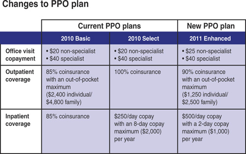
How should you consider using shapes? The simplest way is through the use of charts and tables to organize, connect, and separate information. In Figure 6-3, a complicated set of information—the differences between this year’s PPO health plan and next year’s plan—is neatly contained within a table. The shapes at work are just squares and rectangles, but they lead the reader’s eye to find the facts he or she is looking for.
Shapes also serve as symbols, providing visual shortcuts for key concepts:
![]() signifies something special
signifies something special
X marks the spot or indicates “don’t”
![]() invites you to check something off your list
invites you to check something off your list
![]() tells you to pay attention, often because something’s on sale
tells you to pay attention, often because something’s on sale
![]() conveys balance
conveys balance
Take a Picture
Visit any news website (CNN, USA Today, BBC), and what’s the first thing you see? A photo that conveys today’s top story. Stand in front of a newsstand, and what attracts your eye? Cover photos of celebrities, models, and, in the case of food magazines, a delicious meal. Look at today’s newspaper, and what do you notice first? Even in the case of traditionally “gray” newspapers such as The New York Times and the Wall Street Journal, the most prominent feature on the front page is a large and evocative photo.
If, as Dr. Lester from the University of California says, we’re living in a “visually mediated society,” the medium most often used is photography. Ever since the advent of digital photography (and the ability of most mobile phones to snap a photo), nearly everyone’s communicating with pictures instead of words. Visit a popular 20-year-old’s Facebook page, and you’ll see photos of him, his friends, his travels, and even what he ate for lunch.
How should you use photographs in your HR communication? We recommend two ways: stock photography and photos of employees.
Stock Photography
Stock photos are, according to Webopedia, “professional photographs of common places, landmarks, nature, events, or people” that photographers provide to a service that then makes them available for sale. Sometimes stock services act as a paid library—you can “rent” the photo for one specific use—and sometimes the service is more like a bookstore, where you buy the photo and use it as you see fit.
The advantage of stock photography is that, for a reasonable price (and sometimes even for free) you can find nearly any photo you need, from a laughing baby to a piggy bank. And you can always locate photos of people who look like employees, to create communications employees can relate to.
In Figure 6-4, an article about a new life insurance option has been made more interesting by including a photo of a little girl holding an umbrella. The idea is to convey protection and to associate insurance with sheltering people you love.

The downside of stock photos, of course, is that those smiling people aren’t really employees. So you have to decide which is better: the convenience and professionalism of stock photos, or the authenticity of having pictures of your actual employees.
Stock Photo Sources
Search the web for “stock photo,” and you’ll find dozens of services available. Here are the three most often used by graphic designers we know:
• iStockphoto is a comprehensive stock photo service where members contribute content (which, in addition to photos, includes illustrations, video, and Flash animation). iStockphoto has many people photos in its collection, and the costs are reasonable: You can buy low-resolution images for a website or PowerPoint for as little as $1 per image.
• Shutterstock is a subscription-only collection, so you pay a monthly rate that allows you to download a certain number of photos. If you’re a regular buyer of stock photos, and you need a large collection to choose from, Shutterstock may be for you.
• Veer is at the top of the price range, but it also offers the most sophisticated photos and illustrations.
Employee Photos
We remember a time when the only way to obtain photos of your employees was to hire a professional photographer and arrange a photo shoot. Although that’s certainly still an option—one of our clients just made the investment to illustrate a printed piece about culture change—digital photography gives you lots of other ways to include real-people photos in your communications.
Along the way, expectations about the quality of photos have changed. With the growth of social media—especially networking sites such as Facebook and content-sharing sites such as YouTube, SlideShare, and Flickr—we’ve all gotten more relaxed. The philosophy is that it’s better for photos and videos to be “real” than to be perfect. You can be the photographer and take the photos you need—by getting out your digital camera and and asking employees to say “cheese”—or you can reach out to employees and ask them to submit their own photos. For example, you can ask parents to share baby photos to use in your maternity leave communication. Or suggest that active employees provide photos of themselves exercising to promote a wellness program. Use your creativity (and invite employees to do the same), and you’ll find endless possibilities for picturing employees (by encouraging them to create the photos).
Illustrate the Specific Point You Want to Make
If you have the budget to work with illustrators, they offer you another way to make your point clearly and quickly. What’s great about illustrations is that you can show something it would be difficult to photograph (such as an accident happening), and you can include just the information that makes your point. Look at a variety of magazines and newspapers, and notice which stories benefit from illustrations and which from photographs, and then take your cues from the professionals.
Create Shortcuts Using Icons
We’re now ready to ascend to the upper branches of the Visual Tree to the mighty icon, which the Merriam Webster dictionary defines as “a pictorial representation: an image, emblem, or symbol.” Or, as Alison wrote in her book, Your Attention, Please, an icon is “a small, easy-to-recognize image that is universally understood.” Think about the image on a restroom door signifying men or women. Or the recycling symbol. Or how an outline of a folder indicates a location on your computer for storing files.
We like how designer and graphics instructor Jennifer Farley describes icons: “From the hieroglyphics on the pyramids of ancient Egypt to the orange RSS icon now gracing so many websites, icons have been used in both print and in web design . . . to draw the eye quickly to important parts of the document or web page.”
The advantage of icons, says Ms. Farley, is that they “convey lots of information quickly” and can be used to grab people’s attention or to rapidly communicate an idea.
We find lots of uses for icons in HR communication. For example, the enrollment communication shown in Figure 6-5 introduces an icon for each plan component: healthcare, dental, and vision. Throughout the rest of this enrollment package, which employees received at home, the icons reappear every time information is conveyed about that particular plan. And when employees visit the HR website, those icons appear again to provide a quick way for employees to find information about each plan. Icons therefore become a convenience for employees; they don’t even have to read words to locate what they’re looking for.

Make Complex Concepts Simple Through Infographics
Imagine that you were just appointed commissioner of a new transit system in your city that combines buses and light rail trains that connect to the Amtrak train station and the airport. You need to communicate to riders how they can get from point A to point B, which often involves transferring from one vehicle to another.
What’s the best way to do so? Ideally, the solution would be a single page that riders could carry with them as they travel. This page also would become a poster displayed at bus stops and ticket windows, and an image posted on your system’s website.
What you need, of course, is something like the New York City subway map, which uses a visual system for showing routes, modes of transportation, and where all those vehicles go.
That visual system is known as an information graphic, or infographic. And the best definition we found was on Wikipedia (yes, we know, not always the most reliable source): “Infographics are visual representations of information, data, or knowledge. These graphics are used where complex information needs to be explained quickly and clearly.”
Wikipedia goes on to give examples of infographics:
• In newspapers, such as USA Today, they’re used to show the weather as well as maps and site plans for newsworthy events.
• In scientific literature, they illustrate physical systems, such as cutaway views of anatomy, astronomical diagrams, and images of microscopic systems.
• Transit systems use infographics to integrate a variety of information such transfer points and local landmarks.
The more complex your information, the more you should consider creating an infographic. For example, if your performance management system has a lot of moving parts—goal setting, mid-year review, year-end review, calibration, bonus calculation—an infographic could be created to capture all the components. Then it could be shared with your HR team or managers so that they clearly understand how the system works.
In Figure 6-6, an infographic helps convey the details of maternity leave. The organizing principle is time. In this company, a typical maternity leave spans 14 weeks—two weeks before the baby is born and 12 weeks afterward. So the infographic is organized to show pay and leave choices the employee might make during the period.

When You Don’t Have Money for Graphic Designers
If you don’t have the budget to work with a graphic designer, and yet you know you really could use a professional’s help, here are two suggestions:
First, get recommendations of talented graphic designers from communication professionals in other companies. Then meet with a few designers to see if they would agree to a single-time fee to create a template you could use for all your communication needs. Or perhaps you could offer something that would be an incentive for the designer to give you a price break (sometimes it can be as simple as a credit line). If you can get a price break, approach your management with evidence to persuade them that working with a specific designer would be a good investment.
The second suggestion (which we mention briefly in Chapter 3, “Plan and Manage Communication”) is to visit a local college that teaches graphic design. Ask one or more instructors if your need for communication design or illustration could become a class project. This would be a win-win situation. The students would see what it’s like to work in the real world, the student whose work is selected would have a work sample before graduation, and you would get a great design or illustration for free.
Checklist for Leveraging Visuals
Now that you’ve climbed the Visual Tree, you’re ready to leverage visuals in your communication. Keep in mind the following:
![]() Even the simplest text treatment (such as putting text in boldface) can make your communication more interesting.
Even the simplest text treatment (such as putting text in boldface) can make your communication more interesting.
![]() You can use simple graphics—tables, charts, and shapes—to organize information, make it easier to access, and give it more energy.
You can use simple graphics—tables, charts, and shapes—to organize information, make it easier to access, and give it more energy.
![]() A compelling visual is as close as your digital camera or the photo-taking abilities of your employees.
A compelling visual is as close as your digital camera or the photo-taking abilities of your employees.
![]() When time is of the essence, icons are an effective shortcut.
When time is of the essence, icons are an effective shortcut.
![]() Whether you’re navigating the subways or helping people understand complicated HR systems, infographics make the complex simple.
Whether you’re navigating the subways or helping people understand complicated HR systems, infographics make the complex simple.