

One of the things that has baffled me for many a long year is the complete and utter obsession business presenters have with PowerPoint. When they are not slamming it for dumbing down business communication, they are holding it firmly to their chests like a comfort blanket as soon as anyone utters the word presentation.
The following sections contain the “punch line” to everything we’ve been working up to during each stage of the Presentation Lab process. From the clarification of objectives to creating an audience-centric sticky message and then supporting this with content and visuals that add real value, we’ve been rattling toward the selection of the presentation tool.
I bet you thought that was going to be PowerPoint. And although you’re not wrong, per se, that’s just one of the options.
Don’t get me wrong; PowerPoint is great in many situations. Despite there being a vast array of great new presentation technologies available to us, my company and its band of expert designers still do the vast majority of their valuable visual creation in PowerPoint (with a fair sprinkling of Photoshop and Illustrator thrown in to keep things looking super fresh).
It’s a wonderful tool, but not always the most appropriate. Any seasoned salesperson is familiar with that sinking feeling the lone prospect experiences when the salesperson makes it clear that he’s about to deliver his creds PowerPoint presentation. It’s possible, even likely, to kill any rapport, engagement, and warmth you may have developed with the prospect as soon as you look like you’re going to put a computer and a series of slides between the two of you. It’s not that that they don’t want you to have any visual support as you present; it’s just that you’ve turned quite a friendly, intimate chat into a pitch.
By the same token, there are many larger prospect audiences that would look at you askance if you considered pitching to them without using PowerPoint (or Keynote, if that is your want).
It’s about using the right tool at the right time. And this brings to mind a personal story.

As I have galloped toward middle age, becoming a father and managing director, I’ve found solace (and quiet) in the simple joys of gardening. It seems not long ago that the very idea of pottering around a garden would fill me with dread, but now I’m a man obsessed with soil types, hard landscaping, and sheds.
I had always assumed that the garden shed was a typically British thing. The idea of a man and his shed is well known and regarded in the United Kingdom, with males of a certain age seeing them as a bolt hole, a place of solace, their own private space. Some men go as far as adding heating, a small fridge (typically filled with beer), and some comfy but suitably unfashionable furniture. After checking with friends in other countries, it would seem that these outside man caves are commonplace across the world—and indeed, something to be proud of.
So came the time when I decided that I needed a shed and dutifully scoured the Internet for a suitable building. Three days after ordering, the shed arrived and my heart beat just a little bit faster (mainly because it was the most flat-packed thing I have ever seen. It might have been easier to simply chop down a tree).
Undeterred, my wife and I set aside most of the following weekend to construct the shed. We warned our children to keep a safe distance to avoid being hit with either flying pieces of wood or bad language. And so we began.
Because I can never turn down a bargain or refuse purchasing a new man toy, I was able to bring many tools to this shed-building party. Never has such a small project had so many tools made available to it—from an array of clamps, drills, and spirit levels, to hammers, set squares, and chisels, to the most prized possession of these: my faithful old electric screwdriver.
Aaaaah—my electric screwdriver. It’s been with me for many years, from the first time my wife and I attempted (and failed) to put up shelves in our first apartment together, to successfully mounting pictures of our two children. It’s a dependable friend that’s never far from my side.

And this is part of the problem. Despite having a vast array of different tools, all specifically designed for the separate stages of shed building, I ended up repeatedly using the electric screwdriver. Not only does it drive screws in (as you’d expect), it’s also heavy enough to knock shed side panels together, tap nails in, and take the top off paint tins.
In short, I ignored all the tools I had at my disposal and went back to the one tool I had always used—despite knowing that it was the wrong tool for the job, and that I had other choices that might have worked better (had I only given them a chance).
The purpose of this somewhat tortured and tenuous story is that business presenters the world over are doing exactly the same thing. They keep returning to PowerPoint as their presentation tool of choice despite there being far better options for them—and more important, for their audience.
As you know by now, the entire presentation optimization process is built on one simple goal: attaining the highest degree of audience engagement.
Yet, despite all this focus on audience-centric messaging, years of conditioning within business have led the vast majority of you to immediately turn to PowerPoint, or at a push, Apple’s equivalent, Keynote, as the tool of choice.
The Blended Presenting stage of the process implores you to consider the wide array of Visual Engagement Tools. This does not mean dropping that “old faithful” PowerPoint completely and swapping it for the new kid on the block. It means having a presentation story that’s strong enough that you’re able to use whatever tool best suits your audience to get the message across.
For marketers, it means deriving your power and confidence in front of an audience from your ability to visually share your story and demonstrate your points in a multitude of different ways. It means realizing that this power does not come from the fact that your department spent a lot of money creating an iPad app that does little more than your old company PowerPoint did.
For internal presentations, it’s about truly opening up and emotionally engaging with your colleagues through visually supported stories—not hiding behind the prepackaged content the head office sent down to which you have little or no emotional attachment.

Most important, it’s about audiences getting the respect they deserve from a presenter who feels compelled to deliver their message in the most visually engaging way they can to suit your needs.
In short, Blended Presenting is about letting the audience and your story take center stage—and then using the visual engagement tools you have available to you appropriately.

We scratched the surface of one of the biggest omissions of the presentation sector way back in the introduction of the Presentation Lab, namely, that the vast majority of advice focuses on formal presentations rather than recognizing the other potential forms that business presentations take. Now, with Blended Presenting firmly in mind, it’s time to revisit the Presentation Landscape.
There’s no getting away from it; bookstores, social media, and the Web are awash with great advice to support the business presenter. Type “help with business presentations” into Google, and you’re greeted with more than 100 million results.
The good news is that most of these links will offer considered, practical advice to help you navigate your way through a formal presentation. They’ll no doubt provide hints and tips on how to stand, project your voice, and ensure that your PowerPoint slides look good. If you’re wearing a suit, presenting to an audience that knows not to ask any questions until the end of the presentation, and are determined only to use PowerPoint as a visual aid, you’re in good hands.
The bad news is that most business presentations are nothing like this.
Indeed, most of the day-to-day presentation situations in which you’ll find yourself in do not lend themselves to the (many) rules that surround formal presentations. You’ll often be presenting to a single individual over an informal coffee or to a group on a topic that needs greater levels of interaction than a linear PowerPoint slide deck will support. You might be next up on stage at a conference, and can tell from the coma-like expressions of the conference audience that another 30 slide PowerPoint deck would push them over the edge.
Yet pretty much the entire canon of presentation thinking remains transfixed on addressing the shortcomings of the “I speak; you listen” format.
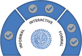
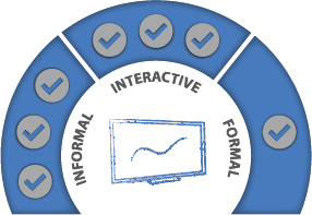
How Does the Presentation Landscape Break Down?
As with all good things in the presentation world, the landscape breaks down rather nicely into three key areas shown in the graphic below:

And although they aren’t hard-and-fast rules, there are some basic parameters we can use to determine which kinds of presentations might fit into each area.
The Formal Presentation
As already highlighted, the Formal presentation is the traditional setting for PowerPoint, Keynote, and the multitude of other presentation software packages. Used properly, these tools can be incredibly powerful and guide an equally formal audience down your chosen path, to a mutually satisfying conclusion.
Typical presentation scenarios that fall into the Formal category are bids and pitches, conferences, and investor presentations. They have one thing in common: The presenter speaks and the audience listens, and then (ideally) a lively Q&A session kicks off at the conclusion of the presentation at the behest of the presenter. In short, the majority of the presentation is a broadcast rather than a conversation.
If it seems that I’m a little snooty about Formal presentations or that I feel they lack an intimacy that plays well with audiences, please know that this couldn’t be further from the truth. Getting Formal presentations right is hard—damned hard. This is because these kinds of presentations, more than any other, are subject to disengaged audiences. They also frequently have more at stake, which inadvertently but understandably puts the presenter at a disadvantage before they’ve even stepped onto the stage. Formal presentations are also more likely to be one-offs or delivered irregularly, which means that studious rehearsal is required by all involved (and, lest we forget, most of the intended rehearsal time will be eaten up by last minute changes to the slides—an unavoidable part of human nature).

My semi-snooty tone might come from the fact that the formal presentation structure has been foisted on presenters and audiences alike for way too long. We’ve followed the unwritten (and in some cases, written) rules regarding posture, diction, and how many bullet points you’re allowed on a slide so slavishly that they’ve hindered audience engagement.
So how do we fix this? Being a little more casual with all presentations is foolish, because some do demand the formal approach. However, a good place to start is to recognize that not all presentations fit the same mold.
This leads rather nicely onto our next category: the Interactive presentation.
The Interactive Presentation
The ability to interact has never been so widely embraced as it is today. Our media thrives on its ability to engage and interact with its audiences, from the occasionally hysterical discussion boards on newspaper websites, to the hoards of business Tweeters and Facebookers, to the ease of voting contestants on and off reality TV shows (my children don’t believe a Saturday evening in front of the TV is complete if they haven’t called a premium rate phone line to vote off a dancer/singer/juggler who doesn’t meet their high standards).
With interaction being so prevalent across the media landscape, it seems strange that presentations have, on the whole, managed to dodge the trend. It might be that conventional wisdom scorns the idea of an audience asking questions throughout a presentation; heaven forbid they got ideas above their station and started driving the presentation toward something that actually appealed to them. Or it might be that presenters have preferred to stay within the lines and stick with the formal approach.

Another reason for the lack of interactivity in presentations is that presenters are simply not aware that many presentation tools at their disposal are eminently capable of supporting an interactive audience engagement.
The starting off point is ultimately less about the tools you choose to use and more about the decision to move away from the Formal approach’s comfort zone. When we embrace the Interactive approach we must rethink the rules and allow a presentation to become more about discussion than broadcast. This apparent lack of control demands that the presenter has a much greater grasp of the presentation story and message, an intimate knowledge of the tool, and an awareness of the audience and how and when to react to their engagement.
Make no bones about it: As the presenter, you are still in charge of the process and need to navigate the presentation and your audience from A to B. The only difference with the Interactive model is that you may meander off-course occasionally if and when a given topic proves of particular interest to your audience. But as long as you complete the journey and end up at point B with message duly delivered and understood, then it really doesn’t matter how circuitous a route your audience may have taken you. You’ve still succeeded.

The good news is that it’s not as scary as it sounds! A good interactive presentation requires as much from the presenter as a business conversation. You simply need to know your subject—because there’s no opportunity to simply read words from the slide autocue style—and be ready to listen to your audience.
As such, the best opportunities to move from a Formal to Interactive presentation style are exhibitions, demonstrations, and account management sales meetings. It’s less about delivering a slick pitch and more about building a bond and rapport and demonstrating you can support your audience.
It’s for these reasons that interactive presentations tend to work best for smaller audience groups. Any more than five audience members and you can find yourself in the middle of an argument rather than a conversation. At this point, you’ll be better served by calling upon the more traditional rules of the Formal approach.
Ultimately the reason we present is to engage with the audience to the point where they will listen to, understand, and ideally act on our message. By putting them in the driver’s seat and allowing them into the presentation conversation, you dramatically change the dynamics of the presenter-audience relationship. You’re giving them license to test, question, and evaluate your message as part of the process. By doing so, you’re much more likely to keep the audience on your side and thus to get the result you desire.
The Informal Presentation
Paradoxically, this is both the most natural form of communication but also the most difficult presentation approach to get right. The Informal presentation still requires sufficient structure to guide the presenter and their audience from A to B. However, you must do so in a way that does not impact the cozy/nonthreatening environment that both parties enjoy.
The example I always use is the ubiquitous airport bar conversation. You’re unwinding with a beer while waiting for your flight to board when you strike up a conversation with the person next to you. As businesspeople do, you ask each other what line of work you’re in and the reason for your travel. One thing leads to another, and soon enough you’re sharing your business message with your new friend—just like you had done three hours prior to a room of prospects.

Note: The use of handmade impromptu visuals as part of an Informal engagement is not restricted to bars! It’s a running joke in our offices that I find it difficult to chat with anyone without a pad of paper and selection of pens at hand. I’m always doodling to visually share my thoughts and ideas with someone. Despite the jokes, people understand that this is my informal way of presenting and engaging with the team, and ultimately ensuring that they understand and receive my message loud and clear.
It’s essential to know that using an Informal approach works only if the presenter really knows their subject. This is more than aimless doodling and a meandering story; it’s about recognizing that the engagement with the audience demands a more relaxed approach, while still delivering a focused and powerful message.
Delivering Competitive Advantage
The evolving Presentation Landscape is an incredibly exciting change in the way we deliver our messages to audiences. In my opinion, it trumps any new technological developments (while the birth of the iPad/tablet was exciting, it’s just another tool at the end of the day) or new design thinking.
The reason for this bold statement is a simple one—it relies on people recognizing and acting on the opportunity. Once we understand the dynamics in play at any presentation situation—and use this insight to apply the right storytelling approach and tools to meet the audience’s requirements—we automatically move up the scale in terms of engagement. This increased engagement provides us not only with a greater chance of meeting our objectives (remember Must-Intend-Like!), but also addressing our audience’s specific needs.
There’s no getting away from it: A greater understanding of the Presentation Landscape coupled with a Blended Presenting approach delivers huge competitive advantage that while useful for internal or conference presentations is invaluable for sales or investor presentations.


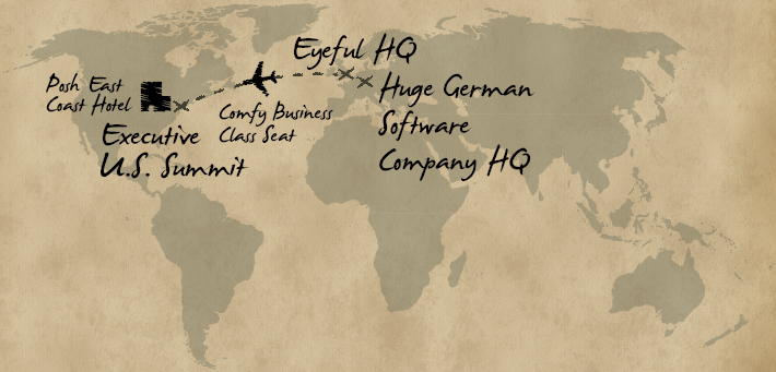
As news of our Presentation Optimization methodology spread, we started getting calls from international companies looking for support and guidance. These were always exciting projects that combined travel to some remarkable countries with the opportunity to work with some truly fantastic companies and people.
Of all these early international projects, there is one that stands out for a couple of reasons. We’d been working with the European offices of a German software company for a number of years, having supported them in all manner of different presentation scenarios. We’d been there for sales decks, kick off events, and for internal presentations—and we’d used PowerPoint as the visual tool each and every time.
There’s no doubt that they’d categorized us as their “PowerPoint people.” This suited us down to the ground; they required a lot of PowerPoint, we had a great reputation within the business and, top down, they were nice people to work with. Then the message spread to the United States.
I was asked to join a confidential conference call, where it was announced that the software company was in the process of acquiring one of their largest competitors. This acquisition would make a huge difference to the already very impressive business—a revised and improved customer proposition, greater leverage in a vibrant marketplace, and the opportunity to embed themselves even deeper into their growing customer base. It was all very exciting, and they needed a PowerPoint presentation to release as part of the rollout training and coaching for their global sales team. I was summoned to the United States and arrived at their offices fresh as a daisy after sitting in business class on my flight and being put up in one of the finest hotels the East Coast could offer.
With a suitably senior (and, let’s be honest, expensive) executive team seated behind closed doors, we commenced the Presentation Optimization process. We established a good understanding of the prospect audience, discussed objectives, and quickly identified a compelling key message (it was such a wonderful proposition that none of this was all that tricky). Then we moved onto the content.
And this is where the cold sweats started.
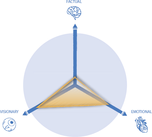
The audience heat map profile was heavily weighted toward the Factual with a strong sense of Visionary. This was to be expected—it was a highly technical sale with a multimillion dollar price tag attached. Given the very technical nature of the new combined solution, we were going to have to get pretty detailed quite quickly in terms of content, which could alienate the visionary section of the audience. My business prides itself in getting PowerPoint to do things it wasn’t originally designed to do, but this seemed like a step too far.
I had no option but to voice my concerns. So, with more than a little trepidation, I turned to my senior and generous hosts and uttered the fatal words:
Somewhat understandably, a silence fell over the room. (Oh dear.)
I pressed on, however, explaining that the story itself was extremely compelling and that by sticking purely to PowerPoint, we ran the very real risk of switching off what should and would be an audience hooked on everything we had to say.
I suggested that we continue to think visually and see where the rest of the session took us. I think it’s fair to say that there was a sense in the room that this had all turned a bit sour, and I was to blame. (Oh dear indeed.)

Add to that the fact that our customer’s sales team now had a visual describing their prospects’ specific requirements in the prospect’s handwriting. This meant that they could use the wonders of Smartboards to e-mail and insert them directly into proposal documents—and could reference them later on to produce a truly bespoke offering.
From moments of blind panic came a solution that exceeded all of our expectations.
Personally, this was a sea change in the way I looked at the entire process of presenting. By challenging the established norms and mixing things up a bit, we’d made a great story even more powerful and palatable for the audience. It was a simple as using the right tool at the right time for the right type of content—and by doing so, we’d inadvertently created a new approach to presentations. Blended Presenting had been born.
We no longer view presentations as necessarily being purely of one format. Our customer base now generally accepts that getting the message and story optimized is the first and often most challenging phase in the development of a presentation. The visualization of that story into an array of different presentation outputs is the fun bit. It’s what allows us to engage with any audience type, in any number, and in any situation in a way that truly makes a difference.
It’s exciting, it’s relevant, and it’s powerful.

So Many Ways to Engage . . .
With a firm understanding of the Presentation Landscape in hand, you can now turn your attention to the plethora of presentation tools available to you. Used properly as part of a blended approach, these tools will support your new thinking and aid that all-important engagement with your audience.
It’s time to look at the tools for the job; however with so many available to the business presenter today, it can all become a little overwhelming.
Beware the New Toy . . .
Presenters the world over are subject to the constant temptation to try something new—either for the novelty factor or because it will look cutting edge to their audience.
When Apple launched the iPad, people scrambled to convert a wave of presentations from PowerPoint to Keynote (a relatively slow process in the early days of the iPad) so that executives could use their new toy at the next board meeting. While sleek and slick, the early iPads were awful if presenting to more than three people due to the lack of a VGA port. Yet people still persisted.
Online presentation tool Prezi rode on the back of being different when presenters started picking it up in early 2011. Again, the allure of zooms, whooshes, and a general step away from the norm appealed to many, despite the occasional moans from nauseous audience members.
I distinctly remember a conversation with a creative agency that had come to us for support. The lead presenter was fully aware that Prezi was the wrong tool for his audience and message, but felt compelled to employ it since “we’re expected to use the latest technology.”
Even though it was the wrong tool for the job? At best, it’s foolhardy, at worst, it shows a complete disrespect for the audience.
What Fits Where . . . ?
Alas, there is no truly definitive list of which tool to use for different presentation scenarios. Indeed, the purpose of the Presentation Lab is to arm you with sufficient information to allow you to make the right choice at the right time. The beauty of having a good understanding of the Presentation Landscape, coupled with the Blended Presenting approach is that it lets you apply these tools at the most appropriate time to deliver true audience engagement.
After all, there is no reason that an informal presentation may not ultimately lead to you firing up the computer and running a PowerPoint show—if that’s what engages the audiences best. By the same token, if it doesn’t achieve that measure, you must move on to another tool.
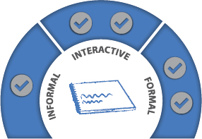
The Blended Presenting wheel (below) is designed to offer no more than a best practice guide—one we’ve developed after working with hundreds of companies on thousands of presentations that fall into one of these three main categories.

With this in mind, and to get things off to a good start, we’ve pulled together a list of the usual suspects in terms of presentation tools. The following section includes our diagnosis of their relative strengths, weaknesses, where and what you can use them with—and most important the audience type that matches each one best.
PowerPoint
As already discussed, PowerPoint is the weapon of choice for the vast majority of business presenters across the world. The often-quoted number is that 30 million PowerPoint presentations are created every day (and remember that this was a number at best guesstimated back in 2001!). As recently as 2012, Microsoft announced that PowerPoint was now installed on 1 billion computers globally. Inevitably, its success means that its name has become synonymous with presentations (especially bad ones!).
PowerPoint started life as a Mac tool called Forethought back in 1987, but after being bought by Microsoft (initially against Bill Gates’ wishes), it gained popularity and profile on every businessperson’s desktop computer.
For every fan of PowerPoint, there are 10 who deride it as a tool of mass miscommunication and the source of many of the evils of business today, namely dumbed down data and a general lack of understanding. However, this somewhat misses the point; it is simply a piece of software. Blaming PowerPoint for awful business presentations and communication is like blaming your TV set for the fact that there is nothing interesting to watch this evening.
The truth is somewhere in the middle; PowerPoint is neither evil nor particularly angelic. As with all of the technologies available nowadays, the sins and blessings primarily sit with the user.

What’s good
PowerPoint does a lot of things very well. It’s incredibly simple to use, despite more recent versions offering real power in terms of graphic manipulation and video editing.
In comparison to other tools, it’s very flexible, and offers a wide range of outputs from the development of slides—video, hard copy, PDF and, with the right plug-ins, Web-friendly formats such as Flash and HTML5—that are incredibly easy to use.
In the right hands, it can also be a powerful interactive presentation tool that lets presenters “drill down” into information in line with the audiences’ questions and areas of interest. As is the case with much of PowerPoint’s features, most are either left undiscovered or horribly misused by would-be presentation designers.
What’s not good
Paradoxically, its ease of use is what causes PowerPoint most of its issues. It’s intuitive nature and wide availability compels every businessperson with Office installed on their computer to mistakenly believe that they are equipped to develop a visual presentation. For reasons already covered, crafting an engaging and impactful presentation requires so much more than pulling together some highly animated slides—and sadly, PowerPoint fools its users into a false sense of security and confidence in being able to provide this.
One of the reasons that PowerPoint gets such a hard time from disgruntled audiences is the fact that unprepared presenters fall into the trap of “vomiting” their content onto the slide with little thought for message, story or structure. Although it’s slightly unfair to blame the Microsoft programmers entirely, they could do a bit more to support their customers (and their audiences!) by providing some hints, tips, and nudges toward presentation best practice. Instead, all they provide is a dazzling and disorientating array of background template options, and a blank bullet point slide to fill in. People don’t think in bullets; they think in pictures. Yet PowerPoint encourages them to take this route.
However, it’s transformation from visual presentation tool to extension of Word is an issue that all businesspeople should be aware of. More important, Microsoft’s developers and programmers need to be aware of it too.
What it mixes well with
One of the best things going for PowerPoint is the level of flexibility it allows the presenter. Want to add video? No problem. Link to external sources? Ditto. Output your slides to PDF or as handouts? No sweat.
PowerPoint’s flexibility often makes it the common presentation tool thread running through a Blended Presenting approach. Embedding a video into a PowerPoint slide at the appropriate point within your presentation ensures a seamless link between the two; so why wouldn’t you keep it running in the background? This “Launchpad” approach seems to be the best way to think of PowerPoint. It plays nice with pretty much anything you can throw at it—even the iPad (most of the time).
When to use it
Again, PowerPoint’s flexibility makes this a tricky one to answer, as it can be used in most situations.
We would suggest that the typical PowerPoint mentality—which sadly normally means “I talk; you listen”—is best kept to the reserve of the Formal presentation with a Q&A session at the end. This Formal environment—be it a seminar, conference, or tightly controlled sales pitch environment—is the traditional home of PowerPoint. It’s what it was designed for back in 1987, and features such as speaker notes, although incredibly valuable, speak volumes (no pun intended) about the environment Microsoft still believes it belongs in today. The telltale sign is the linear deck of slides that follow each other. Although the format is perfect for the “I talk; you listen” presenter, it has the potential to quickly become a nightmare as soon as one of the audience members (often the CEO) raises a hand and asks a question “off script.”
At this point, the presenter looks to the skies and asks for one of three things:
- That the ground opens and swallows him or her up
- That the number of the slide that has the answer to the question posed would spring to mind
- That PowerPoint could be an interactive tool
Thankfully, these formal presentations are becoming less and less the norm and, certainly in sales and marketing circles, a more interactive approach is gaining in popularity. This interactive scenario is where communication, storytelling, and messaging really go up a few notches, as it allows the presenter and the audience to engage to the point where a presentation becomes a conversation. PowerPoint can provide all the bells and whistles required for these situations while simultaneously applying the salve of familiarity to the nervous presenter.
There’s nothing that can kill the sense of bonhomie and presenter-audience rapport quicker than someone firing up a computer to deliver slide after slide of content. The one caveat here is to think about the choice of delivery tool. A well-crafted and relevant visual slide delivered via a smartphone or tablet can work well in an informal setting. Just be sure to use sparingly and with the audience and setting firmly in mind.
Who to use it with

How to use it

Keynote

Despite the intense feelings that the PowerPoint versus Keynote debate generates among the business presentation community (I’m not kidding—I’ve seen discussion threads disintegrate into petty name-calling as each side extols the virtues of their chosen slideware), Keynote can pretty much be summarized as Apple’s take on PowerPoint.
Until the arrival of the iPad, Keynote was most closely associated with Steve Jobs and his Macworld conference presentations. The clean graphics, smooth transitions, and unique animations stood out from the crowd and certainly made PowerPoint look like the “corporate” option rather than the beautiful and engaging slides that accompanied each of Mr. Jobs’ appearances.
Perhaps the biggest coup in the widespread acceptance of Keynote came with the launch of the iPad, which brought Apple’s sexy new technology into the hands of business people worldwide. These very same business people wanted to use their shiny new iPads to share presentations. When they went in search of the nearest thing they could find to PowerPoint, the Keynote app won out. It’s fair to say that most business people would have stayed completely oblivious to Keynote had it not been for the iPad.
Sadly, it’s not a completely happy ending to the story. There remain frustrating compatibility issues between the Keynote app and business’s native PowerPoint files—issues with fonts, custom shows (see earlier section on Interactive presentations), and certain animations means that trepidation remains whenever one opens a Keynote presentation that originated in PowerPoint (or vice versa).

What’s good?
Despite countless Apple fans’ protests (and I say this writing on a MacBook), Keynote and PowerPoint are practically indistinguishable. This may send shivers down the spines of both Apple and Microsoft fanboys, but it’s pretty much a draw for the basic user of either presentation tool.
One of the areas where Keynote used to shine was in the animation and transitions available. They were more interesting, ran smoother (mainly due to the better hardware on which they ran) and generally looked a bit fancier. They also had an ace up their sleeve with an animation tool called “Magic Move,” which makes certain animations a breeze—giving Keynote the upper hand for certain odds and ends. Ultimately, however, whizzy animation does not ensure a good presentation; indeed, most of the time, it makes for a truly awful one. But it was an advantage that Keynote had over it’s nearest rival, PowerPoint.
As time has gone on, Microsoft developers have caught up and (horror) may have even overtaken Keynote on this as a result of PowerPoint’s most recent releases.
What’s not good?
In conjunction with the iPad, Keynote has done a great job getting Apple into the consciousness of today’s tech savvy business presenter. Despite this, they don’t seem to have made much investment in keeping Keynote ahead of the pack. The compatibility with PowerPoint remains patchy and still does not support many of the features people have come to expect from tablet solutions—most notably intelligent hyperlinking to support the interactive presentation requirements. This lack of investment has unwittingly led to a number of app providers exploiting the opportunity for a robust presentation app and aiding business presenters in their use of the iPad.
The other frustration is the Keynote iPad app’s “lightness” versus its desktop equivalent; indeed, it is very much a slimmed down version. There is some logic behind this, as software developers recognize the fact that any tablet is imperfect when it comes to creating content. The lack of a permanent keyboard and mouse makes fine tuning content cumbersome and time consuming. However, there is a sense that the Keynote developers are happy to accept average rather than innovate to make the most out of the hardware the app sits on.
What they mix well with
In much the same way as PowerPoint acts as a foundation for repurposing presentations into different formats and media, Keynote has the option to share to PDF, printed formats, HTML, and QuickTime video.
Without a doubt, the biggest feather in its cap is its ability to work seamlessly on the iPad. For those business people who have made the move to a purely Apple environment (typically the creative sector and subject matter experts), this compatibility makes the switch from laptop to tablet to hard copy presentations a breeze.
When to use it
In line with PowerPoint, Keynote works well for Formal presentations and for linear iPad presentations.
Ironically, Keynote’s limitations come to the fore with Interactive presentations. The lack of custom show functionality means that building a presentation to support a truly interactive engagement can be a little clumsy and not particularly intuitive.
Who to use it with

How to use it

Prezi
If there’s any slideware that demonstrates the market’s hunger for new presentation approaches, it’s Prezi. Prezi arrived in 2009 in a flurry of attention-grabbing PR and assurances that it would single-handedly change the face of presentations. And although it may have some way to go before knocking PowerPoint off the slideware top spot, it has forced many business presenters to completely revaluate the way they think about presentation visuals and delivery.
Prezi’s secret weapon is the way it delivers information using its Zooming User Interface (ZUI). It has completely (and almost literally) turned the presentation experience on its head by allowing presenters to zoom and pan in and out of images, text, and other media. Because Prezi is based in the Cloud, it’s cheap to work with (at the time of writing, the basic version is free to use) and accessible from any Internet-enabled piece of hardware. Subsequently, the novelty of this new approach coupled with a well-funded marketing campaign caused the number of registered Prezi users to skyrocket to over 18 million in 2012, and more than 250 million Prezi presentations were viewed online that year. It very quickly became a presentation phenomenon.
Prezi’s refreshingly original visual approach makes it stand out from the multitude of standard linear presentation tools out there. However, there is a caveat—namely, the reports that sometimes, the Prezi experience is a little too extreme. Some audience members have experienced motion sickness–induced nausea when viewing fast action Prezi presentations on a large screen. And although some don’t have as extreme a reaction, they’re simply overwhelmed by the entire approach.

Many people have embraced the slick transitions and new nonlinear approach to sharing their message; others have derided it as a one-trick pony that is more style than substance in terms of truly delivering a sticky, message-driven presentation.
My personal view is that Prezi has its place in the canon of presentation tools—but for a very specific type of engagement. To see it as a direct challenge to the likes of PowerPoint and Keynote is not only a bit naïve; it can be downright dangerous when presenting to certain audience types.
Let me explain.
What’s good?
In addition to its unique and very clever zooming features, we must applaud Prezi for making business people think differently about their presentations. The software’s very nature prevents presenters from mindlessly filling slide after slide with bullet points; more planning, pondering, and consideration of the audience is required before a presenter can develop the Prezi canvas. This is not to say that there are not bad, ill-conceived, and overly wordy Prezi presentations out there (!). It’s just that this option makes it little more difficult to fall into the trap of creating autocue-type slides.
Perhaps Prezi’s most obvious benefit is that it is so very different from the other options out there. You cannot underestimate the novelty factor when considering how to best engage your audience—and Prezi wholeheartedly delivers on this. However, bear in mind that this can be a double-edged sword.
What’s not good?
Prezi is very good at one thing: zooming and panning. And that’s pretty much as far as it goes. So if your presentation isn’t going to benefit from this high-impact animated approach, Prezi probably isn’t going to be much use.
Perhaps as a nod toward the greater functionality of tools like PowerPoint and Keynote, developers at Prezi are slowly increasing their tool’s bells and whistles. For example, Prezi now offers fade animations and the ability to embed PowerPoint files. The ease by which presenters can import elements into Prezi is an important factor, as it remains extremely limited in it’s ability to generate anything but the most basic shapes. In other words, pretty much everything needs to be created outside of Prezi and imported in, which can be both time consuming and frustrating. As a colleague said recently, “Man cannot live by zoom and pan alone.”
Finally, there is no getting away from it; Prezi’s unique zoom and pan functionality could very easily become an unwelcome distraction. In the most extreme cases, you might find sections of your audience turning a funny shade of green as you visually throw them across the screen one more time. But even in more moderate situations, you risk having them focus more on the transition than the message.
What they mix well with
Prezi works well as part of a Blended Presenting strategy. It’s fairly intuitive to combine it with other technologies and approaches to engage an audience. It gives you just the right level of razzmatazz while keeping them on track and supporting your message.
It can be used alongside PowerPoint, converted to video (with a bit of jiggery pokery), and played as an introduction on the web or on an exhibition stand. In short, Prezi is probably best as part of an ensemble of presentation tools rather than sitting center stage for the vast majority of presentation scenarios.
You can think of it as a spice that you add to a meal to jazz it up. Used sparingly, it can enhance the meal and add real flavor and depth. Sprinkle it around too liberally and it will overpower the dish completely and leave a bad taste in the mouth. So use it with care!

When to use it
I’d hate to think that the plethora of caveats I issued in the previous paragraphs would lead you to shy away from trying Prezi and incorporating it into a Blended Presenting approach. The Prezi zoom and pan feature does lend itself to some pretty cool applications and can bring some much needed impact into the most intense and business-like presentations.
At Eyeful Presentations, we have used it most successfully to demonstrate a journey in several ways:
Prezi worked brilliantly for these very specific applications—but only these.
As with all the latest technology, it’s about finding the right application for its cool widgets rather than blindly using them simply because they’re new and different.
Who to use it with
How to use it
Whiteboard
The lowly whiteboard sits largely ignored in executive suites and meeting rooms in businesses of all sizes, across all parts of the world. They’re occasionally dusted down, either to project a PowerPoint slide or Excel chart onto or for an enthusiastic product manager to leap into action and share their latest complex diagram with perplexed colleagues. If you look carefully enough, you’ll see the faint remnants of the time someone used the wrong type of pen on the board, much to their own embarrassment and the chagrin of the premises supervisor. But most of the time, they just sit there unused, unloved, and underutilized, and representing a huge missed opportunity to business presenters everywhere.
When embraced, the whiteboarding concept unlocks a whole new level of interactivity with an audience. It allows presenters to engage in a completely different way to the more formal approaches.
The range of whiteboards available is vast—from the analogue versions which are simply a sheet of plastic mounted on the wall, to a fully digital version that links directly to your computer, is supported using pens/fingers/stylus, and has the ability to access the web, videos, and a host of other media. The joy with whiteboard presenting is that it really doesn’t matter how technically advanced you or your audience are. This approach is about engaging your audience in the most pure way possible, with story, structure, and key visuals. And the fact that almost all businesses have a whiteboard—or, at worst, a paper flipchart in a conference room somewhere—means that you are never left without a medium by which to present.
What’s good?
The simplicity of whiteboards is the secret to their success as a presentation tool. They represent a huge blank canvas upon which you can share your story, thereby allowing you to add the visual content when it supports your message—and leave other areas blank to complete in conjunction with your audience. Compared with the technical safety blanket that PowerPoint, Keynote, and the like provide, whiteboard presenting gently forces you to think and deliver visually—since writing up a series of bullet points on a vast whiteboard would seem more than a little, well, weird.
Add to this the fact that they are available in pretty much every office the world over (and if you’re struggling to find one, a pad of paper and pen works just fine for a small audience) and you’re in good stead.
Even more powerful is the ability to record the results of you and your audience’s combined efforts for posterity—either by hitting the screengrab button on electronic whiteboards or using your smartphone’s camera to take a picture. You can then use this jointly produced masterpiece (with the audience’s handwriting in place) as part of your post-presentation follow up—either as a proposal document, summary e-mail, or call to action reminder.
There’s no denying it; being able to deliver your message in this way gives you some powerful choices.

What’s not good?
Despite it’s many benefits, whiteboard presenting is not without it’s flaws.
A strong story is by far the most important element in making whiteboard presentations work. Without a strong story in place, the very thought of standing in front of a blank canvas will (quite naturally) bring on heart palpitations from the most experienced presenter.
Presenters, especially nervous ones, really need to know their story and be confident enough to respond and run with the audience’s interactions while keeping everything on track. This increases the stakes exponentially—so approach with caution.
And although you never want to use PowerPoint and other slideware as an autocue, there is no doubt that a few choice pre designed words on a slide can help the nervous presenter stay on track. With insufficient knowledge or preparation, whiteboard presenting is the presentation equivalent of tightrope walking . . . without a safety net . . . over a ravine full of crocodiles.
If they are in Formal mode and expect you to follow a specific agenda and format for the presentation, you run the risk of upsetting them by turning things on their head. Choose your moment, gauge your audience and know what you want to say before you attempt to say it.
What they mix well with
Whiteboard presenting works incredibly well as part of a blended approach. It might be to simplify some particularly technical information, work as an exercise to uncover an audience’s needs and then align a solution accordingly—or simply serve to change the dynamics within the room.
When to use it
This model is normally best used as part of a mix, to be pulled out of the presentation toolkit at the point where audience engagement and buy-in is at it’s most powerful. In my experience, this is rarely at the start or conclusion of your allotted speaking time; it’s more likely to form the core of your presentation Engage stage.

Who to use it with

How to use it
Hard Copy Document
On the surface, a hard copy presentation format shouldn’t really be particularly noteworthy. Surely it’s simply a static, printed version of PowerPoint or Keynote slides you’d typically associate with business presentations, right?
Actually, it’s much more than that.
These presentations are beautifully bound, incredibly text heavy, and normally rather thick. Despite riding roughshod over pretty much every presentation rule known to man, certain sectors simply love them. It might be the vast amount of content that is shared in the very dense pages of text, that the velum coated covers appeal to the audience, or simply the “stackability” of the documents back at their offices. But financial services companies can’t seem to get enough of them, investment companies adore them, and private equity houses go all of a quiver when they see them.
It really is all rather strange to me. And despite our regular protests, we at Eyeful Presentations have an array of customers who prefer to present in this format to this very specific audience type. Let’s delve into why.

What’s good?
This hybrid of document and presentation provides the audience with an almost word-for-word record of the meeting without automatically excluding the use of valuable visuals. The book’s layout and construction, typically carried out in PowerPoint, makes it easy to use large, engaging imagery—so don’t overlook this opportunity.
Additionally, the comprehensive nature of the content provides both presenter and audience with the confidence that all the information required will be in the document (somewhere!). Therefore, if audience members share the presentation with colleagues after the meeting, they’re unlikely to misinterpret the message.
What’s not good?
The biggest issue with hard copy presentations is the constant debate over whether it’s a presentation or a visual document. Presenting from a visual document is downright difficult, since it can cause you to fall into the trap of reading large sections of the content to your audience (something you tend to do even more when you’re nervous).
As such, it is very easy for the presentation to actually form a barrier between the presenter and the audience—which is, of course, the polar opposite of your objective. Building a rapport and engaging an audience is best managed through a shared experience, something that the hard copy document’s binary approach does little to support.
What they mix well with
Packed schedules and the chaos of everyday business life means that you won’t always get to deliver your presentation to absolutely everyone who needs to hear it. It might be that one of the key decision makers for a sales presentation was unable to attend and relies on colleagues to interpret your message. It might be that an internal audience will want to ponder on your recommendations before acting on them. In these situations, the follow-up hard copy presentation is priceless.
When to use it
You can also use them for the very specific financial audiences previously mentioned, or when a more conventional approach is appropriate. (This is a polite way of saying that if your audience simply will not accept another approach, you must follow this in deference to them.)
Who to use it with

How to use it
So how does this plethora of presentation scenarios, tools, and styles play out in real-life? How easy is it to use the concept of Blended Presenting in a situation such as a sales presentation? By way of answering that, I share the following story.
I recall working with a company in the United Kingdom that had a real problem with their presentation. The relationship began when they tried to sell me human resources (HR) services for our fast-growing company.
It wasn’t particularly their salesperson; she was well presented, obviously knew her content, was proud of her product, and had run a good meeting up to a point.
It wasn’t particularly their slide deck either (although this was incredibly corporate and a little too uptight for its own good).
And it wasn’t their message. They had a good product and a relatively clear point about the impact their offering would have on our business.
The problem was the way the salesperson handled the presentation. Up until the moment she fired up her laptop, we’d been getting on well. She’d done a fine job in building rapport, had obviously done her research on our business, asked me sensible and educated questions, and answered all my queries clearly and confidently.
However, as soon as she entered “presentation mode,” she transformed from a warm professional in whom I had faith into a robot. Over the course of 20 minutes and far too many slides to count, she slowly removed all sense of credibility from herself and her employer.
I asked her why she felt the need to deliver a PowerPoint presentation at that stage of the meeting. As a prospect, I was warmed up and ready to do a deal—full of positive energy; sentiment she then killed by unveiling and delivering the living embodiment of death by PowerPoint.
Her answer shocked me: “Our Sales Director says we have to deliver this PowerPoint presentation every time, in exactly this order and using this exact script.”
It transpired that the company had worked with a presentation design company who had convinced them that the best way to get their message across was to deliver their story, word-for-word without any deviation. That, coupled with the Sales Director’s lack of confidence in the sales force, had turned a good proposition into a complete turn-off within minutes.
This lack of presentation flexibility is occurring across the globe every minute of every day. It’s costing sales people the opportunity to close deals. It’s costing marketing people reputation—and most important, it’s costing audiences time and, I’m sure in some cases, their mental health!
And Now the Good News . . .
By taking a Blended approach to the same proposition, we are able to slim down the vast number of slides required in the company PowerPoint and offer more visual ways of demonstrating key points, be that via the slide deck or on a whiteboard or a pad of paper and ultimately free the sales team to do what it did best: communicate and sell.
Blended Presenting has that power, and the Presentation Lab “experiments” in the next section will demonstrate just how.
