
Preview: Presenting data visually can make it easier to understand and absorb. It is one thing to read a row of figures on the page, but quite another to see those figures presented in a user-friendly chart. The data visualization process aims to make sense of the raw data, presenting it in a manner that is easy to understand even for non experts. Pie charts and bar charts are among the most commonly used data visualization techniques; they can be created easily using common spreadsheet programs like Microsoft Excel. Numerical data can be represented in histograms, while categorical data can be visualized using frequency tables and charts. Cumulative frequencies count the number of data points up to a given value and are used to find the median, quartile, and percentiles in a group of data. Relative frequency, on the other hand, is used to represent how often something happens relative to some total. For example, the relative frequency may be used to show that a given sales team won 10 of its last 13 contracts, while the cumulative frequency will show the median number of contracts won across the entire year. Visualizing data is an important skill, and that ability is important whether you are running a business or teaching a class. You can get a sense of the importance of the data by looking at numbers on a spreadsheet, but a well-chosen visual representation of that data can be much more useful.
Learning Objectives: At the conclusion of this chapter, you should be able to:
- Organize data
- Construct tables and charts for numerical data
- Construct tables and charts for categorical data
- Describe the principles of properly presenting graphs
- Use Microsoft Excel to present data in basic graphs and charts
- Demonstrate how to create a pivot table and histogram
Introduction
As we have seen in Chapter 1, statistics is the study of making sense of data and consists of four components: defining the problem, collecting and analyzing data, and reporting the results. In this chapter we will concern ourselves with summarizing data and presenting it visually.
Usually when data is collected there are several numbers, results, responses, and so on. In fact, there is often so much data that it needs to be summarized before you can make sense of it; raw data usually does not reveal any patterns or insights. One approach to summarizing data is to summarize it in graphical or tabular form. Since a picture is worth a thousand words, we hope to be able to detect patterns or to draw conclusions once we see data presented graphically.
In this chapter we will discuss a variety of ways to visualize data and how to use Excel to accomplish the visualization. We will also show how charts can be used to emphasize different points of views without modifying or falsifying data.
Pie Charts and Bar Charts
Pie charts are a convenient way to visualize data if the categories that divide the data are not that numerous (eight or less). Pie charts apply to categorical variables (either ordinal or nominal); in most cases pie charts are not appropriate for numerical variables.
Example: Suppose a survey was conducted among 1,000 adults about their job status, with the following results:
|
No job |
One job |
More than one job |
|
122 |
536 |
342 |
Use a pie chart to represent this data.
A pie chart divides a circle into segments such that the area of each segment over the total area corresponds to the ratio of each number over the total. A pie chart representing the preceding data is shown in Figure 2.1.
See the following text for the mechanics of creating charts with Excel. Note that Excel has automatically converted the raw data into percentages of the total and rounded it properly. In other words the figure for “one job” was converted to
536/(122 + 536 + 342) * 100 = 536/1000 * 100 = 53.6 percent, rounded up to 54 percent.

Figure 2.1 Sample pie chart with three segments
If you move your cursor over the various slices of the pie while inside Microsoft Excel, you will see the total number as well as the number in percentage corresponding to that slice.
Exploding your pie chart: You can also explode your pie chart (which sounds a lot more fun than it is). Simply click on one of the pie slices (not any text, though) and drag it outwards a little—your chart will explode! You can either make one slice move out of the pie or all slices. This is useful to highlight one particular slice. In Figure 2.2 we have also colored that slice light gray to further accentuate it.
Bar charts are applicable to categorical variables, just as pie charts, but they can accommodate more categories.
Example: A survey was conducted to find the number of workers employed by major foreign investors. The results are presented in this table.
|
Great Britain |
Germany |
Japan |
Netherlands |
Ireland |
|
6,500 |
1,450 |
1,200 |
200 |
138 |
Construct a bar chart representing this data.

Figure 2.2 A so-called exploding pie chart

Figure 2.3 A sample bar chart
A bar chart uses vertical or horizontal bars whose length corresponds to the frequency of each category. In our example, the bars represent the number of workers employed by major foreign investors. The first attempt is shown in Figure 2.3.
Nice, but we do not like that the bars go horizontally; it would be nicer if they went vertically. We use some of the options Excel provides to change the bar chart to the one shown in Figure 2.4.
To summarize:
- Pie charts and bar charts can be used to visualize the number of values in each category for a categorical variable. They represent a visual representation of the frequencies of the various categories and are useful to quickly find data that either has a particularly high or low frequency as compared to other data values.
- A pie chart becomes difficult to read if there are more than 6 or 7 categories, while a bar chart can handle up to 20 categories or more.

Figure 2.4 A bar chart with vertical bars and a title
Frequency Histograms
The previous chart types work well for categorical data since there are usually a limited number of categories. The most important type of graphical data representation for numerical data is a frequency histogram, or histogram for short. Let us first consider a simple example.
Example: In an anonymous survey of students in a statistics course (like the one you are taking at the moment), students were asked about their sex, male or female. Visualize the responses received: 2, 1, 2, 1, 2, 1, 2, 1, 2, 1, 1, 1, 2, 1, 1, 2, 1, 2, 2, 2, 2, 2, 2, 2, 2, 1, 1, 2, 2, 2, 2, 2, 2, 1, 2, 1, 2, 2, 1, where 1 = male and 2 = female.
First, as a quick review, this is a nominal variable; do not get fooled by the minor detail that the values are all numbers (they are merely codes for the categories).
Second, a usual bar chart (or pie chart) would not work well. We are not really interested in the fact that some responses were 1 and others were 2. Instead we want to know how many 1’s (men) and how many 2’s (women) there are, or in the frequencies of the various responses. In this case we could (relatively) easily count the values manually to find the following frequencies:
|
|
Frequency |
|
Male (1) |
15 |
|
Female (2) |
24 |
|
Totals |
39 |
This frequency table tells us, for example, that more women than men are taking this statistics class. These frequencies directly translate to probabilities: if we meet a person from this class completely at random on the street, there is a “15 in 39” or 38 percent chance it is a man and a “24 in 39” or 62 percent chance it is a woman (we will discuss some probability theory later but this should make common sense). A pie chart could be used to illustrate these figures nicely and shows at a glance that there are more females than males. See Figure 2.5.
In the preceding example we could generate our frequency table manually in an easy manner. But if we have hundreds or thousands of responses, we want to use Excel to generate the frequency table and associated chart automatically. First, however, we will work out a slightly more elaborate frequency histogram manually.
Example: Many communities add fluoride to water to prevent tooth decay. In a 25-day period, these levels of fluoride were measured: 75, 86, 84, 85, 97, 94, 89, 84, 83, 89, 88, 78, 77, 76, 82, 72, 92, 105, 94, 83, 81, 85, 97, 93, 79. Create an appropriate frequency histogram representing this data.

Figure 2.5 Sample pie chart showing counts in each category as percentage
There are too many numbers for a pie or bar chart; in fact we are not interested in the actual numbers as much as we are interested in the frequency with which they occur. Hence, we want to group them into categories, and then graph the frequency counts of these categories instead of the original numbers. We decide, somewhat arbitrarily, to group the data into six categories that we will call bins. The smallest data value is 72, the largest is 105, so that the width of each bin should be (105 − 72)/6 = 5.5. Thus, our bins are:
72.0 to 72.0 + 5.5 = 77.5
77.5 to 77.5 + 5.5 = 83.0
83.0 to 83.0 + 5.5 = 88.5
88.5 to 88.5 + 5.5 = 94.0
94.0 to 94.0 + 5.5 = 99.5
99.5 to 99.5 + 5.5 = 105.0.
Next we count how many of our data values will fall in each bin. If a number should fall on a boundary between two bins, we will decide to count it in the lower bin if possible. The frequencies are shown in Table 2.1.
We can of course construct a bar chart for this frequency table; to distinguish a frequency histogram from a bar chart we set the gap between the columns to zero. See Figure 2.6.
A frequency histogram, in addition to being able to assign probabilities to certain events, also tells you the type of distribution of your variable: homogeneous or heterogeneous. For this example, the variable is heterogeneous.
Table 2.1 Frequencies of fluoride levels in water supplies (in parts per billion [ppb])
|
Bin |
Data |
Frequency |
|
less than 77.5 |
75, 77, 76, 72 |
4 |
|
77.5–83.0 |
83, 78, 82, 83, 81, 79 |
6 |
|
83.0–88.5 |
86, 84, 85, 84, 88, 85 |
6 |
|
88.5–94.0 |
94, 89, 89, 92, 94, 93 |
6 |
|
94.0–99.5 |
97, 97 |
2 |
|
more than 99.5 |
105 |
1 |

Figure 2.6 A frequency histogram
Example: Open the Excel spreadsheet linked in the following text. It shows the age of respondents to a survey. Generate a frequency histogram and determine if the variable is homogeneous or heterogeneous. Use the default number of categories Excel comes up with.
![]() www.betterbusinessdecisions.org/data/math1101_survey_numeric.xls
www.betterbusinessdecisions.org/data/math1101_survey_numeric.xls
The data in that file has the following format:

We use Excel’s histogram tool, which is outlined in detail in the “Using Microsoft Excel” section, to create the chart as shown in Figure 2.7.
According to this histogram, most values are between 20.8 and 24.6. Thus, most values are pretty similar so that this is a homogeneous distribution. Another way to look at this is to say that if we meet a random member of this survey, that person is most likely between 20.8 and 24.6 years old.
Example: The next Excel spreadsheet contains data for salaries of almost 20,000 Major League Baseball (MLB) players from 1988 to 2011. Open the data files and create a histogram for the salary variable. Think about whether it is actually a good idea to create this histogram.

Figure 2.7 Frequency histogram as generated by Excel’s histogram tool

This data set consists of salary information for almost 20,000 MLB players. It has the following format:
Using Excel’s histogram tool with 10 bins, defined manually, gives the histogram shown in Figure 2.8 (you might want to jump to the “Using Microsoft Excel” section to see how to use Excel’s histogram tool, and then return here).
This histogram shows again a homogeneous distribution with most players making less than $3.3 million. This diagram is accurate but it does not tell the whole story because it ignores the fact that players’ salaries typically increased over the years. A more accurate analysis would perhaps create several histograms, maybe one per decade. That would give a more accurate picture of how salaries changed over time and how they are distributed in each decade.

Figure 2.8 Frequencies of MLB salary information
Relative Frequency Histograms
The preceding charts and tables have used the count, or frequency, of each category. In most cases, though, we are not interested in the raw numbers but in relative frequencies.
Example: Convert the frequencies in Table 2.1 showing the level of fluoride in drinking water to obtain show relative frequencies. How often did the fluoride level go beyond 94 ppb?
Recall the data from that example (see Table 2.2 on the left). It clearly shows that the fluoride level went beyond 94 ppb on three days. However, that raw count tells us little. To interpret it and to put it in perspective we need to relate it to the total number of days that measurements were taken. In this case, the level went above 94 ppb on 3 out of 25 days, or 12 percent of the time. In fact, we can convert each frequency into a relative frequency by dividing it by the sample size n, as in Table 2.2 on the right.
Table 2.2 Frequencies and relative frequencies
|
Bin |
Frequency |
|
72.0–77.5 |
4 |
|
77.5–83.0 |
6 |
|
83.0–88.5 |
6 |
|
88.5–94.0 |
6 |
|
94.0–99.5 |
2 |
|
99.5–105 |
1 |
|
Total |
25 |
|
Bin |
Frequency |
Relative frequency % |
|
72.0–77.5 |
4 |
4/25 = 16 |
|
77.5–83.0 |
6 |
6/25 = 24 |
|
83.0–88.5 |
6 |
6/25 = 24 |
|
88.5–94.0 |
6 |
6/25 = 24 |
|
94.0–99.5 |
2 |
2/25 = 8 |
|
99.5–105 |
1 |
1/25 = 4 |
|
Total |
25 |
100 |
Usually we are interested in relative frequencies, since they put the raw count in perspective. However, if the sample size is particularly small, relative frequencies can be misleading.
Example: A sample of size 3 was selected from a survey of teacher evaluations. Two respondents were male and one was female. Discuss the merits of relative versus raw frequencies.
The relative frequencies of the sample are clear: 33 percent of the samples were female and 67 percent were male. This seems to suggest that about 33 percent of all evaluations were submitted by females, 67 percent by males. However, since the sample size is so small, these figures are likely to be incorrect. Thus, if the sample size is small, relative frequencies might convey a false sense of certainty.
Perhaps a reasonable solution is to state the relative frequency as a ratio, not in percentage. In other words, one out of three evaluations was female and two out of three were male.
Example: Consider the same data set of MLB salaries and create a relative frequency table and corresponding histogram for the salaries in 2011 only. How many players, approximately, made less than $13 million in 2011?
To create a relative frequency table, we first create a standard frequency table; as before, then we convert each frequency into a relative frequency by dividing it by the sample size. Figure 2.9 shows the resulting table, using 10 categories, of MLB salaries in 2011. We added a column containing the relative frequencies by dividing each frequency by the sample size n = 843. Now it is easy to see that approximately 6.5 + 64.8 + 12.9 + 5.8 = 90% of MLB players made less than $13 million in 2011.
Note that a frequency histogram and a relative frequency histogram will have the exact same shape. The only difference between the two would be the scale on the (vertical) y-axis.

Figure 2.9 Relative frequencies of MLB salaries in 2011
Table 2.3 Relative and cumulative frequency table for MLB salaries in 2011
|
Bin ($) |
Frequency |
Relative frequency (%) |
Cumulative frequency (%) |
|
414,000 |
55 |
6.5 |
6.5 |
|
3,572,600 |
546 |
64.8 |
6.5 + 64.8 = 71.3 |
|
6,731,200 |
109 |
12.9 |
71.3 + 12.9 = 84.2 |
|
9,889,800 |
49 |
5.8 |
84.2 + 5.8 = 90.0 |
|
13,048,400 |
38 |
4.5 |
90.0 + 4.5 = 94.5 |
|
16,207,000 |
25 |
3.0 |
94.5 + 3.0 = 97.5 |
|
19,365,600 |
11 |
1.3 |
97.5 + 1.3 = 98.8 |
|
22,524,200 |
5 |
0.6 |
98.8 + 0.6 = 99.4 |
|
25,682,800 |
3 |
0.4 |
99.4 + 0.4 = 99.8 |
|
28,841,400 |
1 |
0.1 |
99.8 + 0.1 = 99.9 |
|
and greater |
1 |
0.1 |
99.9 + 0.1 = 100 |
|
|
843 |
100.0 |
|
Cumulative Frequency Histograms
Another frequency that is often used is the cumulative frequency. It is defined as the sum of the relative frequencies up to the given bin.
Example: Consider the salaries of MLB players in 2011 and add cumulative frequencies to the table.
To compute the cumulative frequency for a row, we add the relative frequencies up to and including that row, or equivalently we add the current relative frequency to the prior cumulative frequency (see Table 2.3).
We already saw that relative frequencies translate to probabilities. Cumulative frequencies, on the other hand, will be useful to find median, quartiles, and percentiles (see Chapter 3).
Excel provides a number of additional charts as well as variations on existing types. It is easy to experiment so feel free to check out other types of charts.
Bending the Rules: Lying or Exaggeration
Using graphical data representation provides a great opportunity to visualize data so that it conveys a particular point of view. This is not cheating; it is simply using some visual aids to make your data appear to support one particular point of view over another without actually changing the data. Table 2.4 shows, for example, some data of how much different states spent per student in dollars in 2013.
It is easy to see that of the states listed, New Jersey (NJ) spends the most per student, about twice as much as states like Arkansas (AR) or Mississippi (MS). The difference between NJ and AR is pretty clear (see Figure 2.10).
Now suppose we want to give a presentation in which the state of AR is supposed to look reasonably good as compared to the state of NJ. We could create a bar chart that minimizes the visual differences in state spending by using a particularly “large” scale on the y-axis. See Figure 2.11.
We are also de-emphasizing the empty space that results in choosing a large y-scale by placing the chart title into that area. In this chart it is still clear that NJ spends the most per student—after all, we cannot change the actual data—but the difference does not look quite so stark any more. As another option, we could remove the horizontal gridlines to make it harder to see exactly how much money the different states actually spend.
Table 2.4 Money spent per student in select states in 2013
|
State |
$ per student |
State |
$ per student |
|
Arkansas |
9,394 |
Idaho |
6,791 |
|
Mississippi |
8,130 |
New Jersey |
17,572 |
|
North Dakota |
11,980 |
Washington |
9,672 |

Figure 2.10 Standard bar chart representing money spent per student in 2013

Figure 2.11 Spending per student, de-emphasizing differences between states

Figure 2.12 Spending per student, emphasizing the difference between AR and NJ
Now let us try the opposite: we want to give a presentation in which the state of AR looks bad as compared to the state of NJ. Thus, we pick a scale on the y-axis that makes sure that the difference between AR and NJ appears as large as possible. In particular, we choose a y-scale that starts at 6,000 and ends at 17,600 instead of the standard values. See Figure 2.12.
We can also pick an “aggressive” color (such as red) for the AR figure and a “calm” color (such as green) for NJ, emphasizing the fact that we want to represent AR as “bad” and NJ as “good.” In this chart AR indeed looks pretty bad compared to NJ—in fact, it seems as if NJ spends many times more money per student than AR—but we have not changed the actual data values.
All three charts represent the same data and are perfectly valid. Yet visually they tell different stories. There are many other tricks that can be used to represent data in such a way as to support one particular point of view without outright changing the data.
Exercise: Suppose you have some data showing the cases of H1N1 influenza infections per region as follows:
- Region 01—Boston: 215
- Region 02—New York: 229
- Region 03—Philadelphia: 193
- Region 04—Atlanta: 301
- Region 05—Chicago: 1,788
- Region 06—Dallas: 734
- Region 07—Kansas City: 164
- Region 08—Denver: 175
- Region 09—San Francisco: 1,080
- Region 10—Seattle: 420
If you were a health official in Dallas, you might want to use this data to try to get people in your region to vaccinate against the H1N1 flu or to encourage a government agency to fund prevention and treatment programs in Dallas. Thus, you are trying to create a chart that emphasizes the number of cases in Dallas versus the other regions so that your citizens are motivated to get vaccinated or that funding is approved. Figure 2.13 shows a few suggestions.
Try this: check your local newspaper or online news source to find some charts. See if these charts try to promote any particular point of view or if they are relatively neutral.
Using Microsoft Excel
Usually we use Excel for help with some calculations only. This is relatively easy and needs no further explanation. However, Excel also includes some more complex procedures useful for statistics; we will explore some of them in this section.

Figure 2.13 Tricks to highlight a particular data point without changing the data
Creating Charts
We have already seen bar charts and pie charts to summarize our data. Such charts can be created in Excel with just a few clicks. Note that the following instructions are for Excel 2013 but other versions of Excel offer similar capabilities.
Example: Table 2.5 shows the percentage of the population living in poverty and the violent crime rate per 100,000 people in 2009 (from census.gov) in the six New England states. Decide if a bar chart or pie chart is better to represent the data.
We have only six categories for our data, so neither a bar chart nor a pie chart can be excluded. We will create both to see which one seems more meaningful.
- Enter the data into an empty spreadsheet in Excel.
- Use the mouse (or cursor keys while holding SHIFT) to select the cells in the first two columns, including the first row containing the variable names; ignore the third column for now.
- Select the “Insert” ribbon. You should see an icon for “recommended chart” as well as icons for specific chart types. It is usually a good idea to check the recommended chart. In our case, though, we know which chart type we want, so we directly click on the pie chart icon and select the “3D” subtype.
While you hover over a particular chart type you will see a preview of the chart. In our case the 3D pie chart for the variable poverty is shown in Figure 2.14 on the left. We repeat the procedure to produce a 3D column bar chart, shown on the right in Figure 2.14.
Table 2.5 Poverty and crime data for New England states in 2009
|
State |
Poverty |
Crime |
|
Connecticut |
9.4 |
306.7 |
|
Maine |
12.3 |
119.4 |
|
Massachusetts |
10.3 |
466.2 |
|
New Hampshire |
8.5 |
166 |
|
Rhode Island |
11.5 |
252.8 |
|
Vermont |
11.4 |
140.8 |
The pie chart is not very helpful. It is difficult to grasp which slice represents what state and it is difficult to see the actual poverty rate for each slice. In addition, Excel recommends pie charts if the various category values add to 100 percent. This is not the case, so this chart type is out. The bar chart in Figure 2.14 on the right side has more potential but at the moment it is not looking its best.
- Click on the chart title “Poverty” and press Delete. The title will disappear and the chart will grow slightly.
- Excel offers some “styles” on the “Insert” ribbon that can further improve the look of a chart. We pick, for example, the third option called “style 3” to get a nicely formatted, readable chart as shown in Figure 2.15.
To create a chart for the “crime” variable we first switch the second and third columns with each other via cut and paste—for simple charts it is easiest to make sure that the data and the labels are next to each other. If you select all three columns, Excel will recommend a “stacked” chart, which is not appropriate for this data. Alternatively, you could use the cursor keys together with CTRL to select the non-adjacent columns “State” and “Crime.” We leave the details to you.
For additional help and information, see “How to use the Chart Wizard,” available at https://support.microsoft.com/en-us/kb/304421
Excel’s Histogram Tool
The Analysis ToolPak provides a convenient tool to create histograms for numerical variables.
Example: Many communities add fluoride to water to prevent tooth decay. In a 25-day period, these levels of fluoride were measured: 75, 86, 84, 85, 97, 94, 89, 84, 83, 89, 88, 78, 77, 76, 82, 72, 92, 105, 94, 83, 81, 85, 97, 93, 79. Create an appropriate frequency histogram representing this data, using the appropriate Analysis ToolPak tool.

Figure 2.14 Poverty data for New England states in a pie chart (left) and a bar chart (right)

Figure 2.15 Nicely formatted bar chart for poverty data
Here is a quick walk-through of this procedure:
- Start Excel and enter the preceding numbers, all in one column. You do not need to enter a title or anything else, just the numbers in one column, one number in each row.
- Bring up the “Data Analysis ...” dialog (remember, it is available on the “Data” ribbon). If you do not see this item, you must first install the “Analysis ToolPak” as described in Chapter 1. You will see a dialog box listing all procedures available in this Analysis ToolPak. Highlight the entry “Histogram”; then click “OK.”
- Next, enter the options for a (frequency) histogram, including the location of the data to use and, optionally, the categories (bin ranges) that you want to define. See Figure 2.16 for details.
To define the input range, you can use the “cell selector” icon ![]() next to the “Input Range” field. Click it and use the mouse or cursor keys to select the appropriate cells by highlighting them. Click the “Return” icon to return to the original “Histogram” dialog box. Leave the “Bin Range” empty for now so that the tool will automatically pick the bins for the data. Make sure to check “New Worksheet Ply” as your output options, check the “Chart Output,” and click OK. Note that if your first cell contained a variable label instead of the first value, you would need to check the “Labels” option as well. The resulting histogram is shown in Figure 2.17.
next to the “Input Range” field. Click it and use the mouse or cursor keys to select the appropriate cells by highlighting them. Click the “Return” icon to return to the original “Histogram” dialog box. Leave the “Bin Range” empty for now so that the tool will automatically pick the bins for the data. Make sure to check “New Worksheet Ply” as your output options, check the “Chart Output,” and click OK. Note that if your first cell contained a variable label instead of the first value, you would need to check the “Labels” option as well. The resulting histogram is shown in Figure 2.17.

Figure 2.16 Options for the histogram procedure in Analysis ToolPak
As usual, we can now customize our chart by double-clicking on its components to replace the various titles by more meaningful names, and removing the “Frequency” label. In this example Excel determined the categories for our numerical variable (the “bins”) automatically.
- Category 1 includes all numbers less than 72 and includes one measurement.
- Category 2 goes from 72 to 78.6 and includes four measurements.
- Category 3 goes from 78.6 to 85.2 and includes nine measurements.
- Category 4 goes from 85.2 to 91.8 and includes four measurements.
- Category 5 goes from 91.8 to 98.4 and includes six measurements.
- Category 6 includes everything above 98.4 and includes one measurement.
If we want to define the bin boundaries manually, we would add the numbers representing the bin boundaries in increasing order somewhere in a column and select them by clicking the cell selector icon in the “Bin Range” field.

Figure 2.17 A histogram with automatically generated bins
Example: Use Excel to create another histogram for the fluoride data that has four bins.
We need to determine the boundaries of the bins so that we end up with exactly four bins. We can use Excel’s =min(RANGE) and =max(RANGE) functions to determine the smallest and largest data point. Then, if we use bins with width of (max − min)/(number of bins), we will end up with the right number of equally spaced bins:
min = 72, max = 105, bin width = (105 − 72)/4 = 8.25.
Now we add a column to the Excel table where we define the bin boundaries:
min + width = 80.25
min + 2 * width = 88.5
min + 3 * width = 96.75.
Note that we need three bin boundaries to define four bins:
less than 80.25
between 80.25 and 88.5
between 88.5 and 96.75
bigger than 96.75.
Finally, start the histogram procedure from our Analysis ToolPak. Define the data range as usual, but also define as bin range the three bin boundaries we just computed. The resulting histogram will now have four bars, as desired.
Students frequently have trouble using the histogram tool with a given number of bins, so here is one more example.
Example: Consider the Excel spreadsheet containing salary data of almost 20,000 MLB players from 1988 to 2011. Create a histogram for the salary variable with 10 equally spaced bins.

We first compute the minimum and maximum data values and then use them to define the bin widths for our bins. Finally we create 9 bin boundaries to define our 10 bins, letting Excel do the actual computations (see Figure 2.18).
With these boundaries in place, start the histogram tool as usual. Enter the range for the salary data C2:C19544 and use the boundaries we just computed as bin range (H6:H14). Make sure the option for “Chart Output” is checked to generate this histogram chart in addition to the table. The resulting histogram should look like the one in Figure 2.8.
Excel’s Pivot Tool: Charts for Categorical Data
Often one would like to know the frequency of occurrence of values for a variable in percentage. This is similar to a frequency histogram we studied earlier, but a histogram only applies to numerical variables, while the procedure outlined in this section applies to categorical variables.

Figure 2.18 Computing bin boundaries for MLB data
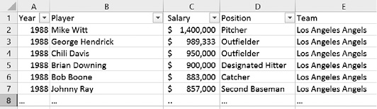
Example: A survey was conducted in the summer of 2014, asking several students in a statistics course a number of questions about their background and musical taste. The data can be found by clicking on the following link. Display a bar chart for the race of the students. In other words, compute how many of the students are White, Black, Hispanic, and so on and display those figures in a bar chart.

Loading this data into Excel, we see in Figure 2.19 that the column of interest is column E titled “Race.” However, that column represents a categorical variable (ordinal or nominal?), so we cannot compute a frequency histogram.
Before we figure out how Excel can generate the desired data automatically let us do it by hand. Inspecting the data we see that there are five categories: White, Black, Hispanic, Pacific Islander, and Other. We can manually count how many people are contained in each category (see Figure 2.20).
Our manual procedure worked because we did not have that much data. For large data sets we need to figure out an automatic procedure to generate the appropriate table. Fortunately, Excel has just such a procedure, called a Pivot Table. The pivot tool is found as the first button of the “Insert” ribbon. It looks slightly different depending on your version of Excel but the differences are pretty minor. To use the pivot tool:
- Load the preceding spreadsheet into Excel and click anywhere outside the data area, for example, below the last row of data (otherwise the pivot tool may be disabled).
- Select “Insert | Pivot Table” and choose the entire data table for the Input Range field, using the by now familiar range selector. Make sure to pick the entire data table, including the first row containing labels. Excel should by default have selected the entire table already for your convenience.
- Choose to put the resulting pivot table into a new spreadsheet and click “Okay” to generate the pivot table, which will initially be empty.

Figure 2.19 Excerpt of data from a student survey

Figure 2.20 A frequency table generated manually
You will see a “potential frequency table” containing labels such as “Drop Row Field Here,” “Drop Column Fields Here,” and so on, but no data values are yet contained in the table (see Figure 2.21). There will also be a list containing the available variables from your data, in our case “id,” “Sex,” “Weight,” “Height,” “Race,” and so on. You can “drag and drop” these variables onto the various slots in the table to create a variety of useful tables for data analysis.
- Drag the variable “Race” from the field list into the “Drop Row Fields” area of the table. Your table will adjust, showing you all available “Race” categories but as for now no frequencies (counts).
- Next, again drag the variable “Race” from the field list, but this time drag it to the “Drop Value Fields” area in the middle.

Figure 2.21 An empty pivot table with a list of named fields
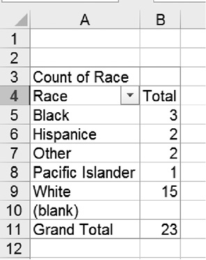
Figure 2.22 A pivot table showing the counts in the race categories
You will now see the counts of how many occurrences fell inside each race category, which of course will turn out similar to the one we created manually before in Figure 2.17, except this time it includes the “blank” category (and the order may be different). See Figure 2.22 for the finished pivot table.
See if you can eliminate the “blank” response row. (Hint: Maybe you can find a drop-down menu somewhere where you can “uncheck” unwanted categories.) Also, when you double-click the “Count of Race” label in the table you can specify exactly what type of counts should be shown and in which way it should be formatted. Try, for example, to get your counts to appear as percentage of the overall total.
You can now create a bar chart as usual, including or excluding the blank response as you see fit. We will later revisit the pivot table tool and investigate additional options and possibilities.