Windows Presentation Foundation (WPF), introduced in the .NET Framework 3.0, provides an alternative to Windows Forms (see Chapter 7) for the development of highly functional rich client applications. The WPF development model is radically different than that of Windows Forms and can be difficult to adjust to—especially for experienced Windows Forms developers. However, WPF is incredibly flexible and powerful, and taking the time to learn it can be lots of fun and immensely rewarding. WPF enables the average developer to create user interfaces that incorporate techniques previously accessible only to highly specialized graphics developers and take a fraction of the time to develop that they would have once taken.
The capabilities offered by WPF are immense, so it is not possible to provide full coverage here. A far more extensive set of recipes about WPF is provided in WPF Recipes in C# 2010 (Apress, 2010), of which the recipes in the chapter are a much simplified subset. Thanks to Sam Bourton and Sam Noble for the original work on some of the recipes in this chapter. The recipes in this chapter describe how to do the following:
Create and use a dependency and attached properties (recipes 17-1 and 17-2)
Define and use application-wide resources (recipe 17-3)
Debug data bindings (recipes 17-4 and 17-5)
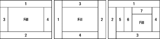
Control the position of UI elements using layout containers (recipes 17-6 through 17-9)
Get rich text input from the user (recipe 17-10)
Display a control rotated (recipe 17-11)
Create and configure user controls (recipes 17-12 through 17-14)
Create two-way and command bindings (recipes 17-15 and 17-16)
Use data templates to display bound data (recipe 17-17)
Bind controls to a master-detail collection (recipe 17-18)
Change a control's appearance when the mouse goes over it (recipe 17-19)
Make alternate items in a list look different (recipe 17-20)
Allow the user to drag items from a list and position them on a canvas (recipe 17-21)
Show progress and allow cancellation of a long-running process (recipe 17-22)
Draw and reuse two-dimensional shapes (recipes 17-23 and 17-24)
Fill shapes with colors, gradients, images, and textures (recipes 17-25 through 17-28)
Animate the properties of a control (recipes 17-29 through 17-32)
Play a media file (recipe 17-33)
Query the state of the keyboard (recipe 17-34)
You need to add a property to a class that derives from System.Windows.DependencyObject to provide support for any or all of the following:
Data bindings
Animation
Setting with a dynamic resource reference
Automatically inheriting a property value from a superclass
Setting in a style
Using property value inheritance
Notification through callbacks on property value changes
Register a System.Windows.DependencyProperty to use as the backing store for the required property on your class.
A dependency property is implemented using a standard Common Language Runtime (CLR) property, but instead of using a private field to back the property, you use a DependencyProperty. A DependencyProperty is instantiated using the static method DependencyProperty.Register(string name, System.Type propertyType, Type ownerType), which returns a DependencyProperty instance that is stored using a static, read-only field. There are also two overrides that allow you to specify metadata that defines behavior and a callback for validation.
The first argument passed to the DependencyProperty.Register method specifies the name of the dependency property being registered. This name must be unique within registrations that occur in the owner type's namespace. The next two arguments give the type of property being registered and the class against which the dependency property is being defined. It is important to note that the owning type must derive from DependencyObject; otherwise, an exception is raised when you initialize the dependency property.
The first override for the Register method allows a System.Windows.PropertyMetadata object, or one of the several derived types, to be specified for the property. Property metadata is used to define characteristics of a dependency property, allowing for greater richness than simply using reflection or common CLR characteristics. The use of property metadata can be broken down into three areas:
Specifying a default value for the property
Providing callback implementations for property changes and value coercion
Reporting framework-level characteristics used in layout, inheritance, and so on
Warning
Because values for dependency properties can be set in several places, a set of rules define the precedence of these values and any default value specified in property metadata. These rules are beyond the scope of this recipe; for more information, you can look at the subject of dependency property value precedence at http://msdn.microsoft.com/en-us/library/ms743230(VS.100).aspx.
In addition to specifying a default value, property-changed callbacks, and coercion callbacks, the System.Windows.FrameworkPropertyMetadata object allows you to specify various options given by the System.Windows.FrameworkPropertyMetadataOptions enumeration. You can use as many of these options as required, combining them as flags. Table 17-1 details the values defined in the FrameworkPropertyMetadataOptions enumeration.
Table 17.1. Values for the FrameworkPropertyMetadataOptions Class
Property | Description |
|---|---|
| The property will adopt the default behavior of the WPF property system. |
| Changes to the dependency property's value affect the owning control's measure. |
| Changes to the dependency property's value affect the owning control's arrangement. |
| Changes to the dependency property's value affect the parent of the owning control's measure. |
| Changes to the dependency property's value affect the parent of the owning control's arrangement. |
| Changes to the dependency property's value affect the owning control's render or layout composition. |
| The value of the dependency property is inherited by any child elements of the owning type. |
| The value of the dependency property spans disconnected trees in the context of property value inheritance. |
| Binding operations cannot be performed on this dependency property. |
| When used in data bindings, the |
| The value of the dependency property is saved or restored through any journaling processes or URI navigations. |
| Properties of the value of the dependency property do not affect the owning type's rendering in any way. |
Warning
When implementing a dependency property, it is important to use the correct naming convention. The identifier used for the dependency property must be the same as the identifier used to name the CLR property it is registered against, appended with Property. For example, if you were defining a property to store the velocity of an object, the CLR property would be named Velocity, and the dependency property field would be named VelocityProperty. If a dependency property isn't implemented in this fashion, you may experience strange behavior with property system–style applications and some visual designers not correctly reporting the property's value.
Value coercion plays an important role in dependency properties and comes into play when the value of a dependency property is set. By supplying a CoerceValueCallback argument, it is possible to alter the value to which the property is being set. An example of value coercion is when setting the value of the System.Windows.Window.RenderTransform property. It is not valid to set the RenderTransform property of a window to anything other than an identity matrix. If any other value is used, an exception is thrown. It should be noted that any coercion callback methods are invoked before any System.Windows.ValidateValueCallback methods.
The following example demonstrates the definition of a custom DependencyProperty on a simple System.Windows.Controls.UserControl (MyControl, defined in MyControl.xaml). The UserControl contains two text blocks: one set by the control's code-behind, and the other bound to a dependency property defined in the control's code-behind.
<UserControl
    x:Class="Apress.VisualCSharpRecipes.Chapter17.MyControl"
    xmlns="http://schemas.microsoft.com/winfx/2006/xaml/presentation"
    xmlns:x="http://schemas.microsoft.com/winfx/2006/xaml">
    <Grid>
        <Grid.RowDefinitions>
            <RowDefinition Height="20" />
            <RowDefinition Height="*" />
        </Grid.RowDefinitions>

        <TextBlock x:Name="txblFontWeight" Text="FontWeight set to: Normal."  />

        <Viewbox Grid.Row="1">
            <TextBlock Text="{Binding Path=TextContent}"
                FontWeight="{Binding Path=TextFontWeight}" />
        </Viewbox>
    </Grid>
</UserControl>
The following code block details the code-behind for the previous markup (MyControl.xaml.cs):
using System.Windows;
using System.Windows.Controls;

namespace Apress.VisualCSharpRecipes.Chapter17
{
    public partial class MyControl : UserControl
    {
        public MyControl()
        {
            InitializeComponent();
            DataContext = this;
        }

        public FontWeight TextFontWeight
        {
            get { return (FontWeight)GetValue(TextFontWeightProperty); }
            set { SetValue(TextFontWeightProperty, value); }
        }

        public static readonly DependencyProperty TextFontWeightProperty =
            DependencyProperty.Register(
                "TextFontWeight",
                typeof(FontWeight),
                typeof(MyControl),
                new FrameworkPropertyMetadata(FontWeights.Normal,
                             FrameworkPropertyMetadataOptions.AffectsArrange
                             & FrameworkPropertyMetadataOptions.AffectsMeasure
                             & FrameworkPropertyMetadataOptions.AffectsRender,
                             TextFontWeight_PropertyChanged,
                             TextFontWeight_CoerceValue));

        public string TextContent
        {
            get { return (string)GetValue(TextContentProperty); }
            set { SetValue(TextContentProperty, value); }
        }

        public static readonly DependencyProperty TextContentProperty =
            DependencyProperty.Register(
                "TextContent",
                typeof(string),
                typeof(MyControl),

                new FrameworkPropertyMetadata(
                   "Default Value",
                   FrameworkPropertyMetadataOptions.AffectsArrange
                   & FrameworkPropertyMetadataOptions.AffectsMeasure
                   & FrameworkPropertyMetadataOptions.AffectsRender));
private static object TextFontWeight_CoerceValue(DependencyObject d,
object value)
{
FontWeight fontWeight = (FontWeight)value;
if (fontWeight == FontWeights.Bold
|| fontWeight == FontWeights.Normal)
{
return fontWeight;
}
return FontWeights.Normal;
}
private static void TextFontWeight_PropertyChanged(DependencyObject d,
DependencyPropertyChangedEventArgs e)
{
MyControl myControl = d as MyControl;
if (myControl != null)
{
FontWeight fontWeight = (FontWeight)e.NewValue;
string fontWeightName;
if (fontWeight == FontWeights.Bold)
fontWeightName = "Bold";
else
fontWeightName = "Normal";
myControl.txblFontWeight.Text =
string.Format("Font weight set to: {0}.", fontWeightName);
}
}
}
}You need to add a dependency property to a class but are not able to access the class in a way that would allow you to add the property, or you want to use a property that can be set on any child objects of the type.
Create an attached property by registering a System.Windows.DependencyProperty using the static DependencyProperty.RegisterAttached method.
You can think of an attached property as a special type of dependency property (see Recipe 17-1) that doesn't get exposed using a CLR property wrapper. Common examples of attached properties include System.Windows.Controls.Canvas.Top, System.Windows.Controls.DockPanel.Dock, and System.Windows.Controls.Grid.Row.
As attached properties are registered in a similar way to dependency properties, you are still able to provide metadata for handling property changes, and so on. In addition to metadata, it is possible to enable property value inheritance on attached properties.
Attached properties are not set like dependency properties using a CLR wrapper property; they are instead accessed through a method for getting and setting their values. These methods have specific signatures and naming conventions so that they can be matched up to the correct attached property. The signatures for the property's getter and setter methods can be found in the following code listing.
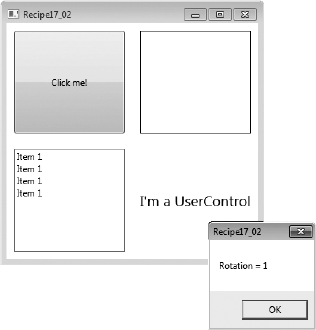
The following code defines a simple System.Windows.Window that contains a few controls. The window's code-behind defines an attached property named RotationProperty with SystemWindows.UIElement as the target type. The window's markup defines four controls, three of which have the value of MainWindow.Rotation set in XAML. The button's value for this property is not set and will therefore return the default value for the property—0 in this case.
<Window
    x:Class=" Apress.VisualCSharpRecipes.Chapter17.MainWindow"
    xmlns="http://schemas.microsoft.com/winfx/2006/xaml/presentation"
    xmlns:x="http://schemas.microsoft.com/winfx/2006/xaml"
    xmlns:local="clr-namespace:Apress.VisualCSharpRecipes.Chapter17"
    Title="Recipe17_02" Height="350" Width="350">
    <UniformGrid>
        <Button Content="Click me!"  Click="UIElement_Click" Margin="10" />

        <Border MouseLeftButtonDown="UIElement_Click"
             BorderThickness="1" BorderBrush="Black" Background="Transparent"
             Margin="10" local:MainWindow.Rotation="3.14" />

        <ListView PreviewMouseLeftButtonDown="UIElement_Click"
            Margin="10" local:MainWindow.Rotation="1.57">
            <ListViewItem Content="Item 1" />
            <ListViewItem Content="Item 1" />
            <ListViewItem Content="Item 1" />
            <ListViewItem Content="Item 1" />
        </ListView>
<local:UserControl1 Margin="10" local:MainWindow.Rotation="1.0" />
</UniformGrid>
</Window>
using System.Windows;
using System.Windows.Controls;
namespace Apress.VisualCSharpRecipes.Chapter17
{
/// <summary>
/// Interaction logic for MainWindow.xaml
/// </summary>
public partial class MainWindow : Window
{
public MainWindow()
{
InitializeComponent();
}
private void UIElement_Click(object sender, RoutedEventArgs e)
{
UIElement uiElement = (UIElement)sender;
MessageBox.Show("Rotation = " + GetRotation(uiElement), "Recipe17_02");
}
public static readonly DependencyProperty RotationProperty =
DependencyProperty.RegisterAttached("Rotation",
typeof(double),
typeof(MainWindow),
new FrameworkPropertyMetadata(
0d, FrameworkPropertyMetadataOptions.AffectsRender));
public static void SetRotation(UIElement element, double value)
{
element.SetValue(RotationProperty, value);
}
public static double GetRotation(UIElement element)
{
return (double)element.GetValue(RotationProperty);
}
}
}The following markup and code-behind define a simple System.Windows.Controls.UserControl that demonstrates the use of the custom attached property in code:
<UserControl
    x:Class=" Apress.VisualCSharpRecipes.Chapter17.UserControl1"
    xmlns="http://schemas.microsoft.com/winfx/2006/xaml/presentation"
    xmlns:x="http://schemas.microsoft.com/winfx/2006/xaml"
    MouseLeftButtonDown="UserControl_MouseLeftButtonDown"
    Background="Transparent">
    <Viewbox>
        <TextBlock Text="I'm a UserControl" />
    </Viewbox>
</UserControl>

using System.Windows;
using System.Windows.Controls;

namespace Apress.VisualCSharpRecipes.Chapter17
{
    /// <summary>
    /// Interaction logic for UserControl1.xaml
    /// </summary>
    public partial class UserControl1 : UserControl
    {
        public UserControl1()
        {
            InitializeComponent();
        }

        private void UserControl_MouseLeftButtonDown(object sender,
                                                     RoutedEventArgs e)
        {
            UserControl1 uiElement = (UserControl1)sender;

            MessageBox.Show("Rotation = " + MainWindow.GetRotation(uiElement),
                            "Recipe17_02");
        }
    }
}
Figure 17-1 shows the result of clicking the button. A value for the MainWindow.Rotation property is not explicitly set on the button; therefore, it is displaying the default value.
Merge all the required System.Windows.ResourceDictionary objects into the application's ResourceDictionary.
ResourceDictionary objects are by default available to all objects that are within the scope of the application. This means that some System.Windows.Controls.Control that is placed within a System.Windows.Window will be able to reference objects contained within any of the ResourceDictionary objects referenced at the application level. This ensures the maintainability of your styles because you will need to update the objects in a single place.
It is important to know that each time a ResourceDictionary is referenced by a System.Windows.Controls.Control, a local copy of that ResourceDictionary is made for each instance of the control. This means that if you have several large ResourceDictionary objects that are referenced by a control that is instantiated several times, you may notice a performance hit.
Note
System.Windows.Controls.ToolTip styles need to be referenced once per control. If several controls all use a ToolTip style referenced at the application level, you will observe strange behavior in your tooltips.
The following example demonstrates the content of an application's App.xaml. Two System.Windows.Media.SolidColorBrush resources are defined that are referenced in other parts of the application.
<Application
  x:Class="Apress.VisualCSharpRecipes.Chapter17.App"
  xmlns="http://schemas.microsoft.com/winfx/2006/xaml/presentation"
  xmlns:x="http://schemas.microsoft.com/winfx/2006/xaml"
  StartupUri="MainWindow.xaml">
  <Application.Resources>
    <SolidColorBrush x:Key="FontBrush" Color="#FF222222" />
    <SolidColorBrush x:Key="BackgroundBrush" Color="#FFDDDDDD" />
  </Application.Resources>
</Application>
The following example demonstrates the content of the application's MainWindow.xaml file. The two resources that were defined in the application's resources are used by controls in the System.Windows.Window. The first resource is used to set the background property of the outer System.Windows.Controls.Grid, and the second resource is used to set the foreground property of a System.Windows.Controls.TextBlock (see Figure 17-2).
<Window
    x:Class="Apress.VisualCSharpRecipes.Chapter17.MainWindow"
    xmlns="http://schemas.microsoft.com/winfx/2006/xaml/presentation"
    xmlns:x="http://schemas.microsoft.com/winfx/2006/xaml"
    Title="Recipe17_03" Height="100" Width="300">
    <Grid Background="{StaticResource BackgroundBrush}">
        <Viewbox>
            <TextBlock Text="Some Text" Margin="5"
                Foreground="{StaticResource FontBrush}" />
        </Viewbox>
    </Grid>
</Window>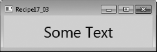
You need to debug a binding that is not working as expected and want to make sure the correct values are going in.
Create a converter class that implements System.Windows.Data.IValueConverter and simply returns the value it receives for conversion, setting a breakpoint or tracepoint within the converter.
Debugging a data binding can be quite tricky and consume a lot of time. Because data bindings are generally defined in XAML, you don't have anywhere you can set a breakpoint to make sure things are working as you intended. In some cases, you will be able to place a breakpoint on a property of the object that is being bound, but that option isn't always available, such as when binding to a property of some other control in your application. This is where a converter can be useful.
When using a simple converter that returns the argument being passed in, unchanged, you immediately have code on which you can place a breakpoint or write debugging information to the Output window or log. This can tell you whether the value coming in is the wrong type, is in a form that means it is not valid for the binding, or has a strange value. You'll also soon realize whether the binding is not being used, because the converter will never be hit.
The following example demonstrates a System.Windows.Window that contains a System.Windows.Controls.Grid. Inside the Grid are a System.Windows.Controls.CheckBox and a System.Windows.Controls.Expander. The IsExpanded property of the Expander is bound to the IsChecked property of the CheckBox. This is a very simple binding, but it gives an example where you are able to place a breakpoint in code.
<Window
    x:Class="Apress.VisualCSharpRecipes.Chapter17.MainWindow"
    xmlns="http://schemas.microsoft.com/winfx/2006/xaml/presentation"
    xmlns:x="http://schemas.microsoft.com/winfx/2006/xaml"
    xmlns:local="clr-namespace:Apress.VisualCSharpRecipes.Chapter17"
    Title="Recipe17_04" Width="200" Height="200">
    <Window.Resources>
        <local:DebugConverter x:Key="DebugConverter" />
    </Window.Resources>
    <Grid>
        <Grid.RowDefinitions>
            <RowDefinition Height="0.5*" />
            <RowDefinition Height="0.5*"/>
        </Grid.RowDefinitions>

        <CheckBox x:Name="chkShouldItBeOpen" Margin="10"
            IsChecked="False" Content="Open Expander" />

        <Expander IsExpanded="{Binding
            ElementName=chkShouldItBeOpen, Path=IsChecked,
            Converter={StaticResource DebugConverter}}"
            Grid.Row="1" Background="Black" Foreground="White"
            Margin="10" VerticalAlignment="Center"
            HorizontalAlignment="Center" Header="I'm an Expander!">
                <TextBlock Text="Expander Open" Foreground="White"/>
        </Expander>
    </Grid>
</Window>
The following code defines the code-behind for the previous XAML:
using System.Windows;

namespace Apress.VisualCSharpRecipes.Chapter17
{
    /// <summary>
    /// Interaction logic for MainWindow.xaml
    /// </summary>
    public partial class MainWindow : Window
    {
        public MainWindow()
        {
            InitializeComponent();
        }
    }
}
The following code defines a converter class that simply returns the value passed to it unchanged. However, you can place breakpoints on these lines of code to see what data is flowing through the converter:
using System;
using System.Globalization;
using System.Windows.Data;

namespace Apress.VisualCSharpRecipes.Chapter17
{
    public class DebugConverter : IValueConverter
    {
        public object Convert(object value,
                              Type targetType,
                              object parameter,
                              CultureInfo culture)
        {
            return value;
        }

        public object ConvertBack(object value,
                                  Type targetType,
                                  object parameter,
                                  CultureInfo culture)
        {
            return value;
        }
    }
}You need to debug a binding that is not working as expected and want to make sure the correct values are going in. Using a converter is either undesired or not feasible.
Use the System.Diagnostics.PresentationTraceSources.TraceLevel attached property defined in the WindowsBase assembly, setting the level of detail required. If the data binding is defined in code, use the static method PresentationTraceLevel.SetTraceLevel.
Warning
Using the PresentationTraceSources.TraceLevel attached property can affect the performance of a WPF application and should be removed as soon as it is no longer required.
The PresentationTraceSources.TraceLevel attached property allows you to specify the level of information written to the Output window for data bindings, on a per-binding basis. The higher the System.Diagnostics.PresentationTraceLevel value that is used, the more information that will be generated. The PresentationTraceSources.TraceLevel can be used on the following object types:
System.Windows.Data.BindingBaseSystem.Windows.Data.BindingExpressionBaseSystem.Windows.Data.ObjectDataProviderSystem.Windows.Data.XmlDataProvider
It is important to remember to remove any trace-level attached properties from your code once you are finished debugging a binding; otherwise, your Output window will continue to be filled with binding information. Table 17-2 details the values of the PresentationTraceSource.TraceLevel enumeration.
Table 17.2. Values for PresentationTraceSources.TraceLevel
Property | Description |
|---|---|
| Generates no additional information. |
| Generates some information about binding failures. This generally details the target and source properties involved and any exception that is thrown. No information is generated for bindings that work properly. |
| Generates a medium amount of information about binding failures and a small amount of information for valid bindings. When a binding fails, information is generated for the source and target properties, some of the transformations that are applied to the value, any exceptions that occur, the final value of the binding, and some of the steps taken during the whole process. For valid bindings, information logging is light. |
| Generates the most binding state information for binding failures and valid bindings. When a binding fails, a great deal of information about the binding process is logged, covering all the previous data in a more verbose manner. |
The following markup demonstrates how to use the PresentationTraceSource.TraceLevel property in two different bindings. One of the bindings is valid and binds the value of the text block to the width of the parent grid; the other is invalid and attempts to bind the width of the parent grid to the height of the text block. Set the values of the PresentatonTraceSource.TraceLevel attached properties to see how they behave.
<Window
    x:Class="Apress.VisualCSharpRecipes.Chapter17.MainWindow"
    xmlns="http://schemas.microsoft.com/winfx/2006/xaml/presentation"
    xmlns:x="http://schemas.microsoft.com/winfx/2006/xaml"
    xmlns:diagnostics="clr-namespace:System.Diagnostics;assembly=WindowsBase"
    Title="Recipe17_05" Height="300" Width="300">
    <Grid x:Name="gdLayoutRoot">
        <Viewbox>
            <TextBlock x:Name="tbkTextBlock">
                <TextBlock.Text>
                  <Binding ElementName="gdLayoutRoot" Path="ActualWidth"
                  diagnostics:PresentationTraceSources.TraceLevel="High" />
                </TextBlock.Text>
                <TextBlock.Height>
                  <Binding ElementName="gdLayoutRoot" Path="Name"
                  diagnostics:PresentationTraceSources.TraceLevel="High" />
                </TextBlock.Height>
            </TextBlock>
        </Viewbox>
    </Grid>
</Window>Place the UI elements in a System.Windows.Controls.StackPanel. Use the Orientation property of the StackPanel to control the flow of the stacking (vertical or horizontal).
The StackPanel arranges the elements it contains in a horizontal or vertical stack. The order of the elements is determined by the order in which they are declared in the XAML (that is, the order in which they occur in the Children collection of the StackPanel). By default, the StackPanel will arrange the elements vertically (one under another). You can control the direction of the stack using the Orientation property. To stack the elements horizontally (next to each other), set the Orientation property to the value Horizontal.
Note
If the StackPanel is smaller than the space required to display its content, the content is visually cropped. However, you can still interact with visual elements that are cropped by using keyboard shortcuts or by tabbing to the control and pressing Enter.
The default height and width of elements in a StackPanel depend on the type of element and the orientation of the StackPanel. When the Orientation property of the StackPanel has the value Vertical, text is left justified, but buttons are stretched to the width of the StackPanel. You can override this default behavior by directly configuring the width of the element or by setting the HorizontalAlignment property of the contained element to the value Left, Center, or Right. These values force the element to take a width based on its content and position it in the left, center, or right of the StackPanel.
Similarly, when the Orientation property of the StackPanel has the value Horizontal, the text is top justified, but the height of buttons is stretched to fill the height of the StackPanel. You can override this behavior by directly configuring the height of the element or by setting the VerticalAlignment property of the contained element to the value Top, Center, or Bottom. These values force the element to take a height based on its content and position it in the top, center, or bottom of the StackPanel.
The following XAML demonstrates how to use three StackPanel panels. An outer StackPanel allows you to stack two inner StackPanel panels vertically. The first inner StackPanel has a horizontal orientation and contains a set of System.Windows.Controls.Button controls. The Button controls show the effects of the various VerticalAlignment property values on the positioning of the controls. This panel also shows the cropping behavior of the StackPanel on the elements it contains (see Figure 17-3). You can see that Button 4 is partially cropped and that Button 5 is not visible at all. However, you can still tab to and interact with Button 5.
The second inner StackPanel has a vertical orientation and also contains a set of Button controls. These buttons show the effects of the various HorizontalAlignment property values on the positioning of a control in the StackPanel.
<Window x:Class="Apress.VisualCSharpRecipes.Chapter17.MainWindow"
    xmlns="http://schemas.microsoft.com/winfx/2006/xaml/presentation"
    xmlns:x="http://schemas.microsoft.com/winfx/2006/xaml"
    Title="Recipe17_06" Height="240" Width="250">
    <StackPanel Width="200">
        <StackPanel Height="50" Margin ="5" Orientation="Horizontal">
            <Button Content="Button _1" Margin="2" />
            <Button Content="Button _2" Margin="2"
                    VerticalAlignment="Top"/>
            <Button Content="Button _3" Margin="2"
                    VerticalAlignment="Center"/>
<Button Content="Button _4" Margin="2"
VerticalAlignment="Bottom"/>
<Button Content="Button _5" Margin="2" />
</StackPanel>
<Separator />
<StackPanel Margin="5" Orientation="Vertical">
<Button Content="Button _A" Margin="2" />
<Button Content="Button _B" Margin="2"
HorizontalAlignment="Left" />
<Button Content="Button _C" Margin="2"
HorizontalAlignment="Center" />
<Button Content="Button _D" Margin="2"
HorizontalAlignment="Right" />
<Button Content="Button _E" Margin="2" />
</StackPanel>
</StackPanel>
</Window>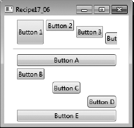
Place the UI elements in a System.Windows.Controls.DockPanel. Use the DockPanel.Dock attached property on each element in the DockPanel to position the element on a particular edge.
The DockPanel allows you to arrange UI elements (including other panels) along its edges. This is very useful in achieving the basic window layout common to many Windows applications with menus and toolbars along the top of the window and control panels along the sides.
When you apply the DockPanel.Dock attached property to the elements contained in a DockPanel, the DockPanel places the UI element along the specified edge: Left, Right, Top, or Bottom. The DockPanel assigns the elements' positions in the same order they are declared in the XAML (that is, in the order in which they occur in the Children collection of the DockPanel).
As each element is placed on an edge, it takes up all the space available along that edge. This means you must consider the layout you want when ordering the contained elements. Also, if there are multiple elements on a given edge, the DockPanel stacks them in order.
By default, the last element added to the DockPanel fills all the remaining space in the panel regardless of its DockPanel.Dock property value. You can stop this behavior by setting the LastChildFill property of the DockPanel to False. The DockPanel places any elements without a DockPanel.Dock property value along the left edge.
Figure 17-4 provides examples of the different layouts you can achieve by declaring elements in different orders. The third example also shows how the DockPanel stacks elements when specified on a common edge.
The following XAML demonstrates how to use a DockPanel to dock a System.Windows.Controls.StackPanel containing a set of System.Windows.Controls.Button controls along its top edge and another along its left edge. The final Button added to the DockPanel stretches to fill all the remaining space in the panel (see Figure 17-5).
<Window x:Class="Apress.VisualCSharpRecipes.Chapter17.MainWindow"
    xmlns="http://schemas.microsoft.com/winfx/2006/xaml/presentation"
    xmlns:x="http://schemas.microsoft.com/winfx/2006/xaml"
    Title="Recipe17_07" Height="200" Width="300">
    <DockPanel >
        <StackPanel DockPanel.Dock="Top" Orientation="Horizontal">
            <Button Content="Button 1" Margin="2" />
            <Button Content="Button 2" Margin="2" />
<Button Content="Button 3" Margin="2" />
<Button Content="Button 4" Margin="2" />
<Button Content="Button 5" Margin="2" />
</StackPanel>
<StackPanel DockPanel.Dock="Left">
<Button Content="Button A" Margin="2" />
<Button Content="Button B" Margin="2" />
<Button Content="Button C" Margin="2" />
<Button Content="Button D" Margin="2" />
<Button Content="Button E" Margin="2" />
</StackPanel>
<Button Content="Fill Button" />
</DockPanel>
</Window>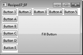
Place the UI elements in a System.Windows.Controls.Grid. Define the number of rows and columns in the Grid. For each UI element in the Grid, define its row and column coordinates using the Grid.Row and Grid.Column attached properties.
To define the number of rows in a Grid panel, you must include a Grid.RowDefinitions element inside the Grid. Within the Grid.RowDefinitions element, you declare one RowDefintion element for each row you need. You must do the same thing for columns, but you use elements named Grid.ColumnDefinitions and ColumnDefinition.
Tip
Although you will rarely want it in live production code, it is often useful during development to be able to see where the row and column boundaries are within your Grid panel. Setting the ShowGridLines property of the Grid panel to True will turn visible grid lines on.
Using the Height property of the RowDefinition element and the Width property of the ColumnDefinition, you have fine-grained control over the layout of a Grid. Both the Height and Width properties can take absolute values if you require fixed sizes. You must define the size of the column or row as a number and an optional unit identifier. By default, the unit is assumed to be px (pixels) but can also be in (inches), cm (centimeters), or pt (points).
If you do not want fixed sizes, you can assign the value Auto to the Height or Width property, in which case the Grid allocates only the amount of space required by the elements contained in the row or column.
If you do not specify absolute or auto values, the Grid will divide its horizontal space equally between all columns and its vertical space equally between all rows. You can override this default behavior and change the proportions of available space assigned to each row or column using an asterisk (*) preceded by the relative weighting the Grid should give the row or column. For example, a RowDefinition element with the Height property of 3* will get three times as much space allocated to it as a RowDefinition element with a Height property of *. Most often, you will use a mix of auto and proportional sizing.
Once you have defined the structure of your Grid, you specify where in the Grid each element should go using the Grid.Row and Grid.Column attached properties. Both the Grid.Row and Grid.Column properties are zero-based and default to zero if you do not define them for an element contained within the Grid.
If you want elements in the Grid that span multiple rows or columns, you can assign them Grid.RowSpan and Grid.ColumnSpan attached properties that specify the number of rows or columns that the element should span.
The following XAML demonstrates how to use a three-by-three Grid to lay out a set of System.Windows.Controls.Button controls. The Grid uses a mix of fixed, auto, and proportional row and column sizing, and the Grid lines are turned on so that you can see (in Figure 17-6) the resulting Grid structure. The top-left Button controls span multiple rows or columns, and the leftmost Button is rotated (see recipe 17-11 for details on how to do this).
<Window x:Class="Apress.VisualCSharpRecipes.Chapter17.MainWindow"
    xmlns="http://schemas.microsoft.com/winfx/2006/xaml/presentation"
xmlns:x="http://schemas.microsoft.com/winfx/2006/xaml"
Title="Recipe17_08" Height="200" Width="250">
<Grid ShowGridLines="True">
<Grid.RowDefinitions>
<RowDefinition MinHeight="50" />
<RowDefinition Height="2*" />
<RowDefinition Height="*" />
</Grid.RowDefinitions>
<Grid.ColumnDefinitions>
<ColumnDefinition Width="50" />
<ColumnDefinition Width="2*" />
<ColumnDefinition Width="3*" />
</Grid.ColumnDefinitions>
<Button Content="Button spanning 3 rows" Grid.RowSpan="3">
<Button.LayoutTransform>
<RotateTransform Angle="90" />
</Button.LayoutTransform>
</Button>
<Button Content="Button spanning 2 columns" Grid.Column="1"
Grid.Row="0" Grid.ColumnSpan="2" />
<Button Content="Button" Grid.Column="2" Grid.Row="2"/>
</Grid>
</Window>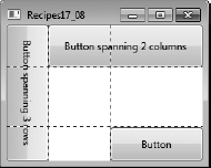
Place the UI elements in a System.Windows.Controls.Canvas panel. Use the Canvas.Top, Canvas.Bottom, Canvas.Left, and Canvas.Right attached properties to define the position of each element.
The Canvas panel allows you to place UI elements using exact coordinates. Unlike other layout panels, the Canvas does not provide special layout logic to position and size the elements it contains based on the space it has available. Instead, the Canvas simply places each element at its specified location and gives it the exact dimensions it requires. This does not facilitate maintainable user interfaces that are easy to localize, but in certain circumstances (such as drawing and graphical design applications) it may be necessary.
By default, the Canvas positions the elements it contains in its top-left corner. To position an element elsewhere in the Canvas, you can define the Canvas.Top, Canvas.Bottom, Canvas.Left, and Canvas.Right attached properties on the element. Each property takes a number and an optional unit identifier. By default, the unit is assumed to be px (pixels), but can also be in (inches), cm (centimeters), or pt (points). The value can even be negative, which allows the Canvas to draw elements outside its own visual boundaries.
If you define both Canvas.Top and Canvas.Bottom on an element, the Canvas ignores the Canvas.Bottom value. Similarly, if you define both Canvas.Left and Canvas.Right on an element, the Canvas ignores the Canvas.Right value.
Because you have complete control over element position when using a Canvas, it is easy to get elements that overlap. The Canvas draws the elements in the same order they are declared in the XAML (that is, the order in which they occur in the Children collection of the Canvas). So, elements declared later are visible on top of elements declared earlier. You can override this default stacking order (referred to as the z-order) by defining the Canvas.ZIndex attached property on the element. The default Canvas.ZIndex is zero, so by assigning a higher integer value to the Canvas.ZIndex property on an element, the Canvas will draw that element over the top of elements with a lower value.
The following XAML demonstrates how to use a Canvas to lay out a set of System.Windows.Controls.Button controls. In Figure 17-7, the shaded area shows the boundary of the Canvas. You can see how using negative position values for Button 1 and Button 5 place them wholly or partially outside the boundary of the Canvas. Despite Button 4 being declared after Button 2, the higher Canvas.ZIndex assigned on Button 2 forces the Canvas to draw Button 2 over the top of Button 4.
<Window x:Class="Apress.VisualCSharpRecipes.Chapter17.MainWindow"
    xmlns="http://schemas.microsoft.com/winfx/2006/xaml/presentation"
    xmlns:x="http://schemas.microsoft.com/winfx/2006/xaml"
    Title="Recipe17_09" Height="300" Width="300">
    <Canvas Background="LightGray" Margin="1cm">
        <Button Content="Button _1" Canvas.Top="-1cm" Canvas.Left="1cm" />
        <Button Content="Button _2" Canvas.Bottom="1cm" Canvas.Left="1cm"
                Canvas.ZIndex="1"/>
        <Button Content="Button _3" Canvas.Top="1cm" Canvas.Right="1cm" />
        <Button Content="Button _4" Canvas.Bottom="1.2cm" Canvas.Left="1.5cm" />
<Button Content="Button _5" Canvas.Bottom="1cm" Canvas.Right="-1cm" />
</Canvas>
</Window>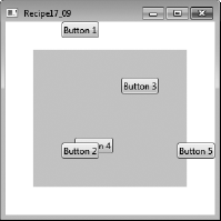
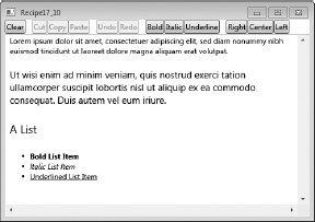
You need to allow the user to edit large amounts of text and give them fine-grained control over the formatting of text they enter.
The RichTextBox is a sophisticated and highly functional control designed to allow you to display and edit System.Windows.Documents.FlowDocument objects. The combination of the RichTextBox and FlowDocument objects provides the user with access to advanced document-editing capabilities that you do not get in a System.Windows.Controls.TextBox control. These features include mixed text formatting, hyphenation, tables, lists, paragraphs, and embedded images.
To populate the content of a RichTextBox statically, you include a FlowDocument element as the content of the RichTextBox XAML declaration. Within the FlowDocument element, you can define richly formatted content using elements of the flow document content model. Key structural elements of this content model include Figure, Hyperlink, List, ListItem, Paragraph, Section, and Table.
To populate the RichTextBox in code, you must work with a FlowDocument object directly. You can either create a new FlowDocument object or obtain one currently in a RichTextBox through the RichTextBox.Document property.
You manipulate the content of the FlowDocument by selecting portions of its content using a System.Windows.Documents.TextSelection object. The TextSelection object contains two properties, Start and End, which identify the beginning and end positions of the FlowDocument content you want to manipulate. Once you have a suitable TextSelection object, you can manipulate its content using the TextSelection members.
Note
For detailed information about flow content, see the .NET Framework documentation at http://msdn.microsoft.com/en-us/library/ms753113(VS.100).aspx.
To simplify the manipulation of FlowDocument objects, the RichTextBox supports standard commands defined by the ApplicationCommands and EditingCommands classes from the System.Windows.Input namespace. The RichTextBox also supports standard key combinations to execute basic text-formatting operations such as applying bold, italic, and underline formats to text, as well as cutting, copying, and pasting selected content. Table 17-3 summarizes some of the more commonly used members of the RichTextBox control.
Table 17.3. Commonly Used Members of the RichTextBox Control
Member | Summary |
|---|---|
Properties | |
| Controls whether the user can insert tab characters in the |
| Gets or sets the current insertion position index of the |
| Gets or sets the |
| Determines whether the |
| Controls whether the |
| Gets a |
| Determines whether the |
Methods | |
| Appends text to the existing content of the |
| Copies the currently selected |
| Cuts the currently selected |
| Pastes the current content of the clipboard over the currently selected |
| Selects the entire content of the |
| Undoes the most recent undoable action on the |
Events | |
| The event fired when the text in a |
The following code provides a simple example of a RichTextBox used to edit a FlowDocument. The XAML defines a static FlowDocument that contains a variety of structural and formatting elements. The user interface provides a set of buttons to manipulate the RichTextBox content. The buttons rely on the application and editing command support provided by the RichTextBox control and use a style to make the RichTextBox the target of the button's command.
<Window x:Class="Apress.VisualCSharpRecipes.Chapter17.MainWindow"
    xmlns="http://schemas.microsoft.com/winfx/2006/xaml/presentation"
    xmlns:x="http://schemas.microsoft.com/winfx/2006/xaml"
    Title="Recipe17_10" Height="350" Width="500">
    <DockPanel>
        <StackPanel DockPanel.Dock="Top" Orientation="Horizontal">
            <StackPanel.Resources>
                <Style TargetType="{x:Type Button}">
                    <Setter Property="CommandTarget"
                            Value="{Binding ElementName=rtbTextBox1}" />
                </Style>
            </StackPanel.Resources>
<Button Content="Clear" Name="btnClear" Click="btnClear_Click" />
<Separator Margin="5"/>
<Button Content="Cu_t" Command="ApplicationCommands.Cut" />
<Button Content="_Copy" Command="ApplicationCommands.Copy" />
<Button Content="_Paste" Command="ApplicationCommands.Paste" />
<Separator Margin="5"/>
<Button Content="_Undo" Command="ApplicationCommands.Undo" />
<Button Content="_Redo" Command="ApplicationCommands.Redo" />
<Separator Margin="5"/>
<Button Content="_Bold" Command="EditingCommands.ToggleBold" />
<Button Content="_Italic" Command="EditingCommands.ToggleItalic" />
<Button Content="Underline"
Command="EditingCommands.ToggleUnderline" />
<Separator Margin="5"/>
<Button Content="_Right" Command="EditingCommands.AlignRight" />
<Button Content="C_enter" Command="EditingCommands.AlignCenter" />
<Button Content="_Left" Command="EditingCommands.AlignLeft" />
</StackPanel>
<RichTextBox DockPanel.Dock="Bottom" Name="rtbTextBox1"
HorizontalScrollBarVisibility="Visible"
VerticalScrollBarVisibility="Visible">
<FlowDocument>
<Paragraph FontSize="12">
Lorem ipsum dolor sit amet, consectetuer adipiscing elit,
sed diam nonummy nibh euismod tincidunt ut laoreet dolore
magna aliquam erat volutpat.
</Paragraph>
<Paragraph FontSize="15">
Ut wisi enim ad minim veniam, quis nostrud exerci tation
ullamcorper suscipit lobortis nisl ut aliquip ex ea
commodo consequat. Duis autem vel eum iriure.
</Paragraph>
<Paragraph FontSize="18">A List</Paragraph>
<List>
<ListItem>
<Paragraph>
<Bold>Bold List Item</Bold>
</Paragraph>
</ListItem>
<ListItem>
<Paragraph>
<Italic>Italic List Item</Italic>
</Paragraph>
</ListItem>
<ListItem>
<Paragraph>
<Underline>Underlined List Item</Underline>
</Paragraph>
</ListItem></List>
</FlowDocument>
</RichTextBox>
</DockPanel>
</Window>The following code-behind contains the event handler that handles the Clear button provided on the user interface defined earlier:
using System.Windows;

namespace Apress.VisualCSharpRecipes.Chapter17
{
    /// <summary>
    /// Interaction logic for MainWindow.xaml
    /// </summary>
    public partial class MainWindow : Window
    {
        public MainWindow()
        {
            InitializeComponent();
        }

        // Handles Clear button click event.
        private void btnClear_Click(object sender, RoutedEventArgs e)
        {
            // Select all the text in the FlowDocument and cut it.
            rtbTextBox1.SelectAll();
            rtbTextBox1.Cut();
        }
    }
}
Figure 17-8 shows what the RichTextBox looks like when the example is first run.
WPF makes many things trivial that are incredibly complex to do in Windows Forms programming. One of those things is the ability to rotate controls to any orientation yet still have them appear and function as normal. Admittedly, it is not every day you need to display a rotated control, but when you do, you will appreciate how easy it is in WPF. Most frequently, the ability to rotate controls becomes important when you start to customize the appearance of standard controls using templates or when you create custom controls.
Both the LayoutTransform and RenderTransform have a RotateTransform property, in which you specify in degrees the angle you want your control rotated by. Positive values rotate the control clockwise and negative values rotate the control counterclockwise. The rotation occurs around the point specified by the CenterX and CenterY properties. These properties refer to the coordinate space of the control that is being transformed, with (0,0) being the upper-left corner. Alternatively, you can use the RenderTransformOrigin property on the control you are rotating; this allows you to specify a point a relative distance from the origin using values between 0 and 1, which WPF automatically converts to specific values.
The difference between the LayoutTransform and RenderTransform is the order in which WPF executes the transformation. WPF executes the LayoutTransform as part of the layout processing, so the rotated position of the control affects the layout of controls around it. The RenderTransform, on the other hand, is executed after layout is determined, which means the rotated control does not affect the positioning of other controls and can therefore end up appearing partially over or under other controls.
The following XAML demonstrates a variety of rotated controls, and the output is shown in Figure 17-9. Figure 17-9 shows the difference in behavior between a LayoutTransform (bottom left) and a RenderTransform (bottom-right).
<Window x:Class="Apress.VisualCSharpRecipes.Chapter17.MainWindow"
    xmlns="http://schemas.microsoft.com/winfx/2006/xaml/presentation"
    xmlns:x="http://schemas.microsoft.com/winfx/2006/xaml"
    Title="Recipe17_11" Height="350" Width="400">
    <Grid ShowGridLines="True">
        <Grid.RowDefinitions>
            <RowDefinition MinHeight="140" />
            <RowDefinition MinHeight="170" />
</Grid.RowDefinitions>
<Grid.ColumnDefinitions>
<ColumnDefinition />
<ColumnDefinition />
</Grid.ColumnDefinitions>
<TextBox Grid.Row="0" Grid.Column="0" Height="23"
HorizontalAlignment="Center" Text="An upside down TextBox."
Width="140">
<TextBox.LayoutTransform>
<RotateTransform Angle="180"/>
</TextBox.LayoutTransform>
</TextBox>
<Button Content="A rotated Button" Grid.Row="0" Grid.Column="1"
Height="23" Width="100">
<Button.LayoutTransform>
<RotateTransform Angle="-120"/>
</Button.LayoutTransform>
</Button>
<StackPanel Grid.Row="1" Grid.Column="0" >
<TextBlock HorizontalAlignment="Center" Margin="5">
Layout Tranform
</TextBlock>
<Button Margin="5" Width="100">Top Button</Button>
<Button Content="Middle Button" Margin="5" Width="100">
<Button.LayoutTransform>
<RotateTransform Angle="30" />
</Button.LayoutTransform>
</Button>
<Button Margin="5" Width="100">Bottom Button</Button>
</StackPanel>
<StackPanel Grid.Row="1" Grid.Column="1" >
<TextBlock HorizontalAlignment="Center" Margin="5">
Render Tranform
</TextBlock>
<Button Margin="5" Width="100">Top Button</Button>
<Button Content="Middle Button" Margin="5"
RenderTransformOrigin="0.5, 0.5" Width="100">
<Button.RenderTransform>
<RotateTransform Angle="30" />
</Button.RenderTransform>
</Button>
<Button Margin="5" Width="100">Bottom Button</Button>
</StackPanel>
</Grid>
</Window>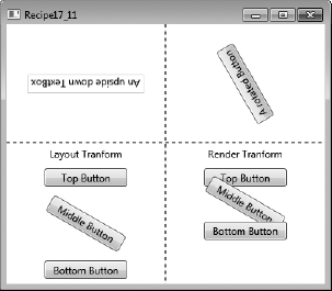
You need to create a user control to reuse part of the UI in different contexts within your application, without duplicating appearance or behavior logic.
Create a class that derives from System.Windows.Controls.UserControl or System.Windows.Controls.ContentControl, and place the visual elements you need in your reusable component in the XAML for the user control. Put custom logic in the code-behind for the UserControl to control custom behavior and functionality.
Tip
A control that derives from UserControl is useful for creating a reusable component within an application but is less useful if the control must be shared by other applications, software teams, or even companies. This is because a control that derives from UserControl cannot have its appearance customized by applying custom styles and templates in the consumer. If this is needed, then you need to use a custom control, which is a control that derives from System.Windows.UIElement.FrameworkElement or System.Windows.Controls.Control.
User controls provide a simple development model that is similar to creating WPF elements in standard windows. They are ideal for composing reusable UI controls out of existing components or elements, provided you do not need to allow them to be extensively customized by consumers of your control. If you do want to provide full control over the visual appearance of your control, or allow it to be a container for other controls, then a custom control is more suitable. Custom controls are covered in recipe 17-14.
To create a user control, right-click your project in Visual Studio, click Add, and then click the User Control option in the submenu. This creates a new XAML file and a corresponding code-behind file. The root element of the new XAML file is a System.Windows.Controls.UserControl class. Inside this XAML file, you can create the UI elements that compose your control.
The following example demonstrates how to create a FileInputControl, a custom reusable user control to encapsulate the functionality of browsing for a file and displaying the selected file name. This user control is then used in a window, as shown in Figure 17-10. The XAML for the FileInputControl is as follows:
<UserControl x:Class="Apress.VisualCSharpRecipes.Chapter17.FileInputControl"
    xmlns="http://schemas.microsoft.com/winfx/2006/xaml/presentation"
    xmlns:x="http://schemas.microsoft.com/winfx/2006/xaml">
    <DockPanel>
        <Button DockPanel.Dock="Right" Margin="2,0,0,0" Click="BrowseButton_Click">
            Browse...
        </Button>
        <TextBox x:Name="txtBox" IsReadOnly="True" />
    </DockPanel>
</UserControl>
The code-behind for the control is as follows:
using System.Windows.Controls;
using Microsoft.Win32;

namespace Apress.VisualCSharpRecipes.Chapter17
{
    public partial class FileInputControl : UserControl
    {
        public FileInputControl()
        {
            InitializeComponent();
        }

        private void BrowseButton_Click(
            object sender,
            System.Windows.RoutedEventArgs e)
        {
            OpenFileDialog dlg = new OpenFileDialog();
if(dlg.ShowDialog() == true)
{
this.FileName = dlg.FileName;
}
}
public string FileName
{
get
{
return txtBox.Text;
}
set
{
txtBox.Text = value;
}
}
}
}The XAML for the window that consumes this user control is as follows:
<Window x:Class="Apress.VisualCSharpRecipes.Chapter17.MainWindow"
xmlns="http://schemas.microsoft.com/winfx/2006/xaml/presentation"
xmlns:x="http://schemas.microsoft.com/winfx/2006/xaml"
xmlns:local="clr-namespace:Apress.VisualCSharpRecipes.Chapter17;assembly="
Title="Recipe17_12" Height="80" Width="300">
<Grid>
<local:FileInputControl Margin="8" />
</Grid>
</Window>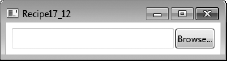
You need to support common application commands in your System.Windows.Controls.UserControl, such as Undo, Redo, Open, Copy, Paste, and so on, so that your control can respond to a command without needing any external code.
Use the System.Windows.Input.CommandManager to register an instance of the System.Windows.Input.CommandBinding class for each member of System.Windows.Input.ApplicationCommands that you need to support in your user control. The CommandBinding specifies the type of command you want to receive notification of, specifies a CanExecute event handler to determine when the command can be executed, and specifies an Executed event handler to be called when the command is executed.
There are many predefined commands in WPF to support common scenarios. These commands are grouped as static properties on five different classes, mostly in the System.Windows.Input namespace, as shown in Table 17-4.
Table 17.4. Predefined Common Commands
Value | Description |
|---|---|
| Common commands for an application; for example, |
| Common commands for user interface components; for example, |
| Common commands used for multimedia; for example, |
| A set of commands used for page navigation; for example, |
| A set of commands for editing documents; for example, |
Each command has a System.Windows.Input.InputGestureCollection that specifies the possible mouse or keyboard combinations that trigger the command. These are defined by the command itself, which is why you are able to register to receive these automatically by registering a CommandBinding for a particular command.
A CommandBinding for a particular command registers the CanExecute and Executed handlers so that the execution and the validation of the execution of the command are routed to these event handlers.
The following example creates a UserControl called FileInputControl that can be used to browse to a file using Microsoft.Win32.OpenFileDialog and display the file name in a System.Windows.Controls.TextBox.
It registers a CommandBinding for two application commands, Open and Find. When the user control has focus and the keyboard shortcuts for the Open and Find commands (Ctrl+O and Ctrl+F, respectively) are used, the Executed event handler for the respective command is invoked.
The Executed event handler for the Find command launches the OpenFileDialog, as if the user has clicked the Browse button. This command can always be executed, so the CanExecute event handler simply sets the CanExecute property of System.Windows.Input.CanExecuteRoutedEventArgs to True.
The Executed event handler for the Open command launches the file that is currently displayed in the TextBox. Therefore, the CanExecute event handler for this command sets the CanExecuteRoutedEventArgs to True only if there is a valid FileName. The XAML for the FileInputControl is as follows:
<UserControl x:Class=" Apress.VisualCSharpRecipes.Chapter17.FileInputControl"
xmlns="http://schemas.microsoft.com/winfx/2006/xaml/presentation"
xmlns:x="http://schemas.microsoft.com/winfx/2006/xaml">
<DockPanel>
<Button DockPanel.Dock="Right" Margin="2,0,0,0" Click="BrowseButton_Click">
Browse...
</Button>
<TextBox x:Name="txtBox" />
</DockPanel>
</UserControl>The code-behind for the FileInputControl is as follows:
using System.Diagnostics;
using System.IO;
using System.Windows.Controls;
using System.Windows.Input;
using Microsoft.Win32;
namespace Apress.VisualCSharpRecipes.Chapter17
{
public partial class FileInputControl : UserControl
{
public FileInputControl()
{
InitializeComponent();
// Register command bindings
// ApplicationCommands.Find
CommandManager.RegisterClassCommandBinding(
typeof(FileInputControl),
new CommandBinding(
ApplicationCommands.Find,
FindCommand_Executed,
FindCommand_CanExecute));
// ApplicationCommands.Open
CommandManager.RegisterClassCommandBinding(
typeof(FileInputControl),
new CommandBinding(ApplicationCommands.Open,
OpenCommand_Executed,
OpenCommand_CanExecute));
}
#region Find Command
private void FindCommand_CanExecute(
object sender,
CanExecuteRoutedEventArgs e)
{
e.CanExecute = true;
}
private void FindCommand_Executed(
object sender,
ExecutedRoutedEventArgs e)
{
DoFindFile();
}
#endregion
#region Open Command
private void OpenCommand_CanExecute(
object sender,
CanExecuteRoutedEventArgs e)
{
e.CanExecute =
!string.IsNullOrEmpty(this.FileName)
&& File.Exists(this.FileName);
}
private void OpenCommand_Executed(
object sender,
ExecutedRoutedEventArgs e)
{
Process.Start(this.FileName);
}
#endregion
private void BrowseButton_Click(
object sender,
System.Windows.RoutedEventArgs e)
{
DoFindFile();
}private void DoFindFile()
{
OpenFileDialog dlg = new OpenFileDialog();
if(dlg.ShowDialog() == true)
            {
                this.FileName = dlg.FileName;
            }
        }

        public string FileName
        {
            get
            {
                return txtBox.Text;
            }
            set
            {
                txtBox.Text = value;
            }
        }
    }
}
The following XAML shows how to use the FileInputControl in a window. If the TextBox has the focus, then pressing the keyboard shortcut Ctrl+F will automatically open the OpenFileDialog. If a file is selected and a valid file name appears in the TextBox, then the shortcut Ctrl+O will launch it.
<Window x:Class="Apress.VisualCSharpRecipes.Chapter17.MainWindow"
    xmlns="http://schemas.microsoft.com/winfx/2006/xaml/presentation"
    xmlns:x="http://schemas.microsoft.com/winfx/2006/xaml"
    xmlns:local="clr-namespace:Apress.VisualCSharpRecipes.Chapter17;assembly="
    Title="Recipe17_13" Height="80" Width="300">
    <Grid>
        <local:FileInputControl Margin="8"/>
    </Grid>
</Window>You need to create a custom control that encapsulates functionality and behavior logic but can have its visual appearance changed by consumers. For example, you need consumers to be able to change the style, template, or visual theme of your control for a particular context, application, or operating system theme.
Create a lookless custom control class that contains interaction and behavior logic but little or no assumptions about its visual implementation. Then declare the default visual elements for it in a control template within a default style.
Tip
When creating the code for a custom control, you need to ensure it is lookless and assumes as little as possible about the actual implementation of the visual elements in the control template, because it could be different across different consumers. This means ensuring that the UI is decoupled from the interaction logic by using commands and bindings, avoiding event handlers, and referencing elements in the ControlTemplate whenever possible.
The first step in creating a lookless custom control is choosing which control to inherit from. You could derive from the most basic option available to you, because it provides the minimum required functionality and gives the control consumer the maximum freedom. On the other hand, it also makes sense to leverage as much built-in support as possible by deriving from an existing WPF control if it possesses similar behavior and functionality to your custom control. For example, if your control will be clickable, then it might make sense to inherit from the Button class. If your control is not only clickable but also has the notion of being in a selected or unselected state, then it might make sense to inherit from ToggleButton.
Some of the most common base classes you will derive from are listed in Table 17-5.
Table 17.5. Common Base Classes for Creating a Custom Control
Name | Description |
|---|---|
| This is usually the most basic element from which you will derive. Use this when you need to draw your own element by overriding the |
|
|
| This inherits from |
| This has a property called |
| This wraps another control to decorate it with a particular visual effect or feature. For example, the |
After choosing an appropriate base class for your custom control, you can create the class and put the logic for the interaction, functionality, and behavior of your control in the custom control class.
However, don't define your visual elements in a XAML file for the class, like you would with a user control. Instead, put the default definition of visual elements in a System.Windows.ControlTemplate, and declare this ControlTemplate in a default System.Windows.Style.
The next step is to specify that you will be providing this new style; otherwise, your control will continue to use the default template of its base class. You specify this by calling the OverrideMetadata method of DefaultStyleKeyProperty in the static constructor for your class.
Next, you need to place your style in the Generic.xaml resource dictionary in the Themes subfolder of your project. This ensures it is recognized as the default style for your control. You can also create other resource dictionaries in this subfolder, which enables you to target specific operating systems and give your custom controls a different visual appearance for each one.
Tip
When a custom control library contains several controls, it is often better the keep their styles separate instead of putting them all in the same Generic.xaml resource dictionary. You can use resource dictionary merging to keep each style in a separate resource dictionary file and then merge them into the main Generic.xaml one.
The custom style and template for your control must use the System.Type.TargetType attribute to attach it to the custom control automatically.
Tip
In Visual Studio, when you add a new WPF custom control to an existing project, it does a number of the previous steps for you. It automatically creates a code file with the correct call to DefaultStyleKeyproperty.OverrideMetadata. It creates the Themes subfolder and Generic.xaml resource dictionary if they don't already exist, and it defines a placeholder Style and ControlTemplate in there.
When creating your custom control class and default control template, you have to remember to make as few assumptions as possible about the actual implementation of the visual elements. This is in order to make the custom control as flexible as possible and to give control consumers as much freedom as possible when creating new styles and control templates. You can enable this separation between the interaction logic and the visual implementation of your control in a number of ways.
First, when binding a property of a visual element in the default ControlTemplate to a dependency property of the control, use the System.Windows.Data.RelativeSource property instead of naming the element and referencing it via the ElementName property.
Second, instead of declaring event handlers in the XAML for the template—for example, for the Click event of a Button—either add the event handler programmatically in the control constructor or bind to commands. If you choose to use event handlers and bind them programmatically, override the OnApplyTemplate method and locate the controls dynamically.
Furthermore, give names only to those elements without which the control would not be able to function as intended. By convention, give these intrinsic elements the name PART_ElementName so that they can be identified as part of the public interface for your control. For example, it is intrinsic to a ProgressBar that it has a visual element representing the total value at completion and a visual element indicating the relative value of the current progress. The default ControlTemplate for the System.Windows.Controls.ProgressBar therefore defines two named elements, PART_Track and PART_Indicator. These happen to be Border controls in the default template, but there is no reason why a control consumer could not provide a custom template that uses different controls to display these functional parts.
Tip
If your control requires named elements, as well as using the previously mentioned naming convention, apply the System.Windows.TemplatePart attribute to your control class, which documents and signals this requirement to users of your control and to design tools such as Expression Blend.
The following code example demonstrates how to separate the interaction logic and the visual implementation using these methods.
The following example demonstrates how to create a lookless custom control to encapsulate the functionality of browsing to a file and displaying the file name. Figure 17-11 shows the control in use.
The FileInputControl class derives from Control and uses the TemplatePart attribute to signal that it expects a Button control called PART_Browse. It overrides the OnApplyTemplate method and calls GetTemplateChild to find the button defined by its actual template. If this exists, it adds an event handler to the button's Click event. The code for the control is as follows:
using System.Windows;
using System.Windows.Controls;
using System.Windows.Markup;
using Microsoft.Win32;

namespace Apress.VisualCSharpRecipes.Chapter17
{
    [TemplatePart(Name = "PART_Browse", Type = typeof(Button))]
    [ContentProperty("FileName")]
    public class FileInputControl : Control
    {
        static FileInputControl()
        {
            DefaultStyleKeyProperty.OverrideMetadata(
                typeof(FileInputControl),
                new FrameworkPropertyMetadata(
                    typeof(FileInputControl)));
        }

        public override void OnApplyTemplate()
        {
            base.OnApplyTemplate();

            Button browseButton = base.GetTemplateChild("PART_Browse") as Button;

            if (browseButton != null)
                browseButton.Click += new RoutedEventHandler(browseButton_Click);
        }

        void browseButton_Click(object sender, RoutedEventArgs e)
        {
            OpenFileDialog dlg = new OpenFileDialog();
            if (dlg.ShowDialog() == true)
            {
                this.FileName = dlg.FileName;
            }
        }

        public string FileName
        {
            get
            {
                return (string)GetValue(FileNameProperty);
            }
set
{
SetValue(FileNameProperty, value);
}
}
public static readonly DependencyProperty FileNameProperty =
DependencyProperty.Register( "FileName", typeof(string),
typeof(FileInputControl));
}
}The default style and control template for FileInputControl is in a ResourceDictionary in the Themes subfolder and is merged into the Generic ResourceDictionary. The XAML for this style is as follows:
<ResourceDictionary
    xmlns="http://schemas.microsoft.com/winfx/2006/xaml/presentation"
    xmlns:x="http://schemas.microsoft.com/winfx/2006/xaml"
    xmlns:local="clr-namespace:Apress.VisualCSharpRecipes.Chapter17;assembly=">

    <Style TargetType="{x:Type local:FileInputControl}">
        <Setter Property="Template">
            <Setter.Value>
                <ControlTemplate
                      TargetType="{x:Type local:FileInputControl}">
                    <Border Background="{TemplateBinding Background}"
                            BorderBrush="{TemplateBinding BorderBrush}"
                            BorderThickness="{TemplateBinding BorderThickness}">
                        <DockPanel>
                            <Button x:Name="PART_Browse" DockPanel.Dock="Right"
                                Margin="2,0,0,0">
                                Browse...
                            </Button>
                            <TextBox IsReadOnly="True"
                                Text="{Binding Path=FileName,
                                    RelativeSource=
                                       {RelativeSource TemplatedParent}}" />
                        </DockPanel>
                    </Border>
                </ControlTemplate>
            </Setter.Value>
        </Setter>
    </Style>
</ResourceDictionary>
The XAML for the window that consumes this custom control is as follows:
<Window x:Class="Apress.VisualCSharpRecipes.Chapter17.MainWindow"
    xmlns="http://schemas.microsoft.com/winfx/2006/xaml/presentation"
    xmlns:x="http://schemas.microsoft.com/winfx/2006/xaml"
    xmlns:local="clr-namespace:Apress.VisualCSharpRecipes.Chapter17;assembly="
Title="Recipe17_14" Height="200" Width="300">
<StackPanel>
<StackPanel.Resources>
<Style x:Key="fileInputStyle">
<Setter Property="Control.Height" Value="50" />
<Setter Property="Control.FontSize" Value="20px" />
<Setter Property="Control.BorderBrush" Value="Blue" />
<Setter Property="Control.BorderThickness" Value="2" />
<Style.Triggers>
<Trigger Property="Control.IsMouseOver" Value="True">
<Setter Property="Control.BorderThickness" Value="3" />
<Setter Property="Control.BorderBrush" Value="RoyalBlue" />
</Trigger>
</Style.Triggers>
</Style>
<ControlTemplate x:Key="fileInputTemplate"
TargetType="{x:Type local:FileInputControl}">
<Border Background="{TemplateBinding Background}"
BorderBrush="{TemplateBinding BorderBrush}"
BorderThickness="{TemplateBinding BorderThickness}">
<DockPanel>
<Button x:Name="PART_Browse" DockPanel.Dock="Left"
Background="Lightgreen">
<TextBlock FontSize="20px" Padding="3px" FontFamily="Arial"
Text="Open..."/>
</Button>
<TextBlock x:Name="PART_Text" VerticalAlignment="Center"
Margin="5, 0, 0, 0" FontSize="16px" FontWeight="Bold"
Text="{Binding Path=FileName,
RelativeSource=
{RelativeSource TemplatedParent}}" />
</DockPanel>
</Border>
</ControlTemplate>
</StackPanel.Resources>
<!-- Use the default appearance -->
<local:FileInputControl Margin="8" />
<!-- Applying a style to the control -->
<local:FileInputControl Margin="8" Style="{StaticResource fileInputStyle}" />
<!-- Applying a template to the control -->
<local:FileInputControl Margin="8" Template="{StaticResource
fileInputTemplate}" />
</StackPanel>
</Window>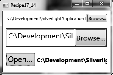
You need to create a two-way binding so that when the value of either property changes, the other one automatically updates to reflect it.
Use the System.Windows.Data.Binding markup extension, and set the Mode attribute to System.Windows.Data.BindingMode.TwoWay. Use the UpdateSourceTrigger attribute to specify when the binding source should be updated.
The data in a binding can flow from the source property to the target property, from the target property to the source property, or in both directions. For example, suppose the Text property of a System.Windows.Controls.TextBox control is bound to the Value property of a System.Windows.Controls.Slider control. In this case, the Text property of the TextBox control is the target of the binding, and the Value property of the Slider control is the binding source. The direction of data flow between the target and the source can be configured in a number of different ways. It could be configured such that when the Value of the Slider control changes, the Text property of the TextBox is updated. This is called a one-way binding. Alternatively, you could configure the binding so that when the Text property of the TextBox changes, the Slider control's Value is automatically updated to reflect it. This is called a one-way binding to the source. A two-way binding means that a change to either the source property or the target property automatically updates the other. This type of binding is useful for editable forms or other fully interactive UI scenarios.
It is the Mode property of a Binding object that configures its data flow. This stores an instance of the System.Windows.Data.BindingMode enumeration and can be configured with the values listed in Table 17-6.
Table 17.6. BindingMode Values for Configuring the Data Flow in a Binding
Value | Description |
|---|---|
| The |
| The target property is updated when the control is first loaded or when the data context changes. This type of binding is appropriate if the data is static and won't change once it has been set. |
| The target property is updated whenever the source property changes. This is appropriate if the target control is read-only, such as a |
| This is the opposite of |
| Changes to either the target property or the source automatically update the other. |
Bindings that are TwoWay or OneWayToSource listen for changes in the target property and update the source. It is the UpdateSourceTrigger property of the binding that determines when this update occurs. For example, suppose you created a TwoWay binding between the Text property of a TextBox control and the Value property of a Slider control. You could configure the binding so that the slider is updated either as soon as you type text into the TextBox or when the TextBox loses its focus. Alternatively, you could specify that the TextBox is updated only when you explicitly call the UpdateSource property of the System.Windows.Data.BindingExpression class. These options are configured by the Binding's UpdateSourceTrigger property, which stores an instance of the System.Windows.Data.UpdateSourceTrigger enumeration. Table 17-7 lists the possible values of this enumeration.
Therefore, to create a two-way binding that updates the source as soon as the target property changes, you need to specify TwoWay as the value of the Binding's Mode attribute and PropertyChanged for the UpdateSourceTrigger attribute.
Note
To detect source changes in OneWay and TwoWay bindings, if the source property is not a System.Windows.DependencyProperty, it must implement System.ComponentModel.INotifyPropertyChanged to notify the target that its value has changed.
Table 17.7. UpdateSourceTrigger Values for Configuring When the Binding Source Is Updated
Value | Description |
|---|---|
| The |
| Updates the binding source only when you call the |
| Updates the binding source whenever the binding target element loses focus. |
| Updates the binding source immediately whenever the binding target property changes. |
The following example demonstrates a window containing a System.Windows.Controls.Slider control and a System.Windows.Controls.TextBlock control. The XAML statement for the Text property of the TextBlock specifies a Binding statement that binds it to the Value property of the Slider control. In the binding statement, the Mode attribute is set to TwoWay, and the UpdateSourceTrigger attribute is set to PropertyChanged. This ensures that when a number from 1 to 100 is typed into the TextBox, the Slider control immediately updates its value to reflect it. The XAML for the window is as follows:
<Window x:Class="Apress.VisualCSharpRecipes.Chapter17.MainWindow"
    xmlns="http://schemas.microsoft.com/winfx/2006/xaml/presentation"
    xmlns:x="http://schemas.microsoft.com/winfx/2006/xaml"
     Title="Recipe17_15" Height="100" Width="260">
    <StackPanel>
        <Slider Name="slider" Margin="4" Interval="1"
                TickFrequency="1" IsSnapToTickEnabled="True"
                Minimum="0" Maximum="100"/>
        <StackPanel Orientation="Horizontal" >
            <TextBlock Width="Auto" HorizontalAlignment="Left"
                       VerticalAlignment="Center" Margin="4"
                       Text="Gets and sets the value of the slider:" />
            <TextBox Width="40" HorizontalAlignment="Center" Margin="4"
                 Text="{Binding
                        ElementName=slider,
                        Path=Value,
                        Mode=TwoWay,
                        UpdateSourceTrigger=PropertyChanged}" />
        </StackPanel>
    </StackPanel>
</Window>
Figure 17-12 shows the resulting window.
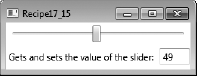
You need to bind a System.Windows.Controls.Button control directly to a System.Windows.Input.ICommand. This enables you to execute custom logic when the Button is clicked, without having to handle its Click event and call a method. You can also bind the IsEnabled property of the Button to the ICommand object's CanExecute method.
Create a class that implements ICommand, and expose an instance of it as a property on another class or business object. Bind this property to a Button control's Command property.
The Button control derives from the System.Windows.Controls.Primitives.ButtonBase class. This implements the System.Windows.Input.ICommandSource interface and exposes an ICommand property called Command. The ICommand interface encapsulates a unit of functionality. When its Execute method is called, this functionality is executed. The CanExecute method determines whether the ICommand can be executed in its current state. It returns True if the ICommand can be executed and returns False if not.
To execute custom application logic when a Button is clicked, you would typically attach an event handler to its Click event. However, you can also encapsulate this custom logic in a command and bind it directly to the Button control's Command property. This approach has several advantages. First, the IsEnabled property of the Button will automatically be bound to the CanExecute method of the ICommand. This means that when the CanExecuteChanged event is fired, the Button will call the command's CanExecute method and refresh its own IsEnabled property dynamically. Second, the application functionality that should be executed when the Button is clicked does not have to reside in the code-behind for the window. This enables greater separation of presentation and business logic, which is always desirable in object-oriented programming in general, and even more so in WPF development, because it makes it easier for UI designers to work alongside developers without getting in each other's way.
To bind the Command property of a Button to an instance of an ICommand, simply set the Path attribute to the name of the ICommand property, just as you would any other property. You can also optionally specify parameters using the CommandParameter attribute. This in turn can be bound to the properties of other elements and is passed to the Execute and CanExecute methods of the command.
The following example demonstrates a window containing three System.Windows.Controls.TextBox controls. These are bound to the FirstName, LastName, and Age properties of a custom Person object. The Person class also exposes an instance of the AddPersonCommand and SetOccupationCommand as read-only properties. There are two Button controls on the window that have their Command attribute bound to these command properties. Custom logic in the CanExecute methods of the commands specifies when the Buttons should be enabled or disabled. If the ICommand can be executed and the Button should therefore be enabled, the code in the CanExecute method returns True. If it returns False, the Button will be disabled. The Set Occupation Button control also binds its CommandParameter to the Text property of a System.Windows.Controls.ComboBox control. This demonstrates how to pass parameters to an instance of an ICommand. Figure 17-13 shows the resulting window. The XAML for the window is as follows:
<Window x:Class="Apress.VisualCSharpRecipes.Chapter17.MainWindow"
   xmlns="http://schemas.microsoft.com/winfx/2006/xaml/presentation"
   xmlns:x="http://schemas.microsoft.com/winfx/2006/xaml"
   Title="Recipe17_16" Height="233" Width="300">
    <Grid>
        <Grid.ColumnDefinitions>
            <ColumnDefinition Width="70"/>
            <ColumnDefinition Width="*"/>
        </Grid.ColumnDefinitions>

        <Grid.RowDefinitions>
            <RowDefinition Height="30"/>
            <RowDefinition Height="30"/>
            <RowDefinition Height="30"/>
            <RowDefinition Height="40"/>
            <RowDefinition Height="34"/>
            <RowDefinition Height="30"/>
        </Grid.RowDefinitions>

        <TextBlock Margin="4" Text="First Name" VerticalAlignment="Center"/>
        <TextBox Text="{Binding Path=FirstName}" Margin="4" Grid.Column="1"/>
<TextBlock Margin="4" Text="Last Name" Grid.Row="1"
VerticalAlignment="Center"/>
<TextBox Margin="4" Text="{Binding Path=LastName}"
Grid.Column="1" Grid.Row="1"/>
<TextBlock Margin="4" Text="Age" Grid.Row="2"
VerticalAlignment="Center"/>
<TextBox Margin="4" Text="{Binding Path=Age}"
Grid.Column="1" Grid.Row="2"/>
<!-- Bind the Button to the Add Command -->
<Button Command="{Binding Path=Add}" Content="Add"
Margin="4" Grid.Row="3" Grid.Column="2"/>
<StackPanel Orientation="Horizontal"
Grid.Column="2" Grid.Row="4">
<ComboBox x:Name="cboOccupation" IsEditable="False"
Margin="4" Width="100">
<ComboBoxItem>Student</ComboBoxItem>
<ComboBoxItem>Skilled</ComboBoxItem>
<ComboBoxItem>Professional</ComboBoxItem>
</ComboBox>
<Button Command="{Binding Path=SetOccupation}"
CommandParameter="{Binding ElementName=cboOccupation, Path=Text}"
Content="Set Occupation" Margin="4" />
</StackPanel>
<TextBlock Margin="4" Text="Status"
Grid.Row="5" VerticalAlignment="Center"/>
<TextBlock Margin="4"
Text="{Binding Path=Status, UpdateSourceTrigger=PropertyChanged}"
VerticalAlignment="Center" FontStyle="Italic" Grid.Column="1"
Grid.Row="5"/>
</Grid>
</Window>The code-behind for the window sets its DataContext property to a new Person object. The code for this is as follows:
using System.Windows;

namespace Apress.VisualCSharpRecipes.Chapter17
{
    public partial class MainWindow : Window
    {
        public MainWindow()
        {
            InitializeComponent();
// Set the DataContext to a Person object
this.DataContext = new Person()
{
FirstName = "Zander",
LastName = "Harris"
};
}
}
}The code for the Person, AddPersonCommand, and SetOccupationCommand classes are as follows:
using System;
using System.ComponentModel;
using System.Windows.Input;

namespace Apress.VisualCSharpRecipes.Chapter17
{
    public class Person : INotifyPropertyChanged
    {
        private string firstName;
        private int age;
        private string lastName;
        private string status;
        private string occupation;

        private AddPersonCommand addPersonCommand;
        private SetOccupationCommand setOccupationCommand;

        public string FirstName
        {
            get
            {
                return firstName;
            }
            set
            {
                if(firstName != value)
                {
                    firstName = value;
                    OnPropertyChanged("FirstName");
                }
            }
        }


        public string LastName
        {
            get

            {
                return lastName;
            }
set
{
if(this.lastName != value)
{
this.lastName = value;
OnPropertyChanged("LastName");
}
}
}
public int Age
{
get
{
return age;
}
set
{
if(this.age != value)
{
this.age = value;
OnPropertyChanged("Age");
}
}
}
public string Status
{
get
{
return status;
}
set
{
if(this.status != value)
{
this.status = value;
OnPropertyChanged("Status");
}
}
}
public string Occupation
{
get
{
return occupation;
}
set
{if(this.occupation != value)
{
this.occupation = value;
OnPropertyChanged("Occupation");
}
}
}
/// Gets an AddPersonCommand for data binding
public AddPersonCommand Add
{
get
{
if(addPersonCommand == null)
addPersonCommand = new AddPersonCommand(this);
return addPersonCommand;
}
}
/// Gets a SetOccupationCommand for data binding
public SetOccupationCommand SetOccupation
{
get
{
if(setOccupationCommand == null)
setOccupationCommand = new SetOccupationCommand(this);
return setOccupationCommand;
}
}
#region INotifyPropertyChanged Members
/// Implement INotifyPropertyChanged to notify the binding
/// targets when the values of properties change.
public event PropertyChangedEventHandler PropertyChanged;
private void OnPropertyChanged(string propertyName)
{
if(this.PropertyChanged != null)
{
this.PropertyChanged(
this, new PropertyChangedEventArgs(propertyName));
}
}
#endregion
}public class AddPersonCommand : ICommand
{
private Person person;
public AddPersonCommand(Person person)
{
this.person = person;
this.person.PropertyChanged +=
new PropertyChangedEventHandler(person_PropertyChanged);
}
// Handle the PropertyChanged event of the person to raise the
// CanExecuteChanged event
private void person_PropertyChanged(
object sender, PropertyChangedEventArgs e)
{
if(CanExecuteChanged != null)
{
CanExecuteChanged(this, EventArgs.Empty);
}
}
#region ICommand Members
/// The command can execute if there are valid values
/// for the person's FirstName, LastName, and Age properties
/// and if it hasn't already been executed and had its
/// Status property set.
public bool CanExecute(object parameter)
{
if(!string.IsNullOrEmpty(person.FirstName))
if(!string.IsNullOrEmpty(person.LastName))
if(person.Age > 0)
if(string.IsNullOrEmpty(person.Status))
return true;
return false;
}
public event EventHandler CanExecuteChanged;
/// When the command is executed, update the
/// status property of the person.
public void Execute(object parameter)
{
person.Status =
string.Format("Added {0} {1}",
person.FirstName, person.LastName);
}#endregion
}
public class SetOccupationCommand : ICommand
{
private Person person;
public SetOccupationCommand(Person person)
{
this.person = person;
this.person.PropertyChanged +=
new PropertyChangedEventHandler(person_PropertyChanged);
}
// Handle the PropertyChanged event of the person to raise the
// CanExecuteChanged event
private void person_PropertyChanged(
object sender, PropertyChangedEventArgs e)
{
if(CanExecuteChanged != null)
{
CanExecuteChanged(this, EventArgs.Empty);
}
}
#region ICommand Members
/// The command can execute if the person has been added,
/// which means its Status will be set, and if the occupation
/// parameter is not null
public bool CanExecute(object parameter)
{
if(!string.IsNullOrEmpty(parameter as string))
if(!string.IsNullOrEmpty(person.Status))
return true;
return false;
}
public event EventHandler CanExecuteChanged;
/// When the command is executed, set the Occupation
/// property of the person, and update the Status.
public void Execute(object parameter)
{
// Get the occupation string from the command parameter
person.Occupation = parameter.ToString();person.Status =
string.Format("Added {0} {1}, {2}",
person.FirstName, person.LastName, person.Occupation);
}
#endregion
}
}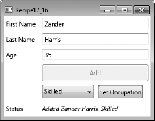
Create a System.Windows.DataTemplate to define the presentation of your data objects. This specifies the visual structure of UI elements to use to display your data.
When you bind to a data object, the binding target displays a string representation of the object by default. Internally, this is because without any specific instructions the binding mechanism calls the ToString method of the binding source when binding to it. Creating a DataTemplate enables you to specify a different visual structure of UI elements when displaying your data object. When the binding mechanism is asked to display a data object, it will use the UI elements specified in the DataTemplate to render it.
The following example demonstrates a window that contains a System.Windows.Controls.ListBox control. The ItemsSource property of the ListBox is bound to a collection of Person objects. The Person class is defined in the Data.cs file and exposes FirstName, LastName, Age, and Photo properties. It also overrides the ToString method to return the full name of the person it represents. Without a DataTemplate, the ListBox control would just display this list of names. Figure 17-14 shows what this would look like.
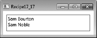
However, the ItemTemplate property of the ListBox is set to a static resource called personTemplate. This is a DataTemplate resource defined in the window's System.Windows.ResourceDictionary. The DataTemplate creates a System.Windows.Controls.Grid control inside a System.Windows.Controls.Border control. Inside the Grid, it defines a series of System.Windows.Controls.TextBlock controls and a System.Windows.Controls.Image control. These controls have standard binding statements that bind their properties to properties on the Person class. When the window opens and the ListBox binds to the collection of Person objects, the binding mechanism uses the set of UI elements in the DataTemplate to display each item. Figure 17-15 shows the same ListBox as in Figure 17-14 but with its ItemTemplate property set to the DataTemplate.
The XAML for the window is as follows:
<Window
    x:Class="Apress.VisualCSharpRecipes.Chapter17.MainWindow"
    xmlns="http://schemas.microsoft.com/winfx/2006/xaml/presentation"
    xmlns:x="http://schemas.microsoft.com/winfx/2006/xaml"
    xmlns:local="clr-namespace:Apress.VisualCSharpRecipes.Chapter17"
    Title="Recipe17_17" Height="298" Width="260">


    <Window.Resources>

        <!-- Creates the local data source for binding -->
        <local:PersonCollection x:Key="people"/>

        <!-- Styles used by the UI elements in the DataTemplate -->
        <Style
            x:Key="lblStyle"
            TargetType="{x:Type TextBlock}">
            <Setter Property="FontFamily" Value="Tahoma"/>
            <Setter Property="FontSize" Value="11pt"/>
            <Setter Property="VerticalAlignment" Value="Center"/>
<Setter Property="Margin" Value="2"/>
<Setter Property="Foreground" Value="Red"/>
</Style>
<Style
x:Key="dataStyle"
TargetType="{x:Type TextBlock}"
BasedOn="{StaticResource lblStyle}">
<Setter Property="Margin" Value="10,2,2,2"/>
<Setter Property="Foreground" Value="Blue"/>
<Setter Property="FontStyle" Value="Italic"/>
</Style>
<!-- DataTemplate to use for displaying each Person item -->
<DataTemplate x:Key="personTemplate">
<Border
BorderThickness="1"
BorderBrush="Gray"
Padding="4"
Margin="4"
Height="Auto"
Width="Auto">
<Grid>
<Grid.ColumnDefinitions>
<ColumnDefinition Width="80"/>
<ColumnDefinition Width="*"/>
</Grid.ColumnDefinitions>
<StackPanel>
<TextBlock
Style="{StaticResource lblStyle}"
Text="First Name" />
<TextBlock
Style="{StaticResource dataStyle}"
Text="{Binding Path=FirstName}"/>
<TextBlock
Style="{StaticResource lblStyle}"
Text="Last Name" />
<TextBlock
Style="{StaticResource dataStyle}"
Text="{Binding Path=LastName}" />
<TextBlock
Style="{StaticResource lblStyle}"
Text="Age" />
<TextBlock
Style="{StaticResource dataStyle}"
Text="{Binding Path=Age}" />
</StackPanel><Image
Margin="4"
Grid.Column="1"
Width="96"
Height="140"
Source="{Binding Path=Photo}"/>
</Grid>
</Border>
</DataTemplate>
</Window.Resources>
<Grid>
<!-- The ListBox binds to the people collection, and sets the -->
<!-- DataTemplate to use for displaying each item -->
<ListBox
Margin="10"
ItemsSource="{Binding Source={StaticResource people}}"
ItemTemplate="{StaticResource personTemplate}"/>
<!-- Without specifying a DataTemplate, the ListBox just -->
<!-- displays a list of names. -->
<!--<ListBox
Margin="10"
ItemsSource="{Binding Source={StaticResource people}}"/>-->
</Grid>
</Window>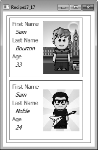
You need to bind to the items in a data collection and display more information about the selected item. For example, you might display a list of product names and prices on one side of the screen and a more detailed view of the selected product on the other side.
Bind a data collection to the ItemsSource property of a System.Windows.Controls.ItemsControl such as a System.Windows.Controls.ListBox, System.Windows.Controls.ListView, or System.Windows.Controls.TreeView. Implement System.Collections.Specialized.INotifyCollectionChanged on the data collection to ensure that insertions or deletions in the collection update the UI automatically. Implement the master-detail pattern by binding a System.Windows.Controls.ContentControl to the same collection.
To bind an ItemsControl to a collection object, set its ItemsSource property to an instance of a collection class. This is a class that implements the System.Collections.IEnumerable interface, such as System.Collections.Generic.List<T> or System.Collections.ObjectModel.Collection<T>, or the System.Collections.IList and System.Collections.ICollection interfaces. However, if you bind to any of these objects, the binding will be one-way and read-only. To set up dynamic bindings so that insertions or deletions in the collection update the UI automatically, the collection must implement the System.Collections.Specialized.INotifyCollectionChanged interface. This interface provides the mechanism for notifying the binding target of changes to the source collection, in much the same way as the System.ComponentModel.INotifyPropertyChanged interface notifies bindings of changes to properties in single objects.
INotifyCollectionChanged exposes an event called CollectionChanged that should be raised whenever the underlying collection changes. When you raise this event, you pass in an instance of the System.Collections.Specialized.NotifyCollectionChangedEventArgs class. This contains properties that specify the action that caused the event—for example, whether items were added, moved, or removed from the collection and the list of affected items. The binding mechanism listens for these events and updates the target UI element accordingly.
You do not need to implement INotifyCollectionChanged on your own collection classes. WPF provides the System.Collections.ObjectModel.ObservableCollection<T> class, which is a built-in implementation of a data collection that exposes INotifyCollectionChanged. If your collection classes are instances of the ObservableCollection<T> class or they inherit from it, you will get two-way dynamic data binding for free.
Note
To fully support transferring data values from source objects to targets, each object in your collection that supports bindable properties must also implement the INotifyPropertyChanged interface. It is common practice to create a base class for all your custom business objects that implements INotifyPropertyChanged and a base collection class for collections of these objects that inherits from ObservableCollection<T>. This automatically enables all your custom objects and collection classes for data binding.
To implement the master-detail scenario of binding to a collection, you simply need to bind two or more controls to the same System.Windows.Data.CollectionView object. A CollectionView represents a wrapper around a binding source collection that allows you to navigate, sort, filter, and group the collection, without having to manipulate the underlying source collection itself. When you bind to any class that implements IEnumerable, the WPF binding engine creates a default CollectionView object automatically behind the scenes. So if you bind two or more controls to the same ObservableCollection<T> object, you are in effect binding them to the same default CollectionView class. If you want to implement custom sorting, grouping, and filtering of your collection, you will need to define a CollectionView explicitly yourself. You do this by creating a System.Windows.Data.CollectionViewSource class in your XAML. This approach is demonstrated in the next few recipes in this chapter. However, for the purpose of implementing the master-detail pattern, you can simply bind directly to an ObservableCollection<T> and accept the default CollectionView behind the scenes.
To display the master aspect of the pattern, simply bind your collection to the ItemsSource property of an ItemsControl, such as a System.Windows.Controls.ListBox, System.Windows.Controls.ListView, or System.Windows.Controls.TreeView. If you do not specify a DataTemplate for the ItemTemplate property of the ItemsControl, you can use the DisplayMemberPath property to specify the name of the property the ItemsControl should display. If you do not support a value for DisplayMemberPath, it will display the value returned by the ToString method of each data item in the collection.
To display the detail aspect of the pattern for the selected item, simply bind a singleton object to the collection, such as a ContentControl. When a singleton object is bound to a CollectionView, it automatically binds to the CurrentItem of the view.
If you are explicitly creating a CollectionView using a CollectionViewSource object, it will automatically synchronize currency and selection between the binding source and targets. However, if you are bound directly to an ObservableCollection<T> or other such IEnumerable object, then you will need to set the IsSynchronizedWithCurrentItem property of your ListBox to True for this to work. Setting the IsSynchronizedWithCurrentItem property to True ensures that the item selected always corresponds to the CurrentItem property in the ItemCollection. For example, suppose there are two ListBox controls with their ItemsSource property bound to the same ObservableCollection<T>. If you set IsSynchronizedWithCurrentItem to True on both ListBox controls, the selected item in each will be the same.
The following example demonstrates a window that data-binds to an instance of the PersonCollection class in its constructor. The PersonCollection class is an ObservableCollection<T> of Person objects. Each Person object exposes name, age, and occupation data, as well as a description.
In the top half of the window, a ListBox is bound to the window's DataContext. This is assigned an instance of the PersonCollection in the code-behind for the window. The ItemTemplate property of the ListBox references a DataTemplate called masterTemplate defined in the window's Resources collection. This shows the value of the Description property for each Person object in the collection. It sets the UpdateSourceTrigger attribute to System.Windows.Data.UpdateSourceTrigger.PropertyChanged. This ensures that the text in the ListBox item is updated automatically and immediately when the Description property of a Person changes. In the bottom half of the window, a ContentControl binds to the same collection. Because it is a singleton UI element and does not display a collection of items, it automatically binds to thecurrent item in the PersonCollection class. Because the IsSynchronizedWithCurrentItem property of the ListBox is set to True, this corresponds to the selected item in the ListBox. The ContentControl uses a DataTemplate called detailTemplate to display the full details of the selected Person.
When the data displayed in the details section is changed, it automatically updates the corresponding description in the master section above it. This is made possible for two reasons. First, the System.Windows.Controls.TextBox controls in the details section specify a System.Windows.Data.Binding.BindingMode of TwoWay, which means that when new text is input, it is automatically marshaled to the binding source. Second, the Person class implements the INotifyPropertyChanged interface. This means that when a value of a property changes, the binding target is automatically notified.
At the bottom of the window, there is a System.Windows.Controls.Button control marked Add Person. When this button is clicked, it adds a new Person object to the collection. Because the PersonCollection class derives from ObservableCollection<T>, which in turn implements INotifyCollectionChanged, the master list of items automatically updates to show the new item.
The XAML for the window is as follows:
<Window x:Class="Apress.VisualCSharpRecipes.Chapter17.MainWindow"
    xmlns="http://schemas.microsoft.com/winfx/2006/xaml/presentation"
    xmlns:x="http://schemas.microsoft.com/winfx/2006/xaml"
    Title="Recipe17_18" Height="380" Width="280">
    <Window.Resources>

        <DataTemplate
            x:Key="masterTemplate">
            <TextBlock
                Margin="4"
                Text="{Binding
                       Path=Description,
                       UpdateSourceTrigger=PropertyChanged}"/>
        </DataTemplate>

        <DataTemplate x:Key="detailTemplate">
            <Border
                BorderBrush="LightBlue"
                BorderThickness="1">
                <Grid Margin="10">
                    <Grid.ColumnDefinitions>
                        <ColumnDefinition Width="74"/>
                        <ColumnDefinition Width="*"/>
                    </Grid.ColumnDefinitions>

                    <Grid.RowDefinitions>
                        <RowDefinition Height="30"/>
                        <RowDefinition Height="30"/>
<RowDefinition Height="30"/>
<RowDefinition Height="30"/>
</Grid.RowDefinitions>
<TextBlock
Margin="4"
Text="First Name"
VerticalAlignment="Center"/>
<TextBox
Text="{Binding Path=FirstName, Mode=TwoWay}"
Margin="4" Grid.Column="1"/>
<TextBlock
Margin="4"
Text="Last Name"
Grid.Row="1"
VerticalAlignment="Center"/>
<TextBox
Margin="4"
Text="{Binding Path=LastName, Mode=TwoWay}"
Grid.Column="1" Grid.Row="1"/>
<TextBlock
Margin="4"
Text="Age"
Grid.Row="2"
VerticalAlignment="Center"/>
<TextBox
Margin="4"
Text="{Binding Path=Age, Mode=TwoWay}"
Grid.Column="1"
Grid.Row="2"/>
<TextBlock
Margin="4"
Text="Occupation"
Grid.Row="3"
VerticalAlignment="Center"/>
<ComboBox
x:Name="cboOccupation"
IsEditable="False"
Grid.Column="1"
Grid.Row="3"
HorizontalAlignment="Left"
Text="{Binding Path=Occupation, Mode=TwoWay}"
Margin="4" Width="140">
<ComboBoxItem>Student</ComboBoxItem>
<ComboBoxItem>Engineer</ComboBoxItem>
<ComboBoxItem>Professional</ComboBoxItem>
</ComboBox></Grid>
</Border>
</DataTemplate>
</Window.Resources>
<StackPanel Margin="5">
<TextBlock
VerticalAlignment="Center"
FontSize="14"
Margin="4"
Text="People"/>
<!-- The ItemsControls binds to the collection. -->
<ListBox
ItemsSource="{Binding}"
ItemTemplate="{StaticResource masterTemplate}"
IsSynchronizedWithCurrentItem="True" />
<TextBlock
VerticalAlignment="Center"
FontSize="14"
Margin="4"
Text="Details"/>
<!-- The ContentControl binds to the CurrentItem of the collection. -->
<ContentControl
Content="{Binding}"
ContentTemplate="{StaticResource detailTemplate}" />
<!-- Add a new person to the collection. -->
<Button
Margin="4"
Width="100"
Height="34"
HorizontalAlignment="Right"
Click="AddButton_Click">
Add Person
</Button>
</StackPanel>
</Window>The code-behind for the window is as follows:
using System.Windows;

namespace Apress.VisualCSharpRecipes.Chapter17
{
    public partial class MainWindow : Window
    {
        // Create an instance of the PersonCollection class
PersonCollection people =
new PersonCollection();
public MainWindow()
{
InitializeComponent();
// Set the DataContext to the PersonCollection
this.DataContext = people;
}
private void AddButton_Click(
object sender, RoutedEventArgs e)
{
people.Add(new Person()
{
FirstName = "Simon",
LastName = "Williams",
Age = 39,
Occupation = "Professional"
});
}
}
}The code for the Person class is omitted for brevity. The code for the PersonCollection class is as follows:
using System.Collections.ObjectModel;

namespace Apress.VisualCSharpRecipes.Chapter17
{
    public class PersonCollection
        : ObservableCollection<Person>
    {
        public PersonCollection()
        {
            this.Add(new Person()
                         {
                             FirstName = "Sam",
                             LastName = "Bourton",
                             Age = 33,
                             Occupation = "Engineer"
                         });
            this.Add(new Person()
                         {
                             FirstName = "Adam",
                             LastName = "Freeman",
                             Age = 37,
                             Occupation = "Professional"
                         });
this.Add(new Person()
{
FirstName = "Sam",
LastName = "Noble",
Age = 24,
Occupation = "Engineer"
});
}
}
}Figure 17-16 shows the resulting window.
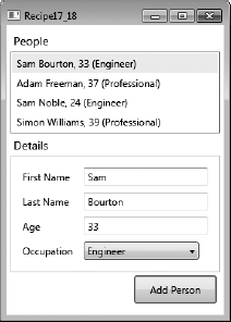
Create a System.Windows.Style resource for the System.Windows.Controls.Control, and use a property trigger to change the properties of the Style when the IsMouseOver property is True.
Every control ultimately inherits from System.Windows.UIElement. This exposes a dependency property called IsMouseOverProperty. A System.Windows.Trigger can be defined in the Style ofthe control, which receives notification when this property changes and can subsequently change the control's Style. When the mouse leaves the control, the property is set back to False, which notifies the trigger, and the control is automatically set back to the default state.
The following example demonstrates a window with a Style resource and two System.Windows.Controls.Button controls. The Style uses a Trigger to change the System.Windows.FontWeight and BitmapEffect properties of the Button controls when the mouse is over them. The XAML for the window is as follows:
<Window x:Class="Apress.VisualCSharpRecipes.Chapter17.MainWindow"
    xmlns="http://schemas.microsoft.com/winfx/2006/xaml/presentation"
    xmlns:x="http://schemas.microsoft.com/winfx/2006/xaml"
    Title="Recipe17_19" Height="120" Width="240">

    <Window.Resources>
        <Style TargetType="{x:Type Button}">
            <Style.Triggers>
                <Trigger Property="IsMouseOver" Value="True">
                    <Setter Property="FontWeight" Value="Bold" />
                    <Setter Property="BitmapEffect">
                        <Setter.Value>
                            <DropShadowEffect BlurRadius="15"
                                Color="Orange" ShadowDepth="0" />
                        </Setter.Value>
                    </Setter>
                </Trigger>
            </Style.Triggers>
        </Style>
    </Window.Resources>

    <StackPanel Margin="8">
        <Button Height="25" Width="100" Margin="4">
            Mouse Over Me!
        </Button>
        <Button Height="25" Width="100" Margin="4">
            Mouse Over Me!
        </Button>
    </StackPanel>
</Window>
Figure 17-17 shows the resulting window.
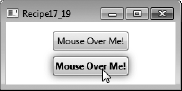
You need to give a different appearance to items in alternate rows of a System.Windows.Controls.ListBox.
When you set the ItemContainerStyleSelector property of a ListBox to a StyleSelector, it will evaluate each item and apply the correct Style. This allows you to specify custom logic to vary the appearance of items based on any particular value or criteria.
The following example demonstrates a window that displays a list of country names in a ListBox. In the XAML for the ListBox, its ItemContainerStyleSelector property is set to a local StyleSelector class called AlternatingRowStyleSelector. This class has a property called AlternateStyle, which is set to a Style resource that changes the Background property of a ListBoxItem.
The AlternatingRowStyleSelector class overrides the SelectStyle property and returns either the default or the alternate Style, based on a Boolean flag. The XAML for the window is as follows:
<Window x:Class="Apress.VisualCSharpRecipes.Chapter17.MainWindow"
    xmlns="http://schemas.microsoft.com/winfx/2006/xaml/presentation"
    xmlns:x="http://schemas.microsoft.com/winfx/2006/xaml"
    xmlns:local="clr-namespace:Apress.VisualCSharpRecipes.Chapter17;assembly="
    Title="Recipe17_20" Height="248" Width="200">
<Window.Resources>
<local:Countries x:Key="countries"/>
<Style x:Key="AlternateStyle">
<Setter Property="ListBoxItem.Background" Value="LightGray"/>
</Style>
</Window.Resources>
<Grid Margin="4">
<ListBox
DisplayMemberPath="Name"
ItemsSource="{Binding Source={StaticResource countries}}" >
<ListBox.ItemContainerStyleSelector>
<local:AlternatingRowStyleSelector
AlternateStyle="{StaticResource AlternateStyle}" />
</ListBox.ItemContainerStyleSelector>
</ListBox>
</Grid>
</Window>The code for the StyleSelector is as follows:
using System.Windows;
using System.Windows.Controls;

namespace Apress.VisualCSharpRecipes.Chapter17
{
    public class AlternatingRowStyleSelector : StyleSelector
    {
        // Flag to track the alternate rows
        private bool isAlternate = false;

        public Style DefaultStyle {  get; set; }
        public Style AlternateStyle { get; set; }

        public override Style SelectStyle(object item, DependencyObject container)
        {
            // Select the style, based on the value of isAlternate
            Style style = isAlternate ? AlternateStyle : DefaultStyle;

            // Invert the flag
            isAlternate = !isAlternate;

            return style;
        }
    }
}
Figure 17-18 shows the resulting window.
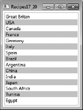
You need to allow the user to drag items from a System.Windows.Controls.ListBox to a System.Windows.Controls.Canvas.
Note
Drag-and-drop is relatively simple to implement in WPF, but contains a lot of variations depending on what you are trying to do and what content you are dragging. This example focuses on dragging content from a ListBox to a Canvas, but the principles are similar for other types of drag-and-drop operations and can be adapted easily.
On the ListBox or ListBoxItem, handle the PreviewMouseLeftButtonDown event to identify thestart of a possible drag operation and identify the ListBoxItem being dragged. Handle the PreviewMouseMove event to determine whether the user is actually dragging the item, and if so, set up the drop operation using the static System.Windows.DragDrop class. On the Canvas (the target for the drop operation), handle the DragEnter and Drop events to support the dropping of dragged content.
The static DragDrop class provides the functionality central to making it easy to execute drag-and-drop operations in WPF. First, however, you must determine that the user is actually trying to drag something.
There is no single best way to do this, but usually you will need a combination of handling MouseLeftButtonDown or PreviewMouseLeftButtonDown events to know when the user clicks something, and MouseMove or PreviewMouseMove events to determine whether the user is moving the mouse while holding the left button down. Also, you should use the SystemParameters.MinimumHorizontalDragDistance and SystemParameters.MinimumVerticalDragDistance properties to make sure the user has dragged the item a sufficient distance to be considered a drag operation; otherwise, the user will often get false drag operations starting as they click items.
Once you are sure the user is trying to drag something, you configure the DragDrop object using the DoDragDrop method. You must pass the DoDragDrop method a reference to the source object being dragged, a System.Object containing the data that the drag operation is taking with it, and a value from the System.Windows.DragDropEffects enumeration representing thetype of drag operation being performed. Commonly used values of the DragDropEffects enumeration are Copy, Move, and Link. The type of operation is often driven by special keys being held down at the time of clicking—for example, holding the Ctrl key signals the user's intent to copy (see recipe 17-34 for information on how to query keyboard state).
On the target of the drop operation, implement event handlers for the DragEnter and Drop events. The DragEnter handler allows you to control the behavior seen by the user as the mouse pointer enters the target control. This usually indicates whether the control is a suitable target for the type of content the user is dragging. The Drop event signals that the user has released the left mouse button and indicates that the content contained in the DragDrop object should be retrieved (using the Data.GetData method of the DragEventArgs object passed to the Drop event handler) and inserted into the target control.
The following XAML demonstrates how to set up a ListBox with ListBoxItem objects that support drag-and-drop operations (see Figure 17-19):
<Window x:Class="Apress.VisualCSharpRecipes.Chapter17.MainWindow"
    xmlns="http://schemas.microsoft.com/winfx/2006/xaml/presentation"
    xmlns:x="http://schemas.microsoft.com/winfx/2006/xaml"
    Title="Recipe17_21" Height="300" Width="300">
    <DockPanel LastChildFill="True" >
        <ListBox DockPanel.Dock="Left" Name="lstLabels">
            <ListBox.Resources>
                <Style TargetType="{x:Type ListBoxItem}">
                    <Setter Property="FontSize" Value="14" />
                    <Setter Property="Margin" Value="2" />
                    <EventSetter Event="PreviewMouseLeftButtonDown"
                       Handler="ListBoxItem_PreviewMouseLeftButtonDown"/>
                    <EventSetter Event="PreviewMouseMove"
                                 Handler="ListBoxItem_PreviewMouseMove"/>
                </Style>
            </ListBox.Resources>
            <ListBoxItem IsSelected="True">Allen</ListBoxItem>
            <ListBoxItem>Andy</ListBoxItem>
            <ListBoxItem>Antoan</ListBoxItem>
            <ListBoxItem>Bruce</ListBoxItem>
            <ListBoxItem>Ian</ListBoxItem>
            <ListBoxItem>Matthew</ListBoxItem>
<ListBoxItem>Sam</ListBoxItem>
<ListBoxItem>Simon</ListBoxItem>
</ListBox>
<Canvas AllowDrop="True" Background="Transparent"
DragEnter="cvsSurface_DragEnter" Drop="cvsSurface_Drop"
Name="cvsSurface" >
</Canvas>
</DockPanel>
</Window>The following code-behind contains the event handlers that allow the example to identify the ListBoxItem that the user is dragging, determine whether a mouse movement constitutes a drag operation, and allow the Canvas to receive the dragged ListBoxItem content.
using System;
using System.Windows;
using System.Windows.Controls;
using System.Windows.Input;

namespace Apress.VisualCSharpRecipes.Chapter17
{
    /// <summary>
    /// Interaction logic for MainWindow.xaml
    /// </summary>
    public partial class MainWindow : Window
    {
        private ListBoxItem draggedItem;
        private Point startDragPoint;

        public MainWindow()
        {
            InitializeComponent();
        }

        // Handles the DragEnter event for the Canvas. Changes the mouse
        // pointer to show the user that copy is an option if the drop
        // text content is over the Canvas.
        private void cvsSurface_DragEnter(object sender, DragEventArgs e)
        {
            if (e.Data.GetDataPresent(DataFormats.Text))
            {
                e.Effects = DragDropEffects.Copy;
            }
            else
            {
                e.Effects = DragDropEffects.None;
            }
        }

        // Handles the Drop event for the Canvas. Creates a new Label
        // and adds it to the Canvas at the location of the mouse pointer.
private void cvsSurface_Drop(object sender, DragEventArgs e)
{
// Create a new Label.
Label newLabel = new Label();
newLabel.Content = e.Data.GetData(DataFormats.Text);
newLabel.FontSize = 14;
// Add the Label to the Canvas and position it.
cvsSurface.Children.Add(newLabel);
Canvas.SetLeft(newLabel, e.GetPosition(cvsSurface).X);
Canvas.SetTop(newLabel, e.GetPosition(cvsSurface).Y);
}
// Handles the PreviewMouseLeftButtonDown event for all ListBoxItem
// objects. Stores a reference to the item being dragged and the
// point at which the drag started.
private void ListBoxItem_PreviewMouseLeftButtonDown(object sender,
MouseButtonEventArgs e)
{
draggedItem = sender as ListBoxItem;
startDragPoint = e.GetPosition(null);
}
// Handles the PreviewMouseMove event for all ListBoxItem objects.
// Determines whether the mouse has been moved far enough to be
// considered a drag operation.
private void ListBoxItem_PreviewMouseMove(object sender,
MouseEventArgs e)
{
if (e.LeftButton == MouseButtonState.Pressed)
{
Point position = e.GetPosition(null);
if (Math.Abs(position.X - startDragPoint.X) >
SystemParameters.MinimumHorizontalDragDistance ||
Math.Abs(position.Y - startDragPoint.Y) >
SystemParameters.MinimumVerticalDragDistance)
{
// User is dragging, set up the DragDrop behavior.
DragDrop.DoDragDrop(draggedItem, draggedItem.Content,
DragDropEffects.Copy);
}
}
}
}
}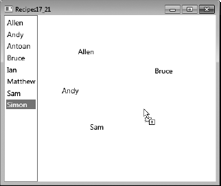
You need to execute a method asynchronously on a background thread, show a System.Windows.Controls.ProgressBar while the process is executing, and allow the user to cancel the background operation before completion.
Create an instance of the System.ComponentModel.BackgroundWorker class and attach event handlers to its DoWork and RunWorkerCompleted events. To report progress, set its WorkerReportsProgress property to True, and add an event handler to its ProgressChanged event. Call the ReportProgress method of the BackgroundWorker while processing the operation on the background thread, and in the code for this ProgressChanged event handler, update the Value property of a ProgressBar.
To support cancellation, set its WorkerSupportsCancellation property to True and call the CancelAsync method when the user wants to cancel the operation. In the DoWork event handler, check the CancellationPending property, and if this is True, use the Cancel property of System.ComponentModel.DoWorkEventArgs to notify the RunWorkerCompleted event handler that the operation was cancelled.
The BackgroundWorker component gives you the ability to execute time-consuming operations asynchronously. It automatically executes the operation on a different thread to the one that created it and then automatically returns control to the calling thread when it is completed.
The BackgroundWorker's DoWork event specifies the delegate to execute asynchronously. It is this delegate that is executed on a background thread when the RunWorkerAsync method is called. When it has completed the operation, it calls the RunWorkerCompleted event and executes the attached delegate on the same thread that was used to create it. If the BackgroundWorker object is created on the UI thread—for example, in the constructor method for a window or control—then you can access and update the UI in the RunWorkerCompleted event without having to check that you are on the UI thread again. The BackgroundWorker object handles all the thread marshaling for you.
The DoWork method takes an argument of type System.ComponentModel.DoWorkEventArgs, which allows you to pass an argument to the method. The RunWorkerCompleted event is passed an instance of the System.ComponentModel.RunWorkerCompletedEventArgs class, which allows you to receive the result of the background process and any error that might have been thrown during processing.
The BackgroundWorker class has a Boolean property called WorkerReportsProgress, which indicates whether the BackgroundWorker can report progress updates. It is set to False by default. When this is set to True, calling the ReportProgress method will raise the ProgressChanged event. The ReportProgress method takes an integer parameter specifying the percentage of progress completed by the BackgroundWorker. This parameter is passed to the ProgressChanged event handler via the ProgressPercentage property of the System.ComponentModel.ProgressChangedEventArgs class. The ProgressBar control sets the default value for its Maximum property to 100, which lends itself perfectly and automatically to receive the ProgressPercentage as its Value property.
The BackgroundWorker class has a Boolean property called WorkerSupportsCancellation, which when set to True allows the CancelAsync method to interrupt the background operation. It is set to False by default. In the RunWorkerCompleted event handler, you can use the Cancelled property of the RunWorkerCompletedEventArgs to check whether the BackgroundWorker was cancelled.
The following example demonstrates a window that declares a ProgressBar control and a Button. An instance of the BackgroundWorker class is created in the window's constructor, and its WorkerSupportsCancellation property is set to True.
When the Button is clicked, the code in the Click handler runs the BackgroundWorker asynchronously and changes the text of the Button from Start to Cancel. If it is clicked again, the IsBusy property of the BackgroundWorker returns True, and the code calls the CancelAsync method to cancel the operation.
In the RunWorkerCompleted event handler, a System.Windows.MessageBox is shown if the Cancelled property of the RunWorkerCompletedEventArgs parameter is True. The XAML for the window is as follows:
<Window x:Class="Apress.VisualCSharpRecipes.Chapter17.MainWindow"
        xmlns="http://schemas.microsoft.com/winfx/2006/xaml/presentation"
        xmlns:x="http://schemas.microsoft.com/winfx/2006/xaml"
        Title="Recipe17_22" Height="100" Width="250">
    <Grid>
<Grid.RowDefinitions>
<RowDefinition/>
<RowDefinition/>
</Grid.RowDefinitions>
<ProgressBar Name="progressBar" Margin="4"/>
<Button Name="button" Grid.Row="1" Click="button_Click"
HorizontalAlignment="Center" Margin="4" Width="60">
Start
</Button>
</Grid>
</Window>The code-behind for the window is as follows:
using System.ComponentModel;
using System.Threading;
using System.Windows;
using System.Windows.Input;

namespace Apress.VisualCSharpRecipes.Chapter17
{
    /// <summary>
    /// Interaction logic for MainWindow.xaml
    /// </summary>
    public partial class MainWindow : Window
    {
        private BackgroundWorker worker;

        public MainWindow()
        {
            InitializeComponent();

            // Create a Background Worker
            worker = new BackgroundWorker();
            worker.WorkerReportsProgress = true;

            // Enable support for cancellation
            worker.WorkerSupportsCancellation = true;

            // Attach the event handlers
            worker.DoWork +=
                new DoWorkEventHandler(worker_DoWork);
            worker.RunWorkerCompleted +=
                new RunWorkerCompletedEventHandler(worker_RunWorkerCompleted);
            worker.ProgressChanged +=
                worker_ProgressChanged;
        }
private void button_Click(
object sender, RoutedEventArgs e)
{
if(!worker.IsBusy)
{
this.Cursor = Cursors.Wait;
// Start the Background Worker
worker.RunWorkerAsync();
button.Content = "Cancel";
}
else
{
// Cancel the Background Worker
worker.CancelAsync();
}
}
private void worker_RunWorkerCompleted(
object sender, RunWorkerCompletedEventArgs e)
{
this.Cursor = Cursors.Arrow;
if(e.Cancelled)
{
// The user cancelled the operation
MessageBox.Show("Operation was cancelled");
}
else if(e.Error != null)
{
MessageBox.Show(e.Error.Message);
}
button.Content = "Start";
}
private void worker_DoWork(
object sender, DoWorkEventArgs e)
{
for(int i = 1; i <= 100; i++)
{
// Check if the BackgroundWorker
// has been cancelled
if(worker.CancellationPending)
{
// Set the Cancel property
e.Cancel = true;
return;
}// Simulate some processing by sleeping
Thread.Sleep(100);
worker.ReportProgress(i);
}
}
private void worker_ProgressChanged(
object sender, ProgressChangedEventArgs e)
{
progressBar.Value = e.ProgressPercentage;
}
}
}Figure 17-20 shows the resulting window.
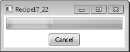
You need to draw shapes such as circles, rectangles, polygons, or more complex shapes constructed from a combination of simpler shapes with straight and curved lines.
Draw simple shapes using the Ellipse, Rectangle, or Polygon classes from the System.Windows.Shapes namespace. For complex shapes, use a System.Windows.Shapes.Path element to represent the overall shape. In the Data property of the Path object, include a GeometryGroup element containing one or more EllipseGeometry, LineGeometry, PathGeometry, or RectangleGeometry elements that together describe your shape. GeometryGroup, EllipseGeometry, LineGeometry, PathGeometry, and RectangleGeometry are all classes from the System.Windows.Media namespace.
Tip
Defining complex shapes manually can be time-consuming, error prone, and frustrating. For complex shapes, you should consider using a visual design tool (such as Microsoft Expression Design) that generates XAML to draw the shape and then use the output of the tool in your application.
The Ellipse, Rectangle, and Polygon classes all derive from the System.Windows.Shapes.Shape class and provide a quick and easy way to draw simple shapes. To use an Ellipse or Rectangle element, you need only specify a Height property and a Width property to control the basic size of the shape. The values are assumed to be px (pixels) but can also be in (inches), cm (centimeters), or pt (points). For the Rectangle element, you can also specify values for the RadiusX and RadiusY properties, which set the radius of the ellipse used to round the corners of the rectangle.
The Polygon allows you to create shapes with as many sides as you require by constructing a shape from a sequence of connected lines. To do this, you specify the sequence of points you want connected by lines to form your shape. The Polygon automatically draws a final line segment from the final point back to the first point to ensure the shape is closed.
You can declare the points for the Polygon statically by specifying a sequence of coordinate pairs in the Points property of the Polygon element. Each of these coordinate pairs represents the x and y offset of a point from the base position of the Polygon within its container (see recipes 17-6 through 17-9 for details on how to position UI elements in the various types of containers provided by WPF). For clarity, you should separate the x and y coordinates of a pair with a comma and separate each coordinate pair with a space (for example, x1,y1 x2,y2 x3,y3, and so on). To configure the points of a Polygon programmatically, you need to add System.Windows.Point objects to the System.Windows.Media.PointsCollection collection contained in the Points property of the Polygon object.
Although the Polygon class allows you to create somewhat complex shapes easily, it allows you to use only straight edges on those shapes. Polygon also includes significant overhead because of all the functionality inherited from the System.Windows.Shapes.Shape class.
For complex and lightweight shapes over which you have more control, use a Path element to represent the overall shape. Path defines the settings—such as color and thickness—used to actually draw the line and also implements events for handling mouse and keyboard interaction with the line. You must then construct the desired shape using the classes derived from the System.Windows.Media.Geometry class, including PathGeometry, EllipseGeometry, LineGeometry, and RectangleGeometry. To make shapes that consist of multiple simpler shapes, you must encapsulate the collection of simpler shapes in a GeometryGroup element within the Data property of the Path.
The EllipseGeometry, LineGeometry, and RectangleGeometry elements are lighter-weight equivalents of the Ellipse, Line, and Rectangle classes from the System.Windows.Shapes namespace, intended for use when creating more complex shapes. To draw an ellipse with the EllipseGeometry class, position the ellipse using the Center property, and specify the width and height of the ellipse using the RadiusX and RadiusY properties. To draw a line with the LineGeometry class, specify the starting point of the line using the StartPoint property and the end of the line using the EndPoint property. To draw a rectangle with the RectangleGeometry class, specify the position of the top-left corner of the rectangle as well as the width and height of the rectangle using the Rect property. You can also specify values for the RadiusX and RadiusY properties, which set the radius of the ellipse used to round the corners of the rectangle. All coordinates are relative to the root position of the Path element within its container.
Drawing curved lines in WPF is not as simple as you would hope. Unlike with lines, ellipses, and rectangles, there is no simple class that draws a curved line for you. However, at the expense of a little complexity, you get a great deal of flexibility and control, which is what you really want if you need to draw all but the simplest curved lines. To draw a curved line, you must use a PathGeometry element. The PathGeometry element can define multiple lines, so you must declare each line inside the PathGeometry element within its own PathFigure element. The StartPoint property of the PathFigure element defines the point where WPF will start to draw your line. The StartPoint property takes a pair of System.Double values representing the x and y offsets from the root position of the Path element within its container.
Within the PathFigure element, you finally get to define what your line is going to look like using one or more ArcSegment, LineSegment, and BezierSegment elements. When rendered, each segment defines how your line continues from the point where the previous segment ended (or the StartPoint of the PathFigure if it is the first segment).
A LineSegment defines a straight line drawn from the end of the last segment to the point defined in its Point property. The Point property takes a pair of Double values representing the x and y offsets from the root position of the Path element.
An ArcSegment defines an elliptical arc drawn between the end of the last segment and the point defined in its Point property. The Point property takes a pair of Double values representing the x and y offsets from the root position of the Path element. Table 17-8 defines the properties of the ArcSegment class that let you configure the shape of the curved line it defines.
Table 17.8. Properties of the ArcSegment Class
Value | Description |
|---|---|
| Specifies whether the line drawn between the start and end of the |
| A |
| A |
| A pair of |
| Defines the direction in which WPF draws the |
A BezierSegment defines a Bezier curve drawn between the end of the last segment and the point defined in its Point3 property. The Point3 property takes a pair of Double values representing the x and y offsets from the root position of the Path element. The Point1 and Point2 properties of the BezierSegment define the control points of the Bezier curve that exert a "pull" on the line, causing it to create a curve. You can read more about Bezier curves at http://en.wikipedia.org/wiki/Bezier_curves.
Note
WPF defines a minilanguage that provides a concise syntax by which you can define complex geometries. Because it is terse and difficult to read, this language is primarily intended for tools that generate geometry definitions automatically, but can also be used in manual definitions. A discussion of this minilanguage is beyond the scope of this book. To find out more, read the MSDN article at http://msdn.microsoft.com/en-us/library/ms752293(VS.100).aspx.
The following XAML demonstrates how to use the various drawing elements mentioned previously to draw a wide variety of two-dimensional shapes in a System.Windows.Controls.Canvas (see Figure 17-21).
<Window x:Class="Apress.VisualCSharpRecipes.Chapter17.MainWindow"
    xmlns="http://schemas.microsoft.com/winfx/2006/xaml/presentation"
    xmlns:x="http://schemas.microsoft.com/winfx/2006/xaml"
    Title="Recipe17_23" Height="350" Width="450">
    <Canvas>
        <Canvas.Resources>
            <Style TargetType="Ellipse">
                <Setter Property="Stroke" Value="Black" />
                <Setter Property="StrokeThickness" Value="3" />
            </Style>
            <Style TargetType="Polygon">
                <Setter Property="Stroke" Value="Black" />
                <Setter Property="StrokeThickness" Value="3" />
            </Style>
            <Style TargetType="Rectangle">
                <Setter Property="Stroke" Value="Black" />
                <Setter Property="StrokeThickness" Value="3" />
            </Style>
        </Canvas.Resources>
        <Rectangle Canvas.Top="20" Canvas.Left="10"
                   Height="60" Width="90" />
        <Rectangle Canvas.Top="20" Canvas.Left="120"
                   Height="100" Width="70"
                   RadiusX="10" RadiusY="10"/>
        <Rectangle Canvas.Top="20" Canvas.Left="220"
                   Height="70" Width="70"
                   RadiusX="5" RadiusY="30"/>
        <Ellipse Canvas.Top="100" Canvas.Left="20"
                 Height="100" Width="70"/>
        <Ellipse Canvas.Top="130" Canvas.Left="110"
                 Height="50" Width="90"/>
        <Ellipse Canvas.Top="120" Canvas.Left="220"
                 Height="70" Width="70"/>
        <Polygon Canvas.Top="200" Canvas.Left="10"
                 Margin="5" Points="40,10 70,80 10,80"/>
<Polygon Canvas.Top="200" Canvas.Left="110"
Margin="5" Points="20,0 60,0 80,20 80,60 60,80
20,80 0,60 0,20"/>
<Polygon Canvas.Top="200" Canvas.Left="210"
Margin="5" Points="20,0 50,10 50,50 80,60 60,80 0,20"/>
<Path Canvas.Top="60" Canvas.Left="320"
Stroke="Black" StrokeThickness="3" >
<Path.Data>
<GeometryGroup>
<!--Head and hat-->
<PathGeometry>
<PathFigure IsClosed="True" StartPoint="40,0">
<LineSegment Point="70,100" />
<ArcSegment Point="70,110" IsLargeArc="True"
Size="10,10" SweepDirection="Clockwise"/>
<ArcSegment Point="10,110" Size="30,30"
SweepDirection="Clockwise"/>
<ArcSegment Point="10,100" IsLargeArc="True"
Size="10,10" SweepDirection="Clockwise"/>
</PathFigure>
</PathGeometry>
<!--Hat buttons-->
<EllipseGeometry Center="40,40" RadiusX="2" RadiusY="2"/>
<EllipseGeometry Center="40,50" RadiusX="2" RadiusY="2"/>
<EllipseGeometry Center="40,60" RadiusX="2" RadiusY="2"/>
<!--Eyes-->
<EllipseGeometry Center="30,100" RadiusX="3" RadiusY="2"/>
<EllipseGeometry Center="50,100" RadiusX="3" RadiusY="2"/>
<!--Nose-->
<EllipseGeometry Center="40,110" RadiusX="3" RadiusY="3"/>
<!--Mouth-->
<RectangleGeometry Rect="30,120 20,10"/>
</GeometryGroup>
</Path.Data>
</Path>
</Canvas>
</Window>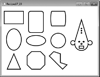
Define the geometry of the shape as a static resource, and give it a Key. You can then use binding syntax to reference the geometry from the Data property of a System.Windows.Shapes.Path element wherever you need it.
Geometries describing complex shapes can be long and complicated, so you will not want to repeat the geometry description in multiple places. Instead, you can define the geometry once as a static resource and refer to the resource wherever you would normally use that geometry.
You can declare instances of any of the classes that inherit from the System.Windows.Media.Geometry class in the resource dictionary of a suitable container. This includes the PathGeometry, EllipseGeometry, LineGeometry, RectangleGeometry, and GeometryGroup classes from the System.Windows.Media namespace. The only special action you need to take is to give the geometry resource a name by assigning a value to the x:Key property.
Once defined, refer to the geometry resource from the Data property of a Path element using the following syntax:
... Data="{StaticResource GeometryKey}" ...The following XAML demonstrates how to create a System.Windows.Media.GeometryGroup static resource with the key Clown, and its subsequent use to display a clown shape multiple times in a System.Windows.Controls.UniformGrid. Each clown displayed uses the same underlying geometry but different stroke settings to change the color and format of the lines (see Figure 17-22).
<Window x:Class="Apress.VisualCSharpRecipes.Chapter17.MainWindow"
    xmlns="http://schemas.microsoft.com/winfx/2006/xaml/presentation"
    xmlns:x="http://schemas.microsoft.com/winfx/2006/xaml"
    Title="Recipe17_24" Height="350" Width="300">
    <Window.Resources>
        <GeometryGroup x:Key="Clown">
            <!--Head and hat-->
            <PathGeometry>
                <PathFigure IsClosed="True" StartPoint="40,0">
                    <LineSegment Point="70,100" />
                    <ArcSegment Point="70,110" IsLargeArc="True"
                                    Size="10,10" SweepDirection="Clockwise"/>
                    <ArcSegment Point="10,110" Size="30,30"
                                    SweepDirection="Clockwise"/>
                    <ArcSegment Point="10,100" IsLargeArc="True"
                                    Size="10,10" SweepDirection="Clockwise"/>
                </PathFigure>
            </PathGeometry>

            <!--Hat buttons-->
            <EllipseGeometry Center="40,40" RadiusX="2" RadiusY="2"/>
            <EllipseGeometry Center="40,50" RadiusX="2" RadiusY="2"/>
            <EllipseGeometry Center="40,60" RadiusX="2" RadiusY="2"/>
            <!--Eyes-->
            <EllipseGeometry Center="30,100" RadiusX="3" RadiusY="2"/>
            <EllipseGeometry Center="50,100" RadiusX="3" RadiusY="2"/>
            <!--Nose-->
            <EllipseGeometry Center="40,110" RadiusX="3" RadiusY="3"/>
            <!--Mouth-->
            <RectangleGeometry Rect="30,120 20,10"/>
        </GeometryGroup>
    </Window.Resources>
    <UniformGrid Columns="2" Rows="2">
        <Path HorizontalAlignment="Center" Data="{StaticResource Clown}"
              Stroke="Black" StrokeThickness="1" Margin="5" Fill="BurlyWood"/>
        <Path HorizontalAlignment="Center" Data="{StaticResource Clown}"
              Stroke="Blue" StrokeThickness="5" Margin="5" />
        <Path HorizontalAlignment="Center" Data="{StaticResource Clown}"
              Stroke="Red" StrokeThickness="3"  StrokeDashArray="1 1"/>
        <Path HorizontalAlignment="Center" Data="{StaticResource Clown}"
              Stroke="Green" StrokeThickness="4" StrokeDashArray="2 1"/>
    </UniformGrid>
</Window>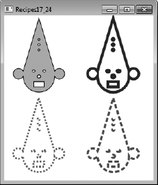
For shapes derived from System.Windows.Shapes.Shape, set the Stroke or Fill property to an instance of System.Windows.Media.SolidColorBrush configured with the color you want to use.
The SolidColorBrush class represents a brush with a single solid color that you can use to draw or fill shapes. To draw a shape derived from Shape using a solid color, assign an instance of a SolidColorBrush to the Stroke property of the Shape. To fill a shape derived from Shape using a solid color, assign an instance of a SolidColorBrush to the Fill property of the Shape.
There are a variety of ways to obtain SolidColorBrush objects in both XAML and code, but you need to understand how WPF represents color to best understand how to create and use SolidColorBrush objects.
WPF represents color with the System.Windows.Media.Color structure, which uses four channels to define a color: alpha, red, green, and blue. Alpha defines the amount of transparency the color has, and the red, green, and blue channels define how much of that primary color is included in the aggregate color.
The Color structure supports two common standards for defining the values for these channels: RGB and scRGB. The RGB standard uses 8-bit values for each channel, and you use a number between 0 and 255 to specify the value. This gives you 32 bits of color information, which is usually sufficient when displaying graphics on a computer screen.
However, when you are creating images for printing or further digital processing, a wider range of colors is required. The scRGB standard uses 16-bit values for each channel, and you use a floating-point number between 0 and 1 to specify the value. This gives you 64 bits of color information.
To support both the RGB and scRGB standards, the Color structure provides two sets of properties to represent the alpha, red, green, and blue channels of a color. The properties that provide RGB support are named A, R, G, and B, and take System.Byte values. The properties that provide scRGB support are named ScA, ScR, ScG, and ScB, and take System.Single values. The two sets of properties are synchronized, so, for example, if you change the A property of a Color object, the ScA property changes to the equivalent value on its own scale.
To obtain a Color object in code, you can use the static properties of the System.Windows.Media.Colors class, which provide access to more than 140 predefined Color objects. To create a custom Color object, call the static FromArgb, FromAValues, FromRgb, FromScRgb, or FromValues methods of the Color structure.
Once you have a Color object, you can pass it as an argument to the SolidColorBrush constructor and obtain a SolidColorBrush instance that will draw or fill your shape with that color. You can also obtain a SolidColorBrush instance preconfigured with current system colors using the static properties of the System.Windows.SystemColors class.
XAML provides flexible syntax support to allow you to specify the color of a SolidColorBrush within the Stroke or Fill property of a shape. You can use RGB syntax, scRGB syntax, or the names of the colors defined in the Colors class.
If you want to reuse a specific SolidColorBrush, you can declare it as a resource within the resources collection of a suitable container and assign it a key. Once defined, refer to the SolidColorBrush resource from the Fill or Stroke property of a Shape element using the following syntax:
... Fill="{StaticResource SolidColorBrushKey}" ...The following XAML uses a set of Rectangle, Ellipse, and Line objects (from the System.Windows.Shapes namespace) to demonstrate how to use SolidColorBrush objects to draw and fill shapes (see Figure 17-23). The XAML demonstrates how to use named colors, RGB syntax, and scRGB syntax, as well as how to create and use a static SolidColorBrush resource.
<Window x:Class="Apress.VisualCSharpRecipes.Chapter17.MainWindow"
    xmlns="http://schemas.microsoft.com/winfx/2006/xaml/presentation"
    xmlns:x="http://schemas.microsoft.com/winfx/2006/xaml"
    Title="Recipe17_25" Height="300" Width="300">
    <Canvas Margin="5">
        <Canvas.Resources>
            <!--scRGB semi-transparent color-->
            <SolidColorBrush Color="sc# 0.8,0.3,0.9,0.25" x:Key="Brush1" />
        </Canvas.Resources>

        <!--SolidColorBrush resource-->
        <Rectangle Fill="{StaticResource Brush1}" Height="180" Width="80" />
        <!--Named color-->
<Rectangle Canvas.Top="10" Canvas.Left="50"
Fill="RoyalBlue" Height="70" Width="220" />
<!--RGB semi-transparent color-->
<Ellipse Canvas.Top="30" Canvas.Left="90"
Fill="#72ff8805" Height="150" Width="100" />
<!--RGB solid color-->
<Ellipse Canvas.Top="150" Canvas.Left="70"
Fill="#ff0000" Height="100" Width="200" />
<!--scRGB semi-transparent color-->
<Line X1="20" X2="260" Y1="200" Y2="50"
Stroke="sc# 0.6,0.8,0.3,0.0" StrokeThickness="40"/>
<!--scRGB solid color-->
<Line X1="20" X2="270" Y1="240" Y2="240"
Stroke="sc# 0.1,0.5,0.1" StrokeThickness="20"/>
</Canvas>
</Window>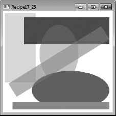
You need to draw or fill a shape with a linear or radial color gradient (that is, a fill that transitions smoothly between two or more colors).
For shapes derived from System.Windows.Shapes.Shape, to use a linear gradient, set the Fill or Stroke property to an instance of System.Windows.Media.LinearGradientBrush. To use a radial gradient, set the Fill or Stroke property to an instance of System.Windows.Media.RadialGradientBrush.
The LinearGradientBrush and RadialGradientBrush classes allow you to create a blended fill or stroke that transitions from one color to another. It is also possible to transition through a sequence of colors.
A LinearGradientBrush represents a sequence of linear color transitions that occur according to a set of gradient stops you define along a gradient axis. The gradient axis is an imaginary line that by default connects the top-left corner of the area being painted with its bottom-right corner. You define gradient stops using GradientStop elements inside the LinearGradientBrush element.
To position gradient stops along the gradient axis, you assign a System.Double value between 0 and 1 to the Offset property of a GradientStop. The Offset value represents the percentage distance along the gradient axis at which the gradient stop occurs. So, for example, 0 represents the start of the gradient axis, 0.5 represents halfway, and 0.75 represents 75 percent along the gradient axis. You specify the color associated with a gradient stop using the Color property of the GradientStop element.
You can change the position and orientation of the gradient axis using the StartPoint and EndPoint properties of the LinearGradientBrush. Each of the StartPoint and EndPoint properties takes a pair of Double values that allow you to position the point using a coordinate system relative to the area being painted. The point 0,0 represents the top left of the area, and the point 1,1 represents the bottom right. So, to change the gradient axis from its default diagonal orientation to a horizontal one, set StartPoint to the value 0,0.5 and EndPoint to the value 1,0.5; to make the gradient axis vertical, set StartPoint to the value 0.5,0 and EndPoint to the value 0.5,1.
Note
By setting the MappingMode property of the LinearGradientBrush to the value Absolute, you change the coordinate system used by the StartPoint and EndPoint properties from being one relative to the area being filled to being one expressed as device-independent pixels. For details, refer to the MSDN documentation on the MappingMode property, at http://msdn.microsoft.com/en-us/library/system.windows.media.gradientbrush.mappingmode.aspx.
Using the StartPoint and EndPoint properties of the LinearGradientBrush, you can assign negative numbers or numbers greater than 1 to create a gradient axis that starts or ends outside the area being filled. You can also define a gradient axis that starts or ends somewhere inside the body of the area being filled.
Where the gradient axis does not start and end on the boundary of the area being painted, WPF calculates the gradient as specified but does not paint anything that lies outside the area. Where the gradient does not completely fill the area, WPF by default fills the remaining area with the final color in the gradient. You can change this behavior using the SpreadMethod property of the LinearGradientBrush element. Table 17-9 lists the possible values of the SpreadMethod property.
Table 17.9. Possible Values of the SpreadMethod Property
Value | Description |
|---|---|
| The default value. The last color in the gradient fills all remaining area. |
| The gradient is repeated in reverse order. |
| The gradient is repeated in the original order. |
The RadialGradientBrush is similar in behavior to the LinearGradientBrush except that it has an elliptical gradient axis that radiates out from a defined focal point. You still use GradientStop elements in the RadialGradientBrush to define the position and color of transitions, but you use the RadiusX and RadiusY properties to define the size of the elliptical area covered by the gradient and the Center property to position the ellipse within the area being painted. You then use the GradientOrigin property to specify the location from where the sequence of gradient stops and starts within the gradient ellipse. As with the LinearGradientBrush, all of these properties' values are relative to the area being painted.
Tip
If you want to reuse LinearGradientBrush or RadialGradientBrush elements, you can declare them as a resource within the resources collection of a suitable container and assign them a key. Once defined, refer to the gradient resource from the Fill or Stroke property of the Shape element using the following syntax:
... Fill="{StaticResource GradientKey}" ...The following XAML uses a set of Rectangle, Ellipse, and Line objects (from the System.Windows.Shapes namespace) to demonstrate how to use LinearGradientBrush and RadialGradientBrush objects to draw and fill shapes (see Figure 17-24). The XAML also demonstrates how to create and use static LinearGradientBrush and RadialGradientBrush resources.
<Window x:Class="Apress.VisualCSharpRecipes.Chapter17.MainWindow"
    xmlns="http://schemas.microsoft.com/winfx/2006/xaml/presentation"
    xmlns:x="http://schemas.microsoft.com/winfx/2006/xaml"
    Title="Recipe17_26" Height="300" Width="300">
    <Canvas Margin="5">
        <Canvas.Resources>
            <!--Vertical reflected LinearGradientBrush static resource-->
            <LinearGradientBrush x:Key="LGB1" SpreadMethod="Reflect"
                                 StartPoint="0.5,-0.25" EndPoint="0.5,.5">
                <GradientStop Color="Aqua" Offset="0.5" />
                <GradientStop Color="Navy" Offset="1.0" />
            </LinearGradientBrush>
<!--Centered RadialGradientBrush static resource-->
<RadialGradientBrush Center="0.5,0.5" RadiusX=".8" RadiusY=".5"
GradientOrigin="0.5,0.5" x:Key="RGB1">
<GradientStop Color="BlanchedAlmond" Offset="0" />
<GradientStop Color="DarkGreen" Offset=".7" />
</RadialGradientBrush>
</Canvas.Resources>
<!--Fill with LinearGradientBrush static resource-->
<Rectangle Canvas.Top="5" Canvas.Left="5"
Fill="{StaticResource LGB1}" Height="180" Width="80" />
<!--Fill with RadialGradientBrush static resource-->
<Rectangle Canvas.Top="10" Canvas.Left="50"
Fill="{StaticResource RGB1}" Height="70" Width="230" />
<!--Fill with offset RadialGradientBrush-->
<Ellipse Canvas.Top="130" Canvas.Left="30" Height="100" Width="230">
<Ellipse.Fill>
<RadialGradientBrush RadiusX=".8" RadiusY="1"
Center="0.5,0.5" GradientOrigin="0.05,0.5">
<GradientStop Color="#ffffff" Offset="0.1" />
<GradientStop Color="#ff0000" Offset="0.5" />
<GradientStop Color="#880000" Offset="0.8" />
</RadialGradientBrush>
</Ellipse.Fill>
</Ellipse>
<!--Fill with diagonal LinearGradientBrush-->
<Ellipse Canvas.Top="30" Canvas.Left="110" Height="150" Width="150">
<Ellipse.Fill>
<LinearGradientBrush StartPoint="1,1" EndPoint="0,0">
<GradientStop Color="#DDFFFFFF" Offset=".2" />
<GradientStop Color="#FF000000" Offset=".8" />
</LinearGradientBrush>
</Ellipse.Fill>
</Ellipse>
<!--Stroke with horizontal multi-color LinearGradientBrush-->
<Line X1="20" X2="280" Y1="240" Y2="240" StrokeThickness="30">
<Line.Stroke>
<LinearGradientBrush StartPoint="0,0.5" EndPoint="1,0.5">
<GradientStop Color="Red" Offset="0.15" />
<GradientStop Color="Orange" Offset="0.2" />
<GradientStop Color="Yellow" Offset="0.35" />
<GradientStop Color="Green" Offset="0.5" />
<GradientStop Color="Blue" Offset="0.65" />
<GradientStop Color="Indigo" Offset="0.75" />
<GradientStop Color="Violet" Offset="0.9" />
</LinearGradientBrush>
</Line.Stroke>
</Line>
</Canvas>
</Window>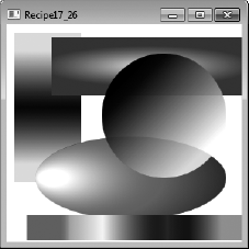
Assign an instance of System.Windows.Media.ImageBrush to the Fill property of the Shape. Use the Stretch, AlignmentX, AlignmentY, and ViewBox properties of the ImageBrush element to control the way the image fills the shape.
The abstract System.Windows.Media.TileBrush class contains the functionality required to use a graphical image to paint a specified area. Classes derived from TileBrush include ImageBrush, DrawingBrush, and VisualBrush (all from the System.Windows.Media namespace). Each TileBrush subclassallows you to specify a different source for the graphics used to fill the area: ImageBrush lets you use a graphics file, DrawingBrush lets you use a drawing object, and VisualBrush lets you use an existing screen element.
To use an image to fill a shape, you simply assign an ImageBrush element to the Fill property of the Shape you want to fill. You specify the name of the source image file using the Source property of the ImageBrush. You can use a local file name or a URL. The image can be loaded from any of the following image formats:
.bmp.gif.ico.jpg.png.wdp.tiff
The default ImageBrush behavior (inherited from TileBrush) is to stretch the source image to completely fill the shape. This does not maintain the aspect ratios of the source image and will result in a stretched and distorted image if the source image is not the same size as the shape. You can override this behavior using the Stretch property of the ImageBrush. Table 17-10 lists the possible values you can assign to the Stretch property and describes their effect.
Table 17.10. Possible Values of the Stretch Property
Value | Description |
|---|---|
| Don't scale the image at all. If the image is smaller than the area of the shape, the rest of the area is left empty (transparent fill). If the image is larger than the shape, the image is cropped. |
| Scale the source image so that it all fits in the shape while still maintaining the original aspect ratio of the image. This will result in some parts of the shape being left transparent unless the source image and shape have the same aspect ratios. |
| Scale the source image so that it fills the shape completely while still maintaining the original aspect ratio of the image. This will result in some parts of the source image being cropped unless the source image and shape have the same aspect ratios. |
| The default behavior. Scale the image to fit the shape exactly without maintaining the original aspect ratio of the source image. |
When using None, Uniform, and UniformToFill values for the Stretch property, you will want to control the positioning of the image within the shape. ImageBrush will center the image by default, but you can change this with the AlignmentX and AlignmentY properties of the ImageBrush element. Valid values for the AlignmentX property are Left, Center, and Right. Valid values for the AlignmentY property are Top, Center, and Bottom.
You can also configure the ImageBrush to use only a rectangular subsection of the source image as the brush instead of the whole image. You do this with the Viewbox property of the ImageBrush element. Viewbox takes four comma-separated System.Double values that identify the coordinates of the upper-left and lower-right corners of the image subsection relative to the original image. The point 0,0 represents the top left of the original image, and the point 1,1 represents the bottom right. If you want to use absolute pixel values to specify the size of the Viewbox, set the ViewboxUnits property of the ImageBrush to the value Absolute.
The following XAML uses a set of Rectangle, Ellipse, Polygon, and Line objects (from the System.Windows.Shapes namespace) to demonstrate how to use ImageBrush objects to fill shapes with an image (see Figure 17-25). The XAML also demonstrates how to create and use a static ImageBrush resource.
<Window x:Class="Apress.VisualCSharpRecipes.Chapter17.MainWindow"
    xmlns="http://schemas.microsoft.com/winfx/2006/xaml/presentation"
    xmlns:x="http://schemas.microsoft.com/winfx/2006/xaml"
    Title="Recipe17_27" Height="300" Width="300">
    <Canvas Margin="5">
        <!--Define a static ImageBrush resource-->
        <Canvas.Resources>
            <ImageBrush x:Key="IB1" ImageSource="WeeMee.jpg" />
        </Canvas.Resources>

        <!--Fill ellipse using static ImageBrush resource-->
        <Ellipse Height="160" Width="160"
                 Canvas.Top="0" Canvas.Left="110"
                 Stroke="Black" StrokeThickness="1"
                 Fill="{StaticResource IB1}" />
        <!--Fill rectangle with UniformToFill ImageBrush-->
        <Rectangle Height="180" Width="50"
                   Canvas.Top="5" Canvas.Left="5"
                   Stroke="Black" StrokeThickness="1" >
            <Rectangle.Fill>
                <ImageBrush ImageSource="WeeMee.jpg" Stretch="UniformToFill"/>
            </Rectangle.Fill>
        </Rectangle>
        <!--Fill Polygon with Left aligned Uniform ImageBrush-->
        <Polygon Canvas.Top="110" Canvas.Left="45"
                 Points="40,0 150,100 10,100"
                 Stroke="Black" StrokeThickness="1">

            <Polygon.Fill>
                <ImageBrush ImageSource="WeeMee.jpg" Stretch="Uniform"
                            AlignmentX="Left" />
            </Polygon.Fill>
        </Polygon>
<!--Draw a line using a part of the source image-->
<Line X1="20" X2="280" Y1="240" Y2="240" StrokeThickness="30">
<Line.Stroke>
<ImageBrush ImageSource="WeeMee.jpg"
Viewbox="30,46,42,15" ViewboxUnits="Absolute" />
</Line.Stroke>
</Line>
</Canvas>
</Window>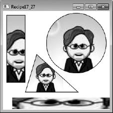
To fill shapes derived from System.Windows.Shapes.Shape, assign an instance of System.Windows.Media.ImageBrush to the Fill property of the Shape. Use the Stretch, TileMode, ViewBox, and ViewPort properties of the ImageBrush element to control the way WPF uses the image to fill the shape.
Recipe 17-27 describes how to fill a shape with an image using an ImageBrush. To fill a shape with a pattern or texture, you typically load some abstract graphic or texture from a file and apply it repeatedly to cover the entire area of a given shape. You do this using the same techniques discussed in recipe 17-27, but you use a number of additional ImageBrush properties (inherited from TileBrush) to completely fill the shape by drawing the image repeatedly instead of once.
The first step is to define the tile that the ImageBrush will use to fill the shape. The ImageBrush uses the concept of a viewport to represent the tile. By default, the viewport is a rectangle with dimensions equal to those of the image that the ImageBrush would normally use to fill the shape. Normally the viewport would be completely filled with the source image, but you can define what proportion of the viewport is filled by the source image using the Viewport property of the ImageBrush.
The Viewport property takes four comma-separated System.Double values that identify the coordinates of the upper-left and lower-right corners of the rectangle within the viewport where you want the ImageBrush to insert the source image. So, for example, you can take the original image and configure it to cover only a fraction of the viewport. The point 0,0 represents the top-left corner of the viewport, and the point 1,1 represents the bottom-right corner.
With your base tile defined, you use the TileMode property of the ImageBrush to define how the ImageBrush fills the shape using the tile defined by the viewport. Table 17-11 lists the possible values of the TileMode property you can assign and describes their effect.
Table 17.11. Possible Values of the TileMode Property
Value | Description |
|---|---|
| The default value. The base tile is drawn but not repeated. You get a single image, and the rest of the shape is empty (transparent fill). |
| The base tile is used repeatedly to fill the shape. Each tile is placed next to the other using the same orientation. |
| The base tile is used repeatedly to fill the shape, except that the tiles in alternate columns are flipped horizontally. |
| The base tile is used repeatedly to fill the shape, except that the tiles in alternate rows are flipped vertically. |
| The base tile is used repeatedly to fill the shape, except that the tiles in alternate columns are flipped horizontally and the tiles in alternate rows are flipped vertically. |
The following XAML uses a set of Rectangle, Ellipse, and Line objects (from the System.Windows.Shapes namespace) to demonstrate how to use ImageBrush objects to fill shapes with repeating patterns loaded from image files (see Figure 17-26). The XAML also demonstrates how to create and use static ImageBrush resources for the purpose of tiling.
<Window x:Class="Apress.VisualCSharpRecipes.Chapter17.MainWindow"
    xmlns="http://schemas.microsoft.com/winfx/2006/xaml/presentation"
    xmlns:x="http://schemas.microsoft.com/winfx/2006/xaml"
    Title="Recipe17_28" Height="300" Width="380">
    <StackPanel Orientation="Horizontal">
<StackPanel Margin="10">
<StackPanel.Resources>
<!--Style for the tile swabs-->
<Style TargetType="{x:Type Image}">
<Setter Property="Margin" Value="5"/>
<Setter Property="MaxHeight" Value="50"/>
</Style>
</StackPanel.Resources>
<!--Display the basic tiles used in the example-->
<TextBlock Text="Tiles:" />
<Image Source="bubble_dropper.jpg" />
<Image Source="mini_mountains.jpg" />
<Image Source="fly_larvae.jpg" />
<Image Source="fishy_rainbow.jpg" />
</StackPanel>
<Canvas Margin="5">
<Canvas.Resources>
<!--Define static ImageBrush resource with TileMode FlipXY-->
<ImageBrush x:Key="IB1" ImageSource="bubble_dropper.jpg"
Stretch="UniformToFill" TileMode="FlipXY"
Viewport="0,0,0.2,0.2" />
<!--Define static ImageBrush resource with TileMode FlipX-->
<ImageBrush x:Key="IB2" ImageSource="mini_mountains.jpg"
Stretch="UniformToFill" TileMode="FlipX"
Viewport="0,0,0.5,0.2" />
</Canvas.Resources>
<!--Fill Rectangles with static ImageBrush resources-->
<Rectangle Canvas.Top="5" Canvas.Left="5"
Height="180" Width="80"
Fill="{StaticResource IB1}" />
<Rectangle Canvas.Top="10" Canvas.Left="50"
Height="70" Width="230"
Fill="{StaticResource IB2}" />
<!--Fill Ellipse with custom ImageBrush - TileMode Tile-->
<Ellipse Canvas.Top="130" Canvas.Left="30"
Height="100" Width="230">
<Ellipse.Fill>
<ImageBrush ImageSource="fishy_rainbow.jpg"
Stretch="Fill" TileMode="Tile"
Viewport="0,0,0.25,0.5" />
</Ellipse.Fill>
</Ellipse><!--Fill with custom ImageBrush - TileMode Tile-->
<Ellipse Canvas.Top="30" Canvas.Left="110"
Height="150" Width="150">
<Ellipse.Fill>
<ImageBrush ImageSource="fly_larvae.jpg" Opacity=".7"
Stretch="Uniform" TileMode="Tile"
Viewport="0,0,0.5,.5" />
</Ellipse.Fill>
</Ellipse>
<!--Draw Stroke with tiled ImageBrush - TileMode Tile-->
<Line X1="20" X2="280" Y1="240" Y2="240" StrokeThickness="30">
<Line.Stroke>
<ImageBrush ImageSource="ApressLogo.gif"
Stretch="UniformToFill" TileMode="Tile"
Viewport="0,0,0.25,1" />
</Line.Stroke>
</Line>
</Canvas>
</StackPanel>
</Window>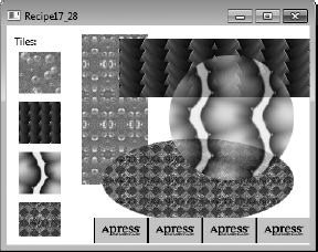
You need to change the value of a property on a control with respect to time. This could be the opacity of a button, the color of a rectangle, or the height of an expander, for example.
Animate the value of the property using one or more System.Windows.Media.Animation.Timeline objects in a System.Windows.Media.Animation.Storyboard.
Owing to the richness of WPF's animation framework, there are myriad options when it comes to animating something. In essence, you are able to animate just about any System.Windows.DependencyProperty of an object that derives from System.Windows.Media.Animation.Animatable. Couple that with the range of types for which Timeline objects already exist, and you find yourself in a position of endless possibilities.
To animate the property of a control, you will generally declare one or more AnimationTimeline objects that target the data type of the property being animated. These timelines are defined as children of a System.Windows.Media.Animation.Storyboard, with the root Storyboard being activated by a System.Windows.Media.Animation.BeginStoryboard when used in markup. It isalso possible to nest Storyboard objects and ParallelTimeline objects as children. Each AnimationTimeline can target a different property of a different object, a different property of the same object, or the same property of the same object. The target object or target property can also be defined at the level of the parent ParallelTimeline or Storyboard.
For each data type that WPF supports, there exists an AnimationTimeline. Each timeline will be named <Type>Animation, possibly with several variants for special types of Timeline, where <Type> is the target data type of the Timeline. With the exception of a few AnimationTimeline objects, the animation's effect on a target property is defined by specifying values for one or more of the To, From, or By properties. If the From property of an AnimationTimeline is not specified, the value of the property at the point the timeline's clock is applied will be used. This is useful because it means you do not need to worry about storing a property's initial value and then restoring it at a later date. If a value for the From property is specified, the property will be set with that value when the Timeline is applied. Again, the original value of the property will be restored when the timeline's clock is removed.
The abstract Timeline class, from which all AnimationTimeline, Storyboard, and ParallelTimeline objects derive, defines several properties that allow you to define the characteristics of an animation. Table 17-12 describes these properties of the Timeline class.
Table 17.12. Commonly Used Properties of the Timeline Class
Property | Description |
|---|---|
| Used to specify a percentage of the timeline's duration that should be used to accelerate the speed of the animation from 0 to the animation's maximum rate. The value should be a |
| A |
| A |
| Used to specify a percentage of the timeline's duration that should be used to reduce the speed of the animation from the maximum rate to 0. The value should be a |
| A nullable |
| A value of the |
| A |
| A property of type |
The following example demonstrates some of the functionality available with animations. Properties of various controls are animated using different values for the previously discussed properties togive an example of their effect.
<Window x:Class="Apress.VisualCSharpRecipes.Chapter17.MainWindow"
    xmlns="http://schemas.microsoft.com/winfx/2006/xaml/presentation"
    xmlns:x="http://schemas.microsoft.com/winfx/2006/xaml"
    Title="Recipe17_29" Height="300" Width="300">
    <Window.Resources>
        <Storyboard x:Key="ellipse1Storyboard"
                    Storyboard.TargetName="ellipse1">
            <ParallelTimeline>
                <DoubleAnimation
                    To="50"
                    Duration="0:0:5"
                    AccelerationRatio="0.25"
                    DecelerationRatio="0.25"
                    Storyboard.TargetProperty="Width"
                    RepeatBehavior="5x" />
                <DoubleAnimation
                    To="50"
                    Duration="0:0:5"
                    AccelerationRatio="0.5"
                    DecelerationRatio="0.25"
                    Storyboard.TargetProperty="Height"
                    RepeatBehavior="5x"
                    SpeedRatio="4" />
            </ParallelTimeline>
        </Storyboard>

        <Storyboard x:Key="rect1Storyboard"
            Storyboard.TargetName="rect1">
            <ParallelTimeline>
                <DoubleAnimation
                    To="50"
                    Duration="0:0:10"
FillBehavior="Stop"
Storyboard.TargetProperty="Width" />
<DoubleAnimation
To="50"
Duration="0:0:5"
FillBehavior="HoldEnd"
AccelerationRatio="0.5"
DecelerationRatio="0.25"
Storyboard.TargetProperty="Height" />
</ParallelTimeline>
</Storyboard>
</Window.Resources>
<Window.Triggers>
<EventTrigger
RoutedEvent="Ellipse.Loaded"
SourceName="ellipse1">
<BeginStoryboard
Storyboard="{DynamicResource ellipse1Storyboard}" />
</EventTrigger>
<EventTrigger
RoutedEvent="Rectangle.Loaded"
SourceName="rect1">
<BeginStoryboard
Storyboard="{StaticResource rect1Storyboard}" />
</EventTrigger>
</Window.Triggers>
<Grid>
<Grid.ColumnDefinitions>
<ColumnDefinition Width="0.5*" />
<ColumnDefinition Width="0.5*" />
</Grid.ColumnDefinitions>
<Ellipse x:Name="ellipse1" Margin="10" Width="100" Height="100"
Fill="CornflowerBlue" />
<Rectangle x:Name="rect1" Margin="10" Width="100" Height="100"
Fill="Firebrick" Grid.Column="1" />
</Grid>
</Window>You need to animate several properties of a control at the same time—for example, its height, width, and color.
Define your animations as discussed in Recipe 17-29, but make them children of a System.Windows.Media.Animation.ParallelTimeline.
The ParallelTimeline is a special type of System.Windows.Media.Animation.Timeline that allows for one or more child Timeline objects to be defined as its children, with each child Timeline being run in parallel. Because ParallelTimeline is a Timeline object, it can be used like any other Timeline object. Unlike a Storyboard, where animations are activated based on the order in which its child Timeline objects are declared, a ParallelTimeline will activate its children based on the value of their BeginTime properties. If any of the animations overlap, they will run in parallel.
The Storyboard class actually inherits from ParallelTimeline, and simply gives each child a BeginTime based on where in the list of child objects a Timeline is declared and the cumulative Duration and BeginTime values of each preceding Timeline. The Storyboard class goes further to extend the ParallelTimeline class by adding a number of methods for controlling the processing of its child Timeline objects. Because ParallelTimeline is the ancestor of a Storyboard, ParallelTimeline objects are more suited to nesting because they are much slimmer objects.
Like other Timeline objects, the ParallelTimeline has a BeginTime property. This allowsyou to specify an offset from the start of the owning Storyboard to the activation of the ParallelTimeline. As a result, if a value for BeginTime is given by the ParallelTimeline, its children's BeginTime will work relative to this value, as opposed to being relative to the Storyboard.
It is important to note that a Storyboard.Completed event will not be raised on the owning Storyboard until the last child Timeline in the ParallelTimeline finishes. This is because a ParallelTimeline can contain Timeline objects with different BeginTime and Duration values, meaning they won't all necessarily finish at the same time.
The following example defines a System.Windows.Window that contains a single System.Windows.Shapes.Rectangle. When the mouse is placed over the rectangle, the Rectangle.Height, Rectangle.Width, and Rectangle.Fill properties are animated. The animation continues untilthe mouse is moved out of the rectangle.
<Window x:Class="Apress.VisualCSharpRecipes.Chapter17.MainWindow"
    xmlns="http://schemas.microsoft.com/winfx/2006/xaml/presentation"
    xmlns:x="http://schemas.microsoft.com/winfx/2006/xaml"
    Title="Recipe17_30" Height="300" Width="300">
    <Grid>
        <Rectangle Height="100" Width="100" Fill="Firebrick"
            Stroke="Black" StrokeThickness="1">
            <Rectangle.Style>
                <Style TargetType="Rectangle">
                    <Style.Triggers>
<EventTrigger
RoutedEvent="Rectangle.MouseEnter">
<BeginStoryboard>
<Storyboard>
<ParallelTimeline
RepeatBehavior="Forever"
AutoReverse="True">
<DoubleAnimation
Storyboard.TargetProperty="Width"
To="150" />
<DoubleAnimation
Storyboard.TargetProperty="Height"
To="150" />
<ColorAnimation
Storyboard.TargetProperty="Fill.Color"
To="Orange" />
</ParallelTimeline>
</Storyboard>
</BeginStoryboard>
</EventTrigger>
<EventTrigger
RoutedEvent="Rectangle.MouseLeave">
<BeginStoryboard>
<Storyboard>
<ParallelTimeline>
<DoubleAnimation
Storyboard.TargetProperty="Width"
To="100" />
<DoubleAnimation
Storyboard.TargetProperty="Height"
To="100" />
<ColorAnimation
Storyboard.TargetProperty="Fill.Color"
To="Firebrick" />
</ParallelTimeline>
</Storyboard>
</BeginStoryboard>
</EventTrigger>
</Style.Triggers>
</Style>
</Rectangle.Style>
</Rectangle>
</Grid>
</Window>Use a keyframe-based animation such as System.Windows.Media.Animation.DoubleAnimationUsingKeyFrames. You can then use several System.Windows.Media.Animation.IKeyFrame objects to define the keyframes in your animation.
Keyframes allow you to specify key points in an animation where the object being animated needs to be at a required position or in a required state. The frames in between are then interpolated between these two keyframes, effectively filling in the blanks in the animation. This process of interpolating the in-between frames is often referred to as tweening.
When defining an animation using keyframes, you will need to specify one or more keyframes that define the animation's flow. These keyframes are defined as children of yourkeyframe animation. It is important to note that the target type of the keyframe must matchthat of the parent animation. For example, if you are using a System.Windows.Media.Animation.DoubleAnimationUsingKeyFrames, any keyframes must be derived from the abstract class System.Windows.Media.Animation.DoubleKeyFrame.
You will be pleased to hear that a good number of types have keyframe objects, from System.Int to System.String and System.Windows.Thickness to System.Windows.Media.Media3D.Quarternion. (For a more complete list of the types covered, please see http://msdn.microsoft.com/en-us/library/ms742524(VS.100).aspx.) All but a few of the types covered by animations have a choice of interpolation methods, allowing you to specify how the frames between two keyframes are generated. Each interpolation method is defined as a prefix to the keyframe's class name, and is listed in Table 17-13.
Table 17.13. Interpolation Methods for Keyframe Animation
Type | Description |
|---|---|
| A discrete keyframe will not create any frames between it and the following keyframe. Once the discrete keyframe's duration has elapsed, the animation will jump to the value specified in the following keyframe. |
| Linear keyframes will create a smooth transition between it and the following frame. The generated frames will animate the value steadily at a constant rate to its endpoint. |
| Spline keyframes allow you to vary the speed at which a property is animated using the shape of a Bezier curve. The curve is described by defining its control points in unit coordinate space. The gradient of the curve defines the speed or rate of change in the animation. |
Although keyframes must match the type of the owning animation, it is possible to mix the different types of interpolation, offering variable speeds throughout.
The following XAML demonstrates how to use linear and double keyframes to animate the Height and Width properties of a System.Windows.Shapes.Ellipse control (see Figure 17-27). The animation is triggered when the System.Windows.Controls.Button is clicked.
<Window x:Class="Apress.VisualCSharpRecipes.Chapter17.MainWindow"
    xmlns="http://schemas.microsoft.com/winfx/2006/xaml/presentation"
    xmlns:x="http://schemas.microsoft.com/winfx/2006/xaml"
    Title="Recipe17_31" Height="300" Width="300">
    <Window.Resources>
        <Storyboard x:Key="ResizeEllipseStoryboard">
            <ParallelTimeline>
                <DoubleAnimationUsingKeyFrames
                  Storyboard.TargetName="ellipse"
                  Storyboard.TargetProperty="Height">
                  <LinearDoubleKeyFrame Value="150" KeyTime="0:0:1" />
                  <LinearDoubleKeyFrame Value="230" KeyTime="0:0:2" />
                  <LinearDoubleKeyFrame Value="150" KeyTime="0:0:2.5" />
                  <LinearDoubleKeyFrame Value="230" KeyTime="0:0:5" />
                  <LinearDoubleKeyFrame Value="40" KeyTime="0:0:9" />
                </DoubleAnimationUsingKeyFrames>
                <DoubleAnimationUsingKeyFrames
                  Storyboard.TargetName="ellipse"
                  Storyboard.TargetProperty="Width">
                  <DiscreteDoubleKeyFrame Value="150" KeyTime="0:0:1" />
                  <DiscreteDoubleKeyFrame Value="230" KeyTime="0:0:2" />
                  <DiscreteDoubleKeyFrame Value="150" KeyTime="0:0:2.5" />
                  <DiscreteDoubleKeyFrame Value="230" KeyTime="0:0:5" />
                  <DiscreteDoubleKeyFrame Value="40" KeyTime="0:0:9" />
                </DoubleAnimationUsingKeyFrames>
            </ParallelTimeline>
        </Storyboard>
    </Window.Resources>

    <Grid>
        <Grid.RowDefinitions>
            <RowDefinition />
            <RowDefinition Height="40" />
        </Grid.RowDefinitions>

        <Ellipse Height="40" Width="40" x:Name="ellipse"
            HorizontalAlignment="Center" VerticalAlignment="Center">
            <Ellipse.Fill>
                <RadialGradientBrush GradientOrigin="0.75,0.25">
                    <GradientStop Color="Yellow" Offset="0.0" />
                    <GradientStop Color="Orange" Offset="0.5" />
<GradientStop Color="Red" Offset="1.0" />
</RadialGradientBrush>
</Ellipse.Fill>
</Ellipse>
<Button Content="Start..." Margin="10" Grid.Row="1">
<Button.Triggers>
<EventTrigger RoutedEvent="Button.Click">
<BeginStoryboard
Storyboard="{DynamicResource ResizeEllipseStoryboard}" />
</EventTrigger>
</Button.Triggers>
</Button>
</Grid>
</Window>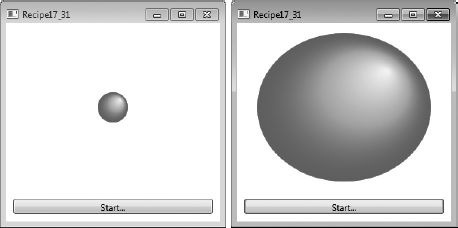
WPF kindly provides you with three ways of animating an object along a path. Each of these methods takes a System.Windows.Media.PathGeometry as its input, defining the shape of the path that the object will follow, and produces some kind of output, depending on the timeline's target type. All three timelines generate their output values by linearly interpolating between the values of the input path. Table 17-14 describes each of these three methods.
Table 17.14. Path Animation Types
Type | Description |
|---|---|
| Outputs a single |
| Generates a series of |
| Generates a series of |
Table 17.15. Values of the PathAnimationSource Enumeration
Value | Description |
|---|---|
| Values output by the |
| Values output by the |
| Values output by the |
It should be clear that each of the path timelines has a specific use and offers different levels of functionality. The MatrixAnimationUsingPath provides the neatest method for animating both the position and the orientation of an object. The same effect is not possible using a PointAnimationUsingPath, and would require three DoubleAnimationUsingPath timelines, each with a different PathAnimationSource value for the Source property.
When using a value of PathAnimationSource.Angle for the Source property of a DoubleAnimationUsingPath timeline or setting the DoesRotateWithTangent property of a MatrixAnimationUsingPath timeline to True, you ensure that the object being animated is correctly rotated so that it follows the gradient of the path. If an arrow is translated using a path-driven animation, its orientation will remain the same throughout the timeline's duration. If, however, the arrow's orientation is animated to coincide with the path, the arrow will be rotated relative to its initial orientation, based on the gradient of the path. If you have a path defining a circle and the arrow initially points in to the center of the circle, the arrow will continue to point into the center of the circle as it moves around the circle's circumference.
Although the MatrixAnimationUsingPath has the most compact output, controls will rarely expose a Matrix property that you can directly animate. The target property of a MatrixAnimationUsingPath timeline will most commonly be the Matrix property of a System.Windows.Media.MatrixTransform, where the MatrixTransform is used in the render transform or layout transform of the control you want to animate. In a similar fashion, DoubleAnimationUsingPath can be used to animate the properties of a System.Windows.Media.TranslateTransform and System.Windows.Media.RotateTransform, or just about any System.Double property of the target control.
The following XAML demonstrates how to use a MatrixAnimationUsingPath, where a System.Windows.Controls.Border is translated and rotated according to the shape of the path. The path is also drawn on the screen so you can better visualize the motion of the border (seeFigure 17-28).
<Window x:Class="Apress.VisualCSharpRecipes.Chapter17.MainWindow"
    xmlns="http://schemas.microsoft.com/winfx/2006/xaml/presentation"
    xmlns:x="http://schemas.microsoft.com/winfx/2006/xaml"
    Title="Recipe17_32" Height="300" Width="550">
    <Window.Resources>
        <PathGeometry x:Key="AnimationPathGeometry"
        Figures="M 50,150 C 100,-200 500,400 450,100 400,-100 285,400 50,150" />

        <Storyboard x:Key="MatrixAnimationStoryboard">
            <MatrixAnimationUsingPath
            RepeatBehavior="Forever"
            Duration="0:0:5"
            AutoReverse="True"
            Storyboard.TargetName="BorderMatrixTransform"
            Storyboard.TargetProperty="Matrix"
            DoesRotateWithTangent="True"
            PathGeometry="{StaticResource AnimationPathGeometry}" />
        </Storyboard>
    </Window.Resources>
    <Grid>
        <Path
        Stroke="Black"
        StrokeThickness="1"
        Data="{StaticResource AnimationPathGeometry}" />
<Border HorizontalAlignment="Left" VerticalAlignment="Top"
Width="100" Height="50" CornerRadius="5" BorderBrush="Black"
BorderThickness="1" RenderTransformOrigin="0,0">
<Border.Background>
<LinearGradientBrush StartPoint="0.5,0" EndPoint="0.5,1">
<GradientStop Color="CadetBlue" Offset="0" />
<GradientStop Color="CornflowerBlue" Offset="1" />
</LinearGradientBrush>
</Border.Background>
<Border.RenderTransform>
<MatrixTransform x:Name="BorderMatrixTransform" />
</Border.RenderTransform>
<Border.Triggers>
<EventTrigger RoutedEvent="Border.Loaded">
<BeginStoryboard
Storyboard="{StaticResource MatrixAnimationStoryboard}"/>
</EventTrigger>
</Border.Triggers>
<TextBlock Text="^ This way up ^" HorizontalAlignment="Center"
VerticalAlignment="Center" />
</Border>
</Grid>
</Window>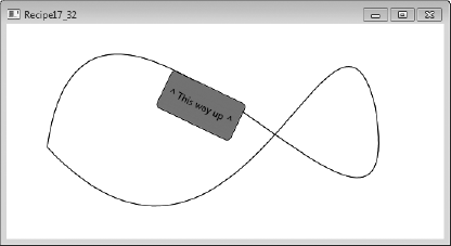
You need to play a sound or music file and allow the user to control the progress of the playback, volume, or balance.
Use a System.Windows.Controls.MediaElement to handle the playback of the media file. Use a System.Windows.Media.MediaTimeline to control the playback of the desired media through the MediaElement. Declare the set of controls that will enable the user to control the playback and associate triggers with the controls that start, stop, pause, and resume the animation controlling the MediaTimeline. For volume and balance, data-bind controls to the Volume and Balance properties of the MediaElement.
A MediaElement performs the playback of a media file, and you control that playback via animation using a MediaTimeline. To control the playback, you use a set of EventTrigger elements to start, stop, pause, and resume the animation Storyboard containing the MediaTimeline.
You can either define the EventTrigger elements in the Triggers collection on the controls that control the playback or centralize their declaration by placing them on the container in which you place the controls. Within the Actions element of the Triggers collection, declare the Storyboard elements to control the MediaTimeline.
One complexity arises when you want a control such as a System.Windows.Controls.Slider to show the current position within the media file as well as allow the user to change the current play position. To update the display of the current play position, you must attach an event handler to the MediaTimeline.CurrentTimeInvalidated event, which updates the Slider position when it fires.
To move the play position in response to the Slider position changing, you attach an event handler to the Slider.ValueChanged property, which calls the Stoyboard.Seek method to change the current MediaTimeline play position. However, you must include logic in the event handlers to stop these events from triggering each other repeatedly as the user and MediaTimeline try to update the Slider position (and in turn the media play position) at the same time.
The following XAML demonstrates how to play an AVI file using a MediaElement and allow the user to start, stop, pause, and resume the playback. The user can also move quickly back and forth through the media file using a slider to position the current play position, as well as control the volume and balance of the audio (see Figure 17-29).
<Window x:Class="Apress.VisualCSharpRecipes.Chapter17.MainWindow"
    xmlns="http://schemas.microsoft.com/winfx/2006/xaml/presentation"
    xmlns:x="http://schemas.microsoft.com/winfx/2006/xaml"
    Title="Recipe17_33" Height="450" Width="300">
    <StackPanel x:Name="Panel">
        <StackPanel.Resources>
            <!-- Style all buttons the same. -->
            <Style TargetType="{x:Type Button}">
                <Setter Property="Height" Value="25" />
                <Setter Property="MinWidth" Value="50" />
            </Style>
        </StackPanel.Resources>
        <StackPanel.Triggers>
            <!-- Triggers for handling playback of media file. -->
            <EventTrigger RoutedEvent="Button.Click" SourceName="btnPlay">
                <EventTrigger.Actions>
                    <BeginStoryboard Name="ClockStoryboard">
                        <Storyboard x:Name="Storyboard"  SlipBehavior="Slip"
                                    CurrentTimeInvalidated="Storyboard_Changed">
                            <MediaTimeline BeginTime="0" Source="clock.avi"
                                 Storyboard.TargetName="meMediaElement"
                                 RepeatBehavior="Forever" />
                        </Storyboard>
                    </BeginStoryboard>
                </EventTrigger.Actions>
            </EventTrigger>
            <EventTrigger RoutedEvent="Button.Click" SourceName="btnPause">
                <EventTrigger.Actions>
                    <PauseStoryboard BeginStoryboardName="ClockStoryboard" />
                </EventTrigger.Actions>
            </EventTrigger>
            <EventTrigger RoutedEvent="Button.Click" SourceName="btnResume">
                <EventTrigger.Actions>
                    <ResumeStoryboard BeginStoryboardName="ClockStoryboard" />
                </EventTrigger.Actions>
            </EventTrigger>
            <EventTrigger RoutedEvent="Button.Click" SourceName="btnStop">
                <EventTrigger.Actions>
                    <StopStoryboard BeginStoryboardName="ClockStoryboard" />
                </EventTrigger.Actions>
            </EventTrigger>
            <EventTrigger RoutedEvent="Slider.PreviewMouseLeftButtonDown"
                              SourceName="sldPosition" >
                <PauseStoryboard BeginStoryboardName="ClockStoryboard" />
            </EventTrigger>
            <EventTrigger RoutedEvent="Slider.PreviewMouseLeftButtonUp"
                              SourceName="sldPosition" >
                <ResumeStoryboard BeginStoryboardName="ClockStoryboard" />
            </EventTrigger>
        </StackPanel.Triggers>
<!-- Media element to play the sound, music, or video file. -->
<MediaElement Name="meMediaElement" HorizontalAlignment="Center"
Margin="5" MinHeight="300" Stretch="Fill"
MediaOpened="MediaOpened" />
<!-- Button controls for play, pause, resume, and stop. -->
<StackPanel HorizontalAlignment="Center" Orientation="Horizontal">
<Button Content="_Play" Name="btnPlay" />
<Button Content="P_ause" Name="btnPause" />
<Button Content="_Resume" Name="btnResume" />
<Button Content="_Stop" Name="btnStop" />
</StackPanel>
<!-- Slider shows the position within the media. -->
<Slider HorizontalAlignment="Center" Margin="5"
Name="sldPosition" Width="250"
ValueChanged="sldPosition_ValueChanged">
</Slider>
<!-- Sliders to control volume and balance. -->
<Grid>
<Grid.ColumnDefinitions>
<ColumnDefinition Width="1*"/>
<ColumnDefinition Width="4*"/>
</Grid.ColumnDefinitions>
<Grid.RowDefinitions>
<RowDefinition />
<RowDefinition />
</Grid.RowDefinitions>
<TextBlock Grid.Column="0" Grid.Row="0" Text="Volume:"
HorizontalAlignment="Right" VerticalAlignment="Center"/>
<Slider Grid.Column="1" Grid.Row="0" Minimum="0" Maximum="1"
TickFrequency="0.1" TickPlacement="TopLeft"
Value="{Binding ElementName=meMediaElement, Path=Volume, Mode=TwoWay}" />
<TextBlock Grid.Column="0" Grid.Row="1" Text="Balance:"
HorizontalAlignment="Right" VerticalAlignment="Center"/>
<Slider Grid.Column="1" Grid.Row="1" Minimum="-1" Maximum="1"
TickFrequency="0.2" TickPlacement="TopLeft"
Value="{Binding ElementName=meMediaElement, Path=Balance, Mode=TwoWay}" />
</Grid>
</StackPanel>
</Window>The following code-behind shows the event handlers that allow the user to set the current play position using a slider and update the position of the slider to reflect the current play position:
using System;
using System.Windows;
using System.Windows.Input;
using System.Windows.Media;
using System.Windows.Media.Animation;
namespace Apress.VisualCSharpRecipes.Chapter17
{
    /// <summary>
    /// Interaction logic for MainWindow.xaml
    /// </summary>
    public partial class MainWindow : Window
    {
        bool ignoreValueChanged = false;

        public MainWindow()
        {
            InitializeComponent();
        }


        // Handles the opening of the media file and sets the Maximum
        // value of the position slider based on the natural duration
        // of the media file.
        private void MediaOpened(object sender, EventArgs e)
        {
            sldPosition.Maximum =
                meMediaElement.NaturalDuration.TimeSpan.TotalMilliseconds;
        }

        // Updates the position slider when the media time changes.
        private void Storyboard_Changed(object sender, EventArgs e)
        {
            ClockGroup clockGroup = sender as ClockGroup;

            MediaClock mediaClock = clockGroup.Children[0] as MediaClock;

            if (mediaClock.CurrentProgress.HasValue)
            {
                ignoreValueChanged = true;
                sldPosition.Value = meMediaElement.Position.TotalMilliseconds;
                ignoreValueChanged = false;
            }
        }

        // Handles the movement of the slider and updates the position
        // being played.
        private void sldPosition_ValueChanged(object sender,
            RoutedPropertyChangedEventArgs<double> e)
        {
            if (ignoreValueChanged)
            {
                return;
            }
Storyboard.Seek(Panel,
TimeSpan.FromMilliseconds(sldPosition.Value),
TimeSeekOrigin.BeginTime);
}
}
}
You need to query the state of the keyboard to determine whether the user is pressing any special keys.
Use the IsKeyDown and IsKeyToggled methods of the static System.Windows.Input.Keyboard class.
The static Keyboard class contains two methods that allow you to determine whether a particular key is currently pressed or whether keys that have a toggled state (for example, Caps Lock) are currently on or off.
To determine whether a key is currently pressed, call the IsKeyDown method and pass a member of the System.Windows.Input.Keys enumeration that represents the key you want to test. The method returns True if the key is currently pressed. To test the state of toggled keys, call the IsKeyToggled method, again passing a member of the Keys enumeration to identify the key to test.
The following XAML defines a set of CheckBox controls representing various special keys on the keyboard. When the key is pressed, the program uses the Keyboard class to test the state of each button and update the IsSelected property of the appropriate CheckBox (see Figure 17-30).
<Window x:Class="Apress.VisualCSharpRecipes.Chapter17.MainWindow"
    xmlns="http://schemas.microsoft.com/winfx/2006/xaml/presentation"
    xmlns:x="http://schemas.microsoft.com/winfx/2006/xaml"
    Title="Recipe17_34" Height="190" Width="210">
    <StackPanel HorizontalAlignment="Center">
        <UniformGrid Columns="2">
            <UniformGrid.Resources>
                <Style TargetType="{x:Type CheckBox}">
                    <Setter Property="IsHitTestVisible" Value="False" />
                    <Setter Property="Margin" Value="5" />
                </Style>
            </UniformGrid.Resources>
            <CheckBox Content="LeftShift" Name="chkLShift"/>
            <CheckBox Content="RightShift" Name="chkRShift"/>
            <CheckBox Content="LeftControl" Name="chkLControl"/>
            <CheckBox Content="RightControl" Name="chkRControl"/>
            <CheckBox Content="LeftAlt" Name="chkLAlt"/>
            <CheckBox Content="RightAlt" Name="chkRAlt"/>
            <CheckBox Content="CapsLock" Name="chkCaps"/>
            <CheckBox Content="NumLock" Name="chkNum"/>
        </UniformGrid>
        <Button Content="Check Keyboard" Margin="10" Click="Button_Click"/>
    </StackPanel>
</Window>
The following code-behind contains the Button.Click event that checks the keyboard and updates the CheckBox controls:
using System.Windows;
using System.Windows.Input;

namespace Apress.VisualCSharpRecipes.Chapter17
{
    /// <summary>
/// Interaction logic for MainWindow.xaml
/// </summary>
public partial class MainWindow : Window
{
public MainWindow()
{
InitializeComponent();
CheckKeyboardState();
}
// Handles the Click event on the Button.
private void Button_Click(object sender, RoutedEventArgs e)
{
CheckKeyboardState();
}
// Checks the state of the keyboard and updates the check boxes.
private void CheckKeyboardState()
{
// Control keys.
chkLControl.IsChecked = Keyboard.IsKeyDown(Key.LeftCtrl);
chkRControl.IsChecked = Keyboard.IsKeyDown(Key.RightCtrl);
// Shift keys.
chkLShift.IsChecked = Keyboard.IsKeyDown(Key.LeftShift);
chkRShift.IsChecked = Keyboard.IsKeyDown(Key.RightShift);
// Alt keys.
chkLAlt.IsChecked = Keyboard.IsKeyDown(Key.LeftAlt);
chkRAlt.IsChecked = Keyboard.IsKeyDown(Key.RightAlt);
// Num Lock and Caps Lock.
chkCaps.IsChecked = Keyboard.IsKeyToggled(Key.CapsLock);
chkNum.IsChecked = Keyboard.IsKeyToggled(Key.NumLock);
}
}
}