Lesson 11: Mobile Design
For the web designer, the World Wide Web is no longer just accessible through a desktop web browser. In this lesson, you will learn how to design for the small screen sizes and limited bandwidth capabilities of mobile devices.
What you’ll learn in this lesson:
• The challenges of designing for mobile devices
• Using CSS3 media queries
• Converting a fixed width layout to a single column layout
Starting up
You will work with several files from the web11lessons folder in this lesson. Make sure you have loaded the weblessons folder onto your hard-drive from www.digitalclassroombooks.com/webdesign. See “Loading lesson files” in the Starting Up section of this book.
 |
|
This lesson uses the TextWrangler text editor to create the markup text, but you can use any of the text editors covered in Lesson 3. |
The need for mobile-optimized websites
Until recently, the way a website displayed on a mobile phone’s browser was only a peripheral concern for most web designers. Browsing on mobile devices still represents a small percentage of all browsing; however, mobile browsing is growing at an astonishing rate. Some estimates put the growth rate at 25 to 30 percent each year.
|
For estimates of web browsing statistics, see www.netmarketshare.com. |
To illustrate the growing importance of optimizing a site for mobile devices, consider that 50 percent of mobile users start their activity with a search. If your site appears in a mobile user’s search results, you have a unique opportunity to reach them.
How is the mobile experience of the web different than the desktop?
The most obvious answer to this question is screen size. The two most common screen resolutions in use today for desktop browsing are 1024 × 768 pixels and 1280 × 800 pixels. Mobile phone resolutions can range from 240 × 320 (for a non-smartphone) to 640 × 960 (for a smartphone). Screen resolution numbers change when you include mobile devices such as the first-generation iPad, which has a screen resolution of 1024 × 768. In most cases, however, a page of content that seems reasonable on the desktop may seem too long for a mobile device.
 |
|
Comparing the screen resolution of a typical desktop screen (left) to a mobile screen (right). (This diagram is not to actual size.) |
You also need to take into account screen orientation: for computer monitors, the default orientation is horizontal; for mobile phones, it’s vertical. In addition, older mobile phones can only display web pages vertically, while newer smartphones can rotate the screen from portrait to landscape format. There are a number of other limitations for mobile users, particularly with older devices:
• Most websites are designed to be used with a mouse and keyboard. Modern smartphones address this with touch screens and QWERTY keyboards, but for many users, navigation on a cell phone is limited to arrow keys and numerical keypads.
• Older mobile web browsers have limited ability to render CSS. For example, they might ignore CSS layout such as floated divs, but maintain the text styles.
• Multimedia such as audio, video, and Flash have limited or no support on many mobile devices. JavaScript might also not be supported.
• The speed of the mobile phone’s Internet connection is a major factor in the user’s experience. In addition to multimedia files, large images can slow down the performance of a page.
• Many mobile devices have limited processing power and memory, which may result in incomplete or delayed page rendering. Features such as copy and paste may either be completely missing or limited.
Deciding which type of mobile device to target
Before deciding whether to spend time optimizing your website for mobile devices, you should determine the size of your target audience and address their needs based on your time and budget. For example, if only two percent of your visitors use legacy browsers and 15 percent use smartphones, you would optimize for the smartphone first.
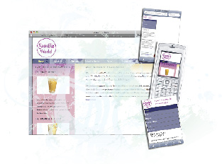
The following figures show the SmoothieWorld site as displayed on a desktop computer, a legacy mobile browser, and the WebKit-based browser of the iPhone. The layout for this figure includes a fixed-width container of 960 pixels, which is centered horizontally within the page. This page structure will have some implications in all three formats.
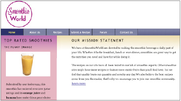
The figure below shows the default layout view in a desktop web browser. Because of the decision to use a fixed-width CSS layout, the page will render predictably across different monitor resolutions. The designer accepts that in larger monitors, there will be more space on either side of the content, and in smaller monitors, the content may be cropped.
 |
|
The fixed-width layout as shown in a monitor with 1024 × 768 screen resolution. |
The figure below shows the same layout in a Nokia E60, a cell phone released in 2007. In this example, because the screen resolution is 240 pixels wide by 320 pixels high, the view is cropped to a small section of the top-left corner of the page. The user would have to use the arrow keys to scroll across and down the page.
 |
|
The fixed-width layout as shown |
The following figure shows the page in the Safari web browser included with the Apple iPhone. You can see that the entire page displays in the vertical orientation. The browser automatically scales the page to size, and it also uses the 960-pixel-wide container as the border of the screen. When rotated, the browser flips to the landscape mode and automatically scales again; in this mode, the largest text on the page is readable, but the main body text remains too small to read unless the user zooms in.
 |
 |
|
The fixed-width layout as shown in the iPhone 3GS 320 × 480 — vertical layout (top) and horizontal layout (bottom). |
Although the iPhone’s rendering is better than that of the older Nokia’s, it still presents problems. Largely as a result of the two-column layout, the body text of the page is unreadable without zooming. Also, the navigation bar presents a major problem in the default portrait mode: it is essentially unusable because the buttons are too small a target for the touchscreen (unless the user zooms in). In landscape mode, the navigation bar becomes more usable, but the target of the buttons is still small enough to frustrate the user who accidentally presses the wrong button.
The trouble with style sheets
A common problem in web design is the discrepancy between how something should work and how it really works. You saw this in Lesson 9 with issues of browser compatibility. Different browsers render the exact same page differently depending on various factors. This is especially the case with mobile web browsers. A solution to this problem was proposed in 1999 when the original specifications for CSS were developed. Using this solution, the browser defaults to the screen type when there is no other designation for the type of style sheet to use. In other words, this code:
<link rel="stylesheet" href="base.css" type="text/css" />
is the same as this code:
<link rel="stylesheet" media="all" href="base.css" type="text/css" />
Other media types are available for use: screen, which is the standard for desktop monitors; projection; print; handheld; etc. You can use the handheld media type by adding the following link to target handheld devices:
<link rel="stylesheet" media="handheld" href="smallscreen.css"
type="text/css" />
In some cases, you can create a separate style sheet and attach it to your pages so that certain handheld devices will use this style sheet accordingly. However, mobile web browsers have not traditionally done a good job with these style sheets, and in some cases, will ignore or interpret them in different ways. An even greater issue today is that some of the most popular and high-profile mobile web browsers do not announce themselves as handheld devices at all, so a line of code such as the one indicated above would not work.
Using CSS3 media queries
When media types don’t work, you can use media queries in CSS3 to recognize devices that are visiting your website. Instead of looking for a device that announces itself as handheld, a media query looks at the capability of the device, and then allows you to send it styles based on certain values. For example, the media query might look for the width and height of the browser window, the device width and height, the device orientation (landscape or portrait), and the resolution, among other things.
When the user has a mobile browser that supports media queries, you can write CSS specifically for certain situations, for example, to detect whether the user has a small device such as a smartphone. To understand how this works, you will create some styles for the mobile-optimized version of the SmoothieWorld site.
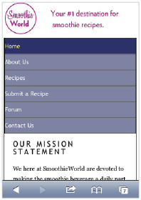
1 In your text editor, choose File > Open and navigate to the web11lessons folder. Locate the 11_home.html file and click OK. Preview this page in your browser. You will use the two-column design similar to the one at the end of Lesson 7.
 |
|
The two-column design you will be optimizing for a mobile device. |
Close your browser and return to your text editor. You will now add a media query to your base.css style sheet.
2 In your text editor, choose File > Open, locate the base.css style sheet, and click OK. Scroll to the very bottom of the style sheet and add the following code:
@media only screen and (max-device-width:480px) {
}
A media query is a new category that has been added to the CSS3 specification. Most browsers use the CSS 2.1 specification and won’t recognize the code, so you should be careful when adding CSS3 properties. However, in this case you are specifically targeting mobile browsers such as the Safari web browser on the iPhone, as well as all other mobile browsers that support CSS3, so you can use it.
3 Now you will add a new rule that sets a style for the width of the wrapper. Add the following code (highlighted in red):
@media only screen and (max-device-width:480px) {
body {
padding:5px;
background-color:#FFF;
background-image:url(images/smoothieworld_logo_mobile.jpg);
background-repeat:no-repeat;
}
#wrap {
width:auto;
margin-top:80px;
}
}
|
Note that throughout this lesson, you are adding new rule sets nested within the media query section. The syntax here is slightly different than what you have created up to this point; study the code example carefully, and always add your new rules inside the @media section. |
This code accomplishes a few things: the 5 pixels of padding for the body will add a bit of space to any content you place inside your page, and the background image is a new image optimized for the mobile format. The rule for the wrap ID style redefines the main container of the page to an automatic width instead of the 960 pixels used for the current style sheet. Additionally, the top margin property adds 80 pixels of space between the wrap div and the top of the page, which allows your site logo to be visible.
4 Choose File > Save.
The most reliable way to test this page is to upload the entire site to a remote server and then point to the resulting link using your mobile phone’s web browser. If you’re not currently set up for this workflow, take time now to set up your remote server, or preview the page later.
5 Preview the page in your mobile web browser. Your page might appear somewhat broken, but the media query is working.
 |
|
Your mobile design after adding rules for |
You currently have two logos; the second one (in the masthead) is redundant and you will remove it. Your page appears distorted because the mobile browser is attempting to fit all div elements that are floated and have fixed widths into a narrow space.
In general, mobile design works better with a single column for your content. In the following steps you will begin to override your existing styles using two methods: removing floats and changing pixel widths to a value of auto. First, however, you will remove the masthead, which contains the second SmoothieWorld logo.
6 Add the following code (highlighted in red):
#masthead {
display:none;
}
The display:none property prevents the masthead element from appearing.
This property is useful because it deactivates elements from the original style sheet. Now you’ll configure your navigation.
7 Add the following code, which targets the list items in your mainnav div:
#mainnav {
height:auto;
}
#mainnav li {
float:none;
width:auto;
text-align:left;
}
Setting the height value for the mainnav to auto ensures that this container will expand and display the navigation items inside. Choose File > Save and then upload your HTML and CSS files to your server (if testing on your phone). Load or refresh your page in the web browser.
 |
|
Your navigation section after removing the |
Setting the float property to none and the width to auto turns your navigation into a vertical list. The text-align:left property places them on the left side of the menu. The auto width will work only after you have converted the rest of your page to a single column. You will continue to do that in the following steps.
Note that all the original properties for the appearance of the navigation list are still present, including the background color and the height. This is a benefit of the cascading nature of CSS. A single property, such as the 35-pixel height of the list items, can work in the desktop design and the mobile design, but you only need to specify it once.
8 You will now add more styles in you media query for the sidebar and the main content. First, locate the rule for the masthead ID and then add the following selector (highlighted in red):
#masthead, #sidebar {
display:none;
}
This removes the sidebar on the left side from the mobile page. Floats in a desktop layout can be useful, but not in a single-column layouts, so you will now remove the floated properties of your main content div. Remember that for mobile devices, simpler layouts work better.
9 To style the maincontent div, add the following code within your media query:
#maincontent {
float:none;
width:auto;
background-color:white;
}
The key changes here are to set the float property to none and the width to auto.
Save the file and then upload your HTML and CSS files to your server (if you are testing on your phone). Load or refresh the page in your web browser.
 |
|
Your maincontent section also fills a single |
Your content flows into a single column and you are getting closer to the intended layout, but your footer is still floated.
10 The last section of the page to style is the footer. Add the following rule set within your media query:
#footer, #footer p {
clear:none;
width:auto;
height:auto;
background-image:none;
padding-top:20px;
margin-top:0px;
}
In this code, you are setting the styles for the footer and the paragraph inside the footer. You need to use the clear:none rule to override the clear:both rule from the main style sheet. You set both width and height to auto in this case. Additionally, you set the background-image to none to simplify the page design. Finally, you add more padding and set the top margin to zero.
Save the file and then upload your HTML and CSS files to your server (if you are testing on your phone). Load or refresh the page in your web browser.
 |
|
With all the floats removed and widths set |
Test your page in both portrait and landscape modes. You are done with this lesson.
Self study
1 Experiment with the design of your page. Add some left padding to the #mainnav list rules to give your navigation links a bit more space.
2 Improve the formatting of the second-level heading, “Our Mission Statement,” by adding a new rule for #maincontent h2 in your media query section.
3 Experiment with different font sizes and other text styling.
Review
Questions
1 Name three ways in which mobile websites provide a different experience for the user.
2 How are CSS3 media queries better than style sheets that use the handheld media type?
3 Rebecca wants to convert her pre-existing website to a mobile site and she begins to use a CSS3 media query to do so. She also wants to convert her multi-column layout to a single-column layout to maximize the screen space on the mobile browser. What are the two CSS properties relating to layout Rebecca should modify first?
Answers
1 First, desktop websites assume that you are using a mouse and keyboard, whereas mobile devices use arrow keys, numerical keypads, or a touchscreen. Second, desktop websites are often designed with the landscape format in mind, whereas most mobile devices use portrait format. Third, multimedia such as video, audio, and Flash are not always supported on mobile devices. A fourth difference is that mobile devices often have slower connections to the Internet than desktop computers.
2 The handheld media type was designed to allow mobile browsers use a special style sheet if the designer or developer added the correct code. This method works for many mobile devices, but it is inconsistent and newer devices, such as the iPhone, do not recognize the handheld value. These devices use CSS3 media queries, which are inside a style sheet and use a special syntax. The benefit of media queries is that they look for the capabilities of the mobile device (based on properties such as screen width and orientation) and allow the designer to create unique styles based on these capabilities.
3 To convert a multi-column layout to a single-column layout, Rebecca should first set a float property of none and a width property of auto to most or all elements using floats or that have fixed-width values.