
What do we do when we need to temporarily allow the user to quickly select between one of three or four options, but it seems out of place to send the user to another page in order to make the choice?
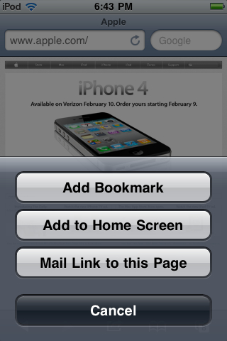
Action Sheets are designed to be a quick and unobtrusive way to present the user with multiple action items in relation to the initiated task. For example, pressing the plus button near the address bar in Safari initiates an Action Sheet presenting the user with the option to bookmark the current web page, add the page to the home screen, or email a link of the page to a friend:
Apple has designed the Action Sheet element to help provide a flexible way to quickly offer the user choice when initiating a task, which will be influential in many of our applications.
Action Sheets vary a bit between the iPhone and iPad, so we'll need to take note of the differences and properly abide by the human interface guidelines when implementing the element. For this recipe, we'll discuss our options and decide if our work could benefit from an Action Sheet.
Action Sheets are somewhat different elements on the iPad when compared to iPhone or iPod touch devices, so we have both on hand as an example for this recipe.
Action Sheets are an extremely simple interface element to include in our application. When we find ourselves needing a bit of flexibility in a cramped interface, the Action Sheet will usually come to save the day.
Action Sheets are great because they essentially allow one interface element to serve multiple functions. If we find ourselves running low on space, we can attempt to group like functions together in an Action Sheet. On the iPhone and iPod touch, Action Sheets always rise up from the bottom of the screen, with the space above the sheet darkening to indicate that it is inactive and the sheet is the foremost interface object.
Under general practices and in addition to combining similar application functions together, we should also use an Action Sheet to receive user confirmation when looking to perform a destructive task. For example, if we give the user the option to delete all personal data inside of an application, we should present an Action Sheet to confirm their decision.
When initiating an Action Sheet on the iPhone, we must always include a Cancel button to allow the user to dismiss the view. This button should be the choice closest to the bottom of the screen, below all other Action Sheet items.
On the iPad, Action Sheets work a bit differently in the sense that they do not rise from the bottom of the screen. Instead, these sheets are placed inside of a Popover view that lies above the rest of the screen. A Cancel button isn't required or recommended on the iPad, as tapping outside of the Action Sheet will close the view for the user.
As noted by Apple in the Human Interface Guidelines, our Action Sheet buttons will be default silver gradient color with black text, with two important exceptions. The Cancel button should be the standard dark gradient with white text, making it clear to the user that this button serves a different purpose on the preceding options. A button that performs a destructive action should be red in color with white text, with this button also being the first and highest up action on the sheet. The distinctive color and placement far away from the Cancel button will help minimize the risk of accidental data deletion.
Action Sheets are a fairly common interface inclusion, mostly because they're a quick way to focus the users, attention on a specific action. The user can quickly invoke a task that requires clarification or confirmation through an Action Sheet, make their choice, then dismiss the sheet, and be back in the application interface.
Action Sheets work by focusing the user's locus of attention on an important task, which the user cannot get past without making a decision or cancelling the action. This helps to ensure that while a mobile application is often used passively on the go, an important application will receive significant attention from the user. By requiring the user to focus momentarily on the task at hand, we can eliminate frustration caused by haphazardly using our application.
- Properly utilizing modal views in Chapter 3