8. Working with Typography
Lesson overview
In this lesson, you’ll learn how to do the following:
Adjust vertical and horizontal text spacing.
Change fonts and type styles.
Insert special characters.
Create a headline that spans multiple columns.
Adjust line and column breaks.
Hang punctuation outside a margin.
Add and format a drop cap.
Adjust line breaks.
Specify a tab with a leader and create a hanging indent.
Add a rule and shading to a paragraph.

This lesson will take about 60 minutes to complete. To get the lesson files used in this chapter, download them from the web page for this book at adobepress.com/InDesignCIB2023. For more information, see “Accessing the lesson files and Web Edition” in the Getting Started section at the beginning of this book.
The Adobe InDesign typography features make it easy to find just the right font to help convey a document’s message; fine-tune character, word, line, and paragraph spacing for a professional look; and add special touches such as fractions and drop caps.
Getting started
In this lesson, you’ll fine-tune the typography in a magazine layout for a botanic gardens cafe. For the rich look of the magazine, the typography includes precision formatting and spacing along with decorative touches.
To ensure that the preferences and default settings of your InDesign program match those used in this lesson, move the InDesign Defaults file to a different folder following the procedure in “Saving and restoring the InDesign Defaults file” on pages 3–4.
 Note
NoteIf you have not already downloaded the project files for this lesson to your computer from your Account page, make sure to do so now. See “Getting Started” at the beginning of the book.
If possible, confirm that Adobe Caslon Pro is not active on the Windows or macOS system.
Start InDesign.
The InDesign Home screen displays. Click Open at the left. (If the Home screen does not display, choose File > Open from the InDesign menu bar.)
Open the 08_Start.indd file in the Lesson08 folder, located inside the Lessons folder within the InDesignCIB folder on your hard drive.
Choose File > Save As, rename the file 08_Type.indd, and save it in the Lesson08 folder.
To ensure that the panels and menu commands match those used in this lesson, choose Window > Workspace > [Essentials], and then choose Window > Workspace > Reset Essentials.
If you want to see what the finished document looks like, navigate to the Lesson08 folder on your system. Double-click 08_End.pdf to open it.
This lesson previews a PDF of the final document because the necessary fonts are embedded in the PDF file. If you were to open the final InDesign document now, the necessary fonts would be activated automatically. You would be able to complete the lesson, but you would not be able to practice activating the font family.
In this lesson, you will work intensively with text. You can use the character- and paragraph-formatting controls in the Properties panel for convenience, and you can use the Character panel and the Paragraph panel when you need more power.
NoteDrag the Paragraph panel tab into the Character panel tab to create a panel group, if you prefer.
Choose Type > Character and Type > Paragraph to open the two primary text-formatting panels. Leave these panels open until you finish this lesson.
Choose Type > Show Hidden Characters so that you can see spaces, paragraph returns, tabs, and the like while you work on this lesson.
Adjusting vertical spacing
InDesign provides several options for customizing and adjusting the vertical spacing of text in a frame. You can do the following:
Set the space between lines of paragraphs using a baseline grid (covered in Lesson 6).
NoteTo better view the interface onscreen or in print, the screen captures in this book reflect the Medium Light interface rather than the default setting of Medium Dark. In addition, some screen captures illustrate User Interface Scaling for a closer look at interface elements. You can modify interface settings in Preferences.
Set the space between lines using the Leading menu in the Character panel.
Set the space between paragraphs using the Space Before and Space After options in the Paragraph panel. To prevent awkward spacing, the Space Before value is not applied at the top of a column, and the Space After value is not applied at the bottom of a column.
Use the Vertical Justification and Balance Columns options in the Text Frame Options dialog to position text within a frame.
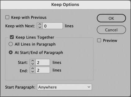
Control how paragraphs flow from one column to the next using the Keep With Previous, Keep With Next, and Keep Lines Together settings available in the Keep Options dialog (choose Keep Options from the Paragraph panel menu).
In this lesson, you will adjust the space between paragraphs and the line spacing within a paragraph.
Changing the spacing between paragraphs
To adjust space between paragraphs, you select the paragraphs and specify a Space Before and/or Space After value. (The amount of space between paragraphs ends up being the sum of the space after one paragraph and the space before the next paragraph. Therefore, it’s generally best to use one or the other—space before or space after—to prevent confusion.) The Space Before and Space After values can be saved in paragraph styles and applied consistently across a document.
![]() Tip
Tip
Specifying Space Before and/or Space After values for paragraphs is preferable to typing extra paragraph returns between paragraphs. A full paragraph return is often too much space, and it can end up at the top of a page or column, leaving undesirable space.
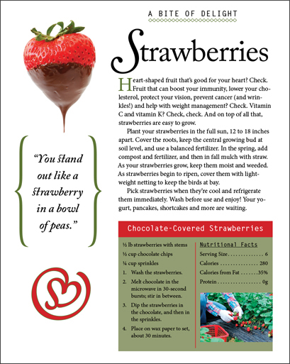
Here, you’ll add more space between paragraphs in the Chocolate-Covered Strawberries recipe at the bottom of the page.
Scroll and zoom as necessary to view the recipe in the green box.
Using the Type tool (
 ), click immediately in front of the first line of the recipe, “1/2 lb strawberries with stems.”
Drag to select all the recipe text from “1/2 lb strawberries with stems” to “Protein 0g.”
In the Paragraph panel, click the up arrow once next to Space After (
 ).
).This adds .0625 inches (or 4.5 points) of space between paragraphs. The text will overset the frame, but this will be resolved later with the addition of columns.
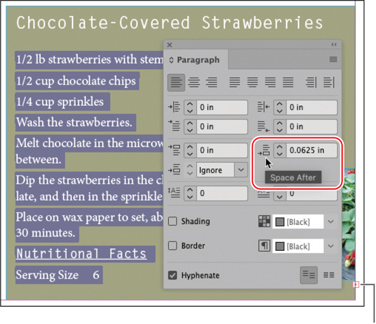
The red plus sign + in the lower-right corner of the text frame indicates overset text (more text than can fit in the frame). This is resolved later in the lesson.
Choose Edit > Deselect All.
Choose File > Save.
Working with fonts, type styles, and glyphs
Changing the fonts and type styles of text can make a dramatic difference in the appearance of your document. InDesign automatically installs a few fonts, and Creative Suite members have access to thousands of already licensed fonts at no extra charge through Adobe Fonts. Once a font is installed, you can apply it to text and change its size, select a style (such as bold or italic), and more. In addition, you can access all the glyphs (every form of each character) in the font. For example, fonts have variations of special characters such as these: % % $ $ # #.
Adding a font from Adobe Fonts
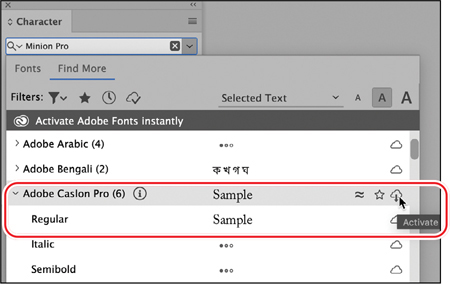
This exercise uses Adobe Caslon Pro, which is available for free from Adobe Fonts. If the font is already installed on your system, follow the steps to see how you can add another font.
![]() Note
Note
Activating fonts from the Adobe Fonts service requires access to the internet.
In the Character panel, click the arrow to the right of Font to display the menu.
Click Find More at the top of the menu.
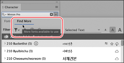
Scroll down in the list to locate Adobe Caslon Pro.
Click the Activate button (
 ) to the right of the font family folder, and then click OK to confirm.
 Tip
TipA font family is a collection of styles of the same font. For example, the Adobe Caslon Pro family includes the following fonts: Regular, Italic, Semibold, Semibold Italic, Bold, and Bold Italic. You can activate the entire family or an individual style within the font.
OpenType fonts
![]() Note
Note
A longtime font format, Type 1, was retired by Adobe in January 2023. When opening documents that require Type 1 fonts, you may encounter an alert. You may be able to replace Type 1 fonts with an OpenType font of the same name.
OpenType fonts, such as Adobe Caslon Pro, may display many more glyphs than you are accustomed to seeing. (Glyphs are representations of characters within a font.) OpenType fonts can contain many more characters and glyph alternates than other font formats. InDesign supports a new OpenType font format called Variable Font as well. This format provides convenient slider controls for adjusting weight, width, slant, optical size, and more. For more information on OpenType fonts, visit www.adobe.com/products/type/opentype.html.
Applying a font, style, size, and leading
First, you’ll apply a different font to the headline and then to the first character of the headline. Next, you’ll change the font family, style, size, and leading for the text in the quote on the left side of the page.
Scroll and zoom as necessary to view the headline.
Using the Type tool (
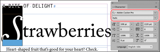
), select the story headline, “Strawberries,” at the top of the page.Click the Font menu in the Character panel. Scroll through the list to see how “Strawberries” looks in various fonts.
TipFor a little more control, use the arrow keys on your keyboard to move up and down in the Font menu.
In the list, find the font family you just activated, Adobe Caslon Pro, which may be alphabetized under “C.”
Click the arrow to the right of Adobe Caslon Pro to open the font family, and select Regular from the menu.
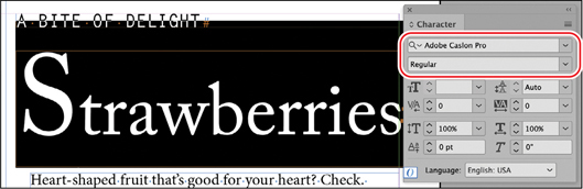
Using the Type tool, click immediately to the left of the first “S” in the “Strawberries” headline. Drag to select the “S.”
In the Character panel, select Italic from the Style menu below the Font menu.
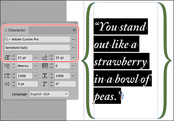
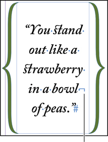
Now you will work on the quote on the left side of the page: “You stand out like a strawberry in a bowl of peas.” Scroll and zoom as necessary to view the quote.
Using the Type tool (
), click inside the quote’s text frame. To select the entire paragraph, quadruple-click (click four times rapidly).In the Character panel, set the following options:
TipTo quickly select a font, you can type the first few letters in the Font field until it is recognized.
Font: Adobe Caslon Pro
Style: Semibold Italic
Size: 25 pt
Leading: 35 pt
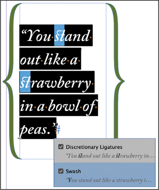
Click the Character panel menu, and select OpenType. Notice that Swash is already selected, indicating that some glyphs have already been replaced with more ornate glyphs.
TipIn the OpenType menu, the options in brackets are not available for the selected font.
Select Swash to deactivate this feature, and notice the changes (such as the Y vs. ϒ in Adobe Caslon Pro Semibold Italic). Select Swash from the OpenType menu again to reactivate the feature.
If the OpenType badge (
 ) is not displayed somewhere on the paragraph, click in the quote’s paragraph four times to reselect it.
Click the OpenType badge, which offers another way to access OpenType features available in the font.
Check Discretionary Ligatures along with Swash, and note how the two “st” glyph pairs are replaced with an “st” ligature: st.
 Tip
TipLigatures combine two or three glyphs into a single glyph to achieve a more harmonious look. Common ligatures include the “fi” and “fl” letter pairs.
Choose Edit > Deselect All.
Choose File > Save.
Adding a special character
Many types of special characters—such as bullets, checkboxes, accented characters, and ornamental curlicues—are used in documents for useful and decorative purposes. Now you’ll add a decorative character in the lower-left corner of the page.
If necessary, scroll down to see the text frame below the quote about peas.
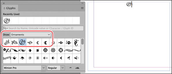
Using the Type tool (
), click to place an insertion point in the text frame.Choose Type > Glyphs. You can use the Glyphs panel to view and insert OpenType attributes, such as ornaments, swashes, fractions, and ligatures.
In the Glyphs panel, choose Ornaments from the Show menu.
Locate the heart-shaped character (
 ), and double-click it. Tip
You can access some of the more commonly used glyphs (such as the copyright and trademark symbols, bullets, and dashes) in the Type menu (Insert Special Character) and the context menu. To access the context menu, right-click at the insertion point.
Choose Type > Glyphs to close the Glyphs panel, and then choose File > Save.
Finding fonts in the Font menu
InDesign provides multiple ways to quickly find fonts in the Font menus that are available in the Control, Character, and Properties panels.
![]() Tip
Tip
When logged into Creative Cloud, you also can activate fonts through fonts. adobe.com and the Manage Fonts link in the left column of the Creative Cloud app.
Name Search: A quick way to find a font is to start typing the font name in the Font field. For example, as you type “Cas” for Adobe Caslon Pro, all fonts with those three characters in it are listed. By default, InDesign searches by the entire font name. You can click the search icon (
 ) to the left of the font name to search by first word only. In that case, you would need to type “Adobe Cas” for the same result.
Filter by Class: Select a font classification from the Filter menu (
 ), such as Serif or Script.
Favorites: For quick access to fonts you use frequently, click the star to the right of a font name in any Font menu. Then, click Show Favorite Fonts (
 ) at the top of the menu.
Font Similarity: Click Show Similar Fonts (
 ) to the right of a font to display visually similar fonts in the menu.

Icons in the Filter menu indicate the visual characteristics of each font classification.
Applying a stroke and fill to text
Next, you’ll add a fill color and stroke to the glyph you just added.
With the Type tool (
) still selected, select the heart-shaped glyph.In the Character area of the Properties panel, type 122 pt in the Font Size field. Press Enter (Windows) or Return (macOS).
In the Appearance area of the Properties panel, do the following:
Select the Fill box (
 ), and click the Strawberry Red swatch.
Click the up arrow next to the Stroke Weight field to apply a 1 pt stroke.
Select the Stroke box (
 ), and click the Stem Green swatch.
Click next to the character so that you can view the stroke effect.
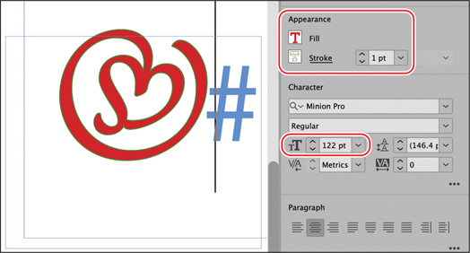
Press Ctrl+Shift+A (Windows) or Shift+Command+A (macOS) to deselect anything on the page. Choose File > Save.
Inserting fraction characters
The recipes in this article do not use actual fraction characters—rather, the 1/2 is built with a numeral 1, a slash, and a numeral 2. Most fonts contain individual characters for common fractions such as ½, ¼, and ¾. When available, these elegant fractions look much more professional than using numerals and slashes. You will try several methods for inserting fractions here.
Scroll and zoom as necessary to view the recipe.
Using the Type tool (
), drag to select the “1/2” in the first line, “1/2 lb strawberries with stems.”Choose Type > Glyphs to open the Glyphs panel.
TipIf you are working on a cookbook or other document that requires a variety of fractions, the fractions built into most fonts will not cover all the values you need. You will need to research numerator and denominator formatting options, which are available in some OpenType fonts, or purchase a specific fraction font.
Choose Numbers from the Show menu. (If necessary, scroll up in the menu to locate the Numbers option.)
Locate the ½ fraction. If necessary, resize the panel and scroll to see more characters.
Double-click the ½ fraction to replace the selected 1/2 in the text.
Notice that the ½ fraction is stored in the Recently Used boxes at the top of the Glyphs panel. Now you’ll replace the “1/2” in the second line of the recipe.
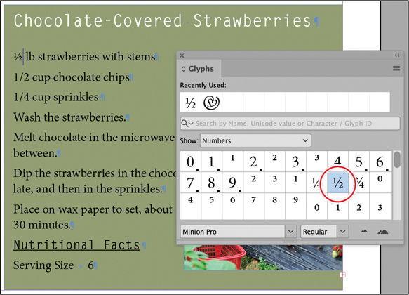
Drag to select the “1/2” in “1/2 cup chocolate chips” in the next line of the recipe.
Double-click the ½ fraction in the Recently Used box at the top of the Glyphs panel.
Drag to select the “1/4” in “1/4 cup sprinkles” in the third line of the recipe.
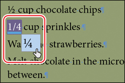
Point at the blue underline that displays under “1/4” and click the fraction to replace the 1/4 with 1/4.
Close the Glyphs panel, and choose Edit > Deselect All.
NoteOnly OpenType fonts offer convenient inline access to glyph variations.
Choose File > Save.
Working with columns
You can specify the number of columns in a text frame, the width of the columns, and the space between them. Once a text frame is divided into columns, you can create a heading that spans multiple columns (also known as a “straddle head”). In this section, you will add columns and a straddle head to a text frame.
![]() Tip
Tip
Attractive and readable type relies on many factors that work together, including the font choice and size, line length (column width), leading (space between lines), alignment (such as justified), and more. As you design pages, you may experiment with all these options, keeping readability in mind.
Specifying columns for a text frame
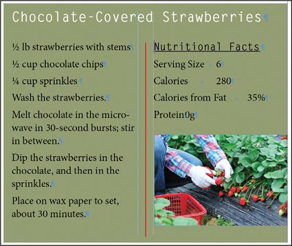
The recipe in the green text frame will look better and be more legible if it’s divided into two columns with a rule between the columns.
Using the Selection tool (
 ), click the recipe’s text frame to select it.
Choose Object > Text Frame Options, and then click the General tab. Check Preview to see the changes.
In the Columns area, enter 2 in the Number field.
Press Tab to select the Gutter field, and then type .25 in.
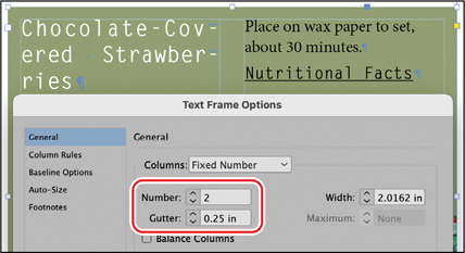
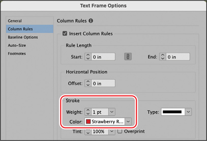
Click the Column Rules tab at left, and then check Insert Column Rules.
Under the Stroke area, enter 1 in the Weight field and select Strawberry Red from the Color menu. Drag the dialog out of the way to see the changes.
Click OK, and choose File > Save.
Creating a straddle head
The heading for the recipe needs to span the two columns. You can do this with a paragraph format rather than by placing the heading in its own text frame.
Using the Type tool (
), click in the “Chocolate-Covered Strawberries” heading. This selects the paragraph for formatting. TipYou can also access the Span Columns controls in the Control panel.

Select Span Columns from the Paragraph panel menu (
 ).
).In the Span Columns dialog, select Span Columns from the Paragraph Layout menu.
Choose All from the Span menu, and select Preview to confirm the change.
Click OK.
Choose File > Save.
Adjusting columns
Now that the heading is positioned, you can complete the fine-tuning of the recipe sidebar by balancing the amount of text in each column. You can do this automatically by selecting Balance Columns in the General tab of the Text Frame Options dialog (Object menu) or by inserting a “break character” that shifts text to the next column, frame, or page.
![]() Tip
Tip
Designers often use Insert Break Character because it’s quick. However, if text reflows due to edits, the character remains and can force text to the wrong column or into overflow. Therefore, you should use this technique when editing and design are close to final.
Using the Type tool (
), click immediately before “Nutritional Facts” in the recipe.Choose Type > Insert Break Character > Column Break.
Choose File > Save.
Changing paragraph alignment
You can easily manipulate how a paragraph fits within its text frame by changing the horizontal alignment. You can align text with one or both edges of a text frame, or you can apply inset spacing. In this exercise, you’ll use different methods to apply paragraph alignments.
Choose View > Fit Page In Window to view the entire page.
Using the Type tool (
), click to place an insertion point in the tagline at the top of the page: “A BITE OF DELIGHT.” Zoom as necessary to see the text.In the Paragraph panel, click Align Center (
 ).
).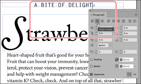
Click in the first paragraph of the story below the “Strawberries” headline (starting with “Heart-shaped fruit”).
Choose Edit > Select All, and then click Justify With Last Line Aligned Left (
 ) in the Properties panel.
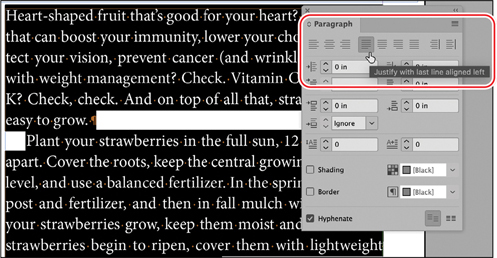
Click in the “Chocolate-Covered Strawberries” recipe heading. Press Ctrl+Shift+C (Windows) or Shift+Command+C (macOS) to center the one-line paragraph.
Click in the pea quote at the left to select the paragraph. Click Align Center (
) in the Properties panel.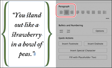
Choose Edit > Deselect All.
Choose File > Save.
Hanging punctuation outside the margin
Sometimes, particularly with punctuation at the beginning and end of lines, margins that are in fact even may appear uneven. To fix this visual discrepancy, designers use optical margin alignment to “hang” punctuation and swashes on characters slightly outside the text frame.
![]() Note
Note
When you select Optical Margin Alignment, it applies to all the text in a story—defined as all the text in a frame or a series of threaded text frames. If you have paragraphs that should not hang outside the margin, you can select the paragraphs and select Ignore Optical Margin from the Paragraph panel menu.
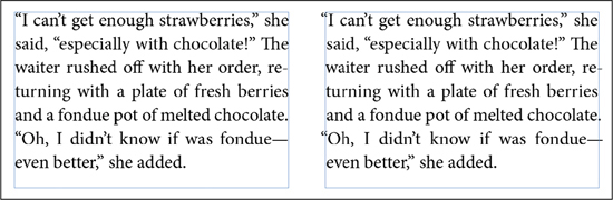
Without (left) and with (right) optical margin alignment. Notice the alignment of the quotation marks, hyphens, and em dashes. The text looks more visually aligned on the right.
In this exercise, you will apply optical margin alignment to the main story.
Using the Selection tool (
), click to select the text frame containing the main story, starting with “Heart-shaped fruit that’s good for your heart?”Choose Type > Story to open the Story panel.
Select Optical Margin Alignment. Enter 14 pt in the field and press Enter or Return.
TipWhen using Optical Margin Alignment, specifying an Align Based On Size setting that matches the point size of the text in the frame produces the best results.

Note how the hyphen extends slightly beyond the edge of the text frame. Overall, this creates the appearance of a smoother edge.
Click the Story panel’s close box, and then choose File > Save.
Creating a drop cap
You can add creative touches to your document using InDesign typographic features. For example, you can make the first character or word in a paragraph a drop cap and then apply additional formatting to the drop-cap character. Here, you’ll create a drop cap out of the first character in the first paragraph of the story.
![]() Tip
Tip
Drop caps can be saved with paragraph styles so that you can apply them quickly and consistently throughout a long document.
Using the Type tool (
), click to place an insertion point anywhere in the paragraph of the story starting with “Heart-shaped fruit that’s good for your heart?”In the Paragraph panel, type 2 in the Drop Cap Number Of Lines field (
 ) to make the letter drop down two lines. Press Enter or Return.
Note the 1 in the Drop Cap One Or More Characters field (
 ) to see how you would increase the number of characters that drop.
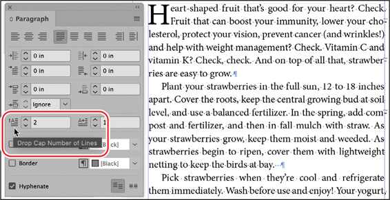
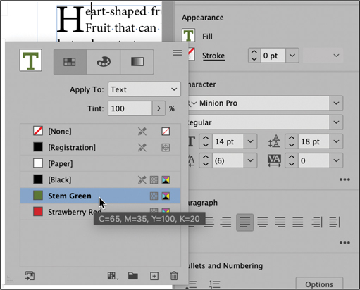
Using the Type tool, select the drop-cap character.
Now, you can apply any character formatting you want.
Select Stem Green from the Fill menu in the Properties panel.
TipYou can create a drop cap and apply a character style in one step using the Drop Caps And Nested Styles dialog (Paragraph panel menu). You can then save that formatting in a paragraph style.
Click the pasteboard to deselect the text and view the drop cap.
Choose File > Save.
Adjusting letter and word spacing
To change the spacing between letters and words, you use the kerning and tracking controls. You can also control the overall spacing of text in a paragraph by using the Adobe Single-Line Composer and the Adobe Paragraph Composer. This type of fine-tuning is the hallmark of professional typography.
Adjusting the tracking and kerning
Tracking increases or decreases spacing across a range of selected letters. By adjusting kerning, you can add or subtract space between specific letter pairs. You can use both kerning and tracking on the same text.
Here, you’ll track out the “A BITE OF DELIGHT” heading for effect and then track in the “Strawberries” heading. Finally, you will manually kern the space between the swash “S” and the remainder of the “Strawberries” headline.
To see the results of the tracking and kerning more clearly, scroll and zoom as necessary to view the top quarter of the page.
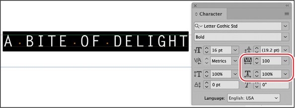
Using the Type tool (
), click in the “A BITE OF DELIGHT” heading at the top of the page. Click three times to select the entire heading.In the Character panel, choose 100 from the Tracking menu (
 ).
).
Click in the “Strawberries” heading and click two times to select the entire heading.
TipWhen you kern text, the right arrow key adds space and the left arrow key removes space when combined with the Alt (Windows) or Option (macOS) key. To change the amount of kerning applied using the shortcuts, you can edit the Keyboard Increments value in Preferences (Units & Increments).
Type –20 in the Tracking field in the Character panel.
Click to place an insertion point between the “S” and the “t” in “Strawberries.”
Press Alt+Left Arrow (Windows) or Option+Left Arrow (macOS) on the keyboard three times to decrease the amount of space between the two characters.
The Kerning field (
 ) in the Character panel and the Control panel lets you see and adjust the amount of space between characters.
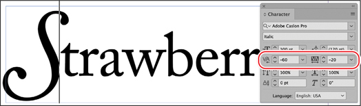
Click the pasteboard to deselect the text. Choose View > Fit Page In Window to see the results.
Choose File > Save.
Adjusting line breaks
Hyphenation and line breaks at the end of each line affect readability and impact. For example, when paragraphs are aligned left, the right edge remains ragged. Too much “rag” can make the text easier or harder to read based on many factors, including the font, size, leading, column width, and more. Three other paragraph formats affect the readability of the text:
![]() Tip
Tip
For justified text, Justification settings combine with the Paragraph Composer and Hyphenation Settings to control how dense paragraphs look. To adjust these settings for a selected paragraph, choose Justification from the Paragraph panel menu.
The Adobe Single-Line Composer and Adobe Paragraph Composer, which automatically determine line breaks
Hyphenation settings, such as whether to hyphenate capitalized words
The Balance Ragged Lines feature
Typically, a graphic designer will experiment with a combination of settings until a few paragraphs of sample text look just right. Then, all these options can be saved in paragraph styles and applied with one click.
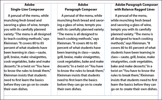
Note the difference in line breaks with successive applications of line break methods. The first column shows a paragraph with the Adobe Single-Line Composer applied. The middle column shows the same paragraph with the Adobe Paragraph Composer applied. As you can see, the right edge is much less ragged. The column on the right shows the paragraph with both Adobe Paragraph Composer and Balance Ragged Lines applied, which helps balance the length of lines in the paragraph.
Hyphenation settings
Whether and how words are hyphenated at the ends of lines is a paragraph format. In general, Hyphenation Settings are editorial decisions, not design decisions. A publication’s style guide, for example, may specify that capitalized words should not be hyphenated.
Using the Type tool (
), click to place an insertion point in the main story, starting with “Heart-shaped fruit that’s good for your heart?” TipWhen you’re editing text, you can use the Hyphenate option in the Control panel or the Paragraph panel to quickly enable and disable hyphenation for selected paragraphs.
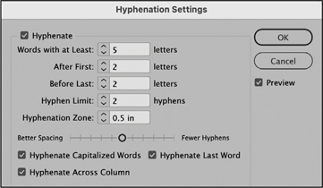
Choose Edit > Select All to select all the paragraphs in the story.
From the Paragraph panel menu, select Hyphenation. Make sure Preview is selected so that you can see the changes.
Deselect Hyphenate to see how the text looks with no hyphenation.
Select Hyphenate again, and then type 2 in the Hyphen Limit field to prevent more than two lines in a row ending with a hyphen.
Click OK to close the dialog, but keep the text selected.
The hyphenation helps prevent gaps in the justified lines of text. However, the justified text is not suited to this casual magazine.
With the text still selected, press Ctrl+Shift+L (Windows) or Shift+Command+L (macOS) to align the text with the left margin.
Choose Edit > Deselect All, and then choose File > Save.
Inserting manual line breaks
Once a layout is nearly complete, you may want to fine-tune line breaks for aesthetic or contextual reasons. Here, you will add two line breaks to the quote on the left side of the page.
![]() Tip
Tip
Another way to control how text flows is to use a nonbreaking space between two words. For example, you might use a nonbreaking space to “glue” two words together so that they cannot split at the end of a line (such as “et al.”). To do this, delete the existing space and choose Type > Insert White Space > Nonbreaking Space.
Using the Type tool (
), click in the fourth line of the quote, immediately before the word “of.”Enter a forced line break character by choosing Type > Insert Break Character > Forced Line Break, or pressing Shift+Enter (Windows) or Shift+Return (macOS).
Choose Edit > Deselect All, and then choose File > Save.
A forced line break character
Understanding the Adobe Paragraph and Single-Line Composers
The density of a paragraph (sometimes called its “color”) is determined by the composition method used. InDesign’s composition methods consider the word spacing, letter spacing, glyph scaling, and hyphenation options you’ve selected and then determine the best line breaks. InDesign provides two options for composing text: the Adobe Paragraph Composer, which examines all the lines in a paragraph before composing each line, and the Adobe Single-Line Composer, which composes text one line at a time starting with the first line.
![]() Note
Note
The Adobe World-Ready Single-Line Composer and the Adobe World-Ready Paragraph Composer are intended for use with Middle Eastern languages. With these composers, you can enter text in a combination of Arabic, Hebrew, English, French, German, Russian, and other Latin languages.
When you use the Paragraph Composer, InDesign composes a line while considering the impact on other lines in the paragraph to set the best overall arrangement of the paragraph. As you change type in a given line, previous and subsequent lines in the same paragraph may break differently, making the overall paragraph appear more evenly spaced. When you use the Single-Line Composer, which is the standard for other layout and word-processing software, InDesign recomposes only the lines following the edited text.
The Single-Line Composer handles each line individually. As a result, some lines in a paragraph appear denser or sparser than others. Because the Paragraph Composer looks at multiple lines at once, it makes the density of the lines in a paragraph more consistent. Using the Single-Line Composer is helpful if you are adjusting all line breaks by hand in a design such as a wedding invitation.
The Adobe Paragraph Composer and Adobe Single-Line Composer—along with other hyphenation and justification controls—are available in the Paragraph panel menu.
Setting tabs
As you’re typing or formatting text, pressing the Tab key lets you quickly and consistently place text across a column or frame. The default tab stops are placed at every .5 inch, often resulting in too much space. To fine-tune the tab spacing, you can specify the location of each tab stop and how the text aligns to it. The Tabs panel provides all the controls for adding and changing tabs.
![]() Tip
Tip
Tabs are paragraph formats, so to organize a column of text with tabs, each line needs to be its own paragraph.
When you’re working with tabs, it helps to view the tab characters by choosing Type > Show Hidden Characters. It is common to receive word-processing files in which the writer or editor has entered multiple tabs to align the text onscreen—or worse, entered spaces rather than tabs. The only way to see what you’re dealing with (and to fix it) is to view hidden characters.
![]() Tip
Tip
See Lesson 6 for details on using Find/Change to quickly delete extra characters such as tabs and spaces.
A writer, working in Microsoft Word, entered multiple tabs and spaces to align the text onscreen. The tabbed alignment works only for the font and size in use at the time, and the spaces are an imprecise way to align the numbers. These extra tabs and spaces need to be removed in InDesign.
Aligning text to tabs and adding tab leaders
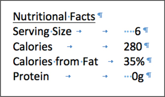
Here, you’ll format the tabbed Nutritional Facts list in the Chocolate-Covered Strawberries recipe. The tab markers have already been entered in the text, so you will specify the final location of the text. In addition, you will enter a leader character to fill the space between the text and the tab stop.
Scroll and zoom as necessary to view the recipe.
To view the tab markers in the text, make sure that hidden characters are showing (Type > Show Hidden Characters) and that Normal Mode (
 ) is selected in the Tools panel.
Using the Type tool (
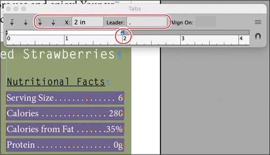
), click immediately before “Serving Size” after the “Nutritional Facts” heading. Drag to select the text through the last line, “Protein 0g.”Choose Type > Tabs to open the Tabs panel.
When a text frame has an insertion point and enough space at the top, the Tabs panel snaps to the top of the frame so that the measurements in the panel’s ruler exactly match the text. Regardless of the position of the Tabs panel, you can enter values to set tabs with precision.
In the Tabs panel, click Right-Justified Tab (
 ). This specifies that text aligns to the left of the tab stop.
Type 2 in in the X (tab stop) field, and press Tab to jump to the Leader field.
You will now create a tab leader, such as the periods that lead your eye across the page in a table of contents. In this case, you will use a space between periods to create a more open dot sequence in the tab leader.
Type a period (.) and a space in the Leader field. Press Enter or Return to complete the tabs.
The information following each tab marker in the selected text now aligns to the new tab stop, and a dotted line (of periods and spaces) helps lead the eye across the line.
Choose Type > Tabs to close the Tabs panel, and then choose Edit > Deselect All.
Choose File > Save.
Creating a numbered list with a hanging indent
InDesign makes it easy to create bulleted lists and numbered lists to clearly delineate information. Lists generally feature a “hanging indent” so that the text hangs to the right of the tab. Here, you will add step numbers to the recipe instructions.
Scroll and zoom as necessary to see the recipe at the bottom of the page.
TipClick the Options button next to the Bullets And Numbering buttons to fine-tune the numbering, bullet characters, spacing, and more.
Using the Type tool (
), click immediately before the first step in the recipe, “Wash the strawberries.” Drag to select all four paragraphs through the word “minutes.”Click the Numbered List button (
 ) in the Properties panel.
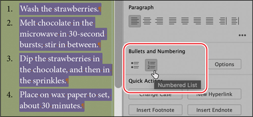
Deselect the text, and view the numbered list with the hanging indent.
Choose File > Save.
Working with paragraph shading and rules
To call attention to text within a story—such as a new subhead, a quote, or an author’s biography—you can apply a border around a paragraph, shade a paragraph, or place a rule (line) above or below a paragraph. InDesign offers many options for fine-tuning the color, placement, and look of these paragraph formats.
While you can achieve the look of paragraph borders, shading, and rules with various objects, applying them as paragraph formats offers advantages. These formats will travel with paragraphs as text reflows, and they can be included in paragraph styles for quick and consistent application across a document.
Here, you will apply paragraph shading and a rule below a paragraph. Applying a border to a paragraph is similar to applying shading or a rule above/below.
Applying shading to a paragraph
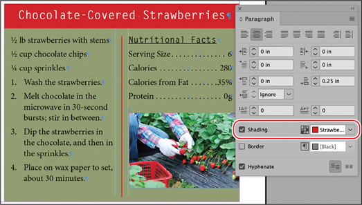
The final touch in this layout is using shading to create a reverse type effect for the recipe heading.
Using the Type tool (
), click in the “Chocolate-Covered Strawberries” recipe heading. This targets the paragraph for formatting. TipThe paragraph-shading controls are available in the Control panel as well. To fine-tune the shading, choose Paragraph Borders And Shading from the Paragraph panel menu, and click the Shading tab at the top. You can also open the Paragraph Borders And Shading dialog by Alt-clicking (Windows) or Option-clicking (macOS) the Shading Color button in the Control panel or the Paragraph panel.
Select Shading in the lower-left corner of the Paragraph panel.
To select the color of the shading, click the Shading Color menu to the right of the Shading option. Select the Strawberry Red swatch.
Choose Edit > Deselect All.
Choose File > Save.
Applying a rule to a paragraph
Here you’ll add a rule below “A BITE OF DELIGHT” at the top of the page.
Choose View > Fit Page In Window.
Using the Type tool (
), click to place an insertion point in the “A BITE OF DELIGHT” tagline.
Choose Paragraph Rules from the Paragraph panel menu.
At the top of the Paragraph Rules dialog, choose Rule Below from the menu, and select Rule On to activate the rule.
Select the Preview option. Move the dialog so that you can see the paragraph.
In the Paragraph Rules dialog, set these options:
Weight: 8 pt
Color: Stem Green
Width: Text
Type: White Diamond
Offset: .0625 in (one click of the up arrow)
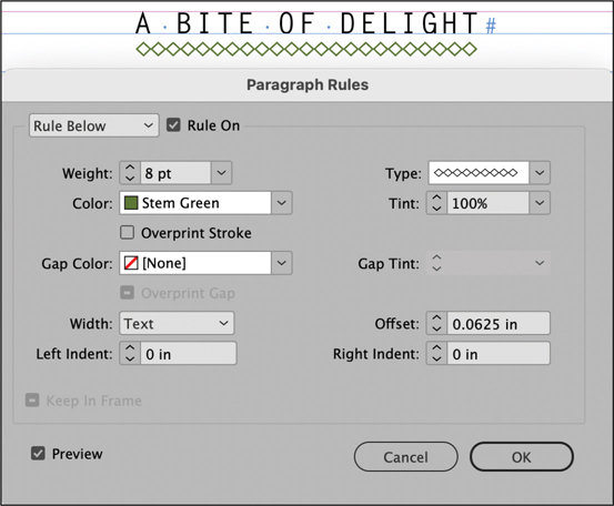
Click OK to apply the changes. A rule now appears below the tagline.
Choose File > Save.
TipTo learn more about typography and definitions of terms such as “widow,” see InDesign Type: Professional Typography with Adobe InDesign (Adobe Press, 4th Edition, 2018).
To view your results at full screen, choose View > Screen Mode > Presentation.
When you’re finished viewing the document, press Esc.

Congratulations, you have finished the lesson. To finalize this article, you would likely spend time with an editor or a proofreader to fix any tight or loose lines, awkward line breaks, runts, widows, and orphans.
Exploring on your own
InDesign provides a feature for extracting inspiration from the digital images you find around you. Place any picture in a document to extract color themes, shapes, and fonts from the image. To try this feature:
![]() Note
Note
To use the Extract From Image features, you need to be logged into a Creative Cloud account.
Create a new document of any size.
Choose File > Place. Locate MenuFontIdea.jpg, in the Lesson08 folder, and then double-click it. Click the page to place the graphics file.
Choose Object > Extract From Image > Type. Position the blue box around type on the image, and then click Find Similar Fonts.
NoteOnce InDesign finds fonts, the Find Similar Fonts button becomes the Save To CC Libraries button.
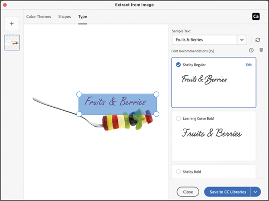
Click the other two options at the top of the Extract From Image dialog, Color Themes and Shapes, to extract colors and shapes from the image.
Review questions
1 What is the advantage of specifying a Space Before/Space After value for paragraphs rather than entering extra paragraph returns to add space?
2 What are glyphs? How do you insert them into text?
3 A drop cap affects a character, so why is it specified as a paragraph format?
4 What is a tab leader?
5 What is the difference between kerning and tracking?
6 What is the difference between the Adobe Paragraph Composer and the Adobe Single-Line Composer?
Review answers
1 Using Space Before/Space After values allows for precision spacing that can be applied consistently through paragraph styles. Paragraph returns often result in too much space between paragraphs, and they can end up leaving space at the bottom or top of a column as text flows.
2 A glyph is a representation of a character within a single font. For example, a font may provide two different options for a dollar sign, such as the two dollar sign symbols ($ and $) available in Warnock Pro. The Glyphs panel (Type menu) provides access to all the glyphs in a font.
3 Drop caps are paragraph formats because they are not specific to selected text. If a drop cap is applied to a paragraph, it remains even if the text is edited. In addition, drop cap formatting can be applied consistently through paragraph styles.
4 A tab leader is a character (or multiple characters) that fills the space between text and a tab marker.
5 Kerning adjusts the space between two characters; tracking adjusts the space between a range of selected characters. Kerning controls are available when the text insertion point is flashing; tracking controls are available when a range of text is selected. The controls are available in the Control panel and the Character panel.
6 The Paragraph Composer evaluates all lines in a paragraph when determining the best possible line breaks. The Single-Line Composer evaluates only one line at a time when determining line breaks.