IN THIS CHAPTER
Understanding Process Control Charts
Getting Budget Variances
If you've ever come across a numeric analysis technique called statistical process control you probably associate it with the notion of quality management. That's a logical association, because the technique came about as a method of monitoring manufacturing operations, of getting an early warning that a manufacturing process was going out of control. Suppose that tool wear is causing your factory to turn out o-rings with inside diameters that don't conform to specifications. You want to find out about that as soon as possible so you can take corrective action. Statistical process control (or SPC) can help you diagnose the problem early on.
Like many statistical techniques, though, SPC has applications that go well beyond those that it was originally developed for. For example, the statistical methods and experimental designs that are now used to test pharmaceuticals were originally developed to determine the best ways to brew beer and to plant crops. Similarly, you find SPC methods, originally designed for manufacturing environments, being used in the service, financial, and medical industries.
A few years ago a mid-size hospital contacted me to inquire about arranging for an Excel-based utility that would do SPC for it. The idea was to measure how well the hospital conformed to various standards such as number of accidental needle sticks, the use of restraints on patients, and arterial blood oxygen saturation levels.
But the person who bought my time, and who was responsible for putting the utility into the hospital in the first place, was the hospital's chief operating officer. And he used it to monitor budget variances.
I had never seen SPC used on budgets before and admit that I had no idea that it made sense. But it does. When the budget doesn't conform to the actual results, something's gone wrong. It could be in the planning process, or in the management of sales, or the control of expenses. SPC can help you identify that sort of problem, as well as when it started to occur, and that knowledge puts you well on the way to a solution.
In this chapter I'll try to convince you of that — and, incidentally, show you how you can use QuickBooks' budgeting and reporting tools to give you more insight on how well a company manages to its budgets.
Of course, if you're to benefit from the analysis of actual results compared to budgeted amounts, you need to have set up a budget in your company file. That process isn't explained in any detail in this book — it's more a topic for a book on how to use QuickBooks than a book on analyzing the business data found in QuickBooks. Briefly, though, if you choose Company
Budget variances aren't the only financial indicator that you can profitably analyze using SPC. It can be useful to monitor the ratios explored in Chapter 7, particularly the ratios that tend to vary frequently (and perhaps unpredictably) such as inventory turns ratios and average collection periods. Keeping your eye on these indicators using SPC will help you stop a minor problem from getting entirely out of hand.
The notion of charting a process is built on two basic characteristics:
A process has a central tendency, most typically a long-term average. The long-term average of your company's variance in its budget for monthly subcontractors expenses might be $0. Some months you spend more than budgeted, some months less, and the long-term average is near $0 if your budgets make sense and your actual expenditures are rational.
A process has spread, or variability. One month, a budget variance might be $500. Another month it might be –$750. One measure of this sort of variability is the range, and in this example the range, or the maximum minus the minimum, is $1,250.
A process control chart shows these two characteristics, along with the individual measurements, in a format that helps you visualize the quantitative nature of the process. Figure 9.1 has a simple example of a process control chart.
There are three main elements in the chart in Figure 9.1:
Center line. It represents the process's measure of central tendency, sometimes called the long-term average. It could be either the arithmetic average or the median. In the figure, it is the horizontal line representing an average budget variance of about $5,000.
Control limits. These are the two horizontal lines above and below the center line. The area that lies between these limits shows where you expect all, or nearly all, the individual data points to fall.
Individual observations. Each data point represents an observation on a particular date or range of dates such as a week.

An individual observation might itself be an average. In some processes, such as budget variances, there's only one possible observation at a particular time. You can have only one monthly budget variance for a particular account as of a particular month. In a case such as this, the data point on the control chart is that single observation. But if you're applying SPC to the inside diameters of o-rings, you might chart the average diameter of 100 o-rings on a given day.
The chart you see in Figure 9.1 is usually called an X chart. In SPC jargon, you refer generically to any given observation as "X" (just as you originally did in Algebra I). When you're charting averages (unlike here), the chart is usually called an X-bar chart. That's because the usual statistical symbol for the average of a sample is an X with a horizontal line, or bar, atop the X. As you'll see in this chapter's section on "Understanding the moving range charts," there is an MR (moving range) chart to accompany the X chart.
The control limits you see in Figure 9.1 are critically important in SPC analysis. They are always built on some measure of the variability in the process — that is, by how great an amount the individual observations differ from one another. The math that underlies SPC charts uses that measure of variability to calculate and locate the upper and lower control limits. As a result, in the normal course of events they capture over 99% of individual observations.
Therefore, if you see an individual observation that is outside the control limits, either you're looking at one of the roughly 1 in 400 that occur simply by chance, or something has gone wrong with the process.
Depending on the situation, control limits are calculated using ranges, standard deviations, or moving ranges. This section explains each approach, but not in any mind-numbing detail.
If you're new to the concept of a standard deviation, you can think of it as the average amount by which the observations in a set of data differ from the simple average of the full data set. At least, that's not a bad place to start. The properties of the standard deviation have been extensively studied and are well understood, and it has some aspects that make it a particularly useful measure of the amount of variability in a data set.
In particular, the standard deviation uses every item in a data set to calculate the variability in the data set. By contrast, the range — explained next — uses only two data points.
The range is the simplest way to estimate the variability in a series of data points. You just take the largest value and subtract the smallest value. At the time that SPC techniques were being developed, in the mid-20th century, it was important that a person be able to estimate the amount of variability in a data set simply and quickly. The calculations were usually done with paper and pencil, frequently right on the factory floor. The need for a quick and easy calculation, in a noisy and distracting environment, was a powerful argument for using the range to estimate variability.
But the range uses only two data points. Suppose you had 10 observations, as follows: 1, 8, 8, 8, 9, 9, 9, 10, 10, 10.
The range is 9. As it happens, the standard deviation is 2.66. With nine of the observations clustering at the top end of the range, within two points of one another, you can successfully argue that the standard deviation is a better expression of the amount of variability in the data set than is the range.
Nevertheless, some traditionalists prefer to use the range as a measure of variability in SPC applications.
The third way to estimate variability in a data set — at least, for SPC purposes — is by way of the moving range, and it's the method used in this chapter's examples. Its use is more or less forced on you; it's not a matter of choice or of theoretical issues, as it would be if you were deciding between using the standard deviation or the range.
As I noted earlier in the chapter, the kind of data covered here tends to have only one observation per time period. Returning to the o-ring example, you might have many o-rings to check each day. You would measure their diameters and record that information, and then calculate the standard deviation of the o-ring diameters for that day. After quite a few days of recording the data, you could take the average of all those standard deviations and the result would be the basis for the control limits on your SPC chart.
That's not feasible if you're monitoring budget variances or inventory turns. For the month of February, say, there's only one monthly budget variance for the Job Materials account, and it is not possible to calculate a measure of variability for February when there's only one observation available from February — there's nothing else for it to differ from.
It would be mathematically possible to gather all the monthly budget variances for the Job Materials account, from 1/1/1995 through 12/31/2011, and calculate their standard deviation. But that approach addresses the wrong sort of variability. You would get a standard deviation, but it would address how much the individual variances deviate from the overall average of all budget variances in the particular account.
That's not the sort of variability you're interested in here. You'd like to know as soon as you get an outlier — that is, a budget variance that's unusually large, whether positive or negative — and therefore the kind of variability you're interested in is based on the differences between each period and the next.
That difference is called the moving range. The difference in the variances for January and for February is one moving range. The difference in the variances for February and for March is another moving range — and so on. In effect, you take the average of all those moving ranges, do a little statistical hand-waving, and the result is an estimate of the process variability. (The software you use usually does the statistical hand-waving on your behalf.)
Regardless of how you calculate the process variability, via standard deviations, ranges, or moving ranges, you wind up with a value called sigma. The term "sigma" is used to mean " standard deviation," but it's employed regardless of which calculation you have used.
Suppose the calculations result in a finding that the sigma value for your budget variance process is $400. SPC charts call for a three-sigma upper control limit and a three-sigma lower control limit. That is, you multiply the value of sigma — $400 in this example — by 3, and add the result to (and subtract the result from) the long-term process average. If that average is $0, your upper and lower control limits are $1,200 and –$1,200, respectively.
The value of three sigmas is chosen because going three sigmas up and three sigmas down from the long-term average captures, as noted earlier, more than 99% of the variances for the account that supplied the variances. If you see next month's budget variance fall above the upper limit or below the lower limit, you see that either something very unusual has occurred (and after all, that does happen every few hundred time periods) or something has happened to the process of managing to the budget.
Maybe the people who work in the Job Materials department already know that they are well over budget for the month, just because they were in the room when the purchases occurred. But if you are analyzing the budget variance figures you get from QuickBooks, you can view that variance in a historical context. When you have your next meeting with that department — a meeting that might well be a testy one — you'll arrive armed with the knowledge that a budget variance of this size is a once-in-10-years event.
You often see SPC charts with more than just the three-sigma upper and lower control limits. These charts include one- and two-sigma limits in addition to the three-sigma limits. Figure 9.2 has an example.
The actual expectancies are as follows:
Between the center line and a one-sigma limit: 34.1%
Between the one- and the two-sigma limits: 13.6%
Between the two- and the three-sigma limits: 2.1%
Beyond the three-sigma limit: 0.1%
The figures just given are for one side of the chart only; that is, either above or below the center line. You double the percentages to determine the amount of observations that are expected to exist on either side of the center line. For example, 34.1% of the observations are expected to fall between the center line and one sigma above it; another 34.1% of the observations are expected to fall between the center line and one sigma below it. So, 68.2% of the observations are expected to fall between one sigma above and one sigma below the center line.
The one- and two-sigma limits are typically used with something called the Western Electric Rules. These so-called rules are simply guidelines developed in the 1950s by the Western Electric Company to help its managers make more informed decisions about their manufacturing processes.
The idea is that there are telltale signs that a process is going out of control, other than a single data point that's outside the three-sigma limits. Briefly, those telltales, or "rules," are as follows:
One observation outside the three-sigma limits.
Two of three consecutive observations outside a two-sigma limit.
Four of five consecutive observations outside a one-sigma limit.
Eight consecutive observations on the same side of the center line.

The rules become a little more stringent the closer you get to the center line. The reason is that more observations occur, just by distributional probability, between the center line and a one-sigma limit than occur beyond that one-sigma limit; similarly, more observations occur between one sigma and the two-sigma limit than beyond the two-sigma limit, Because we expect to find more observations closer to the center line, the rules get more stringent about the number of consecutive observations needed to signal a possible out-of-control situation.
Figure 9.3 shows a process made up of monthly budget variances that is going out of control.
Notice the final three data points at the rightmost end of the chart. Beside each point is the numeral 2, to indicate that the second of the four rules has been violated. Two of the three consecutive data points are beyond the two-sigma limit (see the legends at the bottom of the chart for the correspondence between a line pattern and which limit it represents).
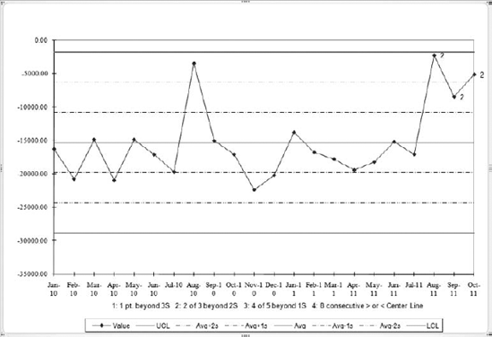
Figure 9.3. The labels by the data points, in this case at the right end of the chart, indicate which rule has been violated.
If you buy into the Western Electric rules, the violation indicated by those three data points indicates that the process has begun to go out of control. If you don't buy into them, they are nevertheless a handy way to tell that something unusual has occurred. The actual likelihood that two of these three points would be found beyond the two-sigma limit (and the third, in this case, beyond the one-sigma limit) is less than one in a thousand, unless something in the process has changed.
Usually, a change in the nature of a process is undesirable. In the normal course of events, the processes that your company runs — from manufacturing processes to financial activities — occur the way you want them to. Perhaps not optimally, but well enough that you've stayed in business. So when a process goes out of control that's probably bad enough to get your close attention.
Not always, though. So far we're dealing with budget variances. If you glance back at Figure 9.3 you'll notice that the actual values of the variances, the plotted data points, are all negative. They were calculated by subtracting the budget from the actual, so a negative value means that less was spent than was budgeted.
That's not a good situation, of course — it doesn't speak well for the budgeting process, or how well the company is managing to its budgets, or possibly both. But it's probably not as bad as spending more money than budgeted, month after month after month.
Because two variables are involved, the budgeted amounts and the actual expenditures, it would make sense to look at the budgeted amounts and actuals for the first 19 months and try to understand why the actuals were all less than the budget. And then check the final three months to determine why the variances suddenly got so much smaller. Did the budget amounts suddenly change? Did prices you pay suddenly spike?
Again, it's not necessary to think of the Western Electric guidelines as hard–and-fast rules, although many users of SPC techniques think of them in exactly that way. You can think of them as leading indicators warning you that something unusual may be going on that needs management's attention.
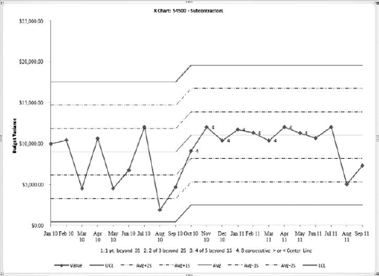
Figure 9.4 shows another example of budget variances. The data come from the Rock Castle Construction sample file, and the account used is Subcontractors (part of the Cost of Goods Sold accounts).
It's not uncommon for a single chart to have more than one rule violation. In Figure 9.4, you see a Rule 1 violation for August 2010, and a Rule 4 violation extending from October 2010 through May 2011. A Rule 1 violation, as explained earlier, is one extreme data point that lies outside the upper control limit. (You can think of the upper control limit as a three-sigma limit if you want, but upper control limit, or UCL, is the more common term.)
A Rule 4 violation is eight consecutive observations on one side or another of the center line. In Figure 9.4, budget variances stay consistently below the center line for eight straight months. Without knowing anything about Rock Castle Construction beyond its financials (it is an imaginary company, after all), you might sensibly guess that management saw that one spike in August 2010 when the subcontractors account actually went $5,000 over budget. The COO was sufficiently unhappy that whoever was responsible for subcontractors kept the actual expenditures down for the next three quarters.
I'm generally more comfortable evaluating Rule 2, 3, and 4 violations than I am Rule 1 violations. When you're looking at two of three consecutive points beyond two sigmas, or four of five consecutive points beyond one sigma, there's some confirmation built into the assessment. Those violations consist of more than just one point sticking out beyond a three-sigma limit.
After all, you're going to encounter an outlier like the one for August 2010 in Figure 9.4 every 300 or 400 observations, due to nothing more insidious than simple random chance. Apart from chance, there's always the possibility that someone made a data-entry error. But it is much less likely that several data-entry errors — consecutive errors at that — could cause a violation of Rules 2, 3, or 4. So when you do see a Rule 1 violation, you should always consider the possibility that it's benign — the result of a typographical error or the inevitable, random anomaly — and not a process that's going out of control.

If the Rule 1 violation is confirmed by other rule violations, whether earlier or later, that's a different story, and you need not be quite so blasé about the Rule 1 violation.
The process of creating control charts based on budget variances takes two main steps: calling for and exporting the QuickBooks report, and running an Excel utility based on the exported report. This section walks you through the process.
This book's Web page — you'll find the URL on the back cover — has a link to a site where you can download an Excel workbook that does statistical process control. It is stripped down and tailored specifically to the QuickBooks budget report. It's also free. Before you can use it, though, you need to get the data out of QuickBooks and into Excel. The next section shows you how to do that.

QuickBooks has a report, Profit & Loss Budget vs. Actual, that shows you in one place the budgeted and actual figures for income statement accounts over time. Figure 9.5 shows that report as run on the Rock Castle Construction sample file. This report forms the basis for the control charts that Excel will produce for you.
There are just two columns for each month: a column that shows the actuals, headed by a label that shows the month and year, and an adjacent column that shows the budgeted amounts.
Of course you need to have entered a budget in the company file before QuickBooks will even run this report. Assuming you've done that, the following steps will create the report shown in Figure 9.5.
Choose Reports

Budgets are created in QuickBooks on an annual basis. If you have created more than one budget, you'll have to select the budget year you want from a dropdown. Make your selection and click Next.
Select the Account by Month layout and click Next. In the final dialog box, click Finish. The report initially appears as shown in Figure 9.6.
The report initially appears as shown in Figure 9.6.
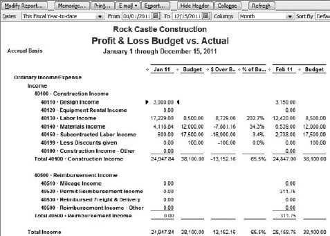
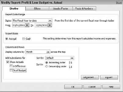
Figure 9.7. Leave the Show Actuals checkbox selected, but clear the $ Difference and % of Budget checkboxes.
As you'll see, for the purpose of running this data through an SPC routine, you'll need to adjust the report layout because the percent and dollar variances should not be displayed. Click Modify Report, and in the Modify Report dialog box clear the $ Difference and % of Budget checkboxes. Then click OK to return to the report. The Modify Report dialog box is shown in Figure 9.7.
Normally you want to compare actuals with budgets on an annual basis, which is the reason QuickBooks asks you to select a budget year in Step 2. But there's no special reason to restrict the process control analysis to a 12-month period. And generally the more data, the longer the baseline — and the more precise and the more informative the analysis.
So it makes sense to adjust the From date at the top of the report to the earliest date that the company had both a budget and actuals. The same is true of the To date: Set it to the latest date for which there are budgeted amounts and actual results. After you have changed these two dates, click the Refresh button to force QuickBooks to update the report according to the new date range you have established.
It won't do any particular harm, but if you choose a From date that precedes the month in which you first had both a budget and actual values, the control chart will display nothing of value before it reaches a date that has a true variance. For example, if you had neither a budget nor actuals for an account before January 2009, including 2008 in the report will cause 12 months' worth of $0 variances to appear in the chart. And all those zeros are used in calculating the moving ranges used to establish the location of the control limits, so including too early a start date can result in control limits that are based in part on meaningless data.
Unless you know beforehand when both budgeted and actual amounts were recorded in QuickBooks, the best approach is to specify a fairly early From date and the final complete month as the To date. Examine the resulting report so that you can locate the date where you want the control chart to begin, and adjust the From date accordingly. (Don't forget to click Refresh.)
Now the report is in shape to export. Click Export and choose to export to a new Excel workbook. When the export is complete, switch to Excel, which will show you a worksheet that looks like the one shown in Figure 9.8.
If you don't see the header information on the worksheet, it is sent instead to Excel's Page Setup options. Don't worry about it: The SPC software allows for the header's presence or absence on the worksheet.
It often happens that when you export a report from QuickBooks to Excel, you need to rearrange the data before you can do further analysis. The reason is that many QuickBooks reports show dates left to right; that is, a column for January is followed by a column for February, then one for March, and so on. The rows in the report typically represent accounts or transactions, depending on whether you have chosen a summary or a detail report.

Figure 9.8. Notice the active cell: Your choice of account here determines which account is analyzed.
But Excel analyses in general, and charts in particular, prefer that the data be turned 90 degrees from the QuickBooks orientation. For example, Excel considers a COGS account as a field, and the dollar amounts for COGS from month to month as records in that field. Most of Excel's analysis tools work best, and some work only, if the data is laid out with a field occupying a column and individual observations for that field occupying different rows in the column. Because a QuickBooks report has a field — in this example, the COGS account — occupy a row, and has individual monthly actuals for that account occupy different columns, it's just the reverse of what you need in Excel.
So you often have to use the Excel interface to transpose the data in a QuickBooks report. The SPC utility that you can obtain via the Wiley Web page for this book takes care of all that for you. Just export the report to Excel and click the SPC Charts item, as described next.
With the report ready for analysis, you need to open the SPC workbook you obtained from this book's Web site. That workbook contains code written in Visual Basic for Applications (VBA, for short). The code puts the data that you exported from QuickBooks through some preliminary routines, calculating the budget variances and the moving ranges, testing for violations of the Western Electric Rules, and so on. Then it creates the process control charts shown earlier in this chapter.
The code just mentioned is what Microsoft Office applications terms a macro. It's not a particularly accurate term, but it's a legacy of the earliest versions of Excel when there really was an Excel 4 macro language. It was arcane and comparatively weak, and when Microsoft replaced it with support for the Visual Basic programming language, the term "macro" was retained.
Visual Basic is much more powerful than the old Excel 4 macro language, and brings with it the possibility of doing genuine harm to someone's data, if the person supplying the code is so motivated. Therefore Excel warns you if you're opening a workbook that contains macros, and if you see that warning message you should not finish opening the workbook unless you trust its source.
When you open a workbook that contains macros, you should see a warning to that effect.
I say should because it's possible that Excel's security level has been set so low that you see no warning. That's a bad idea, and if you see no warning when you open the SPC workbook you should stop and do nothing else with Excel (and possibly other Microsoft Office applications) until you have your arms around the macro security issue.
If you're using Excel 2003 or earlier, the macro warning comes in the form of a message box and it's hard to miss. You can choose to disable macros, enable macros, or request more information. In the case of the SPC workbook, you can safely enable the macros.
If you're using Excel 2007, under most circumstances the warning is a good bit more subtle. Between the Ribbon and the worksheet grid you'll see the message bar informing you that the workbook's macros have been disabled. Click the message bar's Options button, choose Enable this Content, and click OK.
After enabling the macros, select the cell with the name of the account you want to analyze. Because of the way QuickBooks justifies the account names in the cells of an exported report, you might want to double check that you have the right selection by looking at the formula box at the top of the worksheet — that box always shows the contents of the active cell.
Your next action again depends on the version of Excel that you're running:
If you are running Excel 2003 or earlier, choose Data
If you are running Excel 2007, click Add-Ins on the Ribbon. (The Add-Ins tab appears when you open a workbook that contains macros, and choose to enable them.) The Add-Ins tab has a group labeled Menu Commands, where you'll find SPC Charts. Click it.
After you've clicked the SPC Charts menu item, Excel takes over, and the first thing it does is check to see whether your exported report is laid out properly with actual dollar amounts alternating in columns with budgeted amounts. If it finds that the columns are not laid out as it wants, Excel displays a message about the layout and the macro stops running. You'll have to switch back to QuickBooks and re-create the report, this time with the percent and dollar difference checkboxes cleared.

After Excel completes its check of the report data layout, it displays the dialog box shown in Figure 9.9.
Figure 9.9 shows the Analysis Options tab only (see Figure 9.11 for the Labels and Formats tab). The three checkboxes under Chart Limits are not mutually exclusive. Their effects are described shortly.
The first checkbox, Show All Control Limits, determines whether all six control limits are shown in the chart. If you select the checkbox, all six limits (lower control limit, −2 sigma, −1 sigma, +1 sigma, +2 sigma, and the upper control limit) appear in the chart. Seeing all the limits in the chart is particularly helpful if you're using the Western Electric Rules as guidelines to what's happening with the budget variance process.
This checkbox controls the placement of the center line and control limits when one of the Western Electric Rules has been violated. The idea is that when that occurs, the average level of the process has shifted, either up or down. In that case, subsequent observations should be evaluated according to the location of the process's new measure of central tendency.
The center line is shifted to a level that is the average of the data points that caused the rule violation, and the control limits are also relocated. Figure 9.10 shows an example of how this effect can appear in a control chart.
In Figure 9.10, notice that the eight points that are labeled as Rule 4 violations are all above the center line where it was located prior to the X shift — and it's those points that cause the shift. The center line's new location is the average value of those eight points.
Before adopting a shift in level such as the one shown in Figure 9.10, there are various statistical tests that should be run. Because the SPC workbook that is made available to you works only with budget variances, and not high precision machining tolerances or measures of pharmaceutical product quality, those tests are not so critical. You might find it useful to allow the process to shift level in response to a rule violation.
Suppressing Rule 1 Violations checkbox
This checkbox is implied by a previous section, "Interpreting the Rule 1 violation."
The option is disabled unless you choose to implement X shift analysis. If you select the Suppress Rule 1 option, and therefore if you have chosen to implement X shift analysis, any Rule 1 violations found will not cause a shift in the location of the center line and the control limits.
I have had enough clients complain about typographical errors causing Rule 1 violations in their SPC charts that I've provided this option. The point in question gets charted, of course, as does the data label 1 next to the data point. But while the other rule violations shift the locations of the center line and control limits, the Rule 1 violation does not.
You are reminded of this setting in the legend at the bottom of the chart. Instead of a brief reminder of the meaning of a Rule 1 violation, you see the message, in red and boldface, that the rule has been suppressed.
The starting point options pertain to where the X chart's center line is initially placed; that is, the center line's value as of the first date that's charted. Your choice here can have a profound effect on the charted results. Whichever option you choose will determine the value of the first point of the center line, and, unless you choose X shift analysis, it will determine all values of the center line.
In turn, that determines the locations of the various control limits. They are always offset by a constant amount from the center line, so your choice affects the location of all control limits in the chart. Because process control charts evaluate individual data points in terms of the Western Electric Rules, and those rules are based on the location of the control limits, your choice will affect whether the individual budget variances are regarded as rule violations.
The good news is that if you don't like how a chart behaves as a result of one choice of a starting point, you can close the workbook that contains the chart and create another. You don't need to start over with a new QuickBooks export. Just select the exported report in Excel and click SPC Charts again, choosing a different starting point option.
The term "average" here means the usual arithmetic mean; that is, the total of all the budget variances in the chart divided by the number of variances. This option is often the most useful starting point. Unless your data is highly skewed from the theoretical normal distribution, you wind up with fewer rule violations if you select the Average as the starting point.
If you find that you get more rule violations than you would have expected from using Average as the starting point, and if those violations are found mostly on the same side of the center line (either above it or below it), consider using the Median instead. A skewed distribution of budget variances causes a center line based on the Average to occupy a position in the chart that isn't really in the center. The median, the value of the budget variance that is the 50th percentile among the charted budget variances, could bring better balance to your control chart.
In an ideal world you would have a set of budget variances that were all zero. The people who manage the various accounts would either take in or expend money exactly in accord with the budget. This isn't an ideal world, but you're probably still shooting for budget variances that are as small as possible — certainly on the expense side of the equation.
Setting Zero as the starting point in the chart tends to emphasize it as a goal for the process. Variances that cling closely to the center line when you select Average as the starting point might appear as rule violations when you start with Zero.
This option has greater usefulness in manufacturing applications, when you're trying to measure conformance to particular process specifications and zero has meaning as a physical measure of departure from a specification.
The intent of this option is similar to that of the Zero option. If you have identified a goal, perhaps not as ambitious as zero, for budget variances, select this option and enter the value of that goal in the associated edit box. Now when you continue with construction of the chart, the individual data points — the budget variances — are located within control limits based on the location of the custom value you entered, and which appears as the value of the center line.
Figure 9.11 shows the Labels and Formats tab of the Control Chart Analysis dialog box. The specific options are as follows.
Use this edit box to enter any label you want to appear at the top of the control chart. It defaults to the name of the account that you selected just before calling SPC Charts. If you want to use some other label, just drag across the default value with your mouse pointer and type the verbiage you prefer.
Anything you type into this edit box is used as a label for the vertical, Y-axis at the left of the chart. There is no default label as there is for the Chart label. If you leave the edit box blank, the label "Value" appears to the left of the Y-axis.
You can select only one of the format options for Y-axis labels in the edit box. These labels help you determine where the center line and control limits, as well as the individual data points, are located on a numeric scale. When you see the chart, if you don't like the appearance of the labels, you can always change their format using the Excel user interface. The quickest way is to right-click the Y-axis and choose Format Axis from the contextual menu.
Select this option if you want to show labels in the chart's vertical, Y-axis with dollar signs and thousands separators. Neither decimal points nor cents appear.
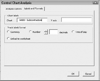
Figure 9.11. These options have no effect on the analysis. They control only the appearance of the results.

Figure 9.12. Compare with Figure 9.11. This chart does not call for an X shift, and you can see the Rule 4 violations above the original center line location.
Select the Number option if you want to omit the dollar sign from the Y-axis labels. You can also use the spinner to control the number of decimals displayed in the labels. (The spinner is disabled until you select the Number option.) Click the ▲ button to increase the number of decimals, and the ▼ button to decrease it.
This option causes Excel to use the same format for the axis labels as is used in the worksheet. In turn, that is determined by options you choose in QuickBooks when you create the report.
Figure 9.12 shows a control chart with the account name in the chart label, the phrase "Budget Variance in Dollars" as the Y-axis label, and currency as the Y-axis label format.
When you run the SPC Charts utility, you see the X chart that has been covered extensively in this chapter. That chart, of course, plots individual budget variances over time, and shows where they fall in the context of the various control limits that Excel calculates.
If you recall from the "Control limits" section early in this chapter, the moving range creates a measure of the variability in the process you've presented to Excel. Because there is one measure only per time period, the only way of quantifying the right kind of variability is through the moving range. With only one measurement possible on a given date, there is no within-date variability.
The situation is different when there are many possible measures available at any time, and that's the typical situation in manufacturing. A random sample of 10 or 20 items from a job lot provides those measures, and the analyst can apply either the standard deviation or the range to those same-date measures.
That sort of situation makes it important to look not only at the X-bar chart, which shows each average, but also the S chart, which shows each standard deviation. It is possible for compensating defects on a given day to cancel one another out in the average measurement, and the only way you'd recognize that had occurred is by way of the S chart.
Suppose that on a normal day, people on the factory floor sample 10 o-rings from the production line and measure their inside diameter; they typically find that the diameter is anywhere from 1.7 cm to 1.8 cm. They report the summary statistics to you, and on most days you note that the average is about 1.75 cm and the standard deviation is about 0.03 cm.
Today, though, you see that the quality report shows the usual average of 1.75 but the standard deviation is 0.1, more than three times normal. Looking more closely at the data, you see that of the 10 o-rings, one had an interior diameter of 1.9 while another had 1.5. These measures are outside the process specifications, and it's possible that 20% of today's entire run might be out of spec.
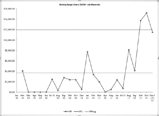
Figure 9.13. This MR chart does not suggest that the moving ranges jump around much until the final three dates.
You wouldn't have caught the problem if you'd been looking only at the average measure, the amount that plotted on the X-bar chart. But it would appear in the S chart, where you would see a long line of standard deviations close to 0.03 and then one from today's run of 0.1 — a sore thumb.
In principle you can draw the same sort of conclusion from a moving range (MR) chart when you have one observation only for each date. Nevertheless, the MR chart cannot tell you much more than you have already learned from the X chart. When two consecutive observations are relatively far apart, you know that the associated moving range value is relatively large. When the observations are relatively close, the associated MR is fairly small.
Still, it's a good idea to keep an eye on the moving ranges, and they are found on a chart sheet adjacent to the X chart. (See Figure 9.13.)
In this particular MR chart, the final three observations are wildly discrepant, and a sample manager at this sample company should have a close look at what's going on with the budgets and actuals to create such large swings during the most recent three months. (If you open the Rock Castle Construction sample file and run the Budget vs. Actual report, you'll see that the issue appears to be the budgeted amounts.)
You should keep in mind these three aspects of moving range charts:
The moving range is always a positive number because it is defined as the absolute value of the difference between two consecutive observations. The reason for using absolute value is that the average of the moving ranges themselves tends to approach zero unless the data series is trended; that is, the level of the series is continuously increasing, or continuously decreasing. The result of using raw moving ranges would be a gross underestimate of the amount of sequential variability in the data series.
This rationale is similar to the use of squared deviations when calculating a standard deviation. If you totaled, and averaged, the raw deviations of each observation from the mean of the observations, the result would always be zero. Therefore, the deviations are squared before summing them and the result is always a positive number. (The standard deviation is the square root of the average squared deviation.)
Because the moving ranges are always positive, due to the use of the absolute value of the difference, there is no real lower control limit in an MR chart (or a range chart or a standard deviation chart, for that matter). The lowest possible value is 0, and it is used as a floor value for the chart.
Notice in Figure 9.13 that the only control limit shown is the upper control limit; there is no one- or two-sigma control limit. The reason is that moving ranges tend to be autocorrelated; there tends to be a nonzero correlation between, say, moving ranges number 1 through 10 and moving ranges 2 through 11. This fact has implications for probability statements about the distribution of the moving ranges, and it's those statements that form the basis for locating the control limits. To attempt to distinguish reliably between one-, two-, and three-sigma limits on a moving range chart, in the way that is done on an X chart, is asking more of a handy diagnostic tool than it can deliver.
Every Excel chart must have data behind it to form the plotted data points and to help structure the chart's axes. The SPC Charts utility makes that data available to you in a worksheet named Data for Charts. The worksheet that is the basis for the X chart and the MR chart shown in Figures 9.12 and 9.13 appears in Figure 9.14.
The data in the worksheet is always laid out in this fashion:
Column A: The date on which the measurement occurred.
Column B: The measurement itself. This would occupy several columns in an X-bar and S chart context, with multiple observations per period.
Column C: Always blank.
Column D: The individual data points plotted in the chart. In an X-bar chart, these values would be the average of the multiple observations.
Column E: The moving ranges calculated from the actual observations (the budget variances). The first moving range occurs at the same period as the second data point because it's not until then that a moving range can be calculated.

Note
The calculations for all the control limits in the X chart and the MR chart are made using the average moving range. If you're interested, you can find the details in most textbooks on the topic of quality control.
Column F: The upper control limit for the X chart.
Column G: The upper 2-sigma control limit for the X chart.
Column H: The upper 1-sigma control limit for the X chart.
Column I: The upper control limit for the MR chart.
Column J: The center line for the MR chart.
Column K: The lower control limit for the MR chart, always set to zero.
Column L: The center line for the X chart.
Column M: The lower 1-sigma limit for the X chart.
Column N: The lower 2-sigma limit for the X chart.
Column O: The lower control limit for the X chart.
As mentioned at the beginning of this chapter, there are other sorts of QuickBooks data that can profitably be analyzed using the techniques explained here. You will need two basic tools not covered here:
A utility similar to the one you can download via Wiley's Web site. The utility should not be tailored to the particular layout of the Budget vs. Actual report, as is the SPC Charts utility. There are many such utilities available on the Web, some free and some not. If you investigate this matter, bear in mind that price is not necessarily an indictor of quality. The R application, a suite of extremely sophisticated statistical analysis procedures, is free. (It's also unusually difficult to use.)
You will also need a method of converting the data in a QuickBooks report to a layout that the SPC routine you acquire can deal with. The utility detailed in this chapter manages that conversion using Visual Basic for Applications to place the data properly in Excel worksheets. Another very workable approach is to use Intuit's Software Development Kit, explained in detail in Chapters 11 and 12.
If there's an indicator that's of particular interest to you, though, you don't need to get all tied up with programming anything at all. Just start collecting that indicator on a regular basis in an Excel workbook. Update the history as needed — daily, monthly, quarterly, whatever — by running the appropriate QuickBooks report and transferring the latest indictor value to your Excel workbook. Then run an SPC utility against that data. I am not oversimplifying this process — it really is that straightforward.
Possible indicators that you might consider putting through an SPC routine and that are easily available from QuickBooks reports include:
Total asset value of an inventory item at the end of each week, or month.
Average collection period for Accounts Receivable
Total sales per month
Sales by item per month
Total discounts for early payment of vendor bills
Accounts payable by month
Current ratio by month
The possibilities are limited only by what reports QuickBooks offers — and it's really a pretty broad set of reports — and by the directions that your inquisitiveness leads you.