IN THIS CHAPTER
Reasons for Comparative Analysis
Using QuickBooks to Create Comparative Financial Statements
Combining Vertical and Horizontal Analyses
Making Comparisons to Other Companies
Chapter 1 touches briefly on the reasons you might want to use QuickBooks to prepare financial statements such as comparative balance sheets and comparative income statements. That chapter also goes into detail on the mechanics of structuring that kind of statement in QuickBooks. This chapter goes into the rationale for comparative statements in more depth, and explains how that rationale helps you decide how to structure those statements.
In its simplest form, a comparative financial statement merely shows you two, or occasionally three, periods of financial data so you can compare across time periods the results of doing business. In theory, the periods could represent anything from days to decades, but in practice people usually look at years or quarters. Of course, both periods should be of the same duration, so you would compare Year 3 with Year 4, or Quarter 1 with Quarter 2.
If it's year-end and you want to compare last year's income statement with this year's, it seems that the thing to do is to use QuickBooks reports to print a couple of income statements. The dates would be January 1 through December 31 for each year. Then just look at them and see what's changed.
Suppose you do just that with a merchandising company, and find that the company's COGS (cost of goods sold) increased by $230 from one year to the next. That doesn't seem like much. It's so small, in fact, that it could even be the result of cumulative rounding errors in QuickBooks' average cost algorithm.
But what if you also noticed that the company's revenues increased by $60,000 from Year 1 to Year 2? Does that put an almost-constant COGS value in a different light? How can revenue increase by $60,000 while COGS increases by $230? If you're genuinely interested in what's going on with this company, you have some spadework to do.
It's for that sort of reason that comparative financial statements often express raw dollar amounts both in dollars and in percentages. When you express several dollar amounts — one amount for each account, usually — as percentages, all the percentages must use the same basis; else, you find yourself trying to compare 25% of one thing with 15% of another.
To say that the percentages must have the same basis doesn't mean that the basis must be the same number, but it must be the same kind of measure. You would divide the income account amounts for Year 1 by total income in Year 1, and those for Year 2 by total income in Year 2.
This approach, which casts the dollar amounts in the common metric of percentages, is called common sizing. Its use makes comparative statements more informative. Furthermore, it makes it possible to compare one company's financials with the published financials of another company, or even group of companies, usually from the same industrial grouping or Standard Industrial Classification (SIC).
Now, if you find that COGS is 47% of sales in Year 1 and 38% of sales in Year 2, it doesn't much matter what the actual dollar amounts are. As a percentage of sales dollars, there's a large year-over-year dropoff in COGS. Did the company emulate Southwest Airlines and use hedging strategies to lock in low costs before increasing its sales prices in Year 2? Did the company make a major purchase, enough to fulfill sales for two or more years, early in Year 1?
To find the reason for the apparent disconnect between COGS and revenue, you'd have to take a look at the balance sheet in addition to the income statement. Of course, you should use a comparative balance sheet and it should also be common-sized. It's typical, and most useful, to common-size an income statement by total income, and to common-size a balance sheet by total assets.
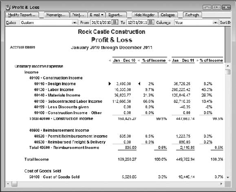
Suppose you want to examine Rock Castle Construction's income statement (also known as its Profit & Loss report) for two consecutive years to compare its performance year-to-year. One way is to call for a Profit & Loss Prev Year Comparison report. An excerpt from the report appears in Figure 4.1.
Notice the dates that head the two columns of actuals. The report was run December 15, 2011, and the current fiscal year is not quite over. QuickBooks calls the column that contains the previous year's data a subcolumn. A subcolumn uses the same date range as the main column. Therefore, in Figure 4.1 the main column (January 1 through December 15, 2011) and the sub column (January 1 through December 15, 2010) are based on the same 349-day range within consecutive years.

Figure 4.1. The change columns are both year-to-year; note that the more recent year's actuals are on the left.
Note
You can verify that the prior year's data is shown as a subcolumn, not a column, by clicking the report's Modify Report button. In the Modify Report dialog box, notice that in the Subcolumns area, the Previous Year checkbox has been selected. This is the default setting for both the Profit & Loss and the Balance Sheet Prev Year Comparison reports (see Figure 4.2 for an example).
The report in Figure 4.1 shows the actual dollar values in each income and expense account during each year, and it also shows the dollar and percent changes, account by account, from year to year. The report supplies good information but it's not all you want. The percentages, for example, are strictly year-over-year changes, following this pattern:
($ Year 2 - $ Year 1) / ($ Year 1)
That is, for each account, subtract the value for Year 1 from the value for Year 2, and divide the difference by the value for Year 1. It's helpful to know that, and you'll want it for a full analysis, but it's horizontal only, a measure of year-to-year change. For a fuller picture you need a vertical analysis, which shows you how each account contributed to total income (or to total expenses) during each year.

The vertical analysis is necessary because it gives you a context for interpreting a year-to-year change. An account that shows a 300% growth rate year-to-year is exciting at first glance, but when you find that the same account is responsible for 0.5% of total income, you're less excited about its growth rate.
The Profit & Loss Prev Year Comparison report shown in Figure 4.1 does not provide information about percentage of total income. For that information you might resort to the Profit & Loss Standard report (see Figure 4.3).
The report in Figure 4.3 is abbreviated, to fit in this book's page size. It omits two columns at the right, which on screen would show each account's total dollars for two years and its percent of the two-year income.
The four visible numeric columns show, for both 2010 and 2011, the actual dollars and the percent of income in each account. (The income referred to in the % of Income column headers is Total Income, sometimes labeled Revenue or Total Sales. Whatever term used, it is the proper basis for component percentages in a comparative Profit & Loss report.)
Those percentages represent the data missing from the Profit & Loss Prev Year Comparison report shown in Figure 4.1. The columns that show the percent of income accounts give you the component percentage of each source of income during each year. For the expense accounts, they show what percentage of total income is used to pay for the various expense categories that help produce revenue.
The Profit & Loss Standard report is not a complete comparative report because it's missing the year-to-year change data shown in the Profit & Loss Prev Year Comparison report. And there are problems with its legibility. It's slightly more difficult to compare the percentages for Year 2010 with those for Year 2011 because they are separated by the dollar amounts for Year 2011.
You cannot get the vertical (account by total income) and the horizontal (year-to-year change) analyses in one QuickBooks report. The reason is that QuickBooks shows year-to-year change as a percentage only for the combination of a column with a subcolumn: for example, in the Profit & Loss Prev Year Comparison report. But QuickBooks does not analyze percent of income for a subcolumn. And the % of Row option (see Figure 4.2) is not helpful because it is not a rate of change but a component rate: For example, the % of Row option might tell you that 25% of the total two-year COGS was spent in Year 1 and 75% in Year 2.
Nor is the Custom Transaction Summary report an answer. It is possible to structure that report with rows that show Income Statement accounts and columns that show annualized results. But it does not provide a percent of total income analysis — only a percent of column analysis, and those two are very different things. With income and expense accounts as the report's rows, the % of Column option shows each row's dollar amount as a percent of net income, not total income.
Still, you have one report that shows the year-to-year changes and another that shows the figures for percent of total income. Why not run both reports and combine them somehow, perhaps by exporting them to Excel? There are at least two good reasons not to do that, explained next.
If you intend to combine or compare two or more different QuickBooks reports, you must take care that they use the same date ranges. For example, suppose you open a Profit & Loss Prev Year Comparison report, when today's date is December 15, 2011 and you're not quite to the end of the fiscal year. Both the main column (for the current year) and the subcolumn (for the previous year, 2010) capture data for the first 349 days of the year, January 1 through December 15.
Then, you want to compare that report with a Profit & Loss Standard report, for the same two years. You use a different report (Standard instead of Prev Year Comparison) because you want the % of Income column. The % of Income information is available only for columns, not sub-columns (various aspects of this distinction are explained later), and the Prev Year Comparison report shows the prior year as a subcolumn. Therefore you cannot get % of Income for both years in a Prev Year Comparison report.
So you open the Profit & Loss Standard report, set the date range to start at January 1, 2010, and set the columns to display by Year. You click Modify Report and in the Display tab, call for % of Income, and click OK.
Now you're ready to compare the Profit & Loss Standard report with the Profit & Loss Prev Year Comparison report, but there are two problems that make a comparison tricky: the order in which the report displays the dates, and ensuring that all the pertinent accounts appear.
The Profit & Loss Prev Year Comparison report shows 2011 figures to the left of 2010 figures. This is because the report shows 2010 as a subcolumn, and a subcolumn appears to the right of a main column. In contrast, the Profit & Loss Standard report, structured as just described, shows two main columns, one for 2010 and one for 2011. When both years are shown as main columns, QuickBooks puts them in chronological order, left to right.
So when you compare the two reports you'll need to keep in mind that their column order is not the same.
The second difficulty in comparing the two reports arises in a Profit & Loss report, which displays cumulative data, but not in a Balance Sheet report, which displays balances as of a particular date. The Profit & Loss Prev Year Comparison report provides a subcolumn based on the same dates, one year earlier, as are used for the main column. So if the main column's end date is 12/15/2011, the subcolumn's end date is 12/15/2010.
The same is not true of a Profit & Loss Standard report, where you set the date range to capture everything from 1/1/2010 through 12/15/2011, and you display columns by Year. In this case the column for 2010 captures activity for the full 365-day year, but the Prev Year Comparison report shows only the first 349 days of 2010.
There are various ways that the difference in date ranges for the two Profit & Loss reports, Standard and Prev Year Comparison, can throw you off. One way is that the only activity in an account for 2010 might occur after December 15. The default option for displaying rows in a report is to show active rows only. Therefore, you might wind up with account activity in the Profit & Loss Standard report (which shows data through 12/31/2010) but not in the apparently complementary Profit & Loss Prev Year Comparison report, where the 2010 subcolumn stops at the same date as the main column, December 15.
The way to manage the problems concerning date ranges, and at the same time create a more readable report, is to stick with one report. You export its data to Excel to complete the analysis. That way you don't have to worry about inconsistencies in the two reports that are due solely to the way that reports are structured. The process of exporting one report and completing the analysis in Excel is detailed in the next section.
You'll still need two reports, a Profit & Loss and a Balance Sheet, but you'll find that you need to export only one of each.
The most straightforward way to get the data out of QuickBooks and into Excel is to export two reports. One is a Profit & Loss Prev Year Comparison report that has a main column for Year 2 and a subcolumn for Year 1. This enables you to call for the previous year comparison, both in dollars and in percentages. You also want a similarly structured Balance Sheet report. You could get Excel to make those prior-year comparisons for you, but there's little reason not to leave the comparisons to QuickBooks. (There is one potential problem though; see the section "The trouble with the SIGN function.")
You'll also want each account as a percentage of income, for the Profit & Loss report, and as a percentage of total assets, for the Balance Sheet report. It's those comparisons that you'll get Excel to make for you.
Here are the steps to get the data out of QuickBooks and into Excel. The process is broken into two main tasks: exporting the Profit & Loss and exporting the Balance Sheet. Within each task you'll find steps first for exporting the report and then for completing the calculations.
This example continues to use the Rock Castle Construction file, a QuickBooks sample file. When you open a sample file, QuickBooks sets the effective date to a particular date, and this example uses December 15, 2011 as the effective date. The following steps allow for that setting.
To export the Profit & Loss, follow these steps:
Choose Reports

The report opens. Change the date in the To edit box to December 31, 2011. (More generally, change the To date to the end of the current fiscal year.)
Click the Refresh button to force QuickBooks to update the report to capture the full year for both 2011 and the previous year, 2010.
Verify that the report shows raw dollar amounts for 2011 and 2010, the year-to-year dollar change and percent change.
Click the Export button.
In the Export Report dialog box, choose A New Excel Workbook. Clear the Include a New Worksheet checkbox.
Click the Advanced tab in the Export Report dialog box.
In the Advanced tab, select the Send Header to Screen in Excel. If necessary, clear the Space Between Columns checkbox.
Click OK to complete the export.
If Excel is not already running, the application starts. A new workbook is added to any open workbooks and the data from the QuickBooks Profit & Loss Prev Year Comparison report is written to a worksheet in that workbook. Switch to Excel and verify that the exported report resembles the one shown in Figure 4.4.
Step 8 advises you to use the Advanced tab option labeled Send Header to Screen in Excel. That's a mildly misleading label. QuickBooks always sends report headers to Excel, including the report title (such as Profit & Loss Standard), the pertinent From and To dates and the basis for the figures (accrual versus cash). QuickBooks sends that information either to the worksheet that contains the report data, or to Page Setup.
When QuickBooks sends the header to the Screen, the header actually goes to the worksheet. In that case the header information occupies the worksheet's first few rows. When QuickBooks sends the header to Page Setup, it is stored not in the worksheet itself but as data that's shown only when you print, or print-preview, the worksheet. Stored as page setup information, it's available to you but out of your way when you're editing the worksheet.
Step 8 suggests that you put the header information in the worksheet, just to keep it straight which report you're looking at.
If you find the information is in your way in the worksheet, just delete the rows it occupies. Page Setup is the default destination, so simply skip setting the header option in the future.
Tip
To edit a header that's already been sent to Excel's Page Setup, choose File
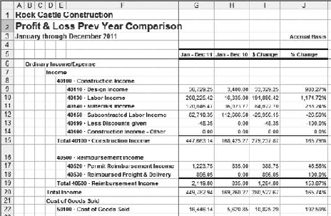
Figure 4.4. Exporting the report title is a good way to keep track of which QuickBooks report you're looking at.
Step 8 in the prior list also advises you to clear the Space Between Columns checkbox. If the checkbox is selected, QuickBooks places an empty column between columns that contain data; some people prefer this arrangement as visually clearer. However, it can complicate matters if you intend to add formulas to the worksheet and the formulas rely on data found in different columns. That's the case here, and you'll find it easier to create, and duplicate, the formulas if you have omitted intervening, blank columns.
So far, you have exported the account names, dollar amounts for each of two years, and the dollar and percent changes year-to-year. It remains to get the percent of total income represented by each account. To do so, take these steps:
Using a worksheet layout such as that shown in Figure 4.4, enter this formula in cell K9:
=IF(G9<>"",G9/G$20,"")
If necessary, re-select cell K9. Click the Percent Style button in Excel's Formatting toolbar; if you're using Excel 2007, click the Home tab, then click the Percent Style button in the Number group.
Position your cursor over the small black box in the cell's lower-right corner (the box is called the fill handle). Your cursor turns into a crosshairs.
Drag one column to the right, and release the mouse button. You should now have two percent values appearing in cells K9:L9, the result of dividing Design Income by Total Income, for 2011 in column K and for 2010 in column L. The process described in this step is called autofill.
Make the multiple selection of cells K9:L9. (To make a multiple selection of these two adjacent cells, select K9, continue to hold down the mouse button, drag into L9, and release the mouse button.)
The fill handle will now appear in the lower-right corner of cell L9. Click it and, while holding down the mouse button, drag down to the end of the report. Release the mouse button.
In row 5 (and row 6 if necessary) add descriptive labels for the component percentages in columns K and L.

Your worksheet should now resemble the one shown in Figure 4.5.
It will help to examine the formula in Step 1 more closely. It's usually best to examine a formula from the inside out, so start with this fragment of the formula as it's first entered into cell K9 in Figure 4.5:
G9/G$20
This fragment returns the result of dividing the value in cell G9 by the value in cell G20. In this case, the expression divides the total Design Income during 2011 by the Total Income for 2011, or 8.17%.
The dollar sign between the G and the 20 in G20 anchors the formula to row 20. No matter where you copy and paste this formula, the divisor is found somewhere in row 20.
For example, if you look at the formula as it's autofilled into cell K10 (one row down from K9), you'll find this:
=IF(G10<>"",G10/G$20,"")
The numerator in the division expression now refers to G10, one row down from where you originally entered it. But the denominator is still a cell in row 20, and that's because of the dollar sign. It anchors the row reference.
Note
This type of Excel cell reference is called a mixed reference. If there were no dollar sign at all, it would be a relative reference. If both the column letter and the row number were preceded by a dollar sign, it would be an absolute reference. The F4 key makes it easy to cycle through a sequence of reference types: Select the reference you want to change and press F4 repeatedly. So doing cycles the reference through the styles A1, $A$1, A$1, $A1, and back to A1.
Now enclose the division expression in an IF structure. The IF function has this syntax in Excel worksheets:
=IF(Condition, Result if Condition is TRUE, Result if Condition is
   FALSE)
In cell K9, the condition is:
G9<>""
This expression is TRUE if cell G9 contains any value or formula, and FALSE otherwise.
If the condition is TRUE, the result is the division expression:
G9/G$20
If the condition is FALSE, the result is the empty quotation marks:
""
Suppose first that G9 contains a numeric value, as it will when row 9 represents a particular account such as Design Income and not a category of accounts such as Construction Income. In this case you want to calculate a percentage based on the value in G9. (Because QuickBooks faithfully keeps dollar amounts in different columns than labels such as account names, you can be confident that you won't find a dollar amount in G9 and a label in G10.)
So, when the condition is TRUE, because G9 contains a value, show the result of the division expression in K9, because that is the result when the condition is TRUE.
On the other hand, suppose there's nothing in cell G9. It's empty, as indicated by the empty quotation marks in the condition. Then the condition is FALSE, and Excel shows the result for a FALSE condition. As the formula is written, it's a blank — again, the empty quotation marks.
When there's nothing in cell G9, putting the division expression in cell K9 results in the value 0: If you divide a blank cell by a numeric value, the result is 0. If you do not test for blank cells in the numerator, you get a 0 in every cell, such as K16, where the corresponding cell in column G is empty — that's an undesirable outcome. It's uninformative and it clutters up the analysis.
Therefore, the formula tests for a value in column G of the current row. If the formula finds a value there, the division is performed and the result displayed. If the formula finds no value in the current row of column G, the IF test returns, and displays, a blank. You could characterize all this as cosmetic. You could also characterize it as an effort to make the analysis legible.
Notice in the worksheet in Figure 4.5 that columns J, K, and L contain the relevant percentages: percent change, percent of total income for 2011, and percent of total income for 2010. Because they are adjacent, it is much easier to compare them than in the original QuickBooks reports. Furthermore, the gridlines help you read across from a percentage that gets your attention to the actual dollar amounts that underlie the percentages.
And the columns are in the same year order: Columns G and H show 2011 and 2010, respectively, as do columns K and L. That's not the case with the Profit & Loss Standard report, which is how you get component percentages in QuickBooks by calling for a % of Income subcolumn. There, the years are in chronological order, reading left to right — the reverse of what you get with the Profit & Loss Prev Year Comparison.
These may seem like small things — whether columns of interest are adjacent, whether columns are in the same order, whether there are gridlines separating columns and rows, and so on. But they have a cumulative effect, and the way you handle these matters results in reports that are either easy to misread or easy to interpret correctly. By exporting the basic framework of the Profit & Loss Prev Year Comparison report to Excel, and then using its data to derive component percentages by way of formulas, you wind up with a report layout that is much easier to interpret correctly.
Figure 4.6 shows another benefit of putting a QuickBooks report in an Excel worksheet: You can hide uninteresting, uninformative rows in a long report, making it easy to see the rows and the numbers you want to compare. Notice in Figure 4.6, for example, rows 16 through 19 are hidden.
To hide a row, right-click on the row number and choose Hide from the contextual menu. To show a hidden row, make a multiple selection of the visible row above the hidden row and the row below it. Right-click either row number and choose Unhide from the contextual menu.
Tip
To make a multiple selection of two or more rows, click the row number you want to select. Then Shift+click the row number of the other row. The two rows you clicked, and any intervening rows, are now selected.
You'll see an example of how useful this technique can be in the section "Interpreting the Profit & Loss report."

When QuickBooks exports a report to Excel, some of the resulting cells may contain formulas rather than values. For example, cell G9 in Figure 4.6 contains the value 36729.25. But cell G15, which contains the sum of all the Construction Income accounts, contains the formula:
=ROUND(SUM(G8:G14),5)
This formula takes the sum of the values in cells G8:G14 and rounds the sum to 5 decimal places. That's pretty straightforward, but consider this formula in cell J9:
= ROUND(IF(G9=0, IF(H9=0, 0, SIGN(-H9)), IF(H9=0, SIGN(G9),
    (G9-H9)/H9)),5)
Strip it down a bit by getting rid of the portion of the formula that does nothing but round its result to five decimals:
=IF(G9=0, IF(H9=0, 0, SIGN(-H9)), IF(H9=0, SIGN(G9), (G9-H9)/H9))
Notice there are three IF functions in the formula, the second and the third nested inside the first. It's still complicated enough that I don't intend to disentangle it here. If you're not interested in how it works, explaining it will just make your eyes glaze over. If you are interested, you'll learn more prying it apart yourself than reading about it.
Tip
Excel 2002 and later versions have a way to help you peer inside a complex formula. Start by selecting the cell containing the formula. Then, in Excel 2002 and 2003, choose Tools
I will explain, though, that the SIGN function used in the formula merely returns one of three values, 1, 0, or −1, depending on whether the value presented to the function is positive, zero, or negative. So:
SIGN(8) = 1
SIGN(0) = 0
SIGN(−15) = −1
The magnitude of the number presented to SIGN is irrelevant.
In the great majority of cases, both the values the formula tests are positive numbers, and so there is no problem with the result. With two positive numbers, the formula returns the result of this expression (in row 9; in other rows, the only changes are to the row references):
(G9-H9)/H9)
But the formula presents problems when cell G19 is positive and cell H9, the cell in the divisor, has a value of zero. In this case, the formula in cell J9 evaluates to return SIGN(G9). When G9 is positive, the result of SIGN(G9) is 1.0, and formatted as a percent 1.0 is 100%. That means that if the annual cumulative value for an account is zero for the first year, and is a positive number for the second year, the year-to-year growth percentage is taken to be 100%.
This is a simple decision rule, but it's terribly misleading. For example, a cumulative value of $1 in year 1 and of $10 in year 2 represents a growth rate of 900%. It is therefore senseless to say that growing from $0 to $10 represents a 100% growth rate. It would be much better to simply divide by zero and allow Excel to assign the error value of #DIV/0! to the result. But doing so would mean that the native QuickBooks report and the report as exported to Excel would not be identical.
The next section highlights this problem and how it can throw you off when you're interpreting a Profit & Loss report.
Figure 4.7 shows the Profit & Loss report from top to bottom, with most of the rows hidden and only the rows of greatest interest remaining visible. See the earlier section "Report legibility" for information about how to hide rows, and to subsequently show them.
Rock Castle Construction had a good year in 2011, at least as compared to 2010. Total income was up by nearly 166% (cell J20). Total COGS went up too, but not by quite so great a degree as income. Net income as a percent of total income is healthy in both years (cells K82 and L82). Even Procter & Gamble managed only about 14% in 2007 and 2008. (See this chapter's "Making comparisons to other companies" section.)
But some figures don't seem quite right. In particular, the net income is growing by more than 300% year-to-year. At first glance that figure doesn't fit with a growth in total income of 166%. To determine the reason for the apparent discrepancy you need to look both at how the expenses have behaved during that period, and also the relative importance (as gauged by percent of total income) of different accounts.
Total COGS, for example, grows at about 155% (cell J31), a figure that's just a bit lower than the growth in total income. When your revenues grow faster than your costs, your profitability inevitably rises, whether it's measured in dollars or in percentages. The cost of the goods themselves rises faster than total income (193 versus 166%, in cells J22 and J20, respectively). Note, though, that the cost of goods is only about 4% of total income and therefore is not a major cost driver.
But at the same time you have another COGS component, Job Materials, increasing at almost 713% per year (cell J25), a huge rate. Looking a little further, you see that the cost of Subcontractors has increased only about 18% (cell J27).
Now you check the component percentages for Job Materials and Subcontractors, and find that they account for nearly all the COGS. Take just 2010, for example. Total COGS is 42% of total income (cell L31). Job Materials is 7% (cell L25) and Subcontractors is 31% (cell L27) of total income, so together they account for nearly all of Total COGS. Job Materials may have increased year-to-year by 713%, but in 2010 it was only 7% of total income. All that growth in Job Materials is mitigated by the far more moderate 18% increase in Subcontractors, which started at 31% of total income and finished at 14%, still an appreciable component percentage.
An increase in the cost of subcontractors is probably inevitable when total income increase 166%. But 713% for Job Materials is not sustainable, especially when its component percentage rises to 22% of total income in 2011 (cell K25). A manager at Rock Castle Construction should be watching the company's use of subcontractors during 2012.
Continuing down the report into the Expense section, you see that Total Expenses grew by 127% (cell J74). That's a significantly lower rate of growth than occurred in total income, 166%. And from 2010 to 2011, Total Expenses as a percent of total income dropped from 43% to 37% (cells L74 and K74, respectively).
There are two effects at work in this Profit & Loss analysis: total income growing faster than COGS, and total income growing much faster than expenses. The combination of those effects results in the dramatic increase of over 300% in net income. How those effects combine can be seen more easily by working directly with percentages, as shown in Figure 4.8.

Figure 4.7. The combination of percent change in column J with the percent of total income in columns K and L points you to the interesting drivers.
Figure 4.8 summarizes the principal effects that bring about a 307% growth in Net Income from 2010 to 2011. Columns B and D show the actual component percentages for Total Income, Total COGS and Total Expense during 2011 and 2010; although the Gross Profit and Net Income percentages are derived by subtraction, they match the figures in the original report.
Column C takes into account the percentage increase in Total Income, 2010 to 2011. The growth reported in the Profit & Loss is 166%, but the ratio of 2011 Total Income to 2010 Total Income is 266%, or 2.66. The original component percentages for 2011 were based on 2011
Total Income. Multiplying the 2011 percentages by 2.66 makes the percentages commensurate with the 2010 percentages.
Subtracting Total COGS and Total Expenses from Total Income results in a Net Income of 15% for 2010 and 61% for 2011, where both percentages are relative to 2010 Total Income. Their growth rate of 307% agrees with the 307% shown in the Profit & Loss report.
This analysis is meant to emphasize how combining a strong increase in sales with increases in costs and expenses that are not so strong can result in a truly dramatic increase in net income. And you can perform similar analysis with comparative, common-sized reports on other companies and other years. Notice that while it's necessary to interpret the growth rates over time, those rates are not informative if you don't know what component percentages they represent.

Refer to Figure 4.7 and notice the percent year-to-year change in payroll expenses (cell J51). It is shown as 100%. As you analyze this Profit & Loss report, you're looking for percentage changes that are on roughly the same order of magnitude as the change in total income, 166%, or larger, and a change of "only" 100% does not really jump out at you.
Have another look at the formula that calculates the year-to-year percentage change rate, shorn of its irrelevant ROUND function:
=IF(G51=0, IF(H51=0, 0, SIGN(-H51)), IF(H51=0, SIGN(G51), (G51-H51)/H51))
In this case, G51 is greater than 0 and H51 is exactly 0: no wages or other payroll expenses were reported for 2010. Evaluating the formula shows that under those conditions, the formula returns the result of SIGN(G51). The figure in G51 is positive, so SIGN(G51) returns 1.0, and formatted as a percent, the result is shows as 100%.
In effect, for QuickBooks to use this formulation is to redefine mathematics. To derive a growth rate when both G51 and H51 are positive numbers, the growth rate is calculated as the difference between the payrolls for 2010 and 2011, divided by the payroll for 2010. But when the payroll for 2010 (the denominator) is 0, the result of the division is undefined in a mathematical sense. To avoid showing an error value, QuickBooks defines the result of division by 0 as 100%.
There's nothing terribly wrong about that. Certainly it's not as goofy as the Indiana Pi Bill of 1897. But the result makes a potential problem easy to miss. Notice that if the company had paid $1 in wages and payroll expenses during 2010, the calculated growth rate would have been over 12 million percent, and that really would have stood out.
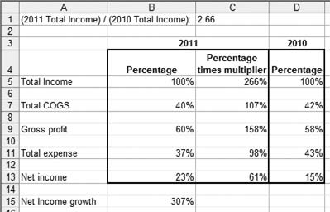
Figure 4.9. When you interpret the balance sheet, bear in mind that the dollar figures are snapshots, not cumulative amounts as on a P&L.
Note
The problem just described is not merely an artifact of exporting a report from QuickBooks to Excel. It is native to QuickBooks. To prove it to yourself, open the Rock Castle Construction sample file and pay a $1 bonus to an employee for a previous year in which there is at present no payroll expense. Then open a P&L Prev Year Comparison report and check the % Change column.
A manager at Rock Castle needs to watch the increase in payroll expenses. Although QuickBooks says that the year-over-year increase was 100%, the dollar increase is over
$120,000 and its component percentage goes from 0% to over 26%. That sort of payroll growth is just not sustainable any more than a 713% increase in Job Materials, even when subcontractor costs are falling. But the payroll expense growth is hidden by the use of 100% to represent the percent change. Remember that this occurs in a Profit & Loss report at a period in the company's history when three-digit growth rates are the norm.
The lesson once again is that you can't look just at growth rates. You need to look at dollar changes and component percentages for context. But you also need to bear in mind that QuickBooks' formulas can sometimes paint a misleading picture.
The considerations involved in selecting and exporting a balance sheet from QuickBooks are largely the same as those involved in exporting a Profit & Loss report. You want to see the actual dollars and rates of change year-to-year for each asset and liability/equity account, so you need a previous year comparison report.
The Balance Sheet Standard report offers a % of Column option, which is based on Total Assets and therefore is better behaved than the % of Column option in the Profit & Loss Standard report. Still, the % of Column subcolumns in the Balance Sheet Standard report are neither adjacent nor in the same order as in the Balance Sheet Prev Year Comparison report. So again you're better off using just the comparative balance sheet report and entering the component percentage formulas yourself.

Figure 4.10. Total Assets should always equal Total Liabilities & Equity, so you can use either as the denominator for the component percentages.
The process of opening and modifying the Balance Sheet Prev Year Comparison report is identical to the process used for the Profit & Loss Prev Year Comparison, described earlier in this chapter in the section "Exporting the Profit & Loss report." The exported balance sheet should resemble the one excerpted in Figure 4.9.
Once the comparative report is exported, you can calculate the component percentages just as you did for the Profit & Loss Prev Year Comparison report. The one difference is that you use Total Assets (or, equivalently, Total Liabilities & Equity) as the denominator for component percentages instead of total income.
Using the layout as shown in Figure 4.9, you would begin by entering this formula in cell K9:
=IF(G9<>"",G9/G$35,"")
where cell G35 contains Total Assets for 2011. Don't forget the dollar sign in the denominator's cell address, to make the reference a mixed reference and anchor the denominator to a value in row 35. Then autofill the formula into column H, and down through the remaining rows in the report as described earlier, again in the "Exporting the Profit & Loss report" section.

Figure 4.11. The zeroes in the dollar and percent change columns for Long Term Liabilities are unexpected.
When you have finished adding the formulas, the Excel worksheet should look something like Figure 4.10.
It's clear, looking at the increases in accounts receivable and inventory, that the company is going through the early growing process typical of successful startups. The company develops a larger customer base over time and therefore sends out more invoices — and accounts receivable grows. Similarly, the company requires more in the way of physical resources to complete its work, and the inventory asset grows.
As it happens, this balance sheet suggests there is some sound financial management to accompany the entrepreneurial activity that's taking place during 2010 and 2011. For example, see Figure 4.11, which displays the Balance Sheet report's sections for Long Term Liabilities and for Equity accounts.
Overall, you can tell from the decrease in Total Liabilities and the increase in Equity that the company is shifting its sources of capital from debt to equity. This would be regarded as a good move by those who prefer a conservative approach to financial management. Equally, it might be regarded as unduly conservative if the company's return on assets is higher than the interest rates it is paying for its loans.
There's something strange about the figures in the balance sheet, however: No payments have been made on four of the long-term loans during 2011; have a look at cells I63, I64, I66, and I68. Perhaps this accounts for the increase of almost $27,000 in the company's checking accounts, shown in Figure 4.10. More likely, it's simply an oversight in a sample QuickBooks company file. Again, you need to look at both the Profit & Loss and the Balance Sheet. Unless you were quite familiar with this company's finances anyway, you would not be able to spot these odd loan balances from a Profit & Loss alone.
Another useful aspect of a common-sized balance sheet is that some standard ratios are derived automatically. You can read more about these ratios in Chapter 6, and two of them are the debt ratio and its complement, the equity ratio. The former is the result of dividing Total Liabilities by Total Liabilities & Equity, and the latter is the result of dividing Total Equity by Total Liabilities & Equity.
Either one tells you the degree to which the company relies on borrowing, or on investment, for its funds. Using the comparative, common-sized balance sheet, you can find the debt ratio for this company during 2011 and during 2010 in cells K69:L69 of Figure 4.11. The equity ratio values are found in cells K76:L76.
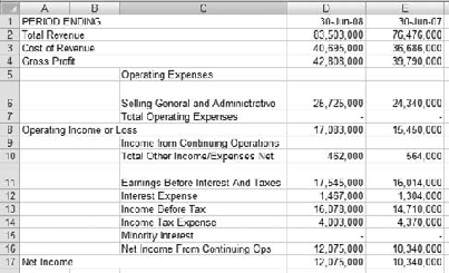
Many companies, particularly very large and publicly traded corporations, make their financial statements available on the Web. Even if you can't find the statements on a company's Web site, you can often find them on the sites maintained by brokerages or by content providers like Yahoo. Sometimes it can be illuminating to compare your company's finances with a Fortune 500 company, although the differences in scale can make such comparisons suspect — if not entirely bogus.
Suppose yours is a small company that manufactures a household product, perhaps a specialty wood polish. You manufacture it and even assist with local marketing but you do not act as a retailer. Instead, you sell it on a wholesale basis to the few small hardware and home goods stores that have not yet been driven out of business by Home Depot and Wal-Mart.
As a percent of total income, how does your gross profit compare to a firm that's in a similar line of business, albeit much, much larger? You could find, for example, Procter & Gamble's income statements for 2007 and 2008, and copy them into an Excel worksheet. Then, by doing the same kinds of calculations described in this chapter for exported QuickBooks reports, you could compare your company's Gross Profit (or any other component) to P&G's on the common metric, percent of sales.
To do so, browse to a Web page with an income statement (or balance sheet, and some sites also publish cash flow statements). Select the statement's numbers by dragging through the statement on the Web page. Use any of a variety of methods (your Web browser's menu, or right-clicking, or a button on the Web page) to copy the matrix of selected numbers to the Windows Clipboard.
Then switch to Excel and, with a blank worksheet active, right-click in, say, cell A1. Choose Paste Special from the contextual menu. Figure 4.12 shows the Paste Special dialog box.

Click the Text option in the As list box and click OK. You'll get a result that looks much like the worksheet in Figure 4.13. It may be necessary to adjust column widths, to get very large numbers to appear correctly in the cells.
Don't choose the HTML option in the Paste Special dialog box. If you do, you're likely to get graphics and controls such as buttons that you copied, usually unintentionally, from the Web page. These objects just get in the way of your analysis.
And don't choose the Unicode option. Unicode is a sort of extended ASCII (the encoding standard for text and symbols on computers), and it includes some nonprinting characters that Excel has trouble dealing with (particularly HTML's , which is a nonbreaking space character and can't be removed by Excel's TRIM function).

Figure 4.14. Component percentages in consecutive years for Procter & Gamble's published income statements appear in columns F and G.
Your best bet is to paste the copied data into the worksheet as Text. Despite the name Text, Excel will normally paste pure ASCII and Excel will interpret a number as a numeric value.
Now just enter the formulas presented in this chapter to obtain the component percentages. (These formulas were described earlier in this chapter in the sections "Exporting the Profit & Loss report" and "Exporting and interpreting the Balance Sheet report.") Figure 4.14 shows an example of what the formulas will return to the worksheet.
You're now in a position to compare the component percentages for your company with those reported by a member of the Dow Jones 30 Industrials.
Notice in Figure 4.14 how stable the component percentages are year-to-year, even though there's considerable growth in all components over time. The dollar values are reported in $1000s, so you're looking at revenues and costs that are measured in tens of billions of dollars. With such large amounts of money, it takes a huge shift of $360 million in COGS to get it to budge from 48% to 49%. In my own business, I can move my COGS from 40% to 50% just by spilling a glass of water on a laptop's keyboard.
With that degree of inertia in the component percentages, it doesn't make much sense to compare year-to-year percentage changes with annual changes that QuickBooks reports in your company file. But it makes good sense to aim to get your COGS (or any given expense category) to a level similar to that reported by a large and mature company, one that shares your company's SIC code. Presumably, one of the ways they got to be large and mature is by managing their costs sensibly.