
Chapter 11
Spectrum Analysis
In this chapter, you will learn about the following:
- Spectrum Analyzer Options
- Review of RF Fundamentals
- Cycle
- Amplitude
- Frequency
- Free Space Path Loss
- Decibel (dB)
- Received Signal Strength Indicator (RSSI)
- Noise floor
- Signal-to-noise ratio (SNR)
- Receive sensitivity
- Narrow band vs. spread spectrum
- Channel widths and spectral masks
- Modulation Schemes
- How Network Interface Cards (NICs) Work
- Wired NICs
- Wireless NICs
- How Spectrum Analysis Works
- Modulation vs. raw energy
- Frequency domain vs. time domain
- Displaying Spectrum Analysis Data
- Enter the waterfall plots
- Spectrum density
- Duty cycle
- Noise floor
- Wi-Fi integration
- Locating and Identifying RF Interference Devices
- Device classification
- Techniques for locating RF devices
- RF Signature Characteristics
- Shape
- Patterns
- Uniqueness
- Frequency
- Pulse vs. constant
- Duty Cycle
- Frequency hopping
- Example RF Signatures
- Frequency hopping example
- Analog RF energy
- Jammers
- Wireless video cameras
- Microwave ovens
Before diving into the technical aspect of this chapter, we will define spectrum analysis, since it is a term that is viewed differently by many vendors and support people. Some vendors will say they offer “spectrum analysis” because their management system captures Wi-Fi frame data, and from the frame information they categorize the details about the traffic flow and the channel information that is gathered from this traffic. Thus, according to them, you have analysis by spectrum. Although this information is very important and can be very useful in diagnosing network problems, these types of products are not really providing spectrum analysis but rather frame and channel analysis.
In this chapter, you will focus on “raw” RF spectrum analysis, which means analyzing the RF signals received through the air, regardless of whether they are Wi-Fi frames generated by an 802.11 station or whether they are noise generated by a nearby microwave oven. We will cover the differences between what a Wi-Fi NIC receives and reports, compared with what spectrum analysis devices can see and report. In earlier chapters of this book, you read about the detail, organization, and processing of frames defined by the IEEE’s 802.11 specifications. The IEEE additionally defines many specific issues regarding how the RF signals must be processed. One of the abilities of spectrum analysis is to see and confirm these integral pieces of RF communications that are typically unseen parts of the 802.11 protocols.
When talking about the unseen world of RF communications, we often joke about how it would be nice to have RF goggles or Geordi LaForge’s visor from the TV show Star Trek: The Next Generation. In the fictional TV series, Geordi’s visor could see the entire electromagnetic spectrum.
Throughout this book, we show the details surrounding the many different types of 802.11 frames. Wi-Fi NICs do a great job of following these frame-based protocols. Wi-Fi NICs let you see the 802.11 frames and how they are processed. Wi-Fi NICs can process the frames that are transmitted; however, they are unable to analyze the RF that is used to transmit the frames. With a spectrum analyzer, we are able to look at the RF signal itself, getting closer to the capabilities of Geordi’s fictional visor.
One of the key tools or components of spectrum analyzers is color. Color is used extensively in all the spectral views that you will be looking at in this book. Although all the figures in the book are presented in black and white, electronic versions of them have been provided on the companion CD. We strongly suggest you look at these files so that you can have a better understanding of how spectrum information is presented.
Spectrum analyzers range in price from a few hundred dollars to more than $100,000. Along with the vast range in price, there is a vast range in knowledge and skill needed to operate these different units, with operators of the expensive units practically needing advanced degrees in RF and electronics to use and understand them. The advanced units are often designed to listen in on a wide range of frequencies and can be used to analyze radio communications of many types. In this book and on the CWAP exam, you will be concentrating on the different devices that are specifically developed to help you design, maintain, and troubleshoot an 802.11 wireless LAN.
For consistency’s sake, we decided to use the output from one spectrum analyzer to generate all the figures throughout this chapter. You should reference Appendix B, “WLAN Vendor List,” for a list of analyzers that are focused on the 802.11-based frequency ranges.
There are many reasons to purchase a spectrum analyzer. Understanding your need for a spectrum analyzer will help you evaluate and select the best unit to address your needs. To help you understand some of the options and features that spectrum analyzers offer, we are including the following list of options and features that are offered by the different spectrum analyzers on the market. This list will also help you understand more about the devices as you progress through this chapter and learn about how to read and interpret the output that these devices produce. Remember that we will be focusing on the options that pertain to spectrum analyzers oriented to the 802.11 market.
Frequency There are two frequency ranges that you need to be concerned with, 2.4 GHz and 5 GHz. In 2009, the 802.11n amendment was ratified. This amendment supports both 2.4 GHz and 5 GHz devices. In addition to the ratification of 802.11n, many, if not the majority, of 802.11 client devices are shipping with support for both 2.4 GHz and 5 GHz transmissions. Even if you are currently only using 2.4 GHz, we recommend that any spectrum analyzer decision support both bands. Also, some spectrum analyzers are capable of monitoring the 5.470 GHz to 5.725 GHz UNII-2E channels, whereas others are not. If this band is important to you, make sure it is supported by the units you are evaluating.
Form Factor Unfortunately, more and more laptop manufacturers are no longer including PCMCIA slots in their machines and instead are transitioning to Express Card slots or no slots at all. Some of the spectrum analyzer manufacturers have only PCMCIA units available. You can purchase an adapter to connect a PCMCIA card to an Express Card slot; however, the adapters are typically not convenient to use, especially if you need to walk around with the laptop. Many of the newer spectrum analyzers provide their adapters in a USB form factor. The USB devices are more flexible and easily interchangeable between computers.
Price Here too you will see a wide range of costs and quality. The differences in cost will usually be reflected in the quality of the hardware, along with the robustness and features of the associated software. As we stated earlier in this section, the CWAP exam and book is focused on spectrum analyzers that are geared toward the Wi-Fi market. The least expensive unit is a small USB device starting at around $40, and the most expensive units are specifically designed portable devices that cost more than $9,000, with many others in between.
Hardware Platform Most 802.11-oriented spectrum analyzers are specialty cards or adapters packaged as a USB or PCMCIA device, paired with specialty software that runs on a laptop computer. Some spectrum analyzers are specialty handheld or tablet-sized devices with the sensor either built into the unit or purchased as a module that plugs into the device. The spectrum analyzer hardware may have internal digital signal processors for doing some of the intense RF math calculations onboard; or, to save costs, some vendors use the spectrum analyzer hardware to merely collect the data from the device’s antenna and then use the laptop’s internal CPU for doing the number crunching and calculations. Others have dedicated chips in their devices to do this work inside the tool.
Resolution Some of the less expensive options do not have the granularity or resolution to see fast-moving frequency-hopping patterns. If you want to see and work with Bluetooth signatures, you need to be aware of this possible limitation. You should check with the vendors before purchasing to confirm that you will be able to visualize your target devices. Like many things in life, you get what you pay for.
Supporting Software Each spectrum analyzer uses software to take the captured signals and put them into human-readable form. Some devices display the data with different views. Nearly all the spectrum analyzers can generate an FFT plot. Plots that may be important to you are waterfall views or swept spectrograms to show historical RF events, duty cycle, channel utilization, device lists, channel interference, and others. What these plots look like and the importance of these plots will be discussed later in this chapter. Some programs are also capable of automatic device classification based upon known RF signatures.
Wi-Fi Integration Wi-Fi cards and spectrum analyzer cards go about seeing the RF world in slightly different ways. The Wi-Fi card can see frames and modulated bits going across the RF medium. It is one thing for a spectrum analyzer to know and recognize a variety of RF interferers’ signatures but still another to speculate what the effect of that interferer will be on the wireless LAN. Enter Wi-Fi integration; this is the holy grail of 802.11 spectrum analysis. This may be the secret sauce that puts one vendor in a unique space compared with the competitors. By correlating the raw RF with the data from the Wi-Fi card, you can better understand the effects of various scenarios on your wireless network. As you can imagine, this capability will not be found in the less expensive products.
Look to spectrum analyzer vendors to be adding more integration between both the spectrum analysis cards and Wi-Fi cards. Try to get an appropriate level of Wi-Fi integration that meets your needs. The less you understand about RF fundamentals and 802.11 basics, the more you will need and benefit from the expert analysis software that is built into some of the spectrum analyzers.
Different vendors label their screens with sometimes inconsistent naming conventions, although they are providing the same fundamental information. Check the vendors’ websites to compare what screens and capabilities are offered by each of the vendors you are evaluating. You may be able to download a demo version of each of the products and perform a better comparison before determining which unit to purchase.
Before we move forward and explain the processes that spectrum analyzers use to do their thing, we first will review the basics of both RF and wired NICs to make sure that the proper groundwork and foundation is covered. RF fundamentals need to be reviewed because spectrum analysis relies heavily on RF principles. Wired and wireless NICs also need to be reviewed because it is important to understand the differences between data devices—those NIC devices that can decode bits, combine them into bytes, and then finally into frames; and spectrum analyzer devices that are not even capable of decoding a single bit yet can see a wide swath of the RF spectrum in great detail.
Please note that there is much more detail available on both of these preliminary subjects in the CWNA: Certified Wireless Network Administrator Official Study Guide (Sybex, 2009). This review is merely a quick cursory overview of some of the concepts and vocabulary.
In addition to providing a basic foundation of RF fundamentals, the overview will also give you a shared vocabulary of terms used in the discussion of spectrum analysis. As stated earlier, this is by no means a detailed education in radio frequency issues but a quick review of these terms. Now let us begin our journey toward understanding spectrum analysis.
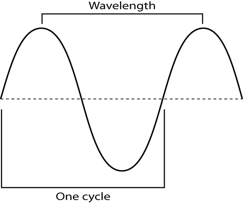
Cycle
A cycle is a wave form that starts at the center; climbs in energy to the highest point, called the peak; returns to the center; then drops to the weakest point, called the trough; and then finally returns to the center point, as shown in Figure 11-1. The number of cycles that occur during a one-second period of time is measured in hertz. Hertz is a term coined for one of the founding fathers of radio transmission, Heinrich Hertz. The distance traveled by one cycle of a wave pattern is called the wavelength. Cycle and wavelength are the same distance. Although a cycle is often measured from the center or zero power level, wavelength is often measured from one peak to the next simply because it is easy to identify two sequential peaks.
Figure 11-1: RF wave: cycle and wavelength
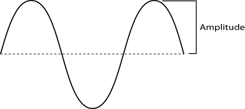
Amplitude
The amplitude of a wave is defined as the height, force, or power of the wave (see Figure 11-2). RF power is typically measured in watts; however, the power used by Wi-Fi devices is significantly less, measured in milliwatts (mW), or one-thousandths of a watt. The more energy put into a wave, the larger or taller the wave. This higher wave would have more amplitude; the difference between the lower amplitude and the new higher one is referred to as gain. The opposite of gain is attenuation, also referred to as loss. When the wave gets smaller, or decreases in energy as it travels, we call that attenuation. RF waves attenuate as they pass through different materials. RF even attenuates without passing through any material, simply because of the decrease in energy as the waves travel. This is known as free space loss.
Figure 11-2: Amplitude of a wave
Frequency
Frequency can be defined as the number of cycles that occur within one second. For this discussion, we will be dealing with very large numbers. 2.4 GHz Wi-Fi equipment generates RF waves 2.4 billion times or cycles every second. 5 GHz Wi-Fi equipment generates RF waves 5 billion times or cycles every second. As a point of comparison, AM radio stations transmit down in the much slower range of 500,000 to 2,000,000 cycles per second. Human speech and hearing is exponentially slower still in the range of 400 to 15,000 cycles per second. 802.11 transmissions happen in specific frequencies as defined and approved by various government entities worldwide. The government entities that define and monitor usage of the RF equipment are referred to as regulatory domain authorities.
Free Space Path Loss
Because of the laws of physics, an electromagnetic signal will attenuate as it travels away from the transmitter. Free space path loss (FSPL) is the loss of signal energy caused by the natural broadening of the waves, often referred to as beam divergence. The energy of an RF signal spreads over larger and larger areas over time. Think of the waves emanating from a pebble dropped in a pond. At the moment of impact, all the energy of the pebble converts to the wave starting at the point of impact. A second later, the wave now has a much larger circumference. But it still has the same amount of energy that it started with. However, now it must share that energy over a larger area, so the height of the wave decreases or attenuates. Another second later, the circumference of the wave again grows larger, and thus the wave height continues to decrease as the circumference of the wave increases.
In the RF world, we normally work in three dimensions. Like the wave caused by the pebble, RF waves also get weaker as they travel further from their source. The loss of power of the wave is based on the inverse square law, originally developed by Isaac Newton.
This law states that the change in power is equal to 1 divided by the square of the change in distance. In other words, as the distance from the source of a signal doubles, the energy is spread out over four times the area, resulting in one-fourth of the original intensity of the signal. There is a logarithmic formula to explain this phenomena, but in short simple terms, as you double the distance from the transmitter, the wave has lost four times its starting energy. If you double the distance, the amount of energy of the wave will be one quarter of its starting energy. In addition to FSPL, any materials the RF signal must pass through only exacerbate the signal loss, which adds even more attenuation.
Here are the logarithmic formulas to calculate free space path loss:
FSPL = 36.6 + (20log10(f)) + (20log10(d))
FSPL = path loss in dB
f = frequency in MHz
d = distance in miles between antennas
FSPL = 32.4 + (20log10(f)) + (20log10(d))
FSPL = path loss in dB
f = frequency in MHz
d = distance in kilometers between antennas
Decibel (dB)
A decibel (dB) is a unit of comparison. You could use dB to compare sound to silence. You could use dB to compare the number of gray hairs today vs. the gray hairs prior to your children being teenagers. dB is merely a unit used to compare numbers, usually for comparing numbers that are drastically different. Comparing 10,000,000 to 3—now that is a big comparison. What kind of chart could you make that would realistically show the difference between 3 and 10,000,000?
Decibels take advantage of the math of logarithms. Normal intelligent people are pretty good at most simple mathematics—adding, subtracting, multiplying, and possibly even doing squares and square roots. But most of us cannot easily do logarithms in our heads. If you want to perform the RF math calculations using the logarithmic formulas, here they are:
dBm =10 × log10(mW)
mW = 10(dBm/10)
With respect to Wi-Fi RF, we normally use a milliwatt to describe the amount of electromagnetic energy used in radio transmissions. You can convert mW to dBm. That is, use the math behind the dB logarithmic formula to change mW to dBm. See Chapter 3 of the CWNA Official Study Guide for further details. For this discussion concerning spectrum analysis, we will continue to show our energy received in dBm and leave it to you to convert to milliwatts if you so need. Most, if not all, spectrum analysis can be performed totally using dBm values.
Received Signal Strength Indicator
Received signal strength indicator (RSSI) is a metric that is specified by measuring the amount of energy associated with the bits received via the wireless NIC. Each vendor calculates this value differently. RSSI is sometimes shown in dBm and sometimes converted into a percentage. This is the term most people refer to when they say “signal.” RSSI will be discussed in more detail later in this chapter.
Noise Floor
Noise floor is the ambient or background level of radio energy on the specific channel you are analyzing. This can include modulated or encoded bits from other 802.11 stations in the area or nonmodulated energy coming from other devices such as microwave ovens, Bluetooth, portable telephones, and so on.
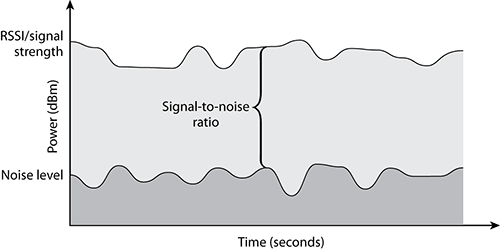
Signal-to-Noise Ratio
Signal-to-noise Ratio (SNR) can be presented as a dB value or as the difference between the RSSI (signal) and the noise floor (noise) (see Figure 11-3). For example, if the RSSI is -68 dBm and the noise floor is -85 dBm, the SNR would be -68 minus -85 or an SNR of 17dB. SNR is an important value to be familiar with because it is used extensively in RF communications. RF devices often require a minimum SNR to provide a certain level of communications. The SNR requirements often vary between different device types, models, and brands.
Figure 11-3: Signal-to-noise ratio
Receive Sensitivity
Receive sensitivity refers to the power level of an RF signal required to be successfully received by the receiver radio. The lower the power level that the receiver can successfully process, the better the receive sensitivity. Vendors develop 802.11 Wi-Fi devices with different abilities to discern a 1 bit or a 0 bit in different RF environments. The receive sensitivity of an 802.11 station is also closely tied to data rates. Different speeds use different modulation techniques and encoding methods, and the higher data rates use encoding methods that are more susceptible to corruption. The lower data rates use modulation-encoding methods that are less susceptible to corruption. Determining what data rate to transmit at often includes monitoring the receive sensitivity, RSSI, SNR, transmission retries, and bit error rates.
Narrow Band vs. Spread Spectrum
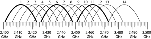
Ever since Marconi started working with radio signals, we have used the word channel to define the specific frequency or range of frequencies for transmitting and receiving. This has historically meant a small narrow-band or range of RF energy grouped tightly around a defined frequency. In developing the protocols to transmit larger amounts of data, 802.11 engineers needed a new broader spectrum to carry more information. They defined new, wider spread spectrum groups of frequencies. Figure 11-4 shows a rudimentary comparison of how a narrow-band and spread spectrum signal relate to each other. Sadly, the same word, channel, was used to define these larger groups of frequencies. The problem that arises is that these larger groups of defined frequencies (channels) overlap with other channels, as shown in Figure 11-5. Thus, we have issues with co-channel and adjacent-channel interference when unknowledgeable people do not choose channels carefully. Unfortunately, in 2.4 GHz 802.11 we use spread spectrum channels that, if not selected properly, have significant overlap.
Figure 11-4: Narrow-band vs. spread spectrum
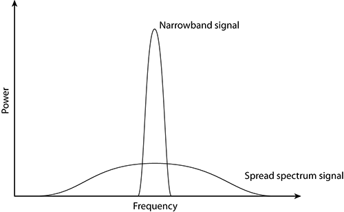
Figure 11-5: 2.4 GHz channel overlay diagram
Channel Widths and Spectral Masks
One of the desires with respect to using spread spectrum RF energy was to limit or define a very specific level of energy within this wide band of frequencies. To achieve this, the developers used something called a spectral mask, which is essentially nothing more than a frequency spectrum template.
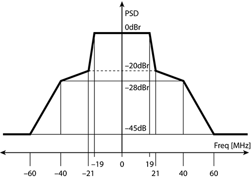
For 802.11b and its associated data rates of 1, 2, 5.5, and 11, the 22 MHz wide spectral mask is used (see Figure 11-6). Note the drastic falling off of energy on both sides. Also notice how wide this mask is and how many frequencies are being used to carry a single “channel” of RF energy.
Figure 11-6: 22 MHz spectral mask
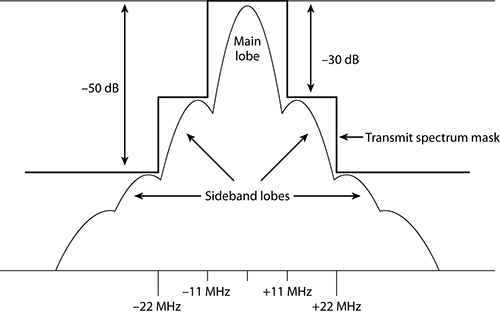
Although it is very common to represent the RF signal of a particular channel with an arch-type line (as shown in Figure 11-5), this is not a true representation of the signal. In addition to the main carrier frequency, or main frequency, sideband carrier frequencies are also generated. The transmit spectrum mask is defined to minimize interference between devices on different frequencies. Even though the sideband carrier frequencies are mere whispers of signals compared to the main carrier frequency, even a whisper is noticeable when the person whispering is close to you. This is true for RF devices too.
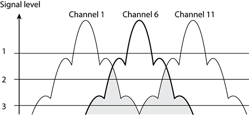
Figure 11-7 represents RF signals on channels 1, 6, and 11 (please note that this figure is simplified and not drawn to scale). A signal-level line indicates an arbitrary level of reception by the access point on channel 6. At level 1, meaning the AP on channel 6 receives only the signals above the level 1 line, the signals from channel 1 and channel 11 do not intersect (interfere) with the signals on channel 6. However, at the level 2 line, the signals from channel 1 and channel 11 do intersect (interfere) slightly with the signals on channel 6. At the level 3 line, there is significant interference from the signals from channel 1 and channel 11.
Figure 11-7: Sideband carrier frequency interference
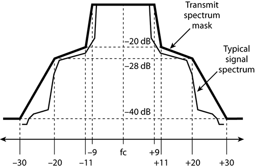
For 802.11g and 802.11a devices that use the OFDM encoding scheme, a 20 MHz spectral mask is used and looks entirely different from the spectral mask for an 802.11b device (see Figure 11-8). OFDM allows for a more dense spectral efficiency, providing higher data throughput than achievable in the BPSK/QPSK encoding schemes of 802.11b.
Figure 11-8: 20 MHz spectral mask
With the advent of 802.11n, we now have an additional spectral mask to deal with. This is the optional OFDM 40MHz channel (see Figure 11-9). Although the 40 MHz wide channel is referred to as channel bonding, it is not two unique 20 MHz channels bonded together but rather an entirely new 40 MHz wide channel that exists across what would have been two 20 MHz channels.
Figure 11-9: 40 MHz spectral mask
Modulation Schemes
To send data via radio waves, we need to find a way to take the 0s and 1s and encode them into a radio wave in such a way that they can be successfully delivered to the remote device. You could use a very simple encoding scheme. If you want to send a 1, you could send a loud, read strong, wave; and if you want to send a 0, you could send a quiet, or weak wave. Using this very rudimentary method, you could send one bit per cycle. If you were transmitting in the 2.4 GHz frequency range, you would send 2.4 billion bits per second. Though this seems like quite a high rate of data transmission, it is a little misleading. To successfully transmit data, the node that you are sending the data to needs to receive all the data bits in the proper order and without losing any.
When transmitting data, errors can occur. A counter known as bit error rate (BER) is used to keep track of transmission errors. There are some very detailed and high-level mathematical ways of showing BER, but to keep it simple, it is essentially counting all the bits sent and comparing that value with the number of bits that showed errors. The result works out to be the number of errors per total bits sent.
So, using our rudimentary amplitude modulation scheme, remember a 1 is a loud cycle and a 0 is a soft cycle, transmitted at 2.4 billion bits per second. Using this scenario, let us see how this may work out transmitting frames of data:
8 bits = 1 byte
1,500 bytes = 1 frame
Thus:
1 frame = 12,000 bits
Using the values shown previously, when you send one data frame, you are actually sending 12,000 bits. Even though you send those bits at a very high rate of speed, 2.4 billion bits per second, if you do not have flawless communications, you might have a problem. What if your BER is greater than 1 in 12,000?
If you send one frame and in that frame there is only one single corrupted bit, the receiving device collects all the bits and then runs a CRC error check against the frame. Since one of the bits is bad, the CRC fails. Thus, you must retransmit the data again. When you transmit the data a second time, the BER is still 1:12,000, and you get another error, thus another retransmission. The engineers who developed the modulation schemes used with 802.11 took this issue to bear and designed in very robust, mathematically complex modulation schemes to help take care of the BER issues inherent in RF transmissions. These modulation schemes used in Wi-Fi are called BPSK, QPSK, 16-QAM, and 64-QAM.
Again, you can visit the CWNA: Certified Wireless Network Administrator Official Study Guide (Sybex, 2009) for further details. For the sake of this book, you just need to know they exist and use RF waveforms differently.
How Network Interface Cards (NICs) Work
So far in this chapter we have done a quick review of some of the RF fundamentals and terms you need to be familiar with for the discussion of spectrum analysis. Unfortunately, before we can delve into spectrum analysis, we will need to take one more detour and provide some knowledge about how network interface cards (NICs) function. After this section, we promise we will begin discussing spectrum analysis.
Wired NICs
Let us begin by going into the “wayback machine” and traveling to the early 1980s. The team at 3Com took the nascent Ethernet protocol and started selling it to the public. With the introduction of Ethernet cards, the electronics on these cards would allow for transmitting and receiving of frames. These frames were strings of bits. Each bit would have to be transmitted and received.
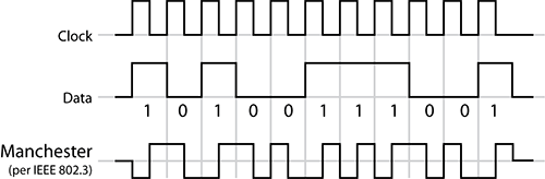
The protocol used an encoding system called Manchester Encoding (see Figure 11-10). This was a protocol that caused electrical current to change its state in a specific pattern to indicate a 0 or a 1. With Manchester Encoding, a high-to-low transition at the middle of the bit period indicates a 0 bit, and a low-to-high transition at the middle of the bit period indicates a 1 bit. This technique allows for a transmission rate of up to 10 Mbps.
Figure 11-10: Manchester signal encoding
When the various Ethernet vendors were looking to speed up the data transmission speeds, they needed new technical protocol that could transmit and receive more bits of data in shorter periods of time. So, 100 Mbps Ethernet started using new encoding schemes called Non-Return-to-Zero, Invert-on-One and its partner in crime, Multiple Level Transition – 3 Levels (MLT-3). And to answer your question, you do not need to remember these. We are just highlighting that each change in network capability required a change in the encoding methodology.
If you look at the current state of wired networking, you can see that you are using 1 Gbps Ethernet connections, and as you may imagine, gigabit Ethernet has its own encoding process. This one is even more complex and mathematically intricate than previous encoding schemes, which is typical; it is called 8B/10B encoder/decoder and works on entire octets of data rather than single bits. As you move toward 10 Gbps communications protocols, you will see further refinements and advancements in the encoding schemes.
In each of these options, the wired NIC listens across its copper pairs, sensing the changes in electrical current, and interprets these currents as 0s or 1s and combines these bits into strings of data. These strings of bits make up frames, constituted by the Preamble, Header, Data Payload, and finally a Frame Check Sequence (FCS) or CRC, which is used whether or not all of the enclosed bits were received accurately.
The NIC strips off the preamble, checks the destination MAC address to see whether the frame is targeted for this specific NIC or whether the frame is addressed as a multicast or broadcast address. If the MAC address of the frame is not destined for this NIC, then it is discarded. If this frame is addressed to be received by this station or if it is a broadcast or multicast, the header is then stripped off. Finally, the FCS or CRC is calculated to ensure that all the included bits were accurate. At this point, the data payload is sent up the protocol stack to the OS as a designated and approved frame.
Wireless NICs
Enough with the wired side, the CWAP is a wireless certification. It is time to move on to the wireless NICs of today. Unlike their wired counterparts, wireless NICs do not have the advantage of a bounded media like copper or fiber. So instead of using the changes in current or voltage across a copper pair, wireless NICs have to add some additional features.
Instead of the copper connection of an Ethernet NIC, a wireless 802.11 NIC has an antenna. Wireless antennas are designed for specific ranges of frequencies. This allows the antenna to only pass the RF energy for the frequencies that they are designed to operate on. In the case of 802.11b/g, we are referring to radio waves in the 2.4 GHz ISM bands. The antenna is designed specifically to focus on this frequency. Here again, there are some pretty complex mathematics around antenna design, but for the sake of our discussion, these antennas try to block radio waves except 2.4 GHz. Blocking all radio waves from other frequencies is not possible; however, the design of the antennas helps to at least reduce the amount of signal received on other frequencies.
Think for a moment about all the radio waves that you bump into every second of the day. The list is immense, including AM radio, FM radio, satellite radio, police bands, aviation bands, global positioning satellite, HAM operator bands, cell phones, broadcast television, cordless telephones, garage door openers, and many, many more. This list does not even mention any of the devices that radiate RF unintentionally such as lights and motors. To make sense out of all of this RF chaos, the antennas for each of the different types of RF equipment are designed to block the unwanted frequencies or respond to a certain range of frequencies.
So, the first line of defense for the 802.11b/g wireless NIC is its antenna, out there attempting to block all but the 2.4 GHz waves. Unfortunately, even though the antenna focuses on only 2.4 GHz waves, it cannot focus solely on just 802.11b/g signals. Other non-802.11b/g radio signals may be received also. The 2.4 GHz band is an unlicensed band, and many devices are legally able to transmit in this range. Thus, your wireless NIC’s antenna will receive RF signals from cordless telephones, Bluetooth transmissions, wireless security cameras, and even microwave oven radiation. All of these devices use the same 2.4 GHz frequency range.
To try to isolate the 802.11b/g signals from the other types of 2.4 GHz signals, the developers of the wireless NICs came up with a second line of defense. This second line of defense is designed to filter out the unwanted RF. To understand this, we refer to our encoding schemes. Since the 10/100/1000 Ethernet encoding schemes are copper dependent, unfortunately they could not be used for wireless communications. Instead, the engineers designed different robust, complex protocols that are capable of discerning 0s from 1s out of RF energy. These encoding schemes are those that we mentioned previously—BPSK, QPSK, 16-QAM, and 64-QAM, like in the ever-increasing and ever more complex world of Ethernet.
As with Ethernet encoding schemes, 802.11 encoding schemes have also become more complex. For Ethernet to move from 10 Mbps to 100 Mbps to 1000 Mbps, the encoding systems increased in complexity. As 802.11 speeds increase, a similar transition occurred with the wireless encoding schemes. Over the years, 802.11 wireless networks have increased the speeds of data transmissions by moving from BPSK used in 1 and 2 Mbps transmissions to QPSK used in 5.5 and 11 Mbps transmissions finally on to the even higher 54 Mbps transmissions supported by OFDM. As the radio signal is processed by this filter, which is based on the encoding systems supported by the wireless NIC, we can now finally see the bits. Just like in the wired NIC, the bits are strung together into a string of 0s and 1s, and in the format of preamble, header, frame body, and FCS. Again, just like the wired NIC, the preamble is discarded, the header is processed to see whether the frame is targeted for the wireless device, and finally the FCS is calculated to ensure that all the included bits were accurate. At this point, the data payload is sent up the protocol stack to the OS as a designated and approved frame.
All of these tasks are just like the ones performed by a wired NIC. However, there are a few differences between the processes performed by the wired and wireless NICs. First, the wireless NIC must use its antenna and encoding filter to keep out all unwanted RF signals and thus unwanted bits as well. There is another unique difference between the way wireless NICs and wired NICs process the incoming data. The wireless NIC will use some of the specific information gleaned from the RF to bit transition process to actually add information to the wireless frame. This additional information is added at the receiving station and is in addition to the bits sent from the source. This added information is called the Radiotap Header (see Figure 11-11). It includes date and time stamps, channel stamp, signal stamp, and a noise stamp. The date and time stamps are obvious. The channel stamp is based on the frequency that the NIC was on while it received this bit stream.
Figure 11-11: Radiotap Header
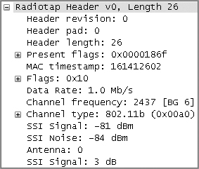
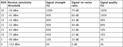
The next piece of information has its own name and is RSSI. The 802.11-2007 standard defines the RSSI as a relative metric used by 802.11 radios to measure signal strength (amplitude). The 802.11 RSSI measurement parameter can have a value from 0 to 255. The RSSI value is designed to be used by the WLAN hardware manufacturer as a relative measurement of the RF signal strength that is received by an 802.11 radio. RSSI metrics are typically mapped to receive sensitivity thresholds expressed in absolute dBm values, as shown in Table 11-1. For example, an RSSI metric of 255 might represent –30 dBm of received signal amplitude. The RSSI metric of 0 might be mapped to –110 dBm of received signal amplitude. Though RSSI may be calculated differently by various vendors, we still use it and put trust in the number as the true amount of RF energy received by the NIC.
Table 11-1: RSSI metrics (vendor example)
We stated that the channel stamp indicated the channel that the NIC was on while it received a bit stream, not the channel that the data was transmitted on. This is an important piece of information for troubleshooting because the transmitter and receiver could be on different channels that are near each other.
It would be very nice if all wireless NIC manufacturers of both stations and access points would adopt a standard for calculating RSSI and presenting RF information from their various devices. But, alas, we do not foresee this happening any time in the near future. The good news is that another measurement, received channel power indicator (RCPI), has in many instances replaced RSSI. RCPI is an 8-bit value ranging from 0 to 220, incrementing by .5 dB. The RCPI values begin at -110 dBm and increment to 0 dBm.
The final bit of information in the Radiotap Header is a variable for noise. To reemphasize, the wireless NIC is not a spectrum analyzer, and though it can transmit and receive data at a prodigious rate, it cannot see raw ambient RF signals. Since the only things getting past the NIC’s encoding filter are bits, all of the information reported by the NIC must come from the bits it receives. If you turn on a microwave oven near a wireless NIC, there are no data bits being generated by the microwave, so the NIC will always report a noise variable of zero. Remember that this is because wireless NICs require bits in order to do their magic. You should pause here for a moment to let this fact sink in. In the absence of encoded RF signals coming from other 802.11 devices, the noise variable cannot be used to report the noise floor. We know that you may have seen many screens generated by your various 802.11 devices that display signal (from the RSSI variable) and another value displayed as SNR or signal-to-noise ratio, showing the comparison between the RSSI and the noise floor. The developers of the wireless NICs knew that the RF folks out there “live, breathe, and die” by signal, noise, and signal-to-noise ratio data. These RF engineers demanded a noise variable in order to perform their RF calculations, so various vendor organizations came up with unique ways to guess the noise floor. Since 802.11 wireless NICs can only process bits, they needed to come up with algorithms to calculate a noise variable based on the bits going through the NIC.
By the way, like RSSI, each vendor that manufactures 802.11 equipment calculates noise in a different way. Some vendors flatly refused to make up a number for noise only based on bits. Other vendors have developed very sophisticated algorithms for calculating noise. More recently some 802.11 chip manufactures have figured out how to turn off the encoding filters and use the RF signals coming through the antenna to become rudimentary spectrum analyzers. However, this is in lieu of being an 802.11 NIC capable of processing data. These new chips can be either a lightweight spectrum analyzer or a Wi-Fi card processing data, but never both at the same time. Some of the access point vendors are also using these extra-capable Wi-Fi chips and are adding spectrum analysis as an option for an access point with the appropriate software to take advantage of this extra ability.
With this data resulting from the Radiotap Header information, a wireless NIC can learn about the environment around it by scanning and listening to the different channels available. Many Wi-Fi tools use this technique to learn of the RF environment, such as NetStumbler and inSSIDer. Some vendors also use this same technique of listening in on channels to determine data points to help in their automatic channelizing and power balancing systems. However, none of these devices can see raw ambient RF; they only see what is received in the form of bits or modulated RF encoded by one of our protocols.
Spectrum analysis is used to determine the spectral composition of audio, electrical, optical, or radio waveforms. We will be discussing spectrum analysis to focus on radio waves in the specific frequencies for Wi-Fi data communications, 2.4 GHz and 5 GHz. In the following sections, we will discuss the fundamentals of spectrum analysis and how it differs from packet analysis.
Modulation vs. Raw Energy
To introduce this section, we want you to remember the first time you used a pixel-based “paint” program, either on a Macintosh or Windows computer. No matter which paint program you used, they both kind of worked alike. It was fun to draw circles and squares and the like. However, if you wanted to edit your drawing, you had to erase and then redraw the section that you were trying to edit. The same was true with drawing and editing text within these programs. It felt perfectly natural to use the keyboard to type words in these paint programs and then to make changes to the font, size, or other features of the text. However, once you saved or committed the text to your drawing, the text, which initially was ASCII characters that you typed, was converted to a picture with the attributes you defined. After the text was converted into a graphic, you could no longer edit the text but had to erase and replace it just like any of the graphics you created.
Remembering that experience, we can delve into one of the key differences between an 802.11 Wi-Fi card and a spectrum analyzer. The Wi-Fi card deals with data, bits, frames, and so on. These are hard-coded into the Wi-Fi card. It can process these bits at astonishingly fast rates of 2.4 billion or 5 billion times a second. Wi-Fi cards are great at decoding the modulated bits encoded into RF energy. Those encoding schemes as we have discussed earlier—BPSK, QPSK, 16-QAM, and 64-QAM—can also be seen by the spectrum analyzer, but the spectrum analyzer does not have the filtering capability to interpret the modulated bits. It is only capable of seeing the raw energy of the RF signal. To the spectrum analyzer, the signal is just graphics with a signature shape. The spectrum analyzer cannot decode any bits at all from the RF energy.
So to recap, a spectrum analyzer can see the graphical shape of encoded RF energy but cannot decode any of the bits. By contrast, a Wi-Fi card can decode the bits at amazingly fast rates but cannot see the graphical shapes of the RF signal.
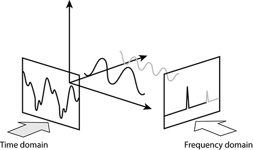
Frequency Domain vs. Time Domain
Another difference between the two types of cards is the domains they use. We will describe these two domains by using a couple of examples. The first is the time domain. The time domain is where the horizontal axis of the graphs you look at is calibrated by time. One example might be in a hospital where you have seen an electrocardiograph (ECG) machine. These machines monitor the electrical impulses that occur in the heart, representing the information over a period of time. Each heartbeat leaves behind a unique signature on the screen. The horizontal axis is time, and the vertical axis is based on the strength of the electrical impulse generated by the heartbeat.
The next domain is the frequency domain. In this view, the horizontal axis does not represent time but rather frequency. This is the main view of spectrum analyzers. The horizontal axis is defined by the frequencies of RF energy that you are monitoring, and the vertical axis represents how loud or strong the RF energy is, calibrated to decibels. Figure 11-12 shows the output of a spectrum analyzer displayed in a frequency domain format.
Figure 11-12: Sample FFT plot
We can use both the time domain and the frequency domain to view the same RF energy. Since the frequencies of RF energy are very high and since we are not able to see or hear them, we will use sound waves to demonstrate this capability. We are using sound waves because most people are familiar with sound and the difference between different frequencies. Additionally, it is likely that sometime in your life you have seen a visual representation of a sound wave either at school, on television, or on the Internet.
We will start with the time domain view of a sound by using something as simple as a tuning fork.
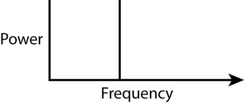
If you plot the time domain view of a tuning fork’s sound, it would look much like the image in Figure 11-13. By design, the tuning fork transmits sound waves at a perfect frequency, only slowly dissipating in the height or volume of the wave over time as energy is lost.
Another way to plot the sound generated by this same tuning fork is shown in the frequency domain view (see Figure 11-14). Since the tuning fork has only a solitary frequency, the frequency domain view shows a very simple view: a single spike on that individual frequency.
Figure 11-13: Tuning fork in time domain
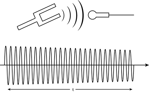
Figure 11-14: Tuning fork in frequency domain
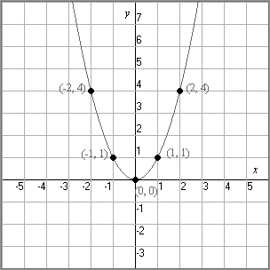
We will explain this a little differently. When you first started to learn algebra, one of the tasks you learned to do was to plot the results of an equation on a graph using a Cartesian coordinate system: the x-axis and y-axis and the little “T”-table. You were probably taught to enter a sequential series of X values and then calculate the corresponding Y values. The X values typically consisted of positive numbers, negative numbers, and 0.
If the equation was something like y=x2 and the X coordinates were whole numbers from -2 to +2, then the T table would like this:
|
X |
Y |
| -2 | 4 |
| -1 | 1 |
| 0 | 0 |
| 1 | 1 |
| 2 | 4 |
Based on the equation and the T-table, the resulting graph can be plotted, as shown in Figure 11-15, with the graph ending up as a parabola.
Figure 11-15: The graph of a parabola
After starting with a simple equation and graph, you then learned that the more complex the equation was, the more complex the graph became. As you moved on in your math career, you learned even more equations and more graphs. You also learned that some graphs such as sine and cosine have repeating patterns. What does all this math have to do with spectrum analysis? To bring all these stories into focus, it is just a quick thought that passed among mathematicians for years—they realized they could make a curve from any equation, but could they get an equation from any curve?
The Fourier Transform in Spectrum Analysis
Joseph Fourier led a very eventful and interesting life—at least more interesting than most mathematicians of his time. An orphan at an early age, he had to live by his wits, and folks around him noticed his quick intelligence. Thus, he was educated at some of the best institutions in France. He was also involved in the politics of the French Revolution, and from that he won an appointment to a prestigious science post.
Noticed by none other than Napoleon Bonaparte, Fourier accompanied the emperor on his conquest of Egypt and was appointed Governor of Egypt for a time. For our part here, we will use his name in spectrum analysis for the process he invented, of taking a known curve and doing a calculation to derive its equation. This has been called a Fourier transform. A faster more efficient algorithm was developed to perform these calculations, which became known as a fast Fourier transform (FFT).
If you take a time domain curve and desire to transform it into a frequency domain curve, you would apply something called a fast Fourier transform (see the sidebar “The Fourier Transform in Spectrum Analysis”). This process takes a complex waveform (see Figure 11-16) and first breaks it into simpler component parts. Then each of these simple parts is graphed against a frequency domain x-axis, as shown in Figure 11-17.
Figure 11-16: Complex waveform to component parts
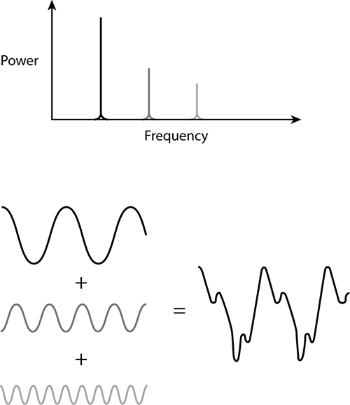
Figure 11-17: Converting time domain to frequency domain
In spectrum analysis, you rely heavily on this FFT process to take the complex waveforms of RF energy and break them down into their simpler component parts that you can then analyze and plot using a variety of views. This FFT process is fairly CPU intensive. Some vendor products keep their costs down by capturing only the raw RF information and then allowing the laptop’s faster CPU to do the FFT process. Other vendor products put custom application-specific integrated circuits (ASICs) on board that can efficiently process the FFTs without relying on the laptop’s CPU to perform the calculations.
Displaying Spectrum Analysis Data
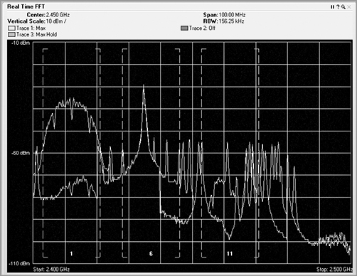
Once the received RF energy data has been collected and processed, one of the functions or features of spectrum analyzers is to show the human user this complex data in views to help simplify the understanding. The first view is the real-time FFT plot (see Figure 11-18). In this plot, the FFT realized data is plotted with the horizontal axis as frequency, and the vertical axis is plotted as energy as defined in dBms. Different vendor options may or may not support a real-time FFT plot. This one is fairly CPU intensive and needs a lot of horsepower to plot in near real time (once every second or so). A feature of real-time FFT plots is the ability to plot not only the current FFT data but the average and max hold.
Figure 11-18: Real-time FFT plot
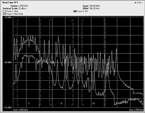
Though the FFT plot shows current RF energy across the watched spectrum, it is displaying “live,” and thus you have to pay constant attention to it because it can change quickly. Unfortunately, that can be hard to do, and it is likely that you would miss or forget things that happened in the past.
In the following sections, we will cover the different plots and views that are used to display and analyze spectrum analysis information.
Enter the Waterfall Plots
In a waterfall plot, you use the same data from the FFT plot, but you add the dimension of time. In the FFT, the vertical axis was energy, represented in decibels, and the horizontal axis was frequency. With one type of waterfall plot, the swept spectrogram, you use the same frequency on the horizontal axis, but you are using the vertical axis to show historical data, so instead, you code the dB values into colors. You use blue for the weaker signals, then up through green, and finally on to red to show very strong signals.
So, with a waterfall plot (Figure 11-19), the spectrum analyzer takes the RF energy readings post FFT, and instead of plotting the dB values in vertical height, like in the FFT plot, it converts the dB values to color and then plots a single 1-pixel tall line at the bottom of the swept spectrogram plot. Then when the next set of data arrives, this process is repeated, with all the previous data being pushed up the stack by one row of pixels. If the sampling interval is 1 second, in order to look back at what occurred 10 seconds ago, you simply need to look up 10 pixels from the bottom, and you will see the RF energy information received in the past.
In a waterfall view, you can visualize a variety of signature from different RF devices. Some devices leave trails, some look like freckles, some pulse on and off, others are wide, and still others are quite narrow.
Figure 11-19: Waterfall plot

Understanding RF Signatures in Spectrum Analysis
A group of five radiology students were on their way to their national exams. They were preparing for one of the largest tests of their life, and so with a little downtime, they were quizzing each other on different X-ray examples.
One of the students would hold up an X-ray, and the others would quickly identify the body part and what symptom was being displayed. So that all five students could study at the same time, a fellow traveler offered to reveal the X-rays and help grade their answers. These guys were fast! The gentleman who was helping them could barely even recognize the bone, when the students would have already done a complete analysis of the patient’s problem.
In some ways, you are starting down the same path. You have at your disposal a variety of tools and views of RF energy. Many of these seem very confusing and maybe even downright unintelligible. But you are just starting. Reading and analyzing these various plots is going to take some time and dedicated effort. Please do not get discouraged early on. Keep at it, and soon you too will be seeing the correct things in the views to help you with your wireless LAN troubleshooting.
Waterfall views can also be used to show other data sets. Viewing a duty cycle displayed as a swept spectrogram is a very useful tool to see how badly a device is causing interference.
Sometimes the waterfall type views fall up, meaning the latest information is at the bottom, with historical information moving up on the screen. Other times the most current information is displayed on the top, with the historical information falling down the screen. It does not matter which way the data flows. In either display, the latest information will be inserted in front of the previous data. If the display area is full, the oldest information will be purged from the end of the display.
Spectrum Density
Some vendors’ spectrum analysis products also include a spectrum density view. Figure 11-20 shows the spectrum density view from AirMagnet Spectrum XT. In this view, the “popularity” of a specific frequency is highlighted. The horizontal axis represents frequency, and the vertical axis represents energy in decibels, with the brightness of the color being determined by how many times that specific set of information has been captured.
Figure 11-20: Spectrum density view

Duty Cycle
The Duty Cycle view of the FFT data gives you the ability to track how harmful the specific RF interference might be (see Figure 11-21). This view displays the percentage of time the ambient RF signal is higher than the noise floor or some other predefined signal threshold. In this view, you can see whether a device is constantly using a frequency. You may also see a very low percentage, meaning that the device was barely pulsing on and did not transmit much of the time.
Figure 11-21: Duty cycle view
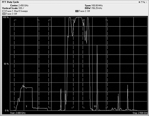
Paired with the FFT plot, you can compare and contrast between the two. Both the duty cycle and the FFT views display the frequency in the horizontal axis. The FFT view shows vertically how loud the signal is, and the duty cycle view shows how much of a signal there is. Think of the data in these views as water coming through a hose. In the FFT view, the high dB would be a high-pressure burst of water coming through the hose. The duty cycle view is not concerned with pressure but rather the volume or amount of water that comes through the hose. So, you could experience a short high-power burst of energy, which would be displayed on the FFT view. You could also experience an extended period of low-power signal, which would be displayed on the duty cycle view. The worst scenario would be to have a high-power level signal for a high percentage of the time. In general, a high-duty cycle is far worse for RF interference than high dB.
If you are performing a spectrum analysis on a network and you see what appears to be a strong dB device in the FFT view, take a look at the signal from the duty cycle screen. If the duty cycle is very low, even though there may be a strong signal, it is not occurring often, so there is actually not much interference.
Noise Floor
Unlike Wi-Fi devices that need to see encoded and modulated bits in order to register a noise variable, spectrum analyzers can see any type of RF signal. Spectrum analyzers can see RF signals from modulated devices such as Wi-Fi NICs and can see RF signals from nonmodulated devices such as microwave ovens, and a host of other non-Wi-Fi devices. In addition, spectrum analyzers may also have the resolution or scanning sensitivity to even see frequency-hopping devices, either telephones or data devices such as older 802.11 FHSS stations or Bluetooth accessories.
The RF noise floor is defined as all the background RF signal that is received in the frequency range that your device is operating in, from any type of device whether it is generated by an intentional radiator or an unintentional radiator. Earlier in this chapter, we explained how 802.11 NICs are designed to process decoded bits. Therefore, any of the noise floor information that is generated by them is based solely on decodable 802.11 traffic, while any sources of non-802.11 noise are simply ignored. The use of Wi-Fi cards to see non-802.11 transmissions is fraught with errors. Therefore, in order to really see and determine the raw ambient RF noise, you must use a spectrum analyzer.
Because spectrum analyzers are portable and might be located physically close to an access point one minute and then far away the next, their displays have the ability to zoom in to give the user the best possible view of the RF that is being analyzed. This includes the ability to zoom in to a specific channel or to a series of frequencies. You can also use the zoom feature to zoom in on the specific pertinent information you are interested in. The ability to zoom in on specific data is a great option to have. However, like many things with great power, you must use this capability carefully and responsibly. Using the zoom capability, it is possible to recalibrate the display to make a very weak signal appear to be very strong or take a very nasty interfering device and calibrate its signal down so that it looks benign. When reviewing any view generated by a spectrum analyzer, be careful to check the scale and legend of the view. Do not automatically assume that the data you are looking at is being displayed using the default scale.
Wi-Fi Integration
As spectrum analysis tools have matured, more emphasis in their data reporting and analysis has moved toward tighter integration and correlation with Wi-Fi information. We noted earlier how Wi-Fi cards and spectrum analyzers are uniquely different in how they see and interpret RF signals. To provide a much greater overall view of what is happening on a specific channel or frequency range, it is possible to integrate and correlate the data from both of these sources.
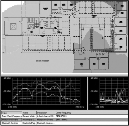
Channel utilization is one of the places where integration of both sets of data makes perfect sense. The Wi-Fi card can use 802.11 channel information to capture and analyze the 802.11-encoded data transmitted on a specific channel. The Wi-Fi card can lock on that channel and capture the frames transmitted there. Wi-Fi cards can also scan the other channels to see whether there is data on the adjacent or overlapping channels, which can cause interference. By integrating the raw ambient RF reported by the spectrum analyzer with the channel data from the Wi-Fi NIC, we now have access to a comprehensive view of all that is happening on a given channel or range of channels. Figure 11-22 shows the integration of both spectrum analysis data and Wi-Fi data within the same analysis tool. The first three graphics in the figure are showing spectrum information in the Real Time FFT, Spectrum Density, and Spectrogram graphs. The last graphic, however is displaying individual channel information that is being interpreted from the 802.11 frames being received, since a spectrum analyzer has no knowledge of the channels, only knowledge of the frequencies.
Figure 11-22: Wi-Fi Integration with spectrum analyzer

With all wireless analysis products, it behooves the reader to sit down and break open the user guide for your products. There is a wealth of information contained in the spectrum analysis product guides. The user guide will have descriptions of each screen and how the vendor implemented differing spectrum views, which is vital to understanding how to interpret the data. Without this understanding, you will simply be looking at a colorful screen of information without being able to understand what you are looking at. It is also important to realize that not all vendors support all views. Therefore, you need to check your documentation to learn about which views are supported by your product.
This integration can help with performing more detailed analysis. By combining both sets of data, you can see the effects that other Wi-Fi devices have on your network along with the effects that nonmodulated RF signals have on your Wi-Fi network. Having both sets of data can help you identify which of these two different types of RF interference may be causing problems on your network. As you also integrate the errors and reporting from the packet side, you can be even more granular in your analysis by looking at additional data that may allow you to track how the ambient RF affected retry rates on frame transmissions. The ultimate end to this integration will be seen when Wi-Fi cards are fully integrated into spectrum analysis products, as well as when spectrum analyzers are fully integrated into the Wi-Fi-based analyzers and survey tools. How sweet it will be to do a single walk-through of a site and capture both raw ambient RF and passive Wi-Fi data simultaneously. With an integrated site survey, your heat maps will be able to show Wi-Fi coverage along with being able to show any anomalies in the ambient and nonmodulated signals all in one report (Figure 11-23).
Figure 11-23: Survey with integrated spectrum analysis
Exercise 11-1
Identifying Noise and Wi-Fi Cards
This exercise is designed to help you think about and understand how Wi-Fi cards process RF noise. Imagine yourself in a room that is surrounded by a Faraday cage, essentially an RF shield that prevents any outside RF energy from entering your room. You take out a laptop with a Wi-Fi card and an RF jammer. Except for these two devices, there are no other RF devices in the room. Think about each of the following four scenarios and postulate an answer.
1. With the jammer off, what does the Wi-Fi card register for noise?
2. If you turn the jammer on, now what does the Wi-Fi card register for noise?
3. A friend walks into the room and gives you an access point. The access point is turned on; however, there are no clients connected to it. Now what noise is indicated by the Wi-Fi card?
4. Ten friends with laptops join you in the room. Your friends all connect to the access point, and using FTP, they all begin to wirelessly download a very large (and funny) video file, while the jammer is still turned on. What does your Wi-Fi card report for its noise variable?
Now for the answers:
1. No noise. There are no modulated signals and thus no bits.
2. No noise. There are still no modulated signals and thus no bits to be affected by the jammer.
3. A low amount of noise. Since the access point is only beaconing, there is a small amount of modulated bits riding on RF, the jammer harms those bits, and the Wi-Fi card interprets the broken and harmed modulated bits as noise.
4. A high amount of noise shows up. There are now lots and lots of bits being transmitted across the RF medium in the form of frames. These frames are all hurt by the jammer, with lots of corrupted bits, causing the Wi-Fi card to report a high level of noise.
Note that in these scenarios, the room never changed, the Wi-Fi card never changed, and the jammer never changed. The only change was the number of bits in the air.
One final statement about Wi-Fi cards and their misrepresentation of ambient raw RF. Sometimes if the interfering device is strong enough, when a Wi-Fi device performs a physical clear channel assessment by detecting the RF energy (as opposed to a virtual CCA), it can sense that the frequency is not clear and then refuse to transmit any frames. If this occurs, there would be no frames transmitted in the air, meaning no bits flying across the RF media to be harmed by the interfering device. In this scenario, with your Wi-Fi card monitoring, the RF will show no interference and also no signal since the Wi-Fi devices are not sending any frames at all, but it will display a channel utilization at or near 100 percent.
Locating and Identifying RF Interfering Devices
In addition to identifying different types of devices that are operating near your network, it is often necessary to locate these devices and sometimes disconnect or replace them to prevent interference. In this section, we will discuss a couple of ways to track down interfering devices.
Device Classification
The first step to finding an interfering device is to determine what type of device it is. Many of the professional spectrum analysis tools offer automatic device classification, which can identify and categorize the devices based upon the signal that is received, as shown in Figure 11-24. These tools perform a task known as pattern matching. This process works by mapping the data that your spectrum analyzer is capturing against a database of known RF signatures. In the following section, “Techniques for Locating RF Devices,” we will show you some of these signatures. Although computers are wonderful systems of technology and can do many marvelous things, pattern matching is a process that humans still excel at.
Figure 11-24: Spectrum analyzer displaying auto device classification
Think about the following scenario. You are at the park with your son. He is playing on the big toys along with a group of other children. The birds are chirping, there are traffic noises far away in the background, and people all around you are talking. There are many sounds coming into your brain. Yet with just one word, a very small data point actually, you hear your son yell the word “Dad” with a bit of pain in his voice. Your brain is extremely good at pattern matching, and the voice print of your son’s voice is instantly registered, so you quickly turn your head to see what happened.
With respect to the automatic device classification capability that is integrated into many of the spectrum analyzers, these programs use computer algorithms to analyze the received RF data and try to match it to known patterns. One of the downfalls of this process is if there is no pattern for the interfering device in the database of RF signatures. If this were the case, the spectrum analysis software would not be able to classify the signal.
Although the automatic device classification is a great feature, it is important that you learn how to recognize and identify RF signatures yourself. By learning and understanding the signatures that different devices make, you will not have to rely on the computer to do the task for you. This knowledge can also be invaluable if you are using a tool that is not capable of performing automatic device classification. Growing up with a mechanic for a grandfather, I was taught to never buy a car with “idiot lights”—you know, the little indicator lights that go on when there is a problem with your car. I was taught it is always better to have gauges that are capable of showing ranges of values than simple binary on/off indicators. By having gauges and understanding how to read and interpret the gauges, you are more capable of identifying and understanding problems that were occurring with the car, often before they became critical.
This philosophy is also true regarding understanding and troubleshooting using a spectrum analyzer. With the proper training and practice, you will be able to identify and classify the devices on your network whether or not the spectrum analyzer is capable of autoclassifying devices.
Techniques for Locating RF Devices
After you have identified and classified the interfering device, you may already have an idea about where to look for it. If the device is transmitting a modulated signal, you may be able to easily track down the MAC address of the device by looking in the address tables of your wired switches to find the port/jack to which the device is physically connected.
Unfortunately, locating devices is not all that easy. The next technique for locating an RF device requires the use a directional antenna. This assumes your spectrum analyzer has an external antenna connector. If your spectrum analyzer does have an antenna jack, try to use an external antenna that has the tightest beam width possible, along with the least amount of side and back lobes in the antenna pattern. If the antenna’s side lobes are too strong, it can make it more difficult to interpret the signal when using it for location tracking.
In addition to the directional antenna, you will need a floor plan of the building that you can write on. During this method of locating a device, we will show how to take RF readings from around the device and try to zoom in on or triangulate the device. To begin the process, from a location in the building, do the following:
1. Hold the directional antenna with it aimed horizontally and away from you.
2. While watching the spectrum analyzer, slowly spin in either direction 360 degrees.
3. During this spin, identify the direction that the antenna is aiming when the signal is at its highest level.
4. On the floor plan, draw a line from your location in the direction of the strongest signal.
5. Now move to a different location at least 15 to 20 meters (50 feet) and somewhere between 45 and 90 degrees to the right or left of the direction of the strongest signal.
6. From this new location, slowly spin 360 degrees, and identify the direction of the strongest signal of the device.
7. On the floor plan, draw a line from your new location in the direction of the strongest signal.
You need to perform this task from at least one additional location.
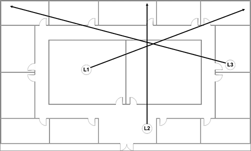
After looking at the three lines on your floor plan, you may want to try to pick a fourth line from a location that is surrounding or circling the device. After the third and possibly fourth reading, the location where the lines cross should give you a reasonable idea of the location of the device (Figure 11-25). Realize that the beam width of the antenna and the environment can cut down on the accuracy of your readings; however, you should have a fairly reasonable estimate of the device’s location.
Figure 11-25: Angles and overlapping coverage
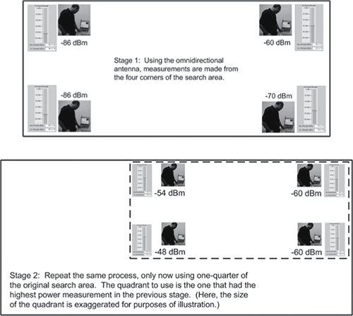
Another method for locating a device does not require a directional antenna. Using this method, you will first divide your floor plan into four quadrants. Go to the center of each quadrant, and take an RF reading. Mark the results either on your floor plan or on a sheet of paper, as shown in the first drawing in Figure 11-26. When you have identified which quadrant has the strongest signal, divide that quadrant into four subquadrants. Now go to the center of each subquadrant and take an RF reading, as shown in the second drawing in Figure 11-26. Again, identify which quadrant has the strongest signal, and divide that quadrant into four smaller subquadrants. Continue subdividing each quadrant as long as there are identifiable RF signal differences in each of the quadrants.
Figure 11-26: Quadrant method of finding
It is important to remember that RF is three-dimensional. You may perform one of these physical locating methods and narrow down your search for a device and not be able to locate the device because it is actually on the floor above or below you. Realize that when you performed the search, you were looking for the location where the signal was the strongest. After you have identified that location, you may need to go to the floor above and the floor below to make sure you are searching for the devices on the correct floor.
A Tip from an RF Inspector
In the course of traveling the world consulting and training people on 802.11, I once met a fellow whose title was RF Inspector. I was intrigued to say the least. His full-time job was to track down RF interference, not only on the 802.11 bands but across all frequencies. He did use some of the tools talked about in this chapter, as well as larger and much more expensive full-size spectrum analysis tools that start around $100,000 (USD).
In his work, he is responsible for finding devices that are causing RF interference. Below is a quote from him that makes perfect sense:
“Unless you can turn it off, you have not found it yet.”
Well, in this case, you can look to this quote for guidance and inspiration while tracking down RF interference issues. So even though you think you have found the offending device, double-check by making sure that when you turn it off, it disappears from your spectrum analyzer.
As you start down your journey of becoming skilled in the art and science of spectrum analysis, you will want to learn the different RF signatures that interfering devices generate. Like the student radiologists in the “Understanding RF Signatures in Spectrum Analysis” example, you will need practice and experience to quickly recognize the characteristics and traits of various devices. In the following sections, you will see some of the traits you will need to look for when trying to identify and manually classify an unknown interfering device.
Shape
One of the first traits to look at is the general shape of the signal that the device is generating. These shapes can vary greatly. Some could be tall and flat on top like the side view of a building. Others could be flat on top but with sloping side, like a geological plateau. Some could be a series of spiky peaks, like what you might see in the ocean during a storm. To fully analyze the shape of the signal, you need to look at it in multiple views, including the FFT plot view, the swept spectrogram view, the spectral density, and other views that your spectrum analyzer may provide. Practice and experience will help you learn to recognize the different shapes that are generated in each of these views along with the types of RF signals that can generate these shapes.
Patterns
Some RF signatures generate specific patterns. When analyzing an RF signal, it is important to see and be able to identify any patterns. Pattern behaviors to look for are things such as if the signature is rock-solid on one frequency, whether it hops around, or whether it merely wavers as it slides between frequencies. Some RF patterns have gaps in them or transition from a random pattern to nonrandom pattern depending upon the state of the device.
Uniqueness
An extremely important concept for analyzing RF signals is to identify what is unique about the specific shape or pattern. When looking at the spectrum pattern or behavior of a device, it is typically necessary to compare it to the patterns and behaviors of known devices. It is important to analyze and identify components of the device that are exactly the same or have similar properties to known devices. To do this, it is important to know and remember the patterns and behaviors of known devices. You need to identify ways that you can use to remember and understand the known devices. Whatever technique or memory aid works for you is fine. Does the pattern or behavior remind you of something else? The Matterhorn Mountain? Teeth of a crosscut saw? An ice pick? Does it have “shoulders”? It does not matter what you use as a memory aid, as long as you remember it. It can be helpful to jot down both text and graphical descriptions as you learn the patterns and behaviors of a new device. Turn the device on and off so that you can learn how it behaves.
Frequency
The patterns of some devices will always show up at a specific frequency or frequency range, while other devices can be set to a specific frequency or channel within a range or selection of valid channels. The pattern of other devices may move or hop between channels or frequencies. Try to identify whether the device operates on a single frequency or channel. If the device is moving between frequencies, try to identify whether it moves in large or small increments across the range.
Pulse vs. Constant
Some devices, such as 802.11 stations, generate traffic that fluctuates on and off, referred to as pulsing traffic. Other devices such as wireless video cameras generate traffic that is steady and constant. Try to understand and interpret the function of the devices and how it handles the data that it is transmitting. If it is a pulsing type of device, see whether there is something memorable or unique with how it turns its transmissions on and off.
Duty Cycle
Another trait that is closely tied to the pulse vs. constant aspect of a device’s signal is duty cycle. Be sure to look specifically at each device’s duty cycle. It is one sure predictor of RF interference. You might have a interfering device with a very strong, high-power signal, but without a corresponding high-duty cycle it is typically not going to cause much harm to your Wi-Fi network. On the other hand, something with a high-duty cycle but low power could cause much greater harm to your Wi-Fi network.
Frequency Hopping
One of the patterns to look for from RF devices is known as frequency hopping. Frequency-hopping devices operate within a defined range of frequencies. They typically transmit on a single channel or frequency for a short period of time and then switch or hop to another frequency within the operating range and then transmit on that frequency. Frequency-hopping devices usually have a predefined pattern of frequencies that they hop across, although they typically hop so fast that it is virtually impossible to identify the specific pattern.
As an example, Bluetooth devices hop 1600 times per second, across a 79 MHz range of 1 MHz channels. Frequency-hopping devices include but are not limited to Bluetooth peripherals, older 802.11 FHSS networks, baby monitors, and some digital portable telephones. Try to determine whether the pattern changes as the state of the device changes. As an example, some cordless telephones change the way they hop based on if they are “on-hook” or “off-hook.”
Another way to classify frequency-hopping devices is by the seemingly randomness of their hopping. Depending upon the actual protocol being implemented, different frequency-hopping devices exhibit different behaviors. Take Bluetooth, for instance. During the discovery process, a Bluetooth device will do a little frequency hopping, but always using the same frequencies. This ends up looking like the teeth of a saw. Looking at this pattern, it is pretty obvious that it is frequency hopping. Initially it may appear to be random. If you look in the waterfall swept spectrogram, you will notice that the little high points look like freckles, but you should choose your own analogy to remember it by. If you continue to do discovery and monitor the swept spectrogram, you will see that these freckles will line up in nice neat columns. That does not sound very random. And it is not. It is pseudorandom. An interesting characteristic of Bluetooth devices is that after discovery is performed and an actual connection is made between the two Bluetooth devices, the little hot spots, or freckles, lose their nice, neat columns and become random across the allowed frequency range. Understanding and interpreting these behaviors is just one more trick to keep up your sleeve when learning to properly classify RF devices.
Our first foray into looking at example RF signatures will be to look at the main devices in wireless LANs: the actual 802.11 devices. Each of the 802.11 Physical layers (PHYs) have unique RF signatures. These are specifically mandated by the protocol. The first is a phase shift keying (PSK) curve (see Figure 11-27). This plot is formed by 802.11b devices or 802.11g devices transmitting at the lower data rates. Note the little notch in the center, designating the center frequency of the channel. You may also note smaller notches on the two sides where the protocol demands a distinct drop in signal. Earlier in this chapter you saw the spectral mask for PSK devices (shown in Figure 11-6). This mask is defined as 22 MHz wide by the protocol.
Figure 11-27: PSK curve of access point
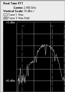
The next modulated signal looks the same for either 802.11g or 802.11a. It is an OFDM signature. The key difference is that the 802.11g plot is in the 2.4 GHz band, and 802.11a plot is in the 5 GHz band. This signature is distinguished by a flat top, as shown in Figure 11-28. Note that the edges tend to fall off in both directions on either side of the flat top. Sometimes, even though you are looking at the RF signature of an 802.11g access point, you will only see the curved signature represented by the PSK plot. The reason why this may occur is that 802.11g access points usually transmit beacon management frames at the lowest supported data rate, which is typically a 1 Mbps or 2 Mbps PSK frame. Thus, you are likely to see the plot of these PSK transmitted management frames.
Figure 11-28: OFDM curve—20 MHz
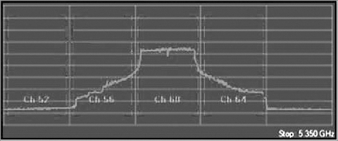
Initially all 802.11a and 802.11g devices used 20 MHz wide channels. With the introduction of 802.11n, you now also have 40 MHz wide channels. They have similar-shaped spectral masks, but you will note the 40 MHz mask is twice as wide (Figure 11-29). The 40 MHz channels are not recommended for 2.4 GHz deployments; however, that does not prevent someone from using them. The 40 MHz channels are commonly implemented 5 GHz deployments for 802.11n Greenfield mode. It is also possible to mix 20 MHz and 40 MHz modes on the same frequencies, but it is not best practice because of an inordinate amount of protection mechanisms that must be put in place. The protection mechanisms will greatly reduce your potential throughput.
Figure 11-29: OFDM curve—40 MHz

Frequency-Hopping Example
The first frequency-hopping spectrum example is of a Bluetooth device first in discover mode using pseudorandom frequency selection, followed by the personal area network (PAN) mode that happens after connection. Note in the swept spectrogram view during the discovery mode (Figure 11-30) that the little dots line up in nice, clean vertical columns. This is because in discovery mode, when the Bluetooth devices are searching for others to pair with, there is a fixed pseudorandom sequence, thus leaving the vertical lines as the hops are always returning to the same spots. This behavior can also be seen in the FFT plot in Figure 11-31.
Now you will see a Bluetooth device that is functioning in PAN mode. When operating in this mode, you can see in the swept spectrogram view (Figure 11-32), a fully random distribution of hot points. You can still see the peaks in the RF energy, but those are no longer in a fixed pattern. You can also see the random distribution of signal in the FFT plot in Figure 11-33.
Figure 11-30: Swept spectrogram of Bluetooth discovery
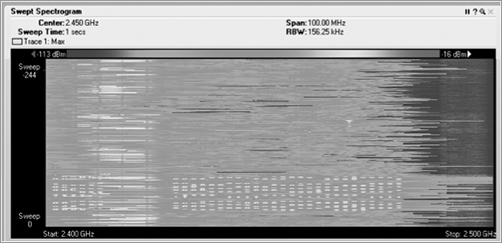
Figure 11-31: FFT plot of Bluetooth discovery
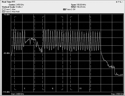
Figure 11-32: Swept spectrogram of Bluetooth PAN
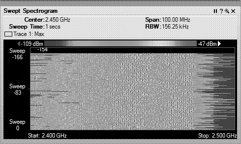
Figure 11-33: FFT plot of Bluetooth PAN
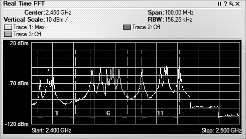
Figures 11-34 and 11-35 show the RF patterns of a couple of frequency-hopping digital portable telephones. Figure 11-34 displays the patterns of a 2.4 GHz telephone, and Figure 11-35 displays the patterns of a 5.8 GHz telephone. These views display the RF patterns of digital telephones you might pick up at a local electronics store. These telephones have very low-duty cycles and by hopping around the spectrum are less likely to interfering with an 802.11 wireless network. Notice that even though these telephones operate in different frequencies, their RF signatures are similar.
Other frequency-hopping technologies that you may run across include some medical telemetry units, very old FHSS 802.11 classic devices, and a variety of proprietary systems.
In evaluating frequency-hopping systems, be sure to not be focused on the FFT and swept spectrogram plots alone. These type signatures may seem to be quite strong, and individual peaks on the hops might actually have a high dB value. However, you must also check the duty cycle. This will help you determine how much actual interference is being transmitted. You might have a device, as shown in this Bluetooth capture, that transmits a high dB signal but uses very little-duty cycle (Figure 11-36) and not have much interfering capacity at all.
Figure 11-34: Frequency-hopping porTable 2-4 GHz telephone

Figure 11-35: Frequency-hopping 5 GHz portable telephone
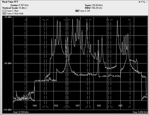
Figure 11-36: Duty cycle of Bluetooth discovery
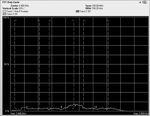
Analog RF Energy
A variety of devices that operate in the 2.4 GHz band use analog radio signals to communicate. Analog radio signals work fine for devices such as a wireless mouse or a cordless telephone carrying voice data. Analog signals have a certain quality to them, transmitting using a very narrow specific frequency, usually with an RF pattern that has much weaker shoulders falling off to both sides.
One of the RF signatures that Figure 11-37 shows is the RF signature of a Logitech 2.4 GHz mouse. This mouse is currently operating around channel 6. As described earlier, it has a very narrow signal that drops off quickly. When viewed in the swept spectrogram (Figure 11-38), the mouse leaves a unique trail, leaving behind a line of hot signal. This signal is generated when the mouse is actually moving and needing to send data to your laptop. This mouse, and many others like it, will also detect interference and move itself to a different frequency when needed.
Another type of analog device is an older model portable cordless telephone. These units operate in the 2.4 GHz and 5.8 GHz frequency ranges. Unlike many of the newer model telephones that automatically switch between frequencies when there is interference, with these older-style telephones, you have to press a “channel” button on the telephone to manually switch to a new channel. When you click the channel button, the frequency does switch but barely. In Figure 11-40, the channel button was pressed five times, but you can clearly see that there are only four different frequencies used. This is because this model of telephone supports only four unique channels, so the fifth pressing of the channel button just returned the telephone to the original channel. Also notice that all four channels are very close together, with all of them operating within the 22 MHz wide area of channel 1.
Figure 11-37: Real-time FFT of Logitech analog mouse
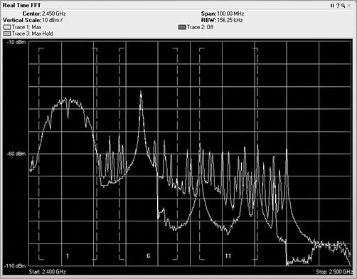
Figure 11-38: Swept spectrogram of Logitech analog mouse
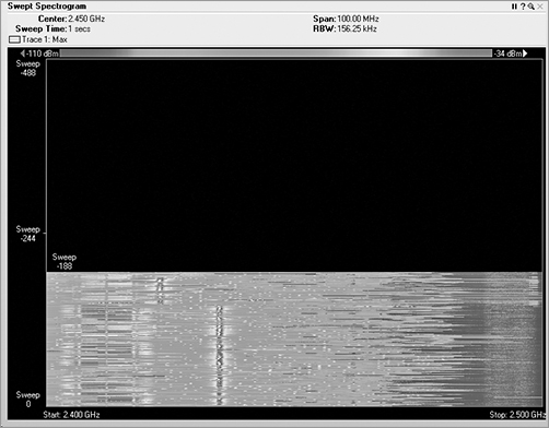
Figure 11-39: Real-time FFT of 2.4 GHz analog telephone
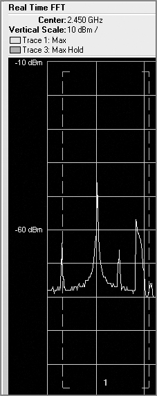
It is important to monitor as much of the frequency spectrum as possible when you are testing equipment or monitoring the RF behavior of a device. In addition to the 2.4 GHz analog telephone, we also monitored a 5 GHz analog telephone. If you look at Figure 11-40, you are actually looking at a swept spectrogram of the 2.4 GHz frequencies. While changing channels on the 5 GHz telephone, we noticed that the 2.4 GHz spectrum was being affected. What do you think is causing this?
The answer to this question is simple and straightforward, although intriguing. A 5 GHz radio uses more electrical energy than 2.4 GHz radio. To prolong battery life in the handheld telephone, the manufacturer decided to use a 5 GHz signal to transmit from the base station that is plugged directly into a power source and then to use a 2.4 GHz signal to transmit from the handset to the base station. It’s not only intriguing but also misleading, especially when the box for the telephone clearly states it is a 5 GHz telephone!
Figure 11-40: Swept spectrogram of 5 GHz analog telephone affecting 2.4 GHz spectrum
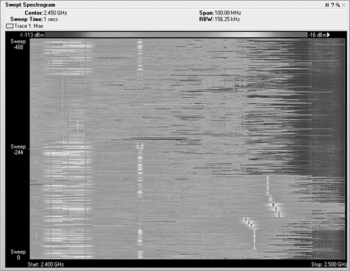
Jammers
An analog narrow-band jammer is actually a signal generator that was initially designed to test coaxial RF cable. The one we used to create the figures generates 700 mW of raw analog RF energy. The intended use of it is to first connect it to one end of a cable and to place a watt meter on the other end of the cable. At this point, it can be used to perform different tests. When the signal generator is turned on, the technician can look at the watt meter and identify how much of the generated 700 mW of signal is actually received at the meter. The difference is the loss or attenuation caused by the cables and connector. The technician can also lightly wiggle or shake the cable and watch to see whether the meter on the other end of the cable fluctuates. If the reading on the meter fluctuates, this indicates there is an electrical short or opening internally in the cable or at one of the connectors. However, when the signal generator is connected to an antenna, it becomes a very strong narrow-band jammer. The jammer has a very analog-looking signature (Figure 11-41). What is particularly significant is how much power it is generating, both in decibels (Figure 11-42) and more importantly in the duty cycle (Figure 11-43).
Figure 11-41: Swept spectrogram of narrow-band jammer
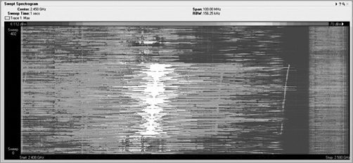
Figure 11-42: Real-time FFT of narrow-band jammer
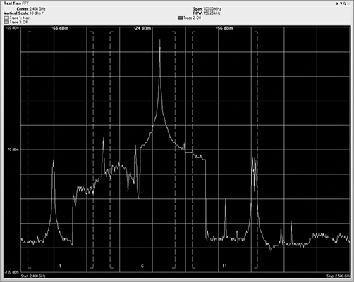
Figure 11-43: Duty cycle of narrow-band jammer

A narrow-band jammer is also useful in wireless LAN penetration testing, because it can be used to disconnect all clients from a specific channel, which in turn will force them to re-associate to other access points, perhaps giving up information useful to the penetration tester.
Another type of jammer, a wide-band jammer, generates interfering signals across an entire frequency range. You can purchase them as a spy camera stopper or as a privacy device, because any of the video cameras mentioned in the section “Video Cameras” would be unable to transmit in the presence of this type of jamming device.
We will leave it to the reader to research the legality of using jamming devices within the operating environment of your regulatory domain. You should realize that in most countries it is illegal to intentionally cause interference, which is exactly what jammers do.
When operating wide-band jammers, these devices typically transmit across the entire RF band (Figure 11-44). Once the jammer is turned on and viewed using a swept spectrogram, you can clearly see the continuous signal spread across the entire band (Figure 11-45), while the duty cycle view also reaffirms the nearly 100 percent continuous transmission (Figure 11-46).
When a wide-band jammer is powered on, both stations and access points will be unable to transmit any frames—since any time they perform a clear channel assessment, it will fail. This will keep all frames from being transmitted on the media. When you look at the effect of this device with a Wi-Fi card, you will see no noise, as well as no signal.
Another type of jamming device is created by misconfiguring an 802.11 client radio. This is not a task that a typical user can do to their Wi-Fi adapter but rather modifications that hardware and software engineers have performed on certain cards. When following the protocol, an 802.11 chipset will perform a clear channel assessment (CCA) before transmitting any frames. This CCA is performed to make sure that no one else is currently transmitting on this same frequency.
As mentioned, some enterprising folks have hacked into the code on some 802.11 devices and removed or shortened the CCA process, allowing the wireless adapter to continuously transmit without having to first check whether the media is busy. The initial version of this type of device was called the Queensland Attack and was a piece of test software that used any PCMCIA NIC built on a specific chipset. This internally developed test utility was leaked to the public, and with this tool you could put your card into a constant transmit mode. Today you can purchase a device for testing your spectrum analyzer called AirHORN that is capable of generating a variety of test signals, scanning across 2.4 GHz or 5 GHz channels, pulsing, that uses an 802.11 USB device to perform a variety of jamming processes.
Figure 11-44: Real-time FFT of 2.4 GHz wide-band jammer
Figure 11-45: Swept spectrogram of 2.4 GHz wide-band jammer
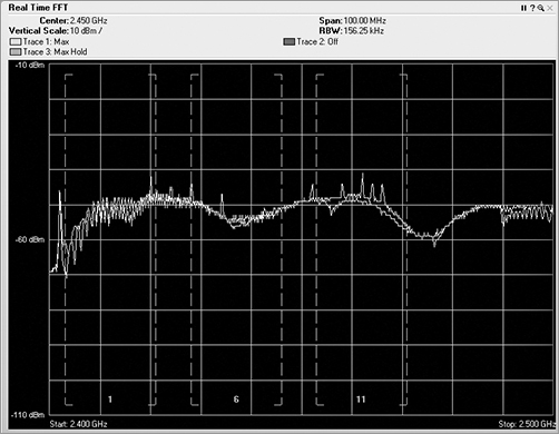
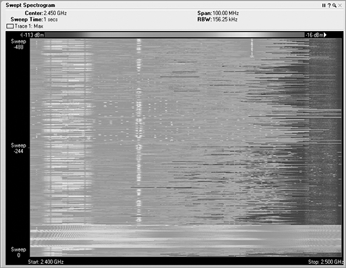
Figure 11-46: FFT duty cycle of 2.4 GHz wide-band jammer
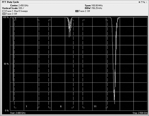
This slight change in the coding allows for a client station, either a PCMCIA or USB form-factor device, to be used in jamming mode. To generate the figures, we used the signal generation product called AirHORN. It can transmit what looks like a standard PSK curve in the FFT plots (Figure 11-47). You will notice near the top of the swept spectrogram (Figure 11-48) that the signal does not look quite right. The shape is the same as a normal 802.11 PSK curve, but it no longer pulses on and off the way a typical Wi-Fi device does. Instead, it is constantly on.
If you look at the duty cycle (Figure 11-49), you will see that this is not like any 802.11 card you have ever seen before. Because of the pulse-like nature of the 802.11 protocol, the spectrum analysis signature of an 802.11 device is unique. These are things that have already been covered in previous chapters, such as DIFS, contention windows, transmitting data, SIFS, and ACKs. These and many other components of 802.11 communications cause many periods of time when there is no transmission on the media.
Figure 11-47: Real-time FFT of AirHorn 802.11 jammer
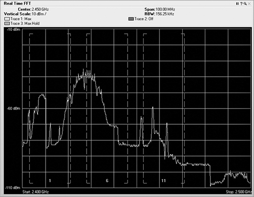
Figure 11-48: Swept spectrogram of AirHorn 802.11 jammer
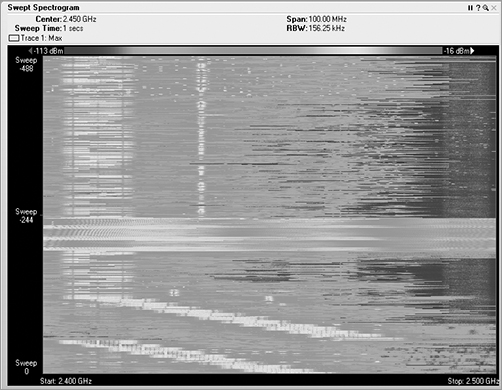
Figure 11-49: Duty cycle of AirHorn 802.11 jammer
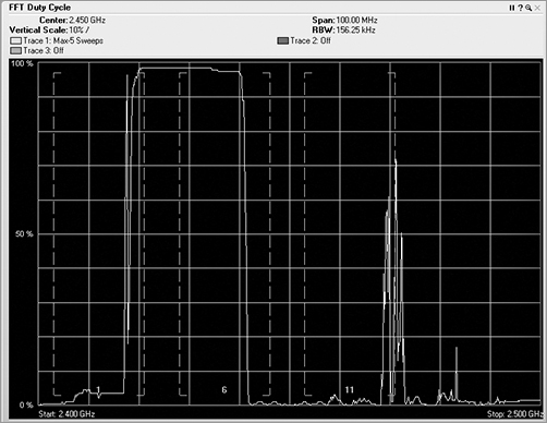
If viewed by a Wi-Fi adapter, since this device is transmitting what appears to be an 802.11 signal, the Wi-Fi card will report this as just a strong access point.
Wireless Video Cameras
These little devices are typically sold as nannycams, as wireless security cameras, or even as remote ways to watch your children while you are gone. There are two key types of video cameras available in the 2.4 GHz spectrum: Wi-Fi based cameras, and non-Wi-Fi based cameras. To begin with, we will be referring to the non-Wi-Fi-based cameras.
These wireless video cameras transmit an analog signal (Figure 11-50), taking up a large chunk of the RF spectrum in the channel 1 area, often as much as one-fourth of the available 2.4 GHZ band, which is about the width of one of the 22 MHz 802.11 channels, as shown in the lower-left corner (Figure 11-51). These wireless video cameras also transmit with near 100 percent duty cycle, as shown on the left side of the plot (Figure 11-52). These analog video cameras do not specifically use any of the 802.11 channels and can cause great havoc to your wireless LAN. Fortunately, many are not very high-powered devices and therefore have a fairly small RF coverage area or footprint. The coverage area where these devices may cause disruption to your wireless LAN is perhaps as small as 10 to 20 meters.
Figure 11-50: Real-time FFT of analog video camera
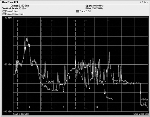
Figure 11-51: Swept spectrogram of analog video camera
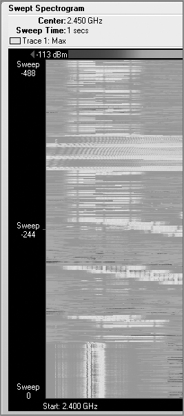
Figure 11-52: Duty cycle of analog video camera

Vulnerability of a Layer 1 Denial of Service
When doing wireless penetration testing at client venues, we sometimes enter the premises with one or more of the analog wireless video cameras hidden unobtrusively in a pocket or backpack. To provide power to these cameras, we have created small, portable battery packs. This is a very disruptive activity that we perform to prove to the client that their wireless LAN is always vulnerable to a layer 1 denial-of-service (DoS) attack. It is important to remember that in many parts of the world, the 2.4 GHz and 5 GHz bands that are used for 802.11 networking are also allowed to be used by other non-networking devices. Both of these bands are often unlicensed, allowing anyone to use these bands, providing they stay within the operating standards of the local regulatory domain or agency.
The second type of wireless video cameras is Wi-Fi based. These cameras compete in all the same function arenas as the non-Wi-Fi-based cameras, such as security, remote surveillance, and monitoring. These cameras do not use analog RF signals but instead digitize the video and audio streams and transmit these streams as standard 2.4 GHz or 5 GHz Wi-Fi traffic. Since these cameras transmit their data as standard 802.11 frames, they must contend with any other 802.11 data frames to gain access to the RF medium. These types of digital 802.11 cameras do not have the same interfering capacity of their analog brethren. We have not provided any spectrum analyzer images for these digital cameras, since they are standard 802.11 devices, and therefore their traffic looks just like any other 802.11 device, either generating PSK or OFDM signatures.
If you need wireless security cameras, you will definitely want to be using digital rather than analog. The digital cameras are more likely to have remote control or pan, tilt, and zoom (PTZ) capabilities as well as access to the video and audio streams via IP connectivity.
Microwave Ovens
Simply put, microwave ovens are not supposed to leak. In reality, microwave ovens do leak an extremely minute amount of RF signal. For a microwave oven to be sold in a country, it must pass a certain level of testing that regulates the amount and level of leakage that is allowed. Even though most microwave ovens are designed with multiple locking systems and auto shutoff upon opening the door, after repeated use, or sometimes abuse, microwave ovens may begin to leak more as time goes by. Industrial ovens, such as those used in commercial restaurants, are designed with replaceable door seals, since this is a common place for leaks to occur. However, most home and office microwaves are not reparable, and if they begin to leak, they will need to be replaced instead of being repaired.
Even the smallest microwave ovens are rated at 800 watts of power. In our world of 802.11 devices, client stations normally transmit signals at around 30 mW, and access points can typically transmit at as much as 100 mW. Microwave ovens operate at around 2.45 GHz, which is near channels 8 and 9 in the 2.4 GHz band. Although this frequency is above channel 6 and below channel 11, the width of the microwave signal can cause interference on either of these channels. All of the autoclassification programs have an easy time classifying microwave ovens. Microwave ovens have a very easy-to-read signature. In Figure 11-53, you can see the tip of the RF signature seeming to bend at the top, and it appears to move around quite a bit. Unlike RF systems that use a crystal to lock the frequency, the RF signals of microwave ovens tend to slide around a bit.
Figure 11-53: Spectrum plots of a microwave oven

A malfunctioning microwave oven has the potential to cause devastating results to your wireless network. If the RF blocking/absorbing front door were removed from a microwave oven, a single microwave oven could take down all 802.11 activities in the neighboring area. This is not something we suggest you try at home or work, because the nonfunctioning 802.11 networks would be the least of your problems. You should not minimize the importance of how much RF interference can result from a leaking microwave oven or even at times one that is operating and functioning normally. Many times seemingly random client problems on a Wi-Fi network have been traced back to the times when someone was heating up some food in the break room. If you determine that a microwave oven is causing problems on your network, you typically have two ways of addressing the problem—move it or replace it. If you decide that the microwave oven should be replaced, you may need to first have it approved by management. In today’s market, the cost of replacing the microwave is far less than the cost of a network technician to troubleshoot further problems caused by the malfunctioning microwave oven. Since a microwave oven is often used by many people in many departments, the problem of replacing it is usually a budget issue, often trying to decide whose budget is going to pay for the replacement.
In this chapter, you left the world of frames and byte structures that were prevalent in the previous sections and moved into the world of radio frequency.
We began the chapter by discussing some of the different options available to a wireless LAN professional. By understanding these options, you can choose which type of spectrum analyzer will fit your specific situation.
You then took a quick look back at how wired and wireless network interface cards process changes in the electromagnetic spectrum, convert them into encoded bits, and then transport them across a medium. You compared and contrasted the differences between Wi-Fi NICs and spectrum analyzers. The Wi-Fi NIC can decode data at an amazing rate, whereas the spectrum analyzer can see all RF signatures.
Then the chapter covered how spectrum analyzers do their thing. We introduced new views and plots to visualize what happens with both modulated and non-modulated RF and what types of signals might cause interference for our wireless LANs. This chapter also included many graphical examples of a variety of RF signatures so you can start learning and recognizing valid vs. interfering RF devices.
To really get the most out of this chapter, go back and review the different examples. Set up a little lab environment and see for yourself what the different devices in your world look like, what your spectrum analyzer reports, and practice. Reading spectrum analysis plots is a learned skill. Start learning today.
Demonstrate appropriate use, features, and configuration of professional spectrum analysis tools. There are many different types of spectrum analyzers varying in price and capabilities. Understand the different features and capabilities that are available.
Identify common RF device signatures, their operating frequencies, behaviors, and impact on WLAN operations. An important part of understanding spectrum analysis is to know and understand the RF signatures that different devices generate. By understanding the signatures of common devices and how they impact the wireless LAN, you can better understand how the RF signatures of unknown devices may affect your wireless LAN.
Identify the purpose and illustrate proper interpretation of common types of spectrum measurement, including swept spectrograph, real-time FFT, utilization, duty cycle. It is important to know the types of plots that spectrum analyzers use to display RF information. Understanding and interpreting an RF signal depends upon being able to read and correlate the information that is generated by the different views. Each view does not present a complete picture or understanding of the RF signal.
| amplitude | narrow-band |
| amplitude modulation | noise floor |
| bit error rate (BER) | PCMCIA |
| cycle | Radiotap Header |
| decibel (dB) | received channel power indicator (RCPI) |
| Express Card | received signal strength indicator (RSSI) |
| fast Fourier transform (FFT) | signal-to-noise ratio (SNR) |
| free space path loss (FSPL) | spectral mask |
| frequency | spectrum analyzers |
| frequency domain | spread spectrum |
| hertz | time domain |
| jammer | waterfall plot |
| milliwatts (mW) | wavelength |
1. What is the best way to mitigate a leaking office microwave oven causing disruption in your wireless LAN?
A. Replace the magnetron device.
B. Use RF-sealing caulk on the door edges.
C. Replace the entire microwave oven.
D. Turn the power on the microwave oven to less than 4.
E. Move the microwave away from the edge of the counter.
2. Looking at the graphic, which of the following devices could have generated this plot?

A. 802.11 OFDM device
B. 802.11 HR-DSSS device
C. Wide-band jammer
D. Narrow-band jammer
E. Bluetooth headset
3. Looking at the graphic, which of the following devices could have generated this plot?
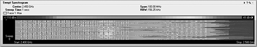
A. An operating Bluetooth mouse
B. A microwave oven
C. An analog video camera
D. A Bluetooth phone in discovery mode
E. A cordless telephone
4. Which of the following are important items to consider when purchasing a spectrum analyzer? (Choose all that apply.)
A. Frequency range
B. Form factor
C. Resolution
D. Wi-Fi integration
E. GPS integration
5. When performing a spectral analysis, it is important to view the information using different plots, because each plot displays a different aspect of the information. Which of the following are common plots that are used? (Choose all that apply.)
A. Swept spectrogram
B. FFT spectrogram
C. Real-time FFT
D. Frame distribution
E. FFT duty cycle
6. If you were isolated in the middle of a desert and you turn on a microwave oven near your 802.11 wireless NIC, which of the following statements would be true regarding the way your NIC will report noise?
A. Your NIC will report noise if it is set to channel 1.
B. Your NIC will report noise if it is set to channel 6.
C. Your NIC will report noise if it is set to channel 11.
D. Your NIC will report noise regardless of the channel.
E. Your NIC will not report noise.
7. Looking at the graphic, what type of plot is being displayed?
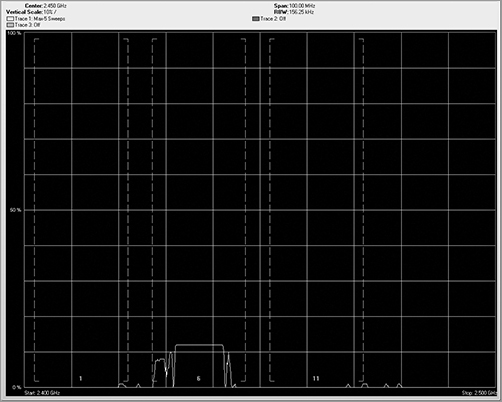
A. Real-time FFT
B. FFT duty cycle
C. Swept spectrogram
D. Spectrum density
E. Waterfall plot
8. Looking at the graphic, what type of plot is being displayed?
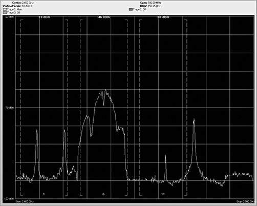
A. Real-time FFT
B. FFT duty cycle
C. Swept spectrogram
D. Spectrum density
E. Waterfall plot
9. Looking at the graphic you see a swept spectrogram plot, which is also referred to as what type of plot?

A. Heat map
B. Spectrum density
C. Waterfall
D. Power dispersion
E. Noise dispersion
10. Choose which of the following two conditions has the potential to cause the most RF interference. (Choose all that apply.)
A. A high-duty cycle
B. A low-duty cycle
C. A high-power burst of energy
D. A low-power burst of energy
E. Not enough information is provided
11. When analyzing RF signatures, which of the following are key characteristics to analyze? (Choose all that apply.)
A. Shape
B. Patterns
C. Pulse or constant
D. Uniqueness
E. Frequency
F. Duty cycle
12. Which of the following are characteristic of an analog RF device such as a wireless mouse? (Choose all that apply.)
A. Wide frequency range
B. Very narrow specific frequency
C. Continuous transmission
D. Low transmitting power
E. Always low-duty cycle
13. Which of the following are characteristics of a non-802.11 wireless video camera? (Choose all that apply.)
A. Narrow band signal
B. Uses up to 1/4 of the available frequencies
C. Low duty cycle
D. Analog signal
E. High duty cycle, nearing 100 percent
14. Looking at the graphic, what type of RF signature is being displayed?
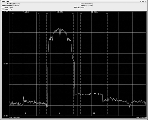
A. OFDM
B. ERP-OFDM
C. FSK
D. ASK
E. PSK
15. Looking at the graphic, what type of RF signature is being displayed?
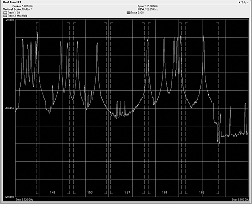
A. Bluetooth device in discovery mode
B. Bluetooth device operating in personal area network mode
C. Frequency-hopping cordless telephone
D. Analog video camera
E. 802.11g OFDM device
16. When analyzing RF information, it is often separated into two different types of domains, known as what? (Choose all that apply.)
A. Power domain
B. Frequency domain
C. Regulatory domain
D. Time domain
E. Signal domain
17. All the nonuseful background RF signal that is received in the frequency range that your device is operating in, from any type of device whether it is generated by an intentional radiator or an unintentional radiator, is known as what?
A. Interference
B. Background noise
C. Spectral noise
D. White noise
E. Noise floor
18. What is the name of the additional information that is added to the frame at the receiving station and includes date and time stamps, channel stamp, signal stamp, and noise stamp?
A. Preamble
B. Radiohead
C. Start of frame delimiter
D. Radiotap Header
E. Received signal strength indicator
19. What are two systematic methods for dividing and locating or tracking unknown RF devices? (Choose all that apply.)
A. Triangulation
B. Follow the leader
C. Geiger counter
D. Quadrants
E. Sectorizing
20. Looking at the graphic showing U-NII 2 channels, what type of RF signature is being displayed?

A. 20 MHz OFDM
B. 40 MHz OFDM
C. PSK
D. ASK
E. FSK
1. C. Industrial ovens, like those used in commercial restaurants, are designed with replaceable door seals. However, most home and office microwaves are not reparable, and if they begin to leak, they will need to be replaced instead of being repaired.
2. D. Of the possible answers, a narrow-band jammer is the only device listed that would generate such a strong signal across such a narrow frequency range.
3. D. During the discovery process, a Bluetooth device will do a little frequency hopping, but always using the same frequencies. This ends up looking like the teeth of a saw. After discovery is performed and an actual connection is made between the two Bluetooth devices, the little hot spots, or freckles, lose their nice, neat columns and become random across the allowed frequency range.
4. A, B, C, D. When choosing a spectrum analyzer, it is important to make sure it can monitor the necessary frequency range. Form factor is important to make sure the sensor can connect or plug into your computer. Resolution will provide granularity so that you can see the plots better. Wi-Fi integration will allow you to see both frames and modulated bits on the RF medium at the same time. GPS integration is not typically an available option.
5. A, C, E. The real-time FFT plot displays the FFT realized data plotted with the horizontal axis as frequency and the vertical axis as energy, typically displayed in decibels. The swept spectrogram plot takes the RF energy readings post FFT, and instead of plotting the dB values in vertical height, it converts the dB values to color and then plots a single 1-pixel tall line at the bottom of the plot. When the next set of data arrives, this process is repeated, with all the previous data being pushed up the stack by one row of pixels. The FFT duty cycle plot displays the percentage of the time the ambient RF signal is higher than the noise floor. In this view, you can see whether a device is constantly using a frequency.
6. E. If you turn on a microwave oven near a wireless NIC, there are no data bits being generated by the microwave, so the NIC will always report a noise variable of zero. Remember that this is because 802.11 wireless NICs require bits in order to perform any type of analysis.
7. B. The FFT duty cycle plot displays the percentage of the time the ambient RF signal is higher than the noise floor. Along the side of the plot, the legend is displayed as a percentage from 0 percent to 100 percent. In this view, you can see whether a device is constantly using a frequency. You may also see a very low percentage meaning that the device was barely pulsing on and did not transmit much of the time.
8. A. In a real-time FFT plot, the FFT realized data is plotted with the horizontal axis as frequency and the vertical axis as energy as defined in dBms.
9. C. With a waterfall plot, the spectrum analyzer takes the RF energy readings post FFT, and instead of plotting the dB values in vertical height, like in the FFT plot, it converts the dB values to color and then plots a single 1-pixel tall line at the bottom of the plot. The data flows down the plot, with the latest sampling often at the bottom; however, this can vary by vendor.
10. A, C. The worst scenario would be to have a high-power level signal for a high percentage of the time. In general, a high-duty cycle is worse for RF interference than high dB.
11. A, B, C, D, E, F. All of these are key characteristics for analyzing RF signatures. An additional characteristic to look for is if the signal is generated by a frequency-hopping device.
12. B, D. Analog radio signals work fine for devices such as a wireless mouse or a cordless telephone carrying voice data. Analog signals have a certain quality to them, transmitting using a very narrow specific frequency, usually with an RF pattern that has much weaker shoulders falling off to both sides. A wireless mouse leaves a unique trail, leaving behind a line of hot signal. This signal is generated when the mouse is actually moving and needing to send data to your laptop.
13. B, D, E. Wireless video cameras transmit an analog signal, taking up a large chunk of the RF spectrum, often as much as one-fourth of the available 2.4 GHZ band, which is about the width of one of the 22 MHz 802.11 channels. These wireless video cameras also transmit with near 100 percent duty cycle. These analog video cameras do not specifically use any of the 802.11 channels and can cause great havoc to your wireless LAN. Fortunately, they are not very high-powered devices and therefore have a fairly small RF coverage area or footprint.
14. E. This is a phase shift keying (PSK) curve. This plot is formed by 802.11b devices or 802.11g devices transmitting at the lower data rates. Note the little notch in the center, designating the center frequency of the channel. You may also note smaller notches on the two sides where the protocol demands a distinct drop in signal.
15. C. Looking at the graphic, you will see that the device is operating in the 5 GHz spectrum, which would exclude the Bluetooth devices and the 802.11g OFDM device. Analog cameras typically stick to a range of frequencies and use up a wide range of frequencies, which leaves the choice of the frequency-hopping cordless telephone.
16. B, D. The time domain is where the horizontal axis of the graphs we look at is calibrated by time. The next domain is the frequency domain. In this view, the horizontal axis does not represent time but, rather, frequency. This is the main view of spectrum analyzers.
17. E. The RF noise floor is defined as all the background RF signal that is received in the frequency range that your device is operating in, from any type of device whether it is generated by an intentional radiator or an unintentional radiator.
18. D. The wireless NIC will use some of the specific information gleaned from the RF to bit transition process to actually add information to the wireless frame. This additional information is added at the receiving station, not at the transmitting station, and is in addition to the bits sent from the source. This added information is called the Radiotap Header.
19. A, D. On the floor plan, draw a line from your location in the direction of the strongest signal. Now move to a different location at least 15 to 20 meters (50 feet) and somewhere between 45 and 90 degrees to the right or left of the direction of the strongest signal. From this new location, slowly spin 360 degrees and identify the direction of the strongest signal of the device. On the floor plan, draw a line from your new location in the direction of the strongest signal. You need to perform this task from at least one additional location.
20. A. This is the RF signature for a 20 MHz OFDM RF signature. Note that the edges tend to fall off in both directions on either side of the flat top.