Chapter 10 Presentation Graphics—More than Just SAS/GRAPH
10.1 Generating Box Plots
10.1.1 Using PROC BOXPLOT
10.1.2 Using PROC GPLOT and the SYMBOL Statement
10.1.3 Using PROC SHEWHART
10.2 SAS/GRAPH Specialty Techniques and Procedures
10.2.1 Building Your Own Graphics Font
10.2.2 Splitting a Text Line Using JUSTIFY=
10.2.3 Using Windows Fonts
10.2.4 Using PROC GKPI
10.3 PROC FREQ Graphics
SAS/GRAPH software has had the ability to create presentation-quality graphs since its introduction. Currently within SAS there are several graphing systems, with some of the newest innovations associated with ODS Statistical Graphics. Outside of these two graphics systems there are a number of procedures that have plotting and graphing capabilities that are comparable to SAS/GRAPH. A well-rounded programmer will be aware of each of these systems and will be able to take advantage of the strengths of each. This chapter briefly discusses the plotting capabilities of some procedures that are not part of SAS/GRAPH.
MORE INFORMATION
The plotting capability of PROC UNIVARIATE (see Sections 8.2.1 through 8.2.3) and PROC REG (see Sections 9.3 and 9.4) are demonstrated in other sections of the book.
A review of the SYMBOL, AXIS, and LEGEND statements, which are used throughout this chapter, can be found in Chapter 9.
SEE ALSO
Carpenter (2010b) demonstrates a number of these procedures along with a variety of capabilities. SAS has extensive graphing capabilities that are not covered in this book. Introductions to SAS/GRAPH can be found in Carpenter and Shipp (1995) and Miron (1995). The annotate facility is introduced in Carpenter (1999). ODS Graphics and Statistical Graphics are described in the books by Kuhfeld (2010), as well as Matange and Heath (2011).
10.1 Generating Box Plots
A box plot is a type of graph that has been used to display more than two dimensions worth of information on a single graph. Unlike some other graphics techniques that also attempt to display more than two dimensions, the box plot can do so without creating visual distortions that otherwise can mislead the reader (Carpenter 1994 and Carpenter 1995, Section 5.7). Although used heavily in some disciplines, they are unfortunately ignored in others.
Traditionally, the number of ways to generate a box plot within SAS was fairly limited. User-written programs were common with some of the more sophisticated published examples presented by Michael Friendly (Friendly, 1991). The SYMBOL statement within SAS/GRAPH can also be used to generate box plots; however, even with the addition of recent options this is still a limited technique. More recent additions to SAS provide procedures that can be used to generate box plots. Of these, the only procedure dedicated to the generation of box plots is PROC BOXPLOT (see Section 10.1.1), which is part of SAS/STAT software. Other procedures that generate variations of this type of data display include:
|
SAS/GRAPH |
(using the SYMBOL statement, see Section 10.1.2) |
|
SAS/STAT |
|
|
SAS/QC |
(see Section 10.1.3) |
SEE ALSO
The programs and macros found in Michael Friendly’s book (Friendly, 1991) are well written and well explained. The techniques described provide a flexibility that is hard to beat even in the newer procedures.
10.1.1 Using PROC BOXPLOT
PROC BOXPLOT, a fairly recent addition to SAS/STAT software, is used to create a variety of types of box plots. The PLOT statement is used to provide primary control, and PLOT statement options in addition to those shown in the example below include:
|
indicates the type of box to be displayed |
|
|
used to control the box width |
|
|
allows box width to vary according to a function of the group size |
|
|
draws the boxes with notches |
|
|
attaches a legend statement (see Section 9.3.2) |
|
Although this is a SAS/STAT procedure, it has the capability of utilizing statements that are normally associated with SAS/GRAPH. These include the SYMBOL, AXIS, and LEGEND statements (see Section 9.3).
symbol1 color = blue h = .8 v=dot;
axis1 minor=none color=black
label=(angle=90 rotate=0);
proc boxplot data=demog;
plot wt*symp/ cframe = cxdedede 
boxstyle = schematicid 
cboxes = red
cboxfill = cyan
vaxis = axis1 
;
id race; 
run;
![]()
![]()
![]()
![]()
![]()

In this example the SYMBOL statement has been used to control the color and symbol designating the mean (a blue dot). The median is designated with a horizontal line and the upper and lower limits of the box are the 25th and 75th percentiles.
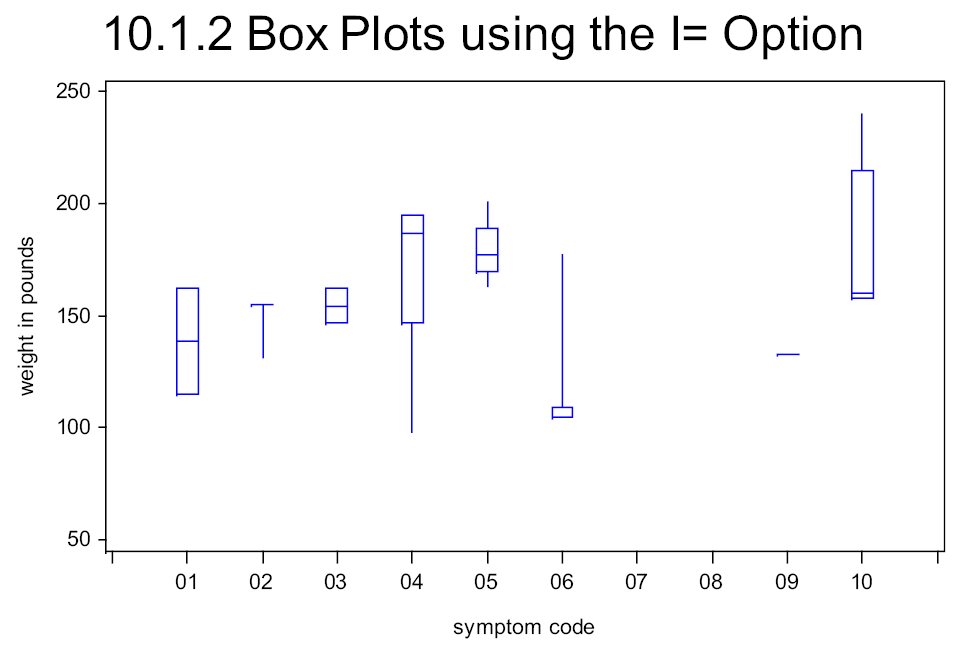
10.1.2 Using PROC GPLOT and the SYMBOL Statement
The SYMBOL statement (see Section 9.3.1) can be used to generate box plots directly in the GPLOT procedure. The control is through the use of the INTERPOL= option, which is usually abbreviated as I=. When I= takes on the value of BOX, data are condensed into a box plot for constant values of the horizontal variable (SYMP).
symbol1 color = blue v=none i=box10 bwidth=3;
symbol2 color = red v=dot i=none h=1.2;
axis1 minor=none color=black
order=(50 to 250 by 50)
label=(angle=90 rotate=0);
axis2 order = ('00' '01' '02' '03' '04' '05'
'06' '07' '08' '09' '10' '11')
value = (t=1 ' ' t=12 ' '),
proc gplot data=demog;
plot wt*symp/ haxis = axis2
vaxis = axis1
;
run;
![]()
|
identifies the outline color |
|
indicates that plot symbols are not needed |
|
requests box plots with the BOX option BOX10 whiskers are at the 10th and 90th percentiles |
|
specifies the width of the boxes |
symbol1 color = blue v=dot i=box10 bwidth=3;
symbol2 color = red v=dot i=none h=1.2;
axis1 minor=none color=black
order=(50 to 250 by 50)
label=(angle=90 rotate=0);
axis2 order = ('00' '01' '02' '03' '04' '05'
'06' '07' '08' '09' '10' '11')
value = (t=1 ' ' t=12 ' '),
proc shewhart data=demog;
boxchart wt*symp/
haxis = axis2
vaxis = axis1
stddeviations nolimits
;
run;
![]()
![]()
10.1.3 Using PROC SHEWHART
PROC SHEWHART, which is available in SAS/QC software, can be used to generate a number of process control charts, and box plots are one of the supported chart forms.
The following code can be used to create box plots using PROC SHEWHART. Note that the horizontal plot variable must be character.
The AXIS statements are used to augment the axes. Although SHEWHART and CAPABILITY are not SAS/GRAPH procedures, they support AXIS, SYMBOL, and PATTERN statements.


symbol1 color = blue v=dot h=2;
You can also use the ANNOTATE facility with these procedures.
10.2 SAS/GRAPH Specialty Techniques and Procedures
SAS/GRAPH software has been a product of SAS software for quite a long time. During that time not only has its capabilities continued to expand, but so have the technologies to which it is delivering. As a result there are a great many graphics problems that have been solved over the years. Here are a few of the more interesting.
10.2.1 Building Your Own Graphics Font
Although the plot symbols available through SAS/GRAPH software are generally adequate for our graphing needs, occasionally you may want to tailor plot symbols for specific needs. The GFONT procedure can be used to create plot symbols. The procedure is used to draw the symbol shape in much the same way as the annotate facility is used to draw, that is by drawing from one coordinate to the next.
In this example we are not satisfied with the ‘lumpy’ appearance of the dot symbol, and would like to create a smoother symbol. This portion of a graph was generated using the standard DOT symbol.
We can smooth out the circle by generating our own symbol using PROC GFONT.

A control data set that draws the font characters (in this case just a circle) is first generated in a DATA step. Like annotate data sets, specific variables are used to pass information to the GFONT procedure. Here we are drawing the outline of a circle using 721 short line segments. This control data set is then passed to GFONT.
data fontdata(keep=char seg x y lp ptype);
retain char 'c'
seg 1
lp 'p';
ptype='w'; x=-10; y=110; output fontdata;
ptype='v'; x=100; y=50; output fontdata;
do deg = 0 to 360 by .5;
rad = deg*arcos(-1)/180;
x=50*cos(rad)+50;
y=50*sin(rad)+50;
output fontdata; 
end;
run;
libname gfont0 "&pathdata"; 
proc gfont data=fontdata
name=mydot 
filled 
resolution=3; 
run;
symbol1 f=mydotc=blue v='c'h=1;
![]()
![]()
![]()
![]()
![]()
![]()
![]()
![]()
![]()
![]()
![]()
The resulting dots are a bit smoother. In this screen capture some pixelation has taken place when the image was copied into this document.

SEE ALSO
Carpenter (1995) uses PROC GFONT to create a logo and sunflower symbols that self adjust according to the plotted value. Plot symbol resolution was further discussed with alternate solutions in the SAS Forum thread at http://support.sas.com/forums/thread.jspa?threadID=12547&start=0&tstart=0.
10.2.2 Splitting a Text Line Using JUSTIFY=
Within SAS/GRAPH software you can use the text justification option to split lines of text. Very often this technique can be used where you otherwise would be unable to split the text line. All that you need to do is to repeat the justification option. The second occurrence will cause a line split.
title1 f=arial h=1.2 justify=c '10.2.2'
j=center 'Splitting Text';
symbol1 c=blue v=dot h=1.5;
symbol2 c=red v=dot h=1.5;
axis1 reflabel = (h=1.5
t=1 c=red j=left 'Overweight'
j=l ' '
j=l c=blue 'Normal'),
axis2 order=(1920 to 1970 by 10)
label=(j=c 'Birthyear'j=c 'All Subjects'),
![]()

![]()
![]()
10.2.3 Using Windows Fonts
SAS/GRAPH software has a number of built-in fonts. In addition if you are executing in the Windows environment, you may also use Windows TrueType fonts.
The GOPTIONS statement (see Section 9.2) is used to specify graphics options, and one of these options, the FTEXT= option, can be used to specify fonts. On titles the FONT= option (see Section 9.1) can also be used to specify fonts.
goptions reset=all noborder
device=emf
gsfname=image gsfmode=replace
ftext='Arial';
title1 f=arial 'This is a Title';
![]()
![]()
You can see a list of available fonts, and their alternate designations, by selecting the FONTS entry in the Windows control panel. Select Start → Control Panel → Fonts.
Some fonts have named variations that include bold and italics (‘Arial Bold’). You may also want to specify font modifiers. Of the three available font modifiers, bold (/bold or /bo ![]()
axis1 label=(f='arial/bo
symbol1 c=blue
f='wingdings 2' v='ð'
i=box10 bwidth=3;
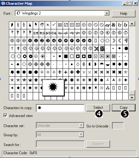
There are a number of symbol sets that are included with SAS/GRAPH software. For symbol sets other than the default symbol set, the name of the symbol set is specified with the FONT= (or F=) option on the SYMBOL statement. For special characters that are not SAS/GRAPH special characters (characters that do not have a value mapped to the keyboard), the character can often be inserted from the character map (shown to the right). Select Start → Programs → Accessories → System Tools → Character Map. ![]()
![]()
![]()
CAVEAT: If you choose a non-standard font that is only available on your local machine, your SAS program becomes less transportable.
10.2.4 Using PROC GKPI
The GKPI (Key Performance Indicator) procedure is fairly new to SAS/GRAPH. This procedure allows you to quickly build indicator bars or dials that show the relative status of a value within a range that you have specified. There are several types of performance indicators available through this procedure. The horizontal slider (HBULLET) is shown here. You can specify the range of values, colors to separate ranges, and the current value.

goptions reset=all noborder
device=javaimg
xpixels=130 ypixels=50
ftext='Arial';
The JAVAIMG device ![]()
Each execution of the procedure generates a single indicator graphic; therefore, for practical applications the GKPI procedure step will need to be called within a macro loop of some kind.
%macro slider(gname,bmi);
proc gkpi mode=raised;
hbullet actual=&bmibounds=(0 18.5 25 30 50)/
noavalue nobvalue
target=. colors=(blue,green,yellow,red)
name="c: emp&gname"
run;
quit;
%mend slider;
![]()
![]()
![]()
![]()
![]()
We would like to report on each subject’s body mass index, BMI, value. In that report we need to show the indicator calculated for each specific subject. This means that we need to run the GKPI procedure once for each subject in the data set after first calculating the BMI value. The CALL EXECUTE routine allows us to create a series of macro calls; one for each observation in the DATA step.
title; ods html file="c: empslider.gif";
data bmi(keep=subject ht wt gname bmi); set advrpt.demog(obs=8); length gname $4; bmi = wt / (ht*ht) * 703;
gname=cats('G',subject);
call execute('%slider('||gname||','||put(bmi,4.1)||')'),
run; ods html close; |
![]()
![]()
![]()
%slider(G200,24.3)
%slider(G201,21.4)
%slider(G202,25.1)
%slider(G203,36.5)
%slider(G204,18.0)
%slider(G205,25.1)
%slider(G206,23.0)
%slider(G207,24.3)
![]()
After all the calls to the macro %SLIDER have been executed, a series of PNG files will have been generated ![]()
![]()
![]()
ods pdf file="&path
esultsE10_2_4.pdf" style=default;
title font=arial '10.2.4 Using GKPI'; proc report data=bmi nowd; column subject gname ht wt bmi slider; . . . . code not shown . . . . define slider / computed ' '; compute slider/char length=62; slider=' '; imgfile = "style={postimage='c: emp"||trim(left(gname))||".png'}";
call define ('slider','style',imgfile);
endcomp; run; ods pdf close; |
![]()
![]()
.
A portion of the resultant PDF file is shown here.

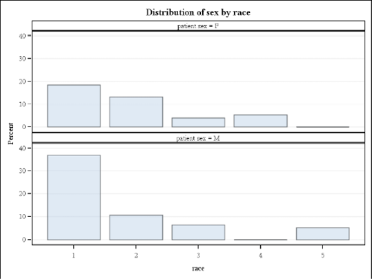
10.3 PROC FREQ Graphics
The FREQ procedure has now been included in the list of base procedures that can produce graphics through the ODS Statistical Graphics routines. The TABLE statement supports the PLOT= option, which can be used to generate a number of graphs.
A number of different types of plots are available, especially if you are calculating test statistics, such as those generated with the CHISQ option. The PLOTS= option is used to make the plot requests. You may specify specific types of plots, as is done below, or you may request all plots (plots=all).

ods graphics on;
ods pdf file="&path
esultsE10_3.pdf";
proc freq data=advrpt.demog;
table wt / plots=cumfreqplot(scale=freq);
table sex*race/plots=freqplot(scale=percent);
run;
ods pdf close;
![]()

![]()