Chapter 4: Clinical Graphs Using the SAS 9.4 SGPLOT Procedure
4.1 Box Plot of QTc Change from Baseline
4.1.1 Box Plot of QTc Change from Baseline
4.1.2 Box Plot of QTc Change from Baseline with Inner Risk Table and Bands
4.1.3 Box Plot of QTc Change from Baseline in Grayscale
4.2 Mean Change in QTc by Visit and Treatment
4.2.1 Mean Change in QTc by Visit and Treatment
4.2.2 Mean Change in QTc by Visit and Treatment with Inner Table of Subjects
4.2.3 Mean Change in QTc by Visit and Treatment in Grayscale
4.3 Distribution of ASAT by Time and Treatment
4.3.1 Distribution of ASAT by Time and Treatment
4.3.2 Distribution of ASAT by Time and Treatment in Grayscale
4.4 Median of Lipid Profile by Visit and Treatment
4.4.1 Median of Lipid Profile by Visit and Treatment on Discrete Axis
4.4.2 Median of Lipid Profile by Visit and Treatment on Linear Axis in Grayscale
4.5.1 Survival Plot with External "Subjects At-Risk" Table
4.5.2 Survival Plot with Internal "Subjects At-Risk" Table
4.5.3 Survival Plot with Internal "Subjects At-Risk" Table in Grayscale
4.6.2 Simple Forest Plot with Study Weights
4.6.3 Simple Forest Plot with Study Weights in Grayscale
4.8 Adverse Event Timeline by Severity
4.10.1 Injection Site Reaction
4.10.2 Injection Site Reaction in Grayscale
4.11 Distribution of Maximum LFT by Treatment
4.11.1 Distribution of Maximum LFT by Treatment with Multi-Column Data
4.11.2 Distribution of Maximum LFT by Treatment Grayscale with Group Data
4.12.2 Clark Error Grid in Grayscale
4.13.1 The Swimmer Plot for Tumor Response over Time
4.13.2 The Swimmer Plot for Tumor Response over Time in Grayscale
4.14 CDC Chart for Length and Weight Percentiles
Clinical graphs often display the data in one cell along with derived statistics and other details that aid in the decoding of the information in the graph. Most of these single-cell graphs can be created using the SGPLOT procedure.
With SAS 9.4, the SGPLOT procedure supports some new and useful features that simplify the creation of such graphs. These include the following new statements and features:
• XAXISTABLE and YAXISTABLE. These two statements support axis tables along the x- and y-axes. These statements can be used to draw "At-Risk" tables along the X-axis, or study names and statistic values along the Y-axis. Rows and columns of textual data can be displayed inside the data area or outside.
• TEXT plot. This statement displays a text string from a column at the specified location. It replaces the need for using a SCATTER plot statement with the MARKERCHAR option. Because a text plot draws only text strings, other features are available for this function, including control of offsets that might be driven by the text values.
• POLYGON plot. This statement displays polygons in the graph based on the columns in the data set. This is useful in drawing ranges in the graph for various levels, including complex regions in graphs for device evaluation like the Clark Error Grid.
The goal in this chapter is to cover in detail the creation of some commonly used clinical graphs using SAS 9.4. The chapter will provide not only code that you can use directly for such graphs, but will also provide ideas on how you can use or combine plot statements to create your own custom graph.
The SG Annotate facility features are also available for you to use in cases where the result cannot be achieved using plot layers. SG Annotate was used extensively in Chapter 3 to create the clinical graphs. See Section 2.9 for an introduction to this feature.
4.1 Box Plot of QTc Change from Baseline
This graph displays the distribution of QTc change from baseline by week and treatment for all subjects in a study. The x-axis has a linear scale. The "Subjects At-Risk" values are displayed by treatment at the right location along the time axis.
4.1.1 Box Plot of QTc Change from Baseline
For the graph in Figure 4.1.1, we will use a box plot to display the distribution of QTc change from baseline by week and treatment on a linear x-axis. The "Subjects At-Risk" table is shown in the traditional arrangement at the bottom of the graph using the XAXISTABLE statement.
Figure 4.1.1 – Graph of QTc Change from Baseline with the Subjects Table at the Bottom

title 'QTc Change from Baseline by Week and Treatment';
footnote j=l "Note: Increase < 30 msec 'Normal', "
"30-60 msec 'Concern', > 60 msec 'High' ";
proc sgplot data=QTcData;
format week qtcweek.;
vbox qtc / category=week group=drug groupdisplay=cluster nofill;
xaxistable risk / class=drug colorgroup=drug;
refline 26 / axis=x;
refline 0 30 60 / axis=y lineattrs=(pattern=shortdash);
xaxis type=linear values=(1 2 4 8 12 16 20 24 28) max=29
display=(nolabel);
yaxis label='QTc change from baseline' values=(-120 to 90 by 30);
keylegend / title='' linelength=20;
run;
Normally, a box plot treats the category variable as discrete, which would have placed all the tick values on the x-axis at equally spaced intervals. However, in this case the values on the x-axis represent days from start of study, and we want to place the data at the correctly scaled distance along the x-axis. This can be done be explicitly setting TYPE=LINEAR on the x-axis. Now, each box is placed at the scaled location along the x-axis.
The box plot is classified by treatment, which has two values "Drug A" and "Drug B". The boxes are sized by the smallest interval along the x-axis. In this case, it is one day at the start of the study. Hence, the effective midpoint spacing is set by that interval, and all boxes are drawn to fit in this space.
The box plot uses the GROUPDISPLAY=CLUSTER option to place the groups side by side. We have used the NOFILL option to draw empty boxes.
The table of the subjects at risk is displayed using the XAXISTABLE statement, showing risk values by week and drug. The optional X role is not specified, so the table uses the X role that is active; in this case, it is from the VBOX statement. The option LOCATION=OUTSIDE is used to display the risk values outside the data area at the default bottom position.
The XAXISTABLE is classified by treatment by setting CLASS=DRUG. Now, the values for risk are displayed in separate rows by drug. The value of the classifier DRUG is shown in the row label on the left of the data. The option COLORGROUP=DRUG is used to color the risk values by drug for easier association. Display attributes such as font size and font weight are set for both the risk values and labels using the appropriate options:
xaxistable risk / class=drug colorgroup=drug
valueattrs=(size=6 weight=bold)
labelattrs=(size=6 weight=bold);
Reference lines are placed on the y-axis at y= 0, 30, and 60 to represent the levels of concern. A reference line is also placed on the x-axis at x=26 to separate MAX value.
The axis tick value "Max" has a value of x=28, and a format is used to display the tick value. The tick values displayed on the x-axis are determined by the VALUES option on the XAXIS statement, and the option MAX is set to 29 to allow an even display of the tick values.
The y-axis places the tick values from -120 to 90 by 30, and also sets the displayed axis range.
A legend is automatically added by the procedure because the box plot has a GROUP role. We have used the KEYLEGEND statement to customize some aspects of the legend. The legend title is removed, and the lengths of the line segments representing each classification value are shortened using the LINELENGTH option.
Normally, the procedure draws longer lines for each class value in the legend in order to represent the full line pattern. In this case, however, we are using the HTMLBlue style, which uses the attribute priority of color. So, most line styles used are solid, and a long line segment is not required.
Relevant details are shown in the code snippet above. For full details, see Program 4_1, available from the author’s page at http://support.sas.com/matange.
4.1.2 Box Plot of QTc Change from Baseline with Inner Risk Table and Bands
The traditional graph commonly in use in the industry, as shown in Figure 4.1.1, shows the "At-Risk" table at the bottom of the graph, just above the footnote with other items in between. Such a layout places the risk data relatively far away from the graph. Even though the values are aligned with the data along the x-axis, the distance and intervening items like the legend and the axis items create a distraction.
Figure 4.1.2 – Graph of QTc Change from Baseline with Subjects Table inside

Graphs are easier to decode when relevant information is placed as close as possible, thus reducing the amount of eye movement needed to decode the graph. Following this principle, it would be more effective to place the risk information inside the graph area, closer to the graphical information. This arrangement is shown in the Figure 4.1.2. It was achieved by placing the XAXISTABLE with LOCATION=INSIDE, as shown in the code snippet below.
Another improvement would be to represent the levels of concern as colored bands with direct labels. This reduces the eye movement that is required to decode the information in the data. We can do this by using the BAND plot statements. A text plot is used to label each band with the level of concern "Normal", "Concern", and "High". The columns needed are included in the data. The code snippet for inclusion of bands, band labels, and the inner risk table is shown below.
title 'QTc Change from Baseline by Week and Treatment';
proc sgplot data=QTcBand;
format week qtcweek.;
band x=wk lower=L0 upper=L30 / fill legendlabel='Normal' name='a'
fillattrs=(color=white transparency=0.6) ;
band x=wk lower=L30 upper=L60 / fill legendlabel='Concern' name='b'
fillattrs=(color=gold transparency=0.6) ;
band x=wk lower=L60 upper=L90 / fill legendlabel='High' name='c'
fillattrs=(color=pink transparency=0.6);
vbox qtc / category=week group=drug groupdisplay=cluster
nofill name='d';
text x=wk y=ylabel text=label / contributeoffsets=none;
xaxistable risk / class=drug colorgroup=drug location=inside;
refline 26 / axis=x;
xaxis type=linear values=(1 2 4 8 12 16 20 24 28) valueshint
min=1 max=29 display=(nolabel)
colorbands=odd colorbandsattrs=(transparency=1);
yaxis label='QTc change from baseline' values=(-120 to 90 by 30);
keylegend 'a' / title='Treatment:' linelength=20;
run;
For graphs that are consumed in a color medium, this graph provides all the information in a compact form that is free of clutter. The levels of concern are color coded with direct labels, and risk values are moved closer to the rest of the data. For full details, see Program 4_1.
4.1.3 Box Plot of QTc Change from Baseline in Grayscale
The graph in Figure 4.1.3 is created for a grayscale medium using the Journal style, along with a few other customizations.
Figure 4.1.3 – Box Plot of QTc Change from Baseline in Grayscale

title 'QTc Change from Baseline by Week and Treatment';
proc sgplot data=QTcBand;
format week qtcweek.;
styleattrs datalinepatterns=(solid);
band x=wk lower=L0 upper=L30 / fill legendlabel='Normal'
fillattrs=(color=white transparency=0.6);
band x=wk lower=L30 upper=L60 / fill legendlabel='Concern'
fillattrs=(color=lightgray transparency=0.6);
band x=wk lower=L60 upper=L90 / fill legendlabel='High'
fillattrs=(color=gray transparency=0.6) ;
vbox qtc / category=week group=drug groupdisplay=cluster nofill;
scatter x=wk y=QTc / group=drug name='a' nomissinggroup;
text x=wk y=ylabel text=label / contributeoffsets=none;
xaxistable risk / class=drug colorgroup=drug location=inside;
refline 26 / axis=x;
xaxis type=linear values=(1 2 4 8 12 16 20 24 28) valueshint
min=1 max=29 display=(nolabel)
colorbands=odd colorbandsattrs=(transparency=1);
yaxis label='QTc change from baseline' values=(-120 to 90 by 30);
keylegend 'a' / title='Treatment:' linelength=20;
run;
Box plots are represented in the legend using the display characteristics of the box. In this case, the boxes are not filled. Normally, when using grayscale, the line style for the second group is a dashed line. To avoid drawing boxes with patterned lines, we have specified only one solid pattern for all groups in the STYLEATTRS statement. So, using lines in the legend will not be effective.
To distinguish the two groups, we would like to display markers in the legend. To do this, we added a scatter plot that plots QTc by Week and Drug, except that all these QTc values are missing. So, no markers are actually drawn in the plot, but the legend that is derived from the scatter plot displays the marker symbols. Relevant details are shown in the code snippet above. For full details, see Program 4_1.
4.2 Mean Change in QTc by Visit and Treatment
In this section we discuss creating the graph of the mean change in QTc by visit and treatment.
4.2.1 Mean Change in QTc by Visit and Treatment
The graph above displays the mean value of QTc change from baseline by week and treatment for all subjects in a study. The x-axis displays weeks on a numeric scale, with week 28 formatted to "LOCF". The mean values are clustered side by side.
Figure 4.2.1 – Mean Change in QTc by Visit and Treatment

title 'Mean Change of QTc by Week and Treatment';
proc sgplot data=QTc_Mean_Group;
format week qtcmean.;
format n 3.0;
scatter x=week y=mean / yerrorupper=high yerrorlower=low
group=drug groupdisplay=cluster clusterwidth=0.5
markerattrs=(size=7 symbol=circlefilled) name='a';
series x=week y=mean2 / group=drug groupdisplay=cluster
clusterwidth=0.5 lineattrs=(pattern=solid);
xaxistable n / class=drug colorgroup=drug location=outside
title='Number of Subjects at Visit' titleattrs=(size=8);
refline 26 / axis=x;
refline 0 / axis=y lineattrs=(pattern=shortdash);
xaxis type=linear values=(0 1 2 4 8 12 16 20 24 28)
max=29 valueshint;
yaxis label='Mean change (msec)' values=(-6 to 3 by 1);
keylegend 'a' / title='Drug: ' location=inside position=top;
run;
The overlaid series plot could have also used the same response variable "Mean", but then the last value on the x-axis, "LOCF", would have been joined to the previous one.
To avoid this, we have copied the values from the variable "Mean" to the variable "Mean2", with a missing value for the x=28. The series plot uses "Mean2" as the response variable, which excludes the last value to avoid connecting to the "LOCF" value.
Note, both the SCATTER and SERIES statements use GROUPDISPLAY=CLUSTER. This option spreads the position of each group value on the x-axis. CLUSTERWIDTH=0.5 is set to keep the clusters tight. This means that all the class values will be spread within 50% of the midpoint spacing. Since both statements use same setting for group display and cluster width, the lines and markers match for each group value.
An XAXISTABLE is used to display the "Number of Subjects" values at the bottom of the graph. The display variable is "N", and the x-axis variable is the same as the x variable for the primary plot – "Week". So, the optional X role does not need to be specified in the statement.
xaxistable n / class=drug colorgroup=drug location=outside
valueattrs=(size=5 weight=bold) labelattrs=(size=6 weight=bold)
title='Number of Subjects at Visit' titleattrs=(size=8);
The graph is classified by "Drug". We have specified "Drug" for the CLASS role for the axis table. This causes the values for the two values of "Drug" to be displayed in separate rows. COLORGROUP is also set to "Drug", so the values are colored by "Drug".
The table of subjects is displayed at the bottom of the graph by setting LOCATION=OUTSIDE, which is also the default setting. The table has a title, which was set using the TITLE option. Text attributes for the values, labels, and title are specified using the appropriate options.
The Y reference line is drawn at y=0, and the X reference line is drawn at X=26, which acts like a separator for the "LOCF" value. A user-defined format is used to display "LOCF" for x=28.
The legend is generated by default by the procedure because group is in effect. But to prevent multiple items in the legend, we specify the KEYLEGEND statement with the name of only one statement. The legend is placed at the top center of the wall.
Relevant details are shown in the code snippet above. For full details, see Program 4_2.
4.2.2 Mean Change in QTc by Visit and Treatment with Inner Table of Subjects
In this graph, the table of subjects at visit is displayed above the x-axis. This makes it easier to understand the numbers because they are closer to the rest of the graph.
Figure 4.2.2 – Mean Change in QTc by Visit and Treatment

proc sgplot data=QTc_Mean_Group;
format week qtcmean.;
format n 3.0;
scatter x=week y=mean / yerrorupper=high yerrorlower=low
group=drug groupdisplay=cluster clusterwidth=0.5
markerattrs=(size=7 symbol=circlefilled) name='a';
series x=week y=mean2 / group=drug
groupdisplay=cluster clusterwidth=0.5;
xaxistable n / class=drug colorgroup=drug location=inside
valueattrs=(size=5 weight=bold)
labelattrs=(size=6 weight=bold) separator
title='Number of Subjects at Visit' titleattrs=(size=8);
refline 26 / axis=x;
refline 0 / axis=y lineattrs=(pattern=shortdash);
xaxis type=linear values=(0 1 2 4 8 12 16 20 24 28) max=29
valueshint display=(nolabel);
yaxis label='Mean change (msec)' values=(-6 to 3 by 1);
keylegend 'a' / title='Drug: ' location=inside position=top;
run;
The graph above is mostly similar to 4.2.1, with the key difference of placing the "Subjects at Visit" inside the data area instead of at the bottom of the graph. This improves the readability of the graph.
The key difference in the code is the use of LOCATION=Inside for the XAXISTABLE. We also use the SEPARATOR option to draw the line above the table. A reference line is used to separate the "LOCF" value. Relevant details are shown in the code snippet above. For full details, see Program 4_2.
4.2.3 Mean Change in QTc by Visit and Treatment in Grayscale
The graph shown in Figure 4.2.3 shows the Mean Change in QTc graph in grayscale.
Figure 4.2.3 – Mean Change in QTc by Visit and Treatment in Grayscale

ods listing style=journal;
proc sgplot data=QTc_Mean_Group;
styleattrs datasymbols=(circlefilled trianglefilled)
datalinepatterns=(solid shortdash);
format week qtcmean.;
format n 3.0;
series x=week y=mean2 / group=drug groupdisplay=cluster c
clusterwidth=0.5;
scatter x=week y=mean / yerrorupper=high yerrorlower=low
group=drug name='a' groupdisplay=cluster
clusterwidth=0.5 markerattrs=(size=7)
filledoutlinedmarkers markerfillattrs=graphwalls;
xaxistable n / class=drug colorgroup=drug location=inside
title='Number of Subjects at Visit' separator;
refline 26 / axis=x;
refline 0 / axis=y lineattrs=(pattern=shortdash);
xaxis type=linear values=(0 1 2 4 8 12 16 20 24 28) max=29 valueshint;
yaxis label='Mean change (msec)' values=(-6 to 3 by 1);
keylegend 'a' / title='Drug: ' location=inside position=top;
run;
To create an effective graph in grayscale, we have run the same graph as in 4.2.2 with ODS Style=JOURNAL. Also, we have used STYLEATTRS option to customize the group attributes.
Note the use of FILLEDOUTLINEDMARKERS. When we are using the filled markers that are specified here, the markers are drawn with fill and outline. MARKERFILLATTRS=GRAPHWALLS is used. Relevant details are shown in the code snippet above. For full details, see Program 4_2.
4.3 Distribution of ASAT by Time and Treatment
The graphs below consist of three sections. The main body of the graph contains the display of ASAT by Week and Treatment in the middle. A table of subjects in the study by treatment is at the bottom, and the number of subjects with value > 2 by treatment is at the top of the graph.
4.3.1 Distribution of ASAT by Time and Treatment
The values of ASAT by week and treatment are displayed using a box plot. The x-axis type is linear.
Figure 4.3.1 – Distribution of ASAT by Time and Treatment

This graph is likely one of the most complex displays that can be created using the SGPLOT procedure. This graph displays the distribution of ASAT by treatment over time using a grouped box plot on a linear x-axis. The visit values are scaled correctly on the time axis. The smallest interval between the visits determines the "effective" midpoint spacing used for adjacent placement of the treatment values.
title 'Distribution of ASAT by Time and Treatment';
proc sgplot data=asat;
vbox asat / category=week group=drug name='box' nofill;
xaxistable gt2 / class=drugGT colorgroup=drugGT position=top
location=inside separator valueattrs=(size=6)
labelattrs=(size=7);
xaxistable count / class=drug colorgroup=drug position=bottom
location=inside separator valueattrs=(size=6)
labelattrs=(size=7);
refline 1 / lineattrs=(pattern=shortdash);
refline 2 / lineattrs=(pattern=dash);
refline 25 / axis=x;
xaxis type=linear values=(0 2 4 8 12 24 28) offsetmax=0.05
valueattrs=(size=7) labelattrs=(size=8);
yaxis offsetmax=0.1 valueattrs=(size=7) labelattrs=(size=8);
keylegend 'box' / location=inside position=top linelength=20;
run;
An XAXISTABLE statement is used to display the "Number of Subjects" values at the bottom of the graph. A second XAXISTABLE at the top is used to display the count of values above 2.0 by treatment.
4.3.2 Distribution of ASAT by Time and Treatment in Grayscale
The graph in Figure 4.3.2 is the same as above in grayscale. Markers are used in the legend for treatment.
Figure 4.3.2 – Distribution of ASAT by Time and Treatment in Grayscale

Drawing this graph using the Journal style poses a few challenges, mainly in the drawing of the boxes and their representation in the legend. Using the Journal style, the boxes for Drug "B" will get drawn using dashed lines. Because those look odd, I set the STYLEATTRS option to use only solid lines.
ods listing style=journal;
title 'Distribution of ASAT by Time and Treatment';
proc sgplot data=asat2;
styleattrs datalinepatterns=(solid);
vbox asat / category=week group=drug nofill;
scatter x=week y=asat2 / group=drug name='s';
xaxistable gt2 / class=drugGT colorgroup=drugGT position=top
location=inside;
xaxistable count / class=drug colorgroup=drug position=bottom
location=inside;
refline 1 / lineattrs=(pattern=shortdash);
refline 2 / lineattrs=(pattern=dash);
refline 25 / axis=x;
xaxis type=linear values=(0 2 4 8 12 24 28) offsetmax=0.05;
yaxis offsetmax=0.1 valueattrs=(size=8) labelattrs=(size=9);
keylegend 's' / location=inside position=top linelength=20;
run;
Although this improves the rendering of the boxes, it will put two solid lines in the legend for "A" and "B". It would be better to show the mean markers in the legend instead. To do this, I have to add a scatter plot of asat2 by Week and Drug and include that in the legend. Because values in "asat2" are all missing, no markers are displayed in the graph itself, but the group markers are displayed in the legend. Relevant details are shown in the code snippet above. For full details, see Program 4_3.
4.4 Median of Lipid Profile by Visit and Treatment
This graph displays the median of the lipid values by visit and treatment. The visits are at regular intervals and represented as discrete data.
4.4.1 Median of Lipid Profile by Visit and Treatment on Discrete Axis
The values for each treatment are displayed along with the 95% confidence limits as adjacent groups using GROUPDISPLAY option of "Cluster" and the option CLUSTERWIDTH=0.5. The HTMLBlue style is used.
Figure 4.4.1 – Median of Lipid Profile by Visit and Treatment

title 'Median of Lipid Profile by Visit and Treatment';
proc sgplot data=lipid_grp;
series x=day y=median / lineattrs=(pattern=solid) group=trt name='s'
groupdisplay=cluster clusterwidth=0.5 lineattrs=(thickness=2);
scatter x=day y=median / yerrorlower=lcl yerrorupper=ucl group=trt
groupdisplay=cluster clusterwidth=0.5
errorbarattrs=(thickness=1) filledoutlinedmarkers
markerattrs=(symbol=circlefilled)
markerfillattrs=(color=white);
keylegend 's' / title='Treatment' linelength=20;
yaxis label='Median with 95% CL' grid;
xaxis display=(nolabel);
run;
This graph displays the median of the lipid data by visit and treatment. The visits are at regular intervals and represented as discrete data. However, they could also be on a time axis with unequal intervals. The values for each treatment are displayed along with the 95% confidence limits as adjacent groups using GROUPDISPLAY=Cluster and CLUSTERWIDTH=0.5.
The values across visits are joined using a series plot. Note, the series plot also uses cluster groups with the same cluster width. The lengths of the line segments in the legends are reduced using the LINELENGTH option. Markers with fill and outlines are used with specific fill attributes.
Relevant details are shown in the code snippet above. For full details, see Program 4_4.
4.4.2 Median of Lipid Profile by Visit and Treatment on Linear Axis in Grayscale
This graph displays the median of the lipid data by treatment in grayscale on a linear x-axis.
Figure 4.4.2 – Median of Lipid Profile by Visit and Treatment on Linear Axis

title 'Median of Lipid Profile by Visit and Treatment';
proc sgplot data=lipid_Liner_grp;
styleattrs datasymbols=(circlefilled trianglefilled
squarefilled diamondfilled);
series x=n y=median / group=trt groupdisplay=cluster
clusterwidth=0.5;
scatter x=n y=median / yerrorlower=lcl yerrorupper=ucl group=trt
groupdisplay=cluster clusterwidth=0.5
errorbarattrs=(thickness=1) filledoutlinedmarkers
markerattrs=(size=7) name='s'
markerfillattrs=(color=white);
keylegend 's' / title='Treatment' linelength=20;
yaxis label='Median with 95% CL' grid;
xaxis display=(nolabel) values=(1 4 8 12 16);
run;
The visits are not at regular intervals and are displayed at the correct scaled location along the x-axis. The visits are at week 1, 2, 4, 8, 12, and 16. These values are formatted to the strings shown on the axis. "Visit 1" collides with "Baseline", causing alternate tick values to be dropped, so I removed "1" from the tick value list.
As you can see, the group values are displayed as clusters, and the "effective midpoint spacing" is the shortest distance between the values. The markers are reduced in size to show the clustering. This can be adjusted by setting marker SIZE=7. Four filled markers are assigned to the list of markers.
Relevant details are shown in the code snippet above. For full details, see Program 4_4.
4.5 Survival Plot
The survival plot is one of the most popular graphs that users want to customize to their own needs. Here I have run the LIFETEST procedure to generate the data for this graph. The output is saved into the "SurvivalPlotData" data set. For more information about the LIFETEST procedure, see the SAS/STAT documentation.
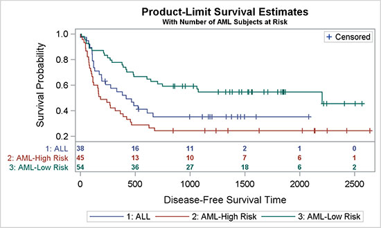
4.5.1 Survival Plot with External "Subjects At-Risk" Table
The survival plot shown below in Figure 4.5.1 has the traditional arrangement where the table of Subjects At-Risk is displayed at the bottom of the graph, below the x-axis.
Figure 4.5.1 – Survival Plot with External "Subjects At-Risk" Table

ods output Survivalplot=SurvivalPlotData;
proc lifetest data=sashelp.BMT plots=survival(atrisk=0 to 2500 by 500);
time T * Status(0);
strata Group / test=logrank adjust=sidak;
run;
A step plot of survival by time by strata displays the curves. A scatter overlay is used to draw the censored values, and an XAXISTABLE statement is used to display the at-risk values at the bottom of the graph. Relevant details are shown in the code snippet above. For full details, see Program 4_5.
title 'Product-Limit Survival Estimates';
title2 h=0.8 'With Number of AML Subjects at Risk';
proc sgplot data=SurvivalPlotData;
step x=time y=survival / group=stratum
lineattrs=(pattern=solid) name='s';
scatter x=time y=censored / markerattrs=(symbol=plus) name='c';
scatter x=time y=censored / markerattrs=(symbol=plus) GROUP=stratum;
xaxistable atrisk/x=tatrisk location=outside class=stratum
colorgroup=stratum;
keylegend 'c' / location=inside position=topright;
keylegend 's';
run;
4.5.2 Survival Plot with Internal "Subjects At-Risk" Table
The graph shown here is mostly similar to the graph in Section 4.5.1, with the difference that the "Subjects At-Risk" table is moved above the x-axis, close to the rest of the data. Bringing all the data closer makes it easy to align the values with the data, and that improves the effectiveness of the graph.
Figure 4.5.2 – Survival Plot with Internal "Subjects At-Risk" Table
title 'Product-Limit Survival Estimates';
title2 h=0.8 'With Number of AML Subjects at Risk';
proc sgplot data=SurvivalPlotData;
step x=time y=survival / group=stratum lineattrs=(pattern=solid)
name='s';
scatter x=time y=censored / markerattrs=(symbol=plus) name='c';
scatter x=time y=censored / markerattrs=(symbol=plus) GROUP=stratum;
xaxistable atrisk / x=tatrisk location=inside class=stratum
colorgroup=stratum separator valueattrs=(size=7 weight=bold)
labelattrs=(size=8);
keylegend 'c' / location=inside position=topright;
keylegend 's';
run;
All this graph needs is to simply specify LOCATION=Inside for the XAXISTABLE statement. In addition to that, we have switched on the separator that draws the horizontal line between the table and the curves.
Relevant details are shown in the code snippet above. For full details, see Program 4_5.
4.5.3 Survival Plot with Internal "Subjects At-Risk" Table in Grayscale
Displaying the survival plot in a grayscale medium presents some challenges.
Here we cannot use colors to identify the strata. Normally, the Journal style uses line patterns to identify the groups. Although line patterns work well for curves, they are not so effective with step plots because of the frequent breaks. So, it is preferable to use solid lines for all the levels of the step plot and to use markers to identify the strata.
Figure 4.5.3 – Survival Plot with Internal "Subjects At-Risk" Table in Grayscale

title 'Product-Limit Survival Estimates';
title2 h=0.8 'With Number of AML Subjects at Risk';
proc sgplot data=SurvivalPlotData;
step x=time y=survival / group=stratum lineattrs=(pattern=solid)
name='s' curvelabel curvelabelattrs=(size=6) splitchar='-';
scatter x=time y=censored / name='c'
markerattrs=(symbol=circlefilled size=4);
xaxistable atrisk / x=tatrisk location=inside class=stratum
colorgroup=stratum separator valueattrs=(size=7 weight=bold)
labelattrs=(size=8);
keylegend 'c' / location=inside position=topright;
run;
In this case, markers are also used to identify the censored observations. So, I have chosen to use the CURVELABEL option with the SPLITCHAR option to identify the curves. This results in a clean and effective graph, without the need for a legend for the strata.
Relevant details are shown in the code snippet above. For full details, see Program 4_5.
4.6 Simple Forest Plot
This forest plot is a graphical representation of a meta-analysis of the results of randomized controlled trials.
4.6.1 Simple Forest Plot
The graph in Figure 4.6.1 shows a simple forest plot, with the odds ratio plot in the middle by study, along with the tabular display of the statistics on the right.
Figure 4.6.1 – Simple Forest Plot

title "Impact of Treatment on Mortality by Study";
title2 h=8pt 'Odds Ratio and 95% CL';
proc sgplot data=forest noautolegend nocycleattrs;
styleattrs datasymbols=(squarefilled diamondfilled);
scatter y=study x=or / xerrorupper=ucl xerrorlower=lcl group=grp;
yaxistable or lcl ucl wt / y=study location=inside position=right;
refline 1 100 / axis=x noclip;
refline 0.01 0.1 10 / axis=x lineattrs=(pattern=shortdash) noclip;
text y=study x=xlbl text=lbl / position=center contributeoffsets=none;
xaxis type=log max=100 minor display=(nolabel) valueattrs=(size=7);
yaxis display=(noticks nolabel) fitpolicy=none reverse
valueshalign=left colorbands=even ) valueattrs=(size=7);
run;
The data for this graph contains the odds ratio, the confidence limits, and the weight for each study. The studies are reclassified with "1" for individual study names and "2" for "Overall". We use this information to plot the graph by study using SCATTERPLOT and YAXISTABLE statements. Note that this graph uses the Analysis style that has an attribute priority of "None", and producing the display of varying markers by group.
We have used the TEXT statement to place the "Favors" strings at the bottom, using a study value of NBSP. Y-axis tick values are left-aligned, and the fit policy is set to "none" so that all tick values are displayed regardless of congestion. For full details, see Program 4_6.
4.6.2 Simple Forest Plot with Study Weights
The graph below shows a simple forest plot with Study Weights, where the markers in the odds ratio plot are sized by the weight of the study.
Figure 4.6.2 – Simple Forest Plot with Study Weights

title "Impact of Treatment on Mortality by Study";
title2 h=8pt 'Odds Ratio and 95% CL';
proc sgplot data=forest noautolegend nocycleattrs nowall noborder;
styleattrs axisextent=data;
scatter y=study x=or2 / markerattrs=graphdata2(symbol=diamondfilled);
highlow y=study low=lcl high=ucl / type=line;
highlow y=study low=q1 high=q3 / type=bar barwidth=0.6;
yaxistable study / y=study location=inside position=left
labelattrs=(size=7);
yaxistable or lcl ucl wt / y=study location=inside position=right;
refline 1 / axis=x noclip;
refline 0.01 0.1 10 100 / axis=x lineattrs=(pattern=shortdash noclip;
text y=study x=xlbl text=lbl / position=center contributeoffsets=none;
xaxis type=log max=100 minor display=(nolabel) valueattrs=(size=7);
yaxis display=none fitpolicy=none reverse valueshalign=left
colorbands=even colorbandsattrs=Graphdatadefault(transparency=0.75);
run;
This graph uses a highlow plot to display the relative weights for each study and the confidence interval. The scatter plot uses the "OR2" variable, which is non-missing only for the "Overall" study. So, only the diamond marker is drawn by the scatter plot.
The width of each marker is proportional to the weight in linear scale. However, because we have used a log x-axis, the widths might not be represented accurately in log scale. So, this can provide a qualitative representation of the weight.
The graph has no wall or wall borders and the x-axis line is displayed only to the extent of the data by using the AXISEXTENT=DATA option on the STYLEATTRS statement. The y-axis is replaced by a YAXISTABLE on the left side so that the bands extend across the full graph.
Relevant details are shown in the code snippet above. For full details, see Program 4_6.
4.6.3 Simple Forest Plot with Study Weights in Grayscale
Figure 4.6.3 shows the same forest plot in grayscale medium.
Figure 4.6.3 – Simple Forest Plot with Study Weights in Grayscale

ods listing style=journal;
title "Impact of Treatment on Mortality by Study";
title2 h=8pt 'Odds Ratio and 95% CL';
proc sgplot data=forest noautolegend nocycleattrs nowall noborder;
styleattrs axisextent=data;
scatter y=study x=or2 / markerattrs=graphdata2(symbol=diamondfilled);
highlow y=study low=lcl high=ucl / type=line;
highlow y=study low=q1 high=q3 / type=bar barwidth=0.6;
yaxistable study / y=study location=inside position=left
labelattrs=(size=7);
yaxistable or lcl ucl wt / y=study location=inside position=right
labelattrs=(size=7);
refline 1 / axis=x noclip;
refline 0.01 0.1 10 100 / axis=x lineattrs=(pattern=shortdash)noclip;
text y=study x=xlbl text=lbl / position=center contributeoffsets=none;
xaxis type=log max=100 minor display=(nolabel) valueattrs=(size=7);
yaxis display=none fitpolicy=none reverse valueshalign=left
colorbands=even valueattrs=(size=7)
colorbandsattrs=Graphdatadefault(transparency=0.8);
run;
Rendering this graph in a grayscale medium does not pose a lot of challenges. Basically, we have set the ODS style to JOURNAL to produce the graph above. This is structurally similar to the graph shown in Section 4.6.2.
Relevant details are shown in the code snippet above. For full details, see Program 4_6.
4.7 Subgrouped Forest Plot
More recently, many of you have been asking for building a forest plot, where each study value has multiple subgroups. The example in Figure 4.7.1 shows two subgroups per observation.
For the graph shown below, only the hazard ratio plot in the middle is displayed using a plot statement. The tabular data is displayed in axis tables.
Figure 4.7.1 – Subgrouped Forest Plot

proc sgplot data=forest_subgroup_2 nowall noborder nocycleattrs dattrmap=attrmap;
styleattrs axisextent=data;
refline ref / lineattrs=(thickness=13 color=cxf0f0f0);
highlow y=obsid low=low high=high;
scatter y=obsid x=mean / markerattrs=(symbol=squarefilled);
scatter y=obsid x=mean / markerattrs=(size=0) x2axis;
refline 1 / axis=x;
text x=xl y=obsid text=text / position=center contributeoffsets=none;
yaxistable subgroup / location=inside position=left textgroup=id
labelattrs=(size=8) textgroupid=text indentweight=indentWt;
yaxistable countpct / location=inside position=left;
yaxistable PCIGroup group pvalue / location=inside position=right;
yaxis reverse display=none colorbands=odd
colorbandsattrs=(transparency=1);
xaxis display=(nolabel) values=(0.0 0.5 1.0 1.5 2.0 2.5);
x2axis label='Hazard Ratio' display=(noline noticks novalues);
run;
The graph above displays the hazard ratio and confidence limits by subgroup, along with the number of patients in the study and other statistics. The key difference here is the display of the subgroups and values in the first column. The subgroup titles are displayed in a bold font, and the values are displayed in a normal font and indented to the right.
Table 4.7.2 - Data for Subgrouped Forest Plot
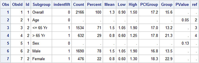
The data for the graph is shown above. The study values come from the "Subgroup" column and are displayed by "ObsId" order. For subgroup labels like "Overall", the Id value is "1", and for the values in the subgroup, the ID is "2". This ID is used to control the attributes of the values that are displayed in the first column of the graph using the attribute map as defined below. Text attributes are defined by the value. Id=1 values are displayed with a bigger, bold font.
In addition, the indention of some of the values in column 1 are controlled by "IndentWt" column. The default indention value is 1/8 inch, and can be changed using the INDENT option. Actual indention amount is based on the INDENTWEIGHT * INDENT.
Figure 4.7.3 – Attribute Map for Font Attributes

The second column contains a combination of patient count and percentage and is displayed by another YAXISTABLE statement. The hazard ratio graph in the middle is displayed using a highlow plot and a scatter plot. Then, the three columns on the right are displayed using another YAXISTABLE, with three columns.
The insets at the bottom, "<- PCI Better" and "Therapy Better ->", are displayed in a text plot using the "text", "xl", and "ObsId" columns. The text is center justified. See the full code for this information in the data set, available from the author’s page at http://support.sas.com/matange.
Finally, the wide horizontal bands across the graph are drawn using the REFLINE statement with the "Ref" column. This column is a copy of the ObsId column where alternate 3 observations are set to missing. Reference lines are not drawn when the value is missing. Also note, the x-axis line is drawn only to the extent of the actual data, and not all the way using the AXISEXTENT option on the STYLEATTRS statement.
Relevant details are shown in the code snippet above. For full details, see Program 4_7.
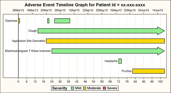
4.8 Adverse Event Timeline by Severity
An Adverse Event Timeline graph by AEDECOD and Severity is useful to view the history of a specific subject in a study.
Figure 4.8.1 – Adverse Event Timeline by Severity
title "Adverse Event Timeline Graph for Patient Id = &pid";
proc sgplot data=ae3s dattrmap=attrmap;
format stdate date7.;
refline 0 / axis=x lineattrs=(color=black);
highlow y=aedecod low=stday high=enday / type=bar group=aesev
lineattrs=(color=black pattern=solid) barwidth=0.8
lowlabel=aedecod highcap=highcap attrid=Severity
nomissinggroup labelattrs=(color=black size=7);
scatter y=aedecod x=stdate / x2axis markerattrs=(size=0);
xaxis grid display=(nolabel) valueattrs=(size=7)
values=(&minday to &maxday by 2) offsetmax=0.02 ;
x2axis display=(nolabel) type=time valueattrs=(size=7) v
alues=(&mindate to &maxdate) offsetmax=0.02;
yaxis reverse display=(noticks novalues nolabel);
run;
The graph above displays each adverse event as a bar segment over its duration. The color of the event is set by the severity. The source data is in CDISC, using the SDTM tabulation model format, as shown below.
Figure 4.8.2 – Data Set for Adverse Event Timeline Graph

The data has many columns, but the ones that we are using are aeseq, aedecod, aesev, aestdtc, and aeendtc. In the example above, all aestdtc values are present and assumed to be valid. If not, some data cleaning might be needed. In the DATA step, stdate is extracted from aestdtc and endate from aeendtc. If aeendtc is missing, the largest value of endate is used, and highcap is set to “FilledArrow” to indicate that the event does not have an end date. A valid end date is required to draw the event in the graph. The data set that is required for plotting the graph is shown below.
Figure 4.8.3 – Data Set for Adverse Event Timeline Graph with Caps

The data set below is computed for creating the graph. Note that in this data set, we do not have any observations with Severity=”Severe”. However, the legend in the graph does have an entry for “Severe”. These dummy observations do not have valid start and end values, so they are not actually drawn in the graph. The top x-axis is enabled by using a scatter plot assigned to the x2- axis. Macro variables are used to align the x- and x2-axes.
Observations with specific group values are assigned the color and other attributes from the GraphData1-12 style elements. These are assigned in the order in which they are encountered in the data. In this case, we are using specific colors for "Mild", "Moderate", and "Severe". If we just change the colors of the style elements, we will get one of the three colors, but the color assignments can shift based on the order of the data.
To ensure consistent and reliable color assignment, we will use the Discrete Attribute Map data set. Colors and the specific values of the group values are explicitly assigned. Now, the group values will get the colors by value, and not those based on the order of the values in the data. In this case, LineColor is used both for lines and text.
Figure 4.8.4 – Discrete Attribute Map Data Set

Another benefit of using the attribute map is based on the SAS 9.4 option "Show" in the map data set. This applies to every map "ID" that is defined in the data set. In this case, there is only one "Severity". By default, only the values that occur in the data are included in the legend. But, if Show is set to "AttrMap", then all the values from the attribute map ID are shown in the legend. In this case, even though the aesev value of "Severe" never occurs in the data, it is still shown in the legend. Another benefit of this feature is that the values that are shown in the legend are sorted in the same order in which they appear in the attribute map. So, we can get a custom sorting of the legend by using this feature.
The highlow plot is ideally suited for such a use case, and provides support for drawing labels and arrowhead caps at each end. In this case, the LOWLABEL option is used to draw the event names. We have displayed the aedecod label only the first time. The HIGHCAP option is used to draw the arrowhead as shown for "Cough" at the right end. This indicates an event that does not have an end date in the data.
For the grayscale use case, we can change the highlow bar type to the default "Line". This will allow use of the line pattern as the visual element for the different severity values. Here is the graph, along with the appropriate attribute map.
Figure 4.8.5 – Adverse Event Timeline for Grayscale

Figure 4.8.6 – Attribute Map for Grayscale Graph

Relevant details are shown in the code snippet above. For full details, see Program 4_8.
4.9 Change in Tumor Size
The graph shown below is commonly known at a "waterfall chart" in the oncology domain. The graph displays the change in tumor size by treatment.
Figure 4.9.1 – Graph of Change in Tumor Size

title 'Change in Tumor Size';
title2 'ITT Population';
proc sgplot data=TumorSize nowall noborder;
styleattrs datacolors=(cxbf0000 cx4f4f4f) datacontrastcolors=(black);
vbar cid / response=change group=group categoryorder=respdesc
datalabel=label datalabelattrs=(size=5) groupdisplay=cluster
clusterwidth=1;
refline 20 -30 / lineattrs=(pattern=shortdash);
xaxis display=none;
yaxis values=(60 to -100 by -20);
inset ("C="="CR" "R="="PR" "S="="SD" "P="="PD" "N="="NE") / title='BCR'
position=bottomleft border textattrs=(size=6)
titleattrs=(size=7);
keylegend / title='' location=inside position=topright across=1 border;
run;
The graph displays the change in tumor size in descending order of size increase for the population by treatment. The data is shown on the right. The response type is shown at the end of the bar.
Figure 4.9.2 – Data for Waterfall Chart

Confidence limits are shown at +20% and -30%. A partial response is generally indicated for tumor shrinkage of 30% or more; however, the author does not claim domain-specific expertise. See domain-centric papers for more information about such details.
The STYLEATTRS statement is used to control the colors for treatments 1 and 2. For specific assignment of colors by treatment, a discrete attribute map would be preferred.
A serious clinical graph does not necessarily have to have boring aesthetics. The graph below displays the same information using a different set of colors and presentation aspects, including bars with a textured look. The confidence region is displayed using a band plot with 50% transparency.
Figure 4.9.3 – Waterfall Chart with Alternative Appearance

title 'Change in Tumor Size';
title2 'ITT Population';
proc sgplot data=TumorSizeDesc nowall noborder;
styleattrs datacolors=(cxbf0000 gold) datacontrastcolors=(black);
band x=cid upper=20 lower=-30 /transparency=0.5
filllegendlabel='Confidence';
vbarparm category=cid response=change / group=group datalabel=label
datalabelattrs=(size=5 weight=bold) groupdisplay=cluster
dataskin=pressed;
xaxis display=none;
yaxis values=(60 to -100 by -20) grid gridattrs=(color=cxf0f0f0);
inset ("C="="CR" "R="="PR" "S="="SD" "P="="PD" "N="="NE") / title='BCR'
position=bottomleft border textattrs=(size=6)
titleattrs=(size=7);
keylegend / title='' location=inside position=topright
across=1 border opaque;
run;
A VBARPARM statement is used instead of a VBAR statement because we want to layer a band plot in the graph. Grid lines are enabled, and the legend has an opaque background. Group display of "Cluster" is used so that we can display the bar data labels.
Relevant details are shown in the code snippet above. For full details, see Program 4_9.
4.10 Injection Site Reaction
The graph in Figure 4.10.1 shows the incidence of injection site reaction by Time and Cohort.
4.10.1 Injection Site Reaction
The (simulated) data is shown on the right, with incidence by group over time.
Figure 4.10.1.1 – Graph of Injection Site Reaction

title 'Incidence of Injection-site Reaction by Time and Cohort - Erythema';
title2 'As-treated Population';
ods listing style=listing;
proc sgplot data=Incidence nowall noborder;
styleattrs datacolors=(gray pink lightgreen lightblue)
datacontrastcolors=(black);
vbar time / response=incidence group=group groupdisplay=cluster;
xaxis discreteorder=data valueattrs=(size=8) fitpolicy=none
display=(nolabel);
yaxis grid display=(noticks);
keylegend / title='' location=inside position=topright across=1 border
autoitemsize valueattrs=(size=8);
run;
We have used a VBAR statement with Time as the category and Cohort (Group) as the group. The time values are treated as discrete, and each cluster of incidence bars is positioned at equidistant midpoints along the axis.
Figure 4.10.1.1 – Data Set for Injection Site Reaction Graph

The STYLEATTRS statement is used to set the four colors for the group values. Y-axis grid lines are enabled, and the tick marks are removed.
4.10.2 Injection Site Reaction in Grayscale
The graph above uses the JOURNAL2 style that is suitable for submissions to journals that are published in grayscale medium. The group classifications are displayed using fill patterns.
Figure 4.10.2 – Graph of Injection Site Reaction in Grayscale

title 'Incidence of Injection-site Reaction by Time and Cohort - ';
title2 'As-treated Population';
ods listing style=Journal2;
proc sgplot data=Incidence nowall noborder;
styleattrs datacolors=(gray pink lightgreen lightblue )
datacontrastcolors=(black) axisextent=data;
vbar time / response=incidence group=group groupdisplay=cluster
baselineattrs=(thickness=0) outlineattrs=(color=gray);
xaxis discreteorder=data valueattrs=(size=8) fitpolicy=none
display=(nolabel);
yaxis offsetmin=0.04 grid display=(noticks);
keylegend / title='' location=inside position=topright across=1 border
autoitemsize valueattrs=(size=8);
run;
We have used a new SAS 9.4 feature to display the axis only for the extent of the data using the AXISEXTENT=DATA on the STYLEATTRS statement. This produces results that are preferred by many users.
Relevant details are shown in the code snippet above. For full details, see Program 4_10.
4.11 Distribution of Maximum LFT by Treatment
The graph below shows the distribution of LFT values by Test and Treatment.
4.11.1 Distribution of Maximum LFT by Treatment with Multi-Column Data
The graph shows the distribution of LFT values by Test and Treatment using multi-column data.
Figure 4.11.1.1 – Distribution of Maximum LFT by Treatment

title 'Distribution of Maximum LFT by Treatment';
footnote j=l 'Level of concern is 2.0 for ALAT, ASAT, ALKPH and 1.5 for BILTOT';
proc sgplot data=LFT;
refline 1 / lineattrs=(pattern=shortdash);
dropline x='BILTOT' y=2.0 / dropto=y discreteoffset=-0.5;
dropline x='BILTOT' y=1.5 / y2axis dropto=y discreteoffset=-0.5;
vbox a / category=test discreteoffset=-0.15 boxwidth=0.2 name='a'
legendlabel='Drug A (N=209)';
vbox b / category=test discreteoffset= 0.15 boxwidth=0.2 name='b'
legendlabel='Drug B (N=405)';
vbox a / category=test y2axis transparency=1;
vbox b / category=test y2axis transparency=1;
keylegend 'a' 'b';
xaxis display=(nolabel);
y2axis display=none;
run;
The graph above uses two VBOX statements, one each for the values for drugs A and B.
Figure 4.11.1.2 – Data for Graph Using Multiple Columns

The levels of concern for the lab tests are different, so we have used the DROPLINE statement to draw the levels differently for the upper and lower values. Discrete offset is used to start the drop line halfway between the lab values.
4.11.2 Distribution of Maximum LFT by Treatment Grayscale with Group Data
This graph displays the Distribution of Maximum LFT graph by Treatment group in grayscale.
Figure 4.11.2.1 – Distribution of Maximum LFT by Treatment

title 'Distribution of Maximum LFT by Treatment';
proc sgplot data=lft_Grp;
styleattrs datalinepatterns=(solid);
refline 1 / lineattrs=(pattern=shortdash);
dropline x='BILTOT' y=2.0 / dropto=y discreteoffset=-0.5;
dropline x='BILTOT' y=1.5 / y2axis dropto=y discreteoffset=-0.5;
vbox value / category=test group=drug groupdisplay=cluster nofill;
scatter x=test y=out / y2axis group=drug name='a';
keylegend 'a';
xaxis display=(nolabel);
y2axis display=none min=0 max=4;
run;
In this example, the data is arranged by group, instead of by multi-column as in 4.11.1. We are using empty boxes in a black and white medium using the Journal style. We have set all lines to solid, so we need another way to indicate the treatment name.
Figure 4.11.2.2 – Data for Graph Using Group Data

Here we used a scatter overlay, with Y=OUT, on a column that has all values > 4. We also set the y-axis MAX=4 in order to remove these fake markers while still retaining them in the legend.
Relevant details are shown in the code snippet above. For full details, see Program 4_11.
4.12 Clark Error Grid
The Clark Error Grid graph is used to quantify the clinical accuracy of blood glucose levels that are generated by the meters. The sensor response and the reference value are plotted on the grid.
4.12.1 Clark Error Grid
The graph includes demarcated zones that indicate the divergence of the meter values from reference values. Zone "A" demarcates the zone where the divergence is < 20%. Zone "B" has divergence > 20%, but not leading to improper treatment. Other zones indicate dangerous or confusing results.
Figure 4.12.1 – Clark Error Grid for Blood Glucose Measurement Accuracy

title 'Clark Error Grid for Blood Glucose';
proc sgplot data=plotZoneCount noautolegend dattrmap=attrmap;
scatter x=x y=y / group=zone attrid=A filledoutlinedmarkers
markerattrs=(symbol=circlefilled size=5);
series x=rfbg y=sbg / group=id nomissinggroup
lineattrs=graphdatadefault(color=black) ;
text x=xl y=yl text=label / backfill fillattrs=(color=white) outline;
xaxis min=0 max=400 offsetmin=0 offsetmax=0
label='Reference Blood Glucose';
yaxis min=0 max=400 offsetmin=0 offsetmax=0
label='Sensor Blood Glucose';
run;
The data for this graph includes the measured and reference glucose level observations, data for zone boundaries and the zone labels, and data for zone labels.
The scatter plot in the program is used to draw the metered glucose values by reference. The series plot is used to display the boundaries of each zone, and the text plot is used to display the zone name. The text plot is optimized for display of textual items in a graph. A discrete attributes map is used to color the markers in each zone appropriately.
4.12.2 Clark Error Grid in Grayscale
The same graph as in Section 4.12.1 is rendered here for a grayscale medium. The key difference in approach is that we need to ensure the correct decoding of the data in the five zones. Here, we have used filled markers for each zone as specified in the STYLEATTRS statement. The marker fill color is set to "White".
Figure 4.12.2 – Clark Error Grid in Grayscale

ods listing style=journal;
title 'Clark Error Grid for Blood Glucose';
proc sgplot data=plotZoneCount noautolegend;
styleattrs datasymbols=(trianglefilled circlefilled
squarefilled diamondfilled triangledownfilled);
scatter x=x y=y / group=zone attrid=A markerattrs=(size=5)
filledoutlinedmarkers markerfillattrs=(color=white);
series x=rfbg y=sbg / group=id nomissinggroup;
text x=xl y=yl text=label / backfill fillattrs=(color=white) outline;
xaxis min=0 max=400 offsetmin=0 offsetmax=0
label='Reference Blood Glucose';
yaxis min=0 max=400 offsetmin=0 offsetmax=0
label='Sensor Blood Glucose';
run;
The attribute map is not used here because the zones are clearly marked in the graph itself. It is only helpful to have different markers in each zone, but not necessary. However, if it does become necessary to place the same markers across different graphs for each zone, this can be ensured by using a discrete attribute map.
All axis offsets are set to zero to ensure the zone boundaries touch the axes. This also removes the effect of any offset contributions preferred by the text plot.
Relevant details are shown in the code snippet above. For full details, see Program 4_12.
4.13 The Swimmer Plot
This "swimmer plot" displays the response of the tumor to the study drug over time in months. Each horizontal bar represents one subject in the study.
4.13.1 The Swimmer Plot for Tumor Response over Time
This graph shows the tumor response by subject over time1. Each horizontal bar in the graph represents one subject. The inset line indicates complete or partial response with start and end times.
Figure 4.13.1.1 – The Swimmer Plot for Tumor Response over Time

title 'Tumor Response for Subjects in Study by Month';
proc sgplot data= swimmer dattrmap=attrmap nocycleattrs;
highlow y=item low=low high=high / highcap=highcap type=bar group=stage
fill nooutline name='stage' nomissinggroup transparency=0.3;
highlow y=item low=startline high=endline / group=status
name='status' nomissinggroup attrid=statusC;
scatter y=item x=start / name='s' legendlabel='Response start'
markerattrs=(symbol=trianglefilled size=8 color=darkgray);
scatter y=item x=end / name='e' legendlabel='Response end'
markerattrs=(symbol=circlefilled size=8 color=darkgray);
scatter y=item x=xmin / name='x' legendlabel='Continued response '
markerattrs=(symbol=trianglerightfilled
size=12 color=darkgray);
scatter y=item x=durable / name='d' legendlabel='Durable responder'
markerattrs=(symbol=squarefilled size=6 color=black);
scatter y=item x=start / group=status attrid=status
markerattrs=(symbol=trianglefilled size=8);
scatter y=item x=end / group=status attrid=status
markerattrs=(symbol=circlefilled size=8);
xaxis display=(nolabel) label='Months'
values=(0 to 20 by 1) valueshint;
yaxis reverse display=(noticks novalues noline)
label='Subjects Received ...';
keylegend 'stage' / title='Disease Stage';
keylegend 'status' 's' 'e' 'd' / noborder location=inside
position=bottomright across=1 linelength=20;
run;
An arrowhead on the right indicates continuing response. The bar contains durations over which the "Complete" or "Partial" response is indicated, with a start and end time. The disease stage is indicated by the color of the bar, with a legend showing the unique values below the x-axis. An inset is included to decode the different markers in the event bar. A "Durable" response is indicated by the square marker on the left end of the bar.
Note that the start and end points for each response are represented by colored markers inside each event bar. However, the same points are shown in grayscale in the inset table. This is achieved by first plotting the markers in a gray color, and overdrawing those by colored markers using GROUP=Status. The scatter plots that plot the gray markers are the ones that are included in the inset.
Also note the existence of a "right arrow" marker in the inset indicating the continuing event. This is done by including a scatter plot with a right triangle marker in the plot, but the data for this marker is missing. However, it is included in the inset.
The structure of the data set that is needed for the graph is shown below.
Figure 4.13.1.2 – Data Set for Tumor Response Graph

Note, although the program for this graph is longer than some other ones, it can be built one part at a time.
• First, plot the full duration from Low to High by Item using a grouped highlow plot with a High Cap and TYPE=BAR. Include this in the outside legend.
• Layer the individual "Response" events from Startline to Endline by Status using a high-low bar with the default line type. Include this in the inset legend.
• Layer the Start and End events in a gray color. Include these in the inset legend.
• Layer the Start and End events again using GROUP=Status.
• Add a scatter plot with missing data to include the "Right Arrow" in the legend.
The Discrete Attribute Map data set contains two maps, one for the colored graph "StatusC", and one for the grayscale graph called "StatusJ". AttrId=StatusC is used in this graph. For full details, see Program 4_12.
4.13.2 The Swimmer Plot for Tumor Response over Time in Grayscale
The tumor response graph is shown in grayscale. The disease stage is shown on the left as we cannot use a color indicator.
Patterned lines are used to draw the response events, and a YAXISTABLE is used to draw the stage labels on the left. ATTRID=StatusJ is used in this graph. For full details, see Program 4_13.
Figure 4.13.2 – The Swimmer Plot for Tumor Response over Time in Grayscale

ods listing style=journal;
title 'Tumor Response for Subjects in Study by Month';
proc sgplot data= swimmer dattrmap=attrmap nocycleattrs;
styleattrs datalinepatterns=(solid shortdash);
highlow y=item low=low high=high / highcap=highcap type=bar group=stage
nooutline lineattrs=(color=black) fillattrs=(color=lightgray)
name='stage' barwidth=1 nomissinggroup fill;
highlow y=item low=startline high=endline / group=status name='status'
lineattrs=(thickness=2) nomissinggroup attrid=statusJ;
scatter y=item x=start / name='s' legendlabel='Response start'
markerattrs=(symbol=trianglefilled size=8);
scatter y=item x=end / name='e' legendlabel='Response end'
markerattrs=(symbol=circlefilled size=8);
scatter y=item x=xmin / name='x' legendlabel='Continued response'
markerattrs=(symbol=trianglerightfilled size=12
color=darkgray);
scatter y=item x=durable / name='d' legendlabel='Durable responder'
markerattrs=(symbol=squarefilled size=6 color=black);
scatter y=item x=start / group=status attrid=statusJ;
scatter y=item x=end / group=status attrid=statusJ
yaxistable stage / location=inside position=left nolabel
attrid=statusJ;
xaxis display=(nolabel) label='Months'
values=(0 to 20 by 1) valueshint;
yaxis reverse display=(noticks novalues noline)
label='Subjects Received ...';
keylegend 'status' 's' 'e' 'd' 'x' / noborder location=inside across=1
position=bottomright linelength=20;
run;
4.14 CDC Chart for Length and Weight Percentiles
The CDC chart for length and weight for boys and girls from birth to 36 months is widely used in pediatric practices to track vital statistics. This graph is shown in Figure 4.14.1, and the entire chart is created using the SGPLOT procedure. The purpose is primarily to evaluate the features of the procedure.
Figure 4.14.1 – CDC Chart for Length and Weight Percentiles

The graph above renders the full CDC chart for Length and Weight Percentiles from the data for one subject. The original graph was a bit taller, but I shrank it to fit this page. The data that is required is created by appending the CDC percentile data with the historical data for one subject. The CDC data is included in the file named "4_14_CDC_Cleaned.csv".
The CDC data for the percentile curves is shown below. Only a few of the observations are displayed to conserve space. Also, the data contains all the columns for 5, 10, 25, 50, 75, 90, and 95 percentiles, but only a few columns are included to fit in the space.
Figure 4.14.2 – Data for CDC Chart

The historical data for the subject is appended at the bottom of the curve data, using the column names Sex, Age, Height, and Length, as shown below.
Figure 4.14.3 – Data for CDC Chart

title j=l h=9pt 'Birth to 36 months: Boys' j=r "Name: John Smith";
title2 j=l h=8pt "Length-for-age and Weight-for-age percentiles" j=r "Record # 12345-67890";
footnote j=l h=7pt "Published May 30, 2000 (modified 4/20/01) CDC";
proc sgplot data=Chart_Patient noautolegend;
where sex=1;
refline 3 4 5 6 / axis=y2 lineattrs=graphgridlines;
/*--Curve bands--*/
band x=agemos lower=w5 upper=w95 / y2axis fillattrs=graphdata1
transparency=0.9;
band x=agemos lower=w10 upper=w90 / y2axis fillattrs=graphdata1
transparency=0.8;
band x=agemos lower=w25 upper=w75 / y2axis fillattrs=graphdata1
transparency=0.8;
/*--Curves--*/
series x=agemos y=w5 / y2axis lineattrs=graphdata1 transparency=0.5;
series x=agemos y=w10 / y2axis lineattrs=graphdata1 transparency=0.7;
series x=agemos y=w25 / y2axis lineattrs=graphdata1 transparency=0.7;
series x=agemos y=w50 / y2axis x2axis lineattrs=graphdata1;
series x=agemos y=w75 / y2axis lineattrs=graphdata1 transparency=0.7;
series x=agemos y=w90 / y2axis lineattrs=graphdata1 transparency=0.7;
series x=agemos y=w95 / y2axis lineattrs=graphdata1 transparency=0.5;
The program that is required to draw all the elements of this graph is long, but easy to understand. So, I have shown it in parts across the following pages. The first part of the program is shown above, with titles, footnotes, and percentile curves for Weight. The bands are drawn with three transparent overlays to create the appearance of color gradation. The curves are overlaid on the bands.
/*--Curve labels--*/
text x=agemos y=w5 text=l5 / y2axis textattrs=graphdata1
position=right;
text x=agemos y=w10 text=l10 / y2axis textattrs=graphdata1
position=right;
text x=agemos y=w25 text=l25 / y2axis textattrs=graphdata1
position=right;
text x=agemos y=w50 text=l50 / y2axis textattrs=graphdata1
position=right;
text x=agemos y=w75 text=l75 / y2axis textattrs=graphdata1
position=right;
text x=agemos y=w90 text=l90 / y2axis textattrs=graphdata1
position=right;
text x=agemos y=w95 text=l95 / y2axis textattrs=graphdata1
position=right;
/*--Patient datas--*/
series x=age y=weight / lineattrs=graphdata1(thickness=2)
y2axis markers markerattrs=(symbol=circlefilled size=11)
filledoutlinedmarkers markerfillattrs=(color=white)
markeroutlineattrs=graphdata1(thickness=2);
The code section above draws the curve labels for the percentile curves on the right. This is overlaid by the historical subject weight data as a series plot. The code for Height is shown below.
/*--Curve bands--*/
band x=agemos lower=h5 upper=h95 / fillattrs=graphdata3 transparency=0.9;
band x=agemos lower=h10 upper=h90 / fillattrs=graphdata3 transparency=0.8;
band x=agemos lower=h25 upper=h75 / fillattrs=graphdata3 transparency=0.8;
/*--Curves--*/
series x=agemos y=h5 / lineattrs=graphdata3(pattern=solid)
transparency=0.5;
series x=agemos y=h10 /lineattrs=graphdata3(pattern=solid)
transparency=0.7;
series x=agemos y=h25 /lineattrs=graphdata3(pattern=solid)
transparency=0.7;
series x=agemos y=h50 /lineattrs=graphdata3(pattern=solid) x2axis;
series x=agemos y=h75 /lineattrs=graphdata3(pattern=solid)
transparency=0.7;
series x=agemos y=h90 /lineattrs=graphdata3(pattern=solid)
transparency=0.7;
series x=agemos y=h95 /lineattrs=graphdata3(pattern=solid) transparency=0.5;
/*--Curve labels--*/
text x=agemos y=h5 text=l5 / textattrs=graphdata3
position=bottomright;
text x=agemos y=h10 text=l10 / textattrs=graphdata3 position=right;
text x=agemos y=h25 text=l25 / textattrs=graphdata3 position=right;
text x=agemos y=h50 text=l50 / textattrs=graphdata3 position=right;
text x=agemos y=h75 text=l75 / textattrs=graphdata3 position=right;
text x=agemos y=h90 text=l90 / textattrs=graphdata3 position=right;
text x=agemos y=h95 text=l95 / textattrs=graphdata3 position=topright;
/*--Patient datas--*/
series x=age y=height /
lineattrs=graphdata3(pattern=solid thickness=2)
markers markerattrs=(symbol=circlefilled size=11)
filledoutlinedmarkers markerfillattrs=(color=white)
markeroutlineattrs=graphdata3(thickness=2);
The Height (Length) and Weight data ranges are different, and these need to be plotted with different vertical scales and axis details. We can do that by using two separate Y-axes for each column. Here we used the Y2AXIS for Weight and YAXIS for Height. This breaks the link between the two variables scales, thus allowing us to draw the Height and Weight curves and data independently.
/*--Table--*/
inset " Date Age(Mos) Wt(Kg) Ln(Cm)"
"04 May 2010 Birth 3.5 52"
"02 Aug 2010 3 6.5 63"
"01 Nov 2010 6 8.5 68"
"07 Feb 2011 9 9.5 72"
"02 May 2011 12 10.5 75" / border
textattrs=(family='Courier' size=6 weight=bold)
position=bottomright;
xaxis grid offsetmin=0 integer values=(0 to 36 by 3);
x2axis grid offsetmin=0 integer values=(0 to 36 by 3);
yaxis grid offsetmin=0.25 offsetmax=0.0 label="Length (Cm)" integer
values=(30 to 110 by 5) labelattrs=graphdata3(weight=bold)
valueattrs=graphdata3;
y2axis offsetmin=0.0 offsetmax=0.25 label="Weight (Kg)" integer
values=(2 to 18 by 1) labelattrs=graphdata1(weight=bold)
valueattrs=graphdata1;
run;
Note the options on the YAXIS and the Y2AXIS statements. The Y2AXIS has OFFSETMAX=0.25, which means that all items that are associated with it are displayed only in the lower 75% of the graph height. This causes all the "Weight" related items and the axis (drawn in blue) to be drawn in the lower part.
Similarly, the YAXIS has OFFSETMIN =0.25, so all the "Height or Length" related items are drawn in the upper part of the graph. More importantly, the scaling for each axis is independent, allowing us to draw different tick values on the axes. To make the graph easier to read, we have taken care to position the Y grid lines so that they line up with the values on each side.
The program snippet above also shows how we can include the historical data as a tabular display in the chart for easy reference. I have used the INSET statement to create a tabular display. Although the values here are hardcoded, we can use macro variables assigned from the DATA step.
Relevant details are shown in the code snippet above. For full details, see Program 4_14.
4.15 Summary
The graphs discussed in this chapter represent a large fraction of the graphs commonly used in the clinical trials industry and in Health and Life Sciences in general. Most of these are "single-cell" graphs where the main data is displayed in one cell in the middle, along with other information.
In this chapter, we have used the SAS 9.4 SGPLOT procedure, which provides you with a large selection of plot statements that can be used to create many graphs on their own. Many of these plot statements can be combined in creative ways to create almost any graph that might be needed. Some new statements, such as the axis tables, and options newly added to SAS 9.4 make it much easier to create these graphs.
The SG Annotate facility further enhances your ability to create custom graphs using the SGPLOT procedure. Although we have not used it in these examples, annotation can be very useful to add some custom details that are otherwise hard to do using plot layers.
Group attributes such as colors or marker symbol shapes can be assigned by specific group values using the Attribute Map feature. This ensures that attributes are correctly mapped regardless of the data order, or whether some groups are present or not.
1 My graph is based on ideas presented in a paper. See Phillips, Stacey D. 2014. “Swimmer Plot: Tell a Graphical Story of Your Time to Response Data Using PROC SGPLOT.” Proceedings of the Pharmaceutical Industry SAS Users Group (PharmaSug) 2014 Conference. San Diego, CA: SAS Institute Inc. Available at http://www.pharmasug.org/2014-proceedings.html.