Chapter 5: Clinical Graphs Using the SGPANEL Procedure
5.1 Panel of LFT Shifts from Baseline to Maximum by Treatment
5.1.1 Panel of LFT Shifts with Common Clinical Concern Levels
5.1.2 Panel of LFT Shifts with Individual Clinical Concern Levels
5.2 Immunology Profile by Treatment
5.2.2 Immunology Panel in Grayscale
5.3 LFT Safety Panel, Baseline vs Study
5.3.1 LFT Safety Panel, Baseline vs Study
5.3.2 LFT Safety Panel, Baseline vs Study
5.4.1 Lab Test Panel with Clinical Concern Limits
5.4.2 Lab Test Panel with Box Plot, Band, and Inset Line Name
5.5 Lab Test for Patient over Time
5.5.1 Lab Test Values by Subject over Study Days
5.5.2 Lab Test Values by Subject with Study Days Band
5.6 Vital Statistics for Patient over Time
5.6.1 Vital Statistics for Patient over Time
5.6.2 Vital Statistics for Patient over Time
5.7 Eye Irritation over Time by Severity and Treatment
5.7.1 Eye Irritation over Time by Severity and Treatment
5.7.2 Vital Statistics for Patient over Time in Grayscale
In Chapters 3 and 4, we discussed many types of single-cell graphs that are commonly used in the clinical domain. Most of these graphs have only one region for displaying the data. Some of the complex graphs seem to use additional cells to display important items such as the associated table of subjects in the study for a survival plot or the columns of numeric data values in a forest plot.
Graphs like the survival plot or forest plot, especially in SAS 9.4, actually have more than one cell in the generated GTL code. Such additional cells are automatically generated for us by the SGPLOT procedure, and they take care of table placement when those tables are positioned outside the main graph area. So, behind the scenes, these are multi-cell graphs, and we will see more details about them as well as about GTL in Chapters 7 and 8.
Another important type of multi-cell graph is the classification panel shown in Figure 5.0. It was created using the SGPANEL procedure. Note, this graph displays the distribution of Systolic blood pressure by Weight_Status. The procedure determines the number of unique values for the panel variable or variables and creates one cell for each unique value or crossing of the panel variable or variables as shown below. The typical PROC SGPANEL code for the graph is also included.
Figure 5.0 – Classification Panel Graph

title "Distribution of Systolic Blood Pressure by Weight Status";
proc sgpanel data=sashelp.heart;
panelby weight_status / <options>;
histogram systolic;
run;
These graphs enable us to understand the data by different classifiers. Using the SAS 9.4 SGPANEL procedure, this chapter will review many examples of real-world panel graphs that are commonly used in the clinical domain.
5.1 Panel of LFT Shifts from Baseline to Maximum by Treatment
The graph below displays Maximum by Baseline values for four lab results. The classification panel is created using the SGPANEL procedure.
5.1.1 Panel of LFT Shifts with Common Clinical Concern Levels
Here is the classification panel with common level of concern lines. The values are grouped by treatment.
Figure 5.1.1 – Panel of LFT Shifts with Common Clinical Concern Levels

title "Panel of LFT Shift from Baseline to Maximum by Treatment";
footnote1 j=l "For ALAT, ASAT and ALKPH, the Clinical Concern Level is 2 ULN;";
footnote2 j=l "For BILTOT, the CCL is 1.5 ULN: where ULN is the Upper Level of Normal Range";
proc sgpanel data=LFTShiftNorm;
format Drug $drug.;
panelby Test / layout=panel columns=4 spacing=10 novarname;
scatter x=base y=max / group=drug;
refline 1 1.5 2 / axis=Y lineattrs=(pattern=dash);
refline 1 1.5 2 / axis=X lineattrs=(pattern=dash);
rowaxis integer min=0 max=4;
colaxis integer min=0 max=4;
keylegend / title="" noborder;
run;
Figure 5.1.1 displays a plot of the Maximum values to Baseline by "Test" for subjects in a study. The data is simulated. The Test variable has four distinct values: ALAT, ALKPH, ASAT, and BILTOT. The procedure determines that there are four unique values for the class variable and subdivides the graph area into four cells. Each cell is then populated by the same plots that are specified in the procedure syntax. This includes the scatter plot of Maximum by Baseline by treatment as well as the reference lines. Row and column axis options are specified to customize the axes.
Note the use of two REFLINE statements, one each for the X and the Y reference lines drawn at "1", "1.5", and "2" in each cell. An automatic legend is created and has been customized to exclude the legend title and border. ROWAXIS and COLAXIS statements are used to customize the axes.
For the full code, see Program 5_1, available from the author’s page at http://support.sas.com/matange.
5.1.2 Panel of LFT Shifts with Individual Clinical Concern Levels
Figure 5.1.2 shows the graph of Maximum by Baseline values for subjects in a study. In the panel, each cell has individual clinical concern level reference lines as indicated by the arrow.
Figure 5.1.2 – Panel of LFT Shifts with Individual Clinical Concern Levels

title "Panel of LFT Shift from Baseline to Maximum by Treatment";
footnote1 j=l "For ALAT, ASAT and ALKPH, the Clinical Concern Level is 2 ULN;";
footnote2 j=l "For BILTOT, the CCL is 1.5 ULN: where ULN is the Upper Level of Normal Range";
proc sgpanel data=LFTShiftNormRef;
format Drug $drug.;
panelby Test / layout=panel columns=4 spacing=10 novarname;
scatter x=base y=max / group=drug;
refline ref / axis=Y lineattrs=(pattern=dash);
refline ref / axis=X lineattrs=(pattern=dash);
rowaxis integer min=0 max=4;
colaxis integer min=0 max=4;
keylegend / title="" noborder;
run;
This graph is very similar to the one shown in Figure 5.1.1 and displays a plot of the Maximum values to Baseline by "Test" for simulated data. The Test variable has four distinct values: ALAT, ALKPH, ASAT, and BILTOT. One cell is created for each unique value of the panel variable. Each cell is then populated by a scatter plot of Maximum by Baseline by treatment, with a 45-degree line and reference lines. Row and column axis options are specified to customize the axes.
The main difference between Figure 5.1.1 and Figure 5.1.2 is that the reference lines shown in each cell are not all the same. The clinical concern level for ALAT, ASAT, and ALKPH is 2 ULN, and for BILTOT it is 1.5 ULN. Instead of showing reference lines at 1, 1.5, and 2 in each cell, it is preferable to draw the appropriate ULN level for each cell. To do this, the reference values are added to the data set for each cell as appropriate in the "Ref" variable. Only one observation per test value is added to avoid over-plotting.
The REFLINE statement is used to draw these specific reference lines using the "Ref" column. Now the first three cells, one each for ALAT, ALKPH, and ASAT, have reference lines at 1.0 and 2.0. By contrast, the fourth cell has reference lines at 1 and 1.5 as indicated in Figure 5.1.2 by the arrow.
For the full code, see Program 5_1.
5.2 Immunology Profile by Treatment
The graph in Figure 5.2.1 displays immunology values over time by drug and lab parameters for eight different subjects as indicated in the legend. Lab values for each subject are represented as a series plot.
5.2.1 Immunology Panel
Four cycles of 30 days each are displayed in each cell, marked by the colored zones. The values 1 to 12 on the x-axis are replaced to show four cycles of 0 to 30 using the VALUESDISPLAY option.
Figure 5.2.1 – Immunology Panel

title "Immunology Profile";
proc sgpanel data=immune2;
panelby trt lbparm / layout=lattice novarname uniscale=column;
block x=xval block=cyc / transparency = .75 filltype=alternate;
series x=xval y=sival / group=pt name='a' markers
lineattrs=(thickness=2) markerattrs=(symbol=circlefilled);
colaxis values=(1 to 12 by 1) integer label='Cycle Day'
valuesdisplay=("0" "15" "30" "0" "15" "30"
"0" "15" "30" "0" "15" "30");
rowaxis offsetmax=.1 label="Values Converted to SI Units " grid;
keylegend 'a' / title="Patient:";
run;
This is done by plotting the data over x values of 1-12, and labeling each of the three values (in a cycle) as "0", "15", and "30" using the VALUEDISPLAY option.
A BLOCK plot statement is used to display the cycles using X=xval and BLOCK=cyc. An alternate coloring scheme is used to display the blocks for each cycle. See Program 5_2 for the full code.
5.2.2 Immunology Panel in Grayscale
Here is the immunology panel using the grayscale medium. Each patient is represented by a curve using different marker shapes--four filled and four unfilled.
Figure 5.2.2 – Immunology Panel in Grayscale

ods listing style=journal;
title "Immunology Profile";
proc sgpanel data=immune2;
styleattrs datasymbols=(circlefilled trianglefilled diamondfilled
triangledownfilled circle triangle diamond
triangledown);
panelby trt lbparm / layout=lattice novarname uniscale=column;
block x=xval block=cyc / filltype=alternate;
series x=xval y=sival / group=pt lineattrs=(pattern=solid)
markers markerattrs=(color=cx2f2f2f size=8) name='a';
colaxis values=(1 to 12 by 1) integer label='Cycle Day'
valuesdisplay=("0" "15" "30" "0" "15" "30"
"0" "15" "30" "0" "15" "30");
rowaxis offsetmax=.1 label="Values Converted to SI Units " grid;
keylegend 'a' / title="Patient:";
run;
This graph displays immunology values over time by drug and lab parameter for eight different subjects. Lab values for each subject are represented by a series plot classified by treatment and lab values similar to the graph in Section 5.2.1.
The main difference is the output is in grayscale using the Journal style. By default, the Journal style uses patterned lines for drawing the line plots by patient. So, each patient would get a line of a different pattern.
However, line patterns can often get a bit confusing. So here I have set the line pattern for all curves to solid with a 1-pixel thickness. I have used the STYLEATTRS statement to assign eight different markers, one for each patient. An alternate fill color for the band plot is set to white with full opacity for clarity. See Program 5_2 for the full code.
5.3 LFT Safety Panel, Baseline vs Study
This graph displays the study by baseline (/ULN) values for each lab test by visit for all subjects in a study. I have reduced the number of rows to fit the graph in the space, but the same code will work for any number of unique values of labs or visits.
5.3.1 LFT Safety Panel, Baseline vs Study
Figure 5.3.1 displays a panel of Study by Baseline values (/ULN) by "Labtest" and "VisitNum". The results are classified by "LabTest" as the column classifier and "VisitNum" as the row classifier.
Figure 5.3.1 – LFT Safety Panel, Baseline vs Study

proc sgpanel data=labs(where=(visitnum ne 1));
panelby labtest visitnum / layout=lattice onepanel novarname;
scatter x=baseline y=study/ group=drug markerattrs=(size=9)
nomissinggroup;
refline ref / axis=Y lineattrs=(pattern=shortdash);
refline ref / axis=X lineattrs=(pattern=shortdash);
rowaxis integer min=0 max=4 label='Study (/ULN)' valueattrs=(size=7);
colaxis integer min=0 max=4 label='Baseline (/ULN) *'
valueattrs=(size=7);;
keylegend/title=" " noborder;
run;
Values for the different reference lines are added to the end of the data set for each visit and test. For "Billirubin Total", the clinical concern level is 1.5, and the correct reference lines are drawn in each cell.
As you can see, a relatively complex graph can be created using a few lines of code and the SGPANEL procedure. See Program 5_3 for the full code.
5.3.2 LFT Safety Panel, Baseline vs Study
This graph shows the LFT panel by lab test and visit in grayscale.
Figure 5.3.2 – LFT Safety Panel, Baseline vs Study in Grayscale

ods listing style=journal;
proc sgpanel data=labs(where=(visitnum ne 1));
panelby labtest visitnum / layout=lattice onepanel novarname;
scatter x=baseline y=study/ group=drug markerattrs=(size=9)
nomissinggroup;
refline ref / axis=Y lineattrs=(pattern=shortdash);
refline ref / axis=X lineattrs=(pattern=shortdash);
rowaxis integer min=0 max=4 label='Study (/ULN)' valueattrs=(size=7);
colaxis integer min=0 max=4 label='Baseline (/ULN) *'
valueattrs=(size=7);;
keylegend/title=" " noborder;
run;
This graph displays the study by baseline values for each lab test by visit for all subjects in a study. The graph is shown in grayscale using the Journal style. The results are classified by "LabTest" as column classifier and "Visit" as the row classifier. I have reduced the number of rows to fit the graph in the space, but the same code will work for any number of unique values of labs or visits.
Values for the different reference lines are added to the end of the data set for each visit and test. For "Billirubin Total", the clinical concern level is 1.5, and the correct reference lines are drawn in each cell.
As you can see, a relatively complex graph can be created using a few lines of code and the SGPANEL procedure. See Program 5_3 for the full code.
5.4 Lab Test Panel
This graph shows the lab results for WBC and Differential by visit for all subjects in the study by visit. Different lab values are shown in the panel of rows, with one row for each lab value.
5.4.1 Lab Test Panel with Clinical Concern Limits
This graph shows the results for only two lab tests to fit the space. This will work equally well if the line classifier has multiple values. Each lab test has its own Y data range.
Figure 5.4.1 – Lab Test Panel with Clinical Concern Limits

title 'WBC and Differential: Weeks 1-6';
proc sgpanel data=labs2;
panelby line / onepanel uniscale=column layout=rowlattice novarname;
refline numlow / label noclip;
refline numhi / label noclip;
scatter x=visitnum y=result / jitter transparency=0.5;
rowaxis display=(nolabel) valueattrs=(size=7) grid
gridattrs=(pattern=dash);
colaxis display=(nolabel) offsetmax=0.1 valueattrs=(size=7)
type=discrete;
run;
The name of the test is shown in the row header on the right. Note the use of Unicode characters (103) in the header of the top row. This is done by specifying Unicode values in the format for the column.
Also note, the range of data on the y-axis is not uniform. The y-axis for each row shows the data range that is appropriate for each test. Clinical concern levels are displayed as reference lines with values for the lower and upper levels on the right. Each lab test has different CCL values, so these values have to be inserted into the data for plotting. The scatter plot is "jittered", so that we can see the values spread out over the midpoint range. Discrete jittering is used by setting the COLAXIS TYPE=Discrete.
The actual lab panel can have many rows, and the panel will break up into multiple pages if needed. In this example, I have restricted the number of labs to two to fit the space. As you can see, a relatively complex graph can be created using a few lines of code and the SGPANEL procedure. See Program 5_4 for the full code.
5.4.2 Lab Test Panel with Box Plot, Band, and Inset Line Name
The clinical concern levels are included in this graph as a band plot for clarity and easier comparison with the values for the subjects in the study.
Figure 5.4.2 – Lab Test Panel with Box Plot, Band, and Inset Line Name

title 'WBC and Differential: Weeks 1-6';
proc sgpanel data=labs2 noautolegend;
panelby line /onepanel uniscale=column layout=rowlattice noheader;
band x=visitnum lower=numlow upper=numhi / transparency=0.9
fillattrs=(color=yellow) legendlabel='Limits';
refline numlow / label noclip lineattrs=(color=cxdfdfdf)
labelattrs=(size=7);
refline numhi / label noclip lineattrs=(color=cxdfdfdf)
labelattrs=(size=7);
scatter x=visitnum y=result / transparency=0.9 jitter;
vbox result / category=visitnum nofill nooutliers;
inset label / position=topleft nolabel textattrs=(size=9);
rowaxis display=(nolabel) offsetmax=0.15 grid gridattrs=(pattern=dash);
colaxis display=(nolabel) valueattrs=(size=7);
run;
This graph shows the lab results for WBC and Differential by visit as described in Section 5.4.1. Different lab values are shown in the panel of rows, with one row for each lab value. In this example, we have displayed the results as a box plot, with overlaid scatter. The scatter plot is "jittered", so that we can see the values spread out over the midpoint range. This allows us to get a better feel for the distribution of the data.
The clinical concern levels are displayed as band plots. The concern level values are still displayed using the REFLINE statements. COLAXIS TYPE=Discrete is not necessary, as the box plot causes the axis to be discrete by default.
Note, the names of each lab test are no longer displayed in a row header on the right side. Such rotated text in the row headers is not optimal for readability. Instead, I have disabled the display of the header entirely by setting the NOHEADER option in the PANELBY statement. Then, each lab test name is displayed horizontally in the top left corner of each cell using the INSET statement. The result is much more readable.
Some code details are trimmed to fit the page. See Program 5_4 for the full code.
5.5 Lab Test for Patient over Time
This graph displays test values for ALAT, ASAT, ALKPH, and BILTOT over study days by subject. The data is simulated.
5.5.1 Lab Test Values by Subject over Study Days
The graph is classified by patient ID for three patients as an illustration. All values are plotted from a scale of 0.0-4.0 on the y-axis and by study days on the x-axis.
Figure 5.5.1 – Lab Test Values by Subject over Study Days

ods graphics / reset attrpriority=color;
proc sgpanel data=Safety;
panelby patient / novarname columns=3 headerattrs=(size=6);
series x=days y=alat / markers;
series x=days y=asat / markers;
series x=days y=alkph / markers;
series x=days y=biltot / markers;
series x=days y=dval / lineattrs=graphdatadefault(thickness=2px);
refline 1 1.5 2 / axis=Y lineattrs=(pattern=shortdash);
colaxis min=-50 max= 200 valueattrs=(size=7) labelattrs=(size=9) grid;
rowaxis max=4 label="LFT (/ULN)" valueattrs=(size=7) grid;
keylegend / noborder linelength=25;
run;
Gridlines are displayed for each axis, along with reference lines for the clinical concern levels of 1.0, 1.5, and 2.0. The duration of the study is indicated using a horizontal line at the bottom of the graph. I have restricted the number of patients to three and set the number of columns to three in order to create a graph that fits in the page.
The number of unique patients does not need to be limited, and the graph will automatically "page" to create multiple graphs with a set number of cells. See Program 5_5 for the full code.
5.5.2 Lab Test Values by Subject with Study Days Band
This graph shows the lab test values by patient ID. The study days are indicated by the band.
Figure 5.5.2 – Lab Test Values by Subject with Study Days Band

ods graphics / reset attrpriority=color;
proc sgpanel data=Safety cycleattrs;
panelby patient / novarname columns=3 headerattrs=(size=6);
series x=days y=alat / markers name='a';
series x=days y=asat / markers name='b';
series x=days y=alkph / markers name='c';
series x=days y=biltot / markers name='d';
series x=days y=dval / lineattrs=graphdatadefault(thickness=2px)
name='e';
band x=sdays lower=dval upper=4.5 / transparency=0.6;
refline 1 1.5 2 / axis=Y lineattrs=(pattern=dash);
colaxis min=-50 max= 200 valueattrs=(size=7) labelattrs=(size=9) grid;
rowaxis label="LFT (/ULN)" valueattrs=(size=7)
labelattrs=(size=9) grid;
keylegend 'a' 'b' 'c' 'd' 'e' / linelength=25;
run;
This graph displays test values for ALAT, ASAT, ALKPH, and BILTOT over study days by Subject as in Section 5.5.1. The data is simulated for illustration of the technique only. All values are plotted from a scale of 0.0-4.0 on the y-axis, and study days on the x-axis. Patient is used as the panel variable, creating a graph with three cells, one for each patient.
Gridlines are displayed for each axis along with reference lines for the clinical concern levels of 1.0, 1.5, and 2.0. The duration of the study is indicated using a horizontal line at the bottom of the graph and also a band extending the height of the graph. This provides for a better view of the data that is within the study duration. See Program 5_5 for the full code.
5.6 Vital Statistics for Patient over Time
This graph displays different vital statistics values for a specific subject over time. In this case I have retained systolic and diastolic blood pressure and pulse to fit the graph in the space available. In a real-world use case you can have many unique values for the panel variable. The cells will be automatically split over multiple pages of the graphs, while still retaining uniform axes across pages.
5.6.1 Vital Statistics for Patient over Time
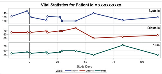
Figure 5.6.1 shows as a traditional LATTICE layout with the class values on the right.
Figure 5.6.1 – Vital Statistics for Patient over Time

ods graphics / attrpriority=color;
title "Vital Statistics for Patient Id = xx-xxx-xxxx";
proc sgpanel data=vss noautolegend nocycleattrs;
panelby vstest2 / onepanel layout=rowlattice uniscale=column
novarname spacing=10 sort=data;
refline 0 / axis=x lineattrs=(thickness=1 color=black);
series x=vsdy y=vsstresn / group=vstest2 lineattrs=(thickness=3)
name='bp' markerattrs=(symbol=circlefilled size=11)
nomissinggroup;
scatter x=vsdy y=vsstresn / group=vstest2 markerattrs=(size=11);
scatter x=vsdy y=vsstresn / group=vstest2 markerattrs=(size=5);
keylegend 'bp' / title='Vitals:' across=3 linelength=20;
rowaxis grid display=(nolabel) valueattrs=(size=7) labelattrs=(size=8);
colaxis grid label='Study Days' valueattrs=(size=7)
labelattrs=(size=8);
run;
The data set is sorted by test value in the order I want, and I have used the SORT=Data option to get the rows in the data order.
The panel variable is VSTEST2, unique values of which are shown in the row headers on the right. Multiple scatter plots are used to render the markers that are shown. ATTRPRIORITY is set to Color, so that all groups of the series plots have a solid pattern. Thus, we can reduce the length of the line in the legend using the LINELENGTH option.
Some options in the code above are trimmed to fit the space. See Program 5_6 for the full code.
5.6.2 Vital Statistics for Patient over Time
In a traditional LATTICE layout, the class values are displayed on the right, rotated vertically. This can often be hard to read or notice. In this example, the traditional row headers are suppressed, and the class values are displayed inside the cells.
Figure 5.6.2 – Vital Statistics for Patient over Time
ods graphics / attrpriority=color;
title "Vital Statistics for Patient Id = xx-xxx-xxxx";
proc sgpanel data=vss noautolegend nocycleattrs;
panelby vstest2 / onepanel layout=rowlattice uniscale=column novarname
spacing=10 noheader sort=data;
refline 0 / axis=x lineattrs=(thickness=1 color=black);
series x=vsdy y=vsstresn / group=vstest2 lineattrs=(thickness=3)
nomissinggroup name='bp';
scatter x=vsdy y=vsstresn / group=vstest2
markerattrs=( circlefilled size=11);
scatter x=vsdy y=vsstresn / group=vstest2
markerattrs=(symbol=circlefilled size=5 color=white);
inset vstest2 / nolabel position=topright textattrs=(size=9);
keylegend 'bp' / title='Vitals:' across=3 linelength=20;
rowaxis grid display=(nolabel);
colaxis grid label='Study Days';
run;
Figure 5.6.2 displays different vital statistics values for a specific subject over time, similar to the graph in Section 5.5.1. In this case, I have retained systolic and diastolic blood pressure and pulse to fit the graph in the space available. The data set is sorted by test value in the order I want, and I have used the SORT=Data option to get the rows in the data order.
The panel variable is VSTEST2, unique values of which are shown in the row headers on the right. Multiple scatter plots are used to render the markers that are shown.
Vertically oriented text in the row headers is harder to read, so in this graph I have suppressed the headers using the NOHEADER option and displayed the test values in the top right corner of each cell using the INSET statement.
Some options in the code above are trimmed to fit the space. See Program 5_6 for the full code.
5.7 Eye Irritation over Time by Severity and Treatment
This graph shows the percentage of subjects with eye irritation over time by severity and treatment.
5.7.1 Eye Irritation over Time by Severity and Treatment
The values are stacked with "None" and "Mild" above the baseline using positive values, and "Moderate", "Severe", "Very Severe", and below the baseline using negative values. The group values are colored to indicate the intensity using the STYLEATTERS option.
Figure 5.7.1 – Eye Irritation over Time by Severity and Treatment

title "Subjects with Eye Irritation Over Time by Severity and Treatment";
proc sgpanel data=eye;
where param=1;
format percent abs.;
panelby time / layout=columnlattice onepanel noborder
colheaderpos=bottom novarname noheaderborder;
styleattrs datacolors=(darkgreen lightgreen gold orange red);
vbar trtgrp / response=percent group=value dataskin=pressed;
colaxis display=(nolabel noticks);
rowaxis values=(-100 to 100 by 20) grid offsetmax=0.025;
keylegend / fillheight=2pct fillaspect=golden;
run;
The bars are stacked by severity and clustered by treatment for each visit. We know that a bar chart can support either stacked or clustered grouping, but not both at the same time. A COLUMNLATTICE layout is used to display the graph. Cell headers are displayed at the bottom without header borders so that they look like category (Visit) values. The treatment values are shown above the visit for each bar.
Legend items are made wider for easier viewing using legend options. Some appearance options in the code above are trimmed to fit the space. See Program 5_7 for the full code.
5.7.2 Vital Statistics for Patient over Time in Grayscale
This graph shows the percentage of subjects with eye irritation over time by severity and treatment in a grayscale medium using gray shades and fill patterns.
Figure 5.7.2 – Vital Statistics for Patient over Time in Grayscale

ods lisitng style=journal3;
title "Subjects with Eye Irritation Over Time by Severity and Treatment";
proc sgpanel data=eye;
where param=1;
format percent abs.;
panelby time / layout=columnlattice onepanel noborder
colheaderpos=bottom novarname noheaderborder;
vbar trtgrp / response=percent group=value dataskin=pressed;
colaxis display=(nolabel noticks);
rowaxis values=(-100 to 100 by 20) grid offsetmax=0.025;
keylegend / fillheight=3pct fillaspect=golden;
run;
The values are stacked with "None" and "Mild" above the baseline using positive values, and "Moderate", "Severe", "Very Severe", and below the baseline using negative values. Group values use colors and fill patterns as specified in the Journal3 style.
The bars are stacked by severity and clustered by treatment for each visit. Again, we know that a bar chart can support either stacked or clustered grouping, but not both at the same time. A COLUMNLATTICE layout is used to display the graph. Cell headers are displayed at the bottom without header borders so that they look like category (Visit) values. The treatment values are shown above the visit value for each bar.
Legend items are made wider for easier viewing using legend options. Some appearance options in the code above are trimmed to fit the space. See Program 5_7 for the full code.
5.8 Summary
Multi-cell panel graphs by one or more classification variables are very common in the clinical domain. Such graphs can be tedious to create with traditional software, when you must create each cell separately and then replay these together into one gridded layout. It is a challenge to ensure uniformity across all cells.
The SGPANEL procedure does this work for us, based on one or more classification variables. The graph includes a cell for each crossing of the class variables, arranged in a grid. If the grid is large, the procedure automatically breaks up the grid into smaller clusters that are easier to print or handle.
Four different layouts are available, and you can use the one that is most appropriate for your use case.
• PANEL – Supports one or more (N) class variables and creates a cell for each crossing of the class variables that has data. So, if a cell does not contain data, it is skipped entirely. This layout is very useful for "sparse" data sets, where there are many crossings, but not many actual cells.
Each cell has a cell header at the top that includes the values of each class variable. When there are many class variables, much of the cell space might be taken up by the headers. This can be alleviated by suppressing the headers and adding the information in each cell using the INSET option as described in Section 5.4.2.
• COLUMNLATTICE – Supports one class variable and creates a grid of columns (one row). All cells are retained regardless of whether they have data or not. Each column has a column header that includes the value of the class variable.
• ROWLATTICE – Supports one class variable and creates a grid of rows (one column). All cells are retained regardless of whether they have data or not. Each row has a row header that includes the value of the class variable.
• LATTICE – Supports two class variables, where the first class variable is used for columns and the second for rows. A cell is created for each crossing of the unique values of the class variables, even if they are devoid of data. Each column has a column header, and each row has a row header showing the value of the class variable.
These graphs automatically enforce uniform axes. All y-axes for the rows and all x-axes for the columns have uniform scale. This can be customized as needed by using the UNISCALE option.
However, as we showed in Figure 5.4, when creating a panel of lab results in which each lab has a different scale of data, it is important that such a scale not be made uniform.
As can be seen from the various examples in this chapter, it is very easy to create relatively complex multi-cell classification graphs using this procedure.