Chapter 8: Clinical Graphs Using SAS 9.4 GTL
8.1 Distribution of ASAT by Time and Treatment 211
8.2 Most Frequent On-Therapy Adverse Events Sorted by Relative Risk. 213
8.3 Treatment Emergent Adverse Events with Largest Risk Difference with NNT. 216
8.4 Butterfly Plot of Cancer Deaths by Cause and Gender 218
8.5 Forest Plot of Impact of Treatment on Mortality by Study. 222
8.6 Forest Plot of Hazard Ratios by Patient Subgroups. 226
8.7 Product-Limit Survival Estimates. 231
8.8 Bivariate Distribution Plot 236
Most commonly used clinical graphs have a simple single-cell structure with one main data area, two or more axes, and other related items such as axis tables that can be configured using the SGPLOT procedure as described in Chapters 3 and 4. Other graphs have a regular grid of data cells determined by the number of unique values of one or more classifier variables. Such graphs can be easily created using the SGPANEL procedure as described in Chapter 5. Such graphs generally cover a majority of the common use cases.
That brings us to the remaining cases where we have to go beyond the abilities of the SGPLOT or SGPANEL procedures to create graphs that need a special layout or display.
The graph in Figure 8.0 shows a multi-cell graph that uses a custom layout that cannot be produced by either the SGPLOT or SGPANEL procedures.
Figure 8.0 – Multi-Cell Panel Graph

This graph uses a special layout that shows the distribution of Systolic blood pressure by Cholesterol on the left side of the graph. On the right side, the graph contains two plots that use a common x-axis. The upper plot shows a bar chart of mean Weight by Cause of Death. The lower plot shows a box plot of Diastolic blood pressure by Cause of Death.
The graph above in Figure 8.0 is built using the techniques described in Chapter 6. We have used the TEMPLATE procedure to define a StatGraph template using GTL. In this case, we have used nested LAYOUT LATTICE and LAYOUT OVERLAY statements to define the structure of the graph, populated with SCATTERPLOT, BARCHART, and BOXPLOT statements. Then, we have used the SGRENDER procedure to create the graph from the SASHELP.HEART data set. For full details see Program 8_0, available from the author’s page at http://support.sas.com/matange.
In this chapter, we will create such graphs using SAS 9.4 GTL. SAS 9.4 includes some useful plot statements such as AXISTABLE that make our task easier. SAS 9.4 also supports features such as tick value splitting that enable you to split long multi-word tick values over multiple lines as shown on the right side of Figure 8.0.
8.1 Distribution of ASAT by Time and Treatment
The graph in Figure 8.1.1 displays the distribution of ASAT by time and treatment, along with the number of subjects in the study in the bottom cell, and the number of subjects with a value greater than 2 in the top cell.
Figure 8.1.1 – Distribution of ASAT by Time and Treatment

Figure 8.1.2 – Data for Graph

With the advent of the AXISTABLE statement in SAS 9.4, it is possible to create this graph using a single LAYOUT OVERLAY container. The main body of the graph displays the ASAT value by treatment. Inner margins are used to display the number of subjects in the study and the number of subjects with ASAT values greater than 2 by treatment.
/*--Define the Template--*/
proc template;
define statgraph Fig_8_1_ASAT_By_Time_and_Trt;
begingraph;
entrytitle 'Distributiion of ASAT by Time and Treatment';
layout overlay / yaxisopts=(offsetmax=0.1)
xaxisopts=(type=linear
linearopts=(tickvaluelist=(0 2 4 8 12 24 28) viewmax=29));
boxplot x=week y=asat / group=drug name='a' groupdisplay=cluster
display=(mean median outliers);
referenceline x=25;
referenceline y=1 / lineattrs=(pattern=shortdash);
referenceline y=2 / lineattrs=(pattern=dash);
discretelegend 'a' / itemsize=(linelength=20) location=inside
halign=center valign=top;
innermargin / separator=true;
axistable x=week value=count / class=drug colorgroup=drug
valueattrs=(size=5 weight=bold) labelattrs=(size=7);
endinnermargin;
innermargin / separator=true align=top;
axistable x=week value=gt2 / class=drugGT colorgroup=drugGT
valueattrs=(size=5 weight=bold) labelattrs=(size=7);
endinnermargin;
endlayout;
endgraph;
end;
run;
/*--Render the Graph--*/
proc sgrender data=asat template=Fig_8_1_ASAT_By_Time_and_Trt;
run;
The graph uses one LAYOUT OVERLAY for the entire graph. The reason for this is that we are placing the upper and lower numbers inside the graph using INNERMARGIN statements.
The Overlay container contains one grouped box plot of ASAT by Week by Drug. Groups are displayed side-by-side. One reference line is used to place the vertical divider at X=25, and two reference lines are placed at Y=1 and 2 using different line patterns. A discrete legend is placed inside the graph area at the top center, and space is created by setting OFFSETMAX=0.1 on the YAXISOPTS.
The Subjects At-Risk are placed in the bottom inner margin region of the graph using an AXISTABLE of Count by Week classified (stacked) and colored by Drug. The number of subjects with values greater than 2 for A or B are shown at the top inner margin region using an AXISTABLE of GT2 by Week, also classified (stacked) and colored by DrugGT. Note, the data values that are shown in Figure 8.1.2 are simulated and might not match the data. For full details, see Program 8_1.
8.2 Most Frequent On-Therapy Adverse Events Sorted by Relative Risk
This graph displays the incidence of On-Therapy Adverse Events by Treatment, sorted by the relative risk of occurrence.
Figure 8.2.1 – Most Frequent On-Therapy Adverse Events Sorted by Relative Risk

Figure 8.2.2 – Data for Graph

The incidence of Adverse Events by Treatment is displayed on the left side of the graph, and the relative risks with 95% confidence intervals are displayed on the right. The adverse events are displayed, sorted by the mean of the relative risk.
A portion of the data set for the graph is shown in Figure 8.2.2 and contains six columns including the AE name, percent incidences for drug A and B, Mean value of the relative risk, and the low and high values for the 95% confidence limits. The values are drawn decreasing from the top of the y-axis.
The graph is created using LAYOUT LATTICE with two columns. The weights of the columns are set as (0.4, 0.6), so that the left column is narrower, with 40% of the width. The right column is wider, about 60% of the width. A gutter of 10 pixels is placed between the two cells.
Note, the two cells do not have separate y-axes. Instead, one common y-axis is displayed on the left, and it applies to both cells in the row. This also automatically aligns the corresponding values with the correct adverse event name for each cell. The plot on the left has a linear x-axis, but the plot on the right has a log (base 2) x-axis.
The structure of the template to create such a layout is shown below.
1. We use the PROC TEMPLATE statement to define a StatGraph template.
2. The GTL definition is between the BEGINGRAPH and ENDGRAPH statements.
3. An outer LAYOUT LATTICE container is used to create a layout of two columns with 40% and 60 % widths and a common y-axis. A COLUMNGUTTER of 10 pixels is used.
4. The ROWAXES – ENDROWAXES block with one ROWAXIS statement triggers the placement of the single row axis on the left, with grids, ticks, tick values, and line.
5. The first LAYOUT OVERLAY container defines the cell on the left.
6. The second LAYOUT OVERLAY container defines the cell on the right.
7. We finish off the template with the matching ENDLAYOUT, ENDGRAPH, END, and RUN statements.
proc template;
define statgraph Fig_8_2_Most_Frequent_On_Therapy_Adverse_Events;
begingraph;
layout lattice / columns=2 columnweights=(0.4 0.6)
rowdatarange=union columngutter=10px;
rowaxes;
rowaxis / griddisplay=on display=(ticks tickvalues line);
endrowaxes;
/*--Left Cell--*/
layout overlay;
endlayout;
/*--Right Cell--*/
layout overlay;
endlayout;
endlayout;
endgraph;
end;
run;
The definition of the left cell is shown below. Some appearance options are skipped to fit the page.
1. The left cell is defined by the first LAYOUT OVERLAY – ENDLAYOUT block. All the plot statements in this block are layered together and displayed in the left cell.
2. The first SCATTERPLOT statement displays values for drug 'A' by 'AE'. The marker attributes are set to use a filled circle marker using the first group color from the style. This statement has NAME='a' and LEGENDLABEL="Drug A (N=&na)". The string is used for representing this plot in the legend. Note the use of the macro variable "&na".
3. The second SCATTERPLOT statement displays values for drug 'B' by 'AE'. The marker attributes are set to use a filled triangle marker using the second group color from the style. This statement has NAME='b', and LEGENDLABEL="Drug B (N=&nb)". The string is used for representing this plot in the legend. Note the use of the macro variable "&nb".
4. The DISCRETELEGEND statement includes plots 'a' and 'b'. This is drawn in the default location outside and below, centered on the x-axis of the graph.
/*--Left Cell--*/
layout overlay;
scatterplot x=a y=ae / markerattrs=graphdata1(symbol=circlefilled)
name='a' legendlabel="Drug A (N=&na)";
scatterplot x=b y=ae /
markerattrs=graphdata2(symbol=trianglefilled)
name='b' legendlabel="Drug B (N=&nb)";
discretelegend 'a' 'b' / valueattrs=(size=6) border=true;
endlayout;
The definition of the right cell is shown below. Some appearance options are skipped to fit the space.
1. The right cell is defined by the second LAYOUT OVERLAY – ENDLAYOUT block shown below. All the plot statements in this block are displayed in the right cell.
2. A SCATTERPLOT statement displays the 'Mean' occurrence values for by 'AE'. The marker attributes are set to a filled circle marker using the first default color from the style.
3. A vertical REFERENCELINE line with a dash pattern is drawn at Y=1.
5. The x-axis is of TYPE log with LOGBASE of 2.
/*--Right Cell--*/
layout overlay / xaxisopts=(label='Relative Risk with 95% CL'
type=log logopts=(base=2
tickintervalstyle=logexpand));
scatterplot x=mean y=ae / xerrorlower=low xerrorupper=high
markerattrs=(symbol=circlefilled);
referenceline x=1 / lineattrs=graphdatadefault(pattern=shortdash);
endlayout;
Some option settings for font and marker sizing have been trimmed to fit the code in the available space. See Program 8_2 for the full details.
8.3 Treatment Emergent Adverse Events with Largest Risk Difference with NNT
The graph shown in Figure 8.3.1 is a variation on the graph shown in Section 8.2, as created by SAS users Matt Cravets and Jeff Kopicko, using the data set shown in Figure 8.3.2.1 The difference is the display of the "Numbers Needed to Treat" along the top X2 axis of the right cell, where NNT =1.0 / RiskDiff.
Figure 8.3.1 – Treatment Emergent Adverse Events with Largest Risk Difference with NNT

Figure 8.3.2 – Data for Graph

Matt wanted to display the NNT axis along the top to match the RiskDiff axis, with inverse values at each tick mark. This means we have an axis that goes from negative small values to negative ∞, and then from positive ∞ to smaller positive values. That means we have two axes at the top.
To do this, we replicate the x-axis as the x2-axis at the top, with exactly the same settings. This ensures that the tick values are aligned, as seen in the very light grid lines. Then, the values on the x2-axis are replaced using the inverse of the values on the x-axis. The inverse of zero is replaced with the Unicode ∞ symbol "221e"x. Note the use of TICKVALUELIST and TICKDISPLAYLIST in the program shown below.
If the Unicode symbol ∞ is too small (as it appears here), we might need to find a better font or replace it using annotation.
/*--Define the Template--*/
proc template;
define statgraph Fig_8_3;
begingraph;
entrytitle "Treatment Emergent Adverse Events with Largest ...";
entryfootnote halign=left "Number needed to treat = 1/riskdiff." /;
/* Define a Lattice layout with two columns and a common y-axis */
layout lattice / columns=2 columnweights=(0.4 0.6)
rowdatarange=union columngutter=10px;
rowaxes;
rowaxis / griddisplay=on display=(tickvalues)
tickvalueattrs=(size=7);
endrowaxes;
/* Left cell with incidence values */
layout overlay / xaxisopts=(label="Proportion" );
scatterplot y=aedecod x=pct0 / name='drga'
markerattrs=(symbol=circlefilled color=bib)
legendlabel='Drug A (N=90)';
scatterplot y=aedecod x=pctr / name='drgb'
markerattrs=(symbol=trianglefilled color=red)
legendlabel='Drug B (N=90)';
endlayout;
/* Right cell with risk differences and NNT */
layout overlay / xaxisopts=(label="Risk Difference with 95% CI"
griddisplay=on gridattrs=(color=cxf7f7f7)
linearopts=(tickvaluefitpolicy=none
viewmin=-0.2 viewmax=0.2
tickvaluelist=(-0.20 -0.1 0 0.1 0.20)))
x2axisopts=(label="Number needed to treat"
linearopts=(tickvaluefitpolicy=none
viewmin=-0.2 viewmax=0.2
tickvaluelist=(-0.20 -0.1 0 0.1 0.20)
tickdisplaylist=('-5' '-10'
"(*ESC*){unicode '221e'x}" '10' '5')));
scatterplot y=aedecod x=risk / xerrorlower=lrisk
xerrorupper=urisk
markerattrs=(symbol=diamondfilled color=black);
scatterplot y=aedecod x=risk / xaxis=x2 datatransparency=1;
innermargin / align=right;
axistable y=aedecod value=riskci /
class=origin display=(label) labelposition=min);
endinnermargin;
referenceline x=0 / lineattrs=(pattern=shortdash color=black);
endlayout;
/* Bottom-centered sidebar with legend */
sidebar / align=bottom spacefill=false;
discretelegend 'drga' 'drgb' / autoitemsize=true
valueattrs=(size=8);
endsidebar;
endlayout;
endgraph;
end;
run;
Some option settings have been trimmed to fit in the available space. See Program 8_3 for the full details.
8.4 Butterfly Plot of Cancer Deaths by Cause and Gender
The graph shown in Figure 8.4.1 is the classic butterfly chart showing the incidence of cancer cases by gender along with the deaths for each cause.
Figure 8.4.1 – Butterfly Plot of Cancer Deaths by Cause and Gender

Figure 8.4.2 – Data for Graph

The data is shown in Figure 8.4.2, with Cause, Male Cases, Female Cases, Male Deaths and Female Deaths, and total number of Deaths. A LAYOUT LATTICE is used to define the layout of the graph, with two columns as shown below in the GTL code snippet.
layout lattice / columns=2 columnweights=(0.45 0.55) rowdatarange=union;
/*--Left cell--*/
layout overlay;
endlayout;
/*--Right cell--*/
layout overlay;
endlayout;
endlayout;
Only two cells are defined using the LAYOUT OVERLAY – ENDLAYOUT blocks, so we have only one row. COLUMNWEIGHTS=(0.45 0.55) assigns 45% of the graph space to the left cell and 55% to the right cell. This is made so because the y-axis in the middle of the graph belongs to the right cell, and therefore it needs a bit more space to make the data space for each cell about equal.
The y-axis display for the left cell is suppressed, so the y-axis for the right cell serves as the common axis for both cells. ROWDATARANGE=Union is set to ensure that both cells have uniform y-axes. TICKVALUEHALIGN=Center is used to center-align the values on the y-axis, thus creating the expected appearance of a butterfly chart.
The left cell is defined by the first LAYOUT OVERLAY – ENDLAYOUT block of the GTL code shown below. Note the following aspects of this code:
1. The x-axis is reversed, and grid lines are displayed.
2. The y-axis is suppressed, and values are reversed so that they are positioned top down.
3. Wall display is suppressed to get the lightweight, modern look.
4. A horizontal bar chart of MCases by Cause is shown, with the name 'mc' and a legend label.
5. A horizontal bar chart of MDeaths by Cause is overlaid with a narrower bar width with the name 'md', and with skin effect.
/*--Left Cell--*/
layout overlay / xaxisopts=(reverse=true label='Males'
display=(tickvalues) griddisplay=on)
yaxisopts=(display=none reverse=true) walldisplay=none;
barchart category=cause response=mcases /
fillattrs=graphdata1(transparency=0.7) orient=horizontal
name='mc' legendlabel='Male Cases';
barchart category=cause response=mdeaths /
fillattrs=graphdata1(transparency=0.3) orient=horizontal
name='md' legendlabel='Male Deaths'
barwidth=0.6 dataskin=pressed;
endlayout;
The right cell is defined by the second LAYOUT OVERLAY – ENDLAYOUT block of the GTL code shown below. Note the following aspects of this code:
1. The x-axis grid lines are displayed.
2. The y-axis values are reversed so that they are positioned top down, and the tick values are center-justified. This serves as the common central y-axis for both cells of the graph.
3. A horizontal bar chart of FCases by Cause is shown, with the name 'fc' and a legend label.
4. A horizontal bar chart of FDeaths by Cause is overlaid with a narrower bar width with the name 'fd', and with skin effect.
/*--Right Cell--*/
layout overlay / xaxisopts=(reverse=true label='Males'
display=(tickvalues) griddisplay=on)
yaxisopts=(display=none reverse=true) walldisplay=none;
barchart category=cause response=mcases /
fillattrs=graphdata1(transparency=0.7) orient=horizontal
name='mc' legendlabel='Male Cases';
barchart category=cause response=mdeaths /
fillattrs=graphdata1(transparency=0.3) orient=horizontal
name='md' legendlabel='Male Deaths'
barwidth=0.6 dataskin=pressed;
endlayout;
The common discrete legend is placed in the bottom side bar as shown in the code snippet below. The names of each statement that contributes to the legend are listed. The items are positioned in two columns. The ITEMSIZE option is used to display slightly bigger fill items with the "Golden" aspect ratio. These bigger items are easier to decode.
/*--Bottom Side Bar--*/
sidebar / spacefill=false;
discretelegend 'mc' 'fc' 'md' 'fd' / across=2
itemsize=(fillheight=10px fillaspectratio=golden);
endsidebar;
Alternatively, the data can be sorted descending by total deaths as shown in Figure 8.4.3.
Figure 8.4.3 – Data for Graph, Sorted Descending by Total Deaths

The full GTL code is shown below. Some appearance options have been trimmed to fit the space. See Program 8_4 for the full details.
proc template;
define statgraph Fig_8_4_Butterfly_Plot_Of_Cancer_Deaths;
begingraph;
entrytitle "Leading Cause of Cancer Deaths in USA for 2007 ...";
layout lattice / columns=2 columnweights=(0.45 0.55)
rowdatarange=union;
/*--Left Cell--*/
layout overlay / walldisplay=none
xaxisopts=(reverse=true tickvalueattrs=(size=7)
label='Males' display=(tickvalues) griddisplay=on)
yaxisopts=(display=none reverse=true);
barchart category=cause response=mcases / orient=horizontal
fillattrs=graphdata1(transparency=0.7)
name='mc' legendlabel='Male Cases';
barchart category=cause response=mdeaths / name='md'
fillattrs=graphdata1(transparency=0.3) barwidth=0.6
orient=horizontal dataskin=pressed
legendlabel='Male Deaths';
endlayout;
/*--Right Cell--*/
layout overlay / walldisplay=none
xaxisopts=(tickvalueattrs=(size=7) label='Females'
display=(tickvalues) griddisplay=on)
yaxisopts=(tickvaluehalign=center
display=(tickvalues line) reverse=true
tickvalueattrs=(size=7));
barchart category=cause response=fcases /
fillattrs=graphdata2(transparency=0.7)
orient=horizontal
name='fc' legendlabel='Female Cases';
barchart category=cause response=fdeaths / name='fd'
fillattrs=graphdata2(transparency=0.3)
orient=horizontal dataskin=pressed
legendlabel='Female Deaths';
endlayout;
/*--Bottom Side Bar--*/
sidebar / spacefill=false;
discretelegend 'mc' 'fc' 'md' 'fd' / across=2
itemsize=(fillheight=10px fillaspectratio=golden);
endsidebar;
endlayout;
endgraph;
end;
run;
ods graphics / reset width=5in height=2.5in imagename='8_4_Butterfly_Plot';
proc sgrender data=cancerByCases
template=Fig_8_4_Butterfly_Plot_Of_Cancer_Deaths;
run;
8.5 Forest Plot of Impact of Treatment on Mortality by Study
A forest plot is a graphical representation of a meta-analysis of the results of randomized controlled trials.
Figure 8.5.1 – Forest Plot of Impact of Treatment on Mortality by Study

Figure 8.5.2 – Data for Graph

The graph in Figure 8.5.1 shows the names of the studies on the left, with a plot of the measure of the effect as an odds ratio of each study and the 95% confidence intervals. Area or width of each marker can be proportional to the weight of each study. The overall meta-analyzed measure of effect is plotted with a diamond-shaped marker. The actual values of the odds ratio, confidence limits, and weight are displayed on the right.
The graph uses a log x-axis, with reference lines at various levels and one at "1", which indicates "no Effect". If the odds ratio and CL overlap the "no-effect" line, it demonstrates their effect sizes do not differ from no-effect for the individual study at the given level of confidence.
The graph in Figure 8.5.1 can be created using one LAYOUT OVERLAY container with a SCATTERPLOT statement to display the odds ratio and confidence limits. Two inner margin regions are used to plot the textual data, with study names on the left and values on the right.
The overall structure of the GTL template is shown below.
layout overlay;
scatterplot <parameters>;
/*--Study Names on the Left--*/
innermargin / align=left;
endInnerMargin;
/*--Study values on the Right--*/
innermargin / align=right;
endInnerMargin;
endlayout;
The odds ratio and confidence limits are plotted by the study names using the SCATTERPLOT statement in the overlay container as shown below. The study name column is assigned to the Y role. Reference lines are drawn at 0.01, 0.1, 10, and 100 using the first REFERENCELINE statement.
The X role for reference line accepts either a data column or one data value. So, we could either provide four different REFERENCELINE statements, or one statement with X pointing to a column in the data that would contain these four values. Here, we have used the COLN() function, which produces a column of the values. Because these values are static, I can use the function with the fixed values inline in the GTL syntax. A second REFERENCELINE statement is used to display the value at X=1 using different visual attributes. Note the use of the DATATRANSPARENCY and PATTERN options.
layout overlay / walldisplay=none
yaxisopts=(reverse=true display=none offsetmax=0.05
discreteopts=(colorbands=even));
xaxisopts=(type=log tickvaluepriority=true
logopts=(tickvaluelist=(0.01 0.1 1 10 100))
display=(tickvalues) displaysecondary=(label)
label='Odds Ratio and 95% CL');
scatterplot y=study x=oddsratio / group=grp
xerrorlower=lowercl xerrorupper=uppercl;
referenceline x=eval(coln(0.01, 0.1, 10, 100)) /
lineattrs=(pattern=shortdash) datatransparency=0.5;
referenceline x=1 / datatransparency=0.5;
endlayout;
The values are displayed in reverse order, from top to bottom, so the last value in the data "Overall" is at the bottom. The x-axis line and ticks are suppressed, and the wall fill and outline are suppressed to provide a lightweight, modern look. The tick values are set to the ones desired, and this also sets the extent of the axis by the use of TICKVALUEPRIORITY. The axis label "Odds Ratio and 95% CL" is displayed on the secondary x-axis.
The study names on the left could be displayed using the y-axis tick values. Normally, axis tick values are right-aligned, but we could fix this using the SAS 9.4 TICKVALUEHALIGN option. However, we also need the label on the top, and we will use a different method. So, the entire y- axis is turned off.
Now, let us examine how we have displayed the study names on the left and the study values on the right. The overlay layout supports inner margins on all four sides of the container. This enables us to insert one-dimensional items in each inner margin. By one-dimensional, we mean items that span the axis in one direction (say, x), but have a well-defined size in the other direction (in this case, y). Usually, these are text-based statements, like axis tables and block plots.
The code snippet below describes the addition of the study labels on the left. We have used an inner margin that is aligned to the left of the container. We have added an AXISTABLE statement, with Y=Study, the same Y variable used with the scatter plot in the middle of the container. It is important to use either the same variable, or else a matching variable, in order to retain the correct alignment of the values across the graph for each study name. The label (header) for the column is displayed, and the font is customized.
innermargin / align=left;
axistable y=study value=study / display=(label) labelattrs=(size=8);
endinnermargin;
The code snippet below describes how we have added the display of the four study values on the right by using an inner margin that is aligned to the right of the container. Four AXISTABLE statements are used, each with Y=Study, assigning VALUE to the appropriate column name in the data. The label for each column is displayed, and the values are center-aligned.
innermargin / align=right;
axistable y=study value=Oddsratio / display=(label) labelattrs=(size=8)
showmissing=false valuehalign=center;
axistable y=study value=lowercl / display=(label) labelattrs=(size=8)
showmissing=false valuehalign=center;
axistable y=study value=uppercl / display=(label) labelattrs=(size=8)
showmissing=false valuehalign=center;
axistable y=study value=weight / display=(label) labelattrs=(size=8)
showmissing=false valuehalign=center;
endinnermargin;
The last detail is the addition of the labels "Favors Treatment" and "Favors Placebo" to each side of the no-effect line on the x-axis. Normally, an ENTRY statement is used to position text inside a graph area. However, that can be positioned relative only to the container and not to data values. To do that, we either have to use annotation, or the DRAWTEXT statement.
drawtext textattrs=(size=8) 'Favors Placebo' / x=1.2 y=0
xspace=datavalue yspace=wallpercent anchor=left width=50;
drawtext textattrs=(size=8) 'Favors Treatment' / x=0.8 y=0
xspace=datavalue yspace=wallpercent anchor=right width=50;
If the position of the labels were to change from case to case, then the right way would be to use annotation. However, in this case, the labels are always aligned to the no-effect (x=1) value. So, we can use the DRAWTEXT statement, as shown above.
Two DRAWTEXT statements are used, one for each label. The labels are placed with XSPACE of DataValue and YSPACE of WallPercent. Therefore, the x position is relative to data, but the y position is relative to the bottom edge of the container. Also, the appropriate ANCHOR is used to position each label. Extra space is created at the bottom of the graph for the labels using the OFFSETMAX option in YAXISOPTS.
Faint color bands are drawn behind alternate study values to help draw the eye to the study names, odds ratio graph, and the study values across the width of the graph. The full GTL code is shown below. Some appearance options have been trimmed to fit the space. See Program 8_5 for the full details.
proc template;
define statgraph Fig_8_5_Forest_Plot;
begingraph / datasymbols=(squarefilled diamondfilled);
entrytitle "Impact of Treatment on Mortality by Study";
layout overlay / walldisplay=none
yaxisopts=(reverse=true display=none offsetmax=0.05
discreteopts=(colorbands=even
colorbandsattrs=(transparency=0.5)))
xaxisopts=(type=log logopts=(tickvaluelist=(0.01 0.1 1 10 100)
tickvaluepriority=true) display=(tickvalues)
displaysecondary=(label)
label='Odds Ratio and 95% CL' labelattrs=(size=8)
tickvalueattrs=(size=7));
scatterplot y=study x=oddsratio / group=grp
xerrorlower=lowercl xerrorupper=uppercl;
referenceline x=eval(coln(0.01, 0.1, 10, 100)) /
lineattrs=(pattern=shortdash);
referenceline x=1 / datatransparency=0.5;
innermargin / align=left;
axistable y=study value=study / display=(label);
endinnermargin;
innermargin / align=right;
axistable y=study value=Oddsratio / display=(label)
showmissing=false;
axistable y=study value=lowercl / display=(label)
showmissing=false;
axistable y=study value=uppercl / display=(label))
showmissing=false;
axistable y=study value=weight / display=(label)
showmissing=false;
endinnermargin;
drawtext textattrs=(size=8) 'Favors Placebo' / x=1.2 y=0
xspace=datavalue yspace=wallpercent anchor=left
width=50;
drawtext textattrs=(size=8) 'Favors Treatment' / x=0.8 y=0
xspace=datavalue yspace=wallpercent anchor=right
width=50;
endlayout;
endgraph;
end;
run;
ods graphics / reset attrpriority=none;
proc sgrender data=forest template=Fig_8_5_Forest_Plot;
run;
8.6 Forest Plot of Hazard Ratios by Patient Subgroups
The graph shown in Figure 8.6.1 shows the hazard ratios by patient subgroups. This graph is much like the forest plot shown in Section 8.5, with the added feature of grouping the study values by subgroups. The subgroup labels are displayed with a bold font, but the individual subgroup values are displayed in normal font and indented.
Figure 8.6.1 – Forest Plot of Hazard Ratios by Patient Subgroups

Figure 8.6.2 – Data for Graph
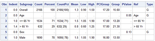
As noted, the construction of this graph is very similar to the one in Section 8.5, and we have used the AXISTABLE statement to display the textual data by subgroup. A portion of the data set is displayed in Figure 8.6.2. Note the "Indent" column that provides a measure of how much to indent each value. The subgroup labels have zero indention, and the regular values have an indention of 1 unit. Note, for some values, the indention is larger. This is to allow the alignment of the values adjusting for the "<=" or ">" symbols.
The graph above is created using a LAYOUT LATTICE container with one LAYOUT OVERLAY to display the graph and the data columns. A SIDEBAR statement is used to create the multi-level header. The hazard ratio graph is displayed in the middle of the overlay container. One INNERMARGIN statement is placed on the left for the two columns, and one INNERMARGIN statement on the right to display the three columns on the right.
The overall structure of the GTL template is shown below.
layout lattice;
sidebar / align=top;
layout lattice / columns=4;
endlayout;
endsidebar;
layout overlay;
scatterplot <parameters>;
/*--Subgroup Patient Counts on the Left--*/
innermargin / align=left;
endInnerMargin;
/*--Event Rate values on the Right--*/
innermargin / align=right;
endInnerMargin;
endlayout;
endlayout;
A LAYOUT LATTICE is used to partition the graph area into the header information at the top and the graph and tables at the bottom. A SIDEBAR statement is used at the top of the lattice. This contains a nested LAYOUT LATTICE with four columns. The COLUMNWEIGHTS option is used to set the width of each column. ENTRY statements are used to define the column headers.
The graph, along with the subgroup names and values, is displayed in the main overlay container using the LAYOUT OVERLAY. Wall fill and outline are turned off to create a modern, lightweight look. The x-axis label is suppressed, and it is shown in the header on top. A specific tick value list is provided, and the axis data extent is set by the tick list using the TICKVALUEPRIORITY option. Display of the entire y-axis is turned off using DISPLAY=none. Display of the values is reversed, so "Overall" is shown at the top.
/*--Column headers--*/
sidebar / align=top;
layout lattice / columns=4 columnweights=(0.2 0.25 0.25 0.3);
entry textattrs=(size=8) halign=left "Subgroup";
entry textattrs=(size=8) halign=left " No.of Patients (%)";
entry textattrs=(size=8) halign=left "Hazard Ratio";
entry halign=center textattrs=(size=8) "4-Yr Cumulative Event Rate";
endlayout;
endsidebar;
The hazard ratio graph is a scatter plot of Mean by Subgroup. Confidence limits are displayed using the XERRORLOWER and XERRORUPPER options. Note, the Subgroup values will be displayed using the first AXISTABLE statement by Subgroup. All AXISTABLES will use Y=Subgroup to ensure that all the Subgroup labels and values are correctly aligned with the hazard plot. See the code snippet below.
An INNERMARGIN statement is placed on the left side and contains two axis tables to display the Subgroup values and the Patient counts. The first AXISTABLE statement uses INDENTWEIGHT=Indent to position the values that are indented from the left side. INDENTWEIGHT is a multiplier on the INDENT value, which is 1/8" by default. So, indent weight of zero means no indention. Other values of 1.0 and 1.4 are used to indent the values as needed.
/*--Hazard Ratio graph--*/
layout overlay / walldisplay=none
xaxisopts=(display=(ticks tickvalues line))
linearopts=(tickvaluepriority=true
tickvaluelist=(0.0 0.5 1.0 1.5 2.0 2.5)))
yaxisopts=(reverse=true display=none offsetmax=0.1);
referenceline y=ref / lineattrs=(thickness=14 color=_color);
referenceline x=1;
scatterplot y=subgroup x=mean / xerrorlower=low xerrorupper=high
markerattrs=(symbol=squarefilled) errorbarcapshape=none;
innermargin / align=left;
axistable y=subgroup value=subgroup / indentweight=indent
textgroup=type display=(values) valueattrs=(size=7);
axistable y=subgroup value=countpct / display=(values)
valueattrs=(size=7);
endinnermargin;
innermargin / align=right;
axistable y=subgroup value=PCIGroup / showmissing=false
valuehalign=center pad=(right=10pct);
axistable y=subgroup value=group / showmissing=false
valuehalign=center pad=(right=10pct);
axistable y=subgroup value=pvalue / showmissing=false
valuehalign=center pad=(right=5pct);
endinnermargin;
endlayout;
Also note the use of TEXTGROUP=Type. This option is used in conjunction with DISCRETEATTRMAP and DISCRETEATTRVAR to use the bold font for observations that have Type='G'. Display of missing values is suppressed using SHOWMISSING=False, and the columns on the right are padded to fit in the space under the spanning header.
In this graph we have used alternating horizontal bands to group observations together to make the graph easier to read. Except for the first "Overall" observation, three observations including the subgroup and its two values are grouped together using the shaded horizontal bands. This is done by drawing wide reference lines with Y=ref. The column 'Ref' has a copy of the Subgroup column for alternating three observations followed by three with missing values.
The x-axis line will extend from end to end, including the inner margin zone. We can use the option AXISLINEEXTENT=Data to restrict the axis line to the data extent only. The "PCI Better" and "Therapy Better" labels are displayed using the DRAWTEXT statements as shown below. The labels are positioned close to the x=1 reference line, using XSPACE=data and appropriate ANCHOR.
drawtext textattrs=(size=6) '< PCI Better' / x=0.9 y=1
xspace=datavalue yspace=wallpercent anchor=bottomright width=50;
drawtext textattrs=(size=6) 'Therapy Better >' / x=1.1 y=1
xspace=datavalue yspace=wallpercent anchor=bottomleft width=50;
The full GTL code block is shown below. Some appearance options have been trimmed to fit in the space available. See Program 8_6 for the full details.
proc template;
define statgraph Fig_8_6_Forest_Plot_with_Subgroups;
dynamic _color;
begingraph / axislineextent=data;
entrytitle 'Forest Plot of Hazard Ratios by Patient Subgroups ';
discreteAttrmap name='text';
value 'G' / textattrs=(weight=bold);
value other;
endDiscreteAttrmap;
discreteAttrvar attrvar=type var=type attrmap='text';
layout lattice / columns=1;
/*--Column headers--*/
sidebar / align=top;
layout lattice / columns=4 columnweights=(0.2 0.25 0.25 0.3);
entry textattrs=(size=8) halign=left "Subgroup";
entry textattrs=(size=8) halign=left " No.of Patients (%)";
entry textattrs=(size=8) halign=left "Hazard Ratio";
entry halign=center "4-Yr Cumulative Event Rate";
endlayout;
endsidebar;
/*--Hazard Ratio graph--*/
layout overlay / walldisplay=none <xaxisopts> <yaxisopts>;
/*--Draw color Bands--*/
referenceline y=ref / lineattrs=(thickness=14 color=_color);
referenceline x=1;
/*--Draw Hazard Ratios--*/
scatterplot y=subgroup x=mean / xerrorlower=low
xerrorupper=high errorbarcapshape=none
markerattrs=(symbol=squarefilled);
/*--Draw axis labels--*/
drawtext textattrs=(size=6) '< PCI Better' / <opts>;
drawtext textattrs=(size=6) 'Therapy Better >' / <opts>;
/*--Draw Subgroup and Patient Count columns--*/
innermargin / align=left;
axistable y=subgroup value=subgroup / indentweight=indent
textgroup=type display=(values);
axistable y=subgroup value=countpct / display=(values);
endinnermargin;
/*--Draw Subgroup Values--*/
innermargin / align=right;
axistable y=subgroup value=PCIGroup / showmissing=false
valuehalign=center pad=(right=10pct);
axistable y=subgroup value=group / showmissing=false
valuehalign=center pad=(right=10pct);
axistable y=subgroup value=pvalue / showmissing=false
valuehalign=center pad=(right=5pct);
endinnermargin;
endlayout;
endlayout;
endgraph;
end;
run;
ods graphics / reset attrpriority=none;
proc sgrender data=forestWithSubgroups2
template=Fig_8_6_Forest_Plot_with_Subgroups;
dynamic _color='cxf0f0f0';
run;
8.7 Product-Limit Survival Estimates
Product-limit survival estimates can be used to measure the lengths of time that patients survive after treatment.
Figure 8.7.1 – Product-Limit Survival Estimates

Figure 8.7.2 – Data for Graph

This product-limit survival estimate graph shown in Figure 8.7.1 can be obtained directly by running the LIFETEST procedure with the sample data SASHELP.BMT. The LIFETEST procedure uses a pre-built GTL template to create this graph. In this section, we will go over how to design such a template so that you can customize the graph to suit your needs.
The first step is to generate the data that is required to create this graph. We can do that by running the LIFETEST procedure code shown below. The ODS OUTPUT statement is used to write the data.
ods output Survivalplot=SurvivalPlotData;
proc lifetest data=sashelp.BMT plots=survival(atrisk=0 to 2500 by 500);
time T * Status(0);
strata Group / test=logrank adjust=sidak;
run;
The table above contains multiple observations of the survival probability by time for leukemia stratified by type. The types include the Acute Lymphocytic Leukemia (ALL) and two types of Acute Myeloid Leukemia (AML), AML-High Risk and AML Low-Risk.
The key feature of the graph is the display of the survival curves of probability by time and stratum in the upper cell. The censored observations are displayed with a legend inside the cell. The lower cell contains the number of Subjects At-Risk by time and strata. The At-Risk values are displayed by tAtRisk, which is non-missing at every 500 days on the x-axis.
The overall structure of the GTL template is as shown below. A LAYOUT LATTICE is used to split the graph space into two cells with one column. The x-axes of both cells are made uniform using COLUMNDATARANGE=Union. The ROWWEIGHTS option is set to PREFERRED, which will allow the system to compute the height needed by the At-Risk table, and the rest of the graph height is given over to the upper cell. With this feature, we do not need to provide the height of each cell.
layout lattice / columns=1 columndatarange=union rowweights=preferred;
/*--Upper Cell--*/
layout overlay / walldisplay=none
endlayout;
/*--Lower Cell--*/
layout overlay / walldisplay=none xaxisopts=(display=none);
endlayout;
endlayout;
Two cells are defined, one by each of the LAYOUT OVERLAY – ENDLAYOUT blocks. In this case, we want to display only one x-axis. We could use the COLUMNAXES construct, but that will place the single x-axis at the bottom. Since we want to display the axis for the upper cell, we did not use the COLUMNAXES construct. Instead, we shut off the x-axis for the lower cell. The option COLUMNDATARANGE=Union will ensure that the axes are uniform.
The details of the upper cell are shown below. Some appearance options have been trimmed to fit the space available. The step plot of survival by time with group of stratum draws the survival curves.
/*--Upper Cell--*/
layout overlay / walldisplay=none
yaxisopts=(display=(ticks tickvalues line));
stepplot x=time y=survival / group=stratum name='s';
scatterplot x=time y=censored / markerattrs=(symbol=plus) name='c';
scatterplot x=time y=censored / markerattrs=(symbol=plus)
group=stratum;
discretelegend 'c' / location=inside halign=right valign=top;
discretelegend 's' / valueattrs=(size=7);
/*--Draw the Y axis label closer to the axis--*/
drawtext textattrs=(size=8) 'Survival Probability' / x=-6 y=50
anchor=bottom xspace=wallpercent yspace=wallpercent
rotate=90 width=50;
endlayout;
The scatter plots are used to display the censored observations. The first scatter plot with name 'c' draws the censored observations without a group. So, these markers use plus symbols and are drawn with default color. This scatter plot is included in the inner legend. The second scatter plot overplots the censored markers, with group = stratum so that we see the colored markers. A second discrete legend of the three stratum values for the step plot is displayed below the upper cell.
Because we have uniform axes, and the lower cell has long label values for each stratum, the y-axis for the upper cell gets pushed out beyond the long label values. To remedy this situation, we have turned off the display of the y-axis label and displayed the label using the DRAWTEXT statement.
The details of the lower cell are shown below. The At-Risk values are displayed using the AXISTABLE statement of AtRisk by tAtRisk by Stratum. The values for tAtRisk are non-missing only at an interval of 500 days, so the At-Risk values are drawn only at these tick values. CLASS=Stratum stacks the values for each stratum in a table of rows. COLORGROUP=stratum draws the values using the same color as the survival curves, thus making it easier to associate the numbers with the curves.
/*--Lower Cell for Subjects At-Risk--*/
layout overlay / walldisplay=none xaxisopts=(display=none);
axistable x=tatrisk value=atrisk / class=stratum colorgroup=stratum
title='Subjects At Risk' titleattrs=(size=7);
endlayout;
The full program is shown below. Some appearance options are trimmed to fit. Please see the full code in Program_8_7.
proc template;
define statgraph Fig_8_7_Survival_plot_out;
begingraph / axislineextent=data;
entrytitle 'Product-Limit Survival Estimates';
entrytitle 'With Number of AML Subjects at Risk' /
textattrs=(size=8);
layout lattice / columns=1 columndatarange=union
rowweights=preferred rowgutter=10px;
/*--Upper cell--*/
layout overlay / walldisplay=none;
yaxisopts=(display=(ticks tickvalues line));
stepplot x=time y=survival / group=stratum name='s';
scatterplot x=time y=censored /
markerattrs=(symbol=plus) name='c';
scatterplot x=time y=censored /
markerattrs=(symbol=plus) GROUP=stratum;
discretelegend 'c' / location=inside
halign=right valign=top valueattrs=(size=7);
discretelegend 's' / valueattrs=(size=7);
/*--Draw the Y axis label closer to the axis--*/
drawtext textattrs=(size=8) 'Survival Probability' /
x=-6 y=50 rotate=90 width=50
anchor=bottom xspace=wallpercent yspace=wallpercent;
endlayout;
/*--Lower cell--*/
layout overlay / walldisplay=none xaxisopts=(display=none);
/*--Subjects at risk--*/
axistable x=tatrisk value=atrisk /
class=stratum colorgroup=stratum
labelattrs=(size=7) valueattrs=(size=7)
title='Subjects At Risk' titleattrs=(size=7);
endlayout;
endlayout;
endgraph;
end;
run;
proc sgrender data=SurvivalPlotData template=Fig_8_7_Survival_plot_out;
run;
The graph that is shown at the beginning of this section shows a traditional layout of the product-limit survival plot, where the values of Subjects At-Risk are displayed at the bottom of the graph, below the x-axis values, label, and the legend. This places a considerable distance between these related parts of the graph, making it harder to decipher the graph.
It is possible to improve the layout of the graph, placing the survival curves and the "Subjects At-Risk" data closer for easier understanding of the data. This arrangement is shown below.
Figure 8.7.3 – Product-Limit Survival Estimates with Inner Table

The GTL code for this graph is shown below. We need only one LAYOUT OVERLAY, and both the survival curves and the Subjects At-Risk information can be placed in one container.
proc template;
define statgraph Fig_8_7_Survival_plot_in;
begingraph;
entrytitle 'Product-Limit Survival Estimates';
entrytitle 'With Number of AML Subjects at Risk' /
textattrs=(size=8);
layout overlay / walldisplay=none
xaxisopts=(labelattrs=(size=8) tickvalueattrs=(size=7))
yaxisopts=(labelattrs=(size=8) tickvalueattrs=(size=7));
stepplot x=time y=survival / group=stratum name='s';
scatterplot x=time y=censored / markerattrs=(symbol=plus)
name='c';
scatterplot x=time y=censored / markerattrs=(symbol=plus)
group=stratum;
discretelegend 'c' / location=inside halign=right valign=top
valueattrs=(size=7);
discretelegend 's' / valueattrs=(size=7);
/*--Subjects at risk--*/
innermargin / align=bottom;
axistable x=tatrisk value=atrisk / class=stratum
colorgroup=stratum
title='Subjects At Risk' titleattrs=(size=7);
endinnermargin;
endlayout;
endgraph;
end;
run;
proc sgrender data=SurvivalPlotData template=Fig_8_7_Survival_plot_in;
run;
To achieve this layout, we use the INNERMARGIN-ENDINNERMARGIN block at the bottom of the overlay container. We can place one-dimensional statements in this block. Such statements span the full axis in one direction (x-axis, in this case) and the space required to draw the plot can be precisely determined as it is based only on the text attributes. This allows the graph to size the inner margin precisely.
Using this layout, all the information is inside the overlay container, and the "Subjects At-Risk" information is placed closer to the survival curves, without any intervening clutter from the x-axis or the legend. This layout is presented as an alternative to the traditional layout presented earlier.
8.8 Bivariate Distribution Plot
The graph shown in Figure 8.8.1 is very useful to view the distribution of data by two variables in any domain, whether clinical, health care, financial, and so on. The graph shows a scatter plot of Systolic by Weight from the data set SASHELP.HEART. A few observations from the data set are shown in Figure 8.8.2.
Figure 8.8.1 – Bivariate Distribution Plot

Figure 8.8.2 – Data for Graph

This graph provides a visual representation of any correlation between these two variables. Solid filled markers are displayed with a high value of transparency, which enables us to view where the dense clusters are in the data. A quadratic regression fit is overlaid.
The graph also shows the univariate distributions of each variable using a histogram and a box plot on each axis. In addition to the scatter plot, this provides us another view of the distribution of the data in each dimension.
GTL is the ideal tool to create such a graph. The LAYOUT LATTICE container is used to apportion the graph space into a 3x3 grid of cells. The row weights are set to 0.2, 0.15, and 0.65 and the column weights are set to 0.74, 0.06, and 0.2 to create a layout as shown in Figure 8.8.3.
Figure 8.8.3 – Layout Schematic for the Graph
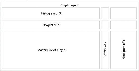
The structure of the graph shown in Figure 8.8.3 is created by the following GTL code block.
layout lattice / rows=3 columns=3 columndatarange=union
rowdatarange=union rowweights=(0.2 0.15 0.65)
columnweights=(0.74 0.06 0.2);
/*--Define 9 cells using Layout Overlay blocks*/
layout overlay / <options>;
< plot statements >
endlayout;
endlayout;
Nine sets of LAYOUT OVERLAY – ENDLAYOUT blocks of code are used to populate each of the nine cells that are defined by the 3 x 3 settings in the LAYOUT LATTICE statement. Each block must contain either a plot statement or an ENTRY statement. In the actual lattice structure for the graph, we do not need cell borders, so individual ENTRY statements can be placeholders for each cell.
There must be a placeholder for each cell, or the arrangement will shift and thus cause other alignment problems between axis types. Finally, there must be at least one valid plot type, or else the entire graph layout will be blank. The three cells in the top row are defined as follows.
/*--Top Row--*/
layout overlay / walldisplay=none;
histogram _xvar / filltype=gradient;
endlayout;
entry ' ';
entry ' ';
The individual cells are populated in row major order, from top left to bottom right. Options can be used to reverse the order, if needed. The three cells in the middle row are defined as follows.
/*--Middle Row--*/
layout overlay / walldisplay=none;
boxplot y=_XVar / orient=horizontal boxwidth=0.9;
endlayout;
entry ' ';
entry ' ';
Finally, the three cells in the bottom row are defined as follows.
/*--Bottom Row--*/
layout overlay / walldisplay=none;
if (_type = 'heatmap')
heatmap x=_xvar y=_yvar / colormodel=(cx5f7faf gold red);
else
scatterplot x=_xvar y=_yvar / markerattrs=(symbol=circlefilled)
datatransparency=0.95;
endif;
regressionplot x=_xvar y=_yvar / degree=2 lineattrs=graphdatadefault;
endlayout;
layout overlay / walldisplay=none;
boxplot y=_YVar / boxwidth=0.9;
endlayout;
layout overlay / walldisplay=none;
histogram _yvar / orient=horizontal filltype=gradient;
endlayout;
Note the use of the dynamic variables "_XVar" and "_YVar". These are used to make the template flexible, and they are useful to create multiple graphs with different X- or Y- variables. These dynamic variables can be defined at run time in the PROC SGRENDER step as shown below. Here we have set _XVar='Weight' and _YVar='Systolic' to view the distribution of Systolic x Weight. The use of dynamic variables enables us to define one template and use it repeatedly with different variable names.
proc sgrender data=sashelp.heart template=Fig_8_8_Bivariate_Distribution_Plot;
dynamic _XVar='Weight' _YVar='Systolic' _Type='scatter'
_Title='A Scatter Plot of the Joint Bivariate Distribution of ';
run;
We have also defined other dynamics: "_Type" and "_Title". The "_Type" dynamic is used to control the type of plot that is displayed in the lower left cell of the graph. In the procedure invocation below, we have specified _Type="heatmap" to get the graph shown in Figure 8.8.4. We have also set the "_Title" dynamic to alter the title accordingly.
proc sgrender data=sashelp.heart template=Fig_8_8_Bivariate_Distribution_Plot;
dynamic _XVar='Weight' _YVar='Systolic' _Type='heatmap'
_Title='A Heat Map of the Joint Bivariate Distribution of ';
run;
Figure 8.8.4 – Heat Map of the Joint Bivariate Distribution

A heat map is a more useful and efficient plot type for display of the distribution of large data. When the number of observations grows large, into the millions or billions of observations, plotting each observation as a marker in a scatter plot becomes inefficient and ineffective.
Such large data sets are likely to reside on cloud servers, and retrieving each observation for plotting is not feasible. Even rendering the scatter plot on the server is not effective, as it is time-consuming, and all we will see is a glob of data. This is true even with SASHELP.HEART data set, which has only 5400 observations. This can be seen in Figure 8.8.1.
However, creating a heat map provides a faster and more effective solution. Now, we are counting the number of observations in each bin of the plot. The number of bins is constant; they might be 100 x 50 in this case. Each bin is displayed using a color that represents the number of observations in the bin using a three-color mode as shown in Figure 8.8.4.
A gradient legend could have been included in the display, but I have chosen to skip it because the key here is to see the relative densities, not the actual densities. The full code for the template and graph creation can be seen in Program 8_8.
8.9 Summary
With SAS 9.4, you have a powerful set of features to create clinical graphs. The new AXISTABLE statement was specifically designed to address many different needs to include textual data in the graph. Such data needs to be aligned with the horizontal axis, as in the case of a survival plot, or aligned with the vertical axis, as in the case of a forest plot.
The axis table supports features to assign the text attributes of a row or column for rich text support. Class data can be arranged side by side or stacked. Values can be colored by classifiers. These statements support extensive options for arrangement of the values or labels for the vertical table.
Inner margins are now supported on all four sides of the overlay container. One-dimensional objects can be placed in these regions, and the axis table can be placed in any of the four locations. Multiple columns of an axis tables are automatically arranged into tables.
Axis tables can also be placed in the cells of a lattice container using the row or column weight of "Preferred". This allows the container to assign the right amount of space for the cell based on the font metrics.
New features have been added for the arrangement of the axis tick values and labels. These can be seen in the butterfly plot or in the control for the axis line extent to span only the data. This enables you to create graphs with a modern, lightweight feel.
Many of these features are also included with the SGPLOT procedure. As shown in Chapters 3 and 4, many commonly used clinical graphs can be created using SG procedures. However, often you need more complex layout of the data. In such cases, you can use GTL, which provides you with more options for the layout of your graph.
1 Matange, Sanjay. "Graphically Speaking." Available at http://blogs.sas.com/content/graphicallyspeaking/. Last updated October 31, 2015. Accessed on February 1, 2016.