
So far, all the recipes in this chapter have only created one type of chart. Incanter also lets us combine chart types. This allows us to add extra information and create a more useful, compelling chart. For instance, showing the interaction between the raw data and the output of a machine learning algorithm is a common use for overlaying lines onto scatter plots.
In this recipe, we'll take the chart from the Creating scatter plots with Incanter recipe and add a line from a linear regression.
We'll use the same dependencies in our project.clj file as we did in Creating scatter plots with Incanter. We'll also use this set of imports in our script or REPL:
(require '[incanter.core :as i]
         '[incanter.charts :as c]
         '[incanter.io :as iio]
         '[incanter.stats :as s])
We'll start with the chart we made in Creating scatter plots with Incanter. We'll keep it assigned to the iris-petal-scatter variable.
For this recipe, we'll create the linear model and then add it to the existing chart from the previous recipe:
- First, we have to create the linear model for the data. We'll do that using the
incanter.stats/linear-modelfunction:(def iris-petal-lm (s/linear-model (i/sel iris :cols :Petal.Length) (i/sel iris :cols :Petal.Width) :intercept false)) - Next, we take the
:fitteddata from the model and add it to the chart usingincanter.charts/add-lines:(c/add-lines iris-petal-scatter (i/sel iris :cols :Petal.Width) (:fitted iris-petal-lm) :series-label "Linear Relationship")
Once we've added that, our chart resembles the following screenshot:
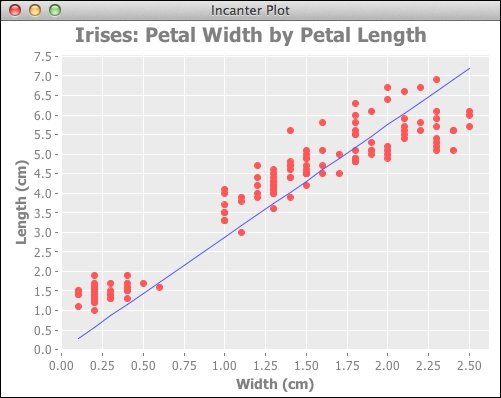
The fitted values for the linear regression are just a sequence of y values corresponding to the sequence of x values. When we add that line to the graph, Incanter pairs the x and y values together and draws a line on the graph linking each point. Since the points describe a straight line, we end up with the line found by the linear regression.
- The Modeling linear relationships recipe in Chapter 7, Statistical Data Analysis with Incanter.