
CHAPTER
4
Data Science Craftsmanship, Part I
This is the most technical chapter of the book. Metric selection is discussed in some detail before moving on to new visualization techniques to represent complex spatial processes evolving over time. It then digs deeper into the technical aspects of a range of topics.
This chapter presents some interesting techniques developed recently to handle modern business data. It is more technical than previous chapters, yet it's easy to read for someone with limited statistical, mathematical, or computer science knowledge. The selection of topics for this chapter was based on the number of analytics practitioners that found related articles useful when they were first published at Data Science Central. This chapter is as broad as possible, covering many different techniques and concepts.
Advanced statistics, in particular cross-validation, robust statistics, and experimental design, are all part of data science. Likewise, computational complexity is part of data science when it applies to algorithms used to process modern large, unstructured, streaming data sets. Therefore, many computer science and statistical techniques are discussed at a high level in this chapter.
NOTE Material that is traditionally found in statistical textbooks (such as the general linear model), as well as run-of-the mill, old computer science concepts (such as sorting algorithms) are not presented in this book. You can check out Chapter 8, “Data Science Resources,” for an introduction to those subjects.
New Types of Metrics
Identifying powerful metrics—that is, metrics with good predictive power—is a fundamental role of the data scientist. The following sections present a number of metrics used in optimizing digital marketing campaigns and in fraud detection. Predictive power is defined in Chapter 6 in the section Predictive Power of a Feature, Cross-Validations. Metrics used to measure business outcomes in a business model are called KPIs (key performance indicators). A metric used to predict a trend is called a leading indicator.
Some metrics that are not KPIs still need to be identified and tracked. For instance, if you run e-mail campaigns to boost membership, two KPIs are the number of new members per month (based on number of e-mails sent), and churn. But you still need to track open rates, even open rates broken down by ISP, segments, and message sent, as these metrics, while clearly not KPIs, are critical to understand variations in new members and improve new members stats/reduce churn. For instance, analyzing open rates will show you that sending an e-mail on a Saturday night is much less efficient than on a Wednesday morning; or that no one with a Gmail e-mail address ever opens your message—a problem that is relatively easy to fix, but must be detected first. You can't fix it if you can't detect it; you can't detect it if you don't track open rates by ISP.
Big data and fast, clustered computers have made it possible to track and compute more sophisticated metrics, test thousands of metrics at once (to identify best predictors), and work with complex compound metrics: metrics that are a function of other metrics, such as type of IP address. These compound metrics are sometimes simple transformations (like a logarithmic transformation), sometimes complex combination and ratios of multiple base metrics, and sometimes derived from based metrics using complex clustering algorithms, such as the previous example: type of IP address (which will be discussed later in this chapter in the section Internet Topology Mapping).
Compound metrics are to base metrics what molecules are to atoms. Just like as few as seven atoms (oxygen, hydrogen, helium, carbon, sodium, chlorine, and sulfur) can produce trillions of trillions of trillions of molecules and chemical compounds (a challenge for analytical and computational chemists designing molecules to cure cancer), the same combinatorial explosion takes place as you move from base to compound metrics. Base metrics are raw fields found in data sets.
The following list of metrics (mostly compound metrics) is by no means comprehensive. You can use it as a starting point to think about how to create new metrics.
Metrics to Optimize Digital Marketing Campaigns
If you run an online newsletter, here are a number of metrics you need to track:
- Open rate: Proportion of subscribers opening your newsletter. Anything below 10 percent is poor, unless your e-CPM is low.
- Number of opens: Some users will open your message multiple times.
- Users opening more than two times: These people are potential leads or competitors. If few users open more than once, your content is not interesting, or maybe there is only one clickable link in your newsletter.
- Click rate: Average number of clicks per open. If less than 0.5, your subject line might be great, but the content (body) irrelevant.
- Open rate broken down per client (Yahoo! Mail, Gmail, Hotmail, and so on): If your open rate for Hotmail users is low, you should consider eliminating Hotmail users from your mailing list because they can corrupt your entire list.
- Open rate and click rate broken down per user segment.
- Trends: Does open rate, click rate, and such per segment go up or down over time? Identify best performing segments. Send different newsletters to different segments.
- Unsubscribe and churn rate: What subject line or content increases the unsubscribe or complaint rate?
- Spam complaints: these should be kept to less than one per thousand messages sent. Identify segments and clients (for example, Hotmail) generating high complaint rates, and remove them.
- Geography: Are you growing in India but shrinking in the United States? Is your open rate better in Nigeria? That's not a good sign, even if your overall trend looks good.
- Language: Do you have many Hispanic subscribers? If yes, can you send a newsletter in Spanish to these people? Can you identify Spanish speakers? (You can if you ask a question about language on sign-up.)
- Open rate by day of week and time: Identify best times to send your newsletter.
- User segmentation: Ask many questions to new subscribers; for example, about their interests. Make these questions optional. This will allow you to better target your subscribers.
- Growth acceleration: Are you reaching a saturation point? If yes, you need to find new sources of subscribers or reduce your frequency of e-mail blasts (possibly finding fewer but better or more relevant advertisers to optimize e-CPM).
- Low open rates: Are images causing low open rates? Are redirects (used to track clicks) causing low open rates? Some URL shorteners such as bit.ly, although useful, can result in low open rates or people not clicking links due to risk of computer infection.
- Keyword tracking: Have you tracked keywords that work well or poorly in the subject line to drive your open rate up?
- From field: Have you tried changing your From field to see what works best? A/B testing could help you get better results.
- Size of message: If too large, this could cause performance issues.
- Format: Text or HTML? Do some A/B testing to find optimum format.
You should note that e-CPM is the revenue generated per thousand impressions. It is your most important metric, together with churn.
Metrics for Fraud Detection
Many data scientists work on fraud detection projects. Since 1995, metrics dealing with fraud detection have been refined so that new powerful metrics are now used. The emphasis in this discussion of modern fraud detection metrics is on web log data. The metrics are presented here as rules. More than one rule must be triggered to fire an alarm if you use these metrics to build an alarm system. You may use a system such as hidden decision trees to assign a specific weight to each rule.
- Extreme events: Use Monte Carlo simulations to detect extreme events. For example, a large cluster of non-proxy IP addresses that have exactly eight clicks per day, day after day. What is the chance of this happening naturally?
- Blacklists and whitelists: Determine if an IP address or referral domain belongs to a particular type of blacklist or whitelist. For example, classify the space of IP addresses into major clusters, such as static IP, anonymous proxy, corporate proxy (white-listed), edu proxy (high risk), highly recycled IP (higher risk), and so on.
- Referral domain statistics: Gather statistics on time to load with variance (based on three measurements), page size with variance (based on three measurements), or text strings found on web page (either in HTML or JavaScript code). For example, create a list of suspicious terms (Viagra, online casino, and so on), or create a list of suspicious JavaScript tags or codes but use a whitelist of referral domains (for example, top publishers) to eliminate false positives.
- Analyze domain name patters: For example, a cluster of domain names, with exactly identical fraud scores, are all of the form xxx-and-yyy.com, and their web pages all have the same size (1 char).
- Association analysis: For example, buckets of traffic with a huge proportion (> 30 percent) of very short (< 15 seconds) sessions that have two or more unknown referrals (that is, referrals other than Facebook, Google, Yahoo!, or a top 500 domain). Aggregate all these mysterious referrals across these sessions; chances are that they are all part of a same Botnet scheme (used, for example, for click fraud).
- Mismatch in credit card fields: For example, phone number in one country, e-mail or IP address from a proxy domain owned by someone located in another country, physical address yet in another location, name (for example, Amy) and e-mail address (for example, [email protected]) look different, and a Google search on the e-mail address reveals previous scams operated from same account, or nothing at all.
- Gibberish: For example, a referral web page or search keyword attached to a paid click contains gibberish or text strings made of letters that are close on the keyboard, such as fgdfrffrft.
- E-mail address anomalies: For example, an e-mail digits other than area code, year (for example, 73), or ZIP code (except if from someone, in India or China).
- Transaction time: For example, if the time the first transaction after sign-up is short.
- Abnormal purchase pattern: For example, on a Sunday at 2 a.m., a customer buys expensive product on your e-store, from an IP outside the United States, on a B2B e-store targeted to U.S. clients.
- Repetitive small purchases: For example, when multiple $9.99 purchases are made across across multiple merchants with the same merchant category, with one or two transactions per cardholder.
The key point here is that fraud detection metrics keep getting more complicated and diversified, as criminals constantly try to gain a competitive advantage by reverse-engineering fraud detection algorithms. There will always be jobs for data scientists working on fraud detection. Fraud detection also includes metrics to fight non-criminals—for instance, marketers who want to game search engines to get their websites listed first on Google, as well as plagiarists and spammers.
Choosing Proper Analytics Tools
As a data scientist, you will often use existing tools rather than reinventing the wheel. So before diving deeper into the technical stuff, it's important that you identify and choose the right tools for your job. Following are some important questions you need to ask and criteria to keep in mind when looking for a vendor for analytics software, visualization tools, real-time products, and programming languages.
Analytics Software
Here are a few good criteria and questions to consider that will help you select appropriate analytics software. Those I've found to be very important are indicated with an asterisk.
- Is it a new product or company, or well established?
- Is it open source or, if not, is a free trial available?
- Can it work with big data?*
- Price*
- Compatible with other products
- Easy to use and GUI offered*
- Can work in batch or programmable mode*
- Offers an API
- Capable of fetching data on the Internet or from a database (SQL supported)
- Nice graphic capabilities (to visualize decision trees, for instance)*
- Speed of computations and efficiency in the way memory is used*
- Good technical support, training, or documentation available*
- Local company
- Offers comprehensive set of modern procedures
- Offers add-ons or modules at an extra charge (this could be important as your needs grow)*
- Platform-independent*
- Technique-specialized (for example, time series, spatial data, scoring technology) versus generalist
- Field-specialized (for example, web log data, healthcare data, and finance)
- Compatible with your client (for example, SAS because your clients use SAS)*
- Used by practitioners in the same analytic domain (quant, econometrics, Six Sigma, operations research, computer science, and so on)
- Handles missing data, data cleaning, auditing functionality, and cross-validation
- Supports programming languages such as C++, Python, Java, and Perl rather than internal, ad hoc languages (despite the fact that an ad hoc language might be more efficient)*
- Learning curve is not too steep*
- Easy to upgrade*
- Able to work on the cloud, or to use MapReduce and NoSQL features
- Real-time features (can be integrated in a real-time system, such as auction bidding)
In some cases, three products might be needed: one for visualization, one with a large number of functions (neural networks, decision trees, constrained logistic regression, time series, and simplex), and one that will become your “work horse” to produce the bulk of heavy-duty analytics.
Related questions you should ask include:
- When do you decide to upgrade or purchase an additional module to an existing product, for example—SAS/GRAPH or SAS/ACCESS, to use on top of SAS Base?
- Who is responsible in your organization to make a final decision on the choice of analytics software? End users? Statisticians? Business people? The CTO?
Visualization Tools
Ask yourself the following questions to help you select the proper visualization tools for each of your projects:
- How do you define and measure the quality of a chart?
- Which tools allow you to produce interactive graphs or maps?
- Which tools do you recommend for big data visualization?
- Which visualization tools can be accessed via an API, in batch mode (for instance, to update earthquake maps every 5 minutes, or stock prices every second)?
- What do you think of Excel? And Python or Perl graph libraries? And R?
- Are there any tools that allow you to easily produce videos about your data (for example, to show how fraud cases or diseases spread over time)?
- In Excel you can update your data, and then your model and charts get updated right away. Are there any alternatives to Excel, offering the same features, but having much better data modeling capabilities?
- How do you produce nice graph structures—for example, to visually display Facebook connections?
- What is a heat map? When does it make sense to use it?
- How do you draw force-directed graphs?
- Is the tool a good choice for raster images, vector images, graphs, decision trees, fractals, time series, stock prices, maps, spatial data, and so on?
- How can you integrate R with other graphical packages?
- How do you represent five dimensions (for example, time, volume, category, price, and location) in a simple two-dimensional graph? Or is it better to represent fewer dimensions if your goal is to communicate a message to executives?
- Why are the visualization tools used by mathematicians and operations research practitioners (for example, Matlab) different from the tools used by data scientists? Is it because of the type of data, or just historical reasons?
Real-Time Products
These questions will help you get a good handle on the use and selection of real-time products:
- In addition to transaction scoring (credit card transactions and online ad delivery systems), what other applications need true real time?
- What types of applications work better with near real time, rather than true real time?
- How do you boost performance of true real-time scoring? For example, by having preloaded, permanent, in-memory, small, lookup tables (updated hourly) or other mechanisms? Explain.
- How do you handle server load at peak times because it can be 10 times higher than, for example, at 2 a.m.? And at 2 a.m., do you use idle servers to run hourly or daily algorithms to refine or adjust real-time scores?
- Are real-time algorithms selected and integrated into production by data scientists, mostly based on their ability to be easily deployed in a distributed environment?
- How do you solve difficult problems such as 3-D streaming video processing in real time from a moving observation point (to automatically fly a large plane at low elevations in crowded skies)?
- Do you think end users (for example, decision makers) should have access to dashboards updated in true real time, or is it better to offer five-minute delayed statistics to end users? In which application is real time better for end users?
- Is real time limited only to machine generated data?
- What is machine generated data? What about a real-time trading system that is based on recent or even extremely recent tweets or Facebook posts? Do you call this real time, big data, machine data, machine talking to machines, and so on?
- What is the benefit of true real time over five-minutes-delayed signals? Does the benefit (increased accuracy) outweigh the extra cost? (On Wall Street, usually the answer is yes. But what about with keyword bidding algorithms—is a delayed reaction okay?)
- Are there any rules regarding optimum latency (when not implementing true real time) depending on the type of application? For instance, for Internet traffic monitoring, 15 minutes is good because it covers most user sessions.
- What kinds of programming environments are well suited for big data in real time? (SQL is not, C++ is better, what about Hadoop? What technology do you use?)
- What kind of applications are well suited for real-time big data?
- What type of metrics are heavily or easily used in real time (for example, time to last transaction)?
- To deliver clicks evenly and catch fraud right away, do you think that the only solution for Google is to monitor clicks (on paid ads) in true real time?
- Do you think Facebook uses true real time for ad targeting? How can it improve its very low impression-to-click ratio? Why is this ratio so low despite the fact that it knows so many things about its users? Could technology help?
- What is the future of real time over the next 10 years? What will become real time? What will stay hourly for end-of-day systems?
- Are all real-time systems actually hybrid, relying also on hourly and daily or even yearly (with seasonality) components to boost accuracy? How are real-time predictions performed for sparse highly granular data, such as predicting the yield of any advertising keyword in real time for any advertiser? (Answer: Group sparse data into bigger buckets; make forecasts for the entire bucket.)
Programming Languages
Python and R have become very popular: They're open source, so you can just download them from the web, get sample scripts, and start coding. Python offers analytics libraries, known as Pandas. R is also very popular. Java, Perl, and C++ have lost some popularity, though there are still people coding in C (in finance) because it's fast and lots of libraries are available for analytics as well as for visualization and database access. Perl is great and very flexible, especially if you are an independent creative data scientist and like to code without having to worry about the syntax, code versioning, team work, or how your code will be integrated by your client. Perl also comes with the Graph library.
Of course, you also need to know SQL. Hadoop has become the standard for MapReduce programming. SAS is widespread in some environments, especially government and clinical trials. I sometimes use R for advanced graphing (including videos) because it works well with palettes and other graphic features. R used to be limited by the memory available in your machine, although there are solutions that leverage the cloud (RHadoop).
Visualization
This section is not a review of visualization tools or principles. Such a review is beyond the scope of this book and would constitute a book by itself. Readers can check the Books section in Chapter 8 for references. You can also get more information on how to choose a visualization tool at http://bit.ly/1cGlFA5.
This section teaches you how to produce advanced charts in R and how to produce videos about data, or data videos—information. It also includes code to produce any kind of color pattern you want, because of the rgb (red/green/blue) R function embedded in an R plot command. By creating videos rather than pictures, you automatically add more dimension to your visuals—most frequently but not always, that dimension is time, as in time series. So this section is a tutorial on producing data videos with R. Finally, you can upload your data videos on YouTube. R is chosen for this discussion because it is very easy to use, and it is one of the most popular tools used by data scientists today.
Producing Data Videos with R
Following is a step-by-step process for producing your video. The first three sections explain how to do it. Then the subsequent sections provide additional detail you may find helpful.
Videos are important because they allow you to present spatial information that changes over time (spatial-temporal data), or display one additional dimension to what is otherwise a static image. They're also used to see the convergence (or lack thereof) and speed of convergence of data science algorithms. Song-Chun Zhu is one of the pioneers in producing “data videos” (see http://www.stat.ucla.edu/∼sczhu/publication.html).
Another useful aspect of videos is the ability to show rotating 3-D charts so that the user can see the chart from all angles and find patterns that traditional 2-D projections (static images) don't show (unless you look at dozens of projections). The basic principles are:
- Deciding which metric will be used as your time variable (let's call it “time”)
- How fast frames are moving
- How granular time is (you decide)
- Producing the data frames (one for each time—that's where R, Python, or Perl is used)
- Displaying the frames (easy with R) and/or getting them embedded into a video file (open source ActivePresenter is used here)
Two important points are how the data should be visualized and who should make this decision—the data scientist, the business analyst, or the business user. The business user typically decides, but the data scientist should also propose new visualizations to the business user (depending on the type of data being analyzed and the KPIs used in the company), and let the business user eventually decide, based on how much value he can extract from a visualization and how much time it takes to extract that value.
Visualizations communicating business value linked to KPIs, solving a costly issue, or showing a big revenue opportunity, and that can be understood in 30 seconds or less, are the best, The worst graphs have one or more of the following features: (1) they're cluttered, (2) the data is rescaled, (3) unimportant data masks or hides valuable information, and (4) they display metrics that are not comparable.
Produce the Data You Want to Visualize
Using Python, R, Perl, Excel, SAS, or any other tool, produce a text file called rfile.txt, with four columns:
- k: frame number
- x: x-coordinate
- y: y-coordinate
- z: color associated with (x,y)
Or, if you want to exactly replicate my experiment, you can download my rfile.txt (sample data to visualize) at http://www.datashaping.com/first.r.txt.
Run the Following R Script
Note that the first variable in the R script is labeled iter. It is associated with an iterative algorithm that produces an updated data set of 500 (x,y) observations at each iteration. The fourth field is called new, which indicates if point (x,y) is new for a given (x,y) and given iteration. New points appear in red; old ones appear in black.
vv<-read.table(“c:/vincentg/rfile.txt”,header=TRUE);
iter<-vv$iter;
for (n in 0:199) {
  x<-vv$x[iter == n];
  y<-vv$y[iter == n];
  z<-vv$new[iter == n];
  plot(x, y, xlim=c(0,1),ylim=c(0,1),pch=20,col=1+z,
xlab=““,ylab=““,axes=FALSE);
dev.copy(png, filename=paste(“c:/vincentg/Zorm_“,n,“.png”,sep=““));
  dev.off ();
}
Produce the Video
There are four different ways to produce your video. When you run the R script, the following happens:
- 200 images (scatter plots) are produced and displayed sequentially on the R Graphic window in a period of about 30 seconds.
- 200 images (one for each iteration or scatter plot) are saved as Zorm0.png, Zorm1.png, and so on, up to Zorm199 in the target directory.
Then your three options to produce the video are as follows:
- Caveman style: Film the R Graphic frame sequence with your cell phone.
- Semi-caveman style: Use a screen-cast tool (for example, ActivePresenter) to capture the streaming plots displayed on the R Graphic window.
- Use Adobe or other software to automatically assemble the 200 Zorm*.png images produced by R.
You can read about other possible solutions (such as open source ffmpeg or the ImageMagick library) at http://stackoverflow.com/questions/1298100/creating-a-movie-from-a-series-of-plots-in-r. You could also watch the animation “An R Package for Creating Animations and Demonstrating Statistical Methods” published in the April 2013 issue of the Journal of Statistical Software.
A nice thing about these videos is that you can upload them to YouTube. You can check out mine at these URLs:
- http://www.youtube.com/watch?v=DL4cYD2X9PM
- http://www.youtube.com/watch?v=fb0yevGSAxY
- http://www.youtube.com/watch?v=QBQIHbQdptk
- http://www.youtube.com/watch?v=4oIsB0EdnmQ
ActivePresenter
You can use ActivePresenter (http://atomisystems.com) screen-cast software (free edition), as follows:
- Let the 200 plots automatically show up in fast motion in the R Graphics window.
- Use ActivePresenter to select the area you want to capture (a portion of the R Graphic window, just like for a screen shot, except that it captures streaming content rather than a static image).
- Click Stop when finished and export it to your .wmv format and upload to a web server for others to access.
I recently created two high quality videos using ActivePresenter based on a data set with two additional columns using the following, different R script (you can download the data as a 7 MB text file at http://www.datashaping.com/rfile2.txt):
vv<-read.table(“c:/vincentg/rfile.txt”,header=TRUE);
iter<-vv$iter;
for (n in 0:199) {
  x<-vv$x[iter == n];
  y<-vv$y[iter == n];
  z<-vv$new[iter == n];
  u<-vv$d2init[iter == n];
  v<-vv$d2last[iter == n];
  plot(x,y,xlim=c(0,1),ylim=c(0,1), pch=20+z, cex=3*u,
col=rgb(z/2,0,u/2),xlab=““, ylab=““,axes=TRUE);
  Sys.sleep(0.05); # sleep 0.05 second between each iteration
}
You could also try changing the plot command to:
plot(x,y,xlim=c(0,1),ylim=c(0,1),pch=20,cex=5,col=rgb(z,0,0),
xlab=““,ylab=““,axes=TRUE);
This second R script differs from the first as follows:
- The dev.copy and dev.off calls are removed to stop producing the PNG images on the hard drive. (You don't need them here because you use screen casts). Producing the PNG files slows down the whole process and creates flickering videos—this step removes most of the flickering.
- The function Sys.sleep is used to make a short pause between each frame, which makes the video smoother.
- rgb is used inside the plot command to assign a color to each dot: (x, y) gets assigned a color that is a function of z and u, at each iteration.
- The size of the dot (cex) in the plot command now depends on the variable u: That's why you see bubbles of various sizes that grow bigger or shrink.
Note that d2init (fourth column in the rfile2.txt input data used to produce the video) is the distance between the location of (x,y) at the current iteration and its location at the first iteration. In addition, d2last (fifth column) is the distance between the current and previous iterations for each point. The point will be colored in a more intense blue if it made a big move between the current and previous iterations.
The function rgb accepts three parameters with values between 0 and 1, representing the intensity, respectively in the red, green, and blue frequencie. For instance, rgb (0,0,1) is blue, rgb (1,1,0) is yellow, rgb (0.5,0.5,0.5) is gray, rgb (1,0,1) is purple, and so on. Make sure 0 ≤ rgb ≤ 1 otherwise it will crash.
More Sophisticated Videos
You can also create videos that involve points and arrows (not just points) continuously moving from frame to frame. Arrows are attached to points and indicate which cluster a point is moving toward or away from at any given time. Transitions from frame to frame are accelerated over time, and color gradients are also used. I recently produced a couple of these videos. You can find additional information on them at the following URLs:
- Download the data set at http://www.datashaping.com/rfile3.txt.
- View the videos at http://www.analyticbridge.com/profiles/blogs/shooting-stars.
Here is the R source code used in this version.
vv<-read.table(“c:/vincentg/rfile3.txt”,header=TRUE);
iter<-vv$iter;
for (n in 1:199) {
  x<-vv$x[iter == n];
  y<-vv$y[iter == n];
  z<-vv$new[iter == n];
  u<-vv$d2init[iter == n];
  v<-vv$d2last[iter == n];
  p<-vv$x[iter == n-1];
  q<-vv$y[iter == n-1];
  u[u>1]<-1;
  v[v>0.10]<-0.10;
  s=1/sqrt(1+n);
  if (n==1) {
    plot(p,q,xlim=c(-0.08,1.08),ylim=c(-0.08,1.09),pch=20,cex=0,
col=rgb(1,1,0),xlab=““,ylab=““,axes=TRUE);
  }
  points(p,q,col=rgb(1-s,1-s,1-s),pch=20,cex=1);
  segments(p,q,x,y,col=rgb(0,0,1));
  points(x,y,col=rgb(z,0,0),pch=20,cex=1);
  Sys.sleep(5*s);
  segments(p,q,x,y,col=rgb(1,1,1));
}
segments(p,q,x,y,col=rgb(0,0,1)); # arrows segments
points(x,y,col=rgb(z,0,0),pch=20,cex=1);
Statistical Modeling Without Models
Statistical “modeling without models” is a way to do inference, even predictions or computing confidence intervals, without using statistical distributions or models. Sometimes, understanding the physical model driving a system (for instance, the stock market) may be less important than having a trading system that works. Sometimes (as in the stock market), you can try to emulate the system (using Monte Carlo simulations to simulate stock market prices) and fit the data to the simulations without knowing exactly what you are emulating (from a physical or theoretical point of view), as long as it works and can be adapted when conditions or environment (for instance, market conditions) change.
You may be wondering how to get the data needed to produce the previously discussed videos. This section presents details on the algorithms used to produce the data for the videos. I will use my shooting stars video as the example, which means you need a bit of history on the project.
The project began as the result of several of my personal interests and research, including the following:
- Interest in astronomy, visualization, and how physics models apply to business problems
- Interest in systems that produce clusters (as well as birth and death processes) and in visualizing cluster formation with videos rather than charts
- Research on how urban growth could be modeled by the gravitational law
- Interest in creating videos with sound and images synchronized and generated using data
The statistical models behind the videos are birth and death processes—gravitational forces that create clusters that form and die—with points moving from one cluster to another throughout the process, and points coming from far away. Eventually, it became modeling without models, a popular trend in data science.
What Is a Statistical Model Without Modeling?
There is a generic mathematical model behind the algorithm used to create the video data, but the algorithm was created first without having a mathematical model in mind. This illustrates a new trend in data science: less and less concern about modeling, and more and more about results.
My algorithm has a bunch of parameters and features that can be fine-tuned to produce anything you want—be it a simulation of a Neyman-Scott cluster process or a simulation of some no-name stochastic process. It's a bit similar to how modern mountain climbing has evolved: from focusing on big names such as Everest in the past, to exploring deeper wilderness and climbing no-name peaks today (with their own challenges), and possibly to mountain climbing on Mars in the future.
You can fine-tune the parameters to:
- Achieve the best fit between simulated data and real business (or other data), using traditional goodness-of-fit testing and sensitivity analysis. Note that the simulated data represents a realization (an instance for object-oriented people) of a spatio-temporal stochastic process.
- After the parameters are calibrated, perform predictions (if you speak the statistician's language) or extrapolations (if you speak the mathematician's language).
How Does the Algorithm Work?
The algorithm starts with a random distribution of m mobile points in the [0,1] × [0,1] square window. The points get attracted to each other (attraction is stronger to closest neighbors) and thus, over time, they group into clusters.
The algorithm has the following components:
- Creation of n random fixed points (n = 100) on [−0.5, 1.5] × [−0.5, 1.5]. This window is four times bigger than the one containing the mobile points, to eliminate edge effects impacting the mobile points. These fixed points (they never move) also act as some sort of dark matter: they are invisible, they are not represented in the video, but they are the glue that prevents the whole system from collapsing onto itself and converging to a single point.
- Creation of m random mobile points (m = 500) on [0,1] × [0,1].
- Main loop (200 iterations). At each iteration, compute the distance d between each mobile point (x,y) and each of its m–1 mobile neighbors and n fixed neighbors. A weight w is computed as a function of d, with a special weight for the point (x,y) itself. Then the updated (x,y) is the weighted sum aggregated over all points, and I do that for each point (x,y) at each iteration. The weight is such that the sum of weights over all points is always 1. In other words, replace each point with a convex linear combination of all points.
Some special features of this algorithm include the following:
- If the weight for (x,y) (the point being updated) is very high at a given iteration, then (x,y) will barely move.
- When negative weights are tested (especially for the point being updated) the results are better. A delicate amount of negative weights also prevents the system from collapsing and introduces a bit of desirable chaos.
- Occasionally, one point is replaced by a brand new random point, rather than updated using the weighted sum of neighbors. This is called a “birth.” It happens for less than 1 percent of all point updates, and it happens more frequently at the beginning. Of course, you can play with these parameters.
In the Perl source code shown here, the birth process for point $k is simply encoded as:
if (rand()<0.1/(1+$iteration)) { # birth and death
  $tmp_x[$k]=rand();
  $tmp_y[$k]=rand();
  $rebirth[$k]=1;
}
In this source code, in the inner loop over $k, the point ($x,$y) to be updated is referenced as point $k, that is, ($y, $y) = ($moving_x[$k], $moving_y[$k]). Also, in a loop over $l, one level deeper, ($p, $q) referenced as point $l, represents a neighboring point when computing the weighted average formula used to update ($x, $y). The distance d is computed using the function distance, which accepts four arguments ($x, $y, $p, and $q) and returns $weight, the weight w.
In summary, realistic simulations used to study real-life mechanisms help you understand and replicate the mechanism in the laboratory, even if the mechanism itself is not understood. In this case, these simulations (visualized in videos) help you understand how multiple celestial bodies with various sizes, velocities, and origins work (or anything subject to forces similar to gravitational forces—possibly competitive forces in the market), including how they coalesce, are born, and die. In turn, by fitting data to simulations, you can make predictions, even if the mechanism is not well understood.
Source Code to Produce the Data Sets
Both Perl and R have been used to produce the datasets for the video. You can download the source code for both at http://bit.ly/11Jdi4t.
The Perl code runs much faster than the R code, not because Perl itself is faster, but because of the architecture used in the program: Perl recomputes all of the frames at once and loads them into memory, while R produces each frame only as needed. The advantage of the R version is that it completes all aspects of the process, including producing the data and displaying the video frames.
Three Classes of Metrics: Centrality, Volatility, Bumpiness
This section marks the beginning of a deeper dive into more technical data science information. Let's start with a simple concept. Statistical textbooks focus on centrality (median, average, or mean) and volatility (variance). They don't mention the third fundamental class of metrics: bumpiness. This section begins by considering the relationship between centrality, volatility, and bumpiness. It then discusses the concept of bumpiness and how it can be used. Finally, you will see how a new concept is developed, a robust modern definition is materialized, and a more meaningful definition is created based on, and compatible with, previous science.
Relationships Among Centrality, Volatility, and Bumpiness
Two different data sets can have the same centrality and volatility, but a different bumpiness. Bumpiness is linked to how the data points are ordered, whereas centrality and volatility completely ignore order. So bumpiness is useful for data sets where order matters—in particular, time series. Also, bumpiness integrates the notion of dependence among the data points, whereas centrality and variance do not. Note that a time series can have high volatility (high variance) and low bumpiness. The converse is also true.
Detecting changes in bumpiness is important. The classical example is stock market strategy: an algorithm works well for a while, and then a change in bumpiness makes it fail. Detecting when bumpiness changes can help you adapt your algorithm earlier, and hopefully decrease losses. Low bumpiness can also be associated with stronger, more accurate predictions. When possible, use data with low bumpiness or use bumpiness reduction techniques.
Defining Bumpiness
Given a time series, an intuitive, data science, scale-dependent, and robust metric would be the average acute angle measured on all the vertices. This metric is bounded by the following:
- The maximum is Pi and is attained by smooth time series (straight lines).
- The minimum is 0 and is attained by time series with extreme, infinite oscillations, from one time interval to the other.
This metric is non-sensitive to outliers. It is by all means a modern metric. However, I don't want to reinvent the wheel, and thus I will define bumpiness using a classical “statistic” (as opposed to “data science”) metric that has the same mathematical and theoretical appeal and drawbacks as the old-fashioned average (to measure centrality) or variance (to measure volatility).
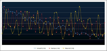
Bumpiness can be defined as the auto-correlation of lag 1. Figure 4-1 shows three time series with the same mean, variance, and values, but different bumpiness.
Note that the lag 1 auto-correlation is the highest of all auto-correlations, in absolute value. Therefore, it is the single best indicator of the auto-correlation structure of a time series. It is always between –1 and +1. It is close to 1 for smooth time series, close to 0 for pure noise, negative for periodic time series, and close to –1 for time series with huge oscillations. You can produce an r close to –1 by ordering pseudos-random deviates as follows: x(1), x(n), x(2), x(n–1), x(3), x(n–2)… where x(k) [k = 1, …, n] represents the order statistics for a set of n points, with x(1) = minimum, x(n) = maximum.
A better but more complicated definition would involve all the auto-correlation coefficients embedded in a sum with decaying weights. It would be better in the sense that when the value is 0, it means that the data points are truly independent for most practical purposes.
Bumpiness Computation in Excel
You will now consider an Excel spreadsheet showing computations of the bumpiness coefficient r for various time series. It is also of interest if you want to learn new Excel concepts such as random number generation with RAND, indirect references with INDIRECT, RANK, and LARGE, and other powerful but not well-known Excel functions. Finally, it is an example of a fully interactive Excel spreadsheet driven by two core parameters.
You can download the spreadsheet from http://bit.ly/KhU41L. It contains a base (smooth, r > 0) time series in column G and four other time series derived from the base time series:
- Bumpy in column H (r < 0)
- Neutral in column I (r not statistically different from 0)
- Extreme (r = 1) in column K
- Extreme (r = –1) in column M
Two core parameters can be fine-tuned: cells N1 and O1. Note that r can be positive even if the time series is trending down: r does not represent the trend. Instead, a metric that would measure trend would be the correlation with time (also computed in the spreadsheet).
The creation of a neutral time series (r = 0), based on a given set of data points (that is, preserving average, variance, and indeed all values) is performed by reshuffling the original values (column G) in a random order. It is based on using the pseudo-random permutation in column B, itself created using random deviates with rand, and using the rank Excel formula. The theoretical framework is based on the Analyticbridge second theorem.
Analyticbridge Second Theorem
A random permutation of non-independent numbers constitutes a sequence of independent numbers. This is not a real theorem per se; however, it is a rather intuitive and easy way to explain the underlying concept. In short, the more data points, the more the reshuffled series (using a random permutation) looks like random numbers (with a prespecified, typically non-uniform statistical distribution), no matter what the original numbers are. It is also easy to verify the theorem by computing a bunch of statistics on simulated reshuffled data: all these statistics (for example, auto-correlations) will be consistent with the fact that the reshuffled values are (asymptotically) independent of each other.
NOTE You can check out the first Analyticbridge theorem at http://www.analyticbridge.com/profiles/blogs/how-to-build-simple-accurate-data-driven-model-free-confidence-in.
Excel has some issues In particular, its random number generator has been criticized, and values get recomputed each time you update the spreadsheet, making the results nonreplicable (unless you “freeze” the values in column B).
Uses of Bumpiness Coefficients
Economic time series should always be studied by separating periods with high and low bumpiness, understanding the mechanisms that create bumpiness, and detecting bumpiness in the first place. In some cases, the bumpiness might be too small to be noticed with the naked eye, but statistical tools should detect it.
Another application is in high-frequency trading. Stocks with highly negative bumpiness in price (over short time windows) are perfect candidates for statistical trading because they offer controlled, exploitable volatility—unlike a bumpiness close to zero, which corresponds to uncontrolled volatility (pure noise). And of course, stocks with highly positive bumpiness don't exist anymore. They did 30 years ago: they were the bread and butter of investors who kept a stock or index forever to see it automatically grow year after year.
QUESTION
How do you generalize this definition to higher dimensions—for instance, to spatial processes? You could have a notion of directional bumpiness (north-south or east-west).
Potential application: flight path optimization in real time to avoid serious bumpy air (that is, highly negative wind speed and direction bumpiness).
Statistical Clustering for Big Data
Clustering techniques have already been explored in Chapter 2. Here I describe an additional technique to help cluster large data sets. It can be added to any clustering algorithm. It consists of first creating core clusters using a sample, rather than the entire data set.
Say you have to cluster 10 million points—for instance, keywords. You have a dissimilarity function available as a text file with 100 million entries, each entry consisting of three data points:
- Keyword A
- Keyword B
- Distance between A and B, denoted as d(A,B)
So, in short, you can perform kNN; (k-nearest neighbors) clustering or some other type of clustering, which typically is O(n2) or worse, from a computational complexity point of view.
The idea is to start by sampling 1 percent (or less) of the 100 million entries and perform clustering on these pairs of keywords to create a “seed” or “base-line” cluster structure.
The next step is to browse sequentially your 10 million keywords, and for each keyword, find the closest cluster from the baseline cluster structure. If there are 1,000 base clusters, you'll have to perform 10 billion (10,000,000 × 1,000) computations (hash table accesses), a rather large number, but it can easily be done with a distributed architecture (Hadoop).
You could indeed repeat the whole procedure five times (with five different samples), and blend the five different final cluster structures that you obtain. The final output might be a table with 30 million entries, where each entry consist of a pair of keywords A and B and the number of times (if >0) when A and B belong to a same cluster (based on the five iterations corresponding to the five different samples). The final cluster detection algorithm consists of extracting the connected components from these 30 million entries. These entries, from a graph theory point of view, are called ridges, joining two nodes A and B. (Here a node is a keyword.)
What are the conditions for such an algorithm to work? You can assume that each keyword A has on average between 2 and 50 neighboring keywords B such that d(A,B) > 0. The number of such neighbors is usually much closer to 2 than to 50. So you might end up after classifying all keywords with 10 or 20 percent of all keywords isolated (forming single-point clusters).
Of course you'll solve the problem if you work with 50 rather than 5 samples, or samples that represent 25 percent of the data rather than 1 percent, but this is a time-prohibitive approach that poorly and inefficiently leverages statistical sampling. The way to optimize these parameters is by testing: If your algorithm runs very fast and requires little memory, but leaves too many important keywords isolated, then you must increase the sample size or number of samples, or a combination of both. Conversely, if the algorithm is very slow, stop the program and decrease the sample size or number of samples. When you run an algorithm, it is always a good idea to have your program print on the screen (or in a log file) the size of the hash tables as they grow (so you will know when your algorithm has exhausted all your memory and can fix the problem), as well as the steps completed. In short, displaying progress status. For instance:
10,000 keywords processed and 545 clusters created
20,000 keywords processed and 690 clusters created,
30,000 keywords processed and 738 clusters created
As the program is running, after 21 seconds the first line is displayed on the screen, after 45 seconds the second line is displayed below the first line, after 61 seconds the third line is displayed, and so on. The symbol > is used because it typically shows up on the window console where the program is running. Sometimes, instead of > it's $ or something like $c://home/vincentg/myprograms>.
You can also compute the time used to complete each step (to identify bottlenecks) by calling the time function at the end of each step, and measuring time differences (see http://bit.ly/1e4eRgP for details).
An interesting application of this keyword clustering is as follows: Traditional yellow pages have a few hundred categories and subcategories. The restaurant category has subcategories that are typically all related to type of cuisine: Italian, American, sushi, seafood, and so on. By analyzing and clustering online user queries, you can identify a richer set of subcategories for the restaurant category: type of cuisine, of course (as usual), type of restaurant (wine bar, upscale, pub, family dining, restaurant with view, romantic, ethnic, late dining), type of location (downtown, riverfront, suburban, beach, mountain), or stuff not related to the food itself (restaurant jobs, recipes, menus, restaurant furniture).
NOTE You should prioritize areas that have a high node density, and then assume those areas have a higher chance of being sampled.
Correlation and R-Squared for Big Data
With big data, you sometimes have to compute correlations involving thousands of buckets of paired observations or time series. For instance, a data bucket corresponds to a node in a decision tree, a customer segment, or a subset of observations having the same multivariate feature. Specific contexts of interest include multivariate feature selection (a combinatorial problem) or identification of the best predictive set of metrics.
In large data sets, some buckets contain outliers or meaningless data, and buckets might have different sizes. You need something better than the tools offered by traditional statistics. In particular, you need a correlation metric that satisfies the following conditions:
- Independent of sample size to allow comparisons across buckets of different sizes: A correlation of (say) 0.6 must always correspond to, for example, the 74th percentile among all potential paired series (X, Y) of size n, regardless of n.
- The same bounds as old-fashioned correlation for back-compatibility: It must be between −1 and +1, with −1 and +1 attained by extreme, singular data sets, and 0 meaning no correlation.
- More general than traditional correlation: It measures the degree of monotonicity between two variables X and Y (does X grow when Y grows?) rather than linearity (Y = a + b*X + noise, with a, b chosen to minimize noise). Yet it should not be as general as the distance correlation (equal to zero if and only if X and Y are independent) or the structuredness coefficient defined later in this chapter.
- Not sensitive to outliers; robust.
- More intuitive; more compatible with the way the human brain perceives correlations.
Note that R-Squared, a goodness-of-fit measure used to compare model efficiency across multiple models, is typically the square of the correlation coefficient between observations and predicted values, measured on a training set via sound cross-validation techniques. It suffers the same drawbacks and benefits from the same cures as traditional correlation. So I will focus here on the correlation.
To illustrate the first condition (dependence on n), consider the following made-up data set with two paired variables or time series X, Y:
X Y
0 0
1 1
2 0
3 1
4 0
5 1
6 0
7 1
Here n = 8 and r (the traditional correlation) is equal to r = 0.22. If n = 7 (delete the last observation), then r = 0. If n = 6, r = 0.29. Clearly I observe high correlations when n is even, although, they slowly decrease to converge to 0, for large values of n. If you shift Y one cell down (assuming both X and Y are infinite time series), then correlations for n are now negative! However, this (X, Y) process is supposed to simulate a perfect 0 correlation. The traditional correlation coefficient fails to capture this pattern, for small n.
This is a problem with big data, where you might have tons of observations (monthly home prices and square feet for 300 million homes) but you compute correlations on small buckets (for instance, for all specific types of houses sold in 2013 in a particular ZIP code) to refine home value estimates for houses not on the market by taking into account local fluctuations. In particular, comparisons between buckets of different sizes become meaningless.
Our starting point to improve the standard correlation will be Spearman's rank correlation. It is the traditional correlation but measured on ranked variables. All correlations from the new family that I will introduce in the next section are also based on rank statistics. By working on ranked variables, you satisfy conditions #3 and #4 (although #4 will be further improved with my new correlation). Now denote Spearman's coefficient as s.
It is easy to prove:
s = 1 − S(X, Y)/q(n)
where:
- S(X, Y) = SUM{ |x(j) – y(j)|2 }
- x(j), y(j) represent the ranks of observation j, in the X and Y series
- q(n) = n*(n2−1)/6,
Of course, s satisfies condition #2, by construction. An interesting and important fact, and a source of concern, is that q(n) = O(n3). In short, q(n) grows too fast.
A New Family of Rank Correlations
Without loss of generality, from now on you can assume that X is ordered and thus x(j) = j. The new correlation will be denoted as t or t(c) to emphasize that it is a family of correlations governed by the parameter c. Bayesian statisticians might view c as a prior distribution.
The new correlation t is computed as follows:
Step A
- Compute u = SUM{ |x(j) – y(j)|c}
- Compute v = SUM{ |x(j) – z(j)|c}, where z(j) = n–1–y(j)
- T = T(c) = min(u, v)
- Sign = +1 if u<v, –1 if u>v, 0 if u = v
Step B
- t = t(c) = Sign * { 1–T(c)/q(n) }
- q(n) is the maximum value for T(c) computed across all (X, Y) with n observations
Explanation and Discussion
Here are some properties of this new correlation:
- This new correlation is still symmetric. (t will not change if you swap X and Y.) Also, if you reverse Y order, then only the sign of the correlation changes. (But this was already true for s; prove it as an exercise.)
- It always satisfies condition #2 when c > 0. Also, when c > 0, t = +1 if and only if s = +1, and t = –1 if and only if s = –1.
- It is similar to s (Spearman's) when c = 2. However c = 2 makes t too sensitive to outliers. Also, c = 2 is an artificial value that makes old-style computations and modeling easy. But it is not built with practical purposes in mind, unlike c = 1. In short, it is built based on theoretical and historic considerations and suffers drawbacks and criticism similar to old-fashioned R-Squared.
- I conjecture that q(n) = O(n{c+1}). When c is large, it creates a long, artificial tail for the distribution of T(c). A small c is preferred; otherwise, rare, extremely high values of T(c) artificially boost q(n) and create a t that is not well balanced.
- You will focus here on the case c = 1.
- You compute the rank distances between X and Y (in u) as well as between X and Z, (in v), where Z is Y in reversed order, and then pick up the smallest between u and v. This step also determines the sign of the correlation.
- In general, s and t are very similar when the value is close to –1 or +1, but there are significant differences (spread) when the value is close to 0—that is, when you test whether the correlation is 0 or not. Figure 4-2 presents an example showing all n! = 362,880 potential correlation combinations. Figure 4-3 shows an example where s and t are very different.
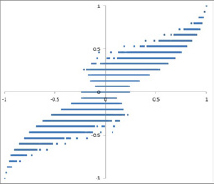
NOTE Question: In Figure 4-3, which correlation makes the most sense, s or t? Answer: Neither is statistically different from 0. However, t makes more sense since the two points in the top-right and bottom-left corners look like outliers and make s positive (but not t, which is less sensitive to outliers).
Asymptotic Distribution and Normalization
Again, I assume that t is defined using c = 1. Simulations where X = (0, 1… n–1) and Y is a random permutation of n elements (obtained by first creating n random numbers then extracting their rank) show that
- t converges faster than s to 0: in one experiment, the observed t averaged more than 30 simulations, for n = 10, it was 0.02; average s was 0.04.
- Average t is also smaller than average s.
- You haven't computed p-values yet, but they will be different, everything else (n, c, test level, null hypothesis that correlation is 0) being equal.
Finally, when t and s are quite different, usually the t value looks more natural, as in Figure 4-3; t < 0 but s > 0 because t is better at eliminating the effect of the two outliers (top-right corner, bottom-left corner). This is critical when you compute correlations across thousands of data buckets of various sizes: You are bound to find outliers in some buckets. And if you look for extreme correlations, your conclusions might be severely biased. (Read the section “The Curse of Big Data” in Chapter 2 for more information on this.)
Figure 4-4 shows the distribution for T, when n = 10. When n = 10, 97.2 percent of t values are between –0.5 and +0.5. When n = 7, 92.0 percent of t values are between –0.5 and +0.5. So the distribution of t depends on n. Theoretically, when c gets close to 0, what happens?
NOTE An interesting fact is that t and s agree most of the time. The classic correlation r between s and t, computed on all n! = 362,880 potential (X, Y) vectors with n = 9 observations, is equal to 0.96.
To estimate the asymptotic distribution of t (when n becomes large), you need to compute q(n). Is there an exact formula for q(n)? I ran a competition to see if someone could come up with a formula, a proof that none exists, or at least an asymptotic formula. Read the next section to find out the details. Let's just say for now that there were two winners—both experts in mathematical optimization—and $1,500 in awards were offered.
Normalization
Because the correlation is in the range [−1, +1] and is thus bounded, I would like a correlation of, for example, 0.5 to always represent the same percentile of t, regardless of n. There are various ways to accomplish this, but it always involves transforming t. Some research still needs to be done. For r or s, you can typically use the Fisher transformation. But it will not work on t, plus it transforms a bounded metric in a nonbounded one, making interpretation difficult.
Permutations
Most of this research and these simulations involve the generation of a large number of permutations for small and large n. This section discusses how to generate these permutations.
One way is to produce all permutations: You can find source code and instructions at http://bit.ly/171bEzt. It becomes slow when n is larger than 20; however, it is easy to use MapReduce to split the task on multiple virtual machines, in parallel. Another strategy is to sample enough random permutations to get a good approximation of t's distribution, as well as q(n). There is a one-to-one mapping between permutations of n elements and integer numbers between 1 and n. Each of these numbers can be uniquely represented by an n-permutation and the other way around. Also check the “numbering permutations” section of the Wikipedia article on permutations for details: http://en.wikipedia.org/wiki/Permutation#Numbering_permutations). It is slow: O(n2) to transform a number into a permutation or the other way around. So instead, I used a rudimentary approach (you can download the source code at http://bit.ly/H4Y1oV), which is just as fast:
The algorithm to generate a random permutation is as follows:
(p(0), p(1), … , p(n–1))
For k = 0 to n–1, do
Step 1: Generate p(k) as a random number on {0, … , n–1}.
Step 2: Repeat Step 1 until p(k) is different from p(0), p(1), … , p(k–1).
Final Comments
The following comments provide more insight into the differences between the two correlations s and t.
- If you are interested in using correlations to assess how good your predicted values are likely to be, you can divide your data set into two sets for cross-validation: test and control. Fine-tune your model on the test data (also called the training set), using t to measure its predictive power. But the real predictive power is measured by computing t on the control data. The article “Use PRESS, not R-squared to judge predictive power of regression” at http://bit.ly/14fRoGp presents a leaving-one-out strategy that accomplishes a similar goal.
- Note that t, unlike s, has a bimodal distribution with a dip around 0. This makes sense because a correlation of 0 means no pattern found (a rare event), whereas different from 0 (but far from –1 or +1) means pattern found—any kind of pattern, however slight—a more frequent event. Indeed, I view this bimodal distribution as an advantage that t has over s.
- t can be used for outlier detection: when |t-s| is large, or |t-r| is large; I have outliers in the data set.
- My t is one of the few metrics defined by an algorithm, rather than a formula. This is a new trend in data science, using algorithms to define stuff.
- The fact that s uses square distances rather than distances (like t) makes it less robust, as outliers heavily weight on s. Although both s and t are based on rank statistics to smooth out the impact of outliers, s is still sensitive to outliers when n is large. And with big data, I see more cases of large n.
- You could spend years of research on this whole topic of t and random permutations, and write a book or PhD thesis on the subject. Here I did the minimum amount of research to get to a good understanding and solution to the problem. This way of doing data science research is in contrast with slow-paced, comprehensive academic research.
Computational Complexity
The purpose of this section is twofold. First, to solve the problem discussed in the previous section—namely, to find an explicit formula for q(n)—using algorithms (simulations) that involve processing large amount of data. This can help you get familiarized with a number of computer science concepts related to computational complexity. Second, to display an exact mathematical solution proving that sometimes mathematical modeling can beat even the most powerful system of clustered computers to find a solution. Though usually, both work hand in hand.
This function q(n) is at the core of a new type of statistical metrics developed for big data: a nonparametric, robust metric to measure a new type of correlation or goodness of fit. This metric generalizes traditional metrics that have been used for centuries, and it is most useful when working with large ordinal data series, such as rank data. Although based on rank statistics, it is much less sensible to outliers than current metrics based on rank statistics (Spearman's rank correlation), which were designed for rather small n, where Spearman's rank correlation is indeed robust.
Computing q(n)
Start with a caveman approach, and then go through a few rounds of improvements.
Brute Force Algorithm
Brute force consists of visiting all n! permutations of n elements to find the maximum q(n). Computational complexity is therefore O(n!)—this is terribly slow.
Here's the code that iteratively produces all the n! (factorial n) permutations of n elements stored in an array. It allows you to easily compute stats associated with these permutations and compute aggregates over all or specific permutations. For n>10, it can be slow, and some MapReduce architecture would help. If n>15, you might be interested in sampling rather than visiting all permutations to compute summary stats—more on this later. Because q(n) is a maximum computed on all permutations of size n, this can help you compute n.
This code is also useful to compute all n-grams of a keyword, or, more interesting, in the context of nonparametric statistics. On Stackoverflow.com (http://bit.ly/1cKCAEA) you can find the source code in various modern languages, including Python. A Google search for calculate all permutations provides interesting links. Here is the Perl code:
use List::Permutor;
$n=5;
@array=();
for ($k=0; $k<$n; $k++) { $array[$k]=$k; }
  $permutIter=0;
  my $permutor = new List::Permutor(@array);
  while ( my @permutation = $permutor->next()) {
   for ($k=0; $k<$n; $k++) { print “$permutation[$k] “; }
  print “
”;
  $permutIter++;
}
It couldn't be any easier. You need the Permutor library in Perl. (In other languages no library is needed; the full code is provided.) The easiest way to install the library is as follows, and this methodology applies to any Perl library.
Don't believe people who claim you can use ppm or CPAN to automatically in one click download and install the library. This is by far the most difficult way. Instead, use a caveman install (supposedly the hardest way, but in fact the easiest solution) by doing the following:
- Do a Google search for Permutor.pm.
- Click SOURCE (at the top of the page) on the Permutor CPAN page (the first link on the Google search results page). This .pm document is a text file (pm is used here a filename extension, like .doc, .txt, xls).
- Copy and paste the source code into Notepad, and save it as Permutor.pm in the Perl64/lib/List/ folder (or whatever that folder name is on your machine).
That's it! Note that if you don't have the List library installed on your system (the parent Library for Permutor), you'll first have to download and install List using the same process, but everybody has List on their machine nowadays because it is part of the default Perl package.
First improvement: sampling permutations to estimate q(n). Rather than visiting all permutations, a lot of time can be saved by visiting a carefully selected tiny sample. The algorithm to generate random permutations (p(0), p(1), …, p(n–1)) was previously mentioned:
For k=0 to n-1, do:
Step 1. Generate p(k) as a random number on {0, … , n-1}
Step 2. Repeat Step 1 until p(k) is different
from p(0), p(1), … , p(k-1)
End
You should also consider the computational complexity of this algorithm, as you compare it with two alternative algorithms:
- Alternative algorithm I: Create n random numbers on [0,1], then p(k) is simply the rank of the k-th deviate (k = 0, …, n–1). From a computational complexity point of view, this is equivalent to sorting, and thus it is O(n log n).
- Alternative algorithm II: Use the one-to-one mapping between n-permutations and numbers in 1…n! However, transforming a number into a permutation, using the factorial number representation, is O(n2).
You would expect the rudimentary algorithm to be terribly slow. Actually, it might never end, running indefinitely, even just to produce p(1), let alone p(n-1), which is considerably harder to produce. Yet it turns out that the rudimentary algorithm is also O(n log n). (Proving this fact would actually be a great job interview question.) Here's the outline.
For positive k strictly smaller than n, you can create p(k) in these ways:
- On the first shot with probability L(k,1) = 1 – k/n
- On the second shot with probability L(k,2) = (k/n) * (1 – k/n)
- On the third shot with probability L(k,3) = (k/n)2 * (1 – k/n)
- On the fourth shot with probability L(k,4) = (k/n)3 * (1 – k/n)
- And so on
Note that the number of shots required might be infinite (with probability 0). Thus, on average, you need M(k) = SUM{ j * L(k,j) } = n/(n–k) shots to create p(k), where the sum is positive integers j = 0, 1, 2…. The total number of operations is thus (on average) SUM{M(k)} = n * {1 +1/2 + 1/3 + … + 1/n}, where the sum is on k = 0,1,…,n–1. This turns out to be O(n log n). Note that in terms of data structure, you need an auxiliary array A of size n, initialized to 0. When p(k) is created (in the last, successful shot at iteration k), you update A as follows: A[p(k)] = 1. This array is used to check if p(k) is different from p(0), p(1), …, p(k–1), or in other words, if A[p(k)] = 0.
Is O(n log n) the best that you can achieve? No, the algorithm in the next section is O(n), which is better.
Second Improvement: Improving the Permutation Sampler
The Fisher–Yates shuffle algorithm is the best for your purpose. It works as follows:
p(k) ← k, k=0,…,n-1
For k=n-1 down to 1, do:
j ← random integer with 0 ≤ j ≤ k
exchange p(j) and p(k)
End
This is the best that can be achieved, in terms of computational complexity, for the random permutation generator (that is, it is the fastest algorithm).
A Theoretical Solution
Sometimes, processing vast amounts of data (billions or trillions of random permutations in this case) is not the best approach. A little bit of mathematics can solve your problem simply and elegantly.
In 2013, Jean-Francois Puget, PhD, Distinguished Engineer, Industry Solutions Analytics and Optimization at IBM, found the exact formula and came up with a proof. He was awarded a $1,000 prize by Data Science Central for his solution as the winner of their first theoretical data science competition. If you are interested in applied data science competitions (involving real data sets), you should check http://www.Kaggle.com.
Consider Dr. Puget's result:
- Let m be the quotient and let r be the remainder of the Euclidean division of n by 4: n = 4m + r, 0 ≤ r < 4.
- Let p(n) = 6m2 + 3mr + r(r–1)/2.
- Then:
- q(n) = p(n) if p(n) is even
- q(n) = p(n) – 1 if p(n) is odd
You can find the rather lengthy and complicated proof for this at www.datashaping.com/Puget-Proof.pdf.
Structured Coefficient
This section discusses a metric to measure whether a data set has some structure in it. This metric measures the presence or absence of a structure or pattern in data sets. The purpose is to measure the strength of the association between two variables and generalize the modern correlation coefficient discussed in the section Correlation and R-Squared for Big Data in a few ways:
- It applies to non-numeric data—for instance, a list of pairs of keywords, with a number attached to each pair, measuring how close to each other the two keywords are.
- It detects relationships that are not necessarily functional (for instance, points distributed in an unusual domain such as a sphere that has holes in it, and where holes contain smaller spheres that are part of the domain itself).
- It works with traditional, numeric bivariate observations.
The structured coefficient is denoted as w. I am working under the following framework:
- I have a data set with n points. For simplicity, consider for now that these n points are n vectors (x, y) where x, y are real numbers.
- For each pair of points {(x,y), (x',y')} I compute a distance d between the two points. In a more general setting, it could be a proximity metric to measure distance between two keywords.
- I order all the distances d and compute the distance distribution, based on these n points.
- Leaving-one-out removes one point at a time and computes the n new distance distributions, each based on n–1 points.
- I compare the distribution computed on n points, with the n ones computed on n–1 points.
- I repeat this iteration, but this time with n–2, then n–3, then n–4 points, and so on.
- You would assume that if there is no pattern, these distance distributions (for successive values of n) would have some kind of behavior uniquely characterizing the absence of structure, behavior that can be identified via simulations. Any deviation from this behavior would indicate the presence of a structure. The pattern-free behavior would be independent of the underlying point distribution or domain, which is an important point. All this would have to be established or tested, of course.
- It would be interesting to test whether this metric can identify patterns such as fractal distribution/fractal dimension.
This type of structured coefficient makes no assumption about the shape of the underlying domains, where the n points are located. These domains could be smooth, bumpy, made up of lines, made up of dual points, have holes, and so on. This type of structured coefficient can be applied to non-numeric data (for example, if the data consists of keywords), time series, spatial data, or data in higher dimensions. It is more generic than many metrics currently used to measure structure, and is entirely data-driven.
Identifying the Number of Clusters
Clustering algorithms have been discussed at large in the previous chapters, as well as this chapter. Here you find a rule of thumb that can be automated and does not require visual inspection by a human being to determine the optimum number of clusters associated with any clustering algorithm.
Note that the concept of cluster is a fuzzy one. How do you define a cluster? Nevertheless, in many applications there is a clear optimum number of clusters. The methodology described here will solve all easy and less easy cases, and will provide a “don't know” answer to cases that are ambiguous.
Methodology
The methodology is described by the following three steps:
- Create a two-dimensional table with the following rows: number of clusters in row #1 and percentage of variance explained by clusters in row #2.
- Compute third differences.
- Compute the maximum for third differences (if much higher than other values) to determine the number of clusters.
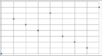
This is based on the fact that the piece-wise linear plot of number of clusters versus percentage of variance explained by clusters is a convex function with an elbow point; (see Figure 4-5). The elbow point determines the optimum number of clusters. If the piece-wise linear function is approximated by a smooth curve, the optimum would be the point vanishing the second derivative of the approximating smooth curve. This point corresponds to the inflection point on the curve in question. This methodology is simply an application of this “elbow-point detection” technique in a discrete framework (the number of clusters being a discrete number).

Example
Row #1 represents the number of clusters (X-axis), and Row #2 is the percentage of variance explained by clusters (Y-axis) in Figure 4-5. Then the third, fourth, and fifth rows are differences (sometimes called deltas) from the row just above each of them. For instance, the second number in Row #3 is 15=80−65.
- 1 2 3 4 5 6 7 8 9 ==> number of clusters (X-axis)
- 40 65 80 85 88 90 91 91 ==> percentage of variance explained by clusters (Y-axis)
- 25 15 5 3 2 1 0 ==> first difference on Y-axis
- -10 -10 -2 -1 -1 -1 ==> second difference on Y-axis
- 0 8 1 0 0 ==> third difference on Y-axis
The optimum number of clusters in this example is 4, corresponding to maximum = 8 in the third differences.
NOTE If you already have a strong minimum in the second difference (not the case here), you don't need to go to the third difference: stop at level 2.
Internet Topology Mapping
This section discusses a component often missing, yet valuable for most systems: algorithms and architectures that are dealing with online or mobile data, known as digital data, such as transaction scoring, fraud detection, online marketing, marketing mix and advertising optimization, online search, plagiarism, and spam detection.
I will call it an Internet topology mapping. It might not be stored as a traditional database. (It could be a graph database, a file system, or a set of lookup tables.) It must be prebuilt (for example, as lookup tables with regular updates) to be efficiently used.
Essentially, Internet topology mapping is a system that matches an IP address (Internet or mobile) with a domain name (ISP). When you process a transaction in real time in production mode (for example, an online credit card transaction, to decide whether to accept or decline it), your system has only a few milliseconds to score the transaction to make the decision. In short, you have only a few milliseconds to call and run an algorithm (subprocess), on the fly, separately for each credit card transaction, to decide whether to accept it or reject it. If the algorithm involves matching the IP address with an ISP domain name (this operation is called nslookup), it won't work: direct nslookups take between a few hundred and a few thousand milliseconds, and they will slow the system to a grind.
Because of that, Internet topology mapping is missing in most systems. Yet there is a simple workaround to build it:
- Look at all the IP addresses in your database. Chances are, even if you are Google, 99.9 percent of your traffic is generated by fewer than 100 million IP addresses. Indeed, the total number of IP addresses (the whole universe) consists fewer than 2564 = 4,294,967,296 IP addresses. That's approximately four billion, not that big of a number in the real scheme of big data. Also, many IP addresses are clustered: “many IP addresses starting (say) with 120.176.231 are likely part of the same domain.” In short, you need to store a lookup table possibly as small as 20 million records (IP ranges/domain mapping) to solve the nslookup issue for 99.9 percent of your transactions. For the remaining 0.1 percent, you can either assign “unknown domain” (not recommended because quite a few IP addresses actually have an unknown domain), or “missing” (better) or perform the caveman, slow nslookup on the fly.
- Create the lookup table that maps IP ranges to domain names for 99.9 percent of your traffic.
When processing a transaction, access the lookup table created in the last step (stored in memory, or least with some caching available in memory) to detect the domain name. Now you can use a rule system that does incorporate domain names.
Example of rules and metrics based on domain names are:
- Domain extension (.com, .cc, and so on)
- Length of domain name
- Domain name flagged as good (white-listed) or bad (black-listed)
- Patterns found in domain name (for example, digits, a date, flagged keywords, and special characters such as a dash)
- Specific keywords found in a domain name
- Owner of the domain name (Does the owner own other domains, in particular bad domains?)
- Date of creation of a domain name
- Time needed to do the nslookup on IP address in question (0.5 second or 4 seconds?)
- Multiple nslookups needed to find domain attached to this IP address when building IP address or domain name table?
- No domain found
- Is this a subdomain?
This is the first component of the Internet topology mapping. The second component is a clustering structure—in short, a structure (text file is OK) where a cluster is assigned to each IP address or IP range. Examples of clusters include:
- IP address corresponding to an anonymous proxy.
- .edu proxy.
- Corporate proxy (large with many IPs versus small with a few, heavily used IPs; use a list of top 50,000 companies or websites to help detect corporate domain names).
- Government proxy.
- Static, personal IP.
- Volatile, recycled IP (for example, AOL, Comcast, and mobile IP addresses).
- Isolated IP address versus IP address belonging to a cluster or multiple clusters (either small or large) of IP addresses.
- Well-known ISP: Comcast and so on.
- Mobile IP address.
- IP address is AWS (Amazon Web Services and cloud services) or similar.
- IP address is a mail/web/FTP or API server.
Armed with these components (IP address/domain mapping + IP address cluster structure, aka Internet topology), you can now develop better algorithms: real-time or back-end, end-of-day algorithms. You need the IP address/domain mapping to build the cluster structure. If you have a data scientist on board, it should be easy for her to create this Internet topology mapping and identify the great benefits of using it.
The only issue with creating this product (assuming it will contain 20 million IP address ranges and get updated regularly) is the large amount of time spent in doing millions of slow (0.5 second each) caveman nslookups. Now, there are well-known ranges reserved for AOL and other big ISPs, so probably you will end up doing just 10 million nslookups. Given that 1 percent of them will fail (timing out after two seconds) and that you will have to run nslookup twice on some IP addresses, say that in short, you are going to run 10 million nslookups, each taking on average one second. That's about 2,777 hours, or 115 days.
You can use a MapReduce environment to easily reduce the time by a factor of 20, by leveraging the distributed architecture. Even on one single machine, if you run 25 versions of your nslookup script in parallel, you should make it run four times faster—that is, it would complete in less than a month. That's why I claim that a little guy alone in his garage could create the Internet Topology Mapping in a few weeks or less. The input data set (for example, 100 million IP addresses) would require less than 20 GB of storage, even less when compressed. Pretty small.
Finally, here's a Perl script that automatically performs nslookups on an input file ips.txt of IP addresses and stores the results in outip.txt. It works on my Windows laptop. You need an Internet connection to make it run, and you should add an error management system to nicely recover if you lose power or you lose your Internet connection.
open(IN,“<ips.txt”);
open (OUT,“>outip.txt”);
while ($lu=<IN>) {
  $ip=$lu;
  $n++;
  $ip=∼s/
//g;
  if ($ip eq ““) { $ip=“na”; }
  `nslookup $ip | grep Name > titi.txt`;
  open(TMP,“<titi.txt”);
  $domainName=“n/a”;
  while ($i=<TMP>) {
    $i=∼s/
//g;
    $i=∼s/Name://g;
    $domainName=$i;
  }
  close(TMP);
  print OUT “$ip	$domainName
”;
  print “$n> $ip | $domainName
”;
}
close(OUT);
close(IN);
In summary, Internet topology mapping is a tool that needs to be created using the steps described here to help in a number of business problems, including spam detection, fraud detection, attribution modeling, digital marketing (including e-mail marketing), publishing (to customize content based on IP address category), and advertising (to optimize relevancy). Traditional algorithms use blacklists or whitelists of IP addresses or IP ranges (a component of the Internet topology mapping), but none, to my knowledge, use IP clusters produced using a clustering algorithm. I have seen business dashboards that show the top 100 IP addresses for a specific metric (traffic volume, amount of fraud, and so on), but this is a really bad business practice since IP addresses are very granular (so the top 100 does not communicate many actionable insights) and a few IP addresses are shared by a very large number of users (mobile IP address proxies in particular). Dashboards based on IP categories derived from Internet topology mapping are more useful to decision makers.
I have also seen IP addresses used as a metric in decision trees, which is also terrible. IP categories or IP clusters should be used in decision trees, rather than a highly granular metric such as IP address. Examples of potential fraud detection rules derived from Internet topology mapping include “corporate IP addresses (unless hacked) should be white-listed” and “IP addresses from universities, associated with computers shared by many students (proxies), are riskier (except some of them where the sys-admin is doing a great job making these networks safe).” The difficulty is not coming up with these two intuitive rules, but rather classifying an IP address as a corporate or university proxy—a problem solved with Internet topology mapping.
Securing Communications: Data Encoding
This section is important, as it illustrates how to develop a real-life application with JavaScript code, how to create a tool that any end user can use from their browser without having to install R, and how to download and/or purchase software or write code. The JavaScript code provided here can be run online or offline from your browser. I believe that in the future, there will be more data science tools that are browser-based and lighter than a full API (I like the fact that it can be run offline from your browser). This code also provides another example of random number generation.
A big issue with data is how to securely transmit it. Here you will see some simple JavaScript code to encode numbers, such as credit card numbers, passwords made up of digits, phone numbers, Social Security numbers, dates such as 20131014, and so on.
The following is an example of an app that anyone can download as a text file, save as an HTML document, and run on their laptop, locally, from a browser (without any Internet connection). I call it an offline app, as opposed to a mobile or web or social (Facebook) app. As with most apps, you don't need any programming skills to use it. This one is original in the sense that you don't even need an Internet connection to make it work.
Here's how it works:
- Open the web app (datashaping.com/encode.html) in a separate browser tab.
- Enter number to encode or decode in the box shown on the web page.
- Select Encrypt/Decrypt.
- E-mail the encoded number (it should start with e) to your contact.
- Your contact uses the same form, enters the encoded number, selects Encrypt/Decrypt, and then the original number is immediately retrieved.
This code is simple (it is by no means strong encryption) and less sophisticated than uuencode. But uuencode is for the tech-savvy, whereas our app is easy to use by any non-technical person. The encoded value is also a text string, and thus easy to copy and paste in any e-mail client. The encoded value has some randomness, in the sense that encoding the same values twice will result in two different encoded values. Finally, it is more secure than it seems at first glance, if you don't tell anyone (except over the phone) where the decoder can be found.
You can make it even more secure by creating a version that accepts parameters. Here's the JavaScript/HTML code (this is the source code of the web page where our application is hosted). You could save it as an HTML document on your local machine, with the filename (for example, encode.html) in a folder (for example, C://Webpages) and then open and run it from a browser on your local machine. The URL for this local web page would be \/C:/Webpages/encode.html if you use Chrome.
<html>
<script language=“Javascript”>
<!--
function encrypt2() {
  var form=document.forms[0]
  if (form.encrypt.checked) {
    form.cardnumber.value=crypt(form.cardnumber.value)
  } else {
    form.cardnumber.value=decrypt(form.cardnumber.value)
  }
}
function crypt(string) {
  var len=string.length
  var intCarlu
  var carlu
  var newString=“e”
  if ((string.charCodeAt(i)!=101)&&(len>0)) {
    for (var i=0; i<len; i++) {
      intCarlu=string.charCodeAt(i)
      rnd=Math.floor(Math.random()*7)
      newIntCarlu=30+10*rnd+intCarlu+i-48
      if (newIntCarlu<48) { newIntCarlu+=50 }
      if (newIntCarlu>=58 && newIntCarlu<=64) { newIntCarlu+=10 }
      if (newIntCarlu>=90 && newIntCarlu<=96) { newIntCarlu+=10 }
      carlu=String.fromCharCode(newIntCarlu)
      newString=newString.concat(carlu)
    }
    return newString
  } else {
    return string
  }
}
function decrypt(string) {
  var len=string.length
  var intCarlu
  var carlu
  var newString=““
  if (string.charCodeAt(i)==101) {
    for (var i=1; i<len; i++) {
      intCarlu=string.charCodeAt(i)
      carlu=String.fromCharCode(48+(intCarlu-i+1)%10)
      newString=newString.concat(carlu)
    }
    return newString
  } else {
    return string
  }
}
// -->
</script>

<form>
Enter Number <input type=text name=cardnumber size=19><p>
Encrypt / Decrypt <input type=checkbox name=encrypt
onClick=“encrypt2()“>
</form>
</html>
Summary
This chapter discussed many original, new techniques and recipes used by data scientists to process modern data, including big data. I dived deep enough into the details so that you can reproduce them when needed, but without being too technical, and avoiding jargon and mathematical formulas so that business people can still quickly extract the essence.
Chapter 5 discusses additional techniques that are also part of core data science. While Chapters 4 and 5 contain the most technical material of the book, the transition has been made as smooth as possible by introducing some of the technical material in Chapter 2 (see the section Clustering and Taxonomy Creation for Massive Data Sets).