
CHAPTER
7
Launching Your New Data Science Career
Chapter 6 discussed case studies, real-life applications, and success stories covering various types of data science initiatives. This chapter focuses on helping you get employed as a data scientist, starting with 90 job interview questions (including questions on how to solve small, real-life data science problems), exercises to test your visual analytic skills, career moves from statistician to data scientist, examples of well-known data scientists and the skills they have, and finally, typical job titles (few are actually called data scientists, though this is changing) and salary surveys.
Job Interview Questions
These are mostly open-ended questions that prospective employers may ask to assess the technical horizontal knowledge of a senior candidate for a high-level position, such as a director, as well as of junior candidates. The answers to some of the key questions can be found at http://bit.ly/1cGlFA5.
Questions About Your Experience
- What is the biggest data set you have processed, and how did you process it? What were the results?
- Tell me two success stories about your analytic or computer science projects. How was lift (or success) measured?
- Have you been involved in database design and data modeling?
- Have you been involved in dashboard creation and metric selection? What do you think about BIRT?
- What features of Teradata do you like?
- How do you handle missing data? What imputation techniques do you recommend?
- Have you been working with white lists? Positive rules (in the context of fraud or spam detection)? Have you optimized code or algorithms for speed in SQL, Perl, C++, Python, and so on? How and by how much?
- Is it better to spend 5 days developing a 90 percent accurate solution or 10 days for 100 percent accuracy? Does this depend on the context?
- How can you prove that one improvement you've brought to an algorithm is an improvement over not doing anything? Are you familiar with A/B testing, and have you been able to make such tests truly successful (give examples)?
- Do you know or have you used data reduction techniques other than PCA? What do you think of step-wise regression? What kind of step-wise techniques are you familiar with? When is full data better than reduced data or samples?
- Are you familiar with extreme value theory, Monte Carlo simulations, or mathematical statistics (or anything else) to correctly estimate the chance of a rare event?
- Do you have any experience with using APs, programming APIs, Google or Amazon.com APIs, or AaaS (Analytics as a Service)?
- When is it better to write your own code rather than using a data science software package?
- Which tools do you use for visualization? What do you think of Tableau, R, and SAS? Do you know how to efficiently represent five dimensions in a chart or in a video?
- What types of clients have you been working with: internal, external, sales/finance/marketing/IT people? Do you have consulting experience? Have you dealt with vendors, including vendor selection and testing?
- Are you familiar with software life cycle? With IT project life cycle—from gathering requests to maintenance? (Read the section Lifecycle of Data Science Projects in Chapter 5 for details.)
- Are you a lone coder? A production person (developer)? Or a designer (architect)?
- Are you familiar with pricing optimization, price elasticity, inventory management, competitive intelligence? Give examples.
- Have you used time series models, cross-correlations with time lags, correlograms, spectral analysis, and signal processing and filtering techniques? In which context?
- Which data scientists do you admire most? Which startups?
- How did you become interested in data science?
- What did you do today? Or what did you do this week/last week?
- What/when is the latest data mining book/article you read? What/when is the latest data mining conference/webinar/class/workshop/training you attended? What/when is the most recent programming skill that you acquired?
- What are your favorite data science websites? Who do you admire most in the data science community and why? Which company do you admire most?
- What/when/where is the last data science blog post you wrote?
- Who are the best people you have recruited and where are they today?
Technical Questions
- What are lift, KPI, robustness, model fitting, design of experiments, and the 80/20 rule?
- What are collaborative filtering, n-grams, MapReduce, and cosine distance?
- What is probabilistic merging (aka fuzzy merging)? Is it easier to handle with SQL or other languages? Which languages would you choose for semi-structured text data reconciliation?
- Toad or Brio or any other similar clients are quite inefficient to query Oracle databases. Why? What would you do to increase speed by a factor of 10 and be able to handle far bigger outputs?
- What are hash table collisions? How are they avoided? How frequently do they happen?
- How can you make sure a MapReduce application has good load balance? What is load balance?
- Is it better to have 100 small hash tables or one big hash table in memory, in terms of access speed (assuming both fit within RAM)? What do you think about in-database analytics?
- Why is Naive Bayes so bad? How would you improve a spam detection algorithm that uses Naive Bayes?
- What is star schema? What are lookup tables?
- Can you perform logistic regression with Excel, and if so, how, and would the result be good?
- Define quality assurance, Six Sigma, and design of experiments. Give examples of good and bad designs of experiments.
- What are the drawbacks of general linear model? Are you familiar with alternatives (Lasso, ridge regression, and boosted trees)?
- Do you think 50 small decision trees are better than one large one? Why?
- Give examples of data that do not have a Gaussian distribution or lognormal. Give examples of data that have a chaotic distribution.
- Why is mean square error a bad measure of model performance? What would you suggest instead?
- What is a cron job?
- What is an efficiency curve? What are its drawbacks, and how can they be overcome?
- What is a recommendation engine? How does it work?
- What is an exact test? How and when can simulations help when you do not use an exact test?
- What is the computational complexity of a good, fast clustering algorithm? What is a good clustering algorithm? How do you determine the number of clusters? How would you perform clustering on 1 million unique keywords, assuming you have 10 million data points—each one consisting of two keywords and a metric measuring how similar these two keywords are? How would you create this 10-million-data-points table?
- Should removing stop words be Step 1, rather than Step 3, in the search engine algorithm described in the section Big Data Problem Epitomizing the Challenges of Data Science in Chapter 2?
General Questions
- Should click data be handled in real time? Why? In which contexts?
- What is better: good data or good models? And how do you define “good”? Is there a universal good model? Are there any models that are definitely not so good?
- How do you handle missing data? What imputation techniques do you recommend?
- Compare SAS, R, Python, and Perl.
- What is the curse of big data? (See section The Curse of Big Data in Chapter 2.)
- What are examples in which MapReduce does not work? What are examples in which it works well? What are the security issues involved with the cloud? What do you think of EMC's solution offering a hybrid approach—to both an internal and external cloud—to mitigate the risks and offer other advantages (which ones)? (You can find more information about key players in this market in the section The Big Data Ecosystem in Chapter 2, and especially in the online references provided in this section.)
- What is sensitivity analysis? Is it better to have low sensitivity (that is, great robustness) and low predictive power, or vice versa? How can you perform good cross-validation? What do you think about the idea of injecting noise into your data set to test the sensitivity of your models?
- Compare logistic regression with decision trees and neural networks. How have these technologies been vastly improved over the last 15 years?
- Is actuarial science a branch of statistics (survival analysis)? If not, how so? (You can find more information about actuarial sciences at http://en.wikipedia.org/wiki/Actuarial_science and http://www.dwsimpson.com/.)
- What is root cause analysis? How can you identify a cause versus a correlation? Give examples. (You can find information on this in Chapter 5, Data Science Craftsmanship, Part II.)
- How would you define and measure the predictive power of a metric?
- Is it better to have too many false positives, or too many false negatives?
- Have you ever thought about creating a startup? Around which idea/concept?
- Do you think that a typed login/password will disappear? How could they be replaced?
- What do you think makes a good data scientist?
- Do you think data science is an art or a science?
- Give a few examples of best practices in data science.
- What could make a chart misleading, or difficult to read or interpret? What features should a useful chart have?
- Do you know a few rules of thumb used in statistical or computer science? Or in business analytics?
- What are your top five predictions for the next 20 years?
- How do you immediately know when statistics published in an article (for example, newspaper) are either wrong or presented to support the author's point of view, rather than correct, comprehensive factual information on a specific subject? For instance, what do you think about the official monthly unemployment statistics regularly discussed in the press? What could make them more accurate?
- In your opinion, what is data science? Machine learning? Data mining?
Questions About Data Science Projects
- How can you detect individual paid accounts shared by multiple users? This is a big problem for publishers, digital newspapers, software developers offering API access, the music and movie industry (file sharing issues), and organizations offering monthly flat-fee access to single users to view or download content.
- How can you optimize a web crawler to run much faster, extract better information, and better summarize data to produce cleaner databases?
- How would you come up with a solution to identify plagiarism?
- You are about to send 1 million e-mails (marketing campaign). How do you optimize delivery? How do you optimize response? Can you optimize both separately?
- How would you turn unstructured data into structured data? Is it really necessary? Is it OK to store data as flat text files rather than in a SQL-powered RDBMS?
- How would you build nonparametric confidence intervals for scores?
- How can you detect the best rule set for a fraud detection scoring technology? How can you deal with rule redundancy, rule discovery, and the combinatorial nature of the problem (for finding optimum rule set—the one with best predictive power)? Can an approximate solution to the rule set problem be OK? How would you find an OK approximate solution? How would you decide it is good enough and stop looking for a better one?
- How can you create keyword taxonomies?
- What is a Botnet? How can it be detected?
- How does Zillow's algorithm work to estimate the value of any home in the United States?
- How can you detect bogus reviews or bogus Facebook accounts used for bad purposes?
- How would you create a new anonymous digital currency (focusing on the aspects of security)? How do you protect this currency against Internet pirates? How do you make it easy for stores to accept it? (For instance, each transaction has a unique ID used only once and expiring after a few days, and the space for unique IDs is very large to prevent hackers from creating valid IDs just by chance.)
- You design a robust nonparametric statistic (metric) to replace correlation or R-Square that is independent of sample size, always between −1 and +1 and based on rank statistics. How do you normalize for sample size? Write an algorithm that computes all permutations of n elements. How do you sample permutations (that is, generate tons of random permutations) when n is large, to estimate the asymptotic distribution for your newly created metric? You may use this asymptotic distribution for normalizing your metric. Do you think that an exact theoretical distribution might exist, and therefore, you should find it and use it rather than wasting your time trying to estimate the asymptotic distribution using simulations?
- Here's a more difficult, technical question related to the previous one. There is an obvious one-to-one correspondence between permutations of n elements and integers between 1 and factorial n. Design an algorithm that encodes an integer less than factorial n as a permutation of n elements. What would be the reverse algorithm used to decode a permutation and transform it back into a number? Hint: An intermediate step is to use the factorial number system representation of an integer. You can check this reference online to answer the question. Even better, browse the web to find the full answer to the question. (This will test the candidate's ability to quickly search online and find a solution to a problem without spending hours reinventing the wheel.)
- How many “useful” votes will a Yelp review receive?
- Can you estimate and forecast sales for any book, based on Amazon.com public data? Hint: See http://www.fonerbooks.com/surfing.htm.
- This question is about experimental design (and a bit of computer science) using LEGOs®. Say you purchase two sets of LEGOs® (one set to build a car and a second set to build another car). Now assume that the overlap between the two sets is substantial. There are three different ways that you can build the two cars. The first step consists of sorting the pieces (LEGOs®) by color and maybe also by size. The three ways to proceed are:
- Sequentially: Build one car at a time. This is the traditional approach.
- Semi-parallel system: Sort all the pieces from both sets simultaneously so that the pieces will be blended. Some in the red pile will belong to car A; some will belong to car B. Then build the two cars sequentially, following the instructions in the accompanying leaflets.
- In parallel: Sort all the pieces from both sets simultaneously, and build the two cars simultaneously, progressing simultaneously with the two sets of instructions.
Which is the most efficient way to proceed?
NOTE To test these assumptions and help you become familiar with the concept of distributed architecture, you can have your kid build two LEGO® cars, A and B, in parallel and then two other cars, C and D, sequentially. If the overlap between A and B (the proportion of LEGO® pieces that are identical in both A and B) is small, then the sequential approach will work best. Another concept that can be introduced is that building an 80-piece car takes more than twice as much time as building a 40-piece car. Why? (The same also applies to puzzles.)
- How can you design an algorithm to estimate the number of LinkedIn connections your colleagues have? The number is readily available on LinkedIn for your first-degree connections with up to 500 LinkedIn connections. However, if the number is above 500, it just says “500+.” The number of shared connections between you and any of your LinkedIn connections is always available.
For this question, you are provided with the solution below as a learning tool. First, let's introduce some notations:
- A is you.
- B is one of your connections.
- y is your number of connections (easily available).
- x is the unknown number of connections that B has (unknown if x > 500).
- z is the number of shared connections between A and B (easily available).
- N is the size (number of LinkedIn members) of the LinkedIn cloud or large network you belong to (must be estimated).
Basic formula: P(C is a shared connection) = P(C is connected to you) × P(C is connected to B) = (y/N) × (x/N) = (x × y) / (N × N). Thus x = (z × N) / y, or N = (x × y) / z.
Step 1: Compute N
To build the table shown in Figure 7-1, I sampled a few of my connections that have fewer than 500 connections to find out what x and z were. My number of connections is y=9,670.
A first approximation (visual analytics without using any tool other than my brain!) yields N = (x × y) / z = (approx.) 500 × 9,670 / 5 = (approx.) 1 million. So my N is 1 million. Yours might be different. Note that the number of people on LinkedIn is well above 100 million.
Step 2: Compute x for a specific connection
Using the formula x = (z × N) / y, if a LinkedIn member shares 200 connections with me, he probably has approximately 20,000 connections, using y=10,000 rather than 9,670, as an approximation for my number of connections. If he shares only one connection with me, he's expected to have 100 connections. You can compute confidence intervals for x by first computing confidence intervals for N, by looking at the variations in the above table. You can also increase accuracy by using a variable N that depends on job title or location.
- How would you proceed to reverse engineer the popular BMP image format and create your own images byte by byte, with a programming language?

Testing Your Own Visual and Analytic Thinking
Here are some exercises you can do on your own that will help to prepare you for job interviews. These exercises are aimed at assessing your visual and analytic judgment.
Detecting Patterns with the Naked Eye
Look at the three charts (A, B, and C) shown in Figure 7-2. Two of them exhibit patterns. Which ones? Do you know that these charts are called scatterplots? Are there other ways to visually represent this type of data?

It is clear that chart C exhibits a strong clustering pattern, unless you define your problem as points randomly distributed in an unknown domain whose boundary has to be estimated. So, the big question is: between charts A and B, which one represents randomness? Look at these charts closely for 60 seconds, then make a guess, and then read on. Note that all three charts contain the same number of points, so there's no scaling issue involved here.
Now assume that you are dealing with a spatial distribution of points over the entire 2-dimensional space, and that observations are seen through a small square window. For instance, points (observations) could be stars as seen on a picture taken from a telescope.
The first issue is that the data is censored: if you look at the distribution of nearest neighbor distances to draw conclusions, you must take into account that points near the boundary have fewer neighbors because some neighbors are outside the boundary. You can eliminate the bias by:
- Tiling the observation window to produce a mathematical tessellation.
- Mapping the square observation window onto the surface of a torus.
- Applying statistical bias-correction techniques.
- Using Monte Carlo simulations to estimate what the true distribution would be (with confidence intervals) if the data were truly random.
The second issue is that you need to use better visualization tools to see the patterns. Using + rather than a dot symbol to represent the points helps: some points are so close to each other that if you represent points with dots, you won't visually see the double points. (In our example, double points could correspond to double star systems—and these small-scale point interactions are part of what makes the distribution non-random in two of the charts.) But you can do much better: you could measure a number of metrics (averages, standard deviations, correlation between x and y, number of points in each subsquare, density estimates, and so on) and identify metrics proving that you are not dealing with pure randomness.
In these three charts, the standard deviation for either x or y—in case of pure randomness—should be 0.290 plus or minus 0.005. Only one of the three charts succeeds with this randomness test.
The third issue is that even if multiple statistical tests suggest that the data is truly random, it does not mean it actually is. For instance, all three charts show zero correlation between x and y and have mean x and y close to 0.50 (a requirement to qualify as random distribution in this case). However, only one chart exhibits randomness.
The fourth issue is that you need a mathematical framework to define and check randomness. True randomness is the realization of a Poisson stochastic process, and you need to use metrics that uniquely characterize a Poisson process to check whether a point distribution is truly random. Such metrics could be:
- The interpoint distance distributions.
- Number of observations in subsquares. (These counts should be uniformly distributed over the subsquares, and a chi-square test could provide the answer; however, in these charts, you don't have enough points in each subsquare to provide a valid test result.)
The fifth issue is that some of the great metrics (distances between k and its nearest neighbors) might not have a simple mathematical formula. But you can use Monte Carlo simulations to address this issue: simulate a random process, compute the distribution of distances (with confidence intervals) based on thousands of simulations, and compare with distances computed on your data. If distance distribution computed on the data set matches results from simulations, you are good; it means the data is probably random. However, you would have to make sure that distance distribution uniquely characterizes a Poisson process and that no non-random processes could yield the same distance distribution. This exercise is known as goodness-of-fit testing: you try to see if your data supports a specific hypothesis of randomness.
The sixth issue is that if you have a million points (and in high dimensions, you need more than a million points due to the curse of dimension), then you have a trillion distances to compute. No computer, not even in the cloud, can make all these computations in less than 1,000 years. So you need to pick up 10,000 points randomly, compute distances, and compare with equivalent computations based on simulated data. You need to make 1,000 simulations to get confidence intervals, but this is feasible.
Here's how the data in charts A, B, and C were created:
- Produce 158 random points [a(n), b(n)], n = 1,…,158
- Produce 158 random deviates u(n), v(n), n = 1,…,158
- Define x(n) as follows for n > 1: if u(n) < r, then x(n) = a(n), else x(n) = s × v(n) × a(n) + [1–s × v(n)] × x(n–1), with x(1) = a(1)
- Define y(n) as follows for n > 1: if u(n) < r, then y(n) = b(n), else y(n) = s × v(n) × b(n) + [1–s × v(n)] × y(n–1), with y(1) = b(1)
- Chart A: x(n) = a(n), y(n) = b(n)
- Chart B: r = 0.5, s = 0.3
- Chart C: r = 0.2, s = 0.8
The only chart exhibiting randomness is chart A. Chart B has significantly too low standard deviations for x and y, too few points near boundaries, and too many points that are close to each other. In addition, Chart A (the random distribution) exhibits a little bit of clustering, as well as some point alignments. This is, however, perfectly expected from a random distribution. If the number of points in each subsquare were identical, the distribution would not be random, but would correspond to a situation in which antagonist forces make points stay as far away as possible from each other. How would you test randomness if you had only two points (impossible to test), three points, or just 10 points?
Finally, once a pattern is detected (for example, abnormal close proximity between neighboring points), it should be interpreted and/or leveraged. That is, it should lead to, for example, ROI-positive trading rules if the framework is about stock trading or the conclusion that double stars do exist (based on chart B) if the framework is astronomy.
Identifying Aberrations
Pretend that I drew the picture shown in Figure 7-3, and then I told you that this is how Earth and its moon would be seen by a human being living on Saturn, which is 1 billion miles away from Earth. Earth's radius is approximately 4,000 miles, and the distance between Earth and its moon is approximately 200,000 miles. What would be your reaction? There's not a right or wrong answer; this simply checks your thought process.

Potential answers include:
- The image is magnified. Earth is too small to be seen from Saturn with the naked eye, unless brightly illuminated by the sun. It is a false colors image.
- The distance between Earth and the moon seems too big seen from Saturn. Earth might not even be visible with the naked eye from Saturn. Maybe the sun would look as big and as bright as Earth on this picture from Saturn.
- The size of the moon is too big, compared to Earth.
- Why is the moon as bright as Earth and why is Earth brighter than any other stars?
- Where are all the stars?
Misleading Time Series and Random Walks
Many time series charts seem to exhibit a pattern: an uptrend, apparent periodicity, or a stochastic process that seems not to be memoryless, and so on. The picture shown in Figure 7-4 represents stock price simulations, with the X-axis representing time (days) and the Y-axis the simulated stock price.

Do you think there is an uptrend in the data? Actually, in the long term, there isn't, it's a realization of a pure random walk. At any time, the chance that it goes up or down by a given amount is exactly 50 percent. Yet, for short-term periods, it is perfectly normal to observe ups and downs. It does not make this time series predictable: you could try to design a predictive model trained on the first 1,000 observations and then test it on the remaining 1,000 observations. You would notice that your model is not better (for predicting up and down movements) than randomly throwing dice.
Another test you can do to familiarize yourself with how randomness and lack of randomness look is to simulate auto-regressive time series. One of the most basic processes is X(t) = a × X(t–1) + b × X(t–2) + E + c, where t is time, c is a constant (−0.25 < c < +0.25), and E is an error term (white noise) simulated as a uniform deviate on [−1, +1]. For instance, X(t) represents a stock price at time t. You can start with X(0) = X(1) = 0. If a + b = 1, then the process is stable in equilibrium. Why? If c < 0, there is a downward trend. If c > 0, there is an upward trend. If c = 0, it does not go up or down (stationary process). If a = b = 0, the process is memory-free; there's no stochastic pattern embedded into it—its just pure noise. Try producing some of these charts with various values for a, b, and c and see if you visually notice the pattern and can correctly interpret it. In Figure 7-4, c = 0, b = 0, a = 1. Of course, with some values of a, b, and c, the patterns are visually obvious. But if you keep both c and a + b close to zero, it is visually a more difficult exercise, and you might have to look at a long time frame for your brain to recognize the correct pattern. Try detecting the patterns with a predictive algorithm, and see when and if your brain can beat your predictive model.
From Statistician to Data Scientist
Recently a long thread grew on LinkedIn about why statisticians are not involved in big data and how to remedy the situation. You can read the entire discussion at http://bit.ly/197Jsfa. At the time of this writing, it had 160 comments from leading data scientists and statisticians. Here I mention those comments that I think will be most beneficial in helping you understand (particularly if you are a statistician) what you can do to make yourself highly marketable.
Data Scientists Are Also Statistical Practitioners
Statistics does not deal enough with applied computational aspects critical for big data, or with the business aspects that are critical for getting business value out of data. Statisticians should acquire business acumen, including being able to carry out tasks traditionally performed by business analysts, especially when working for a small company or tech startup. (The discussions on digital analytics in Chapter 6 show examples of this.) It will also be helpful for the statistician to acquire more engineering and computer science knowledge, including APIs, Python, MapReduce, NoSQL, and even Hadoop architecture—at least having a general understanding of these techniques and languages and how they impact data access, data storage, algorithm efficiency, and data processing.
Statisticians are well-equipped to make the transition to data science since they typically have critical skills that many data scientists lack, such as design of experiments, sampling, and R.
For those who believe that big data and data science are just pure engineering or computer science fields with ignorance of or poor application of statistics, you are now reading the book that will debunk this myth. In this book, you learn that data science has its own core of statistics and statistical research. For instance, in Chapter 2, Big Data Is Different, you considered that in big data, you are bound to find spurious correlations when you compute billions or trillions of correlations. Such spurious correlations overshadow real correlations that go undetected. Instead of looking at correlations, you should compare correlograms. Correlograms uniquely determine if two time series are similar, which correlations do not do. You also learned about normalizing for size. You don't need to be a statistician to identify these issues and biases and correct them. A data scientist should know these things too, as well as other things such as experimental design, applied extreme value theory and Monte Carlo simulations, confidence intervals created without underlying statistical model (as in the Analyticbridge First Theorem), identifying non-randomness, and much more.
You can be both a data scientist and a statistician at the same time, just like you can be a data scientist and an entrepreneur at the same time—and actually, it is a requirement. It's certainly not incompatible; you just have to be aware that the official image of statisticians as pictured in ASA publications or on job boards does not represent (for now at least) the reality of what many statisticians do.
Still, data science and statistics are different. Many of the data science books can give you the impression that they are one and the same, but it's because the authors just reused old information (not even part of data science), added a bit of R or Python, and put a new name on it. I call this fake data science. Likewise, data science without statistics (or with reckless application of statistical principles) is not real data science either.
In the end, everyone has their own idea of what data science, statistics, computer science, BI, and entrepreneurship are. You decide what you want to call yourself. As for me, I'm clearly no longer a statistician, but rather a data scientist. (I was a computational statistician to begin with anyway.) My knowledge and expertise are different from those of a statistician. (It's probably closer to computer science.) And although I have a good knowledge of experimental design, Monte Carlo, sampling, and so on, most of it I did not learn at school or in a training program. The knowledge is available for free on the Internet. Anybody—a lawyer, a politician, a geographer—can acquire it without attending statistics classes.
NOTE Part of the Data Science Central data science apprenticeship is to make this knowledge accessible to a broader group of people. My intuitive Analyticbridge Theorem on model-free confidence intervals is an example of one “statistical” tool designed to be understood by a 12-year-old, with no mathematical prerequisite and applied in big data environments with tons of data buckets.
Who Should Teach Statistics to Data Scientists?
Statistics in data science can be built from within by data scientists or brought in by outsiders (those who don't want to be called data scientists and call themselves, for example, statisticians). I am an example of an insider creating a culture of statistics inside data science. Some people like contributions from outsider statisticians, whereas others like insider contributions because the insider is already familiar with data science, understands the difference between statistics and data science, and tends to be close to the businesspeople.
Hiring Issues
While many interesting positions are offered by various government agencies and large non-governmental organizations, the creative data scientist might face a few challenges, and might thrive better in a startup environment. Some of these challenges (also preventing employers from attracting more candidates) are:
- Bureaucracy often discourages people from applying. For example, security clearance requirements (eliminating Green Card holders and applicants from abroad; if you are an applicant, acquiring United States citizenship will open far more positions to you).
- The location is not desirable or flexible. If you apply for a position in a location that fewer applicants would like to relocate to, your likelihood of finding a job increases. Nowadays, a few employers offer telecommuting positions to increase their chances of attracting the best talent. (Employers take note: you might consider this option when hiring a data scientist.)
Data Scientists Work Closely with Data Architects
Statisticians should gain some familiarity with how to design a database: metrics to use (exact definitions), how they are captured, and how granular you need to be when keeping old data. This is part of data science. It involves working closely with DB engineers and data architects. Data scientists must have some of the knowledge of data architects and also of business people to understand exactly what they do and what they are going to capture. Data scientists should also be involved in dashboard design. Typically, all these things are tasks that many statisticians don't want to do or believe are not part of their job.
Who Should Be Involved in Strategic Thinking?
Discussing the question is the first critical, fundamental step in any project. Not doing it is like building a skyscraper without a foundation. But flexibility should be allowed. If something does not work as expected, how can you rebuild or change the project? How do you adapt to change? Is the design flexible enough to adapt? Who's in charge of defining the project and its main feature?
While business analysts (when present in your company, which is the case in larger organizations) and executives are eventually responsible for defining KPIs and dashboard design, the data scientist must get involved and communicate with these businesspeople (especially in organizations with fewer than 500 employees), rather than working in isolation. Data scientists should also communicate with data architects, product managers, and engineers/software engineers.
Such communication is crucial for several reasons: to help the data scientist to understand the business problem and gain business acumen and necessary domain expertise, to make technical implementations smoother, to influence company leaders by making recommendations to boost robustness and help them gain analytics acumen themselves, and so on. This two-way communication is useful to optimize business processes.
Two Types of Statisticians
In my opinion, there are two types of statisticians: those who associate themselves with the ASA (American Statistical Association), and those do not. Likewise, there are two types of big data practitioners:
- Those who know little about stats, but know far more than statisticians in other fundamental areas of big data.
- Those who know as much as the best statisticians in the world with statistical knowledge oriented toward data science.
I advise statisticians to apply for positions with teams that do not have strong statistical knowledge. (You can assess the team's level of competency by asking questions during the interview, such as what kind of statistical analyses they do.) You will better shine if you can convince them of the value of sampling, mathematical modeling, experimental design, imputation techniques, identifying and dealing with bad data, survival analysis, and sound confidence intervals, and show real examples of added value.
Also, when interviewing for a data scientist position (or when the interviewer is not a statistician), do not use excessive statistical jargon during the interview, but rather discuss the benefits of simple models. For example, the statistical concept of p-value is rarely used in data science, not because of ignorance but because data science uses different terms and different metrics, even though it serves a similar purpose. In data science contexts, many times there are no underlying models. You do model-free inference, such as predictions, confidence intervals, and so on, which are data-driven with no statistical model. So a data scientist interviewer will be more receptive to discussions of simple models.
NOTE Instead of p-values, I invite you to use alternatives, such as the model-free confidence intervals discussed in Chapter 5. This equivalent approach is easy to understand by non-statisticians. In another context, I use predictive power (a metric easily understood by non-statisticians, as discussed in Chapter 6) as a different, simpler, model-free approach to p-value. Also, when talking to clients, you need to use words they understand, not jargon like p-value.
Data scientists also do EDA (exploratory data analysis), but it's not something done by statisticians exclusively. (See the section Data Dictionary in Chapter 5.) As a statistician, you should easily understand this data dictionary concept, and you may already be using it when dealing with larger data sets. Indeed, I believe that the EDA process could be automated, to a large extent, with the creation of a data dictionary being the first step of such an automation.
Using Big Data Versus Sampling
Sometimes you need the entire data set. When you create a system to estimate the value of every single home in the United States, you probably want the entire data set being part of the analysis; millions of people each day are checking millions of houses and neighboring houses for comparison shopping. In this case, it makes sense to use all the data. If your database had only 10 percent of all historical prices, sure, you could do some inference (though you would miss a lot of the local patterns), but 90 percent of the time, when a user entered an address to get a price estimate, he would also have to provide square footage, sales history, number of bathrooms, school rankings, and so on. In short, this application (Zillow.com) would be useless.
Examples of observational data where sampling is not allowed include:
- Credit card processing: each single transaction must be approved or declined.
- Book recommendations on Amazon.com: each book and each user must be a part of the data set.
- Price estimates for each house.
- High-frequency trading (trillions of tiny bins of data: the more data per bin, the better).
- Friends and other recommendations on social networks.
- E-mail categorization: spam, not spam. Each single piece of e-mail must be processed.
- Sensor data: higher resolution and frequency provide better predictive power.
- Customized hotel room pricing for each online request to book a room.
- Keyword bidding: each of 1 billion keywords must be priced right, in real time.
- Keyword correlations: find all keywords related to specific keywords. Needed in search engine technology or for keyword taxonomy, for billions of searches entered daily by users.
- Ad relevancy: matching an ad with a user and a web page, billions of times a day and individually for each page request.
- News feed aggregator: detection, categorization, and management of millions of microblog postings to deliver high-quality news to syndicated partners. Each posting counts.
Taxonomy of a Data Scientist
Understanding the taxonomy of a data scientist can help you identify areas of potential interest for your data science career. This discussion is the result of a data science project I did recently, and it is slightly more technical than the previous section. If you like, you can skip the technicalities and focus on the main conclusions of the discussion. But since this is a data science book, I thought it good to provide some details about the methodology that I used to come to my conclusions.
The key point of this discussion is to help you determine which technical domains you should consider specializing in based on your background. You can identify (with statistical significance) the main technical sub-domains related to data science (machine learning, data mining, big data, analytics, and so on) by attaching a weight to each domain based on data publicly available on LinkedIn.
Also provided is a list of several well-known, successful data scientists. You can further check their profiles to better understand what successful data scientists actually do. Finally, I explain cross-correlations among top domains, since all of them overlap, some quite substantially.
Data Science's Most Popular Skill Mixes
I present here the results of a study I conducted on LinkedIn, in which I used my own LinkedIn account, which has 8,000+ data science connections, to identify the skills most frequently associated with data science, as well as the top data scientists on LinkedIn. The following lists were created by searching for data scientists with 10+ data science skill endorsements on LinkedIn, and analyzing the top five skills that they list on their profile.
The statistical validity of data science–related skills is strong, whereas validity is weak for top data scientists. The reason is that you need to have at least 10 endorsements for your LinkedIn data science profile in the skills section to be listed as a top data scientist in the following list. Some pioneering data scientists are not listed because they did not add data science skills to their LinkedIn profile, for the same reason that you are not listed in top big data people lists based on Twitter hashtags if you don't use Twitter hashtags in your Tweets or if you do not Tweet at all.
Figure 7-5 shows the list of data science related skills (DS stands for Data Science). In short, you could write the data science equation as:
![]()

Note that, surprisingly, visualization does not appear at the top. This is because visualization, just like UNIX, is perceived either as a tool (for example, Tableau) or sometimes as a soft skill, rather than a hard skill, technique, or field, and thus it is frequently mentioned as a skill on LinkedIn profiles but not in the top five. Computer science is also missing, probably because it is too broad a field, and instead people will list (in their profile) a narrower field such as data mining or machine learning.
Figure 7-6 shows how (from a quantitative point of view) related skills contribute to data science, broken down per skill and per person. (This is used to compute the summary table shown in Figure 7-5.) For instance, the first row reads: Monica Rogati lists data science as skill #3 in her LinkedIn profile; she is endorsed by 61 people for data science and by 106 people for machine learning. The machine learning contribution to data science coming from her is 106/3 = 35.33. The people listed in the following table (Figure 7-6) are data science pioneers—among the top data scientists, according to LinkedIn.
The full list, based on the top 10 data scientists identified on LinkedIn, can be downloaded at http://bit.ly/1iRJXQC.

Alternative Formula
If, for each skill, instead of summing Endorsements(person, skill)/DS_Skill_Rank(person) over the 10 persons listed in the spreadsheet, you sum SQRT{Endorsements(person, skill) * DS_Endorsements(person) } over the same 10 persons, then you obtain a slightly different mix illustrated in the following:
![]()
Whether you use the first or second formula, you are dealing with three parameters, n, m, and k:
- You looked only at the top n = 5 skills (besides data science) for each person.
- You ignored people with less than m = 10 endorsements for data science.
- You looked only at the k = 10 top persons.
The most complicated problem is to identify all professionals with at least 10 endorsements for data science on LinkedIn. It can be solved by using a list of 100 well-known data scientists as seed persons, and then looking at first-degree, second-degree, and third-degree-related persons. “Finding related people” means accessing the LinkedIn feature that tells you “people who visit X's profile also visit Y's profile” and extracting endorsement counts and skills, for each person, using a web crawler.
WHICH IS BEST?
In your opinion, which formula is best from a methodology point of view? The first one, or the alternative? Not surprisingly, they both yield similar results. I like the second one better.
A good exercise would be to find the equivalent formulas for data mining, big data, machine learning, and so on. It's important to remember that people can be more than just data scientists—for instance, a data scientist and a musician at the same time. This explains why the skill rank, for anybody, is rarely if ever #1 for data science: even I get far more endorsements for data mining or analytics than for data science, in part because data science is relatively new.
Skills Interactions
Machine learning is part of data mining (at least for some people). Data mining and machine learning both involve analytics, big data, and data science. Big data involves analytics, data mining, machine learning, data science, and so on. So how do you handle skill interactions? Should you have multiple equations, one for data science, one for data mining, one for big data, and so on, and try to solve a linear system of equations? Each equation could be obtained using the same methodology used for the data science equation. I'll leave it to you as an exercise.
Hilary Mason (at the time of writing) has data science as skill #4, with 49 endorsements and the following top skills:
- Machine Learning (104 endorsements)
- Data Mining (64 endorsements)
- Python (54 endorsements)
- Big Data (48 endorsements)
- Natural Language Processing (28 endorsements)
So she should definitely be in the top 10, yet she does not show up when doing a Data Science search using my LinkedIn account, although she is a second-degree connection. If you add her to the list, now Python will pop up as a data science-related skill, with a low weight, but above R or SQL.
Top Data Scientists on LinkedIn
Some of the top data scientists in the world and their areas of interest are discussed in this section. The list is summarized in Figure 7-7.
The 10 pioneering data scientists listed here were identified as top data scientists based on their LinkedIn profiles. For each of them, I computed the number of LinkedIn endorsements for the top four data science–related skills: analytics, big data, data mining, and machine learning (these skills were identified as most strongly linked to data science, as discussed in the previous section). Then I normalized the counts so that each is expressed as a ratio between 0 and 1, and for each individual the total aggregated count over the four skills is 100 percent. This approach makes the classification easier.

Note that the correlation between machine learning and analytics is very negative (−0.82). Likewise, the correlation between big data and data mining is very negative (−0.80). All other cross-skill correlations are negligible. Other notable items include the following:
- Kirk Borne's skill set is highly fragmented. Analytics is not listed, but many analytics-related skills are.
- Simon Zhang's profile experienced a spike in analytics endorsements when I completed the second part of this analysis. The spike could be a data glitch.
The big data/machine learning combo exhibits the strongest cluster structure among the six potential scatterplots. Milind Bhandarkar (Pivotal's Chief Scientist), and to a lesser extent Eric Colson (former VP of Data Science and Engineering at Netflix), are outliers, both strong in big data.
- Kirk Borne (Professor of Computer Science at George Mason University) and Monica Rogati (VP of Data at Jawbone) constitute one cluster, with strong machine learning recognition.
- DJ Patil (former LinkedIn Chief Scientist) and Dean Abbott (President, Abbott Analytics) belong to an intermediate cluster, with good machine learning skills but not known for big data.
- Simon Zhang (LinkedIn Director, previously at eBay, not a machine learning guy), as well as closely related—at least on the graph—Gregory Piatetski-Shapiro (KDnuggets Founder), Vincent Granville (Data Science Central Co-Founder), and Marck Vaisman (EMC), constitute the remaining cluster.
IS THIS BIG DATA ANALYSIS?
Yes and no. Yes, because I extracted what I wanted out of Terabytes of LinkedIn data, leveraging my expertise to minimize the amount of work and data processing required. No, because it did not involve massive data transfers—the information being well organized and easy to efficiently access. After all, you could say it's tiny data with just 10 observations and four variables. But that 10x4 table is a summary table. Identifying the data scientist with the most endorsements on LinkedIn isn't easy, unless you have domain expertise.
I performed what I would call “manual clustering.” You could say that my analysis is light analytics. How much better (or worse!) can you do using heavy analytics: by extracting far more data from LinkedIn (200 people selected out of 5,000, with 10 metrics), and applying a real (not manual) clustering algorithm? Which metric would you use to assess the lift created by heavy analytics as opposed to light analytics?
Who Is the “Purest” Data Scientist?
I compared the four-skill mix of each of these 10 data scientists with a generic data science skill mix (Data Science = 0.24 * Data Mining + 0.15 * Machine Learning + 0.14 * Analytics + 0.11 * Big Data). In short, I computed 10 correlations (one per data scientist) to determine who best represents data science. The results are shown in Figure 7-8.
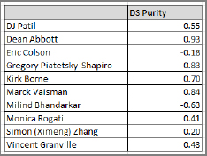
Dean Abbott is closest to the “average” (which I define as the “purest”), whereas Milind Bhandarkar (a big data, Hadoop guy) is farthest from the “center.” Despite repeated claims (by myself and others) that I am a pure data scientist, I score only 0.43. (Sure, I'm also some kind of product/marketing/finance/entrepreneur guy, not just a data scientist, but these extra skills were isolated from my experiment.) Surprisingly, Kirk Borne, known as an astrophysicist, scores high in the data science purity index. So does Gregory Piatetsky-Shapiro, who is known as a data miner.
400 Data Scientist Job Titles
I looked at more than 10,000 data scientists in my network of LinkedIn connections and found that most data scientists (including me) don't use the title “data scientist” to describe their job. So what are the most popular job titles used for data scientists? Below is a list of many of the job titles I found for “director” and “chief” positions. But keep in mind that, for every director, there are multiple junior and mid-level data scientists working on the same team and, thus, they would have similar job titles (minus “chief” or “director”). Also remember that many data scientists are consultants, principals, founders, CEOs, professors, students, software engineers, and so on.
Chiefs:
- Actuary of GeoSpatial Analytics and Modeling
- Analytic Officer
- Analytics and Algorithms Officer
- Credit and Analytics Officer
- Data and Analytics Officer
- Research and Analytics Officer
- Scientist, Global Head of Analytics
- Vice President of Analytics
- Technology Officer, Enterprise Information Management and Analytics
- Client Director, Business Analytics
Directors:
- Analytics
- Analytic Science
- Analytics Delivery
- BI and Analytics
- Fraud Analytics and R&D
- Predictive Analytics
- Analytics and Creative Strategy
- Marketing Analytics
- Digital Analytics
- Advanced Analytics
- Analytic Consulting, Product/Data Loyalty Analytics
- Analytic Solutions
- Data Analytics and Advertising Platforms
- Digital Analytics and Customer Insight
- Health Analytics
- Innovation, Big Data Analytics
- Product Analytics
- Risk Analytics and Policy
- Science and Analytics for Enterprise Marketing Management (EMM)
- Web Analytics and Optimization
- Advanced Strategic Analytics
- Analytic Strategy
- Analytical Services
- Big Data Analytics and Segmentation
- Business Analytics
- Business Analytics and Decision Management Strategy
- Business Intelligence and Analytics
- Business Planning and Analytics
- Clinical Analytics
- Customer Analytics
- Customer Analytics and Pricing
- Customer Insights and Business Analytics
- Data Analytics
- Data Science and Analytics Practice
- Data Warehousing and Analytics
- Database Marketing and Analytics (Marketing)
- DVD BI and Analytics
- Gamification Analytics Platform, Information Analytics and Innovation
- Global Digital Marketing Analytics
- Group Analytics
- Forensic Data Analytics
- Marketing Analytics
- Predictive Analytic Applications
- Reporting/Analytics
- Risk and Analytics
- Risk and Business Analytics
- The full list can be accessed at http://bit.ly/11WhOcu.
Salary Surveys
This section provides data about salaries and the number of open positions for various big data skills in several major cities worldwide.
CROSS-REFERENCE Chapter 3, “Becoming a Data Scientist,” presents a brief overview of salary surveys along with a link to comprehensive information (http://bit.ly/19vA0n1). Sample job descriptions and resumes, as well as companies hiring data scientists, are provided in Chapter 8, “Data Science Resources.”
The following data was obtained in December 2013 from the job search website Indeed.com. (You can find the search results at http://bit.ly/1dmCouo.) Hadoop, a fast-growing data science skill listed in many job ads, is compared with other IT skills, including big data, Python, Java, SQL, and others, in different locales. Note that in these search results, an exact match is shown in quotes (for example, “data science”) whereas a broad match does not contain quotes. The discrepancy between the results for “data science” and data science is huge because data scientists can have hundreds of different job titles, as seen in the previous section. The results for “big data” are 15 times smaller than the results for big data. Also note that San Francisco is the hub for big data, Hadoop, data science, and so on. But location #2 could be London, where there are more jobs and better salaries than in New York City.
Salary Breakdown by Skill and Location
The information presented here shows you what tools are available to help you find numerous job openings, where large numbers of jobs are located geographically, and the general salary overview for different data science skills. The numbers in parentheses represent the number of openings listed for each salary.
Hadoop – San Francisco, CA
Hadoop – Seattle, WA
- $50,000+ (349)
- $70,000+ (248)
- $90,000+ (122)
- $110,000+ (47)
- $130,000+ (9)
Hadoop – New York, NY
- $60,000+ (781)
- $80,000+ (557)
- $100,000+ (358)
- $120,000+ (204)
- $140,000+ (121)
Hadoop – Chicago, IL
- $50,000+ (194)
- $70,000+ (150)
- $90,000+ (84)
- $110,000+ (40)
- $130,000+ (24)
Hadoop – Los Angeles, CA
- $50,000+ (320)
- $70,000+ (238)
- $90,000+ (113)
- $110,000+ (65)
- $130,000+ (29)
Hadoop – London, UK
- £40,000+ (619)
- £60,000+ (351)
- £80,000+ (170)
- £100,000+ (97)
- £120,000+ (37)
- $60,000+ (4,388)
- $80,000+ (3,268)
- $100,000+ (1,735)
- $120,000+ (867)
- $140,000+ (433)
“Big Data” – San Francisco, CA
- $60,000+ (2,630)
- $80,000+ (1,990)
- $100,000+ (1,075)
- $120,000+ (581)
- $140,000+ (296)
Data Science – San Francisco, CA
- $50,000+ (10,000)
- $70,000+ (7,739)
- $90,000+ (4,535)
- $110,000+ (2,060)
- $130,000+ (965)
“Data Science” – San Francisco, CA
- $50,000+ (320)
- $70,000+ (219)
- $90,000+ (152)
- $110,000+ (68)
- $130,000+ (24)
Python – San Francisco, CA
- $60,000+ (5,880)
- $80,000+ (4,024)
- $100,000+ (1,757)
- $120,000+ (761)
- $140,000+ (296)
SQL – San Francisco, CA
Java – San Francisco, CA
- $60,000+ (10,266)
- $80,000+ (7,675)
- $100,000+ (3,527)
- $120,000+ (1,547)
- $140,000+ (649)
Perl – San Francisco, CA
- $60,000+ (3,850)
- $80,000+ (2,528)
- $100,000+ (1,119)
- $120,000+ (445)
- $140,000+ (187)
Statistician – San Francisco, CA
- $50,000+ (163)
- $70,000+ (111)
- $90,000+ (65)
- $110,000+ (33)
- $130,000+ (20)
“Data Mining” – San Francisco, CA
- $50,000+ (1,063)
- $70,000+ (772)
- $90,000+ (453)
- $110,000+ (257)
- $130,000+ (121)
“Data Miner” – San Francisco, CA
- No data available
A great source for salary surveys, some broken down by experience level, can be found at http://bit.ly/19vA0n1.
Create Your Own Salary Survey
You can use the same Indeed.com website, modifying the search keyword and location in the search box, to find the number of positions and salary breakdown in any locale, for any data science-related occupation. (See previous sections to identify potential job titles.) Many positions can be found on LinkedIn and AnalyticTalent, but competition is fierce (hundreds of applicants per opening) for jobs in the following companies: Google, Twitter, Netflix, PayPal, eBay, LinkedIn, Facebook, Yahoo, Apple—typically companies involved in data science since its beginnings—as well as Intel, Pivotal, IBM, Microsoft, Amazon.com, and a few others. Unknown companies or companies located in less popular cities (for instance, banks or insurance companies in Ohio) attract much fewer candidates—fewer than 50 per job ad. Startups are also a good source of jobs.
Other sources of career information include Glassdoor.com and Wetfeet.com.
Summary
This chapter focused on helping you get employed as a data scientist. It discussed more than 90 job interview questions, tests to assess your analytic and visual skills, guidance on transitioning from statistician to data scientist, top data scientists and data science–related skills, typical job titles for data scientists, and salary surveys. It also included a few small data science project examples.
In the next and final chapter, you can find several resources useful for current and aspiring data scientists: conference listings, sample resumes and job ads, data science books, definitions, data sets, organizations, popular websites, companies with many data scientists, and so on.