CHAPTER 7
Conversion Optimization
By Kim Krause Berg
I dialed up the Internet for the first time in 1995 to see what the fuss was about and was introduced to two surprises. One was email. The other was communities of people. In one instant, the entire world was at my fingertips, and I wanted to know more about everyone with a keyboard. I dove into the web headfirst before I knew how to swim. This helped me learn that communication is vital. So is trust. And no ALL CAPS.
My first job was building and promoting websites for a magazine publisher back in 1997. This was when search engines and directories were so numerous that it became its own field, called search engine optimization (SEO).
I founded an online community in 1998 for web designers and SEOs, which is how I learned the importance of understanding website user experiences from many countries.
Communication with people around the world became a new skill. Australians will tell you like it is. The United Kingdom can be counted on for wry humor. Americans were boring but learned quickly.
Everyone saw the potential to generate revenue from their kitchen table.
The Internet provided new opportunities for businesses to expand their reach and small businesses to launch. Imagine two teams meeting on a large football field. The corporation with a staff of web designers, content writers, and graphic designers building online empires were ready with data and skills on one side of the field.
And then there was the rest of us. Same ball field. Outmatched.
How do you compete online when you're a startup or new and jumping in?
Well, by the end of this chapter, you will know that and more:
- Some simple conversion guidelines
- Key areas important to conversion
- What persuasive design is
- Understand your customers and their intent
- How to design for people with disabilities
- Basic conversion opportunities and considerations
- How to create calls to action
- The value of user personas
Build It and They Will Come
This is what we thought would happen in those early days.
Maybe it was because there was less competition or experience with building websites. I remember how long it took to learn nested tables in HTML. The most common homepage design literally linked to every page without a menu because we thought that if we didn't put it there, nobody would know what we had on the website.
Oh, and text links were expected to be the color blue.
The art of web conversions evolved because we were building websites people didn't want to come to.
Why was that?
Our customers learned that some websites were difficult to use. This created website abandonment, which provided helpful data used to help determine how to improve web page design. Today this is called KPIs, for key performance indicators.
In 25 years, regardless of the size of the business, the same issues occur that prevent people from completing a task on a website or mobile app. When a task is measurable, such as adding an item to a shopping cart, there is no room for error.
If a flutter from data indicates “something bad is happening,” certain steps can be performed to find out if there is a functional or design bug. Split A/B testing with distinctive designs can contribute possible insight into user behaviors.
You may be thinking to yourself that your site meets every performance recommendation for speed or responsive layout and there is not a single grammatical error anywhere. Today's testing tools provide tremendous support for making those improvements.
But sales are still not where you want them. Downloads are slowing down. Rank and referrals are taking a hit.
Now what can you do?
Conversions optimization techniques have changed because computers did. Advanced SEO audits include user experience and information architecture audits because we learned how these areas affect conversions.
As the technology changes from desktop to mobile devices, user experience designers and digital marketers look for new ways to make us click. Human experience is the last place companies look for clues.
There are five areas for new conversions opportunities. In every website audit I perform, the most often neglected is Who. This is followed up with Why.
People are unique. If you fail to understand the core source for conversions, they simply will not meet your expectations.
To persuade anyone to use your website, mobile app, make a purchase, follow a link, join your community, or make a connection, there is one basic rule of thumb: never make assumptions about your visitors.
Easy Conversion Guidelines
Conversions optimization is directly related to the neurosciences. How we behave and think, choose, make decisions, plan, and comprehend our world is a researcher's dream. We learn from their data.
Don't Design for Yourself
It's important to accept that there is no one way to convert a click. This is because people are unique and unpredictable. Well, unique at least. After years of studying humans and computers, and human behavior and the Web, we may have figured out some common denominators.
For example, how we learn has a direct influence on how we search, browse, and make decisions online.
How customers purchase from one company may not be how customers buy from others. One retailer may find that their customers require many design ideas that require shipping free samples first, while another one has so many five‐star ratings that customer confidence is already a sure thing.
What persuades one online visitor may not work for the next one. The worst approach to conversions design is designing for yourself.
Many companies do it anyway.
Study User Behavior
I'm a visual learner. I didn't know that until I needed to learn how to design a property we moved to into a small horse stable for my retired racehorse.
For starters, we had woods and a house. No barn. No pasture. One horse. One husband and a pile of contractors.
The only way any of them could communicate to me where the electric, water, fences, and barn would go was to make drawings. And even with that, I still had my horse friends review the layout.
Could we expand to get another horse? Was there room for a riding ring? Can we get water out to the new barn before winter comes?
- There was the immediate need.
- There was the future need.
There was me not wanting to carry buckets in knee‐deep snow. It didn't take long for the contractors to know that to persuade me to agree to anything required knowing the following:
- Cost. How much will it cost? (Cost matters for conversions.)
- Time. How long will it take? (Amazon learned this early on.)
- Security. Will the fencing be secure? (Privacy and security for transactions and data can make or break conversions.)
- Brand loyalty. When can I add another horse? (Scheduled shipments, upsell, future enhancement discounts, dreamer enablement tactic.)
There are other key areas important to conversions:
- Relevancy
- Trust
- Customer service
- Ease of use
- Competitive pricing
- Brand reputation
- User interface design
Determine Who Performs Conversion Optimization
Companies develop methodologies that work within their vertical and business culture. A team approach delivers the most chance for success because frankly there's much to explore and understand.
Stakeholders answer to someone, and usually they want to know how much to invest to improve revenue opportunities.
Stakeholders rely on marketers, who may be responsible for writing content. I discuss this later, but for now, let me assure you that every conversion is tied to words. Those words must be in the right place at the right time, say the right thing to the right person, and be accessible to anyone who wants to know what the content is. This is one of the areas for web and mobile conversions where failures are high.
Like I said, communication is the key to conversion survival.
Usability and user experience (UX) designers must understand conversion design. This is everything from color use and button placement to patterns and designing for cognition.
Mobile developers have a similar path as UX, but the code is different. Mobile devices manage user experiences differently depending on the operating system. Downloadable mobile apps render on small screens, requiring innovative designs to make call‐to‐action prompts visible and tappable.
Anyone with a title that includes analyzing data produces spreadsheets and tracking information that help gauge performance. When they meet with marketing people, they help devise or revise game plans.
Persuasive Design for Conversion
What does it mean when someone recommends persuasive design? At first it may seem odd to think that a web or mobile page can lead anyone around with clever tricks, but that's the beauty of conversions design. The goal is to remove pain points.
Instant Feedback
If you are using a keyboard, press the Tab key. Do it several times. What do you see? If the page you are clicking on was designed to provide instant feedback on sense of place, each link reached with the Tab key would be highlighted upon activation.
Sometimes the designer will put a border around the link and a colored background. If it is a button, the colors may switch. If a screen reader is being used, the words are highlighted to help with orientation for sight‐impaired people. On a mobile phone, accessibility settings can indicate wherever the cursor is by highlighting it and adding audio.
In other words, we create these design touches because we want to know where we are, where we're going, and hey, is there anything else cool in here?
Being Responsive Is About Meeting Expectations
A polished, functioning, successful website supports your marketing investment and so it is important to focus on increasing user engagement and flow by making your pages responsive to your site visitors.
Make every task easy to find and use, provide feedback, create a clear information architecture using terms your target users understand, and minimize distractions.
Calls to action, tasks, navigation, content, images, page layout, and forms design lead visitors to interact with the web page. Success or failure impacts ROI (return on investment) and KPIs.
Before you design for conversions, take a look under the hood for the parts you should focus on:
- Calls to action, also known as CTAs, are the points in your content where you invite a website visitor to take action. This may be in the form of a button or a text link. For mobile apps, sometimes filling out a form field activates something. Typically, CTAs stand out visually so that they capture attention. For people using a screen reader, there is no visual prompt, making the text itself more important.
- Leading tasks are often the main actions on a page. There can be several, from finding a contact page to searching for a product. The “moneymaker” tasks should be easy to find and follow to avoid user frustration.
- Desirability and momentum are critical, coveted human responses to every web page that contains a task, even if that task is to simply provide content to read or listen to. The goal is to create reasons to read and inspire the need to want more. These responses are tied to persuasion and incorporated into what is known as persuasive design.
- Information architecture works in tandem with search engine optimization and site structure for web and mobile applications. It's so important that journey mapping is recommended as part of the mockup and design process.
For navigation and conversions to function and grow over time, the crucial element is understanding how your users think. Couple that with how you know they behave online when searching, purchasing, and using their devices. To ignore anyone is to lose potential revenue.
Information architecture supports revenue tasks.
Taxonomies are simply the words chosen for a specific type of website. For example, you are familiar with “About,” “Contact,” and “Blog.” Everyone understands what they refer to and what happens if they go there. The challenge is giving a tour of your particular place online. Do you sell fitness or exercise equipment? If you sell boots, where are the clearance men's boots in width EEE?
Do you know how to structure the navigation for the guy with big feet? What else is he looking for? Do you have related items? A newsletter? Maybe Mr. EEE has a favorite brand, and the only reason he found your shoes is because the others were sold out.
Findability is your friend.
Structure is related to navigation. Having each page layout be consistent helps reduce pain points. Headings structure is an accessibility guideline recommendation because of how screen readers can be asked to sort through content. Both search engines and assistive devices are programmed to place higher importance on H1 headings because they are used for page titles, followed by H2, H3, and so on, with keywords for easy subject scanning.
Desirability, Momentum, and Conversions
What makes people stay on your website has everything to do with how they feel when they get there. Proper navigation means that users can move forward and backward and side to side with ease, always knowing where they are within the site. For mobile apps, this design approach is sometimes ignored, making it difficult for mobile users to complete tasks.
Avoid High Bounce Rates
From the perspective of the user experience and conversions, issues can be traced to the lack of a guidance system. When there is no sense of place built into the navigation, and it's built for forward momentum only, one page at a time, browsing and item searches are the first casualties.
Whether the page appears as an embedded text link or is located in a navigation menu, the task is to go to a page and read or perform a task. For many users, the activity stops there for the following reasons:
- There is no incentive to conduct a task.
- The page opened a new window, and they are lost. (New windows are a risk on mobile devices and screen readers.)
- There is no sense of place, and they are lost within the website. Where was that cool discount code?
- There are too many choices (too much content, too many links, and so on), and they are overwhelmed. If you want to kill conversions, overwhelm and overstimulate your visitors.
- Related content is not found.
- Pages are too long to read.
- There is redundant information.
- There is no incentive provided to create momentum to “click for more.”
Conversion Optimization Strategy and Planning
We're entering an era where web pages are expected to render on mobile devices. From there, the next step is downloading a mobile app to continue the relationship between company and customer.
The basic principles for conversions design are the same, but the challenges for web designers, mobile developers, and digital marketers increased. Everyone is chasing new target markets that have learned to become dependent on mobile.
One of those lucrative areas are people with disabilities who are far more independent thanks to advances in technology that come with their mobile devices.
Another growing target market is the aging population. They may have more cognitive or eyesight issues, but they are often better off financially and ready to buy gifts, read hot novels, and search for natural organic products.
The old saying “take the time to walk a mile in someone else's moccasins” is helpful when putting together a strategy for marketing to people we don't know. Picture a team with a gigantic whiteboard brainstorming. The first ideas begin with what we know. Then we explore.
Awareness, Interest, Desire, Action
I'll let you in a secret. There is one sure way to convert anyone on a web page to act. When you present your amazing solution or product, introduce it, and get out of their way.
Copywriters often follow a particular pattern:
- Introduce new product or service in the first sentence of a paragraph.
- Describe a benefit or drop a juicy morsel about it in the next sentence.
- Link to the product or service in the next sentence, so that the sentence literally cradles the object you want them to do something about. (The anchor text is important here.)
- Continue to throw out juicy morsels and teasers in the next sentence or two, then end the paragraph.
- Continue with a new heading for different content.
- Hope they clicked the link in the previous paragraph.
So, what's wrong with this approach? Most notably, there is too much information surrounding the linked text. That link is the conversion sweet spot, but what often occurs is contrary to what you want:
- It does not contain action‐oriented anchor text. (Think verbs.)
- It contains a product name that is new and unfamiliar. (No confidence.)
- It cannot be easily seen.
- Too much distracting information surrounds it, so the reader literally jumps over the call to action to continue reading so they don't miss the content after the link.
- Some readers scan the entire page's content first. They take it all in and may not return to the paragraph with the link.
- Unconsidered cognitive behaviors might interfere with the click response you're looking for. Memory, cognitive impairment, emotional distress, and age are several factors to consider.
For awareness, interest, desire, and action to activate into a strong conversion point, less is more.
Advocating for Your Website Visitors
Business owners know their products or services inside and out. They created them. They built something from scratch and watched it grow. They hire creatives and marketers and follow every SEO technique recommended to them. What they don't fully understand is who their customers are. They believe they do. (They truly do!) Remember: never assume to know what your website visitors are looking for.
Understanding Customer Intent
When considering a digital marketing strategy, the most successful results occur when everyone agrees on whom they are marketing to. The other agreement must be what the look and feel of the website or mobile app will be.
I'm Too Young and Sexy for My Shades In one real‐life example, a seller of brand‐name sunglasses couldn't understand why sales were not meeting expectations. All of the SEO efforts were intact. The web page layouts were fine for an ecommerce website. They were stumped.
The brand had a line specially created for young people wanting to look cool and tough. The two main colors on the product pages were black and blood red. In fact, some of the images contained street language, and the overall design was intended to present a feeling of turf, fighting, and anger.
For a young person to walk down the street wearing these cool shades, they needed a credit card to buy them. No other payment methods were accepted. Which meant they had to be old enough to own a credit card.
The target market for that particular product line ran from high school age to early 20s with no credit history. They would need to convince a parent to buy them the sunglasses.
Maybe dad might. Mom, not so lucky. Adding other payment options would help sales. So might gift certificates and birthday lists.
Unexpected Cosmetics Demos The beauty products industry is hot and highly competitive. Brands today live or die by customer loyalty and must watch and listen to what their customers say and do.
So, it was a surprise to one brand to see video demos of its products created by men. Thought to be targeting women, some of the more fascinating demonstrations and expertly created videos were by men demonstrating expert applications of everything from eye liner to how to hide acne with foundation.
Realizing that the company had a bias built into their web page content, they went back to review and adjust for inclusion.
Services Are Not One Size Fits All Before COVID‐19 created personal deliveries to your home, some home services were already experts at it. Plumbers, electricians, roofers, and building contractors with a website plan for how their customers want to be serviced.
- Is it an emergency call? What would a landing page look like for the customer who is concerned about a flooded basement?
- Is routine maintenance an option, and if so, how is it structured?
- What type of payments are accepted?
- If the business delivers or makes house calls, what does the truck look like? Do they wear uniforms?
You might be surprised at the variables in customer preferences. The more you know their number‐one desire, the more conversions will follow because your web pages will be designed to connect with their needs.
Creating User Personas
User personas are a technique developed in the early days that was used to help understand target markets. The goal is always about learning human behavior as it relates to websites since this is how we reach people in today's information age. A tremendous volume of research and data are used to create them.
Could you be a user persona? What is your story?
Today, user testing in person or with software applications developed for interviews provides better accuracy. We can interview customers. We can use video interviews combined with user testing software to go through web pages or test software during the development phases. Some companies use focus groups.
The first personas I worked with were printed booklets containing imaginary stories of pretend people. I referred to them as “user characters” because when I put them to use, it was like acting in a play.
An exercise in persona creation is simply an aid used by design and marketing teams to ask questions and sort out practical solutions.
Nothing beats true user testing, but defining certain human characteristics, considering how people use computers, and understanding user behavior in various circumstances is valuable for user experience design and writing marketing content.
The Willow Harrington sidebar is one example to start you thinking about conversion optimizations for a specific set of people.
If you were to sit down with Willow and ask her to shop for clothes for herself, and then shop for clothes for her daughter, you might learn there are differences in her choices.
Would she purchase for herself and a child from one store? Does she search with a cell phone or a laptop? Is she super‐organized while job hunting online? How does she research career options?
What if Willow is living at home because she depends on a wheelchair to get around sometimes?
What has changed in your thought process? What did you miss? She asked about customer service. This is a good clue. She's independent and refuses to pity herself. (“Leave Tennessee to travel and explore the country.”)
She has a cradle for her mobile device attached to her wheelchair and sometimes can't access websites that are not designed to flip to landscape mode.
In fact, most of us never stop to consider how people use computers.
This is why creating personas contributes to gathering requirements for marketing and design. We are missing opportunities by not listening to customers or inviting them to ask us for help when they may require assistance.
Of course, Willow isn't real. I made her up based on what I see when conversions testing fails to pinpoint any obvious cause for low conversion rates.
It's always tied to simply being human.
Designing the Landing Page
For PPC projects, the landing page is the main moneymaker, and therefore the most scrutinized page to be designed. For that reason, there is rarely one design per campaign. There are several.
This is because of what Tim Ash introduced in his landmark book, Landing Page Optimization, as the four stages for decision‐making:
- Awareness (attention)
- Interested
- Desire (decision)
- Action
And then he added a fifth post‐sale stage called “Permanent Satisfaction,” which drives repeat sales.
Amazon figured out how to simplify repeat orders by creating the “Buy Again” filter, making it easier to search for an item that met with customer satisfaction. When you add in a “Buy Now” button, the entire process takes seconds because all of the information is already in the database.
What Makes a Great Landing Page?
Designing for today's landing page is trickier because computer devices come in all shapes and sizes. A laptop web page has more room to display content than a mobile device. Sidebars on larger monitors are stacked below on mobile or excluded.
What is it? Why is it for me? Take me there. What is the value you are offering?
In its most simple state, a landing page meets needs for a well‐structured value proposition. Figure 7.1 shows an example mockup landing page.
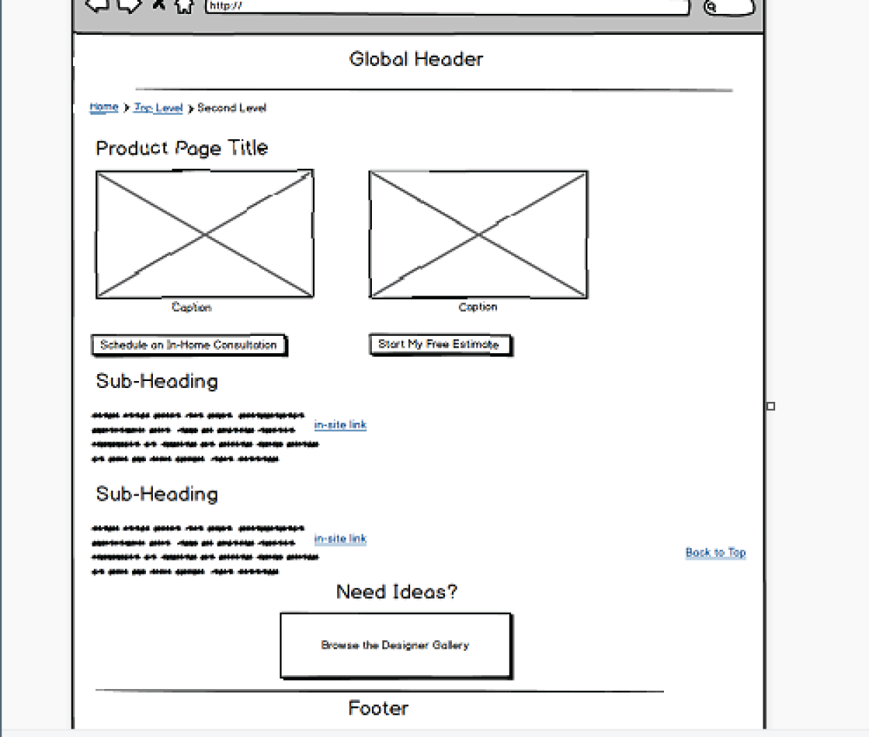
FIGURE 7.1 Example Mockup for a Landing Page
A few critical elements items should appear in the top third of your home page:
- Company name or product brand. Identify yourself right away. The number‐one error in page design is forgetting to put the name of the brand or company on the home‐page or landing page in text.
- Why choose us. State why your site visitor should choose your service or product. You have about 3 seconds to convince them to stay on the page.
- Why you're better for them. Clearly indicate that you understand who your visitor is and how you can meet their needs.
- How to start. Place your lead call to action task in this space. It can be a button (“download free trial”) or a short form (“get started now”). Avoid forcing anyone to scroll to complete the top user task.
- Here's how to buy. Start a conversion funnel here. Some visitors will have been to your site earlier. They want to get past the formalities and start a task.
- Emphasize the benefits, rather than the features. How does the product or service make a positive impact? This is often directly related to feelings and an immediate reward.
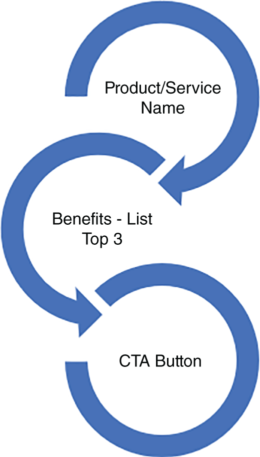
FIGURE 7.2 Structure the Order of Appearance to Aid in Understanding the Offer
Creating Calls to Action
Nothing is more unmotivating than reading a “Click Here” or “Learn More” link. Did you know that it is against website accessibility guidelines to indicate text links solely by color? Figure 7.2 shows the value proposition order.
Here are ways to improve the design of your buttons and text links.
- Always choose foreground and background colors that pass accessibility color contrast tests when designing buttons. The outer border can be darker. Padding between text and sides matters too.
- Tap targets for mobile devices must meet specific size requirements. If the finger misses the arrow, that's a risk.
- Always describe the landing page. “Learn More” and “Click Here” are not descriptive enough. Learn more about what?
- When you present a new product offering, show your visitor what it is with a product image or name. Figure 7.3 shows a simple example.
When providing a call to action, it must be placed at the moment when you inspired your readers to leave their train of thought.
FIGURE 7.3 What is on sale? Be sure to put in the details.
Design Considerations
Computer technology changes at a fast pace, requiring us to update everything we traditionally tracked about user experiences.
Behavior from a generation that grew up with handheld devices is not like Boomers, who fondly recall reading the Sunday paper and watching TV shows delivered by the antenna on the house roof.
Small cellphone screens take getting used to, especially for people who are sight impaired. Not only is squeezing text, buttons, video, and images into a handheld device a challenge, but so is designing that content to connect with readers.
Conversion optimization teams stay on top of trends, especially when products and services are displayed for websites or within mobile apps. Let's take a look.
When someone lands on a web page, they need directions and reminders for what is referred to as “sense of place.” They also need to be reminded where they are when comparison shopping or learning about a new company or brand.
The number‐one error in page design is forgetting to put the name of the brand or company on the homepage or landing page in text. Sounds crazy, right?
Eye‐tracking studies show us that we read top to bottom, left to right, unless you live in a country that reads right to left. Most web pages are designed for “F” pattern.
To commit a brand name, product name, company name, or service description to memory, you should present it three times near the top of a web page, or what is sometimes referred to as “above the page fold.”
My favorite way to test how often the brand name appears for search engines, screen readers, and reading cognition is to remove all images to see what's in the text. Hopefully the brand, company, or product name is!
However, many companies rely on their logo as the only place the brand name appears. If there is no ALT text for the logo, the company name is not available. Images don't stick in our memory if shown just one time.
To remedy this, the brand could be placed into a navigation menu as part of a category or page title such as “About Brand Name,” but once that menu is reduced to a hamburger menu icon, the text display disappears.
This leaves you with headings, subheadings, paragraphs, bulleted lists, and picture captions.
Be sure the brand is in text three times at or near the top of the page because this is how long the normal attention span is. If you have not held the attention of your web page visitor long enough for them to remember your company, they will not remember they stopped by.
Remember that on mobile apps, there is no page fold, creating innovative design challenges for guiding our eyes down the page.
Design touches that increase conversions help more people by making content perceivable and understandable. Here are more ideas:
- Add ALT text to product images.
- Remember to create ALT text for images in Twitter too!
- Avoid inserting ads inside articles.
- Transcribe content for YouTube and include links to product landing pages within the text. Demonstrating a hobby with how‐to instructions is a sales bonanza when adding affiliate links for your viewers.
- Many visual learners benefit from listening to instructions and blind customers who can't see the visuals benefit from the transcribed step‐by‐step details you provide in a video to help them understand what you are offering. This is another way to reach out to new customers.
- Images can be powerful motivators. We are more likely to trust credible information. Allow customer demos. Real‐life pictures of products in action are helpful.
This summer I purchased a yurt‐style tent for the backyard. I wanted to find something within my budget, which would help handle a larger group of people for a party in the event of rain. And I always wanted a yurt. This was my opportunity to get the experience.
The manufacturer I went with provided videos to help with decision‐making. As you would expect, they were professionally produced and focused on a key benefit, which was how easy it is to set up the yurt. They invited customer videos too. By allowing prospective customers to see the product in action, they added another layer of authenticity. Add the written feedback and five‐star ratings and bingo, they won the sale. They even beat Amazon!
Welcome new ideas. Customs may have changed. Brides on a budget are finding wedding dresses on Etsy rather than bridal boutiques. Wedding photographers and videographers familiar with new traditions add packages to include “First Look,” and couples expecting a baby may invite a video of a “Mother's Blessing Ceremony.”
Research into trends increases opportunities.
Copywriting for Conversions
Limited space and a growing sense for inclusion has created an even deeper need to find the right words to use.
ALT text character limits have been expanded to grant more room to describe scenes or images with diagrams. Because you are trying to convey information to people who may just be listening to your web pages, describing images takes on new relevancy for conversions.
It can be interesting to read content from the perspective of someone who can't do what you are recommending. One example is to write, “Tell your friends” about something. How might a blind person do this? Or “Show me how” takes on new meaning for demonstrations for deaf, blind, deaf/blind, or people with cognition impairments.
Writing for Screen Readers
Mobile apps and web pages are accessible with screen readers and other assistive technologies used to interpret content.
Android devices come with Talk Back, a free built‐in screen reader with settings to meet many preferences from font sizes and colors to listening speed.
Apple's iOS provides VoiceOver for free, the same as it provides for Macs. VoiceOver is a robust screen reader that provides audio. The Rotor command is used to sort content by headings and links content, making the use of keywords important for understanding content.
NVDA for Chrome and Firefox PCs provide audio for free. JAWS is popular but requires a fee for a license after a free trial.
The crux of writing for screen readers is that conversions are less likely to occur if the audio version is not precisely described. A button must be announced as a button and must also describe where clicking it will go. This includes warnings if a link or button takes the listener off the website. They do not have visual aids and require the added assistance.
Ableisms
We make choices every day. What influences those choices falls into human behavior research. We pull a tremendous amount of data and work it like putty in our hands to form new ways of saying the same things.
What we don't consider is who the reader may be when writing marketing copy. Trained to write for SEO? Most of us are. We're not trained to consider the meanings for words.
One example is the use of “Call Now.” This is not going to fly for people who require assistance to make a phone call.
Another example is “Tell Your Friends.” There is an assumption that talking is as simple as opening up a mouth to speak, but for people who are deaf or hard of hearing, “telling” is not a natural response.
With accessibility and design for people with disabilities growing as its own discipline, it's important to understand how to not offend people.
Ableism assumes that the physical, cognitive, and sensory differences with which disabled people live are deficits that need to be “fixed.” It's not hard to offend readers.
I've found that the best way for me to understand people who are different from myself is to listen to their stories and watch how they get through the day. I've taken these observations and researched more if I'm not sure how my own behavior should be.
Conversions are traced to empathy.
Lessons Learned
I've audited and tested thousands of web pages over 25 years. There is no end to what you can learn. Here are some of my favorite discoveries:
- The chances are likely that you are missing from your story. Your website design doesn't feel like you are there. Its marketing strategies are not you and don't seem to represent what you really want to say.
- Content is written for search engines rather than your targeted visitors. What may be “soda” to someone is “pop” to another.
- Ads inserted inside content interrupt reading. Why send someone away from the page?
- Clutter and distractions include providing too many links and too much reading, making decisions nearly impossible.
- Always test color contrasts.
- Forms require information. Providing options and choices is more welcoming and helps to create trust.
- Forms can have too many steps and are prone to functional errors.
- Poorly designed shopping carts make it difficult to continue shopping.
- Provide a visible customer service page or help during specific tasks such as entering data into forms.
- Always prevent user errors. If they make a mistake, show where it is and how to fix it. (And don't use the color red for error messages. It's a color‐ blind issue.)
- An oldie but goodie: Create a text tagline containing your site's unique selling proposition with one or two top keywords in it. This verifies in an instant that a search query has found a good match.
- Page content should clarify with more detail the meta description displayed in the search results. If your meta description is written in a way that creates an incentive to click, be sure to fulfill that desire.
- Maintain fresh content. Sometimes a conversion is lost because there's no sign that anyone's home.
- Concise is the new way to deliver content in the age of brief attention spans. An overwhelmed visitor becomes frustrated and is more likely to leave for the organized competitor.
- Related to shorter content is writing for people with disabilities or impairments who perceive information easier when delivered in brief bursts.
- Never mislead site visitors with false claims.
- Build global navigation that offers directions to groupings of pages (hubs). Base the dropdown order on what you know about your target user. Navigation should be designed to meet their top needs and interests.
- All navigation labels must describe a category in terms your customers use (machine parts and products fall into this rabbit hole).
- Avoid orphan landing pages. It's like sending the worker ants out to find food and then moving the ant hill so they can't get back.
Conducting UX Audits
When the options discussed in the previous section fail to uncover blocks, marketers turn to UX audits. These audits include functional testing and evaluating business and website requirements for missed opportunities.
Sometimes an audit requires journey mapping and a complete review of the information architecture of a website. Have you ever lost your keys? You can't start your car without them. The same is true for generating revenue from websites. There is always one lead CTA that is given the job of driving in the most revenue.
One day a client arrived with a mystery. They had built a website they loved and had followed everyone's advice. Of course, they invested thousands of dollars in marketing campaigns and were puzzled at the dismal results.
Finally, they consented to a usability audit, which meant looking under every nook and cranny of the website. And wouldn't you know it? The number‐one revenue‐generating lead CTA was hiding in a poorly labeled button in a dark corner of the homepage.
Nobody saw it there. So, they didn't click on it.
Conversion Opportunities and Considerations
Email conversions are a trendy way to discover how well campaigns are going. When used for announcements, adding a button or text link tagged for click tracking is one straightforward way to conduct A/B or multivariate testing.
For email, remember to add a privacy statement and provide directions to painlessly, unsubscribe. People's lives change. They may need to leave.
The questions some businesses ask during the unsubscribe process are not answered because there is a form field to tell a story. While the feedback may be helpful, the effort to describe why an email newsletter is no longer needed is time consuming. Try a list instead:
- Not enough time to read
- Outgrew the topic
- Career change
- Other
Social websites like Facebook, Twitter, Pinterest, LinkedIn, and others are like tribes. Each one has rules for their community, and those rules are always changing. Trust is a major concern for Facebook because ads appear based on algorithms. If you look at a Toyota sporty SUV, there's an excellent chance your Facebook feed will erupt with SUV vehicles from other automobile manufacturers.
There is a larger issue with social marketing, however. It has to do with consumer trust. Many clothing ads point to stores that do not exist. Over time, after chasing down payments to nonexistent companies, Facebook users stop buying at all.
To convince people on social sites to make a purchase or follow a link requires just as much user research and the same attention to content writing as you apply to any other campaign.
In many ways, when it all comes down to it, the best approach to conversions is to network with your tribe. In fact, “tribe” is a new label for online communities that gather online to share on specific topics of interest.
The experience is satisfying because for starters, everyone is there for a common cause or shared interest. Conversions between members create trust and that feeds into authenticity, which makes presenting something for sale lucrative.
Facebook Marketplace understood the value of trust and how to help local communities sell their old John Deeres to their neighbors. When you can see someone with many sales and an excellent reputation, it's easier to make decisions.
Online communities gather people together. Friendships and business relationships result from this common ground. It's an enormous positive contribution from the Web.
Twitter and LinkedIn are not used to persuade people to buy a product. However, they too contain the ability to segment into topical groups and communities. When people are comfortable with one another, word‐of‐mouth advertising increases.
Knowledge of local customs and use of language contribute to the conversions experience when the words are familiar. “Add to Cart” may mean something different to someone who is used to “Add to Bucket” because a cart and bucket may be different items in everyday use.
“Buy Now” is universally understood.
We all like that one.