Up to this point, I’ve described how individual creatures are put together and outlined some points to consider when deciding how those creatures look and move when you draw them. But what happens when two creatures meet? Specifically, what happens when two dragons clash over territory, gold (which dragons adore), or today’s damsel in distress? Of course, not all dragons are aggressive, and not all of them will pick a fight when they meet another dragon. But if they do, what might that encounter look like? This project is my interpretation of an aerial dragon fight—the figures aren’t limited by having to maintain their footing, so they’re free to twist and turn around each other in space.

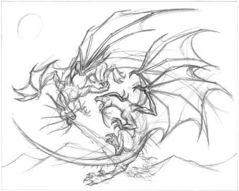
Sketching the Composition The first thing I do is go to my sketchbook and work out several ideas for the composition. The one I settled on has a circular flow and gives a sense of the motion of the two dragons tumbling through the air, constantly circling each other.
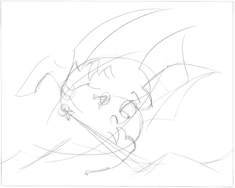
Step 1 Even though I’ll transfer my initial sketch to a clean sheet of paper later, I start by using a ruler to mark borders on the page. This will help me keep the composition centered the way I want it. Also, leaving a border around your drawing makes the image look more polished, and it makes it easier to get the final matted and framed. Because there are two figures in this scene, each one gets a line of action. Referring to my original sketch, I block in the stick figures, wings, and the plume of fire from the dragon on the left. I sketch some mountaintops below the figures to indicate that the dragons are in mid-air.
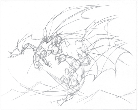
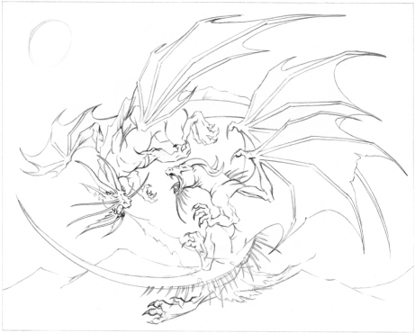
Step 2 Next I block in the forms with simple shapes, using the framework of the stick figures. Notice that I “draw through” in places—this helps me make sure that the limbs are attached and positioned correctly, even though we might not be able to see them later on.
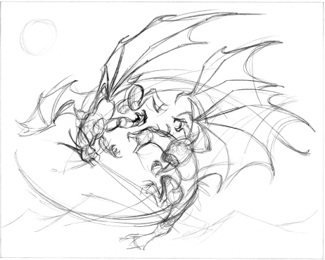
Step 3 Once I’ve established the basic shapes, I add a little more detail, such as toes, ears, horns, and whiskers. I add more definition to the wings, and I use a few loose circles to indicate the sun’s position in the upper-left corner.
Step 4 Now I add even more detail, including claws, eyes, and the shape of the flames. The dragon on the right gets a long row of spikes down his back and tail, and the dragon on the left has what looks like a fin running the length of his body. The dragon on the right also gets some tattered edges on his wings. If you look closely at the dragon on the left, you’ll see two little slashes that indicate fresh wounds. I don’t detail the right forearm of the dragon on the right because I will omit the limb entirely when I transfer the drawing in the next step. This is because it is mostly obscured by the dragon’s wing and we can assume the limb is there.
Step 5 Now I mark the correct borders on a new sheet of drawing paper and use my light table to transfer the sketch. As I trace the lines of the sketch, I make sure the details are nice and crisp. I also add more spikes to the dragon on the right, extending them to his shoulders and the base of his neck. Note that I also transfer the light outline for the placement of the sun.
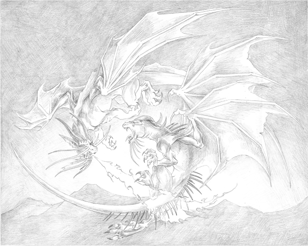
Step 6 Before I start shading, I mark off the borders on the page with artist’s tape. I place the tape with one edge right up against the border lines I marked, extending the tape about an inch or two beyond the paper edges on all sides. When I remove the tape in the last step, I’ll have clean, neat edges. Now I use an HB pencil to start indicating the light and dark areas of the composition. The lightest areas are those that are most brightly illuminated by the flames. I create a few darker areas throughout, especially around the dragon’s heads—this helps keep things separate and clearly defined. Don’t be afraid to do this wherever you need to, especially in a busy scene such as this one; it’ll help you keep track of all your details. Just be careful not to go too dark at this stage, because you might change your mind later. For the sky, I use a harder F pencil to keep the shading very light, especially toward the horizon. I make the sky darker near the top of the image and lighter toward the horizon; if you look outside on a clear day, you’ll notice the same effect. I take a lot of time when shading the sky, building up layers to smooth out the shading as much as I can. Notice that I shaded over the sun—I’ll explain this in the final step.

Step 7 I continue to darken the sky by adding more layers with an F pencil; then I smooth out the shading with an HB. I vary the length and direction of my marks as I build up more layers, which helps smooth the shading and obscure the underlying pencil marks. Next I use some light hatching and crosshatching to add texture and folds to the wings of both dragons and to the finlike ridge along the spine of the dragon on the left. I make the mountains a little bit darker, and I use a kneaded eraser to pick out some lighter areas along the mountaintops. Even though I’m indicating areas of light and shadow on the mountains, I keep them very light, using atmospheric perspective to show that they are in the distance. Notice that I haven’t done much shading in the areas behind the flames for now—this is because the flames will be one of the last things I add detail to, as I’ll explain in the next step.
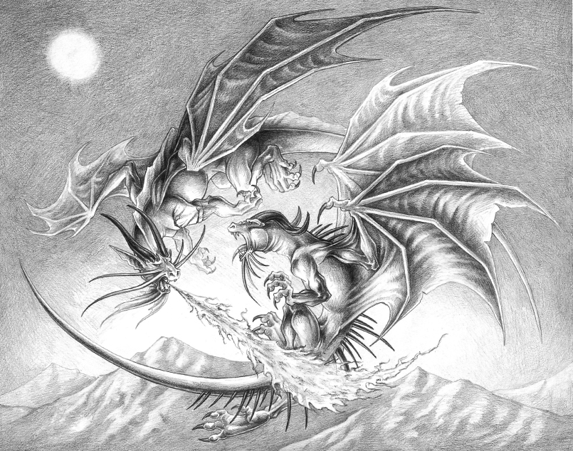
Step 8 Now it’s time to darken and blend the rest of the shadows. I make some of the shadows quite dark, especially in areas that are farthest away from the flames, such as along the backside, wings, and tail of the dragon on the left. This high-contrast shading helps make the lighting from the flames seem more dramatic. To build the darkest darks, I apply several layers of shading with the HB pencil and then layer over it with a 2B, switching again to the HB to blend the shadows back into the lighter areas. Because this is a daylight scene, I employ atmospheric perspective to the farthest wing of the dragon on the left, making it look even farther away. I use a similar trick with the dragon on the right, making his left wing appear closer by giving it more detail. Next I add more detail and shading to the mountains, making the center range the darkest and most detailed. Then I create the sun by using a kneaded eraser to carefully lift out the graphite in a circular shape—the result has a very soft edge, giving the sun a soft, glowing appearance. I add a third wound to the shoulder of the dragon on the left, adding a few trickles to indicate gore. Finally, I concentrate on the fire. To achieve the rough, chaotic appearance of the flames, I lightly scribble with the F and HB pencils, making the base and center column of the flames the darkest areas. Then, using a kneaded eraser and a small stick eraser, I lift out the tips of some of the flames and add bright highlights all over. To finish, I use the tip of a sharp HB pencil to pick out some of the edges of the flames, taking care not to press too hard or etch the lines into the page. Once I’m finished, I very slowly and carefully peel off the artist’s tape to reveal my crisp, clean borders. There you have it—a great dragon duel!