
Chapter Four. Working with Illustrator
There’s a classic Saturday Night Live commercial parody for a product called Shimmer, in which a husband (played by Dan Aykroyd) and wife (Gilda Radner) argue over whether the product is a floor wax or a dessert topping. As the debate escalates, a slick pitchman (Chevy Chase) breaks it up by stating that Shimmer is both a floor wax and a dessert topping.
Illustrator is a lot like Shimmer because it serves so many disparate needs. It’s a print-based application that’s also a Web graphics creation tool with a pixel grid. It’s a vector-based object-creation model that supports transparency and Photoshop-like effects, and now creates naturalistic brush strokes. It’s a two-dimensional tool that has rudimentary three-dimensional modeling and now allows you to draw in perspective.
Whatever task you throw at Illustrator, or whatever your particular artwork needs are, there are a multitude of features that help you explore creatively, work efficiently, and publish reliably.
#25. Understanding the Perspective Grid
Illustrator’s new Perspective Drawing feature gives artists the ability to define a perspective grid, draw art on that grid, and add existing art to that grid in the appropriate perspective. This speeds up perspective-based drawing, but before you start drawing you need to understand the grid you’re drawing on and its various settings and controls.
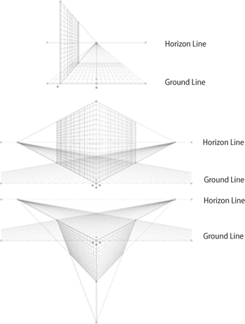
Every Illustrator document contains one perspective grid. By default, that grid is not shown. To reveal a document’s perspective grid, go to View > Perspective Grid > Show Grid, or press Shift-Command-I (Shift-Ctrl-I). The default is a two-point perspective grid, but Illustrator has built-in grid presets for one-, two-, and three-point perspective drawing (Figure 25a) that you can also use as the basis for your drawing.
Figure 25a. From top to bottom: Illustrator’s one-point, two-point (the document default), and three-point perspective grid presets.
You can make the grid visible simply by switching to the Perspective Grid tool ![]() (Shift-P). This tool makes all of the grid’s modification points active so you can reposition its horizon line or left and right planes, extend or redistribute its grid lines, and otherwise customize it to your needs. Any grid you customize can be saved as a preset to use in any other Illustrator document (View > Perspective Grid > Save Grid as Preset).
(Shift-P). This tool makes all of the grid’s modification points active so you can reposition its horizon line or left and right planes, extend or redistribute its grid lines, and otherwise customize it to your needs. Any grid you customize can be saved as a preset to use in any other Illustrator document (View > Perspective Grid > Save Grid as Preset).
Customizing the Perspective Grid
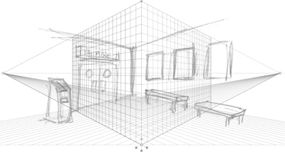
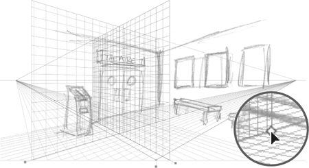
Illustrator’s perspective grid projects forward, so adjusting a grid to match a scanned sketch is pretty simple if the sketch’s composition matches that default. However, not all perspective drawings are composed that way. The sketch in Figure 25b, for example, recedes toward its center.
Figure 25b. Illustrator’s default front-projecting grid does not match this composition.
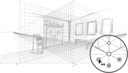
Fortunately, grids can be customized. When the Perspective Grid tool is active, each grid plane has a control handle with which you can reposition that grid. If we move the handle for the right plane to the left, for example, the right grid plane can act as the grid for the left wall in the sketch (Figure 25c).
Figure 25c. The right grid plane is moved to the left using its control handle (inset) to a position that matches the left wall of the sketch.
Once the grid plane is placed in the approximate position, its vanishing point can be moved to get the perspective angle as close to the sketch as possible (Figure 25d). With the plane positions transposed, their respective extents will overlap and create a very busy grid. This can be prevented by dragging the hollow diamond shapes (which control the grid extents) on the repositioned plane in toward where the two walls meet (Figure 25e).
Figure 25d. Moving the vanishing point (inset) sets an angle that better matches the original sketch.
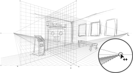
Figure 25e. Pulling in the grid extents diamonds (inset) displays fewer grid lines and prevents the two grids from overlapping.
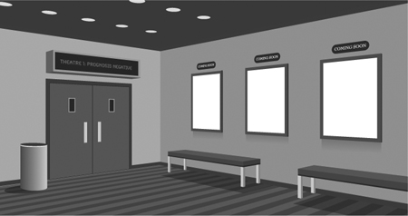
Similar position, vanishing point, and grid extent adjustments can be made to the left plane so that it can serve as the grid for the right wall in the sketch. Once that’s done, the grid is completely customized for the perspective needs of this illustration (Figure 25f). Once the grid is established, the next step is mastering the appropriate drawing strategies to produce a finished perspective illustration (Figure 25g).
Figure 25f. The customized perspective grid with its planes repositioned, horizon line adjusted, and grid extents pulled in to match the sketch.

Figure 25g. A finished perspective drawing from the original sketch and the customized grid.
#26. Drawing in Perspective
As with any new feature, Perspective Drawing brings with it new tools, new behaviors, and new limitations that you need to become familiar with to work effectively.
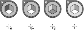
One basic challenge is keeping track of which plane you’re drawing on. Fortunately, Adobe added a hard-to-ignore element—the Active Plane Widget—at the top left of the document that appears whenever the perspective grid is visible (Figure 26a). The highlighted side of the cube shown in the widget indicates the currently active plane.
Figure 26a. The Active Plane Widget in its various modes (top row, left to right): Left Grid, Right Grid, Horizontal Grid (or ground plane), and No Active Grid. Below each is the cursor’s appearance when drawing objects on that grid.
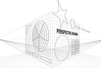
All but one of Illustrator’s object drawing tools work with the Perspective Drawing feature (Figure 26b): the Flare tool is not supported. With the perspective grid visible and the desired plane active, simply choose any other object drawing tool and start drawing. All shapes will be drawn in the perspective of the active plane.
Figure 26b. Rectangles, ellipses, polygons, stars, arcs, spirals, rectangular and polar grids, and live, editable type can all be drawn in perspective.
Moving or modifying objects already in perspective requires switching to the new Perspective Selection tool ![]() (Shift-V). Use this tool to scale objects in perspective, not the Scale tool. Using Illustrator’s standard selection or transformation tools will break any object’s connection to the grid and expand its appearance. Fortunately, Illustrator displays a prominent warning every time you run this risk (Figure 26c).
(Shift-V). Use this tool to scale objects in perspective, not the Scale tool. Using Illustrator’s standard selection or transformation tools will break any object’s connection to the grid and expand its appearance. Fortunately, Illustrator displays a prominent warning every time you run this risk (Figure 26c).
Figure 26c. A useful warning dialog box prevents you from ruining your perspective drawing if you attempt to modify an object with the wrong tool.

Working Smarter in Perspective
Perspective Drawing is a great new feature that’s actually easier to use and more flexible when it’s combined with older Illustrator features. In the following example, we’ll combine Perspective Drawing with symbols, clipping masks, and transparency to make the feature appear to do things it can’t actually do.
Once an object is in perspective, it can’t be removed from the grid and reverted to its flat state. Because of this it’s important to work with symbols as much as possible (Figure 26d). Symbols used on the perspective grid are just placed instances, so you can modify the original symbol as flat artwork, then see all instances on the grid update in perspective.
Figure 26d. These three symbols were used to build the finished illustration in Figure 26i.
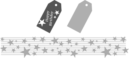
A symbol is a single object, making it easier to select and position on a perspective grid. The stars-and-stripes pattern mapped to the left plane in Figure 26e is one symbol made up of multiple objects. Symbols can be easily contained within a clipping mask, as in Figure 26f.
Figure 26e. The stars and stripes symbol is placed into perspective on the left plane.
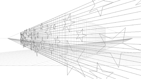
Figure 26f. A rectangle drawn in perspective over the stars-and-stripes symbol and converted to a clipping path crops the pattern to create one side of the box.

By combining symbols and clipping masks, you can simulate art that wraps around an object, which is something the Perspective Drawing feature can’t do (Figure 26g).
Figure 26g. We copied the clipped symbol to the right plane, positioning it within the clipping mask to match up with the pattern on the left plane and create a wrap-around effect. We drew a black, semi-transparent rectangle with a multiply blend mode on the left plane to create a sense of depth.
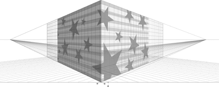
Figure 26h. We added the gift tag and shadow symbols from Figure 26d to the right plane, and created the ribbon by drawing rectangles on both planes.
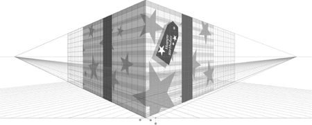
Figure 26i. The finished perspective art. A gradient-filled rectangle drawn in perspective on the ground plane simulates a cast shadow. We added the bow at the top and the string on the tag off the perspective grid.

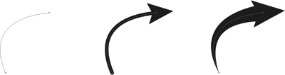
#27. Creating Variable-width Strokes
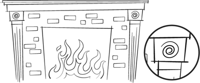
The problem with Illustrator artwork is that it looks like Illustrator artwork. It tends to be a little too perfect and uniform unless you go to a lot of trouble, and sacrifice a lot of editability, to make it look otherwise. The fireplace illustration in Figure 27a should have a loose, casual feel, but that’s undermined by the perfectly consistent line weight of every stroke.
Figure 27a. A typical Illustrator line art drawing using normal strokes. The enlarged detail shows the uniformity of all strokes in the artwork.

The new Width tool ![]() (Shift-W) lets you create variable-width strokes on a single path without adding anchor points or expanding the path. The Width tool adds a new kind of point—a width point—visible only when you hover over the path with the tool (Figure 27b).
(Shift-W) lets you create variable-width strokes on a single path without adding anchor points or expanding the path. The Width tool adds a new kind of point—a width point—visible only when you hover over the path with the tool (Figure 27b).
Figure 27b. A width point selected with the Width tool and displaying Smart Guide data about the width of the stroke at that point.

To add a width point to any path, simply click somewhere on that path with the Width tool and drag either away from the path to widen the stroke, or toward the path to narrow it. To widen the stroke only on one side of the path, select the point, hold down the Option (Alt) key, and drag one of the width point’s handles to the desired width on that side of the path (Figure 27c).
Figure 27c. Widening a stroke equally on both sides of a path (left), and on only one side (right), with the Option (Alt) key.

To relocate a width point, select it with the Width tool and drag it to the desired position along the path. To “pull along” any other width points on that path and redistribute the changes in weight, hold down the Shift key while moving the selected width point. To delete a path, select it with the Width tool and press Delete.
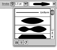
Once you’ve modified a stroke’s width, you can save the stroke as a Width Profile in either the Control panel or the Stroke panel (Figure 27d). That saved profile can be applied to any other stroke in your artwork, or used in any other Illustrator file.
Figure 27d. The Width Profile pull-down in the Control panel, with icon options for saving, deleting, or resetting profiles.
To make the most of your saved width profiles, you can flip them along the path using the Flip Along or Flip Across icons in the Stroke panel (Figure 27e). Flip Along flips the width profile from the start of the path to its end. Flip Across is only active for strokes with different weights on either side of the path, and flips them across that path.
Figure 27e. Both paths are identical, and use the same width profile, but the right path was flipped across the path length using the Stroke panel.

In the final fireplace illustration in Figure 27f, a single width profile was used for all elements of the fireplace frame, but made to look more varied by flipping the profile on select paths and subtly adjusting stroke weights. A second width profile was applied to the bricks and two others to the flames.
Figure 27f. The finished illustration uses four custom width profiles.
#28. Creating Better Dashed Strokes
For as long as Illustrator has been on the market, designers have been plagued by the behavior—or rather, the bad behavior—of its Dashed Strokes feature. In all versions before CS5, dash lengths and gaps were absolute values, so when a dashed stroke was applied to even simple rectangles and ellipses, the results were unpredictable. Complex shapes were an even bigger problem (Figure 28a).
Figure 28a. Illustrator’s dashed strokes “the old way.”

Illustrator CS5 fixes this problem with two new icons in the Stroke panel (Figure 28b). The first—Preserve Exact Gap and Dash Length—does exactly what Illustrator has always done. The second—Align Dashes to Corners and Path Ends, Adjusting Length to Fit—does what Illustrator users have been waiting many versions for: it makes the necessary calculations to position and adjust all dashes for a much more pleasing result (Figure 28c).
Figure 28b. The Align/Adjust dash option selected in the Stroke panel.
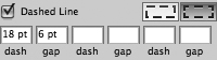
Figure 28c. Adjusted—and much better-looking—dashed strokes in Illustrator CS5.

Illustrator allows for three different dash/gap value combinations for any dashed stroke, and the new adjusted strokes work just as well for those more complex dashed strokes (Figure 28d). All dash and gap settings between corner points are adjusted accordingly.
Figure 28d. Complex dash combinations also benefit from new Align/Adjust behavior.

#29. Adding Arrowheads to Strokes
Arrowheads, which were previously effects added to strokes, have been moved to a logical home within the revamped Stroke panel. In addition to having a new location, arrowheads are now an attribute of the stroke, not an effect in a separate dialog box. They’re easier to apply and and modify.
With a path selected, and the Stroke panel open in expanded view (Figure 29a), you can select any starting or ending arrowhead from the two respective pop-up menus. Each end of the path can have a different arrowhead setting. A new “swap” icon in the panel switches the choices made for the starting and ending arrowheads, in case the path was drawn in a way that Illustrator considers its end point to be what visually looks like its start point. In previous versions, you’d have to change each point’s arrowhead type in the Add Arrowheads dialog box to accomplish this same task.
Figure 29a. Arrowhead options in the Stroke panel.
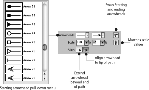
The default size of any arrowhead may not be appropriate for your stroke, depending on its length and width, so each arrowhead has independent Scale options. Previous versions only allowed a single scale value for both arrowheads. If you want to preserve that behavior, click the lock icon ![]() next to those Scale value fields. That will match the value of both fields to what you enter in either one of them.
next to those Scale value fields. That will match the value of both fields to what you enter in either one of them.
Historically, arrowheads extended out past the end points of the path. If you wanted your arrowhead tips to be exactly where the path ended, you’d have to “cheat” your path back a bit to achieve the proper alignment. That’s no longer necessary in Illustrator CS5: the new default is for arrowhead tips to align to the start or end point of the path; see Figure 29b. If you want your arrowhead tips to extend beyond the end points of the path, you can select an optional setting in the Stroke dialog box (Figure 29c).
Figure 29b. A path (left) with a normal stroke and 80 percent arrowhead (center) and with a variable-width stroke and a 22 percent arrowhead (right). The arrowhead is aligned to the end of the path in each instance.

Figure 29c. The same path and stroke options as Figure 29b, but with the arrowheads set to extend beyond the end of the path.
All of these enhancements make arrowheads much easier to control, align, stylize, and modify without ever leaving the Stroke panel.
#30. Drawing with the Shape Builder Tool
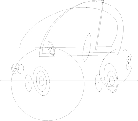
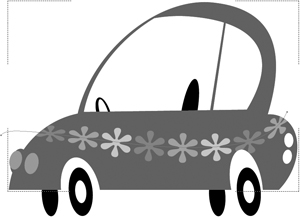
Illustrator CS5’s new Shape Builder tool ![]() is like a dynamic version of the Pathfinder’s Unite and Minus Front options, combined with Live Paint’s shape-sensing, click-and-color functionality. Figure 30a shows an illustration at its very early stages, using only primitive shapes as the basis for a drawing of a car. No fill or stroke has been applied. Using only the Shape Builder tool, we can quickly and easily refine this collection of shapes to form the car and simultaneously fill it with appropriate colors.
is like a dynamic version of the Pathfinder’s Unite and Minus Front options, combined with Live Paint’s shape-sensing, click-and-color functionality. Figure 30a shows an illustration at its very early stages, using only primitive shapes as the basis for a drawing of a car. No fill or stroke has been applied. Using only the Shape Builder tool, we can quickly and easily refine this collection of shapes to form the car and simultaneously fill it with appropriate colors.
Figure 30a. An arrangement of drawn shapes created as the foundation for an illustration of a car. The single horizontal line defines areas where the shapes it intersects can be divided.
The Shape Builder shares a few behaviors with Illustrator’s Live Paint feature, including Gap Detection and a Cursor Swatch Preview option that applies color as shapes are combined. Double-clicking the Shape Builder tool icon in the Tools panel accesses all of these options (Figure 30b).
Figure 30b. The Shape Builder Tool Options share several features with Illustrator’s Live Paint.

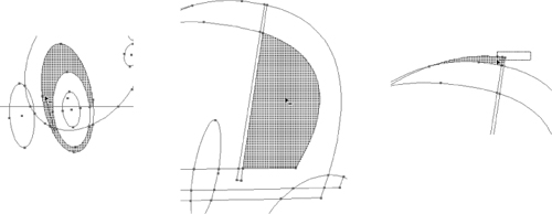
To form a car from the collection of shapes in Figure 30a, we start by removing parts of any shape that won’t be included in the final illustration. With all the shapes selected and the Shape Tool (Shift-M) active, you need only drag over selected shapes while holding down the Option (Alt) key to remove any portion of an object up to the point where it intersects with another shape (Figure 30c). Portions of the shapes “sensed” by the Shape Builder tool are highlighted as you move over them.
Figure 30c. Three ways to remove portions of shapes with the Shape Builder tool: Option-click (Alt-click) and drag through continuous areas (left), Option-click (Alt-click) a single area (center), or Shift-Option-click (Shift-Alt-click) and draw a marquee over multiple areas (right).
Once the unwanted areas are removed, we can start combining those parts we want to keep. With the Cursor Swatch Preview active (Figure 30d), you can cycle through document swatches and choose a color to fill the remaining shapes with as the Shape Builder combines them (Figures 30e and 30f). As with deleting shapes, holding down Shift creates a marquee selection, and simply clicking and dragging creates a linear selection of continuous shapes.
Figure 30d. The Shape Builder tool with Cursor Swatch Preview active.
![]()
Figure 30e. Combining shape areas by Shift-dragging to create a marquee selection.

Figure 30f. Adding colors to different areas of the artwork as they’re combined with the Shape Builder tool.

While much of what the Shape Builder tool does is inherited from the Pathfinder and Live Paint features, it works more quickly and more intuitively than either of those tools, producing finished illustrations (Figure 30g) from basic forms in very little time.
Figure 30g. The finished illustration completed entirely with the Shape Builder tool.

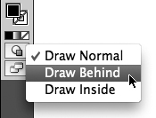
#31. Drawing Behind and Drawing Inside
Illustrator has a stacking order in each document where, by default, new art is created above existing art. To speed up the drawing process, reduce the need to re-stack artwork, and eliminate many of the steps involved in creating clipping masks, Illustrator CS5 introduces two new drawing modes: Draw Behind and Draw Inside. You can cycle through these modes by pressing Shift-D, or you can select any of them from a new icon at the bottom of the Tools panel (Figure 31a).
Figure 31a. New drawing mode options at the bottom of the Tools panel.
Draw Behind effectively reverses Illustrator’s default behavior by creating new artwork beneath the existing objects. As you draw or paint in this mode, artwork is visible above the other objects in the illustration (Figure 31b). However, as soon as you’re done drawing, the new artwork is automatically moved back behind all other artwork (Figure 31c).
Figure 31b. While drawing in Draw Behind mode, artwork initially appears above other art.

Figure 31c. Finished brush strokes automatically moved behind existing artwork.

Draw Inside mode is available only when a single drawn shape is selected. When Draw Inside is activated, the selected artwork is surrounded by a dashed corner selection border (Figure 31d). As long as that border is visible, all new artwork will be created inside the shape, even when you deselect the shape to start drawing other objects. Draw Inside creates clipping masks as you’re working, saving you the trouble of doing so after the artwork is completed.
Figure 31d. Draw Inside mode activated for the body of the car.

Figure 31e. A copied path with a variable-width pattern brush applied pasted into the Draw Inside object. Only the parts of the path within the shape are visible.
An additional benefit of the Draw Inside mode is that allows you to paste artwork inside of other artwork. There is no Paste Inside command in Illustrator, but when you’re in Draw Inside mode, all pasting is done inside the selected object.
To exit Draw Inside mode, double-click anywhere else on the artboard to return to Draw Normal mode.
#32. Creating Bristle Brushes
Illustrator CS5 introduces a new kind of brush that’s designed to mimic the appearance and behavior of natural media brushes. To do this required the addition of a background physics engine that understands a brush’s size, shape, length, the number of bristles it contains, and each bristle’s thickness and stiffness.
This feature greatly benefits artists using a pressure-sensitive tablet and stylus, because the physics engine and brush attributes respond to the orientation and tilt of the stylus, and to the pressure applied to it. This creates a beautiful “painterly” appearance with what is, in fact, 100 percent vector-based artwork.
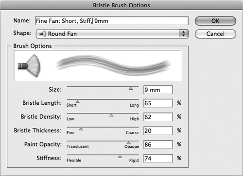
You select a Bristle brush by choosing New Brush, then Bristle Brush to open the Brushes panel menu. The Bristle Brush Options dialog box available in that panel has a Shape pull-down menu for the different categories of brushes. There are five brush types—point, blunt, curve, angle, and fan—and each has both a flat and round version. Including brush size, each of these ten brush types has six customizable attributes (Figure 32a).
Figure 32a. A custom bristle brush established in the Bristle Brush Options dialog box. Note that brush names will appear only when the Brushes panel is in List View.
There’s a range of settings within each of these attributes, so by mixing and matching brush types and attributes, you have a nearly infinite number of brushes at your disposal, faster—and much cheaper!—than you could ever have with real paint brushes.
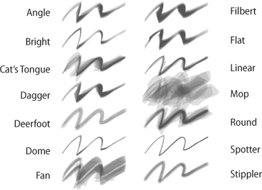
Just as Adobe has always respected typographic conventions designers are used to, it now shows that same reverence for traditional brushes artists are accustomed to. Illustrator CS5 ships with a Bristle brush library (choose Open Brush Library > Bristle Brush > Bristle Brush Library from the Brushes panel menu) containing 14 preset brushes based on real-world painters’ brushes (Figure 32b).
Figure 32b. Samples of each brush in Illustrator’s Bristle Brush Library. All strokes are the same weight. Their appearance is affected by brush thickness and other brush-specific attributes.
The Bristle brush paints using the path’s stroke color, not its fill. You can either paint with the Brush tool, or select existing paths and apply a Bristle brush to them from the Brushes panel. Every brush stroke is a fully editable vector path. You can move and modify anchor points and Bezier curves as you would with any drawn path and still preserve the brush stroke appearance.
If you’re using a pressure-sensitive tablet and stylus with the Bristle brush tool, a cursor preview on the tool simulates the appearance and angle of the brush tip, matching the orientation and tilt of the stylus as you move and tilt it (Figure 32c).
Figure 32c. A Brush tool cursor preview—specific to the current position and angle of a drawing stylus—is displayed when working with a pressure-sensitive tablet and stylus.
![]()
#33. Using Multiple Artboards
The multiple artboard feature introduced in Illustrator CS4 enabled designers to collect many Illustrator assets and layouts into a single file, stored on independent artboards (Figure 33a). The presentation and organizational benefits of multiple artboards were a big hit, and Illustrator CS5 builds upon the feature to make it more versatile and powerful.
Figure 33a. A multi-artboard Illustrator CS5 document containing various components of a design project: poster, flyer, postcard, CD booklet, and disc label.

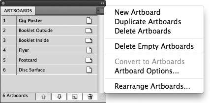
Artboards now have their own dedicated panel (Window > Artboards) from which you can select, rename, and reorder your artboards (Figure 33b). Clicking any artboard name in the Artboard panel makes it the active artboard, and double-clicking fills your document window with that artboard.
Figure 33b. Illustrator CS5’s new Artboards panel displaying six artboards and the panel’s menu options.
When you create a new document, you can add multiple artboards of identical size in the New Document dialog box. In an existing document, you can use the Artboard tool ![]() to add artboards of varying sizes at any time. A single Illustrator document can contain up to 100 artboards.
to add artboards of varying sizes at any time. A single Illustrator document can contain up to 100 artboards.
With the Artboard tool, you can select entire artboards, resize them by pulling on any of the corner/edge handles, or reposition them on the Illustrator canvas by clicking and dragging (Figure 33c). For precise control over artboard size, use the width and height fields in the Control panel to specify the artboard’s size, and the x and y coordinates to control its position on the Illustrator canvas.
Figure 33c. Resizing (left) and repositioning (right) artboards with the Artboard tool.

By default, everything on the artboard moves with it, except locked objects and objects on locked layers. However, artwork doesn’t scale when the artboard is resized. To move the artboard without moving the art on it, deselect the Move/Copy Artwork with Artboard button ![]() in the Control panel.
in the Control panel.
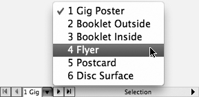
In CS4, artboards were identified only by a number, making it hard to keep track of what each artboard contained when selecting, printing, or exporting individual artboards. In CS5, artboards can be given names that are displayed in the Control panel (when the Artboard tool is in use), the Artboard Navigation pop-up menu (Figure 33d), or in the Artboard panel.
Figure 33d. Artboards listed in the Artboard Navigation menu.
The fastest way to name artboards is not from the Artboards panel, however. That process requires selecting the artboard name, choosing Artboard Options from the panel menu, renaming the artboard in a dialog box, then clicking OK. It’s much more efficient to switch to the Artboard tool (Shift-O), select the artboard to be renamed, and enter a name in the Name field of the Control panel. While that tool’s still active, you can select other artboards and quickly rename them as well.
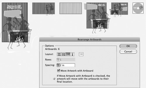
Rearranging artboards in the Artboard panel does not rearrange them visually, just hierarchically. The Artboard panel sequence and appearance of artboards on the Illustrator canvas are not dynamically related. To arrange your artboards on the canvas so they reflect the order in the Artboard panel, choose Rearrange Artboards from the Artboard panel menu, and specify your desired arrangement options (normal order or reverse order, horizontal or vertical distribution, number of columns, and spacing between artboards) in the dialog box (Figure 33e).
Figure 33e. Artboards rearranged in a single row by using the Rearrange Artboards dialog box.
Whether or not you rearrange your artboards visually, their sequence in the Artboards panel plays a key role when the document is printed or exported. The numeric order of artboards in the panel acts as the document’s page order when printing and saving as a PDF.
Other print- and export-related artboard improvements include:
• A new Auto-Rotate default in the Print dialog box sets all artboards to the proper orientation for the destination page size, allowing you to print portrait- and landscape-oriented artboards simultaneously.
• You can now save native Illustrator (.ai) files from individual artboards using Save As. This allows you to save a multi-artboard file as separate files in Illustrator CS3 (or earlier) format for backward compatibility.
• When exporting to non-native formats (EPS, JPEG, and so on), select the Use Artboards check box in the export dialog to create separate files from each artboard. A “root” name is required for the exported files (i.e., campaign.jpg), but the files are named with their artboard name or number appended after that shared root name (i.e., campaign_postcard.jpg).
#34. The Power of Appearances
One of Illustrator’s most powerful and underutilized features isn’t really a feature, it’s a panel: the Appearance panel (Window > Appearance or Shift-F6). Many designers may know it’s there and have perhaps used it from time to time, but few understand its full scope or exploit its potential...largely because Adobe has never given it the hype it deserves.
Understanding Appearances
Paths and anchor points have no appearance. They define shapes, or lines, but contain no information about how that shape or line looks. Paths are like skeletons, and appearances are the attributes that flesh out the skeleton, giving it recognizable form (Figure 34a). All attributes applied to an object—fill, stroke, effects, opacity, etc.—make up its appearance.
Figure 34a. A series of paths (top) as seen on the Illustrator artboard vs. those same paths with appearances applied to them (bottom).
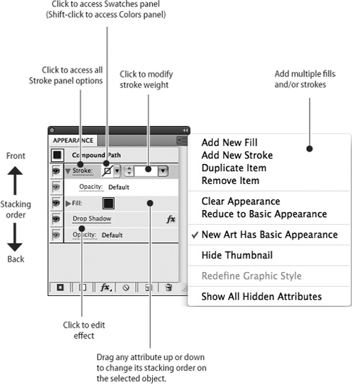
The Appearance panel is a direct conduit to all appearance settings for an object. It also shows you all the appearance attributes of a document, and reveals the stacking order of all appearances applied to a selected path or object at a glance. This one panel gives you one-click access to the panels and dialog boxes for any fill, stroke, opacity settings, and live effects that are part of an object’s appearance (Figure 34b).
Figure 34b. The Appearance panel and its options at a glance.
Adding Multiple Fills or Strokes
Illustrator creates all artwork with what’s called a “basic” appearance, meaning one stroke, one fill, and no effects. But you can achieve a “complex” appearance for any object, ranging from one or more effects to multiple fills and strokes (Figure 34c).
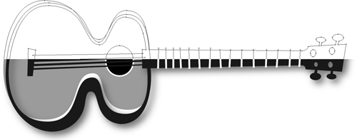
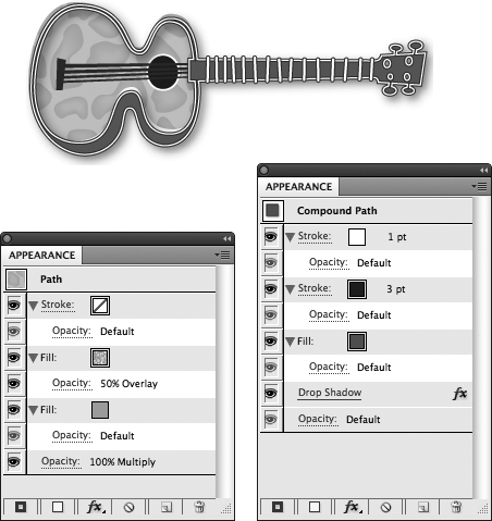
Figure 34c. The guitar illustration has complex appearances applied but uses no more paths than the simple version in Figure 34a. The body of the guitar (left Appearance panel) has two fills—a solid color and a pattern fill (with a 50% overlay blend mode) above it in the stacking order. Both the body and the neck (right Appearance panel) have two strokes—a thin white stroke stacked above a wider black one—and a drop shadow. The frets along the neck are individual paths, each with two strokes applied via the Appearance panel.
Saving Appearances as Graphic Styles
Once established, any appearance can be saved as a Graphic Style (Window > Graphic Styles or Shift-F5) that applies all appearance attributes saved within it in a single click. A change to the style changes every object in the illustration to which that style has been applied.
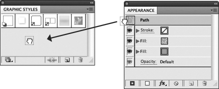
To create a Graphic Style from an appearance, select an object with the desired appearance, then drag the small thumbnail of the appearance next to the object name (Path, Compound Path, etc.) into the Graphic Styles panel (Figure 34d). You can double-click its thumbnail in the Graphic Styles panel to give it a useful name. Once defined, that style can be applied to any other object with a single click on the style thumbnail.
Figure 34d. Creating a Graphic Style from a specific appearance is as easy as clicking the Appearance thumbnail (right) and dragging it into the Graphic Styles panel (left).
Assigning Appearances to Layers
Appearances can be applied to an entire layer, so that all art drawn on or moved to that layer automatically has that appearance. This can be an enormous time-saver in complex, layered illustrations like maps, where common appearances (i.e., road lines) are applied to many objects.
To assign an appearance to a layer, select any object that uses the desired appearance and locate it in the Layers panel by expanding the disclosure triangle for the layer it’s on. The selected object will have a solid colored square next to its name, and you’ll see a small gradient circle indicating that a complex appearance is applied (Figure 34e). Option-click (Alt-click) the gradient circle, drag it up to another layer in the panel, then release the mouse. You’ll see a gradient circle applied at the layer level in the panel for that layer (Figure 34f).
Figure 34e. A selected object (with square at far right) in the Layers panel. The gradient circle indicates that a complex appearance is applied, and the circle around that indicates that the appearance is targeted. The path above it has a hollow circle, indicating only basic appearance in use. The path below it also has a complex appearance, but it is not targeted.
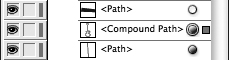
Figure 34f. A layer with a complex appearance assigned to it, indicated by the gradient circle at the layer level in the panel.

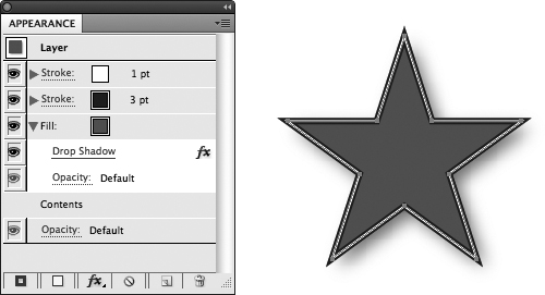
Note that once the appearance applies to the layer, the objects on that layer do not need to have any appearance applied to them. The layer handles all of that (Figure 34g). Any appearance attributes applied directly to an object on that layer will be added to the layer-level appearance. Also, as soon as you move an object off of that layer, the object loses all layer-based appearance attributes.
Figure 34g. An object with 100 percent layer-based appearance applied. Note that all appearance attributes in the panel are attached to the layer. The only attribute under “Contents” is a default opacity setting.
#35. Creating Crisp Artwork for the Web
With its strong typographic capabilities, fast and flexible drawing capabilities, and tight integration with Flash CS5 Professional, Illustrator is a great tool for Web graphics creation. Since it started as a resolution-independent application for print, however, there are some things you need to know to properly work with Illustrator to create artwork for the Web.
Even though all artwork appears razor-sharp at any magnification in Illustrator, the same is not true when that art is rasterized (converted from vectors to pixels) for the Web. Artwork gets fuzzy when exported for the Web due to anti-aliasing, which blurs edges to smooth the appearance to the naked eye (Figure 35a). Illustrator CS5 includes a new Pixel Preview (View > Pixel Preview) mode that allows you to see just what your artwork will look like when rasterized.
Figure 35a. Artwork as it normally appears in Illustrator (top) and the same artwork after it’s been rasterized (bottom).

But seeing a problem with rasterization isn’t much help if you can’t fix it. Fortunately, there are new Illustrator features for that, too. The first is the Align to Pixel Grid option, which is available either for individual objects (Figure 35b), or on a document-wide basis. To align one or more objects to the pixel grid, select the objects, open the Transform panel (Window > Transform), and select the Align to Pixel Grid check box. To make this behavior persistent throughout your document, choose Align New Objects to Pixel Grid from the Transform panel menu.
Figure 35b. The same rasterized buttons from Figure 35a aligned to the pixel grid. Notice the improvements around the edges of each button.
![]()
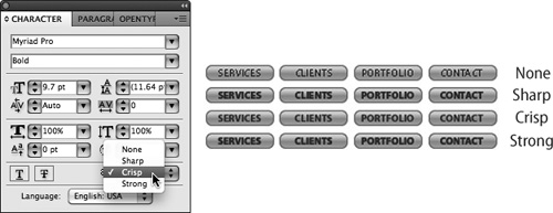
Aligning artwork to the pixel grid solves your rasterization problems for drawn shapes, but typography requires extra attention. The Character panel (Window > Type > Character) in Illustrator CS5 now includes the same type anti-aliasing options that Photoshop has had for many versions (Figure 35c). Choosing the correct option will depend entirely on the typeface in use and its size, color, and interaction with the colors around it.
Figure 35c. Anti-aliasing options in the fully expanded Character panel (left) and the results of each setting (right).
#36. Preparing Scalable Web and Print Graphics
A long-standing frustration about creating Illustrator graphics was how objects distorted when scaled. Everything looked fine when an object was scaled in the same proportion, but if it was scaled more in one direction than another, rounded corners became stretched and horizontal and vertical stroke weights became inconsistent (Figure 36a).
Figure 36a. When Illustrator artwork (left) is scaled in one direction only (right) the corner shapes are distorted, and the horizontal and vertical stroke weights become inconsistent.

For several versions, Illustrator has supported 9-Slice Scaling—an intelligent object scaling method used by Flash. Symbols created in Illustrator and destined for Flash could have 9-Slice Scaling guides established in Illustrator before they were exported (Figure 36b). Until Illustrator CS5, however, this kind of scaling worked only after the art was exported to Flash. Illustrator itself could not take advantage of the feature. Now you have the benefit of the same kind of intelligent scaling Flash has supported for all Illustrator artwork, whether destined for print or the Web.
Figure 36b. Enabling 9-Slice Scaling when creating a symbol allows for intelligent object scaling in both Illustrator CS5 and Flash CS5 Professional.

What 9-Slice Scaling does is establish four guides (two horizontal and two vertical) on the symbol, dividing it into nine regions (Figure 36c). You can position the guides so that rounded or other stylized corners are “locked off” from scaling. The top and bottom center regions scale horizontally, and the left and right center regions scale vertically. Only the center region scales in both directions. When the object is scaled disproportionally, stroke weights remain consistent and custom corners are unchanged (Figure 35c).
Figure 36c. The four scaling guides divide an object into nine regions, each with its own scaling behavior.

Figure 36d. Symbols with 9-Slice Scaling enabled maintain a consistent stroke weight and keep the four corner regions consistent with the original symbol’s shape (left), even when scaled in only one direction (right).

Any Way You Slice It
Illustrator CS5 has improved another kind of slice behavior to make your Web workflow more efficient. Artwork created in Illustrator that has been sliced for eventual use in a Web layout (Object > Slice), is much easier to selectively export with the addition of the Slice Selection tool ![]() , which shares a spot in the Tools panel with the Slice tool. Defined slices can be selected and more easily exported with the new Save Selected Slices command (File > Save Selected Slices...) without having to export the entire layout. You can even have Illustrator generate the HTML necessary for the selected slices.
, which shares a spot in the Tools panel with the Slice tool. Defined slices can be selected and more easily exported with the new Save Selected Slices command (File > Save Selected Slices...) without having to export the entire layout. You can even have Illustrator generate the HTML necessary for the selected slices.