
Chapter Six. Working with Dreamweaver
Dreamweaver has come a long way since its acquisition by Adobe and inclusion in Creative Suite 3. For some designers, though, getting a toe in the water with the application has been a challenging, sometimes intimidating, experience. Although Dreamweaver offers a WYSIWYG working environment and helpful site-management tools, it’s inevitable that designers will, at some point, have to work with code and understand more about what’s going on “under the hood” than they might care to.
Rather than denying that reality, the Dreamweaver CS5 team instead added many new features specifically designed to lessen the “scary” factor for newcomers to Web design, Dreamweaver, or both. Site setup is simpler, starter layouts are streamlined and copiously documented, design experimentation is easier and more flexible, and testing and troubleshooting tools are, no pun intended, woven into the fabric of Dreamweaver CS5.
For more experienced users, advanced capabilities for speeding up PHP coding, content-management system integration, working with dynamically linked files on a testing server, and support for both HTML5 and CSS3 are welcome additions to an already robust Web-site creation tool.
#49. Getting Started with Simplified Site Setup
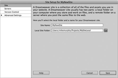
In previous versions of Dreamweaver, setting up a site was a complex process involving an intimidating dialog box with up to 15 screens of options. Getting started in Dreamweaver CS5 is incredibly fast and easy. You can now define a site by choosing New Site from the Site menu, giving the site a name, and pointing Dreamweaver to a local folder where site files are—or will be—stored (Figure 49a). After that, you’re ready to dive right in and start designing your site.
Figure 49a. Dreamweaver CS5’s simplified Site Setup dialog eliminates some of the site information requirements and many of the confusing options found in earlier versions.
At any point as you design your site, you can add more information in other areas of the Site Setup dialog, allowing Dreamweaver to make more of its advanced features available to help you manage your Web site. When Dreamweaver requires information from you—i.e., when you try to add or test server-based code—it will prompt you.
Two parameters you might want to add early on are a default images folder (defined under Advanced Settings > Local Info in the Site Setup dialog), where Dreamweaver will store any images it creates, and information about the remote Web server to which Dreamweaver will upload your local files.
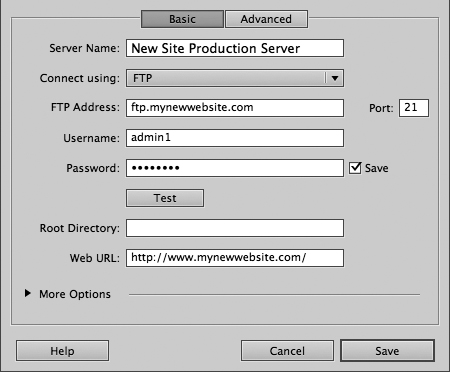
FTP (File Transfer Protocol) is the most common way to connect your local computer to your remote server, and the default option when setting up a remote server. When necessary, Dreamweaver will use FTP to transfer your local site files to the remote server. To add a remote server, go to the Servers section of the Site Setup dialog and click the large plus sign (+) (Figure 49b). In the resulting dialog box, put in the appropriate server information (Figure 49c).
Figure 49b. Adding a server for your Web site.
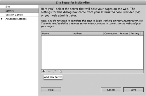
Figure 49c. Basic options for setting up a remote server using FTP.
As you develop your site, Dreamweaver will prompt you with alerts if you start adding features for which it needs more server-related information. Dreamweaver displays alerts indicating that more site information is required, then brings you to the area(s) of the Site Setup dialog (called out with red Xs to guide you along) where you enter the required information.
This guided and “as needed” approach to site setup and management is a big improvement over the formidable and mysterious site setup approach of earlier versions, enabling you to get started on your site design right away, then add more information at any point in the site’s development.
#50. Using Starter Layouts to Kick-Start Site Creation
In the earliest phases of a site’s design and development, you may want to take advantage of some of Dreamweaver’s basic starter layouts. These are very helpful if you’re new to CSS or just looking for a head start for structure and layout. There are more than a dozen standards-compliant layouts to choose from, featuring many common Web-layout schemes. All Dreamweaver starter layouts are compatible with a wide range of modern browsers (IE, Safari, Firefox, Opera) on both Mac OS and Windows.
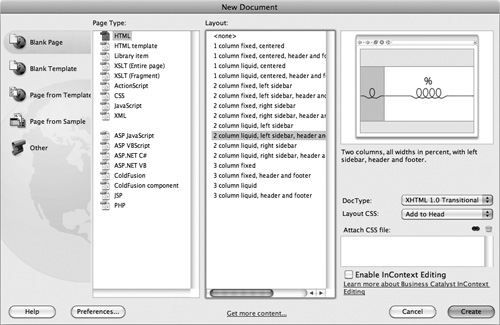
To create a new page based on one of these layouts, choose File > New or Command-N (Ctrl-N). The Blank Page options for an individual HTML page or an HTML template both take advantage of starter layouts. The default for new pages is <none>, but the list in the Layout column of the New Document dialog includes all starter layout options, and a preview for each is displayed to the right of that list for the currently selected layout to help you decide if it’s right for you (Figure 50a).
Figure 50a. Creating a new HTML page from a Dreamweaver starter layout.
For all starter layouts, Dreamweaver can either add the CSS layout and design to the document head (which is not recommended), create a new external CSS file to be shared among many site pages, or add the CSS required for the layout to an existing CSS file you choose.
The CSS generated for the layout is copiously commented with explanations for each CSS rule and warnings about potential problems that could occur when certain rules are edited (Figure 50b).
Figure 50b. Commented CSS for a Dreamweaver starter layout, shown in Code view.

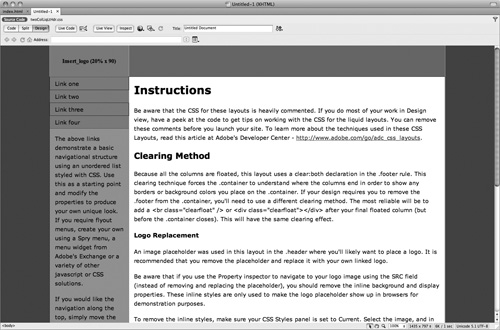
Each starter layout generated this way includes text that acts as both placeholder and instructional guide (Figure 50c). The paragraphs of text in the content well describe how the page’s CSS layout is built, and provide explanations and advice for customizing its attributes. The updated starter layouts in Dreamweaver CS5 even use different color palettes for liquid layouts (a blue palette) and fixed layouts (earth tones).
Figure 50c. A Dreamweaver starter layout applied to a new document with a liquid layout.
Bear in mind, starter layouts are not meant to be your final site design. They provide a structural framework upon which you apply your beautiful design touches. However, if you’ve never used CSS layout before and you want to start on a solid foundation of browser-compatible, standards-compliant CSS-based layout, they’re a great starting point. The CSS and page structure is entirely customizable, so you can modify the code however you choose to get you closer to your ultimate design goals.
#51. Experimenting with Design Using CSS Enable/Disable
Fast and flexible design experimentation has never been one of Dreamweaver’s strengths. Viewing the effect of CSS changes on your layout has always required modifying or deleting one or more properties, saving the CSS, and previewing the page in either Live View or a browser. With the addition of CSS Enable/Disable, changes are easier to make, faster to see, and simple to either keep or undo.
CSS Enable allows you to temporarily enable and disable specific properties of a CSS rule so you can experiment with design options. To disable a property, click in the space just to the left of the property name in the CSS panel in Current mode. This adds a circle-and-line icon and grays out the property name in the panel (Figure 51a). That same icon appears next to disabled property names in Code Navigator.
Figure 51a. Disabled properties in the CSS panel.
In Design view, you can immediately see the change that results from the disabled property without going into the code or committing to the decision by actually modifying the property in the CSS panel or Rule Definition dialog (Figures 51b and 51c). Until the property is enabled again, it’s just ignored. If you don’t like what you see, simply click the circle-and-line icon and the property is restored.
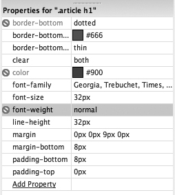
Figure 51b. This layout uses an h1 class that customizes the article headline’s color, weight, font, border, and other attributes.
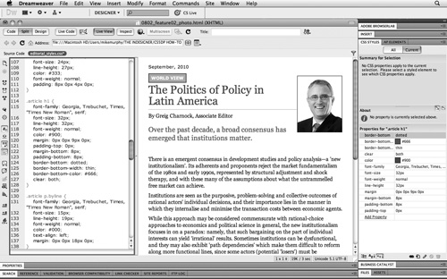
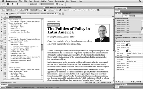
Figure 51c. The same layout with the bottom border, font color, and font weight properties of the “article h1” rule disabled using CSS Enable/Disable. The style document on the left of the split view shows the dynamically generated comments that Dreamweaver adds to the disabled attributes in the CSS rule.
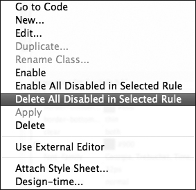
Before you go live with your site, you’ll want to commit to either enabling (removing Dreamweaver’s comments from the code) or permanently disabling (removing both the comments and properties) to keep your CSS file size to a minimum. To do so, select something on the page for which you’ve disabled one or more properties, right-click a disabled property name in the Properties area of the CSS Styles panel, and choose either Delete All Disabled in Selected Rule or Enable All Disabled in Selected Rule from the context menu (Figure 51d).
Figure 51d. The CSS panel’s context menu with final Enable and Disable options.
#52. Testing Your Design with BrowserLab
As part of its CS Live online services, Adobe has brought designers a tool that enables them to preview and compare their Web pages in multiple browsers on both the Mac OS and Windows platforms. This new tool—called Adobe BrowserLab—takes your local Dreamweaver HTML file (or any URL you point it to), loads it into as many different browser versions and platforms as you specify, and delivers back a JPEG screen shot of how that page renders in each browser. This eliminates the need for designers to have multiple computers running multiple operating systems and browsers.
With an HTML document open from a Site project (Dreamweaver’s BrowserLab preview will not work unless the page you want to preview is within a defined site), do any of the following:
• Go to File > Preview in Browser > Adobe BrowserLab, or Shift-Command-F12 (Shift-Ctrl-F12).
• Choose Preview in Adobe BrowserLab from the Preview/Debug in Browser button at the top of the document window.
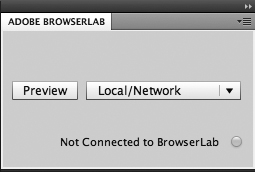
• Click Preview in Dreamweaver’s Adobe BrowserLab panel (Figure 52a).
Figure 52a. Dreamweaver’s Adobe BrowserLab panel (Window > Extensions > Adobe BrowserLab).
If you’ve never used Adobe BrowserLab before, you’ll be required to sign in with your Adobe ID to do so. If you don’t have an Adobe ID, you’ll be prompted to create one.
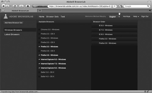
Once logged in to BrowserLab, you can create one or more testing environments by clicking Browser Sets and choosing from the available browsers (Figure 52b). Currently, BrowserLab supports Internet Explorer versions 6 through 8 (Windows), Mozilla Firefox 2.0 through 3.6 (Windows/Mac OS), Safari 3 and 4 (Mac), and Google’s Chrome 3.0 (Windows).
Figure 52b. Browser Set options in Adobe BrowserLab.
You can view the JPEGs rendered by BrowserLab individually or compare them using BrowserLab’s various view modes (Figure 52c). The 2-up View compares two of the rendered screen shots side by side (Figure 52d) and Onion Skin lays one of the JPEGs over another at 50 percent opacity, allowing a pixel-by-pixel comparison (Figure 52e). This is a great way to track down very subtle variations in browser renderings of the same page.
Figure 52c. View options for screen shots in BrowserLab.
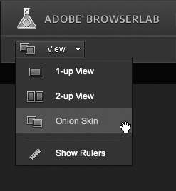
Figure 52d. Firefox 3.0 (Windows) and Internet Explorer 7.0 (Windows) renderings of the same page compared side by side with BrowserLab’s 2-up View.
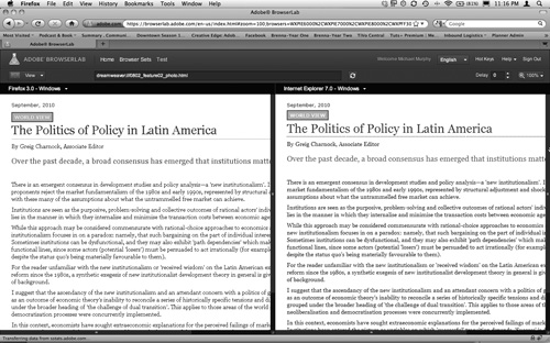
Figure 52e. The same two screen shots from Figure 52d viewed in Onion Skin mode. A slider control above the screen shots allows you to shift the opacity more toward one browser or the other to help you better determine which may be rendering the page in an unexpected fashion.

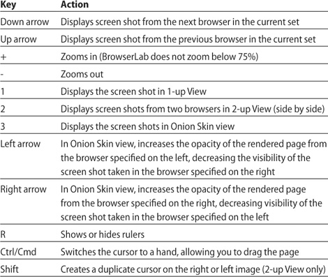
Table 52a. BrowserLab Keyboard Shortcuts
To save a screen shot, right-click (Ctrl-click) the image in BrowserLab and choose Save Locally from the context menu.
#53. Troubleshooting Your Design with CSS Inspect
Many Web designers and developers rely heavily on plug-ins like Mozilla’s Firebug or WebKit’s Web Inspector to test page behaviors and troubleshoot design issues. The downside of these great plug-ins is that they require you to load your page in a browser and activate the plug-in. This is a very inefficient process for basic CSS troubleshooting.
Some of the functionality of these plug-ins has now been folded into Dreamweaver in the form of CSS Inspect, which allows you to visualize the box model of the HTML elements on your page just by hovering over them with the mouse. The feature is limited to the width and height of content (text, images, etc.), and that content’s margin and padding.
Clicking the new Inspect button (Figure 53a) automatically activates Live View, if it’s not active already, because the two features work together. When you switch to Inspect mode, Dreamweaver nicely suggests that you avail yourself of a workspace that maximizes the feature’s usefulness (Figure 53b). This workspace activates Live Code mode and Split view, and opens the CSS Styles panel in Current mode. All of these features are “plugged in” to Inspect.
Figure 53a. The Inspect feature is designed to work in Live View. Both must be turned on to dynamically highlight content, padding, and margins.
Figure 53b. Dreamweaver prompts you to modify your workspace when you turn on Inspect.
With these workspace settings, Live Code will dynamically highlight the HTML for any element you hover over, and the CSS Styles panel will dynamically display the summary, rules, and properties of that element (Figure 53c). In addition, the Tag selector reflects what element is currently in focus (Figure 53d).
Figure 53c. Dreamweaver’s Inspect-optimized workspace reflecting information about the page element currently under the mouse. The paragraph being inspected is also dynamically highlighted by Live Code on the left.

Figure 53d. With the mouse over the paragraph, the extent of its content, padding, and margin boxes are highlighted in Live View. In this example, Inspect reveals both padding and a margin on this <p> element.

If you’re curious about why certain spacing is occurring in your layout, or can’t figure out which rule is causing a puzzling layout problem, hovering over adjacent elements in Inspect mode helps you understand how elements interact and align.
Once you’ve found the source of any unwanted layout property, click on the highlighted element to “freeze” the highlighting in place, then go to the CSS Styles panel to make changes to that element’s margin or padding. As soon as you click, you’re automatically kicked out of Inspect mode. Once you’ve modified the problem property, turn on Inspect again to verify that all is as you expected (Figure 53e).
Figure 53e. The <p> element viewed using Inspect after all padding was removed. Bottom spacing is controlled solely by the margin property, as highlighted here.

Inspect doesn’t fully replace a plug-in like Firebug, which can also analyze a site’s network activity and measure JavaScript performance, and which offers debugging of XML and JavaScript. For resolving layout and CSS problems, however, working with CSS Inspect in Dreamweaver—with your layout visible and your code editable—is a great workflow improvement and time-saver.
#54. Using Live Code and Live View
Under the hood of Dreamweaver’s Live View is the same WebKit-based rendering engine behind Apple’s Safari and Google’s Chrome Web browsers. When viewing a page in Live View, the layout should be reasonably close to what you’ll see when it’s viewed in most modern, standards-compliant browsers.
Live View is a noneditable mode, meaning you won’t be able to make changes directly in the layout as you can in Design view, but you will be able to edit the code and refresh the page to see those changes.
In Live View, “reactive” page elements like rollovers, Ajax widgets, and Spry accordions all work as they would on the page in a modern browser. Activating Live Code view (Figure 54a) in addition to Live View allows you to see what happens in the background—in other words, how your code dynamically changes according to the state of the page (Figures 54b and 54c).
Figure 54a. Live Code mode activated in Dreamweaver CS5.
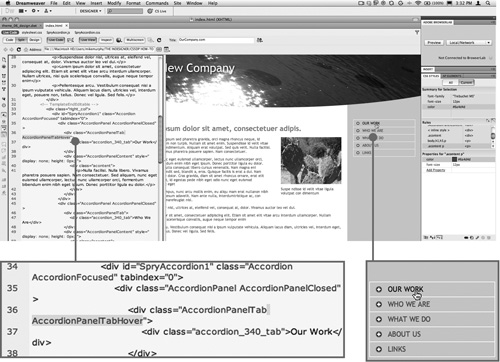
Figure 54b. A Spry accordion’s code as it appears in its idle state. The div tag uses a class of AccordionPanelTab.

Figure 54c. When you roll over the Our Work link in the accordion (bottom right), the AccordionPanelTabHover class is added to the div tag dynamically and highlighted by Live Code (bottom left).
Live Code is a new CS5 feature that dynamically highlights and reveals parts of the code when you interact with page elements in Live View. When you turn Live Code on, that also puts the code into a noneditable mode, preventing you from making any changes until you turn off either Live Code or Live View.
Live Code is especially useful when you’re working with pages connected to content-management systems (a.k.a. CMS frameworks), and dynamic sites like WordPress blogs, which rely heavily on PHP includes and server-side page generation. Live View reveals stage changes on the page; Live Code reveals all of the content code that gets delivered to the browser, even if the blog template page is little more than a handful of PHP calls and includes.
While Live View is a good sample of what a WebKit-based browser will display, it does double duty as a debugging and learning tool when used together with Live Code. The two viewing modes provide something a browser doesn’t—the ability to see in real time what’s happening as code is generated by the server and returned to the user’s browser.
#55. Using the Widget Browser
For many designers without a coding or scripting background, getting the kind of rich, interactive site most users expect can be challenging. Advanced user-interface components like sliding panels, accordion widgets, slideshows, and lightboxes are not something novices can typically build from scratch, but often exactly the sort of functionality they want for their Web sites.
The Widget Browser is an Adobe AIR application that’s tightly integrated into Dreamweaver, allowing you to browse, download, customize, and insert publicly available Ajax widgets with minimal involvement—or in some cases none—with the widget’s code.
Since it’s a separate application that works in tandem with Dreamweaver, you’ll need to first download and install the Widget Browser before you can use it. To do so, click the Extend Dreamweaver menu icon and choose Widget Browser (Figure 55a).
Figure 55a. Accessing the Widget Browser from within Dreamweaver.
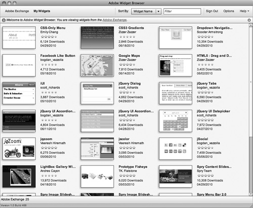
Once the Widget Browser is installed and launched, you’ll need to sign in using your Adobe ID. After logging in, you’ll see the available widgets on the Adobe Exchange (Figure 55b).
Figure 55b. Available widgets on the Adobe Exchange displayed in the Widget Browser application.
The number of widgets on the Adobe Exchange continues to grow as developers share new widgets. Currently, the types of widgets available include functionality like slideshows and lightboxes, a Google Maps widget, dynamic rollover image zooming, jQuery-based tabbed interfaces, calendar-style date pickers, and more.
Click on any widget in the Widget Browser window to see details about the widget’s functionality, its developer, and browser compatibility. Clicking the Preview button loads a working version of the widget in the Widget Browser, where you can view and interact with all of its functionality (Figure 55c).
Figure 55c. The “jqzoom” widget in Widget Browser’s preview mode displays a fully functioning example of the widget and alternate preset behaviors you can test out before downloading.

When you’ve found a widget that suits your needs, click the Add to My Widgets button in the bottom-right corner of the Widget Browser window. You’ll be required to accept the licensing terms of the widget, after which you can start customizing the widget immediately by clicking Go to My Widgets in the resulting dialog box.
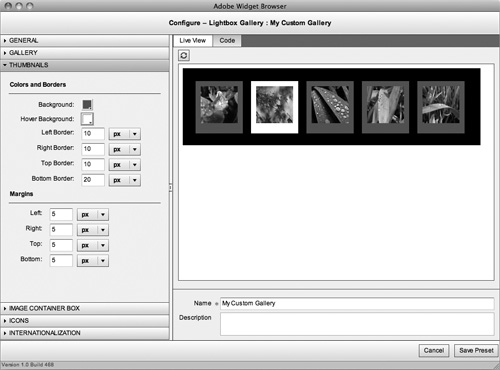
From the My Widgets view in the Widget Browser, click Configure in the lower-left corner of the application window. How customizable a widget is depends on both the widget and the developer, and how many settings they’ve “exposed” for the widget browser. Some widgets offer very few options, and further customization requires getting into the code yourself. Others, however, make many options available, and the Widget Browser application facilitates the process by providing a simple user interface through which various parameters of the widget can be quickly modified and immediately previewed (Figure 55d).
Figure 55d. The LightBox Gallery Widget is highly customizable, and different aspects of the widget are organized into accordion-style collapsible panels, including General, Gallery, Thumbnails, Icons, and other settings.
To save your settings as a preset, name your settings in the Name field under the live preview and click the Save Preset button. Any presets you save with the widget will be selectable options when you later insert the widget in your Web page from Dreamweaver (Figure 55e). Adding a widget to a Web page in Dreamweaver is as simple as clicking Widget in the Inspect panel or choosing Insert > Widget... from the Dreamweaver application menu. In the Widget dialog, select both the desired widget and the appropriate preset, then click OK.
Figure 55e. Widget selection and preset options when inserting widgets.

The inserted widget—and all of its related functionality—is added to your page, and can be fully interacted with in Dreamweaver’s Live View (Figure 55f).
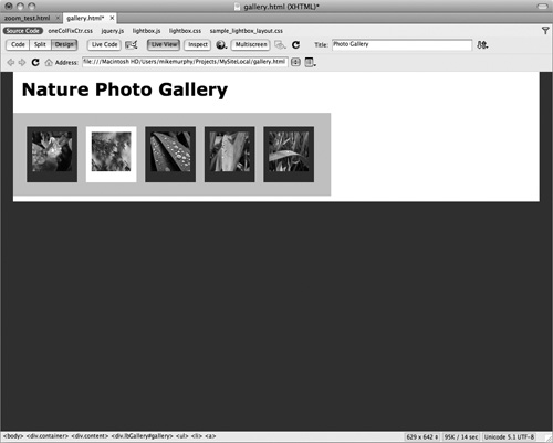
Figure 55f. The LightBox Gallery Widget inserted in an HTML page in Dreamweaver and shown in Live View. Customizing the images requires going into the code and replacing the demo image references with references to your own images, and creating corresponding thumbnails to replace those used in the demo.
Using the Widget Browser, tweaking a few settings, and with little or no delving into code, you can add advanced user-interface controls and components to your Web pages without needing to become an expert in JavaScript or any other coding language.
#56. Reveal Dynamic Files on a Web Server
When working on a site project that has a test Server set up (see “Setting Up a Test Server” and “Installing WordPress”), Dreamweaver can track activity on that server and report back all of the related files that make up a dynamically generated Web site. By “discovering” related files on the server, Dreamweaver can both render the site’s pages and display the code that’s dynamically delivered to the browser.
This new capability can help take the mystery out of a robust and complex content-management system (CMS) like WordPress, Droopl, or Joomla. If you’re interested in customizing an existing WordPress theme, for example, doing so from the WordPress admin’s site appearance settings using only the blog’s CSS files can be intimidating and slow. Working exclusively in the WordPress admin makes it difficult to grasp the context and scope of the CSS rules and cumbersome to preview or undo your changes. With Dreamweaver’s support for these dynamic CMS frameworks, understanding and modifying a blog’s page structure and appearance can be accomplished more quickly and intuitively than ever before.
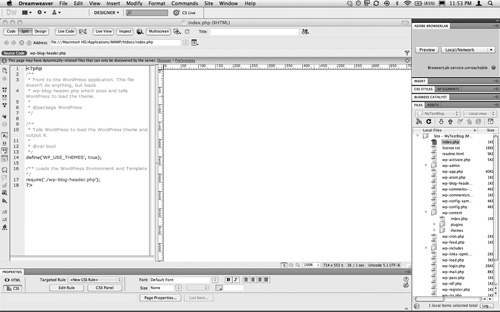
When you first open a page from a WordPress site (index.php, for example), Code view shows you very little, and Design view shows you nothing at all (Figure 56a). That’s because pages in a WordPress site are dynamically generated, requiring page elements and content to be delivered up according to the PHP calls made to the server.
Figure 56a. A WordPress index.php file opened with Live View turned off displays only PHP calls in Code view, and no content at all in Design view.
If your testing server has been set up properly, Dreamweaver CS5 can “discover” the related files necessary to both display the page in Live View and reveal dynamic code changes in Live Code. The application prompts you to allow it to discover those files when it loads a PHP page such as a WordPress index.php file (Figure 56b).
Figure 56b. Dreamweaver prompts you to discover the related files necessary to properly display a PHP-based site such as a WordPress blog.

Once discovered, the related files are listed in a row across the related files panel above the Code and Split views (Figure 56c). Files for the blog’s header, configuration files, CSS style sheets, and XML data files are all listed and editable by Dreamweaver just by clicking their names in the panel.
Figure 56c. The related files panel reveals the PHP, CSS, XML, and other files required to properly render the site’s pages and deliver its content.
When Live View is activated, the PHP page fully renders in the Design view pane, but Code view still shows only the minimal PHP calls used to build the page from other related files (Figure 56d). When Live Code is turned on, however, everything that the index.php file requests from the server is brought in and displayed in the Code view pane (Figure 56e).
Figure 56d. With Live View turned on, the blog page fully renders in the Design view pane, but Code view (on the left) does not change.
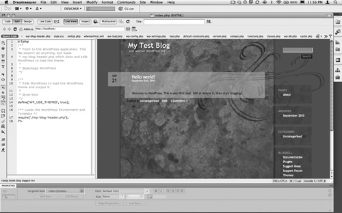
Figure 56e. With Live Code turned on, the Code pane dynamically displays all server-based content delivered to the browser as if the site were live.

Filter Dynamically Related Files
CMS frameworks like WordPress are complex. To be as dynamic as they are, they use many related files. This can make the row of related files listed in the Related Files toolbar tough to navigate through. To make it easier for you to find the file types you want to work with, you can filter the list of files. Click the Filter icon  at the right end of the Related Files toolbar and deselect the file types you’re not interested in seeing in the toolbar, keeping only what you want checked.
#57. Taking Advantage of PHP Code Hinting
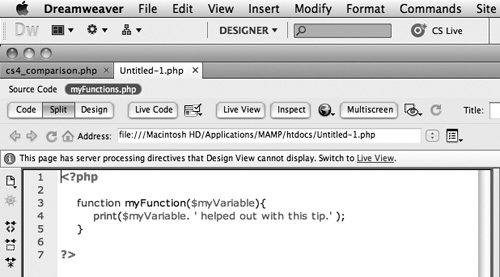
PHP code hinting debuted in Dreamweaver CS4, but was lacking some key functionality, such as support for custom variables and functions defined in related files (external files required by a page to render it as intended in a browser). Custom variables and functions were only hinted when they were defined in the same document (Figure 57a).
Figure 57a. PHP code-hinting behavior as it worked in CS4. The custom myFunction hint appears because the function itself is defined within the same document.
More often than not, however, functions and variables should be defined in separate files and called upon in the Web page at runtime (when the file is delivered to the user’s browser). This allows many pages to share those functions and variables, just as many pages share the same CSS.
Dreamweaver CS5 now provides code hints regardless of where those functions are defined on the site. To take advantage of this feature, the following must be true:
• The page from which you’re calling the functions or variables, and the file(s) being called upon, are part of a defined Dreamweaver site (See Tip #49, “Getting Started with Simplified Site Setup”).
• You must have allowed Dreamweaver to discover related files for the site (See Tip #56, “Reveal Dynamic Files on a Web Server”).
When the above conditions are in place, you can write functions and variables in a separate file (Figure 57b) for maximum efficiency, and still rely on the ease of code hinting. If you want to see the result of the PHP calls in Live View, the site you’re working on must also have a testing server defined and running.
Figure 57b. A separate file named myFunctions.php is set up to store one or more functions or variables for a site.
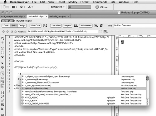
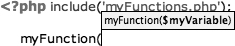
To use the functions contained in that related file, you must first use a PHP include to point your Web page to it with a basic statement such as: <?php include(‘myFunctions.php’); ?>.
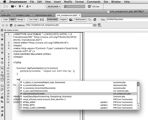
Once Dreamweaver knows that the custom variables and functions in that file are to be included, it will include all of them in pop-up PHP code-hinting mode as you start typing them in the source code of individual site files (Figure 57c). To invoke code hinting, press Control-Spacebar (Mac and Windows) after you start typing the desired code. The more you type, the closer code hinting gets you to the appropriate matching code.
Figure 57c. With the association made between the current document and the myFunctions.php file by the include statement, Dreamweaver can offer up all of the custom functions and variables contained in that file as code hints. In this instance, it identifies not only the myFunction function, but also displays the syntax that indicates what variable—in this case, myVariable—is part of that function, and shows the PHP filename from which the function originates.
As with all other code hinting in Dreamweaver, the hints get narrowed down the more you type, and scrolling to the appropriate match and hitting Return (Enter) completes the code for you. PHP code hinting goes one step beyond this, keeping a persistent tooltip visible if there are variables built into that function. This is both a helpful reminder of what variables the function requires and a way to spare you more typing (Figure 57d).
Figure 57d. A tooltip specific to the syntax of myFunction provides additional context for PHP code hinting.
Code Hinting in Related Files
For sites based on CMS frameworks like WordPress, Droopl, and Joomla, the CMS will already have existing PHP functions and variables in place after you install the CMS on your server. Dreamweaver can now scan through such a site’s related files and add site-specific code hinting to make working with that CMS’s PHP code more efficient.
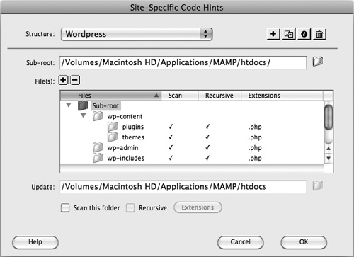
This feature is not on by default, so before you start modifying, for example, a WordPress blog, go to the Dreamweaver Site menu and choose Site > Site-Specific Code Hints. In the resulting dialog, Dreamweaver defaults to WordPress as the site’s structure and displays a directory and file tree for the site (Figure 57e), and every file and folder necessary to build that site’s pages dynamically is set to be scanned for custom functions and variables.
Figure 57e. Setup options for site-specific code hinting. Dreamweaver allows folders to be scanned for custom PHP functions and variables to add to its code-hinting feature. The Recursive option means that all files and subfolders within a given folder will also be scanned.
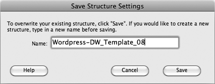
If you opt to customize any of the settings for site-specific code hinting—to exclude unwanted themes or to add custom files not included in the default WordPress structure defined by Dreamweaver—you’ll be prompted to create a custom site-structure setting (Figure 57f). Once saved, the file appears in the files list of the Site panel as “yourstructurename_codehinting.config.”
Figure 57f. Saving a custom site-specific code-hinting structure.
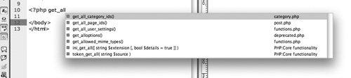
Once site-specific code hinting has been established for your site, typing in the start of any site-specific functions or variables in code-hinting mode will make your site’s specific code available (Figure 57g).
Figure 57g. Site-specific WordPress “get” functions listed as code hints.
#58. Working with HTML5 and CSS3 in Dreamweaver
Dreamweaver CS5 debuted with no support for HTML5—the emerging (but still not fully adopted) standard for modern browsers. Within a month of its release, however, a downloadable extension was made available on Adobe Labs that natively supported the HTML5 DOCTYPE declaration, as well as HTML5 structural elements and CSS3 properties. A few months later, with the 11.0.3 update to Dreamweaver CS5, all the features of that extension were incorporated directly into the application via CS5’s automatic updates feature (see Tip #6 “Keeping CS5 Design Premium Up-to-Date”), eliminating the need for users to download and install a separate extension.
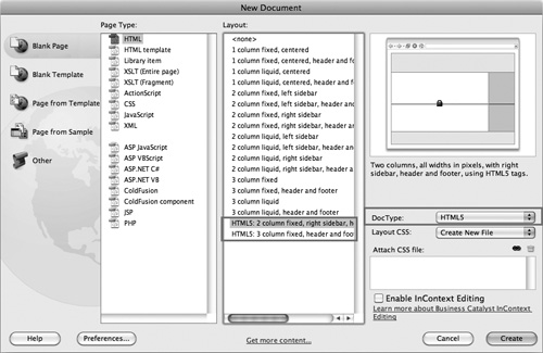
After updating Dreamweaver to add this expansive new functionality, you might not even notice what’s changed. On closer inspection, however, you’ll see a new Multiscreen button in the Document toolbar (see Tip #60 “Testing Alternate Designs with Multiscreen Preview”) and, when you create a new document, there are two HTML5-based starter layouts in the New Document dialog (Figure 58a).
Figure 58a. HTML5 starter layouts available in the New Document dialog.
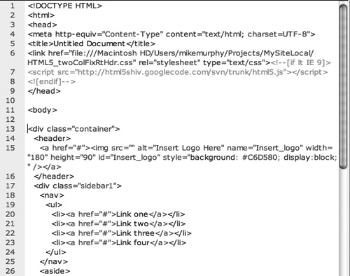
When you open Code view in one of these HTML5 starter layouts, you’ll see familiar tags, such as <div>, <h1>, <ul>, and <p>, along with new HTML5 tags such as <header>, <footer>, <nav>, <article>, and <section> (Figure 58b).
Figure 58b. The HTML5 DOCTYPE declaration and new tags (including header, nav, and aside) in a Dreamweaver starter layout.
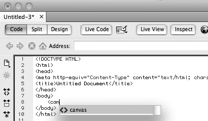
Unfortunately, Dreamweaver’s implementation of HTML5 is not 100 percent integrated into the application, so new elements like <section> and <nav> aren’t available from the Insert panel or accessible from the Property inspector. Until HTML5 is woven in throughout the application, you’ll be able to work more efficiently with HTML5 elements in Code view—taking advantage of code hinting, which fully supports HTML5 tags (Figure 58c)—than you will in Dreamweaver’s panels and other interface elements.
Figure 58c. Code hinting in action for the new HTML5 <canvas> tag.
Despite the incomplete integration of HTML5 and CSS3 into its panels, features like code hinting that do support these emerging standards will take some of the tedious tasks out of working directly with code. Also, the CSS Styles panel does recognize and list CSS3 properties that you’ve defined in Code view when you select elements to which that code is applied. Because of this, you can still take advantage of features like CSS Enable/Disable (see Tip #51, “Experimenting with Design Using CSS Enable/Disable“).
#59. Defining Rounded Corners and Shadows with HTML5 and CSS3
At the dawn of digital design, drop shadows were all the rage, but the Web 2.0 aesthetic is all about rounded corners. Rounding helps disguise the underlying box model of CSS and soften Web-page designs in general. Historically, this look had to be achieved with image-based workarounds. CSS3, however, includes a new border-radius property that displays page elements with rounded corners without the need for any images. The same is true for drop shadows, which can now be rendered with a properly structured shadow property (Figure 59a).
Figure 59a. HTML-based rounded corners and drop shadows coded using standard ul and li tags within the new HTML5 nav tag.

Both of these CSS3 properties are among several that are not yet fully supported by all browsers. Even in browsers where they are understood, they need to be referred to in a browser-specific way until HTML5 and CSS3 are fully adopted.
For rounded corners, the standard CSS3 property syntax is border-radius, followed by a colon and the value of the radius (i.e., 6px) and a semicolon. However, the rendering engines that support the property don’t yet support it in this standard format. Opera supports the property, but WebKit (Safari, Chrome, etc.) and Mozilla (Firefox) do not. Those rendering engines require a specific prefix on the border-radius property. For WebKit, that prefix is -webkit- and for Mozilla, it’s -moz-. For the few properties that Opera doesn’t natively support, the prefix would be -o-. These browser-specific properties must go first in your CSS rules, followed by the standard form of the tag as shown below.
-moz-border-radius: 6px;
-webkit-border-radius: 6px;
border-radius: 6px;
The new shadow property defines drop shadows in terms of color, opacity, offset, and blur. The first two are defined with the rgba attribute. The RGB values (from 0 to 255) define the amounts of red, green, and blue in the color. The “a” in that attribute stands for the color’s alpha channel, with values from 0 (fully transparent) to 1 (fully opaque). For the navigation buttons in Figure 59b, the shadow is offset by 4 pixels both horizontally and vertically, with a 6-pixel blur. The full property is defined as:
Figure 59b. The CSS style sheet—with browser-specific code for both the border-radius and box-shadow properties—that defines rounded corners and drop shadows in the navigation buttons, shown side by side in Dreamweaver’s Split view.
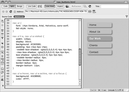
box-shadow: rgba(0,0,0,0.4) 4px 4px 6px;
In Figure 59b, the alpha value of 0.4 equates to 40 percent. The color is 60 percent transparent. The alpha setting is different from the opacity declaration in CSS3, which sets how opaque an element and all of its children are. The alpha value in an rgba color sets the opacity only for that color declaration, not any other elements.
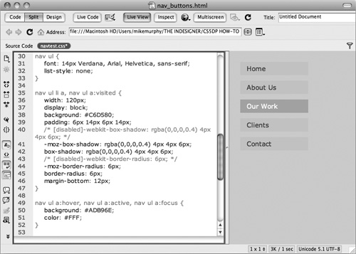
Since Dreamweaver is WebKit-based, you’ll only see these properties in Live View if you’ve included the -webkit- iteration of the property in your CSS. Live View will not render the standard version of the property, nor will it render the Opera- or Firefox-specific iterations (Figure 59c).
Figure 59c. Using CSS Enable/Disable, the WebKit-specific properties have been commented out, and Dreamweaver’s Live View does not render the rounded corners or shadows, even with the standard border-radius and shadow properties present in the CSS.
#60. Testing Alternate Designs with Multiscreen Preview
CSS3 media queries give designers the ability to change a page’s layout and style properties depending on what kind of device that page is delivered to. It’s not the specific device or browser that’s detected, however; it’s the size of the viewing area available for the page that determines what CSS rules are used to display the pages.
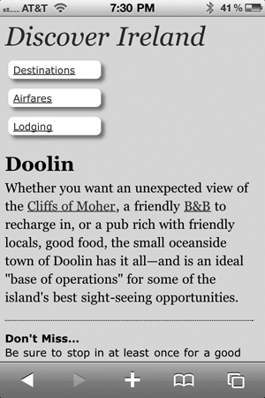
A desktop browser offers the most screen real estate, and most Web-page layouts are optimized for that. A tablet device like the iPad offers somewhat less screen space, and a smartphone provides the smallest viewing area. Rather than implementing complex browser detection with JavaScript and creating multiple pages for the same content, CSS3 and media queries can reconfigure the page according to alternate CSS rules you define for each screen resolution, allowing you to use one HTML page to deliver three different layouts (Figures 60a, 60b, and 60c).
Figure 60a. A Web page designed for desktop-browser viewing. Note the large page heading and the positioning of secondary information in a column on the far right. This layout works fine when viewed on a screen large enough to fit it all.
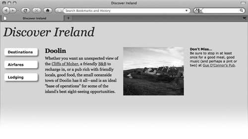
Figure 60b. The same Web page using CSS3 rules and media queries that optimize the layout for tablet viewing. Note the slightly smaller page headline and the positioning of the secondary information below the main content, rather than to the right of the image.
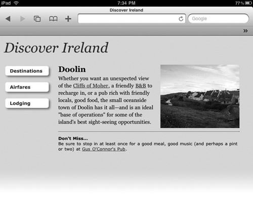
Figure 60c. The same page again, displayed on an iPhone, its layout optimized for a mobile device’s small screen. The page heading is significantly reduced, and the navigation buttons are smaller and arranged more tightly, and the CSS prevents the photo from displaying at all.
In the HTML source code for the example in Figures 60a through 60c, two media queries are included in the document head (Figure 60d). One declares a minimum width of 0 pixels and a maximum of 320 pixels, and points to an external style sheet to be used by mobile devices like smartphones. The other establishes a minimum width of 321 pixels and a maximum of 768 pixels, and points to a different external style sheet to be used by tablet devices or browsers on smaller-screen devices like netbooks. A third style-sheet link uses no media queries so that it will be recognized and used by older browsers that do not support media queries.
Figure 60d. The style-sheet links for the page in Figures 60a, 60b, and 60c, shown in Dreamweaver’s Code view.

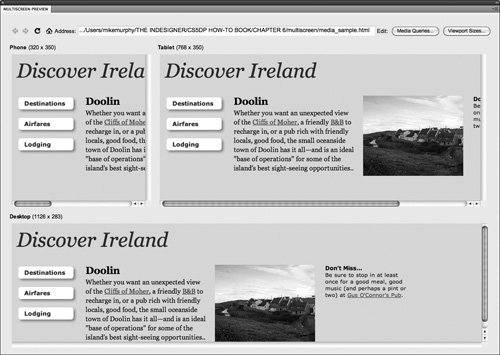
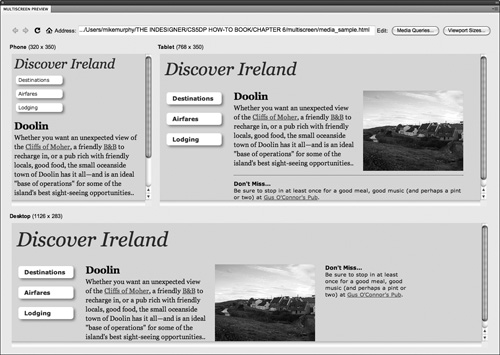
Dreamweaver’s support for media queries includes a feature called Multiscreen Preview. Clicking the Multiscreen button in the document window opens the Multiscreen Preview panel (Figure 60e), where you can see what your page will look like within the confines of three different screen resolutions that correspond to those of a standard desktop browser, tablet, and mobile phone.
Figure 60e. A Web page with no media queries or screen-size-based CSS rules as viewed in Dreamweaver CS5’s Multiscreen Preview panel. The CSS and layout are designed for a desktop-browser’s wider viewport (bottom). In the Tablet viewport (top right), the content to the right of the photo is cut off, and nearly the entire page is cut off in the Phone viewport (top left).
Most tablet or phone browsers would be more likely to shrink the entire page to fit its limited screen width rather than display them as shown in the phone and tablet viewports in Figure 60e, but that would make the text and images too small, and would require the user to zoom in on the parts of the page they want to read, which is also less than desirable.
To optimize the page for multiple devices, the phone.css and tablet.css files called upon by the media queries each contain CSS rules that override specific properties in the main CSS. Only properties that differ need to be defined in these CSS files. For example, the background color does not change for any of the alternate layouts, so it’s defined only in the main CSS file, not the phone or tablet CSS files.
Certain elements, however, do need to be changed. The tablet.css file redefines the div structure to move the text that appears at the far right to below the content area, among other subtle changes. The phone.css file has far more differences, including redefining the padding around the navigation buttons and their overall size, reducing the size of the headline, and setting the display value for the photo to none so it doesn’t appear on mobile devices. All of these differences can be previewed directly within Dreamweaver CS5 from the Multiscreen Preview panel (Figure 60f).
Figure 60f. The same HTML page from Figure 60e displayed in the Multiscreen Preview panel with all of its media queries honored, and all of the screen-size-based CSS3 rules reconfiguring the tablet and phone layouts accordingly.
Media queries are one of the most promising and powerful new features in the developing CSS3 specification, especially considering the explosion of devices currently—or soon arriving—on the market, from smartphones like the iPhone and Droid, to tablets like the iPad and GALAXY Tab. With media queries, a page can be delivered in three completely different configurations from a single HTML file.