9
COLOR CORRECTION: HOW TO GET IT RIGHT
How often do you need to color-correct your video? Chances are, every edit session. The same issues that plague video also affect still photography (especially digital photography). The bad news is that you won’t find a waveform monitor inside Photoshop. The good news is that all of your knowledge about fixing video signals will translate to Photoshop (with a little practice). If you think you’re SOL because you don’t have much experience “onlining” an edit, don’t worry, you’ll be up to speed quickly.
The Five Most Useful Image Adjustments for Video
 1. Levels
2. Curves
3. Hue/Saturation
4. Color Balance
5. Shadow/Highlights
The Approach
When working in Photoshop, the most common type of color correction you will need to perform is scene-to-scene correction. That is to say you will need to bring a variety of shots, from a var iety of sources, closer together. They will need to look as if the same photographer shot them under similar lighting conditions. This is an extremely challenging task if you consider the likelihood that you will pull images from several different stock libraries, client-provided sources, and video frame grabs.
The key when starting out is to work on a copy of the image. This way you always have a copy to return to if something goes wrong. Open the image in question, then choose File>Save As…, and give the corrected version a new name. In fact, this is always a good idea. Image correction is often destructive editing, meaning that you cannot revert to the original state at a later date. Once the modified file is closed and saved, you lose the ability for multiple undos. By preserving an original version, or employing adjustment layers, nondestructive editing is possible.
Color Correction allows you to make important improvements to color and exposure within an image. The top image is the original image; the bottom image has been enhanced.

Choosing a Bit Depth for Color Correction
When fixing images, bit depth is an important consideration. While most Photoshop users are most comfortable working with 8-bit images, there is a strong case to switch to a 16-bit workflow. The extra bit depth gives you more image details (especially in areas such as shadows and highlights). The extra bit depth can also reduce banding and posterization in gradient areas (such as skies). Since most digital cameras and scanners now offer 16-bit modes, be sure to explore this option.
| Mode | Pros | Cons |
| 8-bit | More filters.Faster image processing.Greater compatibility with older video and motion graphic tools. | Banding in gradients.Image can show “wear” more quickly after application of filters or adjustments. |
| 16-bit | Greater range for color and exposure.Allows for more processing of image without visible pixelization. | Larger file sizes.Not as many filters or adjustments available.Overkill for users working with 8-bit video formats. |

Using the Histogram Palette
While Photoshop doesn’t offer the same scopes that you are used to, there is a useful palette that you can leave open. The Histogram palette shows you the data within your image (including the ability to view per-channel data).
Step 1. Choose Window>Histogram.
Step 2. Click the triangular submenu in the upper right corner of the palette and choose All Channels View to see each channel in your image.
Step 3. Leave this palette open as you work on images. We will explore reading a histogram as we work on repairing images in this chapter.

How to Spot a Problem
Color correction, like editing, is a never-ending process. It’s done when the budget runs out, all the time is used up, or the client is satisfied. The end product could always be better if you only had more time/money/processing power. So understand that it is important to be able to spot problems quickly. What sort of problems? There are several. We will analyze the most important tools in Photoshop and evaluate which situations they might help you in. This evaluation will give you a better understanding of color correction.
Levels
There’s a very good reason this image adjustment comes first in the menu. You will need to make a Levels adjustment on every image. The Levels command allows you to correct tonal ranges and color-balance issues. That is to say, that you can fix poor exposure and adjust your white and black point. If you understand the need to white-balance a video camera, the Levels command will soon make sense.
Video #13 Using the Levels Adjustment
 The Levels adjustment is a powerful command that will serve you well. To learn more, see the DVD-ROM for a video tutorial.
Working with a Histogram
The key to understanding the Levels adjustment is the histogram. If you can learn to read this graph, it can serve as a visual guide for adjusting the image. To illustrate this powerful command, let’s try it on an image.
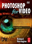
Step 1. Open the file Ch09_Levels1.tif from the chapter’s folder on the DVD-ROM.
Step 2. Launch the Levels dialog by choosing Image>Adjust>Levels or by pressing ![]()
![]() . Make sure that the Preview box is checked so that you can see your changes update.
. Make sure that the Preview box is checked so that you can see your changes update.
By adjusting the black and white input sliders, you can set the black and white points in the image. This can be useful for fixing both the brightness and contrast in the image.
The midtones are way too dark in this image. (Photo by James Ball.)
Step 3. Move the black Input slider to the right until it reaches the rise in the histogram data. This will increase the intensity of the blacks in the image.
Step 4. Move the white Input slider to the left until it reaches the rise in the histogram data. This will increase the intensity of the whites in the image.
By adjusting these to sliders, you have told Photoshop to map the pixels to the values set for black and white in the Output levels area. The pixels that fall in between are adjusted proportionally in order to maintain a proper color balance. For this photo, adjust the Input and Output levels to restore some of the missing contrast in the image. While a separate command exists for brightness and contrast, the Levels adjustment lets you perform several improvements with one adjustment, thus cutting down on quantization (loss of quality) introduced from multiple image processing steps.
Output levels are often clamped for analog video and some nonlinear editing software.

The true power lies in the middle slider. Here you can modify the gamma setting. Effectively, you can use the middle Input slider to change the intensity of the midtones without making dramatic changes to the highlights and shadows. In a sense, you can better expose the picture, adding or subtracting “light” from the midtones. This adjustment is critical to creating a continuous flow between images. Levels adjustments do not offer as many precise adjustment points as Curves adjustments, but they are significantly easier to perform, and they generally create very good results.
Step 5. Adjust the middle Input slider to affect exposure. Pull the slider both left and right to see the changes to the document. Adjust the slider until you are happy with the exposure of the image.

So far you have been making Levels adjustments across all channels evenly. You can choose to isolate your corrections to a specific channel by clicking on the drop-down list of channels. This can be used to remove colorcast issues, such as spill from a background or a photo shot under colored lighting.
Step 6. Switch to the Red channel by choosing it from the drop-down list or by pressing ![]()
![]() .
.
Step 7. Adjust the middle slider for the Red channel to help balance the color in the skin tones.
Adjust the levels for the red channel separately to improve color balance.

This color balancing process can also be automated a bit by using the eyedroppers. Use the black or white eyedroppers to click on an area to define its target color. For example, if you have a blue cast, clicking on a white area with the Set White Point eyedropper will remove the blue cast from the image.
What about all those other buttons?
• The Save and Load buttons can be used to save a color-correction setting. If you have several images from the same camera or photographer that need a common adjustment, you can save that adjustment, then load it back and run it again.
• The Auto button tells Photoshop to attempt to fix the image by making a “best-guess.” I generally recommend avoiding this option unless you are very pressed for time. You will need to make a conscious decision about every image; don’t trust the computer to make accurate, artistic decisions about color.

Curves
Curves aren’t easy, but they are powerful. The Levels adjustment just gives you three control points (highlights, midtones, and shadows). The Curves dialog gives you up to 16 control points, opening significantly more possibilities. One option is to add a single control point and pull it up to lighten the image or down to darken. The adjustment is applied evenly throughout the entire image. Multiple points can be employed for contrast adjustments based on tonal range.
Control Points Made Easy
When the Curves Editor is open, you can automat-ically add control points by ![]() +clicking (
+clicking (![]() +clicking) within the image. The control points will appear in the editor. These can be moved up to lighten or down to darken.
+clicking) within the image. The control points will appear in the editor. These can be moved up to lighten or down to darken.
Let’s take a look at Curves in action. I’ve chosen a grayscale file for the exercise because it is easier to work only on contrast issues when first using Curves. When you feel comfortable with grayscale images, switch to color ones, being sure to keep an eye on color shift.
Step 1. Open the file Ch09_Curves1.tif.


Step 2. Launch the Curves dialog box by choosing Image> Adjust>Curves or by pressing ![]() .
.
Step 3. Under Photoshop CS3 (or newer) click the Curve Display Options triangle and make sure that the Curves is set to Show Amount of Light (0–255). If you are using an older version of Photoshop, click on the small right-hand triangle on the bottom of the x-axis. This will place white at the top and right in the Curves dialog box, thus using the more familiar 0–255 scale.
Currently your curve has two points on it: one representing the black point, the other, the white point. When you add additional curves and move them, you are reassigning values.
Step 4. Click in the middle of the Curve line to a control point at the midpoint, then move that point up (towards the lighter area on the y-axis); the image will lighten. Notice that the input and output values update as you drag.
What differentiates Curves is that you have precise control over what points get mapped, whereas in Levels, you do not. Additionally, a Curves adjustment uses a curved line (rather than Levels’ linear) to make adjustments that are eased through the image. It is possible to create adjustments that are easier to blend in with existing data, as opposed to Levels’ frequent problem of hard clipping.

So how do you know what points to pick? You click on the image itself (actually, ![]() +click on the Mac and
+click on the Mac and ![]() +click for PCs). In the Curves dialog box, you can then move these new points up to lighten or down to darken.
+click for PCs). In the Curves dialog box, you can then move these new points up to lighten or down to darken.
You will notice as you drag on a point that the others react as well. Be careful, because as you add contrast in one area, it is removed from another. Radical adjustments will leave you with an undesirable posterization effect.

Because Curves are so complex, most people use a Curves adjustment layer instead of applying the adjustment directly to the source layer. An adjustment layer affects everything beneath it and has the added ability to support masks and blending modes. The results are just as effective as a trad itional adjustment, but significantly more flexible. We’ll look at adjustment layers in greater detail later in this chapter.

Color Balance
This is a simple yet useful tool. By using the Color Balance command, you can change the overall mixture of colors in a particular tonal range. This is quite useful for generalized color correction. When you think an image is too blue or red, a quick adjustment allows you to tone down specific colors. The adjustment is constrained to the shadows, midtones, or highlights as specified in the dialog box.
Special FX
To create Special FX, try using:
• Curves (with arbitrary settings)
• Channel Mixer (load presets from Photoshop’s Goodies folder)
• Gradient Map
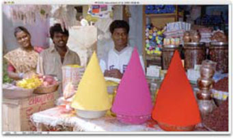
Step 1. Open up the file Ch09_Color_Balance1.tif. Notice how the light from the candles is a bit green?

Step 2. Make sure the composite channel is selected in the Channels palette, or the command won’t work.
Step 3. Launch the Color Balance dialog box, or press ![]() .
.
Step 4. Select the Highlights radio button so the command only affects the brighter areas of the image.
Step 5. Leave the Preserve Luminosity box checked to prevent changing exposure. This option will allow you to maintain tonal balance throughout editing the image.
The original image is too green. A Color Balance adjustment can help.

The new image feels warmer. (Photo by James Ball.)

Step 6. Drag the sliders towards Red and Yellow; those colors will increase while the opposite colors decrease.
Hue/Saturation and Desaturate
These two commands are incredibly important for video graphics. If colors are too saturated, you will need to tone them down. Other wise, you will get “bleeding” onscreen with color data spreading from its original areas into other parts of your graphic. This can severely impact readability and is distracting to the viewer.
Video #14 Fixing Saturation
Fixing saturation problems can be very tricky. See the video tutorial on the DVD-ROM.
Oversaturation Test
How do you know an image is oversaturated? The best way is to import the graphics into your NLE and use features such as Final Cut Pro’s Range Check option. Better yet, put the image onto a vectorscope and see if the image exceeds the target values. If hardware scopes aren’t available, you can purchase software alternatives such as Scopo Gigio from http://www.metadma.com/.
These rich, saturated colors may cause us problems on a video monitor (Photo by James Ball.)
But if you are looking for a built-in option for Photoshop, you’ll need to settle for the NTSC Colors filter. While this filter is designed to fix saturation problems, it generally produces posterization and banding that make it an unacceptable fix. However, it can be used to check whether the image has issues.
Notice color shift in the red and yellow?

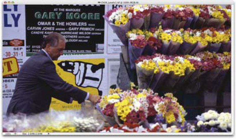
Step 1. Open up the file Ch09_Saturation1.tif.
Step 2. If the bottom-most layer is called Background, double-click and name it so that it’s a floating layer.
Step 3. Create a copy of the photo layer by pressing ![]()
![]() . Make sure that you do not have a selection made.
. Make sure that you do not have a selection made.

Step 4. Run the NTSC Colors filter on the layer. Look for any color shift. In our example, there are two areas that should show up: the juice bottles and the red tower of chalk.
Step 5. Set the filtered layer to Difference blending mode. The problem areas should be quite clear now.
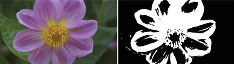
Isolate for Saturation Adjustment
You now need to create a selection matte to isolate the saturation adjustment. You can create this matte by using existing layer data.
Equalize will force the matte.

Step 1. Select (or Link) the two layers.
Step 2. Select the top layer, which is set to Difference mode.
Step 3. Hold down the ![]() or
or ![]() key and choose Merge Layers (or Merge Linked) from the Layer menu. A flattened copy set to Normal mode is now available.
key and choose Merge Layers (or Merge Linked) from the Layer menu. A flattened copy set to Normal mode is now available.
Step 4. Desaturate this new layer by selecting Image>Adjust> Desaturate, or press ![]() .
.
Blur the matte for softer edges in the color correction.

Step 5. You need to expand this matte to make it more useful. To get a larger white area, choose Image>Adjust>Equalize.
This will assign the lightest area to white (255) and the darkest area to black (0). The remaining pixels are dispersed evenly, thus creating a more useful high-contrast layer.
Step 6. Soften the matte by running the Gaussian Blur filter. Choose a value that generates soft edges. Depending on your image’s resolution, this number will vary.
Step 7. Now the high-contrast layer will be used as a selection guide. Switch to the Channels palette (by default, it is docked with Layers. If it isn’t visible, choose Windows>Show Channels).
Step 8. Hold down the ![]() key
key ![]() and click on the layer’s thumbnail. You should now see the appropriate “marching ants.”
and click on the layer’s thumbnail. You should now see the appropriate “marching ants.”
Step 9. Further soften the selection by choosing Select>Feather if desired.
Step 10. Switch back to the layer’s palette; turn off the visibility indicator for the high-contrast matte. Select the photo layer that needs desaturating.
Step 11. Add a Hue/Saturation adjustment layer by choosing Layer> New Adjustment Layer>Hue/Saturation. Click OK to create the layer then make sure the Preview box is checked.
Step 12. Pull down the saturation and lightness sliders in small amounts. If you overdo it, you will get undesirable posterization. Click OK to apply the adjustment. You can double-click the adjustment layer to modify the Hue/Saturation adjustment if needed.
The final image has the oversaturated areas corrected.

Automate Broadcast-Safe Color
The above correction is now available as a prerecorded action. If you have Photoshop CS2 or newer, then load the Video Actions set by clicking on the Actions palette submenu.
Mask Touchup
When touching up mattes, masks, or alpha channels, you will use:
• Levels
• Invert
• Equalize
• Threshold
With experience, you will learn to spot saturation problems visually. You can, however, always use the NTSC Colors filter as a way to spot potential issues.
Exposure
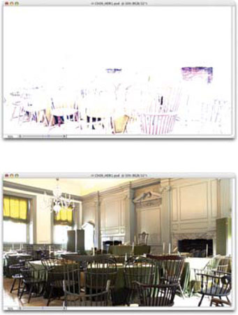
If you are working with 32-bit images, you will turn to the Expos ure command for fixing your images. Generally referred to as High Dynamic Range (HDR), 32-bit images offer great flexibility in exposure. These images are well suited to re-creating the wide range of exposures found in outdoor scenes or intense lighting conditions. This image function usually exists in 32-bit space, and is said to be 32-bit floating point (often shortened to “float”).
HDR images are generally created in one of two ways. First, they can be generated with 3D software tools. The second method requires that the camera be secured firmly to a tripod and that you are careful when triggering or adjusting the camera to not move it. Several photos at various exposures are taken of the same scene (a minimum of three, but usually five to seven is adequate). The camera should have its auto-bracket and ISO features disabled. Each shot should be about two f-stops apart. The user then harnesses the Merge to HDR command (File>Automate>Merge to HDR…) to create the 32-bit image.
We created a HDR image in Chapter 2, so you can use that one. If you skipped that exercise, then open the sample Ch09_HDR1. psd from the chapter’s folder on the DVD-ROM.
Step 1. Open the file Ch09_HDR1.psd. You’ll notice that several features are grayed out. Most image adjustments do not work. Additionally, only Photoshop CS3 Extended allows for the use of layers (including Adjustment Layers).
Step 2. Choose Image>Adjustments>Exposure. This command makes tonal adjustments by performing calculations in a linear color space (gamma 1.0) rather than the current color space. This offers extreme flexibility for future changes, as every adjustment goes back to the original image data in a nondestructive manner.
Step 3. There are three properties than can be modified with the Exposure command:
• Exposure. This modifies the highlight end of the tonal range. It has little effect on the extreme shadows.
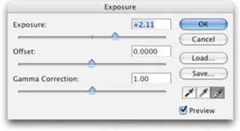
• Offset. This darkens the shadows and midtones of the image. It has little effect on highlights.
• Gamma. This adjusts the gamma of the image.
Step 4. The Exposure command offers three eyedroppers that adjust the image’s luminance values:
• Set Black Point Eyedropper. This sets the Offset, which shifts the selected pixel to zero black.
• Set White Point Eyedropper. This sets the Exposure, which shifts the selected pixel to white (1.0 for HDR images).
• Midtone Eyedropper. This sets the Exposure, which shifts the selected pixel to the middle gray.
Step 5. Apply a dramatic adjustment and Click OK. Let the image blow out, so you can see the flexibility of HDR images.
Step 6. Apply a second Exposure adjustment. Use it to bring the image back into a more accurate exposure. Notice the blown-out areas are restored (this is impossible with 8- or 16-bit images as overexposed data is discarded).
Useful Commands in Brief
Channel Mixer
By using the Channel Mixer, current channels can be combined to form a new channel. This has two distinct purposes:
• Scenario 1. A digital photo had a write error and one of the channels is damaged. You can use the two good channels to create a replacement for the third.
• Scenario 2. You want better grayscales. You can choose the monochromatic option and produce much better grayscales than by simply switching modes or desaturating.
Let’s try the second scenario out and manually create a new grayscale image.
Step 1. Open the file Ch09_Channel_Mixer.tif from the chapter’s folder on the DVD-ROM.

Step 2. Choose Layer>New Adjustment Layer>Channel Mixer… and click OK to create the adjustment layer.
Step 3. Check the Monochrome box and adjust the Red, Green, and Blue sliders to taste. Depending on your source image, you’ll want to emphasize different channels. In general, emphasize Red when skin tones are involved.

Step 4. When satisfied with the new grayscale conversion, click OK.
Step 5. To permanently apply the image adjustment, choose Image>Mode>Grayscale.
Gradient Map
The Gradient Map is an extremely useful effect for stylizing images. With that said, you should always choose to use the Gradient Map adjustment layer instead of the Image Adjustment command.
What does the Gradient Map do? The name says it all; it takes a gradient and then maps it based on luminance values. The effect is particularly useful for colorizing backgrounds and textures. When used on photos, however, it can create some dynamic looks, especially when used with blending modes.
After Effects users have an extremely similar effect too; in AE, it’s called Colorama. To see Gradient Maps in action, open the file Ch09_Gradient_Map.psd and turn on the individual gradient maps.
When Gradient Maps are used as adjustment layers, they can be masked and blended. All of the effects shown used a single Gradient Map. There is no rendering time involved, and the original color data is preserved. (Photo by James Ball.)
Invert
This image adjustment creates an image that is a direct inverse or negative. This is very useful for reversing grayscale images—for example, reversing the masked areas of a layer mask. It can also be used to make a positive from a scanned black-and-white or color negative. When an image is inverted, the brightness of each pixel is assigned the inverse value from the 256 color-values scale. This means that a 0 value would map to 255, while a 15 value would map to 240.

Equalize
If an image appears too dark or washed out, Equalize is the sledgehammer way to pound it into a usable state. The command attempts to redistribute pixels so that they are equally balanced across the entire range of brightness values. You can tell Photoshop to look at the entire image when equalizing, or sample a smaller area that will drive the overall adjustment. The command will take the lightest area and map it to pure white (255) and the darkest area to pure black (0). Since the equalize command uses the full 0–255 range, you will need to adjust levels to keep the image broadcast safe.

Threshold
This command is used to set the “continental divide.” All pixels on one side of the new midpoint are black; the others are white. This adjustment can be used to clean up a mask made from individual channels.
Not-So-Useful Tools
Brightness/Contrast
These controls are an inferior substitute for Levels and Curves, because the overall brightness or darkness is affected. Most of the time, the problem is in the midtones or gamma. A brightness and contrast adjustment will often leave your image washed out. Skip it. While this command has been improved in Photoshop CS3, it is still inferior to a proper Levels or Curves adjustment.
Don’t Bother
Skip these (unless you have no time at all):
• Auto Levels
• Auto Contrast
• Auto Color
• Variations
Replace Color and Selective Color
These are not the most useful commands. Replace Color combines the select color range interface with a fill command. I personally prefer to split this step out and have fine control. The Selective Color command is similar to Color Balance (but not as easy to use) and does not produce the high-quality results that are possible with Levels or Curves. You are better off using the individual Color Range command (Select> Color Range) and then creating a Levels or Curves adjustment layer.
Posterize
Posterization cuts down on the number of colors used, thus producing banding. Reduced color palettes and banding are both extremely poor for video use. Skip the Posterize adjustment.
Even More Problems
 These may introduce new problems to your image:
• Brightness/Contrast
• Replace Color
• Selective Color
• Posterize
Variations
Inexperienced users try Variations. This wizard feels a lot like a visit to the eye doctor with its “more-and-less” approach to image adjustments. While it is initially attractive, it will ultimately leave you wanting more. Don’t bother with this command.
Standard Definition Broadcast-Safe Concerns
Have you ever watched a low-budget commercial on late-night TV? Listen closely, as you may actually hear the graphics. If whites are too hot, the video track bleeds over into the audio track of a broadcast signal. This can also cause problems when tapes are duplicated. It is an accepted industry practice to keep video signals broadcast-safe.

Recently, creating broadcast-safe graphics has gotten trickier. Many video editing tools have begun to automatically adjust graphics to make them broadcast-safe during import. The system will automatically remap the white and black points to a broadcast-safe value. For example, both Premiere Pro and Final Cut Pro will properly interpret a zero black as 7.5 IRE on a Waveform monitor. Avid systems continue to offer you a choice and will ask if the graphics have RGB levels (0–255) or 601 Levels (16–235).
While this can take care of graphics where luminance is the only concern, it generally does not solve the problem of too much saturation. Whenever you adjust an image, you have to be concerned about modifying its colors to the point where they are no longer “broadcast-safe.”

It is important to read the documentation that comes with your video software (or see the guides that come in the Appendixes of this book). If you do need to remap your graphics, then it is better to make this adjustment in Photoshop.
If you need to clamp your graphic to 601 levels, then you’ll want to pull things into the 16–235 broadcast-safe range. In doing so, however, you don’t want to overdo it, so you must monitor the adjustment. By placing targets using the Color Sampler tool (stored in the same well as the Eyedropper and Measure tools), you can monitor the values of white and black.
In the example (Ch09_BSC.tif), I have placed targets on the clouds (for white) and the deepest shadows (for black). In the Info palette, it is clear that these colors are out of the safe range. Add a Levels adjustment layer and set the output levels to 16 and 235. The colors are now in the safe range. You can leave the adjustment layer floating and modify it at any time within Photoshop.

High-Definition Color Space
When creating graphics for high-definition video, you must keep in mind that SD and HD define colors differently. For standard definition, the International Telecommunication Union (ITU) 601 color space is used, while HD normally uses ITU 709. The most common problems occur when conversion occurs between SD and HD video sources. If the codec or video software doesn’t automatically convert the color space, then a slight shift in color will occur.
These color shifts are only visible on a properly calibrated HD monitor that supports the 709 color space. However, most users are not designing with these hooked up so they won’t see the issue.
Fortunately, it is rarely a problem as the color conversion process is fairly transparent and is generally handled internally by the video software application. For example, when Adobe After Effects converts from RGB to Y’CbCr in a video codec, the codec handles the conversion internally. When you export the same After Effects project to both an SD and an HD output, the process should work without issue.
Adjustment Layers
I’ve already mentioned adjustment layers as a helpful tool for pulling down Levels and for use in the Gradient Map feature. Adjustment Layers are the only true way to perform nondestructive editing on an image. The adjustment layer can be blended, masked, or deleted at any time. Additionally, if you double-click on the Adjustment Layer’s thumbnail, the Image Adjustment dialog box comes back. Nearly every image adjustment available in the Image>Adjustments menu and is offered as an Adjustment Layer (the notable exceptions are the Shadow/Highlights, Equalize, Match Color, and Replace Color commands).

Masking Adjustment Layers
If you want to apply an adjustment only to part of a layer, make an active selection as you would for any other change (see Chapter 4, “What About Transparency?”). Then, when you create the Adjustment Layer, it will automatically mask the adjustment to apply only to your selection. It is a good idea to feather the edges of your selection (Select>Modify>Feather) for a more believable adjustment. Otherwise, you will see a hard edge that makes the adjustment very easy to spot.
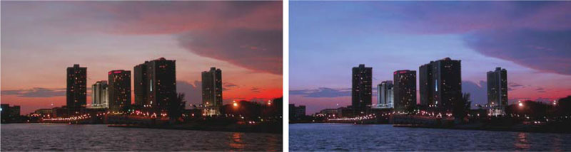
The sign can use a little “punching up.” (Photo by James Ball.)
The new image has a different “feel.” If I change my mind, editing is a double-click away.

Video #15 The Power of Adjustment Layers
Adjustment Layers offer the flexibility you need to edit images non-destructively. Check out the video tutorial on the DVD-ROM.
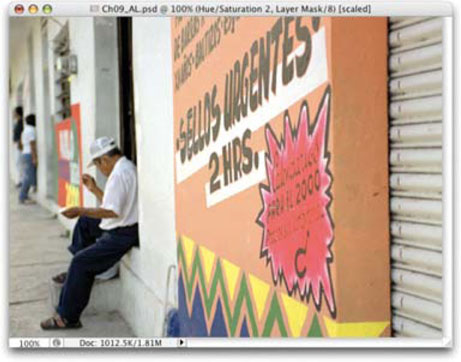
Adjustment Layers can also have gradient masks applied. The Adjustment Layer automatically comes with a mask applied. Just click on its thumbnail (the big, empty white one), and you will see a border around the mask’s icon. You can now add a gradient or hand-painted mask in which to blend the adjustment. To see these two techniques applied, open up the file Ch09_AL_.psd.
Photo Filter Adjustment Layers
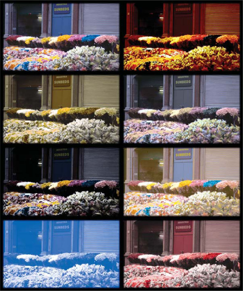
Adobe added to the “real-time” color-correction tools with the introduction of Photo Filter Adjustment Layers. These 20 different adjustments simulate using colored glass filters when the photo was taken. These “filters” can be used to adjust the color balance and color temperature of the light in the scene. Besides the built-in presets, you can also choose custom colors from the Photo Filter interface using the standard color picker.
The filter offers several choices, but they can be simplified into three groupings:
• Warming Filter (85 and LBA) and Cooling Filter (80 and LBB). These are meant to even out photos that were not properly white-balanced. The Cooling Filter (80 or LBB) makes images bluer to simulate cooler ambient light. The Warming Filter (85 or LBA) makes images warmer to simulate hotter ambient light.
• Warming Filter (81) and Cooling Filter (82). These are similar to the previous filters but cast a more distinct color. The Warming Filter (81) makes the image more yellow and the Cooling Filter (82) makes the image bluer.
• Individual colors. The Photo Filter also has several preset colors to choose from. These can be used for two primary purposes: (1) to add a complementary color to a scene to remove color cast, or (2) to introduce a color cast for stylistic reasons.

Let’s try adding a Photo Filter to an image. Open the file Ch09_Photo_Filter1.tif from the chapter’s folder on the DVD-ROM. To apply a Photo Filter, do the following:
Step 1. Ensure that you are on the top-most layer (or above the photo layers) that you want to affect. The image must also be in RGB mode.
Step 2. Click on the adjustment layer icon at the bottom of the Layers palette and choose Photo Filter or choose Layer> New Adjustment Layer>Photo Filter.
Step 3. Be sure the Preview box is checked.
Step 4. Select the Color Option by choosing a preset or defining a custom color.
Step 5. If you don’t want the image to get darker from the adjustment, check the Preserve Luminosity box.
Step 6. Adjust the Density slider to control the intensity of the effect.
Step 7. Click OK. At any point in time, you can double-click on the adjustment layer’s icon to refine the effect.
Color is Easy
Photos that look useless can often be restored quickly. Color problems are one of the easiest things to fix in Photoshop.
Fixing Common Problems
Our next chapter, , “Repairing Damaged Photos,” will tackle more difficult photo damage. Here we will look at six common color problems that will affect you frequently.
Red Eye
I’m not talking about what you have after a late-night editing session. The fill flash bouncing off the back of the eyeball causes red eye. This is a common problem for photos taken with consumer-quality cameras, because the flash and lens are very close together. Dark rooms only aggravate the problem, because the pupils are open wider. If it’s your camera, look for a red eye reduction mode; it will strobe the flash, thus cutting down on the red eye. You can also use a secondary flash with a sync cable if you are using a professional camera.

However, chances are you didn’t take the pictures. Unless the photos are from a visit to the Inferno, you will need to clean up this problem. The discoloration won’t necessarily be red, just look for glowing eyeballs that shouldn’t be there.
Step 1. Open the file Ch09_Red_Eye.tif from the chapter folder on the DVD-ROM.

Step 2. Zoom into the red eye area in the eyes. You only need to select one eye at first. An easy way is to take the Zoom tool and drag around the problem area.
Step 3. Select the Red Eye tool from the toolbox (it is nested with the Healing Brush and Patch tools).
Step 4. Click in the red eye area to remove it. If too little of an area is affected, you will need to undo and modify the tools setting in the option bar. Similarly if too large an area is processed (you’ll notice if the skin around the eyeball turns gray), you’ll want to tweak settings.

Step 5. Adjust the Pupil Size to a higher number if you need to convert a larger area (smaller if too great a range is modified). Adjust the Darken Pupil setting to adjust how dark the pupil will be after the conversion.
Step 6. You may want to touch up the pupil using the Burn tool as well.
Color Cast
Sometimes the light cast conditions are universally off. This could be seen as a blue cast throughout the entire shot. Maybe the wrong filter was used, or the image was not white-balanced. Sometimes the problem is simply at the developing end. (When you go to a one-hour photo center at your local superstore, chances are the machine is on autopilot and is being run by someone with little or no experience.)
Step 1. Open up the file Ch09_Color_Cast.tif, and you will see how easy this is to fix.
Step 2. Examine the photo. Identify a suitable white, gray, and black point. The gray point will be tricky, but you can make multiple attempts.
Step 3. Add a Levels Adjustment Layer.

Step 4. Select the black eyedropper and click on the darkest point in the picture.
Step 5. Select the white eyedropper and click on the lightest point in the picture.
Step 6. Look for a gray point. With the gray eyedropper, click on a gray area that is representative of midtones. It may take a few attempts to find the right point in the picture.
Reset an Adjustment Layer
If you need to reset the adjustment layer hold down the ![]() key and the Cancel button becomes Reset.
key and the Cancel button becomes Reset.
Fixing Shadows and Highlights
One of the most flexible image adjustment commands is called Shadow/Highlight. The purpose of the adjustment is to help salvage images where the subject is silhouetted due to strong backlight. It can also be used to improve subjects who have been washed out by the camera’s flashbulb. The command does not just lighten or darken an image; rather it makes adjustments based on neighboring pixels.
Video #16 Using Shadow/Highlights
The Shadow/Highlight command allows you to fix several problems at once. Be sure to see the video tutorial on the DVD-ROM.
When first opened the tool is too basic, offering just two sliders. However, clicking on the Show More Options box opens this tool up significantly. Let’s give it a try:
Step 1. Open the file Ch09_Shadow_Highlights1.tif.

Step 2. Choose Image>Adjustments>Shadow/Highlight.
Step 3. Be sure that both the Preview box and Show More Options box are checked.
Step 4. Adjust the Shadows and Highlights.
• Amount: How strong of an adjustment is made.
• Tonal Width: Small values affect a smaller region; larger values will begin to include the midtones. If you push these values too high, you will get halos around the images.
• Radius: A tolerance setting that looks at neighboring pixels to determine the affected area.
Step 5. Apply Image Adjustments to improve image quality.
• Color Correction: Essentially adjusts the saturation of the adjusted areas. This allows you to counterbalance washed-out images. This is only available for color images.
• Brightness: If you are working with a grayscale image, Color Correction is replaced by a control for Brightness.
• Midtone Contrast: This command affects missing contrast in the midtones of an image. Negative values reduce contrast, positive values increase contrast.

• Black Clip and White Clip: Raises the black point of shadows and lowers the white point of highlights. This is good to lower the intensity of the effect. You will still want to adjust broadcast-safe levels using the Levels command for finer control.
Step 6. Click Save if you want to reuse the adjustment later, otherwise Click OK.
While this command simplifies the process of fixing shadow/highlight problems, it is not available as an Adjustment Layer. Therefore, it is a destructive editing command, which means you should work with a duplicate file or layer so you can return to the original photo if needed.
Nondestructive Shadow/Highlight Adjustment in CS3
If working in Photoshop CS3, you can use the Shadow/Highlight command nondestructively. You must first turn the photo into a Smart Object (this can be done by right-clicking and choosing Convert to Smart Object). You can then apply the Shadow/Highlight command and make an adjustment. For future changes just double-click the Shadow/Highlight command in the Layers palette.
Skin Tones
It seems like old photos tend to have problems with skin tones. I look back at childhood photos from the 1970s and 1980s, and I know that my skin was never that red. Improvements in film quality and processing have cut down on these color shifts, but the proliferation of digital cameras has made this problem all too prevalent. Picture fading can cause a photo to lighten or darken over time. Generally, this is an even distortion, however, so a slight adjustment is all that is needed.
Step 1. Open up the file Ch09_Skin_Tones.psd.
Over time, the reds in this photo have become too dominant.

Step 2. Add a Levels Adjustment Layer and click Auto. The individual channels have been automatically adjusted. Closer, but not quite right yet.
A proper Levels adjustment makes everything right.

Step 3. Now you can tweak. Switch to each channel by selecting it from the pull-down list at the top of the Levels window. For each channel, adjust the spread of the histogram. Bring the black and white point sliders closer to the pixel spread. Adjust the gamma or midpoint slightly until you are happy with the overall color. You will likely need to take two passes through each channel to get it “just” right.


Tinting a Photo
Imagine that you are working on a project showing different people, and all of your sources are full color, except one. What do you do? Dump it? Look for a tornado to carry you over the rainbow? No, you regress a bit and color it.
This technique is simple, but often overlooked.
Step 1. Create a new layer for each color you need and place the layer in Color mode.
While it can be time consuming, you can hand-paint a grayscale photo to look realistic. Place each color on its own layer and set the layer to Color blending mode.
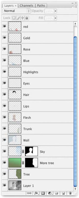
Step 2. Paint on the layer, and it will tint the photo below. Soften the colors with the occasional use of Dodge, Burn, Blur, and Smudge. Be sure to isol ate each color on a separate layer so you have better control over the image.
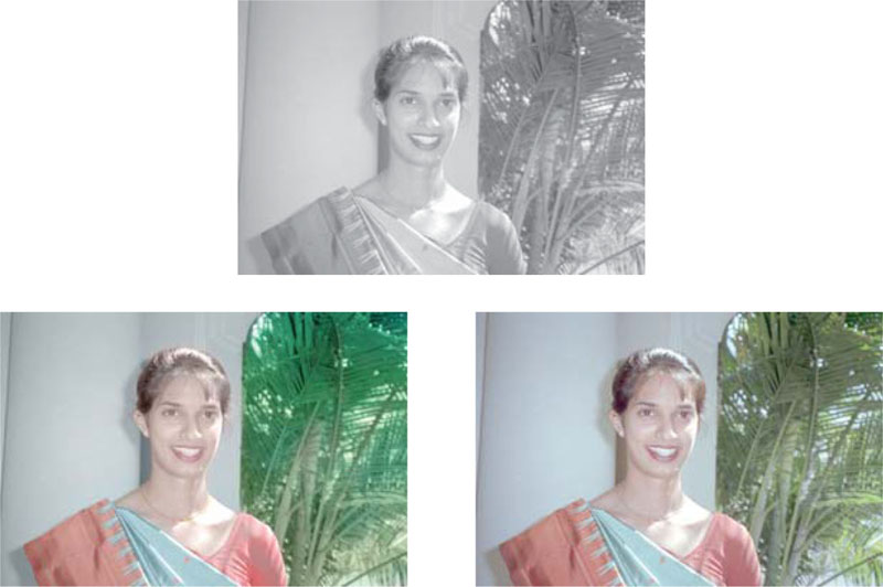
To see this technique open the image Ch09_Recolor.psd from the chapter’s folder.
Can you spot the fake? The top picture is actually a hand-colored grayscale version. The original photo is on the lower right. (Photo by James Ball.)
Hands On | 09
Enhancing Still Images for Video—with Jayse Hansen
As an editor or motion graphic artist, you will often be sent still images to include in your video. These images will often be rather uninspiring and may not fit the overall mood of your video. By harnessing some basic techniques, images can quickly be made to look more professional and meaningful using Photoshop.
For example, you might be tasked with creating a somber biographical video about an individual. The client hands you a box of mismatched photos. Some are color, some are black and white, and some are an awful orange color from the seventies. Simply adding these photos “as-is” to your video would make the end result look messy, inconsistent and amateur.
Therefore, in order to make the video piece have a uniform quality—we want to adjust the photos so they all have a similar look to them. Because this hypothetical piece is somber, we will make the photos a classic sepia-toned. Keep in mind, however, that this same process can be used to create wildly different looks and variations.

You’ll find Exercise 09 on the DVD-ROM.
PROfile: Glen Stephens

Glen Stephens is an experienced broadcast designer who makes time to actively contribute to the Photoshop community. Stephens is the developer of Tools for Television, a Photoshop add-on that brings many features that are needed for broadcast design. He also contributes a monthly column on video graphics to Photoshop User Magazine (www.photoshopuser.com).
“I’ve spent many years studying and researching to find resources and techniques that help me as a designer for video,” said Stephens. “Because Photoshop users in the video industry are hard to come by, those sharing resources and tips are equally elusive. This is why I do everything I can to make the learning process easier for those eager to expand their skills.”
Stephens would not be in a position to offer all of this advice if he were not actively involved in the production community. To get his designs done, Stephens relies heavily on Photoshop.
“Photoshop is my scratch pad and design platform. In most situations, the images for projects, lower thirds, opens, bumpers and closes are all created or conceptualized in Photoshop. If the client doesn’t want or require any animation then Photoshop is my final output. If motion is needed then to After Effects and Motion I go,” said Stephens. “All photographs, scans, digital images, frame grabs, or any clipart that are used in my composites always get color corrected, and stylized in Photoshop before it is used anywhere.”
Stephens also uses Photoshop’s superior text handling to complement his Final Cut Pro editing system. “Photoshop is my character generator. All of my lower thirds, full screen images, Over-The-Shoulder graphics are all created in Photoshop.”
Stephens sees a definite need for any video pro to focus on Photoshop. In fact he sees it as the single most important complement to any video application.
“In my opinion, it is critical to anyone’s career. Doesn’t matter what industry you are in, Photoshop will be there. Even if it is only a supplemental application for you, learn it,” said Stephens. “Many times Photoshop is all you have, and the more you know the less you will turn to other applications for other tasks. It is the single most powerful image creation/manipulation tool and failing to learn it is career suicide.”
Stephens also encourages you to try the Tools for Television PRO package. “I may have written and created it, but I use the tools on it everyday!”
While the process of learning may be challenging due to time constraints and workload, Stephens encourages editors and graphic artists to push themselves further.
“Take seminars, classes, read, interface with others, and just get in and use Photoshop. Then learn After Effects, Illustrator, Motion, Final Cut Pro, and any other desktop video/graphic tool you can,” said Stephens. “The more you know, the more marketable you will be, and the quicker you can get your work done and surprise your client with fresh ideas and the correct execution of them.”
Stephens’ web sites are http://www.pixelpoststudios.com and http://www.toolsfortelevision.com. He is always open to ideas, input and suggestions for products and tools that make graphic design easier and more intuitive. He is also available for training, consulting and graphic design contracting for a wide variety of broadcast and video projects. For questions, suggestions, or good old work you can contact him at [email protected].
