
Chapter 5. Color Correction

I cannot pretend to be impartial about the colors. I rejoice with the brilliant ones, and am genuinely sorry for the poor browns.
–Winston Churchill
No skill is as essential for a compositor as the ability to authoritatively and conclusively take control of color, such that foreground and background elements seem to inhabit the same world, shots from a sequence are consistent with one another, and their overall look matches the artistic direction of the project.
The compositor, after all, is typically the last one to touch a shot before it goes into the edit. Inspired, artistic color work injects life, clarity, and drama into standard (or even substandard) 3D output, adequately (or even poorly) shot footage, and flat, monochromatic stills. It draws the audience’s attention where it belongs, never causing them to think about the compositing at all.
Good compositors are credited with possessing a “good eye,” but color matching is a skill that you can practice and refine even if you have no feel for adjusting images—indeed, even if you consider yourself color blind.
And despite that new color tools appear each year to refine your ability to dial in color, for color matching in After Effects, three color correction tools do most of the heavy lifting: Levels, Curves, and Hue/Saturation (and because Levels and Curves overlap in their functionality, in many cases you’re just choosing one or two of the three). These endure (from the earliest days of Photoshop, even) because they are stable and fast, and they will get the job done every time—just learn how to use them, and keep practicing.
A skeptic might ask:
• Why these old tools with so many cool newer ones?
• Why not use Brightness & Contrast to adjust, you know, brightness and contrast, or Shadow and Highlight if that’s what needs adjustment?
• What do you mean I can adjust Levels even if I’m color blind?
This chapter holds the answers to these and many more questions. First, we’ll look at optimizing a given image using these tools, and then move into matching a foreground layer to the optimized background, balancing colors. The goal is to get you away from hacking away, to build skills that eliminate some of the guesswork and enable artistry.
This chapter introduces topics that resound throughout the rest of the book. Chapter 11, “32 Bit HDR Compositing and Color Management,” deals specifically with HDR color, and then Chapter 12, “Light,” focuses on specific light and color scenarios, while the rest of Section III describes how to create specific types of effects shots.
Optimized Levels
What constitutes an “optimized” clip? What makes a color corrected image correct? Let’s look at what is typically “wrong” with source footage levels and the usual methods for correcting them, laying the groundwork for color matching. As an example, we’ll balance brightness and contrast of a plate image, with no foreground layers to match.
The term “plate” stretches back to the earliest days of optical compositing (and indeed, of photography itself) and refers to the source footage, typically the background onto which foreground elements will be composited. A related term, “clean plate,” refers to the background with any moving foreground elements removed; its usage is covered in the following chapter.
Levels
Levels may be the most-used tool in After Effects, and yet it’s rare to find detailed descriptions of how best to use it. It consists of five basic controls—Input Black, Input White, Output Black, Output White, and Gamma—each of which can be adjusted in five separate contexts (the four individual image channels R, G, B, and A, as well as all three color channels, RGB, at once). There are two different ways to adjust these controls: via their numerical sliders or by dragging their respective carat sliders on the histogram. The latter is the more typical method for experienced users.
Contrast: Input and Output Levels
Four of the five controls—Input Black, Input White, Output Black and Output White (Figure 5.1)—determine brightness and contrast, and combined with the fifth, gamma, they offer more precision than is possible with the effect called Brightness & Contrast.
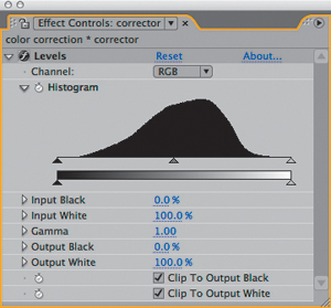
Figure 5.1. Possibly the most used “effect” in After Effects, Levels consists of a histogram and five basic controls per channel; the controls are typically adjusted using the triangles on the histogram, although the corresponding numerical/slider controls appear below.
Two check boxes at the bottom of the Levels effect controls specify whether black and white levels “clip” on output. These are checked on by default, and until you work in HDR (Chapter 11), you might as well ignore their very existence; they handle values beyond the range that your monitor can display.
Figures 5.2a and b show a Ramp effect applied to a solid using the default settings, followed by the Levels effect. Move the black caret at the lower left of the histogram—the Input Black level—to the right, and values below its threshold (the numerical Input Black setting, which changes as you move the caret) are pushed to black. The further you move the caret, the more values are “crushed” to pure black.
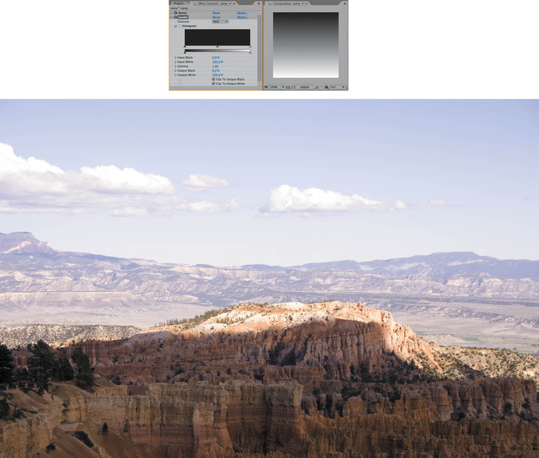
Figures 5.2a and b. Levels is applied to a layer containing a Ramp effect at the default settings, which creates a smooth gradient from black to white (a); this will be the basis for understanding what the basic color correction tools do. You can create this for yourself or open 05_colorCorrection.aep, which also contains the image (b).
Compositing is science as well as art, and so this section employs a useful scientific tool: the control, which is a study subject that eliminates random or hidden variables. This control for the Levels effect is a grayscale gradient I generated with the Ramp effect. You can often set up similar experiments to clarify your understanding of computer graphics applications.
Move the Input White carat at the right end of the histogram to the left, toward the Input Black caret. The effect is similar to Input Black’s but inverted: more and more white values are “blown out” to pure white (Figure 5.3).
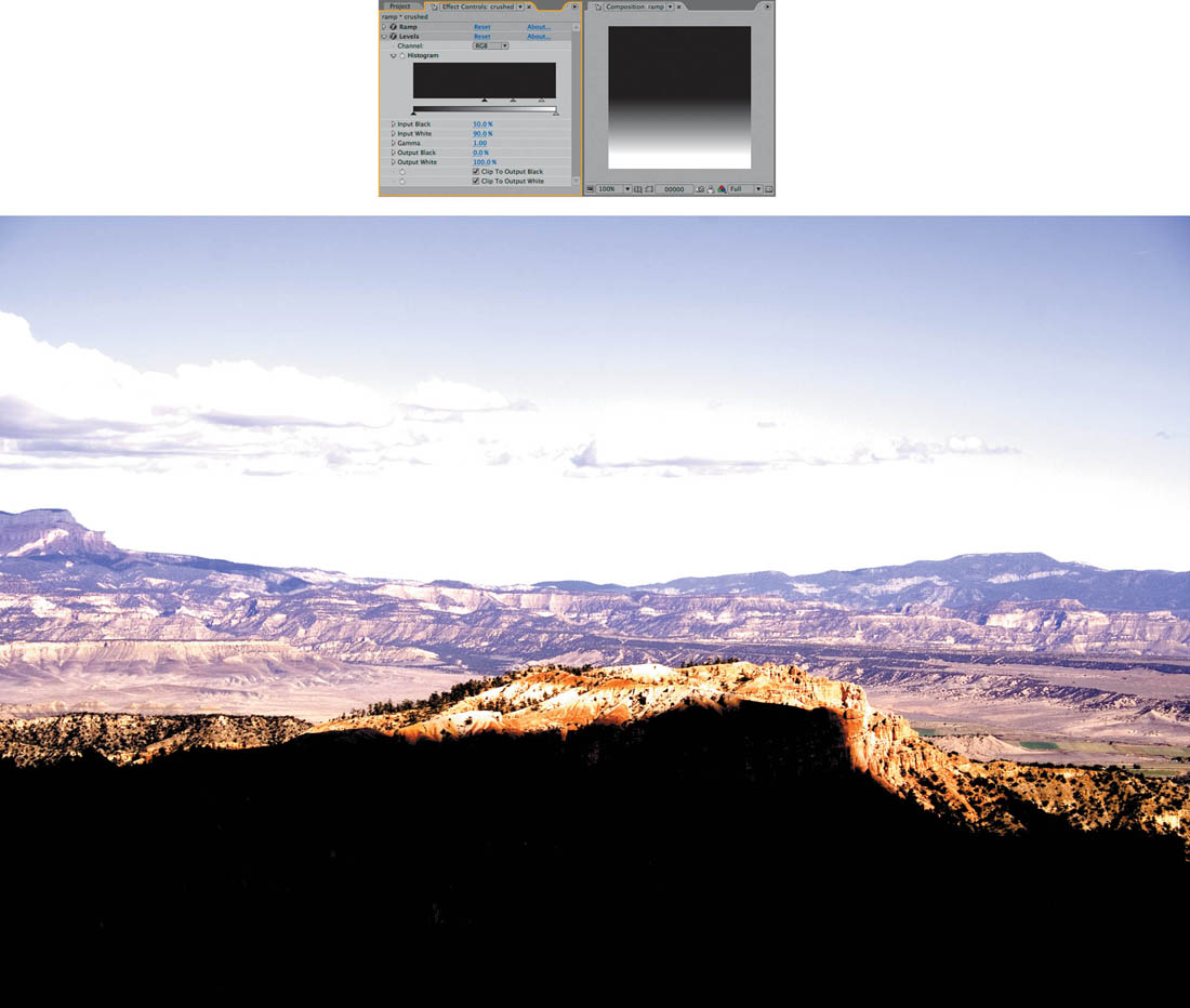
Figure 5.3. Raising Input Black and lowering Input White has the effect of increasing contrast at either end of the scale; at an extreme adjustment like this, many pixels are pushed to full white or black (in an 8-bpc or 16-bpc project).
Either adjustment effectively increases contrast, but note that the midpoint of the gradient also changes if one is adjusted further than the other. In Figure 5.3 Input Black has been adjusted more heavily than Input White, causing the horizon of the gradient to move closer to white and more of the image to turn black. You can re-create this adjustment with Brightness & Contrast (Figure 5.4), but to do so you must adjust both contrast and brightness, with no direct control of the midpoint (gamma) of the image.
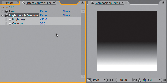
Figure 5.4. You can use Brightness & Contrast to match the look of Figure 5.3’s gradient, mostly because it has no gamma adjustment.
![]() Close-Up: Why Not Brightness & Contrast?
Close-Up: Why Not Brightness & Contrast?
The Brightness & Contrast effect is like training wheels compared to Levels. It contains two sliders, one for each property. Raising the Contrast value above 0.0 causes the values above middle gray to move closer to white and those below the midpoint to move closer to black, in proportion. Lower it and pixels turn gray. The Brightness control offsets the midpoint of any contrast adjustment, allowing a result like that in Figure 5.4.
So what’s the problem? Almost any image needs black and white adjusted to a different degree, and Brightness & Contrast allows this only indirectly; this can make adjustment a game of cat and mouse, as illustrated in Figures 5.5a, b, and c. Add to that the fact that there is no histogram or individual Channel control, and it becomes a lot like playing the piano with mittens on.
Figures 5.5a, b, and c. The source (a) was balanced for the sky, leaving foreground detail too dark to make out. Raising Brightness to bring detail out of the shadows makes the entire image washed out (b); raising Contrast to compensate completely blows out the sky (c). Madness.
Reset Levels (click Reset at the top of the Levels effect controls) and try the same experiment with Output Black and Output White, whose controls sit below the little gradient. Output Black specifies the darkest black that can appear in the image; adjust it upwards and the minimum value is raised.
You can reset any individual effect control by context-clicking it and choosing Reset. You know it’s individual if it has its own stopwatch.
Similarly, lowering Input White is something like dimming the image, cutting off the maximum possible white value at the given threshold. Adjust both and you effectively reduce contrast in the image; with them close together, the gradient becomes a solid gray (Figure 5.6).

Figure 5.6. Raising Output Black and lowering Output White reduces contrast in the dark and light areas of the image, respectively; they will come into play in the Matching section.
Note that you can even cross the two carets; if you drag Output White all the way down, and Output Black all the way up, you have inverted your image (although the more straightforward way to do this typically is to use the Channel: Invert effect).
Evidently the Input and Output controls have the opposite effect on their respective black and white values, when examined in this straightforward fashion. However, there are even situations where you would use them together.
As is the case throughout After Effects, the controls are operating in the order listed in the interface. In other words, raising the Input Black level first crushes the blacks, and then a higher Output Black level raises all of those pure black levels as one (Figure 5.7). It does not restore the black detail in the original pixels; the blacks remain crushed, they all just become lighter.

Figure 5.7. Black and white levels crushed by adjusting the Input controls aren’t then brought back by the Output controls, which instead simply limit the overall dynamic range of the image, raising the darkest possible black level and lowering the brightest possible white.
If you’re thinking, “So what?” at this point, just stay with this—the controls are being broken down to build up an understanding.
Brightness: Gamma
As you adjust the Input Black and White values, you may have noticed the third caret that maintains its place between them. This is the Gamma control, affecting midtones (the middle gray point in the gradient) at the highest proportion and black and white, not at all. Adjust it over the gradient and notice that you can push the grays in the image brighter (by moving it to the left) or darker (to the right) without changing the black and white levels.
Many images have healthy contrast, but a gamma boost gives them extra punch. Similarly, an image that looks a bit too “hot” may be instantly adjusted simply by lowering gamma. As you progress through the book, you will see that it plays a crucial role not only in color adjustment but also in the inner workings of the image pipeline itself (more on that in Chapter 11).
In most cases, the histogram won’t itself offer much of a clue as to whether the gamma needs adjusting, or by how much (see “Problem Solving using the Histogram,” for more on the topic). The image itself provides a better guide for how to adjust gamma (Figure 5.8).

Figure 5.8. The image from Figure 5.2 is improved with a boost to gamma using Curves (explained ahead); the indication that this is a good idea comes not from the histogram, which looks fine, but from the image itself, which lacks foreground detail.
So what is your guideline for how much you should adjust gamma, if at all? I first learned to adjust too far before dialing back, which is especially helpful when learning. An even more powerful gamma adjustment tool that scares most novice artists away is Curves (more on this later).
By mixing these five controls together, have we covered everything there is to know about using Levels? No—because there are not, in fact, five basic controls in Levels (Input and Output White and Black plus Gamma), but instead, five times five (RGB, Red, Green, Blue, and Alpha).
Individual Channels for Color Matching
In baseball, most hitters are “hackers,” unable to discern when to swing at a pitch in the fraction of a second when it approaches the plate. A very few gifted hitters, even at the professional level, can actually discern a pitch as it approaches the plate at 90+ miles per hour; Barry Bonds is the ultimate example, and I say that not only as a beleaguered Giants fan. If you color correct images without looking at individual color channels, you’re only hacking, but if you develop the habit of adjusting on individual color channels, you’ll swing like Barry (with or without the stimulants).
![]() Close-Up: Geek Alert: What Is Gamma, Anyway?
Close-Up: Geek Alert: What Is Gamma, Anyway?
It would be so nice simply to say, “gamma is the midpoint of your color range” and leave it at that. The more accurate the discussion of gamma becomes, the more obscure and mathematical it gets. There are plenty of artists out there who understand gamma intuitively and are able to work with it without knowing the math behind it or the way the eye sees color midtones, but here’s the basic math, just in case.
Gamma adjustment shifts the midpoint of a color range without affecting the black or white points. This is done by taking a pixel value and raising it to the inverse power of the gamma value, like so:
newPixel = pixel (1/gamma)
You’re probably used to thinking of pixel values as being 0 to 255, but this formula works only if they are normalized to 1. In other words, all 255 values occur between 0 and 1, so 0 is 0, 255 is 1, and 128 is .5—which is the “normal” way the math is done behind the scenes.
Why does it work this way? Because of the magic of logarithms: Any number to the power of 0 is 1, any number to the power of 1 is itself, and any fractional value (less than 1) raised to a higher power approaches 0 without ever reaching it. Lower the power closer to 0 and the value approaches 1, again without ever reaching it. Not only that, but the values distribute proportionally, along a curve, so the closer an initial value is to pure black (0) or pure white (1) the less it is affected.
To try this for yourself, all you need is After Effects and a Web browser. Create a 255×255 comp and switch the Info panel to Decimal values (in the panel menu). Enter a Gamma value of .25, divide that value into 1 (result is 4) and at www.google.com search on .5^4, then check to see if the result matches the value you see by placing your cursor over the center of frame. Now try a gamma value of 2.0; divide it into 1 and you get .5, go to Google and try searching on .5^.5. The values will line up.
Many After Effects artists completely ignore that pull-down menu at the top of the Levels control that isolates red, green, blue, and alpha adjustments, and even those who do use it once in a while may do so with trepidation; how can you predictably understand what will happen when you adjust the five basic Levels controls on an individual channel? The gradient again serves as an effective learning tool to ponder what exactly is going on.
Reset the Levels effect applied to the Ramp gradient once more. Pick Red, Green, or Blue in the Channel pull-down of Levels and adjust the Input and Output carets. Color is introduced into what was a purely grayscale image. With the Red channel selected, by moving Red Output Black inward, you tint the darker areas of the image red. If you adjust Input White inward, the midtones and highlights turn pink (light red). If, instead, you adjust Input Black or Output White inward, the tinting goes in the opposite direction—toward cyan, in the corresponding shadows and highlights. As you probably know, on the digital wheel of color, cyan is the opposite of red, just as magenta is the opposite of green and yellow is the opposite of blue (a sample digital color wheel and a visual guide to how levels adjustments operate on individual channels are included on the book’s disc).
Gradients are one thing, but the best way to make sense of this with a real image is to develop the habit of studying footage on individual color channels as you work. This is the key to effective color matching, detailed ahead.
Along the bottom of the Composition panel, all of the icons are monochrome by default save one: the Show Channel pulldown. It contains five selections: the three color channels as well as two alpha modes. Each one has a shortcut that, unfortunately, is not shown in the menu: Alt+1 through Alt+4 (Option+1 through Option+4) reveal each color channel in order. These shortcuts are toggles, so reselecting the active channel toggles RGB. A colored outline around the edge of the composition palette reminds you which channel is displayed (Figure 5.10).
![]() Close-Up: Same Difference: Levels (Individual Controls)
Close-Up: Same Difference: Levels (Individual Controls)
Both Levels and Levels (Individual Controls) accomplish the exact same task. The sole difference is that Levels lumps all adjustments into a single keyframe property, which expressions cannot use. Levels (Individual Controls) is particularly useful to
• Animate and time Levels settings individually
• Link an expression to a Levels setting
• Reset a single Levels property (instead of the entire effect)
Levels is more commonly used, but Levels (Individual Controls) is sometimes more useful.
Try adjusting a single channel of the gradient in Levels while displaying only that channel. You are back on familiar territory, adjusting brightness and contrast of a grayscale image. This is the way to work with individual channel adjustments, especially when beginning or if at all color blind. As you work with actual images instead of gradients, the histogram can show you what is happening in your image.
The Levels Histogram
You might have noticed the odd appearance of the histogram applying Levels to a default Ramp. If you were to try this setup on your own, depending on the size of the layer to which you applied Ramp, you might see a histogram that is flat along the top with spikes protruding at regular intervals (Figures 5.9a and b).

Figures 5.9a and b. Strange-looking histograms. A colored solid (a) shows three spikes, one each for the red, green, and blue values, and nothing else. With Ramp (b) the distribution is even, but the spikes at the top are the result of the ramp not being an exact multiple of 255 pixels, causing certain pixels to recur more often than others.
An often overlooked feature of Levels is that it allows direct adjustment of brightness, contrast, and gamma of the grayscale transparency channel (Alpha Channel). More on this in Chapter 6, “Color Keying.”
The histogram is exactly 256 pixels wide; it is effectively a bar chart made up of 256 single pixel bars, each corresponding to one of the 256 possible levels of luminance in an 8-bpc image (these levels are displayed below the histogram, above the Output controls). In the case of a pure gradient, the histogram is flat because luminance is evenly distributed from black to white; if spikes occur in that case, it’s because the image is not exactly 255 pixels high (or some exact multiple of 256, minus one edge pixel because the Ramp controls default to the edges of the layer), making it slightly uneven at 8 bits per channel.
In any case, it’s more useful to look at real-world examples, because the histogram is useful for mapping image data that isn’t plainly evident on its own. Its basic function is to help you assess whether any color changes are liable to help or harm the image. There is in fact no one typical or ideal histogram—they can vary as much as the images themselves, as seen back in Figure 5.8.
Moving Input White and Input Black to the edges of the histogram is similar to what the Auto Levels effect does. If that by itself isn’t enough to convince you to avoid using Auto Levels, or the “Auto” correctors, consider also that they are processor intensive (slow) and resample on every frame (so the result is not consistent from frame to frame, which isn’t generally what you want).
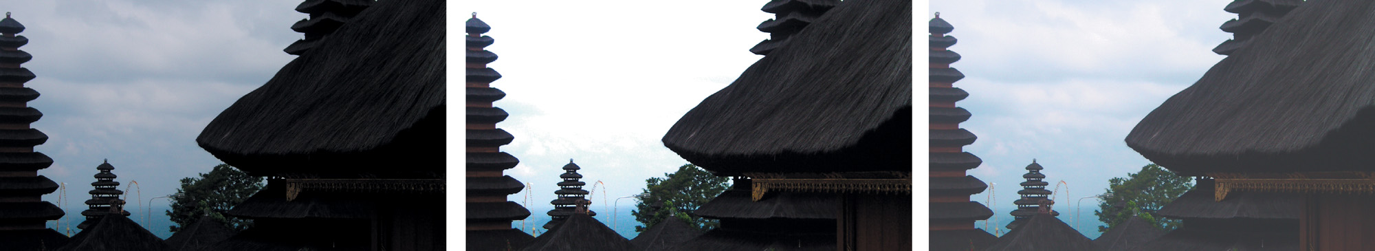
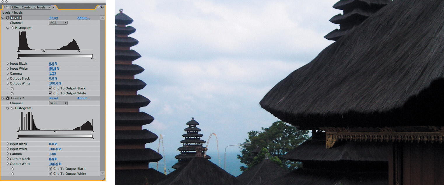
Despite that fact, there’s a simple rule of thumb for a basic contrast adjustment. Find the top and bottom end of the RGB histogram—the highest and lowest points where there is any data whatsoever—and bracket them with the Input Black and Input White carets. To “bracket” them means to adjust these controls inward so each sits just outside its corresponding end of the histogram (Figure 5.10).The result stretches values closer to the top or bottom of the dynamic range, as you can easily see by applying a second Levels effect and studying its histogram (Figure 5.11).
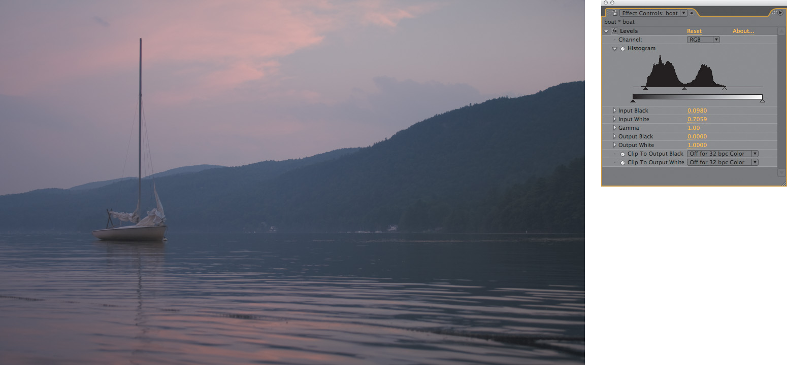
Figure 5.10. Here is a perfect case for bringing the triangle controls corresponding to Input Black and Input White in to bracket the edges of the histogram, increasing contrast and bringing out vibrant colors without losing detail.
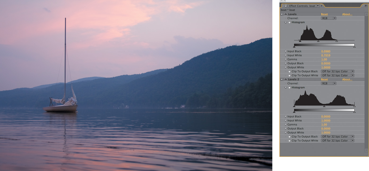
Figure 5.11. Adding a second Levels effect to this image’s histogram only reveals the result of the prior adjustment; levels now extend to each end of the contrast spectrum.
Try applying Levels to any image or footage from the disc and see for yourself how this works. First crush the blacks (by moving Input Black well above the lowest black level in the histogram) and then blow out the whites (moving Input White below the highest white value). Don’t go too far, or subsequent adjustments will not bring back that detail—unless you work in 32-bpc HDR mode (Chapter 11). Occasionally a stylized look will call for crushed contrast, but generally speaking, this is bad form.
Footage is by its very nature dynamic, so it is a good idea to leave headroom for the whites and foot room for the blacks until you start working in 32 bits per channel. Headroom is particularly important when anything exceptionally bright—such as a sun glint, flare, or fire—enters frame.
Black and white are not at all equivalent, in terms of how your eye sees them. Blown-out whites are ugly and can be a dead giveaway of an overexposed digital scene, but your eye is much more sensitive to subtle gradations of low black levels. These low, rich blacks account for much of what makes film look like film, and they can contain a surprising amount of detail, none of which, unfortunately, would be apparent on the printed page.
The occasions on which you would optimize your footage, making it look best, by raising Output Black or lowering Output White controls are unusual, as this lowers dynamic range and the overall contrast. However, there are many uses in compositing for lowered contrast, to soften overlay effects (say, fog and clouds), high-contrast mattes, and so on. More on that later in this chapter and throughout the rest of the book.
Problem Solving using the Histogram
As you’ve no doubt noticed, the Levels histogram does not update as you make adjustments. After Effects lacks a panel equivalent to Photoshop’s Histogram palette, but you can, of course, apply a Levels effect just for the histogram, if only for the purposes of learning (as was done in Figure 5.11).
Many current displays, and in particular flat-panels and projectors, lack the black detail that can be produced on a good CRT monitor or captured on film. The next time you see a projected film, notice how much detail you can see in the shadows and compare.
The histogram reveals a couple of new wrinkles in the backlit shot from Figure 5.5, now adjusted with Levels to bring out foreground highlights (Figures 5.12a and b). At the top end of the histogram the levels peak into a spike. This may indicate clipping and a loss of image detail.
Figures 5.12a and b. In the first instance of Levels (a), Gamma is raised and the Input White brought in to enhance detail in the dark areas of the foreground (b). The second instance is applied only to show its histogram.
At the other end of the scale is the common result of a Gamma adjustment: a series of spikes rising out of the lower values like protruding hash marks, even though a 16-bpc project prevents quantization. Raising Gamma stretches the levels below the midpoint, causing them to clump up at regular intervals. As with crushing blacks and blowing out highlights—the net effect is a loss of detail, although in this case, the spikes are not a worry because they occur among a healthy amount of surrounding data. In more extreme cases, in which there is no data in between the spikes whatsoever, you may see a prime symptom of overadjustment, banding (Figure 5.13).
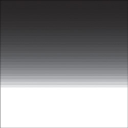
Figure 5.13. Push an adjustment far enough and you may see quantization, otherwise known as banding in the image. Those big gaps in the histogram are expressed as visible bands on a gradient. Switching to 16 bpc from 8 bpc is an instant fix for this problem in most cases.
Banding is typically the result of limitations of 8-bit color, and 16-bit color mode was added to After Effects 5.0 specifically to address that problem. You can switch to 16 bpc by Alt-clicking (Option-clicking) on the bit-depth identifier along the bottom of the Project panel (Figure 5.14) or by changing it in File > Project Settings. Chapter 11 explains more.
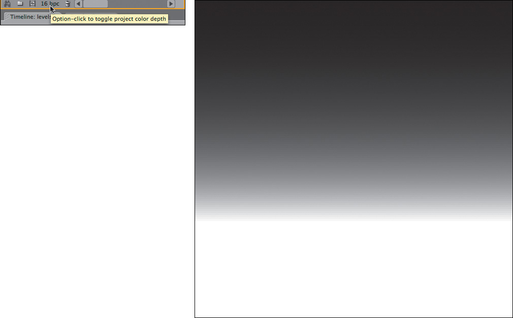
Figure 5.14. An entire project can be toggled from the default 8-bit color mode to 16-bit mode by Alt-clicking (Option-clicking) the project color depth toggle in the Project panel; this prevents the banding seen in Figure 5.13.
Perfecting Brightness with Curves
Curves rocks. I heart curves. The Curves control is particularly useful for gamma correction, because
• Curves lets you fully (and visually) control how adjustments are weighted and roll off.
• You can introduce multiple gamma adjustments to a single image or restrict the gamma adjustment to just one part of the image’s dynamic range.
• Some adjustments can be nailed with a single well-placed point in Curves, in cases where the equivalent adjustment with Levels might require that you coordinate three separate controls.
It’s also worth understanding Curves controls because they are a common shorthand for how digital color adjustments are depicted; the Curves interface recurs not only in all of the other effects compositing packages but also in more sophisticated tools within After Effects, such as Color Finesse (discussed briefly later in this chapter).
Curves does, however, have drawbacks, compared with Levels:
• It’s not immediately intuitive, it can easily yield hideous results if you don’t know what you’re doing, and there are plenty of artists who aren’t comfortable with it.
• Unlike Photoshop, After Effects doesn’t offer numerical values corresponding to curve points, making it a purely visual control that can be hard to standardize.
• Without a histogram, you may miss obvious clues about the image (making Levels more suitable for learners).
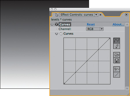
The most daunting thing about Curves is clearly its interface, a simple grid with a diagonal line extending from lower left to upper right. There is a Channel selector at the top, set by default to RGB as in Levels, and there are some optional extra controls on the right to help you draw, save, and retrieve custom curves. To the novice, the arbitrary map is an unintuitive abstraction that you can easily use to make a complete mess of your image. Once you understand it, however, you can see it as an elegantly simple description of how image adjustment works. You’ll find the equivalent Curves graph to the Levels corrections on the book’s disc.
Figure 5.15 shows the more fully featured Photoshop Curves, which illustrates a little better how the controls work.

Figure 5.15. Photoshop’s more deluxe Curves includes a histogram, built-in presets, displays of all channels together, and fields for input and output values for a given point on the curve.
Figures 5.16a through d show some basic Curves adjustments and their effect on an image. Figures 5.17a through f use linear gradients to illustrate what some common Curves settings do. I encourage you to try these on your own.
Figures 5.16a The source image.
Figures 5.16b An increase in gamma above the shadows.

Figures 5.16c A decrease in gamma.
Figures 5.16d Both corrections combined.
Figures 5.16a through d. What you see in an image can be heavily influenced by gamma and contrast.
Figures 5.17a The default gradient and Curves setting.
Figures 5.17b An increase in gamma.

Figures 5.17c A decrease in gamma.
Figures 5.17d An increase in brightness and contrast.

Figures 5.17e Raised gamma in the highlights only.

Figures 5.17f Raised gamma with clamped black values.
Figures 5.17a through f. This array of Curves adjustments applied to a gradient shows the results of some typical settings.
More interesting are the types of adjustments that only Curves allows you to do—or at least do easily. I came to realize that most of the adjustments I make with Curves fall into a few distinct types that I use over and over, and so those are summarized here.
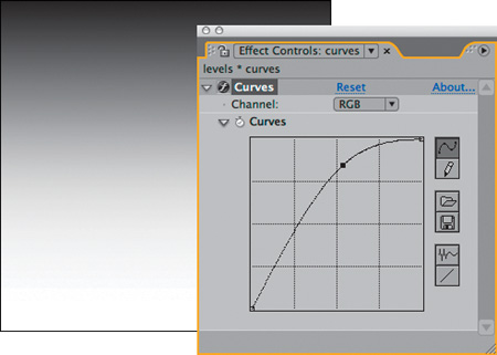
The most common adjustment is to simply raise or lower the gamma with Curves, by adding a point at the middle of the RGB curve and then moving it upward or downward. Figure 5.18 shows the result of each. This produces a subtly different result from raising or lowering the Gamma control in Levels because of how you control the roll-off (Figure 5.19).
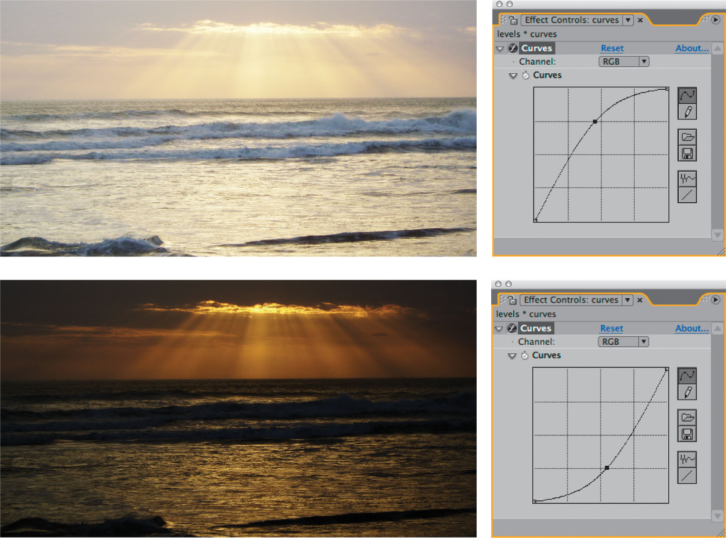
Figure 5.18. Two equally valid gamma adjustments employ a single point adjustment in the Curves control. Dramatically lit footage particularly benefits from the roll-off possible in the highlights and shadows.
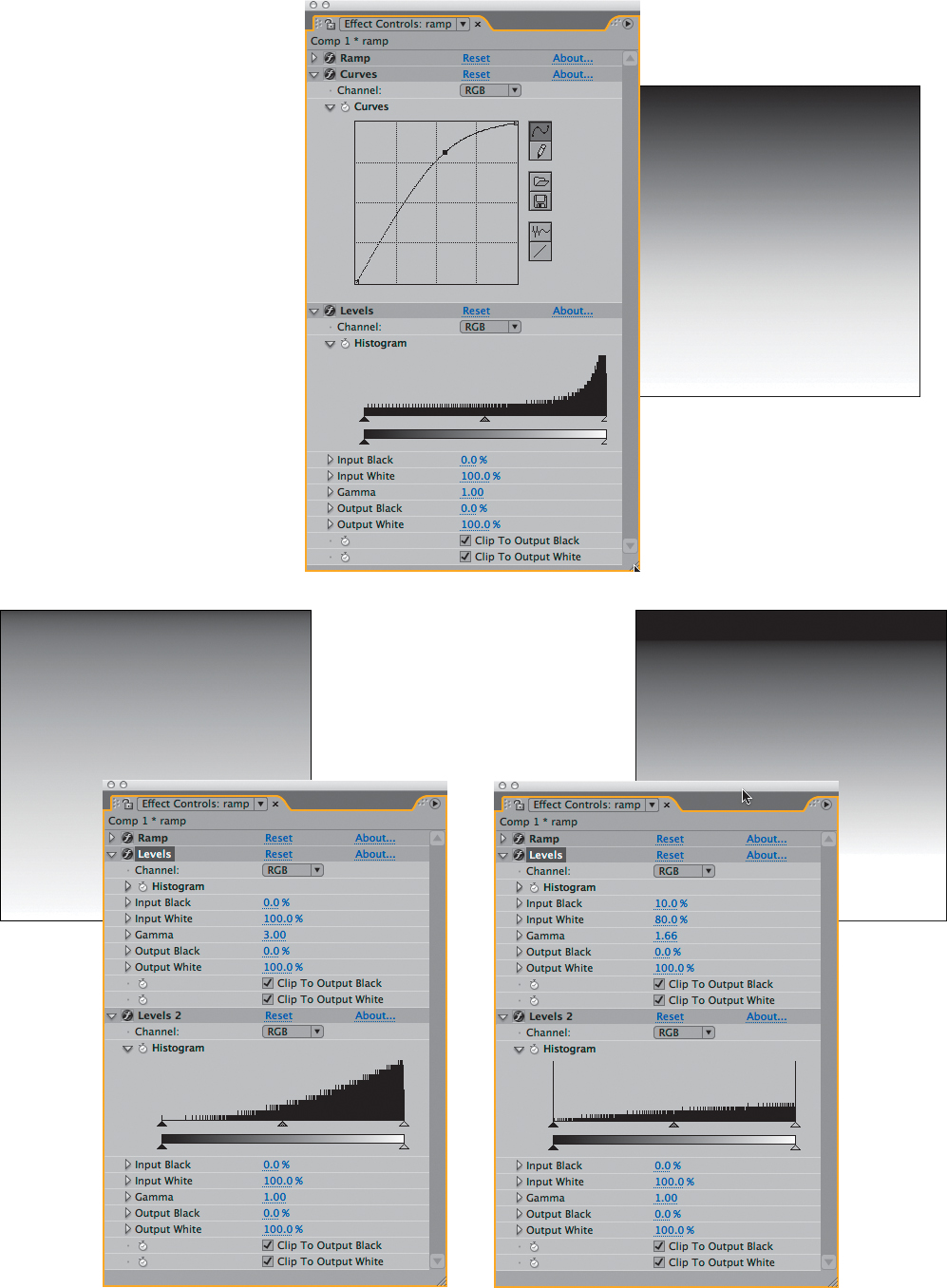
Figure 5.19. Both the gradient itself and the histogram demonstrate that you can push the gamma harder, still preserving the full range of contrast, with Curves rather than with Levels, where you face a choice between losing highlights and shadows somewhat or crushing them.
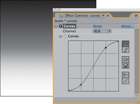
Figure 5.16b weights the gamma adjustment to the high end by adding a point to hold the shadows in place. The classic S-curve adjustment, which enhances brightness and contrast and introduces roll-offs into the highlights and shadows (Figure 5.20) is an alternative method to get the result of the double curves in Figure 5.16d.

Figure 5.20. The classic S-curve adjustment: The midpoint remains the same, but contrast is boosted.
Some images need a gamma adjustment only to one end of the range—for example, a boost to the darker pixels, below the midpoint, that doesn’t alter the black point and doesn’t brighten the white values. Such an adjustment requires three points (Figure 5.21):
• One to hold the midpoint
• One to boost the low values
• One to flatten the curve above the midpoint
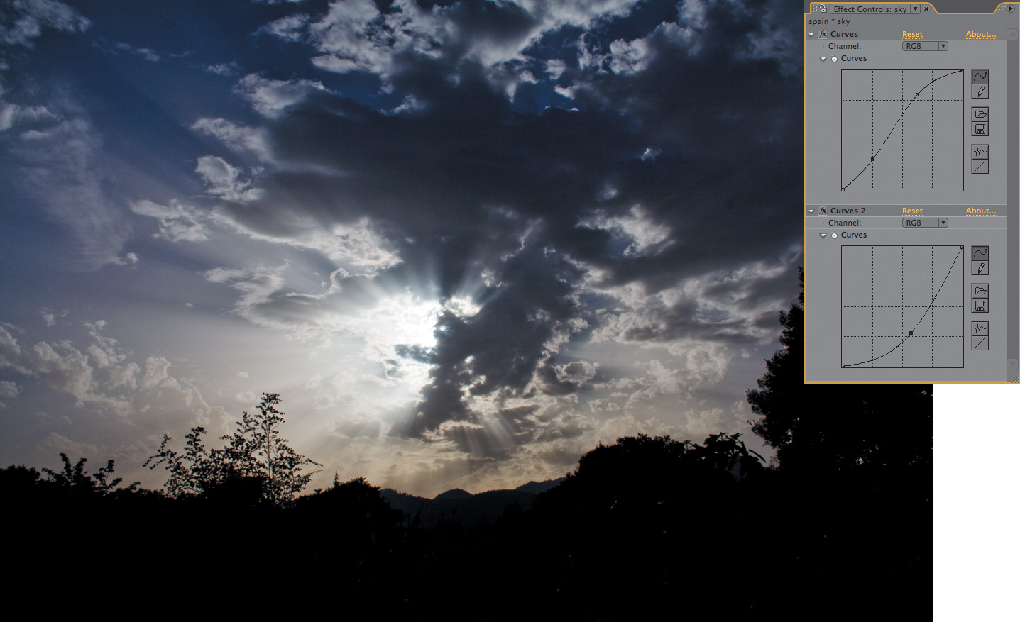
Figure 5.21. The ultimate solution to the backlighting problem presented back in Figure 5.5: Adding a mini-boost to the darker levels while leaving the lighter levels flat preserves the detail in the sky and brings out detail in the foreground that was previously missing.
A typical method for working in Curves is to begin with a single point adjustment to adjust gamma or contrast, then modulate it with one or two added points. More points quickly become unmanageable, as each adjustment changes the weighting of the surrounding points. Typically, I will add a single point, then a second one to restrict its range, and a third as needed to bring the shape of one section back where I want it. The images used for the figures in this section are included as single stills on the book’s disc for your own experimentation; open 05_colorCorrection.aep to find them.
Just for Color: Hue/Saturation
The third of three essential color correction tools in After Effects is Hue/Saturation. This one has many individualized uses:
• Desaturating an image or adding saturation (the tool’s most common use)
• Colorizing images that were created as grayscale or monochrome
• Shifting the overall hue of an image
• De-emphasizing, or knocking out completely, an individual color channel
All of these uses recur in Chapters 12 through 14, to create monochrome elements, such as smoke, from scratch.
Chapter 12 details why Tint, not Hue/Saturation, is the right tool to convert an entire image to grayscale.
The Hue/Saturation control allows you to do something you can’t do with Levels or Curves, which is to directly control the hue, saturation, and brightness of an image. The HSB color model is merely an alternate slice of RGB color data. All real color pickers, including the Apple and Adobe pickers, handle RGB and HSB as two separate but interrelated modes that use three values to describe any given color.
In other words, you could arrive at the same color adjustments using Levels and Curves, but Hue/Saturation gives you direct access to a couple of key color attributes that are otherwise difficult to get at. To desaturate an image is essentially to bring the red, green, and blue values closer together, reducing the relative intensity of the strongest of them; a saturation control lets you do this in one step, without guessing.
Often is the case where colors are balanced but merely too “juicy,” and lowering the Saturation value somewhere between 5 and 20 can be a direct and effective way to make an image adjustment come together (Figure 5.22). It’s essential to understand the delivery medium as well, because film is more tolerant and friendly to saturated images than television.

Figure 5.22. For footage already saturated with color, even a subtle boost to gamma or contrast can send saturation over the top. There’s no easy way to control this with RGB tool, such as Levels and Curves, but moving over to the HSB model allows you to single out saturation and dial it back.
The other quick fix that Hue/Saturation affords you is a shift to the hue of the overall image or of one or more of its individual channels. The Channel Control menu for Hue/Saturation includes not only the red, green, and blue channels but also their chromatic opposites of cyan, magenta, and yellow. When you’re working in RGB color, these secondary colors are in direct opposition, so that, for example, lowering blue gamma effectively raises the yellow gamma, and vice versa.
When in doubt about the amount of color in a given channel, try boosting its Saturation to 100%, blowing it out—this makes the presence of that tone in pixels very easy to spot.
The HSB model includes all six individual channels, which means that if a given channel is too bright or over-saturated, you can dial back its Brightness & Saturation levels, or you can shift Hue toward a different part of the spectrum without unduly affecting the other primary and secondary colors. This is even an effective way to reduce blue or green spill (Chapter 6).
More Color Tools and Techniques
This section has laid the foundation for color correction in After Effects using its most fundamental tools. The truth, of course, is that there are lots of ways to adjust the color levels of an image, with new ones emerging all the time. Alternatives used to create a specific look—layering in a color solid, creating selections from an image using the image itself along with blending modes, and more—are explored in Section III of this book.
One alternative usage of these basic color correction tools is to apply them via an adjustment layer, because you can then dial them back simply by adjusting the layer’s opacity, or hold them out from specific areas of the image using masks or track matte selections.
Color Finesse
Color Finesse is a sophisticated color correction system included with After Effects Professional; unfortunately, it runs as a separate application, and does not allow you to see your corrections in the context of a composite, making it more suitable for overall color adjustments. Furthermore, it is made up mostly of tools that resemble the ones described in the preceding section, so you’d still want to master them. And although I love the way it allows easy isolation and adjustment of specific secondary color ranges, I rarely use it for compositing because of how separate it is from the After Effects workflow (other ways of isolating color for adjustment are revealed throughout Section II of the book).
The previous edition of this book mentioned that Adobe Premiere Pro includes a Three-Way Color Corrector that is supported with an equivalent effect in After Effect. This effect appears only if applied in a Premiere Pro project that you then import into After Effects, however, where it then lacks the color wheel UI. This effect is still not directly available in After Effects CS3.
Three-Way Color
What has been sorely missing from After Effects is a three-way color corrector, typically featuring color wheels to adjust three distinct color ranges: shadows, midtones, and highlights. Look at any contemporary feature film or major television show and you’re likely to find strong color choices that strongly deviate from how the original scene must have looked: In an ordinary day-lit scene the shadows might be bluish, the midtones green, and the highlights orange.
Chapter 12 includes a “roll your own” recipe and Animation Preset for cheap and cheerful three-way color correction.
A third-party tool, Magic Bullet Colorista, has recently been released by Red Giant Software to make this type of correction quick and intuitive in After Effects (Figure 5.23); a demo version is included on the book’s disc. This type of tool can be essential to finish the color look of a project, although the more tried-and-true tools will work every time when matching colors, discussed next.

Figure 5.23. The hot After Effects plug-in for color work as of this writing is Colorista; the simple and intuitive color wheels make it easy to perform radical color surgery such as this day-for-night effect (detailed in Chapter 12).
Color Matching
Having examined the color correction tools in depth, it’s now time for the bread and butter of compositing: to match foreground and background elements so that the scene appears to have been taken with the same basic light conditions.
Although it requires artistry to do well, this is a learnable skill with measurable objective results. The process obeys such strict rules that you can do it without an experienced eye for color. Assuming the background (or whatever source element you’re matching) has already been color-graded, you even can satisfactorily complete a shot on a monitor that is nowhere near correctly calibrated.
How is that possible?
As with so much visual effects work, the answer is derived by correctly breaking down the problem. In this case, the job of matching one image to another obeys rules that can be observed channel by channel, independent of the final, full-color result.
Of course, effective compositing is not simply a question of making colors match; in many cases that is only the first step. You must also obey rules you will understand from the careful observation of nature described in the previous chapter. And even if your colors are correctly matched, if you haven’t interpreted your edges properly (Chapter 3) or pulled a good matte (Chapter 6), or if such essential elements as lighting (Chapter 12), the camera view (Chapter 9), or motion (Chapter 8) are mismatched, the composite will not succeed.
These same basic techniques will work for other situations in which your job is to match footage precisely—for example, color correcting a sequence to match a hero shot (the one determined to have the right color juju), a process also sometimes known as color timing.
The Fundamental Technique
Integration of a foreground element into a background scene often follows the same basic steps:
1. First match overall contrast without regard to color, using Levels. When matching the black and white points, pay attention to atmospheric conditions.
2. Next, study individual color channels and use Levels to match the contrast of each channel (as needed—not all images contain so fundamental a color imbalance).
3. Match the color of the midtones (gamma), channel by channel, using Levels or Curves. This is sometimes known as gray matching and is easiest when an object in the background scene is known to be colorless gray (or something close).
4. Evaluate the overall result for other factors influencing the integration of image elements—lighting direction, atmospheric conditions, perspective, grain or other ambient movement, and so on (all of which and more are covered in this book).
The overall approach, although not complicated or even particularly sexy, can take you to places your naked eye doesn’t readily understand when looking at color. Yet, when you see the results, you realize that nature beats logic every time.
The sad truth is that even an experienced artist can be completely fooled by the context of the image. Figures 5.24a, b, and c show an example in which seeing is most definitely not believing. Therefore you should not feel that working channel by channel is some kind of crutch. The results of your color adjustments will undoubtedly be challenged by other members of your production team, and when it comes time to review them channel by channel, it’s pretty cool to be able to say you got it right.

Figures 5.24a, b, and c. There are no yellow dots in 5.24a, and no blue dots in 5.24b; the four dots shown in 5.24c are identical to their counterparts in the other two images.
Ordinary Lighting
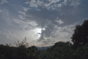
We begin with a simple example: inserting a 3D element lit with ordinary white lights into a daylight scene. As you can see in Figure 5.25, the two elements are close enough in color range that a lazy or hurried compositor might be tempted to leave it as is.

Figure 5.25. An unadjusted foreground layer (the plane) over a day-lit background.
With only a few minutes of effort, you can make the plane look as though it truly belongs there. Make sure the Info palette is somewhere that you can see it, and for now, choose Percent (0–100) in that palette’s wing menu to have your values line up with the ones discussed here (you can, of course, use whatever you want, but this is what I’ll use for discussion in this section).
This particular scene is a good beginner-level example of the technique because it is full of elements that would appear monochromatic under white light; next we’ll move on to scenes that aren’t so straightforward. The background is dominated by colorless gray concrete, and the foreground element is a silver aircraft.
Begin by looking for suitable black and white points to use as references in the background and foreground. In this case, the shadow areas under the archways in the background, and underneath the wing of the foreground plane, are just what’s needed for black points—they are not the very darkest elements in the scene, but they contain a similar mixture of reflected light and shadow cast onto similar surfaces, and you can expect them to fairly nearly match. For highlights, you happily have the top of the bus shelter to use for a background white point, and the top silver areas of the plane’s tail in the foreground are lit brightly enough to contain pure white pixels at this point.
Figure 5.26 shows the targeted shadow and highlight regions and their corresponding readings in the Info palette. The shadow levels in the foreground are lower (darker) than those in the background, while the background shadows have slightly more red in them, giving the background warmth absent from the unadjusted foreground. The top of the plane and bus shelter each contain levels at 100%, or pure white, but the bus shelter has lower blue highlights, giving it a more yellow appearance.
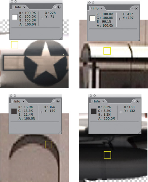
Figure 5.26. The target highlight and shadow areas for the foreground and background are outlined in yellow; levels corresponding to each highlight (in Percent values, as set in the panel menu) are displayed in the adjacent Info palette.
To correct for these mismatches, apply Levels to the foreground and move the Output Black slider up to about 7.5%. This raises the level of the blackest black in the image, lowering the contrast.
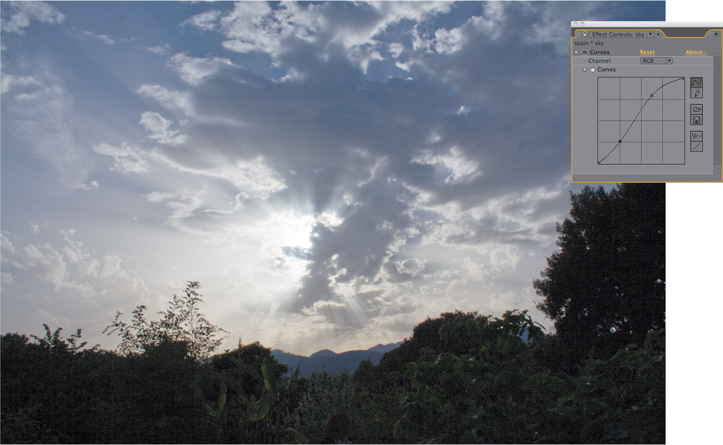
Having aligned contrast, it’s time to balance color. Because the red levels in the background shadows are higher than blue or green, switch the Composition panel to the red channel (click on the red marker at the bottom of the panel or use the Alt+1/Option+1 shortcut), causing a thin red line to appear around the viewer. You can now zoom in on an area that shows foreground and background shadows (Figure 5.27).

Figure 5.27. Evaluate and match black and white levels; start with RGB and then work on each color channel individually. In this case the image is “green matched:” The RGB adjustment is all that is needed for the green channel (often the best channel to match using RGB instead of its individual channel).
Black levels in the red channel are clearly still too low in the foreground, so raise them to match. Switch the Channel pop-up in Levels to Red, and raise Red Output Black slightly to about 3.5%. You can move your cursor from foreground to background and look at the Info palette to check whether you have it right, but the great thing about this method is that your naked eye usually evaluates variations in luminance correctly without the numerical reference.
Now for the whites. Because the background highlights have slightly less blue in them, switch to the blue channel (clicking the blue marker at the bottom of the Composition panel or using Alt+3/Option+3). Pull back slightly to where you can see the top of the bus shelter and the back of the plane. Switching Levels to the blue channel, lower the Blue Output White setting a few percentage points to match the lower blue reading in the background. Back in RGB mode (Alt+3/Option+3 toggles back from blue to RGB), the highlights on the plane take on a more sunlit, yellow quality. It’s subtle, but it seems right.
What about the midtones? In this case, they’re taking care of themselves because both the foreground and background are reasonably well balanced and these corrections are mild.
The human eye is more sensitive to green than red and blue. Often, when you look at a shot channel by channel, you will see the strongest brightness and contrast in the green channel. For that reason, a sensible approach to matching color may be to get the overall match in the ballpark so that the green channels match perfectly, and then adjust the other two channels to make green work. That way, you run less risk of misadjusting the overall brightness and contrast of your footage.
Figure 5.28 displays the result, with the same regions targeted previously, but with the levels corrected. To add an extra bit of realism, I also turned on motion blur, without yet bothering to precisely match it (something you will learn more about in Chapter 8, “Effective Motion Tracking”). You see that the plane is now more acceptably integrated into the scene.

Figure 5.28. This is a better match, particularly in the shadow areas; motion blur helps sell the color adjustment as well.
Work on this composite isn’t done either; besides matching the blur, you can add some sun glints on the plane as it passes, similar to those on the taxi. On the other hand, you can tell that the blur on the plane is too heavy for the pilot’s absence from the cockpit to be noticeable, a good example of how an initial pass at a composite can save a lot of extra work.
Dramatic Lighting
Watch a contemporary feature film objectively for color and you may be shocked at how rare ordinary day-lit scenes such as the plane example are. Dramatic media—not just films but television and theater—use color and light to create mood, to signify key characters and plot points, and more.
Therefore a scene dominated by a single color, such as Figure 5.29, is much more commonly found in dramatic films than it is in your everyday family snapshots. One of the main reasons films take so long to shoot is that the cinematographer and lighting director require the time and resources to get the lighting the way it needs to be to create an image that is both beautiful and serves the story.
(Image courtesy Shuets Udono via Creative Commons license.)
Figure 5.29. This is the unembellished source lighting of this shot.
The foreground element added in Figure 5.30 clearly does not belong in this scene; it does not even contain the scene’s dominant color, and is white-lit. That’s fine; it will better demonstrate the effectiveness of this technique.
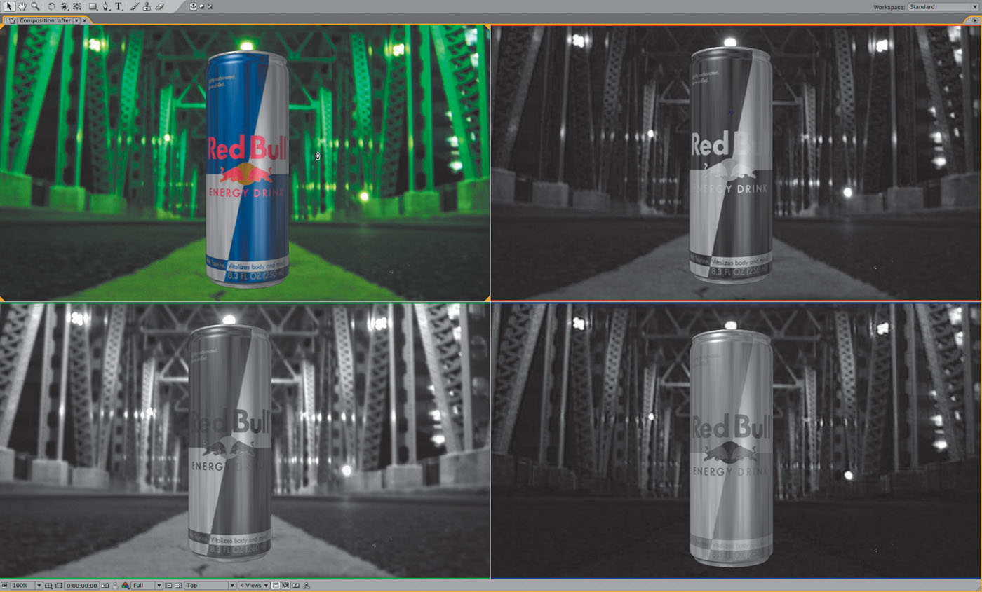
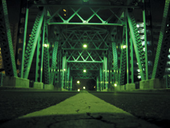
Figure 5.30. Not only is it clear that the can does not belong in the color environment of the background, the mismatch is equally apparent on each color channel.
Note that both the foreground and the background elements have some areas that you can logically assume to be flat gray. The bridge has concrete footings for the steel girders along the edges of the road, while the can has areas of bare exposed aluminum.
This section discusses colors expressed as percentages; to see the same values in your Levels effect, use the wing menu of the Info palette to choose Percent for the Color Display.
To play along with this game, open the project 05_colorMatching2.aep and apply Levels to the foreground layer in the “before” composition (“after” is the final comp to which you can refer as needed once you’ve tried this on your own).
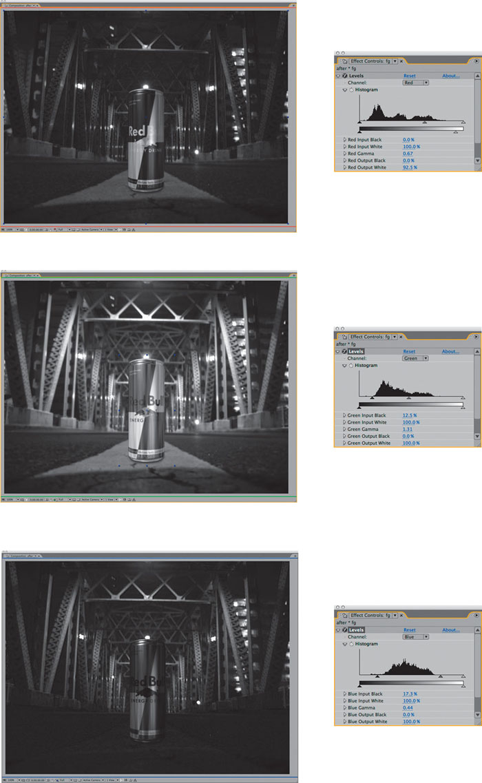
Switch both your Composition view (Alt+1/Option+1) and the Channel pulldown in Levels to Red. I’ll warn you now that the most challenging thing about this technique will be remembering to keep both settings on the same color channel, which is why using a four-up setup as shown in Figure 5.33 is probably worth the trouble.
Now, let’s pretend that the red channel is a black-and-white photograph in which you’re using the red channel of the Levels effect to match the foreground to the background. Clearly, the foreground element is far too bright for the scene. Specifically, the darkest silver areas of the can are way brighter than the brightest areas of the concrete in the background. Therefore, adjust the gamma down (to the right) until it feels more like they inhabit the same world; in my example, I’ve adjusted Red Gamma way down to 0.67. Now cut down the red highlights a little; bring Red Output White down to about 92.5% or whatever looks right to you. The end result should look like a black-and-white photo whose elements match (Figure 5.31a).
Figures 5.31a, b, and c. It’s actually fun to pull off an extreme match like this channel-by-channel. The Levels settings used were not really derived from the histogram, but by a mixture of looking for equivalent black/white/midpoints in the image, as well as just analyzing whether the result looks like a convincing black and white image on each channel.
Now move the Levels Channel and Composition view (Alt+2/Option+2) over to green. Green is the dominant color here, and its black contrast and brightness are much higher in the background. Therefore, raise Green Input Black to about 12.5% (for the contrast) and Green Gamma to something like 1.3 (Figure 5.31b). Better than copying my levels, try to find these on your own.
Finally, switch Levels and the Composition viewer (Alt+3/Option+3) to the Blue channel. Whoa; there is almost no match here. The can is way brighter and more washed out than the background. Again the Input Blue Level must come up, to about 17.5%, but this time gamma has to come way down, ending up at about 0.45%. Now the can looks believably like it belongs there (Figure 5.31c).
It’s strange to make all of these changes without ever looking at the result in full color. So now, go ahead and do that. Astoundingly, that can is now in range of looking like it belongs in that scene; defocus it slightly with a little fast blur and add a shadow and you start to believe it. Make any final contrast adjustments on the Levels RGB Channel, and you have an impressive result that required no guesswork whatsoever (Figure 5.32).

Figure 5.32. The result includes a subtle shadow that has also been color matched as well as a final adjustment to the white contrast.
When There’s No Clear Reference
The previous examples have contained fairly clear black, white, and gray values in the foreground and background elements. Life, of course, is not always so simple.
Figure 5.33 is a scene that lacks any obvious gray values to match; the lighting is so strong, it’s hard to tell what color anything in the scene was originally, or whether there were any neutral black, white or gray items in the scene.
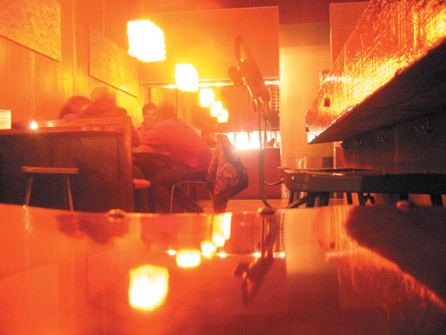
(Image courtesy Jorge L. Peschiera via Creative Commons license.)
Figure 5.33. What the heck is going on here? Again, the source image is as it was shot. Examine some of your favorite films and you may find scenes lit this dramatically; the eye quickly becomes accustomed to strong shifts of color, but the color can also be used to strike a subconscious chord.
The technique still works in this case, but it may require more in the way of trial and error, or artist’s intuition. Looking at each individual color channel, only green is even close to a plausible match right off the bat; the red channel contains blown-out whites, and the blue channel is so dark (and grainy) it hardly exists.
It’s often a good idea to take a break when trying to finalize fine color adjustment. When you come back, even to a labored shot, you regain an immediate impression that can save you a lot of noodling.
Once again, just try to get the brightness and contrast adjusted, working channel by channel, and you get an initial result something like Figure 5.34. Considering how subjective the adjustments are by necessity in this case, this isn’t half bad; and fine adjustments to the RGB channel can bring it where it needs to go.
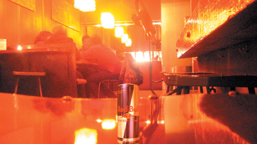
Figure 5.34. This one requires as much intuition as logic, but adjusting it channel by channel still yields a striking result.
The ability to match color without seeing an image in full color is so powerful that it can seem almost magical the first few times you try it. Why, then, do so few artists work this way? I would have to say that laziness and ignorance are the main culprits here. Switching channels seems like a pain, and few untrained artists clearly realize that color works like this.
Gamma Slamming
Maybe you’ve seen an old movie on television—the example I think of first is Return of the Jedi (before the digital re-release)—in which you see black rectangular garbage mattes dancing around the Emperor’s head, inside the cloak, that you obviously shouldn’t be seeing. Jedi was made prior to the digital age, and some of the optical composites worked fine on film, but when they went to video, subtleties in the black levels that weren’t previously evident suddenly became glaringly obvious.
Don’t let this happen to you! Now that you know how to match levels, put them to the test by slamming the gamma of the image. To do this, you need to make a couple of adjustment layers. I usually call one slam up and the other slam down, as in the examples. Be sure that both of these are guide layers so that they have no possibility of showing up in your final render.
To slam up, apply Curves with the gamma raised significantly (Figure 5.35). This exposes any areas of the image that might have been too dark to distinguish on your monitor; if the blacks still match with the gamma slammed up, you’re in good shape.

Figure 5.35. Slamming gamma is like shining a bright light on your scene. Your black and midtone levels should still match when viewed at these extremes.
Similarly, and somewhat less crucial, you can slam down by lowering the gamma and bringing the highlights more into the midrange (Figure 5.35). All you’re doing with these slams is stretching values that may be difficult for you to distinguish into a range that is easy for you to see.
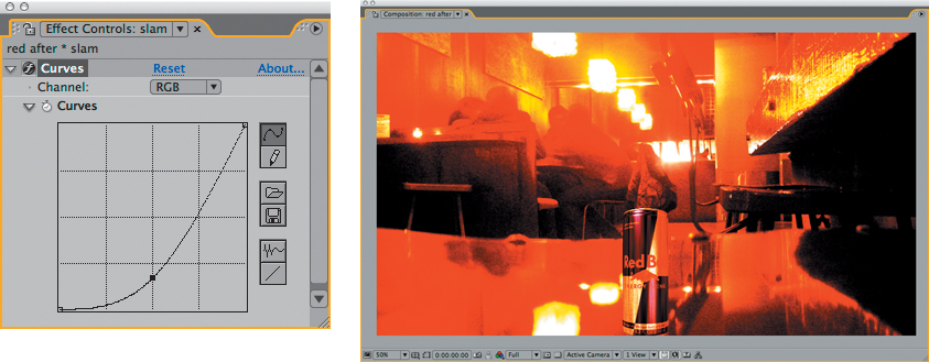
Figure 5.35. If in doubt about the highlights in your footage, you can also slam the gamma downward. Here, the slam makes it clear that the highlight reflected in the can is not as bright or bloomed as the overhead lights, and a lack of grain in the foreground becomes apparent. Grain matching is detailed in Chapter 9, “The Camera and Optics.”
This method is useful anywhere that there is a danger of subtle discrepancies of contrast; you can use it to examine a color key, as you’ll learn in the next chapter, or a more extreme change of scene lighting.
Beyond the Basics
This chapter has covered some of the basics for adjusting and matching footage. Obviously there are exceptional situations, some of which occur all of the time: depth cueing, changes in lighting during the shot, backlighting, interactive light and shadow. There are even cases in which you can, to some degree, relight a shot in After Effects, introducing light direction, exchanging day for night, and so on. These topics and more are covered in depth in Chapter 12.
You can try the Exposure control found at the lower right of every viewer window to slam the image and check levels; just scrub the numerical setting up and down, clicking the adjacent icon to reset when you’re done. This approach requires no additional steps and does not render; however, it does not affect contrast, only luminance.