The chrome (or “skin”) of a Web page is made up of the visual elements that give it its look and feel. Using backgrounds, you can add visual elements to your page to frame and highlight the content of your Web page and guide the user’s eye around.
Although images are often thought to be embedded directly into the page using the <img> tag, this severely limits the versatility of your designs by hard coding the images into the structure. Instead, most Web designs place all graphic interface element on the page using the CSS background property, and reserve the HTML image tag strictly for content such as photos, illustrations, and figures.
The PNG image format is now standard on all Web browsers, allowing you to include an alpha channel in images. You can have areas in your image with an opacity anywhere between 0% and 100%. Rounded corners, drop shadows, or any non-rectangular shapes (such as text) can be used against any background. This differs from GIF transparency where the pixels are either visible or not.
Create PNG images using most standard image editing software (such as Photoshop or Fireworks). There are three different PNG formats, varying in image quality and file size:
| PNG-8: Works a lot like the GIF format, indexing all of the colors in the image down to a maximum of 256. SUPPORT: Fireworks and Photoshop, although Photoshop does not include the alpha channel indexed transparency, where a color is either visible or 100% transparent. |
| PNG-24: Works like JPEG, producing higher quality images with color shifts. However, for images like photographs, PNG-24 tends to create larger images than JPEG. SUPPORT: Photoshop and Fireworks, although Fireworks does not support the alpha channel. |
| PNG-32: An even higher-quality image format than PNG-24, but it creates larger files. SUPPORT: Fireworks. |

The downside to transparent PNGs is IE6. Although it displays PNG images, it does not automatically display them as transparent. Instead, you have to disable the background property and then use a special filter to load the image.
Note
To learn more about the underscore hack see Appendix C, “Fixing Internet Explorer.”
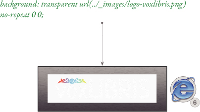
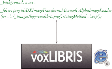
For example, to use the voxLibris logo on a gradient background, save it on a transparent PNG, and use it as a background image:
background: transparent url(../_images/logo-voxlibris.png)
no-repeat 0 0;
In IE6, this will appear with a gray background where the image should be transparent. Now add the following code immediately underneath in the CSS rule:
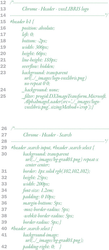
_background: none;
_filter: progid:DXImageTransform. Microsoft .AlphaImageLoader (src=“../_images/logo-voxlibris.png”, sizingMethod=“crop”);
Now the transparent PNG will appear as expected using the AlphaImageLoader and the underscore hack to hide this from other browsers. You have two options for the sizing method: crop and scale. Crop will show the image once, while scale stretches the image to fill the area. You cannot tile backgrounds with the AlphaImageLoader.
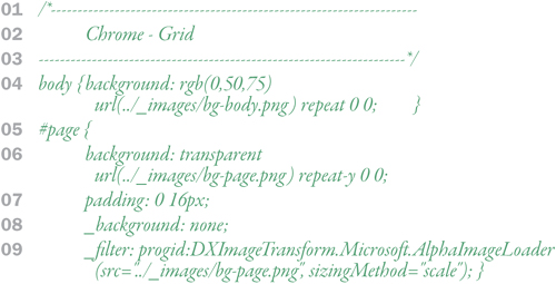
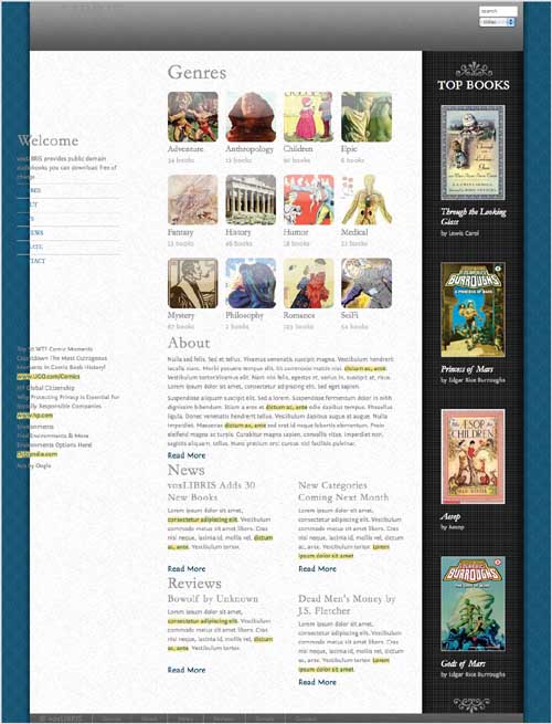
Although the grid of columns and rows is created in the layout, it is often visually defined using background colors and images. This includes a background for the body of the document and then different backgrounds to separate the different grid elements.
bg-body.png
Designers often prefer balanced columns—that is, columns that appear to be the same height. One of the drawbacks of layout with CSS is that you cannot bind column heights together, so, invariably, one column will be shorter than the others.
bg-page.png
A common workaround for this problem is to visually define columns using a background image placed in the page element, which is the parent element to all of the column, and will thus stretch the height of the tallest column in it as long as you remember to put the <br style=“alignclear” /> before the closing </div> tag as described in Chapter 8.
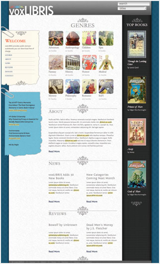
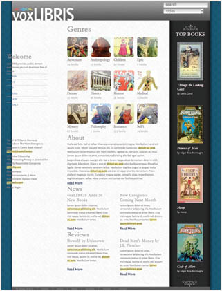
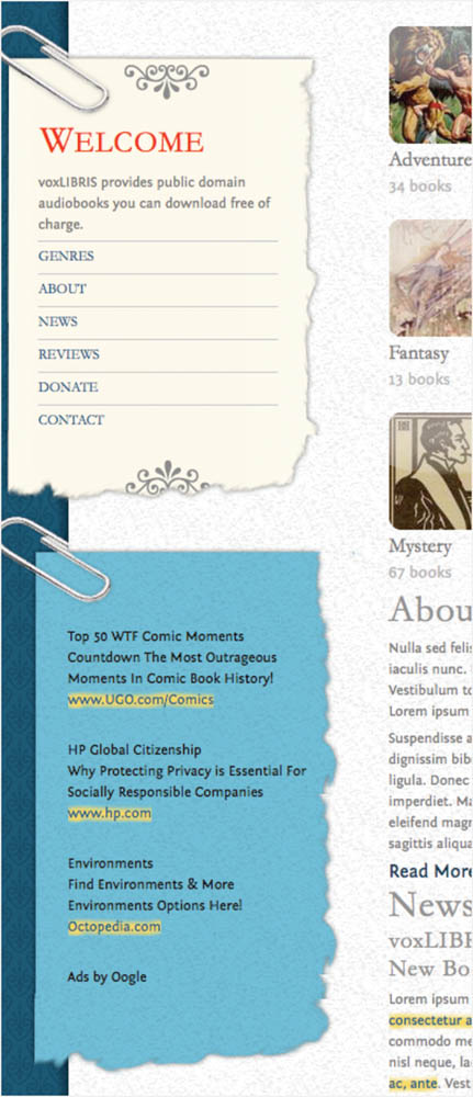
For voxLibris, the right column (#aside2) is visually defined by a dark cloth pattern in the page element background (#page), different from the speckled paper pattern of the larger left side, which includes both the left column (#aside1) and center column (#article1).
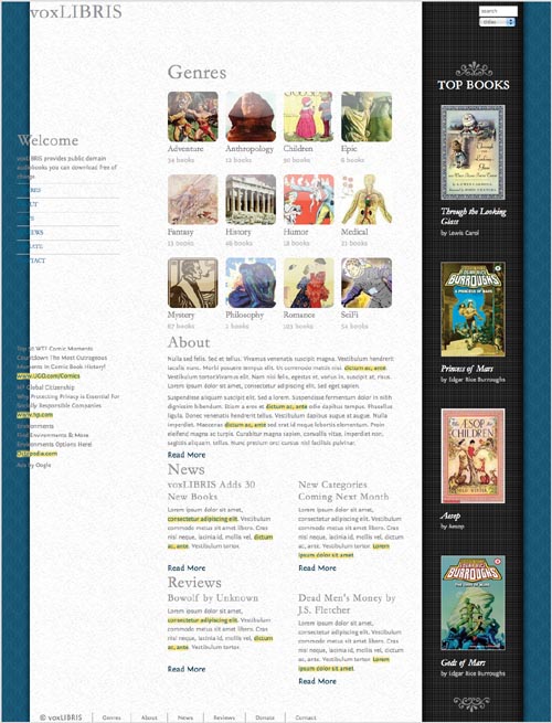
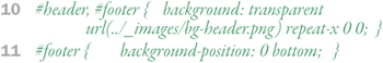
Rows stretch horizontally across the area defined across the page area and can be visually defined with a solid color background color or background image. If you use a gradient, then you may want to have it only repeat horizontally (repeat-x) so that the gradient doesn’t create a repeating pattern, but make sure to set the bottom color in your gradient as the background color for the row so that there is a smooth color transition.
bg-header.png
The voxLibris header and footer use the same repeating gradient image (bg-header.png) as the background. I opted to reuse the same image in both. Different images could have been used, but since they have the same appearance, this reduces the number of images that have to be downloaded, thus speeding up the page display.
Text replacement is any process where HTML is replaced by an image. There are several ways to achieve text replacement, but the best is to use the text in a background image, in an element that includes the text in the HTML.
Begin by specifying the width and height of the element that will contain your graphic text. Set the background image source to the image with the text. Then set the line height to three times the height of the element and set overflow to hidden, so all text is pushed out of the box and will not be displayed.
The voxLibris logo uses the Fontin Sans font, which is not a standard font, so we’ll need to put it into a graphic. We’ll use the level 1 header tag in the #header to create the logo, including the text “voxLibris”. Set the width and height to be the same as the image and then triple the line height.
Form elements are often overlooked as an important element to skin. Most browsers have a default style for form elements that is, to be polite, hideously ugly, especially if the rest of the site is well designed.
bg-grad01.png
For voxLibris, simple gradient, border, and font size changes are all that are needed to spruce up the form fields.


Sections and modules will often have specialized backgrounds to set them off from surrounding content. The module will have a header and footer to cap a central content area whose height will stretch as needed.
bg-sidebar1-head.png bg-sidebar1-mid.png bg-sidebar1-foot.png
| Footer: The background cap for the module is set in the background for the entire module, with its position set to bottom. |
| Header: The header cap image is added to a level 2 header tag, with no repeating. This also means that the amount of content for the header text is limited to the height of the background image. |
| Content: A special class is added around the content of the module and a background repeated vertically behind that. |
Since transparent PNGs are used for all three backgrounds, the background color is set to transparent.
You can also create variations on this module, as is the case with the voxLibris’s ad module, simply by changing the background image source.
bg-ad-head.png bg-ad-mid.png bg-ad-foot.png
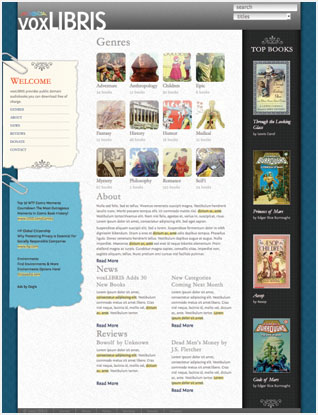
Another way to define sections on the page is to add rules and flourishes that guide the visitor’s eye to important locations. Flourishes can take a number of forms but should fit with the general appearance of your design.
flourish-up.png
The flourishes in the voxLibris article1 section are similar to those in the logo and in other areas throughout the page. They are added in the backgrounds of the section and the headlines to give a top and bottom treatment.
flourish-down.png