Grids are a time-honored method for creating strong visual designs with hierarchy, visual rhythm, and context. Although CSS is not explicitly set up for creating grids—there are no row or column properties—designers have developed methods to overcome this limitation.
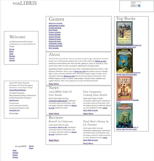
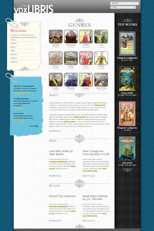
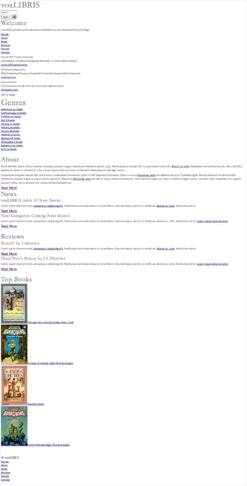
The voxLibris site is designed around a three-column structure with a fixed width and fluid height. We’ll start by resetting all of the browser default properties, and then creating a layout grid for our design.
Layout begins with the HTML document, which creates the structure on which the CSS is applied. A Web page’s structure can take a variety of forms and will depend greatly on the type of site you are creating. Still, many Web pages have structural elements in common. Along with the markup that sets content elements such as headers, paragraphs, lists, links, and forms; we’ll add certain IDs and classes that will be used to define those structural elements.
The HTML for all Web pages is split into two main blocks set off by tags:
01 | <head>: The head is where all the meta information about the Web page is placed—information about the page, such as its title, author, and description. None of this information is displayed in the browser window itself. This is also the best place to put the CSS that will be applied to the body of the page. |
02 | <body>: All Web pages exist within the body of the browser window, which is the eventual parent of all elements on the page. By setting styles with the body HTML selector, you also set default styles for every element on the page (except for some form elements). This is where you set the background that fills the entire browser window. |
A framework is a standard set of IDs and classes added to a Web page’s HTML to facilitate common page components, which can then be referenced in the CSS. Although the exact framework may vary from site to site, these are the most common frameworks:
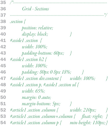
| Page (08): Controls whether the grid is fluid or fixed. Setting an absolute width and/or height fixes the page’s flow vertically or horizontally. |
| Rows (09, 10, 32): Horizontal elements within the grid, stacked from top to bottom and stretching the width of the page element. |
| Columns (11, 16, 27): Vertical elements within the grid, stacked next to each other from left to right and stretching the height of its row. |
| Sections (12, 13, 17, 20, 22, 24, 28): Blocks within the grid containing content and functionality. |


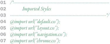
voxLibris will use the modular library approach to adding external style sheets. The idea is to set up several external files based on use and import them into a single CSS file, which then gets linked to the target HTML file. This gives you the versatility to quickly change one part of the design or interface simply by swapping style sheets.
Note
Different strategies for adding external style sheets are detailed in Chapter 7, “Designing with CSS” in the “Prototype: Combining Style Sheets” section.
For voxLibris, we’re using four distinct style sheets:
| default.css: Resets the browser default styles and sets the site-wide default styles. This style sheet is detailed later in this chapter. |
| layout.css: Defines the grid structure and layout for the page. This style sheet is detailed later in this chapter. |
| navigation.css: Provides user interface styles, such as links, navigation, and buttons. |
| chrome.css: Adds the graphic layer to the design, including backgrounds, logos, and design flourishes. |

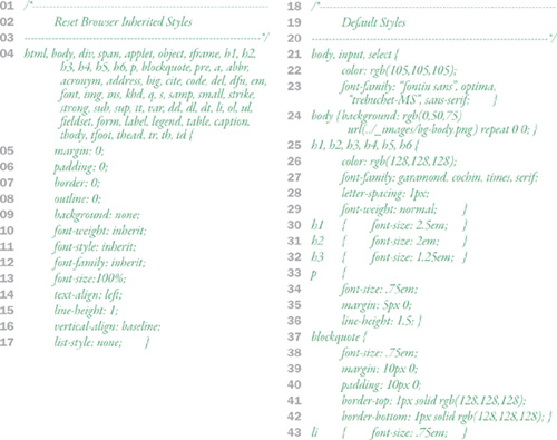
It’s an important fact of life with CSS that, once a style is set, it’s set not only for the particular HTML tag it’s being applied to, but to all tags within that tag as well. To make adding new styles as easy as possible, there are two default styles that you need to know.
Load a Web page into a browser, and even before you add any CSS to the page, you will notice that the page already has a very rough style to it: headlines are bolder and larger, links are colored and underlined, lists are indented with bullets, and paragraphs have margins. These are the browser default styles that I discussed in Chapter 5, “Semantics” in the “Inheritance” section. In the absence of overriding styles from CSS, these default styles are applied. It’s helpful to reset the default styles for all of your HTML tags to get more consistent results across browser types.
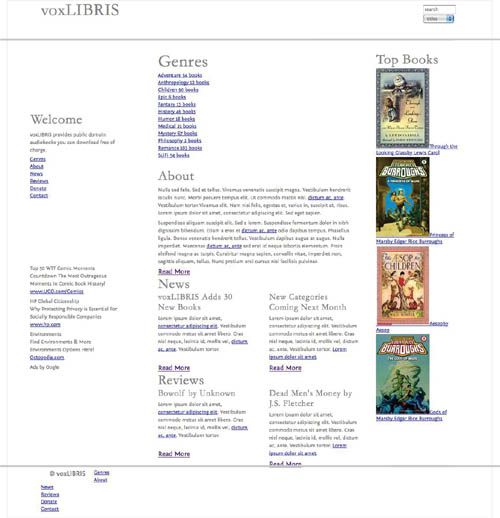
A simple grid structure uses the HTML framework for CSS to lay out the page. voxLibris uses page, header, footer, and content, but other grid sections might be used as defined in the wire frames while planning the site.
Note
Fluid and fixed grid layouts are discussed in Chapter 7, “Designing with CSS” in the “Page Flow” section.
When you planned your design, one of the first things you needed to decide was whether you would use a fluid or fixed layout. voxLibris uses a fixed width of 980px, so we set that as the width using the page ID ( 04 ). If we wanted to make this page fluid, we would set the width as a percentage or use max/min widths.
The <div> tags used to create each row will include the row class and a row ID with specific styles.
| Create the row class and then IDs for individual rows based on purpose (header, content, footer). |
| Be careful when using padding with grid elements, since padding will throw the dimensions off in IE6. If padding is added to an axis that does not have an absolute length set, there is no problem. If the axis does have an absolute length set, though, then IE will shrink the box to accommodate the padding. NoteFor the fix to dealing with padding in IE6, read the “Box Model Problem in IE6” section in Chapter 6. |
| To center a grid element within its parent, set the left/right margin to auto. This puts equal space on both sides of the page, centering it in the browser window. |

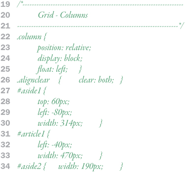
Columns are used to establish a vertical rhythm within the page, allowing you to present information from left to right and make better use of screen real estate.
| Although it may seem counter-intuitive, columns are created by floating block elements next to each other. This lines the blocks up horizontally next to each other. |
| As with other grid elements, set the position property for all columns so that child elements will position themselves from the column’s origin (top left corner). |
| If a column has a specific width, avoid applying padding. If you must use padding, make sure to accommodate IE6 as detailed in “Box Model Problem in IE6” in Chapter 6. |
| The alignclear class can be added to a <br /> tag in your HTML to force columns to drop below, but, more importantly, to also force the column box to the full height of the content. |
One other note: To break out of the grid, use the position properties (top, right, bottom, and left) to move elements from their natural position—potentially even out of their columns.

Sections (sometimes called modules) are content and functionality blocks within the grid.
| As with other grid elements, set the position property for all sections so that child elements will position themselves from the column’s origin (top left corner). |
| If a section has a specific width, avoid applying padding. If you must use padding, make sure to accommodate IE6 as detailed in “Box Model Problem in IE6” in Chapter 6. |
| Sections can also be floated next to each other and used within columns to create “sub-columns.” |