
My guess is that you already have your own personal or professional Web design process in place. Whether you are into Agile, UML, waterfall, or something of your own devising, I’m not here to upset the apple cart—maybe just add a couple of extra apples to it. If you are a designer, CSS needs to become a central part of your Web design process.
Using CSS is likely to change how you approach Web design. Although you may still create wire frames and comps, you’ll find yourself making refinements, adjustments, and wholesale changes in CSS code. You may even find yourself going straight from hand-drawn sketches to CSS code. You’ll save time and effort, and, before you know it your Web designs will start to really pop.
Once upon a time, it was enough for the designer to create a few visual comps, maybe cut the chrome, and then hand everything over to a developer. If you followed this process you probably found that the developer never got things exactly the way you wanted them: Elements didn’t line up, fonts were wrong, colors shifted. Never send a developer to do a designer’s job. It doesn’t matter how great your comps look in Photoshop; what matters is what the visitor sees in the Web browser. To get things right, it’s important to become familiar with every aspect of the process, and be able to step in to guide the final outcome.
01 | Plan your site. Before you code, think carefully about what you are doing, why you are doing it, and how you are doing it: sketching, wire-framing, mood boards, and visual comps are the best ways to plan before creating your site with CSS. |
02 | Build your site. One of the most important differences between print and Web design is not paper versus screen, but static versus dynamic. The great advantage of Web design is that you can make changes at anytime, and with CSS, you can make those changes extremely quickly. Prototypes allow you to test ideas in context. |
03 | Deploy your site. Take your prototype online to test it in the wild before finally going live with the hard launch. |
04 | Iterate the process. Creating a Web site is an iterative process. You can’t just love it and leave it. Never be afraid to go back to anywhere within the process and make changes based on feedback. |

Every project should start with a plan. Whether it’s in your head or formally spelled out, you need to define what the expectations are for the project’s success. As the designer, your job is to conceive the successful design solution using a process of discovery and iteration. As you create your plans in advance of actual coding, it’s important to keep in mind how you will actually realize your vision in code.
Sketches are not meant to be detailed or complete plans, but to help you get the rough ideas down and capture notes about the project and rough dimensions. I like to put information like the Web site’s purpose, audience, and content, as well as the site’s message in big letters to remind me what this project is about. In addition, I’ll quickly throw down different page types, mark stuff out, redraw them as necessary to experiment, looking for different design angles.
There are a lot of different ways to sketch. I carry my Moleskin graph paper sketchbook everywhere I go, ready to whip out when inspiration strikes (or when I have a few spare minutes). If I’m brainstorming with a group, I’ll get pasteboard-size paper and start sketching while others throw out ideas. I’ve even been known to do digital sketches in programs like Microsoft Visio and OmniGraffle, which can then quickly evolve into wire frames.
The most important thing to remember about your sketches is to keep them fluid. Try as many different design solutions as you can come up with—never be tied to any one solution.

The first question you need to ask yourself when starting your design is “Will my page be fluid or fixed?” Although fluidity is generally considered for the width of the design, it can equally be applied to the height of the design. While most Web designs are based on a fixed width with a fluid height (that is, it stretches to the height required to display all of the page content), this is not your only option:
| Fixed width/fluid height: The page width is constrained, generally to prevent horizontal scrolling, and the height will stretch to accommodate the content, requiring a vertical scroll if it doesn’t fit in the browser window. |
| Fluid width/fluid height: The page stretches horizontally and vertically to use the maximum area available in the browser window. Content that does not fit in the area of the open browser window will require a vertical scroll to view. |
| Fixed width/fixed height: Both width and height are constrained. How content that does not fit is treated will depend on how the overflow attribute for the box is set. Generally, with this design, content is carefully controlled so as not to require more space than the available area, or scrolling is controlled on a per module basis. |
| Fluid width/fixed height: The page stretches horizontally to fill the available area and can even cause the page to scroll horizontally. |

Wire frames are your chance to plan the structure of your page without the distractions of visual design. They serve as the blueprints for construction and need to include placement and measurements of elements in pixels. Here are the basic elements you will need to include:
| Fluid or fixed: Determine whether the layout is fluid or fixed. Fluid layouts allow visitors to make better use of their screen real estate, but are generally harder to design to. For general fixed page widths, I use 980px, which will allow most visitors to see everything. |
| Widths: Widths should be exactly specified in fixed layouts, but can be exact or variable—generally indicated with an asterisk (*)—in fluid designs. |
| Heights: Heights should generally be variable, unless you know the element needs a fixed height. In those cases, make sure to account for how overflow content will be treated. |
| Margins: Margins and padding should be indicated, but may need to be adjusted in the visual comps. |
| Scroll lines: Although not as important as it used to be, the “fold” of the page should be indicated for different monitor resolution heights so that you know roughly where the page “fold line” will fall. I use heights of 290px, 410px, and 578px. |
| Color: Use color only to indicate controls and links. Generally, I use blue to show actionable items and grayscale for everything else. |

There are many kinds of mood boards—everything from collages of seemingly random elements that reflect the desired style to boards that are on the verge of being a design specification document. The style you choose should depend on your own strengths as well as the needs of your client. If you are a strong visual designer, a poster style format may work best; if you are an information architect, a more structured document might be appropriate. Whatever style you choose, think carefully about what will best communicate the flavor of the site you want to create.
Mood boards are meant to help define the visual style of your site without you actually designing the entire interface. Generally, you can quickly create two or three “looks” that can then be presented to a client for feedback, without having to get bogged down in the details of building the pages. You can include splashes from the color palette, patterns, textures, typography, photos, and illustrations. I also recommend including treatments of some of the standard user interface elements such as form fields, lists, and tables.

Visual comps (short for compositions) combine the wire frames to create mood boards: a static version of what the final Web page will look like. If you skipped the mood boards, you may also be relying on the visual comps to present to your client, possibly showing several different skins for them to choose from. If you are working with a developer who will be constructing the site, this needs to be a pixel-perfect composition.
Once you get more comfortable with creating Web pages in CSS, however, you may find that you can be less thorough, and can leave some of the final design polishing until the prototype stage. Here are some tips to keep in mind for your visual comps:
| Use guides to reconstruct the grid you created in your wire frames as precisely as possible. You may ultimately want to break out of that grid to a less blocky design, but you need to know where the grid is to break it. |
| Think carefully about how a background element will tile. You can tile horizontally or vertically to fill an area with a pattern. Complex background patterns that don’t tile are possible but generally lead to larger graphic file sizes. |
| If you want to use rounded corners or drop shadows, consider creating these with CSS as design enhancements. They are hard to create graphically but are easily added using CSS. Keep in mind that these styles are not currently supported in all browsers. |
| If using Photoshop, make sure your proof setup (View>Proof Setup) is set to RGB; otherwise your colors will look very different in the browser. |

The faster you can move from planning to building, the better. It’s easy to get bogged down trying to plan for every contingency, to the point that the planning takes over the production. Planning should give you direction, but, in an iterative design process, you can always revisit wire frames and comps as the situation on the ground changes.
Note
Putting the chrome back together to create your interface is covered in detail in Chapter 11, “Chrome.”
Chrome (any graphics or visual effects used to create the user interface of a Web site) is generally cut from the visual comps. How you cut the chrome depends on the software you use to create your comps, but regardless of your software of choice, there are a few guidelines to follow while you are working:
| Most chrome is added as a background image using CSS, rather than as an image tag. |
| Use transparent PNGs where possible to make overlapping elements easier to create. In Photoshop, this means using PNG 24. ImageReady allows you to create transparent PNGs in both PNG 8 and PNG 36, although not in PNG 24 for some reason. |
| Use JPEGs for complex images such as photos. |
| Combine different states of a chrome graphic into a single file, and use CSS sprites to slide it back and forth. |

The style guide pulls all of your planning together into a single document, which is then a common point of reference for everyone on the team when building the site. It serves as a blueprint for constructing the site and provides notes for designers and developers who may work on the site in the future.
You should include the following information in your documents, using CSS style notation:
| Typography: The font families, styles, and weights being used. You do not need to specify exact sizes or usage here. That will be included in the default styles. Because this is Web design, though, you want to include a prioritized list of fonts, starting with the most desired and ending with a generic font-family as the ultimate fallback option. NoteTypography is covered in Chapter 9, “Typography.” |
| Colors: List all of the primary and secondary colors used in the site, giving the hex and RGB values for each. I also like to give each color a specific project name, which generally makes it easier to reference during discussions and feedback. NoteColor values are detailed in Appendix B, “CSS Values.” |
| Default styles: Defines the global styles such as font-family, font-size, color, and page background that will be used over most of the pages. NoteDefault styles and layout are covered in Chapter 8, “Layout.” |
| Layout: The widths, height, padding, and margins of every element in the Web page. NoteChrome is covered in Chapter 11, “Chrome.” |
| Chrome: For each element, show the image(s) with file name(s) being used to create it. |

Ready to start coding? The prototype is where you transform your static visuals into living Web pages. If you are starting a prototype from scratch (rather than re-skinning an existing site), you will want to create your HTML first to define the general page structure to which the CSS is then applied. Keep these tips in mind while coding your CSS:
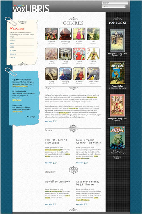
| Don’t be afraid to modify your design as you assemble it. This is the difference between theory (the visual comp) and practice (the prototype). Often what works in the free-form world of the comp doesn’t work in the more structured world of CSS code. For example, I used a different flourish with the “Genres” title than shown in the comp, because it proved impossible to code effectively. Remember: iterate. |
| Use placeholder content. The closer you can get to the final content you will be using, the better, but don’t waste time trying to get the exact content you will use for launch. For example, greek text for copy is fine at this point, as long as it is approximately the same length as the final copy. |
| Show an example of all use cases. Try to replicate a sample of every element that will be on the page to show how it works. For example, add dummy links to show how they will be presented. NoteIf you need to generate greek text (also known as “Lorem Ipsum” text) for your placeholder content, use the Web site lipsum.com. |
| Test, test, test! As you develop your prototype, make sure to constantly test it in as many browsers as possible. Nothing is more frustrating than finding your design looks great in Firefox but falls apart in Internet Explorer. |

How you organize the various rules in your style sheet can affect your workflow and how quickly you can make changes. Of course, you can always just throw your styles together haphazardly, but when your style sheets get longer and longer, you will find yourself spending more and more time tracking down rules to make changes. Keep these tips in mind:
| Cascade: Remember that styles cascade, so once a style is set for a parent element, it is set for all of its children. For example, setting the font-family property in the body HTML selector means that font family is applied to all text on the page. |
| Versatility: Any styles you create without having to resort to adding an image will significantly increase the design’s versatility, making it easier to make adjustments and redesign later. |
| Easy to edit: As your CSS code gets longer and more complex, it can get harder to find and edit code. Even if it takes a little more time, anything you can do to make it easier to sort through it all will save you time and frustration in the long run. NoteOnce you are ready to deploy your site, consider reducing your CSS file size by stripping out all of the comments and unnecessary spaces using a service like csscompressor.com. |
| File size: Every letter, number, space, and character adds to file size. They may seem like grains of sand, but get enough sand and you fill a beach. The larger the file size, the longer it takes to download. That’s not to say that you have to agonize over every space you type, but try to cut code by using the cascade wherever you can. |

Here are a few tips on formatting and organizing your styles to make them easier to edit:
| Place general styles at the top of the style sheet (01–46). This sets the default styles for your Web page—most importantly for the <body> element, which is the parent to all other elements. Remember, once a style is set in a parent tag, you never need to set it again unless you want to override it for a specific element. Since the body tag is the ultimate parent for all tags, anything you set there will be applied to all tags on the page, with the exception of form elements. NoteFor a full listing of the code used to create the voxLibris template, see Appendix A. |
| One declaration, one line (example: 28). If you have only a single declaration for a rule, run it on a single line. |
| Use shorthand properties (example: 11). Many styles have a shorthand property that collects one or more styles into a single line of code. These save time and space and are easier to find and edit in long lists of code. |
| Indent your declaration. Use spaces and returns to make reading the code easier. |
| Organize rules by use (example: 15–17). Group your rules together based on the elements they affect in the Web page, separating each group with notes. This lets you quickly track down a style based on its location on the Web page. |
| Organize by context (example: 89). Within a grouping, group rules with similar contexts. Generally, if two rules have similar contexts, they will be closer to each other on the page, so if you see one, it makes it easier to find the other. |

Style sheets can be linked to or imported into the HTML as detailed in Chapter 5, “Semantics,” in the “Where to Put Style Rules” section. There are two basic strategies for external style sheets, each with its strengths and weaknesses:
Place all of your CSS code into a single file. From an optimization standpoint, this is your best bet, as it takes only a single download to get all of the code. The downside is that this can mean a lot of extra code per page, and conflicts between styles are more likely.
Pros
| Allows user agent to cache one file that can then be reused without extra required download time. |
| Due to predictable nature, less likely to cause unforeseen style conflicts. |
Cons
| Greatly limits design flexibility between channels and projects. Difficult to edit and override styles. |
| Will most likely lead to Web developer kludges to overcome shortcomings. |
A library of CSS files allows you to break down the code by function. Each function has its own unique file that can be independently edited and then imported into a single external CSS file that is in turn linked to an HTML page. Every page will have a unique external CSS file, but that file will be composed of multiple imported CSS files.
Pros
| Easy to edit. |
| Cuts down on unnecessary code. |
| Each external file is cached separately and so will be reused as needed without additional download required. |
Cons
| Requires a server call for each imported style sheet, slowing initial download. |
| IE has some difficulties loading external style sheets using @import before the page content loads. |
Once you have built your prototype pages, you are ready to populate them with their initial content and begin getting reactions.
Your Web site is not ready for prime time (and is possibly password protected), but you can share it with people you know and trust to give you honest feedback and constructive criticism. Make sure the feedback comes with the following information:
| The exact URL where the problem occurred. |
| The visitor’s browser, version, and operating system. |
| Where possible, a screen grab showing the problem. |
Sometimes called the “soft launch,” beta launches are becoming increasingly popular as a way to avoid criticism for any bugs on the site after it goes public. Generally the site is made available to the public but not promoted. Prominent feedback functionality should be provided to report any problems.

Design is an iterative process, where new ideas and new concepts should constantly be explored to make improvements. The Web makes the job of iteration easy because the means of distribution are instantaneous. You can make changes and publish them atthe speed of light (or at least at the speed of your Internet connection).
Iteration is not something you do at the end of the process; it is an integral part of the entire process. Always be willing to question your assumptions throughout the process whenever new facts present themselves.
Design iteration can cause friction on a project, as project managers and developers are generally more comfortable with a linear process. This takes you back into planning: The more you can show the benefits of particular changes in your documentation, the smoother it is in convincing the rest of the team to go along.
