
Chapter 19. Customizing Workbench Windows
A side effect of creating applications with a UI framework is that they tend to look somewhat similar. This may be a good thing; as more applications share a UI model, they become familiar in their look and feel and it is easier to learn new applications.
In reality, the modern desktop is a far cry from being an example of uniformity. Even though each OS provides a standard set of native widgets, an increasing number of applications attempt to distinguish themselves by looking different, providing nonrectangular windows, having different layout mechanisms (e.g., tabbed browsing with custom-drawn tabs), and often their own widget sets. It is very common for applications to promote brand recognition based on a specific look.
The next two chapters are dedicated to developers who want to create applications that do not look and feel like Eclipse. In this chapter you’ll learn to
• Understand the different customization options available
• Understand their limitations
• Extend Hyperbola to allow the toolbar and status line to be hidden and add a new quick bar to the window layout
• Make Hyperbola run in a nonrectangular window
19.1 Customization Defined
Eclipse is all about plug-ins and extensibility. In a perfect world, the entire Workbench would be pluggable in every possible way. For practical reasons, the Workbench is designed to meet specific extensibility requirements, and these do not include fine-grained customizations of Workbench windows or the assembly and painting of every UI element.
Before the Eclipse RCP opened up new opportunities for the Workbench, this level of customization was not needed. The Workbench’s focus was to support an IDE platform. The capabilities found in the Eclipse Workbench are now being used for much more than IDEs. To support this, the Eclipse team has enhanced the Workbench’s UI to be customizable in the following ways:
Customize a window’s contents—A Workbench window’s default layout includes a toolbar, perspective bar, docking trim, content area, and status line. WorkbenchWindowAdvisors, however, can override all aspects of Workbench window creation and change the location of elements as well as add or remove elements.
Customize a window’s shape—By default, Workbench windows are rectangular. Nonrectangular Workbench windows can be created by overriding how windows are created.
Customize the drawing and behavior of views and editors—Views and editors provide much of the look and feel of applications. You can provide your own implementation of view and editor management and drawing and fundamentally change the look and feel of an application.
The next two chapters cover these three Workbench customization options in more detail, providing both background information and examples.
Note
You can do a lot with SWT without ever programming to the graphics interface or implementing a custom layout—the supplied widgets handle the painting of icons, text, and other data for you. However, when customizing the Workbench look and feel, it’s useful to understand how to draw objects and be creative with layouts. Our discussion here assumes some familiarity with SWT concepts and operation.
19.2 Customizing a Workbench Window
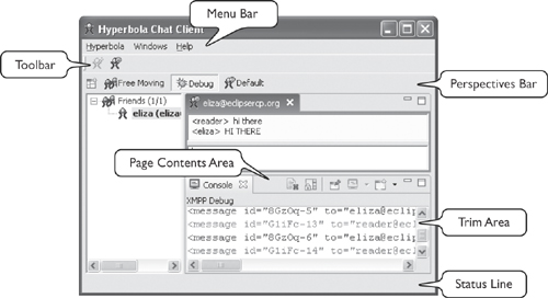
The Workbench opens and configures Workbench windows based on the configuration information provided by a WorkbenchWindowAdvisor. The typical behavior when a Workbench window is created is that the following controls are created: a menu bar, a toolbar, a trim that is used to place fast views and the perspective bar, a page content area, and a status line. Figure 19-1 shows a typical Workbench window’s contents.
Figure 19-1 Typical Workbench window’s contents
The creation of these controls can be changed using the following techniques:
• Change the visibility of the standard controls by calling the IWorkbenchWindowConfigurer method setShow*() from the WorkbenchWindowAdvisor method preWindowOpen(). These methods control the initial visibility only and do not hide/show the controls once the window is opened.
• Override the creation of the window’s controls by implementing the WorkbenchWindowAdvisor method createWindowContents(). This moves the responsibility for creating a window’s controls to the advisor.
For most applications, the setShow*() methods available on IWorkbenchWindowConfigurer are sufficient. To provide further customization, however, the WorkbenchWindowAdvisor needs to create a window’s contents from scratch. To give you an idea of how this works, the following snippet shows a customized createWindowContents(Shell) method that creates a window in a manner very similar to the Workbench:
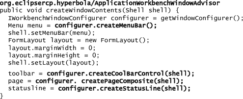
Notice that most of the work is done by a set of helper methods on IWorkbenchWindowConfigurer (see Table 19-1 for a complete list). These methods create the typical Workbench controls and make it easier to compose a custom layout from standard parts. The controls supplied by the helpers are untyped and are not meant to be changed in any way. For example, do not downcast them and tweak the underlying control because the control type is not API. Just place them in the layout.
Table 19-1 IWorkbenchWindowConfigurer Control Creation Methods

These methods are more than just conveniences. If the Workbench creates the controls, it can also add in declarative contributions. We saw this in Chapter 17, “Actions,” where menus and toolbars needed to be managed by the Workbench if contributions were to be added.
If your application does not need action contributions in the menu, toolbar, or status line, you can leave out these calls completely or replace them. Of course, this may prevent some plug-ins from integrating into your application as they expect a menu bar and toolbar into which they can contribute actions.
In any event, createPageComposite(Composite) must be called for the Workbench to run properly. It can be called at any time within the createWindowContents() method.
Note
There are limitations as to when you can override the Workbench window. The Workbench’s default implementation of createWindowContents() creates controls that are not available to clients, such as the job progress area, the trim that docks fast views, and the perspective bar. When you override createWindowContents(), you lose these areas.
19.2.1 Example: Hide and Show
To demonstrate the customization of a window’s content, let’s modify Hyperbola so that users can hide and show the toolbar and status line. The Workbench does not directly support this—you can add or remove the toolbar and status line when the window is created, but you cannot change the visibility afterward.
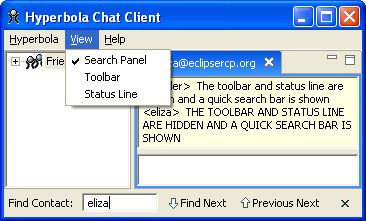
While we’re at it, let’s include a quick search panel that appears below the page content area when Ctrl+F is pressed and hidden when the Esc key or Close button is pressed. The quick search panel is not a view or an editor but a custom area that is completely controlled by Hyperbola.
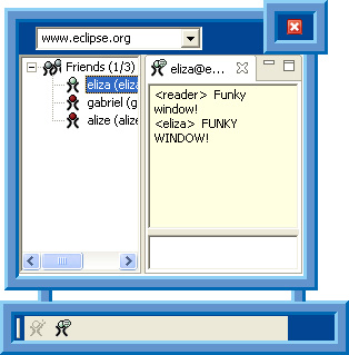
Figure 19-2 shows the result of this customization. The toolbar and status line are hidden, and the quick search panel is visible at the bottom of the window. There are actions in the main menu that toggle the visibility of each.
Figure 19-2 Example of new panel with toolbar and status line hidden
19.2.2 FormLayout
The key to getting the flexibility we need in this scenario is the use of SWT’s FormLayout. A FormLayout can be used to describe complex layouts and make it easy to add or remove controls. A FormLayout is based on FormAttachments. There is an attachment for each side of a control. Each attachment specifies how its side of the control is attached to other controls or the control’s parent composite.
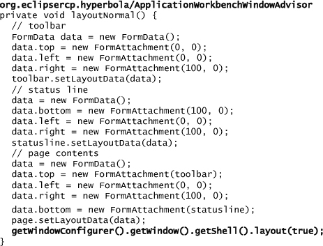
Window creation in the WorkbenchWindowAdvisor method createWindowContents() is simple. The FormLayout is added to the shell, and then the toolbar, page, and status line are created using the appropriate IWorkbenchWindowConfigurer methods. Notice that each control is stored as a field on the WorkbenchWindowAdvisor—this is needed to allow changing the layout of the controls as they are hidden and shown.

After the controls are created, they are connected together in the layoutNormal() method. Here the attachments are specified either as a percentage of the space available in the parent or as a direct connection to a neighboring control. Once the layout is configured, the shell must be told to lay out its controls.
19.2.3 Hiding the Toolbar
With this setup, hiding a control is a matter of making it invisible and then rewiring the controls to which it is attached. For example, the code snippet below, from Hyperbola’s WorkbenchWindowAdvisor, shows how to hide and show the toolbar from Figure 19-1. To hide the toolbar, it is made invisible and its bottom neighbor, the page area, has its top wired to the top of the parent composite. The toolbar disappears and the page area snaps up to take its place. Showing the toolbar is the reverse. This same pattern is used to control the layout of the status line.

19.2.4 Adding the Toggle Actions
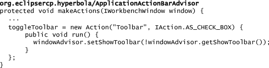
Now that the window and its controls have been created, we need actions that toggle the visibility of these controls. The setShow*() methods on the WorkbenchWindowAdvisor can be used to toggle the controls—all that is left is to create a set of actions that call these new methods. Hyperbola’s ActionBarAdvisor’s constructor is modified to take an extra argument of type WorkbenchWindowAdvisor. This allows it to call back and control the visibility, as shown in the snippet below. As usual, actions are created and managed by the ActionBarAdvisor.
There is a subtle implementation issue to consider: As you can see in Figure 19-3, the actions are created before the window. Actions whose enablement depends on the state of a control in the window must be initialized after the window is created rather than when the action bars are created.
Figure 19-3 Example method sequence
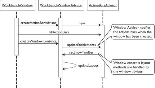
Figure 19-3 also shows an easy solution to this problem—code your WorkbenchWindowAdvisor and ActionBarAdvisor to coordinate when the window’s contents have been created. See the call to updateEnablements() below.
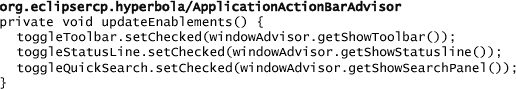
The code for updateEnablements(), shown below, is straightforward. It sets the state of the actions according to the current visibility of the associated controls.
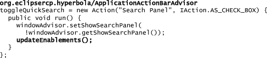
In addition to using this method when the window is created, it is handy to call the toggling actions to update the action, as shown in the following snippet from the ActionBarAdvisor method makeActions():
19.2.5 Quick Search Panel
So far you’ve seen how to toggle controls that the Workbench creates. Adding controls to a Workbench window is handled the same way. Most of the work required is in designing the controls and deciding on an appropriate SWT layout. The following snippet sketches the quick search panel:
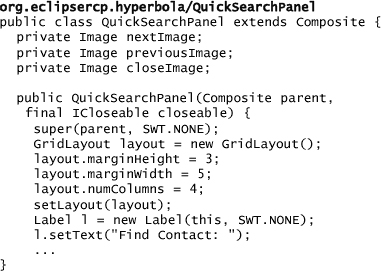
To add the quick search panel, create the control and wire it into the window’s layout. In our example the quick search panel does not show at startup but is instead shown when explicitly toggled via the keyboard or menu item. The next snippet shows how the layout must consider the visibility of the status line in determining where to attach the bottom of the search panel:

19.2.6 Checkpoint
Overriding the Workbench window’s content creation is possible but not free. If you rely on things such as the perspective bar, fast views, and the background progress area, you should think twice about this approach. In fact, it’s really only fast views that are lost when replacing the window’s contents because in Chapter 16, “Perspectives, Views, and Editors,” you saw how to implement your own perspective bar and in Chapter 17 how to implement your own background progress indicator.
The reason for showing the quick search panel was to emphasize that once you control the creation of the window’s content area, anything is possible. The next section shows another example of this when we override createWindowContents() to create a completely new window shape.
19.3 Custom Window Shapes
Another common technique for branding an application is the use of nonrectangular windows. An application window can be curved and have transparent areas. Here we skim the surface of creating custom windows to whet your appetite.
The simplest approach to customizing the window shape is to modify the shell created by the WorkbenchWindowAdvisor and then add widgets, such as toolbars and lists, directly to the shell. Ideally, the widgets you add are crafted to match the custom look of the shell. Here we stick to the standard widgets used in Hyperbola and end up with the Hyperbola shown in Figure 19-4.
Figure 19-4 Hyperbola has got the blues
Note
The elements of the new Hyperbola may be rectangular, but the overall shell mask is the union of the three rectangular components—this forms a nonrectangular whole. (As you can tell, we are not graphic artists, but this shape demonstrates our point.)
Manipulating SWT regions and shells is the key to creating nonrectangular windows. Shells have styles that determine how a window is rendered, for example, with a border, with Maximize and Minimize buttons, resizable, and so on. The area of the window that is visible to the user is controlled by setting the shell’s region. A region is a collection of polygons in the x-y coordinate system. A region can be as complex or as simple as you need.
Note
The region of a shell can be specified only if its trim (i.e., the border and title area) is not shown. This is controlled using the SWT.NO_TRIM flag on shell creation.

You can even call setRegion(Region) multiple times to change the shape of the shell dynamically. This is how the famous “paper clip” animation is implemented. By changing the shape of the shell based on a timer, you can effectively create an animated window with transparent areas.
Note
The sample code for this chapter includes both the “hide and show” example and this nonrectangular window example. The login dialog includes a check box to select the example to run.
19.3.1 Creating the Shape
Simple shapes that can be defined as a set of rectangles are easy to set up—simply create a region and add the various rectangles. More complex regions, however, are hard to describe explicitly. In the end, it is easier to build a region from an image.
For example, you can use any drawing tool to draw an image that is a template for your window. Design the image with spots for the various controls you need in the application. From this you get two things: the look of your application and a mask that defines the region. The mask is made up of every pixel in the rectangular image that is not transparent. For example, Figure 19-5 shows the mask for our Hyperbola example from Figure 19-4.
Figure 19-5 Mask layer used to define a region

You can load the mask and define the region at the same time as the application template image is loaded using the code in the following snippet:
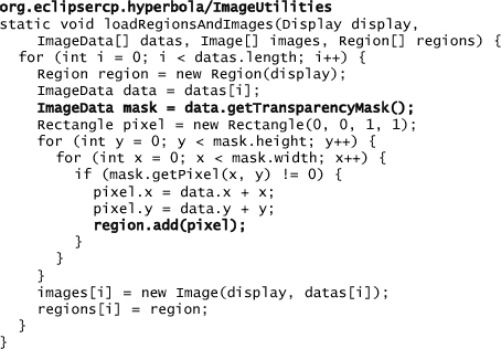
Here the template image is loaded and its getTransparencyMask() scanned to create the region. The region ends up being a collection of 1-×-1 rectangles, each representing one nontransparent pixel in the mask. Of course, the underlying implementation merges these rectangles.
Notice that this method handles the loading of several templates and regions. This is useful if your application allows switching the window shape or animating the window.
Note
The image used in this example has a fixed size. To create a resizable nonrectangular window based on an image requires more work than we can include in this example.
19.3.2 Creating the Window
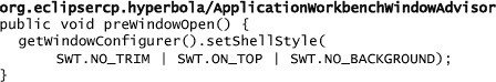
Once regions are initialized with images, you need to configure the application’s shell from the WorkbenchWindowAdvisor. The shell has to be configured with the SWT.NO_TRIM style bit before it is created. This is done in the WorkbenchWindowAdvisor method preWindowOpen():
Next, you must update the method postWindowCreate() to configure the shell in the following ways:
• Load the regions and images and add a paint listener to the shell to draw the shell border. This is much easier than drawing it programmatically using SWT graphics context (GC) calls.
• Add support for dragging the shell with the mouse. The usual method of moving shells with the title bar is not available here since the shell uses the NO_TRIM style.
• Set the size and region for the shell.
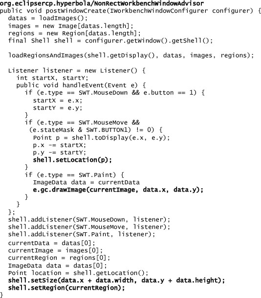
Don’t forget to dispose of the images when the window is closed.
19.3.3 Defining the Window Contents
The last step is to place the controls in the custom-shaped window. Unfortunately, SWT does not provide a predefined layout that can help here. Instead, since the window is a fixed size, you can simply place the controls at absolute locations within the shell. Using the drawing application you used to create the image templates, identify the coordinates for different locations in the image, and then use these to set the bounds of the controls. This is brittle, but it works.
In this example, three controls are placed in the window. A combo box is added to the top, the page content area is added in the middle, and the toolbar is added to the floating area at the bottom:
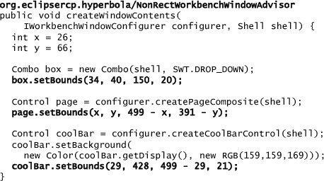
You can also set the background color for controls to make them blend into the window’s colors.
Colors That Can’t Be Changed
Some of the widgets created in the page composite area are drawn by the Workbench. These include the background area beside the tabs and the trim shown between views and editors that allow resizing. Refer to Chapter 20, “Customizing the Presentation of Views and Editors,” for information on customizing the look and feel of these areas.
19.4 Summary
This chapter should have opened your eyes to some of the UI customization options available in Eclipse. The Workbench is extremely flexible, and where it is less obviously customizable, it offers ways of overriding its mechanisms and letting you do what you want. Going off the beaten track is always more work, but as we have shown here, the cost of getting radically different looks is relatively modest.
The next chapter covers another set of customizations: changing how views and editors look and behave. Those facilities, in concert with the ones described here, remove all limits to customization of the Workbench.
19.5 Pointers
The presentation API is covered well in this presentation: