
Not every program needs a tool strip or status strip, but they can make the user's life easier, particularly for complicated programs. This lesson explains how to add tool strips and status strips to your applications.
Usually a tool strip sits below a form's menu bar and displays a series of small buttons that enable the user to easily perform frequently executed tasks. The buttons typically duplicate functions that are also available in menus, but placing them on the tool strip makes it easier for the user to find and use them.
Place only the most frequently used commands in the tool strip so it doesn't become cluttered.
Recall from Lesson 5 that you should also give most if not all of your menu items accelerators, and you can give the most important commands shortcuts. That means the user can access the most important and useful commands in at least four ways: mouse menu navigation, accelerators, shortcuts, and tool strip buttons.
To create a single tool strip, simply double-click the Toolbox's ToolStrip tool. By default, the ToolStrip docks to the top of the form so you don't need to position it manually.
Note
Recall from Lesson 3 that docked controls are drawn in their stacking order, which by default is the same as their creation order. To avoid confusion, if a form should contain a main menu and a tool strip, create the menu first so the tool strip appears below it and not above it.
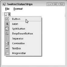
When you select a ToolStrip, the Form Designer displays a little icon with a drop-down arrow. Click the arrow to display a list of items that you might want to add to the ToolStrip, as shown in Figure 6-1.
As you can see from Figure 6-1, you can add the following types of objects to a ToolStrip:
The SplitButton and DropDownButton are new controls that you haven't seen before in the Toolbox so they deserve a little explanation.
The SplitButton normally displays a button holding an icon and a drop-down arrow. (You can change its DisplayStyle property to make it display text instead of an image, both, or neither.) If the user clicks the button, its Click event fires. If the user clicks the drop-down arrow, a menu appears. As is the case with all menus, if the user selects an item, that item's Click event fires.
One way you might use a SplitButton would be to have the menu items perform some action and then change the button's icon to match the action. Clicking the button would perform the action again.
In other words, you can think of the button as representing a tool, and clicking it activates the current action. Selecting an item from the drop-down menu selects a new tool and activates it.
The DropDownButton is similar to the SplitButton except it doesn't provide a button that the user can click to repeat the previous command. It's basically a drop-down menu.
Although they can contain many different kinds of controls, ToolStrips look best when they are not too cluttered and confusing. For example, a ToolStrip that contains only Buttons and Separators is easy to understand and use. DropDownButtons and SplitButtons are the next easiest controls to understand and they don't clutter things up too much so you can add them if necessary.
Avoid using Labels in a ToolStrip to provide status information. Instead, place status information in a StatusStrip.
A ToolStripContainer displays areas on a form's top, left, bottom, and right edges that can hold ToolStrips. At run time, the user can drag ToolStrips back and forth within and among these areas.
The center of the ToolStripContainer is a content panel that can hold one or more other controls.
In a typical configuration for these controls, a form optionally contains a MenuStrip and StatusStrip docked to the form's top and bottom, respectively. A ToolStripContainer is docked to fill the rest of the form, and its content panel contains the rest of the program's controls.
Figure 6-2 shows a form that contains a MenuStrip at the top, a StatusStrip at the bottom, and a ToolStripContainer filling the rest of the form. The ToolStripContainer holds three ToolStrips and a RichTextBox docked to fill its content panel.

Figure 6-3 shows this program at run time. Here, I have dragged two of the ToolStrips to the ToolStripContainer's left and right edges.

Two things in Figure 6-2 are of particular note. First, notice the thin rectangles holding arrows on the middle of the content panel's sides. If you click one of these, the control adds room on that edge so you can insert another ToolStrip.
The second thing of note in Figure 6-2 is the smart tag, which looks like a little square holding an arrow in the control's upper-right corner. If you click the smart tag, the smart tag panel shown in Figure 6-4 appears.
In general, smart tags provide quick ways to perform common tasks for a control. In this example, the smart tag panel lets you decide which panels the control should allow. If you uncheck one of the panels, at run time the user cannot drag ToolStrips to that edge of the ToolStripContainer.

Note
You can also determine which panels are available by setting the control's LeftToolStripPanelVisible, RightToolStripPanelVisible, TopToolStripPanelVisible, and BottomToolStripPanelVisible properties in the Properties window, but using the smart tag is easier.
After you build the ToolStripContainer, simply place ToolStrips on it and build their items as usual.
A status strip is normally docked to a form's bottom edge and displays labels, icons, and other controls to give the user a quick summary of the application's status. This area should be reserved for status information and should generally not include buttons and other controls that make the application perform an action. Those commands belong in menus and tool strips.
To create a status strip, simply double-click the Toolbox's StatusStrip tool. By default, the StatusStrip docks to the bottom of the form so you don't need to position it manually.
When you select a StatusStrip, the Form Designer displays a little icon with a drop-down arrow similar to the one it displays for a ToolStrip. Click the arrow to display a list of items that you might want to add to the StatusStrip, as shown in Figure 6-5.

As you can see from Figure 6-5, you can add the following types of objects to a ToolStrip:
The only new control, StatusLabel, behaves like a normal Label.
In this Try It, you create a MenuStrip (covered in Lesson 5) and a ToolStrip, both containing commands to change a RichTextBox control's ForeColor and BackColor properties. You also create a StatusStrip to show the currently selected colors. (Yes, I know this is redundant because the values are shown in the ToolStrip and in the text itself.) Figure 6-6 shows the program.
Note
You can download the code and resources for this Try It from the book's web page at www.wrox.com or www.vb-helper.com/24hourvb.html. You can find them in the Lesson06 folder in the download.
Create the form shown in Figure 6-6.
Create the
MenuStrip. The menu's hierarchy should be:File
Exit
Format
Text Color
Black
Red
Green
Blue
Background Color
White
Pink
Green
Blue
Initially check the Text Color menu's Black option and the Background Color menu's White option.
Give the Background Color menu items
Imagesthat display samples of the color.Create the
ToolStripwith buttons that duplicate the menu hierarchy. TheToolStripshould hold twoToolStripDropDownButtons.Give the
StatusStripaToolStripStatusLabelnamedlblColorwithText=Text Colors.Add event handlers.
Make the File menu's Exit item close the form.
Make the event handlers for each of the Text Color menu items set the appropriate properties for the
RichTextBox, menu items, toolbar buttons, and status label. Check the selected menu and toolbar items and uncheck the others.

Create the form shown in Figure 6-6.
Start a new project.
Add a
MenuStripto the form.Add a
StatusStripto the form.Add a
ToolStripContainerto the form.Add a
RichTextBoxnamedrchContentinside theToolStripContainer's content panel.
Create the
MenuStrip.Add the indicated menu items to the
MenuStrip. Remember to give them descriptive names and appropriate accelerator keys.
Initially check the Text Color menu's Black option and the Background Color menu's White option.
Set the Text Color

Set the Background Color
Give the Background Color menu items
Imagesthat display samples of the color.Set the
Imageproperties of these menu items to samples of their colors. (Use Microsoft Paint or some other graphical editor to make small, colored images.)
Create the
ToolStripwith buttons that duplicate the menu hierarchy. TheToolStripshould hold twoToolStripDropDownButtons.Name the first tool
ToolStripDropDownButton btnTextColorand make it display the text "A." Give it the items Black, Red, Green, and Blue. Each item should haveForeColorproperty set to its color.Create the
ToolStripDropDownButton.Below that item, add the items Black, Red, Green, and Blue.
Set the
ForeColorproperty for each of these items to show its color (for example, set the Black item'sForeColorproperty to black).
Name the second tool
ToolStripDropDownButton btnBackColorand make it initially display a white color sample. Give it the items White, Pink, Green, and Blue. Make each of these display anImageshowing a sample of the color.Create the
ToolStripDropDownButton.Below that item, add the items White, Pink, Green, and Blue.
Set the
Imageproperty for each of these items to show samples of their colors.
Give the
StatusStripaToolStripStatusLabelnamedlblColorwithText=Text Colors.Create the
ToolStripStatusLabel. Set itsNameandTextproperties.
Add event handlers.
Make the File menu's Exit item close the form.
Type the following bold line of code so the event handler looks like this:
Private Sub fileExitMenuItem_Click() Handles mnuFileExit.ClickMe.Close()End Sub
Make the event handlers for each of the Text Color menu items set the appropriate properties for the RichTextBox, menu items, toolbar buttons, and status label. Check the selected menu and toolbar items and uncheck the others.
For the Format
' Set the text color.Private Sub mnuFormatTextColorBlack_Click() _ Handles mnuFormatTextColorBlack.Click, btnTextColorBlack.ClickrchContents.ForeColor = Color.BlackbtnTextColor.ForeColor = Color.BlacklblColor.ForeColor = Color.BlackmnuFormatTextColorBlack.Checked = TruemnuFormatTextColorRed.Checked = FalsemnuFormatTextColorGreen.Checked = FalsemnuFormatTextColorBlue.Checked = FalsebtnTextColorBlack.Checked = TruebtnTextColorRed.Checked = FalsebtnTextColorGreen.Checked = FalsebtnTextColorBlue.Checked = FalseEnd SubEnter similar code for the other Text Color menu items.
Enter similar code for the other Background Color menu items.
Use the menu items' event handlers for the corresponding tool strip button event handlers.
Click the Properties window's Events button.
For each tool strip button:
Click the button in the Form Designer.
On the Properties window, select the
Clickevent. Then click the drop-down arrow to the right.Select the appropriate menu event handler. For example, for the
btnTextColorBlacktool strip button, select themnuFormatTextColorBlack _Clickevent handler.
Note
Please select Lesson 6 on the DVD to view the video that accompanies this lesson.
(SimpleEdit) Copy the SimpleEdit program you built in Lesson 5, Exercise 5 (or download Lesson 5's version from the book's web site) and add the tool strips, buttons, and separators shown in Figure 6-7. Delete the
RichTextBoxcontrol, add aToolStripContainer, and then re-add theRichTextBoxinside theToolStripContainer's content panel.The black button (fourth from the left on the second tool strip row) is a
ToolStripSplitButtonthat lets the user pick a text color. It contains the options Black, White, Red, Green, and Blue.The white button next to the text color button is another
ToolStripSplitButton.This button lets the user pick a background color. It contains the options Black, White, Pink, Green, Blue, and Yellow.The button that says "AB" is a
ToolStripDropDownButtonthat provides the same options as the Format menu's Offset submenu: Normal, Superscript, and Subscript.(SimpleEdit) Copy the SimpleEdit program you built for Exercise 1 and add menu item code to manage the new tool strip buttons. Add code to synchronize corresponding menu, context menu, and tool strip button items. For example, the following shows the new code for the Align Left menu item:
Private Sub mnuFormatAlignLeft_Click() _
 Handles mnuFormatAlignLeft.Click, ctxAlignLeft.Click
    mnuFormatAlignLeft.Checked = True
    mnuFormatAlignRight.Checked = False
    mnuFormatAlignCenter.Checked = False
    ctxAlignLeft.Checked = True
    ctxAlignRight.Checked = False
    ctxAlignCenter.Checked = False
    btnAlignLeft.Checked = True
    btnAlignRight.Checked = False
    btnAlignCenter.Checked = False

    MessageBox.Show("Align Left")
End Sub
(SimpleEdit) Copy the SimpleEdit program you built for Exercise 2 and attach the tool strip buttons to the corresponding event handlers. Write new event handlers for tool strip buttons that don't have corresponding menu items.
(SimpleEdit) Copy the SimpleEdit program you built for Exercise 3 and add code to display the appropriate image in the Background, Text Color, Offset, and Indent tool strip buttons. For example, when the user selects Offset Subscript, the
btnOffsetbutton and themnuFormatOffsetmenu item should show the subscript image.(SimpleEdit) Copy the SimpleEdit program you built for Exercise 4 and add appropriate tooltips to the program's menu items and tool strip buttons. For example, set the
btnAlignLeftbutton'sToolTipTextproperty to "Align the selected text on the left."Build the Scribbler program shown in Figure 6-8. Give it a
ToolStripContainerand twoToolStrips. Give the firstToolStripbuttons representing arrow, line, rectangle, ellipse, scribble, and star tools. Use code to make these tools exclusive options so if the user selects one, the others are deselected. Give the secondToolStriptwoToolStripDropDownButtonsto represent foreground and background colors. Use code to make the entries in each drop-down exclusive options so if the user selects one, the others are deselected. Give the color buttons appropriate images when the user picks a color. Give all of the tool strip buttons appropriate tooltips.


Note
You can find solutions to this lesson's exercises in the Lesson06 folder inside the download available on the book's web site at www.wrox.com or www.vb-helper.com/24hourvb.html.