Chapter 10
Tracing the Web Development Life Cycle
In This Chapter
![]() How HTML, CSS, and JavaScript work together
How HTML, CSS, and JavaScript work together
![]() Using CSS for text styling
Using CSS for text styling
![]() Using CSS for positioning text and graphics
Using CSS for positioning text and graphics
![]() Designing web pages with WordPress
Designing web pages with WordPress
![]() Using JavaScript in web pages
Using JavaScript in web pages
Web development has advanced hugely since its initial heyday in the late 1990s. At the time, there was a huge gold rush to stake out space in the online world — and in the minds of web users — for new business ideas. Pets.com, the Mining Company (now About.com), Facebook, oDesk (for freelancers), and AltaVista (once a famous search engine) were all big names, and all of them but Facebook are now defunct or rebranded or merged into some other company.
Now, you can spend an entire career in web development without ever actually starting a new website. A lot of the major players in the online world are already in place, so extending, expanding, improving, and updating existing sites can consume all the efforts of large web teams.
This can be misleading because it’s hard to fully understand the reasons that people do what they do on the web if you’ve never gone through the birth and successful launch of a website — from initial idea, through prototyping and development, to launch and getting more and more users — yourself.
Most web developers regularly work on new features, and new parts of a site, but it’s not the same thing as taking on (and downing) the whole enchilada.
Many web developers also work on weblike things, rather than true websites: intranet sites, where the audience is internal; apps, many of which are very weblike (or are even mobile device alternatives for the website that people use on computers — and on mobile devices too); and software that has a weblike, or an actual web interface.
In fact, one of the major reasons for creating and maintaining your own portfolio site, as described in Chapter 16, is just to have the excitement and insight that come from actually bringing your own ideas to life online within a fully developed, and truly new, website.
In this chapter, we describe the web development life cycle, from start to finish. Use the description here to recognize where your projects are in the overall life cycle, and to get a better idea of just what you really need to do to help make them succeed.
Seeing How a Website Gets Started
How does a website get started?
A website gets started to accomplish some goal, or set of goals. Being clear about what you want a website (or any web development project) to accomplish is vital to succeeding, or being able to know whether you’re succeeding.
Like other projects that organizations — and individual people — undertake, people often fail to think rigorously about why they create a website. This lack of rigor often causes problems, or even failure, for the entire life of the site.
To gain true clarity when starting a website, or other web development project, ask yourself a radical question: What’s going to be different because I did this project?
That is, forget about the project itself. What are the important things that will change? Create a list, and then stack-rank it: Put the most important goals first.
Here’s an example of goals for a website project, a stack-ranked list of the things that will change if someone starts a website giving news about solar energy projects — and it’s at least somewhat successful:
- More solar energy projects will get built, so more renewable energy will be used — and less fossil fuel will be burned.
- Fewer mistakes will be made in building solar energy projects, so they’ll be more profitable. Perhaps some injuries or even deaths will be avoided.
- The founders and the team will be able to make a living doing something they enjoy, so they’ll do a good job, there will be less turnover, and the successful business can grow and do more of 1 and 2.
 Always stack-rank your list of goals. If making money is your number one goal, that’s fine; putting it at the top of the list will help you succeed in your goal.
Note that this is not a list of what the website will accomplish. Also notice that it has no details about the website itself.
Instead, it’s a list of what you’re trying to accomplish by creating the website. The website details will be determined by whether they help accomplish the goals.
You should create a list like this for every website project and keep referring to it constantly throughout the project. The clarity you develop as a result will save you endless amounts of time, money, and hassle.
This process usually has some very valuable side effects, including
- Focusing on non-web pieces of a project: When all you have at hand is a hammer, such as an expert web-development team, everything looks like a nail. Focusing on the effects that you want a site to have helps you figure out if there are things that you need, in addition to the website, to accomplish your goals. (For instance, writing a book might also help better solar projects get built — and you can promote the book on the website.)
- Shooting down useless ideas: People always want to use the latest and greatest technology in their projects. This can have strong impact — but can also cost a lot of time and money. By having your goals in front of you, you only use the newest tech when it helps you accomplish what you really want to do.
- Keeping the site coherent and focused: Websites are protean — they can grow and change in a million different directions. By only adding features that contribute to core goals, you help users know just what they can get from your website and keep them coming back for more.
- Keeping meetings short: When every idea is equally valuable, you can spend endless hours discussing them. When you have clear goals, the most useful ones for your specific purposes float to the top.
There’s a lot of advice on website design and project management in general that includes advice about focusing. However, we think it’s so important that we’re devoting this whole section to it — and urging you to keep it at the top of your mind at all times.
Figure 10-1 shows some useful website advice from the U.S. Government’s Small Business Administration. Note that “figuring out what you want to do and defining your niche” is right at the top of the list.
You’ll often hear references to the “look and feel” or the “functionality” of a website. What are these capabilities, and how do they fit together? We describe these pieces here, to help you better understand how you can play your part.

Figure 10-1: The U.S. Government’s Small Business Administration tells you to stay focused and more.
Considering the Look and Feel
The number one cause for website projects getting delayed or even canceled, in our experience, is dissatisfaction from senior executives about the “look and feel” of a website. It’s worth understanding this better so that you focus on it at the beginning of a project, when it can still be fixed, rather than suffering over it at the end of a project, when it’s too late.
Even when executives see mock-ups early, as they usually do, the look changes in many ways as implementation proceeds. Also, an executive getting asked to approve the launch of a website is facing a much bigger decision than just green-lighting a project at the beginning. They can, and do, hold the nearly final result to a much higher standard.
The look and feel of a website is somewhat ineffable — “incapable of being expressed in words,” according to Merriam-Webster dictionary — but we’re going to try anyway.
You got the look
The look of a website is produced by a number of elements: the colors used, singly and in combination; the layout of major elements of each web page like the header, left and right rails, and footer; the amount of white space; the fonts used and how they work (or don’t work) together; and all the other visual elements combined.
Many website demonstrations for senior executives are actually over in a fraction of a second, even if they actually go on for hours. That’s because the senior executive doesn’t like the look of the website at very first glance. They may or may not know this themselves, and they may or may not tell you directly that it’s a problem. But the project, in its current incarnation, is probably doomed if senior executives don’t like the look.
This is a huge problem because the look of the site actually ends up determining, and being determined by, a myriad of things about how the site looks and works. There are some combinations of text and graphics, for instance, that just won’t fit well on a page together if the central content column is narrow. Articles that seem too long when a large font size and a narrow central column is used may look just fine with a smaller font size or a wider central column.
The person in charge of the website project is usually responsible for the look. That’s why graphic designers are so often in charge of these projects, even if other skill areas might seem more important — and why designers who can code well enough to implement their own ideas, or competently lead others in implementing them, are so valuable.
Other team members also have a lot of input into the look of a site, both in the initial design process up front and in the many “small” implementation decisions that end up determining how the planned-for look really appears on the actual site. This tends to make the look better — but also results in widespread disappointment, even shock, if senior executives question or even reject it late in the game.
There are three major things you can do to prevent senior executives from killing your projects, or forcing a painful major revamp, late in the game:
- Get senior executives involved in choosing the look up front. Develop options for their approval and present them. Implement the choice enthusiastically and without major changes, unless you get approval up front for the changes as well.
- Keep showing the look to senior executives as the project progresses. Remind people who will sign off on the project what they’ve already approved. Get any negative feedback in early, while you can still act on it.
- Gather evidence that people exposed to the project like the look. Ask everyone who tries the website what he thinks of the look. Record the comments. Tweak things where needed. Present the feedback you get to executives as part of project updates, and again in approval meetings late in the game.
Every time you take one of these steps, you make it more likely that the website will have a look that executives like, and you also build trust in your own judgment, openness to criticism, and willingness to adjust. All these factors make it more likely that you’ll be able to get your project over the finish line without being ordered to start over — and that you’ll be able to recover quickly if you are.
To understand how the goals of a website can be implemented in its look, consider the websites shown in Figure 10-2, the U.S. Department of Defense (or “the Pentagon,” which was once called the Department of War); Figure 10-3, the U.S. State Department (as close as the U.S. has to a “Department of Peace”); and Figure 10-4, the U.S. Department of Agriculture (which could be called the “Department of Food”).

Figure 10-2: The Pentagon looks like it’s presenting just the facts, ma’am.

Figure 10-3: The State Department website has an open and inviting layout.
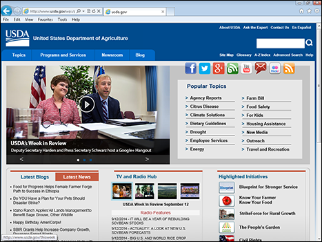
Figure 10-4: The Department of Agriculture website has a friendly look, but with lots of information per square inch.
Each website uses an image clearly relating to its mission. And each has aspects that somewhat fit the public image of the department involved — the Pentagon’s is dense and seemingly factual; the State Department’s is more open and inviting; the Agriculture Department’s is somewhere in-between.
Consider writing down some ideas about how changes to the web design and content for each government department could better reflect its mission and role.
Getting the feel right
The “feel” part of the “look and feel” of a website has a couple of different meanings:
- The feel of something implied by the look: When we look at things, we imagine what they might be like to touch, so a certain degree of touch-type feeling goes with looking. A design can look warm, smooth, cool — all descriptions of how the website design might feel if we could somehow touch it.
- The feelings — emotions — inspired by a visual design: Design affects us emotionally, although everyone’s reaction is different, and the same person’s reaction can vary at different times.
- How it feels to use the website: The process of moving around and accomplishing tasks on a website can feel smooth and easy, difficult, or in-between.
These different meanings of “feel” explain a few things:
- A website can have a “feel” before you “touch” it by trying to use it.
- The overall “feel” of a website changes as you use it, as you add that kind of “feel” information to the part that you get just from looking at the design.
- Different people can mean completely different things when they talk about the “feel,” or the “look and feel,” of a website.
Whereas the “look” part of a website is the responsibility of the project head, who usually has a graphic design background, the interactive parts of the “feel” of a website can be the responsibility of several different people. This can include usability people; front-end programmers; interaction designers; and graphic designers.
 In a well-run team, everyone gives opinions on everything, but the ongoing responsibility for each aspect of the website is also clear.
Bringing the pieces together, a well-run organization will usually have standards for the look and feel of all its websites, external and internally focused. The standards might be applied loosely for low-use, short-term, and internal websites — which are often cobbled together from existing pieces anyway — but applied more strictly for large, highly visible projects and more novel ones.
Figure 10-5 shows the look and feel standards for the U.S. Environmental Protection Agency (EPA). These standards are such a focus for the EPA that they have a name, One EPA Web. Notice the strong wording used — “complying” and “requirement” for using the standard.
 Because big projects often have a wide scope and involve a lot of new work, you may go into the project thinking that there’s a lot of room for creativity. However, these big projects also get the attention of gatekeepers: people who believe that organizational standards are very important. (And often the same people who created and maintain those selfsame standards.) So be ready to be creative on new projects, but to respect and improve, rather than replace, your organization’s standards as you do so.

Figure 10-5: The EPA has a “look and feel” standard that’s so strong, it had to name it — One EPA Web.