
Chapter 11
Implementing and Shipping a Site
In This Chapter
![]() Understanding user needs
Understanding user needs
![]() Creating the look and feel
Creating the look and feel
![]() Developing content and functionality
Developing content and functionality
![]() Creating test sites
Creating test sites
![]() Shipping a site
Shipping a site
There’s a famous phrase in Silicon Valley lore that applies strongly to web development. It’s just two words: “Winners ship.”
This phrase was quoted in an article about Apple being slow to ship a version of its iOS software which runs iPhones and iPads. The version was iOS 7 and it finally shipped in May 2013, shortly after the passing of Steve Jobs.
The article praised Jon Ivey, head of design at Apple, for cleaning up the look of iOS 7 – but it also said, “Winners ship product, and Apple really can’t afford a delay right now.”
The phrase “winners ship” came from the old days where the main action in technology was in hardware and packaged software. If you’re old enough, you’ll remember buying all your software off the shelf, in boxes — and later using early websites like Egghead.com to have boxed software shipped to you.
And that’s where “winners ship” came from. You had to stop working on the hardware or software in question, let it go through final QA, fix as many urgent bugs as you could in a day or two, and then it would go to production. Literal production: Machines would manufacture hardware, or copy floppy disks and print packaging for software, and at some point the postal service would come and start delivering packages to customers.
Websites, of course, are ephemeral — nothing but bits. So “shipping” just means letting the public get access to something that you’ve had online, in a staging site, for days or weeks before the launch date.
But “winners ship” still applies. The greatest website in the world can’t really be great if it goes out too late, costing everyone involved money and frustration. You have to think about the ship date from Day 1 of the project to have a snowball’s chance in Hades of actually meeting the desired date.
In order for you to do a good job as a web developer, you need to understand the entire life cycle of website development — not just what you do, but what everyone does. This will help you understand others’ issues and needs. It will also help you know when it’s the right time to introduce a brilliant new idea — and when it’s best to just put the blinders on and “get it done.”
In this chapter, we describe how the process of “shipping” a website works, and how different job descriptions and roles in web development work together to make it happen.
For clarity, we talk about projects where a new website is being developed. However, most website projects today are updates, rather than “greenfield” new development. These projects still fit within the overall development life cycle, but some parts are shortened because the website already exists. Use this chapter as a model for all kinds of projects.
Phase 1: Grokking User Needs
The science fiction author Robert Heinlein coined the term grok in his 1961 science fiction novel, Stranger in a Strange Land. The term is used pretty regularly in web development.
To grok something means to understand it very deeply and completely — not just intellectually, but emotionally as well. The reason that we talk about grokking user needs in web design is that developers need to be able to predict how the user will react to different designs and different ways of interacting with the site.
To do this properly, developers need to temporarily put themselves completely in the place of the user, which is famously difficult. So a lot of techniques are used to help developers understand user needs.
The best method is to make a developer watch while a user tries to accomplish tasks on the developer’s website. The developer is isolated from the user and not allowed to interact with him and her. Developers have been known to cry in frustration while “stupid” users clicked the wrong link, entered wrong information, or failed to read seemingly obvious instructions.
Figure 11-1 shows a web page about remote testing from the usability.gov website. In remote testing, you get to watch how someone uses your site without being in the same room with him. This helps you concentrate on what the user is doing and not try to call out to him that he’s doing it wrong.

Figure 11-1: Remote testing is a useful — and relatively inexpensive — way to get useful feedback on your website project.
Short of this, developers need to be good at getting quick feedback from other team members, work colleagues, even friends who are not on the project. They also need to be good at watching themselves as they use websites designed by others, noticing what is and isn’t helpful as they move through a site.
In a well-resourced and well-run project, there are several steps where outside input is sought and used. It’s much cheaper to get needed feedback early in a project than after the website launches. But many organizations take the more expensive approach.
 Understanding user needs is the job of everyone on the project. However, there are usually one or two people on a project who take on the role of “voice of the user.” If this is you, consider moving into usability or project management. If you’re already the project manager, either develop this skill yourself, or cultivate and encourage people who have it most strongly.
Phase 2: Developing the Look and Feel
In Chapter 10, we describe the look and feel of a website as “ineffable” — that is, almost impossible to put into words. But words are all we have to tell you about how to design the look and feel of your website, so we’ll do our best.
As with user needs, everyone on a project can and should contribute to getting the look and feel right. Your career will take off if the websites you work on have an attractive look and feel and are easy to use; it may well languish if there are problems in these areas. This is true whether these areas are, strictly speaking, your job or not.
Designers are the ones who take the heat directly, or get the credit, for the look and feel of a site. However, everyone on the project benefits when things go well, and looks bad when they don’t.
Getting the look and feel right is a challenging process, but here are a few tips and tricks to help:
- Pick a target audience. Identify the most important target audience for your site. Always make sure that the decisions you are making will work for that target audience. Then pick a couple of secondary audiences and consider their needs as well.
- Develop personas. Personas are fictional people you describe in detail, representing imaginary users of your website. Describe several personas in detail. Then figure out what that user will want and need from your website.
- Look at sites that are popular with your target audiences. For each of your target audiences, and each of the personas you create, identify sites that are popular with that group. Then analyze the sites for their look and feel, the functionality they support, and how the functionality is implemented. If you want to do something that doesn’t fit these models, be ready to explain why.
- Figure out which devices are popular with your target audiences. Find out how much they use computers versus tablets versus smartphones, and whether they favor apps or websites, when they have a choice. Mac or Windows? iOS or Android? These questions will serve as gateways into your users’ circumstances and needs.
- Find words to describe your chosen look and feel. Pick some words that describe what you’re trying to achieve – “dense” versus “open”, “fun” versus “serious.” Then refer back to these word choices when it’s time to make design decisions.
- Think about apps and real-world tools. In addition to the website, think about whether your organization will make some or all of the same information and functionality in an app. Also, how do people get the same information, or accomplish the same tasks, if they are proceeding in meat space (the real world), not using a computer or smartphone? How can each type of process be informed by the other?
Figure 11-2 shows U.S. Department of Energy standards for app development. Consider app development when planning your website.

Figure 11-2: Apps for tablets and smartphones should be considered along with your website look and feel.
Phase 3: Creating Content
Deciding on the content for a website is tough! There are so many things that people think should be on a site. It can be very difficult to decide.
If you’re in content development for a site, you should make a point of knowing what’s on competing websites and what’s on similar websites, which might not compete directly with yours, but which are similar enough in purpose to set expectations in the user’s mind.
For instance, new car and used car sites are more similar than different, and a user might easily go back and forth between them in a given session. For instance, new car sites tend to be glitzy and use advanced technologies like 3D look-arounds; used car sites tend to be simple, easily searchable databases and lists. There might be things that each could learn from the other. So look at both kinds when you work on one kind or the other.
No matter what your role on a web project, people will react positively if the “right stuff” is on the site and easy to access, and poorly if they can’t find things that they need. So figure out for yourself what should be on the site and push to have it included.
The key is to think of users as coming to your website to accomplish tasks. This is obvious when you think of buying a product or getting a phone number. But getting needed information or entertaining yourself with something funny are also tasks.
So the core content of a website is whatever is needed to allow users to accomplish their desired tasks. This can include how-to information, articles, and more.
There’s also a lot of supporting content on a website. This comes in two forms. The first is information that helps users accomplish tasks. The names of navigation links are supporting content of this type.
There is also information that everyone expects to be on a given type of site — such as a list of past press releases, with links, on an organization’s main site. The way to get this done is to realize that this is task-oriented information too, provided for certain audiences. For instance, links to press releases are usually provided for journalists first. But they’re also interesting to investors, analysts, and even some regular customers.
So meet needs that initially seem to be in the category, “because people expect it” — but think through who’s using the information and why. You’ll do a better job.
You can think of your website as a Christmas tree. Before you decorate the tree, it’s just branches and pine needles. That’s the basic structure of your site — navigation, tabs (major areas of the site), and links.
Then you add ornaments. The ornaments are the things users need to accomplish their tasks, and might include an article the user wants to read, a downloadable file, or the capability to buy a product. The ornaments need to be easy to get to by following the basic structure of the tree itself. They also have to be easy to find through search or from parts of the site that they’re related to in some way.
An advanced use of content is to develop a content marketing strategy. This means using content, such as blog posts or downloadable reports, to get users to come to your website, and to keep them coming back over and over. Often, content marketers seek to engage customers by asking them to subscribe to an email list, attend an online webinar, or attend a real-world conference or showcase event. That way, when it’s time to make a decision — such as, to buy a car, or make a donation to a charity — they buy the car your company makes, or donate to the non-profit organization that you work for.
So think all this through. Different stakeholders will tell you that “of course” you need this or that piece of content on the website. They’re probably right, but it’s your job to determine why that piece of content needs to be there. You also need to decide which content absolutely has to be there on launch day, and which can wait.
Figure 11-3 shows advice from the Small Business Administration on content marketing. There’s much more out there — websites, books, and of course downloadable reports and articles. Consider content marketing as a kind of battery-powered ornament on the Christmas tree of your site that keeps attracting people to interact with it.

Figure 11-3: The Small Business Administration educates people on content marketing.
Phase 4: Developing Functionality
Website functionality will drive you nuts. Developing functionality is really important, and really hard.
Website functionality is, strictly speaking, the concern of project management and software developers first, and everyone else second. However, it’s dramatically obvious when functionality on a website doesn’t work well, and a real pleasure when it does.
As a software developer, try to get stuff working well before you declare yourself done. Consider asking friends or family to poke at it as you go along. They can ask “obvious” questions that you might have missed, and that will make your work better. Then your project colleagues, and ultimately your end users, will really appreciate that the functionality you create works the way they expect it to, right from the start.
Same for project managers — work closely with developers and get stuff working well before you inflict it on other colleagues and internal testers, let alone real users.
Everyone on the team should pitch in. “If you see something, say something.” It’s not always fun to tell people that their stuff just doesn’t work, or even just that it can use improvement, but it’s a vital role on any web development team.
What does “website functionality” even mean? It’s probably clearest in the case of an e-commerce site. Amazon.com’s One-Click buying is a clear example of website functionality. So much so that Amazon claims patent protection for this important feature.
But there are all sorts of things you might like on your website. Forms so users can ask for information easily. The capability to search the site, or articles, or bug reports. Pop-up windows with brief help information or definitions of terms. And on and on.
Each piece of web functionality that you want added to your site is usually a project of its own. For some reason, there’s an immense temptation to put off starting on web functionality until late in a web development project. On a three-month project, people wait until six weeks before launch — or four weeks before launch — to start on a six-week project to add functionality.
This is, of course, is mildly insane. It’s very rare indeed that your six-week project really only takes six weeks. Functionality is often able to be worked on separately from other aspects of the website, such as regular update cycles. So as soon as you determine that a piece of functionality is the next most important thing to add to your website, start working on it. Don’t stop until you’re done.
Web functionality is usually implemented by engineers — some combination of front-end engineers for the user-facing part, back-end engineers to interface with databases and other existing systems, and perhaps also plain old software engineers (not web-specific) to handle complicated functionality. But project managers, designers, usability people, and just about the entire development team should also be involved.
Figure 11-4 shows an online article about the FBI adding new functionality to its online stolen art database. Better website functionality can make a big difference in all sorts of important things. Take it seriously, and your career will blossom.
 Manage website functionality changes separately from changes in navigation, content, and design. Website functionality projects are real software development projects, with all the headaches which that implies. (Including the famous dictum, of Mythical Man-Month fame, which says that half of all software projects fail.)
If you haven’t read The Mythical Man-Month by Frederick P. Brooks (Addison-Wesley, 1995), stop what you’re doing and read it right now. It’s called “the classic book on the human aspects of software engineering” for a reason. Then go read The Soul of a New Machine by Tracy Kidder (Little, Brown & Co., 1981). It’s the ultimate story of a technology development project, including the famous “death march” that often occurs in the weeks and months before a product (or website) ship date. After you read each of these books, take a day or two off and think about what you’ve read. You’ll be better at everything you do in technology for the rest of your career as a result. And you’ll have something very valuable to talk about with other cognoscenti.

Figure 11-4: The FBI is getting the public’s help in finding stolen art.
Phase 5: Creating the Test Site
A test website is a thing of beauty. If you are on a website project where you create a test site, test it with users, and incorporate the feedback, you’re probably on a well-run project.
In all too many web projects, the test site part ends up getting skipped — or never put in the schedule in the first place. The live site at the end of the project ends up serving as the test site. The public gets to use a crappy site, and fixes only happen after many people get a bad impression of your organization from the under-tested website’s problems and the resulting bad publicity.
So, as you rise into project management — or just get a reputation as a tetchy and demanding team member — part of your to-do list is to see that test sites get created; get tested by real users; and that the feedback gets incorporated into the site on this development cycle, not the next one.
This is not easy, given the pressures involved. But it’s also the mark of professionals.
No matter what your role on the team, take test sites seriously. Of course they’re not “live.” But a test site is your best chance to help make sure the live site shines from the minute people start using it. Pay attention and contribute strongly.
One of the things that you can test in the test-site phase is the accessibility of your site — how usable it is to people with various kinds of disabilities, such as vision impairment or blindness.
You may not be able to make your site fully accessible overnight. But if you can improve accessibility with each release, you’ll soon have an unusually accessible website.
Figure 11-5 shows a useful initial list of website testing tools. To access this list, visit www.w3.org/WAI/ER/tools/complete.
Accessibility might seem arcane if you don’t personally know any disabled web users, or if deadline pressure is making you buggy. But accessibility is not only valuable in its own right, and it’s not just required by law in many jurisdictions. It’s also the best way to make your site more usable for everyone. Pay attention to accessibility and usability together, and the websites you develop will become remarkably easy to use.
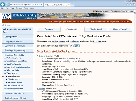
Figure 11-5: Accessibility testing tools help you get accessibility — and usability — right.
Phase 6: Launching the Site
Launch time for a new or updated website is so worrisome — and so exciting. All of us in web development live for it, even if we have a hard time admitting it.
The development team is usually exhausted by this point and just wanting the *#&@&@# thing to get out the door. And everyone internally is bored with the new features, the new look, and the new functionality, which she may have been hearing about for a year by now.
That’s why it’s good, for every role on the team, to “muck in,” as the Brits put it, at site launch time. Try to take a fresh look at the site. Check that links work. Proofread stuff. Try to break it. Then, when you do, tell your colleagues, in a positive manner. There are always going to be problems with a new site; fixing them fast, before many people see them, is something the best people do as a habit.
Still, you can only take so much of a fresh look yourself. You need some new blood to help with launch — or for the existing “blood” to find a way to get a new attitude. Here are a few tips for a successful site launch:
- Look at the new site from a user’s point of view. What are the top three cool things about the site? Just before you launch, identify these winners. Tweak them; improve them; make sure they “do what it says on the tin.” The top few new features are likely to get a huge amount of attention, and everything else is likely to get very little.
- Look at the new site from an internal point of view. What are the top three things you were trying to do with this launch? (Hint: They’re unlikely to be exactly the same as the top three user-visible features mentioned in the preceding bullet point.) Identify these goals. Improve the implementation where you can; fix problems where you must. And if the implementation has fallen short of the original goals, be ready to explain why.
- Find the top three bugs or problems. Find the worst three things about the site. Fix what you can. Be ready to explain what you must.
- Compare to a couple of top competitors. Look at a couple of competing sites. (Not necessarily direct business competitors, but sites that your site will be compared to.) What’s better on your site than the competition? Worse? Be ready to answer this, and to describe plans for improvement where needed.
- Run it by your “worst enemies.” Show the nearly live site to your toughest critics internally. Find out what they think. Fix any problems you can immediately, and make a longer-term plan to address any problems that you can’t fix on this go-around.
- Publicize as much as you can. There’s usually a limit to how much publicity you should do for a website launch or relaunch. But within that limit, get the word out. If some new feature is likely to get attention — such as the FBI’s newly improved capability to track stolen artworks — get the word out in advance.
- Keep a list for next time. It’s amazingly easy to forget all the good ideas you had at the end of the last round of changes to your website. Especially keep track of executive comments. These people run your company; getting their pet bugaboos fixed is valuable all around.
Figure 11-6 shows a press release for a new website update from the city of Boulder, Colorado. View the press release at https://bouldercolorado.gov/newsroom/july-29-2013-city-of-boulder-launches-new-website.

Figure 11-6: The City of Boulder doesn’t get right to the point in its press release.
Unfortunately, the first paragraph of the press release is way too internally focused. It cites a “new layout and design” and “several features” that make the site easier. The first paragraph should include at least one specific feature that people will notice and like about the new site.
Sadly, some people in your organization may resist calling out one or two key new features in a website relaunch. They don’t want to prejudice users in favor of just one thing, or fail to acknowledge everyone’s hard work on the redesign. Unfortunately, unlike the kids in Garrison Keilor’s Lake Wobegon, not every feature in a website redesign can be above average. Pick one or two key features to hook the public into checking out the whole thing.
The first paragraph of the Boulder press release also gives the date of the last new site design; sorry, but no one cares, at least not enough to put that in the first paragraph.
As web designers, we know that people scan content, and often only notice one or two key points on the very top of a web page. You should apply this insight and expertise to your press releases and other communications as well as to your websites.