
7
Value segmentation and cross-selling in retail
7.1 The business background and objective
In retail, competition is hard. The lack of a formal commitment and the easiness with which shoppers can switch to competitors make the process of building a loyal customer base tougher for retailers. Quality of offered commodities and competitive pricing are often not enough for standing out from the competition. In such a dynamic environment, a competitive enterprise should try to understand its customers by gaining insight on their attitudes and behaviors.
To achieve this, retailers have to collect and analyze usage data. Fortunately, this type of information is usually stored at a very detailed level at the point of sales. Transactional data which typically record the detailed information of every transaction are logged with every purchase. A prerequisite for summarizing transactional information at a customer level and for tracking the purchase history of each customer is that every transaction is identified to a customer. This issue is usually tackled with the introduction of a loyalty scheme which assigns a unique identification number, card ID, to each loyalty card. Customers use their loyalty cards for their purchases, and this way, the anonymous transactional records are associated with a specific card ID and a customer.
In this chapter, we’ll focus on the efforts of a retailer (chain of department stores) to analyze purchases’ data and gain insight on its customers. More specifically, the marketers and the analysts of the retailer decided to explore raw transactional data in order to:
- Segment the customer base according to their value (purchase amount) to discern high value from medium- and low-value customers and incorporate prioritization strategies for handling each customer accordingly.
- Go a step ahead and apply RFM cell segmentation. Combine the amount of purchases with frequency and recency of transactions (RFM analysis) to gain a 360° view of the customer relationship with the enterprise.
- Use the above information along with other demographical and behavioral data to promote their new department of House and furniture products. They’ve scheduled a cross-selling campaign for their new department, and they decided to build a relevant model to better target their campaign. In the past, their cross-selling lists were only based on RFM cells. They recorded the response rates of RFM cells in previous campaigns and targeted the best-performing cells. This time, they’ve planned to train a propensity model using all the available information in order to refine their campaign lists and increase their response rates.
7.2 An outline of the data preparation procedure
Five months of transactional data was retrieved for the needs of the mining applications planned (value-based segmentation, RFM cell segmentation, cross-selling model) covering the 5 first months of 2012. The original data, as we’ll see in the next paragraphs, contained multiple lines per order transaction, recording the specifics of each transaction: transaction date, invoice number, store id, payment type, amount, and item code. However, customer-level data were required for all mining applications. Therefore, through extensive data preparation, the detailed raw information had to be transformed and aggregated to summarize the purchase habits of each cardholder, providing a customer “signature,” a unified view of the customer. The usage aspects summarized at a customer level included:
- The frequency and recency of purchases
- The total spending amount
- Relative spending amount per product group
- Size of basket (average spending amount per transaction)
- Preferred payment method
- Preferred period (day/time) of purchases
- Preferred store
- Tenure of each customer
Table 7.1 presents the initial data for two fictional cardholders (Card IDs C1, C2) and three purchase transactions (Invoices INV1, INV2, INV3). Each transactional record (line) contains information about, among other things, the invoice’s number, the date and time of transaction, the code of the product purchased, and the paid amount.
Table 7.1 Initial transactional data retrieved
| Card id | Invoice num | Transaction date | Item code | Amount ($) |
| C1 | INV1 | 2012-2-20 09:10 | PR1001 | 20 |
| C1 | INV1 | 2012-2-20 09:10 | PR2002 | 58 |
| C1 | INV2 | 2012-3-17 18:12 | PR1002 | 110 |
| C1 | INV2 | 2012-3-17 18:12 | PR1003 | 20 |
| C2 | INV3 | 2012-4-17 19:17 | PR2001 | 58 |
| … |
The data preparation procedure is presented in detail in the next paragraphs. Its main steps are outlined below.
Table 7.2 Pivoting transactional data to generate new fields per product group, day and time zone of transaction
| Card id | Invoice num | Transaction date | Item code | Amount ($) | |||||
| Product group pr1 | Product group pr2 | Morning (09:00–16:00) | Afternoon (16:00–) | Weekdays | Weekends | ||||
| C1 | INV1 | 2012-2-20 09:10 | PR1001 | 20 | 20 | 20 | |||
| C1 | INV1 | 2012-2-20 09:10 | PR2002 | 58 | 58 | 58 | |||
| C1 | INV2 | 2012-3-17 18:12 | PR1002 | 110 | 110 | 110 | |||
| C1 | INV2 | 2012-3-17 18:12 | PR1003 | 20 | 20 | 20 | |||
| C2 | INV3 | 2012-4-17 19:17 | PR2001 | 58 | 58 | 58 | |||
| … | |||||||||
Table 7.3 Aggregating at a transaction (invoice) level
| Card id | Invoice num | Transaction date | Amount ($) | |||||
| Product group pr1 | Product group pr2 | Morning (09:00–16:00) | Afternoon (16:00–) | Weekdays | Weekends | |||
| C1 | INV1 | 2012-2-20 09:10 | 20 | 58 | 78 | 78 | ||
| C1 | INV2 | 2012-3-17 18:12 | 130 | 130 | 130 | |||
| C2 | INV3 | 2012-4-17 19:17 | 58 | 58 | 58 | |||
| … | ||||||||
Table 7.4 Aggregating at a customer (Card ID) level
| Card id | Transaction date_max | Amount ($) | Number of transactions | |||||
| Product group pr1 | Product group pr2 | Morning (09:00–16:00) | Afternoon (1600–) | Weekdays | Weekends | |||
| C1 | 2012-3-17 18:12 | 150 | 58 | 78 | 130 | 78 | 130 | 2 |
| C2 | 2012-4-17 19:17 | 58 | 58 | 58 | 1 | |||
| … | ||||||||
7.3 The data dictionary
In the next paragraphs, we’ll examine in detail the data preparation procedure with the use of IBM SPSS Modeler. The data dictionary of the transactional input data is listed in Table 7.5.
Table 7.5 The transactional input data
| Data file: RETAIL_DP_DATA.TXT | |
| Field name | Description |
| CARD_ID | The ID of the customer loyalty card |
| INVOICE_NO | The invoice number of the order transaction |
| TRANS_DATE | The date/time of the transaction |
| STORE | The store code in which the transaction took place |
| ITEM_CODE | The item code of the purchased product |
| PAYMENT_TYPE | The payment type (card/cash) |
| AMOUNT | The amount for the item purchased |
Note: only purchase data of cardholders (transactions associated with a specific card ID) were retained and used in the applications. Unmatched purchase data not associated with customers were discarded. After all, only registered customers could be monitored, addressed, and handled according to the results of the marketing applications planned.
The demographics of the cardholders, collected upon application for the loyalty card, were also retrieved and merged with the transactional data to enrich the profile of each customer. These data are listed in Table 7.6.
Table 7.6 The demographical input data
| Data file: RETAIL_DEMOGRAPHICS_DATA.txt | |
| Field name | Description |
| CARD_ID | The ID of the customer’s loyalty card. To be used as the key field for joining demographics with purchase data |
| GENDER | Gender of customer |
| REGISTRATION_DATE | The registration date, the date when customer applied for the loyalty card |
| CHILDREN | Number of children of cardholder, when available |
| BIRTH_DATE | Cardholder’s birth date |
7.4 The data preparation procedure
The data preparation process outlined in Section 7.2 is presented in detail below using the IBM SPSS Modeler data management functions. Those interested only for the modeling applications could skip to Section 7.5 (although it is strongly recommended to follow the data transformations applied).
7.4.1 Pivoting and aggregating transactional data at a customer level
The first steps of the data preparation process included a series of IBM SPSS Modeler Derive nodes for the construction of new attributes denoting categorization information for each transaction. More specifically, each transactional record was decoded and categorized according to date/time zone (weekday–weekend, morning–afternoon), product group, store, and payment type. Although in the real world product grouping would have been done by mapping the Universal Product Code (UPC) of each purchased item with a reference (lookup table) containing the product grouping hierarchy, for simplification, we assume in our case study that the first two characters of the ITEM_CODE field indicate the relevant product group.
At first, the weekday information was extracted from the transaction’s timestamp field (TRANS_DATE) using the Modeler datetime_weekday() function. Then, with the datetime_hour() function, the transaction hour has been extracted and grouped into time zones. This was achieved by using a Modeler Flag Derive node as shown in Figure 7.1. All transactions that took place before 4 p.m. were flagged as morning transactions and the rest as afternoon.
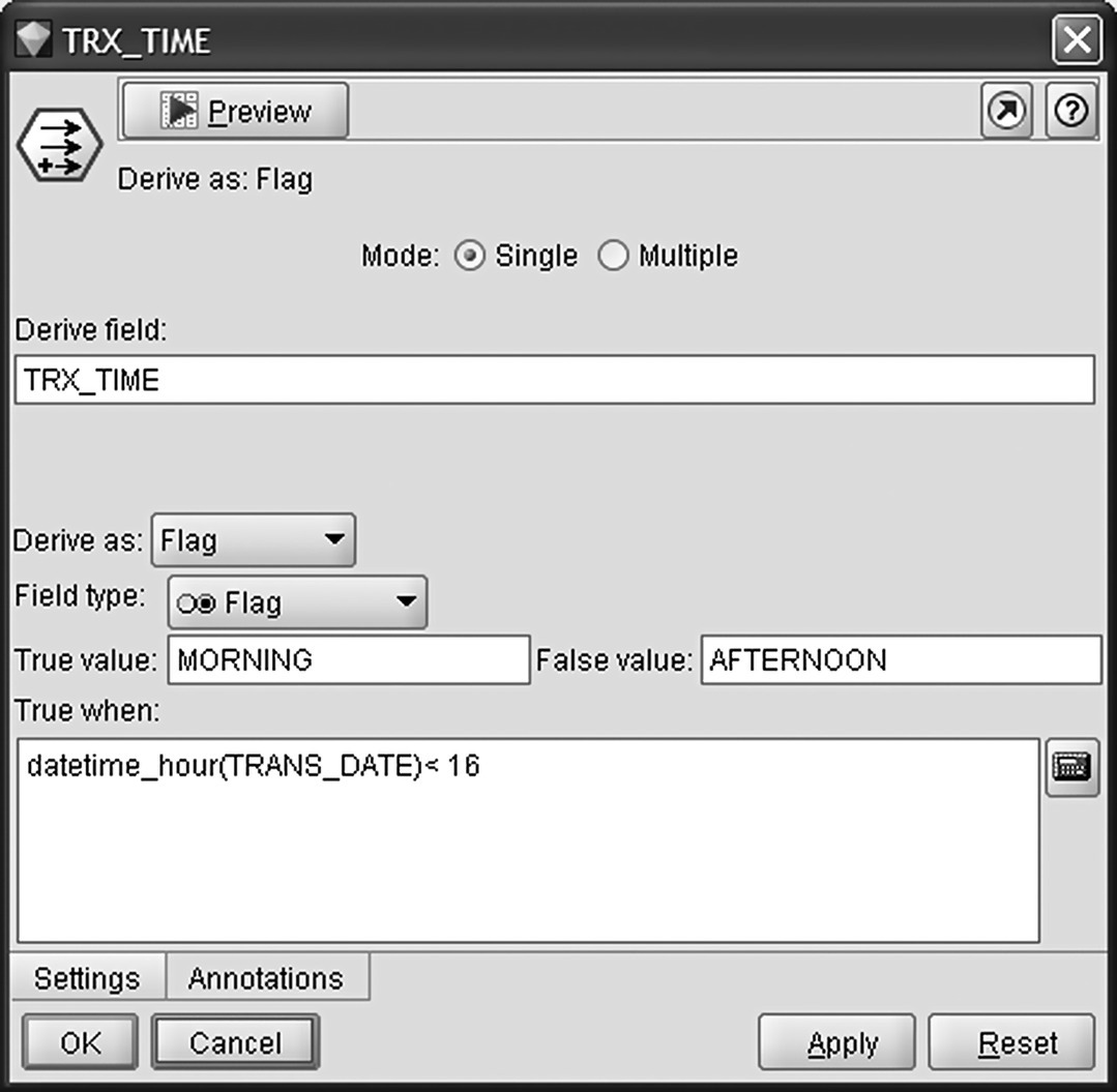
Figure 7.1 Categorizing transactions into time zones
After recoding the information, it was time for pivoting the data to summarize the purchase amount (field AMOUNT) per product group, date/time zone, payment type (card/cash), and store. A series of Restructure nodes were used which created numerical fields based on the values of the grouping attributes.
The Restructure node for pivoting based on the payment type is displayed in Figure 7.2.
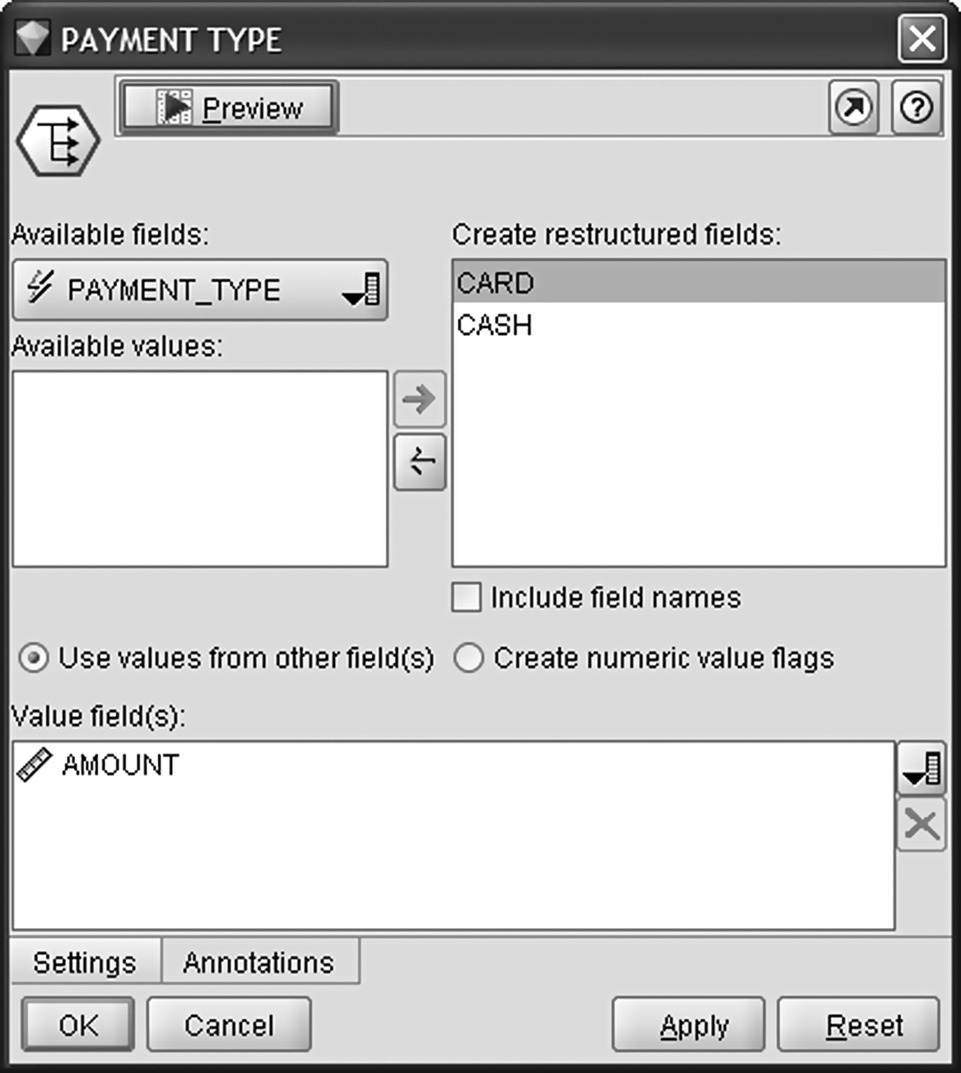
Figure 7.2 Pivoting paid amount based on payment type
Similarly, a series of Restructure nodes were also applied to generate a set of numeric flag fields with a value of 1 for our categorizations. This way, in the subsequent aggregation, the sum of the 1s simply denotes the number of transactions per store, date/time period, etc.
The aggregation was carried out in two steps in order to count the transactions per customer. The first aggregation summarized the numeric fields per transaction/invoice (field INVOICE_NO). In the second step, the invoice information was further aggregated at a cardholder/card id (field CARD_ID) level as shown in Figure 7.3.

Figure 7.3 Aggregating transactional data at a customer level
The number of aggregated records per card ID designates the number of order transactions (invoices) in the period examined.
The total spending amount and the sum of spending amount per store, product group, date/time zone, and payment type were computed for each cardholder. Similarly, the aggregated fields summarized customer behavior in terms of the number of transactions. The most recent transaction date was also captured as the maximum of all transaction dates (maximum of TRX_DATE field). This field will be used later for the calculation of the recency for each customer.
The demographics, listed in Table 7.6, were then retrieved and joined with the purchase data using the card id (field CARD_ID) as the key for merge. A Modeler Merge node had been used and an inner join had been applied as shown in Figure 7.4. The inner join merge retained only customers with demographics since for the rest of the customers, no contact data were available and hence any interaction and marketing action was not feasible.

Figure 7.4 Adding the demographics using a Merge node
7.4.2 Enriching customer data and building the customer signature
The summarized fields were then used for the construction of informative KPIs which meant to be used as inputs in the subsequent data mining applications. The derived attributes included:
- Customer tenure
Based on the recorded registration date, the time in months of the relationship of the cardholder (TENURE field) with the retailer has been calculated (months on books).
- Relative spending
To derive the relative spending for the categorizations of the transactional records (by product group, date/time zone, store, and payment type), each individual field was divided with the total spending amount. A Modeler multiple Conditional Derive node was applied for the calculation as shown in Figure 7.5. The derived fields were named with a PRC_ prefix.
- Monthly average purchase amount per product group
To compute the monthly average purchase amount per product group, each spending amount was divided with 5 (months) for old customers or with the tenure months for new cardholders. Remember that the transactional data retrieved covered a 5-month period. The derived fields have been labeled with an AVG_ prefix.
- Ratio of transactions per date/time zone, store, and payment type
In a way similar to the one applied for calculating the relative spending, the ratio of the number of transactions per date/time zone, store, and payment type has been derived. A Modeler multiple Conditional Derive node has been applied and each individual field was divided with the total number of transactions.
- Average basket size
The average basket size indicates the average spending amount per transaction (in our example order/invoice). The logic of this field is to discern those customers that spend a lot at each visit to the stores (rare visits perhaps yet it remains for investigation after calculating the frequency of the visits) from those which tend to check out small baskets. Through a Conditional Derive node (Figure 7.6), the average basket size attribute (AVG_BASKET_SIZE field) was derived as the ratio of total spending amount to the total number of transactions in the period examined.
- Basket diversity
The next derived field’s scope (NUM_PRODUCT_GROUPS field) was to identify customers who tend to purchase items from multiple product groups. The number of distinct product groups with purchases has been counted for each customer. The values of this attribute range from 1 for customers who only bought products from a single group to 7 for super buyers who have bought something from every group.
- Flags of product groups with purchases
A series of flag (binomial) fields have also been created indicating spending for each product group. The derived flags have a FLAG_ prefix. They are ready to be used as inputs in Association modeling for market basket analysis and for the identification of products that tend to be purchased together.
- Recency
The RECENCY field was the first RFM component attribute derived. It denotes the time (in days) from the last transaction (TRANS_DATE_Max field) to the analysis as-of (reference) date (June 1, 2012). A Modeler Derive node and the date_days_difference() function was applied for the computation and is displayed in Figure 7.7.
- Frequency
The F part of the RFM stands for the frequency of transactions. It was calculated as the monthly average number of order transactions with a Modeler Conditional Derive node as shown in Figure 7.8.
- Monetary value
The M component of RFM stands for the monetary value, and it was derived as the monthly average purchase amount by dividing the total spending amount with 5 (months) or with the tenure months for new customers as shown in Figure 7.9.
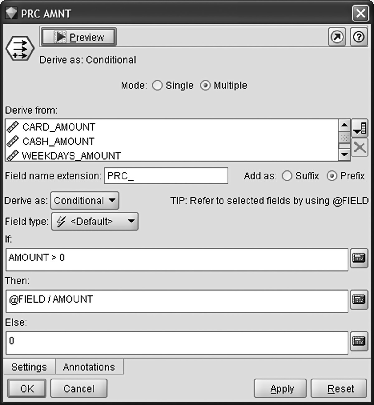
Figure 7.5 Calculating the relative spending KPIs
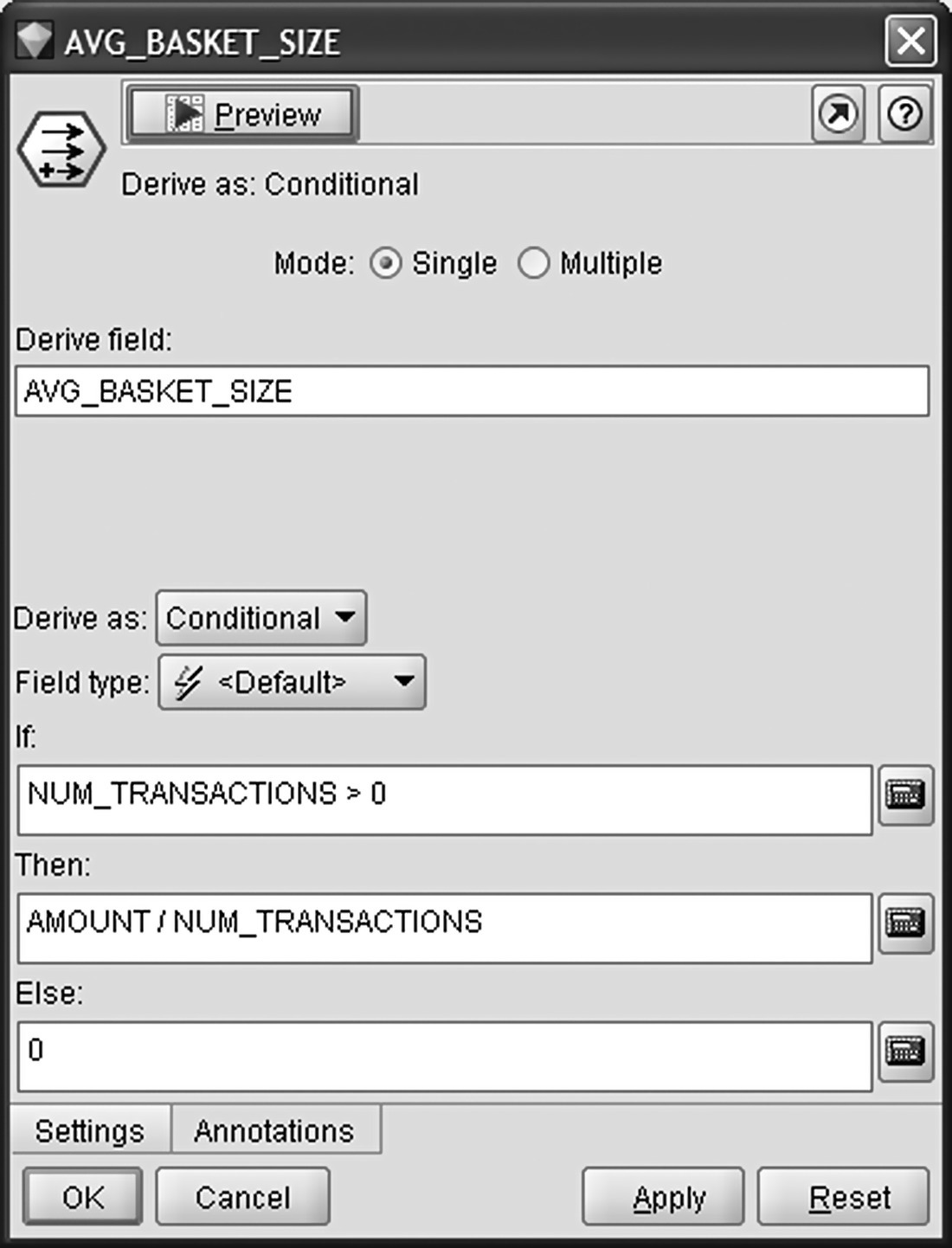
Figure 7.6 Deriving the average basket size
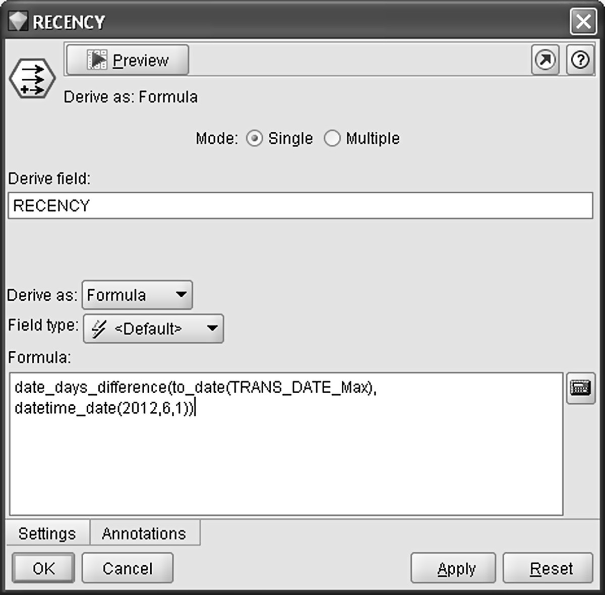
Figure 7.7 Constructing recency, the first RFM component

Figure 7.8 Constructing frequency, the second RFM component
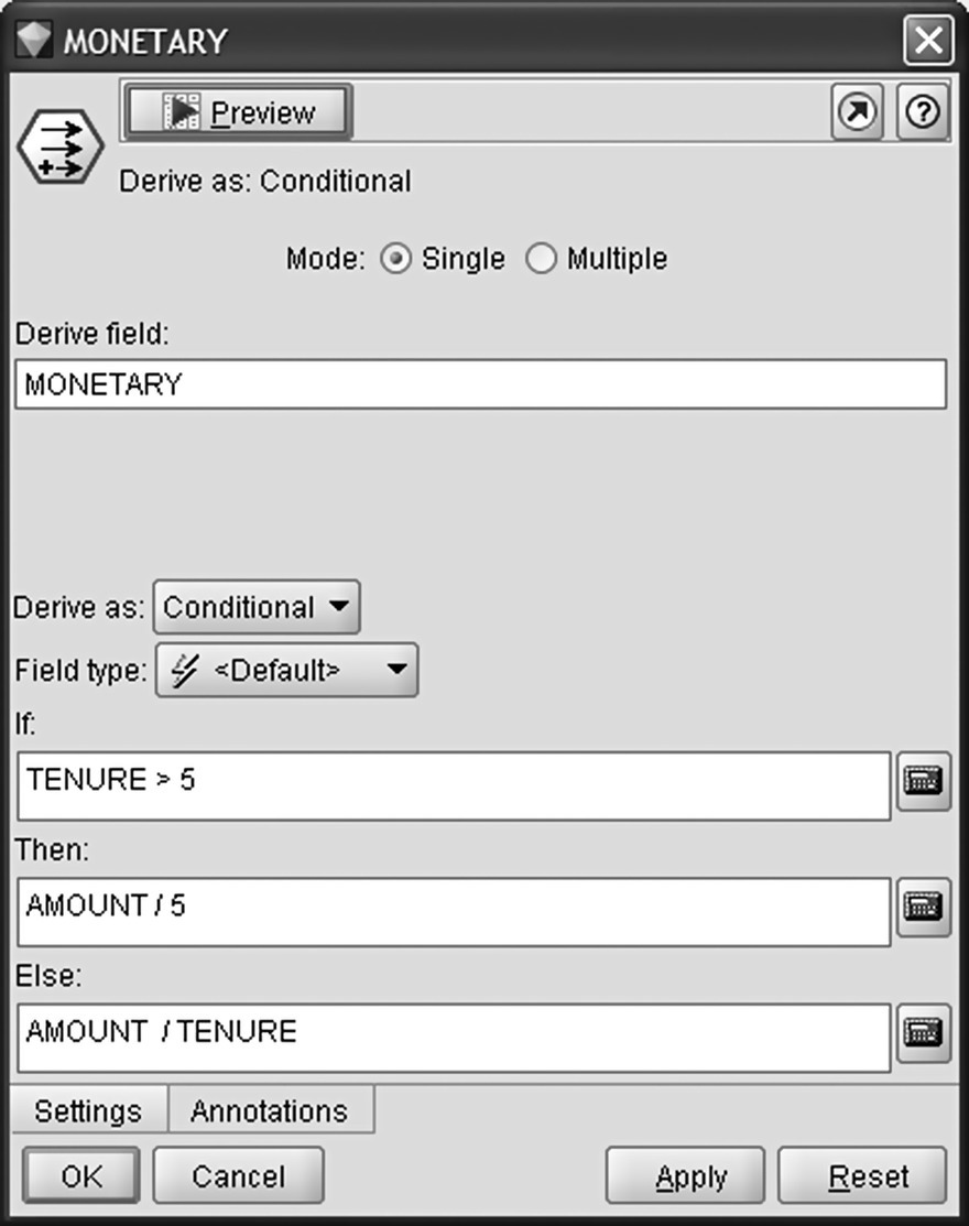
Figure 7.9 Constructing the monetary component of RFM
7.5 The data dictionary of the modeling file
Finally, the enriched customer signature file, summarizing customer purchases in terms of frequency, recency, volume, and type, was ready to be used for the needs of the mining applications which followed. The data dictionary of the modeling file is listed in Table 7.7. The last column of the table indicates the attributes which were used as predictors in the cross-selling model developed for promoting the House department products.
Table 7.7 The data dictionary of the modeling file
| Data file: RETAIL_MODELING_DATA.txt | ||
| Cardholders’ demographics | ||
| Field name | Description | Role in the cross-sell model |
| CARD_ID | The card identification number | |
| GENDER | Gender of the cardholder | PREDICTOR |
| CHILDREN | Number of children of the cardholder | |
| BIRTH_DATE | Cardholder’s birth date | |
| AGE | Age of the customer | |
| AGE_BANDS | Age bins (18–24, 25–34, 35–44, 45–54, 55+) | |
| REGISTRATION_DATE | Cardholder’s registration date | |
| TENURE | Time (in months) since a cardholder | PREDICTOR |
| Purchase data | ||
| Field name | Description | Role in the model |
| TRANS_DATE_Max | Most recent date of order transaction | |
| AMOUNT | Total amount of purchases for each customer for the period of 5 months examined | |
| CARD_AMOUNT | Amount of purchases done with a credit card | |
| CASH_AMOUNT | Amount of purchases with cash | |
| WEEKDAYS_AMOUNT | Amount of purchases on weekdays | |
| WEEKEND_AMOUNT | Amount of purchases at weekends | |
| AFTERNOON_AMOUNT | Amount of afternoon (after 4 p.m.) purchases | |
| MORNING_AMOUNT | Amount of morning (before 4 p.m.) purchases | |
| BEAUTY_AMOUNT | Amount of purchases at the Beauty department | |
| CHILDRENWEAR_AMOUNT | Amount of purchases at the Childrenwear department | |
| GROCERY_AMOUNT | Amount of purchases at the Food and Grocery department | |
| HOME_AMOUNT | Amount of purchases at the House and furniture department | |
| WOMEN_APPAREL_AMOUNT | Amount of purchases at the Women apparel department | |
| ACCESSORIES_AMOUNT | Amount of purchases at the Accessories department | |
| MEN_APPAREL_AMOUNT | Amount of purchases at the Men apparel department | |
| DOWNTOWN_AMOUNT | Amount of purchases at the Downtown store | |
| SUBURBS_AMOUNT | Amount of purchases at the Suburbs store | |
| DEP_STORE_NORTH_AMOUNT | Amount of purchases at the North store | |
| DEP_STORE_SOUTH_AMOUNT | Amount of purchases at the South store | |
| NUM_TRANSACTIONS | Total number of order transactions. Each invoice is considered as a transaction | |
| CARD_TRANSACTIONS | Total number of transactions using a credit card | |
| CASH_TRANSACTIONS | Total number of transactions with cash | |
| WEEKDAYS_TRANSACTIONS | Number of transactions on weekdays | |
| WEEKEND_TRANSACTIONS | Number of transactions at weekends | |
| AFTERNOON_TRANSACTIONS | Number of afternoon (after 4 p.m.) transactions | |
| MORNING_TRANSACTIONS | Number of morning (before 4 p.m.) transactions | |
| DOWNTOWN_TRANSACTIONS | Number of transactions at the Downtown store | |
| SUBURBS_TRANSACTIONS | Number of transactions at the Suburbs store | |
| DEP_STORE_NORTH_TRANSACTIONS | Number of transactions at the North store | |
| DEP_STORE_SOUTH_TRANSACTIONS | Number of transactions at the South store | |
| PRC_CARD_AMOUNT | Relative spending amount (percentage of total spending amount) using a credit card | PREDICTOR |
| PRC_CASH_AMOUNT | Relative spending amount using cash | PREDICTOR |
| PRC_WEEKDAYS_AMOUNT | Relative spending amount on weekdays | PREDICTOR |
| PRC_WEEKEND_AMOUNT | Relative spending amount at weekends | PREDICTOR |
| PRC_AFTERNOON_AMOUNT | Relative spending amount at afternoons | PREDICTOR |
| PRC_MORNING_AMOUNT | Relative spending amount at mornings | PREDICTOR |
| PRC_BEAUTY_AMOUNT | Relative spending amount at the Beauty department | PREDICTOR |
| PRC_CHILDRENWEAR_AMOUNT | Relative spending amount at the Childrenwear department | PREDICTOR |
| PRC_GROCERY_AMOUNT | Relative spending amount at the Food and Grocery department | PREDICTOR |
| PRC_HOME_AMOUNT | Relative spending amount at the House and furniture department | |
| PRC_WOMEN_APPAREL_AMOUNT | Relative spending amount at the Women apparel department | PREDICTOR |
| PRC_ACCESSORIES_AMOUNT | Relative spending amount at the Accessories department | PREDICTOR |
| PRC_MEN_APPAREL_AMOUNT | Relative spending amount at the Men apparel department | PREDICTOR |
| PRC_DOWNTOWN_AMOUNT | Relative spending amount at the Downtown store | PREDICTOR |
| PRC_SUBURBS_AMOUNT | Relative spending amount at the Suburbs store | PREDICTOR |
| PRC_DEP_STORE_NORTH_AMOUNT | Relative spending amount at the North store | PREDICTOR |
| PRC_DEP_STORE_SOUTH_AMOUNT | Relative spending amount at the South store | PREDICTOR |
| PRC_CARD_TRANSACTIONS | Ratio of order transactions using a credit card | |
| PRC_CASH_TRANSACTIONS | Ratio of transactions with cash | |
| PRC_WEEKDAYS_TRANSACTIONS | Ratio of transactions on weekdays | |
| PRC_WEEKEND_TRANSACTIONS | Ratio of transactions at weekends | |
| PRC_AFTERNOON_TRANSACTIONS | Ratio of afternoon (after 4 p.m.) transactions | |
| PRC_MORNING_TRANSACTIONS | Ratio of morning (before 4 p.m.) transactions | |
| PRC_DOWNTOWN_TRANSACTIONS | Ratio of transactions at the Downtown store | |
| PRC_SUBURBS_TRANSACTIONS | Ratio of transactions at the Suburbs store | |
| PRC_DEP_STORE_NORTH_TRANSACTIONS | Ratio of transactions at the North store | |
| PRC_DEP_STORE_SOUTH_TRANSACTIONS | Ratio of transactions at the South store | |
| AVG_BEAUTY_AMOUNT | Monthly average spending amount at the Beauty department | PREDICTOR |
| AVG_CHILDRENWEAR_AMOUNT | Monthly average spending amount at the Childrenwear department | PREDICTOR |
| AVG_GROCERY_AMOUNT | Monthly average spending amount at the Food and Grocery department | PREDICTOR |
| AVG_HOME_AMOUNT | Monthly average spending amount at the House and furniture department | |
| AVG_WOMEN_APPAREL_AMOUNT | Monthly average spending amount at the Women apparel department | PREDICTOR |
| AVG_ACCESSORIES_AMOUNT | Monthly average spending amount at the Accessories department | PREDICTOR |
| AVG_MEN_APPAREL_AMOUNT | Monthly average spending amount at the Men apparel department | PREDICTOR |
| AVG_BASKET_SIZE | Average basket size indicating average amount per transaction | PREDICTOR |
| NUM_PRODUCT_GROUPS | Number of distinct product groups with purchases | PREDICTOR |
| FLAG_BEAUTY | A flag (binomial) field indicating purchases from the product group | PREDICTOR |
| FLAG_CHILDRENWEAR | A flag (binomial) field indicating purchases from the product group | PREDICTOR |
| FLAG_GROCERY | A flag (binomial) field indicating purchases from the product group | PREDICTOR |
| FLAG_HOME | A flag (binomial) field indicating purchases from the product group | |
| FLAG_WOMEN_APPAREL | A flag (binomial) field indicating purchases from the product group | PREDICTOR |
| FLAG_ACCESSORIES | A flag (binomial) field indicating purchases from the product group | PREDICTOR |
| FLAG_MEN_APPAREL | A flag (binomial) field indicating purchases from the product group | PREDICTOR |
| RECENCY | Time (in days) since last transaction | PREDICTOR—also used as RFM component |
| FREQUENCY | Monthly average number of order transactions | PREDICTOR—also used as RFM component |
| MONETARY | Monthly average purchase amount | PREDICTOR—also used as RFM component |
7.6 Value segmentation
All customers are not equal. Some are more valuable than others. Identifying those valuable customers and understanding their importance should be considered as a top priority for any organization.
Value-based segmentation is one of the key tools for developing customer prioritization strategies. It can enable service-level differentiation and prioritization. Marketers of the retailer decided to develop a value-based segmentation scheme in order to assign each customer to a segment according to his value. Their plan was to use this segmentation in order to separate valuable customers from the rest and gain insight on their differentiating characteristics.
7.6.1 Grouping customers according to their value
The value-based segmentation was applied to the customers with a loyalty card, and it was based on the monthly average spent amount of each customer (the derived MONETARY field). Thus, all cardholders were ranked according to their purchases. The ordered records were grouped (binned) to chunks of equal frequency referred to as quantiles. These tiles were then used to construct the value segments.
In value-based segmentation, the number of binning tiles to be constructed depends on the specific needs of the organization. The derived segments are usually of the following form: highest n%, medium–high n%, medium–low n%, and low n%. In general, it is recommended to select a sufficiently rich and detailed segmentation level, especially in the top groups, in order to discern the most valuable customers. On the other hand, a detailed segregation level may not be required in the bottom of the value pyramid.
The segmentation bands selected by the retailer were the following:
- CORE: bottom 50% of customers with lowest purchase amount
- BRONZE: 30% of customers with medium–low purchase amount
- SILVER: 15% of customers with high purchase amount
- GOLD: top 5% of customers with highest purchase amount
Since customers with no purchases in the 5-month period examined were excluded from the procedure, a fifth segment not listed but implied is the one comprised of inactive customers.
Before beginning any data mining task, it is necessary to perform a health check in the data to be mined. Initial data exploration typically involves looking for missing data and checking for inconsistencies, identifying outliers, and examining the field distributions with basic descriptive statistics and charts like bar charts and histograms. IBM SPSS Modeler offers a tool called Data Audit that performs all these preliminary explorations and allows users to have a first look at the data, examine them, and spot potential abnormalities.
A snapshot of the results of the Data Audit node applied to the modeling file is presented in Figure 7.10.
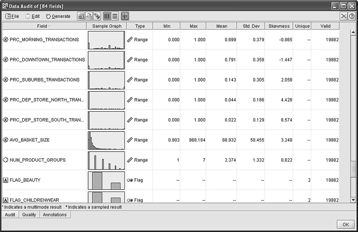
Figure 7.10 Using a Data Audit node to perform an initial exploration of the data
The binning procedure for value-based segmentation is graphically depicted in Figure 7.11.
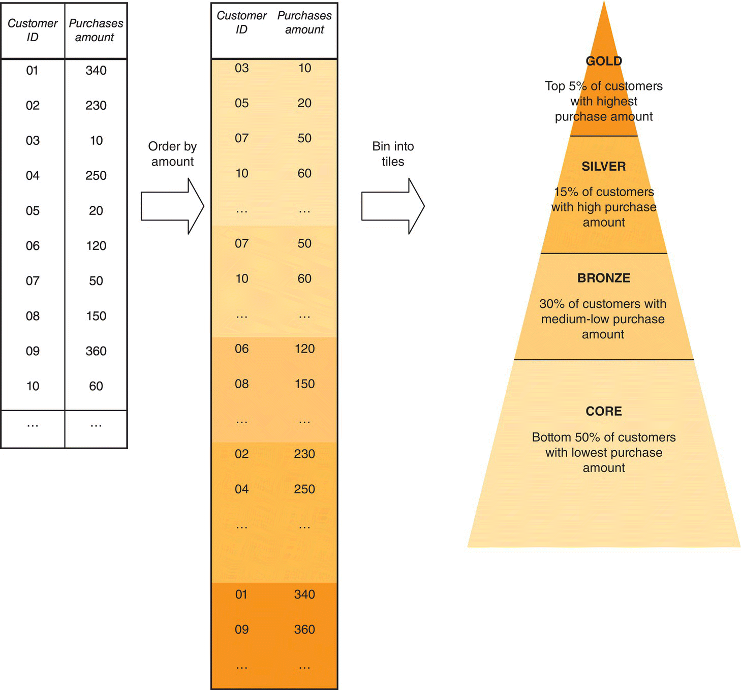
Figure 7.11 An illustration of the value-based segmentation procedure
The Modeler stream used for the value (and RFM) segmentation is presented in Figure 7.12.
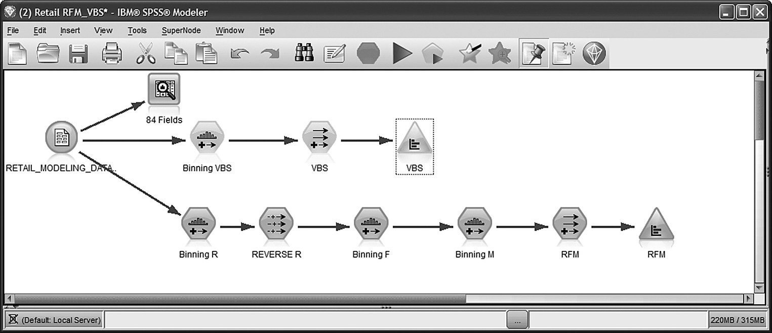
Figure 7.12 The IBM SPSS Modeler stream for value and RFM segmentation
A Binning node was used for grouping cardholders in groups of equal frequency. In order to be able to discern the top 5% customers, binning into vingitiles, 20 tiles of 5% each, was selected as shown in Figure 7.13.
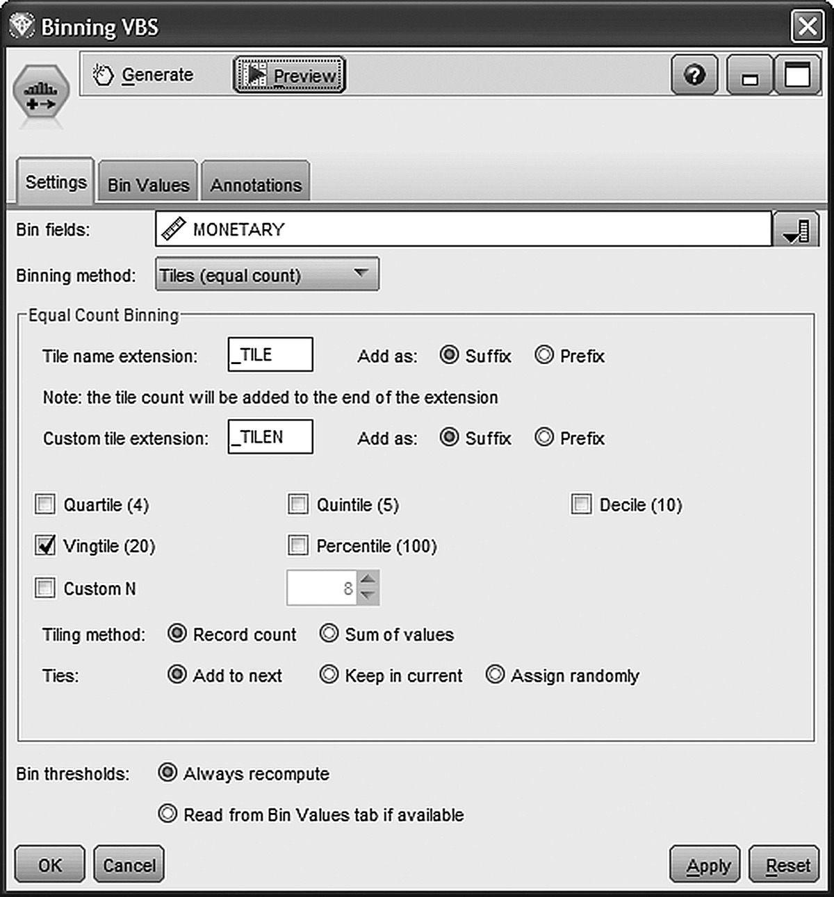
Figure 7.13 Using a Binning node for grouping customers in groups of 5%
The “tiles (equal count)” was selected as the binning method, and customers were assigned to vingitiles according to their monthly average purchase amount by specifying the MONETARY field as the bin field. The derived bands have then been regrouped with a Set Derive node, in order to refine the grouping and construct the VBS field which assigns each customer to one of the desired segments: Core, Bronze, Silver, and Gold. The conditions for regrouping are displayed in Figure 7.14.

Figure 7.14 Regrouping quantiles into value segments
7.6.2 Value segments: exploration and marketing usage
The next step before starting to make use of the derived segments was the investigation of their main characteristics.
The initial goal of this segmentation was to capture the assumed large-scale differences between customers, in terms of spending. Thus, marketers begun to investigate this hypothesis by examining the contribution of each segment to the total sales (purchase amount). Table 7.8 presents the percentage of customers and the percentage of the total sales amount for the 5-month period examined by value segment.
Table 7.8 Value-based segments and total purchase amount
| Percentage of customers | Sum percentage of total purchase amount | Mean purchase amount | ||
| Value-based segments | 1_CORE (Bottom 50%) | 50 | 15 | 56 |
| 2_BRONZE (Medium–low 30%) | 30 | 30 | 186 | |
| 3_SILVER (High 15%) | 15 | 32 | 394 | |
| 4_GOLD (Top 5%) | 5 | 23 | 841 | |
| Total | 100 | 100 | 185 |
The above table shows that a substantial percentage of the total sales comes from a disproportionately small number of high-value users. Almost half of the retailer’s sales arise from the top two value segments. The 20% of the most valuable customers account for about 45% of the total amount spent at the stores of the retailer. On the other hand, low-value users which comprise the mass (bottom 50%) segment provide a moderate 23% of the total sales. The comparison of mean spending also underlines the large-scale differences among segments. The mean sales value for the top 5% segment is almost 17 times higher than the one for the bottom 50%. These findings although impressive are not far from reality. On the contrary, in other industries, in banking, for example, the situation may be even more polarized, with an even larger part of the revenue originating from the top segments of the value pyramid.
In a next step and by using simple descriptive statistics and charts, value segments have also been profiled in terms of their demographics and usage.
The business benefits from the identification of value segments are prominent. The implemented segmentation can provide valuable help to the marketers in setting the appropriate objectives for their marketing actions according to each customer’s value. High-value customers are the heart of the organization. Their importance should be recognized and rewarded. They should perceive their importance every time they interact with the enterprise. Prevention of defection of these customers is vital for every organization. Identification of valuable customers at risk of attrition should trigger an enormous effort in order to avoid losing these customers to competitors. For medium- and especially low-value customers, marketing strategies should focus on driving up revenue through targeted cross- and up-selling campaigns in order to begin to approach the high-value customers.
7.7 The recency, frequency, and monetary (RFM) analysis
The marketers of the retailer extended the value segmentation by implementing an RFM analysis. In RFM cell segmentation, monetary value information is examined along with recency and frequency of purchases, and customers are assigned to cells according to “since when,” “how much,” and “how often” they purchase. Before presenting the RFM procedure in detail, let’s have a look at RFM basics.
7.7.1 RFM basics
RFM analysis is a common approach for understanding and monitoring consuming behaviors. It is quite popular, especially in the retail industry. As its name implies, it involves the calculation of three core KPIs, recency, frequency, and monetary value which summarize the corresponding dimensions of the customer relationship with the enterprise. The recency measurement indicates the time since the last purchase transaction. Frequency denotes the number and the rate of the purchase transactions. Monetary value measures the purchase amount. These indicators are typically calculated at a customer (cardholder) level through simple data processing of the recorded transactional data.
RFM analysis can be used to identify the good customers with the best scores in the relevant KPIs, who generally tend to be good prospects for additional purchases. It can also identify other purchase patterns and respective customer types of interest, such as infrequent big spenders or customers with small but frequent purchases who might also have sales perspectives, depending on the market and the specific product promoted.
In the retail industry, the RFM dimensions are usually defined as below:
- Recency: time (in units of time, typically in days or in months) since the most recent purchase transaction or shopping visit.
- Frequency: total number of purchase transactions or shopping visits in the period examined. An alternative, and more “normalized” approach that also takes into account the tenure of the customer, calculates frequency as the average number of transactions per unit of time, for instance, the monthly average number of transactions.
- Monetary value: the total or the average per time unit (e.g., monthly average value) amount of purchases within the examined period. According to an alternative yet not so popular definition, the monetary value indicator is defined as the average transaction value (average amount per purchase transaction). Since the total value tends to be correlated with the frequency of the transactions, the reasoning of this alternative definition is to capture a different and supplementing aspect of the purchase behavior.
The construction of the RFM indicators is a simple data management task which does not involve any data mining modeling. It does involve through a series of aggregations and simple computations that transform the raw purchase records into meaningful scores. In order to perform RFM analysis, each transaction should be linked with a specific customer (card ID) so that each customer’s purchase history can be tracked and traced over time. Fortunately, in most situations, the usage of a loyalty program makes the collection of “personalized” transactional data possible.
RFM components should be calculated on a regular basis and stored along with the other behavioral indicators in the organization’s mining datamart. They can be used as individual fields in subsequent tasks, for instance, as inputs, along with other predictors, in cross-selling models. They can also be included as clustering fields for the development of a multiattribute behavioral segmentation scheme. Typically, they are simply combined to form a single RFM measure and a respective cell segmentation scheme.
The RFM analysis involves the grouping (binning) of customers into chunks of equal frequency, named quantiles, in a way similar to the one presented for value-based segmentation. This binning procedure is applied independently on the three RFM component measures. Customers are ranked according to the respective measure, and they are grouped in classes of equal size. For instance, the break in four groups results quartiles of 25% and the break in five groups, quintiles of 20%. In the case of binning into quintiles, for example, the R, F, and M measures are converted into rank scores ranging from 1 to 5. Group 1 includes the 20% of customers with the lowest values and group 5 the top 20% of customers with the top values in the corresponding measure. Especially for the recency measure, the scale of the derived ordinal score should be reversed so that larger scores indicate the most recent buyers.
The derived R, F, and M bins become the components for the RFM cell assignment. These bins are combined with a simple concatenation to provide the RFM cell assignment. Customers with top frequency, recency, and monetary values are assigned to the RFM cell 555. Similarly, customers with average recency (quintile 3), top frequency (quintile 5), and lowest monetary values (quintile 1) form the RFM cell 351 and so on.
The aforementioned procedure for the construction of the RFM cells is illustrated in Figure 7.15.

Figure 7.15 Assignment to the RFM cells.
Source: Tsiptsis and Chorianopoulos (2009). Reproduced with permission from Wiley
When grouping customers in quintiles (groups of 20%), the procedure results a maximum of 5 × 5 × 5 = 125 RFM cells as displayed in Figure 7.16.

Figure 7.16 The total RFM cells in the case of binning into quintiles (groups of 20%).
Source: Tsiptsis and Chorianopoulos (2009). Reproduced with permission from Wiley
This combination of the R, F, and M components into RFM cells is widely used; however, it has a certain disadvantage. The large number of the derived cells makes the procedure quite cumbersome and hard to manage. An alternative method for segmenting customers according to their RFM patterns is to use the respective components as inputs in a clustering model and let the algorithm reveal the underlying natural groupings of customers.
7.8 The RFM cell segmentation procedure
RFM analysis was based on the same modeling dataset used for value segmentation with 5 months of aggregated purchase transactions. The procedure involved the calculation of the RFM components and the assignment of customers into RFM segments. As noted before, only active customers with a loyalty card were included in the project. Customers with no purchases during the period examined were identified as candidates for inclusion in upcoming retention and reactivation campaigns. We remind you that the three RFM components had already been calculated during the data preparation phase:
- RECENCY: derived as the number of days since the most recent purchase transaction
- FREQUENCY: denoting the monthly average number of distinct purchase transactions
- MONETARY: indicating monthly average spent amount
Customers were then binned into five groups of 20% (quintiles) through three separate binnings, one for each RFM component. This discretization procedure resulted in a set of three ordinal attributes (RECENCY_TILE5, FREQUENCY_TILE5, MONETARY_TILE5) which were then concatenated to form the RFM cell segmentation. In each of the derived bins, top customers (in terms of RFM) were assigned to bin 5 while worst customers to bin 1. In terms of recency, good customers are those that had recently visited store and hence present a low recency figure. That’s why the analysts of the retailer reversed the recency scale so that a value of 1 corresponds to “distant” customers and a value of 5 to “recent” customers. The formula used for this adjustment ((5-RECENCY_TILE5) + 1) was applied through a Filler node (a Filler node overwrites an existing field’s values instead of creating a new attribute).
The resulted quintiles were finally concatenated by using a simple Formula Derive node to form the RFM cell assignment (field RFM). The distribution of customers into RFM cells is shown in Figure 7.17.

Figure 7.17 The distribution of the constructed RFM cells
Figure 7.18 presents a jittered scatter plot of the monetary and frequency quintiles in X and Y axes respectively. The gray tone (transparency) for each dot represents the recency tile. There is a dispersion of customers across all RFM cells, indicating the vast range of different consumer behaviors.

Figure 7.18 An RFM scatter plot
7.9 Setting up a cross-selling model
The development of a cross-selling model for the House and furniture department was the final mining application. The department was new, with moderate penetration, and the marketers of the retailer wanted to make it known to customers likely to show interest. Therefore, they planned a promotional campaign with a discount offer. Yet they didn’t want to communicate this offer to each and every customer. They wanted to roll out a rather small-scale but well-targeted campaign, addressed to customers with a profile that suits the specific products. To identify their target group, they carried out a pilot campaign and used the collected responses to build a cross-selling model.
7.10 The mining approach
The marketers of the retailer had scheduled a campaign to promote their new House and furniture department. To improve the campaign’s effectiveness and minimize nonresponses, waste of resources, and unsolicited communication, they planned to use analytics to refine their target list. An issue that had to be tackled was that due to the fact that the particular department was new, the number of shoppers was relatively small. Moreover, the marketers wanted to simulate and test the campaign before its actual rollout. Hence, the mining approach decided was to run a pilot campaign with exactly the same characteristics (same promoted product, same channel, same incentive, same initial target group) and collect and analyze responses to identify customers with a purchase potential.
7.10.1 Designing the cross-selling model process
The decided modeling process is outlined in the following paragraphs.
7.10.1.1 The data and the predictors
The mining file constructed for the needs of the value and RFM segmentation was also used for the development of the cross-selling model. Through extensive data transformations on transactional records, the final mining file listed in Table 7.7 provided the customer “signature” information for each cardholder, summarizing consumer behaviors in terms of frequency, intensity, recency, and type of purchases. The role of each attribute in the cross-selling model is also presented in Table 7.7.
7.10.1.2 Modeling population and level of data
The type of the campaign to be launched defines the modeling population and the required level of data. In this case, customer-level data were required. The aggregated mining file provided the necessary information. But the mining file included all active cardholders. The model would be trained on customers who participated in the test campaign. Therefore, a random sample of customers (from those who hadn’t yet visited the House department) had been selected and approached with the special offer, a discount voucher with a traceable promotion code. Redeeming of vouchers had been tracked, relevant information had been collected, and the propensity model had finally been trained on response data. In deployment, the generated model was applied to the entire customer base to score customers according to their likelihood to accept the offer.
7.10.1.3 Target population and definition of target attribute
The target field was derived using the collected campaign response data. The target population included all participants of the pilot campaign who accepted the offer.
7.10.1.4 Time periods and historical information required
A 5-month “snapshot” of behavioral data, covering an observation period from January 1, 2012, to May 31, 2012, was retrieved and analyzed to identify the characteristics of those accepted the offer. The test-campaign approach may have its drawbacks in terms of required resources and delay in collecting the required response data, but it is more straightforward in regard to data preparation for modeling. No latency period was reserved and there was no need to ensure that predictors don’t overlap with the target event. And above all, the model is trained on cases which had gone through the exact customer interaction planned to be launched at a larger scale.
An outline of the mining procedure followed is presented in Figure 7.19.
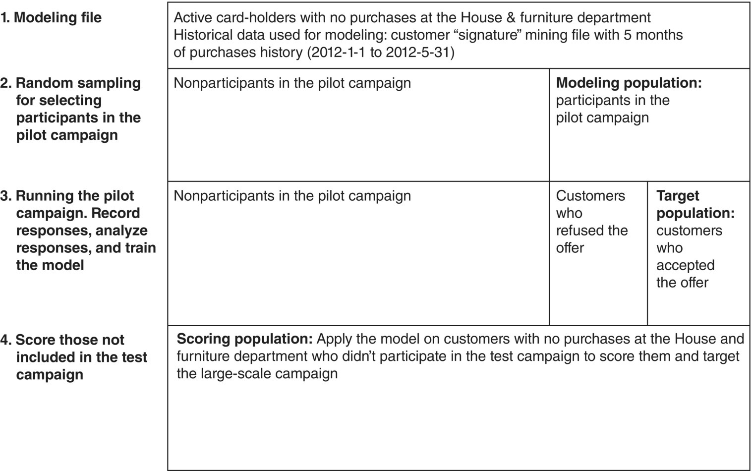
Figure 7.19 An outline of the mining procedure followed for the development of the cross-selling model
7.11 The modeling procedure
The IBM SPSS Modeler stream (procedure) for the cross-sell model is presented in Figure 7.20. The stream loads and uses the fields of Table 7.7 discussed above.
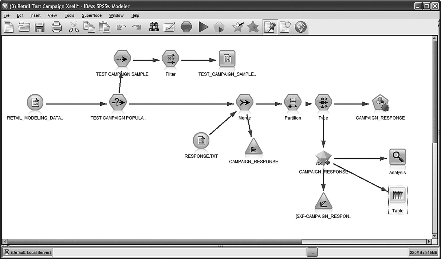
Figure 7.20 The IBM SPSS Modeler procedure for cross-sell modeling
7.11.1 Preparing the test campaign and loading the campaign responses for modeling
Initially, a random sample of customers of the modeling file has been drawn for inclusion in the test campaign. A Sample node has been applied to customers without purchases at the House department, and the campaign list had been stored at an external file. Upon conclusion of the pilot campaign, response data had been collected and stored in a dedicated file. The model had to be trained on known response. Therefore, the relevant data had been retrieved and merged with the rest of the modeling data. An inner join had been applied so that only customers who participated in the campaign were retained for model training. Figure 7.21 presents the Merge node used for joining the two data sources with the CARD_ID field used as the key for merge.

Figure 7.21 Merging campaign response data with the rest of the information
7.11.2 Applying a Split (Holdout) validation: splitting the modeling dataset for evaluation purposes
The loading of response data defined the final modeling population as well as the target attribute, the flag field CAMPAIGN_RESPONSE indicating customers who accepted the offer and used the discount voucher (value “T”). However, not all campaign participants took part in the model training. A random sample of them was left out (Holdout sample) to be used for model evaluation. As already stressed before, using the same data for training and testing the model can lead to optimistic measures of accuracy. Therefore, a standard procedure for ensuring realistic model evaluation is to apply a Split (Holdout) validation so that the model is evaluated on unseen instances. In our case study, a Partition node was applied to split the modeling dataset into Training and Testing datasets through random sampling as shown in Figure 7.22. The Training partition size was set to 75%. Therefore, the 75% of the 13 074 campaign participants were used for the training of the model. The remaining 25% were held out to be used for assessing the model accuracy.
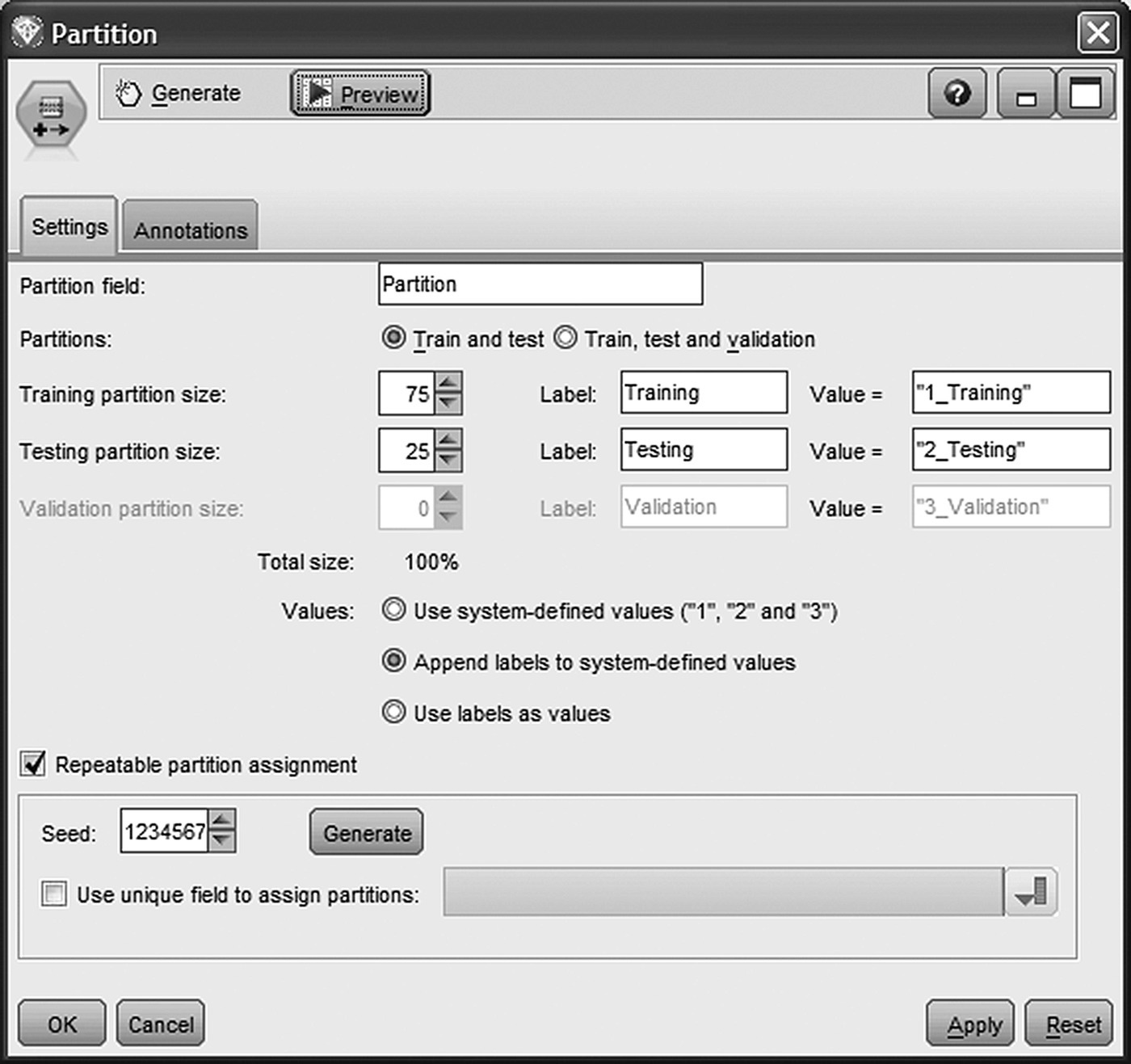
Figure 7.22 Partitioning the modeling dataset for evaluation purposes
Additionally, a random seed was specified in order to “stabilize” the underlying random sampling procedure and ensure the same partitioning on every model run.
7.11.3 Setting the roles of the attributes
The last column of Table 7.7 denotes the attributes used as predictors in the classification model. Obviously, the information regarding the offer acceptance, recorded in the CAMPAIGN_RESPONSE field, defined the model’s target. The role of each attribute in the model was set through a Modeler Type node (Figure 7.23). Predictors were assigned an input role (Direction In), the target attribute was assigned an output role (Direction Out), and fields omitted were given a None direction.
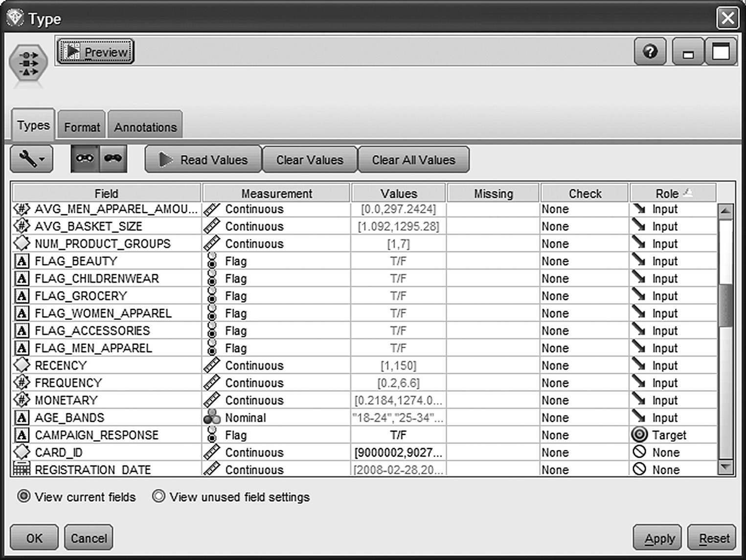
Figure 7.23 Setting the role of the fields in the propensity model
7.11.4 Training the cross-sell model
A series of classification models has been developed through an Auto Classifier node as shown in Figure 7.24. This node allows the training and the evaluation of multiple models for the same target attribute and set of predictors.

Figure 7.24 Building multiple classification models with Auto Classifier
The generated models were initially assessed and ranked in terms of their Lift at the 2% percentile. Additionally, estimated revenue and cost information has been specified in order to enable the comparison of the generated models in terms of expected profit and ROI. By using the specified estimations for cost per offer/contact (50$), revenue if someone accepts the offer (200$), and the propensity scores derived by the models, Auto Classifier can compute the estimated maximum profitability along with the percentile where it occurs. By studying profitability curves, marketers can perform cost–benefit analysis, assess the models, and also decide on the optimal campaign size.
Three Decision Tree models and a Bayesian Network were selected for training (Figure 7.25). More specifically, the models built were CHAID, C5.0, C&R Tree, and a TAN (Tree Augmented Naïve Bayes) model with a feature selection preprocessing step to omit irrelevant predictors.

Figure 7.25 The classification models trained
The parameters specified for each model are displayed in Table 7.9.
Table 7.9 The parameters of the cross-selling models.
| Parameter | Setting |
| CHAID model parameter settings | |
| Model | CHAID |
| Levels below root | 6 |
| Alpha for splitting | 0.05 |
| Alpha for merging | 0.05 |
| Chi-square method | Pearson |
| Minimum records in parent branch | 200 |
| Minimum records in child branch | 100 |
| C&R Tree model parameter settings | |
| Levels below root | 7 |
| Minimum change in impurity | 0.0001 |
| Impurity measure for categorical target | Gini |
| Minimum records in parent branch | 100 |
| Minimum records in child branch | 50 |
| Prune tree | True |
| Use standard error rule | True |
| Multiplier | 1.0 |
| C5.0 model parameter settings | |
| Output type | Decision tree |
| Group symbolics | True |
| Use boosting | False |
| Pruning severity | 75 |
| Minimum records per child branch | 50 |
| Use global pruning | True |
| Winnow attributes | False |
| Bayesian Network model parameter settings | |
| Structure type | TAN (Tree Augmented Naïve Bayes) |
| Include feature selection preprocessing step | True |
| Parameter Learning Method | Maximum Likelihood |
| Independence test (for the feature selection) | Likelihood ratio |
| Significance level (for the feature selection) | 0.01 |
| Maximum number of inputs (selected by feature selection) | 10 |
7.12 Browsing the model results and assessing the predictive accuracy of the classifiers
By double-clicking the generated model nugget in the modeling stream, we can browse the model results. The Model tab provides an initial evaluation of the individual models in terms of Lift, Maximum Profit, Overall Accuracy, and Area Under Curve as displayed in Figure 7.26. All these metrics are based on the testing dataset.

Figure 7.26 Performance metrics for the individual models
Models are ranked according to their Lift values at the top 2% percentile. Although all models performed similarly well in respect to Lift, with the exception of C&RT which presented relatively lower values, the CHAID model was ranked first with a Lift of 3.35. The overall proportion of responders was about 22%. A Lift value of 3.35 means that the percentage of responders was 3.35 times higher, reaching a proportion of 75% (3.35*22%), among the top 2% of customers with the highest propensities. Thus, the CHAID model managed to triple the concentration of potential buyers among its highest quantiles. In respect to prediction accuracy, the figures of all models were analogous with the percentage of correct classification around 79% and the misclassification rate around 21%.
The estimated Maximum (cumulative) Profit for the CHAID model was the highest, 31 550$, occurring at the top 30% quantile. C&RT presented the lowest estimated maximum profit.
The Gains chart displayed in Figure 7.27 provides a visual comparison of the models’ ability to identify the target customers.
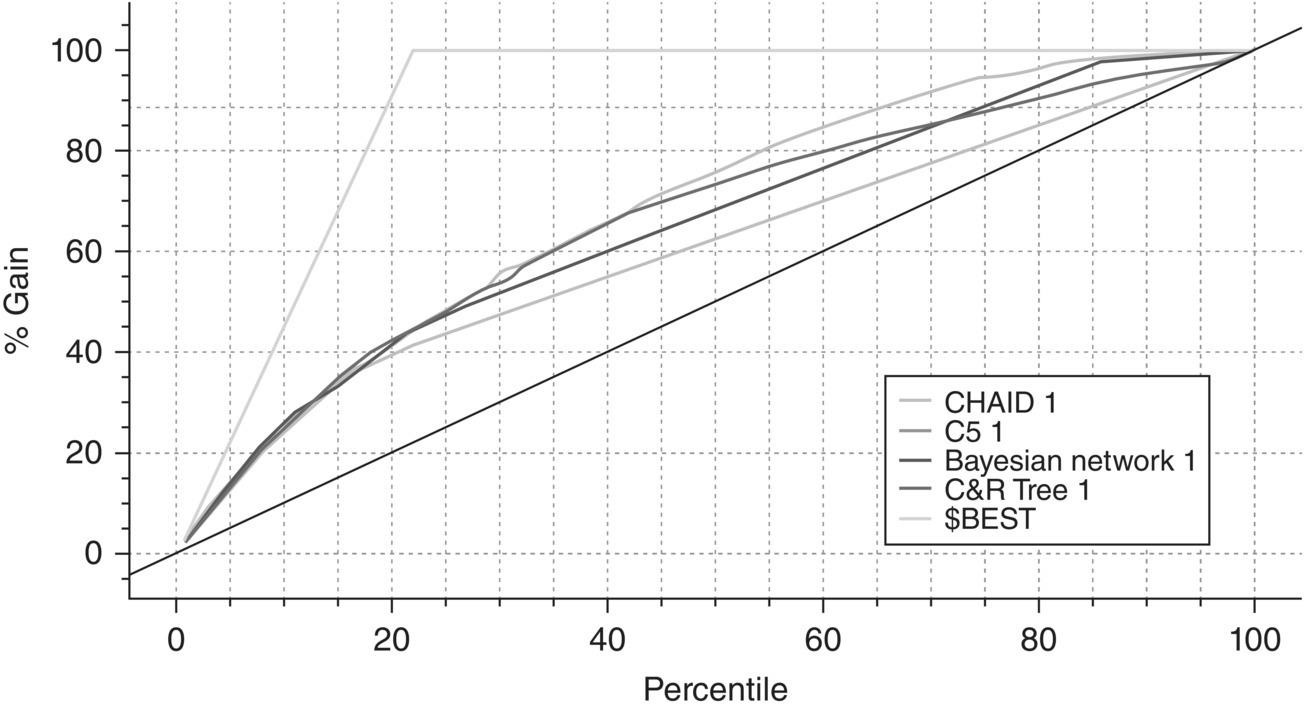
Figure 7.27 The Gains chart for the cross-selling models
A separate Gains curve is plotted for each model summarizing the percentage of true positives, that is, the percentage of actual responders, for the model percentiles. The diagonal line represents the baseline model of randomness. The $BEST line corresponds to “good’s model,” a hypothetical ideal model which classifies correctly all cases. A good model is expected to show a gradual but steep increase at the left of the X-axis before flattening out. Obviously, all curves reach 100% at the rightmost part of the X-axis. But what’s interesting is what goes on at the higher cutoffs, among customers with high estimated propensities. The CHAID model seems to behave better with a smooth curve steadily higher than the rest. Differentiations are trivial though at higher percentiles and only begin to become evident after the 20% percentile. What else does the Gains chart tells us? The percentage of potential customers expected to be reached if we use a campaign list ranked by propensities. For example, by contacting the 20% of customers with the higher model propensities, we expect to capture the 40% of the total buyers. The percentage of responders expected to be captured is even larger at higher cutoff values.
To gain insight on the patterns associated with response, let’s examine the results of some of the individual models starting from the C5.0 tree. The viewer tab displays the model in tree format. Its first three levels are shown in Figure 7.28.

Figure 7.28 The first three levels of the generated C5.0 model
The response rate was higher among customers of the Grocery, Childrenwear, and Accessories department, possibly indicating a target group of women with children who are also responsible for the house equipment. The overall response rate of 22% was tripled, reaching 70%, among customers who had already purchased grocery and childrenwear products in the past. Frequency and diversity of purchases (appearing in the next splits and in the subsequent levels of the tree) also seemed to have a positive relation with response, further increasing the percentage of those who accepted the offer. What is evident, even from the first splits of the model, is the gain from studying all aspects of purchase behavior instead of only using the RFM components as predictors. By introducing attributes which summarized the purchase preferences of the customers, the retailer had managed to reveal a richer profile of the target customers and boosted the predictive accuracy of the classification model.
Figure 7.29 presents the generated TAN (Tree Augmented Naïve Bayesian network) and its network’s structure.

Figure 7.29 The TAN Bayesian network
The same products which were identified by the C5.0 model to be associated with the response (Grocery, Accessories, Childrenwear) were also retained as significant predictors by the preprocessing feature selection procedure of the Bayesian network. Recency, frequency, and diversity of purchases (the NUM_PRODUCT_GROUPS field denoting the distinct number of product groups with purchases) were also included in the model. The significant predictors and the target field are represented as nodes in the Bayesian network. The nodes are connected with arcs (directed edges). If an arc is drawn from attribute X to attribute Y, then X is the parent of Y. All predictors have two attributes as parents, the target attribute (CAMPAIGN_RESPONSE field) plus one more additional predictor, except the accessories amount attribute (PRC_ACCESSORIES_AMOUNT) whose only parent is the target attribute.
Our assumption here is that each attribute’s probabilities only depend on the information provided by its parents. These probabilities are presented in conditional probability tables (CPTs). The CPT for each attribute is displayed when clicking on its node. Figure 7.30 displays the CPT for the grocery flag attribute (FLAG_GROCERY field).

Figure 7.30 The conditional probabilities for the FLAG_GROCERY attribute
Note that all numeric attributes had been discretized in five bands. Each row of the table presents the probability distribution of the attribute, given its parents. In other words, the table summarizes the probability of each value of the node attribute (grocery field) for each combination of values of its parents. Obviously, all row entries sum to 1. For instance, by examining the seventh row of Figure 7.30, we can see that the probability of a grocery buyer is 0.64 among responders of the test campaign with 4.6–5.8 product groups’ purchases. This probability is lower (0.48) among nonresponders of the campaign with the same number of product groups’ purchases (eighth row of the CPT).
Under the assumption stated above, the algorithm can use the CPTs to estimate the probability of response for each customer/instance by multiplying the CPT entries.
Although the CHAID model presented superior performance and seemed a perfect candidate for scoring customers, the final decision was to apply for deployment a model voting procedure based on all models except C&RT. After all, using the advices of more than one “experts” minimizes the risk of misguidance. The ensemble method applied was confidence-weighted voting. Furthermore, although the Gains chart provided valuable information, marketers also studied profitability and ROI charts (to be presented below) to optimize the campaign size according to the estimated financial gains. These charts were created by evaluating the ensemble model with an Evaluation node.
The ensemble model presented an increased AUC (Area under the ROC curve) measure of 0.753. Figure 7.31 presents its ROI chart. The estimated cumulative %ROI for each percentile is calculated as
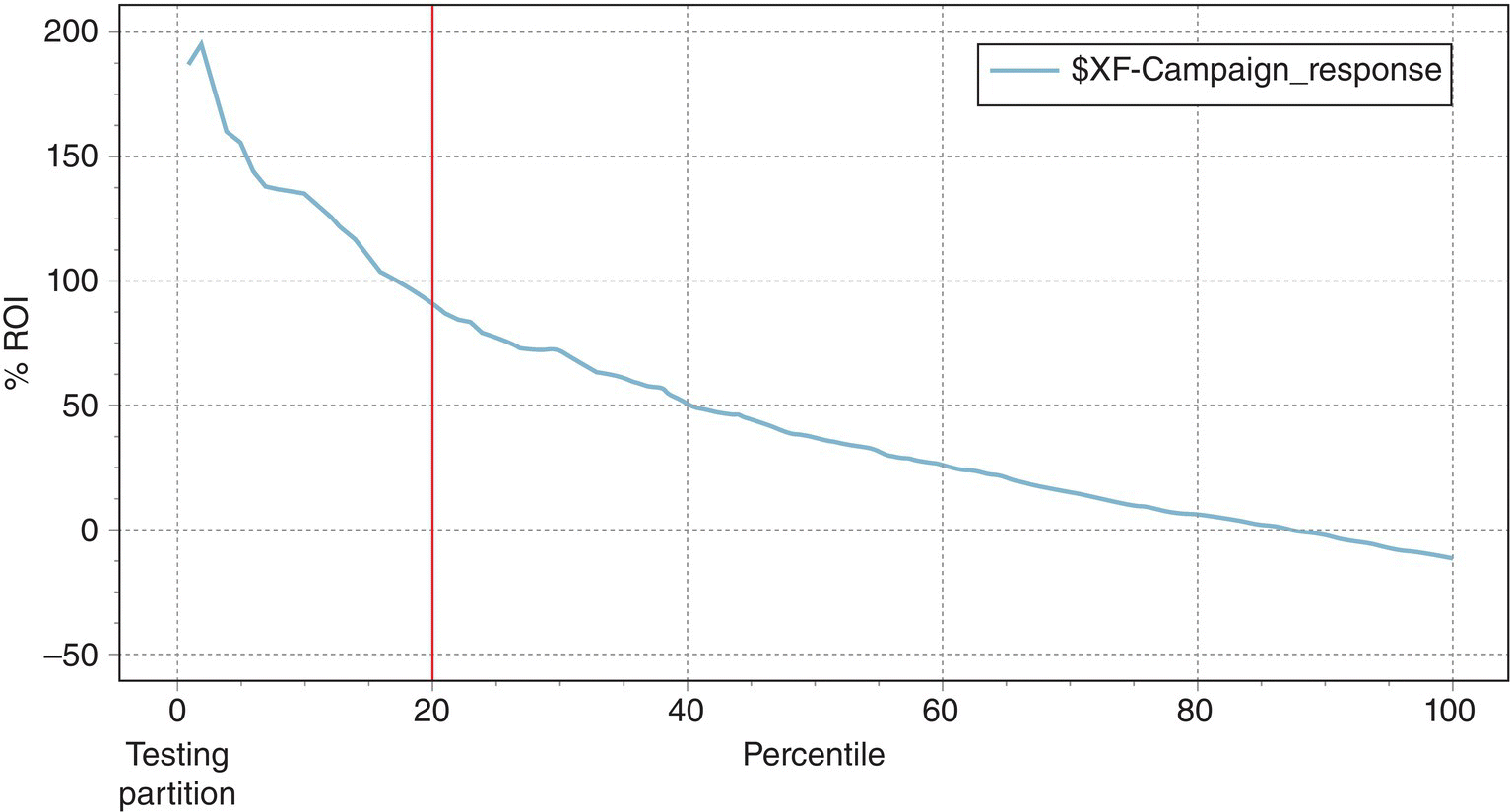
Figure 7.31 The ROI chart of the ensemble model
The ROI chart indicates the (probabilistic) return on investment per instance (per offer).
Since the marketers of the retailer wanted profits (revenue-cost) at least equal to their investments, they decided to target the top 20% percentile which presented an estimated ROI of about 100%. Thus, they expect an average profit of 50$ for each 50$ they spend.
The Gains chart of the ensemble model is presented in Figure 7.32.
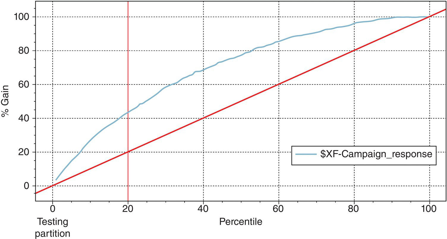
Figure 7.32 The Gains chart of the ensemble model
The top 20% percentile presented a Gains value of 43.2%. Thus, by targeting these tiles, marketers expected to capture about 40% of the total responders and double their investment by achieving an ROI of about 100%.
7.13 Deploying the model and preparing the cross-selling campaign list
The final step of the procedure was the deployment phase. The trained model was applied to “unseen” cases, and the campaign list was constructed based on cross-selling propensities. The IBM Modeler stream for deployment is shown in Figure 7.33. The modeling file was also used as the scoring file.

Figure 7.33 The Modeler deployment stream
The scoring population contained all active customers with no purchases at the House department who had not taken part in the test campaign. Through a Select node, customers with purchases at the House department had been filtered out. Then, only customers present in the scoring file but not present in the campaign responses file were retained.
Two new, estimated fields were derived for scored customers:
- $XF-CAMPAIGN_RESPONSE: indicating the predicted class
- $XFC-CAMPAIGN_RESPONSE: indicating the prediction confidence
The prediction confidence can be easily transformed into cross-selling propensity, that is, likelihood of accepting the offer, by subtracting the confidence from 1 in the case of customers predicted as “F” (nonresponders). The campaign list included the top 20% of the customers with the highest propensities, corresponding to a propensity cutoff value of about 0.30. Through binning, customers were grouped into quintiles (bins of 20%), and the members of bin 5 were selected for the campaign. The model estimated fields, namely, prediction, confidence, propensity, as well as the propensity tile for a sample of scored customers, are presented in Figure 7.34.
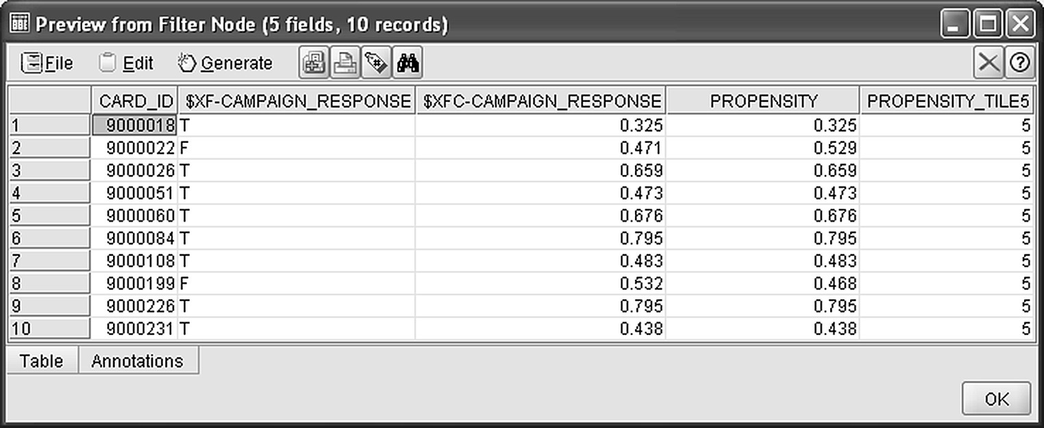
Figure 7.34 The model generated fields for the scored customers
7.14 The retail case study using RapidMiner
In the next paragraphs, the development of the value segments, the RFM segments, and the cross-sell model is presented with the employment of RapidMiner.
7.14.1 Value segmentation and RFM cells analysis
The RapidMiner process for both value segmentation and RFM analysis is shown in Figure 7.35. The upper part of the process implements the value segmentation and starts with a Repository Retrieve operator which loads the modeling dataset presented in Table 7.7.
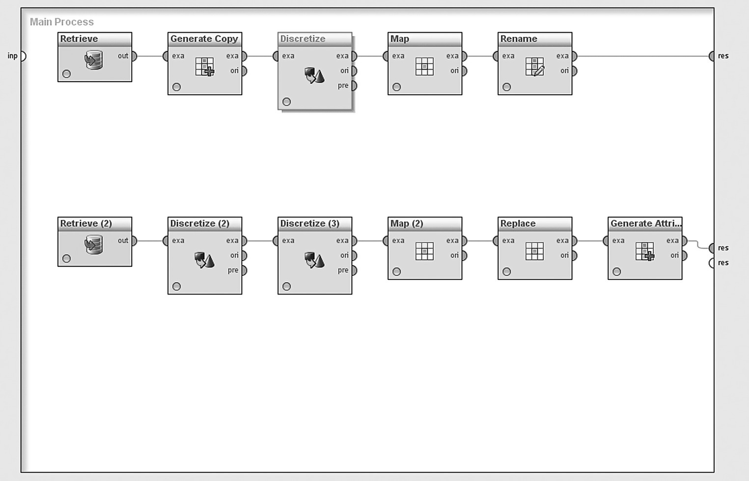
Figure 7.35 The RapidMiner process for value segmentation and RFM analysis
The value segmentation is a simple discretization task, and it was performed by a Discretize by Frequency operator which was applied to the MONETARY attribute. Initially, cardholders were binned into 20 tiles (vingitiles) of 5% each as shown in Figure 7.36. The top 5% of customers with the highest purchases were assigned to the “range20” bin, while on the other end of the monetary pyramid, the bottom 5% of customers with the lowest purchases were assigned to “range1” bin.
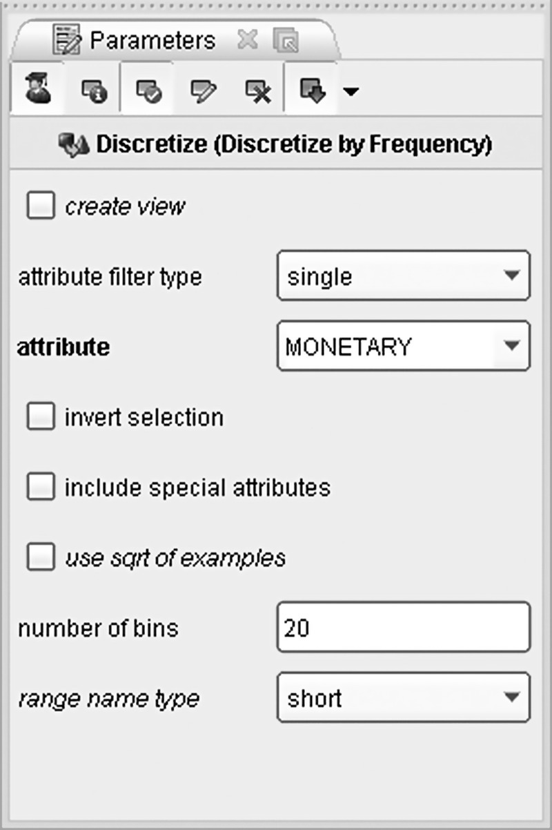
Figure 7.36 The Discretize by frequency operator applied for value segmentation
The discretization converted the numeric MONETARY field into a nominal one. In order to retain the amount information as well, the original MONETARY field was replicated as MONETARY_NUM with a Generate Copy operator.
The value segmentation was refined with a Map operator which further grouped the 20 bins into the final four value segments:
- 1_CORE (Bottom 50%)
- 2_BRONZE (Medium–Low 30%)
- 3_SILVER (High 15%)
- 4_GOLD (Top 5%)
The importance of the derived segments was disproportionate to their sizes as shown in the pie chart in Figure 7.37 which depicts the share of each segment in the total purchase amount.

Figure 7.37 The percentage of the total purchase amount for each value segment
The lower part of the process builds the RFM segmentation scheme by using the same modeling dataset. The procedure is similar to the one applied for value segmentation and involved the discretization of the relevant numeric fields (RECENCY, FREQUENCY, MONETARY attributes) into five pools of 20% each (quintiles) through a Discretize by frequency operator (actually, due to lower dispersion and many value ties, the FREQUENCY attribute had to be binned into four bins of 25% each). Do you remember that the recency bins had to be inversed so that bin 5 would correspond to better (more frequent) customers? This task was carried out by a Map operator which aligned the RECENCY scale with the scale of the other two components.
Before concatenating the three RFM components, their nominal values of the form “range1” to “range5” were slightly modified. The “range” prefix which was assigned automatically by RapidMiner was trimmed with a Replace operator so that all values were of the form 1 to 5. The final step for RFM segmentation involved the concatenation of the individual R, F, and M values through a Generate Attributes operator and a concat() function as shown in Figure 7.38.

Figure 7.38 Constructing RFM cells by concatenating the relevant binned attributes
7.14.2 Developing the cross-selling model
The RapidMiner process file for the cross-selling model is shown in Figure 7.39.
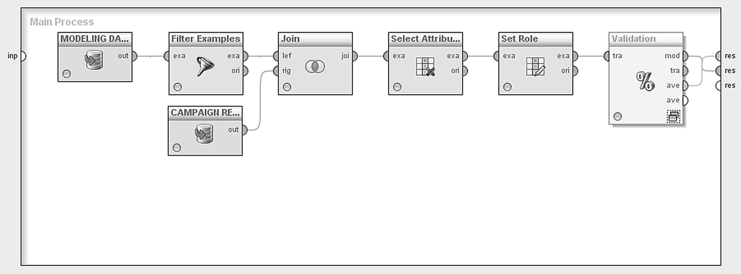
Figure 7.39 The RapidMiner process file for the cross-selling model
The modeling data were initially loaded with a Repository Retrieve operator. Apparently, the model training requires instances with known outcome (purchase yes/no). Therefore, only customers who had participated in the test campaign were selected. Shoppers of the House department were filtered out with a Filter Examples operator. Then, in order to merge the modeling data with the campaign response data, a Join operator has been applied. The CARD_ID field was used as the key for merge and an inner join type was applied. Only customers present in both data sources, hence only customers who had participated in the test campaign, were retained.
A Select Attribute operator was then used to keep only the predictors and the target field (label field, in RapidMiner’s terminology) as listed in Table 7.7. The rest of the attributes were omitted and did not contribute in model building.
The role of each field in model building has been defined using a Set Role operator. Specifically, the CAMPAIGN_RESPONSE field, recording the campaign responses, was assigned a label (target) role for the subsequent cross-selling model. The rest of the fields kept their default regular role to participate as predictors in the classification model.
7.14.3 Applying a Split (Holdout) validation
The evaluation of the classification model is optimistic when based on the training dataset. In order to evaluate the model on a sample different than the one used for model training, a Split (Holdout) validation method has been applied through a Split Validation operator. This operator partitioned the modeling dataset into a training and a testing part of 70% and 30%, respectively, as shown in Figure 7.40.
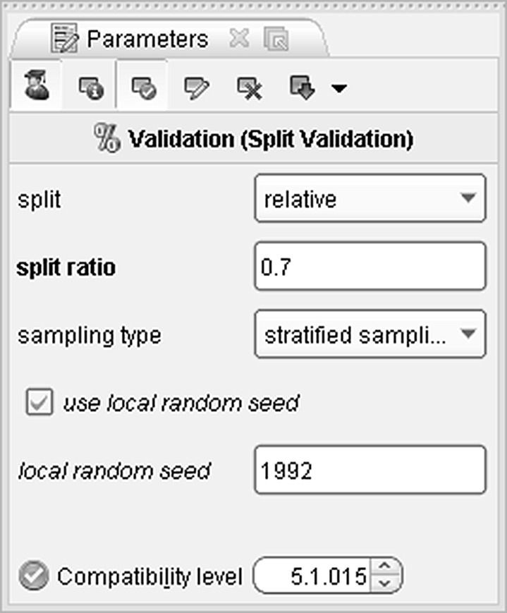
Figure 7.40 The Split validation settings
The dataset was split with a stratified random sampling and a 0.7 split ratio. Therefore, 30% of the training instances were reserved for evaluation and didn’t participate in the model training. The sampling with stratification ensured that the distribution of the target field was maintained across both samples.
The Split Validation operator, contains two subprocesses as displayed in Figure 7.41.
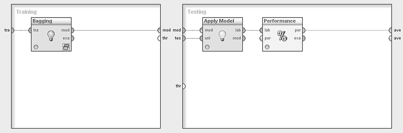
Figure 7.41 The Split Validation operator for partitioning the modeling dataset
The left subprocess corresponds to the training sample and covers the model training phase. Instead of a single model learner, a Bagging operator was applied in order to build a set of classifiers. This technique is explained thoroughly in the next paragraph. The right subprocess corresponds to the Testing dataset and includes all the evaluation steps.
7.14.4 Developing a Decision Tree model with bagging
A widely used ensemble method for combining multiple models in order to improve the classification accuracy, called bagging (bootstrap aggregation), has been applied in this case study. More specifically, five different samples with replacement have been chosen at random from the original training dataset, and a separate Decision tree model has been built for each sample. The Bagging operator used for this procedure is shown in Figure 7.42.

Figure 7.42 The Bagging procedure for building five separate Decision trees
The average confidences option combines the five separate trees, and their average confidences are used for scoring.
The Decision Tree parameters specified are shown in Figure 7.43, and they are summarized in Table 7.10.
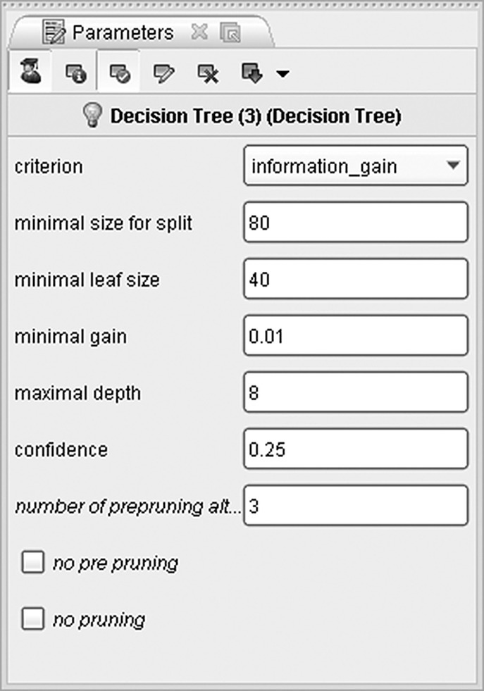
Figure 7.43 The Decision Tree model parameter settings
Table 7.10 Decision Tree model parameters
| Decision Tree model parameter settings | |
| Parameter | Setting |
| Criterion | Information gain |
| Minimal size for split | 80 |
| Minimal leaf size | 40 |
| Minimal gain (to proceed to a split) | 0.01 |
| Maximal depth (levels of the tree) | 8 |
| Confidence | 0.25 |
The execution of the RapidMiner process generated a bagged model, consisted of the five individual Decision trees. By browsing the trees and their branches from the root node down to their leaf nodes, we can see the attributes and the patterns which were associated with increased response. In each node, the lighter shade in the bar represents the proportion of buyers. The width of the bar represents the number of customers at each node. From a first, visual inspection of the trees, we can see an increased number of responders among frequent customers with increased diversity of purchases (purchases of distinct product groups). Customers with purchases at the Grocery, Childrenwear, Accessories, and Beauty departments, especially in the Downtown store, are also probable buyers. The first of the five Decision trees is presented in Figure 7.44 in Graph view.

Figure 7.44 The Decision Tree model in tree format
7.14.5 Evaluating the performance of the model
The next step was to evaluate the performance of the bagged classifier. The Performance operator, placed in the testing subprocess of the validation, provided numerous performance metrics for assessing the classification accuracy of the model. Note that the Performance operator requires scored (labeled) instances; therefore, it was preceded by an Apply Model operator which classified each customer according to the model results. Also note that all evaluation measures are based on the 30% testing subsample.
The Confusion matrix of the ensemble classifier is presented in Figure 7.45. The overall accuracy (correct classification rate) was 79.19% since 3106 of the 3922 testing instances were classified correctly (2915 TN, True Negatives, and 191 TP, True Positives). The misclassification rate was 20.81% (134 FP, False Positives, and 682 FN, False Negatives).
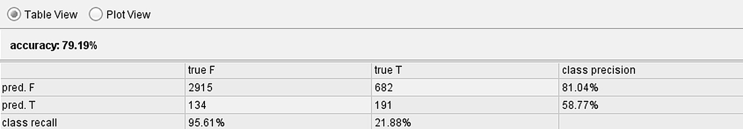
Figure 7.45 The Confusion matrix
The Precision of the model was 58.77%. It denotes the percentage of the predicted positives which were actual positives (TP/TP + FP). The Recall measure (true positive rate or sensitivity) was 21.88%. It denotes the percentage of actual positive instances predicted as such (TP/TP + FN). The F measure is a measure generated by combining Precision (a measure of exactness) and Recall (a measure of completeness) in a single metric. In our case, the F measure had a value of 31.89%.
The 325 customers predicted as responders are those with the highest response propensities, and they comprise the 8.3% top percentile. The percentage of total buyers appearing in the top 8 percentile rises to 21.88% (equal to the recall measure). A random 8% sample would have captured 8% of the total responders. Hence, the Lift at this percentile was 2.64 (21.88/8.3). The Lift further increases at a value of 3.4 at the 2% percentile (although not presented here a detailed Lift curve can easily be plotted using the Create Lift Chart operator).
The ROC curve plots the model’s true positive rate in the Y-axis against the false positive rate in the X-axis: in other words the proportion of positive instances in the Y-axis (percentage of actual responders) against the proportion of misclassified negative instances in the X-axis (percentage of nonresponders) at different propensity cutoffs and samples. The ROC curve for the bagged classifier is depicted in Figure 7.46.

Figure 7.46 The model’s ROC curve
It shows a steep incline at the left of the X-axis, hence at higher model propensities, indicating acceptable model performance. The AUC metric (Area Under the ROC Curve measure) was 0.755.
Since the bagged model presented satisfactory predictive performance according to all evaluation metrics examined, the next step was to deploy it on new instances to target the campaign.
7.14.6 Deploying the model and scoring customers
The final step of the procedure was the deployment of the ensemble model on customers who hadn’t participated in the test campaign. These customers were filtered with a Set Minus operator which discarded the participants of the pilot campaign from the modeling dataset. Then, the model was applied, through an Apply Model operator, to customers who hadn’t yet visited the House department. The respective RapidMiner process is displayed in Figure 7.47.

Figure 7.47 The model deployment process
Three new, model derived fields were created after the model deployment: the model prediction (field prediction(CAMPAIGN_RESPONSE) with values T/F), the estimated likelihood for nonresponse (confidence(F) field), and the response propensity, that is, the estimated likelihood for response (confidence(T) field). The values of the confidence fields range between 0 and 1. A screenshot of the prediction fields for a sample of customers is shown in Figure 7.48.
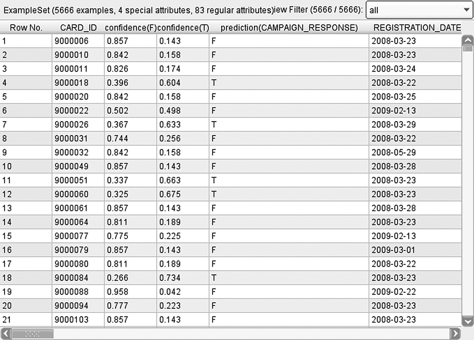
Figure 7.48 The prediction fields derived by the RapidMiner Decision Tree model
Customers were finally ranked according to their response propensities, and the cross-selling mailing list was constructed, including those with the highest likelihood to accept.
7.15 Building the cross-selling model with Data Mining for Excel
In the next paragraphs, the development of the cross-sell model is presented using this time the algorithms of Data Mining for Excel.
7.15.1 Using the Classify Wizard to develop the model
To build a classification model in Data Mining for Excel, we have to use the simple steps of the Classify Wizard. The modeling dataset includes those customers that had been involved in the test campaign. As outlined before, old shoppers of the House department had already been filtered out. The target field (CAMPAIGN_RESPONSE) records the campaign responses.
In the first step of the Classify Wizard, the source data for training the model has been selected as shown in Figure 7.49. In this example, a data range of the active datasheet was specified as the model dataset, although in general, data can also be loaded using an external data source and/or an SQL query.

Figure 7.49 Selecting the source data for model training in the Classify Wizard of Data Mining for Excel
The predictors (“Inputs”) and the target field (“Column to analyze”) were then selected as shown in Figure 7.50. The complete list of predictors is presented in the data dictionary shown in Table 7.7.

Figure 7.50 Assigning roles to the model fields in the Classify Wizard of Data Mining for Excel
7.15.2 Selecting a classification algorithm and setting the parameters
Two different Decision Tree models were trained, using two different attribute selection methods (“Score methods”), the default BDE (Bayesian Dirichlet Equivalent with Uniform prior) and the Entropy. The algorithms and the respective parameters were set through the “Parameters…” menu as shown in Figure 7.51.

Figure 7.51 Setting the parameters for the Decision Tree models
The default “Complexity” value, based on the number of 10+ used inputs, was 0.9. It was relaxed to 0.5 to yield a larger tree. The default “Split method” of “Both” was applied. This method produces optimal groupings of the inputs, combining multiway and binary splits. Finally, a “Minimum Support” value of 50 was specified, setting the minimum acceptable size of the leaf nodes to 50 records.
7.15.3 Applying a Split (Holdout) validation
A Split (Holdout) validation method was applied in the next step of the Classify Wizard. The percentage of random, holdout test cases was set to 30% as shown in Figure 7.52. The rest 70% of the data was used for the development of the model.
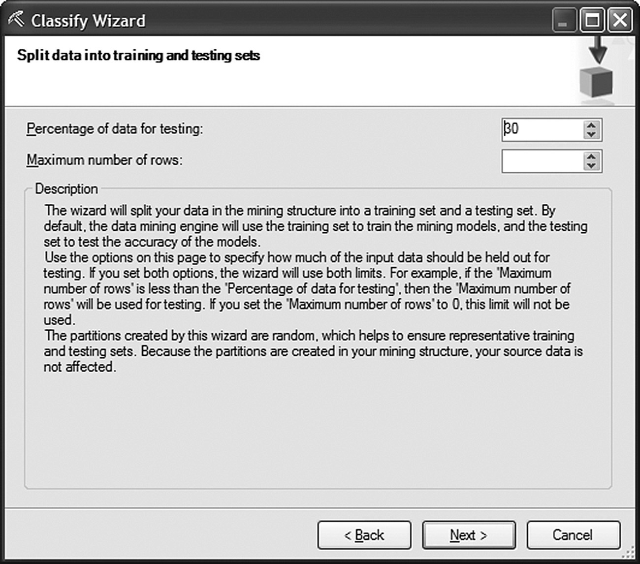
Figure 7.52 Applying a Split validation method
In the last step of the wizard, the created mining structure and the model were stored (Figure 7.53). The testing (holdout) part of the dataset was stored in the created mining structure, enabling its use in the subsequent validation.
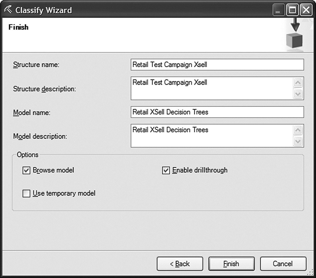
Figure 7.53 Storing the mining structure and model
7.15.4 Browsing the Decision Tree model
The two derived Decision Tree models yielded comparable results in terms of discrimination as we’ll see in the next paragraph. The dependency network of the BDE tree is presented in Figure 7.54.
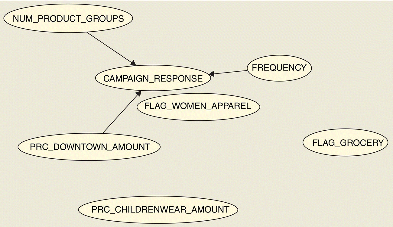
Figure 7.54 The Dependency network of the BDE Decision Tree model
The Dependency network presents the inputs retained in the model. It also provides a graphical representation of the strength of their relationships, based on the split score. Each node represents one attribute, and each edge represents the relationship between two attributes. Heavier lines designate stronger relationships. In our model, the diversity of purchases denoted by the number of distinct product groups with purchases and the frequency of purchases were proven significant predictors. Visits to a specific store (downtown store) as well as previous purchases of women apparel, childrenwear, and groceries also appeared to be related with the campaign response.
The developed Decision Tree model is presented in Figure 7.55. By examining the tree branches, stemming from the root node down to the terminal, the leaf nodes, we can identify the characteristics associated with increased response and the profile of responders. In each node, a darker background color denotes increased concentration of buyers.

Figure 7.55 The cross-selling BDE Decision Tree model of Data Mining for Excel
Customers with diverse buying habits, especially those with purchases of at least four distinct product groups, presented an increased percentage of responders. Increased concentration of responders was also found among visitors of a specific store (downtown store) and among frequent customers and buyers of Groceries and Childrenwear.
7.15.5 Validation of the model performance
The model validation was performed using the Classification Matrix wizard and the Accuracy Chart wizard of the Data Mining for Excel.
The Classification Matrix wizard produces a confusion (misclassification) matrix to summarize the accuracy and the error rate of the classification model. In the first step of the wizard, the entire structure was selected for validation, in order to evaluate and compare the two Decision Trees developed as shown in Figure 7.56.
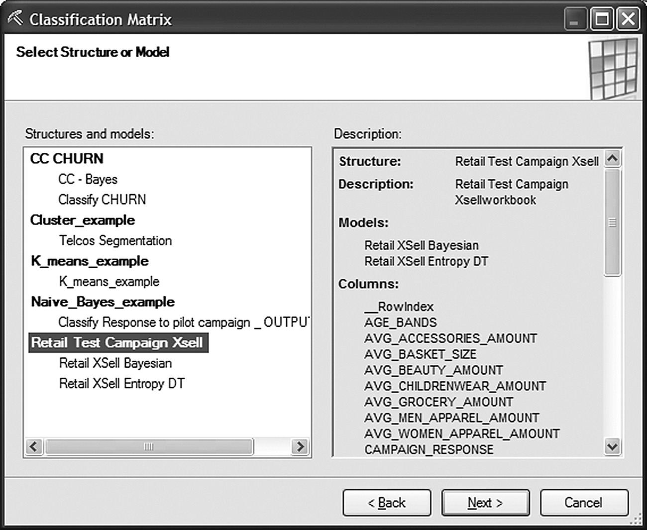
Figure 7.56 Selecting the model to evaluate in Data Mining for Excel
The target field as well as the desired format of the results (in counts and/or percentages) was specified in the second step of the wizard as shown in Figure 7.57.
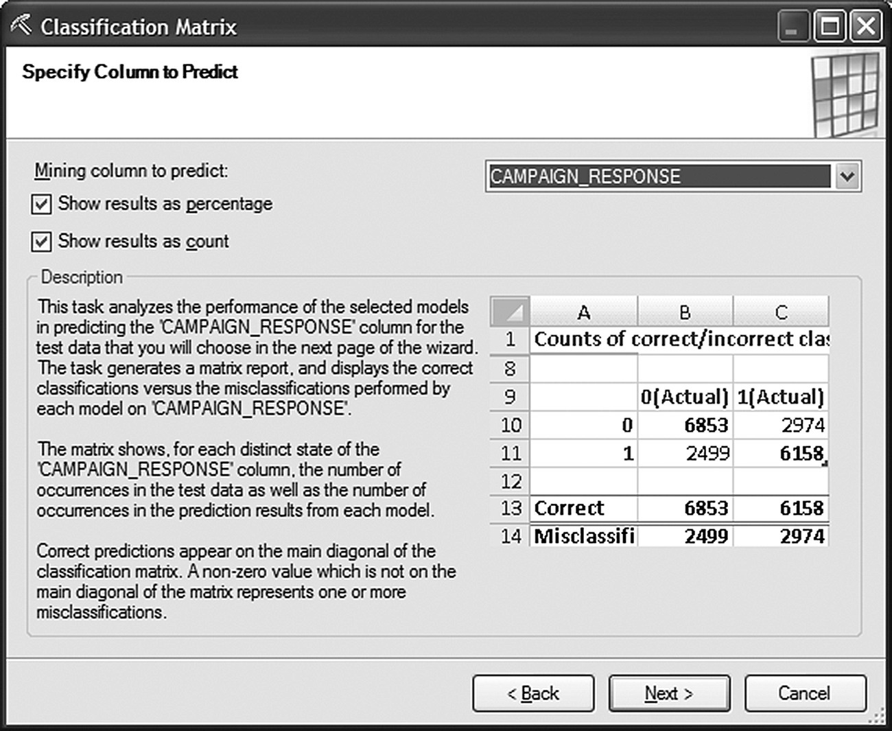
Figure 7.57 Selecting the target field for validation in the Classification Matrix wizard of Data Mining for Excel
The model was selected to be tested on the testing (holdout) dataset which had been stored along with the entire mining structure (Figure 7.58). If the test data were from a different data source, then a mapping of the structure fields (“mining fields” in Excel terminology) to the external fields would be required. This mapping is done in the last step of the Classification Matrix wizard.

Figure 7.58 Selecting the validation dataset in the Classification Matrix wizard of Data Mining for Excel
Table 7.11 presents the accuracy and the error rate of the two Decision Tree models based on the testing dataset. The two models performed equally well. They both achieved an accuracy of 80% with an error rate of 20%.
Table 7.11 The accuracy and the error rate for the generated Decision Tree models
| Model name | Retail XSell Bayesian | Retail XSell Bayesian | Retail XSell Entropy DT | Retail XSell Entropy DT |
| Total correct | 80.06% | 3140 | 80.32% | 3150 |
| Total misclassified | 19.94% | 782 | 19.68% | 772 |
The confusion matrices for the BDE and the Entropy models are presented in Tables 7.12 and 7.13, respectively. The actual classes, in columns, are cross tabulated with the predicted classes. Both models presented a large false negative (FN) rate as they misclassified a large proportion of actual responders as nonresponders. Since the default propensity threshold for predicting an instance as a responder is 50%, the increased FN rate designates that the estimated response propensities were often below 50% among the actual responders. Does this mean that the model is not good? To answer that, we must ask a different question: does the model propensities rank well? Do they discriminate positives from negatives, responders from nonresponders? Are the actual responders assigned with higher estimated probabilities compared to nonresponders? The discrimination power of the model was examined with the Gains chart and the Accuracy Chart wizard.
Table 7.12 The confusion matrix for the BDE Decision Tree model
| Results as percentages for model “Retail XSell Bayesian” | ||
| F(Actual) (%) | T(Actual) (%) | |
| F | 95.73 | 80.32 |
| T | 4.27 | 19.68 |
| Correct | 95.73 | 19.68 |
| Misclassified | 4.27 | 80.32 |
Table 7.13 The confusion matrix for the Entropy Decision Tree model
| Results as percentages for model “Retail XSell Entropy DT” | ||
| F(Actual) (%) | T(Actual) (%) | |
| F | 98.11 | 88.24 |
| T | 1.89 | 11.76 |
| Correct | 98.11 | 11.76 |
| Misclassified | 1.89 | 88.24 |
The steps of the Accuracy Chart wizard are similar with those of the Classification Matrix wizard except from the definition of the target class which is required for producing Gains charts (Figure 7.59).
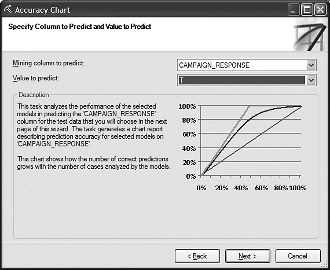
Figure 7.59 Selecting the target class in the Accuracy Chart wizard of Data Mining for Excel
The Gains charts for the two models are presented in Figure 7.60.
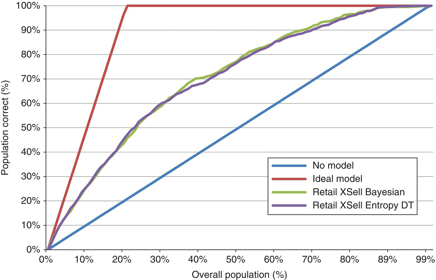
Figure 7.60 The Gains charts for the two Decision tree models in Data Mining for Excel
Once again, the two models presented comparable performance. Table 7.14 lists the cumulative Gain %, that is, the cumulative percentage of responders among the top 20 propensity percentiles.
Table 7.14 The Gains table and the top 20 percentiles of the two Decision Tree models
| Percentile (%) | Ideal model (%) | Retail XSell Bayesian (%) | Retail XSell Entropy DT (%) |
| 0 | 0.00 | 0.00 | 0.00 |
| 1 | 4.83 | 3.59 | 2.97 |
| 2 | 9.65 | 6.81 | 6.44 |
| 3 | 14.48 | 9.41 | 9.53 |
| 4 | 19.31 | 11.88 | 12.00 |
| 5 | 24.13 | 14.11 | 14.23 |
| 6 | 28.96 | 15.84 | 16.96 |
| 7 | 33.79 | 18.44 | 18.69 |
| 8 | 38.61 | 20.67 | 20.92 |
| 9 | 43.44 | 22.90 | 23.64 |
| 10 | 48.27 | 25.50 | 25.37 |
| 11 | 53.09 | 26.98 | 27.23 |
| 12 | 57.92 | 28.96 | 29.58 |
| 13 | 62.75 | 31.06 | 31.93 |
| 14 | 67.57 | 33.29 | 33.91 |
| 15 | 72.40 | 35.15 | 35.27 |
| 16 | 77.23 | 37.13 | 37.25 |
| 17 | 82.05 | 38.61 | 38.99 |
| 18 | 86.88 | 40.47 | 40.47 |
| 19 | 91.71 | 42.08 | 43.07 |
| 20 | 96.53 | 43.56 | 45.30 |
A random 2% sample would have captured 2% of the total responders. The ranking of customers according to the BDE model propensities raised the Gain % of the top 2% percentile to 6.81%. Hence, the Lift at this percentile was 3.4 (6.81/2).
Figure 7.61 presents the cumulative distribution of responders and nonresponders across the propensity percentiles. The plot suggests acceptable discrimination. The point where the maximum separation is observed was the 37% percentile. The maximum separation was 39.7%, and it is equal to the KS statistic.
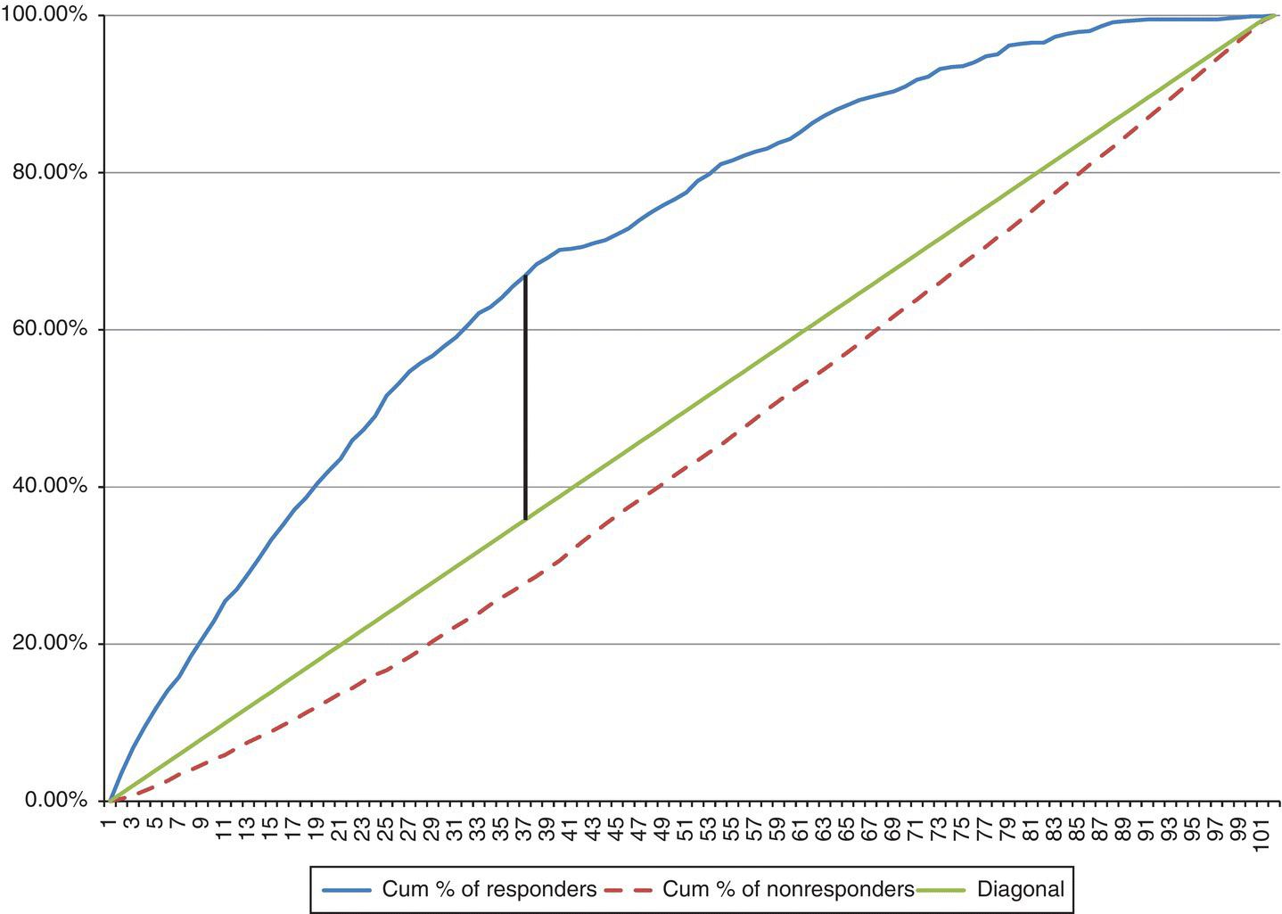
Figure 7.61 The cumulative distribution of responders and nonresponders across propensity percentiles
7.15.6 Model deployment
Finally, the BDE model was deployed on new customers, who hadn’t participated in the test campaign. Using the “Query” wizard, the stored model was applied to the selected dataset. The model estimates that were selected to be derived included the predicted class (based on the 50% propensity threshold) and the prediction confidence, the estimated probability of the prediction (Figure 7.62).

Figure 7.62 Using the Query wizard to deploy the model and score customers
The file of scored customers and the model derived estimates are shown in Figure 7.63.
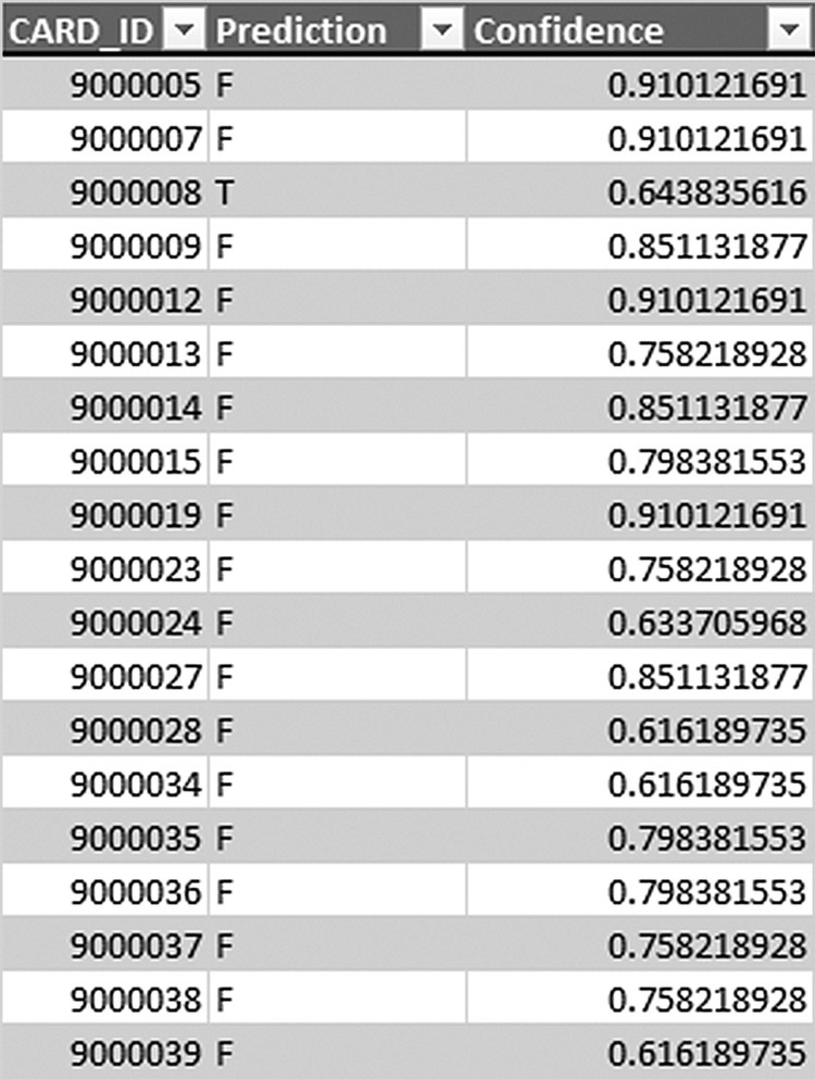
Figure 7.63 The model estimates and the scored file
7.16 Summary
The case studies presented in this chapter concerned a retailer who explored its wealth of available data to better understand its customers and gain insight on their behaviors. By starting from transactional data, we saw how we can transform raw information to valuable KPIs which summarize customer purchase patterns. We developed an RFM cell segmentation, which described the customer relationship in terms of spending amount, recency, and frequency of purchases. Finally, we used three different data mining tools to develop, build, and evaluate a classification model for targeting a cross-selling campaign for the promotion of a new department.